Table of Contents for
High Performance Responsive Design
 High Performance Responsive Design
Published by
O'Reilly Media, Inc., 2014
High Performance Responsive Design
Published by
O'Reilly Media, Inc., 2014
- Cover
- High Performance Responsive Design: Building Faster Sites Across Devices
- High Performance Responsive Design: Building Faster Sites Across Devices
- Preface
- 1. State of the Industry of Responsive Design
- 2. Primer on Performance of Web Applications
- 3. Start with a Plan
- 4. The Backend
- 5. The Frontend
- 6. Continuous Web Performance Testing
- 7. Frameworks
- A. About the Author
- B. High Performance Responsive Design
- Index
- About the Author
- Copyright
Chapter 3. Start with a Plan
A Journey Down the Slippery Slope
I remember the first time I started a project that had aspirations of being responsive. Everyone on the team bought in: the product owner, the design group, engineering. We groomed and groomed, exploring together what our collective ideas of what being responsive meant. We were excited about the possibilities and giddy with the taste of something new.
Until that point, we maintained an mdot website with a separate developer dedicated to keeping it current and aligned with the main site. In engineering, we were looking forward to folding that developer back into the main team, and we were enjoying the collaboration we were experiencing with the design group.
We were a few weeks in and had nothing yet to demonstrate or even show to the executive team, but we nonetheless glowed about what a great learning experience we were having. Naturally, the executive team wasn’t glowing quite as brightly and wanted to have something concrete that they could talk about with their leadership team and their peers. A section of the design team was split off from the working team to mock up what the website would look like on the desktop, just as a talking point. Of course, after that mock-up was shown around, it was approved and suddenly became the final design from which we had to work and on which we had to base an end date.
Even though we conceptually knew that we should have started with the mobile view first and layered on from there, we quickly deferred all intentions to craft the small view for a later iteration and began to focus on creating the vision of the final product. It was only a year later that we started to craft what the experience on other devices might be, but by then the main desktop experience had become so feature rich that it was slow going, and it became a pet project that spanned months to mock up what the responsive site could be.
By then, it was too late; the mockup had about the same page payload as the desktop version, but it performed poorly when displayed on actual devices. The site remained a desktop-only experience.
How closely does that mirror your own experiences, either with previous projects or current ones? How did it all go wrong? I thought on this for a while: what learnings could I carry out from this to benefit future projects?
At a high level, we did ourselves in. From within the team, it all appeared to be fun exploration and collaboration, feeling out the boundaries of something that was new to us. From outside the team, it looked as if we had no plan and no end goal in sight—which was true. In the long term, our lack of planning undermined the executive team’s trust in the working team, and set the precedent that we needed intervention and an end goal outlined for us.
In this chapter, I outline how to craft a plan for your team so that you can quickly create deliverables that can become talking points for the leadership team, all while still sticking to the goals of having a responsive, high-performing site.
Project Plans
Responsive projects really are no different from any other project, in so much as they generally will benefit from having a project plan. In program and project management literature, there are several flavors of project plans, depending on methodology, organization, business sector, and whom you ask (among other factors), but in general, project plans will consist of the following steps:
Assess/summarize the overall task
Establish rough milestones and timelines
List dependencies and risks
List key performance indicators (KPIs) that measure success
The only difference with a responsive project is that requirements which speak to the various device experiences should be explicit in each of the aforementioned steps. Let’s look at each of these steps in greater detail.
Assessing and Summarizing the Overall Task
Assessing the overall task involves collecting requirements and determining the content strategy for your project. This could mean having a discussion with your stakeholders or product manager to establish the philosophy or vision of your site and the intended use cases that you are developing for. This could also mean working with them to do extensive user testing and competitive analysis to determine the content strategy.
Part of assessing the task is to answer certain relevant questions. For example, are you trying to re-create the viewing experience of a 10-foot video screen, or are you trying to serve textual content? Are you creating a companion experience to a television product, or are you crafting an intranet experience available to a locked-down set of users.
Does your project even need to be responsive? A number of years ago I worked on a web app project that aimed to assist construction managers in identifying obvious hazards such as upturned dirt that was not surrounded by silt fences. By the very nature of this single use case, the project never needed a desktop experience, so we built for the smartphone dimensions and just let the size of the page naturally scale up for desktop experiences (there were no tablets back then).
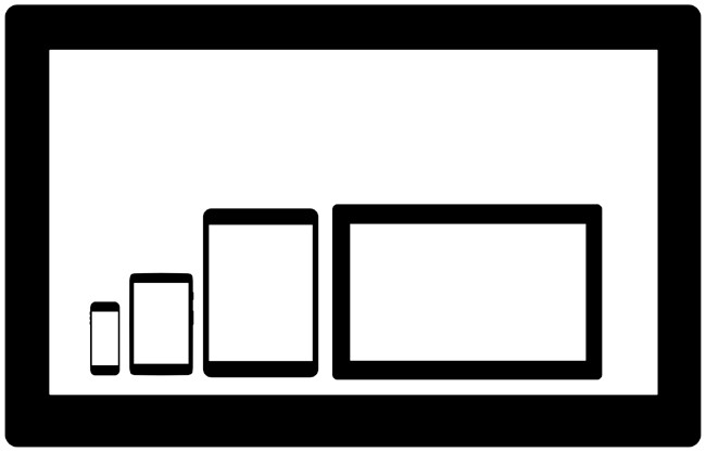
The use cases and overall project vision should explicitly answer the question: what are the viewports that I am targeting for this project? These viewports should be part of your requirements, and as we progress through each step in the project plan, we will refer back to them, but again the very first step is to identify which ones we are explicitly targeting. Figure 3-1 depicts a sampling of potential viewports that you might target as well as their relative size differences.
Beyond just the difference in size, you also need to consider the difference in viewing distance, battery life, and network speed and reliability for each device experience.
Studies have revealed that the average distance from a user’s face to the screen for smartphones is only 12.6 inches.[8] Compare this to an average of 25 inches for laptops,[9] and 96 inches for televisions.[10] (See Figure 3-2.)
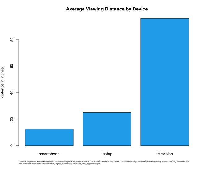
These variations in viewing distances mean differences in, among other things, image and font sizes, each of which require different CSS rules and potentially different images for each experience. You need to account for these when assessing the size of the overall tasks.
Average network speeds are equally staggered across mediums. According to Akamai’s 2013 report “State of the Internet” (http://bit.ly/1tDGysM), the average broadband connection speed in the United States was 11.6 megabits per second (Mbps), whereas the average mobile connection speed was 5.3 Mbps. See Figure 3-3.
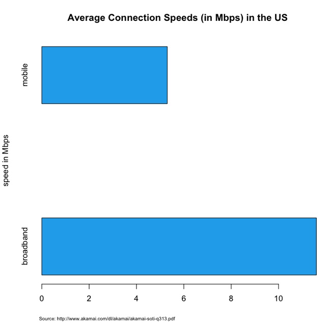
This discrepancy in connection speed obviously speaks to the issue of how long it will take to deliver and render content to a device. This means that you need to plan your feature set and your performance budget accordingly.
Establishing rough milestones and timelines
Don’t plan in a vacuum; after you have established the target viewports, you should perform competitive analysis. Make the effort to research internal and external applications that serve similar functions and come up with a performance baseline for each device experience based on this competitive analysis. Intelligently plot out what the current landscape is for performance and make an intentional decision of where in that landscape you want your application to be.
Figure 3-4 presents the results of a theoretical competitive analysis of page load times for mobile experiences. In this theoretical data set, we can see that the majority of our internal and external competitors fall in the 500-millisecond to 1-second range. Is that an acceptable range for our web application, or do we want to be performance leaders and aim for the sub–500-millisecond tier? What sort of features do the sites in that range have, and are we OK paring down our feature set to get our page load times that low?
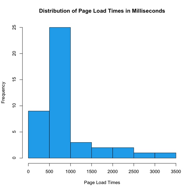
In Figure 3-4, note the outliers that take up to 3.5 seconds. This decision—this line in the sand—is where you are intentionally positioning your application in the performance baseline. This is your performance service-level agreement.
Determining a performance service-level agreement
A service-level agreement (SLA) is a commitment of quality from a service provider, traditionally stipulating aspects such as response times, up times, and error rates. As owners of a website, that site is a service we are providing and we should feel compelled to provide an SLA to our end users as well as internal stakeholders for how our website performs.
Your performance SLA should be explicit both in what it is stating and in how it will be measured. A good performance SLA might read as follows:
For the 95th percentile, the page load times of our website will be 1 second or less on a small screen experience, and 3 seconds or less on a large screen experience, measured via synthetic testing.
When you determine your performance SLA, this decision should influence what features you put on each experience and how you show them. You should also publish this SLA in your documentation to make it available to your team and stakeholders.
Crafting Rough Milestones and Timelines
Now that you have an understanding based not only on what the product request is, but also of what it would really involve from a performance perspective, you can begin to flesh out its implementation. This can be as rich and complex as a hierarchical tree structure of user stories, to as high level as a spreadsheet of T-shirt sized steps.[11]
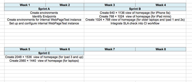
But all of your device/resolution/viewport–specific states are explicitly called out and accounted for as milestones in the overall timeline, as illustrated in Figure 3-5.
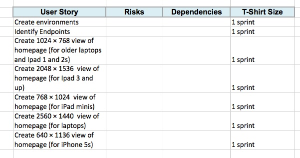
To be clear, the high-level stories that we are indicating in Figure 3-5 (Create 1024 × 768 view, Create 2560 ×1440 view) are not assuming that these are distinct pages or anything of the sort—this is just a collection of milestones that will be accomplished (objectives, if you will); the tactics of how to accomplish that are not implied.
Note
Radu Chelariu wrote a great article for Smashing Magazine that outlines a broad swath of resolutions by device. You can read it at http://bit.ly/ZqcGUb.
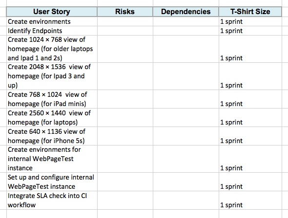
Oh, one more thing: because we have committed to adhering to a performance SLA, we should be sure to include high-level stories that define the setup of the infrastructure and process for monitoring our SLA. Let’s add these supporting stories to our existing list, as shown in Figure 3-6.
List Dependencies and Risks
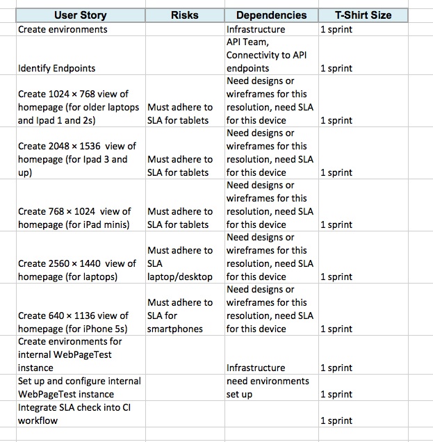
After we have the high-level stories mapped out with time estimates for each one, we can begin to flesh out the risks and dependencies for each story. These should be fairly straightforward and commonsensical, but you still need to call them out both to properly account for the steps needed to accomplish the stories and to show your stakeholders that those steps are being taken. Figure 3-7 is a continuation of the previous example, this time fleshed out with dependencies and risks.
Figure 3-7 illustrates how we can see that the dependencies have the designs or wireframes, have environments set up, and have a defined performance SLA. By calling these out explicitly, we can see what stories need to be predicated by other stories. It also makes it possible for us to craft a meaningful timeline by staggering these stories.
Crafting timelines
Now that we know the steps that will be involved in completing the task, we can construct very rough timelines. By using high-level T-shirt sizes for each task we can group them in a meaningful manner and lay them horizontally across a timeline.
For this example, let’s assume that we have two-week iterations. Assuming that we know our team’s velocity, we can construct a very rough swag of what would fit in each iteration. We can group all of the research and set up stories into a single iteration. Then we can group a handful of stories into another iteration, and the remainder of the stories into a third iteration.
With the following methodology, we can see that the task is probably at least a six-week project, if not longer, as demonstrated in Figure 3-8.
The important thing to note here is that these are very rough timelines. A moment ago, I intentionally used the word “swag,” which stands for Scientific Wild-Ass Guess. In slightly more polite society, it’s sometimes called a guesstimate, or back of the napkin calculation. As long as you are clear with your stakeholders that this timeline is subject to change as you find out more information, and you continue to communicate as new developments arise, you should be good.
KPIs That Measure Success
We have so far assessed the task, created rough timelines around it, and listed dependencies involved in achieving those timelines. Next, we need to ensure that we have clearly defined criteria for success. In truth, the KPIs that measure the success of the project should already exist before our product or business team come to us with the ask, but we need to work with them to ensure that first these KPIs are visible and obvious to the entire team, and second that our solution to the ask actually is aligned to satisfy the intended criteria.
If KPIs are not determined at this point, we need to collaborate with our stakeholders to establish them. How else will we know if our project is a success, and how else will we be able to iterate to improve on those results?
Keep to Your Performance SLA
We now have a plan of what we need to get done, we have identified milestones, and we are communicating when we will have each milestone complete. We have a performance SLA for each experience; we are ready to start the work.
But during development it is imperative to stick to our performance SLA. You need to ensure that performance testing is a part of your continuous integration workflow and that you have alerts go off when you violate your SLA. We talk at length about how to do this in Chapter 6.
Use your SLA as a discussion point when evaluating new features. Will these new features impact your performance? Will slight alterations in the business rule result in a higher-performing product?
Summary
The purpose of this chapter was not to cover how to manage a project, but to discuss a way to incorporate responsiveness and performance into a project plan. With a responsive project plan we can communicate meaningful milestones to our stakeholders, without sacrificing all of the device experiences that we want to cover as part of our final product.
[11] T-shirt sizing is a way to practice agile estimating. Estimates are bucketed in small-, medium-, or large-sized efforts, relative to each other. Rally has a write-up on the practice here: http://bit.ly/1w02oGt.