Table of Contents for
High Performance Responsive Design
 High Performance Responsive Design
Published by
O'Reilly Media, Inc., 2014
High Performance Responsive Design
Published by
O'Reilly Media, Inc., 2014
- Cover
- High Performance Responsive Design: Building Faster Sites Across Devices
- High Performance Responsive Design: Building Faster Sites Across Devices
- Preface
- 1. State of the Industry of Responsive Design
- 2. Primer on Performance of Web Applications
- 3. Start with a Plan
- 4. The Backend
- 5. The Frontend
- 6. Continuous Web Performance Testing
- 7. Frameworks
- A. About the Author
- B. High Performance Responsive Design
- Index
- About the Author
- Copyright
Chapter 5. The Frontend
CHAPTER 4 EXPLORES HOW TO MIGRATE THE RESPONSIVENESS PARADIGM FROM THE CLIENT SIDE TO THE BACKEND. The concept is two-fold: first, load device-appropriate content and serve a dedicated experience from the backend; second, avoid the anti-pattern of loading the content for all devices. This lowers the overall payload of the page, and reduces what the client device has to do to finally render a page.
But what if your infrastructure, business model, or team’s skill set aren’t conducive to a server-side solution? In this case, there are ways to achieve similar performance gains from purely client-side solutions.
In this chapter, we direct our focus back to the frontend and discuss other ways to facilitate the same patterns.
Working with Images
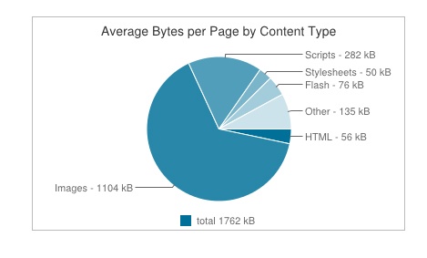
As Steve Souders shows us via his Interesting Stats page in the HTTP Archive, the biggest contributor to page payload are the images on a page (see Figure 5-1). Thus, arguably the biggest impact we can have on responsive performance from the client side is to optimize the delivery of images to mobile clients.
Responsive images in the past have been looked at as needing to scale with a page as the viewport shrinks. Chapter 1 presents a competitive analysis that illustrates how this has usually been achieved by either just resizing images via CSS, or saving images twice as large as necessary and then scaling them down via CSS. But again, these solutions are actually performance anti-patterns: loading the same assets for all devices, and loading assets at twice the size.
For a site to be truly responsive to users’ performance needs—including bandwidth constraints, battery life, pixel density, and viewport size—we must instead follow the pattern of loading device appropriate assets.
This aspect of responsiveness, specifically responsive images, is clearly an area in need of standardization, as evidenced by the proposed solutions currently in working-draft status. Let’s take a look at these, as well as some other options.
The srcset attribute
One of the current options in draft to serve responsive images is the srcset attribute for the <img> tag, recently added by the W3C. The draft for the srcset attribute is available at http://bit.ly/1tDH5Lr. At a high level, the srcset attribute is an update to the <img> tag by which you can specify different images to use for the different pixel ratios of client devices. Let’s take a look at what exactly that means.
<img src="1x.jpg" srcset="2x.jpg 2x">
Device Pixel Ratio
Looking at the preceding source code, you can see that a default image, 1x.jpg, is specified in the src attribute of the <img> tag. The default is there for backward compatibility, in case the browser doesn’t support srcset. Then, you set the srcset attribute and point to a different image—in this case, 2x.jpg—that the browser should use if the device pixel ratio is 2.
Device pixel ratio is the ratio between physical pixels and device-independent pixels on a device. The classic example is of an iPad Retina display being 1,024 physical pixels wide, but because it is a Retina display, it packs more informational pixels, or device-independent pixels, so it has an actual pixel width of 2,048. So, the calculation to determine the device pixel ratio for a Retina display iPad would be the following:
[device independent pixels] divided by [physical pixels]
or
2,048/1,024 = 2
If you’d like to read more about this, try Peter-Paul Koch’s in-depth Quirksmode.org article at http://bit.ly/1uBP6R1.
The value of a device’s pixel ratio is exposed to the browser via the window.devicePixelRatio property. Figure 5-2 offers a screenshot of our srcset example, in which we see Google Chrome emulating a Motorola Droid Razr HD, which has a devicePixelRatio of 1.
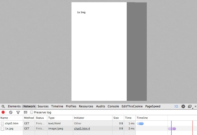
The Droid Razr HD has a 720 × 1280 resolution display and a devicePixelRatio of 1, causing our 1x image to be loaded. Here is the User Agent string:
Mozilla/5.0 (Linux; U; Android 2.3; en-us; DROID RAZR 4G Build/6.5.1-73_DHD-11_M1-29) AppleWebKit/533.1 (KHTML, like Gecko) Version/4.0 Mobile Safari/533.1
Figure 5-3 shows Chrome emulating an iPad 4 which has a Retina display and a devicePixelRatio of 2.
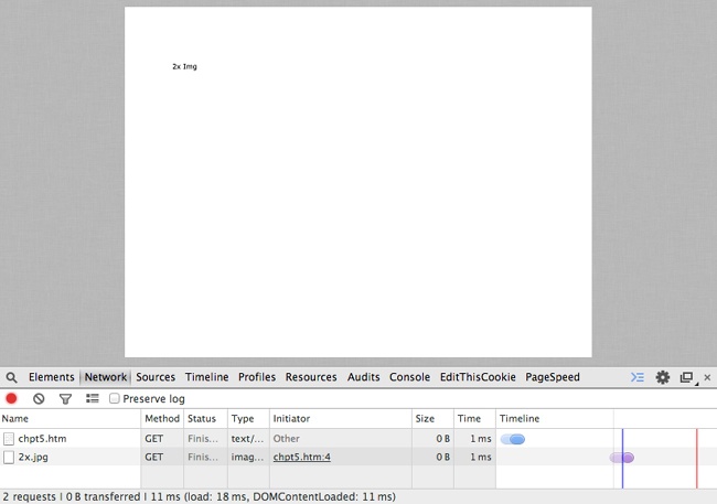
The Apple iPad 4 has a resolution of 2,048 × 1,536 and a devicePixelRatio of 2, causing our 2x image to be loaded. Following is the User Agent string for the iPad:
Mozilla/5.0 (iPad; CPU OS 7_0 like Mac OS X) AppleWebKit/
537.51.1 (KHTML, like Gecko) Version/7.0 Mobile/11A465 Safari/
9537.53.
In both of the previous examples, we can see on the Network tab in Developer Tools that only the required image file is downloaded. Also note in both screenshots that these are emulated devices. Full support for the srcset attribute is still being rolled out, and you are advised to check your usage logs to get a list of your top devices and test on those devices to ensure that they support the srcset attribute.
The downside of using the srcset attribute is that you are sending extraneous bytes in the payload by specifying all of the different images we might need. If you’re interested in optimizing even further, Ilya Grigorik, author of High Performance Browser Networking (O’Reilly), outlines an elegant way to move the mapping of the device pixel ratio to the backend, which you can see at http://bit.ly/1qnPSeY.
The upside of the srcset attribute, aside from making it possible for you to specify multiple images to use for device-specific requirements and not needing to download multiple images, is that it is starting to be supported in modern browsers unlike our next topic of discussion, the picture element.
The Picture Element
Another part of the proposed option for handling responsive images is the <picture> element. You can view the working draft from the W3C at http://www.w3.org/TR/html-picture-element/.
The <picture> element is a new element to be added to HTML5. Conceptually, it is a container element that holds different source tags that specify images to use based on device constraints, viewport width, and pixel density. It can also hold an <img> tag that allows for graceful fallback.
The <source> element supports a media attribute that specifies the media type and CSS property that you can target, and a src element that you can specify an image to download for that targeted media type and CSS property.
If you were to re-create the earlier srcset example in which we targeted high pixel density tablets and phones, using the <picture> element, it would look similar to the following:
<picture>
    <source media="(min-width: 640px, min-device-pixel-ratio: 2)" src=" hi-res_small.jpg ">
    <source media="(min-width: 2048px, min-device-pixel-ratio: 2)" src=" hi-res_large.jpg ">
    <img src="1x.png ">
</picture>
What makes the <picture> element really interesting is that is also supports the srcset attribute. The combination of the two would look like the following:
<picture>
<source srcset="big.jpg 1x, big-2x.jpg 2x, big-3x.jpg 3x" type="image/jpeg" media="(min-width: 40em)" />
<source srcset="med.jpg 1x, med-2x.jpg 2x, med-3x.jpg 3x" type="image/jpeg" />
<img src="fallback.jpg" alt="fancy pants" />
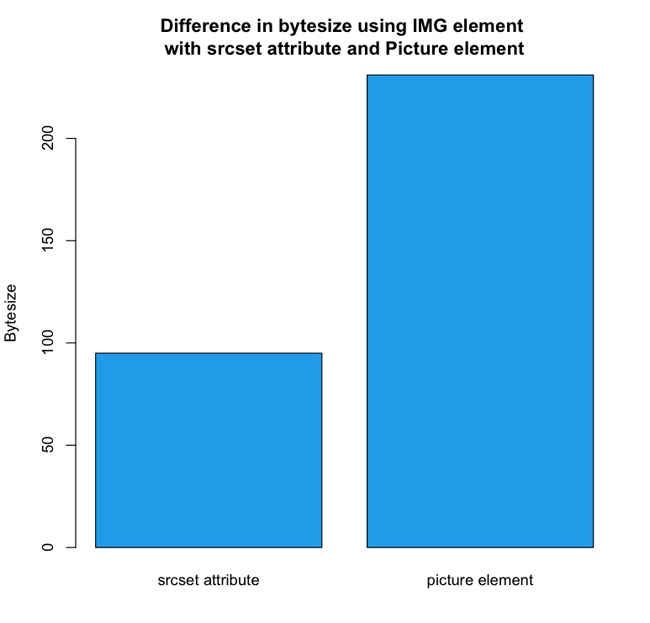
</picture>Both the srcset attribute and the <picture> element are interesting potential solutions. If we were to compare the two solutions from a performance perspective, in theory they both should only download the appropriate resource based on the client capabilities, but the <picture> element is clearly more verbose than simply using the <img> tag with the srcset attribute. If we were to quantify that statement, just in the examples that we’ve used so far in this chapter, the image with the srcset attribute used 95 bytes, whereas the <picture> element example used 231 bytes—the srcset example used 60 percent less bytes than the <picture> element. Figure 5-4 presents a side-by-side comparison.
When viewed by themselves, the numbers 95 and 231 bytes seem fairly innocuous. But that’s for a single <img> tag. Take a moment to review the data set for the Alexa top site in Chapter 1. If we were to use that data set of websites, and pull just the <img> tags from all of those sites, the data on the byte size would look like that shown in Table 5-1 (note that those numbers are in kilobytes).
MIN. | 0.000 |
1ST QUARTILE | 0.305 |
MEDIAN | 3.650 |
MEAN | 56.507 |
3RD QUARTILE | 62.125 |
MAX | 371.100 |
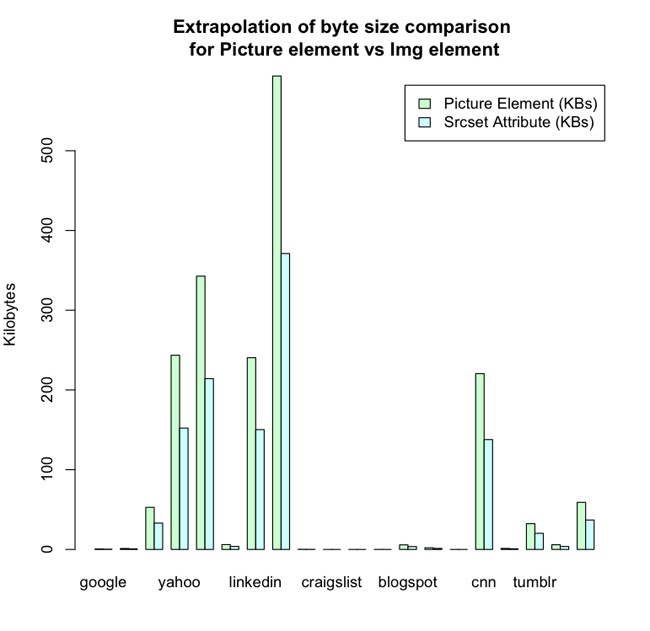
srcset attribute versus using the <picture> element to achieve the same endsAt the maximum, that is 371 kb just in <img> tag text, not counting any other HTML, CSS, or JavaScript on the page. Granted, some of that file size is most likely tracking beacons and spacers that wouldn’t require multiple versions for different devices, but if we extrapolate those numbers, we get the performance implications shown in Figure 5-5 just for using the <picture> element instead of the <img> element.
With this extrapolation, the summary of our data using the <picture> element now looks like Table 5-2.
MIN. | 0.000 |
1ST QUARTILE | 0.488 (+0.183 KB) |
MEDIAN | 5.840 (+2.19 KB) |
MEAN | 90.411 (+33.904 KB) |
3RD QUARTILE | 99.400 (+37.275 KB) |
MAX | 593.760 (+222.66 KB) |
So, pragmatically, the increase in size for 75 percent of sites tested was smaller than if we were to load an additional image, but it’s in the outliers that the concern could lie. Just look at our maximum size from the data set—it is now almost 600 KB! Clearly, although the <picture> element—at one time fully supported by modern browsers—will offer a robust way to load responsive images, because of its impact on file size of the page delivered, it should be treated as a potential solution for evaluation, not the default go-to solution for every responsive image.
It is important to note though that the trade-off of using the <picture> element in these examples would be additional tens of bytes of markup, whereas not using the picture element would be additional hundreds and thousands of bytes of images. Also, you can use compression to negate much of this impact to the payload.
Lazy Loading
Thus far, we’ve touched upon images in this chapter. Let’s now step back and look at how we might take a client-side approach to employing a strategy of only loading device-appropriate assets for the page that is being rendered. Chapter 1 demonstrates that from the perspective of the client-side, this solution would involve lazy loading.
With lazy loading, you load content only when it is actually needed. A familiar example of lazy loading is infinite scroll: only the content that is needed to draw “above the fold” (the content that is actually in view on a device) is brought in on page load, and more content is downloaded and rendered to the screen as a user scrolls. For our purposes, we might load in a bare-bones HTML skeletal structure with semantically structured content, determine the client capabilities, and then lazy load the associated CSS and JavaScript.
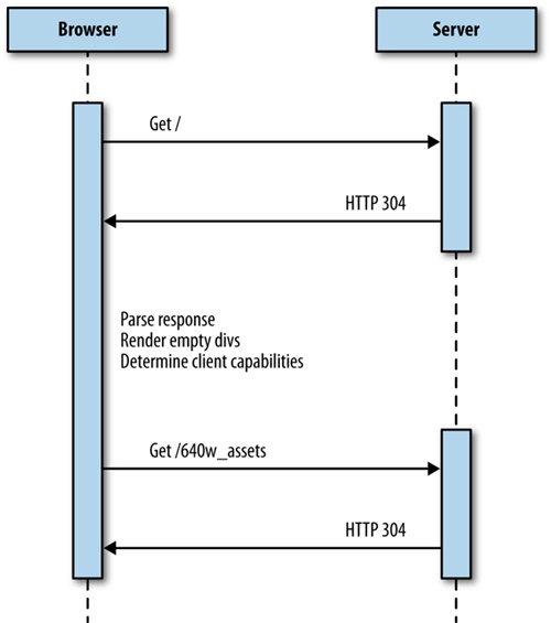
The architecture would look like Figure 5-6.
Let’s take a look at an example. To begin, we’ll start with our base HTML skeletal structure. We’ll include only the bare minimum, no formatting, and only <div>s that have ids that indicate what content we will be loading into them (head, body, and footer, respectively):
<html>
<head></head>
<body>
<h2>Lazy Loading Example</h2>
<div id="head">
</div>
<div id="body">
    Loading Content
</div>
<div id="footer">
</div>
</body>
</html>
We will next make a <script> tag at the bottom of the body and create a function named determineClient(). Within determineClient, we will create an object named client that has its own object named sectionURLs, with the properties head, body, and footer, all named after the <div>s that we have on the page:
<script>
function determineClient(){
    var client = {
        sectionURLs: {
            head: "/components/head/",
            body: "/components/body/",
            footer: "/components/footer/"
        }
    };
}
</script>
The idea is that we will populate these properties with the URLs to the device- or experience-specific content after we have determined what those should be. We will create the object with default data in case we aren’t able to determine capabilities.
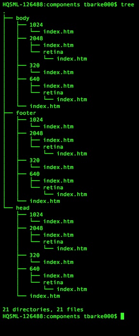
Now, we’ll add in some branching logic to test window.innerWidth and window.devicePixelRatio and populate the sectionURLs accordingly. For our example, we are assuming that we have directory structures set up based on sizes, such as those shown in Figure 5-7.
In Figure 5-7, there are directories with content for each viewport width, including directories for pixel-dense devices. Also note that each high-level section directory (head, body, footer) has its own index.htm files so that default content can be loaded. Of course, these don’t need to be physical files as they are in the diagram; they can be Apache mod_rewrite rules or any other sort of URL manipulation that you want to implement.
After our branching logic populates the client object, the determineClient() function returns the client, as demonstrated here:
<script>
function determineClient(){
    var client = {
        sectionURLs: {
            head: "/components/head/",
            body: "/components/body/",
            footer: "/components/footer/"
        }
    };

    if(window.innerWidth == 320){
        client.sectionURLs.head = "/components/head/320/";
        client.sectionURLs.body = "/components/body/320/";
        client.sectionURLs.footer = "/components/footer/320/";
    }else if(window.innerWidth == 640){
        if(window.devicePixelRatio == 1){
            client.sectionURLs.head = "/components/head/640/";
            client.sectionURLs.body = "/components/body/640/";
            client.sectionURLs.footer = "/components/footer/640/";
        }else if(window.devicePixelRatio >=2){
            client.sectionURLs.head = "/components/head/640/retina/";
            client.sectionURLs.body = "/components/body/640/retina/";
            client.sectionURLs.footer = "/components/footer/
640/retina/";
        }
    }else if((window.innerWidth == 1024) || (window.innerWidth == 1440)){
        client.sectionURLs.head = "/components/head/1024/";
        client.sectionURLs.body = "/components/body/1024/";
        client.sectionURLs.footer = "/components/footer/
1024/";
    }else if(window.innerWidth == 2048){
        if(window.devicePixelRatio ==2){
            client.sectionURLs.head = "/components/head/2048/retina/";
            client.sectionURLs.body = "/components/body/2048/retina/";
            client.sectionURLs.footer = "/components/footer/2048/retina/";
        }
        }
    return client;
}
</script>
If we were to output our client object to the console, it would look like the following:
Object {sectionURLs: Object}
sectionURLs: Object
body: "/components/body/1024/"
footer: "/components/footer/1024/"
head: "/components/head/1024/"
Next, we create a function named loadSection into which we pass the client object as well as a parameter that specifies the <div> that we will be targeting. This function is pretty much standard boilerplate XMLHttpRequest object code; to load in content from the server, our main customizations are the following:
We create a section property on the
xhrobject ad hoc and assign it to the section parameter that has been passed into the function.In the callback function called when the data is loaded, we overwrite the
innerHTMLof the element with the ID that matches the section data with theresponseTextin ourxhrobject:function loadSection(section, client){ var xhr = new XMLHttpRequest(); xhr.open("get", client.sectionURLs[section], true); xhr.section = section; xhr.send(); xhr.onload = function(){ document.getElementById(xhr.section).innerHTML = xhr.responseText; } }
All that is left at this point is to wire all of this logic together. We will create a function that will execute when the window.load() event occurs, and this function will act as our controller, creating a variable to hold the client object passed out of our determineClient() function call, and then calling our loadSection() function for each section we have:
window.onload = function(){
var client = determineClient();
var sections = ["head", "body", "client"];
for(var n=0;n<sections.length(),n++){
loadSection(n, client);
}
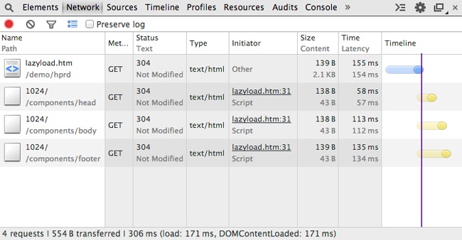
}When we run this in a web browser, the Network tab should look similar to Figure 5-8.
Note that the base page loads and renders in 171 ms, whereas the lazy loaded content took an additional 131 ms to load.
Following is the complete code example, which you can download from http://tom-barker.com/demo/hprd/lazyload.htm:
<html>
<head></head>
<body>
<h2>Lazy Loading Example</h2>
<div id="head">
</div>
<div id="body">
Loading Content ...
</div>
<div id="footer">
</div>
<script>
window.onload = function(){
var client = determineClient();
var sections = ["head", "body", "client"];
for(var n=0;n<sections.length(),n++){
loadSection(n, client);
}
}
function loadSection(section, client){
var xhr = new XMLHttpRequest();
xhr.open("get", client.sectionURLs[section], true);
xhr.section = section;
xhr.send();
xhr.onload = function(){
    document.getElementById(xhr.section).innerHTML = xhr.responseText;
    }
}
function determineClient(){
var client = {
sectionURLs: {
head: "/components/head/",
body: "/components/body/",
footer: "/components/footer/"
}
};
if(window.innerWidth == 320){
client.sectionURLs.head = "/components/head/320/";
client.sectionURLs.body = "/components/body/320/";
client.sectionURLs.footer = "/components/footer/
320/";
}else if(window.innerWidth == 640){
if(window.devicePixelRatio == 1){
client.sectionURLs.head = "/components/head/640/";
client.sectionURLs.body = "/components/body/640/";
client.sectionURLs.footer = "/components/footer/640/";
}else if(window.devicePixelRatio >=2){
client.sectionURLs.head = "/components/head/640/retina/";
client.sectionURLs.body = "/components/body/640/retina/";
client.sectionURLs.footer = "/components/footer/640/retina/";
}
}else if((window.innerWidth == 1024) || (window.innerWidth == 1440)){
client.sectionURLs.head = "/components/head/1024/";
client.sectionURLs.body = "/components/body/1024/";
client.sectionURLs.footer = "/components/footer/1024/";
}else if(window.innerWidth == 2048){
if(window.devicePixelRatio ==2){
client.sectionURLs.head = "/components/head/2048/retina/";
client.sectionURLs.body = "/components/body/2048/retina/";
client.sectionURLs.footer = "/components/footer/2048/retina/";
}
}
return client;
}
</script>
</body>
</html>Note
This is an extreme example in which we are lazy loading formatting as well as content. In some cases, you might just need to lazy load formatting or functionality. But there will also be some cases for which you will find it useful to lazy load content as well. Maybe you are experimenting with new image formats, such as WebP or JPEG XR, that are not yet fully supported by all browsers, so you load your lighter content only for the browsers that support it. Maybe, like one of my teams has been doing lately, you are developing web content for a television set-top box, and different boxes support different video playback formats. In that case, you might lazy load only the videos available for that supported format on that particular box.
Something else to keep in mind: the browser will automatically lazy load CSS background images; if the display is set to none, the background image will not be loaded until the element is made visible. This can be another tactic to lazy load certain images on the page.
Device Detection Libraries
Testing capabilities is natural and easy on the client side, but it’s still difficult determining form factor and the exact device. You could make the argument that as long as we know the capabilities, we don’t need to know the form factor, but that doesn’t take into consideration things such as network reliability. We could parse the User Agent to determine the form factor, but then we’d have to keep a look-up table to correlate tokens from the User Agent to specific devices and form factors.
What if instead of maintaining that look-up table, we wanted to rely on a third party to do that? Relying on a third party would make it possible for us to accurately target specific form factors such as TVs without having to maintain our own User Agent to device database. We could again look to the world of device-detection databases. Both Wurfl and Device Atlas have client-side libraries that expose device capabilities within native JavaScript libraries. Device Atlas bundles its JavaScript library with its client download. Scientiamobile has a site, http://wurfl.io/, dedicated to distributing their client-side solution: wurfl.js. Figure 5-9 depicts the home page of wurfl.io.

To use the wurfl.js, simply include a link to the hosted JavaScript file:
<script type='text/javascript' src="http://wurfl.io/wurfl.js">
</script>
This creates an object in the global scope named WURFL. If you output the WURFL object to the console, it looks similar to the following:
>WURFL
Object {is_mobile: true, complete_device_name: "Apple iPad",
form_factor: "Tablet"}
As you can see, the WURFL object identifies whether a client is on a mobile device, the name of the device, and the device’s form factor. Clearly this isn’t a full capabilities list as much as it is an augmentation of the information we already have on the frontend.
The downside, of course, is that it involves an additional external call that our page needs to make, thus increasing the potential page payload and latency in delivering the page to our end users.
Summary
This chapter focused your attention on the frontend of the web software stack. We first talked about the issue of responsive images and looked at new working drafts to the HTML5 standard to address responsive images. We compared the new srcset attribute in the <img> tag with the upcoming <picture> element and looked at the page payload implications of using them.
We then pulled back and looked at lazy loading entire sections of a page to avoid downloading unneeded styling and content. This was very much like the examples in Chapter 4 in which we employ the strategy of only loading device-appropriate content and formatting. But whereas Chapter 4 achieved this from the backend, the example in this chapter did so from the frontend.
There are advantages and disadvantages to either approach. When parsing the experience from the backend you need to be very aware and careful of your cache semantics because different experiences will be coming from the same URI. When parsing the experience from the frontend, you are at the mercy of the client device being able to run your code, and maintaining the network connection to load your additional assets.
In Chapter 6, we delve into continuous integration and talk about how to include checking responsiveness and the performance of our responsive sites into our continuous integration environment.