Table of Contents for
Data Wrangling with Python
 Data Wrangling with Python
Published by
O'Reilly Media, Inc., 2016
Data Wrangling with Python
Published by
O'Reilly Media, Inc., 2016
- Cover
- nav
- Praise for Data Wrangling with Python
- Data Wrangling with Python
- Data Wrangling with Python
- Preface
- 1. Introduction to Python
- 2. Python Basics
- 3. Data Meant to Be Read by Machines
- 4. Working with Excel Files
- 5. PDFs and Problem Solving in Python
- 6. Acquiring and Storing Data
- 7. Data Cleanup: Investigation, Matching, and Formatting
- 8. Data Cleanup: Standardizing and Scripting
- 9. Data Exploration and Analysis
- 10. Presenting Your Data
- 11. Web Scraping: Acquiring and Storing Data from the Web
- 12. Advanced Web Scraping: Screen Scrapers and Spiders
- 13. APIs
- 14. Automation and Scaling
- 15. Conclusion
- A. Comparison of Languages Mentioned
- B. Python Resources for Beginners
- C. Learning the Command Line
- D. Advanced Python Setup
- E. Python Gotchas
- F. IPython Hints
- G. Using Amazon Web Services
- Index
- About the Authors
- Colophon
Chapter 10. Presenting Your Data
You’ve learned how to analyze your data, and now you’d like to present it. Depending on the audience you have in mind, the presentation can differ greatly. We’ll learn about all different types in this chapter: from simple presentations you can make on your computer to interactive website presentations.
Depending on what you’d like to present, your visualization, with charts, maps, or graphs, might be a major part of the story you are trying to tell. We will cover how to get your own site up and running to share your findings. We’ll also show you how to share a Jupyter notebook, where folks can see your code along with the charts, graphs, and conclusions.
To begin, we’ll explore how to think about your audience and begin telling the stories you have found via your data analysis.
Avoiding Storytelling Pitfalls
Storytelling is not an easy job. Depending on your topic, you might have a difficult time determining solid conclusions from your data. You might encounter inconsistent or inconclusive data. This is OK! We recommend continuing to explore—maybe the story is in the disparate examples you find in your datasets.
Warning
Some of the difficulties you face in storytelling will be due to personal biases you bring to your data analysis. As economist and journalist Allison Schranger aptly discusses in her article “The Problem with Data Journalism”, we bring biases to our analyses that we can’t adequately counter. Her sage advice is to admit those biases and attempt to get to know your data to such a degree you cannot misconstrue it for the purpose of your story.
Don’t presume the story you want to tell and the data are congruous. Attempt to learn the data first, then tell the story you learn from the data. Don’t spend too much time manipulating the data. If you have to alter the data too much (by standardizing, normalizing, and removing outliers), you probably should find another story or different data.
With that in mind, storytelling is a powerful part of becoming an area expert. With the knowledge you have gained by exploring the data you have, you can help illuminate new topics and ideas. With the humility you learn by understanding your biases, the story will be effective and enlightening.
How Will You Tell the Story?
Deciding what story you’d like to tell is just as important as deciding how to tell it. You can use charts, graphs, timelines, maps, videos, words, and interactives. You can publish it online or present it at a meeting or conference. You can upload it to a video sharing site. Whatever you choose, make sure the way you are telling the story enhances your findings. There is nothing more disheartening than seeing a presentation so poor it actually nullifies the story it attempts to tell.
In the next few sections, we will evaluate how your audience, your story, and the platforms available affect your presentation choices. We recommend reading through all of them, even if you already have an idea of how you’d like to present your findings. This will give you a greater understanding of what’s available even if you stick with your initial choice. A combination of several formats can be the best option for those trying to reach a larger audience.
Determining how often you plan to update the data in the future is another part of how you tell the story. Is this an ongoing series? Can your audience expect to hear more about this story soon, or in an annual report? Can you tell them clearly when and how it will be updated? Keeping an audience waiting is only a good idea if you can clarify their expectations.
Know Your Audience
Who you are writing for is almost as important as what you are writing. By identifying your target audience, you can determine what they already know about a topic, what is of most interest to them, and how they learn best. Missing the mark in terms of communicating with your audience creates a story without an interested party.
If your reporting or presentation is part of your job, it should be fairly easy to determine your audience. Whether it’s a small group at work, an executive team, or a daily or annual publication, you know exactly who will be reading your reporting.
Tip
If you are interested in publishing your data for a wider audience, you should research what has already been written and who was interested in learning more. Becoming familiar with the corpus of work in your target field will help you determine whether there’s an existing or new audience to whom you can speak.
If you’re not sure which audience to target, one good strategy is to approach different people you know who have markedly different levels of interest in your chosen topic, say, a parent or mentor, a peer, and a mentee (in terms of exposure to the world and your topic). Is one part of the story more interesting to different people, depending on their level of knowledge about the topic? Do different questions come up depending on the age and experience of your audience? Observe their questions and reactions once you explain your topic and amend your target audience interpretation based on these observations.
Once you’ve determined your target audience, you can find out more about them. Use the tips in the following sidebar to help refine how you might tell the story depending on your audience.
Once you’ve found your audience and taken some time to begin your storytelling, you can start investigating ways to tell your data’s story through visualization.
Visualizing Your Data
When working with data, it’s likely you’ll want to use some kind of visualization to tell your story. Depending on what your story is, your visualization might be a chart, a graph, or a timeline. Regardless of how you present your data, the first step is to determine what visual data is both useful and relevant.
With visual storytelling, it’s incredibly important to determine how to show your findings. As Alberto Cairo writes in his blog post on data visualizations, if you don’t show all the relevant data, you might leave the audience questioning your methods and findings.
Warning
Similar to our documentation detailing our data analysis and methodology, we need to document and defend our visual exploration and representation of the data and ensure we are not omitting important parts of the story.
In this section, we will explore how to use charts, time series and timelines, maps, mixed media, words, images, and video to share findings. Depending on the audience you have in mind, there might be a mixture of these types that are relevant to your story. Each of these formats has its pros and cons, and we’ll review these as we explore.
Charts
Charts are a great way to share numeric data, especially when comparing divergent datasets or different groupings. If you have a clear trend in your data or your data shows specific outliers, charts help communicate those observations to your audience.
You can use a stacked or bar chart to show a large number of figures alongside one another. For example, in his Washington Post story on infant mortality, Christopher Ingraham uses a bar chart to compare countries alongside one another.
To show trends over time, one usually employs a line chart. Ingraham also uses a line chart to compare infant mortality rates at different ages. The bar graph helps us see that the United States lags behind most other countries in infant care. The line chart allows us to compare mortality rates in different countries over time, giving us another way to observe the data.
You will note the author chose to only show a few countries on the line chart rather than all of the countries represented in the bar graph. Why do you think he made this decision? It’s possible he reviewed the data and found including more countries made the chart hard to read.
These are the types of decisions you will need to make when visualizing your findings. In order to better determine whether a chart is right for you and what kind of chart is most useful, first define what you’d like to show with your charts. The easy-to-use flowchart available on the Extreme Presentation blog is one place to start when first thinking about these issues. Juice Labs has built an interactive chart selector showing some of the same concepts.
Tip
Different charts have their own strengths and weaknesses. If you’d like to show relationships, you can use a scatter plot, bubble chart, or line chart, all of which can show data correlations. Bar charts better compare many subjects. If you want to show composition or factors, you can make a stacked chart. To show distribution, you can use a time series plot or histogram.
Let’s think about the data we’ve investigated so far and use some built-in agate features to chart the data.
Charting with matplotlib
One of the main Python charting and imaging libraries is matplotlib, which helps chart and plot datasets. It’s a great way to generate simple charts, and the more parts of the plotting library you learn, the more advanced your graphs and charts will be. First, we need to install it by running pip install matplotlib.
Let’s show our perceived corruption scores compared to the child labor percentages. Here’s how we’d do that:
importmatplotlib.pyplotaspltplt.plot(africa_cpi_cl.columns['CPI 2013 Score'],africa_cpi_cl.columns['Total (%)'])plt.xlabel('CPI Score - 2013')plt.ylabel('Child Labor Percentage')plt.title('CPI & Child Labor Correlation')plt.show()

Uses
pylab’splotmethod to pass the x and y label data. The first variable passed is the x-axis and the second variable is the y-axis. This creates a Python chart plotting those two datasets.
Calls the
xlabelandylabelmethods to label our chart axes.
Calls the
titlemethod to title our chart.
Calls the
showmethod to draw the chart. Everything we set up with our chart before we callshowwill be displayed in the system’s default image program (like Preview or Windows Photo Viewer). Our title, axis labels, and any other attributes we set via thematplotliblibrary will be displayed in the chart.
And voilà! Python renders the chart shown in Figure 10-1.1
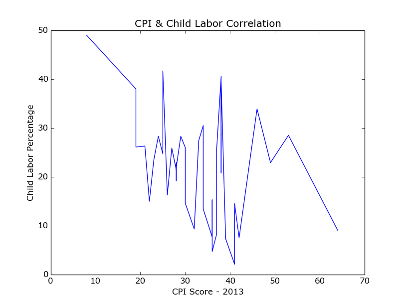
Figure 10-1. Child labor and CPI chart
We can indeed see the overall downward trend, but we can also see the data in the middle does not follow a particular trend. In fact, the data varies greatly, telling us there is not a connection between child labor and perceived corruption for all of the countries, but only for some of them.
Let’s make the same chart using only the worst offenders. We already separated out these worst offenders, in “Separating and Focusing Your Data”. When we run the previous code again with our highest_cpi_cl table, we see the chart shown in Figure 10-2.
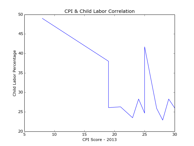
Figure 10-2. Highest child labor chart
Now we can see a clear downward trend for the worst offenders, followed by some anomalies as the child labor rates and perceived corruption scores decrease.
There are many chart types available from pylab, including histograms, scatter charts, bar graphs, and pie charts. We strongly recommend taking a look at matplotlib.org’s introduction to pyplot, covering how to change different aspects of your charts (color, labels, size) and use multiple figures, subplots, and more chart types.
Note
Charting your data can give you a good idea of anomalies or outliers within your dataset. Using the different charting methods available to you in the Python charting libraries can help you research your data’s story and interrelatedness.
The more you play with the library’s charting toolset, the easier it will be to understand which charts work best with your dataset.
Charting with Bokeh
Bokeh is a Python charting library with fairly simple commands for more complex chart types. If you want to create a stacked chart, scatter chart, or time series, we recommend playing around with Bokeh and seeing if it’s right for you. Let’s try making a scatter chart with Bokeh for our CPI and child labor data on a country-by-country basis. Install Bokeh by running this command:
pip install bokeh
Then build a scatter chart with some simple commands using the agate table:
frombokeh.plottingimportfigure,show,output_filedefscatter_point(chart,x,y,marker_type):chart.scatter(x,y,marker=marker_type,line_color="#6666ee",fill_color="#ee6666",fill_alpha=0.7,size=10)chart=figure(title="Perceived Corruption and Child Labor in Africa")output_file("scatter_plot.html")forrowinafrica_cpi_cl.rows:scatter_point(chart,float(row['CPI 2013 Score']),float(row['Total (%)']),'circle')show(chart)
Defines a function,
scatter_point, which takes a chart, x-axis and y-axis values, and marker type (circle, square, rectangle) and adds the point to the chart.The chart’s
scattermethod takes two required arguments (x- and y-axis) and a variety of keyword arguments to style those points (including the color, opacity, and size). This line passes some line colors and fill colors as well as size and opacity settings.Creates the chart using the
figurefunction and passes a title.Defines what file to output using the
output_filefunction. This will create the file scatter_plot.html in the folder where you run the code.
For each row, adds a point using the CPI score as the x-axis and the child labor percentage as the y-axis.

Shows the chart in a browser window.
When you run the code, it opens a tab in your browser containing the chart (Figure 10-3).
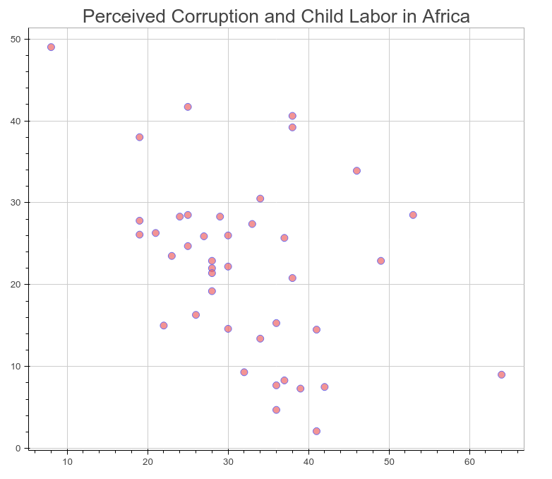
Figure 10-3. CPI and child labor scatter plot
That’s pretty nice, but we can’t see much about what those dots mean. Bokeh can add interactive elements in our charts. Let’s try adding some:
frombokeh.plottingimportColumnDataSource,figure,show,output_filefrombokeh.modelsimportHoverToolTOOLS="pan,reset,hover"defscatter_point(chart,x,y,source,marker_type):chart.scatter(x,y,source=source,marker=marker_type,line_color="#6666ee",fill_color="#ee6666",fill_alpha=0.7,size=10)chart=figure(title="Perceived Corruption and Child Labor in Africa",tools=TOOLS)output_file("scatter_int_plot.html")forrowinafrica_cpi_cl.rows:column_source=ColumnDataSource(data={'country':[row['Country / Territory']]})scatter_point(chart,float(row['CPI 2013 Score']),float(row['Total (%)']),column_source,'circle')hover=chart.select(dict(type=HoverTool))hover.tooltips=[("Country","@country"),("CPI Score","$x"),("Child Labor (%)","$y"),]show(chart)
Imports the main libraries we have been using and adds the
ColumnDataSourceandHoverToolclasses.Defines the tools you’d like to use for the final product. This code adds
hoverso we can use the hover methods.Adds
sourceto the required variables. This will hold our country name information.Passes the
TOOLSvariable to our figure upon initialization.column_sourcenow holds a data source dictionary with the country name. This line passes the name as a list because the values must be iterable objects.Selects the
HoverToolobject from the chart.
Uses the
tooltipsmethod of the hover object to show different data attributes.@countryselects the data passed via the column source, whereas$xand$yselects the x and y points on the chart.
Now your chart should look like Figure 10-4.
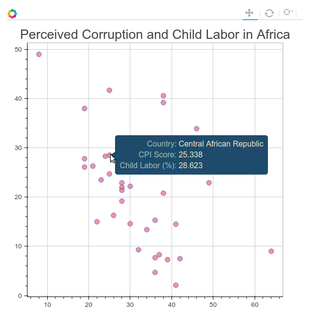
Figure 10-4. CPI and child labor interactive scatter plot
Note
As you move your cursor over each point, the data for x and y change. To improve the chart, try adding the exact values for our two data points to the column_source object by entering new keys and values into the data dictionary.
Bokeh has a great gallery of examples and code available to help you get started. We recommend taking time with your charts and giving Bokeh a try.
Time-Related Data
Time series and timeline data help represent your findings over time. Time series charts show data changing over time (usually as a line chart, bar chart, or histogram). Timelines allow you to visually tell the story of the data by marking events, occurrences, and changes over time.
Time series data
Time series display trends over time, and work especially well when focusing on one factor. The Wall Street Journal produced a great time series on vaccines and disease rates. The interactive element allows for exploration, and the built-in time-lapse animation feature makes for an easy-to-read visual. The vaccination introduction markers add clarity for the readers.
We haven’t investigated changes over time with our dataset. A good next step would be to collect the same datasets for previous years. Such data can answer questions like: Where is child labor increasing over time? Can we see a clear regional trend over time? Can we see another trend over time if we join with another dataset (e.g., does child labor increase alongside agriculture exports)?
There’s a great answer on Stack Overflow providing more information on using matplotlib to chart time series. Remember the agate table’s rows and columns methods, covered in Chapter 9, which allow you to select a column or row of data when given a selection? The lists returned by these methods can be passed to any of the matplotlib functions to pass the data to the chart.
If you’d like to take a look at time-related data using Bokeh, check out some of their excellent examples.
Timeline data
Timeline data can help introduce your audience to important moments in your topic’s history or a breakdown of recent developments. For example, the timeline on the History of Vaccines website shows the history of the measles vaccine and recent developments in California so the audience can quickly understand the topic via historical data.
If we wanted to present a timeline for our child labor story, we would look for important moments in international child labor history. We could research questions that would help point out timeline events, like: When were the first laws to protect child safety implemented? When did public opinion shift against children labor? What public incidents and scandals involved child labor?
For the visualization, TimelineJS by Knight Lab takes a data spreadsheet and creates simple interactive timelines.
Maps
If your findings focus on geography, a map is a great way to present your data. Maps help people identify the impact of a topic on people and regions they know. Depending on how much your audience knows about the area or region you are discussing, you might need to include extra information and context with your map to help relate the story to more familiar regions.
If it’s a local audience, you might include references to locally known monuments and street names. If it’s an international audience and the story covers a particular region (e.g., Amazon deforestation), first reference continental maps and then focus in on your target area.
Warning
Maps can be a difficult form of data visualization. Not only are you beholden to the geographical knowledge of your audience, but maps don’t always show patterns in a clear or digestible way. It’s very important when using a map to be quite familiar with the geography of the region you are showing, so you can both display the important geolocation elements to orient your audience and showcase the findings.
One example of a newsworthy map is The New York Times’s vaccinations in California map. Published during the recent measles outbreak in California, it gives the readers the ability to zoom in and out for more details, provides short anecdotes, and shows differences between personal belief exemptions and other causes for low vaccination rates (such as poverty or lack of access). By focusing only on California, the map is able to show a level of detail that on a nationwide or regional scale could be too cluttered or complicated.
Tip
When preparing your map, you may want to utilize ColorBrewer, which allows you to compare different map color schemas side by side. You want colors that both tell the story and allow for contrast so the reader can clearly see distinctions between groups and group levels.
One example of a larger geographic area map is The Economist’s global debt clock. This map shows public debt on a country-by-country basis with an interactive timeline to examine changes in public debt over time. Its complementary color scheme makes the map easy to read, and one can easily differentiate between heavily indebted countries and those with little or no debt.
Note
The authors of the global debt clock map normalized debt to use the US dollar as a common currency so users can compare different countries and debt ratios side by side. These small normalizations aid audience understanding and enhance the impact of the findings.
There is a very easy-to-use chart and mapping Python library called pygal with great built-in mapping features. pygal has documentation for everything from pie charts and scatter plots to world and country maps. We can use pygal with our agate table to show the worldwide child labor rates. First, we need to install the library and its dependencies by running these commands:
pip install pygal
pip install pygal_maps_world
pip install cssselect
pip install cairosvg
pip install tinycss
pip install lxml
In the pygal world map documentation, we see the two-character ISO codes for every country are necessary to properly map using the world map. We can add these to our ranked table using methods we already know:
importjsoncountry_codes=json.loads(open('iso-2.json','rb').read())country_dict={}forcincountry_codes:country_dict[c.get('name')]=c.get('alpha-2')defget_country_code(row):returncountry_dict.get(row['Countries and areas'])ranked=ranked.compute([('country_code',agate.Formula(text_type,get_country_code)),])forrinranked.where(lambdax:x.get('country_code')isNone).rows:r['Countries and areas']
Loads the string from the iso-2.json file we downloaded from @lukes on GitHub. This file is available in the book’s repository.
Creates a country dictionary where the keys are the country names and the values are the ISO codes.
Defines a new function
get_country_codewhich will take a row of data and return the country code using thecountry_dictobject. If there is no match, it will return None.Evaluates which ones we couldn’t find matches for so we can further investigate.
You should see output like this:
Bolivia (Plurinational State of)
Cabo Verde
Democratic Republic of the Congo
Iran (Islamic Republic of)
Republic of Moldova
State of Palestine
The former Yugoslav Republic of Macedonia
United Republic of Tanzania
Venezuela (Bolivarian Republic of)
We found most matches, but there are still a few missing. As we did with our earth.json file in the previous chapter, we corrected the matches manually by modifying the names in the data file for the mismatched countries. The cleaned file, iso-2-cleaned.json, is also available in the repository. Now we can use the preceding code with the new, cleaned JSON to make a complete table. Note, you will have to either rename your columns or use the new column name country_code_complete so you don’t run into duplicate column name issues. We will utilize the table to create our own world map using the pygal mapping methods:
importpygalworldmap_chart=pygal.maps.world.World()worldmap_chart.title='Child Labor Worldwide'cl_dict={}forrinranked.rows:cl_dict[r.get('country_code_complete').lower()]=r.get('Total (%)')worldmap_chart.add('Total Child Labor (%)',cl_dict)worldmap_chart.render()
The
pygallibrary’sWorldclass in themaps.worldmodule returns our map object.cl_dictholds a dictionary where the keys are the country codes and the values are the child labor percentages.Following the
pygaldocumentation, this code passes the label for the data and a data dictionary.We call the map’s
rendermethod to display the map.
We can see that render outputs the .svg to the terminal as a long, complicated string. If we want to save it in a file, we need to call a different method. pygal gives us a few options for different file types:
worldmap_chart.render_to_file('world_map.svg')worldmap_chart.render_to_png('world_map.png')
Now when we open up our .svg or .png, we’ll see the chart shown in Figure 10-5.
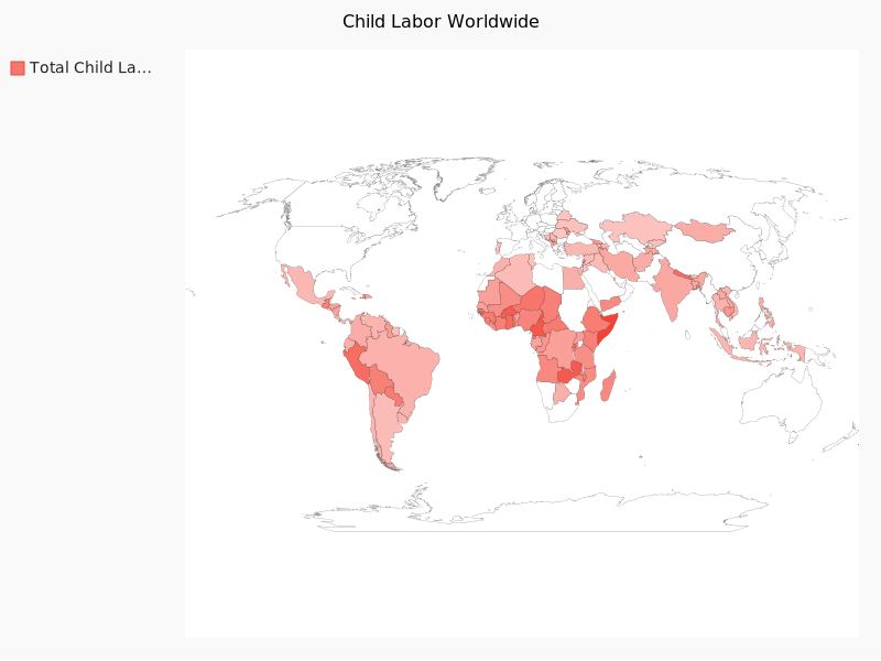
Figure 10-5. World map
Tip
If you have any trouble with the map rendering, make sure you have all dependency libraries installed. If you don’t have an .svg file viewer on your computer, you can always open up your .svg files in a browser, as shown in Figure 10-5.
We strongly encourage you to check out the many other .svg options pygal provides. The documentation is full of examples, both advanced and simple, and it’s a very accessible .svg library for beginners.
Interactives
Interactives tell a story through website interactions or simulations. Because users can click around and explore via the browser, they can take in the topic at their own pace and seek out their own conclusions from the data. This can be particularly powerful for topics which require more research to fully understand.
In response to the recent measles outbreak in the United States, The Guardian created an outbreak interactive allowing users to see and replay effects of potential measles outbreaks with different vaccination rates. This interactive displays different scenarios The Guardian staff researched and coded. Not every simulation turns out with the same outcome, allowing users to understand there is an element of chance, while still showing probability (i.e., less chance of infection with higher vaccination rates). This takes a highly politicized topic and brings out real-world scenarios using statistical models of outbreaks.
Although interactives take more experience to build and often require a deeper coding skillset, they are a great tool, especially if you have frontend coding experience.
As an example, for our child labor data we could build an interactive showing how many people in your local high school would have never graduated due to child labor rates if they lived in Chad. Another interactive could show goods and services available in your local mall that are produced using child labor. These take hard-to-visualize information and present it to your audience so they can understand the data and connect with the story.
Words
Telling the story with words comes naturally for writers and reporters. Regardless of what visual methods you use, any writing or words you include should be useful and appropriate for your intended audience. You might want to interview or speak with topic experts. Including their words, ideas, and conclusions on the findings will help your audience synthesize the information.
If you are researching how a local school board is determining budgeting for upcoming school years, you could speak to board members and perhaps get inside information regarding proposed changes. If you are researching upcoming product releases for your company, you might want to talk to some of the key decision makers to determine what may be on the horizon.
For more information on interviewing and choosing quotes to accompany your story, Poynter has some great tips on how to become a better interviewer, and Columbia University’s Interview Principles shares insights on how to prepare for your interview and determine how to use different interviews for your projects’ needs.
Tip
If you are an area expert and use technical or unfamiliar jargon, you might want to break down those topics into bite-sized chunks, depending on your audience. A simple glossary can be useful. This is common practice in scientific, technical, and medical writing when aimed at a larger audience.
Images, Video, and Illustrations
If your story has a strong visual element, images and video can enhance the storytelling. For example, videotaping interviews with people related to your topic can show a personal side of the data and may uncover other perspectives or future avenues of investigation.
As with videos, images paint a picture for your audience. As we’ve all experienced with graphic images of war or other gruesome current events, they can impact our interpretation of a story. However, using images to simply shock your audience takes away from the careful research you put into your work. Use your discretion to find a good compromise for your storytelling.
If you don’t have access to photos and videos related to your topic or the ability to collect your own, illustrations can be used for visual storytelling. A Washington Post interactive on healthy vs. unhealthy office spaces uses an illustration to show the story concepts.
For our child labor data, it’s unlikely we’ll have a chance to collect videos and photos ourselves of the greatest violations uncovered in our data analysis. However, we can use photos from past child labor exposés (with permission and attribution) as a representation of children still affected by the issue worldwide.
Presentation Tools
If you don’t want to publish your data, but you’d like to present it to a smaller (or internal) group, creating a slide presentation is easier than ever. With many options for how to display your data, you can create a slick presentation without much extra work.
One top-rated tool for creating professional-looking slides is Prezi. Prezi gives you the ability to create free publicly available slide decks and has a variety of desktop clients (if you’d like to have private presentations, you’ll need to sign up for a paid account). Haiku Deck is another online-only option allowing for free public slideshows and private ones for a fee. You can also use Google Slides as a free and easy alternative, particularly if you are presenting to an internal audience and your company uses Google Apps.
Publishing Your Data
You’ve spent time researching, exploring, and presenting your data, and now you want to share your reporting with the world online. When publishing your data online, you should first determine whether the data should be publicly accessible.
Warning
If your presentation includes private data or data pertinent only to your company (proprietary data), you should publish it on a password-protected site, or on an internal network site.
If you want to share your data with the world, publishing it via one of the many different available web platforms should be no problem. In this section, we’ll cover how to publish your data on free and easy-to-use blogging platforms or on your own site.
Using Available Sites
Many of the websites designed for publishing data cater to writers and investigators like you, who want to share reporting or ideas and easily distribute them on the Web. Here are some of the best options.
Medium
On Medium, you can create an account, start writing your post and easily embed comments, quotes, photos, and charts. Because it’s a social media platform, others on Medium can recommend your post, share it, bookmark it, and follow your future articles.
Note
Using a hosted site like Medium allows you to focus on writing and reporting without spending time figuring out how to build and maintain your own site.
Medium’s team maintains some nice charting tools, including Charted.co, which uses simple CSV or TSV files to render an interactive chart. As of the writing of this book, they have not yet enabled embedding of these charts directly into posts, but it’s likely they will add that feature.
Medium makes it easy to embed a variety of social media, videos, photos, and other media directly into your post. You can get great storytelling ideas by reading through some of the top Medium posts of the month.
Tip
We recommend reading and searching Medium posts in your topic area and connecting with other topic area authors to get a feel for how people tell stories.
Medium is a great way to blog on a social network and share your ideas with the world. But what if you want to run your own blog? Read on for some great options to get your site up and running.
Easy-to-start sites: WordPress, Squarespace
If you’d rather have more control over the layout and access to your content, you might start your own blog on Squarespace or WordPress. These platforms give you a maintained website for free (WordPress) or for a relatively small fee (Squarespace), and let you customize the look and feel of your site. You can set up a domain so your writing is hosted on your own URL.
Most web hosting providers give you a one-click install for WordPress. You’ll need to choose a username and some site titles and ensure you have a strong and secure password. With WordPress, you have a great selection of themes and plug-ins available to customize the look, feel, and functionality of your site. To protect your site, we recommend installing one of the popular security plug-ins and reading WordPress’s sage advice around security.
Getting set up with Squarespace is a matter of signing up on their site and choosing a layout. You can customize your connected social media, your domain, and whether you’d like to have an ecommerce shop.
Once your site is up and running, adding content is straightforward. You’ll want to post new pages or posts, add text and images using the built-in editors (or, if you’re using WordPress, you can install extra editor plug-ins with more features), and then publish your content.
Tip
You can make your posts easier to find by taking the time to fill out a description and keywords to increase your visibility via search engine optimization (SEO). There are WordPress plug-ins and Squarespace features to do so for each post.
Your own blog
If you run your own website or blog, you already have a great platform for sharing your reporting. You need to ensure you can properly embed your visual storytelling. Most of the charts we have been working with can be easily embedded into the HTML on your site.
If you are on a platform other than WordPress or Squarespace, you might need to research how to share charts, videos, and photos on your site. We recommend reaching out the platform’s community or creators or reading through the site’s how-tos and documentation to determine how to best embed images, charts, and interactives.
Open Source Platforms: Starting a New Site
We’ve mentioned options for getting a new site up and running using free or low-cost platforms like Squarespace and WordPress; but if you’d like to launch, run, and maintain your own site, you can pick from a wealth of great open source platforms.
Ghost
One easy platform to run is Ghost. Ghost uses Node.js, an open source JavaScript asynchronous server, which is fun to use and learn if you’re interested in JavaScript. Because it’s asynchronous, it has great performance and can handle a lot of traffic. Ghost also offers the ability to set up a hosted site, similar to WordPress or Squarespace, for a small fee.
If you’d like to host your own Ghost blog, DigitalOcean and Ghost have partnered to create an easy-to-use and install server image to get up and running with Ghost on your server in less than an hour. If it’s your first time setting up a server, we highly recommend this route, as some of the initial work is completed for you.
If you have your own servers and you’d like to install Ghost from scratch or on a different platform, Ghost provides some how-tos. The main steps you will need to take are:
-
Download and install the latest source code.
-
Get
noderunning. (We recommend usingnvm.) -
Install
nodedependencies usingnpm(the node version of pip). -
Get
pm2running to manage your Ghost processes. -
Set up nginx to talk to the running Ghost processes using a gateway.
-
Get blogging!
If you run into any issues, you can hop into the Ghost slack channel and see if someone can help you, or search for more information on Stack Overflow.
GitHub Pages and Jekyll
If you are using GitHub for your code, you can also use it to host your website. GitHub Pages, a GitHub-run website hosting tool, gives you flexibility for deployment and eases content creation. With GitHub Pages, you can deploy static content directly to your GitHub page by pushing to your repository. If you’d like to use a framework, you can use Jekyll, a Ruby-based static page generator with GitHub Page’s integration.
Jekyll’s documentation has an explanatory overview covering how to get Jekyll up and running locally, but we recommend reading Barry Clark’s article for Smashing Magazine, where he lays out how to fork an existing repository, get your site up, and modify Jekyll settings and features. If you’d rather not use Jekyll but still want to use GitHub Pages, you can generate static HTML files with a library or by hand and push those files to your GitHub Pages repository.
Tip
One easy-to-use Python HTML generator is Pelican, which takes AsciiDoc, Markdown, or reStructuredText files and turns them into static content. It has easy steps to enable commenting and analytics tracking and fairly thorough instructions on getting started with GitHub pages.
There are plenty of other static site generators, and many write-ups on how to integrate them with GitHub Pages. One option for setting up a GitHub Pages blog is Hexo, a Node.js-based framework. Octopress is another great option; it’s built on Jekyll, so you can easily use GitHub Pages and Ruby to publish and deploy your site.
One-click deploys
If you’d like to stick with a bigger blogging or website framework such as WordPress, DigitalOcean has many one-click installs enabling you to set up your server and install all the necessary libraries and databases in a very short time period. It also provides a handy tutorial describing how to set up WordPress on a droplet.
In addition to large-scale hosting providers, you can also use Python, Ruby, and other open source platforms with Heroku, a cloud-based application host. If you are using or learning an open source framework, you can use Heroku to deploy your website; it offers great documentation and tech support.
No matter what framework or hosting solution you use, it’s important to focus on an easy way to publish your content or code online. Choose something straightforward and simple and focus your attention on getting your content properly displayed, published, and shared with the world.
Jupyter (Formerly Known as IPython Notebooks)
We’ve covered how to share your findings, but what if you’d also like to share your code, data, and process? Depending on your audience, it may be appropriate to share your code and allow people to interact directly with it. If you are sharing with colleagues or peers, this is a great way to show how you went about your research.
Jupyter notebooks (formerly known as IPython notebooks) are a great way to share your Python code and charts generated by your code. These notebooks combine the ease of using a browser with IPython’s interactive features. Notebooks are also tremendously useful for iterative code design and data exploration.
Tip
Learning a new library or playing around with some new data? Save your work in a Jupyter notebook. Once you’ve iterated on and improved your code, you can move the important bits of the code into a repository and properly structure, document, and synthesize them in one place.
Getting Jupyter up and running locally is simple; just run this command:
pip install "ipython[notebook]"
To start your notebook server, run:
ipython notebook
You should see some terminal output like:
[NotebookApp] Using MathJax from CDN: https://cdn.mathjax.org/mathjax/latest/
    MathJax.js
[NotebookApp] Terminals not available (error was No module named terminado)
[NotebookApp] Serving notebooks from local directory: /home/foo/my-python
[NotebookApp] 0 active kernels
[NotebookApp] The IPython Notebook is running at: http://localhost:8888/
[NotebookApp] Use Control-C to stop this server and shut down all kernels.
Created new window in existing browser session.
This is the notebook server starting up. You will also see a new browser window (or tab) open to an empty notebook.
Depending on what folder you are running your notebook in, you might see some files in your browser. The notebook server runs directly from whatever folder you are in and displays that folder’s contents. We recommend creating a new folder for your notebooks. To stop the server so you can create a new folder, press Ctrl-C (Windows and Linux) or Cmd-C on a Mac in the running terminal. Make a new directory, change into it, and restart your server, like so:
mkdir notebooks
cd notebooks/
ipython notebook
Let’s begin using Jupyter by starting a new notebook. To do that, click the New drop-down menu and choose “Python 2” under the Notebooks heading. Once you have created a new notebook, give it a useful name. To do so, click on the title section (it should currently say “Untitled”) and enter a new name. Naming your notebooks will save you hours of searching later.
In Jupyter, each text area is called a cell. Notebooks support many different cell types. It’s a great idea to have some Markdown cells at the top or between sections of code to explain and document your code. Figure 10-6 shows an example of adding a header.
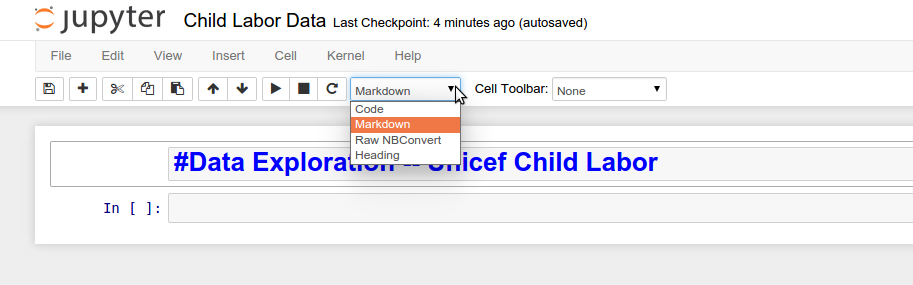
Figure 10-6. Adding a Markdown title
To start writing Python, simply click on the next available cell and start typing. When you are done with whatever statement or function you are writing, hit Shift+Enter. Your code will execute and a new cell will appear for your next Python code. As you can see in Figure 10-7 and your own notebook, you can see any and all outputs you’d expect in a normal Python interpreter.
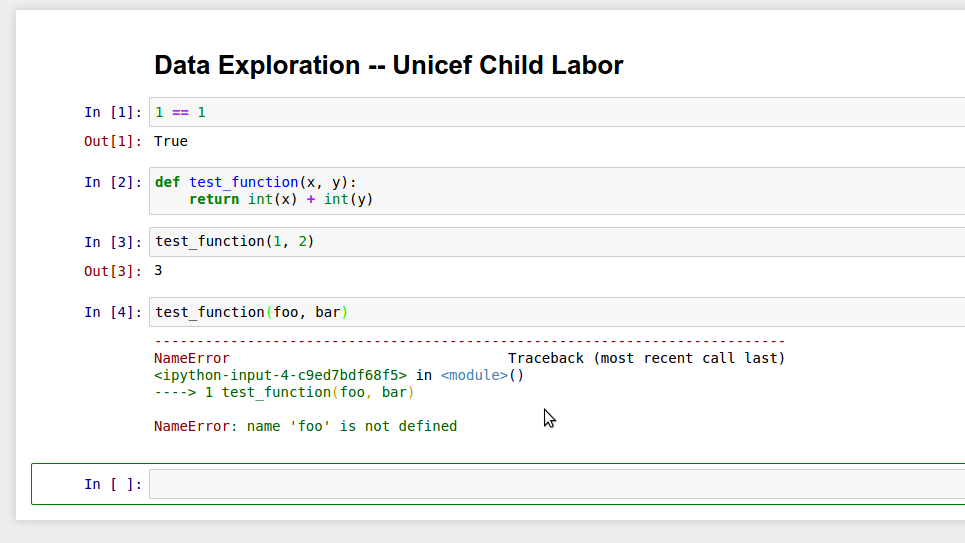
Figure 10-7. Working in Jupyter
There are a ton of great Jupyter (and IPython) notebook tutorials available, but a good starting point might be to retry some code we’ve been using in this book.
Tip
We recommend organizing your notebooks similar to your repository. You might want to have a data folder containing your data in the root directory of your notebook folder, and a utils folder with scripts you can import into your notebooks. Your notebook is like another script, only it’s interactive and in your browser.
When you are done using a notebook, hit the Save button (to make sure it creates a new checkpoint so your files are updated). If you are done with a particular notebook but still using other notebooks, it’s a good idea to stop the old notebook process. To do so, navigate to the Running tab in your server and click the Shutdown button. When you are done with all of your notebooks, save them all and shut down your server in the running notebook terminal using Ctrl-C or Cmd-C.
Shared Jupyter notebooks
Now that you are familiar with using Jupyter notebooks, you can set one up to share your code with others using a shared server. This will allow others to access your notebook on the normal Internet (not just localhost, like the notebook run from your terminal).
There are some great tutorials available on how to set up a notebook server using DigitalOcean, Heroku, Amazon Web Services, Google DataLab, or whatever server you’d like.
Warning
Remember to use secure passwords with your notebook server to ensure your notebooks are being used only by those with the password. This will keep your server and data safe.
We recommend setting up a version control system like Git (explored in more depth in Chapter 14) for your Jupyter notebooks as well, so you can have a history of your notebooks on a daily or weekly basis. This way, you can revert them if anything gets removed, and it helps you store and organize your code.
Tip
If you are using a shared notebook server, make sure people know how to run all of the code if the kernel has been interrupted, which can happen if the server is restarted or if someone stops or restarts the kernel in a notebook. To run all notebook code, select the Cell drop-down in the notebook’s toolbar and click “Run All.” You should also advise users to use Shutdown to stop notebooks when they are done working so you don’t have useless running processes on your server.
Jupyter notebooks, both local and shared, are a great tool for presenting your data and workflow. They are also incredibly useful to run locally as you iterate through your data exploration and analysis. As your Python knowledge grows, you can migrate your scripts to Python 3 and run JupyterHub, a multiuser notebook server that runs many different languages (including Python) and is currently under active development.
Whether you choose to publish on a notebook server or an open source platform, you now possess the skills to analyze how to best present and publish your findings, data, and code.
Summary
You’ve learned how to get your data into a presentable form and distribute it via the Web. You have many publishing options with varying levels of privacy and maintenance requirements. You can set up a site for your reporting and create beautiful graphs and charts to tell your story. With the power of Jupyter, you can easily share and present the code you’ve written and teach others a bit of Python in the process.
You’ve also been introduced to the libraries and concepts listed in Table 10-1.
| Concept/Library | Purpose |
|---|---|
|
Allows you to generate simple charts with two charting libraries. You can use labels and titles for your charts to show your data in a concise way. |
Bokeh library for more complex charts |
Allows you to easily generate more complex charts, along with charts using more interactive features. |
|
For a slicker view and the ability to generate SVGs, |
Ghost blogging platform |
A Node.js-backed blogging platform to quickly set up a blog on your own server (or hosted on Ghost’s infrastructure) to share stories on your own site. |
GitHub Pages and Jekyll |
A simple publishing platform utilizing GitHub to share your posts and presentations via a simple repository push. |
Jupyter notebooks |
An easy way to share your code with other developers or colleagues, as well as a nice way to get started developing your own code using an agile (i.e., trial and error) approach. |
Next, we’ll move on to how to gather even more data via web scraping and API usage. The lessons you’ve learned in this chapter can be used with the data you’ll collect from this point forward, so keep reading and take your new presentation skills with you. In the following chapters, you will acquire more advanced Python data skills, allowing you to better collect, evaluate, store, and analyze data with Python. The storytelling tools you learned in this chapter will aid you in your bright future of Python data wrangling and sharing what you learn with your audience and the world.
1 If a chart doesn’t show up for you, follow the instructions on Stack Overflow to identify where your matplotlib settings are and to set your backend to one of the defaults (Qt4Agg for Mac/Linux or GTKAgg for Windows). For Windows, you may need to also pip install pygtk.