Table of Contents for
The CSS Detective Guide: Tricks for solving tough CSS mysteries
 The CSS Detective Guide: Tricks for solving tough CSS mysteries
Published by
New Riders, 2010
The CSS Detective Guide: Tricks for solving tough CSS mysteries
Published by
New Riders, 2010
- Cover Page
- Title Page
- Copyright Page
- Dedication
- Acknowledgments
- Contents
- Part 1. The Detective’s Apprentice
- 1. Investigating the Scene of the Crime
- 2. The Tools of the Trade
- 3. Giving the Third Degree
- 4. The Usual Suspects
- Part 2. The Game’s Afoot!
- 5. The Case of the Devilish Details
- 6. The Case of the Mistaken Identity
- 7. The Case of the Single White Space
- 8. The Case of the Float with a Mind of Its Own
- 9. The Case of the Browser Who Hated Me
- 10. The Case of the LOL Layout
- Appendix
- Index
4. The Usual Suspects
HERE THEY COME SHUFFLING IN: A MOTLEY CREW of problems and persistent bugs that every CSS developer has run up against. To become more familiar with the most pernicious of these characters, let’s line ’em up so that you can study their distinguishing features and learn how to spot their modus operandi. After all, forewarned is forearmed: knowing about these bugs and their fixes should help you change them from the bad and the ugly to the quick and the dead.
Concepts to Remember
Before we begin identifying the bad guys, let’s quickly review a couple of important foundational concepts. As a burgeoning CSS detective, you need to keep key concepts like document flow, element type, and positioning at the forefront of your mind. Bugs are most often found where one or more element’s properties and qualities collide with a browser’s rendering engine.
Document flow
Every element on a standard HTML page is placed within the “flow” of the page: elements follow each other in the order in which they’re placed in the markup source, wrapping to the next line when they reach the edge of the browser viewport or the edge of a parent element with a set width.
Elements are either block or inline. In the flow, each category has distinct characteristics and behavior.
A block element is its own entity, a contained “block” of information, which is the width of the container surrounding it, unless a specific width is given. In terms of the document flow, block elements flow after one another vertically unless otherwise specified.
You are already familiar with most of the block elements: <div>, headers, <p>, <blockquote>, <ol>, <ul>, <dl>, <table>, and several others. With a few exceptions, block level elements can contain text and other block elements as well as inline elements as long as they are properly nested.
Inline elements flow after one another on the same line as the element before them horizontally. An inline element can contain text and other inline elements, as long as it is properly nested. Inline elements cannot contain block level elements. Common inline elements are <img>, <strong>, <em>, <a>, and <span>, as well as other less frequently used elements.
Elements are in the flow unless the author of the page specifically codes them out of the flow. What does being out of the flow of the page look like? The most common instance of an element being out of the page flow is when an author attributes a position on the page to an image, usually by applying the float property with CSS, but also by using positioning.
Positioning
You can control the placement of elements on the page with the CSS position property.
Static positioning is the default. All elements on the page that are in the flow have a position value of static.
Relative positioned elements are in the flow of the page but you can shift their position by using the top, right, bottom and left offset properties as well as by establishing a stacking order with z-index. The element is positioned in relationship to itself, so its position is calculated based on where it would be located on the page if the CSS wasn’t telling it to move. Changing the offset values of a relatively positioned element does not affect the position of other elements on the page.
Absolute positioning takes an element out of the flow completely. The position of an absolute-positioned element is based on the closest non-static positioned parent element. If the direct parent element is not positioned, then the absolute positioned element will search outward to the page’s base element until it finds an ancestor that is positioned, or reaches the base <html> element, which would make its position relative to the page itself. If the direct parent is positioned, then the absolutely-positioned element will be positioned with the parent element as the base for the offset values.
Fixed positioning is akin to absolute positioning, except that the base element is always the viewport itself. Fixed elements don’t move, even when the rest of the page elements scroll.
A Side-View: Positioning in 3-D
One fascinating aspect of positioned elements is their place in the 3-D space of the page. Yes, it’s true—as with the fateful discovery by Christopher Columbus (or a Chinese admiral, depending on who’s doing the telling), a browser page is not actually flat, limited by two dimensions, but rather has infinite layers in the third dimension (Figure 4.1).
Figure 4.1. The box model hierarchy with z-axis positioned elements.
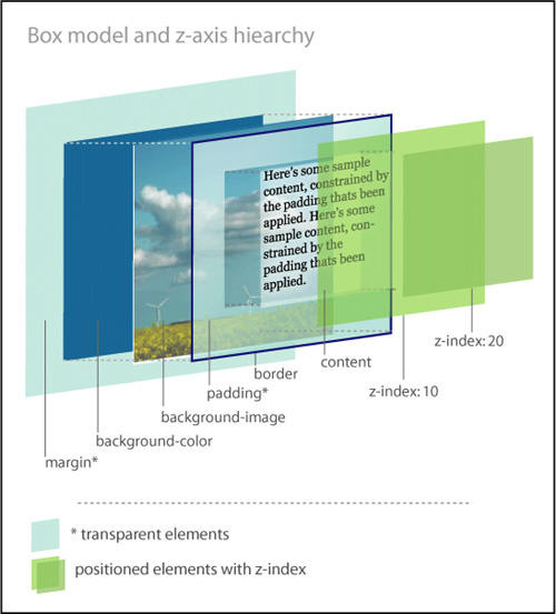
Positioned elements are placed on layers and moved above the flow. They can actually be stacked on top of each other by establishing their z-index, which is based on the z-axis of the three-dimensional grid. Z-index values with smaller numbers are farther away from the user in space, while those with larger numbers are closer. If not established, then the z-index stacking order should be determined by the source order in the markup.
A Broken Box
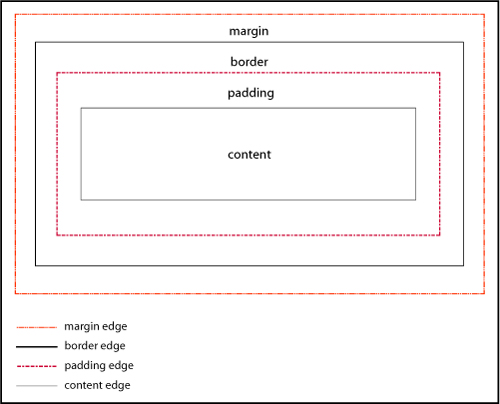
According to the box model as written by the W3C, every element in HTML is composed of a rectangular box consisting of multiple concentric layers (Figure 4.2):
• The content itself, defined by the four edges of the content box.
• The padding around the content, which surrounds the content edge. If the padding value is 0, then the padding edge is the same as the content edge.
• The border, which surrounds both the content and padding. If the border value is 0, then the border edge is the same as the padding edge.
• The margin outside of the border. If the margin value is 0, then the margin edge is the same as the border edge.
Figure 4.2. The components of the element box.
A boxed set of problems
The box model as written is a great idea. But for great ideas to work well, everybody has to adhere to the rules (or understand them the same way). Most browsers calculate the size of the box according to the W3C specification, where the width of the box is calculated using the content box as the base.
#keysersoze {
border: 2px solid black;
margin: 5px;
padding: 10px;
width: 200px;
}
Most browsers would calculate the width as
2px+10px+200px+10px+2px=224px
However, Microsoft Internet Explorer 6, 7 and 8 in quirks mode and lower versions of IE in any mode, calculate the width by including the border and padding in the width of the content: a width of 200px would actually equal 2px+10px+176px+10px+2px=200px (Figure 4.3).
Figure 4.3. Different interpretations of the box model.
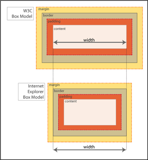
Whoa—that’s a significant difference! Obviously, this can cause problems.
A complement of solutions
If you are lucky, you might never have to deal with IE’s broken box model. Fewer and fewer people are using IE6 and earlier, so there’s light at the end of the tunnel. But if your pages do have to work in older browsers, here are some tips that will help.
Stay in standards mode
Use the HTML 4.01 strict or any of the XHTML doctypes, as described in Chapter 3.
Margin and padding workarounds
Be proactive in your styling:
• Avoid declaring the margin and padding on the same item.
• Avoid declaring either the margin or the padding on an item where you have declared a width.
• Apply the padding or margin to the parent element, instead of the element to which you want the padding to apply. The visual outcome will be the same, but you will avoid the headache of having to try to fix an element box that is dramatically smaller than you intended.
Employ a CSS reset
Instituting a full reset will allow you to deliberately set values for the padding and margins of all of the critical elements on the page, and help you avoid issues based on incorrect box model interpretations.
If you don’t want to go whole-hog and do a full reset for most of the elements in the document, you can do a partial reset to establish the margins and padding for divs.
hasLayout (hasIssues)
Now that we have gotten past IE’s broken box model, let’s tackle hasLayout. Many of the bugs that exist in IE7 and earlier versions of IE are a result of the hasLayout model. Once you have ruled out the broken box model as the culprit for your issue, it’s time to see if the element has a layout problem.
hasWhat?
In versions of IE7 and lower, hasLayout is a quality that is assigned to an element to give it the ability to render itself, sizing and arranging its own contents (including child elements), as opposed to inheriting its rendering properties from an ancestor element.
While you may be thinking that not that many people use IE7 (or even IE6), think again. According to some web browser usage statistics, as many as 30% of users are still using IE7 and below in early 2010, so the numbers are significant enough to justify having a better understanding of this particular aspect of IE and how it affects elements on the page.
Some of the characteristics of an element having layout are:
• The element is treated as a block element for formatting purposes.
• The element sizes and positions itself, and its children.
• The element is constrained to a rectangular shape. In other words, it can’t flow around other elements (such as text does around floated images).
• Margins between parent and children elements do not collapse correctly when an element hasLayout.
• Parent elements will not “shrink to fit” their hasLayout children. They will expand to full width even when a smaller width is defined.
Many of the bugs you may encounter in IE are due to an element not having layout. In fact, one of the main uses of giving elements layout is to solve dimensional bugs! For the most part, having layout causes an element to act as a potentially more stable, independent entity incurring fewer browser bugs. However, sometimes having layout causes an element to behave weirdly.
I can hasLayout?
Many block-level elements and elements with default heights already have layout assigned to them, including <html>, <body>, <table>, <tr>, <td>, <textarea>, <legend>, and <fieldset>. Additionally, floated elements, inline-block elements, inline elements such as <hr>, <img>, <input>, <button>, <select>, and absolutely-positioned elements also have layout by default. Note the absence of the <div> element from the list: <div> does not have layout by default.
If you are dealing with an element that doesn’t have layout already assigned to it, certain CSS properties will trigger layout in IE, changing the IE hasLayout flag from false to true, thereby giving the element layout.
For example, the following properties and values will give an element layout:
• float: left, float: right
• display: inline-block
• overflow: hidden, overflow: auto, overflow: scroll
• position: absolute, position: fixed (IE7)
• height (any value other than auto)
• min-height (any value other than auto in IE7 only)
• width (any value other than auto)
• min-width (any value other than auto in IE7 only)
• zoom (any value other than normal)
Can I not hasLayout?
While you cannot remove layout from any element that has layout by default, you can unflag an element that previously had layout triggered by overriding the CSS property that set the hasLayout property later in the CSS cascade. The later ruleset will undo hasLayout if there are no other conflicting properties that give layout later in the CSS (or with greater specificity)
The following values can override previous properties that have set hasLayout:
• width: auto, height: auto
• max-width: none, max-height: none (IE7)
• position: static
• float: none
• overflow: visible (IE7)
• zoom: normal (MS proprietary property)
A blanket hasLayout application
You can apply hasLayout to the main container and allow it to cascade down to all of the children. This is a good way to proactively code to avoid any potential issues from not having layout in IE6 and 7.
#container {overflow: hidden; }
* html #container {height: 0;}
Note
The first line clears floats in modern browsers and gives layout in IE7 and the second line gives layout in IE6.
IE7 will act on the first set of styles, ignoring the star HTML hack declaration, whereas IE6 and below will take the height declaration, treat it as a min-height, and resize the page’s elements accordingly.
Flaky Floats
Floats are true champs of CSS. Designers use them for everything from positioning images on a page, to making lists horizontal, to creating complex page layouts. However, their very ubiquity means that they are also often the source of problems.
How floats work
The float property is used to move elements on the page to either the far left or far right of the containing element. Floating an element takes it out of the flow of the document, pushes it to the farthest edge of its containing element, and forces the other elements to wrap around it unless otherwise specified. Once floated, an element acts like a block, even if it is an inline element by definition.
The values for float are left, right, inherit, and none (default).
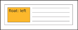
To send an element to the far left of its containing element, apply float: left (Figure 4.4).
Figure 4.4. An element floated left.
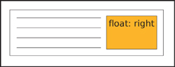
To send an element to the far right of its containing element, apply float: right (Figure 4.5).
Figure 4.5. An element floated right.
To have an element exhibit the same floating behavior as its parent element, apply float: inherit.
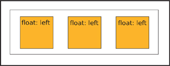
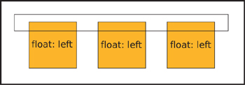
When two elements with combined widths that are smaller than their container are floated next to each other, they will stack horizontally and be aligned by their tops (Figure 4.6).
Figure 4.6. Multiple elements floated left.
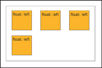
If there is not enough room for them to display next to each other, then the following floated element(s) will be pushed down to the next line (Figure 4.7).
Figure 4.7. Multiple elements floated left. The last element is pushed to the next line.
In order to help the browser render the floated element better, it is always best to provide a value for the width of a floated element. Images are the one exception.
Containing floats
One of the first float issues that novice developers encounter is what happens when you enclose one or more floats in a container.
Because a floated element is taken out of the normal flow of the document, the element that contains only floated children has no content to provide height. The parent element “collapses”: in essence, it doesn’t take up any dimension around the floated elements (Figure 4.8).
Figure 4.8. Collapsed parent element containing floats.
This isn’t a problem if you know that this is the standard behavior, but if you were expecting the element to expand to contain the float, it could be a nasty shock. For the parent element to not collapse, you need is to clear the floats.
There are several ways to clear floats: by floating the parent element, by using a form of the “easy clear” method, or by using the “simple clear” (overflow) method.
Floating the parent
Floating the parent element itself is known as “float nearly everything” or FnE. It’s a simple solution, because a floated element always grows to be at least as tall as its tallest floated child, and it doesn’t require any additional markup. However, you may then have to make other adjustments in the styles to accommodate the parent element being floated.
<div id="notablequotes">
<img src="kujan.jpg" alt="Agent Kujan" class="floatleft">
<p class="floatleft">First day on the job, you know what I learned? How to spot a murderer. Let's say you arrest three guys for the same killing. You put them all in jail overnight. The next morning, whoever's sleeping is your man. You see, if you're guilty, you know you're caught, you get some rest, you let your guard down.</p>
</div>
#notablequotes {
border: 1px solid #999;
float: left;
padding: 30px;
width: 550px;
}
.floatleft {
border: 1px solid #333;
float: left;
margin-right: 30px;
}
Easy clear
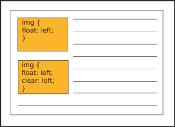
If you have an inline or block level element following a floated element and you don’t want the inline or block element to either wrap around or stack next to the floated element, you need to apply the clear property to the inline or block element. The clear property has meaning only for block-level elements and floated elements that behave like block elements.
Apply clear: left to clear an element that has been floated left (Figure 4.9).
Figure 4.9. Two elements floated left. The second element is clearing the first float.
Apply clear: right to clear an element that has been floated right.
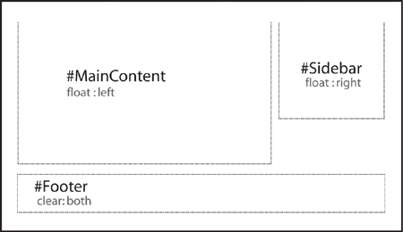
Apply clear: both to a subsequent element to ensure that the previous floated elements are cleared on both sides (Figure 4.10).
Figure 4.10. The footer element clears both floats.
You can use clear: inherit to apply the same clear value to a child element as its parent, while clear: none is the default value.
With the “easy clear” method, you create an entity with the generated content property and then apply the clear property to it. You style the entity to take up no space and disappear. On the page, it’s invisible but it forces your floated element to clear.
The traditional easy-clear is usually structured as follows:
.clearfix {display: inline-block;}
.clearfix:after {
clear: both;
content: ".";
display: block;
font-size: 0;
height: 0;
visibility: hidden;
}
There is also a variation on the first easy-clear method that employs a space instead of a period. With this method, you don’t have to be concerned with trying to hide a generated character.
.clearfix {display: inline-block;}
.clearfix:after {
clear: both;
content: " ";
display: block;
font-size: 0;
height: 0;
visibility: hidden;
}
This code is useful for the standard browsers, but you will need a different clearing method for IE 6/7. The simplest easy-clear for those browsers is to trigger hasLayout by assigning height or another property that gives layout, but this wreaks havoc in browsers other than IE 6/7, so you should use it with conditional comments:
<!--[if lte IE7]>
<style type="text/css">
#photogallery {height: 1%;}
</style>
<![endif]-->
Simple clear (using overflow)
The “simple clear” method is aptly named as it uses only the overflow property to clear the float.
The overflow property tells the browser how to render the contents of an element’s box when that content is larger than the dimensions (height and width) of the element. If you think of an element box as a window, you can easily visualize how the overflow property works and hides (or clips) pieces of content.
The default is overflow: visible, which allows the content to be rendered regardless of the element box’s dimensions. Interestingly enough, while the content is shown outside of the parameters of the box, it does not affect the flow of the page (Figure 4.11).
Figure 4.11. An element with overflow: visible.
Apply overflow: hidden when you want the content in the element box to disappear if it extends past the boundaries of the box. This property is particularly useful in maintaining control of page layouts where an overflow could throw the rest of the page elements out of alignment (Figure 4.12 on the next page).
Figure 4.12. An element with overflow: hidden.

With overflow: scroll, the browser creates scrollbars to let the user view the content of the element while maintaining the specified dimensions. Both the horizontal and vertical scrollbars will display, whether or not they are needed (Figure 4.13).
Figure 4.13. An element with overflow: scroll.

Finally, overflow: auto lets the browser determine whether scrollbars are needed, and will only create them if and where necessary (Figure 4.14 and 4.15).
Figure 4.14 and 4.15. An element with overflow: auto.


With the simple-clear method, you apply the overflow property to the parent container, preventing it from collapsing around its floated children.
div.container {
border: 1px solid #000000;
overflow: hidden;
width: 998px;
}
div.left {
width: 75%;
float: left;
}
div.right {
width: 24%;
float: right;
}
For the purpose of clearing floats, there isn’t a lot of difference between overflow: hidden and overflow: auto: they work by containing the float and hiding anything past the established width.
“We have a float down!”
Even though floats are champs in the world of CSS, IE’s older rendering engine still manages to bully and push them around. Don’t worry—we have the means to stand up to those typical IE float bugs and show them who’s boss.
Float drop
Float drop or pushdown happens when the float contains an item bigger than its specified width. Current browsers render the item past the confines of the float without having it affect the layout. However, old IE will try to contain the item by expanding the float, which usually also alters the layout (Figure 4.16).
Figure 4.16. Example of float drop.
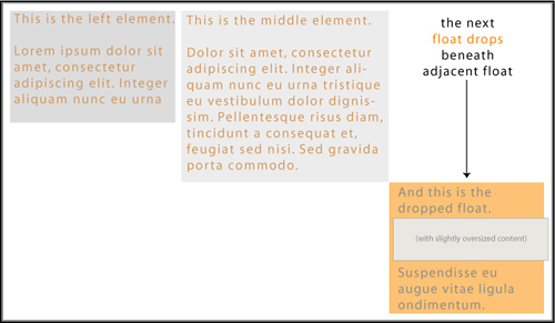
It’s the overflow property to the rescue in this case. Applying overflow: hidden to the container’s styles will hide or clip the oversized element, thereby maintaining the layout.
#maincontent {
float: left;
margin: 10px;
overflow: hidden;
padding: 10px;
width: 650px;
}
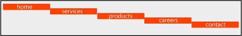
Float stepdown
Under most circumstances, when you float elements, they will stack according to the float specification. However, not in IE6: when a series of floated elements are contained in a series of block level elements that are not floated, in IE6 the floated elements may end up in a step-down effect (Figure 4.17).
Figure 4.17. Example of float stepdown.
You can fix this problem in one of two ways.
• You can employ FnE by floating the parent elements.
#navigation {
list-style-type: none;
margin: 0;
padding: 0;
width: 700px;
}
#navigation li {float: left;}
#navigation li a {
border-right: 1px solid #BC4622;
background-color: #ddd;
display: block;
float: left;
padding: 2px;
text-decoration: none;
width: 100px;
}
• You can also change the element’s display value to display: inline:
#navigation {
font-size: 1.1em;
list-style-type: none;
margin: 0;
padding: 0;
width: 700px;
}
#navigation li {display: inline;}
#navigation li a {
border-right: 1px solid #BC4622;
background-color: #ddd;
display: block;
float: left;
padding: 2px;
text-decoration: none;
width: 100px;
}
Misbehaving Lists
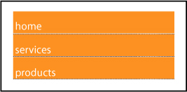
After floats, lists are another key component of CSS page layouts. But unsurprisingly, IE6 keeps us on our toes with rendering lists that won’t listen to reason.
Scratching white space from lists
IE6 and down has a weird habit of adding extra white space to list items. When you apply display:block to links within a list, IE6 and lower incorrectly add white space. So whether you are employing a horizontal or vertical list, the results will be the same in IE: unwanted extra space (Figure 4.18).
Figure 4.18. Where does the extra white space come from?
Here are a couple of ways to solve the problem.
Old-school markup solution
It’s not sexy, but it is effective. Eliminating the actual white space in the code will take care of the problem in a pinch.
So, you would change this code:
<ul class="nysfinesttaxiservice">
<li><a href="#">take emeralds</a></li>
<li><a href="#">take money</a></li>
<li><a href="#">set car on fire</a></li>
</ul>
To this:
<ul class="nysfinesttaxiservice">
<li><a href="#">take emeralds</a></li><li><a href="#">take money</a></li><li><a href="#">set car on fire</a></li>
</ul>
And, yes, as strange as it seems, it does work.
Solutions with style
If you start off with your styles like the below, you are going to find yourself with an embarrassment of white space riches:
#navigation {
list-style-type: none;
margin: 0;
padding: 0;
width: 200px;
}
#navigation li a {
background-color: #ddd;
display: block;
margin: 0;
padding: 0;
text-decoration: none;
}
To pull everything back into place, you have a plethora of options:
- Set the width of the anchor elements
#navigation {
list-style-type: none;
margin: 0;
padding: 0;
width: 200px;
}
#navigation li a {
background-color: #ddd;
display: block;
margin: 0;
padding: 0;
text-decoration: none;
width: 200px;
} - Change the display of the anchor elements
#navigation {
list-style-type: none;
margin: 0;
padding: 0;
width: 200px;
}
#navigation li a {
background-color: #ddd;
display: inline-block;
margin: 0;
padding: 0;
text-decoration: none;
width: 200px;
} - Change the height of the anchor elements
#navigation {
list-style-type: none;
margin: 0;
padding: 0;
width: 200px;
}
#navigation li a {
background-color: #ddd;
display: block;
height: 1em;
margin: 0;
padding: 0;
text-decoration: none;
} - Float the links
Floating the links within the list items will remove the extra white space, but may not work for your design if you’ve applied a background color to the links.
#navigation {
list-style-type: none;
margin: 0;
padding: 0;
width: 200px;
}
#navigation li a {
float: left;
clear: left;
background-color: #ddd;
display: block;
margin: 0;
padding: 0;
text-decoration: none;
} - Apply a bottom border to the list items (not the anchor element)
#navigation {
list-style-type: none;
margin: 0;
padding: 0;
width: 200px;
}
#navigation li {border-bottom: 1px solid #112233;}
#navigation li a {
background-color: #ddd;
display: block;
margin: 0;
padding: 0;
text-decoration: none;
}
Any of the above solutions will yield the desired result: a white space–free list (Figure 4.19).
Figure 4.19. Extra white space: fixed!
Margins and Errors
As you know, margins are the transparent area around the borders of an element box that maintains space between that box and other elements.
When the margins of two elements meet, the correct behavior according to the box model is that the margins collapse. The term “collapse” sounds much more ominous than it is. What happens is that the browser determines the larger of the two joining margins, and instead of adding the two margins together to determine the distance between the two elements, the browser adjusts the margin height or width to equal the larger of the two measurements. The value of the largest margin is honored while the other margin “collapses” to zero. If either margin measurement value is negative, the browser adds the values and combines them to form a single margin.
You can see this best in the case of paragraphs (Figure 4.20).
Figure 4.20. Paragraphs with collapsed margins
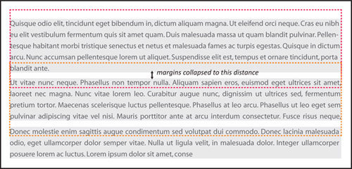
Knowing about collapsing margins is important for the instances when margins start acting funny and exhibiting behavior that you don’t want.
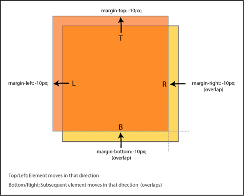
Negative margins
Interestingly, margins can have negative values along with positive values. As you may have suspected, negative values work the opposite of positive values. While positive values push the element box away from the margin position indicated, a negative value will pull the box toward the position. This moves the box itself around on the page, and can be used as a method of positioning for page layouts.
If either a top or left margin is given a negative value, the element box will be pulled in that direction. If either a right or bottom margin is given a negative margin, it will pull the adjacent element towards the main element box, creating an overlap. Many developers use this characteristic of negative margins to fix spots where an element’s spacing seems a little off and needs tweaking (Figure 4.21).
Figure 4.21. Negative margin behavior
Unwanted space
The following margin bugs either give too much space or take it away. Let’s see how we can set things straight.
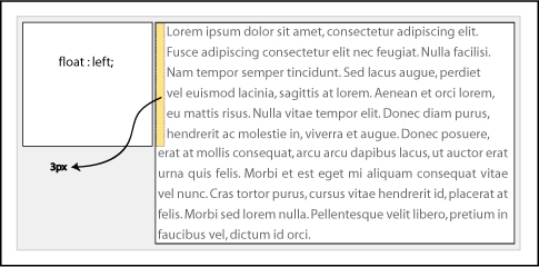
3 pixel text jog bug
You have a floated element and you detect that the text that is floating next to it is somehow pushed away by 3px. It’s the 3 pixel text jog bug (Figure 4.22).
Figure 4.22. 3px Text Jog Bug
Fortunately, there are a couple of ways to solve this issue:
You can use the float nearly everything method (FnE) and float the parent element. This will eliminate the behavior. Using the FnE example from earlier:
<div id="memorablequotes">
<img src="verbal.jpg" alt="Verbal" class="floatleft">
<p>"Who is Keyser Soze? He is supposed to be Turkish. Some say his father was German. Nobody believed he was real....That was his power. The greatest trick the Devil ever pulled was convincing the world he didn't exist. And like that, poof. He's gone."</p>
</div>
#memorablequotes {
border: 1px solid #999999;
float: left;
padding: 30px;
width: 450px;
margin: 0 auto;
}
.floatleft {
border: 1px solid #333;
float: left;
}
p {float: left;}
You could also set a width or height on the affected element to eliminate the behavior.
* html #memorablequotes p {float: left; height: 0;}
Double margin float bug
The double margin bug in IE6 occurs on the first floated element that has a margin value set on the same side as the float on a line. The margin becomes twice the intended size! For example, if you had an element floated left and with margin-left: 10px, the 10px would actually render as 20px. The peculiarity of this bug is that it only occurs when the float and margin are on the same side—margins on the other side of the float will not be doubled (Figure 4.23).
Figure 4.23. Example of the double margin float bug.
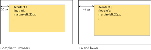
This bug is responsible for many of the layout problems that developers experience in IE6 and below. The additional pixels will cause one of your columns to have insufficient space available for it based on the given widths, and you’ll get float drop.
The fix is to set display: inline on the floating elements. Remember that we are only affecting the display characteristics with this property; the elements will remain block-level.
#navigation {
display: inline;
float: left;
margin-left: 10px;
width: 200px;
}
Bottom margin bug
If you have a floated parent element that also has floated children in it, you may experience the bottom margin bug in which the bottom margin is ignored by the parent and collapses in IE7 and earlier browsers (Figure 4.24).
Figure 4.24. Example of the bottom margin float bug.
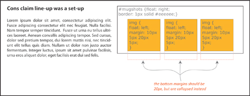
The fix is easy: rather than getting the space you want from the margin of the children elements, establish the space by setting padding for the parent element.
Disappearing Acts
The peekaboo bug and the guillotine bug are probably the two most infamous IE6/7 bugs. Fortunately, there are solid fixes for both of them.
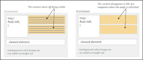
Peekaboo bug
You’ve worked hard to layout and code your page—it’s only fair that you want your users to actually see it, right? Well, IE6 seems to have a sense of humor, adding a little Houdini spice into the mix.
The peekaboo bug causes floated elements or text inside of a container next to floated elements to disappear—most often when the page is resized, and sometimes seemingly at random (Figure 4.25 on the next page).
Figure 4.25. Example of the peekaboo float bug in action.
Here is a stripped-down example of the code that will create the peekaboo sleight of hand:
<h1>The Usual Suspects</h1>
<div id="container">
<p id="floater">
Q: Who are the ususal suspects?<br>
A: Dean Keaton, Michael McManus, Fred Fenster, Todd Hockney, Roger 'Verbal' Kint
</p>
<p>Q: Who disappeared without a trace?</p>
<div class="clearer"></div>
<p>A: Ha! We're not going to give you the spoiler!</p>
</div>
...
#container {
border: 1px solid #000;
background-color: #eee;
}
#floater {
background-color: #dec;
float: left;
width: 35%;
}
.clearer {
clear: both;
}
Manifold fixes
It may seem like magic, but each of these solutions will help solve your “now you see it, now you don’t” problem.
Determine the position
Applying position:relative to the disappearing element will keep it visible for everyone using IE6. For IE7 users, add min-width: 0 as well.
#container {
border: 1px solid #000;
background-color: #eee;
}
#floater {
background-color: #dec;
float: left;
width: 35%;
position: relative; /* peekaboo bug fix for IE6 */
min-width: 0; /* peekaboo bug fix for IE7 */
}
.clearer {
clear: both;
}
Trigger hasLayout
Giving layout to the parent container with any of the properties that trigger hasLayout will also keep the content from disappearing:
• float: left, float: right
• display: inline-block, display: block
• overflow: hidden, overflow: auto, overflow: scroll
• position: absolute, position: fixed (IE7)
• height (any value other than auto)
• min-height (any value other than auto in IE7 only)
• width (any value other than auto)
• min-width (any value other than auto in IE7 only)
• zoom (any value other than normal)
Establish line-height
Setting the line-height on the main container will cascade down to the descendants and keep all of the content in plain sight.
#container {
border: 1px solid #000;
background-color: #eee;
line-height: 1em;
}
#floater {
background-color: #dec;
float: left;
width: 35%;
}
.clearer {
clear: both;
}
Presto! All fixed.
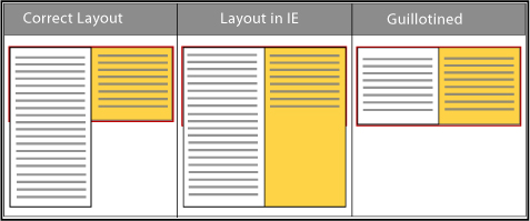
Guillotine bug
The guillotine bug is one of the oddest IE bugs. As with any good mystery, all of the parts have to be in place: a parent container element, a floated element inside of that container that is not cleared, links inside the parent container in non-floated content after the float, and finally, style rules for those links that change certain link properties on hover. The result? Not murder, no, but hovering over the links causes part of the floated element inside of the parent container to get cut off and become inaccessible (Figure 4.26).
Figure 4.26. Example of the guillotine bug.
Clear solutions
The most popular fixes involve adding a cleared element either inside of the container or outside and after the container.
By adding an element
Add an element, such as a <div>, that has the clear property assigned to it:
<div id="container">
<div id="left">
<p>To a cop the explanation is never that complicated. It's always simple. There's no mystery to the street, no arch criminal behind it all. If you got a dead body and you think his brother did it, you're gonna find out you're right.</p>
</div>
<div id="right">
<p>This is a <a href="#">reset link</a> here.</p>
<p>This is another <a href="#">reset link</a> here.</p>
<p>This is a <a href="#">trigger link</a><br></p>
</div>
<div class="clear"></div>
</div>
...
#container {
background-color: #88eeaa;
border: 1px solid #44bb66;
width: 800px;}
#left {
border: 1px dotted #aa3355;
float: left;
width: 200px;
}
#container a:hover {
background: #FFFFCC;
padding: 5px;
text-style: italic;
border-bottom: #0000FF 1px solid;
}
.clear {clear: both;}
Easy clear
You can also use the easy-clear method, by adding a .clearfix class to the elements that contain the uncleared float:
.clearfix {display: inline-block;}
.clearfix:after {
clear: both;
content: " ";
display: block;
font-size: 0;
height: 0;
visibility: hidden;
}
...
<div id="right" class="clearfix">
<p>This is a <a href="#">reset link</a> here.</p>
<p>This is another <a href="#">reset link</a> here.</p>
<p>This is a <a href="#">trigger link</a><br></p>
</div>
By using easy clear, you get the parent element to completely contain the children elements and stabilize them.
Alternate solutions
Giving all of the containers a height using the star HTML hack also does the trick.
* html div {height: 1%;}
#container {
background-color: #88eeaa;
border: 1px solid #44bb66;
width: 800px;}
#left {
border: 1px dotted #aa3355;
float: left;
width: 200px;
}
#container a:hover {
background: #FFFFCC;
padding: 5px;
text-style: italic;
border-bottom: #0000FF 1px solid;
}
A final solution is to wrap the content outside of the float in another div container and give it a width, which eliminates the quirky behavior.
<div id="right">
<p>This is a <a href="#">reset link</a> here.</p>
<p>This is another <a href="#">reset link</a> here.</p>
<p>This is a <a href="#">trigger link</a><br></p>
</div>
...
#right {width: 400px;}
Your page will stay intact, and heads won’t roll from tragic IE outcomes.
Fonts Gone Wrong
Way back in the equivalent of the Mesozoic era of the web (which was only about 10 years ago), web developers used <font size=x></font> to change the font size on the page (and worked with only 6 sizes!). Now that we are in the modern epoch of CSS, evolutionary progress has brought us many more options.
However, with the power of options also comes the responsibility to be mindful of potential issues. As a suspect, typography rarely reaches the level of murder, but if done incorrectly, a change in font size can break the design of the page for users who need a larger text size.
While your pages don’t need to be pixel-perfect in every browser, consistency is still a goal. Let’s take a look at the different ways you can control fonts on your page and also what to do if they turn out differently cross-browser.
An assortment of sizes
There are still absolute or fixed sizes based on either pixels or points as in the days of yore. However, there are now multiple relative sizing options as well, using keywords, em, percentages, or ex.
Fixed (absolute) sizes
Pixels are usually the first choice for developers when they want a lot of control over how the page looks. The advantage of pixels is that they are more consistent across screens, browsers, and operating systems. However, the main complaint about pixels is that in IE6 and below users cannot easily resize them.
Points should really only be used for print CSS if at all. The point unit related to the defacto printed point sizes. They are best avoided for screen use.
Size keywords
Keywords are actually very consistent across browsers and platforms. The font-size keyword values are xx-small, x-small, small, medium, large, x-large, and xx-large as well as relative keywords smaller and larger.
While the standard keywords (small, medium, large) don’t lend themselves to scaling, the relative ones do. You could create pages with scalable text using a fixed keyword as the base, and establishing the other font-sizes on the page with the relative keywords.
Relative sizes
Relative-sized on-screen text allows the user to easily adjust the size of all of the page text.
An important thing to remember when using relative font-sizing: unless specified otherwise, with a few exceptions, an element will inherit the font size of its parent. This means that you have to be particularly aware of nesting elements and how the font sizes may change because of how the elements are nested.
Ems are a measurement based on the height of a font and the width of the letter ‘M’ in the same font. In terms of scalability and correspondingly, accessibility, ems are the perfect choice. They are also resizeable in IE and cascade well.
Ems aren’t just for fonts. Savvy developers will also use ems as a unit of measurement for layout elements and spacing to keep the scale of the entire page consistent.
Percentage font-sizing is another relative method, based on the default size of the font. For example, 100% is equivalent to the current font size. 200% is twice as large. Percentage font-sizing also cascades well.
How Big Is an Em?
1em is equivalent to capital M in the the current font size; 2em is twice as large, and so on.
Below is an extremely useful coversion table that lists the corresponding values between pixels, points, ems and percentages:
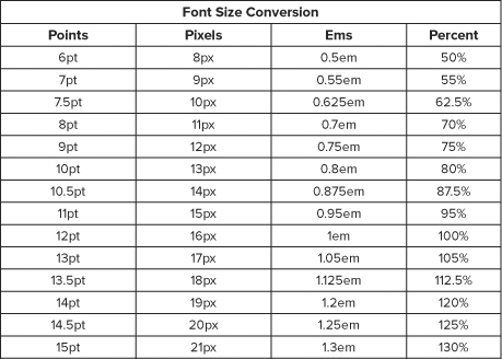
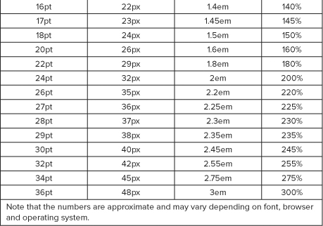
Yet another relative unit of measurement is the ex. An ex is based on the height of the letter ‘x’ in the current font. Very few developers use ex at present: ems are much more widely employed.
Typography tips
Generally speaking, use relative font sizes as opposed to absolute: they are better for usability and accessibility (users can scale their text as need be) and cross-browser consistency.
But the world of CSS is rarely simple: while you might hope you could just apply an em or percentage-based font value for the page and be able to go on about your business, there are many inconsistencies in browser fontrendering due to differences in established base values of the different font families in the user agent style sheets.
Thus, there is a little additional thinking you should do in general when coding the fonts for the page. We’ve already discussed the whys of relative sizing, but there are some further considerations to incorporate.
Techniques for scaling
The one disadvantage with ems and percentages is all of the calculations that you have to do to make sure that you are establishing the correct sizes for all of the elements. You can avoid the math but still get the benefit of relative font sizing by using a pixel size as the base, and then using relative font sizing for all of the other elements (either by ems or percentages).
For example, you could establish the base font size to be 10 pixels, and then scale up the elements relative to that base.
body {font-size: 10px}
p, li {font-size: 1.2em}
h1 {font-size: 2em;}
The best thing about this: easy math! Usability, accessibility, and bug-free functionality are bonus features.
Test the scale
After devising your font sizes for your pages, you should test your pages to be sure that the sizes all work together as expected.
A well-designed page will flow with the resize, while a poorly designed page will have overlapping elements that cause the page to be less readable or even illegible as the page size and zoom change. Reset the font size and page zoom to their default values in all your browsers before testing to be sure you are getting accurate results, and use real-world combinations of text sizing and page zooming in all of the major browsers to determine that the text remains readable in every context. Increasing the font size twice should not break the layout.
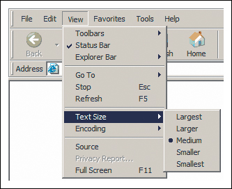
Text size bug
Despite all of the advantages of using ems to establish your font sizes in the page, IE6 still manages to shift the rules on rendering them. The text size bug comes about when the font size of the body is set to 1em. When a user uses the text size feature of the browser, the rest of the sizes are hugely out of proportion (Figure 4.27).
Figure 4.27. Text resizing feature in IE6.
Usually this will be due to a font size set this way:
body {font-size:1em;}
The fix is easy. By changing the font size to 100%, the problem is solved:
body {font-size:100%;}
The solution is unconventional, but effective. By replacing the ems with percentage, we still have the usability of relative fonts but side-step the resizing bug. A few tips when using this solution:
• Stick with percentages 100% and over. Lower numbers will cause Opera (of all browsers) to render incorrectly.
• Avoid using keywords to set the font size of other elements. Your values should stay with ems or percentages.
Remember that line-height goes hand-in-hand with font-size, so the best practice is to establish a properly scaling line-height as well. The recommendation is this: once you have established the font-size at 100%, then establish the line-height with ems, taking into consideration the corresponding size in pixels. Using the example above, you would have this:
body {
font-size:100%;
line-height: 1.125em;
}
This set-up at the very beginning of your document will cascade down to all of the elements and create visual consistency throughout your page.
Planning for the Future
You have seen the lineup of known felons. But there are some new kids on the block that you should also know about: CSS3 properties. Many of these burgeoning properties are actually the new good guys, making time-honored challenges such as drop-shadows, importing fonts, rounded corners, column sizing, and multiple background images easy. But even heroes have an Achilles heel. Unsurprisingly, the weak spot with CSS3 is not the properties themselves, but rather their support by browsers.
At present, the browsers that support most of the CSS3 properties are Firefox, Safari, and Google Chrome. Opera supports many of the properties but not all (although newer versions are slated to have increased support), while Internet Explorer supports practically none of them, with the exception of some of the newer selectors.
Another issue is that the CSS3 specifications themselves are not yet finalized. Some browsers utilize the properties, but in a proprietary form. Because of this, you may have to use several versions of the same property in order for it to be rendered by different browsers. Hopefully, the specification will be solidified soon and all browsers will accept the same standard properties.
So, what can you do now? I say, boldly go forth and start to incorporate CSS3 properties into your code, but also know that for true cross-browser compatibility, you will have to employ alternate solutions.
A Positive ID
Looking at face after face, trying to remember who exactly did the crime, how it went down and each character’s modus operandi can take a lot out you. The work of a CSS detective is not all glitz and glamour! At the end of the day, however, it is worth it to know that you have the tools to catch bugs before they become delinquent and cause even bigger problems later.
Here is a quick and dirty wrap-up of the allies, miscreants, and solutions that we gave the once-over to in this chapter.
Properties
Here are the properties mentioned in this chapter and the bug fixes for which they play a part:
Dimensions (height and width)
height: 1%, min-height, width, min-width, line-height
• Easy clear
• Give layout
• Fixes the peekaboo bug
• Fixes the guillotine bug
Display changes
display: inline
• Fixes the double margin float bug
• Fixes multiple float problems
display: inline-block
• Forces shrink wrapping
• Gives layout
Overflow changes
overflow: hidden, overflow: auto
• Contains floats
• Fixes float drop and overly wide floated columns
Padding and margin changes
padding instead of margin
• Fixes the bottom margin bug
• Fixes the double margin bug
Positioning
position: relative
• Fixes the peekaboo bug
Clear
clear: left, right or both
• Fixes the guillotine bug
Generated Content (for IE8 and up)
:after
• Contains floats
• Fixes the guillotine bug
Font size
font-size
• Fixes the text size bug
Techniques
These techniques and solutions are achieved using these properties or practices:
Broken box model fix
• Stay in standards mode
• Margin and padding workarounds
• CSS reset
Acceptable IE hacks
• Star HTML hack
• Underscore hack
• Child hack
• Conditional comments
Giving layout
• float: left, float: right
• display: inline-block, display: block
• overflow: hidden, overflow: auto, overflow: scroll
• position: absolute, position: fixed (IE7)
• height (any value other than auto)
• min-height (any value other than auto, not IE6)
• width (any value other than auto)
• min-width (any value other than auto, not IE6)
• zoom (any value other than normal, Microsoft proprietary property)
Removing layout
• width: auto, height: auto
• max-width: none, max-height: none (IE7)
• position: static
• float: none
• overflow: visible (IE7)
• zoom: normal (Microsoft proprietary property)
Force shrink-wrapping
• display: inline
• display: inline-block
• display: table
Preventing problems with floats
• float: left, float: right (FnE)
• overflow: hidden, overflow: auto, overflow: scroll
• display: inline
• line-height: 0;
• width, height
• :after (easy clear)
List white space fix
• float: left, float: right (FnE)
• width, height
• display: inline or inline-block
• width
• border-bottom
Margins and space issues
• float: left, float: right (FnE)
• width, height
• margin, padding (on parent element)
Quick-fix list
One of these rules may be the fix you need. If you are pressed for time or just want a quick fix without thinking about theory or strategy, here are some styles you can apply and see if they solve your problem:
• position: relative;
• display: inline;
• display: inline-block;
• margin: 0;
• padding: 0;
• overflow: hidden;