
For online information and ordering of this and other Manning books, please visit www.manning.com. The publisher offers discounts on this book when ordered in quantity. For more information, please contact
       Special Sales Department
       Manning Publications Co.
       20 Baldwin Road
       PO Box 761
       Shelter Island, NY 11964
       Email: orders@manning.com
©2018 by Manning Publications Co. All rights reserved.
No part of this publication may be reproduced, stored in a retrieval system, or transmitted, in any form or by means electronic, mechanical, photocopying, or otherwise, without prior written permission of the publisher.
Many of the designations used by manufacturers and sellers to distinguish their products are claimed as trademarks. Where those designations appear in the book, and Manning Publications was aware of a trademark claim, the designations have been printed in initial caps or all caps.
 Recognizing the importance of preserving what has been written, it is Manning’s policy to have the books we publish printed
on acid-free paper, and we exert our best efforts to that end. Recognizing also our responsibility to conserve the resources
of our planet, Manning books are printed on paper that is at least 15 percent recycled and processed without the use of elemental
chlorine.
Recognizing the importance of preserving what has been written, it is Manning’s policy to have the books we publish printed
on acid-free paper, and we exert our best efforts to that end. Recognizing also our responsibility to conserve the resources
of our planet, Manning books are printed on paper that is at least 15 percent recycled and processed without the use of elemental
chlorine.
 |
Manning Publications Co. 20 Baldwin Road PO Box 761 Shelter Island, NY 11964 |
Development editor: Toni Arritola
Technical development editor: Doug Warren
Review editor: Ivan Martinović
Project manager: Lori Weidert
Copy editor: Katie Petito
Proofreader: Elizabeth Martin
Technical proofreader: Jay Kelkar
Typesetter and cover designer: Marija Tudor
ISBN 9781617294624
Printed in the United States of America
1 2 3 4 5 6 7 8 9 10 – SP – 23 22 21 20 19 18
Chapter 3. Adding interactivity
Chapter 5. Conditionals, looping, and lists
Chapter 6. Working with components
Chapter 7. Advanced components and routing
3. Modeling data, consuming APIs, and testing
A. Setting up your environment
1.1. On the shoulders of giants
1.1.1. The Model–View–Controller pattern
1.1.2. The Model–View–ViewModel pattern
1.1.3. What’s a reactive application?
1.1.4. A JavaScript calculator
2.1.2. Making sure our application is running
2.4.1. Write the filter function
2.4.2. Adding the filter to our markup and testing different values
Chapter 3. Adding interactivity
3.1. Shopping cart data starts with adding an array
3.3. Adding a cart item button and count
3.3.1. When to use a computed property
3.4. Adding user affordance to our button
3.4.1. Keeping an eye on inventory
3.4.2. Working with computed properties and inventory
3.4.3. v-show directive basics
3.4.4. Using v-if and v-else to display a disabled button
3.4.5. Adding the cart item button as a toggle
4.2.1. Binding values to our check box
4.2.2. Working with value bindings and radio buttons
4.3. Learning modifiers with the application
4.3.1. Using the .number modifier
Chapter 5. Conditionals, looping, and lists
5.1. Show an available inventory message
5.2.1. Adding a star rating with v-for range
5.2.2. Binding an HTML class to our star rating
5.2.3. Setting up our products
Chapter 6. Working with components
6.2. Relationships in components
6.4. Defining a template component
6.4.1. Using inline template strings
6.5. Working with custom events
Chapter 7. Advanced components and routing
7.4. Creating a dynamic components app
7.5. Setting up async components
7.6. Converting the pet store app using Vue-CLI
7.6.1. Creating a new application with Vue-CLI
7.6.3. Adding CSS, Bootstrap, and Axios to our application
7.6.4. Setting up our components
7.7.1. Adding a product route with parameters
7.7.2. Setting up a router-link with tags
7.7.3. Setting up a router-link with style
Chapter 8. Transitions and animations
8.5. Updating the pet store application
9.1. Reusing functionality with mixins
9.2. Learning custom directives with examples
9.2.1. Global custom directives with modifiers, values, and args
3. Modeling data, consuming APIs, and testing
10.1. Vuex, what is it good for?
10.2. Vuex state and mutations
10.4. Adding Vuex to Vue-CLI with the pet store app
Chapter 11. Communicating with a server
11.2.1. Creating a music search app
11.2.2. Creating a project and installing dependencies
11.2.3. Creating our building blocks and components
11.2.4. Updating the default layout
11.3. Communicating with a server using Firebase and VuexFire
11.3.2. Setting up our pet store app with Firebase
11.3.3. Updating Vuex with authentication state
12.2. Continuous integration, delivery, and deployment
12.4. Setting up our environment
12.5. Creating our first test case with vue-test-utils
A. Setting up your environment
A.3. Obtaining a chapter’s companion code
A.4. Installing Node.js and npm
A.4.1. Installing Node.js using one-click installers
A.4.2. Install Node.js using NVM
A.4.3. Install Node.js via Linux package management system
B. Solutions to chapter exercises
Frontend web development has become astoundingly complex. If you’ve never used a modern JavaScript framework, building your first app that only displays “Hello” can take a whole week! That might sound ridiculous—and I would agree, it is. The problem is that most frameworks assume knowledge of the terminal, advanced JavaScript, tools such as the Node Package Manager (NPM), Babel, Webpack, and often more.
Vue, refreshingly, doesn’t assume. We call it the “progressive” JavaScript framework because it scales down as well as up. If your app is simple, you can use Vue the same way you use jQuery: by dropping in a <script> tag. But as your skills and needs grow more advanced, Vue grows with you to make you more powerful and productive.
Something else typically stands out. Vue is built not only by computer scientists, but also by designers, educators, and others from more people-focused trades. As a result, our documentation, guides, and devtools are world-class. The experience of using Vue is as important to us as its performance, reliability, and versatility.
Erik has carried that people-focused spirit into this book. First, it’s remarkably visual. The many detailed illustrations and annotated screenshots firmly ground his examples in the workflow of real developers. As a result, you actually learn how to use the browser and Vue’s devtools to confirm what you’re learning—and more importantly, troubleshoot when something goes wrong.
For those without a strong background in frontend development, JavaScript, or even programming, Erik also carefully explains the foundational concepts for understanding what Vue is doing and why. That, combined with his project-centered approach to introducing new features, means the book is ideal for relatively new developers looking to expand their skills with Vue as their first modern, frontend framework.
—CHRIS FRITZ, Vue core team member and docs curator
In early 2017, I was approached with an opportunity to write this book after Benjamin Listwon had to bow out for personal reasons. I had recently finished my MBA from the University of Nevada, Reno, and it had been a full year since I published my last book, the Ember.js Cookbook (Pact Publishing, 2016). I’d begun my YouTube channel, Program with Erik, and I was spending most of my time trying to figure out how best to record programming tutorials for my small but growing audience. Around this time, I started a screencast series on Vue.js and got positive feedback from my viewers. This made me want to explore Vue.js more.
I began by listening to Evan You, the creator of Vue.js, and his roadmap for the framework. I then watched countless YouTube tutorials and videos from other creators. I dropped into online forums and Facebook groups to see what people were talking about. Everywhere I went, people were excited about Vue.js and the possibilities for the framework. This made me want to explore the possibility of writing this book.
After much consideration, and a talk with my wife, I decided to go for it. Luckily, Benjamin had laid out a great foundation for me to build on, so I could hit the ground running. For the next 10 months, I spent countless nights and weekends researching, testing, and writing.
I wish I could tell you that writing this book was easy, or that I didn’t run into any problems. Let’s say it didn’t go exactly as planned. I had personal setbacks, missed deadlines, suffered writer’s block, and if that wasn’t enough, I ended up having to do major revisions after Vue.js did an update.
With all that said, I’m very proud of this book. With every setback, I was motivated to work twice as hard. I was determined to get this book finished with the highest possible quality that I could muster. I hope that comes through when you’re reading it.
Thank you, reader, so much for buying this book. I really hope it helps you in your journey in learning Vue.js. Please let me know if it did. You can tweet me at @ErikCH, email me at erik@programwitherik.com or join my mailing list at https://goo.gl/UmemSS! Thanks again!
First and foremost, I’d like to thank my wife, Susan, because without her help, this book would have never been completed. I’d like to thank my son, Wyatt, and my daughter, Vivian. They’re why I work so hard. I’d like to thank all the reviewers, the Vue.js in Action forum members, and anyone else who helped give feedback on this book. Your help has made this book immensely better than I could have ever done alone. Also, thank you, Chris Fritz, for writing an amazing foreword. Last, I’d like to give my warmest heartfelt gratitude to the Vue.js community, Evan You, and everyone who makes Vue.js such a great framework.
—ERIK HANCHETT
Above all, I’d like to give my most sincere thanks to my wife, Kiffen, for her support and encouragement, not only for my participation in this endeavor, but in every aspect of our lives. To our son, Leo, the star at the center of our family’s universe, I’d like to thank you for your bottomless smiles, hugs, and cheer. For all their encouragement, understanding and support, I’d like to wholeheartedly thank the editorial team at Manning. To Erik, without whom this book would not have come to life, my genuine thanks and appreciation; I wish you all the best. Finally, to Evan You and all the many folks who have contributed to Vue.js, thanks for bringing together a great bit of software, and an even greater community. It’s truly my honor to be a small part of that community.
—BENJAMIN LISTWON
We would both like to thank our technical proofreader, Jay Kelkar, as well as all the reviewers who provided feedback along the way, including Alex Miller, Alexey Galiullin, Chris Coppenbarger, Clive Harber, Darko Bozhinovski, Ferit Topcu, Harro Lissenberg, Jan Pieter Herweijer, Jesper Petersen, Laura Steadman, Marko Letic, Paulo Nuin, Philippe Charriere, Rohit Sharma, Ronald Borman, Ryan Harvey, Ryan Huber, Sander Zegveld, Ubaldo Pescatore, and Vittorio Marino.
Before you dive into learning how to make Vue.js applications, let’s talk about a few things you should know first.
In this book we’ll look at everything you need to know to become proficient in Vue.js. The goal of the book is to get you the knowledge you need so you can jump into any Vue.js application without hesitation.
While doing research for this book, I heard repeatedly that the official Vue.js guides were the best resource for learning Vue.js. While the official guides are great, and I highly recommend you check them out as additional references while you learn Vue.js, they don’t cover everything, and they’re not perfect. As I wrote the book, I took it upon myself to go beyond what the official guides covered. I made the examples more understandable and relatable, so you could more easily adapt the concepts to your own projects. Where I thought a topic was beyond the scope of the book, or not important enough, I added a reference where you can learn more about it inside the official guides.
This book can be used in a couple of different ways. You can read it from front to back. In that instance, you’ll get the full breadth of what Vue.js has to offer. Or you can use this book as a reference manual to look up whatever concept you need more information on. Either way is acceptable and fine.
Later in the book we’ll transition to creating Vue.js apps using a build system. Don’t worry, I’ve included instructions on how to get started with a Vue.js build tool called Vue-CLI in appendix A. One of the most important benefits of Vue-CLI is that it helps us create more complex Vue.js applications without having to worry about building or transpiling our code.
Throughout the book we’ll create a Vue.js pet store application. Certain chapters use the pet store example more than others. I did this on purpose, so you could easily learn a concept without having to learn how it works with the pet store app. But people who prefer to learn with a real application still have that option.
This book is for anyone who’s interested in learning Vue.js and has JavaScript, HTML, and CSS experience. I don’t expect you to have much knowledge on this but knowing the basics, such as arrays, variables, loops, and HTML tags will help. As for CSS, we’ll use Bootstrap 3, a CSS library. However, you don’t need to know anything about Bootstrap to follow along with the examples. It’s only there to help with styling.
Early in the book, I introduce the example code using ECMAScript 2015, otherwise known as ES6. It would be a good idea to look it over before you start this book. For the most part, I use only a few ES6 features, such as arrow functions and ES6 imports. I’ll warn you in the book when we make this transition.
The book is broken into three parts, each building upon the previous one. Part 1 is keyed toward getting to know Vue.js. In chapters 1 and 2 we’ll create our first Vue.js application. We’ll look at what a Vue.js instance is and how it relates to our application.
In part 2, chapters 3–9, we’ll look more closely at the View and ViewModel. In this section we dive into several of the meatiest parts of Vue.js. Part 1 is more of an appetizer to Vue.js, while part 2 is the main course. You’ll learn the intricacies of how to create a Vue.js application. We’ll begin by learning the reactive model, and we’ll create a pet store application that we’ll use throughout the rest of the book.
We’ll add in forms and inputs and how to bind information using Vue.js’s powerful directives, then look at conditionals, looping, and forms.
Chapters 6 and 7 are extremely important. We’ll learn how to break a Vue.js app into several logical parts using components, and we’ll have a first look at the build tools you’ll need to create Vue.js apps.
Chapter 7 also covers routing. In earlier chapters, we use simple conditionals to navigate our application. With the addition of routing, we can properly move around our application and pass information between routes.
Chapter 8 introduces you to the powerful animations and transitions you can perform using Vue.js. These features are baked into the language and are nice features you should check out.
In chapter 9 we’ll learn how to use mixins and custom directives to easily extend Vue without repeating ourselves.
Part 3 is all about modeling data, consuming APIs, and testing. In chapters 10 and 11, we begin with a deep dive into Vue’s state management system called Vuex. We’ll then look at how we can start communicating to a backend server, and we’ll learn more about Nuxt.js, a server-side rendered framework.
Chapter 12 is dedicated to testing. In any professional environment, you’ll need to know testing, and we’ll look at the essentials you must know.
Purchase of Vue.js in Action includes free access to a private web forum run by Manning Publications where you can make comments about the book, ask technical questions, and receive help from the author and from other users. To access the forum, go to https://forums.manning.com/forums/vue-js-in-action. You can also learn more about Manning’s forums and the rules of conduct at https://forums.manning.com/forums/about.
Manning’s commitment to our readers is to provide a venue where a meaningful dialogue between individual readers and between readers and the author can take place. It is not a commitment to any specific amount of participation on the part of the author, whose contribution to the forum remains voluntary (and unpaid). We suggest you try asking the author some challenging questions lest his interest stray! The forum and the archives of previous discussions will be accessible from the publisher’s website as long as the book is in print.
This book contains many examples of source code, both in numbered listings and inline with normal text. In both cases, source code is formatted in a fixed-width font like this to separate it from ordinary text. Sometimes boldface is used to highlight code that has changed from previous steps in the chapter, such as when a new feature is added to an existing line of code.
In many cases, the original source code has been reformatted; we’ve added line breaks and reworked indentation to accommodate
the available page space in the book. In rare cases, even this was not enough, and listings include line-continuation markers
( ). Additionally, comments in the source code have often been removed from the listings when the code is described in the text.
Code annotations accompany many of the listings, highlighting important concepts.
). Additionally, comments in the source code have often been removed from the listings when the code is described in the text.
Code annotations accompany many of the listings, highlighting important concepts.
The source code for this book is available to download from the publisher’s website (www.manning.com/books/vue-js-in-action) and from my personal GitHub repository (https://github.com/ErikCH/VuejsInActionCode). You can also find more instructions on downloading the code and setting up your programming environment in appendix A.
While going through the book, you’ll notice I often split the source code into separate files. I’ve included both the completed file and the separated files in each chapter with the source code, so you can follow along. If you find a bug in the code, feel free to send over a pull request to my GitHub. I’ll maintain the repo, and I’ll leave a comment in the readme with any updates.
To make things easy, all the code in this book will work on any modern browser. I’ve tested it personally on Firefox 58, Chrome 65, and Microsoft Edge 15. I wouldn’t recommend trying to run any of my apps on older browsers, because you’ll certainly run into problems. Vue.js itself doesn’t support IE8 and below. It must have a ECMAScript 5 compliant browser.
In several of the earlier chapters, I use a few ES6 features. You’ll need to have a modern web browser to run those examples.
The pet store app we’ll create throughout the book will work on a mobile browser. However, the pet store application isn’t optimized for mobile, so I recommend you run the examples on a desktop computer.
You don’t have to worry about your operating system. If the web browser runs, you should be fine. There are really no other requirements.
As I mentioned earlier, the Vue.js official guides are great to use as references while you’re working the examples in the book. You can find the guides at https://vuejs.org/v2/guide/. They’re continually being updated.
There’s a curated list of awesome things related to Vue.js on the GitHub page https://github.com/vuejs/awesome-vue. Here, you can find links to Vue.js podcasts, additional Vue.js resources, third-party libraries, and even companies that use Vue.js. I highly recommend checking it out.
The Vue.js community is huge and is continuously growing. One of the best places to talk to other Vue.js developers is the official Vue.js forum at https://forum.vuejs.org/. Here you can discuss or get help on anything Vue.
If you’re looking for more video tutorials, my channel, http://erik.video on YouTube, covers a ton of information on Vue.js and JavaScript in general. Check it out!
In this 300-page book I cover a large amount of material. Please, don’t hesitate to reach out to me, the author, if you’re getting stuck, or you need help. If I can’t help you, I’ll at least point you in the right direction. Don’t be shy. You’ll find those of us in the Vue.js community are approachable to beginners.
Also, as you go through the book, try to take several of the concepts you learn and implement them yourself. One of the best ways of learning is doing. For example, instead of following along with the pet store app, try to create your own ecommerce site. Use the book as guide rails to make sure you don’t get stuck.
One last thing: have fun. Be creative and make something cool. Make sure to hit me up on twitter @ErikCH if you do!

ERIK HANCHETT is a web developer with more than 10 years of development experience. He’s the author of the Ember.js Cookbook (Packt Publishing, 2016), a YouTuber at http://erik.video, and a blogger at http://programwitherik.com. He runs a mailing list where he gives out tips and tricks for JavaScript developers at https://goo.gl/UmemSS. When he’s not working or writing code, he spends time with his children, Wyatt and Vivian, and his wife, Susan.
The figure on the cover of Vue.js in Action is captioned “Habit of a Young Market Woman of Octha in Russia in 1765.” The illustration is taken from Thomas Jefferys’ A Collection of the Dresses of Different Nations, Ancient and Modern (four volumes), London, published between 1757 and 1772. The title page states that these are hand-colored copperplate engravings, heightened with gum arabic.
Thomas Jefferys (1719–1771) was called “Geographer to King George III.” He was an English cartographer who was the leading map supplier of his day. He engraved and printed maps for government and other official bodies and produced a wide range of commercial maps and atlases, especially of North America. His work as a map maker sparked an interest in local dress customs of the lands he surveyed and mapped, which are brilliantly displayed in this collection. Fascination with faraway lands and travel for pleasure were relatively new phenomena in the late 18th century, and collections such as this one were popular, introducing both the tourist as well as the armchair traveler to the inhabitants of other countries.
The diversity of the drawings in Jefferys’ volumes speaks vividly of the uniqueness and individuality of the world’s nations some 200 years ago. Dress codes have changed since then, and the diversity by region and country, so rich at the time, has faded away. It’s now often hard to tell the inhabitants of one continent from another. Perhaps, trying to view it optimistically, we’ve traded a cultural and visual diversity for a more varied personal life—or a more varied and interesting intellectual and technical life.
At a time when it’s difficult to tell one computer book from another, Manning celebrates the inventiveness and initiative of the computer business with book covers based on the rich diversity of regional life of two centuries ago, brought back to life by Jeffreys’ pictures.
Before we can learn all the cool things Vue has to offer, we need to get to know it first. In these first two chapters, we’ll look at the philosophy behind Vue.js, the MVVM pattern, and how it relates to other frameworks.
Once we understand where Vue is coming from, we’ll look deeper at the Vue instance. The root Vue instance is the heart of the application, and we’ll explore how it’s structured. Later, we’ll look at how we can bind data in our application to Vue.
These chapters will give you a great start in Vue.js. You’ll learn how to create a simple app and how Vue works.
This chapter covers
Interactive websites have been around for a long time. During the beginning of the Web 2.0 days in the mid-2000s, a much larger focus was put on interactivity and engaging users. Companies such as Twitter, Facebook, and YouTube were all created during this time. The rise of social media and user-generated content was changing the web for the better.
Developers had to keep up with these changes to allow more interactivity for the end user and early on, libraries and frameworks started making interactive websites easier to build. In 2006, jQuery was released by John Resig, greatly simplifying the client-side scripting of HTML. As time progressed, client-side frameworks and libraries were created.
At first these frameworks and libraries were big, monolithic, and opinionated. Now, we’ve seen a shift to smaller, lighter-weight libraries that can be easily added to any project. This is where Vue.js comes in.
Vue.js is a library that enables us to add that interactive behavior and functionality to any context where JavaScript can run. Vue can be used on individual webpages for simple tasks or it can provide the foundation for an entire enterprise application.
The terms Vue and Vue.js are used somewhat interchangeably around the web. Throughout the book, I use the more colloquial Vue for the most part, reserving Vue.js for when I’m referring specifically to the code or the library.
From the interface that visitors interact with to the database that provides our application with its data, we’ll explore how Vue and its supporting libraries enable us to build complete, sophisticated web applications.
Along the way, we’ll examine how each chapter’s code fits into the bigger picture, what industry best practices are applicable, and how you can incorporate what we’re working on into your own projects, both existing and new.
This book is primarily written for web developers who have a moderate degree of JavaScript familiarity and a healthy understanding of HTML and CSS. That said, owing much to the versatility of its application programming interface (API), Vue is a library that grows with you as a developer as it grows with your project. Anyone who wants to build a prototype or an app for a personal side project should find this book a reliable guide on that journey.
Before we write any code for our first application, or even dig into Vue at a high level, it’s important to understand a little bit of software history. It’s difficult to truly appreciate what Vue does for us without knowledge of the problems and challenges that web applications have faced in the past and what advantages Vue brings to the table.
A testament to its utility, the client-side Model–View–Controller (MVC) pattern provides the architectural blueprint used by many modern web application development frameworks. (If you’re familiar with MVC, feel free to skip ahead.)
It’s worth mentioning before we continue that the original MVC design pattern has changed throughout the years. Sometimes known as Classic MVC, it involved a separate set of rules on how the view, controller, and model interacted. For the sake of simplicity, we’ll discuss a simplified version of the client-side MVC pattern. This pattern is a more modern interpretation for the web.
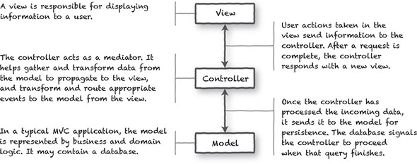
As you can see in figure 1.1, the pattern is used to separate the application’s concerns. The view is responsible for displaying information to the user. This represents the graphical user interface (GUI). The controller is in the middle. It helps transform events from the view to the model and data from the model to the view. Finally, the model holds business logic and could contain a kind of datastore.
If you’re interested in learning more about the MVC pattern, start with Martin Fowler’s page on the evolution of MVC at https://martinfowler.com/eaaDev/uiArchs.html.
Many web framework authors have used a variation of this MVC pattern because of its solid, time-tested architecture. If you want to know more about how modern web frameworks are designed and architected, check out SPA Design and Architecture by Emmitt A. Scott Jr. (Manning, 2015).
In modern software development, the MVC pattern is often used as a part of a single application and provides a great mechanism for separating the roles of application code. For websites using the MVC pattern, every request initiates a flow of information from the client to the server, then the database, and all the way back again. That process is time-consuming, resource-intensive, and doesn’t provide a responsive user experience.
Over the years, developers have increased the interactivity of web-based applications by using asynchronous web requests and client-side MVC so that requests sent to the server are non-blocking and execution continues without a reply. But as web applications begin to function more like their desktop counterparts, waiting for any client/server interaction can make an application feel sluggish or broken. That’s where our next pattern comes to the rescue.
You’ll find a good degree of flexibility in the client-side MVC pattern when considering where business logic should be implemented. In figure 1.1 we consolidated the business logic in the model for simplicity’s sake, but it may also exist in other tiers of the application, including the controller. The MVC pattern has changed since it was introduced by Trygve Reenskaug in 1979 for Smalltalk-76.
Consider the validation of a ZIP Code provided by a user:
It can be difficult to define what constitutes actual business logic, and in many cases, all the previous constraints may come into play within a single request.
As we build our application in this book, we’ll examine how and where we’re organizing our business logic, as well as how Vue and its supporting libraries can help keep functionality from bleeding across boundaries.
When JavaScript frameworks began to support asynchronous programming techniques, web applications were no longer required to make requests for complete web pages. Websites and applications could respond faster with partial updates to the view, but doing so required a degree of duplicated effort. Presentation logic often mirrored business logic.
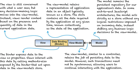
A refinement of MVC, the primary difference in the Model–View–ViewModel (MVVM) pattern is the introduction of the view-model, and its data bindings (collectively, the binder). MVVM provides a blueprint for us to build client-side applications with more responsive user interaction and feedback, while avoiding costly duplication of code and effort across the overall architecture. It’s also easier to unit test. With that said, MVVM may be overkill for simple UIs, so take that into consideration.
For web applications, the design of MVVM allows us to write software that responds immediately to user interaction and allows users to move freely from one task to the next. As you can see from figure 1.2, the view-model also wears different hats. This consolidation of responsibility has a single, profound implication for our application’s views: when data changes in the view-model, any view bound to it is automatically updated. The data binder exposes data and helps guarantee that when data changes, it’s reflected in the view.
You can find more information on the MVVM pattern on Martin Fowler’s page on the Presentation model at https://martinfowler.com/eaaDev/PresentationModel.html.
The reactive programming paradigm isn’t necessarily a new idea. Its adoption by web applications is relatively new and owes much to the availability of JavaScript frameworks such as Vue, React, and Angular.
Many great resources on reactive theory are available on the web, but our needs are perhaps a bit more focused. For a web application to be thought of as reactive, it should do the following:
Reactive web applications accomplish these goals by employing MVVM design principles using asynchronous techniques to avoid blocking continued interaction and using functional programming idioms where possible.
While the MVVM pattern doesn’t imply a reactive application and vice versa, they share a common intention: to provide a more responsive, reliable experience to the users of an application. Superman and Clark Kent may present themselves differently, but they both want to do right by humanity. (No, I won’t say which of MVVM and Reactive I think wears the cape and which the glasses.)
If you’d like to learn more about Vue’s reactive programming paradigm, check out the Reactivity in Depth guide at https://vuejs.org/v2/guide/reactivity.html.
To better understand the notions of data binding and reactivity, we’ll start by implementing a calculator in plain, vanilla JavaScript, as shown in this listing.
<!DOCTYPE>
<html>
  <head>
    <title>A JavaScript Calculator</title>
    <style>
     p, input { font-family: monospace; }
     p, { white-space: pre; }
    </style>
  </head>
  <!-- Bind to the init function -->
  <body>
    <div id="myCalc">                                                1
      <p>x <input class="calc-x-input" value="0"></p>
      <p>y <input class="calc-y-input" value="0"></p>
      <p>--------------------</p>
         <p>= <span class="calc-result"></span></p>                  2
    </div>
    <script type="text/javascript">
     (function(){

       function Calc(xInput, yInput, output) {                       3
         this.xInput = xInput;
         this.yInput = yInput;
         this.output = output;
       }

       Calc.xName = 'xInput';
       Calc.yName = 'yInput';

       Calc.prototype = {
         render: function (result) {
           this.output.innerText = String(result);
         }
       };

       function CalcValue(calc, x, y) {                              4
         this.calc = calc;
         this.x = x;
         this.y = y;
         this.result = x + y;
       }

       CalcValue.prototype = {
         copyWith: function(name, value) {
           var number = parseFloat(value);

           if (isNaN(number) || !isFinite(number))
             return this;

           if (name === Calc.xName)
             return new CalcValue(this.calc, number, this.y);

           if (name === Calc.yName)
             return new CalcValue(this.calc, this.x, number);

           return this;
         },
         render: function() {
           this.calc.render(this.result);
         }
       };

       function initCalc(elem) {                                     5

         var calc =
           new Calc(
             elem.querySelector('input.calc-x-input'),
             elem.querySelector('input.calc-y-input'),
             elem.querySelector('span.calc-result')
           );
         var lastValues =
           new CalcValue(
             calc,
             parseFloat(calc.xInput.value),
             parseFloat(calc.yInput.value)
           );


         var handleCalcEvent =                                       6
           function handleCalcEvent(e) {
             var newValues = lastValues,
                 elem = e.target;

             switch(elem) {
               case calc.xInput:
                 newValues =
                   lastValues.copyWith(
                     Calc.xName,
                     elem.value
                   );
                 break;
               case calc.yInput:
                 newValues =
                   lastValues.copyWith(
                     Calc.yName,
                     elem.value
                   );
                 break;
             }

             if(newValues !== lastValues){
               lastValues = newValues;
               lastValues.render();
             }
           };

         elem.addEventListener('keyup', handleCalcEvent, false);     7
         return lastValues;
       }

       window.addEventListener(
         'load',
         function() {
           var cv = initCalc(document.getElementById('myCalc'));
           cv.render();
         },
         false
       );

     }());
    </script>
  </body>
</html>
This is a calculator using ES5 JavaScript (we’ll use the more modern version of JavaScript ES6/2015 later in the book). We’re using an immediately invoked function expression that kicks off our JavaScript. A constructor is used to hold values and the handleCalcEvent event handler fires on any keyup.
Don’t worry too much about the syntax of the Vue example because our goal here isn’t to understand everything going on in the code, but to compare the two implementations. That said, if you have a good sense of how the JavaScript example works (as shown in the following listing), much of the Vue code should make sense at least on a theoretical level.
<!DOCTYPE html>
<html>
<head>
  <title>A Vue.js Calculator</title>
  <style>
    p, input { font-family: monospace; }
    p { white-space: pre; }
  </style>
</head>
<body>
  <div id="app">                                                1
    <p>x <input v-model="x"></p>                                2
    <p>y <input v-model="y"></p>
    <p>---------------------</p>
    <p>= <span v-text="result"></span></p>                      3
  </div>

  <script src="https://unpkg.com/vue/dist/vue.js"></script>     4
  <script type="text/javascript">
  function isNotNumericValue(value) {
    return isNaN(value) || !isFinite(value);
  }
    var calc = new Vue({                                        5
      el: '#app',                                               6
      data: { x: 0, y: 0, lastResult: 0 },                      7
      computed: {                                               8
        result: function() {
            let x = parseFloat(this.x);
            if(isNotNumericValue(x))
              return this.lastResult;

            let y = parseFloat(this.y);
            if(isNotNumericValue(y))
              return this.lastResult;

            this.lastResult = x + y;

            return this.lastResult;
        }
      }
    });
  </script>
</body>
</html>
The code for both calculator implementations is, for the most part, different. Each sample shown in figure 1.3 is available in the repository that accompanies this chapter, so you can run each one and compare how they operate.
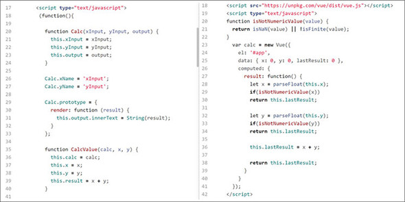
The key difference between the two applications is how an update to the final calculation is triggered and how the result finds its way back to the page. In our Vue example, a single binding v-model takes care of all the updates and calculations on the page. When we instantiate our application with new Vue({ ... }), Vue examines our JavaScript code and HTML markup, then creates all the data and event bindings needed for our application to run.
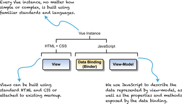
Vue is sometimes referred to as a progressive framework, which broadly means that it can be incorporated into an existing web page for simple tasks or that it can be used entirely as the basis for a large-scale web application.
Regardless of how you choose to incorporate Vue into your project, every Vue application has at least one Vue instance. The most basic application will have a single instance that provides bindings between designated markup and data stored in a view-model (see figure 1.4).
Being built entirely out of web technologies, a single Vue instance exists entirely in the web browser. Crucially, this means that we don’t depend on server-based page reloads for updated views, executing business logic, or any other task that falls under the domain of the view or view-model. Let’s revisit our form submission example with that in mind.
Perhaps the most striking change relative to the client-side MVC architecture is that the browser page needs to rarely, if ever, reload during the user’s entire session. Because the view, view-model, and data bindings are all implemented in HTML and JavaScript, our application can delegate tasks to the model asynchronously, leaving users free to continue with other tasks. When new data is returned from the model, the bindings established by Vue will trigger whatever updates need to happen in the view.
Arguably, it’s Vue’s primary role to facilitate user interaction by creating and maintaining the binding between the views we create and the data in our view-model. In this capacity, as we’ll see in our first application, Vue provides a solid bedrock for any reactive web application.
When starting a new project, there are many decisions to make. One of the most important is the framework or library that should be used. If you’re an agency or even a solo developer, picking the correct tool for the job is extremely important. Luckily, Vue.js is versatile and can handle many different situations.
What follows are several of the most commonly voiced concerns that you might have when starting a new project as a solo developer or agency, plus a description of how Vue helps to address them, either directly or as part of a larger movement toward reactive web applications.
After asking many of these questions on my own projects, I now recommend Vue on almost all my projects. As you become confident in your mastery of Vue throughout this book, my hope is that you’ll feel comfortable advocating for Vue in your next project.
We’ve covered much ground in this introductory chapter alone. If you’re new to web application development, this may be your first contact with the MVVM architecture or reactive programming, but we’ve seen that building a reactive application isn’t as intimidating as the jargon can make it feel.
Perhaps the biggest takeaway from this chapter isn’t about Vue itself, but how reactive applications are easier to work with and easier to write with. It’s also nice that we have less boilerplate interface code to write. Not having to script all our user’s interactions frees us up to focus on how to model our data and design our interface. Wiring them up is something Vue makes effortless.
If you’re like me, then you’re already thinking of the gazillion ways you can make our modest application better. This is a good thing, and you should absolutely experiment and play with the code. Here are a few things I think about when I look at the app:
In part 2, we’ll find answers to all these questions and many more. Vue was designed to grow with us as developers, as much as with our code, so we’ll always make sure to look at different strategies, compare their strengths and weaknesses, and learn how to decide which is the best practice for a given situation.
All right, let’s see how we can improve on some of what we wrote!
This chapter covers
Over the course of this book we’re going to build a complete web application: a webstore with product listings, a checkout process, an administrative interface, and more. The completed webstore may seem like it’s a long way off, especially if you’re new to web application development, but Vue allows you to start small, build on what you learn, and ship a sophisticated product in one smooth progression.
The key to Vue’s consistency at every stage of an application’s growth is the Vue instance. A Vue application is a Vue instance, Vue components are all Vue instances, and you can even extend Vue by creating instances with your own custom properties.
It’s impossible to touch on all the facets of the Vue instance in a single chapter, so we’ll build on the foundation we establish as our application evolves. As we explore new features in chapters to come, we’ll often refer to what we learn about the Vue instance and the Vue lifecycle in this chapter.
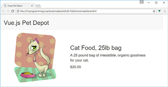
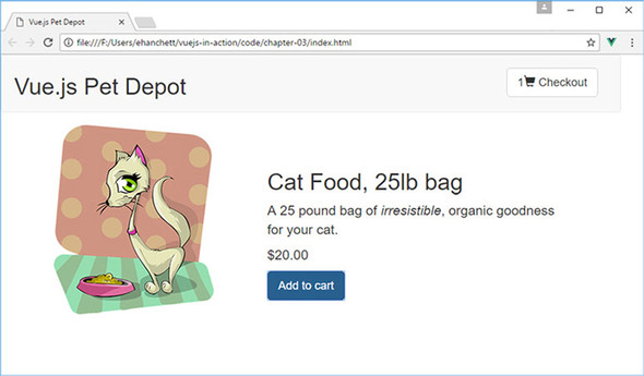
To begin our journey, we’re going to create the foundation of our webstore application, display its name, and create a single product listing. Our focus is on how we create a Vue application and the relationship of the data in our view-model to how it’s displayed in the view. Figure 2.1 shows what our application should look like by the end of this chapter.
If you tried the simple calculator sample in listing 1.2, technically this will be your second Vue application. You’re a seasoned veteran already!
Before we begin, download the vue-devtools plugin for your browser. You can find more information on how to download this plugin in appendix A.
At the heart of every Vue application, no matter how big or small, is the root Vue instance, Vue instance for short. Creating a root Vue instance is done by invoking the Vue constructor, new Vue(). The constructor bootstraps our application by compiling an HTML template for our app, initializing any instance data, and creating the data and event bindings that make our application interactive.
The Vue constructor accepts a single JavaScript object, known as the options object, new Vue({ /* options go here */ }). It’s our job to populate that object with everything the Vue constructor needs to bootstrap our application, but to start off we’re focusing on a single option, the el option.
The el option is used by Vue to specify a DOM element (hence el) where Vue will mount our application. Vue will locate the corresponding DOM element in our HTML and use it as the mount point for our application.
This code is the beginning of our webstore application. To make things easier to follow, I’ve included each code listing in its own file that you can download for this chapter. But to run the application, you’ll need to combine each snippet of code from each file into a single index.html file. Yes, the index.html file will get rather large as we progress through the book, and that’s normal. In future chapters, we’ll discuss ways of splitting our application into separate files.
If you’d like to see the completed application from this chapter, look for the index.html file that’s included with the code in the chapter-02 folder. (If you haven’t downloaded the code that accompanies this chapter, learn how and where to get it in appendix A.) Let’s create our first Vue application.
<html>
  <head>
    <title>Vue.js Pet Depot</title>
    <script src="https://unpkg.com/vue"></script>                        1
    <link rel="stylesheet" type="text/css" href="assets/css/app.css"/>   2
    <link rel="stylesheet"
 href="https://maxcdn.bootstrapcdn.com/bootstrap/3.3.7/css/
     bootstrap.min.css" crossorigin="anonymous">
  </head>
  <body>
    <div id="app"></div>                                                 3

    <script type="text/javascript">
      var webstore = new Vue({                                           4
        el: '#app'                                                       5
      });
    </script>
  </body>
</html>
The markup contains a single div element with a CSS ID selector, #app. Vue uses that value to locate our div and mount the application to it. This selector matches the same syntax used by CSS (such as #id, .class).
Throughout this book we’ll use Bootstrap 3 for all layout and design. This works great and helps keep the focus on Vue.js. As of the time of writing, Bootstrap 4 was recently released, but because the focus of this book isn’t on design, I decided to leave Bootstrap 3 in. These examples will work on Bootstrap 4; but you may need to swap out several of the classes to the newer Bootstrap 4 classes if you do switch over. Keep that in mind.
If the CSS selector we provide resolves to more than one DOM element, Vue will mount the application to the first element that matches the selector. If we had an HTML document with three div elements, and we invoked the Vue constructor as new Vue({ el: 'div' }), Vue would mount the application at the first div element of the three.
If you need to run multiple Vue instances on a single page, you could mount them to different DOM elements by using unique selectors. This may seem like an odd practice, but if you use Vue to build small components, such as an image carousel or a webform, it’s easy to see how you could have several root Vue instances all running on a single page.
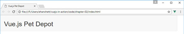
Let’s head over to Chrome and open the file you created for your first Vue application from listing 2.1, though it won’t yet render anything you can see in the main browser window. (After all, there’s no visible HTML!)
Once the page loads, open the JavaScript console if it isn’t already open, and hopefully you’ll see . . . <drum roll> . . . absolutely nothing (or perhaps a note about downloading vue-devtools if you haven’t already done so, or a note that you’re running Vue in development mode). Figure 2.2 shows what your console might look like.
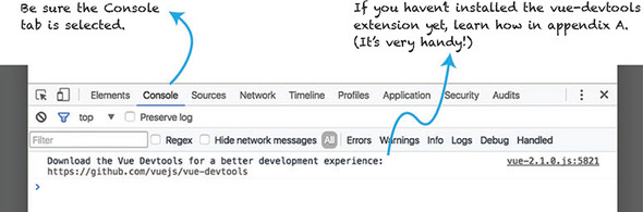
Even as simple as our application is so far, we can still run into trouble when we load our file in Chrome. Here are two common issues to look out for when things don’t go as planned:
Tracking down errors the first few times can be frustrating, but after you’ve resolved a few errors the process will become more natural.
If you run into something you can’t figure out, or you find a particularly nasty error, you can check out the Help section of the Vue forum at https://forum.vuejs.org/c/help or ask for help in the Vue Gitter chat at https://gitter.im/vuejs/vue.
After Vue finishes initializing and mounting the application, it returns a reference to the root Vue instance, which we stored in the webstore variable. We can use that variable to inspect our application in the JavaScript console. Let’s use it now to make sure that our application is alive and well before continuing.
With the console open, enter webstore at the prompt. The result is a Vue object that we can inspect further in the console. For now, click the disclosure triangles
( ) to expand the object and look at the properties of our root Vue instance as seen in figure 2.3.
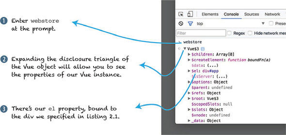
You may have to scroll around a bit, but you should be able to locate the el property we specified as part of our application’s options object. In future chapters, we’ll use the console to access our instance for debugging, manipulating data, and triggering behaviors in our application while it’s running, so we can validate that it behaves as expected. We can also use vue-devtools to peek inside our application while it’s running. (Again, if you don’t yet have vue-devtools installed, visit appendix A to learn how to install it.) Let’s see how it compares with using the JavaScript console. Figure 2.4 shows the different parts of the vue-devtools.
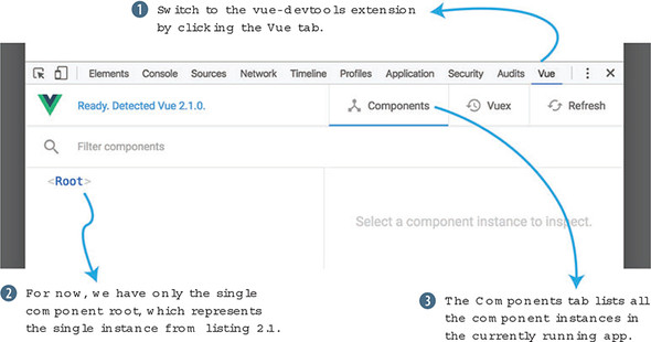
The vue-devtools extension provides big functionality for inspecting a Vue application, its data, and the relationship of its components. As an application grows in complexity, the searchable tree view in vue-devtools shows the relationship of components in a way the JavaScript console cannot. We’ll discuss more about Vue components and how they relate to the Vue instance in a later chapter.
We’ll frequently use both tools to zero in on problems with our application as we build it. In fact, we can use vue-devtools to discover another way to access our application instance in the JavaScript console as seen in figure 2.5.
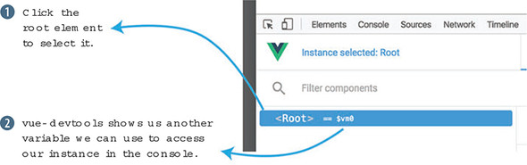
When you select an instance in the tree view, as in figure 2.5, vue-devtools assigns a reference to the instance to the $vm0 variable. We can use $vm0 the same way we used our webstore variable. Try using $vm0 in the JavaScript console to see if you can inspect the root Vue instance
Having multiple ways to access the same instance may appear redundant, but it’s helpful to have both.
When we assigned our root Vue instance to the global variable webstore, we gave ourselves a way to refer to the application in other JavaScript code on the page. Doing so allows us to integrate with other libraries, frameworks, or our own code that may require a reference back to our application.
The Vue instance assigned to the $vm0 variable reflects the current selection made in vue-devtools. When an application is made up of hundreds, or even thousands of instances, it isn’t practical to declaratively assign each instance, so having a way to access specific instances that are created programmatically becomes indispensable when inspecting and debugging such a complex application.
Until now, our application has been a real snoozefest. Let’s liven it up by displaying data from our application instance in our application’s template. Remember, our Vue instance uses the DOM element we provide as the basis for its template.
We’re going to start by adding the name of our webstore. This will show us how to pass data into the Vue constructor, and how to bind that data to a view. In this listing let’s update the application code from listing 2.1.
<html>
  <head>
    <title>Vue.js Pet Depot</title>
    <script src="https://unpkg.com/vue"></script>  </head>
  <body>
    <div id="app">
      <header>                                           1
        <h1 v-text="sitename"></h1>                      2
      </header>                                          1
    </div>

    <script type="text/javascript">
      var webstore = new Vue({
        el: '#app', // <=== Don't forget this comma!
        data: {                                          3
          sitename: 'Vue.js Pet Depot'                   4
        }                                                3
      });
    </script>
  </body>
</html>
We’ve added a data object to the options we pass into our Vue constructor. That data object contains a single property, sitename, which contains the name of our webstore.
Our site’s name needs a home, so we’ve also added a header element to the markup inside of the application’s root div element. On the heading element <h1>, we use a data binding element directive, v-text="sitename".
A v-text directive prints a string representation of the property it references. In this case, once our application is up and running we should see a header with the text “Vue.js Pet Depot” displayed inside it.
If you need to display a property value in the middle of a larger string, you can use Mustache syntax—{{ property-name }}—to bind to a property. To include the name of our webstore in a sentence, you might write <p>Welcome to {{ sitename }}</p>.
Vue only borrows the {{ ... }} syntax from Mustache for text interpolations, not from the entire Mustache specification. But if you’re curious where it comes from, visit the online manual at https://mustache.github.io/mustache.5.html.
With our data binding in place, let’s go see how our new header looks in the browser.
When you reload the application in Chrome, you should see the header proudly displaying the value of our sitename property as seen in figure 2.6. The visual appearance of our header is provided by the stylesheet in chapter-02/assets/css/app.css. We’ll use our stylesheet and Bootstrap to design our application. If you’d like to tinker with the appearance of the header, open that file and find the styles defined by header h1.
Vue automatically creates getter and setter functions for each property of the data object when it initializes our application. That gives us the ability to retrieve the current value of, or set a new value for, any of our instance’s properties without writing any additional code. To see these functions in action, let’s start by using the getter to print the value of the sitename property.
As you can see in figure 2.7, the getter and setter functions for our sitename property are exposed at the root level of our application instance. That lets us access the property from the JavaScript console, or from any other JavaScript that interacts with our application.
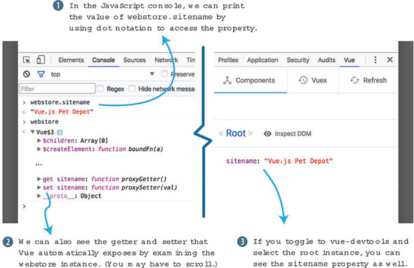
You can also see the property listed in vue-devtools when we select the <root> instance. Now let’s see what happens in figure 2.8 when we use the setter to set the value of sitename in the JavaScript console.
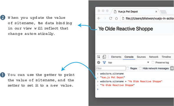
Once we provide a new value for sitename and hit Enter, the output in our header element is automatically updated. This is Vue’s event loop in action. Let’s look at the Vue lifecycle to see how and when changes to our data trigger updates to the view.
When a Vue application is first instantiated, it begins its journey through a sequence of events known collectively as the Vue lifecycle. Although a long-running Vue application will likely spend most of its time cycling within the event loop, much of the heavy lifting of the library itself occurs when an application is first created. Let’s take a high-level look at the lifecycle in figure 2.9.
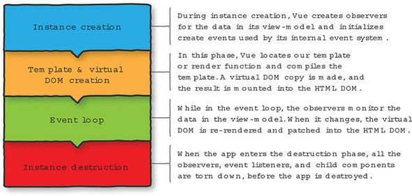
Each phase builds upon the previous phase to create the Vue lifecycle. You may wonder what the virtual DOM is and how the render function works. The virtual DOM is a lightweight abstraction that represents the DOM. It mimics the DOM tree that’s normally accessed by the browser. Vue can make updates to the virtual DOM much quicker than the browser-specific DOM. The render function is the way Vue can display information to the user. For more information on the Vue instance and lifecycle hooks, please check out the official guides at https://vuejs.org/v2/guide/instance.html.
To see when our application instance passes through the different phases of the lifecycle, we can write callback functions for Vue’s lifecycle hooks. Let’s update the code in our main application file (index.html) in listing 2.3.
A hook is a function that gets “hooked” onto a part of the Vue library’s code. Whenever Vue reaches that part of the code during execution, it calls the function you define or continues along if there’s nothing to do.
var APP_LOG_LIFECYCLE_EVENTS = true;        1

var webstore = new Vue({
  el: "#app",
  data: {
    sitename: "Vue.js Pet Depot",
  },
  beforeCreate: function() {                2
    if (APP_LOG_LIFECYCLE_EVENTS) {         2
      console.log("beforeCreate");          2
    }                                       2
  },                                        2
  created: function() {                     3
    if (APP_LOG_LIFECYCLE_EVENTS) {         3
      console.log("created");               3
    }                                       3
  },                                        3
  beforeMount: function() {                 4
    if (APP_LOG_LIFECYCLE_EVENTS) {         4
      console.log("beforeMount");           4
    }                                       4
  },                                        4
  mounted:  function() {                    5
    if (APP_LOG_LIFECYCLE_EVENTS) {         5
      console.log("mounted");               5
    }                                       5
  },                                        5
  beforeUpdate:  function() {               6
    if (APP_LOG_LIFECYCLE_EVENTS) {         6
      console.log("beforeUpdate");          6
    }                                       6
  },                                        6
  updated:  function() {                    7
    if (APP_LOG_LIFECYCLE_EVENTS) {         7
      console.log("updated");               7
    }                                       7
  },                                        7
  beforeDestroy:  function() {              8
    if (APP_LOG_LIFECYCLE_EVENTS) {         8
      console.log("beforeDestroy ");        8
    }                                       8
  },                                        8
  destroyed:  function() {                  9
    if (APP_LOG_LIFECYCLE_EVENTS) {         9
      console.log("destroyed");             9
    }                                       9
  }                                         9
});
The first thing you’ll notice in listing 2.3 is that we’ve defined a variable, APP_LOG_LIFECYCLE_EVENTS, that we can use to enable or disable logging of lifecycle events. We define our variable outside the Vue instance, so it can be used globally by the root instance or any child components we write later. Also, if we defined it inside our application instance, it wouldn’t be available in the beforeCreate callback because it hasn’t yet been created!
APP_LOG_LIFECYCLE_EVENTS uses the uppercase syntax typically reserved for constant definition because, when we start using ECMAScript 6 later in the book, we’ll use the const feature to create constants. Planning ahead means we won’t have to do any find-and-replace to change the name in the rest of our code.
The remainder of the code defines functions that log each lifecycle event as it’s encountered. Let’s revisit our console exploration of the sitename property to see what happens in the Vue lifecycle.
If you open the console in Chrome and reload the app, you should immediately see the output from several of our callbacks as seen in figure 2.10.
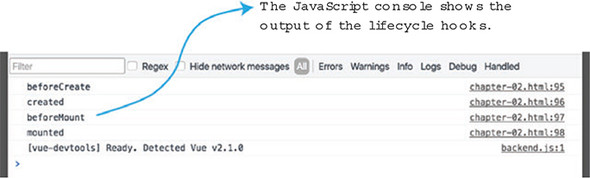
As you might expect, the first four lifecycle hooks get triggered as Vue creates and mounts our application. To test the other hooks, we’ll need to interact with the console a bit. First, let’s trigger the update callbacks by setting a new name for our site. Figure 2.11 displays how this can be done.
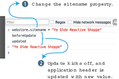
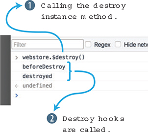
When you change the sitename property, the update cycle kicks off as the data binding in the application’s header is updated with the new value. Now let’s destroy our application! (Don’t worry, it’ll come right back with a reload.) To trigger the last two lifecycle hooks, we use our instance’s $destroy method.
Special methods that Vue creates on our instance are available using the $ prefix. For more information on Vue’s lifecycle instance methods, you can visit the API documentation at https://vuejs.org/v2/api/#Instance-Methods-Lifecycle.
These last two hooks are typically used for cleanup activities in an application or component. If our application created an instance of a third-party library, we should call that library’s teardown code, or de-allocate any references to it manually, so that we avoid leaking memory allocated to our application. Figure 2.12 shows how calling the $destroy() instance method will trigger the destroy hooks.
The lifecycle hooks provide a great way to see what’s going on as an application runs, but I’m the first to admit that there’s repetitive, verbose code required to log messages to the console. Because they’re fairly bulky, I won’t include these debugging functions in code listings from here on, but we’ll occasionally use lifecycle hooks to explore new behavior or for functional reasons in the application itself.
If you do keep these hooks around, and the console gets too noisy with output, you can disable the logging by setting APP_LOG_LIFECYCLE_EVENTS to false. Bear in mind that you can disable them completely by changing the value in the index.html, or you can temporarily toggle logging on and off by setting the value at runtime using the JavaScript console.
Displaying the name of our webstore is a good start, but there are a few more aspects of displaying data in our markup that we should cover before moving on. Our webstore will display products in one of several ways: in a list, in a grid, as a featured product, and on its own individual product page. As we design and mark up each view, we’ll continue to use the same data, but we’ll use Vue’s functionality to manipulate it differently for each display without altering the underlying values or structure.
For now, we’re only going to display a single product, so let’s add a sample product to our data object.
data: {
  sitename: "Vue.js Pet Depot",
  product: {                                                  1
    id: 1001,                                                 2
    title: "Cat Food, 25lb bag",                              2
    description: "A 25 pound bag of <em>irresistible</em>,"+  2
                  "organic goodness for your cat.",           2
    price: 2000,                                              2
    image: "assets/images/product-fullsize.png"               2
  }
},
Adding a product object to our data option is relatively straightforward:
With our data in place, let’s get our view up to speed.
Now we can focus on adding the product markup to our HTML. Beneath the header element, we’ll add a main element that acts as the primary container for the content of our application. The main element, <main>, is a new addition to HTML5 and is meant to contain the primary content of a webpage or application.
For more information about the main element (and others), start by visiting www.quackit.com/html_5/tags/html_main_tag.cfm.
The product layout uses two columns so that the product image is displayed to the side of the product information (figure 2.13). Our stylesheet (chapter-02/assets/css/app.css) already has all the column styles defined, so we only need to include the appropriate class names in our markup.
<main>
  <div class="row product">
    <div class="col">
      <figure>
        <img v-bind:src="product.image">             1
      </figure>
    </div>
    <div class="col col-expand">
      <h1 v-text="product.title"></h1>               2
      <p v-text="product.description"></p>           2
      <p v-text="product.price" class="price"></p>   2
    </div>
  </div>
</main>
One thing you’ll notice right away is the use of JavaScript dot notation in the data bindings. Because product is an object, we must provide each binding with the entire path to a property. Most of the properties of our product data—title, description and price—are bound using the v-text directives, the same way we bound the sitename property in the header.
The product’s image path introduces an attribute binding. We use the v-bind directive because element attributes cannot be bound using simple text interpolations. Any valid element attribute can be bound using the v-bind directive, but it’s important to note that there are special cases for styles, class names, and other scenarios that we’ll come to in future chapters.
You can use a shorthand for the v-bind directive. Instead of typing out v-bind every time you need to use it, you can remove the v-bind and type :, so instead of using v-bind:src=" ... ", you can type :src=" ... ".
We don’t need to restrict our data bindings to properties of our data. Vue allows us to use any valid JavaScript expression inside any of our bindings. A few examples using the code from listing 2.5 might be:
{{ product.title.toUpperCase() }} -> CAT FOOD, 25LB BAG
{{ product.title.substr(4,4) }} -> Food
{{ product.price - (product.price * 0.25)  }} -> 1500
<img :src="product.image.replace('.png', '.jpg')"> -> <img src=" //assets/
images/product-fullsize.png">
Though using expressions in this way is convenient, it introduces logic into the view that’s almost always better off inside the JavaScript code of the application or component responsible for the view’s data. Additionally, expressions like this make it difficult to reason about where an application’s data gets manipulated, especially as an application’s complexity increases.
In general, using an inline expression is a great way to test something before formalizing that functionality within an application.
The next section and upcoming chapters introduce the best practices for manipulating, filtering, and deriving data from existing values without compromising the integrity of our views or application data. For details on what’s considered an expression, please visit https://vuejs.org/v2/guide/syntax.html#Using-JavaScript-Expressions.
Let’s flip over to Chrome, reload the page, and confirm that the product information is displayed as designed.
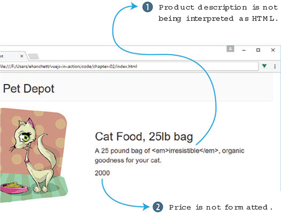
Uh oh, we’ve got a couple of things to work on:
Let’s solve that first issue first. What we need is an HTML directive, so let’s update the product markup using the v-html binding to output the product’s description as intended.
<main>
  <div class="row product">
    <div class="col">
      <figure>
        <img v-bind:src="product.image">
      </figure>
    </div>
    <div class="col col-expand">
      <h1 v-text="product.title"></h1>
      <p v-html="product.description"></p>               1
      <p v-text="product.price" class="price"></p>
    </div>
  </div>
</main>
Reloading the app in Chrome should now render the value of our product description as HTML and the emphasis tag should italicize the word “irresistible,” as shown in figure 2.14.
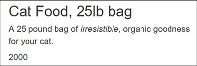
The v-html binding will render the bound property as raw HTML. This can be handy but should be used sparingly and only when the value is one you can trust. Now we need to fix the display of that pesky price value.
When we write code that inserts HTML directly into a view, we open our applications up to cross-site scripting (XSS) attacks.
At a high level, if a bad actor visits our site and saves malicious JavaScript in our database by using a form we haven’t sanitized, we’re vulnerable when we output that code to our HTML.
In general, best practice dictates that we should, at a minimum, follow basic principles regarding HTML and content:
For a comprehensive, clear overview of XSS, start with this article at https://excess-xss.com/, and for a deeper understanding of attacks and sample code for each exploit, consult this OWASP wiki at www.owasp.org/index.php/Cross-site_Scripting_(XSS).
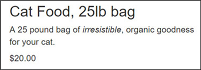
The last thing left to do is to display our product’s price in a familiar format, not as a raw integer. Output filters let us apply formatting to a value before it’s displayed in our markup. The general format of an output filter is {{ property | filter }}. In our case, we want to format the product’s price to look like $20.00, rather than 2000.
Output filters are functions that receive a value, perform a formatting task, and return the formatted value for output. When used as part of a text interpolation, the value passed to the filter is the property we’re binding to.
All our output filters reside in the filters object of the options we pass to our Vue instance, so that’s where we’ll add our price formatter in the following listing.
var webstore = new Vue({
  el: '#app',
  data: { ... },
  filters: {                                                  1
    formatPrice: function(price) {                            2
      if (!parseInt(price)) { return ""; }                    3
      if (price > 99999) {                                    4
        var priceString = (price / 100).toFixed(2);           5
        var priceArray = priceString.split("").reverse();     6
        var index = 3;                                        6
        while (priceArray.length > index + 3) {               6
          priceArray.splice(index+3, 0, ",");                 6
          index += 4;                                         6
        }                                                     6
        return "$" + priceArray.reverse().join("");           7
      } else {
        return "$" + (price / 100).toFixed(2);              8
      }
    }
  }
});
The formatPrice function takes an integer and returns a string formatted to look like a U.S. dollar value. Generically, it will return a value similar to $12,345.67. Depending on the size of the integer provided, the function branches as follows:
You can find probably a gazillion ways to format a dollar figure that are more efficient, terse, or whatever quality you’re searching for. Here, I’ve tried to favor clarity over expediency. For an idea of how complex the issue is, and how many solutions there are, dive into this post at http://mng.bz/qusZ.
To use our shiny new filter function, we need to add it to the binding for our product’s price. We also need to update our price binding to use the Mustache-style binding to apply the filter, as shown next. Filters cannot be used with the v-text binding syntax.
<main>
  <div class="row product">
    <div class="col">
      <figure>
        <img v-bind:src="product.image">
      </figure>
    </div>
    <div class="col col-expand">
      <h1>{{ product.title }}</h1>
      <p v-html="product.description"></p>
      <p class="price">                         1
        {{ product.price | formatPrice }}       1
      </p>                                      1
    </div>
  </div>
</main>
Remember, bindings with filters have the generic form {{ property | filter }}, so we’ve updated our price binding accordingly, {{ product.price | formatPrice }}. Flip back over to Chrome, refresh, and voilà, we’ve got a formatted price as seen in figure 2.15.
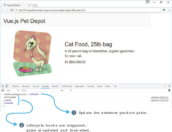
We can see how our filter is applied to different product price values in real time if we tinker with our data in the console. To try different values, open the console and set the value of product.price with a statement such as webstore.product.price = 150000000.
Figure 2.16 shows what will occur after the product price is updated. Be sure to try out small (< 100) and large (> 10000000) values to be sure each is formatted correctly.
Use your knowledge from this chapter to answer this question:
See the solution in appendix B.
The meat of this book lies in the View and ViewModel section. These chapters look deeper into Vue and all the elements and pieces that make up a Vue application. We’ll start out simple and add interactivity to our application. We’ll then move onto forms and inputs, conditionals, and looping.
Several of the most important concepts are in chapters 6 and 7, where we look at components in depth. These are truly the building blocks of our application. This is the first chapter where we’ll see single-file components—a powerful tool in your Vue.js toolbelt.
The last two chapters will look at transitions, animations, and how to extend Vue. This will make our applications more efficient and look a little prettier.
Believe it or not, now that we’ve got our first product all wired up, we’re ready to add interaction to our webstore.
Adding interactivity to an application means binding to DOM events, responding to them in application code, and providing feedback to users about what happened because of their actions. Vue creates and manages all the event and data bindings for us, but there are decisions we need to make about how to manipulate data within our application, as well as how to meet user expectations in our interface.
We’ll begin exploring user interaction by letting customers add our single product to a shopping cart, but along the way we’ll also look at how our work fits into the overall picture of a Vue application.
To get a feel for where we’re headed in this chapter, figure 3.1 shows how the application will look when all our work is done.
Before we can build any of our super-cool shopping cart functionality, we’ll need a container to hold all those items in our application instance. Fortunately, all we need at this stage is a simple array, onto which we’ll push our products.
I’ve broken up the code into small snippets, similar to the way we did it in the last chapter. You’ll need to add these to your index.html file that you created last chapter to continue the application. You can always download the code for this chapter if needed.
data: {
  sitename: "Vue.js Pet Depot",
  product: {                                                 1
    id: 1001,                                                1
    title: "Cat Food, 25lb bag",                             1
    description: "A 25 pound bag of <em>irresistible</em>,   1
                  organic goodness for your cat.",           1
    price: 2000,                                             1
    image: "assets/images/product-fullsize.png",             1
  },
  cart: []                                                   2
},
...
That gives us our shopping cart . . . done. In all seriousness, though, we’ll get good mileage out of this simple array, but eventually we’ll create a cart component that will manage its contents internally.
You need to add a comma after product in listing 3.1 before you add the cart array. Forgetting to add one will throw an error in the console and is a common gotcha. (An error I’m well acquainted with!)
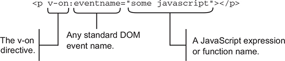
To add interaction to our application, we need to bind elements of the DOM to functions we define in our Vue instance. We can bind an element to any standard DOM event—click, mouseup, keyup, and so on—by using an event binding. Vue takes care of all the wiring under the hood, so we can stay focused on how our application reacts to an event when it occurs.
Event bindings use the v-on directive to bind a snippet of JavaScript, or a function, to a DOM element, as shown in figure 3.2. The bound code or function gets executed when the specified DOM event is triggered.
Here are two common patterns for an event binding’s JavaScript:
Each strategy has its place in an application, but first we’re going to look at using a function to handle an event.
An easier shorthand way to write the v-on directive exists. Instead of using v-on, you can replace it with the @ symbol. For example, if you want to use v-on:click="..." you could replace that with @click="..." instead. We’ll use this shorthand later in the book.
For a customer to add products to their shopping cart, they need a button. We’ll instruct Vue to bind that button’s click event to a function that handles pushing a product onto the cart array.
Before we add the button to our markup, we should write our function. To do so, we need to add a methods object to our application’s options. After the filters object, add this code. (Don’t forget a comma after the filters object!)
methods: {                                1
  addToCart: function() {                 2
    this.cart.push( this.product.id );    2
  }                                       2
}                                         1
For now, adding a product to the cart means pushing the product’s id property from the product data onto the cart array. Keep in mind, you’ll need to add the this keyword to access all data properties.
It may seem simpler to push the entire product object onto our cart array in the code from listing 3.2—this.cart.push( this.product );—but if we did, things would get a bit awkward. JavaScript is neither a pure pass-by-reference language, nor a pure pass-by-copy language, so it takes a bit of practice to know when one or the other will occur.
Pushing the product onto the cart array would push a reference to the product object defined in our data, not a copy. If the product definition in our data changes, perhaps when we retrieve new product data from the server, it might be replaced in the cart or the reference may become undefined.
By pushing the product id onto the cart array instead, we push a copy of the value of our product’s id, not a reference. If the product definition changes, the value(s) in the cart array remain unaltered.
Technically speaking, JavaScript is a call-by-sharing language. You can find a brief explanation of call-by-sharing, and how it compares to other strategies, on Wikipedia at https://en.wikipedia.org/wiki/Evaluation_strategy#Call_by_sharing.
Now we’ve got a function that will add products to our cart so we can go ahead and add button markup. Right after the price markup in our product div, add the button from this listing.
<button class="default"           1
  v-on:click="addToCart">         2
  Add to cart
</button>                         1
Now, when a visitor clicks this button, the addToCart function is called. Time to give it a whirl.
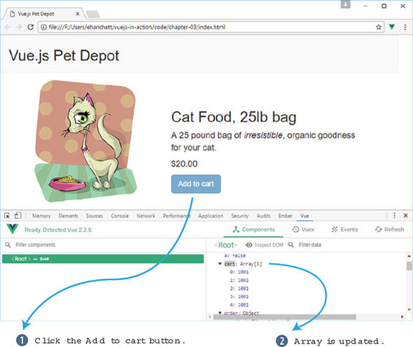
Head over to Chrome, ensure that the console is open, and switch to the Vue tab because we’ll want to peek at the data that’s added to our shopping cart. The cart array should be empty, so if you don’t see Array[0] as shown in figure 3.3, go ahead and reload the page.
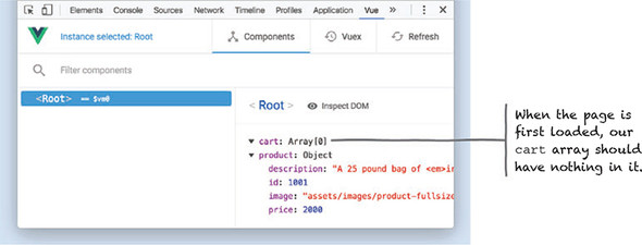
Now, click the Add to cart button a few times. Open the vue-devtools pane and click <Root>. You should see the product’s id getting pushed onto the array with each click as seen in figure 3.4.
Seeing how many items are in the shopping cart using vue-devtools or the console may be okay for developers, but customers will need feedback in the view itself. Time to add an item counter.
To display the number of items a customer has in the shopping cart, we’ll use a computed property. Computed properties can be bound to the DOM like any other property defined by our instance, but they typically provide functionality to derive new information from the current state of an application. In addition, we’ll add a cart item button that will display our checkout cart.
Before we add an item count to our shopping cart, let’s take a more general look at computed properties and how they work.
It might help to think of the properties in the data object as representing data we’d store in a database and computed properties as dynamic values that are used primarily within the context of our view. This may be an overly broad characterization, but it serves as a good first rule of thumb.
Let’s consider a common example of a computed property that displays a user’s full name, as shown in listing 3.4. It makes sense to store someone’s first and last names as separate entities in a database, but it would be redundant and error prone to also store their full name. If the need to display a user’s full name arose, combining the first and last name from existing data is a perfect use case for a computed property.
computed: {
  fullName: function() {                                1
    return [this.firstName, this.lastName].join(' ');   1
  }                                                     1
}
The result returned by the fullName function is conceptually equivalent to having a fullName property in our data object, which means we can easily bind to it in our markup (see figure 3.5).
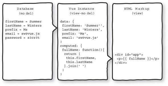
One additional benefit of using computed properties is that we can change the internals of our function to use different or additional data from our application. In figure 3.5, for example, we could use the prefix property to add more formality to a user’s full name.
Using computed properties in this way, we can combine, or otherwise manipulate, any instance data without requiring changes to the backend or the database.
Because computed properties are typically calculated using instance data, their return value is updated automatically when the underlying data changes. Any view markup bound to the computed property will therefore update to reflect the new value as well.
This behavior is at the heart of the update cycle within the greater Vue instance lifecycle. To get a feel for how the update cycle behaves, let’s work through another example of when a computed property is a perfect fit for the job. Consider the task of computing the area of a rectangle, based on its length and width.
new Vue({
  data: {
    length: 5,                            1
    width: 3                              1
  },
  computed: {
    area: function() {                    2
      return this.length * this.width;    2
    }                                     2
  }
});
The computed property area will have an initial value of 15. Any subsequent change to length or width reactively triggers a series of updates to the application:
Figure 3.6 shows the update cycle of the application.
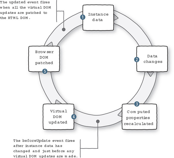
We can see the lifecycle in action by using watch functions to observe when the data in an instance changes, and the beforeUpdate lifecycle hook, which should be executed only after the data changes.
A watch function works the same way as a lifecycle hook but is triggered when the data it’s “watching” is updated. We can even create a watch function to observe a computed property.
Listing 3.6 puts our area calculation in the context of a complete application. The application also contains three watch functions that log messages to the console whenever length, width, or area change, and one function to log when the update cycle begins. These functions must be specified in the watch option of the Vue instance for them to work.
You can find the code for this listing in the samples that accompany this chapter in the file chapter-03/area.html. It’s entirely self-contained, so you can open it directly in Chrome.
<html>
<head>
  <title>Calculating Area - Vue.js in Action</title>
  <script src="https://unpkg.com/vue/dist/vue.js"
    type="text/javascript"></script>
</head>
<body>
  <div id="app">
    <p>
      Area is equal to: {{ area }}                           1
    </p>
    <p>
      <button v-on:click="length += 1">Add length</button>   2
      <button v-on:click="width += 1">Add width</button>     2
    </p>
  </div>
  <script type="text/javascript">
    var app = new Vue({
      el: '#app',
      data: {
        length: 5,                                           3
        width: 3                                             3
      },
      computed: {
        area: function() {                                   4
          return this.width * this.length;                   4
        }                                                    4
      },
      watch: {
        length: function(newVal, oldVal) {                   5
          console.log('The old value of length was: '        5
                      + oldVal +                             5
                      '\nThe new value of length is: '       5
                      + newVal);                             5
        },
        width: function(newVal, oldVal) {                    6
          console.log('The old value of width was: '         6
                      + oldVal +                             6
                      '\nThe new value of width is: '        6
                      + newVal);                             6
        },
        area: function(newVal, oldVal) {                     7
          console.log('The old value of area was: '          7
                      + oldVal +                             7
                      '\nThe new value of area is: '         7
                      + newVal);                             7
        }
      },
      beforeUpdate: function() {                             8
        console.log('All those data changes happened '       8
                    + 'before the output gets updated.');    8
      }
    });
  </script>
</body>
</html>
When you load this file in Chrome, you’ll see an initial value for area is 15 as seen in figure 3.7. Be sure the JavaScript console is open, then try clicking the buttons to trigger the update cycle. The console should log messages about the application’s data when the Add length button and Add width button are clicked (see figure 3.8).
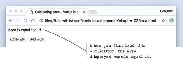
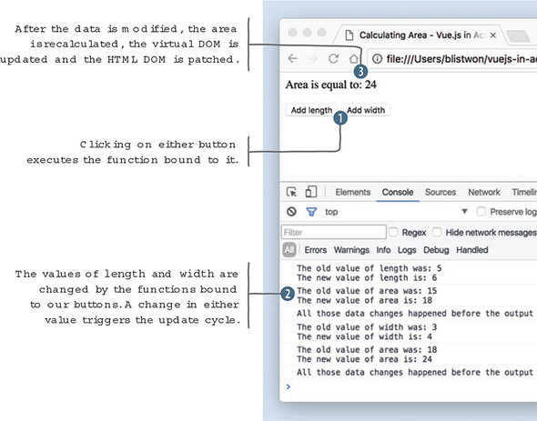
Now that we’ve seen how the application behaves, we can map the data and functions from listing 3.6 onto our diagram of the update cycle in figure 3.9.
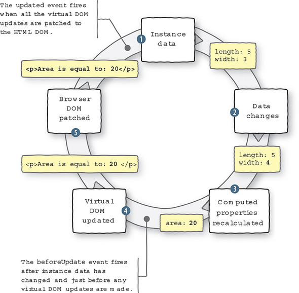
One last thing to note, if you remove the {{ area }} binding from the sample code, and reload the page in your browser, you’ll see a difference in the console output when you click either button (see figure 3.10).
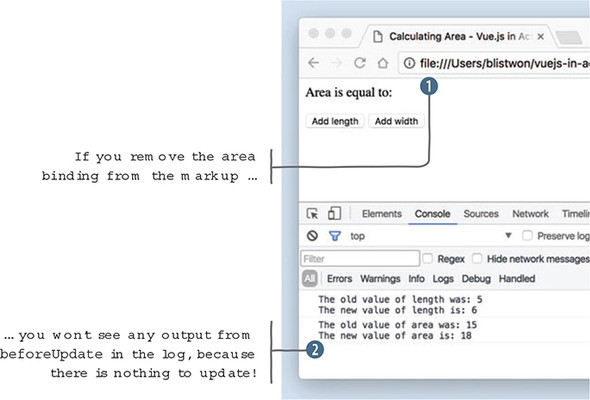
With no outlet for the computed property, there’s nothing to update, and therefore no reason to enter the update cycle. The beforeUpdate function won’t be executed and the corresponding message won’t be logged to the console.
Now that we have a good understanding of computed properties, let’s look at our shopping cart example again. Let’s add a computed property to our Vue instance that will display the number of items in the shopping cart, as shown in the following listing. Don’t forget to add a computed object to the options object, so our function will have a place to live.
computed: {                         1
  cartItemCount: function() {       2
    return this.cart.length || '';  2
  }                                 2
},
This is a straightforward use of a computed property. We use an existing JavaScript property—length—of an array to retrieve our count, because it’s really not necessary to add our own counting mechanism for the shopping cart.
This is also a good example of why it’s inappropriate to store this kind of data as a property of the data object. Because the value of cartItemCount is the result of user interaction, and not something that came from a database, we wouldn’t expect to see it in our data object.
It’s worth noting that there are times when such an item count might be in the data object. For example, if a user was looking at a “previous orders” page, there might be an item count associated with each order. This is consistent with our thinking so far, because that data would come from the database after an order had been processed and persisted.
Function in place, we’re ready to add a little bit of HTML to our application’s header so that we have a shopping cart and a place to display the item count. Update the markup in the header as shown here.
<header>
  <div class="navbar navbar-default">
    <h1>{{ sitename }}</h1>
  </div>
  <div class="nav navbar-nav navbar-right cart">     1
    <span
class="glyphicon glyphicon-shopping-cart">
{{ cartItemCount }}</span>                           2
  </div>
</header>
We add a new div element to the header so we have a place for our cart, and we use the cartItemCount binding to display the value of our computed property. The binding is surrounded by a span element, which is used as a style hook to add a cart icon next to our counter. It’s time to test things out.
After reloading the webstore application in Chrome, clicking Add to cart should cause the indicator to increase with each click. You can double-check that the count is correct by examining the cart array in the console once again (see figure 3.11).
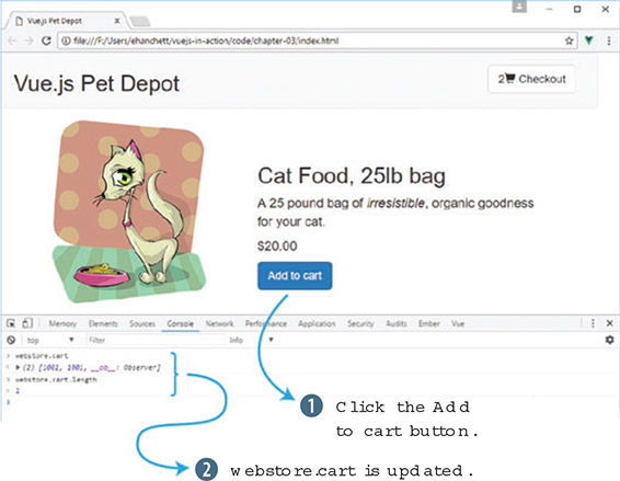
People bring a wide variety of experience and expectation with them when they arrive at a website or use a web application. One of the most fundamental, and deeply ingrained, is that when an interactive element behaves differently than expected, a product can feel broken or disorienting. The idea behind user affordance is to provide visual (or other) cues and feedback to a user that keeps our application consistent with their expectations.
For more information on user affordance and its importance in the experience of digital products, start at the Interaction Design Foundation at http://mng.bz/Xv96.
We now have a button that lets a customer endlessly add a product to their shopping cart. There may be many reasons to limit the number of items a customer can purchase: limited available product, restrictions on per-customer purchases, quantity discounts, and so on. If there’s a limited quantity, then the Add to cart button should become unavailable at some point or otherwise indicate that the action is no longer possible.
To accomplish this task, we need to track our available inventory, compare it against how many instances of a product are in the shopping cart, and act to keep customers from adding more products than there are available. Let’s start with tracking the inventory.
To keep a customer from buying too many of a given product, we’ll need to add a new property to our product object, as shown in the following listing. The availableInventory property will represent how many individual units of a product our store has available.
data: {
  sitename: "Vue.js Pet Depot",
  product: {
    id: 1001
    title: "Cat Food, 25lb bag",
    description: "A 25 pound bag of <em>irresistible</em>,
                  organic goodness for your cat.",
    price: 2000,
    image: "assets/images/product-fullsize.png",
    availableInventory: 5                           1
  }
  cart: []
}
It’s still necessary to double-check product availability when a purchase is being finalized—in case another customer has purchased one or more of the same product in the middle of a transaction—but we can implement a simple solution in our application to greatly reduce the chance a user will be disappointed later by hiding, or disabling, the Add to cart button.
Never rely on values from the client when it comes to transactions, financial or otherwise. The backend of your application should always interpret the incoming data as expressing the user’s intent, not reality.
We don’t want to mutate the availableInventory value, because that represents a fixed value that should be updated only by a process that manages actual inventory (something we’ll come back to much later in the book). But we do want to restrict the amount of product a customer can add to their shopping cart based on the value of availableInventory.
To do this, we need a way to keep track of the number of items in a customer’s shopping cart relative to the fixed amount of product available. We’ll use a computed property to perform this calculation in real-time, as a customer adds items to their shopping cart.
computed: {
  cartItemCount: function() {
    return this.cart.length || '';
  },
  canAddToCart: function() {                                       1
    return this.product.availableInventory > this.cartItemCount;   2
  }
}
Because our code can consume computed properties in the same way as properties of our instance data, we get a chance to leverage one computed property, cartItemCount, within another. Our new computed property checks to see whether the available inventory is greater than the number of items already in the shopping cart. If not, that means the customer has added the maximum number of products to their cart, and we’ll have to act to keep them from adding more.
As you may already be aware, evaluating the truth value of an expression in JavaScript can be a bit tricky. Here’s a quick example you can try in a console for yourself.
When using the non-strict equality operator ==, the integer value 1 compared to the string value "1" evaluates to true. This occurs because JavaScript, attempting to be “helpful,” does a type conversion before the comparison is evaluated. Using the strict equality operator === produces the expected false result.
In our canAddToCart function, we use the greater than operator > to compare two integer values. If we had any doubt about where those values came from, or if they were in fact integers, we could force the conversion using the parseInt method or otherwise ensuring the values are integers.
Much has been written about JavaScript’s type conversions and equality operators, but perhaps the most illuminating reference is this series of diagrams on the topic at https://dorey.github.io/JavaScript-Equality-Table/. Be sure to compare (hah!) the == and === tabs.
Now that we have a mechanism to determine whether a customer can take the Add to cart action, let’s make the interface respond accordingly. The v-show directive renders markup if, and only if, the specified condition evaluates to true. Adding it to our existing button results in the button being hidden from the DOM if our canAddToCart property returns false, shown here.
<button class="default"
    v-on:click="addToCart"
    v-show="canAddToCart"         1
    >Add to cart</button>
If you reload the application in Chrome and try adding six products to your shopping cart, the button should disappear on the fifth click, because that’s the value of availableInventory as seen in figure 3.12.
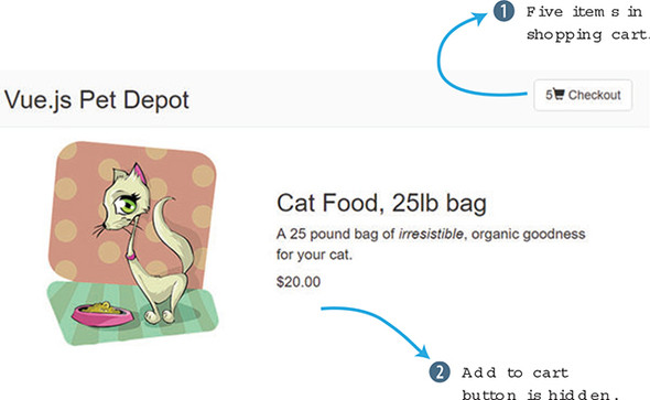
The v-show directive works a bit differently than other directives we’ve encountered so far. When the expression evaluates to false, Vue sets the element’s display CSS property to none as an inline style. This effectively hides the element (and its contents) from view, though it’s still present in the DOM. If the result of the expression later changes to true, the inline style is removed and the element is once again shown to the user.
One side effect of this behavior is that any inline declaration of display you had will be overwritten. But have no fear, Vue will restore the original value when it removes its own display:none. Still, it’s best to avoid inline styles wherever possible in favor of class definitions in your stylesheet.
One other thing to keep in mind is that the v-show directive is most effective when bound to a single element, rather than several adjacent elements. Here’s an example.
// Avoid this
<p v-show="showMe">Some text</p>           1
<p v-show="showMe">Some more text</p>      1
<p v-show="showMe">Even more text</p>      1

// Prefer this
<div v-show="showMe">                      2
  <p>Some text</p>                        2
  <p>Some more text</p>                   2
  <p>Even more text</p>                   2
</div>                                    2
To be clear, it’s okay to use v-show throughout your application wherever you need to. Whenever possible it’s best to aggregate multiple elements that will respond reactively to data, both for better performance and to reduce the chance of forgetting to keep all your elements up-to-date if you make a change. Removing the Add to cart button when inventory is exhausted certainly works, but it’s a bit drastic. Let’s try another way.
Removing the Add to cart button certainly keeps a customer from adding too many product instances to the cart, but it’s a bit heavy-handed. It might be more informative to the user to render the button disabled, because that doesn’t disrupt the continuity of the interface as much and it preserves the layout flow.
The v-if and v-else directives are used to display one of two choices based on the truth value of the provided expression. We’ll use canAddToCart as a condition to evaluate, the way we did in the previous example.
In figure 3.13 you can see how the v-if directive works. If the canAddToCart is true the button appears, if not, the button doesn’t appear.
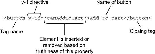
In this listing we can see how this works with our v-if and v-else directives.
<button class="default"         1
    v-on:click="addToCart"      1
    v-if="canAddToCart"         1
    >Add to cart</button>       1

<button class="disabled"        2
    v-else                      2
    >Add to cart</button>       2
When using v-if and v-else together, we need two elements in our markup, one for when the condition is true and one for when it’s false. Additionally, the two elements need to be listed one directly after the other in the markup for Vue to bind to them correctly.
In listing 3.13 we use two different button elements:
This time, when you try out the application in Chrome, the button should switch the active button (figure 3.14) to the disabled button once you’ve added five products to the shopping cart.
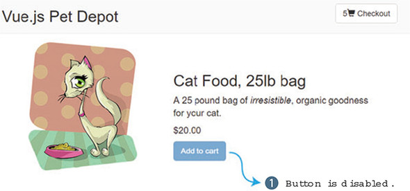
With the v-if and v-else directives, Vue.js removes the element from the DOM (the false condition) and removes it from the other (the true condition). All of this is accomplished as part of a single, simultaneous update to the DOM. Try it out by fiddling with the value of availableInventory in the console and keeping an eye on the display property of these elements.
As with the v-show directive, it’s important to have a single containing element to attach v-if and v-else to, especially with the added criterion that the v-else markup must remain adjacent to the v-if markup, as shown here.
// This won't work
<p v-if="showMe">The if text</p>            1
<p>Some text related to the if text</p>     1
<p v-else>The else text</p>                 1

// Nor will this
<div>                                       2
  <p v-if="showMe">The if text</p>          2
</div>                                      2
<div>                                       2
  <p v-else>The else text</p>               2
</div>                                      2

// Instead, consider grouping
<div v-if="showMe">                         3
  <p>The if text</p>                        3
  <p>Some text related to the if text</p>   3
</div>                                      3
<div v-else>                                3
  <p>The else text</p>                      3
</div>                                      3
Keeping all the DOM elements for a given condition within an outer element—used as a grouping container—is the goal here. Later, we’ll explore different strategies that use templates or components to isolate the markup for conditionals, greatly simplifying the amount of markup needed in the main application itself.
Let’s add a button for the checkout page. We’ll begin by adding a new method and property to our application.
data: {
  showProduct: true,                                        1
...
},
methods: {
...
  showCheckout() {                                          2
       this.showProduct = this.showProduct ? false : true;  3
   },
}
The new showProduct property will toggle the display of the checkout page. Let’s look at that in more detail. The showCheckout method toggles the showProduct property by using something called a ternary operation in JavaScript. The ternary operator is a shortcut for the if statement and takes three parameters. The first parameter is the condition, in this case, this.showProduct. If it resolves to true, it then returns the first expression, false. Otherwise it returns the last expression, true. The ternary conditional operator is a useful tool to have in your back pocket when you need to create a quick conditional statement.
You may have noticed that the method definition was missing the function() declaration after showCheckout(). ES6, also known as ES2015, allows for a shorter syntax for method definitions. We’ll use this syntax for our method definitions throughout the rest of the book.
We now need to add the button to our view and bind it to a click event.
 <div class="nav navbar-nav navbar-right cart">
      <button type="button"
          class="btn btn-default btn-lg"
          v-on:click="showCheckout">                1
        <span
class="glyphicon glyphicon-shopping-cart">
{{ cartItemCount}}</span>
   </span>
     Checkout
      </button>
    </div>
When the button is clicked, the showCheckout method will fire, causing the showProduct method to toggle, or flip, between states. The checkout button is important because we need somewhere to put our checkout information. We’ll look at this more in the next section.
Our application is limited. It only shows one product on one page. To make it more complete we need another page that displays checkout information. We can do this many different ways. In chapter 7, we’ll learn about components which give us a way to easily break down our application into smaller reusable pieces. This could be one way of adding a checkout page.
Another way is to wrap our view in a v-if directive and bind it to the showProduct property we created earlier. We’ll need to add the v-if directive to the top of index file after the main and div elements, as shown in this listing.
<main>
  <div class="row product">
    <div v-if="showProduct">       1
...                                2
    </div>
    <div v-else>
                                   3
    </div>
  </div> <!—end of row-->
</main> <!—end of main-->
Earlier in the chapter, we created a checkout button. When this button is pressed, the showProduct property will toggle, from true to false, or false to true. This will trigger the v-if directive in listing 3.17. Either the product information that we’ve been creating in this chapter will show, or a blank screen will display with only the top navigation at the top (figure 3.15).
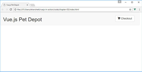
For now, don’t worry about the blank page that we see in figure 3.15. This will be taken care of in the next chapter when we look into different types of input bindings.
Both techniques—v-show and v-if/v-else—have advantages and disadvantages, for a user and for us as developers. As we know, the v-show directive hides or shows an element using CSS, while the v-if/v-else directive removes the content from the DOM. With that said, understanding when to use one or the other depends mostly on what we’re trying to achieve, so perhaps the best way to compare them is to think about a few use cases for each.
The v-show directive is best suited to scenarios where there’s no “else” case. That is, when you have markup to show if a condition is true and no alternative content to show when it’s false. Here are several possible use cases where v-show is the right choice:
The v-if and v-else directives are the right choice when one of two chunks of markup should be rendered, but at least one of them should always be showing. If there’s no fallback (else) case, then v-show is more appropriate. Here are several scenarios where v-if and v-else should be used:
Endless scenarios exist where you’ll need to use one conditional or the other. Perhaps the best way to think about which one fits your needs is to consider whether there’s a fallback, or default, chunk of content you want to display. Next up, we’re going to make our webstore a little more useful to potential customers by offering more than a single bag of cat food.
Use your knowledge from this chapter to answer this question:
See the solution in appendix B.
Our application has evolved substantially since chapter 1. We’ve created items and allowed users to add items to a cart. We now need a way for our customers to check out and enter their information. Let’s add input forms to our application so the customer can enter their address and billing information into the app. Then we need to save this information in our app for later use.
To accomplish our goal, we must bind the form data to our model in our application. The v-model directive was made for this use case.
The v-model directive creates a two-way data binding between form or text area inputs and the template. This assures data in our application model will always be in sync with our UI.
In practice, two-way data binding (figure 4.1) may, or may not, be the best solution. In certain instances, data will never need to change after it’s captured from user input. Other frameworks and libraries such as React and Angular 2 have chosen one-way data bindings by default. Angular 1 started with two-way binding and dropped it for performance management reasons when building Angular 2. One-way data binding occurs when data captured isn’t synced from the model to the view when the input changes. Additional logic needs to be added for the values to change in the model or view. Ember.js decided to stick with two-way data binding by default. With the v-model directive, the data is bound two ways. Regardless, we can specify a property as one-way bound in Vue using the v-once directive.
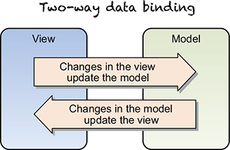
The v-once directive renders an element or component once only. On any additional re-renders, the element or component will be treated as static content and skipped. To learn more about the v-once directive, check out the official API documentation at https://vuejs.org/v2/api/#v-once.
Later in the book we’ll discuss component properties and how they can be passed to other components. These properties form a one-way-down binding between the parent property and the child one. This will become useful in the future.
The v-model directive was made to work with all sorts of form inputs, including text boxes, text areas, check boxes, radio buttons, and select drop-down controls. We’ll need all these elements to build our new checkout form. Let’s look at using the v-model directive and how it works with binding inputs.
Model binding in our applications will help us update data on our user inputs with our template. In our application, we’ve worked primarily with the Vue data object to display static information. Interaction with the application has been limited to a few button-click events. We need to add a way for users to fill in their shipping information at checkout. To keep track of the form inputs, we’ll use the v-model directive and basic input bindings to add more reactivity to the application.
Before we begin, you might be wondering what the differences are between the v-model directive and the v-bind directive that we used in chapter 2. Keep in mind that the v-model directive is used mainly for input and form binding. We’ll use the v-model directive in this chapter to bind our text inputs for our checkout page. The v-bind directive is mostly used to bind HTML attributes. We could use v-bind on an src attribute on an <img> tag or bind it to the class attribute on a <div> tag for example. Both are useful, yet they’re used in different situations. We’ll look at the v-bind directive in more detail later in the chapter.
It’s worth mentioning that the v-model directive uses the v-bind directive behind the scenes. Let’s say you had <input v-model="something">. The v-model directive is syntactic sugar for <input v-bind:"something" v-on: input="something=$event.target.value">. Regardless, using the v-model directive is much easier to type and understand.
In figure 4.2 we see how the v-model directive is broken down. It is added to the input and creates a two-way data bound object.
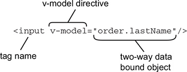
To begin, we’ll need to add new HTML to our application. Open the index.html page that you created in the last two chapters and look for the v-else directive (or you can download the supplied index.html file for chapter 3). Inside this <div> tag we’ll add the HTML code in this chapter. In chapter 7 we’ll discuss a better way of breaking up our application into components. For now, we’ll use the simple v-if directive as a toggle to display our checkout page.
As with the previous chapters, each code snippet is split into its own file. Please combine this with the index.html to create a completed application.
<div class="col-md-6">
  <strong>First Name:</strong>
  <input v-model="order.firstName"        1
    class="form-control"/>
</div>
<div class="col-md-6">
  <strong>Last Name:</strong>
  <input v-model="order.lastName"
   class="form-control"/>  //#A
</div>
<div class="col-md-12 verify">
  <pre>
    First Name: {{order.firstName}}       2
    Last Name:  {{order.lastName}}        2
  </pre>
</div>
The code creates two text boxes for the first and last name and each text box is bound to a property that’s synced in real time. These properties are created in the data object. To make this easier, we’ll use an order property to keep these values saved in our Vue instance data object. This will be added to the index.html file.
In the data object, we’ll need to add our new order property. We need this order property so we can keep track of the first and last names. Add the following code to the existing index.html data object that we used from the previous chapter.
data: {
  sitename: 'Vue.js Pet Depot',
  showProduct: true,
  order: {
    firstName: '',
    lastName: ''
  },
The order object in this listing is in the data object inside the Vue constructor. We can reference this object throughout our code using the double curly brace Mustache syntax {{}} that we learned about in chapter 2. For example, {{order.firstName}} will be replaced by the firstName from the order object. Keeping our order information in an object makes it easier to understand where the data is in the future.
It’s worth mentioning that we could use an empty order object here and not define the properties firstName and lastName explicitly inside it. Vue.js can implicitly add the properties to the object. For the sake of simplicity, and to keep the code base a little cleaner, we’ll add the properties so we can see how everything works.
After typing data into our checkout form, notice that values appear in real time in the box (figure 4.3). This is the beauty of two-way data binding. Values are automatically synced to each other without any other logic needed.
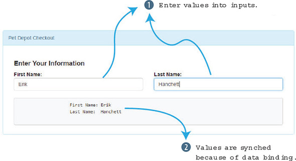
We now have the start of our checkout page. Let’s add more form inputs to our index.html file so our customer can add in their address information, as shown next. We can add this HTML after the HTML code that we added in listing 4.1.
<div class="form-group">
  <div class="col-md-12"><strong>Address:</strong></div>
  <div class="col-md-12">
    <input v-model="order.address"                        1
      class="form-control" />
  </div>
</div>
<div class="form-group">
  <div class="col-md-12"><strong>City:</strong></div>
  <div class="col-md-12">
    <input v-model="order.city"                           1
      class="form-control" />
  </div>
</div>
<div class="form-group">
  <div class="col-md-2">
  <strong>State:</strong>
    <select v-model="order.state"                         2
      class="form-control">
      <option disabled value="">State</option>
      <option>AL</option>
      <option>AR</option>
      <option>CA</option>
      <option>NV</option>
    </select>
  </div>
</div>
<div class="form-group">
  <div class="col-md-6 col-md-offset-4">
  <strong>Zip / Postal Code:</strong>

    <input v-model="order.zip"                            1
      class="form-control"/>
  </div>
</div>
<div class="col-md-12 verify">
  <pre>                                                   3
    First Name: {{order.firstName}}
     Last Name: {{order.lastName}}
       Address: {{order.address}}
          City: {{order.city}}
           Zip: {{order.zip}}
         State: {{order.state}}
  </pre>
</div>
We added our form fields for the address, city, state, and ZIP Code. The address, city, and ZIP Code are all text inputs that use the v-model directive to bind the input. Choosing a state is a little different. Instead of using a text box, we’ll use a select drop-down control. The v-model has been added to the select element.
You might wonder how we can easily add more states to our select drop-down control. For this simple example, hard-coding all four states is fine. But if we were to add all 50 states, we’d probably want to dynamically generate the select box. In the next section, we’ll look at using value bindings to help generate dynamic options.
Before we move on, let’s not forget to add our new properties to the data object in the Vue instance.
data: {
  sitename: "Vue.js Pet Depot",
  showProduct: true,
  order: {
    firstName: '',
    lastName: '',
    address: '',
    city: '',
    zip: '',
    state: ''
  },
As we saw in figure 4.3, if any of these properties are changed within any of the form elements, these values are updated in the <pre> tag at the bottom. Reload the browser and your new form should look like figure 4.4.
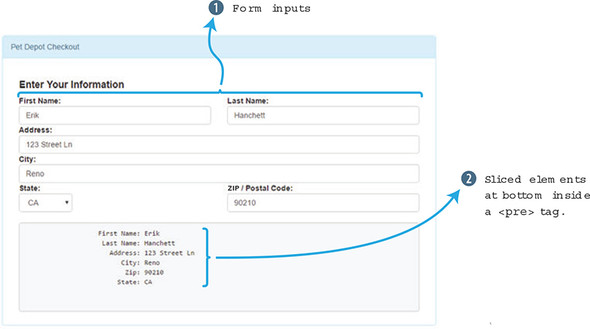
Our form checkout page is looking good, but we need to add in a couple more things. Let’s allow our customer an option to ship items as a gift. To do this, we’ll add a simple check box. If the check box is selected, we’ll ship the items as a gift. If it isn’t, selected items won’t be shipped as a gift. To keep track of the binding we’ll use the order.gift property.
Next up, we need to allow our customer an option to ship to a home or business address. Let’s add a radio button to our code for this purpose. In Vue, we must set the v-model directive in both check boxes to the same value, otherwise the radio buttons won’t update after they’re clicked.
Finally we’ll need to update the <pre> tag with order.method and order.gift, as shown in the following listing. Add this HTML after listing 4.3 in the index.html file.
<div class="form-group">
  <div class="col-md-6 boxes">
    <input type="checkbox"
 id="gift"
 value="true"
 v-model="order.gift">                          1
    <label for="gift">Ship As Gift?</label>
  </div>
</div>
<div class="form-group">
  <div class="col-md-6 boxes">
    <input type="radio"
      id="home"
      value="Home"
      v-model="order.method">                   2
    <label for="home">Home</label>
    <input type="radio"
      id="business"
      value="Business"
      v-model="order.method">                   2
    <label for="business">Business</label>
  </div>
</div>
<div class="col-md-12 verify">
  <pre>                                         3
    First Name: {{order.firstName}}
     Last Name: {{order.lastName}}
       Address: {{order.address}}
          City: {{order.city}}
           Zip: {{order.zip}}
         State: {{order.state}}
       Method: {{order.method}
          Gift: {{order.gift}}
  </pre>
</div>
Let’s add our properties to our data object by adding this code.
data: {
  sitename: "Vue.js Pet Depot",
  showProduct: true,
  order: {
    firstName: '',
    lastName: '',
    address: '',
    city: '',
    zip: '',
    state: '',
    method: 'Home',
    gift: false
  },
You may have noticed that we added default values for both method and gift. The reason behind this is simple. By default, the method radio button is selected, and the check box isn’t selected. Therefore, it would be clever of us to set a default value in this code for now.
One last thing we need to do is add a Place Order (submit) button. For now, we’ll mock out the button so we can use it the future. You have a couple of ways to create a Place Order button. You could attach an action to a form element that encompasses all our inputs. (We’ll look at this more in chapter 6 on Events.) Instead, let’s use the v-on directive that we first learned about in chapter 3. The v-on directive can bind functions to DOM elements in the application. Add it to the click event on the Place Order button. This HTML code can be added after listing 4.5.
<div class="form-group">
  <div class="col-md-6">
    <button type="submit"
      class="btn btn-primary submit"
      v-on:click="submitForm">Place Order</button>       1
  </div>
</div>
In future chapters, we’ll add functionality to our Place Order button. For our purposes now, let’s create a simple function and verify that the button works by adding an alert popup. Add the submitForm function to the method’s object that exists in the index.html file, as shown in this listing.
methods: {
  submitForm() {
    alert('Submitted');
...
  }
},
Inside the Vue constructor is the methods object which holds all our functions that can be triggered in the application. The submitForm function will display an alert popup when triggered. In the browser, click the Place Order button and you’ll see this popup (figure 4.5) that was triggered by the submitForm function.
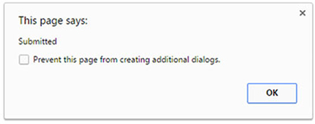
Now that we have the form in place with a Place Order button, it should look like figure 4.6 when it’s all put together.
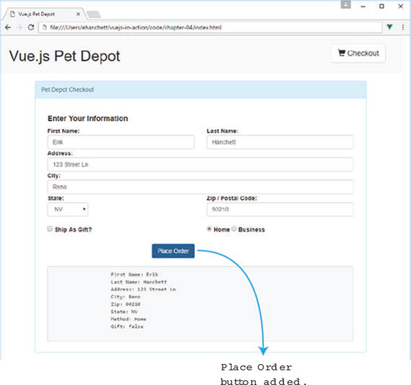
Each property in the form is bound to our Vue.js model! Now let’s see if we can make our input bindings a little better.
The v-model directive has been useful in binding properties for us so far. We’ve used it to bind many basic inputs. We have a problem, though. How do you bind the value for check boxes, radio buttons, and select drop-down controls? If you remember, we hard-coded the values for both check boxes and radio buttons. For our select box control, we left the values blank. All the HTML elements can, and sometimes should, have a value associated with the selected option. Instead of using hard-coded values, let’s rewrite our select box, check box, and radio buttons to use properties from our data object. Let’s begin by updating our check box with values by using the v-bind directive.
In our first example, our check box was bound to the order.gift property. We could set it to be either true or false. With that said, our customers don’t want to see true or false. They’d rather see a message that lets them know if the order will be shipped as a gift. We can add that.
The v-bind directive binds values to attributes in our HTML elements. In this case, we’re binding the true-value attribute to a property. The true-value attribute is unique to the v-bind directive, and it allows us to bind properties based on the check box being checked or not, either true or false. This will change the value of the order.gift. In listing 4.9, the true-value binds to the order.sendGift property. Likewise, the false-value binds to the order.dontSendGift property. When the check box is checked, the order.sendGift message displays. If the check box isn’t checked, the order.dontSendGift property displays. Add this HTML after listing 4.8 in the index.html.
<div class="form-group">
  <div class="col-md-6 boxes">
    <input type="checkbox"
      id="gift" value="true"
      v-bind:true-value="order.sendGift"            1
      v-bind:false-value="order.dontSendGift"       2
      v-model="order.gift">                         3
    <label for="gift">Ship As Gift?</label>
  </div>
</div>
To make this binding work as we expect, we’ll need to add in these new properties to our order object, as shown in the next listing. Update the order object in the index.html values with the sendGift and dontSendGift properties.
order: {
  firstName: '',
  lastName: '',
  address: '',
  city: '',
  zip: '',
  state: '',
  method: 'Business',
  gift: 'Send As A Gift',                  1
  sendGift: 'Send As A Gift',              2
  dontSendGift: 'Do Not Send As A Gift'    3
},
Our data object is getting bigger! We can now assign text values if the check box is checked or not checked. Refresh the page and uncheck the Ship As Gift check box. Look at our box at the bottom (figure 4.7); we’ll see the new values represented in the {{order.gift}} property in the UI.
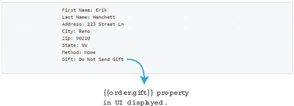
Toggling the check box changes the values from the Do Not Send As A Gift to the Send As A Gift string. Note that because we set the order.gift property value to Send As A Gift, it will default the check box to checked. If needed, we could assign it to the other value. This would cause the check box to display as unchecked.
Like check boxes, we can assign values to radio buttons. We can do this by binding the value directly. This could be a useful feature for our application. Let’s display to the user the home address if the user selects the Home radio button and the business address if the user selects the Business radio button. Add this HTML to the index.html after the previous check box code.
<div class="form-group">
  <div class="col-md-6 boxes">
    <input type="radio"
      id="home"
      v-bind:value="order.home"              1
      v-model="order.method">
    <label for="home">Home</label>
    <input type="radio"
      id="business"
      v-bind:value="order.business"          2
      v-model="order.method">
    <label for="business">Business</label>
  </div>
</div>
The v-bind directive binds order.home to the first radio button and order.business to the second radio button. This can be powerful, because we can dynamically change these values at any time.
To finish this example, let’s add these new properties to the order object in data in the index.html, as shown in the following listing.
order: {
  firstName: '',
  lastName: '',
  address: '',
  city: '',
  zip: '',
  state: '',
  method: 'Home Address',                 1
  business: 'Business Address',           2
  home: 'Home Address',                   3
  gift:'Send As A Gift',
  sendGift: 'Send As A Gift',
  dontSendGift: 'Do Not Send As A Gift'
},
This new order object now has a couple of new properties—home and business—that are bound to the radio buttons. If we select either one, the value at the bottom will toggle between Home Address and Business Address (figure 4.8).
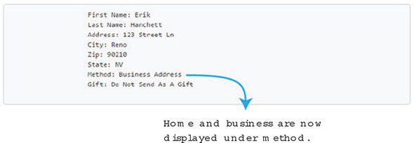
Our customer can see that they have a package being delivered to a business address (Erik Hanchett at 123 Street Ln, Reno, NV) and it won’t be shipped as a gift! Binding properties to any attribute value in our form makes things much cleaner and easier. We now need to look at the US states select box control in the next section.
Our select box control lists US states that our customer can choose from. We need to update the select drop-down control so the state shows in our box when we refresh the page. Let’s look at how we can bind the state values. Replace the state drop-down in the index.html after the city input with the markup shown in the following listing.
<div class="form-group">
  <div class="col-md-2">
    <strong>State:</strong>
    <select v-model="order.state" class="form-control">
      <option disabled value="">State</option>
      <option v-bind:value="states.AL">AL</option>       1
      <option v-bind:value="states.AR">AR</option>       2
      <option v-bind:value="states.CA">CA</option>       3
      <option v-bind:value="states.NV">NV</option>       4
    </select>
  </div>
</div>
As we saw before, the v-bind directive is assigning our value attribute. This time we’ve created a new data property called states. Inside that states property, I’ve listed US states. The states object holds four values. We can access them inside our select box by using the v-bind directive. Update the index.html file and add the states object to the data object.
states: {
  AL: 'Alabama',
  AR: 'Arizona',
  CA: 'California',
  NV: 'Nevada'
},
After everything is updated, we should see these values inside our text box in our template at the bottom of the page (figure 4.9). As you can see, the state is spelled out, making it clear what’s happening.
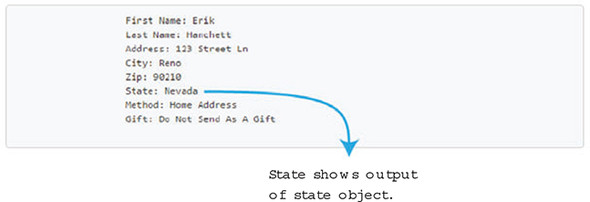
Earlier in this chapter, I mentioned a critical problem with our drop-down. In this example, only four states are listed. As we grow our list of states, we’ll need to create an option> tag for each one. This could be tedious and repetitive. Luckily, Vue has something that can help us with this. It’s called the v-for directive.
The v-for directive makes it easy to loop over values in a list or object, which is perfect for our situation. To make this work, we’ll define all our states in the state object. We’ll then iterate over every state while using the v-bind directive so everything matches. Let’s give it a shot!
Many things are happening here, so I’ll break it down. The v-for directive requires a special syntax in the form of state in states. states is the source data array, while the state is an alias for the array element that is being iterated on. In this case, state is Alabama, Arizona, California, and so on. Replace the state drop-down in the index.html after the city input with the HTML as shown here.
<div class="form-group">
  <div class="col-md-2">
    <strong>State:</strong>
    <select v-model="order.state"
      class="form-control">
      <option disabled value="">State</option>
      <option v-for="(state, key) in states"        1
           v-bind:value="state">                    2
        {{key}}                                     3
      </option>
    </select>
  </div>
</div>
The key value is an optional argument that specifies the index of the current item. This is important in our select drop-down control because our key value can be used as the abbreviated state, while the actual value is the full state name.
The v-bind directive binds the value of state to the value on the <option> tag, as shown in listing 4.16. After replacing this code in your application, peek at the HTML that is generated by opening up your web browser and looking at the source of the index.html. The <option> tag will show every state in the states property.
<option value="Alabama">
    AL
  </option>
  <option value="Alaska">
    AK
  </option>
  <option value="Arizona">
    AR
  </option>
  <option value="California">
    CA
  </option>
  <option value="Nevada">
    NV
  </option>
This is good news for our application. Because we can now bind the values and iterate over them with v-for, we no longer need to hard-code every US state. Our select box can grow dynamically based on how we create the states object.
I mentioned that the key value is optional, so what would a v-for directive look like without the key value? Taking a quick detour and seeing how that works, let’s start from an empty detour.html file and create a brand-new application. Create a Vue constructor and add in a data object with a states array.
<div id="app">
  <ol>
    <li v-for="state in states">             1
      {{state}}
    </li>
  </ol>
</div>
<script src="https://unpkg.com/vue/dist/vue.js"></script>
<script type="text/javascript">
var webstore = new Vue({
  el: '#app',
  data: {
    states: [
      'Alabama',
      'Alaska',
      'Arizona',
      'California',
      'Nevada'
    ]
  }
})
</script>
The states array has five values. Let’s create an ordered list to display each item. We don’t have any keys, so we don’t need to worry about that. To create our list, we’ll use the <ol> and <li> tags. Add these tags to the top of the new detour.html file.
The v-for directive iterates through the states array and displays each state in the list. Keep in mind that state is an alias to the array element being iterated on, whereas states is the array item. It’s easy to get this confused; remember the alias always comes first, then the optional key, then the array or object being iterated on.
When rendered, we’ll see a list of ours states in an ordered numbered list, as follows:
We can now grow our list by adding values to our states object without having to change the template.
You may run into a situation where you need to directly manipulate the DOM, and you may not want to use the v-model directive. In this instance Vue.js offers us $el. You can use $el inside your Vue instance with this.$el. This will be the root DOM element that the Vue instance is managing. From there you can run any type of Document method, like querySelector(), to retrieve any element you’d like. Remember, if you can, try to use the built-in Vue.js directives when working with the DOM. They are there to make your job easier! For more information on $el and other APIs check out the official API documentation at https://vuejs.org/v2/api/.
As mentioned earlier in the chapter, the v-model directive can bind to our input values. These values update with each input event. We can use modifiers with the v-model directive to change that behavior. We can, for example, typecast values to numbers using .number and use .trim with our inputs (for more information about modifiers, go to https://vuejs.org/v2/guide/forms.html#Modifiers). We can also chain modifiers by adding one after the other (for example, v-model.trim.number). Let’s add several of these modifiers to our checkout page on the application.
The .number modifier is used to automatically typecast values in the v-model directive as a number. This will be useful in our ZIP input box (we’ll assume ZIP Codes in our app don’t start with a zero, otherwise the .number modifier removes the leading zero). Let’s update the ZIP Code in the index.html file to use the .number modifier and see what effect it has in the following listing.
<div class="form-group">
  <div class="col-md-6 col-md-offset-4">
    <strong>Zip / Postal Code:</strong>
    <input v-model.number="order.zip"           1
      class="form-control"
      type="number"/>
  </div>
</div>
HTML inputs always return as strings, even if you add in type="number". Adding the .number modifier prevents this behavior and instead returns as a number. To verify this, let’s update the index.html with the typeof operator while displaying the order.zip property in the template.
<div class="col-md-12 verify">
     <pre>
       First Name: {{order.firstName}}
       Last Name: {{order.lastName}}
       Address: {{order.address}}
       City: {{order.city}}
       Zip: {{typeof(order.zip)}}        1
       State: {{order.state}}
       Method: {{order.method}}
       Gift: {{order.gift}}
     </pre>
</div>
Before we added the .number modifier, it would have displayed as a string. Now it returns as a number. Type a number into the ZIP input box and re-render the page to see the new output< as seen in figure 4.10.
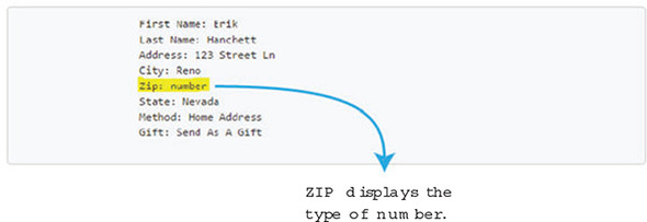
You can see the ZIP column shows number in figure 4.10. Because we wrapped the ZIP Code in the typeof operand, it shows us the type of that property. We’ll be using this feature later; for now we’ll remove the typeof operand so it returns the ZIP Code. Delete the typeof operand from the order.zip property so all that remains is the property {{order.zip}}.
When extracting form information, we often have no use for preceding whitespace or whitespace after the text has been entered. If a user accidentally enters a few spaces before typing their name, we need to remove them. Vue.js gives us a nice modifier to trim the space automatically from our inputs.
In our application, we use input-string text boxes for the first name, last name, address, and city. In the following listing, let’s update the first name and last name in the index.html to see how the .trim modifier works.
<div class="form-group">
  <div class="col-md-6">
    <strong>First Name:</strong>
    <input v-model.trim="order.firstName"       1
      class="form-control" />
  </div>
  <div class="col-md-6">
    <strong>Last Name:</strong>
    <input v-model.trim="order.lastName"        2
      class="form-control" />
  </div>
</div>
To add the .trim modifier all we need to do is add .trim to the end of the v-model directive. This will now trim our whitespace automatically for us! Now we can add it to the address and city inputs in the index.html.
<div class="form-group">
  <div class="col-md-12"><strong>Address:</strong></div>
  <div class="col-md-12">
    <input v-model.trim="order.address"            1
  class="form-control" />
  </div>
</div>
<div class="form-group">
  <div class="col-md-12"><strong>City:</strong></div>
  <div class="col-md-12">
    <input v-model.trim="order.city"               2
       class="form-control" />
  </div>
</div>
If we look at the output at the bottom of the page after browser refresh, we’ll notice that the whitespace is removed (figure 4.11).
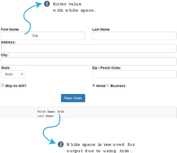
The first name input text box has the name Erik in it with many preceding whitespaces. With that said, the output at the bottom has the trimmed value on display. In fact, if we click outside the box, the value in the first name box syncs to the trimmed value. This is the power of the .trim modifier.
There is one last modifier that is known as the .lazy modifier. As I mentioned earlier, the v-model directive syncs after each input event. In practice, this occurs in a text box after each letter is typed. The value is synced on each keystroke. The .lazy modifier will sync on change events instead. Change events occur in a variety of situations depending on the form element used. A check box or radio button will trigger a change event when it’s clicked. An input text box will trigger a change event when it loses focus. Different browsers might not trigger change events on the same interactions, so keep that in mind.
Typically, a .lazy modifier will look like the following when added to a v-model directive:
<input v-model.lazy="order.firstName" class="form-control" />
Use your knowledge from this chapter to answer these questions:
See the solution in appendix B.
In the previous chapter, we saw the power of the v-model directive and how we can use it to bind inputs to our application. We constructed a checkout page that displayed all the input forms we needed to gather from the user. To display this page, we used a conditional statement.
In chapter 3, we created a checkout button bound to a click event method. This method toggles a property called showProduct. In our template, we used the v-if directive and the v-else directive. If showProduct was true, the product page was displayed; if showProduct was false, the checkout page was displayed. By clicking the checkout button, users can easily switch between these pages. In later chapters, we’ll look at refactoring this code to use components and routes, but for now this will work.
To expand our app, we’ll look at other types of conditionals. For example, we need to add a new feature that displays messages to the user based on available inventory levels. In addition, we need to add more products to our product page. We’ll look at that more closely in section 5.2.
Every time an additional item is added to our shopping cart, the cartItemCount computed property is updated. What if we want to let the user know how many are available? Let’s display a few messages when the available inventory is almost out. We’ll use the v-if, v-else-if, and v-else directives to make this possible.
Before we begin, let’s add more inventory. This will make it easier to display a message to the user as they put more items into their cart. To add inventory, we can update our product property in the data object. Edit the availableInventory product property in index.html. Let’s change it from 5 to 10, as shown in listing 5.1. That should be enough for now.
If you’ve been following along from previous chapters, you should have an index.html file. If not, you can always download the completed chapter 4 index.html file that’s included with this book as a starting point, along with any code snippets and CSS. As always, each listing is broken into its own file. Make sure to add each snippet into index.html as you continue.
product: {
  id: 1001,
  title: "Cat Food, 25lb bag",
  description: "A 25 pound bag of <em>irresistible</em>, organic goodness
 for your cat.",
  price: 2000,
  image: "assets/images/product-fullsize.png",
  availableInventory: 10                           1
},
Now that the inventory has been updated, let’s add a conditional to the template when the available inventory is low. We’ll display a message showing the remaining inventory that the user can add to their cart. In listing 5.2 we can see the new span tag with the v-if directive. A class called inventory-message was also added to this span. This CSS makes the message stand out better and positions it correctly. I’ve added basic formatting to make our message look a little nicer. The v-if directive is flexible. You’ll notice that we aren’t using a specific property the way we did in chapter 3 with showProduct. Instead, we’re using an expression. This is a nice touch that Vue.js allows us to do.
When the Add to cart button is clicked, the checkout number at the top increments. When the inventory reaches fewer than 5 (product.availableInventory – cartItemCount), a message appears that displays the amount of remaining inventory. This count continues to decrement as the button is pressed until the inventory reaches zero.
Locate the addToCart button in our template. Add a new span tag with our v-if directive in the index.html file, as shown here.
<button class="btn btn-primary btn-lg"
  v-on:click="addToCart"
  v-if="canAddToCart">Add to cart</button>
  <button disabled="true" class="btn btn-primary btn-lg"
    v-else >Add to cart</button>
  <span class="inventory-message"                              1
v-if="product.availableInventory - cartItemCount < 5">         2
Only {{product.availableInventory - cartItemCount}} left!
  </span>
Keep in mind the source code, including this app.css file, is available to download for this chapter and all other chapters from Manning at www.manning.com/books/vue-js-in-action.
We could have used a computed property in this v-if directive but for the sake of simplicity, using an expression like this will work. Keep in mind that if your expressions are getting too long inside your template, you’re probably better off using a computed property.
The v-show directive is a close relative of the v-if directive. The use of both is similar: <span v-show="product.availableInventory - cartItemCount < 5">Message</span>. The only real difference is that the v-show directive will always be rendered in the DOM. Vue.js uses a simple toggle in CSS to display the element. If you’re confused about which one to use, use v-if if it’s followed by v-else or v-else-if. Use v-show if it’s more likely to be shown/rendered in most cases or if it’s likely that the visibility of the element will be changed more than once during the lifetime of the page. Otherwise, use v-if.
Let’s look at what we have so far (figure 5.1).
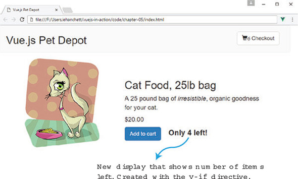
We have a slight problem. When the inventory reaches 0, the message displays “Only 0 left!” Obviously, that doesn’t make sense, so let’s update the code so it outputs a better message when the inventory reaches 0. Add a message that encourages the user to buy now. This time we’ll introduce the v-else-if and v-else directives! Let’s break down what we want to do and how we’ll do it. The v-if directive will display if the inventory count, minus the cart item count, equals zero. If we add all the items to the cart, the product inventory is all gone.
In figure 5.2, we see the completed functionality that shows a message (All Out) when the inventory is sold out.
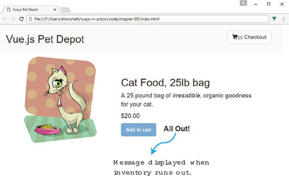
If the product isn’t sold out, we continue to the v-else-if directive. If the available inventory is close to selling out and fewer than five are left, we’ll display a message, as you can see in figure 5.3.
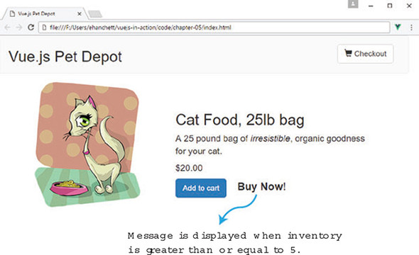
Figure 5.3 shows the Buy Now! message. When you click the Add to cart button, you should see the message change. When the inventory is fewer than 5, you’ll see figure 5.1. After the inventory runs out, you’ll see figure 5.2.
The last else triggers only if both the v-else and v-else-if are false. The v-else directive is a catch-all when everything else falls through. If this occurs, we want a Buy Now message to appear next to the cart button. Update the span tag we added with the following code in the index.html file.
<button class="btn btn-primary btn-lg"
  v-on:click="addToCart"
  v-if="canAddToCart">Add to cart</button>
  <button disabled="true" class="btn btn-primary btn-lg"
  v-else >Add to cart</button>
  <span class="inventory-message"
    v-if="product.availableInventory - cartItemCount === 0">All Out!    1
  </span>
  <span class="inventory-message"
    v-else-if="product.availableInventory - cartItemCount < 5">         2
    Only {{product.availableInventory - cartItemCount}} left!
  </span>
  <span class="inventory-message"
    v-else>Buy Now!                                                     3
  </span>
When working with v-if, v-else, and v-else-if, we must be aware of a few things. Any time you use v-else, it must immediately follow a v-if or v-else-if. You cannot create extra elements in between. Like v-else, a v-else-if must also immediately follow a v-if or v-else-if element. Failure to do this causes the v-else-if or v-else not to be recognized.
Keep in mind that the v-else-if directive can be used more than once in the same block. For example, in our application we could have included multiple messages when the item was close to selling out. This would have been possible with the v-else-if directive.
With all that said, be careful with using too many conditionals and putting too much logic in the template. Instead, use computed properties and methods when needed. This will make your code easier to read and more understandable.
Since we introduced our pet depot store in chapter 2, we’ve been working with only one product. This has worked well up to now with the examples in previous chapters, but once we add more products, we’ll need a way to display them all in our template. In addition, we want to show a simple star rating at the bottom of each product. The versatile v-for directive can handle both scenarios.
Vue.js has the v-for directive to loop through items, as we saw briefly in chapter 4. It’s worth mentioning that we can use it with objects, arrays, or even components. One of the simplest ways of using the v-for directive is by giving it an integer. When added to an element, it will be repeated that many times, which is sometimes referred as a v-for range.
Let’s begin by adding a five-star rating system to our product. To keep it simple, let’s use a span tag and add the v-for directive to it. The v-for syntax is always in the form of item in items. The items refers to the source array data being iterated on. The item is an alias element being iterated on. As you can see in figure 5.4, the v-for directive uses the item as an alias of items. The items is an array.
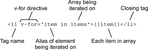
When using v-for ranges, the source data is the upper inclusive limit of the range. This signifies how many times an element will be repeated. In figure 5.5 you can see that n is iterated on five times.
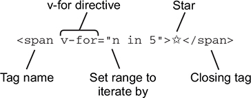
In listing 5.4, we’re going to repeat the  symbol five times. We also add in a div with a class called rating. (Remember to download the ap.css for this book; you’ll find more information in appendix A.) Add this span as shown in the following listing inside the index.html below the inventory messages we added in section 5.1.
<span class="inventory-message" v-else>Buy Now! </span> <div class="rating"> <span v-for="n in 5">
Once we add the stars to the template, refresh your browser. It should look like figure 5.6.
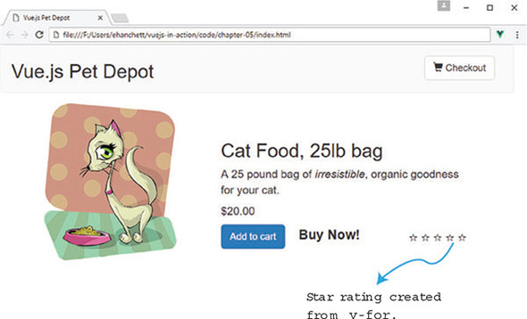
As you can see, there isn’t much to show with our star rating: each star is empty. We’ll need a way to dynamically bind a class to our CSS so we can show a filled-in star.
Vue.js gives us a way to dynamically add or remove classes to HTML elements in our template. We can pass data objects, arrays, expressions, methods, or even computed properties to help determine which classes appear.
Before we can get started, we need to edit the product data object property and add a rating. This rating will determine how many stars each product should display. Open the index.html file and find the product property under order. Add the rating to the bottom of the product property, as shown in the following listing.
product: {
  id: 1001,
  title: "Cat Food, 25lb bag",
  description: "A 25 pound bag of <em>irresistible</em>, organic goodness
for your cat.",
  price: 2000,
  image: "assets/images/product-fullsize.png",
  availableInventory:10,
  rating: 3                 1
},
Next, we need to display the star rating on the screen. The easiest way of doing this is with CSS and a little bit of JavaScript. We’ll add simple CSS that creates a black star when the class is added to our span element. For our example, we’ll need the first three stars to appear black. The last two remaining stars will appear as white. Figure 5.7 is an example of what it should look like when we’re done.
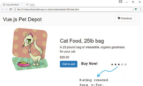
As I mentioned, we can use a method to help determine whether a class should appear. Because we’re using a v-for range, we’ll need to pass in the range to a method. Let’s add a new method that reads the rating from the product and then returns true if the class should be added or not to the span. The class will make the star black.
To make this work, we must pass in a variable n to the method. The passed-in variable n comes from the v-for range directive <span v-for="n in 5"></span>. Although we didn’t display it in our template, n increments from 1 to 5. The first loop’s n is 1, the next loop’s n is 2, and so on. We know that as n loops it will increment from 1, 2, 3, 4, to 5. We can use simple math to determine if the star should be filled in.
In our example the first iteration n should be 1 and this.product.rating will always be 3. 3 – 1 = 2 is greater or equal to 0 so we return true and the class is added. The next iteration n will be 2. 3 – 2 = 1 is greater than or equal to 0 so it evaluates to true again. The next iteration n will be 3. 3 – 3 = 0, so the class is added again. The next iteration n will be 4. 3 – 4 = -1 and therefore the method returns false. It’s that simple. Add a new method called checkRating at the top of the method object in the index.html file, as shown here.
methods: {
  checkRating(n) {
    return this.product.rating - n >= 0;         1
},
To put our new star rating all together, we need to add the v-bind:class syntax to our span element. It will add our new class, rating-active, if the method returns true. Otherwise it will be ignored. In this example, we’re passing an object to the v-bind:class. The truthiness of the checkRating method will determine if the rating-active class is added. Because this is in a loop, we must also pass in the value n, as we discussed before, which iterates with every loop.
Update the rating span in index.html and add the new v-bind:class directive to it, as shown in the next listing. Make sure to add the quotes around rating-active. Otherwise, you’ll get an error in the console.
<span class="inventory-message"
  v-else>Buy Now!
</span>
<div class="rating">
  <span  v-bind:class="{'rating-active': checkRating(n)}"       1
v-for="n in 5">
    </span>
</div>
These are the basics of binding HTML classes. Vue.js allows you to add multiple classes and use arrays and components. For more information on how to bind classes, check out the official Vue.js guides on classes and style bindings at https://vuejs.org/v2/guide/class-and-style.html.
Until now we’ve worked with only one product. A real pet store app would have hundreds if not thousands of products. We won’t go that far! Let’s see what it takes to add in five new products and what we could use to loop through those products on our product page.
To get started, we’ll look at our product object. It’s already taking up space in our index.html file and at this point it will be easier to put it in a separate file.
We need to create a new products.json file and add it to the chapter-05 folder. That way, we can more easily organize our data from our main application. If you want, you can add your own products, the way you did in the data object. But if you don’t want to type all this, you can grab the products.json file from the code that’s included with the book and copy it to the chapter-05 folder. You can find instructions on how to download the code for this book in appendix A. This listing shows the products in the products.json file.
{
  "products":[                                     1
    {
      "id": 1001,                                  2
      "title": "Cat Food, 25lb bag",
      "description": "A 25 pound bag of <em>irresistible</em>, organic
goodness for your cat.",
      "price": 2000,
      "image": "assets/images/product-fullsize.png",
      "availableInventory": 10,
      "rating": 1
    },
    {
      "id": 1002,                                  3
      "title": "Yarn",
      "description": "Yarn your cat can play with for a very
<strong>long</strong> time!",
      "price": 299,
      "image": "assets/images/yarn.jpg",
      "availableInventory": 7,
      "rating": 1
    },
    {
      "id": 1003,                                  4
      "title": "Kitty Litter",
      "description": "Premium kitty litter for your cat.",
      "price": 1100,
      "image": "assets/images/cat-litter.jpg",
      "availableInventory": 99,
      "rating": 4
    },
    {
      "id": 1004,                                  5
      "title": "Cat House",
      "description": "A place for your cat to play!",
      "price": 799,
      "image": "assets/images/cat-house.jpg",
      "availableInventory": 11,
      "rating": 5
    },
    {
      "id": 1005,                                  6
      "title": "Laser Pointer",
      "description": "Drive your cat crazy with this <em>amazing</em>
product.",
      "price": 4999,
      "image": "assets/images/laser-pointer.jpg",
      "availableInventory": 25,
      "rating": 1
    }
  ]
}
After you’ve added or downloaded the products.json file and moved it to the chapter 5 root folder, you’ll need to do additional refactoring. If you’re following along, there’s a good chance you’re loading up everything locally from your hard drive instead of using a web server. This is perfectly fine and works great, except for one thing. Due to security concerns from browser creators, we can’t easily load our products.json file. To do this right, we need to create a web server.
When you run a site using a local web server, it can load JSON files from your hard drive with no problem, and you won’t have any security concerns. In later chapters, we’ll use the Vue CLI. This command-line tool will create a web server for us. Until we get there, we can use an npm module called http-server. You can find instructions on how to install npm in appendix A. This lightweight module makes it a snap to create a simple web server for our app.
We’ll use npm to create a web server. Open a terminal window and run the following command from the command prompt to install the http-server module:
$ npm install http-server -g
After the installation completes, change directories to the chapter 5 folder. Run the command to start a server running your index.html on port 8000:
$ http-server -p 8000
If you receive any errors after running this command, verify that you don’t have any other programs running on port 8000. You may want to try 8001 as the port number instead.
Once it starts, open your favorite web browser and head over to http://localhost:8000 to display your web page. If the page doesn’t display, double-check the command line for errors. You may want to try changing the port if port 8000 is already taken.
Remember in chapter 2 when we learned about Vue.js lifecycle hooks? We need to load our JSON file as soon as the webpage loads. One of those hooks would be perfect in this situation. Do you know which one? If you said the created lifecycle hook you are correct! The created lifecycle hook is called after the instance is created. We can use this hook to load the JSON file. To make this work we’ll need another library.
Axios is a promise-based HTTP client for the browser and Node.js. It has several helpful features such as automatic transforms of JSON data that will come in handy. Let’s add this library to our project. Inside the index.html, add a new script tag for Axios in the head tag, as shown in the following listing.
  <link rel="stylesheet"
href="https://maxcdn.bootstrapcdn.com/bootstrap/3.3.7/css/bootstrap.min.css
" integrity="sha384-
BVYiiSIFeK1dGmJRAkycuHAHRg32OmUcww7on3RYdg4Va+PmSTsz/K68vbdEjh4u"
crossorigin="anonymous">
  <script src="https://cdnjs.cloudflare.com/ajax/libs/axios/0.16.2/axios.js">
</script>                                                                  1
</head>
After this tag is added, we can use Axios in our created lifecycle hook. Insert the created hook in the index.html file right after the filters object. We’ll need to add in code that retrieves the products.json file from the hard drive and overwrites our existing product data. Update the index.html and add the Axios code.
...
},
created: function() {
  axios.get('./products.json')                   1
    .then((response) =>{
      this.products=response.data.products;      2
      console.log(this.products);
  });
},
The axios.get command takes in a location, in our case the local file. It then returns a promise that has a .then method. The promise is fulfilled or rejected and returns a response object. Per Axios documentation, this object has a data property. We copy the response.data.products reference to this.products (this refers to the Vue instance). To make sure everything is okay, we also console-logged the output.
If you look closely at the code in listing 5.10, you may realize that we’re assigning the data from the JSON file to this.products, not this.product. We need to create a new products property on our data object because it helps clean up the code.
Open the index.html file and look for the data object near the middle of the file. Add the new products property and then replace the product property because we no longer need it, as shown in the following listing.
  business: 'Business Address',           1
  home: 'Home Address',
  gift:'',
  sendGift: 'Send As A Gift',
  dontSendGift: 'Do Not Send As A Gift'
},
products: [],                             2
At this point, if you try to refresh your browser you’ll get an error because we removed the product object. We’ll fix that when we add the v-for directive to loop through all the products.
Before we can start looping through our products, we’ll need to make slight changes to the div classes that control our CSS. Because we’re using Bootstrap 3, we want each row to be a product because we must now accommodate more than one product. When we get done, it will look like figure 5.8.
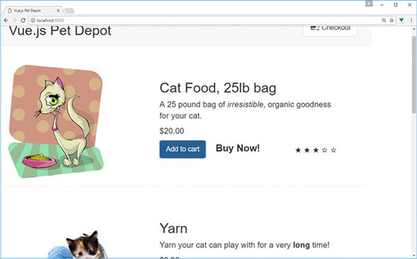
Update index.html and locate the v-else directive that displays the checkout page. Add another div tag for a new row, as shown in the following listing.
<div v-else>
  <div class="row">          1
We’ll need to move the div with the class row that’s right before the showProduct v-if directive. Move the div class to the position below showProduct, as seen in the following listing. Update the index.html so it matches.
<div v-if="showProduct">
  <div class="row product">      1
Now that we have the minor issues with the CSS/HTML resolved, we can add our v-for directive that loops through all the products. This will display all the products on our page. In our example, we’ll use the syntax product in products. products is the object that we loaded earlier; it is now an alias to each individual product in products. We’ll also update the column widths using Bootstrap so that our products are displayed a little nicer.
Inside index.html, add the v-for directive below the showProduct v-if directive. Make sure to end the div tag at the bottom of the page, as shown here.
<div v-if="showProduct">
  <div v-for="product in products">                           1
    <div class="row">
     <div class="col-md-5 col-md-offset-0">                   2
       <figure>
          <img class="product" v-bind:src="product.image">
        </figure>
     </div>
      <div class="col-md-6 col-md-offset-0 description">      3
 ...
    </div><!-- end of row-->
    <hr />                                                    4
  </div><!-- end of v-for-->                                  5
</div><!-- end of showProduct-->
We’ve added the v-for directive but we have a few small problems. The checkRating method and the canAddToCart computed property are still referencing this.product. We need to change this so it references the this.products array instead.
This can be a little tricky. Let’s begin by fixing the checkRating method. This method helps us determine how many stars each product has. We can fix it by passing the product alias into the method. Inside index.html, update the checkRating method, as shown here.
methods: {
  checkRating(n, myProduct) {             1
    return myProduct.rating - n >= 0;
},
We now need to update the template and pass in the product to our updated method. Update the index.html and look for the checkRating method below the inventory messages. Add product to the checkRating method, as shown next.
<span class="inventory-message"
  v-else>Buy Now!
</span>
<div class="rating">
  <span  v-bind:class="{'rating-active': checkRating(n, product)}"   1
    v-for="n in 5" >
  </span>
</div>
If you haven’t done so, grab the pictures from the chapter in the assets/images folder and copy them to your local assets/images folder. Also grab the app.css file, if you haven’t already, and copy it to your assets/css folder.
One of the last things we need to do to finish refactoring our app is to fix the canAddToCart computed property. This property greys out the Add to Cart button after the available inventory exceeds the amount in the cart.
You may be wondering how we can accomplish this. Before, we had only one product, so it was easy to figure out if that product’s inventory had been exceeded. With multiple products, we need to loop through every product in the cart and calculate whether or not we can add another item.
This is easier than you might think. We need to move the canAddToCart computed property and make it a method. Then we need to update the method so it can accept a product. Finally, we’ll update the conditional so it retrieves the count.
To retrieve the count, we’ll use a new method called cartCount that accepts an ID and returns the number of items for that ID. The cartCount method uses a simple for loop to iterate through the cart array. For every match, it increments the count variable. It then returns that variable at the end.
Update index.html with the new canAddToCart method. You can move it from the computed property section to methods. Create a cartCount method as well.
canAddToCart(aProduct) {
  return aProduct.availableInventory > this.cartCount(aProduct.id);  1
},
cartCount(id) {                                                      2
  let count = 0;
  for(var i = 0; i < this.cart.length; i++) {                        3
    if (this.cart[i] === id) {
      count++;
    }
  }
  return count;
}
To complete our updates to canAddToCart, we must update our template and pass the product to it. At the same time, let’s update the addToCart method and make sure it also accepts a product. Update index.html and pass in the product alias to the canAddToCart and addToCart methods.
<button class="btn btn-primary btn-lg"
v-on:click="addToCart(product)"                         1
v-if="canAddToCart(product)">Add to cart</button>       2
This was a simple update to both methods. Because we’ve updated the template to addToCart, we must also update the method to push the ID of the product. For this we’ll use the push mutation method, shown in listing 5.19.
Vue has many mutation methods that you can use with your arrays. Vue, by convention, wraps arrays in observers. When any changes occur to the array, the template is notified and updated. Mutation methods mutate the original array they’re called upon. These mutation methods include push, pop, shift, unshift, splice, sort, and reverse.
Be careful: there are certain changes to arrays that Vue cannot detect. These include directly setting an item, this.cart[index] = newValue and modifying the length, this.item.length = newLength. To learn more about mutations, see the official guide at https://vuejs.org/v2/guide/list.html#Mutation-Methods.
addToCart(aProduct) {
  this.cart.push( aProduct.id );        1
},
Now we can click the Add to cart button without any problems. Every time the button is clicked, the product ID will be pushed into the cart and the cart count will be updated automatically at the top of the screen.
The last step of our refactor is to fix the product inventory messages that we created earlier. The problem is that we’re still using the total cart item count to determine which messages to display. We need to change this code so that we now calculate the message based on the cart item count of only that item.
To fix this issue, let’s change from the cartItemCount method to our new cartCount method, which will accept a product ID. Update the index.html and locate the inventory messages. Update the v-if and v-else-if directives with the new expression that uses cartCount, as shown here.
<span class="inventory-message"
  v-if="product.availableInventory - cartCount(product.id) === 0">      1
All Out!
</span>
<span class="inventory-message"
  v-else-if="product.availableInventory - cartCount(product.id) < 5">   2
  Only {{product.availableInventory - cartCount(product.id)}} left!
</span>
<span class="inventory-message"
  v-else>Buy Now!
</span>
That’s it! We can now load our page and see the results. Make sure that you have the http-server running http-server -p 8000 and reload your web browser. You should see the updated webpage with all the items listed that were pulled from the products.json file. Figure 5.9 shows our completed refactored app using the v-for directive to loop through our products object.
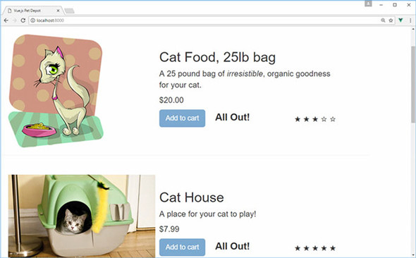
In your browser, make sure that everything works as you expect. Click the Add to cart button and see the messages change. Verify that the button is disabled when the item count reaches zero. Try to change the products.json file and reload the browser. Everything should update accordingly.
Often when working with arrays, or objects in our case, you may want to sort the values when displaying them using the v-for directive. Vue makes this easy to do. In our case, we’ll need to create a computed property that returns our sorted results.
In our app, we load the product list from the JSON file. The order displayed matches the order in the file. Let’s update the sort order so products are listed alphabetically by product title. To do this, we’ll create a new computed property called sortedProducts. We first need to update the template.
Update the index.html file and find the v-for directive in the template that lists our products. Change the v-for to use sortedProducts instead of the products object.
<div v-if="showProduct">
  <div v-for="product in sortedProducts">       1
    <div class="row">
Now that we’ve sortedProducts in place in the template, we need to create the computed property. But we’ve a problem to solve. We’ll need to be aware that the data for this.products may not be available right away because information from the products.json file is loaded from a promise in the create lifecycle hook as the app loads. To make sure this isn’t a problem, we’ll surround our code with an if block that verifies the products exist.
Let’s define our own compare function that will sort on the title, as shown in the following listing. Then we’ll use JavaScript’s array sort, with our passed-in compare function, to alphabetically sort by title.
sortedProducts() {
  if(this.products.length > 0) {
    let productsArray = this.products.slice(0);           1
    function compare(a, b) {                              2
      if(a.title.toLowerCase() < b.title.toLowerCase())
        return -1;
      if(a.title.toLowerCase() > b.title.toLowerCase())
        return 1;
      return 0;
    }
    return productsArray.sort(compare);                   3
  }
}
That should do it. Refresh the browser and you should see an alphabetical list of all the products by title. Figure 5.10 shows the output of our sorted array. If you scroll down, all products should be listed. Double-check to verify that the functionality works as expected.
Use your knowledge from this chapter to answer this question.
See the solution in appendix B.
In the previous chapters, we learned about conditionals, looping, and lists. Instead of repeating code, we used loops to simplify things. We used conditionals to show different messages depending on the user action. This works, but you may have noticed that our application has grown to more than 300 lines of code. The index.html file we’ve been updating every chapter has computed properties, filters, methods, lifecycle hooks, and data properties in it. With all this information, it’s not easy finding things.
To help solve this, we need to separate our code and componentize it. Each part of the code should be reusable and allow properties and events to be passed to it.
Vue.js components can help us accomplish this. Before we begin, let’s look at several of the fundamentals of components and a few examples of how they work. Then we’ll look at local and global registration of components. Afterward, we’ll see a few examples on how to pass props and how to validate them. We’ll end the chapter with defining our templates and custom events.
You maybe be wondering what happened to our pet store application. Don’t worry, we’ll look at this in the next chapter when we look at single-file components, build tools, and Vue-CLI.
Components in Vue.js are a powerful construct that reduce and simplify our code base. Most Vue.js apps consist of one or more components. With components, we can pull out repeated parts of our code and separate them into smaller logical parts that make more sense to us. We can reuse each component throughout our application. Components are defined as a collection of elements that can be accessed through a single element. In certain cases, they can appear as a native HTML element using a special is attribute (we’ll look at that operator later in this chapter).
Figure 6.1 is a simple example of converting a few HTML tags into one component. All of the HTML inside the opening and closing <div> tags are encapsulated in the one component: my-component. It’s worth mentioning that you can also have a self-closing tag, <my-component/> if your web browser supports it or you’re using single-file components that we’ll discuss later in the chapter.
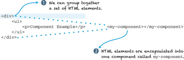
Before we can create our first Vue component we must create a Vue.js root instance, and then we must decide how to structure our application. Vue.js gives us the option to register our components either locally or globally. Global components can be used throughout the application, while local components can only be used in the Vue.js instance that created it. Let’s create a global component first.
Global components, as we mentioned earlier, can be used in all Vue.js instances. In this example, we’re creating a global component called my-component. Vue.js allows much flexibility in naming our components. Keep in mind that Vue.js doesn’t enforce any rules for component names, the way other frameworks do. It’s good practice to name all your components lowercase with hyphens.
To create a global component, we must place it before the Vue instance. As you can see from listing 6.1, the global component (my-component) is defined right before it’s created with new Vue.
To display information in our component, we must add a template property. The template is where the HTML resides. Keep in mind that all templates must be surrounded by a tag. In our example, we’ve surrounded it in a <div> tag; otherwise, you’ll see an error in the console, and the template won’t render on the screen.
The last thing we need to do to get our component to render is to add it to the parent’s template. To get this working, we add the <my-component></mycomponent> custom tag inside the parent entry point of our app, <div id="app">, as shown in the following listing. While going through this chapter, try these examples for yourself. Make sure to save them as a .HTML file and load them in your web browser.
<!DOCTYPE html>
<html>
<head>
<script src="https://unpkg.com/vue"></script>            1
</head>
  <body>
  <div id="app">
    <my-component></my-component>                        2
  </div>
  <script>
  Vue.component('my-component', {                        3
    template: '<div>Hello From Global Component</div>'   4
  });

  new Vue({                                              5
    el: "#app"
  });
  </script>
  </body>
</html>
It goes without saying that our application isn’t too useful. If you open this file in a web browser, you’ll see a message on the page, “Hello From Global Component.” This is a trivial example on how components work so you can understand the fundamentals. Let’s look at local registration and see how that differs.
You have special restrictions when using components in our DOM. Certain HTML tags—<ul>, <ol>, <table>, and <select>—have restrictions on the type of elements that can appear inside them. This is due to how the DOM hoists components out as invalid content. The workaround is to use the is attribute. Instead of putting the component inside those HTML tags, you can add the component to the element itself—for example, <table> <tr is="my-row"></tr></table>. The tr element will now be associated with the my-row component. We can create our own tr component to match whatever functionality we like. This limitation doesn’t apply to inline, x-templates, or .vue components. For more information on this attribute, check out the official guides at http://mng.bz/eqUY.
Local registration restricts scope to only one Vue instance. We can do this by registering it with the component’s instance option. After the component is registered locally, it can only be accessed by the Vue instance that registered it.
In listing 6.2 we see a simple example of a local component. It looks similar to the global component that we registered before. The biggest difference is that we have a new instance option called components.
The components instance option declares all components needed for that Vue instance. Each component is a key-value pair. The key is always the name of the component that you’ll reference later inside the parent template. The value is the component definition. In listing 6.2 the name of the component is my-component. The value is Component. Component is a const variable that defines what’s inside the component.
In the following listing, we name our component my-component and the variable Component. You can name these whatever you like, although, as mentioned earlier, try to name the component using hyphens and lowercase, also known as kebab case. It’s good practice.
<!DOCTYPE html>
<html>
<head>
<script src="https://unpkg.com/vue"></script>
</head>
  <body>
  <div id="app">
    <my-component></my-component>
  </div>
  <script>
      const Component = {                                      1
          template: '<div>Hello From Local Component</div>'    2
      };
      new Vue({
          el: '#app',
          components: {'my-component': Component}              3
      });
  </script>
  </body>
</html>
Load the web page in a browser and you’ll see “Hello From Local Component.” If not, double-check the console for any errors. It’s easy to leave a typo in, forget to surround the template in the <div> tag, or forget to close all your HTML tags.
Although you can name your components whatever you like, there’s one caveat. Inside your HTML templates you must use the kebab case (lowercase with hyphens) equivalent to the name you chose. Let’s say you register your component “myComponent”. When using camelCase, your HTML templates must be in kebab case. Therefore, the component would be named <my-component>. This is also true for PascalCase. If you name your component, MyComponent, then your HTML template must be in kebab case, <my-component> as well. This rule also applies to props, which we’ll learn about later.
Later, when we look at single-file components, this won’t be a problem. Until then, stick with kebab case. You can learn more about camelCase versus kebab case in the official documentation at http://mng.bz/5q9q.
Imagine you’re designing a commenting system. The system should display a list of comments from each user. Each comment needs to contain the username, time and date, and the comment. Each user of our system can delete and edit each of their own comments.
Your first thought might be to use the v-for directive. This worked well in the last chapter when it was used to iterate through our inventory list. That could work, but let’s say our requirements change, and now we need to add a way to show threaded comments, or a new upvote and downvote system is needed. The code will become complicated very quickly.
Components can help solve this problem. In such a relationship, comments will be displayed in a comment-list component. The parent (the Vue.js root instance) is responsible for the rest of the app. The parent also contains a method to retrieve all the comment data from a backend. The parent passes down the data it retrieved to the child component, comment-list. The comment-list component is responsible for displaying all the comments passed down to it.
Keep in mind that each component has its own isolated scope, so it should never access the parent’s data directly. That’s why we always pass that data down. In Vue.js, the data that’s passed down is called props. This is short for properties; but inside Vue.js you must refer to it as props. Child components must explicitly state each prop it expects to receive using the props option. This option will reside in the Vue.js instance and will contain an array in the form like this: props: ['comment']. In this example, 'comment' is a property that will be passed down into the component. If we had multiple props, then we’d separate each with a comma. Props are one-way from the parent component to the child component (figure 6.2).
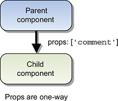
In chapter 4, we discussed how the v-model directive creates a two-way data binding on form inputs and text area elements. Changes to v-model elements update the data properties in the Vue.js instance and vice versa. But components form a one-way data binding. When the parent updates properties, it flows down to the child component and not the other way around. This is an important distinction because it prevents the child from accidentally mutating the parent’s state. If you mutate state, you’ll see an error in your console, like the one in figure 6.3.
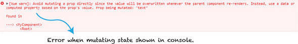
Note that all values are passed by reference. If an object or array is mutated in the child, it will affect the parent state. This isn’t always the desired outcome and should be avoided. Instead you should make the changes in the parent only. Later in this chapter we’ll see how we can use events to update data from the child to the parent.
As mentioned, props are used to pass data from the parent to the child components. Props are intended for one-way communication only. You can think of props as variables the component has that can only be assigned from the parent.
Props also can be validated. We can make sure the values passed in follow a certain type of validation. We’ll look at this too.
The easiest to use type of props are literal props. They’re plain strings that we can pass in to the component. Inside the template, we create the component in the usual manner, but we add our new prop within the angle brackets of our component as an additional attribute, <my-component text="World"></my-component>. This text will be passed down as a string to the text prop we created. The template will interpolate it within the curly braces.
Be aware, this is a common mistake by many beginners: oftentimes, you might want to pass in a real value into the prop, not only a string. You might accidentally pass in a string instead of passing in a value. To pass in a value, you’ll need to make sure you use the v-bind directive as we’ll see in the next section.
In listing 6.3 we see an example of passing in a literal prop. Copy this example into your editor and try it out for yourself. You’ll see that my-component has the passed-in value of "World". You can display that value using the text prop inside the template, as shown here.
<!DOCTYPE html>
<html>
<head>
<script src="https://unpkg.com/vue"></script>
</head>
  <body>
  <div id="app">
    <my-component text="World"></my-component>     1
  </div>
  <script>
  const MyComponent= {
    template:'<div>Hello {{text}}! </div>',        2
    props:['text']
  };
  new Vue({
    el: "#app",
    components: {'my-component': MyComponent}
  });
  </script>
</html>
Dynamic props are props that are passed in from the parent that are bound to a property that can change (unlike literal props, that are static text). We can use the v-bind directive to make sure it’s passed in correctly. Let’s update our example from the previous section and pass in the message to our new prop named text.
The component <my-component v-bind:text="message"></my-component> has a new v-bind directive attribute. This will bind the prop text to our new message. The message is a property from our data function.
If you’ve been following along in previous chapters, you may have noticed that data, in our Vue.js instance, is no longer an object data: { } as you can see in listing 6.4. This is an intentional choice. Components behave a little differently, and data must be represented as a function, not an object.
If I add a data object to my-component, an error displays in the console. To stay consistent, we’ll use data as a function for both our components and the root Vue instance for the rest of the book.
This listing is an example of using dynamic props. Copy this into an editor and try it for yourself.
<!DOCTYPE html>
<html>
<head>
<script src="https://unpkg.com/vue"></script>
</head>
  <body>
  <div id="app">
    <my-component v-bind:text="message"></my-component>     1
  </div>
  <script>
  const MyComponent = {
    template: '<div>Hello {{text}}! </div>',                2
    props: ['text']
  };
  new Vue({
    el: "#app",
    components: {'my-component': MyComponent},
    data() {
      return {
        message: 'From Parent Component!'                   3
      }
    }
  });
  </script>
</html>
Before we move on, let’s imagine that we need to update our program to add three counters. Each counter needs to start at zero and increment independently. Each counter is represented by a button that you can click to increment. How can we do this with components?
Let’s take the code from listing 6.4 and update it. Add a data function to MyComponent and a counter. Your first thought might be to add a global variable. Let’s try that and see what happens.
As you can see from listing 6.5, we added the component three times. We created a global const object called counter, and it’s initialized to zero. In our template, we created a simple binding to the click event using the v-on directive. The counter variable will increment by one on every click.
<!DOCTYPE html>
<html>
<head>
<script src="https://unpkg.com/vue"></script>
</head>
  <body>
  <div id="app">
  <my-component></my-component>                    1
  <my-component></my-component>                    1
  <my-component></my-component>                    1
  </div>
  <script>
  const counter = {counter: 0};                    2
  const MyComponent= {
    template:'<div><button v-on:click="counter +=
 1">{{counter}}</button></div>',                 3
    data() {
      return counter;                              4
    }
  };
// ...
  </script>
</html>
Open your browser to the code you wrote. Click the button on the page a few times and see what occurs (figure 6.4).
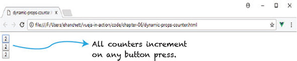
You might be surprised to see that every counter increments when we click any of the buttons. This is certainly not what we want, although it’s a good illustration on how to share scope.
Take the listing from 6.5 and update it so we can correct this problem, as shown in listing 6.6. Remove the const counter and update the data function. Instead of having the data function return the global counter, have it return its own counter. This counter is scoped locally for the component, and therefore isn’t shared with other components.
<!DOCTYPE html>
<html>
<head>
<script src="https://unpkg.com/vue"></script>
</head>
  <body>
  <div id="app">
    <my-component></my-component>
    <my-component></my-component>
    <my-component></my-component>
  </div>
  <script>
  const MyComponent= {
    template: '<div><button v-on:click="counter +=
 1">{{counter}}</button></div>',
    data() {
      return {
        counter: 0                1
      }
    }
  };
// ...
  </script>
</html>
Fire up your browser and open the updated code you wrote. Click a few of the buttons and observe the counter (figure 6.5).
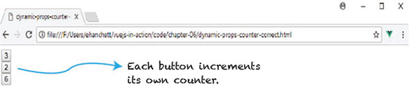
This time things look correct! As we click each button, the counter increments by itself only and doesn’t affect the other counters.
Vue.js has a nice feature called prop validation that ensures that the props that we receive from the parent pass validation. This can be particularly useful when working on a team, where multiple people use the same component.
Let’s begin by checking the type of our props. Vue.js provides the following native constructors to make this possible:
In listing 6.7, you can see the use of prop validation. We’ll first create a component called my-component and pass in values to it. The component will display those values in its template.
Instead of creating a prop array, prop: ['nameofProp'], we create an object. Each object is named after the prop. We then create another object to specify the type; we can add either required or default. Default refers to the default value if no value is passed in to the prop. If the type of property is an object, it must have a default value assigned. The required property, as the name suggests, requires the property to be added to the component during creation in the template.
The last thing you’ll notice from listing 6.7 is the even prop. This is called a custom validator. In this case, we’re checking whether or not the value is even. If it’s even, it’ll return true. If it’s not even, then an error will be shown in the console. Keep in mind that custom validators can perform any type of function you like. The only rule is that they must return true or false.
Keep in mind also that a single colon (:) by itself is shorthand for v-bind. This is similar to the way the at symbol (@) is shorthand for v-on.
<!DOCTYPE html>
<html>
<head>
<script src="https://unpkg.com/vue"></script>
</head>
  <body>
  <div id="app">
    <my-component :num="myNumber" :str="passedString"
           :even="myNumber" :obj="passedObject"></my-component>           1
  </div>
  <script>
  const MyComponent={
    template:'<div>Number: {{num}}<br />String: {{str}} \                 2
              <br />IsEven?: {{even}}<br/>Object: {{obj.message}}</div>',
    props: {
      num: {                                                              3
        type: Number,
        required: true
      },
      str: {                                                              4
        type: String,
        default: "Hello World"
      },
      obj: {                                                              5
        type: Object,
        default: () => {
          return {message: 'Hello from object'}
        }
      },
      even: {                                                             6
        validator: (value) => {
          return (value % 2 === 0)
        }
      }
    }
  };
  new Vue({
    el: '#app',
    components:{'my-component': MyComponent},
    data() {
      return {
        passedString: 'Hello From Parent!',
        myNumber: 43,
        passedObject: {message: 'Passed Object'}
      }
    }

  });
  </script>
  </body>
</html>
Open a browser and run the code in this example. The output is shown in figure 6.6.
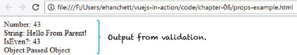
This is what we expect! But is there a problem? If you look at the code, you’ll notice our custom validator checks whether a number is even or odd. If it’s odd, it returns false. Why don’t we see false where it shows IsEven?
In fact, Vue.js does show it as false! But it’s not in the template. By default, prop validations don’t prevent passed-in values from showing up in the template. Vue.js checks the validation and emits warnings in the console. Open the Chrome console and look. Your console should look similar to figure 6.7.
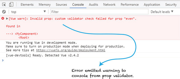
The error shows that our custom validator failed for prop even. This is good to know, and we should change the passed in number to an even number. Keep this type of error in mind while using prop validations.
Until now, we’ve used local and global registration to define our components. Templates in each of our components have been defined as a string. This can be problematic as our components get larger and more complicated. The template strings aren’t the easiest to work with due to different development environments that may cause issues with syntax highlighting. In addition, multiline template strings need escape characters, which clutter our component definition.
Vue.js has multiple ways to display templates that can help fix this. We’ll discuss this and how we can use ES2015 literals to make our component templates easier to use.
One of the simplest ways of working with a template is to use it inline. To make this work, we need to include the template information inside the component when it’s added to the parent template.
In listing 6.8, you can see that we declare the component as <my-component :my-info="message" inline-template> in the template. The inline-template tells Vue to render the contents of the component within the opening and closing of the my-component tag.
One downside of using inline templates is that they separate the template from the rest of the definition of the component. For smaller applications, this will work, although it’s not recommended for use in larger applications. In larger applications, you should look into the single-file components that we’ll discuss in the next chapter.
<!DOCTYPE html>
<html>
<head>
<script src="https://unpkg.com/vue"></script>
</head>
<body>
  <div id="app">
    <my-component :my-info="message" inline-template>         1
      <div>
          <p>
            inline-template - {{myInfo}}                      2
          </p>
      </div>
    </my-component>
  </div>
  <script>
  const MyComponent = {
    props: ['myInfo']
  };

  new Vue({
      el: '#app',
      components: {'my-component': MyComponent},
      data() {
        return {
          message: 'Hello World'
        }
      }
  });
  </script>
</body>
</html>
Another way of defining a template in our component is by using text/x-template script elements. In this case, we create a script tag with the type text/x-template.
In listing 6.9, we use the text/x-template to define the template for my-component. The thing to remember here is that you must define the script as type="text/x-template", otherwise it won’t work.
Once again, we run into the same downside as with the inline templates. The biggest problem is that we’re separating the component definition from the template. This will work, but it’s useful only in smaller applications and not in larger ones.
  <!DOCTYPE html>
  <html>
  <head>
  <script src="https://unpkg.com/vue"></script>
  </head>
  <body>
  <div id="app">
    <my-component></my-component>
  </div>
  <script type="text/x-template" id="my-component">        1
    <p>
      Hello from x-template
    </p>
  </script>
  <script>
  const MyComponent = {
    template: '#my-component'
  };
  new Vue({
    el: '#app',
    components: {'my-component': MyComponent}
  });
  </script>
  </body>
</html>
Earlier in our examples, we used strings to represent our templates in our components. With ES2015 template literals, we can help eliminate several problems we had using strings. In ES2015, if you surround a string with a backtick (`), it becomes a template literal. Template literals can be multiline without having to escape them. They can have embedded expressions in them, too. This makes writing our templates much easier.
With all that said, ES2015 template literals still have several of the same drawbacks as strings. It still looks a little cluttered in your component definition, and certain development environments won’t have syntax highlighting. You have one more option to help fix all these problems: single-file components.
Single-file components combine your template and definitions into one .vue file. Each one has its own scope, and you don’t have to worry about forcing unique names for every component. CSS is also scoped for each component, which is helpful in those larger applications. To top it all off, you no longer have to worry about dealing with string templates or having to work with unusual script tags.
In the following listing, you can see that the HTML is surrounded by the template tag, unlike in our previous examples. The .vue file uses ES2015 export to return the data for the component.
<template>                             1
  <div class="hello">
    {{msg}}
  </div>
</template>

<script>
  export default {                     2
  name: 'hello',
  data () {
    return {
      msg: 'Welcome to Your Vue.js App'
    }
  }
}
</script>

<!-- Add "scoped" attribute to limit CSS to this component only -->
<style scoped>
</style>
To use single-file components, you’ll have to get familiar with several modern build tools. You’ll need to use a tool such as Webpack or Browserify to build the .vue code. Vue.js has made this process easy with its own scaffolding generator called Vue-CLI. It contains all the necessary build tools. We’ll discuss tools in the next chapter. For now, know that there are many ways to work with templates and that single-file components are the way to go for larger applications.
Vue.js has its own event interface. Unlike normal events that we saw in chapter 3, custom events are used when passing events from parent to child components. The event interface can listen to events using the $on(eventname) and trigger events using $emit(eventName). Typically, $on(eventname) is used when sending events between different components that aren’t parent and child. For parent and child events, we must use the v-on directive. We can use this interface so parent components can listen directly to child components.
Imagine you’re creating a counter. You want to have a button on the screen that increments the counter by 1 every time it’s clicked but you’d like to have that button in a child component and the counter in a parent Vue.js instance. You don’t want the counter to mutate inside the child component. Instead, it should notify the parent that the counter should be updated. On every button click, the counter in the parent needs to update. Let’s look at how to do this.
Let’s start by creating a component. When we add it to our template, we’ll need to use the v-on directive and create a custom event. As you can see in listing 6.11, we’ve added the component and created a custom event called increment-me. This custom event is bound to the incrementCounter method that we defined in the parent Vue instance. We’ll also add a normal button that’s bound to the click event that triggers incrementCounter, too. This button resides in the parent’s template.
Inside the definition of our component, we’ll need to add a button. We’ll again use the v-on directive bound to the click event. This triggers the childIncrementCounter method that we defined in the child component.
The childIncrementCounter has only one responsibility, and that’s to emit the custom event we created earlier. This is where it might get confusing. We’ll use this.$emit('increment-me') to trigger the bound event, incrementCounter, defined in the parent methods. We’re triggering the parent Vue.js instance incrementCounter method, which will increment the counter. This is powerful and allows us to modify values in the parent while keeping the one-way data principle intact.
<!DOCTYPE html>
<html>
<head>
<script src="https://unpkg.com/vue"></script>
</head>
  <body>
  <div id="app">
    {{counter}}<br/>
    <button v-on:click="incrementCounter">Increment Counter</button>     1
    <my-component v-on:increment-me="incrementCounter"></my-component>   2
  </div>
  <script>
  const MyComponent = {
    template: `<div>
      <button v-on:click="childIncrementCounter"                         3
        >Increment From Child</button>
    </div>`,
    methods: {
      childIncrementCounter() {
        this.$emit('increment-me');                                      4
      }
    }
  };
  new Vue({
    el: '#app',
    data() {
        return {
            counter: 0
        }
    },
    methods: {
      incrementCounter() {
        this.counter++;                                                  5
      }
    },
    components: {'my-component': MyComponent}
  });
  </script>
  </body>
</html>
If we load the Chrome browser, you’ll see two buttons. Both will increment the counter setup in the parent and be displayed in the component (figure 6.8).
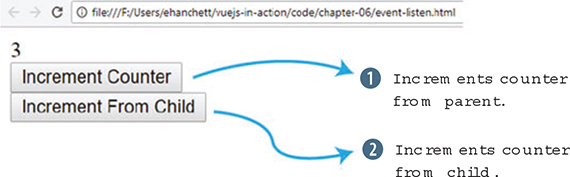
In most situations, we don’t want to have the child component mutate a prop from the parent. We’d rather have the parent do it. This is one of the fundamental rules of the one-way data flow that we mentioned earlier in the chapter. Vue.js allows us to break this rule, though.
The .sync modifier allows us to modify values in a parent component from inside a child component. It was introduced in Vue 1.x and removed from Vue 2.0 but the Vue.js core team decided to reintroduce it in 2.3.0+. With all that said, be cautious when using it.
Let’s create an example that shows how .sync can update a value. Modify the code in listing 6.11 by updating my-component and childIncrementCounter. To begin, we’ll look at the .sync modifier. To use the .sync modifier you can attach it to any prop on the component. In listing 6.12, it’s attached at <my-component :my-counter.sync="counter">. The my-counter prop is bound to counter.
The .sync modifier is syntactic sugar for this <my-component :my-counter="counter" @update:my-counter="val => bar = val"></my-component>. The new event created is called update. That event will take the my-counter prop and assign it to whatever variable is passed in.
To make this work, we still need to emit our new event that was created and pass in the value we want the counter to be updated to. We’ll use this.$emit to do this. The this.myCounter+1 is the first argument that will be passed to the update event.
...
<my-component :my-counter.sync="counter"></my-component>         1
   ...
  const MyComponent = {
    template: `<div>
      <button v-on:click="childIncrementCounter"
>Increment From Child</button>
    </div>`,
    methods: {
      childIncrementCounter() {
        this.$emit('update:myCounter', this.myCounter+1);        2
      }
    },
    props:['my-counter']
If we load the browser, you’ll see two buttons. If we click either one, it updates the counter (figure 6.9).
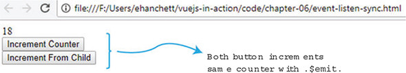
Use your knowledge from this chapter to answer these questions:
See the solution in appendix B.
Now that we’ve looked at components and how they can be used to break applications into smaller parts, let’s look deeper into components and explore more of their advanced features. These features will help us create more dynamic and robust applications.
We’ll look at slots first. Slots interweave the parent’s content with the child components template, making it easier to dynamically update content inside components. Then we’ll move on to dynamic components, which offer the ability to switch out components in real time. This feature makes it easy to change out whole components based on user action. For example, you might be creating an admin panel that displays multiple graphs. You can easily swap out each graph with dynamic components based on user action.
We’ll also look at async components and how to divide an application into smaller chunks. Each chunk will load only when needed—a nice addition when our application grows large and we need to be sensitive to how much data we load when the application starts up.
While we’re here, we’ll look at single-file components and Vue-CLI. With Vue-CLI we can set up and create an application within seconds without having to worry about learning complicated tooling. We’ll take everything we’ve learned from this chapter and refactor our pet store application to take advantage of Vue-CLI!
Finally, we’ll look at routing and how we can use it to create route parameters and child routes. Let’s begin!
When working with components, we occasionally need to weave in parent content with the child content, meaning that you’ll need data passed into your component. Imagine you have a custom form component that you’d like to use on a book-publishing site. Inside the form are two text input elements, named author and title. Preceding each text input element is a label that describes them. Each label’s title is already defined inside the root Vue.js instance data function.
You may have noticed when working with components that you can’t add content in between the opening and closing tags. As you can see in figure 7.1, any content in between the opening and closing tags will be replaced.

The easiest way to make sure content is shown is to use the slot element, as we’ll see next. This can be accomplished with Vue’s slot element, a special tag that Vue.js uses to represent where data that’s added in between the opening and closing tags of a component should be shown. In other JavaScript frameworks, this process is also known as content distribution; in Angular, it’s called transclusion and it’s similar to React’s child components. No matter the name or framework being used, the idea is the same. It’s a way to embed content from the parent to the child without passing it in.
At first, you may think of passing the values down from the root Vue.js instance to the child component. This will work, but let’s see if we run into any limitations. We’ll take each property and pass it down to the component.
Create a new file for this example and create a local component called form-component and a simple form inside it. The goal here is to create two simple props that the component will accept: title and author. In the root Vue.js instance, pass in the props to the component, as you can see in listing 7.1. This is similar to the prop passing we learned in chapter 6.
For the next few examples we’ll create smaller standalone examples. Feel free to copy, or type, this into your text editor and follow along.
<!DOCTYPE html>
<html>
<head>
<script src="https://unpkg.com/vue"></script>
</head>
<body>
  <div id="app">
    <form-component
      :author="authorLabel"                       1
      :title="titleLabel">                        2
    </form-component>
  </div>
<script>
const FormComponent ={
  template: `
  <div>
    <form>
      <label for="title">{{title}}</label>        3
         <input id="title" type="text" /><br/>
      <label for="author">{{author}}</label>      4
         <input id="author" type="text" /><br/>
      <button>Submit</button>
    </form>
  </div>

  `,
  props: ['title', 'author']
}
new Vue({
  el: '#app',
  components: {'form-component': FormComponent},
  data() {
    return {
        titleLabel: 'The Title:',
        authorLabel: 'The Author:'
    }
  }

})
</script>
</body>
</html>
As I mentioned, the code will work, but as the form scales, we’ll need to deal with passing in several attributes. What if we added in ISBN, date, and year to the form? We need to add more props and more attributes to the component. This can become tedious and means many properties to keep track of, which can lead to errors in your code.
Instead, let’s rewrite this example to use slots. To begin, add text that can be displayed at the top of the form. Instead of passing the value in as props, we’ll use a slot to display it. We won’t need to pass everything into the component as a property. We can display whatever we want directly inside the opening and closing brackets of the component. When the form is completed, it should look like figure 7.2.
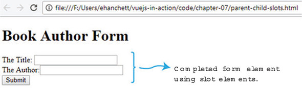
Copy and paste listing 7.1 into a file and change the data function and add a new property called header. (Remember you can always download the code for this book at my GitHub at https://github.com/ErikCH/VuejsInActionCode.) As you can see in figure 7.2, we’ll add a new header property that displays the Book Author Form. Next, find the opening and closing form-component that’s declared in the parent’s Vue.js instance. Add the header property in between those tags. Finally, we need to update the form-component itself. Immediately after the first <form>, add the <slot></slot> elements. This tells Vue to add whatever is in between the opening and closing tags of the form-component. To run this example, update the code from listing 7.1 with the new updates in this listing.
...
<body>
  <div id="app">
    <form-component
      :author="authorLabel"
      :title="titleLabel">
      <h1>{{header}}</h1>                        1
    </form-component>
  </div>
<script>
const FormComponent ={
  template: `
  <div>
    <form>
      <slot></slot>                              2
      <label for="title">{{title}}</label>
    <input id="title" type="text" /><br/>
      <label for="author">{{author}}</label>
         <input id="author" type="text" /><br/>
      <button>Submit</button>
    </form>
  </div>

  `,
  props: ['title', 'author']
}
new Vue({
  el: '#app',
  components: {'form-component': FormComponent},
  data() {
    return {
        titleLabel: 'The Title:',
        authorLabel: 'The Author:',
        header: 'Book Author Form'               3
    }
  }

})
</script>
</body>
</html>
As of now, we’ve added only one slot element to our component. But, as you may have guessed, this isn’t too flexible. What if we had multiple props we wanted to pass in to a component and each prop needed to be displayed at different locations? Once again, passing in every single prop can be tedious, so what if we decided to use slots instead? Is there a way to do it?
This is where named slots come in. Named slots are like normal slots except they can be specifically placed inside a component. And unlike unnamed slots, we can have multiple named slots in our components. We can place these named slots anywhere in our components. Let’s add two named slots to our example app. To add them, we need to define exactly where we want them added in our child component. In listing 7.3 we’ll add two named slots—titleSlot and authorSlot—to the form-component.
We’ll begin by replacing the form-components template with the new slot names. To do this, we must add a new named-slot element into the HTML. Take the completed code listing from 7.2 and move the label elements from the form-component to the parent’s template as seen in listing 7.3. Make sure to change the name of the property in the label from title to titleLabel and from author to authorLabel.
Next, add two new slot elements. Each will replace the label in the form component’s template. It should look like this: <slot name="titleSlot"></slot> and <slot name="authorSlot"></slot>.
Inside the parent’s template, update the label we moved over and add a new attribute called slot to it. Each label should have a slot attribute like this: <label for="title" slot="titleSlot">. This tells Vue.js to make sure that the contents of this label are added to the corresponding named slot. Because we’re no longer using the passed-in props, we can delete them from the form component. This is the completed code listing.
<!DOCTYPE html>
<html>
<head>
<script src="https://unpkg.com/vue"></script>
</head>
<body>
  <div id="app">
    <form-component>
      <h1>{{header}}</h1>
      <label for="title" slot="titleSlot">{{titleLabel}}</label>       1
      <label for="author" slot="authorSlot">{{authorLabel}}</label>    2
    </form-component>
  </div>
<script>
const FormComponent ={
  template: `
  <div>
    <form>
      <slot></slot>
      <slot name="titleSlot"></slot>                                   3
         <input id="title" type="text" /><br/>
      <slot name="authorSlot"></slot>                                  4
         <input id="author" type="text" /><br/>
      <button>Submit</button>
    </form>
  </div>

  `
}
new Vue({
  el: '#app',
  components: {'form-component': FormComponent},
  data() {
    return {
        titleLabel: 'The Title:',
        authorLabel: 'The Author:',
        header: 'Book Author Form'
    }
  }

})
</script>
</body>
</html>
The named slots make it much easier to insert elements from the parent into the child component in various places. As we can see, the code is a little shorter and cleaner. In addition, there are no more props passing, and we no longer have to bind attributes when declaring the form-component. As you design more complicated applications, this will come in handy.
In listing 7.3 we added a data property from the root Vue.js instance within the opening and closing tags of our form component. Keep in mind that the child component doesn’t have access to this element because it was added from the parent. It’s easy to accidentally mistake the correct scope for elements when using slots. Remember that everything in the parent template is compiled in the parent’s scope. Everything compiled in the child template is compiled in the child scope. This is good to memorize because you might run into these problems in the future.
Scoped slots are like named slots except they’re more like reusable templates that you can pass data to. To do this, they use a special template element with a special attribute called slot-scope.
The slot-scope attribute is a temporary variable that holds properties that are passed in from the component. Instead of passing values into a child component, we can pass values from the child component back to the parent.
To illustrate this, imagine you have a web page that lists books. Each book has an author and title. We want to create a book component that holds the look and feel of the page, but we want to style each book that’s listed inside the parent. In this case, we’ll need to pass the book list from the child back to the parent. When all is said and done, it should look like figure 7.3.
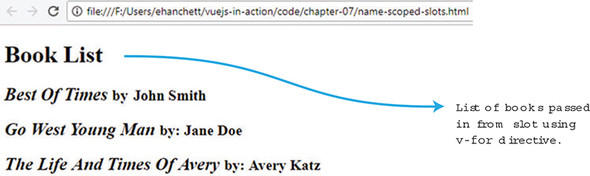
This is a bit of a contrived example, but it shows the power of scoped slots and how we can easily pass data back and forth from child components. To create this app, we’ll create a new book component. Inside the component we’ll display a header using a named slot, and we’ll create another named slot for each book. As you can see in listing 7.4, we’ll add a v-for directive that will loop through all the books and bind values to each one.
The books array is created in the root Vue.js instance. It’s basically an array of objects, each having a title and author. We can pass that books array into the book-component using the v-bind directive :books.
Inside the parent’s template we’ve add the new <template> element. We must also add the slot-scope attribute to the template tag for this to work. The slot-scope attribute binds the passed-in value from the child component. In this case, {{props.text}} is equal to {{book}} from the child component.
Inside the template tags, we can now access the {{props.text}} as if it were {{books}}. In other words, {{props.text.title}} is the same as {{book .title}}. We’ll add special styling to each title and author to make it stand out.
Open your code editor and try to copy the code yourself from listing 7.4. What you’ll see is that we took the books array and passed it into the book component. We then displayed each book in a slot that got passed into a template that the parent displayed to the user.
<!DOCTYPE html>
<html>
<head>
<script src="https://unpkg.com/vue"></script>
</head>
<body>
  <div id="app">
    <book-component :books="books">                               1
      <h1 slot="header">{{header}}</h1>                           2
      <template slot="book" slot-scope="props">                   3
        <h2>
          <i>{{props.text.title}}</i>                             4
          <small>by: {{props.text.author}}</small>
        </h2>
      </template>
    </book-component>
  </div>
<script>
const BookComponent ={
  template: `
  <div>
      <slot name="header"></slot>
      <slot name="book"                                           5
        v-for="book in books"
        :text="book">                                             6
      </slot>
  </div>
  `,
  props: ['books']
}
new Vue({
  el: '#app',
  components: {'book-component': BookComponent},
  data() {
    return {
      header: 'Book List',
      books: [{author: 'John Smith', title: 'Best Of Times' },    7
              {author: 'Jane Doe', title: 'Go West Young Man' },
              {author: 'Avery Katz', title: 'The Life And Times Of Avery' }
             ]
    }
  }

})
</script>
</body>
</html>
This might be a little confusing at first, but using scoped slots is powerful. We can take values from our component and display them in our parent to do special styling. As you’re dealing with more complicated components with lists of data, this is a nice tool to have.
Another powerful feature of Vue.js is dynamic components. This feature lets us dynamically change between multiple components using the reserved <component> element and the is attribute.
Inside our data function, we can create a property that will determine which component will display. Then, inside our template, we need to add the component element with the is attribute which points to the data property we created. Let’s look at a practical example.
Imagine that we’re creating an app with three different components. We need to add a button so we can cycle through each one. One component will list our books, another will list a form to add books, and the last will display header information. When we get it all done, it should look like figure 7.4.
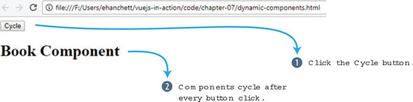
Clicking the Cycle button displays the next component. The Cycle button triggers simple JavaScript that rotates through the book component to the form component then to the header component.
Open your text editor and create a new Vue.js application. Instead of creating one component, we’ll create three. In each template, we’ll display text letting the user know which component is activated. You can see an example of this in listing 7.5.
The data function will have one property called currentView. This property will point to the BookComponent at the start of the application. Next, create a method called cycle. This will update the currentView property on every click so it cycles through all the components.
As a final step, in the root Vue.js instance we’ll add our button, with a click event attached like this: <button @click="cycle">Cycle</button>. Under the button we’ll add an <h1> tag with our new component element. The component element will have one attribute, is, which will point to currentView. This is how you can dynamically change the component. The currentView property will update on every button click. To run this example, create a dynamic-components.html file. Add in this code.
<!DOCTYPE html>
<html>
<head>
<script src="https://unpkg.com/vue"></script>
</head>
<body>
  <div id="app">
    <button @click="cycle">Cycle</button>                   1
    <h1>
      <component :is="currentView"></component>             2
    </h1>
  </div>
<script>
const BookComponent ={
  template: `
  <div>
    Book Component
  </div>
  `
}

const FormComponent = {
  template: `
  <div>
    Form Component
  </div>
  `
}

const HeaderComponent = {
  template: `
  <div>
    Header Component
  </div>
  `
}

new Vue({
  el: '#app',
  components: {'book-component': BookComponent,             3
               'form-component': FormComponent,
               'header-component': HeaderComponent},
  data() {
    return {
      currentView: BookComponent                            4
    }

  },
  methods: {
        cycle() {                                           5
          if(this.currentView === HeaderComponent)
            this.currentView = BookComponent
          else
            this.currentView = this.currentView === BookComponent ?
            FormComponent : HeaderComponent;
        }
    }

})
</script>
</body>
</html>
You’ve learned how you can use one button to cycle through three different components. It’s also possible to do this example using multiple v-if and v-else directives but this is much easier to understand and works better.
When working with larger applications, there might be times when we need to divide the app into smaller components and load only parts of the app when needed. Vue makes this easy with asynchronous components. Each component can be defined as a function that asynchronously resolves the component. Furthermore, Vue.js will cache the results for future re-renders.
Let’s set up a simple example and simulate a server load. Going back to our book example, let’s say we’re loading a book list from a backend, and that backend takes a second to respond. Let’s resolve this using Vue.js. Figure 7.5 is how it will look when we’re all done.
The function has a resolve and reject callback and we must set up our component to handle the situations. Create an app and new book component, as seen in listing 7.6.
This simple component displays text on the screen after it resolves. We’ll create a timeout so it will take 1 second. The timeout is used to simulate network latency.
The most important thing to do when creating an async component is to define it as a function with a resolve and reject callback. You can trigger different actions to occur, depending on whether the callback is resolved or rejected.
To run this example, create a file called async-componets.html. Copy the code in the following listing to see it in action. You should see a simple asynchronous component. We’re simulating a server that takes 1 second to respond. We could have also created a reject as well that would have resolved if the call failed.
<!DOCTYPE html>
<html>
<head>
<script src="https://unpkg.com/vue"></script>
</head>
<body>
  <div id="app">
    <book-component></book-component>                   1
  </div>
<script>

const BookComponent = function(resolve, reject) {       2
  setTimeout(function() {                               3
    resolve({
      template: `
      <div>
        <h1>
          Async Component
        </h1>
      </div>
      `
    });

  },1000);

}

new Vue({
  el: '#app',
  components: {'book-component': BookComponent }

})
</script>
</body>
</html>
Since Vue 2.3.0, you can now create more advanced async components. In these components, you can set up loading components that will display when the component is loaded. You can set error components and set timeouts. If you’d like to learn more about these components, check out the official guides at http://mng.bz/thlA.
Until now, we’ve built our applications using one file. This has proved challenging because our pet store application has grown. One thing that would make our code base cleaner is to break the application into separate components.
As we saw in chapter 6, there are many ways to break up our application. One of the most powerful ways is using single-file components, which have many advantages over the other ways of creating components. The most important advantages are component-scoped CSS, syntax highlighting, ease of reuse, and ES6 modules.
Component-scoped CSS lets us scope CSS per component. This can help us easily make specific styles for each component. Syntax highlighting is improved because we no longer have to worry about our IDE not recognizing our component’s template text since it no longer has to be assigned to a variable or property. ES6 modules make it easier to pull in our favorite third-party libraries. Each has advantages that make writing Vue.js applications a little easier.
To take full advantage of single-file components, we’ll need to use a build tool such as Webpack that helps bundle all our modules and dependencies. In addition, we can use tools such as Babel to transpile our JavaScript so we can ensure that it’s compatible with every browser. We could try to do this all ourselves, but Vue.js has given us Vue-CLI to make this process much easier.
Vue-CLI is a scaffolding tool to help jumpstart your Vue.js applications. It comes with all the glue needed to get started. The CLI has a number of official templates, so you can start your application with the tools you prefer. (You can learn more about Vue-CLI from the official GitHub page at https://vuejs.org/v2/guide/installation.html.) The following is a list of the most common templates:
To create an application, you’ll need to install Node and Git, and then install Vue-CLI. (If you haven’t done this yet, please refer to appendix A for more information.)
As of this writing Vue-CLI 3.0 is still in beta. This chapter was written with the latest version of Vue-CLI, 2.9.2. If you’re using Vue-CLI 3.0, several of these options will be different. Instead of creating the application with vue init, you’ll use vue create <project name>. It will then ask you a new set of questions. You can either select a set of default presets or the features you want from a list. These include TypeScript, Router, Vuex, and CSS pre-processors, to name a few. If you’re following along, make sure to select the same options as you see in listing 7.7. You can then skip ahead to section 7.6.2. For more information on Vue-CLI 3.0, check out the official readme at https://github.com/vuejs/vue-cli/blob/dev/docs/README.md.
Let’s create an application using Vue-CLI for our pet store. Open your terminal and type in vue init webpack petstore. This command tells Vue-CLI to create an application using the Webpack template.
As of this writing the latest Vue-CLI version is 2.9.2. If you’re using a later version don’t worry, the questions should be similar and self-explanatory. If you run into any issues, follow the official guides on the installation and use of Vue-CLI at https://vuejs.org/v2/guide/installation.html - CLI.
After you run the command, you’re prompted with a few questions. The first asks for a name, then a description and author. Type in the name as petstore and put in any description and author you like. The next few questions prompt you whether to run Vue.js with a runtime only or runtime and compiler. I recommend running with the runtime and compiler together. This makes it easier when we’re creating our templates; otherwise all templates are allowed in only .vue files.
The next question asks about installing the vue-router. Type yes. After this, it asks if you want to use ESLint. This is a linting library that will check your code on every save. For our purposes, we’ll say no here because this isn’t important to our project. The last two questions are about testing. In later chapters, I’ll show you how to create test cases using the vue-test-utils library, but for now you can answer yes to both. Follow along with the this listing and create a new Vue-CLI application for our pet store app.
$ vue init webpack petstore                         1
? Project name petstore
? Project description Petstore application for book
? Author Erik Hanchett <erikhanchettblog@gmail.com>
? Vue build standalone
? Install vue-router? Yes
? Use ESLint to lint your code? No
? Setup unit tests with Karma + Mocha? Yes
? Setup e2e tests with Nightwatch? Yes

   vue-cli · Generated "petstore".                  2

   To get started:

     cd petstore
     npm install
     npm run dev

   Documentation can be found at https://vuejs-templates.github.io/webpack
After the application is created and the template is downloaded, you need to install all the dependencies. Change directories to petstore and run npm install, or YARN, to install all the dependencies by running the following commands at the prompt:
$ cd petstore
$ npm install
This will install all the dependencies for your application. This could take several minutes. After all the dependencies are installed, you should now be able to run the server with the following command:
$ npm run dev
Open your web browser and navigate to localhost:8080, where you should see the Welcome to Your Vue.js App window as seen in figure 7.6. (While the server is running, any changes will be hot reloaded in your browser.) If the server doesn’t start, make sure another application isn’t running on the default 8080 port.
We’re now ready to move to our pet store application.
Vue-CLI comes with an advanced routing library called vue-router, the official router for Vue.js. It supports all sorts of features, including route parameters, query parameters, and wildcards. In addition, it has HTML5 history mode and hash mode with auto-fallback for Internet Explorer 9. You should have the ability to create any route you need with it and not have to worry about browser compatibility.
For our pet store app, we’ll create two routes called Main and Form. The Main route will display the list of products from our products.json file. The Form route will be our checkout page.
Inside the app we created, open the src/router/index.js file and look for the routes array. You may see the default Hello route in it; feel free to delete this. Update the routes array so it matches listing 7.8. Every object in the array has at a minimum a path and a component. The path is the URL that you’ll need to navigate to inside the browser to visit the route. The component is the name of the component we’ll use for that route.
Optionally we can also add a name property. This name represents the route. We’ll use the route name later. Props is another optional property. This tells Vue.js if the component should expect props being sent to it.
After updating the array make sure to import the Form and Main components into the router. Any time we refer to a component, you must import it. By default, Vue-CLI uses the ES6 import style. If the components aren’t imported, you’ll see an error in the console.
Finally, by default the vue-router uses hashes when routing. When navigating to form in the browser, Vue will construct the URL as #/form instead of /form. We can turn this off by adding mode: 'history' to the router.
import Vue from 'vue'
import Router from 'vue-router'
import Form from '@/components/Form'        1
import Main from '@/components/Main'

Vue.use(Router)

export default new Router({
  mode: 'history',                          2
  routes: [
    {
      path: '/',
      name: 'iMain',                        3
      component: Main,
      props: true
    },
    {
      path: '/form',
      name: 'Form',                         4
      component: Form,
      props: true
    }

  ]
})
It’s a good idea to start any new application with your routes first. It gives you a good indication on how you want to construct the app.
Our pet store app uses a handful of different libraries that we need to add to our CLI project. We can handle this in different ways.
One way is to use a Vue.js-specific library. As Vue has grown, so has the ecosystem. New Vue.js-specific libraries are popping up all the time. For example, BootstrapVue, is a Vue.js-specific library to add Bootstrap to our project. Vuetify is a popular material-design library. We’ll be looking at several of these libraries in the future, but not right now.
Another common way of adding libraries is to include them in the index file. This is useful when there isn’t a Vue.js-specific library available.
To get started, open the index.html file in the root folder of our pet store application. To stay consistent with our original application from chapter 5, we’ll add a link to Bootstrap 3 and Axios CDN in this file, as shown in the following listing. By adding these libraries in this file, we now have access to it throughout the application.
<!DOCTYPE html>
<html>
  <head>
    <meta charset="utf-8">
    <script
src="https://cdnjs.cloudflare.com/ajax/libs/axios/0.16.2/axios.js">    1

</script>

    <title>Vue.js Pet Depot</title>
    <link rel="stylesheet"
href="https://maxcdn.bootstrapcdn.com/bootstrap/3.3.7/css/bootstrap
 .min.css" crossorigin="anonymous">                                  2

  </head>
  <body>
    <div id="app"></div>
    <!-- built files will be auto injected -->
  </body>
</html>
We have a few ways we can add in the CSS. As we’ll see later, one way to add CSS is to scope it to each component. This is a helpful feature if we have specific CSS we want to use for a component.
We can also specify CSS that will be used throughout the site. To keep things simple, let’s add our CSS to our pet store app so it can be accessed by all components inside it. (Later, we’ll look at using scoped CSS.)
Open the src/main.js file. This is where the root Vue.js instance lives. From here we can import the CSS we’d like to use for our application. Because we’re using Webpack we’ll need to use the require keyword with the relative path to the asset.
For more information on how Webpack and assets work, check out the documentation at https://vuejs-templates.github.io/webpack/static.html.
Copy the app.css file into the src/assets folder, as shown in the next listing. You can find a copy of the app.css with the included code for the book in the appendix A.
import Vue from 'vue'
import App from './App'
import router from './router'
require('./assets/app.css')             1

Vue.config.productionTip = false

/* eslint-disable no-new */
new Vue({
  el: '#app',
  router,
  template: '<App/>',
  components: { App }
})
After the CSS is added to the application, every component will use it.
As we discussed previously, components make it easy to break our application into smaller reusable parts. Let’s break our pet store app into a few smaller pieces so we can more easily work with our application. For the pet store we’ll have a Main, Form, and Header. The Header component will display our site name and navigation, Main will list all our products, and Form will display the checkout form.
Before we begin, delete the HelloWorld.vue file in the src/components folder. We won’t use this. Create a file called Header.vue in this folder instead. This file is where we’ll put in our header information.
Most .vue files follow a simple pattern. The top of the file is usually where the template resides. The template is surrounded by an opening and closing template tag. As we’ve seen before, you must also include a root element after the template tag. I usually put a <div> tag in but a <header> tag will work too. Keep in mind a template can only have one root element.
After the template is a <script> tag. This is where we’ll create our Vue instance. After the <script> tag is a <style> tag, which is where we can optionally put in our CSS code and scope it to the component. (You’ll see this in listing 7.12.)
Go ahead and copy the code from listing 7.11 for the template. This code is similar to the code in chapter 5 for the header. You’ll notice that we have a new element in the template called router-link, which is a part of the vue-router library. The router-link element creates internal links in our Vue.js application between routes. The <router-link> tag has an attribute called to. We can bind that attribute to one of our named routes. Let’s bind it to the Main route.
<template>
<header>
  <div class="navbar navbar-default">
    <div class="navbar-header">
      <h1><router-link :to="{name: 'iMain'}">          1
           {{ sitename }}
               </router-link>
                 </h1>
    </div>
    <div class="nav navbar-nav navbar-right cart">
      <button type="button"
class="btn btn-default btn-lg"
v-on:click="showCheckout">
        <span class="glyphicon glyphicon-shopping-cart">
                {{cartItemCount}}</span> Checkout
      </button>
    </div>
  </div>
</header>
</template>
Next, we need to create the logic for this component. We’ll copy and paste from our previous pet store application into the Header.vue file. We’ll need to make a few changes though. When we last updated the pet store application in chapter 5, we used a v-if directive to determine whether or not to display the checkout page. We created a method that toggled showProduct when the Checkout button was clicked.
Let’s replace that logic so that instead of toggling showProduct we switch to the Form route we created earlier. As you can see in listing 7.14, this is done with this.$router.push. Similar to the router-link, we need to provide the router with the name of the route we want to navigate to. For this reason, we’ll have the Checkout button navigate to the Form route.
Because we changed the sitename variable to a link using router-link, it now looks a little different than it did before. We should update the CSS for our new anchor tag by putting it in the <style> section. Because we added the keyword scoped to it, Vue.js will make sure the CSS will be scoped for this component only.
Also, you may notice from listing 7.12 that we’re no longer using the Vue.js instance initializer that we used in previous chapters. The CLI doesn’t require it. Instead we use a simpler syntax, the ES6 module default export (export default { }). Put all your Vue.js code in here.
In our CSS, we’ll turn off text decorations and set the color to black. Combine listings 7.11 and 7.12 into one file.
<script>
export default {
  name: 'my-header',
  data () {
    return {
    sitename: "Vue.js Pet Depot",
    }
  },
  props: ['cartItemCount'],
  methods: {
    showCheckout() {
      this.$router.push({name: 'Form'});                             1
    }

  }
}
</script>

<!-- Add "scoped" attribute to limit CSS to this component only -->
<style scoped>                                                       2
a {
  text-decoration: none;
  color: black;
}
</style>
From there you should be all set with this component. You may have also noticed that our header accepts a prop called cartItemCount. Our main component will pass this information in, as we’ll see when we create the Main component. The cartItemCount will keep track of how many items we’ve added to our cart.
The Form component is where the checkout page resides. It will remain close to what we created in chapter 5. The biggest difference is that we’re now referencing the new my-header component at the top of the template. We’ll also pass in the cartItemCount into the header.
Create a component in the src/components folder and call it Form.vue. As you can see in listing 7.13, the HTML code in the template is almost exactly what we saw in chapter 5. The only change is that we’ve added a new component at the top for the header. I won’t copy it all here, so I suggest that you download the code for chapter 07 (download instructions are in appendix A).
<template>
  <div>
  <my-header :cartItemCount="cartItemCount"></my-header>      1
    <div class="row">
      <div class="col-md-10 col-md-offset-1">
        ...


      </div><!--end of col-md-10 col-md-offset-1-->
    </div><!--end of row-->
  </div>
</template>
The script code for this component resembles that from chapter 5. One difference is that now it accepts a prop called cartItemCount. In addition, we must define the Header component so it can be used in the template, as shown in this listing.
<script>
import MyHeader from './Header.vue';        1
export default {
  name: 'Form',
  props: ['cartItemCount'],                 2
  data () {
    return {
      states: {
...
      },
      order: {
           ...
      }

    }
  },
  components: { MyHeader },
  methods: {
    submitForm() {
      alert('Submitted');
    }
  }
}
</script>
Combine listings 7.13 and 7.14 and you should be all set. In later chapters we’ll add more logic for inputs, but for now this will work.
The Main component of the pet store application will display all our products. It’s where we’ll add products to our cart and see the star ratings. We’ve already written all the logic for this, so the only thing we really need to do is get it into one .vue file.
As with the Form component, we’ll add the my-header component to the top of the file and pass in the cartItemCount to it. Create a file called Main.vue in the src/components folder. Add the following code into it.
<template>
  <div>
  <my-header :cartItemCount="cartItemCount"></my-header>       1
  <main>
  <div v-for="product in sortedProducts">
    <div class="row">
      <div class="col-md-5 col-md-offset-0">
        <figure>
          <img class="product" v-bind:src="product.image" >
        </figure>
      </div>
      <div class="col-md-6 col-md-offset-0 description">
        <h1 v-text="product.title"></h1>
        <p v-html="product.description"></p>
        <p class="price">
        {{product.price | formatPrice}}
        </p>
        <button class=" btn btn-primary btn-lg"
                v-on:click="addToCart(product)"
                v-if="canAddToCart(product)">Add to cart</button>
        <button disabled="true" class=" btn btn-primary btn-lg"
                                v-else >Add to cart</button>
        <span class="inventory-message"
         v-if="product.availableInventory - cartCount(product.id)
          === 0"> All Out!
        </span>
        <span class="inventory-message"
        v-else-if="product.availableInventory - cartCount(product.id) < 5">
          Only {{product.availableInventory - cartCount(product.id)}} left!
        </span>
        <span class="inventory-message"
              v-else>Buy Now!
        </span>
        <div class="rating">
          <span  v-bind:class="{'rating-active' :checkRating(n, product)}"
             v-for="n in 5" >
          </span>
        </div>
      </div><!-- end of col-md-6-->
    </div><!-- end of row-->
    <hr />
  </div><!-- end of v-for-->
  </main>
  </div>
</template>
After you add the template, we’ll need to add the Vue.js code. Add a new MyHeader import statement at the top of the file, as seen in listing 7.16. You’ll also need to declare the component by referencing components: { MyHeader } after the data function.
Before we add the rest of the code, make sure to copy the image folder and the products.json files into the petstore/static folder. You can find these files and the code for chapter 7 at https://github.com/ErikCH/VuejsInActionCode.
When using the CLI, we can store files in two places—either the assets folder or the static folder. Asset files are processed by Webpack’s url-loader and file-loader. The assets are inlined/copied/renamed during the build, so they’re essentially the same as the source code. Whenever you reference files in the assets folder, you do so by using relative paths. The ./assets/logo.png file could be the location of the logo in the assets folder.
Static files aren’t processed by Webpack at all; they’re directly copied to their final destination as is. When referencing these files, you must do so using absolute paths. Because we’re loading all our files using a products.json file, it’s easier to copy the files to a static folder and reference them from there.
Go ahead and update the Main.vue file in the src/components folder. (Filters and methods are excluded in listing 7.16.) Grab the Vue.js instance data, methods, filters, and lifecycle hooks from the pet store application and add it to the Main.vue file below the template.
<script>
import MyHeader from './Header.vue'             1
export default {
  name: 'imain',
  data () {
    return {
      products: {},
      cart: []
    }
  },
  components: { MyHeader },
  methods: {
    ...

  },
  filters: {
    ...

  },
  created: function() {
    axios.get('/static/products.json')           2
    .then((response) =>{
      this.products=response.data.products;
      console.log(this.products);
    });
  }
}
</script>
After copying the file, delete the styles and logo.png <img> tag in the App.vue file. If you like, you can also delete the logo.png file in the assets folder. Make sure to restart the Vue-CLI server by running npm run dev, if you haven’t already. You should see the pet store application launch, where you can navigate to the checkout page by clicking the Checkout button (figure 7.7). If you receive any errors, double-check the console. For example, if you forgot to import the Axios library inside index.html as we did in listing 7.9, you’ll get an error.
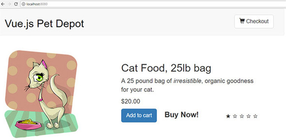
Now that we have our app using Vue-CLI, let’s take a deeper look at routing. Earlier in the chapter, we set up a couple of routes. In this section, we’ll add a couple more.
In any single-page application such as Vue.js, routing helps with the navigation of the app. In the pet store, we have a Form route. When you load the application and go to /form, the route is loaded. Unlike traditional web apps, data doesn’t have to be sent from the server for the route to load. When the URL changes, the Vue router intercepts the request and displays the appropriate route. This is an important concept because it allows us to create all the routing on the client side instead of having to rely on the server.
Inside this section, we’ll look at how to create child routes, use parameters to pass information between routes, and how to set up redirection and wildcards. We aren’t going to cover everything, so if you need more information, please check out the official Vue router documentation at https://router.vuejs.org/en/.
In our application, we have only two routes, Main and Form. Let’s add another route for our product. Let’s imagine we’ve been given a new requirement for our pet store app. We’ve been told to add a product description page This can be achieved with dynamic route matching, using route parameters. Parameters are dynamic values sent inside the URL. After we add the new product description route, you’ll look up a product page using the URL, as shown in figure 7.8. Notice how the URL at the top is product/1001? This is the dynamic route.
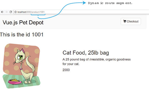
We designate dynamic routes with a colon (:)inside the router file. This tells Vue.js to match any route after /product to the Product component. In other words, both routes /product/1001 and /product/1002 would be handled by the Product component. The 1001 and 1002 will be passed into the component as a parameter with the name id.
Inside the pet store app, look for the src/router folder. The index.js file has our existing routes. Copy the snippet of code from the following listing and add it to the routes array in the src/router/index.js file. Make sure to import the Product component at the top. We’ll create that next.
import Product from '@/components/Product'
...
    },
    {
        path: '/product/:id',         1
        name: 'Id',
        component: Product,
        props: true
    }
...
We have a dynamic segment with a parameter named id. We set the name of the route to Id so we can easily look it up later using the router-link component. As mentioned, let’s create a Product component.
Inside the Product component is a single product that we’ll retrieve from the route params. Our purpose is to display that product information inside the component.
Inside the product template, we’ll have access to the $route.params.id. This will display the id passed into the parameter. We’ll display the id at the top of the component to verify that it was passed in correctly.
Copy the following code into a new file at src/components/Product.vue. This is the top of the file for the component.
<template>
  <div>
    <my-header></my-header>
    <h1> This is the id {{ $route.params.id}}</h1>            1
    <div class="row">
      <div class="col-md-5 col-md-offset-0">
        <figure>
          <img class="product" v-bind:src="product.image" >
        </figure>
      </div>
      <div class="col-md-6 col-md-offset-0 description">
        <h1>{{product.title}}</h1>
        <p v-html="product.description"></p>
        <p class="price">
          {{product.price }}
        </p>
      </div>
    </div>
  </div>
  </template>
...
The template was straightforward but the bottom of the component, where the logic and script live, is a little more complex. To load the correct product for the template, we need to find the correct product using the id that was passed in.
Luckily, with simple JavaScript we can do exactly that. We’ll use the Axios library again to access the products.json flat file. This time we’ll use the JavaScript filter function to return only the products whose ID matches this.$route.params.id. The filter should return only one value because all the IDs are unique. If for any reason this doesn’t occur, double-check the products.json flat file and make sure each ID is unique.
Last, we’ll need to add a fo/’ character in front of the this.product.image that’s returned from our flat file (listing 7.19). This needs to be done because we’re using dynamic route matching and relative paths to files can cause problems.
Copy the code in this listing and add it to the bottom of the src/components/Product.vue file. Make sure that the code from both listings 7.18 and 7.19 are present in the file.
...
  <script>
  import MyHeader from './Header.vue'                     1
  export default {
    components: { MyHeader },
    data() {
    return {
      product: ''
    }
  },
  created: function() {
    axios.get('/static/products.json')                    2
    .then((response) =>{
      this.product = response.data.products.filter(       3
          data => data.id == this.$route.params.id)[0]    4
      this.product.image = '/' + this.product.image;      5
    });
  }
}
</script>
With the product component in place, we can now save the file and open our web browser. We don’t have a way to access the route directly yet, but we can type the URL inside the browser at http://localhost:8080/product/1001. This will display the first product.
If the route doesn’t load, open the console and look for any errors. Make sure you saved the data inside the router file; otherwise, the route won’t load. It’s also easy to forget to add the ‘/’ in front of this.product.image.
Routes can be useless unless we add links to them inside our app. Otherwise, our users would have to memorize each URL. With Vue router, we can make routing to a path easy. One of the easiest ways, which we saw earlier in the chapter, is using the router-link component. You can define the route you want to navigate to by using the :to property. This can be bound to a specific path or object that defines the name of the route to navigate to. For example, <router-link :to="{ name: 'Id' }">Product</router-link> will route to the named route Id. In our app, it’s the Product component.
The router-link component has a few other tricks up its sleeve. This component has many additional props that add more functionality. In this section, we’ll focus on the active-class and tag props.
Let’s imagine we’ve been given another requirement for our pet store app. We want the Checkout button to appear like it’s been clicked when the user navigates to the Form route. When the user leaves the route, the button must return to its normal state. We can do this by adding a class named active to the button when the route is activated and remove the class when the user is not on the route. We also need to add a way for the user to click the title of any product and have it route to the product description page.
When all is done, our app will appear like figure 7.9 after the user clicks the Checkout button. Notice the button’s appearance when the user is on the checkout page.
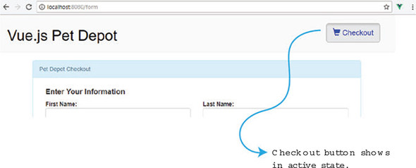
Let’s add the link to our new product page. Open the src/Main.vue file and look for the h1 tag that displays {{product.title}}. Delete it and add a new router-link. Inside the router-link, add a tag prop. The tag prop is used to convert the router-link to the tag listed. In this case, the router-link will display as an h1 tag in the browser.
The to prop is used to denote the target route of the link. It has an optional descriptor object that we can pass to it. To send a param, use the params: {id: product.id} syntax. This tells Vue router to send the product.id as the id to the dynamic segment. For example, if the product.id was 1005, the route would be /product/1005.
Open the src/Main.vue file and update the component with the code in the following listing. Notice how the :to has two different props, name and params. You can separate each prop with a comma.
...
<div class="col-md-6 col-md-offset-0 description">
  <router-link                                             1
 tag="h1"                                                  2
        :to="{ name : 'Id', params: {id: product.id}}">    3
        {{product.title}}                                  4
  </router-link>
  <p v-html="product.description"></p>
...
Save and open the browser after running the command, npm run dev. You can now click the title of any product to navigate to the Product component. The id param will be sent to the Product route and used to display the product.
Query parameters are another way we can send information between routes. Parameters are appended to the end of the URL. Instead of using a dynamic route segment, we could send the product ID using a query parameter. To add a query parameter with Vue router, all you need to do is add a query prop to the descriptor object like this:
<router-link  tag="h1":to=" {name : 'Id', query:
 {Id: '123'}}">{{product.title}}</router-link>
Multiple query parameters can be added, but each one must be separated by a comma; for example, {Id: '123', info: 'erik'}. This will show up in the URL as ?id=123&info=erik. You can access queries inside the template with $route.query.info. If you want more information on query parameters, check out the official documentation at https://router.vuejs.org/en/api/router-link.
One of our requirements is to find a way to activate the Checkout button after the user navigates to the Form route. The active-class prop makes this easy. When the route is active, the router-link will automatically add whatever value we assign to active-class to the tag. Because we’re using Bootstrap, the class name active will make the button look like it’s been activated.
Open the src/components/Header.vue file and update the button element for {{cartItemCount}}. Delete the existing button and add the router-link instead, as in this listing. You can also delete the showCheckout method because it will no longer be needed.
...
<div class="nav navbar-nav navbar-right cart">
    <router-link                                          1
active-class="active"                                     2
tag="button"                                              3
class="btn btn-default btn-lg"                            4
:to="{name: 'Form'}">                                     5
        <span
            class="glyphicon glyphicon-shopping-cart">
            {{ cartItemCount}}
     </span> Checkout
...
Save the changes to the header component and navigate the app. If you open the browser console, you’ll see how the active class is added to the checkout button inside the header after each time it’s clicked. When you navigate to the Main route again, the active class is removed. The active class is added to the button only if the route is active. When the user navigates away from the Form route, the active class is removed.
As of Vue 2.5.0+, a new CSS class was added whenever the user changes route. This is called the router-link-exact-active class. We can use this class out of the box and define functionality. Let’s say we wanted to change the link to the color blue whenever the class was active.
Inside the src/components/Header.vue, add a new CSS selector at the bottom: copy the snippet from this listing. This class will be added to only the router-link element when the route is active.
...
.router-link-exact-active {          1
  color: blue;
}
...
Save the file and try navigating around in the browser. You’ll notice that the Checkout button text in the header changes to blue when the route is active. For the rest of this book, we’ll change this CSS selector to black, because blue doesn’t look as nice as black. It’s nice knowing it’s there if we need it.
The new Id route displays each individual product, but let’s suppose we need to add a way to edit each product. Let’s add another route that will display inside the Product route that’s triggered whenever the user clicks the Edit Product button.
For the sake of simplicity, we won’t implement the edit functionality. With our current implementation, there’s no way we can save changes to our static file. Rather, we’ll focus on how to add a child route and save the implementation of changing the product for the future.
Child routes are nested routes. They’re perfect for situations where you need to edit or delete information within a current route. You can access these routes by adding a router-view component within the parent route, as we’ll see.
When we have everything wired together, the new Edit route should look like figure 7.10. Take notice of the URL, product/1001/Edit.
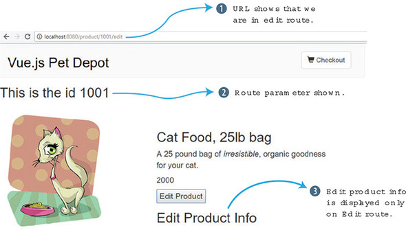
Let’s begin by adding a new component. Inside the src/components folder, add a new file and call it EditProduct.vue. Copy this listing and add it to the src/components/EditProduct.vue file.
<template>
  <div>
    <h1> Edit Product Info</h1>
  </div>
</template>
<script>
    export default {
        //future           1
    }
   </script>
Inside the Product component, add a router-view component. This component is internal to Vue router and is used for the endpoint for new routes. When this route is activated, the EditProduct component will display inside where the router-view component is located.
Copy the code snippet in the following listing and edit the src/components/Product.vue file to add a new button at the bottom and the router-view component. The button will trigger the new edit method. This pushes the Edit route and activates it.
...
  </p>
  <button @click="edit">Edit Product</button>    1
  <router-view></router-view>                    2
</div>
...
methods: {
    edit() {
      this.$router.push({name: 'Edit'})          3
    }
},
Now we have everything in place to update the router file. Add a new array called children inside the Id route. Inside the children array, we’ll add the Edit route and the component EditProduct.
Take the code from the next listing and update the src/router/index.js file. Update the Id route and add the new children array. Make sure to also import the EditProduct component at the top.
import EditProduct from '@/components/EditProduct'
import Product from '@/components/Product'
...
{
    path: '/product/:id',
    name: 'Id',
    component: Product,
    props: true,
    children: [               1
      {
        path: 'edit',
        name: 'Edit',
        component: EditProduct,
        props: true
      }
    ]
},
...
Save the index.js file and check out the new route in your browser. Click the Edit Product button and you should see the Edit Product Info message. If the route isn’t loading, double-check for errors in the console and verify the index.js file again.
The last features of Vue router I want to cover are redirection and wildcard routes. Let’s imagine we’re given one final requirement for our pet store app. We need to make sure that if anyone accidentally enters the wrong URL, it routes them back to the main page. This is done with wildcard routes and redirection.
When creating a route, we can use a wildcard, also known as the * symbol, to catch any routes that aren’t already covered by the other routes. This route must be added at the bottom of all the other routes.
The redirect option redirects the browser to another route. Go ahead and edit the src/routes/index.js file. At the bottom of the route, add this snippet of code.
...
{
  path: '*',          1
  redirect:"/"        2
}
...
Save the file and try to browse to /anything or /testthis. Both URLs will route you back to the main “/” route.
Navigation guards, as the name suggests, guard navigation by redirecting or canceling routes. This might be particularly helpful if you’re trying to validate a user before letting them enter a route. One way to use navigation guards is to add a beforeEnter guard directly in the route configuration object. It might look like this:
beforeEnter (to, from, next) => { next() }
You can also add a beforeEnter(to, from, next) hook inside any component. This is loaded before the route loads. The next() tells the route to continue. A next(false) will stop the route from loading. If you’d like more information, see the official documentation at https://router.vuejs.org/guide/advanced/navigation-guards.html.
For reference, this listing shows the full src/routes/index.js file.
import Vue from 'vue'
import Router from 'vue-router'
import Form from '@/components/Form'
import Main from '@/components/Main'
import Product from '@/components/Product'
import EditProduct from '@/components/EditProduct'
Vue.use(Router)

export default new Router({
  mode: 'history',
  routes: [
    {
      path: '/',
      name: 'iMain',
      component: Main,
      props: true,
    },
    {
        path: '/product/:id',        1
        name: 'Id',
        component: Product,
        props: true,
        children: [                  2
          {
            path: 'edit',
            name: 'Edit',
            component: EditProduct,
            props: true
          }
        ]
    },
    {
      path: '/form',
      name: 'Form',
      component: Form,
      props: true
    },
    {                                3
      path: '*',
      redirect:"/"
    }
  ]
})
The Vue-CLI uses Webpack to bundle the JavaScript code. This bundle can become quite big. This could affect load times in larger applications or for users with slow internet connections. We can use vue.js async component features and code splitting with lazy loading to help decrease the size of our bundles. This concept is beyond this book, but I strongly suggest you look up the official documentation for more information on it. You can find it at https://router.vuejs.org/guide/advanced/lazy-loading.html.
Routes are fundamental to most Vue applications. Anything beyond a simple “Hello World” app will need them. Make sure to take time and map out your routes accordingly so they make logical sense. Use child routes to specify things such as adding or editing. When passing information between routes, don’t be afraid to use parameters. If you’re stuck on a routing issue, don’t forget to check out the official documentation at http://router.vuejs.org/en.
Use your knowledge of this chapter to answer the following question:
See the solution in appendix B.
In chapter 7 we looked at advanced components and discussed how we could use single-file components to break our application into smaller parts. In this chapter we’ll look at transitions and animations using Vue.js. We’ll create simple transitions and animations using these built-in animation/transition classes. After this, we’ll use JavaScript hooks to create animations. We’ll then look at transitions between components. At the end of the chapter we’ll update our pet store application and add transitions and animations to it.
To create a transition in Vue.js, you must first understand the <transition> component element. This is a special element that signifies to Vue.js that you want to transition or animate one or more elements. The <transition> element wraps a conditional, a dynamic component, or a component root node.
The transition component is either inserted or removed from the DOM, depending on certain conditions. For example, a v-if directive may add or remove an element that it surrounds. The transition component can recognize if there are any CSS transitions or animations when this action occurs. It will then either remove or add the CSS classes at the appropriate time to create the transition or animation. You can also add special JavaScript hooks to the component to create more complex scenarios. If no CSS transitions or animations are found, the DOM operations for insertion and removal will happen immediately; otherwise, the transition or animation occurs. Let’s look at an example.
Imagine you’re creating a website with a list of book titles. You want the user to toggle the description on or off by clicking the title. As we’ve learned in previous chapters, we can use a v-if directive to do this.
But you want the description to slowly fade in after clicking the title. You then need it to fade out after clicking the title again. You can do this in Vue.js using CSS transitions and the <transition> element.
Open your editor and create an application, as you see in listing 8.1. To begin, create a simple application that shows a fictitious title of an imaginary book as an <h2> tag at the top of the page. We’ll surround this element by a <div> tag and attach a click event to it using @click. The purpose of this click event is to toggle a variable named show. If show is true, and the user clicks the button, it toggles it to false. If it’s false, it will toggle to true.
Inside the body tag you’ll need to add your new transition element. Transition elements can also have a name attribute. Set the name to fade. Wrapped inside the transition element is the v-if directive. This directive will toggle the description. At the bottom of our application, add the Vue constructor with the data function. This will hold all the variables for our application.
<!DOCTYPE html>
<html>
<head>
  <script src="https://unpkg.com/vue"></script>
</head>
<body>
  <div id="app" >
    <div @click="show = !show">                1
      <h2>{{title}}</h2>
    </div>
    <transition name="fade">                   2
      <div v-if="show">                        3
        <h1>{{description}}</h1>
      </div>
    </transition>
  </div>
  <script>
  new Vue({                                    4
    el: '#app',
    data() {                                   5
      return {
        title: 'War and Peace',
        description: 'Lorem ipsum dolor sit amet,
consectetur adipiscing elim',
        show: false
      }
    }

  });
  </script>
</body>
</html>
Load the application in a browser and open it. You should see a page that looks like figure 8.1. If you click the title, the description will pop up below it. This example has no transition at all. Clicking the title toggles the description either off or on. To add the transition, we must add the transition classes.
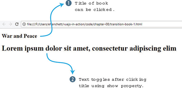
Using listing 8.1, add a style tag inside the head element. For the purposes of simplicity, we’ll inline the CSS inside the style tags in our example. That way, we don’t have to worry about adding a separate CSS file.
There are six Vue.js CSS classes that can be applied to the enter and leave transitions. In this example we’ll use four: v-enter-active, v-leave-active, v-enter, and v-leave-to. The other two we’ll use later are v-enter-to and v-leave.
In listing 8.1, we didn’t add any animation classes. As I mentioned earlier, if no CSS classes are present, the v-if directive conditional fires immediately and there are no CSS transitions. We’ll need to add CSS transition classes to make the fade effect work. First, let’s look at what each of these classes does and when they’re added or deleted from the DOM. Be aware that a frame is an array-like property that represents all elements in the current window. Table 8.1 shows all the CSS transition classes that you should be aware of.
|
Transition class |
Description |
|---|---|
| v-enter | This is the first state. It is added before the element is inserted and removed one frame after the element is inserted. |
| v-enter-active | This class is added to the element as long as the element is entering the DOM. It’s inserted before the element is inserted and removed when the transition/animation is finished. This is where you enter in the duration, delay, and easing curve for the entire transition. |
| v-enter-to | This class was introduced in Vue.js 2.1.8+. This is added one frame after the element is inserted and removed when the transition/animation is finished. |
| v-leave | This class is added as soon as the element is leaving, or being removed, from the DOM. It’s removed after one frame. |
| v-leave-active | This is the active state for the leave animation/transition. This is similar to the v-enter-active. You can use it to set the duration, delay, and easing curve of the leaving transition/animation. It’s added immediately when the leave transition is triggered and removed when the transition/animation finishes. |
| v-leave-to | This is similar to the v-enter-to and was added after Vue.js 2.1.8+. This is the ending state for the leave. It’s added one frame after a leaving transition is triggered and removed when the animation/transition is finished. |
Each of these classes is added and removed at different times when elements in the DOM are added or removed. We can use these elements to construct transitions and animations. For more information on the transition classes, check out the official documentation at http://mng.bz/5mb2.
Let’s add the transitions in the style element inside the head. Before we add these classes, you may have noticed in listing 8.1 that we added a name attribute to the transition element. Because we added a name attribute, the CSS class names will begin with the name we added, fade, instead of v-. If we chose not to add the name attribute to the transition element, the names of the classes would have remained: v-enter-active, v-leave-active, and so on. Instead, the class names will start with fade, fade-enter-active, and fade-leave-active, for example.
Add the fade-enter-active and fade-leave-active CSS transition classes inside the style tag in the application code from the previous listing. As mentioned, active classes are where we put the CSS transitions with the delay. In this example we’ll set opacity, 2.5 seconds, and ease-out. This will create a nice fade effect that will take 2.5 seconds to complete.
Next, we’ll add a fade-enter and fade-leave-to. This will set our initial opacity to 0. This will make sure that the fade occurs correctly with the opacity at 0. Update the previous example with the new style and see how it works. For the sake of simplicity, I’ve removed the other code, and because it’s the same as listing 8.1. You can always consult the completed code that’s included with the book.
...
  <style>
  .fade-enter-active, .fade-leave-active {     1
    transition: opacity 3.0s ease-out;

  }

  .fade-enter, .fade-leave-to {                2
    opacity: 0;

  }
  </style>
...
Load this in your browser and open the development tools. You may notice something interesting when you click the title of the book and look at the source. For 3.0s you’ll see a new class that surrounds the description, fade-enter-active and fade-enter-to. You can see it in figure 8.2.
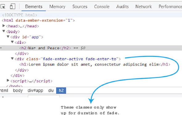
These classes will show up only for the duration of the fade. Afterward, the classes will be removed. If we click the title again, it will begin fading out the text. You can see in the browser fade-leave-active and fade-leave-to are added to the HTML node during the transition in figure 8.3.
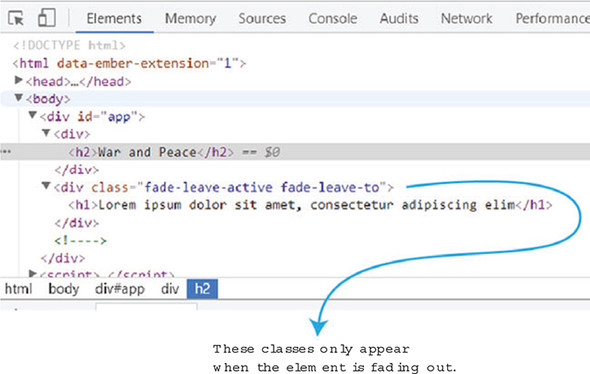
These classes are added momentarily while the element is being removed from the DOM. This is how Vue.js creates its animations and transitions. By adding and removing classes at different times, elements in Vue.js can create neat transitions and animations.
Animations are another important feature that Vue.js is good at. You may be wondering what the difference is between animations and transitions. Transitions are moving from one state to another, whereas animations have multiple states. In the last example, we went from seeing the text to fading the text. We also saw a transition from no text on the page to fading the text back in.
Animations are a bit different. You can have multiple states for each animation that can be within one declaration. You can do neat stuff with animations, such as create complex movements and chain multiple animations together. Animations can act like transitions too, but they aren’t transitions.
Let’s take the same example from listing 8.2 and add an animation. We’ll use the same code, except this time we’ll add a nice bounce effect using CSS keyframes. We want the animation to fade in and scale when the title is clicked. When the title is clicked again, we want the animation to scale and fade out. Open your text editor and copy listing 8.2. Update the transition name to bounce, as seen in listing 8.3.
<div @click="show = !show">
  <h2>{{title}}</h2>
</div>
<transition name="bounce">        1
  <div v-if="show">
    <h1>{{description}}</h1>
  </div>
</transition>
Now we need to add our new animation. This animation needs the enter-active and leave-active classes. Begin by deleting the old CSS transition elements. Then add the bounce-enter-active and the bounce-leave-active classes. Add a CSS animation with a bounceIn of 2s inside the bounce-enter-active class. Add the same to the bounce-leave-active class and add a reverse.
Next create the CSS keyframes. Use @keyframes and add 0%, 60%, and 100%. We’ll use CSS transform with a scale of .1 for 0%, 1.2 for 60%, and 1 for 100%. We’ll also change the opacity from 0 to 1. Add this into the style as shown here.
...
  <style>
  .bounce-enter-active {                1
  animation: bounceIn 2s;
  }
  .bounce-leave-active {                2
  animation: bounceIn 2s reverse;
  }

  @keyframes bounceIn {                 3
  0% {                                  4
    transform: scale(0.1);
    opacity: 0;
  }
  60% {                                 5
    transform: scale(1.2);
    opacity: 1;
  }
  100% {                                6
    transform: scale(1);
  }
</style>
Open the file in your browser and check out the animation. You should see the fade in and scale occur when you click the title of the book. If you click it again, it will fade away. Figure 8.4 is a screenshot of the animation halfway through.
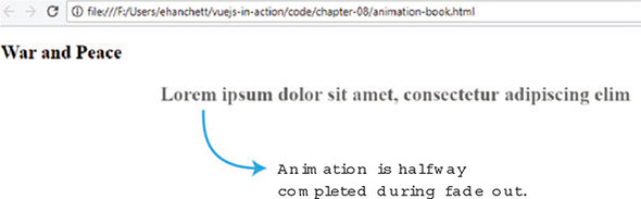
The animation creates an effect where the text gets bigger and shrinks at the end.
The transition and animation classes Vue.js provides should cover most basic transitions and animations you need, but Vue.js gives us an even more robust solution if we need it. We can set JavaScript hooks to do even more complex transitions and animations. We do this by combining the hooks with JavaScript that manipulate and direct CSS.
These hooks may remind you of the hooks we discussed in an earlier chapter for the Vue.js lifecycle. These JavaScript hooks are similar but are used for only transitions/animation. Remember a few things before using these hooks. First, we must always use the done callback when using the enter and leave hooks. Otherwise, they’ll be called synchronously and the transition will finish right away. In addition, it’s a good idea to add v-bind:css="false" when using JavaScript-only transitions so that Vue can skip all the CSS detection for that transition. One last thing to remember is that all hooks have the el, or element parameter, passed in except for enter and leave, which also passes done as a parameter. Don’t worry if this is a little confusing; I’ll show you in the next section how this works.
The JavaScript hooks that we can use when entering are beforeEnter, enter, afterEnter, and enterCancelled. When a transition is leaving, there’s beforeLeave, leave, afterLeave, and leaveCancelled. All these hooks are triggered at various times of the animation.
Let’s imagine we’re updating our book example to use the same sort of animations we were using earlier, except this time, we want to use JavaScript hooks instead of the CSS classes. How can we do this? Let’s begin by taking our program from listing 8.4 and deleting the bounce-enter-active and the bounce-leave-active classes. We’ll leave the keyframes in. Instead, we’ll use the JavaScript hooks for enter and leave to do the animation in JavaScript.
Let’s change the transition element so it has all the JavaScript hooks listed. To do this we’ll need to use the v-on directive or use the @ sign for short. Add the JavaScript hooks for before-enter, enter, before-leave, leave, after-leave, after-enter, enter-cancelled, and leave-cancelled.
<transition name="fade"                  1
    @before-enter="beforeEnter"
    @enter="enter"
    @before-leave="beforeLeave"
    @after-enter="afterEnter"
    @enter-cancelled="enterCancelled"
    @leave="leave"
    @after-leave="afterLeave"
    @leave-cancelled="leaveCancelled"
    :css="false">
Next, we’ll need to add the JavaScript hooks in our methods object inside the Vue instance. To make this work correctly, we’ll need to detect when the animation is completed. That way, we can clear the style and run done on the event. done is the parameter that’s used in the enter and leave JavaScript hooks. done must be executed in these hooks. To do that, we’ll create a new event listener.
The event listener waits until the animation completes by looking for animationend. When the animation completes, the callback will reset the style and execute done. We’ll add this code above the Vue constructor in your HTML file, as shown here.
function addEventListener(el, done) {
  el.addEventListener("animationend", function() {       1
    el.style="";
    done();
});
Even though we’re using only leave and enter, let’s add all the JavaScript hooks to our program. Each hook will write to the console log so you can get a better idea when they’re triggered.
Add a new methods object to your Vue.js instance. Add all the JavaScript hooks that you added to the transition to that methods object. Inside the enter method, add a function to call the addEventListener that was created earlier and make sure to pass in the element and done, as you can see in listing 8.7. Next, we’ll use JavaScript to set up the animation. The el.style.animationName is the name of the keyframe animation we created inside the style. The el.style.animationDuration will be set to 1.5 s.
Inside the leave hook, add the same animationName and animationDuration. We’ll also add an el.style.animationDirection and set it to reverse. This will reverse the animation when the element is leaving the DOM.
...
  methods: {
      enter(el, done) {                           1
        console.log("enter");
        addEventListener(el,done);                2
        el.style.animationName = "bounceIn"
        el.style.animationDuration = "1.5s";
      },
      leave(el, done) {                           3
        console.log("leave");
        addEventListener(el,done);                4
        el.style.animationName = "bounceIn"
        el.style.animationDuration = "1.5s";
        el.style.animationDirection="reverse";
      },
      beforeEnter(el) {                           5
          console.log("before enter");
      },
      afterEnter(el) {                            6
          console.log("after enter");
      },
      enterCancelled(el) {                        7
          console.log("enter cancelled");
      },
      beforeLeave(el) {                           8
          console.log("before leave");
      },
      afterLeave(el) {                            9
          console.log("after leave");
      },
      leaveCancelled(el) {                        10
          console.log("leave cancelled");
      }
    }

  });
...
After running this example, it should behave exactly like the book example in listing 8.4. Click the title and the animation will begin. If you click again, the animation will start in reverse. Keep an eye on the console. When you first click the title, you’ll see a few messages, before enter, enter, and then after enter, as seen in figure 8.5.
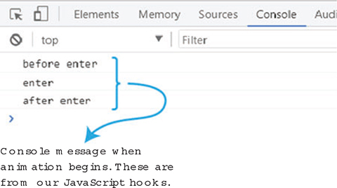
This is the order the hooks are executed. The after enter doesn’t fire until the animation is completed. After clicking the title button again, we can see the order in which the hooks are triggered. First is before leave, then leave, and finally after leave, as you can see in figure 8.6.
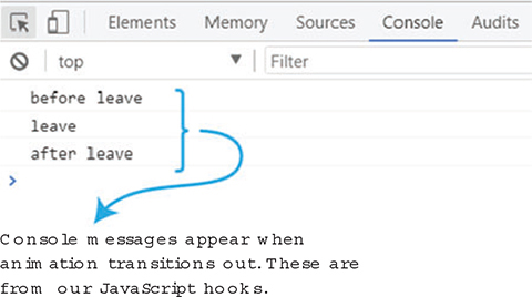
If you look at the source, you’ll also notice the CSS being added and removed after every click. This is much like the CSS transition classes we saw previously.
In the previous chapter we looked at dynamic components. These are components that we can swap out easily by use of the is attribute which points to a variable that’s used to reflect the current component selected.
We can use transitions with components the way we did with the v-if conditional directive that we used earlier. To make things easier, we’ll modify the dynamic-components.html example from chapter 7. Grab a copy of listing 7.5 and make the changes that follow.
First surround the dynamic component, <component :is="currentView"/>, with the <transition name="component-fade"> element. Before we go on, let’s introduce transition modes.
By default, when transitioning components, you’ll notice that one component will transition in while the other transitions out. This might not always be the desired outcome. We can add an attribute to our transition called mode. We can either have it set to in-out or out-in. If the element is set to in-out, the new element transitions in first; then when complete, the current element transitions out. But when it’s set to out-in the current element transitions out first; then when complete, the new element transitions in. This out-in is what we need for our example so that way the previous component fades out before the new one appears. In this case, let’s surround our dynamic component with <transition name="component-fade" mode="out-in">.
Next, we need to add in our transition classes, as shown in the following listing. Add the transitions class component-fade-enter-active and the component-fade-leave-active. We’ll add an opacity:0 to the component-fade-enter and the component-fade-leave-to. This is the completed code.
<!DOCTYPE html>
<html>
<head>
<script src="https://unpkg.com/vue"></script>
<style>
.component-fade-enter-active, .component-fade-leave-active {     1
  transition: opacity 2.0s ease;
}
.component-fade-enter, .component-fade-leave-to {                2
  opacity: 0;
}

</style>
</head>
<body>
  <div class="app">
    <button @click="cycle">Cycle</button>
    <h1>
      <transition name="component-fade" mode="out-in">           3
        <component :is="currentView"/>
      </transition>
    </h1>
  </div>
<script>
const BookComponent ={
  template: `
  <div>
    Book Component
  </div>
  `
}

const FormComponent = {
  template: `
  <div>
    Form Component
  </div>
  `
}

const HeaderComponent = {
  template: `
  <div>
    Header Component
  </div>
  `
}

new Vue({
  el: '.app',
  components: {'book-component': BookComponent,
               'form-component': FormComponent,
               'header-component': HeaderComponent},
  data() {
    return {
      currentView: BookComponent
    }

  },
  methods: {
        cycle() {
          if(this.currentView === HeaderComponent)
            this.currentView = BookComponent
          else
            this.currentView = this.currentView === BookComponent ?
FormComponent : HeaderComponent;
        }
    }

})
</script>
</body>
</html>
Open a browser with the current code and you’ll see a Cycle button. Click the Cycle button and the previous component, Book Component, will fade out and the new component, Form Component, will fade in. Figure 8.7 shows a screenshot of the fade halfway through.
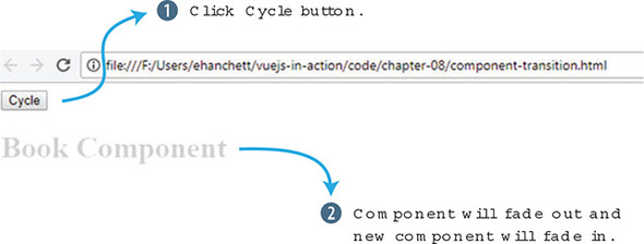
If you click the Cycle button again, the Form component will fade away to the Header component. It then starts over again at Book.
We updated the pet store application in the last chapter when we switched it over to using Vue CLI with single-file components. Now that we have the power of transitions and animations, let’s update the app to give it a little more flair.
Keep in mind that, depending on the web application you’re creating, animations and transitions might be overkill. Unless you’re creating a highly interactive app, you should probably stick to fewer animations and transitions. For this app, we’ll add one animation and one transition. Let’s look at the transition first.
In our app, we want the page to fade in and out between routes. Let’s add a simple fade-in and fade-out transition when navigating to the checkout page and back to the home page. As we did before, we’ll use the Vue.js animation classes to accomplish this. Figure 8.8 shows what it will look like mid-transition from the home page to the checkout page.
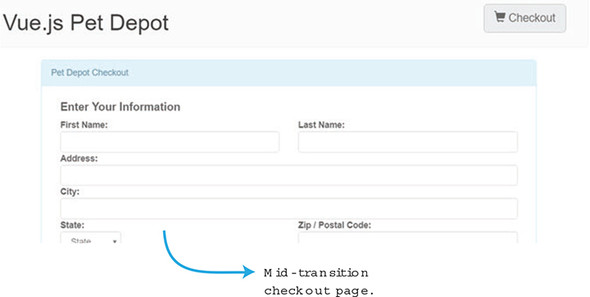
Retrieve the pet store application we were working with in chapter 7 from the code included with this book. Go into the App.vue file inside the src folder. This file is where we set up our router from chapter 7. Similar to what we did with our previous examples, add a transition element and have it surround the router-view. Make sure to add the mode out-in as you see in listing 8.9.
Next, add the fade-enter-active and the fade-leave-active class to the style tag at the bottom. Set the transition to opacity with a .5s ease-out. Add the fade-enter and the fade-leave-to classes and set the opacity to 0.
<template>
  <div id="app">
    <transition name="fade" mode="out-in">       1
      <router-view></router-view>
    </transition>
  </div>
</template>

<script>
export default {
  name: 'app'
}
</script>

<style>
#app {
}
.fade-enter-active, .fade-leave-active {         2
  transition: opacity .5s ease-out;
}
.fade-enter, .fade-leave-to {                    3
  opacity: 0;
}
</style>
After making these changes, save the file and run the npm run dev command. This will start the web server, and the web page should pop up in your browser. If not, navigate to localhost:8081 and check out the application. Click the checkout button and the home page and you’ll see the page fade.
When adding items to the cart, we added several v-if, v-else-if, and v-else directives. This lets the user know how much inventory is left that they can add to their cart. When the inventory runs out, an All Out message is displayed. Let’s add an animation that shakes the text and briefly turns it red when the inventory is depleted for any item. To do this, we’ll use the Vue.js animation CSS classes we learned about earlier. Figure 8.9 shows an example of how it will look with the All Out! animation moving left and right.
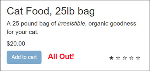
Open the Main.vue file and scroll all the way to the bottom. We’re going to use one of the animation classes, enter-active, to create this animation. We don’t need to worry about the animation when the element is removed from the DOM, so we’ll skip adding the leave-active class.
Add an animation that shakes the text for around .72 seconds. We’ll use a CSS cubic-bezier and a transform. In addition, we’ll set up animation keyframes at every 10%. Copy this listing to the Main.vue file.
...
<style scoped>
.bounce-enter-active {                                        1
  animation: shake 0.72s cubic-bezier(.37,.07,.19,.97) both;
  transform: translate3d(0, 0, 0);
  backface-visibility: hidden;
}

@keyframes shake {                                            2
  10%, 90% {
    color: red;
    transform: translate3d(-1px, 0, 0);
  }

  20%, 80% {
    transform: translate3d(2px, 0, 0);
  }

  30%, 50%, 70% {
    color: red;
    transform: translate3d(-4px, 0, 0);
  }

  40%, 60% {
    transform: translate3d(4px, 0, 0);
  }
}
</style>
...
After adding the CSS, we’ll need to add the transition element for our animation. In the Main.vue file, look for the inventory messages. Each message will have the class of inventory-message. Add the <transition> element and surround the inventory-message. Make sure to add the mode="out-in" to the transition as you can see from listing 8.11.
In the previous examples, we transitioned or animated only one element. To animate more than one element, we need to add a key attribute to the v-else-if and v-if directives. Otherwise, Vue’s compiler won’t animate the content correctly.
The key attribute is needed whenever you want to transition elements that have the same tag name. To make them distinct, you must add a unique key attribute. It’s good practice to always add the key attribute when you’re dealing with multiple items within a transition component.
Add a key attribute to the v-else-if and v-if directives. For the v-else-if, the key will be empty. This is intentional, so it won’t animate. For the v-if directive we’ll set the key to 0, as shown here.
...
<transition name="bounce" mode="out-in">                                  1
  <span class="inventory-message"
        v-if="product.availableInventory - cartCount(product.id) === 0"
        key ="0">                                                         2
        All Out!
  </span>
  <span class="inventory-message"
        v-else-if="product.availableInventory - cartCount(product.id) < 5"
     key="">                                                              3
    Only {{product.availableInventory - cartCount(product.id)}} left!
  </span>
  <span class="inventory-message"
        v-else key="">Buy Now!
  </span>
</transition>
...
Start the web server by running the npm run dev command and try out the app. Click the add to cart button until the inventory runs out. You’ll see the All Out text move and shake for a few seconds and turn red.
Use your knowledge from this chapter to answer this question.
See the solution in appendix B.
This chapter covers
In the previous chapter we discussed transitions and animations. In this chapter we’ll look at different ways we can reuse code in Vue.js. This is important because it allows us to extend the functionality of our Vue.js applications and make them more robust.
We’ll begin by looking at mixins. Mixins are a way to share information between components; functionality is essentially “mixed” into the component. They’re objects that have the same methods and properties that you’d see in any Vue.js component. Next, we’ll look at custom directives. Custom directives allow us to register our own directives, which we can use to create whatever functionality we want. Then we’ll look at the render function. With the render function we can go beyond using normal templates and create our own using JavaScript. Last, we’ll look at using the render function with JSX, which is an XML-like syntax for JavaScript.
Don’t worry, I haven’t forgotten about the pet store application. In the next chapter we’ll revisit it with Vuex.
Mixins are a great tool for many projects. They allow us to take small pieces of functionality and share them between one or many components. As you write your Vue.js applications, you’ll notice that your components will start to look alike. One important aspect in software design is a concept known as DRY (don’t repeat yourself). If you notice that you’re repeating the same code in multiple components, it’s time to refactor that code into a mixin.
Let’s imagine you have an app that needs to collect a phone number or email address from your customer. We’ll design our app to have two different components. Each component will contain a form with an input and a button. When the user clicks the button, it triggers an alert box that displays the text that was entered into the input box. It will look like figure 9.1 when we’re done.
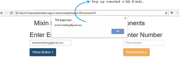
This somewhat contrived example shows how we can extract logic as a mixin, in this case the logic that handles the button click and alert box. This keeps our code clean and avoids repeating code.
To get started with this example, create a file called mixins.html. To begin, we’ll add our script tag for Vue.js and a link tag so we can add in Bootstrap for our styling. Then we’ll add a basic HTML layout. The HTML will use Bootstrap’s grid layout with one row and three columns. The first column will be set to col-md-3 with an offset of col-md-offset-2. This column will display our first component. The next column will have a column size of col-md-3. The third column will have a column size of col-md-3 and will show the last component.
Open your mixins.html file and enter the HTML code in the following listing. This is the first part of the code for this example. We’ll add more code throughout this section. If you’d like to see the completed code for this example, look for the mixins.html file included with the code for this book.
<!DOCTYPE html>
    <script src="https://unpkg.com/vue"></script>
    <link rel="stylesheet"
href="https://maxcdn.bootstrapcdn.com/bootstrap/3.3.7/css
 /bootstrap.min.css">                                    1
<html>
<head>
</head>
<body>
  <div id="app">
    <div id="container">
      <h1 class="text-center">{{title}}</h1>
      <div class="row">
        <div class="col-md-3 col-md-offset-2">             2
          <my-comp1 class="comp1"></my-comp1>              3
        </div>
        <div class="col-md-3">                             2
            <h2 class="text-center">Or</h2>
        </div>
        <div class="col-md-3">                             2
          <my-comp2 class="comp2"></my-comp2>              4
        </div> <!--end col-md-2-->
      </div><!-- end row -->
    </div> <!-- end container -->
  </div> <!-- end app -->
Now that we’ve added HTML, we’ll work on the Vue.js code. Open the mixins.html file and add an opening and closing script tag. It’s worth mentioning for this example that we aren’t using single-file components with Vue-CLI. If we were to do so, this would work the same way. The only difference is that each component and mixin would be in its own file.
Add a new Vue instance in between the opening and closing script tag. Inside the Vue instance we’ll add a data object that returns a title. Because we’re using components, we’ll also need to declare both components that we’re using in this example. Add the code in this listing to the mixins.html file.
...
<script>
  new Vue({                                              1
    el: '#app',
    data() {
      return {
        title: 'Mixin in example using two components'   2
      }
    },
    components:{                                         3
        myComp1: comp1,
        myComp2: comp2
    }

  });
</script>
We have a few other things left to do. We need to add both of our components and our mixin. Each component needs to display text, show an input, and show a button. The button needs to take whatever input was entered and display an alert box.
Each component is similar in a few ways. Both have a title, both have an input box, and both have a button. They also behave the same way after clicking a button. At first it might seem like a good idea to create one component but the visual look and feel of each component is different. For example, each button is styled differently and the input boxes themselves accept different values. For this example, we’ll leave them as separate components.
With that said, we still have similar logic outside the template. We need to create a mixin that handles a method called pressed that displays an alert box. Open the mixin.html file and add a new const called myButton above the Vue.js instance. Make sure to add in the pressed function, an alert, and a data object that returns an item, as seen in this listing.
<script>
const myButton = {           1
  methods: {                 2
    pressed(val) {           3
      alert(val);
    }
  },
  data() {
      return {
          item: ''
      }
  }
}
...
Now that we have the mixin in place, we can go ahead and add our components. After the myButton object, add two new components called comp1 and comp2. Each one will contain an h1 tag, a form, and a button.
In comp1, our input will use a v-model directive to bind the input to a property called item. In our button, we’ll use the v-on directive shorthand @ symbol to bind the click event to the pressed method. Then we’ll pass the item property into the method. The last thing we need to add to our comp1 is to declare the mixin we created. We add the mixins array at the bottom, as you can see in listing 9.4.
For comp2, we’ll add an h1 tag with a form, an input, and a button. For this component, we’ll use the v-model directive to bind the item property. The button will use the v-on directive shorthand @ to bind the click event to the pressed method, as the same way we did in comp1. We’ll pass the item property into the method. As with the other component, we’ll need to define which mixins we want with this component by using the mixins property array at that bottom.
Mixins aren’t shared between components. Each component receives its own copy of the mixin. Variables inside the mixin aren’t shared.
I won’t go into detail, but we’ve also added basic Bootstrap classes to the form elements to style them.
...
const comp1 = {                                                  1
    template: `<div>
    <h1>Enter Email</h1>
    <form>
      <div class="form-group">
        <input v-model="item"                                    2
        type="email"
        class="form-control"
        placeholder="Email Address"/>
      </div>
      <div class="form-group">
        <button class="btn btn-primary btn-lg"
     @click.prevent="pressed(item)">Press Button 1</button>      3
      </div>
    </form>
    </div>`,
    mixins: [myButton]                                           4

  }
  const comp2 = {
    template: `<div>
    <h1>Enter Number</h1>
      <form>
        <div class="form-group">                                 5
            <input v-model="item"
            class="form-control"
            placeholder="Phone Number"/>
        </div>
        <div class="form-group">
          <button class="btn btn-warning btn-lg"
     @click.prevent="pressed(item)">Press Button 2</button>      6
        </div>
      </form>
    </div>`,
    mixins:[myButton]                                            7

  }
...
Open a browser and load the mixins.html file we’re working on. You should see figure 9.1. Go ahead and enter an email into the Enter Email box. Click the button and you should see a pop up, as seen in figure 9.2.
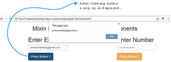
This works the same if we enter values into the Phone Number box.
Until now, we’ve used named mixins that we’ve declared inside each of our components. Another type of mixin, a global mixin, doesn’t require any type of declaration. Global mixins affect every Vue instance created in the app.
You’ll need to be cautious when using global mixins. If you’re using any special third-party tools, they’ll also be affected. Global mixins are good to use when you’re trying to add custom options that need to be added to every Vue.js component and instance. Let’s say you need to add authentication to your app and you want the authenticated user to be available in every Vue component in the application. Instead of registering the mixin in every component, you can create a global mixin.
Let’s look at our app from the last section. We’ll go ahead and change it to a global mixin. First, take a copy of the mixins.html file from the previous example and copy it to mixins-global.html. We’ll refactor our application in this file.
Look for the const myButton line inside the script tags. This is our mixin; to use global mixins, we need to change this from a const to a Vue.mixin. The Vue.mixin tells Vue.js that this is a global mixin and that it must be injected into every instance. Delete the const line and add the Vue.mixin({ line to the top. Next, close the parenthesis at the bottom as you can see in the following listing.
...
  Vue.mixin({                   1
    methods: {
      pressed(val) {
        alert(val);
      }
    },
    data() {
        return {
            item: ''
        }
    }
  });                           2
...
Now that we have the global mixin declared, we can remove the declarations for myButton inside the components. Delete the mixins: [myButton] line from each component. That should do it—now you’re using global mixins! If you load the browser with the newly created mixins-global.html file, it should behave and look the exact same as you saw previously.
If you run into any problems, it might be because you left the mixins declaration at the bottom of the component definitions. Make sure to delete any reference to myButton in your app or you’ll get an error.
In the last eight chapters, we’ve looked at all sorts of directives, including v-on, v-model, and v-text. But what if we needed to create our own special directive? That’s where custom directives come in. Custom directives give us low-level DOM access to plain elements. We can take any element on the page, add a directive, and give it new functionality.
Keep in mind that custom directives are different than components and mixins. All three, mixins, custom directives, and components, help promote code reuse but there are differences. Components are great for taking a large piece of functionality and separating it into smaller parts and making it available as one tag. Usually this consists of more than one HTML element and includes a template. Mixins are great at separating logic into smaller reusable chunks of code that can be shared in multiple components and instances. Custom directives are geared toward adding low-level DOM access to elements. Before using any of these three, take a minute to understand which one will be best for the problem you’re trying to solve.
Two types of directives exist, local and global. Global directives can be accessed throughout the app at any place on any element. Typically, when you’re creating directives you want them to be global, so you can use them everywhere.
Local directives can be used only in the component that registered that directive. This is nice to use when you have a specific custom directive that only needs to be used in one component. For example, you might create a specific select drop-down that works with only one component.
Before we look at each one, let’s create a simple local custom directive that sets the color and font size, and adds a Bootstrap class name to an element. It should look like figure 9.3 when we’re done.
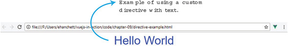
Open a new file and name it directive-example.html. Inside the new file, add simple HTML. The HTML should include the script tag for Vue and the stylesheet for the Bootstrap CDN. Inside our app, we’ll create a new directive called v-style-me, as you can see in this listing. This directive will attach to the p tag.
<!DOCTYPE html>
<html>
<head>
    <script src="https://unpkg.com/vue"></script>
    <link rel="stylesheet"                                          1
href=https://maxcdn.bootstrapcdn.com/bootstrap/3.3.7/css/bootstrap
 .min.css>
</head>
<body>
  <div id='app'>
      <p v-style-me>                                                2
          {{welcome}}
      </p>
  </div>
All custom directives start with a v-*. Now that we have our custom directive in place on our p tag, we can add the Vue logic to the app.
Create a Vue instance and a data function. This function will return a welcome message. Next, we’ll need to add a directives object. This will register a local custom directive. Inside that directives object we can create our directives.
Create a directive called styleMe. Each directive has access to a number of arguments that it can use:
For our example we’ll use only el, for the element. This is always the first argument in the list. Keep in mind that our styleMe element is in camelCase. Because it was declared in camelCase, it must be in kebab case (v-style-me) in the template.
All custom directives must specify a hook. Much like the lifecycle and animation hooks we looked at in earlier chapters, the custom directive also has many similar hooks. These hooks are called at various times of the custom directive’s life cycle:
You may be wondering what a VNode is. In Vue.js the VNode is part of the virtual DOM that Vue creates when the application is started. VNode is short for virtual node and is used in the virtual tree that’s created when Vue.js interacts with the DOM.
For our simple example, we’ll use the bind hook. This is fired as soon as the directive is bound to the element. The bind hook is a good place to do setup work to style the element. Using JavaScript, we’ll use the style and className methods of the element. First add the color blue, then the fontSize 42px, and finally the className text-center inside the bind hook.
Go ahead and update the directive-example.html file. Your code should match the following listing.
<script>
  new Vue({
  el: '#app',
  data() {
    return {
      welcome: 'Hello World'                       1
    }
  },
  directives: {                                    2
    styleMe(el, binding, vnode, oldVnode) {        3
      bind: {                                      4
        el.style.color = "blue";
        el.style.fontSize= "42px";
        el.className="text-center";
      }
    }
  }
  });
</script>
</body>
</html>
Load up the browser and you should see the Hello World message. Now that we have this custom directive, we can use it on any element. Create a new div element and add the v-style-me directive. You’ll notice that after you refresh the browser the text is centered, the font size is changed, and the color is blue.
Now that we have a local directive, let’s see what it looks like using a global directive. We’ll convert our simple example, then we’ll look at the binding argument. With the binding argument, we’ll add a couple of new features to our custom directive. Let’s give to the directive the ability to pass in the color of the text. In addition, we’ll add a modifier so we can choose the size of our text, and we’ll pass an arg for the class name. When it’s all done it will look like figure 9.4.
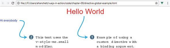
Copy the last example directive-example.html to directive-global-example.html. The first thing we need to do is to remove the directives object from the Vue.js instance. Go into our newly created directive-global-example.html file and remove the directives object below the data object.
Next, we’ll need to create a new Vue.directive. This will tell Vue.js that we’re creating a global directive. The first argument is the name of the directive. Go ahead and name it style-me. Then we’ll assign the name of the hook. We’ll use the bind hook the same way we did in the last example.
Inside the bind hook we’ll have two arguments, el and binding. The first argument is the element itself. As we did in the previous example, we can use the el argument to manipulate the element the directive is attached to by changing its fontSize, className, and color. The second argument is called binding. This object has several properties; let’s take a look at binding.modifiers, binding.value, and binding.arg.
The easiest binding property to work with is binding.value. When we add our new custom directive to an element, we can specify a value with it. For example, we could bind 'red' to binding.value, as follows:
v-style-me="'red'"
We can also use object literals to pass in multiple values:
v-style-me="{ color: 'orange', text: 'Hi there' }"
We could then access each value using binding.value.color and binding.value.text. In listing 9.8, you can see that we set the element el.style.color to binding.value. If binding.value does not exist, it defaults to blue.
The binding.modifiers are accessed by adding a dot to the end of the custom directive:
v-style-me.small
v-style-me.large
When we access binding.modifers.large, it will return true or false, depending if the custom directive was declared when attached to the element. In listing 9.8, you can see that we check if binding.modifiers.large is true. If so, we set the font size to 42px. Else if binding.modifiers.small is true, the font size is set to 17px. If neither one of these modifiers is present, the font size isn’t changed.
The last binding property we’ll look at is binding.arg, declared in the custom directive with a colon and then the name. In this example, text-center is the argument:
v-style-me:text-center
With all that said, you can chain modifiers, args, and values together. We can combine all three. The binding.arg is 'red', the binding.modifier is set to large, and the binding.value is text-center.
v-style-me:text-center.large="'red'".
After adding the global custom directive make sure to go back into the HTML and add the second custom directive with text that displays Hi everybody. In this text, we’ll use the binding modifier small on it, as shown in the following listing.
<!DOCTYPE html>
    <script src="https://unpkg.com/vue"></script>
    <link rel="stylesheet"
href="https://maxcdn.bootstrapcdn.com/bootstrap/3.3.7/css/bootstrap
 .min.css">                                                       1
<html>
<head>
</head>
<body>
  <div id='app'>
      <p v-style-me:text-center.large="'red'">                      2
          {{welcome}}
      </p>
      <div v-style-me.small>Hi everybody</div>                      3
  </div>
<script>
  Vue.directive('style-me', {                                       4
    bind(el, binding) {
        el.style.color = binding.value || "blue";                   5

        if(binding.modifiers.large)                                 6
          el.style.fontSize= "42px";
        else if(binding.modifiers.small)
          el.style.fontSize="17px"

        el.className=binding.arg;                                   7
      }
  });

new Vue({
  el: '#app',
  data() {
    return {
      welcome: 'Hello World'
    }
  }
});
</script>
</body>
</html>
After loading up the browser, you should see the Hello World message. Notice how the second text, Hi Everybody, isn’t centered and is smaller to the left of the screen. We got this because we used the v-style-me directive with only the small modifier. In that case, it changed the font size; however, it left the default color blue.
If you look closely at the source, you’ll notice that a class of “undefined” was added to the second text div, because we assigned the binding.arg to el.className in the custom directive. However, because we didn’t declare it, it’s undefined by default. Beware this could happen: it would probably be a good idea to do a check on binding.arg before we set it to el.className. I’ll leave that for you to do.
Until now we’ve written all Vue.js applications using templates. This will work most of the time; however, there may be instances where you need to have the full power of JavaScript. For those cases, we can define our own render function instead of using a template. The render function will operate similarly to templates. It will output HTML, but you must write it in JavaScript.
JSX is an XML-like syntax that can be converted to JavaScript using a plugin. It’s a way we can define our HTML inside JavaScript, like the render function. It’s more commonly used with React, another frontend framework. We can use the full power of JSX with Vue.js, with the help of a Babel plugin.
Using JSX isn’t the same as using the render function. To use JSX, you need to install a special plugin. But the render function works without any special setup inside your Vue.js instances.
In my experience, using the render function in Vue.js to create complex HTML is difficult. Common directives such as v-for, v-if, and v-model aren’t available. You have alternatives for these directives, but you’ll have to write extra JavaScript. But JSX is a strong suitable alternative. The JSX community is large and the syntax is much closer to templates, and you still get the benefit and power of JavaScript. The Babel plugin for Vue.js and JSX is well-supported and maintained, which is also nice. For those reasons, I’ll only give a simple overview of the render function before we move on to JSX.
If you’d like to learn about the render function in more detail, check out the official guides at https://vuejs.org/v2/guide/render-function.html.
Let’s create a simple example using render. Let’s imagine we have a global Vue.js component that has a property named welcome. We want it to display the welcome message with an HTML header. We’ll use a prop called header to pass in which header to use, h1, h2, h3, h4, or h5. In addition, we’ll add a click event to the message so it shows an alert box. To make this good looking, we’ll use Bootstrap’s classes. Let’s make sure our h1 tag also has a class of text-center on it. When it’s all done it will look like figure 9.5.
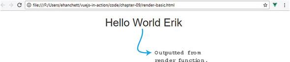
Create a file called render-basic.html. In this file, we’ll create our small app. Before we create our component, let’s create the HTML. Inside the HTML, add your script for Vue and your link to the Bootstrap CDN.
Inside the body, include a div with ID of app and a new component called my-comp. The div is optional; we could assign the ID of app directly to the my-comp component. For the sake of clarity, we’ll leave the div in as is. Inside that component, it will have a prop called header that will be assigned to 1. Inside the opening and closing brackets, we’ll put in a name: Erik. Remember from a previous chapter anything in between the brackets of a component can be referenced with a slot. We can access slots using the render function, as we’ll see next. Copy and paste the code from the following listing into the render-basic.html file.
<!DOCTYPE html>
<html>
<head>
    <script src="https://unpkg.com/vue"></script>                          1
    <link rel="stylesheet"
href="https://maxcdn.bootstrapcdn.com/bootstrap/3.3.7/css/bootstrap.min.css
">                                                                         2
</head>
<body>
    <div id="app">
        <my-comp header="1">Erik</my-comp>                                 3
    </div>
<script>
Now that we have the HTML in place, we must add a root Vue.js instance before we can add a global component. At the bottom of the page inside the script tags, add new Vue({el: '#app'}).
After we add our root Vue.js instance, let’s create our global component. Make sure to have the root Vue.js instance after the global component or you’ll get an error. The first thing we’ll need inside our component is a data function that returns welcome. We’ll make it say, “Hello World.” We also need to declare our prop header.
Instead of declaring a template property on the component, we’ll declare a render function. Inside that function it will have one argument called createElement. (You may sometimes see this as h; it’s the same thing.) Inside the render function, you must return createElement with the proper arguments.
When you return createElement, you’re building a virtual DOM by describing the elements and child elements you’d like to define in your HTML. This is also known as a virtual node (VNode). You are essentially creating a tree of VNodes that represents the virtual DOM.
As you can see from listing 9.10, the createElement accepts three arguments. The first is a string, object, or function. This is usually where you put in the DOM element, such as a div. The second argument is an object. This represents the attributes you want included on the element. The third is an array or string. If it’s a string, it represents the text that will be included inside the tag. But if it’s an array, it usually represents the child VNodes. Each VNode is like adding another createElement. It has the same arguments. For this example, we’ll use only a string.
Inside our Vue.component add the render(createElement) function. Inside the function, return createElement, as you see in listing 9.10. The first argument we want is the header tag. We need to use the prop passed in to form the header value. In this case we sent in 1, which we need to create an h1. We can concatenate the letter h with our prop this.header.
The next argument is the attribute object. Because we’re using Bootstrap, we want to use the text-center class to align the text in the middle of the screen. To do that, we create an object and have the first property be class, with the value being text-center. In JavaScript, class is a defined keyword, so it must be in quotes. Our next attribute is our event. Event handlers are represented by the keyword on when using the render function. In this example, we use the click event and display an alert box that shows clicked.
The last argument is the array or string. This will define what we see inside our header tag. To make things more interesting, we’ll combine the welcome message that we defined in the data function and the text inside the opening and closing brackets of the component, Erik. To get this text, we can use this.$slots.default[0].text. This will get the text in the brackets as if it was the default text in a slot. We can now concatenate that with the welcome message. Copy this code into the render-basic.html. It should be all you need.
  Vue.component('my-comp',{                               1
    render(createElement) {                               2
        return createElement('h'+this.header,             3
        {'class':'text-center',                           4
          on: {
            click(e){
              alert('Clicked');
            }
          }
        },
        this.welcome + this.$slots.default[0].text  )     5
    },
    data() {
           return {
        welcome: 'Hello World '
    }
  },
    props: ['header']
  });
  new Vue({el: '#app'})                                   6
</script>
</body>
</html>
Load the render-basic.html file and look at the output, it should show the Hello World Erik message. Change the prop header to a different value. You should see the text get smaller as you increase the number. Click the message and you should see figure 9.6.
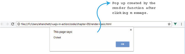
With JSX, you can create HTML similarly to templates and still have the full power of JavaScript. To do this, we’ll create an app using Vue-CLI. Our goal is to re-create the last example but use JSX instead. This example should accept a property, a class, and show an alert box when the message is clicked.
Before we start, make sure you have Vue-CLI installed: the instructions are in appendix A. Open a terminal window and create an app called jsx-example. You’ll be asked to respond to a few prompts: enter no for all of them.
$ vue init webpack jsx-example

? Project name jsx-example
? Project description A Vue.js project
? Author Erik Hanchett <erikhanchettblog@gmail.com>
? Vue build standalone
? Install vue-router? No
? Use ESLint to lint your code? No
? Setup unit tests No
? Setup e2e tests with Nightwatch? No

   vue-cli · Generated "jsx-example".

   To get started:

     cd jsx-example
     npm install
Next, change to the jsx-example directory and run npm install. This will install all the dependencies. Now we’ll need to install the Babel plugin for JSX. If you have any problems with the installation of the plugin, please check the official GitHub page at https://github.com/vuejs/babel-plugin-transform-vue-jsx. The example I’m about to introduce to you only touches on the basics of JSX. I highly recommend reading the official documentation on the GitHub website on all the options available. Run npm install for all the recommended libraries, as shown here.
$ npm install\
  babel-plugin-syntax-jsx\
  babel-plugin-transform-vue-jsx\
  babel-helper-vue-jsx-merge-props\
  babel-preset-env\
  --save-dev
After you have the plugin installed, you’ll need to update the .babelrc file. This is in the root folder. Inside it, you’ll see many presets and plugins. Add "env" to the list of presets and "transform-vue-jsx" to the list of plugins, as in this listing.
{
  "presets": [
    ["env", {
      "modules": false
    }],
    "stage-2",
    "env"                                                   1
  ],
  "plugins": ["transform-runtime", "transform-vue-jsx"],    2
  "env": {
    "test": {
      "presets": ["env", "stage-2"]    }
  }
}
Now that we’ve set up JSX, we can start coding. By default, Vue-CLI creates a HelloWorld.vue file. We’ll use that file, but we’ll need to make several modifications. Go into the src/App.vue file and update the template. Remove the img node and add the HelloWorld component with two props. The first prop is our header, which will determine the header tag level. The second prop will be called name. In listing 9.10, we used slots instead of a named prop. In the following listing, we’ll make a slight modification and pass the name in as a property instead. The result will be the same. Update your src/App.vue file so it matches this.
<template>
  <div id="app">
    <HelloWorld header="1" name="Erik"></HelloWorld>        1
  </div>
</template>

<script>
import HelloWorld from './components/HelloWorld'

export default {
  name: 'app',
  components: {
    HelloWorld
  }
}
</script>

<style>
</style>
Because we’re using Bootstrap, we need to include it somewhere. Find the index.html file in the root folder. Add the link to the Bootstrap CDN, as shown here.
<!DOCTYPE html>
<html>
  <head>
    <meta charset="utf-8">
    <meta name="viewport" content="width=device-width,initial-scale=1.0">
    <title>jsx-example</title>
    <link rel="stylesheet"
 href="https://maxcdn.bootstrapcdn.com/bootstrap/3.3.7/css/bootstrap
  .min.css">                                                        1
  </head>
  <body>
    <div id="app"></div>
  </body>
</html>
Open the src/components/HelloWorld.vue file. Delete the top template—because we’ll be using JSX, we no longer need it. Inside the export default, let’s set up the data object first. The data object will return welcome, as well as a message. The msg property will construct the HTML for the header and it will concatenate the message we want to show on screen using ES6 template literals.
Add a methods object as well. This will have a pressed method that will trigger an alert box that shows clicked. Last, add a props array at the bottom, for header and name.
The render function for JSX is similar to the render function we used in our first example. By convention, instead of using createElement, we use the letter h. Then we return the JSX we need.
As you can see in listing 9.16, the render function returns several tags. The first is a div tag that surrounds all the JSX. Then we have a div with a class that equals text-center. We then add an on-click event handler that is assigned to this.pressed. In normal Vue.js, data binding is done with text interpolation using the Mustache syntax (double braces). In JSX, we use only a single brace.
The last thing we add is a special property called domPropsInnerHTML. This is a special option added by the babel-plugin-transform-vue plugin. If you’re familiar with React, it’s similar to the dangerouslySetInnerHTML option. It takes this.msg and interprets it as HTML. Be aware that taking user input and converting it to HTML may lead to cross-site-scripting attacks, so be cautious whenever you use domPropsInnerHTML. Copy the text from the following listing if you haven’t already and save it in your project.
<script>
export default {
  name: 'HelloWorld',
  render(h) {                                            1
    return (
      <div>                                              2
        <div class="text-center"                         3
        on-click={this.pressed}                          4
        domPropsInnerHTML={this.msg}></div>              5
      </div>
    )
  },
  data () {
    return {
      welcome: 'Hello World ',
      msg: `<h${this.header}>Hello World ${this.name}    6
            </h${this.header}>`,
    }
  },
  methods: {
    pressed() {                                          7
      alert('Clicked')
    }

  },
  props:['header', 'name']                               8
}
</script>

<style scoped>
</style>
Save the file and start your server. Run npm run dev (or npm run serve if you’re on vue-cli 3.0) on the command line, and you can open the webpage at http://localhost:8080. It should show the Hello World Erik message. Try to change several of the values passed into the HelloWorld component inside App.vue. By changing the header, you can change the level of header tag that’s displayed.
Use your knowledge from this chapter to answer this question:
See the solution in appendix B.
As your Vue.js applications grow larger and more complicated, you’ll need to start thinking about a way to store data more efficiently in them. Luckily for us, Vuex offers an amazing solution that makes this process easy. We’ll learn that in greater detail in chapter 10.
In chapter 11, dovetailing nicely from chapter 10, we’ll look at communicating with a server. We’ll discuss talking to a backend system and processing data. We’ll then learn about server-side rendering, a new technology that will increase the speed of your application.
In chapter 12, we’ll learn how to test. As a professional web developer, you’ll need to know how to test your application. Testing helps eliminates bugs, and your applications will be more stable. We’ll also take a peek at development operations, also known as DevOps. We’ll learn how it can benefit our development lifecycle when deploying our application and making sure everything is working properly.
In chapter 9, we looked at ways we could extend Vue.js and reuse part of its functionality without repeating code. In this chapter, we’ll look at how we store data in our application and how that data is shared between components. One of the preferred ways of sharing data in an application is by using a library called Vuex. Vuex is a state-management library that helps create a centralized store that can be shared with all the components in the application.
We’ll begin by looking at when we should use Vuex and when we shouldn’t. Certain applications benefit more from Vuex than others. Next, we’ll look at state and how we can centrally locate it. Afterward we’ll explore getters, mutations, and actions. All three allow us to keep track of state in our application. Then we’ll look at Vuex helpers, which will help us eliminate part of our boilerplate code. Last, we’ll see what type of directory structure we can use to fully take advantage of Vuex in larger applications.
The Vuex state-management library mutates state. It stores state in a central location, which makes it easy for any component to interact with. State is the information or data that supports our application. This is important because we need to access that information in a reliable and understandable way.
If you’ve used other single-page frameworks, such as React, you may be already familiar with several of these concepts. React uses a similar state-management system called Redux. Both Redux and Vuex are inspired by a state-management system called Flux. Flux is an architecture that Facebook created to help build its client-side web applications. It promotes a unidirectional data flow from actions, to a dispatcher, to a store, to a view. This flow helps separate state from the rest of the application and it promotes synchronous updates. You can learn more about flux from the official documentation at https://facebook.github.io/flux/docs/overview.html.
Vuex uses these principles to help mutate state in a predictable, synchronous way. Developers don’t have to worry about synchronous or asynchronous functions changing state in a way that we don’t expect. Let’s say we’re interacting with an API on the backend that delivers a JSON payload to the application. But at the same time a third-party library is changing this information. We don’t want a scenario where the third-party library mutates the data in an unpredictable way. Vuex helps protect us from this scenario by forcing all mutations to be synchronous.
You may be wondering why we need Vuex at all. After all, Vue.js gives us ways to pass information to components. As we learned from the components chapters, we can pass data using props and custom events. You could even come up with an event bus to pass information around and facilitate cross-component communication. You can see in figure 10.1 how this might look.
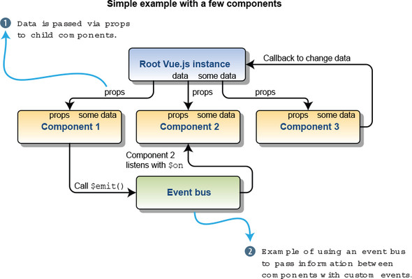
This works well for smaller applications with only a handful of components. In that scenario, we have to pass information to only a few components. What if our application were larger, with more complexity and levels? You can imagine that inside a larger application, keeping straight all the callbacks, passed props, and the event bus would be difficult.
This is where Vuex comes in. It introduces a more organized way to keep track of our state in one central store. Let’s imagine a scenario where you might consider Vuex. In this scenario we’re creating a blog, and inside that blog we have several components including post, comments, create, edit, and delete. We also have an admin interface where we can ban and add users.
Let’s see how that would look with Vuex. As you can see in figure 10.2, the Edit Bio component is nested under the admin component. The Edit Bio component needs to have access to the user information, so it can update it. When using a central store with Vuex, we can access the store, mutate the information, and commit it straight from the Edit Bio component. This is a significant improvement from having to pass the information down from the root vue.js instance to the admin component then finally to the Edit Bio component using props. Trying to keep the information straight from multiple places would be difficult.
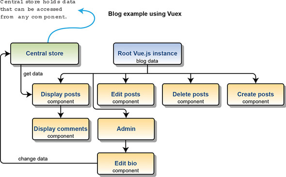
With all that said, there’s a price to pay with Vuex: adding Vuex will add more complexity and boilerplate code to your app. As I mentioned, you probably shouldn’t use Vuex for simple apps with only a few components. Vuex thrives in larger applications where state can be more complicated.
Vuex uses a single object that contains the state for your complete application. This is also sometimes referred to as the single source of truth. As the name suggests, all the data is stored in exactly one place and isn’t duplicated anywhere in the application.
It’s worth mentioning that even though we’re using Vuex, we don’t have to put all our state in Vuex. Individual components can still have their own local state. In certain situations, this might be preferable. For example, in your component you might have a local variable that’s only used in that component. That variable should stay local.
Let’s create a simple example of using state with Vuex. For this example, we’ll use a single file. Later, we’ll see how we can add Vuex to a Vue-CLI application. Open a text editor and create a file called vuex-state.html. In this file we’ll display a message that’s stored in the central store and show a counter. When it’s all done it will look like figure 10.3.
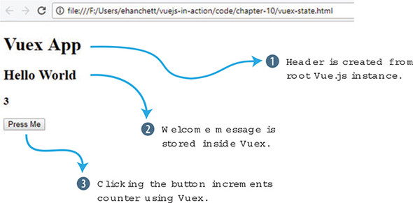
We’ll first add a script tag CDN link to both Vue and Vuex. Next, we’ll add in the HTML. For our HTML we’ll use an H1, H2, H3 and a button tag. The h1 tag will display the header, which is a local variable defined in the Vue.js instance. The welcome and counter messages will be computed properties derived from our Vuex store. The button element will trigger an action called increment. Add the code in this listing to the top of the vuex-state.html file.
<!DOCTYPE html>
<html>
<head>
<script src="https://unpkg.com/vue"></script>          1
<script src="https://unpkg.com/vuex"></script>         2
</head>
<body>
  <div id="app">
      <h1>{{header}}</h1>                              3
      <h2>{{welcome}}</h2>                             4
      <h3>{{counter}}</h3>                             5
      <button @click="increment">Press Me</button>     6
  </div>
Now that we have our HTML in place, let’s begin by adding in a Vuex store. The Vuex store will hold all our data for our example. This will include the msg and count properties.
To update the state, we’ll use something called mutations. You can think of mutations as setters in other programming languages. Setters set values; mutations are what we use to update the state of the application. In Vuex, mutations must be synchronous. In our example, the counter will be triggered only when the button is pressed, so we don’t have to worry about asynchronous code. (Later we’ll look at actions that can help solve the problem when you’re dealing with things that are asynchronous.)
Inside our mutations object we’ll add an increment function that increments state. Take the code in this listing and add it to the bottom of the vuex-state.html file.
<script>
  const store = new Vuex.Store({
      state: {
        msg: 'Hello World',            1
        count: 0
      },
      mutations: {
        increment(state) {             2
            state.count++;
        }
      }
  });
We have our HTML and Vuex store in place, and we can now add the logic that connects everything. We want to make sure that our template displays the msg and counter from the Vuex state and that we can update that count.
Create a Vue.js instance with a new data function. This will return the local header property that displays Vuex App. In the next section, we’ll add a computed property which will have two functions, welcome and counter. The welcome property will return store.state.msg. The counter will return store.state.count.
Finally, we’ll need to create a method called increment. To update the store and access the mutations we set up in Vuex, we can’t call the mutation directly. We must use a special function called commit. This will tell Vuex to update the store and commit the change, so to speak. The store.commit('increment') does the commit to the mutation we created. Add the following code to the vuex-state.html file under the code you created in listing 10.2.
new Vue({
    el: '#app',
    data() {
      return {
        header: 'Vuex App'               1
      }
    },
    computed: {
      welcome() {
        return store.state.msg           2
      },
      counter() {
        return store.state.count;        3
      }
    },
    methods: {
      increment() {
        store.commit('increment')        4
      }

    }
});
</script>
</body>
</html>
Now we have a fully functional app that uses Vuex! Click the button a few times, and you should see the counter increment by one after each button click.
Let’s update this application so that each button click updates the count by 10. If you look closely at the mutations increment function, it has only one argument: state. However, we can pass another argument to it: we’ll call it payload. This payload can be sent from the increment method we created in the root Vue.js instance.
Take the vuex-state.html file and copy it into a new file called vuex-state-pass.html. This file will hold our new application, which shows how to pass in a payload.
As you can see in listing 10.4, we need to update only the mutations object and the increment method. Add another argument called payload to the increment mutation. The payload will be added to the state.count. Inside the increment method, add 10 as another argument to the store.commit. Update the vuex-state.html as shown here.
...
mutations: {
  increment(state,payload) {        1
      state.count += payload;
  }
}
...
methods: {
  increment() {
    store.commit('increment', 10)   2
  }
...
Save the vuex-state-pass.html file and reload your browser. After clicking the button, it should now increment by 10 instead of by 1. If it’s not loading correctly, check your web browser’s console. Make sure you didn’t have any typos.
In the previous example, we directly accessed the store from our computed properties. What if we had multiple components that needed to access these computed properties? What if we wanted to always display a welcome message in all caps? This is where getters can help us out.
Inside Vuex, we have something called getters. With getters, all components can access the state in the same way. Let’s continue with our example from section 10.2. We’re going to update it with getters instead of directly accessing the state in our computed properties. In addition, we want the getter for msg to convert the message to all uppercase letters.
Take the vuex-state-pass.html file from the previous example and copy it to vuex-state-getter-action.html. To make things simple, we’ll leave the HTML the way it was before. When it’s all done it should look like figure 10.4.
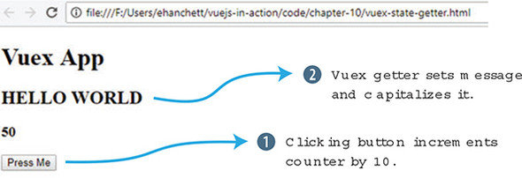
You can see that the Hello World message is now in capital letters. Clicking the Press Me button increments the counter as it did in the last example.
Inside your newly created vuex-state-getter-action.html file, look for the Vuex.Store below the <script> tag. Below the mutations object add a new object called getters. Inside getters we’ll create msg and count as you can see in listing 10.5. Both msg and count take one argument, state.
In our msg getter, we’ll return state.msg.toUppercase(). This will ensure that whenever we use the msg getter, it will return the value in all caps. For our count getter, it will return state.count. Update the vuex-state-getter-action.html with the new getters object under mutations.
...
mutations: {
  increment(state,payload) {
      state.count += payload;
  }
},
getters: {                               1
    msg(state) {                         2
      return state.msg.toUpperCase();
    },
    count(state) {                       3
      return state.count;
    }
},
...
Actions are another integral part of Vuex. I previously mentioned that mutations are synchronous. But what if we’re dealing with asynchronous code? How can we be sure that our asynchronous code will still affect state? That’s where actions in Vuex comes in.
Let’s imagine in our example that we are accessing a server, and we’re waiting for a response. This is an example of an asynchronous action. Unfortunately, mutations must be synchronous, so we can’t use that. Instead, we’ll add the asynchronous operation using a Vuex action.
In this example we’ll create a delay using a setTimeout. Open the vuex-state-getter-action.html file and add a new object called actions after the getter object we created. Inside that object, we’ll have our increment action that takes a context and payload. The context is what we’ll use to commit our changes. We’ll wrap our context.commit inside a setTimeout. This is so we can simulate a delay from a server. We can also pass a payload to the context.commit. This will get passed to the mutation. Update the code based on this listing.
...
},
actions: {                                   1
  increment(context, payload) {              2
    setTimeout(function(){
      context.commit('increment', payload);  3
    },2000);
  }
}
...
Now that we’ve updated our Vuex.Store, we can move on to the root Vue.js instance. Instead of accessing the store directly, we’ll update the computed property to access the getters instead. We’ll also update the increment method. We’ll use the store.dispatch('increment', 10) to access the new Vuex action we created.
The first argument of dispatch is always the name of the action. The second argument is always the payload that will get passed into the action.
The payload can be a simple variable or even an object.
Update the vuex-state-getter-action.html code with the new Vue.js instance from this listing.
...
new Vue({
    el: '#app',
    data() {
      return {
        header: 'Vuex App'
      }
    },
    computed: {
      welcome() {
        return store.getters.msg;         1
      },
      counter() {
        return store.getters.count;       2
      }
    },
    methods: {
      increment() {
        store.dispatch('increment', 10);  3
      }

    }
});
...
Load the app and click the button a few times. You’ll notice a delay, but the counter will update by 10 after each press.
Let’s return to the pet store application that we’ve been working on. If you remember the last time we worked on it, we added fancy animations and transitions. Now that we’ve learned the basics of Vuex, let’s add it to the mix.
Let’s move the product data into the store. If you recall from the previous chapters, we initialized the store in the created hook of the Main component in the pet store application. Instead, we’ll have the create hook dispatch a new action that will initialize the store inside Vuex. We’ll also add a new products computed property that retrieves our products using a Vuex getter that we’ll set up. When all is done it will look and behave the same as it did before, as seen in the figure 10.5.
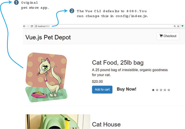
To begin, let’s install Vuex! This is straightforward. If you haven’t already, retrieve the latest version of the pet store application that we last worked on in chapter 8. Or you can download the completed code for this chapter from GitHub at https://github.com/ErikCH/VuejsInActionCode.
Open a terminal window and change directories into the root of the pet store application folder. Run the following command at the prompt to install the latest version of Vuex and save it into the package.json file in the pet store application:
$ npm install vuex
Next, we’ll need to add the store to the main.js file in the src folder. We haven’t created the store yet, but let’s import it anyway. By convention, the store is usually located in the src/store/store.js file. This is up to you, and different developers come up with different conventions. For now, this will work for us. Later in the chapter, we’ll discuss alternative folder structures with something called modules.
Inside the root Vue.js instance, we need to add the store, as shown in the following listing. Add the store to the root instance under router. By the way, because we’re using ES6, we can use the shorthand store, instead of store: store.
// The Vue build version to load with the `import` command
// (runtime-only or standalone) has been set in webpack.base.conf with an
 alias.
import Vue from 'vue'
import App from './App'
import router from './router'
require('./assets/app.css')
import { store } from './store/store';   1

Vue.config.productionTip = false

/* eslint-disable no-new */
new Vue({
  el: '#app',
  router,
  store,                                 2
  template: '<App/>',
  components: { App }
})
Now that we’ve added the store into the root instance, we can access it throughout the application. Create a file in src/store/store.js. This file will be our Vuex store and hold the information for the products in our pet store application. At the top of the file, add two import statements, one each for Vue and Vuex. Next, we’ll add a Vue.use(Vuex). This will connect everything.
Inside the main.js file, we imported store from ./store/store. We need to export a store object inside the store.js file, so that the main.js file can import it. As you can see in listing 10.9, we export a const store of Vuex.Store.
We’ll first add our state and mutations objects. The state object will hold an empty object called products. We’ll load that using our initStore soon. Our mutations will be called SET_STORE. The mutation will take the passed-in products and assign it to state.products. Inside the newly create src/store/store.js file, add the code from this listing.
import Vue from 'vue';
import Vuex from 'vuex';

Vue.use(Vuex);                            1


export const store = new Vuex.Store({     2
  state: {                                3
    products: {}
  },
  mutations: {                            4
    'SET_STORE'(state, products) {
      state.products = products;
    }
  },
  ...
We need to add the action and getter to the store. The getter will return products. The action is a little more complicated. What we want to do is move the created hook code that uses Axios to read the static/products.json file to the actions object in Vuex.
Remember that I mentioned that mutations had to be synchronous and that only actions inside Vuex would accept asynchronous code? To get around this, we’ll put the Axios code inside a Vuex action.
Create the actions object inside the store.js file and add initStore. Inside this action, copy and paste the created lifecycle hook from the components/Main.vue file. Instead of assigning the response.data.products to the products object, we’ll now use the commit function to trigger our mutation. We’ll pass in the response.data.products as the payload to SET_STORE. After all is done, it should look like this.
...
actions: {                                           1
  initStore: ({commit}) => {                         2
    axios.get('static/products.json')
    .then((response) =>{
      console.log(response.data.products);
      commit('SET_STORE', response.data.products )
    });
  }
},
getters: {                                           3
  products: state => state.products
}
});
We’re getting close, and now all we need to do is update the Main.vue file so it uses the Vuex store instead of the local products object. Open the src/components/Main.vue file and look for the data function. Remove the line products: {}. We’ll now access it from a computed property that returns the store.
Look for the computed properties after the methods inside Main.vue. You should see cartItemCount and sortedProducts. Add a new computed property called products and have it return the products getter.
Keep in mind that because we added the store to the root Vue.js instance in the main.js file, we don’t have to do any special imports. Also, the store is always accessed by this.$store when using Vue-CLI. Make sure to remember the dollar sign or you’ll get an error. Add the products computed property to the Main.vue file, as shown here.
computed: {                                 1
  products() {
    return this.$store.getters.products;    2

  },
...
Locate the created hook that initialized the products object. Delete the contents of that object and instead have it call the initStore action we created earlier in the Vuex store. As we did with our previous example, use dispatch to trigger the action. Update the created hook inside the Main.vue file so it triggers the Vuex initStore action, as shown in this listing.
...
},
created: function() {
  this.$store.dispatch('initStore');       1
}
...
That should be it. Run npm run dev from the console and you should see a window open with the pet store application. Try adding items to the cart and verify that all is working. If things aren’t working, check the console for errors. It’s easy to accidentally type Vuex.store instead of Vuex.Store inside the src/store/store.js file. Beware of these problems!
Vuex gives us a handful of helpers that can be used to reduce the amount of verbosity and repetition when adding getters, setters, mutations, and actions to our application. You can find a full list of all the Vuex helpers in the official guides at https://vuex.vuejs.org/en/core-concepts.html. Let’s look at these helpers and see how they work.
The first helper you should know about is mapGetters. This helper is used to add all our getters to our computed properties, without having to type every one of them. To use mapGetters we’ll need to import it into our component first. Let’s look at our pet store application one more time and add in the mapGetters helper.
Open the src/components/Main.vue file and look for the script tag. Inside that tag you should see an import for the header component. Right after that import, add in the mapGetters from Vuex as seen here.
...
...
<script>
import MyHeader from './Header.vue';
import {mapGetters} from 'vuex';           1
export default {
...
Next, we’ll need to update our computed property. Look for the computed property for products that we added earlier. Delete it and add a new mapGetters object.
The mapGetters object is unique and to add it correctly, we need to use the ES6 spread operator which expands our expression in places where zero or more arguments are expected. You can find more information on the ES6 spread syntax from the MDN docs at http://mng.bz/b0J8.
The mapGetters will make sure that all our getters will be added as if they were computed properties. As you can imagine, this syntax is much simpler and cleaner than having to write a computed property for each getter. Each getter is listed in an array inside mapGetters. Add the mapGetters to the Main.vue file.
...
},
computed: {
  ...mapGetters([              1
      'products'               2
  ]),
  cartItemCount() {
...
If you run npm run dev, you’ll see that our pet store application runs normally. Using mapGetters in our application isn’t too useful, but as it grows and we add more getters, this will save us time.
The other three helpers you should know about are mapState, mapMutations, and mapActions. All three behave the same way and are useful to help reduce the amount of boilerplate code you need to write.
Let’s imagine you have several pieces of data in your store. In this instance, you don’t need any getters and you’ll be accessing the state directly from your component. In this case, you might use the mapState helper inside your computed properties.
import {mapState} from 'vuex'         1
...
computed: {
  ...mapState([                       2
      'data1',
      'data2',
      'data3'
  ])
}
...
As with mapState and mapGetters, let’s say you also have several mutations you want access to in your component. You can use the mapMutations helper method to make this easy (shown in the following listing). The mut1 in the listing maps this.mut1() to 'this.$store.commit('mut1').
import {mapMutations} from 'vuex'      1
...
methods: {
  ...mapMutations([                    2
      'mut1',
      'mut2',
      'mut3'
  ])
}
...
Finally, we’ll look at the mapActions helper. This helper maps actions to our app, so we don’t have to create every method and have it dispatch each action. Using the same example, let’s say this application also has some asynchronous operations. We can’t use mutations, so we must use actions instead. We created these in Vuex and now we need to access them in our component method object. Adding mapActions to our methods will take care of this. The act1 maps this.act1() to this.$store.dispatch('act1'), as shown in listing 10.17.
import {mapActions} from 'vuex'     1
...
methods: {
  ...mapActions([                   2
      'act1',
      'act2',
      'act3'
  ])
}
...
These helpers will come in handy as your application grows, and it will cut down on the amount of code you need to write. Keep in mind that you’ll need to plan the names in your store because they’ll map out to the names in your components as you use these helpers.
In the earlier sections of this chapter, we created a store.js file in the src/store directory for the pet store application. This worked well for our relatively small application. However, what if our application were much larger? The store.js file would quickly become bloated and it would be difficult to keep track of everything in it.
The Vuex solution for this is modules. Modules allow us to divide our store into smaller pieces. Each module has its own state, mutations, actions, and getters, and you can even nest modules inside it.
Let’s refactor our pet store application to use modules. First, we’ll need to keep our store.js file; however, we need to create a new folder named modules inside our store folder. Inside that folder create a file called products.js. The folder structure should look like figure 10.6.
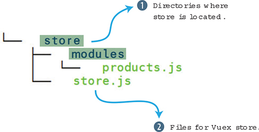
Inside the products.js file, we’ll need to create four objects: state, getters, actions, and mutations. We’ll need to copy and paste each of the values from our store.js to the products.js file.
Open the src/store/store.js file and start copying over the code. When you’re done, your products.js file should look like the following listing.
const state = {                                1
    products: {}
};

const getters = {                              2
    products: state => state.products
};

const actions = {                              3
    initStore: ({commit}) => {
      axios.get('static/products.json')
      .then((response) =>{
        console.log(response.data.products);
        commit('SET_STORE', response.data.products )
      });
    }
};

const mutations = {                            4
    'SET_STORE' (state, products) {
      state.products = products;
    }
};
After adding everything to the product.js file, we need to create an export. This will allow the file to be imported into the store.js file. At the bottom of the file, add an export default. This is an ES6 export command that allows you to import it from other files.
At the bottom of product.js, add the default export.
...
export default {          1
    state,
    getters,
    actions,
    mutations,
}
We’ll need to update the store.js file. In this file we’ll add a new module object, and in this object, we can list all the modules we added. Make sure to add an import to the modules/products file we created.
In our case, we have only one, so we’ll go ahead and add it into the module object. Make sure to delete everything in the Vuex.Store so it matches the following listing.
import Vue from 'vue';
import Vuex from 'vuex';
import products from './modules/products';       1

Vue.use(Vuex);


export const store = new Vuex.Store({
  modules: {                                     2
    products
  }

});
Once we have the modules imported, we’re ready to go. Refresh the application and it should behave as it always has.
In certain larger applications, breaking up your store into modules might present a problem. As the program grows and more modules are added, the names of your actions, getters, mutations, and state might collide. You might, for example, name two getters with the same name in two different files accidentally. Because everything in Vuex shares the same global namespace, you’ll get a duplicate getter key error in your console when this happens.
To alleviate this problem, you can use namespaces. By setting the namespaced: true at the top of your Vuex.store you can break up your modules per namespace. To learn more about namespaces and how to set this up in your file, please check out the Vuex official documentation at https://vuex.vuejs.org/en/modules.html.
Use your knowledge from this chapter to answer this question:
See the solution in appendix B.
We’ve discussed Vuex and how state management can benefit our larger Vue.js applications. Now we’re going to look at communicating with a server. In this chapter, we’ll look at server-side rendering (SSR) and how we can use it to help improve our app’s responsiveness. We’ll use Axios to retrieve data from a third-party API. Then we’ll look at VuexFire. VuexFire is library that helps us communicate with Firebase, a backend service that helps with application development. Last, we’ll see how to add simple authentication to our VuexFire app.
Before we move on, let me preface this chapter by saying there are many ways to communicate with a server in Vue.js. We could use an XMLHttpRequest or use any number of AJAX libraries out there. In the past, Vue officially recommended the Vue resource library as the official AJAX library. Evan You, the creator of Vue, retired the library in late 2016 from official recommendation status. As far as the Vue community goes, you can use whatever library you like.
With all that said, I determined that Axios, Nuxt.js, and VuexFire are several of the most popular libraries that could help us communicate with a server in one way or another. They’re all different, however. Nuxt.js is a powerful framework for creating server-rendered apps, but Axios is a frontend HTTP client. VuexFire helps us communicate with Firebase. All three take different approaches to communication.
The purpose of this chapter is to give you working knowledge of all three of these libraries and frameworks. We’ll create examples for each, but we won’t go too deep. Each subject could warrant its own chapter—and in the case of Nuxt, its own book. Nevertheless, this will be a good primer for these topics, and I’ll include links to each resource, so you can dive in deeper.
Vue.js is a single-page application framework that uses client-side rendering. The logic and routing of the application are written in JavaScript. When the browser connects to the server, the JavaScript is downloaded. The browser is then responsible for rendering the JavaScript and executing the Vue.js application. With larger applications, the time to download and render the application can be significant. You can see from figure 11.1 how this might look.
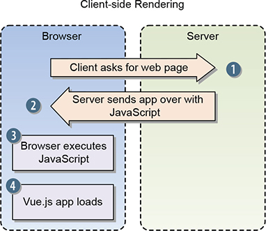
Server-side rendering (SSR) with Vue.js is different. In this case, Vue.js reaches out to the server, which then sends over the HTML so the browser can display the page immediately. The user sees the page load quickly. The server then sends the JavaScript, and it loads in the background. It’s worth mentioning that even if the user sees the webpage, they may not interact with it until Vue is done executing (figure 11.2).
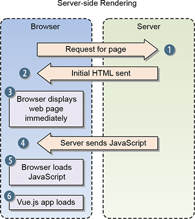
Typically, SSR is a more pleasant experience for the user because the initial load is fast. Most users don’t have the patience to wait for slow apps to load.
SSR also has unique advantages for search engine optimization (SEO). SEO is a term that describes getting organic visibility (non-paid) on search-engine results. Although little is known of the precise methods Google and other search engines use when determining search-engine rankings, there’s a worry that search-engine robots have problems when crawling client-side rendered pages. This could cause issues with rankings. SSR helps prevent these problems.
Vue.js doesn’t come with SSR by itself, but there are great libraries that make it easy to add SSR to our app. The two most popular are vue-server-renderer and Nuxt.js. You can find more information on SSR from the official SSR guides at https://ssr.vuejs.org/. Instead. we’ll look at how we can create an SSR app using Nuxt.js.
Nuxt.js is a higher-level framework built on top of the Vue ecosystem that helps create SSR applications without having to worry about all the aspects of delivering a production-ready, server-rendered app.
Nuxt focuses on UI rendering, and much of the client/server layer is abstracted away. It can act as a standalone project or an addition to a Node.js-based project. In addition, it has a built-in static generator that can be used to create Vue.js websites.
When you create a project with Nuxt, you get Vue 2, the Vue router, Vuex, vue-server-renderer, and vue-meta. Under the hood it uses Webpack to help put everything together. It’s an all-in-one package for getting up and running.
We can use Nuxt with an existing Node.js application but we won’t look at that today. If you want more information on creating a Nuxt app with an existing Node.js project, check the official documentation at https://nuxtjs.org/guide/installation.
Nuxt provides a starter template to help us get started. This starter template can be downloaded from the official GitHub repository at http://mng.bz/w0YV. We can also create a project using the starter template with Vue-CLI. (If you haven’t installed Vue-CLI, see appendix A for installation instructions.)
If you’re using Nuxt, you’ll need Node. Nuxt requires version 8 or later to work. Otherwise, you’ll get async errors when you try to start the project.
The project listed in this chapter is working on Nuxt 1.0. But as of this writing, Nuxt 2.0 is in development and in beta. This example should work on both but if you encounter any problems, check the official GitHub repository for this book at https://github.com/ErikCH/VuejsInActionCode. This code will be maintained.
We’ll use the Vue-CLI to create a project. At the command prompt, run the following command:
$ vue init nuxt-community/starter-template <project-name>
This will create a new Nuxt project using the starter template. Next, you’ll need to change into the directory and install the dependencies with the following commands:
$ cd <project-name>
$ npm install
To launch the project, run the npm run dev command:
$ npm run dev
This will start a new project on localhost port 3000. If you open a web browser, you should see the welcome page (figure 11.3). If the welcome page isn’t displayed, double-check to make sure you didn’t skip the npm install step.

Let’s look at how to use Nuxt.js in a real app.
Server-side rendered apps can be useful and powerful. Let’s look at what Nuxt.js can do for us. Let’s imagine you need to create an app that interacts with the iTunes API. The iTunes API has a list of millions of artists and albums. You want to search for any artist and display their discography.
You can find more information on the iTunes API in the official documentation at http://mng.bz/rm99.
In building our app, we’ll use two different routes. The first route will display an input box for searching the iTunes API. This page will look like figure 11.4.
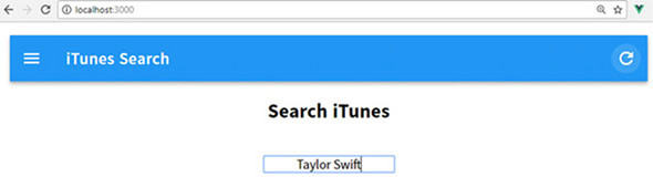
The next route will display the artist’s album information.
To make things look nicer, we’ll use a material component framework called Vuetify. We’ll talk more about that later.
To make things more interesting, we’ll pass information from our search route into the results route by using a parameter. After entering an artist’s name in the search box (Taylor Swift), the results page will be displayed (figure 11.5). You can see in the URL box at the top of the page that “Taylor%20Swift” has been passed in.
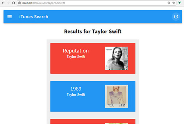
The search page will display all the albums associated with the artist. It will display the album name, artist name, and the cover art, and the card will link to the iTunes artist page. In this example we’ll also look at middleware, which will allow us to write code before the route is rendered. We’ll see how we can use the Axios library to communicate with the iTunes API. We’ll wrap everything up by looking at Vuex again.
Let’s begin creating our music API app by using the Vue-CLI starter template. We’ll then install all our dependencies. Run the following command at the prompt:
$ vue init nuxt-community/starter-template itunes-search
After the application is created, install Vuetify and Axios as an npm package using the npm install command. In addition, Vuetify requires both the stylus and stylus-loader so we can set up our stylus CSS that Vuetify uses.
Vuetify is a material component framework for Vue.js 2.0. It adds many easy-to-use and beautifully crafted components. It has similarities to other UI frameworks, such as Bootstrap. You can find more about Vuetify at the official website at https://vuetifyjs.com.
Run the following commands to install Vuetify, Axios, stylus, and stylus-loader:
$ cd itunes-search
$ npm install
$ npm install vuetify
$ npm install axios
$ npm install stylus –-save-dev
$ npm install stylus-loader –-save-dev
This will install all the dependencies we need to get started, but to get these dependencies to work correctly, we’ll need a little more setup. We’re going to set up Axios and Vuetify in our vendor file, register Vuetify inside our app, set up the Vuetify plugin, and finally set up our CSS and fonts.
The nuxt.config.js file is used to configure the Nuxt app, so navigate to the nuxt.config.js file in the root of the /itunes-search folder. Find the section that begins with extend (config, ctx). This section is used to automatically run ESLint on our code every time we save. (ESLint is a pluggable linting utility that checks our code for style and formatting, among other things.) We could edit the .eslintrc.js file and change the default linting, but for the sake of simplicity, we’ll delete this section instead. This will turn off the automatic linting. Next add a new vendor option under build. We then need to add Axios and Vuetify to the vendor option, as seen in listing 11.1.
Let me explain how this works. Every time we import a module in Nuxt.js, the code is added to a page bundle that Webpack creates. This is a part of something called code splitting. Webpack splits our code into bundles, which then can be loaded on demand or in parallel. When we add the vendor option it makes sure that the code is only added once to the vendor bundle file. Otherwise each import would add to each page bundle and increase the size of the project. It’s good practice to always add your modules to the vendor option so it won’t get duplicated in your project. (Nuxt 2.0 no longer requires the vendor option. This can be removed.) Update the package.json file in the root /itunes-search folder with the new vendor options.
...
  build: {
    vendor: ['axios', 'vuetify']      1
  }
...
Although we’ve added Axios and Vuetify as vendors, we’re not done. Vuetify requires a little more setup. We’ll need to add a plugins section to the nuxt.config.js file and add the plugin to the /plugins folder.
Plugins in Nuxt.js are a way of adding external modules to your application; they require a little more setup. Plugins run before the root Vue.js instance is instantiated. Unlike adding a vendor option, a corresponding file runs in the /plugins folder.
The official documentation for Vuetify recommends that we import Vuetify and tell Vue to use it as a plugin. We’ll add this code to our plugin file. Add a new file in the plugins folder, and name it vuetify.js. Inside the file, register Vuetify with Vue, as shown here.
import Vue from 'vue'
import Vuetify from 'vuetify'

Vue.use(Vuetify)               1
Next, we’ll need to add a reference to the plugin in the nuxt.config.js. Open the nuxt.config.js file in the root of the app folder and add the plugins.
...
  plugins: ['~plugins/vuetify.js'],      1
...
The last thing we need to do to get Vuetify working is to add CSS. The official documentation recommends that you import the material design icons from Google and add a link to the Vuetify CSS file.
Remember earlier when we imported the stylus loader? Well now we can add a link to our own stylus file in the nuxt.config.js file. In the CSS block at the top, delete the main.css file, if it exists, and add a link to the app.styl file that we’ll create in a moment. Also, add a stylesheet in the head section for the Google material design icons. The completed nuxt.config.js file should look like this.
  module.exports = {
  /*
  ** Headers of the page
  */
  head: {
    title: 'iTunes Search App',
    meta: [
      { charset: 'utf-8' },
      { name: 'viewport', content: 'width=device-width, initial-scale=1' },
      { hid: 'description', name: 'description', content: 'iTunes search
      project' }
    ],
    link: [
      { rel: 'icon', type: 'image/x-icon', href: '/favicon.ico' },
      {rel: 'stylesheet', href: 'https://fonts.googleapis.com/
      css?family=Roboto:300,400,500,700|Material+Icons'}          1
    ]
  },
  plugins: ['~plugins/vuetify.js'],
  css: ['~assets/app.styl'],                                      2
  /*
  ** Customize the progress bar color
  */
  loading: { color: '#3B8070' },
  /*
  ** Build configuration
  */
  build: {
    vendor: ['axios', 'vuetify']
  }
}
Now we need to create the assets/app.styl file, as shown in the following listing. This will import the Vuetify styles for the app.
// Import Vuetify styling
@require '~vuetify/src/stylus/main'       1
After this is done, run the npm run dev command and verify that you don’t see any errors in the console. If you do, open the nuxt.config.js file and check for any missing commas or typos. Also, make sure you’ve installed all the dependencies, including stylus and stylus-loader. Those must be installed for Vuetify to work.
Components are our building blocks of our application. It’s where we can split our app into distinct parts that we can build back together. Before we build our routes, you may have noticed that there’s a components folder. This folder is where we can put all our normal, plain components.
Nuxt.js gives us two different types of components. One is supercharged and the other is not. Supercharged components have access to special Nuxt-only configurations and are all located in the pages folder. These options let you access server-side data. The pages directory is also where we set up our routes and where our index component is located.
In this section, we’ll discuss using the components in the components folder. We’ll create two components for our iTunes search application: Card, which will hold the information for each artist album that we find, and Toolbar. The Toolbar component will create a simple toolbar that will be displayed at the top of each route. We’ll use Vuetify to help create both components. I’ll show you the HTML and CSS for these using Vuetify, but we won’t go into much detail.
If you’d like to explore all the options of Vuetify, I recommend you read through the quickstart guide at https://vuetifyjs.com/vuetify/quick-start.
Create a file, Toolbar.vue, in the components folder. This file will hold our Toolbar template. Inside this template we’ll use several of Vuetify’s built-in components. We’ll also add scoped CSS to remove the text decorations on the links. When we’re done, the toolbar should look like figure 11.6.
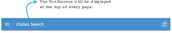
In Vue.js, we normally use the route-link component to navigate inside the application, but this component doesn’t exist in Nuxt. To navigate between routes, we must use the nuxt-link component instead; it works exactly like the route-link. As you can see in listing 11.6, we’ll use the nuxt-link component to create a link to the root of the application whenever someone clicks the iTunes Search text at the top. Add this code to the Toolbar.vue file.
<template>
  <v-toolbar dark color="blue">                                   1
    <v-toolbar-side-icon></v-toolbar-side-icon>
    <v-toolbar-title class="white--text">
      <nuxt-link class="title" to="/">iTunes Search</nuxt-link>   2
    </v-toolbar-title>
    <v-spacer></v-spacer>
    <v-btn to="/" icon>
      <v-icon>refresh</v-icon>
    </v-btn>
  </v-toolbar>
</template>
<script>
</script>
<style scoped>                                                    3
.title {
  text-decoration: none !important;
}
.title:visited{
  color: white;
}
</style>
The next component we need to create is the Card component. It will be used in the results route, and will display each album from the artist. Once again, we’ll use Vuetify to make this component look nice. When it’s all done, it should look like figure 11.7.
In addition to Vuetify, we’ll also use props. The results route will be responsible for accessing the API and retrieving the album information. We’ll then pass that information into the component using props. We’ll pass in the title, image, artistName, url, and color.
The v-card component accepts an href and a color attribute. We can use a v-on directive to bind our props to them. The v-card-media component accepts an img attribute. Our image prop will bind to it. Finally, the artistName and title will be displayed using a class. This will center the title and artist name in the card. Copy the code from this listing and create a file in the components folder named Card.vue.
<template>
  <div id="e3" style="max-width: 400px; margin: auto;"
  class="grey lighten-3">
        <v-container
        fluid
        style="min-height: 0;"
        grid-list-lg>
        <v-layout row wrap>
          <v-flex xs12>
            <v-card target="_blank"                            1
:href="url"
:color="color"
class="white--text">
              <v-container fluid grid-list-lg>
                <v-layout row>
                  <v-flex xs7>
                    <div>
                      <div class="headline">{{title}}</div>    2
                      <div>{{artistName}}</div>                3
                    </div>
                  </v-flex>
                  <v-flex xs5>
                    <v-card-media
                    :src="image"                               4
                    height="100px"
                    contain>
                  </v-card-media>
                </v-flex>
              </v-layout>
            </v-container>
          </v-card>
        </v-flex>
      </v-layout>
    </v-container>
  </div>
</template>
<script>
export default {
    props: ['title', 'image', 'artistName',                    5
'url', 'color'],
}
</script>
These components—Toolbar and Card—will come in handy later when we put together our pages and default layout.
Now that we have our components in place, we need to update our default layout in the layouts folder. As the name suggests, the default layout is a component that wraps every page in the application. Inside each layout is a <nuxt/> component. This is the entry point for each page. The file default.vue implements the default layout. This can be overridden inside any page component. We’ll look at the page structure in the next section. Pages are components that have special properties, and they help define the routing of the application.
For our simple app, we’ll update the default.vue file and make several minor changes. We want to add the Toolbar.vue file to the top of every route, so we don’t have to keep adding it to every page in our app. All we have to do is add it once to the default layout, and then it will appear on every page of our application. Update the default.vue file and add a new section element with a class named container. Import the Toolbar component in the <script> and add it to components. Then add the new <ToolBar/> component above the <nuxt/> component, in the following listing. Update the default.vue file in the /layouts folder so it matches this.
<template>
  <section class="container">                   1
    <div>
      <ToolBar/>                                2
      <nuxt/>
    </div>
  </section>
</template>

<script>
import ToolBar from '~/components/Toolbar.vue'; 3
export default {
  components: {
    ToolBar
  }
}
</script>
<style>
...
Now that we have the layout in place, let’s move on to Vuex.
The album information from the iTunes API will reside in the Vuex store. In Nuxt.js, Vuex stores can be accessed anywhere in the application including in the middleware. The middleware allows us to write code before the route loads. We’ll look at middleware in a later section.
Using Vuex, we’ll create a simple store. It will have one property in the state, called albums, and it will have a mutation called add. The add will take the payload and assign it to the state.albums in the store/index.js file, as you can see in the following listing. Create a file in the store folder named index.js. Add this code to it.
import Vuex from 'vuex'

const createStore = () => {
  return new Vuex.Store({
    state: {                        1
      albums: []
    },
    mutations: {
      add (state, payload) {        2
        state.albums = payload;
      }
    }
  })
}

export default createStore
Now that we have the store in place, we can have our middleware make a call to our API and save it in the store.
Middleware is a term used in Node.js and Express to refer to a function that has access to a request object and a response object. In Nuxt.js, middleware is similar. It’s run on the server and client and can be set on any page in the application. It has access to both the request and response object and it’s run before the route is rendered.
Middleware and asyncData, which we’ll learn more about later, are run on the server and the client. What this means is when a route loads for the first time the asyncData and middleware are run from the server. However, every subsequent time the route loads it’s run on the client. In some instances, you may want to run code purely on the server and not the client. This is where the serverMiddleware property comes in handy. This property is configured in the nuxt.config.js and can be used to run application code on the server. For more information on serverMiddleware check out the official guides at https://nuxtjs.org/api/configuration-servermiddleware/.
Middleware is created in the /middleware directory. Each middleware file has a function that has access to an object called context. Context has many different keys, including request, response, store, params, and environment. You can find the full listing of context object keys in the official documentation at https://nuxtjs.org/api/context.
In our application, we want to send the name of the artist in a route parameter. This is accessible by using the context.params object. We can use that parameter to construct a request to the iTunes search API and retrieve a list of albums. We can then take that list and assign it to our albums property inside our Vuex store.
To make a request to the server, we need to use a library that simplifies the process. Many libraries exist, but I like Axios, the HTTP library that we can use from the browser or Node.js to make HTTP requests. It transforms our JSON data automatically and it supports promises. To learn more about Axios, check out the official GitHub page at https://github.com/axios/axios.
Create a file named search.js in the middleware folder. Add the code in listing 11.10. This code makes an HTTP GET request to the iTunes API and passes in the params.id as the search term in the request. When the promise returns, it calls the add mutation using the store.commit function. You may have noticed that we’re using the ES6 destructuring for {params, store}. Instead of passing in the context, we can use destructuring to pull out the keys we need.
import axios from 'axios'

export default function ( {params, store} ) {              1
  return axios.get(`https://itunes.apple.com/
     search?term=${params.id}&entity=album`)
        .then((response) => {
            store.commit('add', response.data.results)     2
        });
}
We have everything in place now, so we can look at pages and the route.
Routing in Nuxt.js is a little different from what you see in a normal Vue.js application. You don’t have a VueRouter that you have to set up for all the routes. Instead, routes are derived by the file tree created under the pages directory.
Each directory is a route in your application. Each .vue file in that directory corresponds to the route as well. Let’s imagine you have a pages route and in that route you have a user route. To create these routes, your directory structure will look like figure 11.8.
The directory structure in the pages folder will automatically generate the route shown in this listing.
router: {
  routes: [
    {
      name: 'index',
      path: '/',
      component: 'pages/index.vue'           1
    },
    {
      name: 'user',
      path: '/user',
      component: 'pages/user/index.vue'
    },
    {
      name: 'user-one',
      path: '/user/one',
      component: 'pages/user/one.vue'
    }
  ]
}
This is a quick example of the type of routing you can do. You can find more information on routing from the official guides at https://nuxtjs.org/guide/routing.
For our app we’ll have something much simpler. We’ll only have two routes, and one of them will be dynamic. To define a dynamic route in Nuxt you must put an underscore before the name. As seen in figure 11.9 the root of the pages folder has an index.vue file. This is the root component and will be loaded when the application starts. You’ll also see a README.md file. This file can be deleted; it’s only there to remind you what should be inside the directory. The _id route is dynamic. The ID will match the artist name and will be passed into the route.
Inside the pages folder create a results directory. Then open the index.vue file. Delete everything and add the fairly simple code from listing 11.12. We have a template at the top with an <h1> tag and a <form> element. A v-on directive is attached to the submit event on the form. We’ll also use the event modifier prevent to stop the form from submitting.
Inside the submit method, we’ll use this.$router.push. This will route the application over to the results/ page. We’ll pass the search results into the route as a parameter. Because we set up the dynamic _id route, the search results will show up as part of the URL. For example, if we search for Taylor Swift, the URL will be /results/taylor%20swift. Don’t worry about the %20, this is added in automatically and represents a space character.
At the bottom of the page component, add a style tag, as shown in this listing. This will center the text and add a little padding.
<template>
  <div>
    <h1>Search iTunes</h1>
    <br/>
    <form @submit.prevent="submit">                    1
      <input placeholder="Enter Artist Name"
  v-model="search"
  ref='search' autofocus   />
    </form>
  </div>
</template>
<script>
export default {
  data() {
    return {
      search: ''
    }
  },
  methods: {
      submit(event) {
        this.$router.push(`results/${this.search}`);   2

      }
  }
}
</script>

<style>                                                3
* {
  text-align: center;
}

h1 {
  padding: 20px;
}
</style>
The final piece to this app is the _id page that will display a card for each album in the result. It will also alternate the colors between blue and red on each card.
Earlier in this chapter, I mentioned that pages are supercharged components. In other words, they have certain Nuxt-only options available to them. These options include fetch, scrollToTop, head, transition, layout, and validate. We’ll look at two other options called asyncData and middleware. If you want to learn more about Nuxt options, check out the official documentation at https://nuxtjs.org/guide/views.
The middleware option allows us to define the middleware we want to use in our page. This middleware will run each time the component is loaded. You can see in listing 11.13 that the _id.vue file is using the middleware search we created earlier.
The other option is called asyncData. This is helpful because it allows us to retrieve data and pre-render it on the server without using a store. As you saw in the middleware section, we had to use the Vuex store to save our data so it could be accessed by our components. When using asyncData, you don’t have to do this. Let’s look first at how to access the data using middleware. Then we’ll refactor to use asyncData.
Create a file in the pages/results folder called _id.vue. Inside that new component, add a v-if directive for albumData. This will guarantee the album data is loaded before being displayed. Next, create a v-for directive that iterates through the albumData.
On each iteration, we’ll show a card and pass into it the album data for title, image, artistName, url, and color. The color will be calculated by a method called picker. It will alternate between red and blue based on the index value.
At the top of the file, we’ll access the {{$route.params.id}}. This is the parameter that’s passed in from the search results.
As you can see in the next listing, we’ll add a computed property called albumData. This will retrieve the data from the store. The store is populated by the middleware search that’s triggered as soon as the route loads, as shown here.
<template>
  <div>
    <h1>Results for {{$route.params.id}}</h1>           1
    <div v-if="albumData">                              2
      <div v-for="(album, index) in albumData">         3
          <Card :title="album.collectionCensoredName"   4
                :image="album.artworkUrl60"
                :artistName="album.artistName"
                :url="album.artistViewUrl"
                :color="picker(index)"/>
      </div>
    </div>
  </div>
</template>
<script>
import axios from 'axios';
import Card from '~/components/Card.vue'
export default {
    components: {
      Card
    },
    methods: {
      picker(index) {                                   5
          return index % 2 == 0 ? 'red' : 'blue'
      }
    },
    computed: {                                       6
      albumData(){
        return this.$store.state.albums;
      }
    },
    middleware: 'search'                              7
}
</script>
Run the command npm run dev and open a web browser on localhost port 3000. If you already have it running, make sure to close and restart. You should see the iTunes search app open. If not, look in the console for the error. Sometimes it’s as simple as a typo in the component name.
Let’s do one more modification of our app. Like I said earlier, we have access to something called asyncData. This option is used to load data server side, on the initial load of the component. It’s similar to using a middleware, because we’ll have access to the context.
When using asyncData, be cautious. You will not have access to the component through this option because it’s called before the component is initiated. However, it will merge the data you retrieve with the component so you don’t have to use Vuex. You can find more information on asyncData from the official documentation at https://nuxtjs.org/guide/async-data.
Open the _id.vue file again and delete the albumData computed property. We won’t use it. Instead create an asyncData option, shown in listing 11.14. Inside that option, we’ll do an HTTP GET request using Axios. Similar to middleware, asyncData also has access to the context object. We’ll use ES6 destructuring to retrieve the params, and then use them in the iTunes API call. In the response, we’ll set the albumData object. This object will be available to us after the component is initialized, as shown in listing 11.14.
...
    asyncData ({ params }) {                               1
      return axios.get(`https://itunes.apple.com/
     search?term=${params.id}&entity=album`)
        .then((response) => {                              2
            return {albumData: response.data.results}      3
        });
    },
...
That should be it for asyncData. Save the file and run the npm run dev command again. You should see the page as it was before. As you can see, we have the same results, but we don’t have to use the Vuex store.
Firebase is a Google product that helps you create apps quickly for mobile and desktop. It offers several services, including analytics, databases, messaging, crash reporting, cloud storage, hosting, and authentication. Firebase scales automatically and is easy to get up and running. You can find more information about all the Firebase services at the official home page at https://firebase.google.com/.
For our example in this section, we’ll use two of these services: authentication and the Realtime database. We’re going to take our existing pet store application and modify it to include these services.
Let’s imagine we were told that we needed to host our products for our pet store app in the cloud and add authentication. Recall from the previous chapter that our pet store application uses a flat file, products.json. We’ll need to move the products.json contents to Firebase’s Realtime database. We’ll then modify our application so it pulls from Firebase instead of the flat file.
Another important aspect is to add simple authentication using one of Firebase’s built-in cloud providers. We’ll make a new button in our header to sign in and sign out, and we’ll see how we can save our session data into our Vuex store. When all is done, our app will look like figure 11.10.
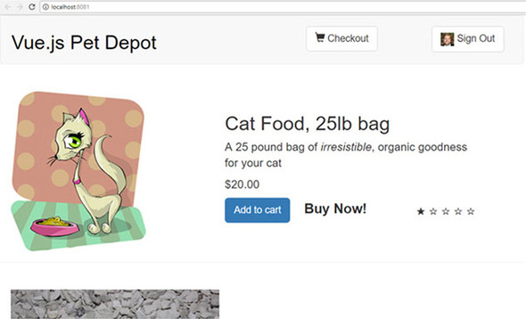
If you have a Google account, you can go to http://firebase.google.com and log in. If you don’t have a Google account, head over to http://accounts.google.com and create one; it’s free. (Firebase is free for a certain number of transactions a month; after that you’ll have to pay.)
After logging in, you’ll be presented with the Welcome to Firebase page. You’ll then have an opportunity to create a project, as seen in figure 11.11.
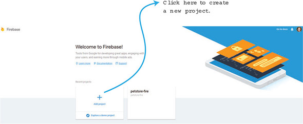
After clicking Add project, you’ll need to type in a project name and country region. Click Create Project and you’ll see the Firebase console. This is where we’ll set up our database, authentication, and retrieve the keys we need to get started.
Click Database on the left side. You should see two options: Realtime Database and Cloud Firestore. We’re going to use the Realtime Database. Click Get Started (figure 11.12).
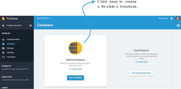
At this point, we’ll add the products.json file into the Firebase database. We could import the JSON file, but we’ll add it manually so we can understand how everything works. Click the plus (+) symbol next to the name you gave the database. Add a Products child. Before clicking Add, click the plus symbol again. This will create another child. In the Name box, add a number. Click the plus symbol again and create seven children. These will be title, description, price, image, availableInventory, id, and rating. Fill in the information and repeat the process for another product. After you’re done, it should look like figure 11.13.
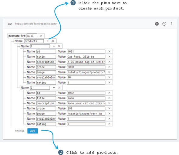
Click Add and you’ll see the two products in the database. Repeat this process and add a few more into it if you like.
After this is done, we’ll need to set up authentication. Click Authentication in the console on the left side. You’ll see a window that has a button for SET UP SIGN-IN METHOD. Click that button, as you see in figure 11.14.
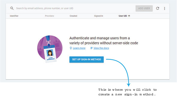
On the next page, choose Google. We’ll be using this for our authentication in our app. We could as easily set up Facebook or Twitter, but for this example we’ll assume that anyone who wants to log in to our app must also have a Google account. In the setup window, slide the Enable button and save your work, as shown in figure 11.15. That should be it; that will enable us to sign in with Google.
Finally, we need to grab configuration information. Head back to the project overview console page by clicking Project Overview on the left side. You’ll see an Add Firebase to your web app button. Click this button and a window will open with your Firebase keys and initialization information. Record this information for later; we’ll need it when setting up Firebase in our app.
Now that we’ve set up Firebase, we need to update our pet store app to use it. The last time we used our pet store was in chapter 10, when we added in Vuex. Copy the pet store app from the previous chapter or download the code for the chapter. We’ll use this code as a starting point.
For Firebase to work correctly with Vue, we’ll need to use a library called VueFire. This will help us communicate with Firebase and set up the bindings we need. You can find more information on VueFire on their official GitHub page at https://github.com/vuejs/vuefire.
Open your console and change directories to the location of your pet store app. Install VueFire and Firebase with the following commands:
$ cd petstore
$ npm install firebase vuefire –save
This will install and save all the dependencies we need.
Create a file named firebase.js in the src folder in the root of the pet store app. Remember when you copied the initialization information from the Firebase console? We’ll need that now. At the top of the file, write import {initializeApp} from Firebase. After the import, create a const variable named app and paste in the initialization information you recorded earlier.
Create two exports, one called db and the other called productsRef. This will allow us to connect to the Firebase database and retrieve the product information we created earlier. If you’d like more information on the Firebase API, check the official API documentation at https://firebase.google.com/docs/reference/js/. Copy the code from listing 11.15 into the src/firebase.js file.
import { initializeApp } from 'firebase';            1

const app = initializeApp({                          2
    apiKey: "<API KEY>",
    authDomain: "<AUTH DOMAIN>",
    databaseURL: "<DATABASE URL>",
    projectId: "<PROJECT ID>",
    storageBucket: "<STORAGE BUCKET>",
    messagingSenderId: "<SENDER ID>"
});

export const db = app.database();                    3

export const productsRef = db.ref('products');       4
We now need to set up our main.js file so it can see the VueFire library we installed earlier. We’ll also need to make sure we import Firebase and the firebase.js we created earlier. The Vue.use(VueFire) line will set VueFire as a plugin for the app. This is required by the VueFire installation. Update the src/main.js file with this code.
import Vue from 'vue'
import App from './App'
import router from './router'
require('./assets/app.css')
import { store } from './store/store';
import firebase from 'firebase';         1
import './firebase';                     2
import VueFire from 'vuefire';           3

Vue.use(VueFire);                        4
Vue.config.productionTip = false

/* eslint-disable no-new */
new Vue({
  el: '#app',
  router,
  store,
  template: '<App/>',
  components: { App }
})
It’s a good idea at this point to make sure we don’t have any errors. Save all your files and run the npm run dev command in your console. This will start your server on localhost. Make sure you don’t see any errors in the console. It’s easy to forget an import, so make sure you didn’t forget any inside the main.js file. Because we have everything set up, let’s look at how to set up authentication in our app.
Earlier I mentioned that we’ll use authentication in our app. To save this information, we’ll need to update the Vuex store. To make things easy, we’ll create a state property called session. After a user is authenticated, Firebase returns a user object which holds session information. It’s a good practice to save that information so it’s available anywhere in the app.
Open the store/modules/products.js file, and add a new session property in state. The same way we did in the last chapter, we’ll add in a getter and a mutation. We’ll name the mutation SET_SESSION. Update the store/modules/products.js file so it matches this listing.
const state = {
    products: {},
    session: false                             1
};

const getters = {
    products: state => state.products,
    session: state => state.session            2
};

const actions = {
    initStore: ({commit}) => {
      axios.get('static/products.json')
      .then((response) =>{
        console.log(response.data.products);
        commit('SET_STORE', response.data.products )
      });
    }
};

const mutations = {
    'SET_STORE' (state, products) {
      state.products = products;
    },
    'SET_SESSION' (state, session) {           3
      state.session = session;
    }
};

export default {
    state,
    getters,
    actions,
    mutations,
}
Now that we have a place to set the session data in Vuex, we can add the code to retrieve it from Firebase.
Inside the header, we display the site name and Checkout button. Let’s update the header so it shows a Sign In and Sign Out button.
When the header is complete, it will look like figure 11.16 after someone is signed in. Notice how in figure 11.16 a picture is shown next to the Sign Out text. This is retrieved from the user object from Firebase.
After the user signs out, the button changes to Sign In, as figure 11.17 shows.
Open the src/components/Header.vue file. In this file, we’ll update the template with the new buttons. We’ll also need to add two new methods for signing in and out. Under the navbar-header, add a new div section for the sign in (see listing 11.18). Below that, add another div section for sign out. Inside the sign out div, we’ll also add an image that will be retrieved from the mySession property.
Surrounded by both divs will be a v-if directive. If the mySession property is false it will show the Sign In button. We’ll use a v-else directive to show the Sign Out button if mySession is true. If the session is signed in, we’ll see a Sign Out button; if the session is signed out, we’ll see a Sign In button.
Because the code for the header component is so large, I’ve broken it into three listings (listing 11.18, 11.19, and 11.20). Make sure to take each of these listings and combine them. Take the combined code from the listing and overwrite the file for src/components/Header.vue, as shown next.
<template>
  <header>
    <div class="navbar navbar-default">
      <div class="navbar-header">
        <h1><router-link :to="{name: 'iMain'}">
{{ sitename }}
</router-link></h1>
      </div>
      <div class="nav navbar-nav navbar-right cart">
        <div v-if="!mySession">                         1
          <button type="button"
class="btn btn-default btn-lg"
v-on:click="signIn">                                    2
            Sign In
          </button>
        </div>
        <div v-else>                                    3
          <button type="button"
class="btn btn-default btn-lg"
v-on:click="signOut">                                   4
            <img class="photo"
:src="mySession.photoURL" />
            Sign Out
          </button>
        </div>
      </div>
      <div class="nav navbar-nav navbar-right cart">
         <router-link
active-class="active"
tag="button"
class="btn btn-default btn-lg"
:to="{name: 'Form'}">
          <span class="glyphicon glyphicon-shopping-cart">
{{cartItemCount}}
             </span>
Checkout
        </router-link>
      </div>
    </div>
  </header>
</template>
In the template, we created two methods, signIn and signOut. We also created a new property called mySession. Let’s go ahead and create the script section of our component with these new methods and a computed property. Make sure to import firebase from 'firebase' at the top of the script (listing 11.19).
The first thing we need to do is add a lifecycle hook called beforeCreate. This hook fires before the component is created. In this hook, we want to set our Vuex store with the current session. Firebase conveniently has an observer that will do this called onAuthStateChanged. This observer is triggered whenever a user signs in or out. We can use this to update our store with the session information using SET_STORE. For more information on onAuthStateChanged, check out the official documentation at http://mng.bz/4F31.
Now that we can track when a user signs in and out, we can create those methods. Create a method named signIn. Inside that method create a provider firebase.auth.GoogleAuthProvider(). Pass that provider into firebase.auth().signInWithPopup. This will create a popup asking the user to sign into their Google account. The signInWithPopup will create a promise. If the login is successful, we display “signed in” in the console. If it isn’t successful, we see “error” in the console.
Remember, because we set up an observer for onAuthStateChanged inside the beforeCreate hook, we don’t have to set up any other variable after a user logs in. The observer will update the store automatically after we sign in or sign out.
The signOut method works the same way. When the user signs out, a message “signed out” shows in the console. If there is an error, “error in sign out!” is displayed.
For our computed property mySession, we’ll return the Vuex getter for session. If the session doesn’t exist, it will be set to false. It’s worth mentioning that we could have used mapGetters with Vuex. This would automatically map the getters session with the name session in our component. However, because we’re dealing with one getter, I decided to return this.$store.getters.session instead.
Copy the code from the following listing and add it to the bottom of the new combined file that you’ll be using for src/components/Header.vue.
<script>
import firebase from 'firebase';
export default {
  name: 'Header',
  data () {
    return {
      sitename: "Vue.js Pet Depot"
    }
  },
  props: ['cartItemCount'],
  beforeCreate() {
      firebase.auth().onAuthStateChanged((user)=> {                 1
          this.$store.commit('SET_SESSION', user || false)
      });
  },
  methods: {
    showCheckout() {
      this.$router.push({name: 'Form'});
    },
    signIn() {                                                      2
      let provider = new firebase.auth.GoogleAuthProvider();
      firebase.auth().signInWithPopup(provider).then(function(result) {
        console.log('signed in!');
      }).catch(function(error){
        console.log('error ' + error)
      });
    },
    signOut() {                                                     3
      firebase.auth().signOut().then(function() {
        // Sign-out successful.
        console.log("signed out!")
      }).catch(function(error) {
        console.log("error in sign out!")
        // An error happened.
      });
    }
  },
  computed: {
    mySession() {                                                   4
      return this.$store.getters.session;
    }
  }
}
</script>
Finally, we’ll need to add a new photo class to our CSS that will size the photo in our button. Take the code from the following listing and combine it with the previous listings to create the new Header.vue file in the src/components folder.
<style scoped>
a {
  text-decoration: none;
  color: black;
}

.photo {               1

  width: 25px;
  height: 25px;
}

.router-link-exact-active {
  color: black;
}
</style>
After adding all the code for the new Header.vue file, make sure to run the npm run dev command and check for errors. It’s easy to make a mistake on the onAuthStateChanged observer and not commit it to the Vuex store. Look out for that.
With all the authentication out of the way, let’s start retrieving information from the database. By default, we left the database configuration in Firebase to read only. That will work for us.
First, update the mapGetters in the src/components/Main.vue file. You’ll notice that we’re retrieving the products getter. Remove that and add the session getter. We won’t use this now, but it’s nice to know we can use the session inside the main component.
To use the Realtime database with Firebase, all we need to do is import the productsRef from the firebase.js file. Then we’ll need to create a Firebase object that maps productsRef to products. That should be it! All the other code in our Main.vue file can remain the same. Take the code in this listing and update the src/components/Main.vue file.
...
import { productsRef } from '../firebase';    1
export default {
  name: 'imain',
  firebase: {                                 2
      products: productsRef
  },
...
  computed: {
    ...mapGetters([
        'session'                             3
    ])
...
Save all the files and run npm run dev. Inside the browser, you’ll notice a slight delay before the products show up. This indicates the products are being downloaded from Firebase. You could always go into Firebase and add a new product, and it should show up on your list of products.
One thing you may wonder is what we could do next. With the session property, we could set up different sections of the app that are accessible only if a user is logged in. We could do this with the v-if directive or through the router. With the router we can add a meta tag to a route. Then we could use the router.beforeEach to navigate to certain routes if a user is logged in. This concept is called navigation guards. You can read up on the navigation guards section in the official documentation at https://router.vuejs.org/guide/advanced/navigation-guards.html. In the next chapter, we’ll look at testing and how we can use it to make sure our app is doing what we expect.
Use your knowledge from this chapter to answer the following question:
See the solution in appendix B.
We’ve discussed many important topics in this book, but one often-neglected topic doesn’t get enough attention: testing. Testing is an extremely important aspect in any software development project. It ensures that the app behaves the way we expect it to—without bugs. In this chapter, we’ll discuss why you should create tests for your application. Then we’ll look at the fundamentals of unit testing. Next, we’ll look at component testing, both the output and the methods. Finally, we’ll see how to get started testing with Vuex.
It’s worth mentioning before we start that testing is a huge subject. In this chapter, I’ll cover several of the most important aspects of testing with Vue.js. I strongly recommend you look over Edd Yerburgh’s Testing Vue.js Applications (Manning, 2018). In his book, Edd delves into much more detail on creating and developing tests. He also covers server-side rendering testing, snapshot testing, and testing mixins and filters.
Snapshot tests are useful tools when you want to ensure that the UI doesn’t change unexpectedly. In this chapter, I’ll use mocha-webpack, which doesn’t support snapshot testing as of this writing. However, if you want to learn more about snapshot testing, look over the official guides for more information on how to set up Jest with snapshot testing at http://mng.bz/1Rur.
Typically, in the world of software development, there are two ways of testing code: manually and automated. Let’s talk about coding manually first.
You probably started testing manually as soon as you started coding. For every line of code you’ve written, you’ve probably gone back and checked to make sure the output you expect is occurring. For example, in our pet store app we added a button that added a product to our cart. In the previous chapters we tested that manually by clicking the button and then checking the number of items in the cart.
In our pet store app, we also added a button that routes to the checkout page. Once again, we can click that button and make sure that it redirects properly. Manual testing works fine for smaller apps where there isn’t much going on.
Now let’s imagine a scenario where we’re working with a team of developers. We have an app in production and many developers are working on the code. Developers are pushing code throughout the day to the version control system. As you can imagine, relying on every developer to thoroughly test their code manually and verify they haven’t broken anything is impossible. Manual testing is a nightmare and bugs could certainly crop up.
In certain organizations, a quality assurance department is responsible for manually testing code after the development department releases it. This helps reduce the chances of a bug reaching production but it slows down the whole process. In addition, many quality assurance developers don’t have the resources or time to run a complete regression test on the code.
Regression testing is a type of software testing that verifies that the application still performs the same way after it was updated.
But automated testing can help solve several of the problems that manual testing runs into. In our imaginary scenario, we could create several automated tests that a developer could run before pushing their code to production. Automated tests run much quicker then manual testing and they’re more likely to catch bugs immediately. With many automated test cases, a developer can run a full regression on a code base and not worry about having to manually test everything, which is time-consuming.
Although automated testing has many benefits, it has its disadvantages. The one disadvantage that you must consider is the upfront cost. Writing test cases takes time, and although you’ll probably save time in the long run, you’ll spend a longer time writing test cases when compared with writing the code. After everything is set up though, processes such as continuous integration, delivery, and deployment can save time, as we’ll see in the next section.
Automated testing has the added benefit of enabling workflows such as continuous development. This workflow consists of continuous integration, delivery, and deployments. As the name suggests, these workflows are closely related. We’ll briefly discuss each one.
Imagine we’re creating a basic app that connects to a database and retrieves information for a book website. We have a team of developers working on the code base, but the team is running into a number of issues. Most developers are having merge conflicts when they push their code into their version control system every few weeks. In addition, every Friday one person is responsible for manually creating a staging environment for the latest code. (A staging environment runs production code for testing purposes.) This increasingly has taken more time to do because the code base has gotten larger and more complicated. Pushing to production is no better. Half the time the production code won’t build correctly, and it takes hours to fix. The manager has decided to switch to continuous development to help fix these problems. The first step in that process is continuous integration.
Continuous integration (CI) is the practice of merging code into a master branch several times a day.
A master branch is where the production code usually resides. A branch is a version-control term that describes a duplication of a code base so modifications can happen in parallel in both branches.
The obvious benefit of CI is that it helps avoid merge conflicts. Merge conflicts happen when multiple developers try to merge or combine their code into a single branch. Merging code into a master branch several times a day helps avoid one developer’s work-in-progress breaking another developer’s code. Because the master branch is updated continuously, another developer working on the same project can easily pull the latest code down into their own development environment and be relatively sure it’s up to date.
In our imaginary scenario, our manager decides to make the CI process smoother by implementing a service that helps run automated test cases before any developer can push their code. In version control systems like Git, developers can submit pull requests. Services such as Travis, CircleCI, and Jenkins can help check that the pull request passes all the test cases before the code can be merged. After the systems are in place, the team has seen fewer merge conflicts, but they still have problems with deployment.
Continuous delivery is a software-engineering approach that aims to build, test, and release software in a fast and frequent manner. The purpose is to create a fast and reliable deployment pipeline that’s guided by a set of checks that must pass before the code is released. For example, before the software is released, all test cases must pass and the build must pass without any errors or warnings. These types of checks help provide more dependable, consistent releases.
Typically, CI isn’t the responsibility of the development team. Usually a team of people known as DevOps or development operations is responsible for setting up and maintaining continuous delivery. It’s good to understand the basics of this process and how it relates to testing.
With continuous delivery, merging or committing code to the master branch triggers a build of the website. This can save time because it removes the manual step of deploying the website to the staging environment. It has the added benefit that it will deploy only if all test cases pass, so it’s less likely that the website will be broken.
With continuous delivery, our team no longer needs to have someone waste hours creating and deploying a staging environment. Continuous delivery will make sure that it occurs daily. With that said, what does continuous deployment have to do with continuous delivery?
Continuous deployment goes one step further than continuous delivery and deploys code directly to production on every single change. As with continuous delivery, developers can rest assured that all tests pass before the code is deployed to production.
As you can imagine, deploying to production after every change can be dangerous if the automated tests aren’t robust enough to check all parts of the app. The worst-case scenario is that a broken website gets deployed to production. At that point, a rollback or emergency fix is needed. Now that we’ve seen the way we can integrate testing into a workflow, let’s look into what type of tests are available and how we can use these test in Vue.js.
In the world of testing, we can create several types of tests. In this chapter we’ll look at the most common, including unit and component testing.
Unit tests are tests against the smallest parts of our application. These are often functions in our apps, but not always. They can also be components. Let’s begin by creating a basic unit test to see how it works.
Unit tests have unique advantages. For one, they’re fast and run quickly. Because they only test a small piece of code, they can run fast. They can also act as documentation. They’re instructions on how the code should behave. Unit tests are also reliable because they only test a small part of the code. They can be run thousands of times and produce the same output. Unlike other tests that might have to rely on APIs that frequently fail, unit tests should never have this problem. Imagine a scenario where you’ve created an application that converts the temperature from Fahrenheit to Celsius. In this app, we have one function that does the conversion. We could easily create a unit test to verify that the amount returned was correct. You can see that in this listing.
function convert(degree) {
  let value = parseFloat(degree);
  return (value-32)/ 1.8;
}

function testConvert() {                       1
  if (convert(32) !== 0) {
    throw new Error("Conversion failed");
  }
}

testConvert();
The second type of tests we’re going to look at are component tests. These tests run against each component and verify how they should behave. They can be a little more complicated than unit tests because they test more of the application and they’re more difficult to debug. But they verify that the component meets its requirements and achieves its goal.
Now that we have a good idea about the kinds of tests that are out there and why we should test, let’s set up our environment. Our pet store app could use several tests, so let’s add them.
In this section we’ll modify our pet store application so we can use the latest testing libraries recommended by Vue.js. As of this writing, the Vue-CLI didn’t have these libraries built in when we generated our project, so we’ll need to do a little setup. This will require us to install several packages and configure a few files.
To begin our setup, we’ll need to get a copy of our pet store app. If you’ve been following along, feel free to use the app you’ve created. If not, copy the pet store app from chapter 11 at https://github.com/ErikCH/VuejsInActionCode.
The vue-test-utils is the official unit-testing library for Vue.js. It makes testing Vue.js much easier and you should use it. We’ll cover the basics of the library in this chapter; if you’d like more information, you can read how it works in the official guides at https://vue-test-utils.vuejs.org.
You may remember from chapter 7, that when we created the pet store app we said yes to Nightwatch and Karma. This will work but at the time of writing, the Vue-CLI doesn’t support the vue-test-utils library out of the box. Because this library isn’t installed by default, we need to install it.
We’ll also need to make a choice regarding which test-runner we want to use within the vue-test-utils library. A test-runner will pick up the unit tests that we create and execute them. When we first installed our pet store app, Mocha and Karma were our only test-runner choices. Karma works with vue-test-utils but it isn’t officially recommended. The vue-test-utils team recommends either Jest or mocha-webpack. Because we already have Mocha installed, we’ll go ahead and install mocha-webpack. Jest is also an excellent choice, but it won’t be covered in this book.
Keep in mind that if you choose Jest, all the tests in this book will still work, but you’ll have a little different setup. You can find instructions on how to set up Jest at the official guides at http://mng.bz/3Dch.
Because we’re going to use mocha-webpack as our test runner, we’ll need to install a few other things. To run tests, we’ll need a browser. We could run our tests in a real browser, such as Chrome or Firefox, but it’s not recommended because running in a browser can be slow and it’s not as flexible as using a headless browser. Instead we’ll use modules called jsdom and jsdom-global. These modules will simulate a browser for us; they’re headless browsers used to run our test cases.
A headless browser doesn’t have a graphical user interface (GUI) and is used to facilitate automated control of a web page. The headless browser performs much the same as contemporary browsers, but interaction is typically accomplished through a CLI.
We’ll need to pick an assertion library, and Chai and Expect are popular choices. Assertion libraries are used to verify things are correct instead of relying on things like if statements. The vue-test-utils team recommends using Expect with mocha-webpack, so we’ll go ahead and install that. You can find more information on picking an assertion library at http://mng.bz/g1yp.
That last library we need to install is the webpack-node-externals. This will help us exclude certain npm dependencies from our test bundle.
Retrieve the latest version of the pet store app that’s included with this book. Beware, if you download the latest version of the pet store app from chapter 11 you’ll need to enter your Firebase configuration inside the firebase.js file in the src folder if you haven’t done so already. If you forget this step the application will not load!
After you retrieve the latest version of the pet store app, install these dependencies by running the following commands:
$ cd petstore
$ npm install
$ npm install –-save-dev @vue/test-utils mocha-webpack
$ npm install –-save-dev jsdom jsdom-global
$ npm install –-save-dev expect
$ npm install –-save-dev webpack-node-externals
After the dependencies are installed, we’ll add configuration. Edit the webpack.base.conf.js file in the build folder of the pet store app. Copy and paste the code from the following listing at the bottom of the file to configure the webpack-node-externals and inline-cheap-module-source map. This is required by those modules for everything to work correctly.
if (process.env.NODE_ENV === 'test') {
  module.exports.externals = [require('webpack-node-externals')()]     1
  module.exports.devtool = 'inline-cheap-module-source-map'
}
Inside the test folder you’ll notice the unit and e2e folders. We won’t use these folders, so feel free to delete them. Add a new file called setup.js inside the test folder. The setup.js file is where we’ll set the global variables for jsdom-global and expect. This will make it so we don’t have to import both modules into every single test case. Copy and paste the code from this listing into the test/setup.js file.
require('jsdom-global')()               1
global.expect = require('expect')       2
Next, we need to update the test script in the package.json file. This script will run the mocha-webpack test runner and our tests. For the sake of simplicity, all tests will have a spec.js file extension. Edit the package.json file and replace the scripts test section with this line.
"test": "mocha-webpack --webpack-config
build/webpack.base.conf.js --require
 test/setup.js test/**/*.spec.js"             1
That is all the configuration we need for our setup. Now we can start creating test cases!
For our first test using vue-test-utils, let’s see if we can verify that our Form component works correctly after clicking the Order button. When you click the Order button on the form component, an alert box appears. We can test for an alert box, but it’s not easy with our setup and will require us to change our jsdom-global configuration. For the purposes of this test, we’ll create a property called madeOrder. This will be defaulted to false. After clicking the Order button, it will turn true.
The order form will be updated so it shows a message at the bottom that the order is complete (figure 12.1). When madeOrder is true, the text will appear. When it’s false, the text will not show up. We add this so we can get a little more feedback when the order button is clicked, because we’re no longer going to use the alert box.
To make this change, we need to update the src/components/Form.vue file Add a new property in the file called madeOrder in the data function. Edit the submitForm method and delete the alert box, then add this.madeOrder = true. This will guarantee that the property is set to true when the app starts up. Update the src/components/Form.vue with the code in this listing.
...
        dontSendGift: 'Do Not Send As A Gift'
      },
      madeOrder: false               1
...
  methods: {
    submitForm() {
      this.madeOrder = true;         2
    }
  }
...
We’re now ready to create our first test case. Let’s verify that after the Place Order button is clicked, the madeOrder property is set to true. To test this, we’ll use the vue-js-utils shallow function. The shallow function renders a Vue component and stubs out any child components it has. The other common function is mount which works the same as shallow, except it doesn’t stub the child component.
We’ll also need to import the Form component. We’ll pass this into the shallow function later to create a wrapper around it. Next, you’ll notice something called describe. The describe function is used to group similar tests together into a test suite. When we run the tests from the command line, we can see whether the test suite passed or failed.
The it function is a test case. This will be our unit test that tests our button and verifies that it updated the madeOrder property correctly. We can have multiple test cases in each test suite.
Because we’re using the expect assertion library, we’ll use it to make sure that the madeOrder property is set to true. In listing 12.6 we’re using wrapper.vm.madeOrder to access the property. The wrapper object returned from the shallow function has several properties including one called vm. We can use the vm property to access any Vue instance methods or properties, allowing us to run any method or get any property inside the Vue component. This is handy.
wrapper also has a find function that accepts a selector. The find function can use any valid CSS selector, such as tag names, IDs, or classes. We can then use the trigger function to trigger the event—in this case, a click event on the button. Take the following listing and create a new Form.spec.js file.
import { shallow } from '@vue/test-utils'                        1
import Form from '../src/components/Form.vue'                    2

describe('Form.vue', () => {

    it('Check if button press sets madeOrder to true', () => {
      const wrapper = shallow(Form)                              3
      wrapper.find('button').trigger('click')                    4

      expect(wrapper.vm.madeOrder).toBe(true);                   5
    })

})
Let’s run our test cases. Make sure you’re in the pet store top-level directory and run the npm test command. This should run our test suite. If you see an error, make sure you installed all the dependencies that we discussed earlier and verify the package.json file has the test script inside it. Figure 12.2 displays what we’ll see when all of our tests pass!
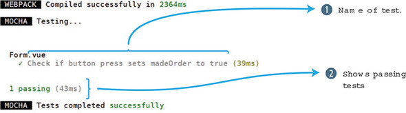
Because everything passed, a successful message is displayed. Let’s see what it looks like when it fails. Go back into the petstore/test/Form.spec.js file. Look for the expect statement and set the value to false instead of true. Run the command npm test again and it should fail. Notice from figure 12.3 that the expected value and the received value are displayed in the output.
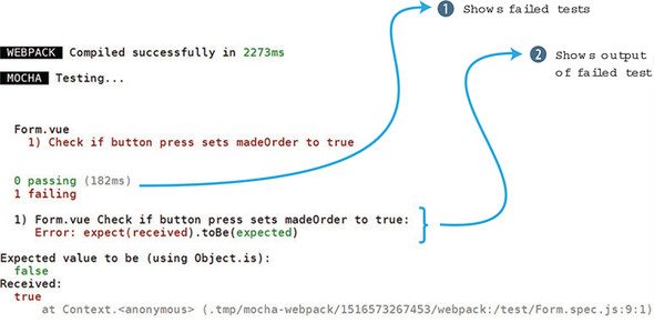
Now that we understand the basics of testing, let’s look at testing components.
Before we test our components, we need a general idea of our specifications. What should we expect the components to do? We’ll use our pet store app as an example.
We have three components in our application: Main, Header, and Form. The Header component’s job is to display the number of items in the shopping cart and to show either a Sign In or a Sign Out button. The Form component’s responsibility is to show all our form inputs, and it gives us an option to order by clicking the Order button. Main is used to display all our products. It needs to render all the components from our Firebase store.
We won’t test every component, but it’s important to write down specifications for each component before creating any test cases. That way we’ll know what to test.
Many of our components will have props that are passed in to them. For example, in our pet store app, the cartItemCount is passed into our Header component and displayed in the top right corner. Let’s create a test case that verifies that this prop is passed in.
Create a file in the petstore/test/ directory called Header.spec.js. This file will contain all our tests for the Header component. Before we can begin, we need to do a little setup.
If you look at the Header.vue file, you’ll notice that we’re using Firebase and Vuex. The beforeCreate hook calls a Firebase function and sets the value using a Vuex store command that commits the session. We won’t test Vuex or Firebase in this example, but we’ll need to import them, otherwise we’ll get an error. Make sure to import both ../src/firebase and ../src/store/store as seen in listing 12.7.
At the top of the file, import shallow from the vue-test-utils library. In addition, import something called createLocalVue. We need this function so we can set up Vuex.
Next, we’ll create a localVue variable and assign it to createLocalVue(). This function returns a localVue class. You can think of it as a photocopier that produces a photocopy version of Vue. We can use this to help set up Vuex for our testing.
You can see from listing 12.7 that we use the shallow function again, but it looks a little different than the unit test we created earlier. The shallow function can accept an optional second argument. This object holds more information that the component needs. Inside it, we can set the props data using propsData as well as localVue and store.
To set the props, we must pass something in to it. The easiest way to do that is to add cartItemCount. We pass that variable into the propsData, and it will be set inside the Header component.
The last thing we do is check that the wrapper.vm.cartItemCount matches the cartItemCount variable. If they’re the same, the test passes. Take the code in the next listing and copy it to the petstore/test/Header.spec.js file.
import { shallow, createLocalVue } from '@vue/test-utils';
import Header from '../src/components/Header.vue';
import Vuex from 'vuex';                                         1
import '../src/firebase';                                        2
import { store } from '../src/store/store';                      3

const localVue = createLocalVue();
localVue.use(Vuex)

describe('Header.vue', () => {

  it('Check prop was sent over correctly to Header', () => {
    const cartItemCount = 10;
    const wrapper = shallow(Header, {                            4
      store, localVue, propsData: { cartItemCount }              5
    })
    expect(wrapper.vm.cartItemCount).toBe(cartItemCount);        6
  })

});
Now that we can check props, let’s look at text.
Sometimes you want to test if text is rendered somewhere in the component. It doesn’t matter what element renders the text, only that an element renders it.
Keep in mind when writing tests that each test case should test only one thing. It might be easy to create multiple assertions inside a test case that checks text, but it’s often better to take these types of tests and create multiple test cases out of them. We’ll follow this rule of creating a single assertion in a test case.
Open the petstore/test/Header.spec.js file and add a new test case. In our last test case, we verified that the cartItemCount prop was being passed correctly into the Header component. Now we want to verify whether the text from the prop is displayed properly inside the component in the span tag.
To do this, we’ll create another wrapper the way we did before. This time, we’ll use the wrapper.find function to look up the span. We can then use the text() function to extract the text inside the span, which is our cartItemCount. We then use the toContain function to verify that the contents match. Copy the code from the following listing into the pet/test/Header.spec.js as another test after the last test.
it('Check cartItemCount text is properly displayed', () => {
  const cartItemCount = 10;
  const wrapper = shallow(Header, {
    store, localVue, propsData: { cartItemCount }
  })
  const p = wrapper.find('span');              1
  expect(p.text()).toContain(cartItemCount)    2
})
When testing classes, we can use the method classes, which returns an array of classes attached to an element. Let’s add a quick check to verify whether the class on one of our divs is correct.
Inside the petstore/test/Header.spec.js file, add a new test case. In this test case we’ll create a new wrapper. This time we’ll use a findAll which will return all the divs in the component. We can use the at(0) to retrieve the first div. From there we can use our expect statement on p.classes() to retrieve all the classes attached to the first div. The toContain will return true if any of the classes match.
If we look at the Header.vue file, we’ll notice that both navbar and navbar-default are attached to the first div. Because we’re looking for navbar, this test will pass.
it('Check if navbar class is added to first div', () => {
  const cartItemCount = 10;
  const wrapper = shallow(Header, {
    store, localVue, propsData: { cartItemCount }
  })
  const p = wrapper.findAll('div').at(0);         1
  expect(p.classes()).toContain('navbar');        2
})
Before we get too much further, run npm test at the command prompt and verify that all the tests are passing (figure 12.4). If any are failing, double-check the expect statements and that you’re importing everything correctly at the top of the file.
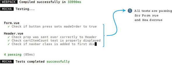
All tests are passing, so let’s move on to Vuex.
The Vuex store is a central location where we can hold data for the application. In our pet store app, we used it to set the session data and hold our product info. When using Vuex, it’s a smart idea to test the store.
Vuex testing is complicated and has many moving parts. Unfortunately, I won’t cover them all here. To learn more about Vuex testing, start with the official Vuex testing guides at https://vue-test-utils.vuejs.org/guides/using-with-vuex.html.
For our test cases, we’ll test our Header component and how it works when the session is set to true or false. We want to verify that if the session exists, the Sign Out button displays and if the session doesn’t exist, the Sign Up button displays.
Earlier in this chapter, we imported the store directly into our test file. This was only a temporary workaround so we could create other test cases for the Header component. This won’t work for testing Vuex. To test our Vuex store, we’ll need to mock the store completely. This is much simpler than you think.
At the top of the petstore/test/Header.spec.js file, you’ll see an import of the store. Delete this line. We’ll create a mock of the store. A mock is an object that has the same structure as a complex object that you cannot use in your test (similar to our Vuex store), but with an implementation that you can control. Beneath the describe statement, add the new variables: store, getters, and mutations, as shown in listing 12.10. Then create a beforeEach function. The code inside the beforeEach runs before every test case. It’s a good place to put setup code.
For the sake of simplicity, our store will be rudimentary. We’ll have a getter for session that returns false, and a mutation that returns an empty object. We can use new Vuex.Store to create the store (make sure you use a capital S in Store). Copy the code in the following listing into the top of the petstore/test/Header.spec.js file.
describe('Header.vue', () => {

  let store;                     1
  let getters;
  let mutations;
  beforeEach(() => {             2
    getters = {                  3
      session: () => false
    }
    mutations = {                4
      SET_SESSION: () => {}
    }
    store = new Vuex.Store({     5
      getters,
      mutations
    })
})
Now that we’ve mocked our Vuex store, we can use it in our test cases. We can assume if the session is set to false, the Sign In button will be displayed. If this is a little confusing, go to the Header.vue file in the src folder, where you’ll see a v-if directive that relies on a computed property called mySession. If mySession is false, the Sign In button is displayed. The v-else directive shows a Sign Out button if it’s true. Copy the code from this listing into the petstore/test/Header.js file.
it('Check if Sign in button text is correct for sign in', () => {
  const cartItemCount = 10;
  const wrapper = shallow(Header, {
    store, localVue, propsData: { cartItemCount }
  })

  expect(wrapper.findAll('button').at(0).text()).toBe("Sign In");       1

})
Conversely, we should also check that, if the session is signed in, that the Sign Out button displays. You can do this a few ways, but one of the easiest is to create a store with a new getter.session. When we create the wrapper, the new store will be added, and the Header component will act as if the session were set to true instead of false. Copy the code from the following listing and add it as another test case in the petstore/test/Header.spec.js file.
it('Check if Sign in text is correct for sign out', () => {
  const cartItemCount = 10;
  getters.session = () => true;
  store = new Vuex.Store({ getters, mutations})
  const wrapper = shallow(Header, {
    store, localVue, propsData: { cartItemCount }
  })
  expect(wrapper.findAll('button').at(0).text()).toBe("Sign Out");     1
})
Run the test and they’ll all pass. These are all the tests we’re going to run for our pet store app. As an exercise, go into the Forms or Main component and add some test cases.
When you’re debugging tests, you often end up using the console.log to see what variables are doing during the execution of code. This works, but there is a better way. We can use the Chrome debugger to make our job much easier.
Inside your test cases, you can add a debugger statement. Add the debugger keyword anywhere in the test. This will stop the execution of code as soon as the debugger statement is parsed. This will work only if you use the node inspector with the Chrome browser. The node inspector is a tool that is built into Node 8.4.0 or later and helps with debugging with the Chrome browser. To run tests with the node inspector, we’ll need to run the following code. You can either run this from the command line or add it to your package.json file under scripts. Open your package.json file and add this line under the scripts section.
...
"private": true,
"scripts": {
...
"inspect": "node --inspect --inspect-brk node_modules/mocha-
webpack/bin/mocha-webpack --webpack-config build/webpack.base.conf.js –
require test/setup.js test/**/*.spec.js" 1
...
To run this command type in npm run inspect in the console. This will begin the node inspector. Alternatively, you can run this command from the command line:
$ node --inspect --inspect-brk node_modules/mocha-webpack/bin/mocha-webpack
--webpack-config build/webpack.base.conf.js --require test/setup.js
test/**/*.spec.js
Either way, a new debugger on localhost 127.0.0.1 will start. You should see an output like this:
Debugger listening on ws://127.0.0.1:9229/71ba3e86-8c3c-410f-a480- ae3098220b59 For help see https://nodejs.org/en/docs/inspector
Open your Chrome browser and type the URL: chrome://inspect. This opens a Devices page (figure 12.5).
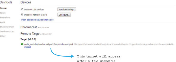
After a few seconds, you should see a target at the bottom and a link that shows inspect. Click the Inspect button and a separate window opens. The Inspect window starts in the paused state. Click the arrow to start the debugger (figure 12.6).
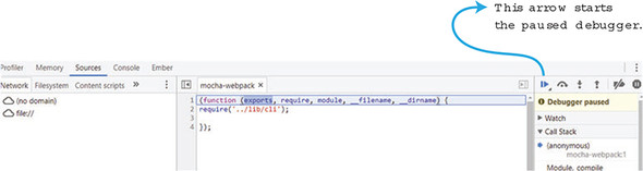
After the debugger starts, it will stop at the place in our code where we added the debugger statement. From here, we can view the console, and look at variables, as you can see in figure 12.7. For example, if you click the wrapper, then __proto__, and then __proto__ again, you’ll see all the wrapper methods.
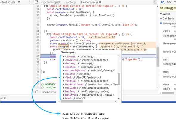
Use the Chrome inspector whenever you need to figure out a test, and you’re not sure what variables do.
Use your knowledge from this chapter to answer the following questions:
See the solution in appendix B.
Developing without the right tools is like exploring a cave without a flashlight: it will get done, but you’ll be in the dark the whole time. That said, if you already have the tools that are covered in this section, or alternatives you feel comfortable with, skip to the next section.
Far and away, our “best buddy” on this journey will be the Chrome Developer Tools. If you haven’t done so, install the Chrome browser. You can find it at https://www.google.com/chrome/. You can access the Developer Tools from the browser menu at View > Developer > Developer Tools or by right-clicking a page and choosing Inspect as seen in figure A.1.
When you inspect your code, you’ll use the JavaScript console in Developer Tools most frequently. You can switch to it using the Console tab or open it directly from the menu at View > Developer > JavaScript Console.
You can even bring up a console while looking at any other tab in the Developer Tools by pressing the ESC key, as seen in figure A.2. This allows us to do things like look at the HTML while we manipulate it from JavaScript.
The core Vue team has developed a Chrome extension—vue-devtools—that’s tailored to the task of inspecting Vue applications at runtime.
You can install the vue-devtools extension from the Chrome Web Store by visiting http://mng.bz/RpuC. The adventurous can build the extension from—and hack at—the code itself by cloning the GitHub repository located at https://github.com/vuejs/vue-devtools.
Chrome can be a little finicky right after an extension has been installed. If you open the Developer Tools pane and don’t see a Vue tab after you install the extension, try opening a new tab or window before restarting Chrome.
After you’ve installed the extension, you need to enable it for use on local files, because we won’t use a web server for the first few chapters. In Chrome, select Window > Extensions, then locate the Vue.js devtools entry. Tick the Allow access to file URLs check box and you’re all set, as seen in figure A.3.
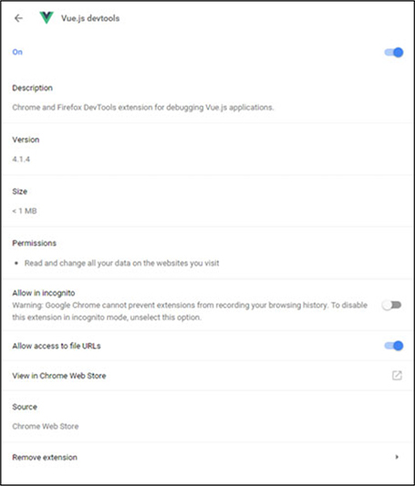
After installing the extension, we can see data used by our application, isolate specific components from our application, and even time travel! It allows us to go back and replay activity that previously took place in our app, at least. Figure A.4 shows all the parts of the extension.
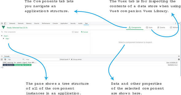
The source code for this book is available to download from the publisher’s website (www.manning.com/books/vue-js-in-action). Chapter code is available on GitHub at https://github.com/ErikCH/VuejsInActionCode. If you have any questions or find any mistakes, feel free to open an issue! This is also where you’ll find all the pictures for each chapter.
In the book we’ll need Node.js and npm so we can use the Vue-CLI tool and have access to the hundreds of thousands of modules available. It’s recommended that you download either the current or LTS (Long Term Support) version of Node. Either one will work fine.
Here are a few approaches that you can use to get Node, which includes npm:
By far, one of the easiest ways to download Node.js is using a one-click installer. Head over to http://nodejs.org/en/download. Choose your version of Windows or Mac, 32-bit or 64-bit, and download the .msi for windows or .pkg for Mac as seen in figure A.5.
NVM is another excellent choice. NVM is a script that helps manage multiple active versions of Node.js. You can install Node.js without even having to visit the website. The script separates each version of Node that you download. I recommend this to most beginners, although you need to understand how to use the command line. You can find NVM at https://github.com/creationix/nvm. A Windows version can be found at https://github.com/coreybutler/nvm-windows/releases.
To install NVM on a Mac, open the command prompt and run this command:
$ curl -o- https://raw.githubusercontent.com/creationix/nvm/v0.33.2/install.sh
This will download the latest version of NVM.
To install NVM on a Windows system, click on the nvm-setup.zip file on the nvm-windows release webpage. Unzip the files and run the nvm-setup.exe file.
After installing NVM or NVM for Windows, run this command to download the latest version of Node.js.
$ nvm install node
That’s it! Now you have Node and npm installed on your system!
All major Linux distributions offer Node.js packages in their repositories. For example, in Ubuntu you can use apt-get:
$ sudo apt-get install nodejs
In Fedora, you can use yum:
$ yum install nodejs
You need to check with your Linux distribution to find out more details on how to install packages on your system. Keep in mind that certain distributions may have outdated versions of Node.js available for download. In that case, you might be better off with NVM or downloading Node.js from the official website.
Macports and Homebrew are package management systems for the Mac. To download Node.js, you need to first install Macports or Homebrew. You can find the latest information on how to install Homebrew at http://brew.sh and Macports at www.macports.org.
After you have one of these package managers installed on your Mac, you can run the following command to install Node.
For Homebrew:
$ brew install node
$ sudo port install nodejs
You should be good to go after this!
To test the installation of Node.js run the -v command:
$ node -v $ npm -v
These commands will display the current version of Node and NPM installed. As of this writing the latest LTS version is 6.11 and the latest current version is 8.2.1.
Before installing Vue-CLI make sure you have at least Node.js >= 4.6, 6.x preferred, npm version 3+, and Git. In chapter 11, we use Nuxt.js. In that case, make sure to have Node.js >= 8.0. Vue-CLI will work fine either way. Follow the previous instructions to install Node. To install Git, follow the instructions on the official Git website at http://mng.bz/D7zz.
After installing all the prerequisites, open a terminal and run this command:
$ npm install -g vue-cli
Running commands in Vue-CLI is easy. Type in vue-cli init template name and then the project name like this:
$ vue init <template-name> <project-name> $ vue init webpack my-project
That should be it.
Note, as of the writing of this book, Vue-CLI 2.9.2 is the latest version. The newest version of Vue-CLI 3.0 is still in beta. For information on how to install and work with Vue-CLI 3.0, follow the official guides at http://mng.bz/5t1C.
Solutions to the exercise questions in chapters 2–12 are listed here.
Filters in Vue.js are commonly used to do text filtering. One filter you may want to add is a way to capitalize the product title.
Computed properties are useful when you’re trying to derive a value. The value will be automatically updated whenever any of its underlying values are updated. It’s also cached to avoid repetitively calculating a value that doesn’t need to be recalculated when it hasn’t changed, as in a loop. Note that methods are functions bound to the Vue instance. They only evaluate when they’re explicitly called. Unlike computed properties, methods accept parameters. Computed properties cannot. Methods are useful in the same situations where any JavaScript functions would be useful. An application isn’t effective without supporting robust user interactions.
In the simplest terms two-way data binding works when updates in the model update the view, and updates in the view update the model. Two-way data binding should be used throughout your application when dealing with forms and inputs.
A v-for directive is used to render a list of items based on an array. Usually it’s in the format of item in items, where item is the source array and item is an alias for the element being iterated on. The v-for can also be used as a range in the format of item in (number). In that case, it will repeat the template that many times.
The typical way of passing information from a parent component to a child component is using props. Props must be explicitly set inside the child component. To pass information from a child component to a parent component you can use $emit(eventName). It’s worth mentioning that later we’ll look at other ways of passing information between components, including using a data store.
To navigate between different routes, you can use two different approaches. Inside the template you can add a router-link element. Or inside the Vue instance you can use this.$router.push.
Transitions move from one state to another, whereas animations have multiple states.
Mixins are a way to distribute reusable functionality for components. You should use mixins whenever you see that you’re writing the same code over and over again between components. Repeating code goes against the DRY (don’t repeat yourself) principal and should be refactored. Mixins will be “mixed” into the component’s own options.
Vuex uses a central store to capture the state of the application. This helps our Vue.js app mutate state in a predictable synchronous way. This helps prevent unintended consequences occurring when state in our application changes. One advantage this has is that it helps organize data in our application in one place. Larger Vue.js applications can be cumbersome. Passing information or relying on an event bus isn’t ideal. Vuex helps abstract this problem away by providing one central store to hold all information.
The asyncData object is loaded on page components before they’re loaded. It has access to the context object and is loaded on the server side. One advantage it may have over using middleware is that its results will be merged with the data object on the page. This can be more advantageous than using middleware, where we might have to use a Vuex store to save data so it can be retrieved later inside the page component.
Testing should be a fundamental part of any organization writing code. Automated testing is much quicker, and less error prone, than manually testing. It has a higher upfront cost, although it will save time in the long run. Vue.js offers many tools to help with testing. One of the most important is the vue-test-utils library. This will help do proper testing with our Vue.js applications.
Vue.component('my-component', {
props: { The parameters the component accepts
myMessage: String,
product: Object,
email: {
type: String,
required: true,
default: "test@test.com"
validator: function (value) {
Return true or false
}
}
},
data: function() { Must be a function
return {
firstName: 'Vue' ,
lastName: 'Info'
}
},
methods: { ... }
computed: ( Return values cached until
fullName: function () { dependencies change
return this.firstName + ' ' + this.lastName
}
}
watch: { Called when firstName changes value
firstName: function (value, oldValue) { .. }
},
components: { components that can be used in the template
ButtonComponent, IconComponent
},
template: ' <span>{{ myMessage }}</span>',
}) Can also use backticks for multiline
Use props to pass data into child components and use custom events to pass data to parent elements.
Set listener on component, within its parent:
<button-counter v-on:incrementThis="incVal">
Inside parent component:
methods: (
incVal: function (toAdd) { . . . }
}
Inside button-counter:
beforeCreate beforeUpdate created updated beforeMount beforeDestroy mounted destroyed
Component template:
<div>
<h2>I'm a title</h2>
<slot>
//Only displayed if no content
</slot>
</div>
Use of component with data for slot:
<my-component> <p>This will go in the slot</p> </my-component>
Component template:
<div class="container">
<header>
<slot name="header"></slot>
</header>
<main>
<slot>Default content is here</slot>
</main>
<footer>
<slot name="footer"></slot>
</footer>
</div>
Use of component with data for slot:
<app-layout> <h1 slot="header">Page title</h1> <p>the main content.</p> <p slot="footer">Contact info</p> </app-layout>
<div id="app">
<p>I have a {{ widget }}</p>
<p>{{ widget + 's' }}</p>
<p>{{ isWorking ? 'YES' : 'NO' }}</p>
<p>{{ widget.getSalePrice() }}</p>
</div>
Element inserted/removed based on truthiness:
<p v-if="inStock">{{ widget }}</p>
<p v-else-if="onOrder">. . .</p>
<h1 v-else>. . .</h1>
Uses element’s display CSS property:
<h1 v-show="ok">Hello World!</h1>
Two-way data binding:
<input v-model="firstName" /> v-model.lazy=". . ." Syncs input after change v-model.number=". . ." Always returns a number v-model.trim=". . ." Removes whitespace
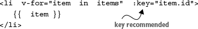
To access the position in the array:
<li v-for="(item, index) in items">. . .
To iterate through objects:
<li v-for="(value, key) in object">. . .
Using v-for with a component:
<my-item v-for="item in products"
:products="item" :key="item.id">
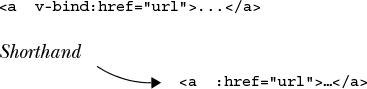
True or false will add or remove attribute:
<button :disabled="isButtonDisabled">...
If isActive is truthy, the class active will appear:
<div :class="{ active: isActive }">. . .
Style color set to value of activeColor:
<div :style="{ color: activeColor }">
Calls add method on component after click:
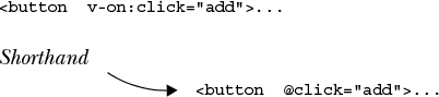
Arguments can be passed.
<button @click="add (widget)">. . .
To prevent page reload . . .
<form @submit.prevent="add">. . .
. . . Only trigger once:
<img @mouseover.once="show">. . . .stop Stop all event propagation .self Only trigger if event.target is element itself.
Keyboard entry example:
<input @keyup.enter="submit">
[SYMBOL][A][B][C][D][E][F][G][H][I][J][K][L][M][N][O][P][Q][R][S][T][U][V][W][X]
_id route
@ symbol, 2nd
* symbol
$destroy method
$vm0 variable
actions in Vuex
active-class prop
Add to cart buttons, binding events to
addEventListener
addToCart function
albumData property
animationDuration
animationName
animations
adding to applications
JavaScript hooks
overview of
updating applications
API (application programming interface)
APP_LOG_LIFECYCLE_EVENTS variable
applications
adding animations to
adding Axios to
adding Bootstrap to
adding CSS to
converting with Vue-CLI
adding child edit routes
adding Main components
adding product route with parameters
creating Form components
redirection
routing
setting up components
setting up router-link with style
setting up router-link with tags
setting up routes
wildcards
creating new with Vue-CLI
for searching music, creating with Nuxt.js
in reactive programming
setting up with Firebase
updating
args (arguments), global custom directives with
arrays, adding
async components
asyncData option
attribute binding
authentication states, updating Vuex with
authentication, updating header components with
availableInventory property, 2nd, 3rd
Axios client
adding to applications
overview of
backtick
beforeEach function
beforeEnter guard
beforeUpdate function
binding
events
overview of
to Add to cart buttons
HTML classes to star ratings
to DOM events
binding argument
binding.modifers.large
binding.modifiers.small
Bootstrap framework
bounce-enter-active class
bounce-leave-active class
branch
Browserify
building blocks, creating in Nuxt.js
buttons
Add to cart buttons, binding events to
adding user affordance to
comparing v-show with v-if/v-else
tracking inventories
v-if to display checkout pages
v-show directives
working with computed properties
working with inventories
disabled
displaying with v-else
displaying with v-if
for cart items
adding as toggles
computed properties with
radio buttons and value binding
calculators
in JavaScript
in Vue
camelCase
canAddToCart function
cart array
cart items
buttons for
adding as toggles
computed properties with
displaying counts for
cartCount method
cartItemCount function
charactersRemaining property
check boxes, binding values to
checkout pages, displaying with v-if
checkRating method, 2nd
child edit routes
child props, modifying with .sync
childIncrementCounter method
Chrome browser
debugger
Developer Tools
vue-devtools for
CI (continuous integration), testing
className method
clickHappened function
colon character
compilation scope
component-fade-enter-active class
component-fade-leave-active class
component-scoped CSS
components
async components
creating
global registration
in Nuxt.js
local registration
creating dynamic components applications
custom events
listening to events
modifying child props using .sync
defining template components
inline template strings
text/x-template script elements
header components, updating with authentication
overview of
props to pass data
dynamic props
literal props
prop validation
relationships in
setting up
single-file components
slots
named
scoped
testing
transitioning
computed properties
examining update events with
when to use
computed property
conditionals
available inventory messages
adding messages with v-else
adding messages with v-else-if
displaying amount of remaining inventory with v-if
products, refactoring apps with v-for directives
console for JavaScript
content distribution
context.params object
counts for cart items
createElement argument
cross-site scripting (XSS) attacks
CSS classes
adding to applications
testing
currentView property
dangerouslySetInnerHTML option
data
defining product data
displaying
passing with props
dynamic props
literal props
prop validation
data binding
debugging, 2nd
default values
delivery
continuous, testing
testing
dependencies, installing with Nuxt.js
deployment
continuous, testing
testing
directives, custom
global with modifers, values, and args
learning
disabled CSS class
disabling lifecycle logging
disclosure triangles
displaying
cart item counts
checkout pages with v-if
data
disabled buttons
with v-else
with v-if
products
defining product data
marking up product views
div element
<div> tag, 2nd
DOM events, binding to
binding events to Add to cart buttons
event binding
domPropsInnerHTML property
DRY (don’t repeat yourself)
dynamic components, creating applications with
dynamic props
ease of reuse
EditProduct component
el argument, 2nd
environments
for testing
setting up
Chrome Developer Tools
installing Node.js
installing npm
installing Vue-CLI
vue-devtools for Chrome
ES6 modules
ESLint, 2nd
events
binding
overview of
to Add to cart buttons
custom
listening to
update events
expect variable
fade-enter class
fade-enter-active class
fade-leave-active class
fade-leave-to class
filters
adding to markup
object
writing functions
find function
Firebase platform
Realtime database, updating Main.vue to use
setting up
setting up applications with
updating header component with authentication
Form components
<form> element
form-components template
formatPrice function
forms
modifiers
.lazy v-model modifiers
.number modifiers
trimming input values
v-model binding
value binding
radio buttons and
to check boxes
v-for directives
v-for directives without optional key value
fullName function
functionality, reusing with mixins
functions, rendering
getters in Vuex
global directives
global mixins
global registration
GUI (graphical user interface), 2nd
<h2> tag
handleCalcEvent
head element
header components, updating with authentication
header property
<header> tag
headless browser
helpers in Vuex
Homebrew package manager, installing Node.js with
hooks
adding
JavaScript hooks
HTML classes, binding to star ratings
HTML directive
id property
image property
img node
<img> tag
importing products from product.json
increment method, 2nd
increment-me event
incrementCounter method
inline template strings
input values, trimming
inputs
modifiers
.lazy v-model modifiers
.number modifiers
trimming input values
v-model binding
value binding
binding values to check boxes
radio buttons and
v-for directives
v-for directives without optional key value
inspecting properties
installing
dependencies with Nuxt.js
Node.js
using Homebrew
using MacPorts
using NVM
using one-click installers
verification of
via Linux package management system
npm
Vue-CLI
Vuex in Vue-CLI
instances
applying output filters
adding filters to markup
testing values
writing filter functions
displaying data
displaying products
defining product data
marking up product views
inspecting properties
JavaScript console
root Vue instances
interactivity
adding arrays
adding cart item buttons
adding user affordance to buttons
adding cart item buttons as toggles
comparing v-show with v-if/v-else
tracking inventories
v-else to display disabled buttons
v-if to display checkout pages
v-if to display disabled buttons
v-show directives
working with computed properties
working with inventories
binding to DOM events
binding events to Add to cart buttons
event binding
displaying cart item counts
inventories
available inventory messages
adding messages with v-else
adding messages with v-else-if
displaying amount of remaining inventory with v-if
tracking
JavaScript programming language
calculators in
console
hooks
Vue vs.
jsdom-global variable
JSX extension, rendering
Kebab case
key values, optional
keyframes
layouts, updating in Nuxt.js
lazy loading
.lazy v-model modifier
lifecycle
code
disabling logging
hooks, adding
of Vue
Linux package management system, installing Node.js with
lists
literal props
local directives
local registration
localVue variable
logging lifecycle code, disabling
Long Term Support (LTS)
looping
overview of
products
adding star ratings with v-for range
binding HTML classes to star ratings
importing products from product.json
refactoring apps with v-for directives
setting up products
LTS (Long Term Support)
MacPorts package manager, installing Node.js with
madeOrder property
Main components
<main> element
Main.vue, updating to use Firebase Realtime database
mapActions
mapGetters
mapMutations
mapState
markups
adding filters to
of product views
master branch
middleware with Nuxt.js
mixins
global
reusing functionality with
modifiers
.lazy v-model modifier
.number modifier
global custom directives with
trimming input values
modules in Vuex
mutation methods
mutations in Vuex
MVC (Model-View-Controller) pattern
MVVM (Model-View-ViewModel) pattern
facilitating with Vue
overview of
my-comp component
mySession property
named slots
namespaces
navigation guards, 2nd
Node Version Manager (NVM), installing Node.js with
Node.js environment, installing
using Homebrew
using MacPorts
using NVM
using one-click installers
verification of
via Linux package management system
npm install command
npm package manager, installing
npm run dev command, 2nd, 3rd, 4th
.number modifier
Nuxt.js framework
adding stores with Vuex
creating building blocks in
creating components in
creating music search applications with
creating projects with
generating routes with
installing dependencies with
middleware with
updating default layouts in
NVM (Node Version Manager), installing Node.js with
oldVnode
onAuthStateChanged
one-click installers, installing Node.js with
one-way data binding
<option> tag
options object
order property
order.dontSendGift property
order.sendGift property
output filters
adding filters to markup
adding to markup
testing values
write filter functions
parameters, adding product routes with
parseInt method
<pre> tag
prefix property
pressed method
price property
product property
product routes, adding with parameters
product.json, importing products from
products
displaying
defining product data
marking up product views
importing from product.json
looping
adding star ratings with v-for range
binding HTML classes to star ratings
refactoring apps with v-for directives
setting up
productsRef, 2nd
progressive framework
properties
props
child props, modifying with .sync
dynamic props
literal props
testing
to pass data
validation of
query parameters
querySelector() method
radio buttons, value binding and
rating class
reactive programming
applications in
facilitating with Vue
Realtime Database
records, sorting
redirect option
redirection
refactoring apps with v-for directives
registration
global
local
regression testing
render(createElement) function
rendering
functions
JSX
server-side
response.data.products
root Vue instances
router-link
setting up with style
setting up with tags
router-link component
router-link element
<router-link> tag
routes
child edit routes, adding
generating with Nuxt.js
product routes, adding with parameters
setting up
routing, 2nd
scoped slots
<script> tag
SEO (search engine optimization)
server-side rendering (SSR)
servers, communicating with
Nuxt.js
server-side rendering
using Firebase
using VuexFire
SET_SESSION mutation
SET_STORE mutation
setters
setTimeout
shallow function
showCheckout method
showProduct property, 2nd
signIn method
signOut method
single source of truth
single-file components
sitename property
sitename variable
slot-scope attribute
slots
named
scoped
snapshot tests
software, history of
facilitating MVVM with Vue
facilitating reactivity with Vue
JavaScript calculators
JavaScript vs Vue
MVC pattern
MVVM pattern
reactive applications
Vue calculators
sortedProducts property
sorting records
src attribute
SSR (server-side rendering)
staging environment
star ratings
adding with v-for range
binding HTML classes to
state.msg.toUppercase() method
states
authentication states, updating Vuex with
in Vuex
static files
store.commit function
stores, adding with Vuex
style method
<style> tag
styleMe directive
styles, setting up router-link with
submitForm function, 2nd
.sync modifier
syntax highlighting
tags, setting up router-link with
template components, defining
inline template strings
single-file components
text/x-template script elements
<template> element
template tag
ternary operator
testing
components
continuous integration
creating test cases
overview of
with vue-test-utils
CSS classes
delivery
deployment
environments
props
setting up Chrome debugger
text
types of
values
with mocked Vuex
text-center class, 2nd
text() function
text/x-template script elements
this keyword
to attribute
toContain function
toggles, adding cart item buttons as
Toolbar component
tr element
transclusion
transition classes
<transition> element
transitions, 2nd
adding to applications
JavaScript hooks
overview of
updating applications
true-value attribute
two-way data binding
typeof operator
unit tests
update events
updating
default layouts in Nuxt.js
header components with authentication
Main.vue to use Firebase Realtime database
Vuex with authentication states
user affordance, adding to buttons
adding cart item buttons as toggles
comparing v-show with v-if/v-else
tracking inventories
v-else to display disabled buttons
v-if to display checkout pages
v-if to display disabled buttons
v-show directives
working with computed properties
working with inventories
v-card-media component
v-else directive
adding messages with
comparing v-show
displaying disabled buttons with
v-else-if directive, adding messages with
v-enter class
v-enter-active class
v-enter-to class
v-for directive
refactoring apps with
without optional key value
v-for range, adding star ratings with
v-html binding
v-if directive
comparing v-show with
displaying amount of remaining inventory with
displaying checkout pages with
displaying disabled buttons with
v-leave class
v-leave-active class
v-leave-to class
v-model binding
v-once directive
v-show directive
comparing with v-else
comparing with v-if
v-text directive
validating props
value binding
binding values to check boxes
radio buttons and
v-for directives
v-for directives without optional key value
values
global custom directives with
testing
verifying Node.js installation
virtual DOM
vm property
vnode
Vue-CLI
adding Vuex to
converting apps with
adding Axios to applications
adding Bootstrap to applications
adding child edit routes
adding CSS to applications
adding Main components
adding product route with parameters
creating Form components
redirection
routing
setting up components
setting up router-link with style
setting up router-link with tags
setting up routes
wildcards
creating new applications with
installing
installing Vuex in
vue-devtools for Chrome, 2nd
vue-router library
vue-test-utils library
Vue.js framework
advantages of
calculators in
facilitating MVVM pattern with
facilitating reactivity with
future of
JavaScript vs
lifecycle of
adding lifecycle hooks
disabling logging
exploring lifecycle code
Vuetify
Vuex library
actions in
adding stores with
adding to Vue-CLI
getters in
helpers in
installing in Vue-CLI
mocked, testing with
modules in
mutations in
overview of
state in
updating with authentication states
VuexFire library
watch functions
Webpack
webstore variable
wildcards
wrapper.find function
Chapter 1. Introducing Vue.js
Figure 1.1. The roles of the model, view, and controller as described by the MVC pattern.
Figure 1.2. The components of the Model–View–ViewModel pattern.
Chapter 2. The Vue instance
Figure 2.1. A preview of our humble webstore’s beginnings.
Figure 2.2. The JavaScript console with no errors or warnings.
Figure 2.4. The vue-devtools window with nothing selected.
Figure 2.6. Our sitename property displayed in the header of our webstore.
Figure 2.7. Using the console and vue-devtools, we can check on our sitename property.
Figure 2.9. Diagram of the Vue lifecycle, divided into four phases.
Figure 2.10. Output from some of our lifecycle functions can be seen in the console.
Figure 2.11. Setting the sitename property triggers the update lifecycle callbacks.
Figure 2.12. Calling the destroy instance method triggers the final pair of lifecycle callbacks.
Figure 2.13. Our product is displayed but has a few issues we need to clean up.
Figure 2.14. Using the v-html binding allows us to display the description as raw HTML.
Chapter 3. Adding interactivity
Figure 3.1. Our product listing with new elements: a shopping cart and an Add to cart button.
Figure 3.2. The syntax of an event binding.
Figure 3.4. The array fills up as you add items to the cart.
Figure 3.5. Combining the user’s first and last name from a dataset into a full name for display.
Figure 3.7. The initial state of our area calculating application.
Figure 3.8. Observing our properties changing in response to clicking buttons.
Figure 3.10. No update message displays if nothing gets updated.
Figure 3.11. Observing change in our application’s header and inspecting the cart in the console.
Figure 3.12. The Add to cart button is hidden when we exhaust the available inventory.
Figure 3.13. Diagram explaining how the v-if directive conditional works.
Chapter 4. Forms and inputs
Figure 4.1. The model updates the view while the view updates the model.
Figure 4.2. Up close with the v-model directive
Figure 4.3. Text is updated in real time into the box at the bottom.
Figure 4.4. Adding the address, city, state, and ZIP Code form fields into our checkout page.
Figure 4.5. This popup was triggered by the submitForm function.
Figure 4.6. Completed checkout page with all form elements included.
Figure 4.7. The {{order.gift}} property is displayed.
Figure 4.8. Method is updated from the radio button.
Figure 4.9. State text property is displaying the correct state selected.
Figure 4.10. Type of value entered into the zip property.
Figure 4.11. An example of using the .trim modifier on the v-model directive.
Chapter 5. Conditionals, looping, and lists
Figure 5.1. Product page with only four items left, the result of using the v-if directive.
Figure 5.2. Product page shows All Out! after the inventory is exhausted.
Figure 5.3. Shows the Buy Now! screen
Figure 5.4. Diagram showing how v-for alias works.
Figure 5.5. Diagram showing how v-for ranges works.
Figure 5.7. With filled-in star rating for the cat food product
Figure 5.8. Final update of products.
Figure 5.9. Showing several items that are being looped through the product.json file
Chapter 6. Working with components
Figure 6.1. Example of encapsulating code into a component
Figure 6.2. A parent component can send data to a child component.
Figure 6.3. Error in console warns against mutating props directly.
Figure 6.4. Dynamic props example in a browser.
Figure 6.5. Dynamic props with a local scope counter example.
Figure 6.6. Validation number, string, and object using prop validation.
Figure 6.7. Error showing validation failure.
Figure 6.8. Shows two buttons; both increment the counter from the parent.
Chapter 7. Advanced components and routing
Figure 7.1. Information inside component tags will be discarded.
Figure 7.2. Book form page example.
Figure 7.3. List of books and authors in the book list.
Figure 7.5. Async component rendered after 1 second onscreen.
Figure 7.6. Default welcome screen for Vue-CLI
Figure 7.7. Pet store application opened with Vue-CLI.
Figure 7.8. Dynamic segment for product 1001.
Chapter 8. Transitions and animations
Figure 8.1. Toggle without any transition
Figure 8.2. Classes when element is being added to the DOM
Figure 8.3. Classes shown when the element is removed from the DOM.
Figure 8.4. Screenshot of transition
Figure 8.5. Hooks triggered after clicking title
Figure 8.6. Hooks triggered when element is removed from the DOM.
Figure 8.7. In-between transition of components
Figure 8.8. Page transitioning to the checkout page
Figure 8.9. All Out! animation. The text moves left and right.
Chapter 9. Extending Vue
Figure 9.1. Mixin example with multiple components
Figure 9.2. The image from figure 9.1 after clicking Press Button 1
Figure 9.3. Hello World text added using a custom directive.
Figure 9.4. Using global directives with the binding argument
Figure 9.5. An example of using the render function
Figure 9.6. The alert box created using the render function after clicking the message.
Chapter 10. Vuex
Figure 10.1. Simple example of using props and an event bus
Figure 10.2. How a central store is used with Vuex
Figure 10.3. Creating a simple app using Vuex
Figure 10.4. Hello World app using setters and actions
Chapter 11. Communicating with a server
Figure 11.1. Client-side rendering
Figure 11.2. Server-side rendering
Figure 11.3. Nuxt.js starter template page
Figure 11.4. Search page for the iTunes API
Figure 11.5. Search results page
Figure 11.6. iTunes search ToolBar.vue
Figure 11.7. Card.vue component with example text
Figure 11.8. Directory structure to create routes
Figure 11.9. Directory structure of iTunes search app
Figure 11.10. Completed pet store application using Firebase
Figure 11.11. Creating a Firebase project
Figure 11.12. Database selection
Figure 11.13. Firebase Realtime Database setup
Figure 11.14. Setting up authentication
Figure 11.15. Enable Google sign-in.
Chapter 12. Testing
Figure 12.1. Pet depot checkout page that displays Ordered at the bottom
Figure 12.2. Checking our first test case, which is successful
Figure 12.3. The test case fails
Figure 12.4. All tests are passing
Figure 12.5. Chrome Devices page
Figure 12.6. Chrome Inspect window
Figure 12.7. Debugger statement showing all the wrapper methods.
Appendix A. Setting up your environment
Figure A.4. The vue-devtools extension lets us explore our Vue applications in real time.
Chapter 1. Introducing Vue.js
Listing 1.1. The JavaScript calculator: chapter-01/calculator.html
Listing 1.2. The Vue calculator: chapter-01/calculatorvue.html
Chapter 2. The Vue instance
Listing 2.1. Our first Vue application: chapter-02/first-vue.html
Listing 2.2. Adding data and a data binding: chapter-02/data-binding.html
Listing 2.3. Adding lifecycle hooks to our instance: chapter-02/life-cycle-hooks.js
Listing 2.4. Adding product data to our Vue instance: chapter-02/product-data.js
Listing 2.5. Adding product markup: chapter-02/product-markup.html
Listing 2.6. Adding product markup: chapter-02/product-markup-cont.html
Listing 2.7. Adding the formatPrice filter: chapter-02/format-price.js
Listing 2.8. Adding product markup: chapter-02/v-text-binding.html
Chapter 3. Adding interactivity
Listing 3.1. All we need is an array: chapter-03/add-array.js
Listing 3.2. The addToCart method: chapter-03/add-to-cart.js
Listing 3.3. A button to add products to the cart: chapter-03/button-product.js
Listing 3.4. Computing a user’s full name: chapter-03/computed.js
Listing 3.5. Computing the area of a rectangle: chapter-03/computed-rect.js
Listing 3.6. Computed properties and update event logging: chapter-03/area.html
Listing 3.7. The cartItemCount’s computed property: chapter-03/cart-item-count.js
Listing 3.8. Adding the cart indicator: chapter-03/cart-indicator.html
Listing 3.9. Adding availableInventory to our product: chapter-03/available-inventory.js
Listing 3.10. A computed property for remaining inventory: chapter-03/computed-remaining.js
Listing 3.11. Button with v-show directive: chapter-03/button-v-show.html
Listing 3.12. Wrapping content for v-show: chapter-03/wrap-content.html
Listing 3.13. Buttons with v-if and v-else directives: chapter-03/v-if-and-v-else.html
Listing 3.14. Single container elements for v-if and v-else chapter-03/single-container.html
Listing 3.15. Adding the cart button: chapter-03/cart-button.js
Listing 3.16. Adding the cart button: chapter-03/add-cart-button.html
Listing 3.17. Using v-if to display a checkout page: chapter-03/v-if-checkout.html
Chapter 4. Forms and inputs
Listing 4.1. A v-model directive with first and last name inputs: chapter-04/first-last.html
Listing 4.2. The Vue instance data object order property: chapter-04/data-property.js
Listing 4.3. Adding in our other text inputs and select box: chapter-04/text-input.html
Listing 4.5. Adding check boxes and radio buttons: chapter-04/adding-buttons.html
Listing 4.6. Adding more properties to our Vue data object: chapter-04/more-props.js
Listing 4.7. Adding the v-on directive to the click event: chapter-04/adding-v-on.html
Listing 4.8. Creating the new submitForm method: chapter-04/submit.js
Listing 4.9. Binding true and false values to the gift check box: chapter-04/true-false.html
Listing 4.10. Adding the sendGift property to the order object: chapter-04/prop-gift.js
Listing 4.11. Binding values to our radio buttons: chapter-04/radio-bind.html
Listing 4.12. Updating the order object with business and home: chapter-04/update-order.html
Listing 4.13. Binding values to our select box: chapter-04/bind-select.html
Listing 4.14. Adding the states property to the Vue instance data object: chapter-04/states.html
Listing 4.15. Updating the select drop down with v-for: chapter-04/select-drop-down.html
Listing 4.16. HTML generated by the v-for directive: chapter-04/options.html
Listing 4.17. Updating the states object in data: chapter 04-/detour.html
Listing 4.18. The .number modifier on the ZIP form element: chapter-04/number-mod.html
Listing 4.19. Using the typeof operator on order.zip: chapter-04/type-of.html
Listing 4.20. The .trim modifier on first and last name: chapter-04/trim-mod.html
Listing 4.21. The .trim modifier on the address and city: chapter-04/trim-mod-add.html
Chapter 5. Conditionals, looping, and lists
Listing 5.1. Updating the inventory: chapter-05/update-inventory.js
Listing 5.2. Adding a new message based on inventory: chapter-05/add-message.html
Listing 5.3. Adding multiple inventory messages: chapter 05/multiple-inventory.html
Listing 5.4. Adding star symbol using v-for: chapter 05/star-symbol.html
Listing 5.5. Adding to the product property: chapter 05/add-product.js
Listing 5.6. Adding a method to check if class should be added: chapter 05/check.js
Listing 5.7. Adding class binding: chapter 05/add-class-bind.html
Listing 5.8. Products in the products.json file: chapter 05/products.json
Listing 5.9. Adding Axios script tag: chapter 05/script-tags.html
Listing 5.10. Adding Axios tag to create a lifecycle hook: chapter 05/axios-lifecycle.js
Listing 5.11. product property, add products: chapter 05/product-delete.js
Listing 5.12. Fixing CSS for Bootstrap: chapter 05/bootstrap-fix.html
Listing 5.13. Fixing CSS for bootstrap: chapter 05/bootstrap-fix-v-if.html
Listing 5.14. Adding the v-for directive for products: chapter 05/v-for-product.html
Listing 5.15. Updating checkRating with product info: chapter 05/check-rating.js
Listing 5.16. Updating template for ratings: chapter 05/update-template.html
Listing 5.17. Updating canAddToCart and adding cartCount method: chapter 05/update-carts.js
Listing 5.18. Updating canAddToCart template: chapter 05/update-can-add-cart.html
Listing 5.19. Updating addToCart method: chapter 05/update-add-to-cart.js
Listing 5.20. Updating the inventory message: chapter 05/update-inventory.html
Listing 5.21. Adding sorting to the template: chapter 05/add-in-sort.html
Listing 5.22. sortedProducts computed property: chapter 05/sort-products-comp.js
Chapter 6. Working with components
Listing 6.1. Creating our first global component chapter-06/global-component-example.html
Listing 6.2. Registering a local component: chapter-06/local-component-example.html
Listing 6.3. Using literal props in our component: chapter 06/literal-props.html
Listing 6.4. Using dynamic props: chapter 06/dynamic-props.html
Listing 6.5. Dynamic props with global counter: chapter 06/dynamic-props-counter.html
Listing 6.7. Validating props: chapter 06/props-example.html
Listing 6.8. Using templates inline: chapter 06/inline-component-example.html
Listing 6.9. Working with text/x-templates: chapter 06/x-template-example.html
Listing 6.10. Single-file components: chapter 06/single-file-component.vue
Listing 6.11. Incrementing a parent counter using $emit: chapter 06/event-listen.html
Listing 6.12. Working with .sync to modify props from child chapter 06/event-listen-sync.html
Chapter 7. Advanced components and routing
Listing 7.1. Creating a normal parent/child component with props: chapter-07/parent-child.html
Listing 7.2. Adding in the slot element: chapter-07/parent-child-slots-extract.html
Listing 7.3. Using named slots: chapter-07/named-slots.html
Listing 7.4. Scoped slots: chapter-07/name-scoped-slots.html
Listing 7.5. Dynamic components: chapter-07/dynamic-components.html
Listing 7.6. Async components; chapter-07/async-components.html
Listing 7.7. Terminal commands
Listing 7.8. Adding routes: chapter-07/petstore/src/router/index.js
Listing 7.9. Adding Axios and Bootstrap: chapter-07/petstore/index.html
Listing 7.10. Adding CSS: chapter-07/petstore/src/main.js
Listing 7.11. Header template: chapter-07/petstore/src/components/Header.vue
Listing 7.12. Adding the script and CSS: chapter-07/petstore/src/components/Header.vue
Listing 7.13. Creating the form component: chapter-07/petstore/src/components/Form.vue
Listing 7.14. Adding the script tag: chapter-07/petstore/src/components/Form.vue
Listing 7.15. Creating the main template: chapter-07/petstore/src/components/Main.vue
Listing 7.16. Creating the script for Main.vue: chapter-07/petstore/src/components/Main.vue
Listing 7.17. Editing the router file: chapter-07/route-product.js
Listing 7.18. Adding the product template: chapter-07/product-template.vue
Listing 7.19. Product script: chapter-07/product-script.js
Listing 7.20. Updating router-link in main: chapter-07/route-link-example.html
Listing 7.21. Updating header links when route is active: chapter-07/header-link.html
Listing 7.22. Router-link-exact-active: chapter-07/route-link.css
Listing 7.23. Adding the EditProduct component: chapter-07/edit-comp.vue
Listing 7.24. Adding the Edit Product button: chapter-07/edit-button.vue
Listing 7.25. Updating the router with the new child route: chapter-07/child-route.js
Listing 7.26. Adding wildcard for route: chapter-07/wildcard-route.js
Listing 7.27. Full router file: chapter-07/petstore/src/router/index.js
Chapter 8. Transitions and animations
Listing 8.1. Creating a description transition: chapter-08/transition-book-1.html
Listing 8.2. Description transition with fade: chapter-08/transition-book.html
Listing 8.3. Animation with scale: chapter-08/animation-book-1.html
Listing 8.4. Animation with scale full: chapter-08/animation-book.html
Listing 8.5. JavaScript hooks transition: chapter-08/jshooks-1.html
Listing 8.6. JavaScript hooks event listener: chapter-08/jshook-2.html
Listing 8.7. JavaScript hooks methods: chapter-08/jshooks.html
Listing 8.8. Transitioning dynamic components: chapter-08/component-transition.html
Listing 8.9. Adding transition to pet store: chapter-08/petstore/src/App.vue
Listing 8.10. Add animation to pet store: chapter-08/petstore/src/components/Main.vue
Chapter 9. Extending Vue
Listing 9.1. Adding our mixin HTML/CSS: chapter-09/mixin-html.html
Listing 9.2. Adding the Vue.js instance: chapter-09/mixins-vue.html
Listing 9.3. Adding the mixin: chapter-09/my-mixin.html
Listing 9.4. Adding in the components: chapter-09/comp1comp2.html
Listing 9.5. Global mixin: chapter-09/global-mixin.html
Listing 9.6. Vue.js local custom directive: chapter-09/directive-html.html
Listing 9.7. Local directive Vue instance: chapter-09/directive-vue.html
Listing 9.8. Completed Vue global directive: chapter-09/directive-global-example.html
Listing 9.9. Render basics html: chapter-09/render-html.html
Listing 9.10. Adding the render function: chapter-09/render-js.html
Listing 9.11. Terminal commands to create jsx project
Listing 9.12. Terminal commands to install plugin
Listing 9.13. Update .babelrc: chapter-09/jsx-example/.babelrc
Listing 9.14. Update App.vue: chapter-09/jsx-example/src/App.vue
Listing 9.15. Update the index.html file: chapter-09/jsx-example/index.html
Listing 9.16. Update HelloWorld.vue: chapter-09/jsx-example/HelloWorld.vue
Chapter 10. Vuex
Listing 10.1. Adding HTML to our Vuex app: chapter-10/vuex-html.html
Listing 10.2. Add our Vuex state and mutations: chapter-10/vuex-state-mut.html
Listing 10.3. Adding our Vue.js instance: chapter-10/vuex-instance.html
Listing 10.4. Passing payload into a mutation: chapter-10/vuex-state-pass-1.html
Listing 10.5. Adding new getters: chapter-10/vuex-state-getter-action1.html
Listing 10.6. Adding actions: chapter-10/vuex-state-getter-action2.html
Listing 10.7. Updating the Vue.js instance: chapter-10/vuex-state-getter-action3.html
Listing 10.8. Updating the main.js file: chapter-10/petstore/src/main.js
Listing 10.9. Creating the main.js file: chapter-10/store-part1.html
Listing 10.10. Adding actions and getters to store.js: chapter-10/store-part2.html
Listing 10.11. Adding product’s computed property: chapter-10/computed-petstore.html
Listing 10.12. Updating created hook: chapter-10/created-petstore.html
Listing 10.13. Adding mapGetters: chapter-10/map-getter.html
Listing 10.14. Adding mapGetters to computed properties: chapter-10/map-getter2.html
Listing 10.15. mapState example: chapter-10/map-state.html
Listing 10.16. mapMutations example: chapter-10/map-mut.html
Listing 10.17. mapActions example: chapter-10/map-actions.html
Listing 10.18. Adding products modules: chapter-10/products-mod.js
Listing 10.19. Adding the export: chapter-10/products-export.js
Listing 10.20. New store.js file: chapter-10/store-update.js
Chapter 11. Communicating with a server
Listing 11.1. Removing ESLint from nuxt.config.js: chapter-11/itunes-search/nuxt.config.js
Listing 11.2. Adding the Vuetify plugin: chapter-11/itunes-search/plugins/vuetify.js
Listing 11.3. Adding plugins reference: chapter-11/itunes-search/nuxt.config.js
Listing 11.4. Adding CSS and fonts: chapter-11/itunes-search/nuxt.config.js
Listing 11.5. Adding CSS stylus: chapter-11/itunes-search/assets/app.styl
Listing 11.6. Adding the Toolbar component: chapter-11/itunes-search/components/Toolbar.vue
Listing 11.7. Adding the Card component: chapter-11/itunes-search/components/Card.vue
Listing 11.8. Updating the default layout: chapter-11/itunes-search/layouts/default.vue
Listing 11.9. Adding a Vuex store: chapter-11/itunes-search/store/index.js
Listing 11.10. Setting up middleware: chapter-11/itunes-search/middleware/search.js
Listing 11.11. Automatically generated route structure
Listing 11.12. Creating the index page: chapter-11/itunes-search/pages/index.vue
Listing 11.13. Creating our dynamic route: chapter-11/itunes-search/pages/results/_id.vue
Listing 11.14. The asyncData example: chapter-11/itunes-search/pages/results/_id.vue
Listing 11.15. Setting up Firebase and initializing files: chapter-11/petstore/src/firebase.js
Listing 11.16. Setting up main file: chapter-11/petstore/src/main.js
Listing 11.17. Updating Vuex: chapter-11/petstore/store/modules/products.js
Listing 11.18. Updating header component: chapter-11/header-temp.html
Listing 11.19. Updating header component 2: chapter-11/header-script.js
Listing 11.20. Updating header styles: chapter-11/header-style.html
Listing 11.21. Updating Main.vue file: chapter-11/update-main.js
Chapter 12. Testing
Listing 12.1. A basic unit test: chapter-12/unit.js
Listing 12.2. Setting up source map and node externals: chapter-12/setup.js
Listing 12.3. Setting up tests: chapter-12/petstore/setup.js
Listing 12.4. Updating package.json: chapter-12/testscript.js
Listing 12.5. Update to the Form component: chapter-12/form-update.js
Listing 12.6. Our first test case: chapter-12/petstore/test/Form.spec.js
Listing 12.7. Testing a prop: chapter-12/header-prop-test.js
Listing 12.8. Testing text: chapter-12/header-text-test.js
Listing 12.9. Testing classes: chapter-12/header-classes-test.js
Listing 12.10. Mocking Vuex: chapter-12/header-vuex-mock.js
Listing 12.11. Testing Sign In: chapter-12/header-signin-test.js
Listing 12.12. Testing Sign Out: chapter-12/header-signout-test.js
Listing 12.13. Adding inspect to the package.json file: chapter-12/petstore/package.json
For online information and ordering of this and other Manning books, please visit www.manning.com. The publisher offers discounts on this book when ordered in quantity. For more information, please contact
Special Sales Department Manning Publications Co. 20 Baldwin Road PO Box 761 Shelter Island, NY 11964 Email: orders@manning.com
©2018 by Manning Publications Co. All rights reserved.
No part of this publication may be reproduced, stored in a retrieval system, or transmitted, in any form or by means electronic, mechanical, photocopying, or otherwise, without prior written permission of the publisher.
Many of the designations used by manufacturers and sellers to distinguish their products are claimed as trademarks. Where those designations appear in the book, and Manning Publications was aware of a trademark claim, the designations have been printed in initial caps or all caps.
Recognizing the importance of preserving what has been written, it is Manning’s policy to have the books we publish printed
on acid-free paper, and we exert our best efforts to that end. Recognizing also our responsibility to conserve the resources
of our planet, Manning books are printed on paper that is at least 15 percent recycled and processed without the use of elemental
chlorine.
|
Manning Publications Co. 20 Baldwin Road PO Box 761 Shelter Island, NY 11964 |
Development editor: Toni Arritola Technical development editor: Doug Warren Review editor: Ivan Martinović Project manager: Lori Weidert Copy editor: Katie Petito Proofreader: Elizabeth Martin Technical proofreader: Jay Kelkar Typesetter and cover designer: Marija Tudor
ISBN 9781617294624
Printed in the United States of America
1 2 3 4 5 6 7 8 9 10 – SP – 23 22 21 20 19 18
Chapter 3. Adding interactivity
Chapter 5. Conditionals, looping, and lists
Chapter 6. Working with components
Chapter 7. Advanced components and routing
3. Modeling data, consuming APIs, and testing
A. Setting up your environment
1.1. On the shoulders of giants
1.1.1. The Model–View–Controller pattern
1.1.2. The Model–View–ViewModel pattern
1.1.3. What’s a reactive application?
1.1.4. A JavaScript calculator
2.1.2. Making sure our application is running
2.4.1. Write the filter function
2.4.2. Adding the filter to our markup and testing different values
Chapter 3. Adding interactivity
3.1. Shopping cart data starts with adding an array
3.3. Adding a cart item button and count
3.3.1. When to use a computed property
3.4. Adding user affordance to our button
3.4.1. Keeping an eye on inventory
3.4.2. Working with computed properties and inventory
3.4.3. v-show directive basics
3.4.4. Using v-if and v-else to display a disabled button
3.4.5. Adding the cart item button as a toggle
4.2.1. Binding values to our check box
4.2.2. Working with value bindings and radio buttons
4.3. Learning modifiers with the application
4.3.1. Using the .number modifier
Chapter 5. Conditionals, looping, and lists
5.1. Show an available inventory message
5.2.1. Adding a star rating with v-for range
5.2.2. Binding an HTML class to our star rating
5.2.3. Setting up our products
Chapter 6. Working with components
6.2. Relationships in components
6.4. Defining a template component
6.4.1. Using inline template strings
6.5. Working with custom events
Chapter 7. Advanced components and routing
7.4. Creating a dynamic components app
7.5. Setting up async components
7.6. Converting the pet store app using Vue-CLI
7.6.1. Creating a new application with Vue-CLI
7.6.3. Adding CSS, Bootstrap, and Axios to our application
7.6.4. Setting up our components
7.7.1. Adding a product route with parameters
7.7.2. Setting up a router-link with tags
7.7.3. Setting up a router-link with style
Chapter 8. Transitions and animations
8.5. Updating the pet store application
9.1. Reusing functionality with mixins
9.2. Learning custom directives with examples
9.2.1. Global custom directives with modifiers, values, and args
3. Modeling data, consuming APIs, and testing
10.1. Vuex, what is it good for?
10.2. Vuex state and mutations
10.4. Adding Vuex to Vue-CLI with the pet store app
Chapter 11. Communicating with a server
11.2.1. Creating a music search app
11.2.2. Creating a project and installing dependencies
11.2.3. Creating our building blocks and components
11.2.4. Updating the default layout
11.3. Communicating with a server using Firebase and VuexFire
11.3.2. Setting up our pet store app with Firebase
11.3.3. Updating Vuex with authentication state
12.2. Continuous integration, delivery, and deployment
12.4. Setting up our environment
12.5. Creating our first test case with vue-test-utils
A. Setting up your environment
A.3. Obtaining a chapter’s companion code
A.4. Installing Node.js and npm
A.4.1. Installing Node.js using one-click installers
A.4.2. Install Node.js using NVM
A.4.3. Install Node.js via Linux package management system
B. Solutions to chapter exercises
Frontend web development has become astoundingly complex. If you’ve never used a modern JavaScript framework, building your first app that only displays “Hello” can take a whole week! That might sound ridiculous—and I would agree, it is. The problem is that most frameworks assume knowledge of the terminal, advanced JavaScript, tools such as the Node Package Manager (NPM), Babel, Webpack, and often more.
Vue, refreshingly, doesn’t assume. We call it the “progressive” JavaScript framework because it scales down as well as up. If your app is simple, you can use Vue the same way you use jQuery: by dropping in a <script> tag. But as your skills and needs grow more advanced, Vue grows with you to make you more powerful and productive.
Something else typically stands out. Vue is built not only by computer scientists, but also by designers, educators, and others from more people-focused trades. As a result, our documentation, guides, and devtools are world-class. The experience of using Vue is as important to us as its performance, reliability, and versatility.
Erik has carried that people-focused spirit into this book. First, it’s remarkably visual. The many detailed illustrations and annotated screenshots firmly ground his examples in the workflow of real developers. As a result, you actually learn how to use the browser and Vue’s devtools to confirm what you’re learning—and more importantly, troubleshoot when something goes wrong.
For those without a strong background in frontend development, JavaScript, or even programming, Erik also carefully explains the foundational concepts for understanding what Vue is doing and why. That, combined with his project-centered approach to introducing new features, means the book is ideal for relatively new developers looking to expand their skills with Vue as their first modern, frontend framework.
—CHRIS FRITZ, Vue core team member and docs curator
In early 2017, I was approached with an opportunity to write this book after Benjamin Listwon had to bow out for personal reasons. I had recently finished my MBA from the University of Nevada, Reno, and it had been a full year since I published my last book, the Ember.js Cookbook (Pact Publishing, 2016). I’d begun my YouTube channel, Program with Erik, and I was spending most of my time trying to figure out how best to record programming tutorials for my small but growing audience. Around this time, I started a screencast series on Vue.js and got positive feedback from my viewers. This made me want to explore Vue.js more.
I began by listening to Evan You, the creator of Vue.js, and his roadmap for the framework. I then watched countless YouTube tutorials and videos from other creators. I dropped into online forums and Facebook groups to see what people were talking about. Everywhere I went, people were excited about Vue.js and the possibilities for the framework. This made me want to explore the possibility of writing this book.
After much consideration, and a talk with my wife, I decided to go for it. Luckily, Benjamin had laid out a great foundation for me to build on, so I could hit the ground running. For the next 10 months, I spent countless nights and weekends researching, testing, and writing.
I wish I could tell you that writing this book was easy, or that I didn’t run into any problems. Let’s say it didn’t go exactly as planned. I had personal setbacks, missed deadlines, suffered writer’s block, and if that wasn’t enough, I ended up having to do major revisions after Vue.js did an update.
With all that said, I’m very proud of this book. With every setback, I was motivated to work twice as hard. I was determined to get this book finished with the highest possible quality that I could muster. I hope that comes through when you’re reading it.
Thank you, reader, so much for buying this book. I really hope it helps you in your journey in learning Vue.js. Please let me know if it did. You can tweet me at @ErikCH, email me at erik@programwitherik.com or join my mailing list at https://goo.gl/UmemSS! Thanks again!
First and foremost, I’d like to thank my wife, Susan, because without her help, this book would have never been completed. I’d like to thank my son, Wyatt, and my daughter, Vivian. They’re why I work so hard. I’d like to thank all the reviewers, the Vue.js in Action forum members, and anyone else who helped give feedback on this book. Your help has made this book immensely better than I could have ever done alone. Also, thank you, Chris Fritz, for writing an amazing foreword. Last, I’d like to give my warmest heartfelt gratitude to the Vue.js community, Evan You, and everyone who makes Vue.js such a great framework.
—ERIK HANCHETT
Above all, I’d like to give my most sincere thanks to my wife, Kiffen, for her support and encouragement, not only for my participation in this endeavor, but in every aspect of our lives. To our son, Leo, the star at the center of our family’s universe, I’d like to thank you for your bottomless smiles, hugs, and cheer. For all their encouragement, understanding and support, I’d like to wholeheartedly thank the editorial team at Manning. To Erik, without whom this book would not have come to life, my genuine thanks and appreciation; I wish you all the best. Finally, to Evan You and all the many folks who have contributed to Vue.js, thanks for bringing together a great bit of software, and an even greater community. It’s truly my honor to be a small part of that community.
—BENJAMIN LISTWON
We would both like to thank our technical proofreader, Jay Kelkar, as well as all the reviewers who provided feedback along the way, including Alex Miller, Alexey Galiullin, Chris Coppenbarger, Clive Harber, Darko Bozhinovski, Ferit Topcu, Harro Lissenberg, Jan Pieter Herweijer, Jesper Petersen, Laura Steadman, Marko Letic, Paulo Nuin, Philippe Charriere, Rohit Sharma, Ronald Borman, Ryan Harvey, Ryan Huber, Sander Zegveld, Ubaldo Pescatore, and Vittorio Marino.
Before you dive into learning how to make Vue.js applications, let’s talk about a few things you should know first.
In this book we’ll look at everything you need to know to become proficient in Vue.js. The goal of the book is to get you the knowledge you need so you can jump into any Vue.js application without hesitation.
While doing research for this book, I heard repeatedly that the official Vue.js guides were the best resource for learning Vue.js. While the official guides are great, and I highly recommend you check them out as additional references while you learn Vue.js, they don’t cover everything, and they’re not perfect. As I wrote the book, I took it upon myself to go beyond what the official guides covered. I made the examples more understandable and relatable, so you could more easily adapt the concepts to your own projects. Where I thought a topic was beyond the scope of the book, or not important enough, I added a reference where you can learn more about it inside the official guides.
This book can be used in a couple of different ways. You can read it from front to back. In that instance, you’ll get the full breadth of what Vue.js has to offer. Or you can use this book as a reference manual to look up whatever concept you need more information on. Either way is acceptable and fine.
Later in the book we’ll transition to creating Vue.js apps using a build system. Don’t worry, I’ve included instructions on how to get started with a Vue.js build tool called Vue-CLI in appendix A. One of the most important benefits of Vue-CLI is that it helps us create more complex Vue.js applications without having to worry about building or transpiling our code.
Throughout the book we’ll create a Vue.js pet store application. Certain chapters use the pet store example more than others. I did this on purpose, so you could easily learn a concept without having to learn how it works with the pet store app. But people who prefer to learn with a real application still have that option.
This book is for anyone who’s interested in learning Vue.js and has JavaScript, HTML, and CSS experience. I don’t expect you to have much knowledge on this but knowing the basics, such as arrays, variables, loops, and HTML tags will help. As for CSS, we’ll use Bootstrap 3, a CSS library. However, you don’t need to know anything about Bootstrap to follow along with the examples. It’s only there to help with styling.
Early in the book, I introduce the example code using ECMAScript 2015, otherwise known as ES6. It would be a good idea to look it over before you start this book. For the most part, I use only a few ES6 features, such as arrow functions and ES6 imports. I’ll warn you in the book when we make this transition.
The book is broken into three parts, each building upon the previous one. Part 1 is keyed toward getting to know Vue.js. In chapters 1 and 2 we’ll create our first Vue.js application. We’ll look at what a Vue.js instance is and how it relates to our application.
In part 2, chapters 3–9, we’ll look more closely at the View and ViewModel. In this section we dive into several of the meatiest parts of Vue.js. Part 1 is more of an appetizer to Vue.js, while part 2 is the main course. You’ll learn the intricacies of how to create a Vue.js application. We’ll begin by learning the reactive model, and we’ll create a pet store application that we’ll use throughout the rest of the book.
We’ll add in forms and inputs and how to bind information using Vue.js’s powerful directives, then look at conditionals, looping, and forms.
Chapters 6 and 7 are extremely important. We’ll learn how to break a Vue.js app into several logical parts using components, and we’ll have a first look at the build tools you’ll need to create Vue.js apps.
Chapter 7 also covers routing. In earlier chapters, we use simple conditionals to navigate our application. With the addition of routing, we can properly move around our application and pass information between routes.
Chapter 8 introduces you to the powerful animations and transitions you can perform using Vue.js. These features are baked into the language and are nice features you should check out.
In chapter 9 we’ll learn how to use mixins and custom directives to easily extend Vue without repeating ourselves.
Part 3 is all about modeling data, consuming APIs, and testing. In chapters 10 and 11, we begin with a deep dive into Vue’s state management system called Vuex. We’ll then look at how we can start communicating to a backend server, and we’ll learn more about Nuxt.js, a server-side rendered framework.
Chapter 12 is dedicated to testing. In any professional environment, you’ll need to know testing, and we’ll look at the essentials you must know.
Purchase of Vue.js in Action includes free access to a private web forum run by Manning Publications where you can make comments about the book, ask technical questions, and receive help from the author and from other users. To access the forum, go to https://forums.manning.com/forums/vue-js-in-action. You can also learn more about Manning’s forums and the rules of conduct at https://forums.manning.com/forums/about.
Manning’s commitment to our readers is to provide a venue where a meaningful dialogue between individual readers and between readers and the author can take place. It is not a commitment to any specific amount of participation on the part of the author, whose contribution to the forum remains voluntary (and unpaid). We suggest you try asking the author some challenging questions lest his interest stray! The forum and the archives of previous discussions will be accessible from the publisher’s website as long as the book is in print.
This book contains many examples of source code, both in numbered listings and inline with normal text. In both cases, source code is formatted in a fixed-width font like this to separate it from ordinary text. Sometimes boldface is used to highlight code that has changed from previous steps in the chapter, such as when a new feature is added to an existing line of code.
In many cases, the original source code has been reformatted; we’ve added line breaks and reworked indentation to accommodate
the available page space in the book. In rare cases, even this was not enough, and listings include line-continuation markers
(). Additionally, comments in the source code have often been removed from the listings when the code is described in the text.
Code annotations accompany many of the listings, highlighting important concepts.
The source code for this book is available to download from the publisher’s website (www.manning.com/books/vue-js-in-action) and from my personal GitHub repository (https://github.com/ErikCH/VuejsInActionCode). You can also find more instructions on downloading the code and setting up your programming environment in appendix A.
While going through the book, you’ll notice I often split the source code into separate files. I’ve included both the completed file and the separated files in each chapter with the source code, so you can follow along. If you find a bug in the code, feel free to send over a pull request to my GitHub. I’ll maintain the repo, and I’ll leave a comment in the readme with any updates.
To make things easy, all the code in this book will work on any modern browser. I’ve tested it personally on Firefox 58, Chrome 65, and Microsoft Edge 15. I wouldn’t recommend trying to run any of my apps on older browsers, because you’ll certainly run into problems. Vue.js itself doesn’t support IE8 and below. It must have a ECMAScript 5 compliant browser.
In several of the earlier chapters, I use a few ES6 features. You’ll need to have a modern web browser to run those examples.
The pet store app we’ll create throughout the book will work on a mobile browser. However, the pet store application isn’t optimized for mobile, so I recommend you run the examples on a desktop computer.
You don’t have to worry about your operating system. If the web browser runs, you should be fine. There are really no other requirements.
As I mentioned earlier, the Vue.js official guides are great to use as references while you’re working the examples in the book. You can find the guides at https://vuejs.org/v2/guide/. They’re continually being updated.
There’s a curated list of awesome things related to Vue.js on the GitHub page https://github.com/vuejs/awesome-vue. Here, you can find links to Vue.js podcasts, additional Vue.js resources, third-party libraries, and even companies that use Vue.js. I highly recommend checking it out.
The Vue.js community is huge and is continuously growing. One of the best places to talk to other Vue.js developers is the official Vue.js forum at https://forum.vuejs.org/. Here you can discuss or get help on anything Vue.
If you’re looking for more video tutorials, my channel, http://erik.video on YouTube, covers a ton of information on Vue.js and JavaScript in general. Check it out!
In this 300-page book I cover a large amount of material. Please, don’t hesitate to reach out to me, the author, if you’re getting stuck, or you need help. If I can’t help you, I’ll at least point you in the right direction. Don’t be shy. You’ll find those of us in the Vue.js community are approachable to beginners.
Also, as you go through the book, try to take several of the concepts you learn and implement them yourself. One of the best ways of learning is doing. For example, instead of following along with the pet store app, try to create your own ecommerce site. Use the book as guide rails to make sure you don’t get stuck.
One last thing: have fun. Be creative and make something cool. Make sure to hit me up on twitter @ErikCH if you do!
ERIK HANCHETT is a web developer with more than 10 years of development experience. He’s the author of the Ember.js Cookbook (Packt Publishing, 2016), a YouTuber at http://erik.video, and a blogger at http://programwitherik.com. He runs a mailing list where he gives out tips and tricks for JavaScript developers at https://goo.gl/UmemSS. When he’s not working or writing code, he spends time with his children, Wyatt and Vivian, and his wife, Susan.
The figure on the cover of Vue.js in Action is captioned “Habit of a Young Market Woman of Octha in Russia in 1765.” The illustration is taken from Thomas Jefferys’ A Collection of the Dresses of Different Nations, Ancient and Modern (four volumes), London, published between 1757 and 1772. The title page states that these are hand-colored copperplate engravings, heightened with gum arabic.
Thomas Jefferys (1719–1771) was called “Geographer to King George III.” He was an English cartographer who was the leading map supplier of his day. He engraved and printed maps for government and other official bodies and produced a wide range of commercial maps and atlases, especially of North America. His work as a map maker sparked an interest in local dress customs of the lands he surveyed and mapped, which are brilliantly displayed in this collection. Fascination with faraway lands and travel for pleasure were relatively new phenomena in the late 18th century, and collections such as this one were popular, introducing both the tourist as well as the armchair traveler to the inhabitants of other countries.
The diversity of the drawings in Jefferys’ volumes speaks vividly of the uniqueness and individuality of the world’s nations some 200 years ago. Dress codes have changed since then, and the diversity by region and country, so rich at the time, has faded away. It’s now often hard to tell the inhabitants of one continent from another. Perhaps, trying to view it optimistically, we’ve traded a cultural and visual diversity for a more varied personal life—or a more varied and interesting intellectual and technical life.
At a time when it’s difficult to tell one computer book from another, Manning celebrates the inventiveness and initiative of the computer business with book covers based on the rich diversity of regional life of two centuries ago, brought back to life by Jeffreys’ pictures.
Before we can learn all the cool things Vue has to offer, we need to get to know it first. In these first two chapters, we’ll look at the philosophy behind Vue.js, the MVVM pattern, and how it relates to other frameworks.
Once we understand where Vue is coming from, we’ll look deeper at the Vue instance. The root Vue instance is the heart of the application, and we’ll explore how it’s structured. Later, we’ll look at how we can bind data in our application to Vue.
These chapters will give you a great start in Vue.js. You’ll learn how to create a simple app and how Vue works.
This chapter covers
Interactive websites have been around for a long time. During the beginning of the Web 2.0 days in the mid-2000s, a much larger focus was put on interactivity and engaging users. Companies such as Twitter, Facebook, and YouTube were all created during this time. The rise of social media and user-generated content was changing the web for the better.
Developers had to keep up with these changes to allow more interactivity for the end user and early on, libraries and frameworks started making interactive websites easier to build. In 2006, jQuery was released by John Resig, greatly simplifying the client-side scripting of HTML. As time progressed, client-side frameworks and libraries were created.
At first these frameworks and libraries were big, monolithic, and opinionated. Now, we’ve seen a shift to smaller, lighter-weight libraries that can be easily added to any project. This is where Vue.js comes in.
Vue.js is a library that enables us to add that interactive behavior and functionality to any context where JavaScript can run. Vue can be used on individual webpages for simple tasks or it can provide the foundation for an entire enterprise application.
The terms Vue and Vue.js are used somewhat interchangeably around the web. Throughout the book, I use the more colloquial Vue for the most part, reserving Vue.js for when I’m referring specifically to the code or the library.
From the interface that visitors interact with to the database that provides our application with its data, we’ll explore how Vue and its supporting libraries enable us to build complete, sophisticated web applications.
Along the way, we’ll examine how each chapter’s code fits into the bigger picture, what industry best practices are applicable, and how you can incorporate what we’re working on into your own projects, both existing and new.
This book is primarily written for web developers who have a moderate degree of JavaScript familiarity and a healthy understanding of HTML and CSS. That said, owing much to the versatility of its application programming interface (API), Vue is a library that grows with you as a developer as it grows with your project. Anyone who wants to build a prototype or an app for a personal side project should find this book a reliable guide on that journey.
Before we write any code for our first application, or even dig into Vue at a high level, it’s important to understand a little bit of software history. It’s difficult to truly appreciate what Vue does for us without knowledge of the problems and challenges that web applications have faced in the past and what advantages Vue brings to the table.
A testament to its utility, the client-side Model–View–Controller (MVC) pattern provides the architectural blueprint used by many modern web application development frameworks. (If you’re familiar with MVC, feel free to skip ahead.)
It’s worth mentioning before we continue that the original MVC design pattern has changed throughout the years. Sometimes known as Classic MVC, it involved a separate set of rules on how the view, controller, and model interacted. For the sake of simplicity, we’ll discuss a simplified version of the client-side MVC pattern. This pattern is a more modern interpretation for the web.
As you can see in figure 1.1, the pattern is used to separate the application’s concerns. The view is responsible for displaying information to the user. This represents the graphical user interface (GUI). The controller is in the middle. It helps transform events from the view to the model and data from the model to the view. Finally, the model holds business logic and could contain a kind of datastore.
If you’re interested in learning more about the MVC pattern, start with Martin Fowler’s page on the evolution of MVC at https://martinfowler.com/eaaDev/uiArchs.html.
Many web framework authors have used a variation of this MVC pattern because of its solid, time-tested architecture. If you want to know more about how modern web frameworks are designed and architected, check out SPA Design and Architecture by Emmitt A. Scott Jr. (Manning, 2015).
In modern software development, the MVC pattern is often used as a part of a single application and provides a great mechanism for separating the roles of application code. For websites using the MVC pattern, every request initiates a flow of information from the client to the server, then the database, and all the way back again. That process is time-consuming, resource-intensive, and doesn’t provide a responsive user experience.
Over the years, developers have increased the interactivity of web-based applications by using asynchronous web requests and client-side MVC so that requests sent to the server are non-blocking and execution continues without a reply. But as web applications begin to function more like their desktop counterparts, waiting for any client/server interaction can make an application feel sluggish or broken. That’s where our next pattern comes to the rescue.
You’ll find a good degree of flexibility in the client-side MVC pattern when considering where business logic should be implemented. In figure 1.1 we consolidated the business logic in the model for simplicity’s sake, but it may also exist in other tiers of the application, including the controller. The MVC pattern has changed since it was introduced by Trygve Reenskaug in 1979 for Smalltalk-76.
Consider the validation of a ZIP Code provided by a user:
It can be difficult to define what constitutes actual business logic, and in many cases, all the previous constraints may come into play within a single request.
As we build our application in this book, we’ll examine how and where we’re organizing our business logic, as well as how Vue and its supporting libraries can help keep functionality from bleeding across boundaries.
When JavaScript frameworks began to support asynchronous programming techniques, web applications were no longer required to make requests for complete web pages. Websites and applications could respond faster with partial updates to the view, but doing so required a degree of duplicated effort. Presentation logic often mirrored business logic.
A refinement of MVC, the primary difference in the Model–View–ViewModel (MVVM) pattern is the introduction of the view-model, and its data bindings (collectively, the binder). MVVM provides a blueprint for us to build client-side applications with more responsive user interaction and feedback, while avoiding costly duplication of code and effort across the overall architecture. It’s also easier to unit test. With that said, MVVM may be overkill for simple UIs, so take that into consideration.
For web applications, the design of MVVM allows us to write software that responds immediately to user interaction and allows users to move freely from one task to the next. As you can see from figure 1.2, the view-model also wears different hats. This consolidation of responsibility has a single, profound implication for our application’s views: when data changes in the view-model, any view bound to it is automatically updated. The data binder exposes data and helps guarantee that when data changes, it’s reflected in the view.
You can find more information on the MVVM pattern on Martin Fowler’s page on the Presentation model at https://martinfowler.com/eaaDev/PresentationModel.html.
The reactive programming paradigm isn’t necessarily a new idea. Its adoption by web applications is relatively new and owes much to the availability of JavaScript frameworks such as Vue, React, and Angular.
Many great resources on reactive theory are available on the web, but our needs are perhaps a bit more focused. For a web application to be thought of as reactive, it should do the following:
Reactive web applications accomplish these goals by employing MVVM design principles using asynchronous techniques to avoid blocking continued interaction and using functional programming idioms where possible.
While the MVVM pattern doesn’t imply a reactive application and vice versa, they share a common intention: to provide a more responsive, reliable experience to the users of an application. Superman and Clark Kent may present themselves differently, but they both want to do right by humanity. (No, I won’t say which of MVVM and Reactive I think wears the cape and which the glasses.)
If you’d like to learn more about Vue’s reactive programming paradigm, check out the Reactivity in Depth guide at https://vuejs.org/v2/guide/reactivity.html.
To better understand the notions of data binding and reactivity, we’ll start by implementing a calculator in plain, vanilla JavaScript, as shown in this listing.
<!DOCTYPE>
<html>
<head>
<title>A JavaScript Calculator</title>
<style>
p, input { font-family: monospace; }
p, { white-space: pre; }
</style>
</head>
<!-- Bind to the init function -->
<body>
<div id="myCalc"> 1
<p>x <input class="calc-x-input" value="0"></p>
<p>y <input class="calc-y-input" value="0"></p>
<p>--------------------</p>
<p>= <span class="calc-result"></span></p> 2
</div>
<script type="text/javascript">
(function(){
function Calc(xInput, yInput, output) { 3
this.xInput = xInput;
this.yInput = yInput;
this.output = output;
}
Calc.xName = 'xInput';
Calc.yName = 'yInput';
Calc.prototype = {
render: function (result) {
this.output.innerText = String(result);
}
};
function CalcValue(calc, x, y) { 4
this.calc = calc;
this.x = x;
this.y = y;
this.result = x + y;
}
CalcValue.prototype = {
copyWith: function(name, value) {
var number = parseFloat(value);
if (isNaN(number) || !isFinite(number))
return this;
if (name === Calc.xName)
return new CalcValue(this.calc, number, this.y);
if (name === Calc.yName)
return new CalcValue(this.calc, this.x, number);
return this;
},
render: function() {
this.calc.render(this.result);
}
};
function initCalc(elem) { 5
var calc =
new Calc(
elem.querySelector('input.calc-x-input'),
elem.querySelector('input.calc-y-input'),
elem.querySelector('span.calc-result')
);
var lastValues =
new CalcValue(
calc,
parseFloat(calc.xInput.value),
parseFloat(calc.yInput.value)
);
var handleCalcEvent = 6
function handleCalcEvent(e) {
var newValues = lastValues,
elem = e.target;
switch(elem) {
case calc.xInput:
newValues =
lastValues.copyWith(
Calc.xName,
elem.value
);
break;
case calc.yInput:
newValues =
lastValues.copyWith(
Calc.yName,
elem.value
);
break;
}
if(newValues !== lastValues){
lastValues = newValues;
lastValues.render();
}
};
elem.addEventListener('keyup', handleCalcEvent, false); 7
return lastValues;
}
window.addEventListener(
'load',
function() {
var cv = initCalc(document.getElementById('myCalc'));
cv.render();
},
false
);
}());
</script>
</body>
</html>
This is a calculator using ES5 JavaScript (we’ll use the more modern version of JavaScript ES6/2015 later in the book). We’re using an immediately invoked function expression that kicks off our JavaScript. A constructor is used to hold values and the handleCalcEvent event handler fires on any keyup.
Don’t worry too much about the syntax of the Vue example because our goal here isn’t to understand everything going on in the code, but to compare the two implementations. That said, if you have a good sense of how the JavaScript example works (as shown in the following listing), much of the Vue code should make sense at least on a theoretical level.
<!DOCTYPE html>
<html>
<head>
<title>A Vue.js Calculator</title>
<style>
p, input { font-family: monospace; }
p { white-space: pre; }
</style>
</head>
<body>
<div id="app"> 1
<p>x <input v-model="x"></p> 2
<p>y <input v-model="y"></p>
<p>---------------------</p>
<p>= <span v-text="result"></span></p> 3
</div>
<script src="https://unpkg.com/vue/dist/vue.js"></script> 4
<script type="text/javascript">
function isNotNumericValue(value) {
return isNaN(value) || !isFinite(value);
}
var calc = new Vue({ 5
el: '#app', 6
data: { x: 0, y: 0, lastResult: 0 }, 7
computed: { 8
result: function() {
let x = parseFloat(this.x);
if(isNotNumericValue(x))
return this.lastResult;
let y = parseFloat(this.y);
if(isNotNumericValue(y))
return this.lastResult;
this.lastResult = x + y;
return this.lastResult;
}
}
});
</script>
</body>
</html>
The code for both calculator implementations is, for the most part, different. Each sample shown in figure 1.3 is available in the repository that accompanies this chapter, so you can run each one and compare how they operate.
The key difference between the two applications is how an update to the final calculation is triggered and how the result finds its way back to the page. In our Vue example, a single binding v-model takes care of all the updates and calculations on the page. When we instantiate our application with new Vue({ ... }), Vue examines our JavaScript code and HTML markup, then creates all the data and event bindings needed for our application to run.
Vue is sometimes referred to as a progressive framework, which broadly means that it can be incorporated into an existing web page for simple tasks or that it can be used entirely as the basis for a large-scale web application.
Regardless of how you choose to incorporate Vue into your project, every Vue application has at least one Vue instance. The most basic application will have a single instance that provides bindings between designated markup and data stored in a view-model (see figure 1.4).
Being built entirely out of web technologies, a single Vue instance exists entirely in the web browser. Crucially, this means that we don’t depend on server-based page reloads for updated views, executing business logic, or any other task that falls under the domain of the view or view-model. Let’s revisit our form submission example with that in mind.
Perhaps the most striking change relative to the client-side MVC architecture is that the browser page needs to rarely, if ever, reload during the user’s entire session. Because the view, view-model, and data bindings are all implemented in HTML and JavaScript, our application can delegate tasks to the model asynchronously, leaving users free to continue with other tasks. When new data is returned from the model, the bindings established by Vue will trigger whatever updates need to happen in the view.
Arguably, it’s Vue’s primary role to facilitate user interaction by creating and maintaining the binding between the views we create and the data in our view-model. In this capacity, as we’ll see in our first application, Vue provides a solid bedrock for any reactive web application.
When starting a new project, there are many decisions to make. One of the most important is the framework or library that should be used. If you’re an agency or even a solo developer, picking the correct tool for the job is extremely important. Luckily, Vue.js is versatile and can handle many different situations.
What follows are several of the most commonly voiced concerns that you might have when starting a new project as a solo developer or agency, plus a description of how Vue helps to address them, either directly or as part of a larger movement toward reactive web applications.
After asking many of these questions on my own projects, I now recommend Vue on almost all my projects. As you become confident in your mastery of Vue throughout this book, my hope is that you’ll feel comfortable advocating for Vue in your next project.
We’ve covered much ground in this introductory chapter alone. If you’re new to web application development, this may be your first contact with the MVVM architecture or reactive programming, but we’ve seen that building a reactive application isn’t as intimidating as the jargon can make it feel.
Perhaps the biggest takeaway from this chapter isn’t about Vue itself, but how reactive applications are easier to work with and easier to write with. It’s also nice that we have less boilerplate interface code to write. Not having to script all our user’s interactions frees us up to focus on how to model our data and design our interface. Wiring them up is something Vue makes effortless.
If you’re like me, then you’re already thinking of the gazillion ways you can make our modest application better. This is a good thing, and you should absolutely experiment and play with the code. Here are a few things I think about when I look at the app:
In part 2, we’ll find answers to all these questions and many more. Vue was designed to grow with us as developers, as much as with our code, so we’ll always make sure to look at different strategies, compare their strengths and weaknesses, and learn how to decide which is the best practice for a given situation.
All right, let’s see how we can improve on some of what we wrote!
This chapter covers
Over the course of this book we’re going to build a complete web application: a webstore with product listings, a checkout process, an administrative interface, and more. The completed webstore may seem like it’s a long way off, especially if you’re new to web application development, but Vue allows you to start small, build on what you learn, and ship a sophisticated product in one smooth progression.
The key to Vue’s consistency at every stage of an application’s growth is the Vue instance. A Vue application is a Vue instance, Vue components are all Vue instances, and you can even extend Vue by creating instances with your own custom properties.
It’s impossible to touch on all the facets of the Vue instance in a single chapter, so we’ll build on the foundation we establish as our application evolves. As we explore new features in chapters to come, we’ll often refer to what we learn about the Vue instance and the Vue lifecycle in this chapter.
To begin our journey, we’re going to create the foundation of our webstore application, display its name, and create a single product listing. Our focus is on how we create a Vue application and the relationship of the data in our view-model to how it’s displayed in the view. Figure 2.1 shows what our application should look like by the end of this chapter.
If you tried the simple calculator sample in listing 1.2, technically this will be your second Vue application. You’re a seasoned veteran already!
Before we begin, download the vue-devtools plugin for your browser. You can find more information on how to download this plugin in appendix A.
At the heart of every Vue application, no matter how big or small, is the root Vue instance, Vue instance for short. Creating a root Vue instance is done by invoking the Vue constructor, new Vue(). The constructor bootstraps our application by compiling an HTML template for our app, initializing any instance data, and creating the data and event bindings that make our application interactive.
The Vue constructor accepts a single JavaScript object, known as the options object, new Vue({ /* options go here */ }). It’s our job to populate that object with everything the Vue constructor needs to bootstrap our application, but to start off we’re focusing on a single option, the el option.
The el option is used by Vue to specify a DOM element (hence el) where Vue will mount our application. Vue will locate the corresponding DOM element in our HTML and use it as the mount point for our application.
This code is the beginning of our webstore application. To make things easier to follow, I’ve included each code listing in its own file that you can download for this chapter. But to run the application, you’ll need to combine each snippet of code from each file into a single index.html file. Yes, the index.html file will get rather large as we progress through the book, and that’s normal. In future chapters, we’ll discuss ways of splitting our application into separate files.
If you’d like to see the completed application from this chapter, look for the index.html file that’s included with the code in the chapter-02 folder. (If you haven’t downloaded the code that accompanies this chapter, learn how and where to get it in appendix A.) Let’s create our first Vue application.
<html>
<head>
<title>Vue.js Pet Depot</title>
<script src="https://unpkg.com/vue"></script> 1
<link rel="stylesheet" type="text/css" href="assets/css/app.css"/> 2
<link rel="stylesheet"
href="https://maxcdn.bootstrapcdn.com/bootstrap/3.3.7/css/
bootstrap.min.css" crossorigin="anonymous">
</head>
<body>
<div id="app"></div> 3
<script type="text/javascript">
var webstore = new Vue({ 4
el: '#app' 5
});
</script>
</body>
</html>
The markup contains a single div element with a CSS ID selector, #app. Vue uses that value to locate our div and mount the application to it. This selector matches the same syntax used by CSS (such as #id, .class).
Throughout this book we’ll use Bootstrap 3 for all layout and design. This works great and helps keep the focus on Vue.js. As of the time of writing, Bootstrap 4 was recently released, but because the focus of this book isn’t on design, I decided to leave Bootstrap 3 in. These examples will work on Bootstrap 4; but you may need to swap out several of the classes to the newer Bootstrap 4 classes if you do switch over. Keep that in mind.
If the CSS selector we provide resolves to more than one DOM element, Vue will mount the application to the first element that matches the selector. If we had an HTML document with three div elements, and we invoked the Vue constructor as new Vue({ el: 'div' }), Vue would mount the application at the first div element of the three.
If you need to run multiple Vue instances on a single page, you could mount them to different DOM elements by using unique selectors. This may seem like an odd practice, but if you use Vue to build small components, such as an image carousel or a webform, it’s easy to see how you could have several root Vue instances all running on a single page.
Let’s head over to Chrome and open the file you created for your first Vue application from listing 2.1, though it won’t yet render anything you can see in the main browser window. (After all, there’s no visible HTML!)
Once the page loads, open the JavaScript console if it isn’t already open, and hopefully you’ll see . . . <drum roll> . . . absolutely nothing (or perhaps a note about downloading vue-devtools if you haven’t already done so, or a note that you’re running Vue in development mode). Figure 2.2 shows what your console might look like.
Even as simple as our application is so far, we can still run into trouble when we load our file in Chrome. Here are two common issues to look out for when things don’t go as planned:
Tracking down errors the first few times can be frustrating, but after you’ve resolved a few errors the process will become more natural.
If you run into something you can’t figure out, or you find a particularly nasty error, you can check out the Help section of the Vue forum at https://forum.vuejs.org/c/help or ask for help in the Vue Gitter chat at https://gitter.im/vuejs/vue.
After Vue finishes initializing and mounting the application, it returns a reference to the root Vue instance, which we stored in the webstore variable. We can use that variable to inspect our application in the JavaScript console. Let’s use it now to make sure that our application is alive and well before continuing.
With the console open, enter webstore at the prompt. The result is a Vue object that we can inspect further in the console. For now, click the disclosure triangles
() to expand the object and look at the properties of our root Vue instance as seen in figure 2.3.
You may have to scroll around a bit, but you should be able to locate the el property we specified as part of our application’s options object. In future chapters, we’ll use the console to access our instance for debugging, manipulating data, and triggering behaviors in our application while it’s running, so we can validate that it behaves as expected. We can also use vue-devtools to peek inside our application while it’s running. (Again, if you don’t yet have vue-devtools installed, visit appendix A to learn how to install it.) Let’s see how it compares with using the JavaScript console. Figure 2.4 shows the different parts of the vue-devtools.
The vue-devtools extension provides big functionality for inspecting a Vue application, its data, and the relationship of its components. As an application grows in complexity, the searchable tree view in vue-devtools shows the relationship of components in a way the JavaScript console cannot. We’ll discuss more about Vue components and how they relate to the Vue instance in a later chapter.
We’ll frequently use both tools to zero in on problems with our application as we build it. In fact, we can use vue-devtools to discover another way to access our application instance in the JavaScript console as seen in figure 2.5.
When you select an instance in the tree view, as in figure 2.5, vue-devtools assigns a reference to the instance to the $vm0 variable. We can use $vm0 the same way we used our webstore variable. Try using $vm0 in the JavaScript console to see if you can inspect the root Vue instance
Having multiple ways to access the same instance may appear redundant, but it’s helpful to have both.
When we assigned our root Vue instance to the global variable webstore, we gave ourselves a way to refer to the application in other JavaScript code on the page. Doing so allows us to integrate with other libraries, frameworks, or our own code that may require a reference back to our application.
The Vue instance assigned to the $vm0 variable reflects the current selection made in vue-devtools. When an application is made up of hundreds, or even thousands of instances, it isn’t practical to declaratively assign each instance, so having a way to access specific instances that are created programmatically becomes indispensable when inspecting and debugging such a complex application.
Until now, our application has been a real snoozefest. Let’s liven it up by displaying data from our application instance in our application’s template. Remember, our Vue instance uses the DOM element we provide as the basis for its template.
We’re going to start by adding the name of our webstore. This will show us how to pass data into the Vue constructor, and how to bind that data to a view. In this listing let’s update the application code from listing 2.1.
<html>
<head>
<title>Vue.js Pet Depot</title>
<script src="https://unpkg.com/vue"></script> </head>
<body>
<div id="app">
<header> 1
<h1 v-text="sitename"></h1> 2
</header> 1
</div>
<script type="text/javascript">
var webstore = new Vue({
el: '#app', // <=== Don't forget this comma!
data: { 3
sitename: 'Vue.js Pet Depot' 4
} 3
});
</script>
</body>
</html>
We’ve added a data object to the options we pass into our Vue constructor. That data object contains a single property, sitename, which contains the name of our webstore.
Our site’s name needs a home, so we’ve also added a header element to the markup inside of the application’s root div element. On the heading element <h1>, we use a data binding element directive, v-text="sitename".
A v-text directive prints a string representation of the property it references. In this case, once our application is up and running we should see a header with the text “Vue.js Pet Depot” displayed inside it.
If you need to display a property value in the middle of a larger string, you can use Mustache syntax—{{ property-name }}—to bind to a property. To include the name of our webstore in a sentence, you might write <p>Welcome to {{ sitename }}</p>.
Vue only borrows the {{ ... }} syntax from Mustache for text interpolations, not from the entire Mustache specification. But if you’re curious where it comes from, visit the online manual at https://mustache.github.io/mustache.5.html.
With our data binding in place, let’s go see how our new header looks in the browser.
When you reload the application in Chrome, you should see the header proudly displaying the value of our sitename property as seen in figure 2.6. The visual appearance of our header is provided by the stylesheet in chapter-02/assets/css/app.css. We’ll use our stylesheet and Bootstrap to design our application. If you’d like to tinker with the appearance of the header, open that file and find the styles defined by header h1.
Vue automatically creates getter and setter functions for each property of the data object when it initializes our application. That gives us the ability to retrieve the current value of, or set a new value for, any of our instance’s properties without writing any additional code. To see these functions in action, let’s start by using the getter to print the value of the sitename property.
As you can see in figure 2.7, the getter and setter functions for our sitename property are exposed at the root level of our application instance. That lets us access the property from the JavaScript console, or from any other JavaScript that interacts with our application.
You can also see the property listed in vue-devtools when we select the <root> instance. Now let’s see what happens in figure 2.8 when we use the setter to set the value of sitename in the JavaScript console.
Once we provide a new value for sitename and hit Enter, the output in our header element is automatically updated. This is Vue’s event loop in action. Let’s look at the Vue lifecycle to see how and when changes to our data trigger updates to the view.
When a Vue application is first instantiated, it begins its journey through a sequence of events known collectively as the Vue lifecycle. Although a long-running Vue application will likely spend most of its time cycling within the event loop, much of the heavy lifting of the library itself occurs when an application is first created. Let’s take a high-level look at the lifecycle in figure 2.9.
Each phase builds upon the previous phase to create the Vue lifecycle. You may wonder what the virtual DOM is and how the render function works. The virtual DOM is a lightweight abstraction that represents the DOM. It mimics the DOM tree that’s normally accessed by the browser. Vue can make updates to the virtual DOM much quicker than the browser-specific DOM. The render function is the way Vue can display information to the user. For more information on the Vue instance and lifecycle hooks, please check out the official guides at https://vuejs.org/v2/guide/instance.html.
To see when our application instance passes through the different phases of the lifecycle, we can write callback functions for Vue’s lifecycle hooks. Let’s update the code in our main application file (index.html) in listing 2.3.
A hook is a function that gets “hooked” onto a part of the Vue library’s code. Whenever Vue reaches that part of the code during execution, it calls the function you define or continues along if there’s nothing to do.
var APP_LOG_LIFECYCLE_EVENTS = true; 1
var webstore = new Vue({
el: "#app",
data: {
sitename: "Vue.js Pet Depot",
},
beforeCreate: function() { 2
if (APP_LOG_LIFECYCLE_EVENTS) { 2
console.log("beforeCreate"); 2
} 2
}, 2
created: function() { 3
if (APP_LOG_LIFECYCLE_EVENTS) { 3
console.log("created"); 3
} 3
}, 3
beforeMount: function() { 4
if (APP_LOG_LIFECYCLE_EVENTS) { 4
console.log("beforeMount"); 4
} 4
}, 4
mounted: function() { 5
if (APP_LOG_LIFECYCLE_EVENTS) { 5
console.log("mounted"); 5
} 5
}, 5
beforeUpdate: function() { 6
if (APP_LOG_LIFECYCLE_EVENTS) { 6
console.log("beforeUpdate"); 6
} 6
}, 6
updated: function() { 7
if (APP_LOG_LIFECYCLE_EVENTS) { 7
console.log("updated"); 7
} 7
}, 7
beforeDestroy: function() { 8
if (APP_LOG_LIFECYCLE_EVENTS) { 8
console.log("beforeDestroy "); 8
} 8
}, 8
destroyed: function() { 9
if (APP_LOG_LIFECYCLE_EVENTS) { 9
console.log("destroyed"); 9
} 9
} 9
});
The first thing you’ll notice in listing 2.3 is that we’ve defined a variable, APP_LOG_LIFECYCLE_EVENTS, that we can use to enable or disable logging of lifecycle events. We define our variable outside the Vue instance, so it can be used globally by the root instance or any child components we write later. Also, if we defined it inside our application instance, it wouldn’t be available in the beforeCreate callback because it hasn’t yet been created!
APP_LOG_LIFECYCLE_EVENTS uses the uppercase syntax typically reserved for constant definition because, when we start using ECMAScript 6 later in the book, we’ll use the const feature to create constants. Planning ahead means we won’t have to do any find-and-replace to change the name in the rest of our code.
The remainder of the code defines functions that log each lifecycle event as it’s encountered. Let’s revisit our console exploration of the sitename property to see what happens in the Vue lifecycle.
If you open the console in Chrome and reload the app, you should immediately see the output from several of our callbacks as seen in figure 2.10.
As you might expect, the first four lifecycle hooks get triggered as Vue creates and mounts our application. To test the other hooks, we’ll need to interact with the console a bit. First, let’s trigger the update callbacks by setting a new name for our site. Figure 2.11 displays how this can be done.
When you change the sitename property, the update cycle kicks off as the data binding in the application’s header is updated with the new value. Now let’s destroy our application! (Don’t worry, it’ll come right back with a reload.) To trigger the last two lifecycle hooks, we use our instance’s $destroy method.
Special methods that Vue creates on our instance are available using the $ prefix. For more information on Vue’s lifecycle instance methods, you can visit the API documentation at https://vuejs.org/v2/api/#Instance-Methods-Lifecycle.
These last two hooks are typically used for cleanup activities in an application or component. If our application created an instance of a third-party library, we should call that library’s teardown code, or de-allocate any references to it manually, so that we avoid leaking memory allocated to our application. Figure 2.12 shows how calling the $destroy() instance method will trigger the destroy hooks.
The lifecycle hooks provide a great way to see what’s going on as an application runs, but I’m the first to admit that there’s repetitive, verbose code required to log messages to the console. Because they’re fairly bulky, I won’t include these debugging functions in code listings from here on, but we’ll occasionally use lifecycle hooks to explore new behavior or for functional reasons in the application itself.
If you do keep these hooks around, and the console gets too noisy with output, you can disable the logging by setting APP_LOG_LIFECYCLE_EVENTS to false. Bear in mind that you can disable them completely by changing the value in the index.html, or you can temporarily toggle logging on and off by setting the value at runtime using the JavaScript console.
Displaying the name of our webstore is a good start, but there are a few more aspects of displaying data in our markup that we should cover before moving on. Our webstore will display products in one of several ways: in a list, in a grid, as a featured product, and on its own individual product page. As we design and mark up each view, we’ll continue to use the same data, but we’ll use Vue’s functionality to manipulate it differently for each display without altering the underlying values or structure.
For now, we’re only going to display a single product, so let’s add a sample product to our data object.
data: {
sitename: "Vue.js Pet Depot",
product: { 1
id: 1001, 2
title: "Cat Food, 25lb bag", 2
description: "A 25 pound bag of <em>irresistible</em>,"+ 2
"organic goodness for your cat.", 2
price: 2000, 2
image: "assets/images/product-fullsize.png" 2
}
},
Adding a product object to our data option is relatively straightforward:
With our data in place, let’s get our view up to speed.
Now we can focus on adding the product markup to our HTML. Beneath the header element, we’ll add a main element that acts as the primary container for the content of our application. The main element, <main>, is a new addition to HTML5 and is meant to contain the primary content of a webpage or application.
For more information about the main element (and others), start by visiting www.quackit.com/html_5/tags/html_main_tag.cfm.
The product layout uses two columns so that the product image is displayed to the side of the product information (figure 2.13). Our stylesheet (chapter-02/assets/css/app.css) already has all the column styles defined, so we only need to include the appropriate class names in our markup.
<main>
<div class="row product">
<div class="col">
<figure>
<img v-bind:src="product.image"> 1
</figure>
</div>
<div class="col col-expand">
<h1 v-text="product.title"></h1> 2
<p v-text="product.description"></p> 2
<p v-text="product.price" class="price"></p> 2
</div>
</div>
</main>
One thing you’ll notice right away is the use of JavaScript dot notation in the data bindings. Because product is an object, we must provide each binding with the entire path to a property. Most of the properties of our product data—title, description and price—are bound using the v-text directives, the same way we bound the sitename property in the header.
The product’s image path introduces an attribute binding. We use the v-bind directive because element attributes cannot be bound using simple text interpolations. Any valid element attribute can be bound using the v-bind directive, but it’s important to note that there are special cases for styles, class names, and other scenarios that we’ll come to in future chapters.
You can use a shorthand for the v-bind directive. Instead of typing out v-bind every time you need to use it, you can remove the v-bind and type :, so instead of using v-bind:src=" ... ", you can type :src=" ... ".
We don’t need to restrict our data bindings to properties of our data. Vue allows us to use any valid JavaScript expression inside any of our bindings. A few examples using the code from listing 2.5 might be:
{{ product.title.toUpperCase() }} -> CAT FOOD, 25LB BAG
{{ product.title.substr(4,4) }} -> Food
{{ product.price - (product.price * 0.25) }} -> 1500
<img :src="product.image.replace('.png', '.jpg')"> -> <img src=" //assets/
images/product-fullsize.png">
Though using expressions in this way is convenient, it introduces logic into the view that’s almost always better off inside the JavaScript code of the application or component responsible for the view’s data. Additionally, expressions like this make it difficult to reason about where an application’s data gets manipulated, especially as an application’s complexity increases.
In general, using an inline expression is a great way to test something before formalizing that functionality within an application.
The next section and upcoming chapters introduce the best practices for manipulating, filtering, and deriving data from existing values without compromising the integrity of our views or application data. For details on what’s considered an expression, please visit https://vuejs.org/v2/guide/syntax.html#Using-JavaScript-Expressions.
Let’s flip over to Chrome, reload the page, and confirm that the product information is displayed as designed.
Uh oh, we’ve got a couple of things to work on:
Let’s solve that first issue first. What we need is an HTML directive, so let’s update the product markup using the v-html binding to output the product’s description as intended.
<main>
<div class="row product">
<div class="col">
<figure>
<img v-bind:src="product.image">
</figure>
</div>
<div class="col col-expand">
<h1 v-text="product.title"></h1>
<p v-html="product.description"></p> 1
<p v-text="product.price" class="price"></p>
</div>
</div>
</main>
Reloading the app in Chrome should now render the value of our product description as HTML and the emphasis tag should italicize the word “irresistible,” as shown in figure 2.14.
The v-html binding will render the bound property as raw HTML. This can be handy but should be used sparingly and only when the value is one you can trust. Now we need to fix the display of that pesky price value.
When we write code that inserts HTML directly into a view, we open our applications up to cross-site scripting (XSS) attacks.
At a high level, if a bad actor visits our site and saves malicious JavaScript in our database by using a form we haven’t sanitized, we’re vulnerable when we output that code to our HTML.
In general, best practice dictates that we should, at a minimum, follow basic principles regarding HTML and content:
For a comprehensive, clear overview of XSS, start with this article at https://excess-xss.com/, and for a deeper understanding of attacks and sample code for each exploit, consult this OWASP wiki at www.owasp.org/index.php/Cross-site_Scripting_(XSS).
The last thing left to do is to display our product’s price in a familiar format, not as a raw integer. Output filters let us apply formatting to a value before it’s displayed in our markup. The general format of an output filter is {{ property | filter }}. In our case, we want to format the product’s price to look like $20.00, rather than 2000.
Output filters are functions that receive a value, perform a formatting task, and return the formatted value for output. When used as part of a text interpolation, the value passed to the filter is the property we’re binding to.
All our output filters reside in the filters object of the options we pass to our Vue instance, so that’s where we’ll add our price formatter in the following listing.
var webstore = new Vue({
el: '#app',
data: { ... },
filters: { 1
formatPrice: function(price) { 2
if (!parseInt(price)) { return ""; } 3
if (price > 99999) { 4
var priceString = (price / 100).toFixed(2); 5
var priceArray = priceString.split("").reverse(); 6
var index = 3; 6
while (priceArray.length > index + 3) { 6
priceArray.splice(index+3, 0, ","); 6
index += 4; 6
} 6
return "$" + priceArray.reverse().join(""); 7
} else {
return "$" + (price / 100).toFixed(2); 8
}
}
}
});
The formatPrice function takes an integer and returns a string formatted to look like a U.S. dollar value. Generically, it will return a value similar to $12,345.67. Depending on the size of the integer provided, the function branches as follows:
You can find probably a gazillion ways to format a dollar figure that are more efficient, terse, or whatever quality you’re searching for. Here, I’ve tried to favor clarity over expediency. For an idea of how complex the issue is, and how many solutions there are, dive into this post at http://mng.bz/qusZ.
To use our shiny new filter function, we need to add it to the binding for our product’s price. We also need to update our price binding to use the Mustache-style binding to apply the filter, as shown next. Filters cannot be used with the v-text binding syntax.
<main>
<div class="row product">
<div class="col">
<figure>
<img v-bind:src="product.image">
</figure>
</div>
<div class="col col-expand">
<h1>{{ product.title }}</h1>
<p v-html="product.description"></p>
<p class="price"> 1
{{ product.price | formatPrice }} 1
</p> 1
</div>
</div>
</main>
Remember, bindings with filters have the generic form {{ property | filter }}, so we’ve updated our price binding accordingly, {{ product.price | formatPrice }}. Flip back over to Chrome, refresh, and voilà, we’ve got a formatted price as seen in figure 2.15.
We can see how our filter is applied to different product price values in real time if we tinker with our data in the console. To try different values, open the console and set the value of product.price with a statement such as webstore.product.price = 150000000.
Figure 2.16 shows what will occur after the product price is updated. Be sure to try out small (< 100) and large (> 10000000) values to be sure each is formatted correctly.
Use your knowledge from this chapter to answer this question:
See the solution in appendix B.
The meat of this book lies in the View and ViewModel section. These chapters look deeper into Vue and all the elements and pieces that make up a Vue application. We’ll start out simple and add interactivity to our application. We’ll then move onto forms and inputs, conditionals, and looping.
Several of the most important concepts are in chapters 6 and 7, where we look at components in depth. These are truly the building blocks of our application. This is the first chapter where we’ll see single-file components—a powerful tool in your Vue.js toolbelt.
The last two chapters will look at transitions, animations, and how to extend Vue. This will make our applications more efficient and look a little prettier.
Believe it or not, now that we’ve got our first product all wired up, we’re ready to add interaction to our webstore.
Adding interactivity to an application means binding to DOM events, responding to them in application code, and providing feedback to users about what happened because of their actions. Vue creates and manages all the event and data bindings for us, but there are decisions we need to make about how to manipulate data within our application, as well as how to meet user expectations in our interface.
We’ll begin exploring user interaction by letting customers add our single product to a shopping cart, but along the way we’ll also look at how our work fits into the overall picture of a Vue application.
To get a feel for where we’re headed in this chapter, figure 3.1 shows how the application will look when all our work is done.
Before we can build any of our super-cool shopping cart functionality, we’ll need a container to hold all those items in our application instance. Fortunately, all we need at this stage is a simple array, onto which we’ll push our products.
I’ve broken up the code into small snippets, similar to the way we did it in the last chapter. You’ll need to add these to your index.html file that you created last chapter to continue the application. You can always download the code for this chapter if needed.
data: {
sitename: "Vue.js Pet Depot",
product: { 1
id: 1001, 1
title: "Cat Food, 25lb bag", 1
description: "A 25 pound bag of <em>irresistible</em>, 1
organic goodness for your cat.", 1
price: 2000, 1
image: "assets/images/product-fullsize.png", 1
},
cart: [] 2
},
...
That gives us our shopping cart . . . done. In all seriousness, though, we’ll get good mileage out of this simple array, but eventually we’ll create a cart component that will manage its contents internally.
You need to add a comma after product in listing 3.1 before you add the cart array. Forgetting to add one will throw an error in the console and is a common gotcha. (An error I’m well acquainted with!)
To add interaction to our application, we need to bind elements of the DOM to functions we define in our Vue instance. We can bind an element to any standard DOM event—click, mouseup, keyup, and so on—by using an event binding. Vue takes care of all the wiring under the hood, so we can stay focused on how our application reacts to an event when it occurs.
Event bindings use the v-on directive to bind a snippet of JavaScript, or a function, to a DOM element, as shown in figure 3.2. The bound code or function gets executed when the specified DOM event is triggered.
Here are two common patterns for an event binding’s JavaScript:
Each strategy has its place in an application, but first we’re going to look at using a function to handle an event.
An easier shorthand way to write the v-on directive exists. Instead of using v-on, you can replace it with the @ symbol. For example, if you want to use v-on:click="..." you could replace that with @click="..." instead. We’ll use this shorthand later in the book.
For a customer to add products to their shopping cart, they need a button. We’ll instruct Vue to bind that button’s click event to a function that handles pushing a product onto the cart array.
Before we add the button to our markup, we should write our function. To do so, we need to add a methods object to our application’s options. After the filters object, add this code. (Don’t forget a comma after the filters object!)
methods: { 1
addToCart: function() { 2
this.cart.push( this.product.id ); 2
} 2
} 1
For now, adding a product to the cart means pushing the product’s id property from the product data onto the cart array. Keep in mind, you’ll need to add the this keyword to access all data properties.
It may seem simpler to push the entire product object onto our cart array in the code from listing 3.2—this.cart.push( this.product );—but if we did, things would get a bit awkward. JavaScript is neither a pure pass-by-reference language, nor a pure pass-by-copy language, so it takes a bit of practice to know when one or the other will occur.
Pushing the product onto the cart array would push a reference to the product object defined in our data, not a copy. If the product definition in our data changes, perhaps when we retrieve new product data from the server, it might be replaced in the cart or the reference may become undefined.
By pushing the product id onto the cart array instead, we push a copy of the value of our product’s id, not a reference. If the product definition changes, the value(s) in the cart array remain unaltered.
Technically speaking, JavaScript is a call-by-sharing language. You can find a brief explanation of call-by-sharing, and how it compares to other strategies, on Wikipedia at https://en.wikipedia.org/wiki/Evaluation_strategy#Call_by_sharing.
Now we’ve got a function that will add products to our cart so we can go ahead and add button markup. Right after the price markup in our product div, add the button from this listing.
<button class="default" 1 v-on:click="addToCart"> 2 Add to cart </button> 1
Now, when a visitor clicks this button, the addToCart function is called. Time to give it a whirl.
Head over to Chrome, ensure that the console is open, and switch to the Vue tab because we’ll want to peek at the data that’s added to our shopping cart. The cart array should be empty, so if you don’t see Array[0] as shown in figure 3.3, go ahead and reload the page.
Now, click the Add to cart button a few times. Open the vue-devtools pane and click <Root>. You should see the product’s id getting pushed onto the array with each click as seen in figure 3.4.
Seeing how many items are in the shopping cart using vue-devtools or the console may be okay for developers, but customers will need feedback in the view itself. Time to add an item counter.
To display the number of items a customer has in the shopping cart, we’ll use a computed property. Computed properties can be bound to the DOM like any other property defined by our instance, but they typically provide functionality to derive new information from the current state of an application. In addition, we’ll add a cart item button that will display our checkout cart.
Before we add an item count to our shopping cart, let’s take a more general look at computed properties and how they work.
It might help to think of the properties in the data object as representing data we’d store in a database and computed properties as dynamic values that are used primarily within the context of our view. This may be an overly broad characterization, but it serves as a good first rule of thumb.
Let’s consider a common example of a computed property that displays a user’s full name, as shown in listing 3.4. It makes sense to store someone’s first and last names as separate entities in a database, but it would be redundant and error prone to also store their full name. If the need to display a user’s full name arose, combining the first and last name from existing data is a perfect use case for a computed property.
computed: {
fullName: function() { 1
return [this.firstName, this.lastName].join(' '); 1
} 1
}
The result returned by the fullName function is conceptually equivalent to having a fullName property in our data object, which means we can easily bind to it in our markup (see figure 3.5).
One additional benefit of using computed properties is that we can change the internals of our function to use different or additional data from our application. In figure 3.5, for example, we could use the prefix property to add more formality to a user’s full name.
Using computed properties in this way, we can combine, or otherwise manipulate, any instance data without requiring changes to the backend or the database.
Because computed properties are typically calculated using instance data, their return value is updated automatically when the underlying data changes. Any view markup bound to the computed property will therefore update to reflect the new value as well.
This behavior is at the heart of the update cycle within the greater Vue instance lifecycle. To get a feel for how the update cycle behaves, let’s work through another example of when a computed property is a perfect fit for the job. Consider the task of computing the area of a rectangle, based on its length and width.
new Vue({
data: {
length: 5, 1
width: 3 1
},
computed: {
area: function() { 2
return this.length * this.width; 2
} 2
}
});
The computed property area will have an initial value of 15. Any subsequent change to length or width reactively triggers a series of updates to the application:
Figure 3.6 shows the update cycle of the application.
We can see the lifecycle in action by using watch functions to observe when the data in an instance changes, and the beforeUpdate lifecycle hook, which should be executed only after the data changes.
A watch function works the same way as a lifecycle hook but is triggered when the data it’s “watching” is updated. We can even create a watch function to observe a computed property.
Listing 3.6 puts our area calculation in the context of a complete application. The application also contains three watch functions that log messages to the console whenever length, width, or area change, and one function to log when the update cycle begins. These functions must be specified in the watch option of the Vue instance for them to work.
You can find the code for this listing in the samples that accompany this chapter in the file chapter-03/area.html. It’s entirely self-contained, so you can open it directly in Chrome.
<html>
<head>
<title>Calculating Area - Vue.js in Action</title>
<script src="https://unpkg.com/vue/dist/vue.js"
type="text/javascript"></script>
</head>
<body>
<div id="app">
<p>
Area is equal to: {{ area }} 1
</p>
<p>
<button v-on:click="length += 1">Add length</button> 2
<button v-on:click="width += 1">Add width</button> 2
</p>
</div>
<script type="text/javascript">
var app = new Vue({
el: '#app',
data: {
length: 5, 3
width: 3 3
},
computed: {
area: function() { 4
return this.width * this.length; 4
} 4
},
watch: {
length: function(newVal, oldVal) { 5
console.log('The old value of length was: ' 5
+ oldVal + 5
'\nThe new value of length is: ' 5
+ newVal); 5
},
width: function(newVal, oldVal) { 6
console.log('The old value of width was: ' 6
+ oldVal + 6
'\nThe new value of width is: ' 6
+ newVal); 6
},
area: function(newVal, oldVal) { 7
console.log('The old value of area was: ' 7
+ oldVal + 7
'\nThe new value of area is: ' 7
+ newVal); 7
}
},
beforeUpdate: function() { 8
console.log('All those data changes happened ' 8
+ 'before the output gets updated.'); 8
}
});
</script>
</body>
</html>
When you load this file in Chrome, you’ll see an initial value for area is 15 as seen in figure 3.7. Be sure the JavaScript console is open, then try clicking the buttons to trigger the update cycle. The console should log messages about the application’s data when the Add length button and Add width button are clicked (see figure 3.8).
Now that we’ve seen how the application behaves, we can map the data and functions from listing 3.6 onto our diagram of the update cycle in figure 3.9.
One last thing to note, if you remove the {{ area }} binding from the sample code, and reload the page in your browser, you’ll see a difference in the console output when you click either button (see figure 3.10).
With no outlet for the computed property, there’s nothing to update, and therefore no reason to enter the update cycle. The beforeUpdate function won’t be executed and the corresponding message won’t be logged to the console.
Now that we have a good understanding of computed properties, let’s look at our shopping cart example again. Let’s add a computed property to our Vue instance that will display the number of items in the shopping cart, as shown in the following listing. Don’t forget to add a computed object to the options object, so our function will have a place to live.
computed: { 1
cartItemCount: function() { 2
return this.cart.length || ''; 2
} 2
},
This is a straightforward use of a computed property. We use an existing JavaScript property—length—of an array to retrieve our count, because it’s really not necessary to add our own counting mechanism for the shopping cart.
This is also a good example of why it’s inappropriate to store this kind of data as a property of the data object. Because the value of cartItemCount is the result of user interaction, and not something that came from a database, we wouldn’t expect to see it in our data object.
It’s worth noting that there are times when such an item count might be in the data object. For example, if a user was looking at a “previous orders” page, there might be an item count associated with each order. This is consistent with our thinking so far, because that data would come from the database after an order had been processed and persisted.
Function in place, we’re ready to add a little bit of HTML to our application’s header so that we have a shopping cart and a place to display the item count. Update the markup in the header as shown here.
<header>
<div class="navbar navbar-default">
<h1>{{ sitename }}</h1>
</div>
<div class="nav navbar-nav navbar-right cart"> 1
<span
class="glyphicon glyphicon-shopping-cart">
{{ cartItemCount }}</span> 2
</div>
</header>
We add a new div element to the header so we have a place for our cart, and we use the cartItemCount binding to display the value of our computed property. The binding is surrounded by a span element, which is used as a style hook to add a cart icon next to our counter. It’s time to test things out.
After reloading the webstore application in Chrome, clicking Add to cart should cause the indicator to increase with each click. You can double-check that the count is correct by examining the cart array in the console once again (see figure 3.11).
People bring a wide variety of experience and expectation with them when they arrive at a website or use a web application. One of the most fundamental, and deeply ingrained, is that when an interactive element behaves differently than expected, a product can feel broken or disorienting. The idea behind user affordance is to provide visual (or other) cues and feedback to a user that keeps our application consistent with their expectations.
For more information on user affordance and its importance in the experience of digital products, start at the Interaction Design Foundation at http://mng.bz/Xv96.
We now have a button that lets a customer endlessly add a product to their shopping cart. There may be many reasons to limit the number of items a customer can purchase: limited available product, restrictions on per-customer purchases, quantity discounts, and so on. If there’s a limited quantity, then the Add to cart button should become unavailable at some point or otherwise indicate that the action is no longer possible.
To accomplish this task, we need to track our available inventory, compare it against how many instances of a product are in the shopping cart, and act to keep customers from adding more products than there are available. Let’s start with tracking the inventory.
To keep a customer from buying too many of a given product, we’ll need to add a new property to our product object, as shown in the following listing. The availableInventory property will represent how many individual units of a product our store has available.
data: {
sitename: "Vue.js Pet Depot",
product: {
id: 1001
title: "Cat Food, 25lb bag",
description: "A 25 pound bag of <em>irresistible</em>,
organic goodness for your cat.",
price: 2000,
image: "assets/images/product-fullsize.png",
availableInventory: 5 1
}
cart: []
}
It’s still necessary to double-check product availability when a purchase is being finalized—in case another customer has purchased one or more of the same product in the middle of a transaction—but we can implement a simple solution in our application to greatly reduce the chance a user will be disappointed later by hiding, or disabling, the Add to cart button.
Never rely on values from the client when it comes to transactions, financial or otherwise. The backend of your application should always interpret the incoming data as expressing the user’s intent, not reality.
We don’t want to mutate the availableInventory value, because that represents a fixed value that should be updated only by a process that manages actual inventory (something we’ll come back to much later in the book). But we do want to restrict the amount of product a customer can add to their shopping cart based on the value of availableInventory.
To do this, we need a way to keep track of the number of items in a customer’s shopping cart relative to the fixed amount of product available. We’ll use a computed property to perform this calculation in real-time, as a customer adds items to their shopping cart.
computed: {
cartItemCount: function() {
return this.cart.length || '';
},
canAddToCart: function() { 1
return this.product.availableInventory > this.cartItemCount; 2
}
}
Because our code can consume computed properties in the same way as properties of our instance data, we get a chance to leverage one computed property, cartItemCount, within another. Our new computed property checks to see whether the available inventory is greater than the number of items already in the shopping cart. If not, that means the customer has added the maximum number of products to their cart, and we’ll have to act to keep them from adding more.
As you may already be aware, evaluating the truth value of an expression in JavaScript can be a bit tricky. Here’s a quick example you can try in a console for yourself.
When using the non-strict equality operator ==, the integer value 1 compared to the string value "1" evaluates to true. This occurs because JavaScript, attempting to be “helpful,” does a type conversion before the comparison is evaluated. Using the strict equality operator === produces the expected false result.
In our canAddToCart function, we use the greater than operator > to compare two integer values. If we had any doubt about where those values came from, or if they were in fact integers, we could force the conversion using the parseInt method or otherwise ensuring the values are integers.
Much has been written about JavaScript’s type conversions and equality operators, but perhaps the most illuminating reference is this series of diagrams on the topic at https://dorey.github.io/JavaScript-Equality-Table/. Be sure to compare (hah!) the == and === tabs.
Now that we have a mechanism to determine whether a customer can take the Add to cart action, let’s make the interface respond accordingly. The v-show directive renders markup if, and only if, the specified condition evaluates to true. Adding it to our existing button results in the button being hidden from the DOM if our canAddToCart property returns false, shown here.
<button class="default"
v-on:click="addToCart"
v-show="canAddToCart" 1
>Add to cart</button>
If you reload the application in Chrome and try adding six products to your shopping cart, the button should disappear on the fifth click, because that’s the value of availableInventory as seen in figure 3.12.
The v-show directive works a bit differently than other directives we’ve encountered so far. When the expression evaluates to false, Vue sets the element’s display CSS property to none as an inline style. This effectively hides the element (and its contents) from view, though it’s still present in the DOM. If the result of the expression later changes to true, the inline style is removed and the element is once again shown to the user.
One side effect of this behavior is that any inline declaration of display you had will be overwritten. But have no fear, Vue will restore the original value when it removes its own display:none. Still, it’s best to avoid inline styles wherever possible in favor of class definitions in your stylesheet.
One other thing to keep in mind is that the v-show directive is most effective when bound to a single element, rather than several adjacent elements. Here’s an example.
// Avoid this <p v-show="showMe">Some text</p> 1 <p v-show="showMe">Some more text</p> 1 <p v-show="showMe">Even more text</p> 1 // Prefer this <div v-show="showMe"> 2 <p>Some text</p> 2 <p>Some more text</p> 2 <p>Even more text</p> 2 </div> 2
To be clear, it’s okay to use v-show throughout your application wherever you need to. Whenever possible it’s best to aggregate multiple elements that will respond reactively to data, both for better performance and to reduce the chance of forgetting to keep all your elements up-to-date if you make a change. Removing the Add to cart button when inventory is exhausted certainly works, but it’s a bit drastic. Let’s try another way.
Removing the Add to cart button certainly keeps a customer from adding too many product instances to the cart, but it’s a bit heavy-handed. It might be more informative to the user to render the button disabled, because that doesn’t disrupt the continuity of the interface as much and it preserves the layout flow.
The v-if and v-else directives are used to display one of two choices based on the truth value of the provided expression. We’ll use canAddToCart as a condition to evaluate, the way we did in the previous example.
In figure 3.13 you can see how the v-if directive works. If the canAddToCart is true the button appears, if not, the button doesn’t appear.
In this listing we can see how this works with our v-if and v-else directives.
<button class="default" 1
v-on:click="addToCart" 1
v-if="canAddToCart" 1
>Add to cart</button> 1
<button class="disabled" 2
v-else 2
>Add to cart</button> 2
When using v-if and v-else together, we need two elements in our markup, one for when the condition is true and one for when it’s false. Additionally, the two elements need to be listed one directly after the other in the markup for Vue to bind to them correctly.
In listing 3.13 we use two different button elements:
This time, when you try out the application in Chrome, the button should switch the active button (figure 3.14) to the disabled button once you’ve added five products to the shopping cart.
With the v-if and v-else directives, Vue.js removes the element from the DOM (the false condition) and removes it from the other (the true condition). All of this is accomplished as part of a single, simultaneous update to the DOM. Try it out by fiddling with the value of availableInventory in the console and keeping an eye on the display property of these elements.
As with the v-show directive, it’s important to have a single containing element to attach v-if and v-else to, especially with the added criterion that the v-else markup must remain adjacent to the v-if markup, as shown here.
// This won't work <p v-if="showMe">The if text</p> 1 <p>Some text related to the if text</p> 1 <p v-else>The else text</p> 1 // Nor will this <div> 2 <p v-if="showMe">The if text</p> 2 </div> 2 <div> 2 <p v-else>The else text</p> 2 </div> 2 // Instead, consider grouping <div v-if="showMe"> 3 <p>The if text</p> 3 <p>Some text related to the if text</p> 3 </div> 3 <div v-else> 3 <p>The else text</p> 3 </div> 3
Keeping all the DOM elements for a given condition within an outer element—used as a grouping container—is the goal here. Later, we’ll explore different strategies that use templates or components to isolate the markup for conditionals, greatly simplifying the amount of markup needed in the main application itself.
Let’s add a button for the checkout page. We’ll begin by adding a new method and property to our application.
data: {
showProduct: true, 1
...
},
methods: {
...
showCheckout() { 2
this.showProduct = this.showProduct ? false : true; 3
},
}
The new showProduct property will toggle the display of the checkout page. Let’s look at that in more detail. The showCheckout method toggles the showProduct property by using something called a ternary operation in JavaScript. The ternary operator is a shortcut for the if statement and takes three parameters. The first parameter is the condition, in this case, this.showProduct. If it resolves to true, it then returns the first expression, false. Otherwise it returns the last expression, true. The ternary conditional operator is a useful tool to have in your back pocket when you need to create a quick conditional statement.
You may have noticed that the method definition was missing the function() declaration after showCheckout(). ES6, also known as ES2015, allows for a shorter syntax for method definitions. We’ll use this syntax for our method definitions throughout the rest of the book.
We now need to add the button to our view and bind it to a click event.
<div class="nav navbar-nav navbar-right cart">
<button type="button"
class="btn btn-default btn-lg"
v-on:click="showCheckout"> 1
<span
class="glyphicon glyphicon-shopping-cart">
{{ cartItemCount}}</span>
</span>
Checkout
</button>
</div>
When the button is clicked, the showCheckout method will fire, causing the showProduct method to toggle, or flip, between states. The checkout button is important because we need somewhere to put our checkout information. We’ll look at this more in the next section.
Our application is limited. It only shows one product on one page. To make it more complete we need another page that displays checkout information. We can do this many different ways. In chapter 7, we’ll learn about components which give us a way to easily break down our application into smaller reusable pieces. This could be one way of adding a checkout page.
Another way is to wrap our view in a v-if directive and bind it to the showProduct property we created earlier. We’ll need to add the v-if directive to the top of index file after the main and div elements, as shown in this listing.
<main>
<div class="row product">
<div v-if="showProduct"> 1
... 2
</div>
<div v-else>
3
</div>
</div> <!—end of row-->
</main> <!—end of main-->
Earlier in the chapter, we created a checkout button. When this button is pressed, the showProduct property will toggle, from true to false, or false to true. This will trigger the v-if directive in listing 3.17. Either the product information that we’ve been creating in this chapter will show, or a blank screen will display with only the top navigation at the top (figure 3.15).
For now, don’t worry about the blank page that we see in figure 3.15. This will be taken care of in the next chapter when we look into different types of input bindings.
Both techniques—v-show and v-if/v-else—have advantages and disadvantages, for a user and for us as developers. As we know, the v-show directive hides or shows an element using CSS, while the v-if/v-else directive removes the content from the DOM. With that said, understanding when to use one or the other depends mostly on what we’re trying to achieve, so perhaps the best way to compare them is to think about a few use cases for each.
The v-show directive is best suited to scenarios where there’s no “else” case. That is, when you have markup to show if a condition is true and no alternative content to show when it’s false. Here are several possible use cases where v-show is the right choice:
The v-if and v-else directives are the right choice when one of two chunks of markup should be rendered, but at least one of them should always be showing. If there’s no fallback (else) case, then v-show is more appropriate. Here are several scenarios where v-if and v-else should be used:
Endless scenarios exist where you’ll need to use one conditional or the other. Perhaps the best way to think about which one fits your needs is to consider whether there’s a fallback, or default, chunk of content you want to display. Next up, we’re going to make our webstore a little more useful to potential customers by offering more than a single bag of cat food.
Use your knowledge from this chapter to answer this question:
See the solution in appendix B.
Our application has evolved substantially since chapter 1. We’ve created items and allowed users to add items to a cart. We now need a way for our customers to check out and enter their information. Let’s add input forms to our application so the customer can enter their address and billing information into the app. Then we need to save this information in our app for later use.
To accomplish our goal, we must bind the form data to our model in our application. The v-model directive was made for this use case.
The v-model directive creates a two-way data binding between form or text area inputs and the template. This assures data in our application model will always be in sync with our UI.
In practice, two-way data binding (figure 4.1) may, or may not, be the best solution. In certain instances, data will never need to change after it’s captured from user input. Other frameworks and libraries such as React and Angular 2 have chosen one-way data bindings by default. Angular 1 started with two-way binding and dropped it for performance management reasons when building Angular 2. One-way data binding occurs when data captured isn’t synced from the model to the view when the input changes. Additional logic needs to be added for the values to change in the model or view. Ember.js decided to stick with two-way data binding by default. With the v-model directive, the data is bound two ways. Regardless, we can specify a property as one-way bound in Vue using the v-once directive.
The v-once directive renders an element or component once only. On any additional re-renders, the element or component will be treated as static content and skipped. To learn more about the v-once directive, check out the official API documentation at https://vuejs.org/v2/api/#v-once.
Later in the book we’ll discuss component properties and how they can be passed to other components. These properties form a one-way-down binding between the parent property and the child one. This will become useful in the future.
The v-model directive was made to work with all sorts of form inputs, including text boxes, text areas, check boxes, radio buttons, and select drop-down controls. We’ll need all these elements to build our new checkout form. Let’s look at using the v-model directive and how it works with binding inputs.
Model binding in our applications will help us update data on our user inputs with our template. In our application, we’ve worked primarily with the Vue data object to display static information. Interaction with the application has been limited to a few button-click events. We need to add a way for users to fill in their shipping information at checkout. To keep track of the form inputs, we’ll use the v-model directive and basic input bindings to add more reactivity to the application.
Before we begin, you might be wondering what the differences are between the v-model directive and the v-bind directive that we used in chapter 2. Keep in mind that the v-model directive is used mainly for input and form binding. We’ll use the v-model directive in this chapter to bind our text inputs for our checkout page. The v-bind directive is mostly used to bind HTML attributes. We could use v-bind on an src attribute on an <img> tag or bind it to the class attribute on a <div> tag for example. Both are useful, yet they’re used in different situations. We’ll look at the v-bind directive in more detail later in the chapter.
It’s worth mentioning that the v-model directive uses the v-bind directive behind the scenes. Let’s say you had <input v-model="something">. The v-model directive is syntactic sugar for <input v-bind:"something" v-on: input="something=$event.target.value">. Regardless, using the v-model directive is much easier to type and understand.
In figure 4.2 we see how the v-model directive is broken down. It is added to the input and creates a two-way data bound object.
To begin, we’ll need to add new HTML to our application. Open the index.html page that you created in the last two chapters and look for the v-else directive (or you can download the supplied index.html file for chapter 3). Inside this <div> tag we’ll add the HTML code in this chapter. In chapter 7 we’ll discuss a better way of breaking up our application into components. For now, we’ll use the simple v-if directive as a toggle to display our checkout page.
As with the previous chapters, each code snippet is split into its own file. Please combine this with the index.html to create a completed application.
<div class="col-md-6">
<strong>First Name:</strong>
<input v-model="order.firstName" 1
class="form-control"/>
</div>
<div class="col-md-6">
<strong>Last Name:</strong>
<input v-model="order.lastName"
class="form-control"/> //#A
</div>
<div class="col-md-12 verify">
<pre>
First Name: {{order.firstName}} 2
Last Name: {{order.lastName}} 2
</pre>
</div>
The code creates two text boxes for the first and last name and each text box is bound to a property that’s synced in real time. These properties are created in the data object. To make this easier, we’ll use an order property to keep these values saved in our Vue instance data object. This will be added to the index.html file.
In the data object, we’ll need to add our new order property. We need this order property so we can keep track of the first and last names. Add the following code to the existing index.html data object that we used from the previous chapter.
data: {
sitename: 'Vue.js Pet Depot',
showProduct: true,
order: {
firstName: '',
lastName: ''
},
The order object in this listing is in the data object inside the Vue constructor. We can reference this object throughout our code using the double curly brace Mustache syntax {{}} that we learned about in chapter 2. For example, {{order.firstName}} will be replaced by the firstName from the order object. Keeping our order information in an object makes it easier to understand where the data is in the future.
It’s worth mentioning that we could use an empty order object here and not define the properties firstName and lastName explicitly inside it. Vue.js can implicitly add the properties to the object. For the sake of simplicity, and to keep the code base a little cleaner, we’ll add the properties so we can see how everything works.
After typing data into our checkout form, notice that values appear in real time in the box (figure 4.3). This is the beauty of two-way data binding. Values are automatically synced to each other without any other logic needed.
We now have the start of our checkout page. Let’s add more form inputs to our index.html file so our customer can add in their address information, as shown next. We can add this HTML after the HTML code that we added in listing 4.1.
<div class="form-group">
<div class="col-md-12"><strong>Address:</strong></div>
<div class="col-md-12">
<input v-model="order.address" 1
class="form-control" />
</div>
</div>
<div class="form-group">
<div class="col-md-12"><strong>City:</strong></div>
<div class="col-md-12">
<input v-model="order.city" 1
class="form-control" />
</div>
</div>
<div class="form-group">
<div class="col-md-2">
<strong>State:</strong>
<select v-model="order.state" 2
class="form-control">
<option disabled value="">State</option>
<option>AL</option>
<option>AR</option>
<option>CA</option>
<option>NV</option>
</select>
</div>
</div>
<div class="form-group">
<div class="col-md-6 col-md-offset-4">
<strong>Zip / Postal Code:</strong>
<input v-model="order.zip" 1
class="form-control"/>
</div>
</div>
<div class="col-md-12 verify">
<pre> 3
First Name: {{order.firstName}}
Last Name: {{order.lastName}}
Address: {{order.address}}
City: {{order.city}}
Zip: {{order.zip}}
State: {{order.state}}
</pre>
</div>
We added our form fields for the address, city, state, and ZIP Code. The address, city, and ZIP Code are all text inputs that use the v-model directive to bind the input. Choosing a state is a little different. Instead of using a text box, we’ll use a select drop-down control. The v-model has been added to the select element.
You might wonder how we can easily add more states to our select drop-down control. For this simple example, hard-coding all four states is fine. But if we were to add all 50 states, we’d probably want to dynamically generate the select box. In the next section, we’ll look at using value bindings to help generate dynamic options.
Before we move on, let’s not forget to add our new properties to the data object in the Vue instance.
data: {
sitename: "Vue.js Pet Depot",
showProduct: true,
order: {
firstName: '',
lastName: '',
address: '',
city: '',
zip: '',
state: ''
},
As we saw in figure 4.3, if any of these properties are changed within any of the form elements, these values are updated in the <pre> tag at the bottom. Reload the browser and your new form should look like figure 4.4.
Our form checkout page is looking good, but we need to add in a couple more things. Let’s allow our customer an option to ship items as a gift. To do this, we’ll add a simple check box. If the check box is selected, we’ll ship the items as a gift. If it isn’t, selected items won’t be shipped as a gift. To keep track of the binding we’ll use the order.gift property.
Next up, we need to allow our customer an option to ship to a home or business address. Let’s add a radio button to our code for this purpose. In Vue, we must set the v-model directive in both check boxes to the same value, otherwise the radio buttons won’t update after they’re clicked.
Finally we’ll need to update the <pre> tag with order.method and order.gift, as shown in the following listing. Add this HTML after listing 4.3 in the index.html file.
<div class="form-group">
<div class="col-md-6 boxes">
<input type="checkbox"
id="gift"
value="true"
v-model="order.gift"> 1
<label for="gift">Ship As Gift?</label>
</div>
</div>
<div class="form-group">
<div class="col-md-6 boxes">
<input type="radio"
id="home"
value="Home"
v-model="order.method"> 2
<label for="home">Home</label>
<input type="radio"
id="business"
value="Business"
v-model="order.method"> 2
<label for="business">Business</label>
</div>
</div>
<div class="col-md-12 verify">
<pre> 3
First Name: {{order.firstName}}
Last Name: {{order.lastName}}
Address: {{order.address}}
City: {{order.city}}
Zip: {{order.zip}}
State: {{order.state}}
Method: {{order.method}
Gift: {{order.gift}}
</pre>
</div>
Let’s add our properties to our data object by adding this code.
data: {
sitename: "Vue.js Pet Depot",
showProduct: true,
order: {
firstName: '',
lastName: '',
address: '',
city: '',
zip: '',
state: '',
method: 'Home',
gift: false
},
You may have noticed that we added default values for both method and gift. The reason behind this is simple. By default, the method radio button is selected, and the check box isn’t selected. Therefore, it would be clever of us to set a default value in this code for now.
One last thing we need to do is add a Place Order (submit) button. For now, we’ll mock out the button so we can use it the future. You have a couple of ways to create a Place Order button. You could attach an action to a form element that encompasses all our inputs. (We’ll look at this more in chapter 6 on Events.) Instead, let’s use the v-on directive that we first learned about in chapter 3. The v-on directive can bind functions to DOM elements in the application. Add it to the click event on the Place Order button. This HTML code can be added after listing 4.5.
<div class="form-group">
<div class="col-md-6">
<button type="submit"
class="btn btn-primary submit"
v-on:click="submitForm">Place Order</button> 1
</div>
</div>
In future chapters, we’ll add functionality to our Place Order button. For our purposes now, let’s create a simple function and verify that the button works by adding an alert popup. Add the submitForm function to the method’s object that exists in the index.html file, as shown in this listing.
methods: {
submitForm() {
alert('Submitted');
...
}
},
Inside the Vue constructor is the methods object which holds all our functions that can be triggered in the application. The submitForm function will display an alert popup when triggered. In the browser, click the Place Order button and you’ll see this popup (figure 4.5) that was triggered by the submitForm function.
Now that we have the form in place with a Place Order button, it should look like figure 4.6 when it’s all put together.
Each property in the form is bound to our Vue.js model! Now let’s see if we can make our input bindings a little better.
The v-model directive has been useful in binding properties for us so far. We’ve used it to bind many basic inputs. We have a problem, though. How do you bind the value for check boxes, radio buttons, and select drop-down controls? If you remember, we hard-coded the values for both check boxes and radio buttons. For our select box control, we left the values blank. All the HTML elements can, and sometimes should, have a value associated with the selected option. Instead of using hard-coded values, let’s rewrite our select box, check box, and radio buttons to use properties from our data object. Let’s begin by updating our check box with values by using the v-bind directive.
In our first example, our check box was bound to the order.gift property. We could set it to be either true or false. With that said, our customers don’t want to see true or false. They’d rather see a message that lets them know if the order will be shipped as a gift. We can add that.
The v-bind directive binds values to attributes in our HTML elements. In this case, we’re binding the true-value attribute to a property. The true-value attribute is unique to the v-bind directive, and it allows us to bind properties based on the check box being checked or not, either true or false. This will change the value of the order.gift. In listing 4.9, the true-value binds to the order.sendGift property. Likewise, the false-value binds to the order.dontSendGift property. When the check box is checked, the order.sendGift message displays. If the check box isn’t checked, the order.dontSendGift property displays. Add this HTML after listing 4.8 in the index.html.
<div class="form-group">
<div class="col-md-6 boxes">
<input type="checkbox"
id="gift" value="true"
v-bind:true-value="order.sendGift" 1
v-bind:false-value="order.dontSendGift" 2
v-model="order.gift"> 3
<label for="gift">Ship As Gift?</label>
</div>
</div>
To make this binding work as we expect, we’ll need to add in these new properties to our order object, as shown in the next listing. Update the order object in the index.html values with the sendGift and dontSendGift properties.
order: {
firstName: '',
lastName: '',
address: '',
city: '',
zip: '',
state: '',
method: 'Business',
gift: 'Send As A Gift', 1
sendGift: 'Send As A Gift', 2
dontSendGift: 'Do Not Send As A Gift' 3
},
Our data object is getting bigger! We can now assign text values if the check box is checked or not checked. Refresh the page and uncheck the Ship As Gift check box. Look at our box at the bottom (figure 4.7); we’ll see the new values represented in the {{order.gift}} property in the UI.
Toggling the check box changes the values from the Do Not Send As A Gift to the Send As A Gift string. Note that because we set the order.gift property value to Send As A Gift, it will default the check box to checked. If needed, we could assign it to the other value. This would cause the check box to display as unchecked.
Like check boxes, we can assign values to radio buttons. We can do this by binding the value directly. This could be a useful feature for our application. Let’s display to the user the home address if the user selects the Home radio button and the business address if the user selects the Business radio button. Add this HTML to the index.html after the previous check box code.
<div class="form-group">
<div class="col-md-6 boxes">
<input type="radio"
id="home"
v-bind:value="order.home" 1
v-model="order.method">
<label for="home">Home</label>
<input type="radio"
id="business"
v-bind:value="order.business" 2
v-model="order.method">
<label for="business">Business</label>
</div>
</div>
The v-bind directive binds order.home to the first radio button and order.business to the second radio button. This can be powerful, because we can dynamically change these values at any time.
To finish this example, let’s add these new properties to the order object in data in the index.html, as shown in the following listing.
order: {
firstName: '',
lastName: '',
address: '',
city: '',
zip: '',
state: '',
method: 'Home Address', 1
business: 'Business Address', 2
home: 'Home Address', 3
gift:'Send As A Gift',
sendGift: 'Send As A Gift',
dontSendGift: 'Do Not Send As A Gift'
},
This new order object now has a couple of new properties—home and business—that are bound to the radio buttons. If we select either one, the value at the bottom will toggle between Home Address and Business Address (figure 4.8).
Our customer can see that they have a package being delivered to a business address (Erik Hanchett at 123 Street Ln, Reno, NV) and it won’t be shipped as a gift! Binding properties to any attribute value in our form makes things much cleaner and easier. We now need to look at the US states select box control in the next section.
Our select box control lists US states that our customer can choose from. We need to update the select drop-down control so the state shows in our box when we refresh the page. Let’s look at how we can bind the state values. Replace the state drop-down in the index.html after the city input with the markup shown in the following listing.
<div class="form-group">
<div class="col-md-2">
<strong>State:</strong>
<select v-model="order.state" class="form-control">
<option disabled value="">State</option>
<option v-bind:value="states.AL">AL</option> 1
<option v-bind:value="states.AR">AR</option> 2
<option v-bind:value="states.CA">CA</option> 3
<option v-bind:value="states.NV">NV</option> 4
</select>
</div>
</div>
As we saw before, the v-bind directive is assigning our value attribute. This time we’ve created a new data property called states. Inside that states property, I’ve listed US states. The states object holds four values. We can access them inside our select box by using the v-bind directive. Update the index.html file and add the states object to the data object.
states: {
AL: 'Alabama',
AR: 'Arizona',
CA: 'California',
NV: 'Nevada'
},
After everything is updated, we should see these values inside our text box in our template at the bottom of the page (figure 4.9). As you can see, the state is spelled out, making it clear what’s happening.
Earlier in this chapter, I mentioned a critical problem with our drop-down. In this example, only four states are listed. As we grow our list of states, we’ll need to create an option> tag for each one. This could be tedious and repetitive. Luckily, Vue has something that can help us with this. It’s called the v-for directive.
The v-for directive makes it easy to loop over values in a list or object, which is perfect for our situation. To make this work, we’ll define all our states in the state object. We’ll then iterate over every state while using the v-bind directive so everything matches. Let’s give it a shot!
Many things are happening here, so I’ll break it down. The v-for directive requires a special syntax in the form of state in states. states is the source data array, while the state is an alias for the array element that is being iterated on. In this case, state is Alabama, Arizona, California, and so on. Replace the state drop-down in the index.html after the city input with the HTML as shown here.
<div class="form-group">
<div class="col-md-2">
<strong>State:</strong>
<select v-model="order.state"
class="form-control">
<option disabled value="">State</option>
<option v-for="(state, key) in states" 1
v-bind:value="state"> 2
{{key}} 3
</option>
</select>
</div>
</div>
The key value is an optional argument that specifies the index of the current item. This is important in our select drop-down control because our key value can be used as the abbreviated state, while the actual value is the full state name.
The v-bind directive binds the value of state to the value on the <option> tag, as shown in listing 4.16. After replacing this code in your application, peek at the HTML that is generated by opening up your web browser and looking at the source of the index.html. The <option> tag will show every state in the states property.
<option value="Alabama">
AL
</option>
<option value="Alaska">
AK
</option>
<option value="Arizona">
AR
</option>
<option value="California">
CA
</option>
<option value="Nevada">
NV
</option>
This is good news for our application. Because we can now bind the values and iterate over them with v-for, we no longer need to hard-code every US state. Our select box can grow dynamically based on how we create the states object.
I mentioned that the key value is optional, so what would a v-for directive look like without the key value? Taking a quick detour and seeing how that works, let’s start from an empty detour.html file and create a brand-new application. Create a Vue constructor and add in a data object with a states array.
<div id="app">
<ol>
<li v-for="state in states"> 1
{{state}}
</li>
</ol>
</div>
<script src="https://unpkg.com/vue/dist/vue.js"></script>
<script type="text/javascript">
var webstore = new Vue({
el: '#app',
data: {
states: [
'Alabama',
'Alaska',
'Arizona',
'California',
'Nevada'
]
}
})
</script>
The states array has five values. Let’s create an ordered list to display each item. We don’t have any keys, so we don’t need to worry about that. To create our list, we’ll use the <ol> and <li> tags. Add these tags to the top of the new detour.html file.
The v-for directive iterates through the states array and displays each state in the list. Keep in mind that state is an alias to the array element being iterated on, whereas states is the array item. It’s easy to get this confused; remember the alias always comes first, then the optional key, then the array or object being iterated on.
When rendered, we’ll see a list of ours states in an ordered numbered list, as follows:
We can now grow our list by adding values to our states object without having to change the template.
You may run into a situation where you need to directly manipulate the DOM, and you may not want to use the v-model directive. In this instance Vue.js offers us $el. You can use $el inside your Vue instance with this.$el. This will be the root DOM element that the Vue instance is managing. From there you can run any type of Document method, like querySelector(), to retrieve any element you’d like. Remember, if you can, try to use the built-in Vue.js directives when working with the DOM. They are there to make your job easier! For more information on $el and other APIs check out the official API documentation at https://vuejs.org/v2/api/.
As mentioned earlier in the chapter, the v-model directive can bind to our input values. These values update with each input event. We can use modifiers with the v-model directive to change that behavior. We can, for example, typecast values to numbers using .number and use .trim with our inputs (for more information about modifiers, go to https://vuejs.org/v2/guide/forms.html#Modifiers). We can also chain modifiers by adding one after the other (for example, v-model.trim.number). Let’s add several of these modifiers to our checkout page on the application.
The .number modifier is used to automatically typecast values in the v-model directive as a number. This will be useful in our ZIP input box (we’ll assume ZIP Codes in our app don’t start with a zero, otherwise the .number modifier removes the leading zero). Let’s update the ZIP Code in the index.html file to use the .number modifier and see what effect it has in the following listing.
<div class="form-group">
<div class="col-md-6 col-md-offset-4">
<strong>Zip / Postal Code:</strong>
<input v-model.number="order.zip" 1
class="form-control"
type="number"/>
</div>
</div>
HTML inputs always return as strings, even if you add in type="number". Adding the .number modifier prevents this behavior and instead returns as a number. To verify this, let’s update the index.html with the typeof operator while displaying the order.zip property in the template.
<div class="col-md-12 verify">
<pre>
First Name: {{order.firstName}}
Last Name: {{order.lastName}}
Address: {{order.address}}
City: {{order.city}}
Zip: {{typeof(order.zip)}} 1
State: {{order.state}}
Method: {{order.method}}
Gift: {{order.gift}}
</pre>
</div>
Before we added the .number modifier, it would have displayed as a string. Now it returns as a number. Type a number into the ZIP input box and re-render the page to see the new output< as seen in figure 4.10.
You can see the ZIP column shows number in figure 4.10. Because we wrapped the ZIP Code in the typeof operand, it shows us the type of that property. We’ll be using this feature later; for now we’ll remove the typeof operand so it returns the ZIP Code. Delete the typeof operand from the order.zip property so all that remains is the property {{order.zip}}.
When extracting form information, we often have no use for preceding whitespace or whitespace after the text has been entered. If a user accidentally enters a few spaces before typing their name, we need to remove them. Vue.js gives us a nice modifier to trim the space automatically from our inputs.
In our application, we use input-string text boxes for the first name, last name, address, and city. In the following listing, let’s update the first name and last name in the index.html to see how the .trim modifier works.
<div class="form-group">
<div class="col-md-6">
<strong>First Name:</strong>
<input v-model.trim="order.firstName" 1
class="form-control" />
</div>
<div class="col-md-6">
<strong>Last Name:</strong>
<input v-model.trim="order.lastName" 2
class="form-control" />
</div>
</div>
To add the .trim modifier all we need to do is add .trim to the end of the v-model directive. This will now trim our whitespace automatically for us! Now we can add it to the address and city inputs in the index.html.
<div class="form-group">
<div class="col-md-12"><strong>Address:</strong></div>
<div class="col-md-12">
<input v-model.trim="order.address" 1
class="form-control" />
</div>
</div>
<div class="form-group">
<div class="col-md-12"><strong>City:</strong></div>
<div class="col-md-12">
<input v-model.trim="order.city" 2
class="form-control" />
</div>
</div>
If we look at the output at the bottom of the page after browser refresh, we’ll notice that the whitespace is removed (figure 4.11).
The first name input text box has the name Erik in it with many preceding whitespaces. With that said, the output at the bottom has the trimmed value on display. In fact, if we click outside the box, the value in the first name box syncs to the trimmed value. This is the power of the .trim modifier.
There is one last modifier that is known as the .lazy modifier. As I mentioned earlier, the v-model directive syncs after each input event. In practice, this occurs in a text box after each letter is typed. The value is synced on each keystroke. The .lazy modifier will sync on change events instead. Change events occur in a variety of situations depending on the form element used. A check box or radio button will trigger a change event when it’s clicked. An input text box will trigger a change event when it loses focus. Different browsers might not trigger change events on the same interactions, so keep that in mind.
Typically, a .lazy modifier will look like the following when added to a v-model directive:
<input v-model.lazy="order.firstName" class="form-control" />
Use your knowledge from this chapter to answer these questions:
See the solution in appendix B.
In the previous chapter, we saw the power of the v-model directive and how we can use it to bind inputs to our application. We constructed a checkout page that displayed all the input forms we needed to gather from the user. To display this page, we used a conditional statement.
In chapter 3, we created a checkout button bound to a click event method. This method toggles a property called showProduct. In our template, we used the v-if directive and the v-else directive. If showProduct was true, the product page was displayed; if showProduct was false, the checkout page was displayed. By clicking the checkout button, users can easily switch between these pages. In later chapters, we’ll look at refactoring this code to use components and routes, but for now this will work.
To expand our app, we’ll look at other types of conditionals. For example, we need to add a new feature that displays messages to the user based on available inventory levels. In addition, we need to add more products to our product page. We’ll look at that more closely in section 5.2.
Every time an additional item is added to our shopping cart, the cartItemCount computed property is updated. What if we want to let the user know how many are available? Let’s display a few messages when the available inventory is almost out. We’ll use the v-if, v-else-if, and v-else directives to make this possible.
Before we begin, let’s add more inventory. This will make it easier to display a message to the user as they put more items into their cart. To add inventory, we can update our product property in the data object. Edit the availableInventory product property in index.html. Let’s change it from 5 to 10, as shown in listing 5.1. That should be enough for now.
If you’ve been following along from previous chapters, you should have an index.html file. If not, you can always download the completed chapter 4 index.html file that’s included with this book as a starting point, along with any code snippets and CSS. As always, each listing is broken into its own file. Make sure to add each snippet into index.html as you continue.
product: {
id: 1001,
title: "Cat Food, 25lb bag",
description: "A 25 pound bag of <em>irresistible</em>, organic goodness
for your cat.",
price: 2000,
image: "assets/images/product-fullsize.png",
availableInventory: 10 1
},
Now that the inventory has been updated, let’s add a conditional to the template when the available inventory is low. We’ll display a message showing the remaining inventory that the user can add to their cart. In listing 5.2 we can see the new span tag with the v-if directive. A class called inventory-message was also added to this span. This CSS makes the message stand out better and positions it correctly. I’ve added basic formatting to make our message look a little nicer. The v-if directive is flexible. You’ll notice that we aren’t using a specific property the way we did in chapter 3 with showProduct. Instead, we’re using an expression. This is a nice touch that Vue.js allows us to do.
When the Add to cart button is clicked, the checkout number at the top increments. When the inventory reaches fewer than 5 (product.availableInventory – cartItemCount), a message appears that displays the amount of remaining inventory. This count continues to decrement as the button is pressed until the inventory reaches zero.
Locate the addToCart button in our template. Add a new span tag with our v-if directive in the index.html file, as shown here.
<button class="btn btn-primary btn-lg"
v-on:click="addToCart"
v-if="canAddToCart">Add to cart</button>
<button disabled="true" class="btn btn-primary btn-lg"
v-else >Add to cart</button>
<span class="inventory-message" 1
v-if="product.availableInventory - cartItemCount < 5"> 2
Only {{product.availableInventory - cartItemCount}} left!
</span>
Keep in mind the source code, including this app.css file, is available to download for this chapter and all other chapters from Manning at www.manning.com/books/vue-js-in-action.
We could have used a computed property in this v-if directive but for the sake of simplicity, using an expression like this will work. Keep in mind that if your expressions are getting too long inside your template, you’re probably better off using a computed property.
The v-show directive is a close relative of the v-if directive. The use of both is similar: <span v-show="product.availableInventory - cartItemCount < 5">Message</span>. The only real difference is that the v-show directive will always be rendered in the DOM. Vue.js uses a simple toggle in CSS to display the element. If you’re confused about which one to use, use v-if if it’s followed by v-else or v-else-if. Use v-show if it’s more likely to be shown/rendered in most cases or if it’s likely that the visibility of the element will be changed more than once during the lifetime of the page. Otherwise, use v-if.
Let’s look at what we have so far (figure 5.1).
We have a slight problem. When the inventory reaches 0, the message displays “Only 0 left!” Obviously, that doesn’t make sense, so let’s update the code so it outputs a better message when the inventory reaches 0. Add a message that encourages the user to buy now. This time we’ll introduce the v-else-if and v-else directives! Let’s break down what we want to do and how we’ll do it. The v-if directive will display if the inventory count, minus the cart item count, equals zero. If we add all the items to the cart, the product inventory is all gone.
In figure 5.2, we see the completed functionality that shows a message (All Out) when the inventory is sold out.
If the product isn’t sold out, we continue to the v-else-if directive. If the available inventory is close to selling out and fewer than five are left, we’ll display a message, as you can see in figure 5.3.
Figure 5.3 shows the Buy Now! message. When you click the Add to cart button, you should see the message change. When the inventory is fewer than 5, you’ll see figure 5.1. After the inventory runs out, you’ll see figure 5.2.
The last else triggers only if both the v-else and v-else-if are false. The v-else directive is a catch-all when everything else falls through. If this occurs, we want a Buy Now message to appear next to the cart button. Update the span tag we added with the following code in the index.html file.
<button class="btn btn-primary btn-lg"
v-on:click="addToCart"
v-if="canAddToCart">Add to cart</button>
<button disabled="true" class="btn btn-primary btn-lg"
v-else >Add to cart</button>
<span class="inventory-message"
v-if="product.availableInventory - cartItemCount === 0">All Out! 1
</span>
<span class="inventory-message"
v-else-if="product.availableInventory - cartItemCount < 5"> 2
Only {{product.availableInventory - cartItemCount}} left!
</span>
<span class="inventory-message"
v-else>Buy Now! 3
</span>
When working with v-if, v-else, and v-else-if, we must be aware of a few things. Any time you use v-else, it must immediately follow a v-if or v-else-if. You cannot create extra elements in between. Like v-else, a v-else-if must also immediately follow a v-if or v-else-if element. Failure to do this causes the v-else-if or v-else not to be recognized.
Keep in mind that the v-else-if directive can be used more than once in the same block. For example, in our application we could have included multiple messages when the item was close to selling out. This would have been possible with the v-else-if directive.
With all that said, be careful with using too many conditionals and putting too much logic in the template. Instead, use computed properties and methods when needed. This will make your code easier to read and more understandable.
Since we introduced our pet depot store in chapter 2, we’ve been working with only one product. This has worked well up to now with the examples in previous chapters, but once we add more products, we’ll need a way to display them all in our template. In addition, we want to show a simple star rating at the bottom of each product. The versatile v-for directive can handle both scenarios.
Vue.js has the v-for directive to loop through items, as we saw briefly in chapter 4. It’s worth mentioning that we can use it with objects, arrays, or even components. One of the simplest ways of using the v-for directive is by giving it an integer. When added to an element, it will be repeated that many times, which is sometimes referred as a v-for range.
Let’s begin by adding a five-star rating system to our product. To keep it simple, let’s use a span tag and add the v-for directive to it. The v-for syntax is always in the form of item in items. The items refers to the source array data being iterated on. The item is an alias element being iterated on. As you can see in figure 5.4, the v-for directive uses the item as an alias of items. The items is an array.
When using v-for ranges, the source data is the upper inclusive limit of the range. This signifies how many times an element will be repeated. In figure 5.5 you can see that n is iterated on five times.
In listing 5.4, we’re going to repeat the symbol five times. We also add in a div with a class called rating. (Remember to download the ap.css for this book; you’ll find more information in appendix A.) Add this span as shown in the following listing inside the index.html below the inventory messages we added in section 5.1.
<span class="inventory-message" v-else>Buy Now! </span> <div class="rating"> <span v-for="n in 5">
Once we add the stars to the template, refresh your browser. It should look like figure 5.6.
As you can see, there isn’t much to show with our star rating: each star is empty. We’ll need a way to dynamically bind a class to our CSS so we can show a filled-in star.
Vue.js gives us a way to dynamically add or remove classes to HTML elements in our template. We can pass data objects, arrays, expressions, methods, or even computed properties to help determine which classes appear.
Before we can get started, we need to edit the product data object property and add a rating. This rating will determine how many stars each product should display. Open the index.html file and find the product property under order. Add the rating to the bottom of the product property, as shown in the following listing.
product: {
id: 1001,
title: "Cat Food, 25lb bag",
description: "A 25 pound bag of <em>irresistible</em>, organic goodness
for your cat.",
price: 2000,
image: "assets/images/product-fullsize.png",
availableInventory:10,
rating: 3 1
},
Next, we need to display the star rating on the screen. The easiest way of doing this is with CSS and a little bit of JavaScript. We’ll add simple CSS that creates a black star when the class is added to our span element. For our example, we’ll need the first three stars to appear black. The last two remaining stars will appear as white. Figure 5.7 is an example of what it should look like when we’re done.
As I mentioned, we can use a method to help determine whether a class should appear. Because we’re using a v-for range, we’ll need to pass in the range to a method. Let’s add a new method that reads the rating from the product and then returns true if the class should be added or not to the span. The class will make the star black.
To make this work, we must pass in a variable n to the method. The passed-in variable n comes from the v-for range directive <span v-for="n in 5"></span>. Although we didn’t display it in our template, n increments from 1 to 5. The first loop’s n is 1, the next loop’s n is 2, and so on. We know that as n loops it will increment from 1, 2, 3, 4, to 5. We can use simple math to determine if the star should be filled in.
In our example the first iteration n should be 1 and this.product.rating will always be 3. 3 – 1 = 2 is greater or equal to 0 so we return true and the class is added. The next iteration n will be 2. 3 – 2 = 1 is greater than or equal to 0 so it evaluates to true again. The next iteration n will be 3. 3 – 3 = 0, so the class is added again. The next iteration n will be 4. 3 – 4 = -1 and therefore the method returns false. It’s that simple. Add a new method called checkRating at the top of the method object in the index.html file, as shown here.
methods: {
checkRating(n) {
return this.product.rating - n >= 0; 1
},
To put our new star rating all together, we need to add the v-bind:class syntax to our span element. It will add our new class, rating-active, if the method returns true. Otherwise it will be ignored. In this example, we’re passing an object to the v-bind:class. The truthiness of the checkRating method will determine if the rating-active class is added. Because this is in a loop, we must also pass in the value n, as we discussed before, which iterates with every loop.
Update the rating span in index.html and add the new v-bind:class directive to it, as shown in the next listing. Make sure to add the quotes around rating-active. Otherwise, you’ll get an error in the console.
<span class="inventory-message"
v-else>Buy Now!
</span>
<div class="rating">
<span v-bind:class="{'rating-active': checkRating(n)}" 1
v-for="n in 5">
</span>
</div>
These are the basics of binding HTML classes. Vue.js allows you to add multiple classes and use arrays and components. For more information on how to bind classes, check out the official Vue.js guides on classes and style bindings at https://vuejs.org/v2/guide/class-and-style.html.
Until now we’ve worked with only one product. A real pet store app would have hundreds if not thousands of products. We won’t go that far! Let’s see what it takes to add in five new products and what we could use to loop through those products on our product page.
To get started, we’ll look at our product object. It’s already taking up space in our index.html file and at this point it will be easier to put it in a separate file.
We need to create a new products.json file and add it to the chapter-05 folder. That way, we can more easily organize our data from our main application. If you want, you can add your own products, the way you did in the data object. But if you don’t want to type all this, you can grab the products.json file from the code that’s included with the book and copy it to the chapter-05 folder. You can find instructions on how to download the code for this book in appendix A. This listing shows the products in the products.json file.
{
"products":[ 1
{
"id": 1001, 2
"title": "Cat Food, 25lb bag",
"description": "A 25 pound bag of <em>irresistible</em>, organic
goodness for your cat.",
"price": 2000,
"image": "assets/images/product-fullsize.png",
"availableInventory": 10,
"rating": 1
},
{
"id": 1002, 3
"title": "Yarn",
"description": "Yarn your cat can play with for a very
<strong>long</strong> time!",
"price": 299,
"image": "assets/images/yarn.jpg",
"availableInventory": 7,
"rating": 1
},
{
"id": 1003, 4
"title": "Kitty Litter",
"description": "Premium kitty litter for your cat.",
"price": 1100,
"image": "assets/images/cat-litter.jpg",
"availableInventory": 99,
"rating": 4
},
{
"id": 1004, 5
"title": "Cat House",
"description": "A place for your cat to play!",
"price": 799,
"image": "assets/images/cat-house.jpg",
"availableInventory": 11,
"rating": 5
},
{
"id": 1005, 6
"title": "Laser Pointer",
"description": "Drive your cat crazy with this <em>amazing</em>
product.",
"price": 4999,
"image": "assets/images/laser-pointer.jpg",
"availableInventory": 25,
"rating": 1
}
]
}
After you’ve added or downloaded the products.json file and moved it to the chapter 5 root folder, you’ll need to do additional refactoring. If you’re following along, there’s a good chance you’re loading up everything locally from your hard drive instead of using a web server. This is perfectly fine and works great, except for one thing. Due to security concerns from browser creators, we can’t easily load our products.json file. To do this right, we need to create a web server.
When you run a site using a local web server, it can load JSON files from your hard drive with no problem, and you won’t have any security concerns. In later chapters, we’ll use the Vue CLI. This command-line tool will create a web server for us. Until we get there, we can use an npm module called http-server. You can find instructions on how to install npm in appendix A. This lightweight module makes it a snap to create a simple web server for our app.
We’ll use npm to create a web server. Open a terminal window and run the following command from the command prompt to install the http-server module:
$ npm install http-server -g
After the installation completes, change directories to the chapter 5 folder. Run the command to start a server running your index.html on port 8000:
$ http-server -p 8000
If you receive any errors after running this command, verify that you don’t have any other programs running on port 8000. You may want to try 8001 as the port number instead.
Once it starts, open your favorite web browser and head over to http://localhost:8000 to display your web page. If the page doesn’t display, double-check the command line for errors. You may want to try changing the port if port 8000 is already taken.
Remember in chapter 2 when we learned about Vue.js lifecycle hooks? We need to load our JSON file as soon as the webpage loads. One of those hooks would be perfect in this situation. Do you know which one? If you said the created lifecycle hook you are correct! The created lifecycle hook is called after the instance is created. We can use this hook to load the JSON file. To make this work we’ll need another library.
Axios is a promise-based HTTP client for the browser and Node.js. It has several helpful features such as automatic transforms of JSON data that will come in handy. Let’s add this library to our project. Inside the index.html, add a new script tag for Axios in the head tag, as shown in the following listing.
<link rel="stylesheet" href="https://maxcdn.bootstrapcdn.com/bootstrap/3.3.7/css/bootstrap.min.css " integrity="sha384- BVYiiSIFeK1dGmJRAkycuHAHRg32OmUcww7on3RYdg4Va+PmSTsz/K68vbdEjh4u" crossorigin="anonymous"> <script src="https://cdnjs.cloudflare.com/ajax/libs/axios/0.16.2/axios.js"> </script> 1 </head>
After this tag is added, we can use Axios in our created lifecycle hook. Insert the created hook in the index.html file right after the filters object. We’ll need to add in code that retrieves the products.json file from the hard drive and overwrites our existing product data. Update the index.html and add the Axios code.
...
},
created: function() {
axios.get('./products.json') 1
.then((response) =>{
this.products=response.data.products; 2
console.log(this.products);
});
},
The axios.get command takes in a location, in our case the local file. It then returns a promise that has a .then method. The promise is fulfilled or rejected and returns a response object. Per Axios documentation, this object has a data property. We copy the response.data.products reference to this.products (this refers to the Vue instance). To make sure everything is okay, we also console-logged the output.
If you look closely at the code in listing 5.10, you may realize that we’re assigning the data from the JSON file to this.products, not this.product. We need to create a new products property on our data object because it helps clean up the code.
Open the index.html file and look for the data object near the middle of the file. Add the new products property and then replace the product property because we no longer need it, as shown in the following listing.
business: 'Business Address', 1 home: 'Home Address', gift:'', sendGift: 'Send As A Gift', dontSendGift: 'Do Not Send As A Gift' }, products: [], 2
At this point, if you try to refresh your browser you’ll get an error because we removed the product object. We’ll fix that when we add the v-for directive to loop through all the products.
Before we can start looping through our products, we’ll need to make slight changes to the div classes that control our CSS. Because we’re using Bootstrap 3, we want each row to be a product because we must now accommodate more than one product. When we get done, it will look like figure 5.8.
Update index.html and locate the v-else directive that displays the checkout page. Add another div tag for a new row, as shown in the following listing.
<div v-else> <div class="row"> 1
We’ll need to move the div with the class row that’s right before the showProduct v-if directive. Move the div class to the position below showProduct, as seen in the following listing. Update the index.html so it matches.
<div v-if="showProduct"> <div class="row product"> 1
Now that we have the minor issues with the CSS/HTML resolved, we can add our v-for directive that loops through all the products. This will display all the products on our page. In our example, we’ll use the syntax product in products. products is the object that we loaded earlier; it is now an alias to each individual product in products. We’ll also update the column widths using Bootstrap so that our products are displayed a little nicer.
Inside index.html, add the v-for directive below the showProduct v-if directive. Make sure to end the div tag at the bottom of the page, as shown here.
<div v-if="showProduct">
<div v-for="product in products"> 1
<div class="row">
<div class="col-md-5 col-md-offset-0"> 2
<figure>
<img class="product" v-bind:src="product.image">
</figure>
</div>
<div class="col-md-6 col-md-offset-0 description"> 3
...
</div><!-- end of row-->
<hr /> 4
</div><!-- end of v-for--> 5
</div><!-- end of showProduct-->
We’ve added the v-for directive but we have a few small problems. The checkRating method and the canAddToCart computed property are still referencing this.product. We need to change this so it references the this.products array instead.
This can be a little tricky. Let’s begin by fixing the checkRating method. This method helps us determine how many stars each product has. We can fix it by passing the product alias into the method. Inside index.html, update the checkRating method, as shown here.
methods: {
checkRating(n, myProduct) { 1
return myProduct.rating - n >= 0;
},
We now need to update the template and pass in the product to our updated method. Update the index.html and look for the checkRating method below the inventory messages. Add product to the checkRating method, as shown next.
<span class="inventory-message"
v-else>Buy Now!
</span>
<div class="rating">
<span v-bind:class="{'rating-active': checkRating(n, product)}" 1
v-for="n in 5" >
</span>
</div>
If you haven’t done so, grab the pictures from the chapter in the assets/images folder and copy them to your local assets/images folder. Also grab the app.css file, if you haven’t already, and copy it to your assets/css folder.
One of the last things we need to do to finish refactoring our app is to fix the canAddToCart computed property. This property greys out the Add to Cart button after the available inventory exceeds the amount in the cart.
You may be wondering how we can accomplish this. Before, we had only one product, so it was easy to figure out if that product’s inventory had been exceeded. With multiple products, we need to loop through every product in the cart and calculate whether or not we can add another item.
This is easier than you might think. We need to move the canAddToCart computed property and make it a method. Then we need to update the method so it can accept a product. Finally, we’ll update the conditional so it retrieves the count.
To retrieve the count, we’ll use a new method called cartCount that accepts an ID and returns the number of items for that ID. The cartCount method uses a simple for loop to iterate through the cart array. For every match, it increments the count variable. It then returns that variable at the end.
Update index.html with the new canAddToCart method. You can move it from the computed property section to methods. Create a cartCount method as well.
canAddToCart(aProduct) {
return aProduct.availableInventory > this.cartCount(aProduct.id); 1
},
cartCount(id) { 2
let count = 0;
for(var i = 0; i < this.cart.length; i++) { 3
if (this.cart[i] === id) {
count++;
}
}
return count;
}
To complete our updates to canAddToCart, we must update our template and pass the product to it. At the same time, let’s update the addToCart method and make sure it also accepts a product. Update index.html and pass in the product alias to the canAddToCart and addToCart methods.
<button class="btn btn-primary btn-lg" v-on:click="addToCart(product)" 1 v-if="canAddToCart(product)">Add to cart</button> 2
This was a simple update to both methods. Because we’ve updated the template to addToCart, we must also update the method to push the ID of the product. For this we’ll use the push mutation method, shown in listing 5.19.
Vue has many mutation methods that you can use with your arrays. Vue, by convention, wraps arrays in observers. When any changes occur to the array, the template is notified and updated. Mutation methods mutate the original array they’re called upon. These mutation methods include push, pop, shift, unshift, splice, sort, and reverse.
Be careful: there are certain changes to arrays that Vue cannot detect. These include directly setting an item, this.cart[index] = newValue and modifying the length, this.item.length = newLength. To learn more about mutations, see the official guide at https://vuejs.org/v2/guide/list.html#Mutation-Methods.
addToCart(aProduct) {
this.cart.push( aProduct.id ); 1
},
Now we can click the Add to cart button without any problems. Every time the button is clicked, the product ID will be pushed into the cart and the cart count will be updated automatically at the top of the screen.
The last step of our refactor is to fix the product inventory messages that we created earlier. The problem is that we’re still using the total cart item count to determine which messages to display. We need to change this code so that we now calculate the message based on the cart item count of only that item.
To fix this issue, let’s change from the cartItemCount method to our new cartCount method, which will accept a product ID. Update the index.html and locate the inventory messages. Update the v-if and v-else-if directives with the new expression that uses cartCount, as shown here.
<span class="inventory-message"
v-if="product.availableInventory - cartCount(product.id) === 0"> 1
All Out!
</span>
<span class="inventory-message"
v-else-if="product.availableInventory - cartCount(product.id) < 5"> 2
Only {{product.availableInventory - cartCount(product.id)}} left!
</span>
<span class="inventory-message"
v-else>Buy Now!
</span>
That’s it! We can now load our page and see the results. Make sure that you have the http-server running http-server -p 8000 and reload your web browser. You should see the updated webpage with all the items listed that were pulled from the products.json file. Figure 5.9 shows our completed refactored app using the v-for directive to loop through our products object.
In your browser, make sure that everything works as you expect. Click the Add to cart button and see the messages change. Verify that the button is disabled when the item count reaches zero. Try to change the products.json file and reload the browser. Everything should update accordingly.
Often when working with arrays, or objects in our case, you may want to sort the values when displaying them using the v-for directive. Vue makes this easy to do. In our case, we’ll need to create a computed property that returns our sorted results.
In our app, we load the product list from the JSON file. The order displayed matches the order in the file. Let’s update the sort order so products are listed alphabetically by product title. To do this, we’ll create a new computed property called sortedProducts. We first need to update the template.
Update the index.html file and find the v-for directive in the template that lists our products. Change the v-for to use sortedProducts instead of the products object.
<div v-if="showProduct">
<div v-for="product in sortedProducts"> 1
<div class="row">
Now that we’ve sortedProducts in place in the template, we need to create the computed property. But we’ve a problem to solve. We’ll need to be aware that the data for this.products may not be available right away because information from the products.json file is loaded from a promise in the create lifecycle hook as the app loads. To make sure this isn’t a problem, we’ll surround our code with an if block that verifies the products exist.
Let’s define our own compare function that will sort on the title, as shown in the following listing. Then we’ll use JavaScript’s array sort, with our passed-in compare function, to alphabetically sort by title.
sortedProducts() {
if(this.products.length > 0) {
let productsArray = this.products.slice(0); 1
function compare(a, b) { 2
if(a.title.toLowerCase() < b.title.toLowerCase())
return -1;
if(a.title.toLowerCase() > b.title.toLowerCase())
return 1;
return 0;
}
return productsArray.sort(compare); 3
}
}
That should do it. Refresh the browser and you should see an alphabetical list of all the products by title. Figure 5.10 shows the output of our sorted array. If you scroll down, all products should be listed. Double-check to verify that the functionality works as expected.
Use your knowledge from this chapter to answer this question.
See the solution in appendix B.
In the previous chapters, we learned about conditionals, looping, and lists. Instead of repeating code, we used loops to simplify things. We used conditionals to show different messages depending on the user action. This works, but you may have noticed that our application has grown to more than 300 lines of code. The index.html file we’ve been updating every chapter has computed properties, filters, methods, lifecycle hooks, and data properties in it. With all this information, it’s not easy finding things.
To help solve this, we need to separate our code and componentize it. Each part of the code should be reusable and allow properties and events to be passed to it.
Vue.js components can help us accomplish this. Before we begin, let’s look at several of the fundamentals of components and a few examples of how they work. Then we’ll look at local and global registration of components. Afterward, we’ll see a few examples on how to pass props and how to validate them. We’ll end the chapter with defining our templates and custom events.
You maybe be wondering what happened to our pet store application. Don’t worry, we’ll look at this in the next chapter when we look at single-file components, build tools, and Vue-CLI.
Components in Vue.js are a powerful construct that reduce and simplify our code base. Most Vue.js apps consist of one or more components. With components, we can pull out repeated parts of our code and separate them into smaller logical parts that make more sense to us. We can reuse each component throughout our application. Components are defined as a collection of elements that can be accessed through a single element. In certain cases, they can appear as a native HTML element using a special is attribute (we’ll look at that operator later in this chapter).
Figure 6.1 is a simple example of converting a few HTML tags into one component. All of the HTML inside the opening and closing <div> tags are encapsulated in the one component: my-component. It’s worth mentioning that you can also have a self-closing tag, <my-component/> if your web browser supports it or you’re using single-file components that we’ll discuss later in the chapter.
Before we can create our first Vue component we must create a Vue.js root instance, and then we must decide how to structure our application. Vue.js gives us the option to register our components either locally or globally. Global components can be used throughout the application, while local components can only be used in the Vue.js instance that created it. Let’s create a global component first.
Global components, as we mentioned earlier, can be used in all Vue.js instances. In this example, we’re creating a global component called my-component. Vue.js allows much flexibility in naming our components. Keep in mind that Vue.js doesn’t enforce any rules for component names, the way other frameworks do. It’s good practice to name all your components lowercase with hyphens.
To create a global component, we must place it before the Vue instance. As you can see from listing 6.1, the global component (my-component) is defined right before it’s created with new Vue.
To display information in our component, we must add a template property. The template is where the HTML resides. Keep in mind that all templates must be surrounded by a tag. In our example, we’ve surrounded it in a <div> tag; otherwise, you’ll see an error in the console, and the template won’t render on the screen.
The last thing we need to do to get our component to render is to add it to the parent’s template. To get this working, we add the <my-component></mycomponent> custom tag inside the parent entry point of our app, <div id="app">, as shown in the following listing. While going through this chapter, try these examples for yourself. Make sure to save them as a .HTML file and load them in your web browser.
<!DOCTYPE html>
<html>
<head>
<script src="https://unpkg.com/vue"></script> 1
</head>
<body>
<div id="app">
<my-component></my-component> 2
</div>
<script>
Vue.component('my-component', { 3
template: '<div>Hello From Global Component</div>' 4
});
new Vue({ 5
el: "#app"
});
</script>
</body>
</html>
It goes without saying that our application isn’t too useful. If you open this file in a web browser, you’ll see a message on the page, “Hello From Global Component.” This is a trivial example on how components work so you can understand the fundamentals. Let’s look at local registration and see how that differs.
You have special restrictions when using components in our DOM. Certain HTML tags—<ul>, <ol>, <table>, and <select>—have restrictions on the type of elements that can appear inside them. This is due to how the DOM hoists components out as invalid content. The workaround is to use the is attribute. Instead of putting the component inside those HTML tags, you can add the component to the element itself—for example, <table> <tr is="my-row"></tr></table>. The tr element will now be associated with the my-row component. We can create our own tr component to match whatever functionality we like. This limitation doesn’t apply to inline, x-templates, or .vue components. For more information on this attribute, check out the official guides at http://mng.bz/eqUY.
Local registration restricts scope to only one Vue instance. We can do this by registering it with the component’s instance option. After the component is registered locally, it can only be accessed by the Vue instance that registered it.
In listing 6.2 we see a simple example of a local component. It looks similar to the global component that we registered before. The biggest difference is that we have a new instance option called components.
The components instance option declares all components needed for that Vue instance. Each component is a key-value pair. The key is always the name of the component that you’ll reference later inside the parent template. The value is the component definition. In listing 6.2 the name of the component is my-component. The value is Component. Component is a const variable that defines what’s inside the component.
In the following listing, we name our component my-component and the variable Component. You can name these whatever you like, although, as mentioned earlier, try to name the component using hyphens and lowercase, also known as kebab case. It’s good practice.
<!DOCTYPE html>
<html>
<head>
<script src="https://unpkg.com/vue"></script>
</head>
<body>
<div id="app">
<my-component></my-component>
</div>
<script>
const Component = { 1
template: '<div>Hello From Local Component</div>' 2
};
new Vue({
el: '#app',
components: {'my-component': Component} 3
});
</script>
</body>
</html>
Load the web page in a browser and you’ll see “Hello From Local Component.” If not, double-check the console for any errors. It’s easy to leave a typo in, forget to surround the template in the <div> tag, or forget to close all your HTML tags.
Although you can name your components whatever you like, there’s one caveat. Inside your HTML templates you must use the kebab case (lowercase with hyphens) equivalent to the name you chose. Let’s say you register your component “myComponent”. When using camelCase, your HTML templates must be in kebab case. Therefore, the component would be named <my-component>. This is also true for PascalCase. If you name your component, MyComponent, then your HTML template must be in kebab case, <my-component> as well. This rule also applies to props, which we’ll learn about later.
Later, when we look at single-file components, this won’t be a problem. Until then, stick with kebab case. You can learn more about camelCase versus kebab case in the official documentation at http://mng.bz/5q9q.
Imagine you’re designing a commenting system. The system should display a list of comments from each user. Each comment needs to contain the username, time and date, and the comment. Each user of our system can delete and edit each of their own comments.
Your first thought might be to use the v-for directive. This worked well in the last chapter when it was used to iterate through our inventory list. That could work, but let’s say our requirements change, and now we need to add a way to show threaded comments, or a new upvote and downvote system is needed. The code will become complicated very quickly.
Components can help solve this problem. In such a relationship, comments will be displayed in a comment-list component. The parent (the Vue.js root instance) is responsible for the rest of the app. The parent also contains a method to retrieve all the comment data from a backend. The parent passes down the data it retrieved to the child component, comment-list. The comment-list component is responsible for displaying all the comments passed down to it.
Keep in mind that each component has its own isolated scope, so it should never access the parent’s data directly. That’s why we always pass that data down. In Vue.js, the data that’s passed down is called props. This is short for properties; but inside Vue.js you must refer to it as props. Child components must explicitly state each prop it expects to receive using the props option. This option will reside in the Vue.js instance and will contain an array in the form like this: props: ['comment']. In this example, 'comment' is a property that will be passed down into the component. If we had multiple props, then we’d separate each with a comma. Props are one-way from the parent component to the child component (figure 6.2).
In chapter 4, we discussed how the v-model directive creates a two-way data binding on form inputs and text area elements. Changes to v-model elements update the data properties in the Vue.js instance and vice versa. But components form a one-way data binding. When the parent updates properties, it flows down to the child component and not the other way around. This is an important distinction because it prevents the child from accidentally mutating the parent’s state. If you mutate state, you’ll see an error in your console, like the one in figure 6.3.
Note that all values are passed by reference. If an object or array is mutated in the child, it will affect the parent state. This isn’t always the desired outcome and should be avoided. Instead you should make the changes in the parent only. Later in this chapter we’ll see how we can use events to update data from the child to the parent.
As mentioned, props are used to pass data from the parent to the child components. Props are intended for one-way communication only. You can think of props as variables the component has that can only be assigned from the parent.
Props also can be validated. We can make sure the values passed in follow a certain type of validation. We’ll look at this too.
The easiest to use type of props are literal props. They’re plain strings that we can pass in to the component. Inside the template, we create the component in the usual manner, but we add our new prop within the angle brackets of our component as an additional attribute, <my-component text="World"></my-component>. This text will be passed down as a string to the text prop we created. The template will interpolate it within the curly braces.
Be aware, this is a common mistake by many beginners: oftentimes, you might want to pass in a real value into the prop, not only a string. You might accidentally pass in a string instead of passing in a value. To pass in a value, you’ll need to make sure you use the v-bind directive as we’ll see in the next section.
In listing 6.3 we see an example of passing in a literal prop. Copy this example into your editor and try it out for yourself. You’ll see that my-component has the passed-in value of "World". You can display that value using the text prop inside the template, as shown here.
<!DOCTYPE html>
<html>
<head>
<script src="https://unpkg.com/vue"></script>
</head>
<body>
<div id="app">
<my-component text="World"></my-component> 1
</div>
<script>
const MyComponent= {
template:'<div>Hello {{text}}! </div>', 2
props:['text']
};
new Vue({
el: "#app",
components: {'my-component': MyComponent}
});
</script>
</html>
Dynamic props are props that are passed in from the parent that are bound to a property that can change (unlike literal props, that are static text). We can use the v-bind directive to make sure it’s passed in correctly. Let’s update our example from the previous section and pass in the message to our new prop named text.
The component <my-component v-bind:text="message"></my-component> has a new v-bind directive attribute. This will bind the prop text to our new message. The message is a property from our data function.
If you’ve been following along in previous chapters, you may have noticed that data, in our Vue.js instance, is no longer an object data: { } as you can see in listing 6.4. This is an intentional choice. Components behave a little differently, and data must be represented as a function, not an object.
If I add a data object to my-component, an error displays in the console. To stay consistent, we’ll use data as a function for both our components and the root Vue instance for the rest of the book.
This listing is an example of using dynamic props. Copy this into an editor and try it for yourself.
<!DOCTYPE html>
<html>
<head>
<script src="https://unpkg.com/vue"></script>
</head>
<body>
<div id="app">
<my-component v-bind:text="message"></my-component> 1
</div>
<script>
const MyComponent = {
template: '<div>Hello {{text}}! </div>', 2
props: ['text']
};
new Vue({
el: "#app",
components: {'my-component': MyComponent},
data() {
return {
message: 'From Parent Component!' 3
}
}
});
</script>
</html>
Before we move on, let’s imagine that we need to update our program to add three counters. Each counter needs to start at zero and increment independently. Each counter is represented by a button that you can click to increment. How can we do this with components?
Let’s take the code from listing 6.4 and update it. Add a data function to MyComponent and a counter. Your first thought might be to add a global variable. Let’s try that and see what happens.
As you can see from listing 6.5, we added the component three times. We created a global const object called counter, and it’s initialized to zero. In our template, we created a simple binding to the click event using the v-on directive. The counter variable will increment by one on every click.
<!DOCTYPE html>
<html>
<head>
<script src="https://unpkg.com/vue"></script>
</head>
<body>
<div id="app">
<my-component></my-component> 1
<my-component></my-component> 1
<my-component></my-component> 1
</div>
<script>
const counter = {counter: 0}; 2
const MyComponent= {
template:'<div><button v-on:click="counter +=
1">{{counter}}</button></div>', 3
data() {
return counter; 4
}
};
// ...
</script>
</html>
Open your browser to the code you wrote. Click the button on the page a few times and see what occurs (figure 6.4).
You might be surprised to see that every counter increments when we click any of the buttons. This is certainly not what we want, although it’s a good illustration on how to share scope.
Take the listing from 6.5 and update it so we can correct this problem, as shown in listing 6.6. Remove the const counter and update the data function. Instead of having the data function return the global counter, have it return its own counter. This counter is scoped locally for the component, and therefore isn’t shared with other components.
<!DOCTYPE html>
<html>
<head>
<script src="https://unpkg.com/vue"></script>
</head>
<body>
<div id="app">
<my-component></my-component>
<my-component></my-component>
<my-component></my-component>
</div>
<script>
const MyComponent= {
template: '<div><button v-on:click="counter +=
1">{{counter}}</button></div>',
data() {
return {
counter: 0 1
}
}
};
// ...
</script>
</html>
Fire up your browser and open the updated code you wrote. Click a few of the buttons and observe the counter (figure 6.5).
This time things look correct! As we click each button, the counter increments by itself only and doesn’t affect the other counters.
Vue.js has a nice feature called prop validation that ensures that the props that we receive from the parent pass validation. This can be particularly useful when working on a team, where multiple people use the same component.
Let’s begin by checking the type of our props. Vue.js provides the following native constructors to make this possible:
In listing 6.7, you can see the use of prop validation. We’ll first create a component called my-component and pass in values to it. The component will display those values in its template.
Instead of creating a prop array, prop: ['nameofProp'], we create an object. Each object is named after the prop. We then create another object to specify the type; we can add either required or default. Default refers to the default value if no value is passed in to the prop. If the type of property is an object, it must have a default value assigned. The required property, as the name suggests, requires the property to be added to the component during creation in the template.
The last thing you’ll notice from listing 6.7 is the even prop. This is called a custom validator. In this case, we’re checking whether or not the value is even. If it’s even, it’ll return true. If it’s not even, then an error will be shown in the console. Keep in mind that custom validators can perform any type of function you like. The only rule is that they must return true or false.
Keep in mind also that a single colon (:) by itself is shorthand for v-bind. This is similar to the way the at symbol (@) is shorthand for v-on.
<!DOCTYPE html>
<html>
<head>
<script src="https://unpkg.com/vue"></script>
</head>
<body>
<div id="app">
<my-component :num="myNumber" :str="passedString"
:even="myNumber" :obj="passedObject"></my-component> 1
</div>
<script>
const MyComponent={
template:'<div>Number: {{num}}<br />String: {{str}} \ 2
<br />IsEven?: {{even}}<br/>Object: {{obj.message}}</div>',
props: {
num: { 3
type: Number,
required: true
},
str: { 4
type: String,
default: "Hello World"
},
obj: { 5
type: Object,
default: () => {
return {message: 'Hello from object'}
}
},
even: { 6
validator: (value) => {
return (value % 2 === 0)
}
}
}
};
new Vue({
el: '#app',
components:{'my-component': MyComponent},
data() {
return {
passedString: 'Hello From Parent!',
myNumber: 43,
passedObject: {message: 'Passed Object'}
}
}
});
</script>
</body>
</html>
Open a browser and run the code in this example. The output is shown in figure 6.6.
This is what we expect! But is there a problem? If you look at the code, you’ll notice our custom validator checks whether a number is even or odd. If it’s odd, it returns false. Why don’t we see false where it shows IsEven?
In fact, Vue.js does show it as false! But it’s not in the template. By default, prop validations don’t prevent passed-in values from showing up in the template. Vue.js checks the validation and emits warnings in the console. Open the Chrome console and look. Your console should look similar to figure 6.7.
The error shows that our custom validator failed for prop even. This is good to know, and we should change the passed in number to an even number. Keep this type of error in mind while using prop validations.
Until now, we’ve used local and global registration to define our components. Templates in each of our components have been defined as a string. This can be problematic as our components get larger and more complicated. The template strings aren’t the easiest to work with due to different development environments that may cause issues with syntax highlighting. In addition, multiline template strings need escape characters, which clutter our component definition.
Vue.js has multiple ways to display templates that can help fix this. We’ll discuss this and how we can use ES2015 literals to make our component templates easier to use.
One of the simplest ways of working with a template is to use it inline. To make this work, we need to include the template information inside the component when it’s added to the parent template.
In listing 6.8, you can see that we declare the component as <my-component :my-info="message" inline-template> in the template. The inline-template tells Vue to render the contents of the component within the opening and closing of the my-component tag.
One downside of using inline templates is that they separate the template from the rest of the definition of the component. For smaller applications, this will work, although it’s not recommended for use in larger applications. In larger applications, you should look into the single-file components that we’ll discuss in the next chapter.
<!DOCTYPE html>
<html>
<head>
<script src="https://unpkg.com/vue"></script>
</head>
<body>
<div id="app">
<my-component :my-info="message" inline-template> 1
<div>
<p>
inline-template - {{myInfo}} 2
</p>
</div>
</my-component>
</div>
<script>
const MyComponent = {
props: ['myInfo']
};
new Vue({
el: '#app',
components: {'my-component': MyComponent},
data() {
return {
message: 'Hello World'
}
}
});
</script>
</body>
</html>
Another way of defining a template in our component is by using text/x-template script elements. In this case, we create a script tag with the type text/x-template.
In listing 6.9, we use the text/x-template to define the template for my-component. The thing to remember here is that you must define the script as type="text/x-template", otherwise it won’t work.
Once again, we run into the same downside as with the inline templates. The biggest problem is that we’re separating the component definition from the template. This will work, but it’s useful only in smaller applications and not in larger ones.
<!DOCTYPE html>
<html>
<head>
<script src="https://unpkg.com/vue"></script>
</head>
<body>
<div id="app">
<my-component></my-component>
</div>
<script type="text/x-template" id="my-component"> 1
<p>
Hello from x-template
</p>
</script>
<script>
const MyComponent = {
template: '#my-component'
};
new Vue({
el: '#app',
components: {'my-component': MyComponent}
});
</script>
</body>
</html>
Earlier in our examples, we used strings to represent our templates in our components. With ES2015 template literals, we can help eliminate several problems we had using strings. In ES2015, if you surround a string with a backtick (`), it becomes a template literal. Template literals can be multiline without having to escape them. They can have embedded expressions in them, too. This makes writing our templates much easier.
With all that said, ES2015 template literals still have several of the same drawbacks as strings. It still looks a little cluttered in your component definition, and certain development environments won’t have syntax highlighting. You have one more option to help fix all these problems: single-file components.
Single-file components combine your template and definitions into one .vue file. Each one has its own scope, and you don’t have to worry about forcing unique names for every component. CSS is also scoped for each component, which is helpful in those larger applications. To top it all off, you no longer have to worry about dealing with string templates or having to work with unusual script tags.
In the following listing, you can see that the HTML is surrounded by the template tag, unlike in our previous examples. The .vue file uses ES2015 export to return the data for the component.
<template> 1
<div class="hello">
{{msg}}
</div>
</template>
<script>
export default { 2
name: 'hello',
data () {
return {
msg: 'Welcome to Your Vue.js App'
}
}
}
</script>
<!-- Add "scoped" attribute to limit CSS to this component only -->
<style scoped>
</style>
To use single-file components, you’ll have to get familiar with several modern build tools. You’ll need to use a tool such as Webpack or Browserify to build the .vue code. Vue.js has made this process easy with its own scaffolding generator called Vue-CLI. It contains all the necessary build tools. We’ll discuss tools in the next chapter. For now, know that there are many ways to work with templates and that single-file components are the way to go for larger applications.
Vue.js has its own event interface. Unlike normal events that we saw in chapter 3, custom events are used when passing events from parent to child components. The event interface can listen to events using the $on(eventname) and trigger events using $emit(eventName). Typically, $on(eventname) is used when sending events between different components that aren’t parent and child. For parent and child events, we must use the v-on directive. We can use this interface so parent components can listen directly to child components.
Imagine you’re creating a counter. You want to have a button on the screen that increments the counter by 1 every time it’s clicked but you’d like to have that button in a child component and the counter in a parent Vue.js instance. You don’t want the counter to mutate inside the child component. Instead, it should notify the parent that the counter should be updated. On every button click, the counter in the parent needs to update. Let’s look at how to do this.
Let’s start by creating a component. When we add it to our template, we’ll need to use the v-on directive and create a custom event. As you can see in listing 6.11, we’ve added the component and created a custom event called increment-me. This custom event is bound to the incrementCounter method that we defined in the parent Vue instance. We’ll also add a normal button that’s bound to the click event that triggers incrementCounter, too. This button resides in the parent’s template.
Inside the definition of our component, we’ll need to add a button. We’ll again use the v-on directive bound to the click event. This triggers the childIncrementCounter method that we defined in the child component.
The childIncrementCounter has only one responsibility, and that’s to emit the custom event we created earlier. This is where it might get confusing. We’ll use this.$emit('increment-me') to trigger the bound event, incrementCounter, defined in the parent methods. We’re triggering the parent Vue.js instance incrementCounter method, which will increment the counter. This is powerful and allows us to modify values in the parent while keeping the one-way data principle intact.
<!DOCTYPE html>
<html>
<head>
<script src="https://unpkg.com/vue"></script>
</head>
<body>
<div id="app">
{{counter}}<br/>
<button v-on:click="incrementCounter">Increment Counter</button> 1
<my-component v-on:increment-me="incrementCounter"></my-component> 2
</div>
<script>
const MyComponent = {
template: `<div>
<button v-on:click="childIncrementCounter" 3
>Increment From Child</button>
</div>`,
methods: {
childIncrementCounter() {
this.$emit('increment-me'); 4
}
}
};
new Vue({
el: '#app',
data() {
return {
counter: 0
}
},
methods: {
incrementCounter() {
this.counter++; 5
}
},
components: {'my-component': MyComponent}
});
</script>
</body>
</html>
If we load the Chrome browser, you’ll see two buttons. Both will increment the counter setup in the parent and be displayed in the component (figure 6.8).
In most situations, we don’t want to have the child component mutate a prop from the parent. We’d rather have the parent do it. This is one of the fundamental rules of the one-way data flow that we mentioned earlier in the chapter. Vue.js allows us to break this rule, though.
The .sync modifier allows us to modify values in a parent component from inside a child component. It was introduced in Vue 1.x and removed from Vue 2.0 but the Vue.js core team decided to reintroduce it in 2.3.0+. With all that said, be cautious when using it.
Let’s create an example that shows how .sync can update a value. Modify the code in listing 6.11 by updating my-component and childIncrementCounter. To begin, we’ll look at the .sync modifier. To use the .sync modifier you can attach it to any prop on the component. In listing 6.12, it’s attached at <my-component :my-counter.sync="counter">. The my-counter prop is bound to counter.
The .sync modifier is syntactic sugar for this <my-component :my-counter="counter" @update:my-counter="val => bar = val"></my-component>. The new event created is called update. That event will take the my-counter prop and assign it to whatever variable is passed in.
To make this work, we still need to emit our new event that was created and pass in the value we want the counter to be updated to. We’ll use this.$emit to do this. The this.myCounter+1 is the first argument that will be passed to the update event.
...
<my-component :my-counter.sync="counter"></my-component> 1
...
const MyComponent = {
template: `<div>
<button v-on:click="childIncrementCounter"
>Increment From Child</button>
</div>`,
methods: {
childIncrementCounter() {
this.$emit('update:myCounter', this.myCounter+1); 2
}
},
props:['my-counter']
If we load the browser, you’ll see two buttons. If we click either one, it updates the counter (figure 6.9).
Use your knowledge from this chapter to answer these questions:
See the solution in appendix B.
Now that we’ve looked at components and how they can be used to break applications into smaller parts, let’s look deeper into components and explore more of their advanced features. These features will help us create more dynamic and robust applications.
We’ll look at slots first. Slots interweave the parent’s content with the child components template, making it easier to dynamically update content inside components. Then we’ll move on to dynamic components, which offer the ability to switch out components in real time. This feature makes it easy to change out whole components based on user action. For example, you might be creating an admin panel that displays multiple graphs. You can easily swap out each graph with dynamic components based on user action.
We’ll also look at async components and how to divide an application into smaller chunks. Each chunk will load only when needed—a nice addition when our application grows large and we need to be sensitive to how much data we load when the application starts up.
While we’re here, we’ll look at single-file components and Vue-CLI. With Vue-CLI we can set up and create an application within seconds without having to worry about learning complicated tooling. We’ll take everything we’ve learned from this chapter and refactor our pet store application to take advantage of Vue-CLI!
Finally, we’ll look at routing and how we can use it to create route parameters and child routes. Let’s begin!
When working with components, we occasionally need to weave in parent content with the child content, meaning that you’ll need data passed into your component. Imagine you have a custom form component that you’d like to use on a book-publishing site. Inside the form are two text input elements, named author and title. Preceding each text input element is a label that describes them. Each label’s title is already defined inside the root Vue.js instance data function.
You may have noticed when working with components that you can’t add content in between the opening and closing tags. As you can see in figure 7.1, any content in between the opening and closing tags will be replaced.
The easiest way to make sure content is shown is to use the slot element, as we’ll see next. This can be accomplished with Vue’s slot element, a special tag that Vue.js uses to represent where data that’s added in between the opening and closing tags of a component should be shown. In other JavaScript frameworks, this process is also known as content distribution; in Angular, it’s called transclusion and it’s similar to React’s child components. No matter the name or framework being used, the idea is the same. It’s a way to embed content from the parent to the child without passing it in.
At first, you may think of passing the values down from the root Vue.js instance to the child component. This will work, but let’s see if we run into any limitations. We’ll take each property and pass it down to the component.
Create a new file for this example and create a local component called form-component and a simple form inside it. The goal here is to create two simple props that the component will accept: title and author. In the root Vue.js instance, pass in the props to the component, as you can see in listing 7.1. This is similar to the prop passing we learned in chapter 6.
For the next few examples we’ll create smaller standalone examples. Feel free to copy, or type, this into your text editor and follow along.
<!DOCTYPE html>
<html>
<head>
<script src="https://unpkg.com/vue"></script>
</head>
<body>
<div id="app">
<form-component
:author="authorLabel" 1
:title="titleLabel"> 2
</form-component>
</div>
<script>
const FormComponent ={
template: `
<div>
<form>
<label for="title">{{title}}</label> 3
<input id="title" type="text" /><br/>
<label for="author">{{author}}</label> 4
<input id="author" type="text" /><br/>
<button>Submit</button>
</form>
</div>
`,
props: ['title', 'author']
}
new Vue({
el: '#app',
components: {'form-component': FormComponent},
data() {
return {
titleLabel: 'The Title:',
authorLabel: 'The Author:'
}
}
})
</script>
</body>
</html>
As I mentioned, the code will work, but as the form scales, we’ll need to deal with passing in several attributes. What if we added in ISBN, date, and year to the form? We need to add more props and more attributes to the component. This can become tedious and means many properties to keep track of, which can lead to errors in your code.
Instead, let’s rewrite this example to use slots. To begin, add text that can be displayed at the top of the form. Instead of passing the value in as props, we’ll use a slot to display it. We won’t need to pass everything into the component as a property. We can display whatever we want directly inside the opening and closing brackets of the component. When the form is completed, it should look like figure 7.2.
Copy and paste listing 7.1 into a file and change the data function and add a new property called header. (Remember you can always download the code for this book at my GitHub at https://github.com/ErikCH/VuejsInActionCode.) As you can see in figure 7.2, we’ll add a new header property that displays the Book Author Form. Next, find the opening and closing form-component that’s declared in the parent’s Vue.js instance. Add the header property in between those tags. Finally, we need to update the form-component itself. Immediately after the first <form>, add the <slot></slot> elements. This tells Vue to add whatever is in between the opening and closing tags of the form-component. To run this example, update the code from listing 7.1 with the new updates in this listing.
...
<body>
<div id="app">
<form-component
:author="authorLabel"
:title="titleLabel">
<h1>{{header}}</h1> 1
</form-component>
</div>
<script>
const FormComponent ={
template: `
<div>
<form>
<slot></slot> 2
<label for="title">{{title}}</label>
<input id="title" type="text" /><br/>
<label for="author">{{author}}</label>
<input id="author" type="text" /><br/>
<button>Submit</button>
</form>
</div>
`,
props: ['title', 'author']
}
new Vue({
el: '#app',
components: {'form-component': FormComponent},
data() {
return {
titleLabel: 'The Title:',
authorLabel: 'The Author:',
header: 'Book Author Form' 3
}
}
})
</script>
</body>
</html>
As of now, we’ve added only one slot element to our component. But, as you may have guessed, this isn’t too flexible. What if we had multiple props we wanted to pass in to a component and each prop needed to be displayed at different locations? Once again, passing in every single prop can be tedious, so what if we decided to use slots instead? Is there a way to do it?
This is where named slots come in. Named slots are like normal slots except they can be specifically placed inside a component. And unlike unnamed slots, we can have multiple named slots in our components. We can place these named slots anywhere in our components. Let’s add two named slots to our example app. To add them, we need to define exactly where we want them added in our child component. In listing 7.3 we’ll add two named slots—titleSlot and authorSlot—to the form-component.
We’ll begin by replacing the form-components template with the new slot names. To do this, we must add a new named-slot element into the HTML. Take the completed code listing from 7.2 and move the label elements from the form-component to the parent’s template as seen in listing 7.3. Make sure to change the name of the property in the label from title to titleLabel and from author to authorLabel.
Next, add two new slot elements. Each will replace the label in the form component’s template. It should look like this: <slot name="titleSlot"></slot> and <slot name="authorSlot"></slot>.
Inside the parent’s template, update the label we moved over and add a new attribute called slot to it. Each label should have a slot attribute like this: <label for="title" slot="titleSlot">. This tells Vue.js to make sure that the contents of this label are added to the corresponding named slot. Because we’re no longer using the passed-in props, we can delete them from the form component. This is the completed code listing.
<!DOCTYPE html>
<html>
<head>
<script src="https://unpkg.com/vue"></script>
</head>
<body>
<div id="app">
<form-component>
<h1>{{header}}</h1>
<label for="title" slot="titleSlot">{{titleLabel}}</label> 1
<label for="author" slot="authorSlot">{{authorLabel}}</label> 2
</form-component>
</div>
<script>
const FormComponent ={
template: `
<div>
<form>
<slot></slot>
<slot name="titleSlot"></slot> 3
<input id="title" type="text" /><br/>
<slot name="authorSlot"></slot> 4
<input id="author" type="text" /><br/>
<button>Submit</button>
</form>
</div>
`
}
new Vue({
el: '#app',
components: {'form-component': FormComponent},
data() {
return {
titleLabel: 'The Title:',
authorLabel: 'The Author:',
header: 'Book Author Form'
}
}
})
</script>
</body>
</html>
The named slots make it much easier to insert elements from the parent into the child component in various places. As we can see, the code is a little shorter and cleaner. In addition, there are no more props passing, and we no longer have to bind attributes when declaring the form-component. As you design more complicated applications, this will come in handy.
In listing 7.3 we added a data property from the root Vue.js instance within the opening and closing tags of our form component. Keep in mind that the child component doesn’t have access to this element because it was added from the parent. It’s easy to accidentally mistake the correct scope for elements when using slots. Remember that everything in the parent template is compiled in the parent’s scope. Everything compiled in the child template is compiled in the child scope. This is good to memorize because you might run into these problems in the future.
Scoped slots are like named slots except they’re more like reusable templates that you can pass data to. To do this, they use a special template element with a special attribute called slot-scope.
The slot-scope attribute is a temporary variable that holds properties that are passed in from the component. Instead of passing values into a child component, we can pass values from the child component back to the parent.
To illustrate this, imagine you have a web page that lists books. Each book has an author and title. We want to create a book component that holds the look and feel of the page, but we want to style each book that’s listed inside the parent. In this case, we’ll need to pass the book list from the child back to the parent. When all is said and done, it should look like figure 7.3.
This is a bit of a contrived example, but it shows the power of scoped slots and how we can easily pass data back and forth from child components. To create this app, we’ll create a new book component. Inside the component we’ll display a header using a named slot, and we’ll create another named slot for each book. As you can see in listing 7.4, we’ll add a v-for directive that will loop through all the books and bind values to each one.
The books array is created in the root Vue.js instance. It’s basically an array of objects, each having a title and author. We can pass that books array into the book-component using the v-bind directive :books.
Inside the parent’s template we’ve add the new <template> element. We must also add the slot-scope attribute to the template tag for this to work. The slot-scope attribute binds the passed-in value from the child component. In this case, {{props.text}} is equal to {{book}} from the child component.
Inside the template tags, we can now access the {{props.text}} as if it were {{books}}. In other words, {{props.text.title}} is the same as {{book .title}}. We’ll add special styling to each title and author to make it stand out.
Open your code editor and try to copy the code yourself from listing 7.4. What you’ll see is that we took the books array and passed it into the book component. We then displayed each book in a slot that got passed into a template that the parent displayed to the user.
<!DOCTYPE html>
<html>
<head>
<script src="https://unpkg.com/vue"></script>
</head>
<body>
<div id="app">
<book-component :books="books"> 1
<h1 slot="header">{{header}}</h1> 2
<template slot="book" slot-scope="props"> 3
<h2>
<i>{{props.text.title}}</i> 4
<small>by: {{props.text.author}}</small>
</h2>
</template>
</book-component>
</div>
<script>
const BookComponent ={
template: `
<div>
<slot name="header"></slot>
<slot name="book" 5
v-for="book in books"
:text="book"> 6
</slot>
</div>
`,
props: ['books']
}
new Vue({
el: '#app',
components: {'book-component': BookComponent},
data() {
return {
header: 'Book List',
books: [{author: 'John Smith', title: 'Best Of Times' }, 7
{author: 'Jane Doe', title: 'Go West Young Man' },
{author: 'Avery Katz', title: 'The Life And Times Of Avery' }
]
}
}
})
</script>
</body>
</html>
This might be a little confusing at first, but using scoped slots is powerful. We can take values from our component and display them in our parent to do special styling. As you’re dealing with more complicated components with lists of data, this is a nice tool to have.
Another powerful feature of Vue.js is dynamic components. This feature lets us dynamically change between multiple components using the reserved <component> element and the is attribute.
Inside our data function, we can create a property that will determine which component will display. Then, inside our template, we need to add the component element with the is attribute which points to the data property we created. Let’s look at a practical example.
Imagine that we’re creating an app with three different components. We need to add a button so we can cycle through each one. One component will list our books, another will list a form to add books, and the last will display header information. When we get it all done, it should look like figure 7.4.
Clicking the Cycle button displays the next component. The Cycle button triggers simple JavaScript that rotates through the book component to the form component then to the header component.
Open your text editor and create a new Vue.js application. Instead of creating one component, we’ll create three. In each template, we’ll display text letting the user know which component is activated. You can see an example of this in listing 7.5.
The data function will have one property called currentView. This property will point to the BookComponent at the start of the application. Next, create a method called cycle. This will update the currentView property on every click so it cycles through all the components.
As a final step, in the root Vue.js instance we’ll add our button, with a click event attached like this: <button @click="cycle">Cycle</button>. Under the button we’ll add an <h1> tag with our new component element. The component element will have one attribute, is, which will point to currentView. This is how you can dynamically change the component. The currentView property will update on every button click. To run this example, create a dynamic-components.html file. Add in this code.
<!DOCTYPE html>
<html>
<head>
<script src="https://unpkg.com/vue"></script>
</head>
<body>
<div id="app">
<button @click="cycle">Cycle</button> 1
<h1>
<component :is="currentView"></component> 2
</h1>
</div>
<script>
const BookComponent ={
template: `
<div>
Book Component
</div>
`
}
const FormComponent = {
template: `
<div>
Form Component
</div>
`
}
const HeaderComponent = {
template: `
<div>
Header Component
</div>
`
}
new Vue({
el: '#app',
components: {'book-component': BookComponent, 3
'form-component': FormComponent,
'header-component': HeaderComponent},
data() {
return {
currentView: BookComponent 4
}
},
methods: {
cycle() { 5
if(this.currentView === HeaderComponent)
this.currentView = BookComponent
else
this.currentView = this.currentView === BookComponent ?
FormComponent : HeaderComponent;
}
}
})
</script>
</body>
</html>
You’ve learned how you can use one button to cycle through three different components. It’s also possible to do this example using multiple v-if and v-else directives but this is much easier to understand and works better.
When working with larger applications, there might be times when we need to divide the app into smaller components and load only parts of the app when needed. Vue makes this easy with asynchronous components. Each component can be defined as a function that asynchronously resolves the component. Furthermore, Vue.js will cache the results for future re-renders.
Let’s set up a simple example and simulate a server load. Going back to our book example, let’s say we’re loading a book list from a backend, and that backend takes a second to respond. Let’s resolve this using Vue.js. Figure 7.5 is how it will look when we’re all done.
The function has a resolve and reject callback and we must set up our component to handle the situations. Create an app and new book component, as seen in listing 7.6.
This simple component displays text on the screen after it resolves. We’ll create a timeout so it will take 1 second. The timeout is used to simulate network latency.
The most important thing to do when creating an async component is to define it as a function with a resolve and reject callback. You can trigger different actions to occur, depending on whether the callback is resolved or rejected.
To run this example, create a file called async-componets.html. Copy the code in the following listing to see it in action. You should see a simple asynchronous component. We’re simulating a server that takes 1 second to respond. We could have also created a reject as well that would have resolved if the call failed.
<!DOCTYPE html>
<html>
<head>
<script src="https://unpkg.com/vue"></script>
</head>
<body>
<div id="app">
<book-component></book-component> 1
</div>
<script>
const BookComponent = function(resolve, reject) { 2
setTimeout(function() { 3
resolve({
template: `
<div>
<h1>
Async Component
</h1>
</div>
`
});
},1000);
}
new Vue({
el: '#app',
components: {'book-component': BookComponent }
})
</script>
</body>
</html>
Since Vue 2.3.0, you can now create more advanced async components. In these components, you can set up loading components that will display when the component is loaded. You can set error components and set timeouts. If you’d like to learn more about these components, check out the official guides at http://mng.bz/thlA.
Until now, we’ve built our applications using one file. This has proved challenging because our pet store application has grown. One thing that would make our code base cleaner is to break the application into separate components.
As we saw in chapter 6, there are many ways to break up our application. One of the most powerful ways is using single-file components, which have many advantages over the other ways of creating components. The most important advantages are component-scoped CSS, syntax highlighting, ease of reuse, and ES6 modules.
Component-scoped CSS lets us scope CSS per component. This can help us easily make specific styles for each component. Syntax highlighting is improved because we no longer have to worry about our IDE not recognizing our component’s template text since it no longer has to be assigned to a variable or property. ES6 modules make it easier to pull in our favorite third-party libraries. Each has advantages that make writing Vue.js applications a little easier.
To take full advantage of single-file components, we’ll need to use a build tool such as Webpack that helps bundle all our modules and dependencies. In addition, we can use tools such as Babel to transpile our JavaScript so we can ensure that it’s compatible with every browser. We could try to do this all ourselves, but Vue.js has given us Vue-CLI to make this process much easier.
Vue-CLI is a scaffolding tool to help jumpstart your Vue.js applications. It comes with all the glue needed to get started. The CLI has a number of official templates, so you can start your application with the tools you prefer. (You can learn more about Vue-CLI from the official GitHub page at https://vuejs.org/v2/guide/installation.html.) The following is a list of the most common templates:
To create an application, you’ll need to install Node and Git, and then install Vue-CLI. (If you haven’t done this yet, please refer to appendix A for more information.)
As of this writing Vue-CLI 3.0 is still in beta. This chapter was written with the latest version of Vue-CLI, 2.9.2. If you’re using Vue-CLI 3.0, several of these options will be different. Instead of creating the application with vue init, you’ll use vue create <project name>. It will then ask you a new set of questions. You can either select a set of default presets or the features you want from a list. These include TypeScript, Router, Vuex, and CSS pre-processors, to name a few. If you’re following along, make sure to select the same options as you see in listing 7.7. You can then skip ahead to section 7.6.2. For more information on Vue-CLI 3.0, check out the official readme at https://github.com/vuejs/vue-cli/blob/dev/docs/README.md.
Let’s create an application using Vue-CLI for our pet store. Open your terminal and type in vue init webpack petstore. This command tells Vue-CLI to create an application using the Webpack template.
As of this writing the latest Vue-CLI version is 2.9.2. If you’re using a later version don’t worry, the questions should be similar and self-explanatory. If you run into any issues, follow the official guides on the installation and use of Vue-CLI at https://vuejs.org/v2/guide/installation.html - CLI.
After you run the command, you’re prompted with a few questions. The first asks for a name, then a description and author. Type in the name as petstore and put in any description and author you like. The next few questions prompt you whether to run Vue.js with a runtime only or runtime and compiler. I recommend running with the runtime and compiler together. This makes it easier when we’re creating our templates; otherwise all templates are allowed in only .vue files.
The next question asks about installing the vue-router. Type yes. After this, it asks if you want to use ESLint. This is a linting library that will check your code on every save. For our purposes, we’ll say no here because this isn’t important to our project. The last two questions are about testing. In later chapters, I’ll show you how to create test cases using the vue-test-utils library, but for now you can answer yes to both. Follow along with the this listing and create a new Vue-CLI application for our pet store app.
$ vue init webpack petstore 1
? Project name petstore
? Project description Petstore application for book
? Author Erik Hanchett <erikhanchettblog@gmail.com>
? Vue build standalone
? Install vue-router? Yes
? Use ESLint to lint your code? No
? Setup unit tests with Karma + Mocha? Yes
? Setup e2e tests with Nightwatch? Yes
vue-cli · Generated "petstore". 2
To get started:
cd petstore
npm install
npm run dev
Documentation can be found at https://vuejs-templates.github.io/webpack
After the application is created and the template is downloaded, you need to install all the dependencies. Change directories to petstore and run npm install, or YARN, to install all the dependencies by running the following commands at the prompt:
$ cd petstore $ npm install
This will install all the dependencies for your application. This could take several minutes. After all the dependencies are installed, you should now be able to run the server with the following command:
$ npm run dev
Open your web browser and navigate to localhost:8080, where you should see the Welcome to Your Vue.js App window as seen in figure 7.6. (While the server is running, any changes will be hot reloaded in your browser.) If the server doesn’t start, make sure another application isn’t running on the default 8080 port.
We’re now ready to move to our pet store application.
Vue-CLI comes with an advanced routing library called vue-router, the official router for Vue.js. It supports all sorts of features, including route parameters, query parameters, and wildcards. In addition, it has HTML5 history mode and hash mode with auto-fallback for Internet Explorer 9. You should have the ability to create any route you need with it and not have to worry about browser compatibility.
For our pet store app, we’ll create two routes called Main and Form. The Main route will display the list of products from our products.json file. The Form route will be our checkout page.
Inside the app we created, open the src/router/index.js file and look for the routes array. You may see the default Hello route in it; feel free to delete this. Update the routes array so it matches listing 7.8. Every object in the array has at a minimum a path and a component. The path is the URL that you’ll need to navigate to inside the browser to visit the route. The component is the name of the component we’ll use for that route.
Optionally we can also add a name property. This name represents the route. We’ll use the route name later. Props is another optional property. This tells Vue.js if the component should expect props being sent to it.
After updating the array make sure to import the Form and Main components into the router. Any time we refer to a component, you must import it. By default, Vue-CLI uses the ES6 import style. If the components aren’t imported, you’ll see an error in the console.
Finally, by default the vue-router uses hashes when routing. When navigating to form in the browser, Vue will construct the URL as #/form instead of /form. We can turn this off by adding mode: 'history' to the router.
import Vue from 'vue'
import Router from 'vue-router'
import Form from '@/components/Form' 1
import Main from '@/components/Main'
Vue.use(Router)
export default new Router({
mode: 'history', 2
routes: [
{
path: '/',
name: 'iMain', 3
component: Main,
props: true
},
{
path: '/form',
name: 'Form', 4
component: Form,
props: true
}
]
})
It’s a good idea to start any new application with your routes first. It gives you a good indication on how you want to construct the app.
Our pet store app uses a handful of different libraries that we need to add to our CLI project. We can handle this in different ways.
One way is to use a Vue.js-specific library. As Vue has grown, so has the ecosystem. New Vue.js-specific libraries are popping up all the time. For example, BootstrapVue, is a Vue.js-specific library to add Bootstrap to our project. Vuetify is a popular material-design library. We’ll be looking at several of these libraries in the future, but not right now.
Another common way of adding libraries is to include them in the index file. This is useful when there isn’t a Vue.js-specific library available.
To get started, open the index.html file in the root folder of our pet store application. To stay consistent with our original application from chapter 5, we’ll add a link to Bootstrap 3 and Axios CDN in this file, as shown in the following listing. By adding these libraries in this file, we now have access to it throughout the application.
<!DOCTYPE html>
<html>
<head>
<meta charset="utf-8">
<script
src="https://cdnjs.cloudflare.com/ajax/libs/axios/0.16.2/axios.js"> 1
</script>
<title>Vue.js Pet Depot</title>
<link rel="stylesheet"
href="https://maxcdn.bootstrapcdn.com/bootstrap/3.3.7/css/bootstrap
.min.css" crossorigin="anonymous"> 2
</head>
<body>
<div id="app"></div>
<!-- built files will be auto injected -->
</body>
</html>
We have a few ways we can add in the CSS. As we’ll see later, one way to add CSS is to scope it to each component. This is a helpful feature if we have specific CSS we want to use for a component.
We can also specify CSS that will be used throughout the site. To keep things simple, let’s add our CSS to our pet store app so it can be accessed by all components inside it. (Later, we’ll look at using scoped CSS.)
Open the src/main.js file. This is where the root Vue.js instance lives. From here we can import the CSS we’d like to use for our application. Because we’re using Webpack we’ll need to use the require keyword with the relative path to the asset.
For more information on how Webpack and assets work, check out the documentation at https://vuejs-templates.github.io/webpack/static.html.
Copy the app.css file into the src/assets folder, as shown in the next listing. You can find a copy of the app.css with the included code for the book in the appendix A.
import Vue from 'vue'
import App from './App'
import router from './router'
require('./assets/app.css') 1
Vue.config.productionTip = false
/* eslint-disable no-new */
new Vue({
el: '#app',
router,
template: '<App/>',
components: { App }
})
After the CSS is added to the application, every component will use it.
As we discussed previously, components make it easy to break our application into smaller reusable parts. Let’s break our pet store app into a few smaller pieces so we can more easily work with our application. For the pet store we’ll have a Main, Form, and Header. The Header component will display our site name and navigation, Main will list all our products, and Form will display the checkout form.
Before we begin, delete the HelloWorld.vue file in the src/components folder. We won’t use this. Create a file called Header.vue in this folder instead. This file is where we’ll put in our header information.
Most .vue files follow a simple pattern. The top of the file is usually where the template resides. The template is surrounded by an opening and closing template tag. As we’ve seen before, you must also include a root element after the template tag. I usually put a <div> tag in but a <header> tag will work too. Keep in mind a template can only have one root element.
After the template is a <script> tag. This is where we’ll create our Vue instance. After the <script> tag is a <style> tag, which is where we can optionally put in our CSS code and scope it to the component. (You’ll see this in listing 7.12.)
Go ahead and copy the code from listing 7.11 for the template. This code is similar to the code in chapter 5 for the header. You’ll notice that we have a new element in the template called router-link, which is a part of the vue-router library. The router-link element creates internal links in our Vue.js application between routes. The <router-link> tag has an attribute called to. We can bind that attribute to one of our named routes. Let’s bind it to the Main route.
<template>
<header>
<div class="navbar navbar-default">
<div class="navbar-header">
<h1><router-link :to="{name: 'iMain'}"> 1
{{ sitename }}
</router-link>
</h1>
</div>
<div class="nav navbar-nav navbar-right cart">
<button type="button"
class="btn btn-default btn-lg"
v-on:click="showCheckout">
<span class="glyphicon glyphicon-shopping-cart">
{{cartItemCount}}</span> Checkout
</button>
</div>
</div>
</header>
</template>
Next, we need to create the logic for this component. We’ll copy and paste from our previous pet store application into the Header.vue file. We’ll need to make a few changes though. When we last updated the pet store application in chapter 5, we used a v-if directive to determine whether or not to display the checkout page. We created a method that toggled showProduct when the Checkout button was clicked.
Let’s replace that logic so that instead of toggling showProduct we switch to the Form route we created earlier. As you can see in listing 7.14, this is done with this.$router.push. Similar to the router-link, we need to provide the router with the name of the route we want to navigate to. For this reason, we’ll have the Checkout button navigate to the Form route.
Because we changed the sitename variable to a link using router-link, it now looks a little different than it did before. We should update the CSS for our new anchor tag by putting it in the <style> section. Because we added the keyword scoped to it, Vue.js will make sure the CSS will be scoped for this component only.
Also, you may notice from listing 7.12 that we’re no longer using the Vue.js instance initializer that we used in previous chapters. The CLI doesn’t require it. Instead we use a simpler syntax, the ES6 module default export (export default { }). Put all your Vue.js code in here.
In our CSS, we’ll turn off text decorations and set the color to black. Combine listings 7.11 and 7.12 into one file.
<script>
export default {
name: 'my-header',
data () {
return {
sitename: "Vue.js Pet Depot",
}
},
props: ['cartItemCount'],
methods: {
showCheckout() {
this.$router.push({name: 'Form'}); 1
}
}
}
</script>
<!-- Add "scoped" attribute to limit CSS to this component only -->
<style scoped> 2
a {
text-decoration: none;
color: black;
}
</style>
From there you should be all set with this component. You may have also noticed that our header accepts a prop called cartItemCount. Our main component will pass this information in, as we’ll see when we create the Main component. The cartItemCount will keep track of how many items we’ve added to our cart.
The Form component is where the checkout page resides. It will remain close to what we created in chapter 5. The biggest difference is that we’re now referencing the new my-header component at the top of the template. We’ll also pass in the cartItemCount into the header.
Create a component in the src/components folder and call it Form.vue. As you can see in listing 7.13, the HTML code in the template is almost exactly what we saw in chapter 5. The only change is that we’ve added a new component at the top for the header. I won’t copy it all here, so I suggest that you download the code for chapter 07 (download instructions are in appendix A).
<template>
<div>
<my-header :cartItemCount="cartItemCount"></my-header> 1
<div class="row">
<div class="col-md-10 col-md-offset-1">
...
</div><!--end of col-md-10 col-md-offset-1-->
</div><!--end of row-->
</div>
</template>
The script code for this component resembles that from chapter 5. One difference is that now it accepts a prop called cartItemCount. In addition, we must define the Header component so it can be used in the template, as shown in this listing.
<script>
import MyHeader from './Header.vue'; 1
export default {
name: 'Form',
props: ['cartItemCount'], 2
data () {
return {
states: {
...
},
order: {
...
}
}
},
components: { MyHeader },
methods: {
submitForm() {
alert('Submitted');
}
}
}
</script>
Combine listings 7.13 and 7.14 and you should be all set. In later chapters we’ll add more logic for inputs, but for now this will work.
The Main component of the pet store application will display all our products. It’s where we’ll add products to our cart and see the star ratings. We’ve already written all the logic for this, so the only thing we really need to do is get it into one .vue file.
As with the Form component, we’ll add the my-header component to the top of the file and pass in the cartItemCount to it. Create a file called Main.vue in the src/components folder. Add the following code into it.
<template>
<div>
<my-header :cartItemCount="cartItemCount"></my-header> 1
<main>
<div v-for="product in sortedProducts">
<div class="row">
<div class="col-md-5 col-md-offset-0">
<figure>
<img class="product" v-bind:src="product.image" >
</figure>
</div>
<div class="col-md-6 col-md-offset-0 description">
<h1 v-text="product.title"></h1>
<p v-html="product.description"></p>
<p class="price">
{{product.price | formatPrice}}
</p>
<button class=" btn btn-primary btn-lg"
v-on:click="addToCart(product)"
v-if="canAddToCart(product)">Add to cart</button>
<button disabled="true" class=" btn btn-primary btn-lg"
v-else >Add to cart</button>
<span class="inventory-message"
v-if="product.availableInventory - cartCount(product.id)
=== 0"> All Out!
</span>
<span class="inventory-message"
v-else-if="product.availableInventory - cartCount(product.id) < 5">
Only {{product.availableInventory - cartCount(product.id)}} left!
</span>
<span class="inventory-message"
v-else>Buy Now!
</span>
<div class="rating">
<span v-bind:class="{'rating-active' :checkRating(n, product)}"
v-for="n in 5" >
</span>
</div>
</div><!-- end of col-md-6-->
</div><!-- end of row-->
<hr />
</div><!-- end of v-for-->
</main>
</div>
</template>
After you add the template, we’ll need to add the Vue.js code. Add a new MyHeader import statement at the top of the file, as seen in listing 7.16. You’ll also need to declare the component by referencing components: { MyHeader } after the data function.
Before we add the rest of the code, make sure to copy the image folder and the products.json files into the petstore/static folder. You can find these files and the code for chapter 7 at https://github.com/ErikCH/VuejsInActionCode.
When using the CLI, we can store files in two places—either the assets folder or the static folder. Asset files are processed by Webpack’s url-loader and file-loader. The assets are inlined/copied/renamed during the build, so they’re essentially the same as the source code. Whenever you reference files in the assets folder, you do so by using relative paths. The ./assets/logo.png file could be the location of the logo in the assets folder.
Static files aren’t processed by Webpack at all; they’re directly copied to their final destination as is. When referencing these files, you must do so using absolute paths. Because we’re loading all our files using a products.json file, it’s easier to copy the files to a static folder and reference them from there.
Go ahead and update the Main.vue file in the src/components folder. (Filters and methods are excluded in listing 7.16.) Grab the Vue.js instance data, methods, filters, and lifecycle hooks from the pet store application and add it to the Main.vue file below the template.
<script>
import MyHeader from './Header.vue' 1
export default {
name: 'imain',
data () {
return {
products: {},
cart: []
}
},
components: { MyHeader },
methods: {
...
},
filters: {
...
},
created: function() {
axios.get('/static/products.json') 2
.then((response) =>{
this.products=response.data.products;
console.log(this.products);
});
}
}
</script>
After copying the file, delete the styles and logo.png <img> tag in the App.vue file. If you like, you can also delete the logo.png file in the assets folder. Make sure to restart the Vue-CLI server by running npm run dev, if you haven’t already. You should see the pet store application launch, where you can navigate to the checkout page by clicking the Checkout button (figure 7.7). If you receive any errors, double-check the console. For example, if you forgot to import the Axios library inside index.html as we did in listing 7.9, you’ll get an error.
Now that we have our app using Vue-CLI, let’s take a deeper look at routing. Earlier in the chapter, we set up a couple of routes. In this section, we’ll add a couple more.
In any single-page application such as Vue.js, routing helps with the navigation of the app. In the pet store, we have a Form route. When you load the application and go to /form, the route is loaded. Unlike traditional web apps, data doesn’t have to be sent from the server for the route to load. When the URL changes, the Vue router intercepts the request and displays the appropriate route. This is an important concept because it allows us to create all the routing on the client side instead of having to rely on the server.
Inside this section, we’ll look at how to create child routes, use parameters to pass information between routes, and how to set up redirection and wildcards. We aren’t going to cover everything, so if you need more information, please check out the official Vue router documentation at https://router.vuejs.org/en/.
In our application, we have only two routes, Main and Form. Let’s add another route for our product. Let’s imagine we’ve been given a new requirement for our pet store app. We’ve been told to add a product description page This can be achieved with dynamic route matching, using route parameters. Parameters are dynamic values sent inside the URL. After we add the new product description route, you’ll look up a product page using the URL, as shown in figure 7.8. Notice how the URL at the top is product/1001? This is the dynamic route.
We designate dynamic routes with a colon (:)inside the router file. This tells Vue.js to match any route after /product to the Product component. In other words, both routes /product/1001 and /product/1002 would be handled by the Product component. The 1001 and 1002 will be passed into the component as a parameter with the name id.
Inside the pet store app, look for the src/router folder. The index.js file has our existing routes. Copy the snippet of code from the following listing and add it to the routes array in the src/router/index.js file. Make sure to import the Product component at the top. We’ll create that next.
import Product from '@/components/Product'
...
},
{
path: '/product/:id', 1
name: 'Id',
component: Product,
props: true
}
...
We have a dynamic segment with a parameter named id. We set the name of the route to Id so we can easily look it up later using the router-link component. As mentioned, let’s create a Product component.
Inside the Product component is a single product that we’ll retrieve from the route params. Our purpose is to display that product information inside the component.
Inside the product template, we’ll have access to the $route.params.id. This will display the id passed into the parameter. We’ll display the id at the top of the component to verify that it was passed in correctly.
Copy the following code into a new file at src/components/Product.vue. This is the top of the file for the component.
<template>
<div>
<my-header></my-header>
<h1> This is the id {{ $route.params.id}}</h1> 1
<div class="row">
<div class="col-md-5 col-md-offset-0">
<figure>
<img class="product" v-bind:src="product.image" >
</figure>
</div>
<div class="col-md-6 col-md-offset-0 description">
<h1>{{product.title}}</h1>
<p v-html="product.description"></p>
<p class="price">
{{product.price }}
</p>
</div>
</div>
</div>
</template>
...
The template was straightforward but the bottom of the component, where the logic and script live, is a little more complex. To load the correct product for the template, we need to find the correct product using the id that was passed in.
Luckily, with simple JavaScript we can do exactly that. We’ll use the Axios library again to access the products.json flat file. This time we’ll use the JavaScript filter function to return only the products whose ID matches this.$route.params.id. The filter should return only one value because all the IDs are unique. If for any reason this doesn’t occur, double-check the products.json flat file and make sure each ID is unique.
Last, we’ll need to add a fo/’ character in front of the this.product.image that’s returned from our flat file (listing 7.19). This needs to be done because we’re using dynamic route matching and relative paths to files can cause problems.
Copy the code in this listing and add it to the bottom of the src/components/Product.vue file. Make sure that the code from both listings 7.18 and 7.19 are present in the file.
...
<script>
import MyHeader from './Header.vue' 1
export default {
components: { MyHeader },
data() {
return {
product: ''
}
},
created: function() {
axios.get('/static/products.json') 2
.then((response) =>{
this.product = response.data.products.filter( 3
data => data.id == this.$route.params.id)[0] 4
this.product.image = '/' + this.product.image; 5
});
}
}
</script>
With the product component in place, we can now save the file and open our web browser. We don’t have a way to access the route directly yet, but we can type the URL inside the browser at http://localhost:8080/product/1001. This will display the first product.
If the route doesn’t load, open the console and look for any errors. Make sure you saved the data inside the router file; otherwise, the route won’t load. It’s also easy to forget to add the ‘/’ in front of this.product.image.
Routes can be useless unless we add links to them inside our app. Otherwise, our users would have to memorize each URL. With Vue router, we can make routing to a path easy. One of the easiest ways, which we saw earlier in the chapter, is using the router-link component. You can define the route you want to navigate to by using the :to property. This can be bound to a specific path or object that defines the name of the route to navigate to. For example, <router-link :to="{ name: 'Id' }">Product</router-link> will route to the named route Id. In our app, it’s the Product component.
The router-link component has a few other tricks up its sleeve. This component has many additional props that add more functionality. In this section, we’ll focus on the active-class and tag props.
Let’s imagine we’ve been given another requirement for our pet store app. We want the Checkout button to appear like it’s been clicked when the user navigates to the Form route. When the user leaves the route, the button must return to its normal state. We can do this by adding a class named active to the button when the route is activated and remove the class when the user is not on the route. We also need to add a way for the user to click the title of any product and have it route to the product description page.
When all is done, our app will appear like figure 7.9 after the user clicks the Checkout button. Notice the button’s appearance when the user is on the checkout page.
Let’s add the link to our new product page. Open the src/Main.vue file and look for the h1 tag that displays {{product.title}}. Delete it and add a new router-link. Inside the router-link, add a tag prop. The tag prop is used to convert the router-link to the tag listed. In this case, the router-link will display as an h1 tag in the browser.
The to prop is used to denote the target route of the link. It has an optional descriptor object that we can pass to it. To send a param, use the params: {id: product.id} syntax. This tells Vue router to send the product.id as the id to the dynamic segment. For example, if the product.id was 1005, the route would be /product/1005.
Open the src/Main.vue file and update the component with the code in the following listing. Notice how the :to has two different props, name and params. You can separate each prop with a comma.
...
<div class="col-md-6 col-md-offset-0 description">
<router-link 1
tag="h1" 2
:to="{ name : 'Id', params: {id: product.id}}"> 3
{{product.title}} 4
</router-link>
<p v-html="product.description"></p>
...
Save and open the browser after running the command, npm run dev. You can now click the title of any product to navigate to the Product component. The id param will be sent to the Product route and used to display the product.
Query parameters are another way we can send information between routes. Parameters are appended to the end of the URL. Instead of using a dynamic route segment, we could send the product ID using a query parameter. To add a query parameter with Vue router, all you need to do is add a query prop to the descriptor object like this:
<router-link tag="h1":to=" {name : 'Id', query:
{Id: '123'}}">{{product.title}}</router-link>
Multiple query parameters can be added, but each one must be separated by a comma; for example, {Id: '123', info: 'erik'}. This will show up in the URL as ?id=123&info=erik. You can access queries inside the template with $route.query.info. If you want more information on query parameters, check out the official documentation at https://router.vuejs.org/en/api/router-link.
One of our requirements is to find a way to activate the Checkout button after the user navigates to the Form route. The active-class prop makes this easy. When the route is active, the router-link will automatically add whatever value we assign to active-class to the tag. Because we’re using Bootstrap, the class name active will make the button look like it’s been activated.
Open the src/components/Header.vue file and update the button element for {{cartItemCount}}. Delete the existing button and add the router-link instead, as in this listing. You can also delete the showCheckout method because it will no longer be needed.
...
<div class="nav navbar-nav navbar-right cart">
<router-link 1
active-class="active" 2
tag="button" 3
class="btn btn-default btn-lg" 4
:to="{name: 'Form'}"> 5
<span
class="glyphicon glyphicon-shopping-cart">
{{ cartItemCount}}
</span> Checkout
...
Save the changes to the header component and navigate the app. If you open the browser console, you’ll see how the active class is added to the checkout button inside the header after each time it’s clicked. When you navigate to the Main route again, the active class is removed. The active class is added to the button only if the route is active. When the user navigates away from the Form route, the active class is removed.
As of Vue 2.5.0+, a new CSS class was added whenever the user changes route. This is called the router-link-exact-active class. We can use this class out of the box and define functionality. Let’s say we wanted to change the link to the color blue whenever the class was active.
Inside the src/components/Header.vue, add a new CSS selector at the bottom: copy the snippet from this listing. This class will be added to only the router-link element when the route is active.
...
.router-link-exact-active { 1
color: blue;
}
...
Save the file and try navigating around in the browser. You’ll notice that the Checkout button text in the header changes to blue when the route is active. For the rest of this book, we’ll change this CSS selector to black, because blue doesn’t look as nice as black. It’s nice knowing it’s there if we need it.
The new Id route displays each individual product, but let’s suppose we need to add a way to edit each product. Let’s add another route that will display inside the Product route that’s triggered whenever the user clicks the Edit Product button.
For the sake of simplicity, we won’t implement the edit functionality. With our current implementation, there’s no way we can save changes to our static file. Rather, we’ll focus on how to add a child route and save the implementation of changing the product for the future.
Child routes are nested routes. They’re perfect for situations where you need to edit or delete information within a current route. You can access these routes by adding a router-view component within the parent route, as we’ll see.
When we have everything wired together, the new Edit route should look like figure 7.10. Take notice of the URL, product/1001/Edit.
Let’s begin by adding a new component. Inside the src/components folder, add a new file and call it EditProduct.vue. Copy this listing and add it to the src/components/EditProduct.vue file.
<template>
<div>
<h1> Edit Product Info</h1>
</div>
</template>
<script>
export default {
//future 1
}
</script>
Inside the Product component, add a router-view component. This component is internal to Vue router and is used for the endpoint for new routes. When this route is activated, the EditProduct component will display inside where the router-view component is located.
Copy the code snippet in the following listing and edit the src/components/Product.vue file to add a new button at the bottom and the router-view component. The button will trigger the new edit method. This pushes the Edit route and activates it.
...
</p>
<button @click="edit">Edit Product</button> 1
<router-view></router-view> 2
</div>
...
methods: {
edit() {
this.$router.push({name: 'Edit'}) 3
}
},
Now we have everything in place to update the router file. Add a new array called children inside the Id route. Inside the children array, we’ll add the Edit route and the component EditProduct.
Take the code from the next listing and update the src/router/index.js file. Update the Id route and add the new children array. Make sure to also import the EditProduct component at the top.
import EditProduct from '@/components/EditProduct'
import Product from '@/components/Product'
...
{
path: '/product/:id',
name: 'Id',
component: Product,
props: true,
children: [ 1
{
path: 'edit',
name: 'Edit',
component: EditProduct,
props: true
}
]
},
...
Save the index.js file and check out the new route in your browser. Click the Edit Product button and you should see the Edit Product Info message. If the route isn’t loading, double-check for errors in the console and verify the index.js file again.
The last features of Vue router I want to cover are redirection and wildcard routes. Let’s imagine we’re given one final requirement for our pet store app. We need to make sure that if anyone accidentally enters the wrong URL, it routes them back to the main page. This is done with wildcard routes and redirection.
When creating a route, we can use a wildcard, also known as the * symbol, to catch any routes that aren’t already covered by the other routes. This route must be added at the bottom of all the other routes.
The redirect option redirects the browser to another route. Go ahead and edit the src/routes/index.js file. At the bottom of the route, add this snippet of code.
...
{
path: '*', 1
redirect:"/" 2
}
...
Save the file and try to browse to /anything or /testthis. Both URLs will route you back to the main “/” route.
Navigation guards, as the name suggests, guard navigation by redirecting or canceling routes. This might be particularly helpful if you’re trying to validate a user before letting them enter a route. One way to use navigation guards is to add a beforeEnter guard directly in the route configuration object. It might look like this:
beforeEnter (to, from, next) => { next() }
You can also add a beforeEnter(to, from, next) hook inside any component. This is loaded before the route loads. The next() tells the route to continue. A next(false) will stop the route from loading. If you’d like more information, see the official documentation at https://router.vuejs.org/guide/advanced/navigation-guards.html.
For reference, this listing shows the full src/routes/index.js file.
import Vue from 'vue'
import Router from 'vue-router'
import Form from '@/components/Form'
import Main from '@/components/Main'
import Product from '@/components/Product'
import EditProduct from '@/components/EditProduct'
Vue.use(Router)
export default new Router({
mode: 'history',
routes: [
{
path: '/',
name: 'iMain',
component: Main,
props: true,
},
{
path: '/product/:id', 1
name: 'Id',
component: Product,
props: true,
children: [ 2
{
path: 'edit',
name: 'Edit',
component: EditProduct,
props: true
}
]
},
{
path: '/form',
name: 'Form',
component: Form,
props: true
},
{ 3
path: '*',
redirect:"/"
}
]
})
The Vue-CLI uses Webpack to bundle the JavaScript code. This bundle can become quite big. This could affect load times in larger applications or for users with slow internet connections. We can use vue.js async component features and code splitting with lazy loading to help decrease the size of our bundles. This concept is beyond this book, but I strongly suggest you look up the official documentation for more information on it. You can find it at https://router.vuejs.org/guide/advanced/lazy-loading.html.
Routes are fundamental to most Vue applications. Anything beyond a simple “Hello World” app will need them. Make sure to take time and map out your routes accordingly so they make logical sense. Use child routes to specify things such as adding or editing. When passing information between routes, don’t be afraid to use parameters. If you’re stuck on a routing issue, don’t forget to check out the official documentation at http://router.vuejs.org/en.
Use your knowledge of this chapter to answer the following question:
See the solution in appendix B.
In chapter 7 we looked at advanced components and discussed how we could use single-file components to break our application into smaller parts. In this chapter we’ll look at transitions and animations using Vue.js. We’ll create simple transitions and animations using these built-in animation/transition classes. After this, we’ll use JavaScript hooks to create animations. We’ll then look at transitions between components. At the end of the chapter we’ll update our pet store application and add transitions and animations to it.
To create a transition in Vue.js, you must first understand the <transition> component element. This is a special element that signifies to Vue.js that you want to transition or animate one or more elements. The <transition> element wraps a conditional, a dynamic component, or a component root node.
The transition component is either inserted or removed from the DOM, depending on certain conditions. For example, a v-if directive may add or remove an element that it surrounds. The transition component can recognize if there are any CSS transitions or animations when this action occurs. It will then either remove or add the CSS classes at the appropriate time to create the transition or animation. You can also add special JavaScript hooks to the component to create more complex scenarios. If no CSS transitions or animations are found, the DOM operations for insertion and removal will happen immediately; otherwise, the transition or animation occurs. Let’s look at an example.
Imagine you’re creating a website with a list of book titles. You want the user to toggle the description on or off by clicking the title. As we’ve learned in previous chapters, we can use a v-if directive to do this.
But you want the description to slowly fade in after clicking the title. You then need it to fade out after clicking the title again. You can do this in Vue.js using CSS transitions and the <transition> element.
Open your editor and create an application, as you see in listing 8.1. To begin, create a simple application that shows a fictitious title of an imaginary book as an <h2> tag at the top of the page. We’ll surround this element by a <div> tag and attach a click event to it using @click. The purpose of this click event is to toggle a variable named show. If show is true, and the user clicks the button, it toggles it to false. If it’s false, it will toggle to true.
Inside the body tag you’ll need to add your new transition element. Transition elements can also have a name attribute. Set the name to fade. Wrapped inside the transition element is the v-if directive. This directive will toggle the description. At the bottom of our application, add the Vue constructor with the data function. This will hold all the variables for our application.
<!DOCTYPE html>
<html>
<head>
<script src="https://unpkg.com/vue"></script>
</head>
<body>
<div id="app" >
<div @click="show = !show"> 1
<h2>{{title}}</h2>
</div>
<transition name="fade"> 2
<div v-if="show"> 3
<h1>{{description}}</h1>
</div>
</transition>
</div>
<script>
new Vue({ 4
el: '#app',
data() { 5
return {
title: 'War and Peace',
description: 'Lorem ipsum dolor sit amet,
consectetur adipiscing elim',
show: false
}
}
});
</script>
</body>
</html>
Load the application in a browser and open it. You should see a page that looks like figure 8.1. If you click the title, the description will pop up below it. This example has no transition at all. Clicking the title toggles the description either off or on. To add the transition, we must add the transition classes.
Using listing 8.1, add a style tag inside the head element. For the purposes of simplicity, we’ll inline the CSS inside the style tags in our example. That way, we don’t have to worry about adding a separate CSS file.
There are six Vue.js CSS classes that can be applied to the enter and leave transitions. In this example we’ll use four: v-enter-active, v-leave-active, v-enter, and v-leave-to. The other two we’ll use later are v-enter-to and v-leave.
In listing 8.1, we didn’t add any animation classes. As I mentioned earlier, if no CSS classes are present, the v-if directive conditional fires immediately and there are no CSS transitions. We’ll need to add CSS transition classes to make the fade effect work. First, let’s look at what each of these classes does and when they’re added or deleted from the DOM. Be aware that a frame is an array-like property that represents all elements in the current window. Table 8.1 shows all the CSS transition classes that you should be aware of.
|
Transition class |
Description |
|---|---|
| v-enter | This is the first state. It is added before the element is inserted and removed one frame after the element is inserted. |
| v-enter-active | This class is added to the element as long as the element is entering the DOM. It’s inserted before the element is inserted and removed when the transition/animation is finished. This is where you enter in the duration, delay, and easing curve for the entire transition. |
| v-enter-to | This class was introduced in Vue.js 2.1.8+. This is added one frame after the element is inserted and removed when the transition/animation is finished. |
| v-leave | This class is added as soon as the element is leaving, or being removed, from the DOM. It’s removed after one frame. |
| v-leave-active | This is the active state for the leave animation/transition. This is similar to the v-enter-active. You can use it to set the duration, delay, and easing curve of the leaving transition/animation. It’s added immediately when the leave transition is triggered and removed when the transition/animation finishes. |
| v-leave-to | This is similar to the v-enter-to and was added after Vue.js 2.1.8+. This is the ending state for the leave. It’s added one frame after a leaving transition is triggered and removed when the animation/transition is finished. |
Each of these classes is added and removed at different times when elements in the DOM are added or removed. We can use these elements to construct transitions and animations. For more information on the transition classes, check out the official documentation at http://mng.bz/5mb2.
Let’s add the transitions in the style element inside the head. Before we add these classes, you may have noticed in listing 8.1 that we added a name attribute to the transition element. Because we added a name attribute, the CSS class names will begin with the name we added, fade, instead of v-. If we chose not to add the name attribute to the transition element, the names of the classes would have remained: v-enter-active, v-leave-active, and so on. Instead, the class names will start with fade, fade-enter-active, and fade-leave-active, for example.
Add the fade-enter-active and fade-leave-active CSS transition classes inside the style tag in the application code from the previous listing. As mentioned, active classes are where we put the CSS transitions with the delay. In this example we’ll set opacity, 2.5 seconds, and ease-out. This will create a nice fade effect that will take 2.5 seconds to complete.
Next, we’ll add a fade-enter and fade-leave-to. This will set our initial opacity to 0. This will make sure that the fade occurs correctly with the opacity at 0. Update the previous example with the new style and see how it works. For the sake of simplicity, I’ve removed the other code, and because it’s the same as listing 8.1. You can always consult the completed code that’s included with the book.
...
<style>
.fade-enter-active, .fade-leave-active { 1
transition: opacity 3.0s ease-out;
}
.fade-enter, .fade-leave-to { 2
opacity: 0;
}
</style>
...
Load this in your browser and open the development tools. You may notice something interesting when you click the title of the book and look at the source. For 3.0s you’ll see a new class that surrounds the description, fade-enter-active and fade-enter-to. You can see it in figure 8.2.
These classes will show up only for the duration of the fade. Afterward, the classes will be removed. If we click the title again, it will begin fading out the text. You can see in the browser fade-leave-active and fade-leave-to are added to the HTML node during the transition in figure 8.3.
These classes are added momentarily while the element is being removed from the DOM. This is how Vue.js creates its animations and transitions. By adding and removing classes at different times, elements in Vue.js can create neat transitions and animations.
Animations are another important feature that Vue.js is good at. You may be wondering what the difference is between animations and transitions. Transitions are moving from one state to another, whereas animations have multiple states. In the last example, we went from seeing the text to fading the text. We also saw a transition from no text on the page to fading the text back in.
Animations are a bit different. You can have multiple states for each animation that can be within one declaration. You can do neat stuff with animations, such as create complex movements and chain multiple animations together. Animations can act like transitions too, but they aren’t transitions.
Let’s take the same example from listing 8.2 and add an animation. We’ll use the same code, except this time we’ll add a nice bounce effect using CSS keyframes. We want the animation to fade in and scale when the title is clicked. When the title is clicked again, we want the animation to scale and fade out. Open your text editor and copy listing 8.2. Update the transition name to bounce, as seen in listing 8.3.
<div @click="show = !show">
<h2>{{title}}</h2>
</div>
<transition name="bounce"> 1
<div v-if="show">
<h1>{{description}}</h1>
</div>
</transition>
Now we need to add our new animation. This animation needs the enter-active and leave-active classes. Begin by deleting the old CSS transition elements. Then add the bounce-enter-active and the bounce-leave-active classes. Add a CSS animation with a bounceIn of 2s inside the bounce-enter-active class. Add the same to the bounce-leave-active class and add a reverse.
Next create the CSS keyframes. Use @keyframes and add 0%, 60%, and 100%. We’ll use CSS transform with a scale of .1 for 0%, 1.2 for 60%, and 1 for 100%. We’ll also change the opacity from 0 to 1. Add this into the style as shown here.
...
<style>
.bounce-enter-active { 1
animation: bounceIn 2s;
}
.bounce-leave-active { 2
animation: bounceIn 2s reverse;
}
@keyframes bounceIn { 3
0% { 4
transform: scale(0.1);
opacity: 0;
}
60% { 5
transform: scale(1.2);
opacity: 1;
}
100% { 6
transform: scale(1);
}
</style>
Open the file in your browser and check out the animation. You should see the fade in and scale occur when you click the title of the book. If you click it again, it will fade away. Figure 8.4 is a screenshot of the animation halfway through.
The animation creates an effect where the text gets bigger and shrinks at the end.
The transition and animation classes Vue.js provides should cover most basic transitions and animations you need, but Vue.js gives us an even more robust solution if we need it. We can set JavaScript hooks to do even more complex transitions and animations. We do this by combining the hooks with JavaScript that manipulate and direct CSS.
These hooks may remind you of the hooks we discussed in an earlier chapter for the Vue.js lifecycle. These JavaScript hooks are similar but are used for only transitions/animation. Remember a few things before using these hooks. First, we must always use the done callback when using the enter and leave hooks. Otherwise, they’ll be called synchronously and the transition will finish right away. In addition, it’s a good idea to add v-bind:css="false" when using JavaScript-only transitions so that Vue can skip all the CSS detection for that transition. One last thing to remember is that all hooks have the el, or element parameter, passed in except for enter and leave, which also passes done as a parameter. Don’t worry if this is a little confusing; I’ll show you in the next section how this works.
The JavaScript hooks that we can use when entering are beforeEnter, enter, afterEnter, and enterCancelled. When a transition is leaving, there’s beforeLeave, leave, afterLeave, and leaveCancelled. All these hooks are triggered at various times of the animation.
Let’s imagine we’re updating our book example to use the same sort of animations we were using earlier, except this time, we want to use JavaScript hooks instead of the CSS classes. How can we do this? Let’s begin by taking our program from listing 8.4 and deleting the bounce-enter-active and the bounce-leave-active classes. We’ll leave the keyframes in. Instead, we’ll use the JavaScript hooks for enter and leave to do the animation in JavaScript.
Let’s change the transition element so it has all the JavaScript hooks listed. To do this we’ll need to use the v-on directive or use the @ sign for short. Add the JavaScript hooks for before-enter, enter, before-leave, leave, after-leave, after-enter, enter-cancelled, and leave-cancelled.
<transition name="fade" 1
@before-enter="beforeEnter"
@enter="enter"
@before-leave="beforeLeave"
@after-enter="afterEnter"
@enter-cancelled="enterCancelled"
@leave="leave"
@after-leave="afterLeave"
@leave-cancelled="leaveCancelled"
:css="false">
Next, we’ll need to add the JavaScript hooks in our methods object inside the Vue instance. To make this work correctly, we’ll need to detect when the animation is completed. That way, we can clear the style and run done on the event. done is the parameter that’s used in the enter and leave JavaScript hooks. done must be executed in these hooks. To do that, we’ll create a new event listener.
The event listener waits until the animation completes by looking for animationend. When the animation completes, the callback will reset the style and execute done. We’ll add this code above the Vue constructor in your HTML file, as shown here.
function addEventListener(el, done) {
el.addEventListener("animationend", function() { 1
el.style="";
done();
});
Even though we’re using only leave and enter, let’s add all the JavaScript hooks to our program. Each hook will write to the console log so you can get a better idea when they’re triggered.
Add a new methods object to your Vue.js instance. Add all the JavaScript hooks that you added to the transition to that methods object. Inside the enter method, add a function to call the addEventListener that was created earlier and make sure to pass in the element and done, as you can see in listing 8.7. Next, we’ll use JavaScript to set up the animation. The el.style.animationName is the name of the keyframe animation we created inside the style. The el.style.animationDuration will be set to 1.5 s.
Inside the leave hook, add the same animationName and animationDuration. We’ll also add an el.style.animationDirection and set it to reverse. This will reverse the animation when the element is leaving the DOM.
...
methods: {
enter(el, done) { 1
console.log("enter");
addEventListener(el,done); 2
el.style.animationName = "bounceIn"
el.style.animationDuration = "1.5s";
},
leave(el, done) { 3
console.log("leave");
addEventListener(el,done); 4
el.style.animationName = "bounceIn"
el.style.animationDuration = "1.5s";
el.style.animationDirection="reverse";
},
beforeEnter(el) { 5
console.log("before enter");
},
afterEnter(el) { 6
console.log("after enter");
},
enterCancelled(el) { 7
console.log("enter cancelled");
},
beforeLeave(el) { 8
console.log("before leave");
},
afterLeave(el) { 9
console.log("after leave");
},
leaveCancelled(el) { 10
console.log("leave cancelled");
}
}
});
...
After running this example, it should behave exactly like the book example in listing 8.4. Click the title and the animation will begin. If you click again, the animation will start in reverse. Keep an eye on the console. When you first click the title, you’ll see a few messages, before enter, enter, and then after enter, as seen in figure 8.5.
This is the order the hooks are executed. The after enter doesn’t fire until the animation is completed. After clicking the title button again, we can see the order in which the hooks are triggered. First is before leave, then leave, and finally after leave, as you can see in figure 8.6.
If you look at the source, you’ll also notice the CSS being added and removed after every click. This is much like the CSS transition classes we saw previously.
In the previous chapter we looked at dynamic components. These are components that we can swap out easily by use of the is attribute which points to a variable that’s used to reflect the current component selected.
We can use transitions with components the way we did with the v-if conditional directive that we used earlier. To make things easier, we’ll modify the dynamic-components.html example from chapter 7. Grab a copy of listing 7.5 and make the changes that follow.
First surround the dynamic component, <component :is="currentView"/>, with the <transition name="component-fade"> element. Before we go on, let’s introduce transition modes.
By default, when transitioning components, you’ll notice that one component will transition in while the other transitions out. This might not always be the desired outcome. We can add an attribute to our transition called mode. We can either have it set to in-out or out-in. If the element is set to in-out, the new element transitions in first; then when complete, the current element transitions out. But when it’s set to out-in the current element transitions out first; then when complete, the new element transitions in. This out-in is what we need for our example so that way the previous component fades out before the new one appears. In this case, let’s surround our dynamic component with <transition name="component-fade" mode="out-in">.
Next, we need to add in our transition classes, as shown in the following listing. Add the transitions class component-fade-enter-active and the component-fade-leave-active. We’ll add an opacity:0 to the component-fade-enter and the component-fade-leave-to. This is the completed code.
<!DOCTYPE html>
<html>
<head>
<script src="https://unpkg.com/vue"></script>
<style>
.component-fade-enter-active, .component-fade-leave-active { 1
transition: opacity 2.0s ease;
}
.component-fade-enter, .component-fade-leave-to { 2
opacity: 0;
}
</style>
</head>
<body>
<div class="app">
<button @click="cycle">Cycle</button>
<h1>
<transition name="component-fade" mode="out-in"> 3
<component :is="currentView"/>
</transition>
</h1>
</div>
<script>
const BookComponent ={
template: `
<div>
Book Component
</div>
`
}
const FormComponent = {
template: `
<div>
Form Component
</div>
`
}
const HeaderComponent = {
template: `
<div>
Header Component
</div>
`
}
new Vue({
el: '.app',
components: {'book-component': BookComponent,
'form-component': FormComponent,
'header-component': HeaderComponent},
data() {
return {
currentView: BookComponent
}
},
methods: {
cycle() {
if(this.currentView === HeaderComponent)
this.currentView = BookComponent
else
this.currentView = this.currentView === BookComponent ?
FormComponent : HeaderComponent;
}
}
})
</script>
</body>
</html>
Open a browser with the current code and you’ll see a Cycle button. Click the Cycle button and the previous component, Book Component, will fade out and the new component, Form Component, will fade in. Figure 8.7 shows a screenshot of the fade halfway through.
If you click the Cycle button again, the Form component will fade away to the Header component. It then starts over again at Book.
We updated the pet store application in the last chapter when we switched it over to using Vue CLI with single-file components. Now that we have the power of transitions and animations, let’s update the app to give it a little more flair.
Keep in mind that, depending on the web application you’re creating, animations and transitions might be overkill. Unless you’re creating a highly interactive app, you should probably stick to fewer animations and transitions. For this app, we’ll add one animation and one transition. Let’s look at the transition first.
In our app, we want the page to fade in and out between routes. Let’s add a simple fade-in and fade-out transition when navigating to the checkout page and back to the home page. As we did before, we’ll use the Vue.js animation classes to accomplish this. Figure 8.8 shows what it will look like mid-transition from the home page to the checkout page.
Retrieve the pet store application we were working with in chapter 7 from the code included with this book. Go into the App.vue file inside the src folder. This file is where we set up our router from chapter 7. Similar to what we did with our previous examples, add a transition element and have it surround the router-view. Make sure to add the mode out-in as you see in listing 8.9.
Next, add the fade-enter-active and the fade-leave-active class to the style tag at the bottom. Set the transition to opacity with a .5s ease-out. Add the fade-enter and the fade-leave-to classes and set the opacity to 0.
<template>
<div id="app">
<transition name="fade" mode="out-in"> 1
<router-view></router-view>
</transition>
</div>
</template>
<script>
export default {
name: 'app'
}
</script>
<style>
#app {
}
.fade-enter-active, .fade-leave-active { 2
transition: opacity .5s ease-out;
}
.fade-enter, .fade-leave-to { 3
opacity: 0;
}
</style>
After making these changes, save the file and run the npm run dev command. This will start the web server, and the web page should pop up in your browser. If not, navigate to localhost:8081 and check out the application. Click the checkout button and the home page and you’ll see the page fade.
When adding items to the cart, we added several v-if, v-else-if, and v-else directives. This lets the user know how much inventory is left that they can add to their cart. When the inventory runs out, an All Out message is displayed. Let’s add an animation that shakes the text and briefly turns it red when the inventory is depleted for any item. To do this, we’ll use the Vue.js animation CSS classes we learned about earlier. Figure 8.9 shows an example of how it will look with the All Out! animation moving left and right.
Open the Main.vue file and scroll all the way to the bottom. We’re going to use one of the animation classes, enter-active, to create this animation. We don’t need to worry about the animation when the element is removed from the DOM, so we’ll skip adding the leave-active class.
Add an animation that shakes the text for around .72 seconds. We’ll use a CSS cubic-bezier and a transform. In addition, we’ll set up animation keyframes at every 10%. Copy this listing to the Main.vue file.
...
<style scoped>
.bounce-enter-active { 1
animation: shake 0.72s cubic-bezier(.37,.07,.19,.97) both;
transform: translate3d(0, 0, 0);
backface-visibility: hidden;
}
@keyframes shake { 2
10%, 90% {
color: red;
transform: translate3d(-1px, 0, 0);
}
20%, 80% {
transform: translate3d(2px, 0, 0);
}
30%, 50%, 70% {
color: red;
transform: translate3d(-4px, 0, 0);
}
40%, 60% {
transform: translate3d(4px, 0, 0);
}
}
</style>
...
After adding the CSS, we’ll need to add the transition element for our animation. In the Main.vue file, look for the inventory messages. Each message will have the class of inventory-message. Add the <transition> element and surround the inventory-message. Make sure to add the mode="out-in" to the transition as you can see from listing 8.11.
In the previous examples, we transitioned or animated only one element. To animate more than one element, we need to add a key attribute to the v-else-if and v-if directives. Otherwise, Vue’s compiler won’t animate the content correctly.
The key attribute is needed whenever you want to transition elements that have the same tag name. To make them distinct, you must add a unique key attribute. It’s good practice to always add the key attribute when you’re dealing with multiple items within a transition component.
Add a key attribute to the v-else-if and v-if directives. For the v-else-if, the key will be empty. This is intentional, so it won’t animate. For the v-if directive we’ll set the key to 0, as shown here.
...
<transition name="bounce" mode="out-in"> 1
<span class="inventory-message"
v-if="product.availableInventory - cartCount(product.id) === 0"
key ="0"> 2
All Out!
</span>
<span class="inventory-message"
v-else-if="product.availableInventory - cartCount(product.id) < 5"
key=""> 3
Only {{product.availableInventory - cartCount(product.id)}} left!
</span>
<span class="inventory-message"
v-else key="">Buy Now!
</span>
</transition>
...
Start the web server by running the npm run dev command and try out the app. Click the add to cart button until the inventory runs out. You’ll see the All Out text move and shake for a few seconds and turn red.
Use your knowledge from this chapter to answer this question.
See the solution in appendix B.
This chapter covers
In the previous chapter we discussed transitions and animations. In this chapter we’ll look at different ways we can reuse code in Vue.js. This is important because it allows us to extend the functionality of our Vue.js applications and make them more robust.
We’ll begin by looking at mixins. Mixins are a way to share information between components; functionality is essentially “mixed” into the component. They’re objects that have the same methods and properties that you’d see in any Vue.js component. Next, we’ll look at custom directives. Custom directives allow us to register our own directives, which we can use to create whatever functionality we want. Then we’ll look at the render function. With the render function we can go beyond using normal templates and create our own using JavaScript. Last, we’ll look at using the render function with JSX, which is an XML-like syntax for JavaScript.
Don’t worry, I haven’t forgotten about the pet store application. In the next chapter we’ll revisit it with Vuex.
Mixins are a great tool for many projects. They allow us to take small pieces of functionality and share them between one or many components. As you write your Vue.js applications, you’ll notice that your components will start to look alike. One important aspect in software design is a concept known as DRY (don’t repeat yourself). If you notice that you’re repeating the same code in multiple components, it’s time to refactor that code into a mixin.
Let’s imagine you have an app that needs to collect a phone number or email address from your customer. We’ll design our app to have two different components. Each component will contain a form with an input and a button. When the user clicks the button, it triggers an alert box that displays the text that was entered into the input box. It will look like figure 9.1 when we’re done.
This somewhat contrived example shows how we can extract logic as a mixin, in this case the logic that handles the button click and alert box. This keeps our code clean and avoids repeating code.
To get started with this example, create a file called mixins.html. To begin, we’ll add our script tag for Vue.js and a link tag so we can add in Bootstrap for our styling. Then we’ll add a basic HTML layout. The HTML will use Bootstrap’s grid layout with one row and three columns. The first column will be set to col-md-3 with an offset of col-md-offset-2. This column will display our first component. The next column will have a column size of col-md-3. The third column will have a column size of col-md-3 and will show the last component.
Open your mixins.html file and enter the HTML code in the following listing. This is the first part of the code for this example. We’ll add more code throughout this section. If you’d like to see the completed code for this example, look for the mixins.html file included with the code for this book.
<!DOCTYPE html>
<script src="https://unpkg.com/vue"></script>
<link rel="stylesheet"
href="https://maxcdn.bootstrapcdn.com/bootstrap/3.3.7/css
/bootstrap.min.css"> 1
<html>
<head>
</head>
<body>
<div id="app">
<div id="container">
<h1 class="text-center">{{title}}</h1>
<div class="row">
<div class="col-md-3 col-md-offset-2"> 2
<my-comp1 class="comp1"></my-comp1> 3
</div>
<div class="col-md-3"> 2
<h2 class="text-center">Or</h2>
</div>
<div class="col-md-3"> 2
<my-comp2 class="comp2"></my-comp2> 4
</div> <!--end col-md-2-->
</div><!-- end row -->
</div> <!-- end container -->
</div> <!-- end app -->
Now that we’ve added HTML, we’ll work on the Vue.js code. Open the mixins.html file and add an opening and closing script tag. It’s worth mentioning for this example that we aren’t using single-file components with Vue-CLI. If we were to do so, this would work the same way. The only difference is that each component and mixin would be in its own file.
Add a new Vue instance in between the opening and closing script tag. Inside the Vue instance we’ll add a data object that returns a title. Because we’re using components, we’ll also need to declare both components that we’re using in this example. Add the code in this listing to the mixins.html file.
...
<script>
new Vue({ 1
el: '#app',
data() {
return {
title: 'Mixin in example using two components' 2
}
},
components:{ 3
myComp1: comp1,
myComp2: comp2
}
});
</script>
We have a few other things left to do. We need to add both of our components and our mixin. Each component needs to display text, show an input, and show a button. The button needs to take whatever input was entered and display an alert box.
Each component is similar in a few ways. Both have a title, both have an input box, and both have a button. They also behave the same way after clicking a button. At first it might seem like a good idea to create one component but the visual look and feel of each component is different. For example, each button is styled differently and the input boxes themselves accept different values. For this example, we’ll leave them as separate components.
With that said, we still have similar logic outside the template. We need to create a mixin that handles a method called pressed that displays an alert box. Open the mixin.html file and add a new const called myButton above the Vue.js instance. Make sure to add in the pressed function, an alert, and a data object that returns an item, as seen in this listing.
<script>
const myButton = { 1
methods: { 2
pressed(val) { 3
alert(val);
}
},
data() {
return {
item: ''
}
}
}
...
Now that we have the mixin in place, we can go ahead and add our components. After the myButton object, add two new components called comp1 and comp2. Each one will contain an h1 tag, a form, and a button.
In comp1, our input will use a v-model directive to bind the input to a property called item. In our button, we’ll use the v-on directive shorthand @ symbol to bind the click event to the pressed method. Then we’ll pass the item property into the method. The last thing we need to add to our comp1 is to declare the mixin we created. We add the mixins array at the bottom, as you can see in listing 9.4.
For comp2, we’ll add an h1 tag with a form, an input, and a button. For this component, we’ll use the v-model directive to bind the item property. The button will use the v-on directive shorthand @ to bind the click event to the pressed method, as the same way we did in comp1. We’ll pass the item property into the method. As with the other component, we’ll need to define which mixins we want with this component by using the mixins property array at that bottom.
Mixins aren’t shared between components. Each component receives its own copy of the mixin. Variables inside the mixin aren’t shared.
I won’t go into detail, but we’ve also added basic Bootstrap classes to the form elements to style them.
...
const comp1 = { 1
template: `<div>
<h1>Enter Email</h1>
<form>
<div class="form-group">
<input v-model="item" 2
type="email"
class="form-control"
placeholder="Email Address"/>
</div>
<div class="form-group">
<button class="btn btn-primary btn-lg"
@click.prevent="pressed(item)">Press Button 1</button> 3
</div>
</form>
</div>`,
mixins: [myButton] 4
}
const comp2 = {
template: `<div>
<h1>Enter Number</h1>
<form>
<div class="form-group"> 5
<input v-model="item"
class="form-control"
placeholder="Phone Number"/>
</div>
<div class="form-group">
<button class="btn btn-warning btn-lg"
@click.prevent="pressed(item)">Press Button 2</button> 6
</div>
</form>
</div>`,
mixins:[myButton] 7
}
...
Open a browser and load the mixins.html file we’re working on. You should see figure 9.1. Go ahead and enter an email into the Enter Email box. Click the button and you should see a pop up, as seen in figure 9.2.
This works the same if we enter values into the Phone Number box.
Until now, we’ve used named mixins that we’ve declared inside each of our components. Another type of mixin, a global mixin, doesn’t require any type of declaration. Global mixins affect every Vue instance created in the app.
You’ll need to be cautious when using global mixins. If you’re using any special third-party tools, they’ll also be affected. Global mixins are good to use when you’re trying to add custom options that need to be added to every Vue.js component and instance. Let’s say you need to add authentication to your app and you want the authenticated user to be available in every Vue component in the application. Instead of registering the mixin in every component, you can create a global mixin.
Let’s look at our app from the last section. We’ll go ahead and change it to a global mixin. First, take a copy of the mixins.html file from the previous example and copy it to mixins-global.html. We’ll refactor our application in this file.
Look for the const myButton line inside the script tags. This is our mixin; to use global mixins, we need to change this from a const to a Vue.mixin. The Vue.mixin tells Vue.js that this is a global mixin and that it must be injected into every instance. Delete the const line and add the Vue.mixin({ line to the top. Next, close the parenthesis at the bottom as you can see in the following listing.
...
Vue.mixin({ 1
methods: {
pressed(val) {
alert(val);
}
},
data() {
return {
item: ''
}
}
}); 2
...
Now that we have the global mixin declared, we can remove the declarations for myButton inside the components. Delete the mixins: [myButton] line from each component. That should do it—now you’re using global mixins! If you load the browser with the newly created mixins-global.html file, it should behave and look the exact same as you saw previously.
If you run into any problems, it might be because you left the mixins declaration at the bottom of the component definitions. Make sure to delete any reference to myButton in your app or you’ll get an error.
In the last eight chapters, we’ve looked at all sorts of directives, including v-on, v-model, and v-text. But what if we needed to create our own special directive? That’s where custom directives come in. Custom directives give us low-level DOM access to plain elements. We can take any element on the page, add a directive, and give it new functionality.
Keep in mind that custom directives are different than components and mixins. All three, mixins, custom directives, and components, help promote code reuse but there are differences. Components are great for taking a large piece of functionality and separating it into smaller parts and making it available as one tag. Usually this consists of more than one HTML element and includes a template. Mixins are great at separating logic into smaller reusable chunks of code that can be shared in multiple components and instances. Custom directives are geared toward adding low-level DOM access to elements. Before using any of these three, take a minute to understand which one will be best for the problem you’re trying to solve.
Two types of directives exist, local and global. Global directives can be accessed throughout the app at any place on any element. Typically, when you’re creating directives you want them to be global, so you can use them everywhere.
Local directives can be used only in the component that registered that directive. This is nice to use when you have a specific custom directive that only needs to be used in one component. For example, you might create a specific select drop-down that works with only one component.
Before we look at each one, let’s create a simple local custom directive that sets the color and font size, and adds a Bootstrap class name to an element. It should look like figure 9.3 when we’re done.
Open a new file and name it directive-example.html. Inside the new file, add simple HTML. The HTML should include the script tag for Vue and the stylesheet for the Bootstrap CDN. Inside our app, we’ll create a new directive called v-style-me, as you can see in this listing. This directive will attach to the p tag.
<!DOCTYPE html>
<html>
<head>
<script src="https://unpkg.com/vue"></script>
<link rel="stylesheet" 1
href=https://maxcdn.bootstrapcdn.com/bootstrap/3.3.7/css/bootstrap
.min.css>
</head>
<body>
<div id='app'>
<p v-style-me> 2
{{welcome}}
</p>
</div>
All custom directives start with a v-*. Now that we have our custom directive in place on our p tag, we can add the Vue logic to the app.
Create a Vue instance and a data function. This function will return a welcome message. Next, we’ll need to add a directives object. This will register a local custom directive. Inside that directives object we can create our directives.
Create a directive called styleMe. Each directive has access to a number of arguments that it can use:
For our example we’ll use only el, for the element. This is always the first argument in the list. Keep in mind that our styleMe element is in camelCase. Because it was declared in camelCase, it must be in kebab case (v-style-me) in the template.
All custom directives must specify a hook. Much like the lifecycle and animation hooks we looked at in earlier chapters, the custom directive also has many similar hooks. These hooks are called at various times of the custom directive’s life cycle:
You may be wondering what a VNode is. In Vue.js the VNode is part of the virtual DOM that Vue creates when the application is started. VNode is short for virtual node and is used in the virtual tree that’s created when Vue.js interacts with the DOM.
For our simple example, we’ll use the bind hook. This is fired as soon as the directive is bound to the element. The bind hook is a good place to do setup work to style the element. Using JavaScript, we’ll use the style and className methods of the element. First add the color blue, then the fontSize 42px, and finally the className text-center inside the bind hook.
Go ahead and update the directive-example.html file. Your code should match the following listing.
<script>
new Vue({
el: '#app',
data() {
return {
welcome: 'Hello World' 1
}
},
directives: { 2
styleMe(el, binding, vnode, oldVnode) { 3
bind: { 4
el.style.color = "blue";
el.style.fontSize= "42px";
el.className="text-center";
}
}
}
});
</script>
</body>
</html>
Load up the browser and you should see the Hello World message. Now that we have this custom directive, we can use it on any element. Create a new div element and add the v-style-me directive. You’ll notice that after you refresh the browser the text is centered, the font size is changed, and the color is blue.
Now that we have a local directive, let’s see what it looks like using a global directive. We’ll convert our simple example, then we’ll look at the binding argument. With the binding argument, we’ll add a couple of new features to our custom directive. Let’s give to the directive the ability to pass in the color of the text. In addition, we’ll add a modifier so we can choose the size of our text, and we’ll pass an arg for the class name. When it’s all done it will look like figure 9.4.
Copy the last example directive-example.html to directive-global-example.html. The first thing we need to do is to remove the directives object from the Vue.js instance. Go into our newly created directive-global-example.html file and remove the directives object below the data object.
Next, we’ll need to create a new Vue.directive. This will tell Vue.js that we’re creating a global directive. The first argument is the name of the directive. Go ahead and name it style-me. Then we’ll assign the name of the hook. We’ll use the bind hook the same way we did in the last example.
Inside the bind hook we’ll have two arguments, el and binding. The first argument is the element itself. As we did in the previous example, we can use the el argument to manipulate the element the directive is attached to by changing its fontSize, className, and color. The second argument is called binding. This object has several properties; let’s take a look at binding.modifiers, binding.value, and binding.arg.
The easiest binding property to work with is binding.value. When we add our new custom directive to an element, we can specify a value with it. For example, we could bind 'red' to binding.value, as follows:
v-style-me="'red'"
We can also use object literals to pass in multiple values:
v-style-me="{ color: 'orange', text: 'Hi there' }"
We could then access each value using binding.value.color and binding.value.text. In listing 9.8, you can see that we set the element el.style.color to binding.value. If binding.value does not exist, it defaults to blue.
The binding.modifiers are accessed by adding a dot to the end of the custom directive:
v-style-me.small v-style-me.large
When we access binding.modifers.large, it will return true or false, depending if the custom directive was declared when attached to the element. In listing 9.8, you can see that we check if binding.modifiers.large is true. If so, we set the font size to 42px. Else if binding.modifiers.small is true, the font size is set to 17px. If neither one of these modifiers is present, the font size isn’t changed.
The last binding property we’ll look at is binding.arg, declared in the custom directive with a colon and then the name. In this example, text-center is the argument:
v-style-me:text-center
With all that said, you can chain modifiers, args, and values together. We can combine all three. The binding.arg is 'red', the binding.modifier is set to large, and the binding.value is text-center.
v-style-me:text-center.large="'red'".
After adding the global custom directive make sure to go back into the HTML and add the second custom directive with text that displays Hi everybody. In this text, we’ll use the binding modifier small on it, as shown in the following listing.
<!DOCTYPE html>
<script src="https://unpkg.com/vue"></script>
<link rel="stylesheet"
href="https://maxcdn.bootstrapcdn.com/bootstrap/3.3.7/css/bootstrap
.min.css"> 1
<html>
<head>
</head>
<body>
<div id='app'>
<p v-style-me:text-center.large="'red'"> 2
{{welcome}}
</p>
<div v-style-me.small>Hi everybody</div> 3
</div>
<script>
Vue.directive('style-me', { 4
bind(el, binding) {
el.style.color = binding.value || "blue"; 5
if(binding.modifiers.large) 6
el.style.fontSize= "42px";
else if(binding.modifiers.small)
el.style.fontSize="17px"
el.className=binding.arg; 7
}
});
new Vue({
el: '#app',
data() {
return {
welcome: 'Hello World'
}
}
});
</script>
</body>
</html>
After loading up the browser, you should see the Hello World message. Notice how the second text, Hi Everybody, isn’t centered and is smaller to the left of the screen. We got this because we used the v-style-me directive with only the small modifier. In that case, it changed the font size; however, it left the default color blue.
If you look closely at the source, you’ll notice that a class of “undefined” was added to the second text div, because we assigned the binding.arg to el.className in the custom directive. However, because we didn’t declare it, it’s undefined by default. Beware this could happen: it would probably be a good idea to do a check on binding.arg before we set it to el.className. I’ll leave that for you to do.
Until now we’ve written all Vue.js applications using templates. This will work most of the time; however, there may be instances where you need to have the full power of JavaScript. For those cases, we can define our own render function instead of using a template. The render function will operate similarly to templates. It will output HTML, but you must write it in JavaScript.
JSX is an XML-like syntax that can be converted to JavaScript using a plugin. It’s a way we can define our HTML inside JavaScript, like the render function. It’s more commonly used with React, another frontend framework. We can use the full power of JSX with Vue.js, with the help of a Babel plugin.
Using JSX isn’t the same as using the render function. To use JSX, you need to install a special plugin. But the render function works without any special setup inside your Vue.js instances.
In my experience, using the render function in Vue.js to create complex HTML is difficult. Common directives such as v-for, v-if, and v-model aren’t available. You have alternatives for these directives, but you’ll have to write extra JavaScript. But JSX is a strong suitable alternative. The JSX community is large and the syntax is much closer to templates, and you still get the benefit and power of JavaScript. The Babel plugin for Vue.js and JSX is well-supported and maintained, which is also nice. For those reasons, I’ll only give a simple overview of the render function before we move on to JSX.
If you’d like to learn about the render function in more detail, check out the official guides at https://vuejs.org/v2/guide/render-function.html.
Let’s create a simple example using render. Let’s imagine we have a global Vue.js component that has a property named welcome. We want it to display the welcome message with an HTML header. We’ll use a prop called header to pass in which header to use, h1, h2, h3, h4, or h5. In addition, we’ll add a click event to the message so it shows an alert box. To make this good looking, we’ll use Bootstrap’s classes. Let’s make sure our h1 tag also has a class of text-center on it. When it’s all done it will look like figure 9.5.
Create a file called render-basic.html. In this file, we’ll create our small app. Before we create our component, let’s create the HTML. Inside the HTML, add your script for Vue and your link to the Bootstrap CDN.
Inside the body, include a div with ID of app and a new component called my-comp. The div is optional; we could assign the ID of app directly to the my-comp component. For the sake of clarity, we’ll leave the div in as is. Inside that component, it will have a prop called header that will be assigned to 1. Inside the opening and closing brackets, we’ll put in a name: Erik. Remember from a previous chapter anything in between the brackets of a component can be referenced with a slot. We can access slots using the render function, as we’ll see next. Copy and paste the code from the following listing into the render-basic.html file.
<!DOCTYPE html>
<html>
<head>
<script src="https://unpkg.com/vue"></script> 1
<link rel="stylesheet"
href="https://maxcdn.bootstrapcdn.com/bootstrap/3.3.7/css/bootstrap.min.css
"> 2
</head>
<body>
<div id="app">
<my-comp header="1">Erik</my-comp> 3
</div>
<script>
Now that we have the HTML in place, we must add a root Vue.js instance before we can add a global component. At the bottom of the page inside the script tags, add new Vue({el: '#app'}).
After we add our root Vue.js instance, let’s create our global component. Make sure to have the root Vue.js instance after the global component or you’ll get an error. The first thing we’ll need inside our component is a data function that returns welcome. We’ll make it say, “Hello World.” We also need to declare our prop header.
Instead of declaring a template property on the component, we’ll declare a render function. Inside that function it will have one argument called createElement. (You may sometimes see this as h; it’s the same thing.) Inside the render function, you must return createElement with the proper arguments.
When you return createElement, you’re building a virtual DOM by describing the elements and child elements you’d like to define in your HTML. This is also known as a virtual node (VNode). You are essentially creating a tree of VNodes that represents the virtual DOM.
As you can see from listing 9.10, the createElement accepts three arguments. The first is a string, object, or function. This is usually where you put in the DOM element, such as a div. The second argument is an object. This represents the attributes you want included on the element. The third is an array or string. If it’s a string, it represents the text that will be included inside the tag. But if it’s an array, it usually represents the child VNodes. Each VNode is like adding another createElement. It has the same arguments. For this example, we’ll use only a string.
Inside our Vue.component add the render(createElement) function. Inside the function, return createElement, as you see in listing 9.10. The first argument we want is the header tag. We need to use the prop passed in to form the header value. In this case we sent in 1, which we need to create an h1. We can concatenate the letter h with our prop this.header.
The next argument is the attribute object. Because we’re using Bootstrap, we want to use the text-center class to align the text in the middle of the screen. To do that, we create an object and have the first property be class, with the value being text-center. In JavaScript, class is a defined keyword, so it must be in quotes. Our next attribute is our event. Event handlers are represented by the keyword on when using the render function. In this example, we use the click event and display an alert box that shows clicked.
The last argument is the array or string. This will define what we see inside our header tag. To make things more interesting, we’ll combine the welcome message that we defined in the data function and the text inside the opening and closing brackets of the component, Erik. To get this text, we can use this.$slots.default[0].text. This will get the text in the brackets as if it was the default text in a slot. We can now concatenate that with the welcome message. Copy this code into the render-basic.html. It should be all you need.
Vue.component('my-comp',{ 1
render(createElement) { 2
return createElement('h'+this.header, 3
{'class':'text-center', 4
on: {
click(e){
alert('Clicked');
}
}
},
this.welcome + this.$slots.default[0].text ) 5
},
data() {
return {
welcome: 'Hello World '
}
},
props: ['header']
});
new Vue({el: '#app'}) 6
</script>
</body>
</html>
Load the render-basic.html file and look at the output, it should show the Hello World Erik message. Change the prop header to a different value. You should see the text get smaller as you increase the number. Click the message and you should see figure 9.6.
With JSX, you can create HTML similarly to templates and still have the full power of JavaScript. To do this, we’ll create an app using Vue-CLI. Our goal is to re-create the last example but use JSX instead. This example should accept a property, a class, and show an alert box when the message is clicked.
Before we start, make sure you have Vue-CLI installed: the instructions are in appendix A. Open a terminal window and create an app called jsx-example. You’ll be asked to respond to a few prompts: enter no for all of them.
$ vue init webpack jsx-example
? Project name jsx-example
? Project description A Vue.js project
? Author Erik Hanchett <erikhanchettblog@gmail.com>
? Vue build standalone
? Install vue-router? No
? Use ESLint to lint your code? No
? Setup unit tests No
? Setup e2e tests with Nightwatch? No
vue-cli · Generated "jsx-example".
To get started:
cd jsx-example
npm install
Next, change to the jsx-example directory and run npm install. This will install all the dependencies. Now we’ll need to install the Babel plugin for JSX. If you have any problems with the installation of the plugin, please check the official GitHub page at https://github.com/vuejs/babel-plugin-transform-vue-jsx. The example I’m about to introduce to you only touches on the basics of JSX. I highly recommend reading the official documentation on the GitHub website on all the options available. Run npm install for all the recommended libraries, as shown here.
$ npm install\ babel-plugin-syntax-jsx\ babel-plugin-transform-vue-jsx\ babel-helper-vue-jsx-merge-props\ babel-preset-env\ --save-dev
After you have the plugin installed, you’ll need to update the .babelrc file. This is in the root folder. Inside it, you’ll see many presets and plugins. Add "env" to the list of presets and "transform-vue-jsx" to the list of plugins, as in this listing.
{
"presets": [
["env", {
"modules": false
}],
"stage-2",
"env" 1
],
"plugins": ["transform-runtime", "transform-vue-jsx"], 2
"env": {
"test": {
"presets": ["env", "stage-2"] }
}
}
Now that we’ve set up JSX, we can start coding. By default, Vue-CLI creates a HelloWorld.vue file. We’ll use that file, but we’ll need to make several modifications. Go into the src/App.vue file and update the template. Remove the img node and add the HelloWorld component with two props. The first prop is our header, which will determine the header tag level. The second prop will be called name. In listing 9.10, we used slots instead of a named prop. In the following listing, we’ll make a slight modification and pass the name in as a property instead. The result will be the same. Update your src/App.vue file so it matches this.
<template>
<div id="app">
<HelloWorld header="1" name="Erik"></HelloWorld> 1
</div>
</template>
<script>
import HelloWorld from './components/HelloWorld'
export default {
name: 'app',
components: {
HelloWorld
}
}
</script>
<style>
</style>
Because we’re using Bootstrap, we need to include it somewhere. Find the index.html file in the root folder. Add the link to the Bootstrap CDN, as shown here.
<!DOCTYPE html>
<html>
<head>
<meta charset="utf-8">
<meta name="viewport" content="width=device-width,initial-scale=1.0">
<title>jsx-example</title>
<link rel="stylesheet"
href="https://maxcdn.bootstrapcdn.com/bootstrap/3.3.7/css/bootstrap
.min.css"> 1
</head>
<body>
<div id="app"></div>
</body>
</html>
Open the src/components/HelloWorld.vue file. Delete the top template—because we’ll be using JSX, we no longer need it. Inside the export default, let’s set up the data object first. The data object will return welcome, as well as a message. The msg property will construct the HTML for the header and it will concatenate the message we want to show on screen using ES6 template literals.
Add a methods object as well. This will have a pressed method that will trigger an alert box that shows clicked. Last, add a props array at the bottom, for header and name.
The render function for JSX is similar to the render function we used in our first example. By convention, instead of using createElement, we use the letter h. Then we return the JSX we need.
As you can see in listing 9.16, the render function returns several tags. The first is a div tag that surrounds all the JSX. Then we have a div with a class that equals text-center. We then add an on-click event handler that is assigned to this.pressed. In normal Vue.js, data binding is done with text interpolation using the Mustache syntax (double braces). In JSX, we use only a single brace.
The last thing we add is a special property called domPropsInnerHTML. This is a special option added by the babel-plugin-transform-vue plugin. If you’re familiar with React, it’s similar to the dangerouslySetInnerHTML option. It takes this.msg and interprets it as HTML. Be aware that taking user input and converting it to HTML may lead to cross-site-scripting attacks, so be cautious whenever you use domPropsInnerHTML. Copy the text from the following listing if you haven’t already and save it in your project.
<script>
export default {
name: 'HelloWorld',
render(h) { 1
return (
<div> 2
<div class="text-center" 3
on-click={this.pressed} 4
domPropsInnerHTML={this.msg}></div> 5
</div>
)
},
data () {
return {
welcome: 'Hello World ',
msg: `<h${this.header}>Hello World ${this.name} 6
</h${this.header}>`,
}
},
methods: {
pressed() { 7
alert('Clicked')
}
},
props:['header', 'name'] 8
}
</script>
<style scoped>
</style>
Save the file and start your server. Run npm run dev (or npm run serve if you’re on vue-cli 3.0) on the command line, and you can open the webpage at http://localhost:8080. It should show the Hello World Erik message. Try to change several of the values passed into the HelloWorld component inside App.vue. By changing the header, you can change the level of header tag that’s displayed.
Use your knowledge from this chapter to answer this question:
See the solution in appendix B.
As your Vue.js applications grow larger and more complicated, you’ll need to start thinking about a way to store data more efficiently in them. Luckily for us, Vuex offers an amazing solution that makes this process easy. We’ll learn that in greater detail in chapter 10.
In chapter 11, dovetailing nicely from chapter 10, we’ll look at communicating with a server. We’ll discuss talking to a backend system and processing data. We’ll then learn about server-side rendering, a new technology that will increase the speed of your application.
In chapter 12, we’ll learn how to test. As a professional web developer, you’ll need to know how to test your application. Testing helps eliminates bugs, and your applications will be more stable. We’ll also take a peek at development operations, also known as DevOps. We’ll learn how it can benefit our development lifecycle when deploying our application and making sure everything is working properly.
In chapter 9, we looked at ways we could extend Vue.js and reuse part of its functionality without repeating code. In this chapter, we’ll look at how we store data in our application and how that data is shared between components. One of the preferred ways of sharing data in an application is by using a library called Vuex. Vuex is a state-management library that helps create a centralized store that can be shared with all the components in the application.
We’ll begin by looking at when we should use Vuex and when we shouldn’t. Certain applications benefit more from Vuex than others. Next, we’ll look at state and how we can centrally locate it. Afterward we’ll explore getters, mutations, and actions. All three allow us to keep track of state in our application. Then we’ll look at Vuex helpers, which will help us eliminate part of our boilerplate code. Last, we’ll see what type of directory structure we can use to fully take advantage of Vuex in larger applications.
The Vuex state-management library mutates state. It stores state in a central location, which makes it easy for any component to interact with. State is the information or data that supports our application. This is important because we need to access that information in a reliable and understandable way.
If you’ve used other single-page frameworks, such as React, you may be already familiar with several of these concepts. React uses a similar state-management system called Redux. Both Redux and Vuex are inspired by a state-management system called Flux. Flux is an architecture that Facebook created to help build its client-side web applications. It promotes a unidirectional data flow from actions, to a dispatcher, to a store, to a view. This flow helps separate state from the rest of the application and it promotes synchronous updates. You can learn more about flux from the official documentation at https://facebook.github.io/flux/docs/overview.html.
Vuex uses these principles to help mutate state in a predictable, synchronous way. Developers don’t have to worry about synchronous or asynchronous functions changing state in a way that we don’t expect. Let’s say we’re interacting with an API on the backend that delivers a JSON payload to the application. But at the same time a third-party library is changing this information. We don’t want a scenario where the third-party library mutates the data in an unpredictable way. Vuex helps protect us from this scenario by forcing all mutations to be synchronous.
You may be wondering why we need Vuex at all. After all, Vue.js gives us ways to pass information to components. As we learned from the components chapters, we can pass data using props and custom events. You could even come up with an event bus to pass information around and facilitate cross-component communication. You can see in figure 10.1 how this might look.
This works well for smaller applications with only a handful of components. In that scenario, we have to pass information to only a few components. What if our application were larger, with more complexity and levels? You can imagine that inside a larger application, keeping straight all the callbacks, passed props, and the event bus would be difficult.
This is where Vuex comes in. It introduces a more organized way to keep track of our state in one central store. Let’s imagine a scenario where you might consider Vuex. In this scenario we’re creating a blog, and inside that blog we have several components including post, comments, create, edit, and delete. We also have an admin interface where we can ban and add users.
Let’s see how that would look with Vuex. As you can see in figure 10.2, the Edit Bio component is nested under the admin component. The Edit Bio component needs to have access to the user information, so it can update it. When using a central store with Vuex, we can access the store, mutate the information, and commit it straight from the Edit Bio component. This is a significant improvement from having to pass the information down from the root vue.js instance to the admin component then finally to the Edit Bio component using props. Trying to keep the information straight from multiple places would be difficult.
With all that said, there’s a price to pay with Vuex: adding Vuex will add more complexity and boilerplate code to your app. As I mentioned, you probably shouldn’t use Vuex for simple apps with only a few components. Vuex thrives in larger applications where state can be more complicated.
Vuex uses a single object that contains the state for your complete application. This is also sometimes referred to as the single source of truth. As the name suggests, all the data is stored in exactly one place and isn’t duplicated anywhere in the application.
It’s worth mentioning that even though we’re using Vuex, we don’t have to put all our state in Vuex. Individual components can still have their own local state. In certain situations, this might be preferable. For example, in your component you might have a local variable that’s only used in that component. That variable should stay local.
Let’s create a simple example of using state with Vuex. For this example, we’ll use a single file. Later, we’ll see how we can add Vuex to a Vue-CLI application. Open a text editor and create a file called vuex-state.html. In this file we’ll display a message that’s stored in the central store and show a counter. When it’s all done it will look like figure 10.3.
We’ll first add a script tag CDN link to both Vue and Vuex. Next, we’ll add in the HTML. For our HTML we’ll use an H1, H2, H3 and a button tag. The h1 tag will display the header, which is a local variable defined in the Vue.js instance. The welcome and counter messages will be computed properties derived from our Vuex store. The button element will trigger an action called increment. Add the code in this listing to the top of the vuex-state.html file.
<!DOCTYPE html>
<html>
<head>
<script src="https://unpkg.com/vue"></script> 1
<script src="https://unpkg.com/vuex"></script> 2
</head>
<body>
<div id="app">
<h1>{{header}}</h1> 3
<h2>{{welcome}}</h2> 4
<h3>{{counter}}</h3> 5
<button @click="increment">Press Me</button> 6
</div>
Now that we have our HTML in place, let’s begin by adding in a Vuex store. The Vuex store will hold all our data for our example. This will include the msg and count properties.
To update the state, we’ll use something called mutations. You can think of mutations as setters in other programming languages. Setters set values; mutations are what we use to update the state of the application. In Vuex, mutations must be synchronous. In our example, the counter will be triggered only when the button is pressed, so we don’t have to worry about asynchronous code. (Later we’ll look at actions that can help solve the problem when you’re dealing with things that are asynchronous.)
Inside our mutations object we’ll add an increment function that increments state. Take the code in this listing and add it to the bottom of the vuex-state.html file.
<script>
const store = new Vuex.Store({
state: {
msg: 'Hello World', 1
count: 0
},
mutations: {
increment(state) { 2
state.count++;
}
}
});
We have our HTML and Vuex store in place, and we can now add the logic that connects everything. We want to make sure that our template displays the msg and counter from the Vuex state and that we can update that count.
Create a Vue.js instance with a new data function. This will return the local header property that displays Vuex App. In the next section, we’ll add a computed property which will have two functions, welcome and counter. The welcome property will return store.state.msg. The counter will return store.state.count.
Finally, we’ll need to create a method called increment. To update the store and access the mutations we set up in Vuex, we can’t call the mutation directly. We must use a special function called commit. This will tell Vuex to update the store and commit the change, so to speak. The store.commit('increment') does the commit to the mutation we created. Add the following code to the vuex-state.html file under the code you created in listing 10.2.
new Vue({
el: '#app',
data() {
return {
header: 'Vuex App' 1
}
},
computed: {
welcome() {
return store.state.msg 2
},
counter() {
return store.state.count; 3
}
},
methods: {
increment() {
store.commit('increment') 4
}
}
});
</script>
</body>
</html>
Now we have a fully functional app that uses Vuex! Click the button a few times, and you should see the counter increment by one after each button click.
Let’s update this application so that each button click updates the count by 10. If you look closely at the mutations increment function, it has only one argument: state. However, we can pass another argument to it: we’ll call it payload. This payload can be sent from the increment method we created in the root Vue.js instance.
Take the vuex-state.html file and copy it into a new file called vuex-state-pass.html. This file will hold our new application, which shows how to pass in a payload.
As you can see in listing 10.4, we need to update only the mutations object and the increment method. Add another argument called payload to the increment mutation. The payload will be added to the state.count. Inside the increment method, add 10 as another argument to the store.commit. Update the vuex-state.html as shown here.
...
mutations: {
increment(state,payload) { 1
state.count += payload;
}
}
...
methods: {
increment() {
store.commit('increment', 10) 2
}
...
Save the vuex-state-pass.html file and reload your browser. After clicking the button, it should now increment by 10 instead of by 1. If it’s not loading correctly, check your web browser’s console. Make sure you didn’t have any typos.
In the previous example, we directly accessed the store from our computed properties. What if we had multiple components that needed to access these computed properties? What if we wanted to always display a welcome message in all caps? This is where getters can help us out.
Inside Vuex, we have something called getters. With getters, all components can access the state in the same way. Let’s continue with our example from section 10.2. We’re going to update it with getters instead of directly accessing the state in our computed properties. In addition, we want the getter for msg to convert the message to all uppercase letters.
Take the vuex-state-pass.html file from the previous example and copy it to vuex-state-getter-action.html. To make things simple, we’ll leave the HTML the way it was before. When it’s all done it should look like figure 10.4.
You can see that the Hello World message is now in capital letters. Clicking the Press Me button increments the counter as it did in the last example.
Inside your newly created vuex-state-getter-action.html file, look for the Vuex.Store below the <script> tag. Below the mutations object add a new object called getters. Inside getters we’ll create msg and count as you can see in listing 10.5. Both msg and count take one argument, state.
In our msg getter, we’ll return state.msg.toUppercase(). This will ensure that whenever we use the msg getter, it will return the value in all caps. For our count getter, it will return state.count. Update the vuex-state-getter-action.html with the new getters object under mutations.
...
mutations: {
increment(state,payload) {
state.count += payload;
}
},
getters: { 1
msg(state) { 2
return state.msg.toUpperCase();
},
count(state) { 3
return state.count;
}
},
...
Actions are another integral part of Vuex. I previously mentioned that mutations are synchronous. But what if we’re dealing with asynchronous code? How can we be sure that our asynchronous code will still affect state? That’s where actions in Vuex comes in.
Let’s imagine in our example that we are accessing a server, and we’re waiting for a response. This is an example of an asynchronous action. Unfortunately, mutations must be synchronous, so we can’t use that. Instead, we’ll add the asynchronous operation using a Vuex action.
In this example we’ll create a delay using a setTimeout. Open the vuex-state-getter-action.html file and add a new object called actions after the getter object we created. Inside that object, we’ll have our increment action that takes a context and payload. The context is what we’ll use to commit our changes. We’ll wrap our context.commit inside a setTimeout. This is so we can simulate a delay from a server. We can also pass a payload to the context.commit. This will get passed to the mutation. Update the code based on this listing.
...
},
actions: { 1
increment(context, payload) { 2
setTimeout(function(){
context.commit('increment', payload); 3
},2000);
}
}
...
Now that we’ve updated our Vuex.Store, we can move on to the root Vue.js instance. Instead of accessing the store directly, we’ll update the computed property to access the getters instead. We’ll also update the increment method. We’ll use the store.dispatch('increment', 10) to access the new Vuex action we created.
The first argument of dispatch is always the name of the action. The second argument is always the payload that will get passed into the action.
The payload can be a simple variable or even an object.
Update the vuex-state-getter-action.html code with the new Vue.js instance from this listing.
...
new Vue({
el: '#app',
data() {
return {
header: 'Vuex App'
}
},
computed: {
welcome() {
return store.getters.msg; 1
},
counter() {
return store.getters.count; 2
}
},
methods: {
increment() {
store.dispatch('increment', 10); 3
}
}
});
...
Load the app and click the button a few times. You’ll notice a delay, but the counter will update by 10 after each press.
Let’s return to the pet store application that we’ve been working on. If you remember the last time we worked on it, we added fancy animations and transitions. Now that we’ve learned the basics of Vuex, let’s add it to the mix.
Let’s move the product data into the store. If you recall from the previous chapters, we initialized the store in the created hook of the Main component in the pet store application. Instead, we’ll have the create hook dispatch a new action that will initialize the store inside Vuex. We’ll also add a new products computed property that retrieves our products using a Vuex getter that we’ll set up. When all is done it will look and behave the same as it did before, as seen in the figure 10.5.
To begin, let’s install Vuex! This is straightforward. If you haven’t already, retrieve the latest version of the pet store application that we last worked on in chapter 8. Or you can download the completed code for this chapter from GitHub at https://github.com/ErikCH/VuejsInActionCode.
Open a terminal window and change directories into the root of the pet store application folder. Run the following command at the prompt to install the latest version of Vuex and save it into the package.json file in the pet store application:
$ npm install vuex
Next, we’ll need to add the store to the main.js file in the src folder. We haven’t created the store yet, but let’s import it anyway. By convention, the store is usually located in the src/store/store.js file. This is up to you, and different developers come up with different conventions. For now, this will work for us. Later in the chapter, we’ll discuss alternative folder structures with something called modules.
Inside the root Vue.js instance, we need to add the store, as shown in the following listing. Add the store to the root instance under router. By the way, because we’re using ES6, we can use the shorthand store, instead of store: store.
// The Vue build version to load with the `import` command
// (runtime-only or standalone) has been set in webpack.base.conf with an
alias.
import Vue from 'vue'
import App from './App'
import router from './router'
require('./assets/app.css')
import { store } from './store/store'; 1
Vue.config.productionTip = false
/* eslint-disable no-new */
new Vue({
el: '#app',
router,
store, 2
template: '<App/>',
components: { App }
})
Now that we’ve added the store into the root instance, we can access it throughout the application. Create a file in src/store/store.js. This file will be our Vuex store and hold the information for the products in our pet store application. At the top of the file, add two import statements, one each for Vue and Vuex. Next, we’ll add a Vue.use(Vuex). This will connect everything.
Inside the main.js file, we imported store from ./store/store. We need to export a store object inside the store.js file, so that the main.js file can import it. As you can see in listing 10.9, we export a const store of Vuex.Store.
We’ll first add our state and mutations objects. The state object will hold an empty object called products. We’ll load that using our initStore soon. Our mutations will be called SET_STORE. The mutation will take the passed-in products and assign it to state.products. Inside the newly create src/store/store.js file, add the code from this listing.
import Vue from 'vue';
import Vuex from 'vuex';
Vue.use(Vuex); 1
export const store = new Vuex.Store({ 2
state: { 3
products: {}
},
mutations: { 4
'SET_STORE'(state, products) {
state.products = products;
}
},
...
We need to add the action and getter to the store. The getter will return products. The action is a little more complicated. What we want to do is move the created hook code that uses Axios to read the static/products.json file to the actions object in Vuex.
Remember that I mentioned that mutations had to be synchronous and that only actions inside Vuex would accept asynchronous code? To get around this, we’ll put the Axios code inside a Vuex action.
Create the actions object inside the store.js file and add initStore. Inside this action, copy and paste the created lifecycle hook from the components/Main.vue file. Instead of assigning the response.data.products to the products object, we’ll now use the commit function to trigger our mutation. We’ll pass in the response.data.products as the payload to SET_STORE. After all is done, it should look like this.
...
actions: { 1
initStore: ({commit}) => { 2
axios.get('static/products.json')
.then((response) =>{
console.log(response.data.products);
commit('SET_STORE', response.data.products )
});
}
},
getters: { 3
products: state => state.products
}
});
We’re getting close, and now all we need to do is update the Main.vue file so it uses the Vuex store instead of the local products object. Open the src/components/Main.vue file and look for the data function. Remove the line products: {}. We’ll now access it from a computed property that returns the store.
Look for the computed properties after the methods inside Main.vue. You should see cartItemCount and sortedProducts. Add a new computed property called products and have it return the products getter.
Keep in mind that because we added the store to the root Vue.js instance in the main.js file, we don’t have to do any special imports. Also, the store is always accessed by this.$store when using Vue-CLI. Make sure to remember the dollar sign or you’ll get an error. Add the products computed property to the Main.vue file, as shown here.
computed: { 1
products() {
return this.$store.getters.products; 2
},
...
Locate the created hook that initialized the products object. Delete the contents of that object and instead have it call the initStore action we created earlier in the Vuex store. As we did with our previous example, use dispatch to trigger the action. Update the created hook inside the Main.vue file so it triggers the Vuex initStore action, as shown in this listing.
...
},
created: function() {
this.$store.dispatch('initStore'); 1
}
...
That should be it. Run npm run dev from the console and you should see a window open with the pet store application. Try adding items to the cart and verify that all is working. If things aren’t working, check the console for errors. It’s easy to accidentally type Vuex.store instead of Vuex.Store inside the src/store/store.js file. Beware of these problems!
Vuex gives us a handful of helpers that can be used to reduce the amount of verbosity and repetition when adding getters, setters, mutations, and actions to our application. You can find a full list of all the Vuex helpers in the official guides at https://vuex.vuejs.org/en/core-concepts.html. Let’s look at these helpers and see how they work.
The first helper you should know about is mapGetters. This helper is used to add all our getters to our computed properties, without having to type every one of them. To use mapGetters we’ll need to import it into our component first. Let’s look at our pet store application one more time and add in the mapGetters helper.
Open the src/components/Main.vue file and look for the script tag. Inside that tag you should see an import for the header component. Right after that import, add in the mapGetters from Vuex as seen here.
...
...
<script>
import MyHeader from './Header.vue';
import {mapGetters} from 'vuex'; 1
export default {
...
Next, we’ll need to update our computed property. Look for the computed property for products that we added earlier. Delete it and add a new mapGetters object.
The mapGetters object is unique and to add it correctly, we need to use the ES6 spread operator which expands our expression in places where zero or more arguments are expected. You can find more information on the ES6 spread syntax from the MDN docs at http://mng.bz/b0J8.
The mapGetters will make sure that all our getters will be added as if they were computed properties. As you can imagine, this syntax is much simpler and cleaner than having to write a computed property for each getter. Each getter is listed in an array inside mapGetters. Add the mapGetters to the Main.vue file.
...
},
computed: {
...mapGetters([ 1
'products' 2
]),
cartItemCount() {
...
If you run npm run dev, you’ll see that our pet store application runs normally. Using mapGetters in our application isn’t too useful, but as it grows and we add more getters, this will save us time.
The other three helpers you should know about are mapState, mapMutations, and mapActions. All three behave the same way and are useful to help reduce the amount of boilerplate code you need to write.
Let’s imagine you have several pieces of data in your store. In this instance, you don’t need any getters and you’ll be accessing the state directly from your component. In this case, you might use the mapState helper inside your computed properties.
import {mapState} from 'vuex' 1
...
computed: {
...mapState([ 2
'data1',
'data2',
'data3'
])
}
...
As with mapState and mapGetters, let’s say you also have several mutations you want access to in your component. You can use the mapMutations helper method to make this easy (shown in the following listing). The mut1 in the listing maps this.mut1() to 'this.$store.commit('mut1').
import {mapMutations} from 'vuex' 1
...
methods: {
...mapMutations([ 2
'mut1',
'mut2',
'mut3'
])
}
...
Finally, we’ll look at the mapActions helper. This helper maps actions to our app, so we don’t have to create every method and have it dispatch each action. Using the same example, let’s say this application also has some asynchronous operations. We can’t use mutations, so we must use actions instead. We created these in Vuex and now we need to access them in our component method object. Adding mapActions to our methods will take care of this. The act1 maps this.act1() to this.$store.dispatch('act1'), as shown in listing 10.17.
import {mapActions} from 'vuex' 1
...
methods: {
...mapActions([ 2
'act1',
'act2',
'act3'
])
}
...
These helpers will come in handy as your application grows, and it will cut down on the amount of code you need to write. Keep in mind that you’ll need to plan the names in your store because they’ll map out to the names in your components as you use these helpers.
In the earlier sections of this chapter, we created a store.js file in the src/store directory for the pet store application. This worked well for our relatively small application. However, what if our application were much larger? The store.js file would quickly become bloated and it would be difficult to keep track of everything in it.
The Vuex solution for this is modules. Modules allow us to divide our store into smaller pieces. Each module has its own state, mutations, actions, and getters, and you can even nest modules inside it.
Let’s refactor our pet store application to use modules. First, we’ll need to keep our store.js file; however, we need to create a new folder named modules inside our store folder. Inside that folder create a file called products.js. The folder structure should look like figure 10.6.
Inside the products.js file, we’ll need to create four objects: state, getters, actions, and mutations. We’ll need to copy and paste each of the values from our store.js to the products.js file.
Open the src/store/store.js file and start copying over the code. When you’re done, your products.js file should look like the following listing.
const state = { 1
products: {}
};
const getters = { 2
products: state => state.products
};
const actions = { 3
initStore: ({commit}) => {
axios.get('static/products.json')
.then((response) =>{
console.log(response.data.products);
commit('SET_STORE', response.data.products )
});
}
};
const mutations = { 4
'SET_STORE' (state, products) {
state.products = products;
}
};
After adding everything to the product.js file, we need to create an export. This will allow the file to be imported into the store.js file. At the bottom of the file, add an export default. This is an ES6 export command that allows you to import it from other files.
At the bottom of product.js, add the default export.
...
export default { 1
state,
getters,
actions,
mutations,
}
We’ll need to update the store.js file. In this file we’ll add a new module object, and in this object, we can list all the modules we added. Make sure to add an import to the modules/products file we created.
In our case, we have only one, so we’ll go ahead and add it into the module object. Make sure to delete everything in the Vuex.Store so it matches the following listing.
import Vue from 'vue';
import Vuex from 'vuex';
import products from './modules/products'; 1
Vue.use(Vuex);
export const store = new Vuex.Store({
modules: { 2
products
}
});
Once we have the modules imported, we’re ready to go. Refresh the application and it should behave as it always has.
In certain larger applications, breaking up your store into modules might present a problem. As the program grows and more modules are added, the names of your actions, getters, mutations, and state might collide. You might, for example, name two getters with the same name in two different files accidentally. Because everything in Vuex shares the same global namespace, you’ll get a duplicate getter key error in your console when this happens.
To alleviate this problem, you can use namespaces. By setting the namespaced: true at the top of your Vuex.store you can break up your modules per namespace. To learn more about namespaces and how to set this up in your file, please check out the Vuex official documentation at https://vuex.vuejs.org/en/modules.html.
Use your knowledge from this chapter to answer this question:
See the solution in appendix B.
We’ve discussed Vuex and how state management can benefit our larger Vue.js applications. Now we’re going to look at communicating with a server. In this chapter, we’ll look at server-side rendering (SSR) and how we can use it to help improve our app’s responsiveness. We’ll use Axios to retrieve data from a third-party API. Then we’ll look at VuexFire. VuexFire is library that helps us communicate with Firebase, a backend service that helps with application development. Last, we’ll see how to add simple authentication to our VuexFire app.
Before we move on, let me preface this chapter by saying there are many ways to communicate with a server in Vue.js. We could use an XMLHttpRequest or use any number of AJAX libraries out there. In the past, Vue officially recommended the Vue resource library as the official AJAX library. Evan You, the creator of Vue, retired the library in late 2016 from official recommendation status. As far as the Vue community goes, you can use whatever library you like.
With all that said, I determined that Axios, Nuxt.js, and VuexFire are several of the most popular libraries that could help us communicate with a server in one way or another. They’re all different, however. Nuxt.js is a powerful framework for creating server-rendered apps, but Axios is a frontend HTTP client. VuexFire helps us communicate with Firebase. All three take different approaches to communication.
The purpose of this chapter is to give you working knowledge of all three of these libraries and frameworks. We’ll create examples for each, but we won’t go too deep. Each subject could warrant its own chapter—and in the case of Nuxt, its own book. Nevertheless, this will be a good primer for these topics, and I’ll include links to each resource, so you can dive in deeper.
Vue.js is a single-page application framework that uses client-side rendering. The logic and routing of the application are written in JavaScript. When the browser connects to the server, the JavaScript is downloaded. The browser is then responsible for rendering the JavaScript and executing the Vue.js application. With larger applications, the time to download and render the application can be significant. You can see from figure 11.1 how this might look.
Server-side rendering (SSR) with Vue.js is different. In this case, Vue.js reaches out to the server, which then sends over the HTML so the browser can display the page immediately. The user sees the page load quickly. The server then sends the JavaScript, and it loads in the background. It’s worth mentioning that even if the user sees the webpage, they may not interact with it until Vue is done executing (figure 11.2).
Typically, SSR is a more pleasant experience for the user because the initial load is fast. Most users don’t have the patience to wait for slow apps to load.
SSR also has unique advantages for search engine optimization (SEO). SEO is a term that describes getting organic visibility (non-paid) on search-engine results. Although little is known of the precise methods Google and other search engines use when determining search-engine rankings, there’s a worry that search-engine robots have problems when crawling client-side rendered pages. This could cause issues with rankings. SSR helps prevent these problems.
Vue.js doesn’t come with SSR by itself, but there are great libraries that make it easy to add SSR to our app. The two most popular are vue-server-renderer and Nuxt.js. You can find more information on SSR from the official SSR guides at https://ssr.vuejs.org/. Instead. we’ll look at how we can create an SSR app using Nuxt.js.
Nuxt.js is a higher-level framework built on top of the Vue ecosystem that helps create SSR applications without having to worry about all the aspects of delivering a production-ready, server-rendered app.
Nuxt focuses on UI rendering, and much of the client/server layer is abstracted away. It can act as a standalone project or an addition to a Node.js-based project. In addition, it has a built-in static generator that can be used to create Vue.js websites.
When you create a project with Nuxt, you get Vue 2, the Vue router, Vuex, vue-server-renderer, and vue-meta. Under the hood it uses Webpack to help put everything together. It’s an all-in-one package for getting up and running.
We can use Nuxt with an existing Node.js application but we won’t look at that today. If you want more information on creating a Nuxt app with an existing Node.js project, check the official documentation at https://nuxtjs.org/guide/installation.
Nuxt provides a starter template to help us get started. This starter template can be downloaded from the official GitHub repository at http://mng.bz/w0YV. We can also create a project using the starter template with Vue-CLI. (If you haven’t installed Vue-CLI, see appendix A for installation instructions.)
If you’re using Nuxt, you’ll need Node. Nuxt requires version 8 or later to work. Otherwise, you’ll get async errors when you try to start the project.
The project listed in this chapter is working on Nuxt 1.0. But as of this writing, Nuxt 2.0 is in development and in beta. This example should work on both but if you encounter any problems, check the official GitHub repository for this book at https://github.com/ErikCH/VuejsInActionCode. This code will be maintained.
We’ll use the Vue-CLI to create a project. At the command prompt, run the following command:
$ vue init nuxt-community/starter-template <project-name>
This will create a new Nuxt project using the starter template. Next, you’ll need to change into the directory and install the dependencies with the following commands:
$ cd <project-name> $ npm install
To launch the project, run the npm run dev command:
$ npm run dev
This will start a new project on localhost port 3000. If you open a web browser, you should see the welcome page (figure 11.3). If the welcome page isn’t displayed, double-check to make sure you didn’t skip the npm install step.
Let’s look at how to use Nuxt.js in a real app.
Server-side rendered apps can be useful and powerful. Let’s look at what Nuxt.js can do for us. Let’s imagine you need to create an app that interacts with the iTunes API. The iTunes API has a list of millions of artists and albums. You want to search for any artist and display their discography.
You can find more information on the iTunes API in the official documentation at http://mng.bz/rm99.
In building our app, we’ll use two different routes. The first route will display an input box for searching the iTunes API. This page will look like figure 11.4.
The next route will display the artist’s album information.
To make things look nicer, we’ll use a material component framework called Vuetify. We’ll talk more about that later.
To make things more interesting, we’ll pass information from our search route into the results route by using a parameter. After entering an artist’s name in the search box (Taylor Swift), the results page will be displayed (figure 11.5). You can see in the URL box at the top of the page that “Taylor%20Swift” has been passed in.
The search page will display all the albums associated with the artist. It will display the album name, artist name, and the cover art, and the card will link to the iTunes artist page. In this example we’ll also look at middleware, which will allow us to write code before the route is rendered. We’ll see how we can use the Axios library to communicate with the iTunes API. We’ll wrap everything up by looking at Vuex again.
Let’s begin creating our music API app by using the Vue-CLI starter template. We’ll then install all our dependencies. Run the following command at the prompt:
$ vue init nuxt-community/starter-template itunes-search
After the application is created, install Vuetify and Axios as an npm package using the npm install command. In addition, Vuetify requires both the stylus and stylus-loader so we can set up our stylus CSS that Vuetify uses.
Vuetify is a material component framework for Vue.js 2.0. It adds many easy-to-use and beautifully crafted components. It has similarities to other UI frameworks, such as Bootstrap. You can find more about Vuetify at the official website at https://vuetifyjs.com.
Run the following commands to install Vuetify, Axios, stylus, and stylus-loader:
$ cd itunes-search $ npm install $ npm install vuetify $ npm install axios $ npm install stylus –-save-dev $ npm install stylus-loader –-save-dev
This will install all the dependencies we need to get started, but to get these dependencies to work correctly, we’ll need a little more setup. We’re going to set up Axios and Vuetify in our vendor file, register Vuetify inside our app, set up the Vuetify plugin, and finally set up our CSS and fonts.
The nuxt.config.js file is used to configure the Nuxt app, so navigate to the nuxt.config.js file in the root of the /itunes-search folder. Find the section that begins with extend (config, ctx). This section is used to automatically run ESLint on our code every time we save. (ESLint is a pluggable linting utility that checks our code for style and formatting, among other things.) We could edit the .eslintrc.js file and change the default linting, but for the sake of simplicity, we’ll delete this section instead. This will turn off the automatic linting. Next add a new vendor option under build. We then need to add Axios and Vuetify to the vendor option, as seen in listing 11.1.
Let me explain how this works. Every time we import a module in Nuxt.js, the code is added to a page bundle that Webpack creates. This is a part of something called code splitting. Webpack splits our code into bundles, which then can be loaded on demand or in parallel. When we add the vendor option it makes sure that the code is only added once to the vendor bundle file. Otherwise each import would add to each page bundle and increase the size of the project. It’s good practice to always add your modules to the vendor option so it won’t get duplicated in your project. (Nuxt 2.0 no longer requires the vendor option. This can be removed.) Update the package.json file in the root /itunes-search folder with the new vendor options.
...
build: {
vendor: ['axios', 'vuetify'] 1
}
...
Although we’ve added Axios and Vuetify as vendors, we’re not done. Vuetify requires a little more setup. We’ll need to add a plugins section to the nuxt.config.js file and add the plugin to the /plugins folder.
Plugins in Nuxt.js are a way of adding external modules to your application; they require a little more setup. Plugins run before the root Vue.js instance is instantiated. Unlike adding a vendor option, a corresponding file runs in the /plugins folder.
The official documentation for Vuetify recommends that we import Vuetify and tell Vue to use it as a plugin. We’ll add this code to our plugin file. Add a new file in the plugins folder, and name it vuetify.js. Inside the file, register Vuetify with Vue, as shown here.
import Vue from 'vue' import Vuetify from 'vuetify' Vue.use(Vuetify) 1
Next, we’ll need to add a reference to the plugin in the nuxt.config.js. Open the nuxt.config.js file in the root of the app folder and add the plugins.
... plugins: ['~plugins/vuetify.js'], 1 ...
The last thing we need to do to get Vuetify working is to add CSS. The official documentation recommends that you import the material design icons from Google and add a link to the Vuetify CSS file.
Remember earlier when we imported the stylus loader? Well now we can add a link to our own stylus file in the nuxt.config.js file. In the CSS block at the top, delete the main.css file, if it exists, and add a link to the app.styl file that we’ll create in a moment. Also, add a stylesheet in the head section for the Google material design icons. The completed nuxt.config.js file should look like this.
module.exports = {
/*
** Headers of the page
*/
head: {
title: 'iTunes Search App',
meta: [
{ charset: 'utf-8' },
{ name: 'viewport', content: 'width=device-width, initial-scale=1' },
{ hid: 'description', name: 'description', content: 'iTunes search
project' }
],
link: [
{ rel: 'icon', type: 'image/x-icon', href: '/favicon.ico' },
{rel: 'stylesheet', href: 'https://fonts.googleapis.com/
css?family=Roboto:300,400,500,700|Material+Icons'} 1
]
},
plugins: ['~plugins/vuetify.js'],
css: ['~assets/app.styl'], 2
/*
** Customize the progress bar color
*/
loading: { color: '#3B8070' },
/*
** Build configuration
*/
build: {
vendor: ['axios', 'vuetify']
}
}
Now we need to create the assets/app.styl file, as shown in the following listing. This will import the Vuetify styles for the app.
// Import Vuetify styling @require '~vuetify/src/stylus/main' 1
After this is done, run the npm run dev command and verify that you don’t see any errors in the console. If you do, open the nuxt.config.js file and check for any missing commas or typos. Also, make sure you’ve installed all the dependencies, including stylus and stylus-loader. Those must be installed for Vuetify to work.
Components are our building blocks of our application. It’s where we can split our app into distinct parts that we can build back together. Before we build our routes, you may have noticed that there’s a components folder. This folder is where we can put all our normal, plain components.
Nuxt.js gives us two different types of components. One is supercharged and the other is not. Supercharged components have access to special Nuxt-only configurations and are all located in the pages folder. These options let you access server-side data. The pages directory is also where we set up our routes and where our index component is located.
In this section, we’ll discuss using the components in the components folder. We’ll create two components for our iTunes search application: Card, which will hold the information for each artist album that we find, and Toolbar. The Toolbar component will create a simple toolbar that will be displayed at the top of each route. We’ll use Vuetify to help create both components. I’ll show you the HTML and CSS for these using Vuetify, but we won’t go into much detail.
If you’d like to explore all the options of Vuetify, I recommend you read through the quickstart guide at https://vuetifyjs.com/vuetify/quick-start.
Create a file, Toolbar.vue, in the components folder. This file will hold our Toolbar template. Inside this template we’ll use several of Vuetify’s built-in components. We’ll also add scoped CSS to remove the text decorations on the links. When we’re done, the toolbar should look like figure 11.6.
In Vue.js, we normally use the route-link component to navigate inside the application, but this component doesn’t exist in Nuxt. To navigate between routes, we must use the nuxt-link component instead; it works exactly like the route-link. As you can see in listing 11.6, we’ll use the nuxt-link component to create a link to the root of the application whenever someone clicks the iTunes Search text at the top. Add this code to the Toolbar.vue file.
<template>
<v-toolbar dark color="blue"> 1
<v-toolbar-side-icon></v-toolbar-side-icon>
<v-toolbar-title class="white--text">
<nuxt-link class="title" to="/">iTunes Search</nuxt-link> 2
</v-toolbar-title>
<v-spacer></v-spacer>
<v-btn to="/" icon>
<v-icon>refresh</v-icon>
</v-btn>
</v-toolbar>
</template>
<script>
</script>
<style scoped> 3
.title {
text-decoration: none !important;
}
.title:visited{
color: white;
}
</style>
The next component we need to create is the Card component. It will be used in the results route, and will display each album from the artist. Once again, we’ll use Vuetify to make this component look nice. When it’s all done, it should look like figure 11.7.
In addition to Vuetify, we’ll also use props. The results route will be responsible for accessing the API and retrieving the album information. We’ll then pass that information into the component using props. We’ll pass in the title, image, artistName, url, and color.
The v-card component accepts an href and a color attribute. We can use a v-on directive to bind our props to them. The v-card-media component accepts an img attribute. Our image prop will bind to it. Finally, the artistName and title will be displayed using a class. This will center the title and artist name in the card. Copy the code from this listing and create a file in the components folder named Card.vue.
<template>
<div id="e3" style="max-width: 400px; margin: auto;"
class="grey lighten-3">
<v-container
fluid
style="min-height: 0;"
grid-list-lg>
<v-layout row wrap>
<v-flex xs12>
<v-card target="_blank" 1
:href="url"
:color="color"
class="white--text">
<v-container fluid grid-list-lg>
<v-layout row>
<v-flex xs7>
<div>
<div class="headline">{{title}}</div> 2
<div>{{artistName}}</div> 3
</div>
</v-flex>
<v-flex xs5>
<v-card-media
:src="image" 4
height="100px"
contain>
</v-card-media>
</v-flex>
</v-layout>
</v-container>
</v-card>
</v-flex>
</v-layout>
</v-container>
</div>
</template>
<script>
export default {
props: ['title', 'image', 'artistName', 5
'url', 'color'],
}
</script>
These components—Toolbar and Card—will come in handy later when we put together our pages and default layout.
Now that we have our components in place, we need to update our default layout in the layouts folder. As the name suggests, the default layout is a component that wraps every page in the application. Inside each layout is a <nuxt/> component. This is the entry point for each page. The file default.vue implements the default layout. This can be overridden inside any page component. We’ll look at the page structure in the next section. Pages are components that have special properties, and they help define the routing of the application.
For our simple app, we’ll update the default.vue file and make several minor changes. We want to add the Toolbar.vue file to the top of every route, so we don’t have to keep adding it to every page in our app. All we have to do is add it once to the default layout, and then it will appear on every page of our application. Update the default.vue file and add a new section element with a class named container. Import the Toolbar component in the <script> and add it to components. Then add the new <ToolBar/> component above the <nuxt/> component, in the following listing. Update the default.vue file in the /layouts folder so it matches this.
<template>
<section class="container"> 1
<div>
<ToolBar/> 2
<nuxt/>
</div>
</section>
</template>
<script>
import ToolBar from '~/components/Toolbar.vue'; 3
export default {
components: {
ToolBar
}
}
</script>
<style>
...
Now that we have the layout in place, let’s move on to Vuex.
The album information from the iTunes API will reside in the Vuex store. In Nuxt.js, Vuex stores can be accessed anywhere in the application including in the middleware. The middleware allows us to write code before the route loads. We’ll look at middleware in a later section.
Using Vuex, we’ll create a simple store. It will have one property in the state, called albums, and it will have a mutation called add. The add will take the payload and assign it to the state.albums in the store/index.js file, as you can see in the following listing. Create a file in the store folder named index.js. Add this code to it.
import Vuex from 'vuex'
const createStore = () => {
return new Vuex.Store({
state: { 1
albums: []
},
mutations: {
add (state, payload) { 2
state.albums = payload;
}
}
})
}
export default createStore
Now that we have the store in place, we can have our middleware make a call to our API and save it in the store.
Middleware is a term used in Node.js and Express to refer to a function that has access to a request object and a response object. In Nuxt.js, middleware is similar. It’s run on the server and client and can be set on any page in the application. It has access to both the request and response object and it’s run before the route is rendered.
Middleware and asyncData, which we’ll learn more about later, are run on the server and the client. What this means is when a route loads for the first time the asyncData and middleware are run from the server. However, every subsequent time the route loads it’s run on the client. In some instances, you may want to run code purely on the server and not the client. This is where the serverMiddleware property comes in handy. This property is configured in the nuxt.config.js and can be used to run application code on the server. For more information on serverMiddleware check out the official guides at https://nuxtjs.org/api/configuration-servermiddleware/.
Middleware is created in the /middleware directory. Each middleware file has a function that has access to an object called context. Context has many different keys, including request, response, store, params, and environment. You can find the full listing of context object keys in the official documentation at https://nuxtjs.org/api/context.
In our application, we want to send the name of the artist in a route parameter. This is accessible by using the context.params object. We can use that parameter to construct a request to the iTunes search API and retrieve a list of albums. We can then take that list and assign it to our albums property inside our Vuex store.
To make a request to the server, we need to use a library that simplifies the process. Many libraries exist, but I like Axios, the HTTP library that we can use from the browser or Node.js to make HTTP requests. It transforms our JSON data automatically and it supports promises. To learn more about Axios, check out the official GitHub page at https://github.com/axios/axios.
Create a file named search.js in the middleware folder. Add the code in listing 11.10. This code makes an HTTP GET request to the iTunes API and passes in the params.id as the search term in the request. When the promise returns, it calls the add mutation using the store.commit function. You may have noticed that we’re using the ES6 destructuring for {params, store}. Instead of passing in the context, we can use destructuring to pull out the keys we need.
import axios from 'axios'
export default function ( {params, store} ) { 1
return axios.get(`https://itunes.apple.com/
search?term=${params.id}&entity=album`)
.then((response) => {
store.commit('add', response.data.results) 2
});
}
We have everything in place now, so we can look at pages and the route.
Routing in Nuxt.js is a little different from what you see in a normal Vue.js application. You don’t have a VueRouter that you have to set up for all the routes. Instead, routes are derived by the file tree created under the pages directory.
Each directory is a route in your application. Each .vue file in that directory corresponds to the route as well. Let’s imagine you have a pages route and in that route you have a user route. To create these routes, your directory structure will look like figure 11.8.
The directory structure in the pages folder will automatically generate the route shown in this listing.
router: {
routes: [
{
name: 'index',
path: '/',
component: 'pages/index.vue' 1
},
{
name: 'user',
path: '/user',
component: 'pages/user/index.vue'
},
{
name: 'user-one',
path: '/user/one',
component: 'pages/user/one.vue'
}
]
}
This is a quick example of the type of routing you can do. You can find more information on routing from the official guides at https://nuxtjs.org/guide/routing.
For our app we’ll have something much simpler. We’ll only have two routes, and one of them will be dynamic. To define a dynamic route in Nuxt you must put an underscore before the name. As seen in figure 11.9 the root of the pages folder has an index.vue file. This is the root component and will be loaded when the application starts. You’ll also see a README.md file. This file can be deleted; it’s only there to remind you what should be inside the directory. The _id route is dynamic. The ID will match the artist name and will be passed into the route.
Inside the pages folder create a results directory. Then open the index.vue file. Delete everything and add the fairly simple code from listing 11.12. We have a template at the top with an <h1> tag and a <form> element. A v-on directive is attached to the submit event on the form. We’ll also use the event modifier prevent to stop the form from submitting.
Inside the submit method, we’ll use this.$router.push. This will route the application over to the results/ page. We’ll pass the search results into the route as a parameter. Because we set up the dynamic _id route, the search results will show up as part of the URL. For example, if we search for Taylor Swift, the URL will be /results/taylor%20swift. Don’t worry about the %20, this is added in automatically and represents a space character.
At the bottom of the page component, add a style tag, as shown in this listing. This will center the text and add a little padding.
<template>
<div>
<h1>Search iTunes</h1>
<br/>
<form @submit.prevent="submit"> 1
<input placeholder="Enter Artist Name"
v-model="search"
ref='search' autofocus />
</form>
</div>
</template>
<script>
export default {
data() {
return {
search: ''
}
},
methods: {
submit(event) {
this.$router.push(`results/${this.search}`); 2
}
}
}
</script>
<style> 3
* {
text-align: center;
}
h1 {
padding: 20px;
}
</style>
The final piece to this app is the _id page that will display a card for each album in the result. It will also alternate the colors between blue and red on each card.
Earlier in this chapter, I mentioned that pages are supercharged components. In other words, they have certain Nuxt-only options available to them. These options include fetch, scrollToTop, head, transition, layout, and validate. We’ll look at two other options called asyncData and middleware. If you want to learn more about Nuxt options, check out the official documentation at https://nuxtjs.org/guide/views.
The middleware option allows us to define the middleware we want to use in our page. This middleware will run each time the component is loaded. You can see in listing 11.13 that the _id.vue file is using the middleware search we created earlier.
The other option is called asyncData. This is helpful because it allows us to retrieve data and pre-render it on the server without using a store. As you saw in the middleware section, we had to use the Vuex store to save our data so it could be accessed by our components. When using asyncData, you don’t have to do this. Let’s look first at how to access the data using middleware. Then we’ll refactor to use asyncData.
Create a file in the pages/results folder called _id.vue. Inside that new component, add a v-if directive for albumData. This will guarantee the album data is loaded before being displayed. Next, create a v-for directive that iterates through the albumData.
On each iteration, we’ll show a card and pass into it the album data for title, image, artistName, url, and color. The color will be calculated by a method called picker. It will alternate between red and blue based on the index value.
At the top of the file, we’ll access the {{$route.params.id}}. This is the parameter that’s passed in from the search results.
As you can see in the next listing, we’ll add a computed property called albumData. This will retrieve the data from the store. The store is populated by the middleware search that’s triggered as soon as the route loads, as shown here.
<template>
<div>
<h1>Results for {{$route.params.id}}</h1> 1
<div v-if="albumData"> 2
<div v-for="(album, index) in albumData"> 3
<Card :title="album.collectionCensoredName" 4
:image="album.artworkUrl60"
:artistName="album.artistName"
:url="album.artistViewUrl"
:color="picker(index)"/>
</div>
</div>
</div>
</template>
<script>
import axios from 'axios';
import Card from '~/components/Card.vue'
export default {
components: {
Card
},
methods: {
picker(index) { 5
return index % 2 == 0 ? 'red' : 'blue'
}
},
computed: { 6
albumData(){
return this.$store.state.albums;
}
},
middleware: 'search' 7
}
</script>
Run the command npm run dev and open a web browser on localhost port 3000. If you already have it running, make sure to close and restart. You should see the iTunes search app open. If not, look in the console for the error. Sometimes it’s as simple as a typo in the component name.
Let’s do one more modification of our app. Like I said earlier, we have access to something called asyncData. This option is used to load data server side, on the initial load of the component. It’s similar to using a middleware, because we’ll have access to the context.
When using asyncData, be cautious. You will not have access to the component through this option because it’s called before the component is initiated. However, it will merge the data you retrieve with the component so you don’t have to use Vuex. You can find more information on asyncData from the official documentation at https://nuxtjs.org/guide/async-data.
Open the _id.vue file again and delete the albumData computed property. We won’t use it. Instead create an asyncData option, shown in listing 11.14. Inside that option, we’ll do an HTTP GET request using Axios. Similar to middleware, asyncData also has access to the context object. We’ll use ES6 destructuring to retrieve the params, and then use them in the iTunes API call. In the response, we’ll set the albumData object. This object will be available to us after the component is initialized, as shown in listing 11.14.
...
asyncData ({ params }) { 1
return axios.get(`https://itunes.apple.com/
search?term=${params.id}&entity=album`)
.then((response) => { 2
return {albumData: response.data.results} 3
});
},
...
That should be it for asyncData. Save the file and run the npm run dev command again. You should see the page as it was before. As you can see, we have the same results, but we don’t have to use the Vuex store.
Firebase is a Google product that helps you create apps quickly for mobile and desktop. It offers several services, including analytics, databases, messaging, crash reporting, cloud storage, hosting, and authentication. Firebase scales automatically and is easy to get up and running. You can find more information about all the Firebase services at the official home page at https://firebase.google.com/.
For our example in this section, we’ll use two of these services: authentication and the Realtime database. We’re going to take our existing pet store application and modify it to include these services.
Let’s imagine we were told that we needed to host our products for our pet store app in the cloud and add authentication. Recall from the previous chapter that our pet store application uses a flat file, products.json. We’ll need to move the products.json contents to Firebase’s Realtime database. We’ll then modify our application so it pulls from Firebase instead of the flat file.
Another important aspect is to add simple authentication using one of Firebase’s built-in cloud providers. We’ll make a new button in our header to sign in and sign out, and we’ll see how we can save our session data into our Vuex store. When all is done, our app will look like figure 11.10.
If you have a Google account, you can go to http://firebase.google.com and log in. If you don’t have a Google account, head over to http://accounts.google.com and create one; it’s free. (Firebase is free for a certain number of transactions a month; after that you’ll have to pay.)
After logging in, you’ll be presented with the Welcome to Firebase page. You’ll then have an opportunity to create a project, as seen in figure 11.11.
After clicking Add project, you’ll need to type in a project name and country region. Click Create Project and you’ll see the Firebase console. This is where we’ll set up our database, authentication, and retrieve the keys we need to get started.
Click Database on the left side. You should see two options: Realtime Database and Cloud Firestore. We’re going to use the Realtime Database. Click Get Started (figure 11.12).
At this point, we’ll add the products.json file into the Firebase database. We could import the JSON file, but we’ll add it manually so we can understand how everything works. Click the plus (+) symbol next to the name you gave the database. Add a Products child. Before clicking Add, click the plus symbol again. This will create another child. In the Name box, add a number. Click the plus symbol again and create seven children. These will be title, description, price, image, availableInventory, id, and rating. Fill in the information and repeat the process for another product. After you’re done, it should look like figure 11.13.
Click Add and you’ll see the two products in the database. Repeat this process and add a few more into it if you like.
After this is done, we’ll need to set up authentication. Click Authentication in the console on the left side. You’ll see a window that has a button for SET UP SIGN-IN METHOD. Click that button, as you see in figure 11.14.
On the next page, choose Google. We’ll be using this for our authentication in our app. We could as easily set up Facebook or Twitter, but for this example we’ll assume that anyone who wants to log in to our app must also have a Google account. In the setup window, slide the Enable button and save your work, as shown in figure 11.15. That should be it; that will enable us to sign in with Google.
Finally, we need to grab configuration information. Head back to the project overview console page by clicking Project Overview on the left side. You’ll see an Add Firebase to your web app button. Click this button and a window will open with your Firebase keys and initialization information. Record this information for later; we’ll need it when setting up Firebase in our app.
Now that we’ve set up Firebase, we need to update our pet store app to use it. The last time we used our pet store was in chapter 10, when we added in Vuex. Copy the pet store app from the previous chapter or download the code for the chapter. We’ll use this code as a starting point.
For Firebase to work correctly with Vue, we’ll need to use a library called VueFire. This will help us communicate with Firebase and set up the bindings we need. You can find more information on VueFire on their official GitHub page at https://github.com/vuejs/vuefire.
Open your console and change directories to the location of your pet store app. Install VueFire and Firebase with the following commands:
$ cd petstore $ npm install firebase vuefire –save
This will install and save all the dependencies we need.
Create a file named firebase.js in the src folder in the root of the pet store app. Remember when you copied the initialization information from the Firebase console? We’ll need that now. At the top of the file, write import {initializeApp} from Firebase. After the import, create a const variable named app and paste in the initialization information you recorded earlier.
Create two exports, one called db and the other called productsRef. This will allow us to connect to the Firebase database and retrieve the product information we created earlier. If you’d like more information on the Firebase API, check the official API documentation at https://firebase.google.com/docs/reference/js/. Copy the code from listing 11.15 into the src/firebase.js file.
import { initializeApp } from 'firebase'; 1
const app = initializeApp({ 2
apiKey: "<API KEY>",
authDomain: "<AUTH DOMAIN>",
databaseURL: "<DATABASE URL>",
projectId: "<PROJECT ID>",
storageBucket: "<STORAGE BUCKET>",
messagingSenderId: "<SENDER ID>"
});
export const db = app.database(); 3
export const productsRef = db.ref('products'); 4
We now need to set up our main.js file so it can see the VueFire library we installed earlier. We’ll also need to make sure we import Firebase and the firebase.js we created earlier. The Vue.use(VueFire) line will set VueFire as a plugin for the app. This is required by the VueFire installation. Update the src/main.js file with this code.
import Vue from 'vue'
import App from './App'
import router from './router'
require('./assets/app.css')
import { store } from './store/store';
import firebase from 'firebase'; 1
import './firebase'; 2
import VueFire from 'vuefire'; 3
Vue.use(VueFire); 4
Vue.config.productionTip = false
/* eslint-disable no-new */
new Vue({
el: '#app',
router,
store,
template: '<App/>',
components: { App }
})
It’s a good idea at this point to make sure we don’t have any errors. Save all your files and run the npm run dev command in your console. This will start your server on localhost. Make sure you don’t see any errors in the console. It’s easy to forget an import, so make sure you didn’t forget any inside the main.js file. Because we have everything set up, let’s look at how to set up authentication in our app.
Earlier I mentioned that we’ll use authentication in our app. To save this information, we’ll need to update the Vuex store. To make things easy, we’ll create a state property called session. After a user is authenticated, Firebase returns a user object which holds session information. It’s a good practice to save that information so it’s available anywhere in the app.
Open the store/modules/products.js file, and add a new session property in state. The same way we did in the last chapter, we’ll add in a getter and a mutation. We’ll name the mutation SET_SESSION. Update the store/modules/products.js file so it matches this listing.
const state = {
products: {},
session: false 1
};
const getters = {
products: state => state.products,
session: state => state.session 2
};
const actions = {
initStore: ({commit}) => {
axios.get('static/products.json')
.then((response) =>{
console.log(response.data.products);
commit('SET_STORE', response.data.products )
});
}
};
const mutations = {
'SET_STORE' (state, products) {
state.products = products;
},
'SET_SESSION' (state, session) { 3
state.session = session;
}
};
export default {
state,
getters,
actions,
mutations,
}
Now that we have a place to set the session data in Vuex, we can add the code to retrieve it from Firebase.
Inside the header, we display the site name and Checkout button. Let’s update the header so it shows a Sign In and Sign Out button.
When the header is complete, it will look like figure 11.16 after someone is signed in. Notice how in figure 11.16 a picture is shown next to the Sign Out text. This is retrieved from the user object from Firebase.
After the user signs out, the button changes to Sign In, as figure 11.17 shows.
Open the src/components/Header.vue file. In this file, we’ll update the template with the new buttons. We’ll also need to add two new methods for signing in and out. Under the navbar-header, add a new div section for the sign in (see listing 11.18). Below that, add another div section for sign out. Inside the sign out div, we’ll also add an image that will be retrieved from the mySession property.
Surrounded by both divs will be a v-if directive. If the mySession property is false it will show the Sign In button. We’ll use a v-else directive to show the Sign Out button if mySession is true. If the session is signed in, we’ll see a Sign Out button; if the session is signed out, we’ll see a Sign In button.
Because the code for the header component is so large, I’ve broken it into three listings (listing 11.18, 11.19, and 11.20). Make sure to take each of these listings and combine them. Take the combined code from the listing and overwrite the file for src/components/Header.vue, as shown next.
<template>
<header>
<div class="navbar navbar-default">
<div class="navbar-header">
<h1><router-link :to="{name: 'iMain'}">
{{ sitename }}
</router-link></h1>
</div>
<div class="nav navbar-nav navbar-right cart">
<div v-if="!mySession"> 1
<button type="button"
class="btn btn-default btn-lg"
v-on:click="signIn"> 2
Sign In
</button>
</div>
<div v-else> 3
<button type="button"
class="btn btn-default btn-lg"
v-on:click="signOut"> 4
<img class="photo"
:src="mySession.photoURL" />
Sign Out
</button>
</div>
</div>
<div class="nav navbar-nav navbar-right cart">
<router-link
active-class="active"
tag="button"
class="btn btn-default btn-lg"
:to="{name: 'Form'}">
<span class="glyphicon glyphicon-shopping-cart">
{{cartItemCount}}
</span>
Checkout
</router-link>
</div>
</div>
</header>
</template>
In the template, we created two methods, signIn and signOut. We also created a new property called mySession. Let’s go ahead and create the script section of our component with these new methods and a computed property. Make sure to import firebase from 'firebase' at the top of the script (listing 11.19).
The first thing we need to do is add a lifecycle hook called beforeCreate. This hook fires before the component is created. In this hook, we want to set our Vuex store with the current session. Firebase conveniently has an observer that will do this called onAuthStateChanged. This observer is triggered whenever a user signs in or out. We can use this to update our store with the session information using SET_STORE. For more information on onAuthStateChanged, check out the official documentation at http://mng.bz/4F31.
Now that we can track when a user signs in and out, we can create those methods. Create a method named signIn. Inside that method create a provider firebase.auth.GoogleAuthProvider(). Pass that provider into firebase.auth().signInWithPopup. This will create a popup asking the user to sign into their Google account. The signInWithPopup will create a promise. If the login is successful, we display “signed in” in the console. If it isn’t successful, we see “error” in the console.
Remember, because we set up an observer for onAuthStateChanged inside the beforeCreate hook, we don’t have to set up any other variable after a user logs in. The observer will update the store automatically after we sign in or sign out.
The signOut method works the same way. When the user signs out, a message “signed out” shows in the console. If there is an error, “error in sign out!” is displayed.
For our computed property mySession, we’ll return the Vuex getter for session. If the session doesn’t exist, it will be set to false. It’s worth mentioning that we could have used mapGetters with Vuex. This would automatically map the getters session with the name session in our component. However, because we’re dealing with one getter, I decided to return this.$store.getters.session instead.
Copy the code from the following listing and add it to the bottom of the new combined file that you’ll be using for src/components/Header.vue.
<script>
import firebase from 'firebase';
export default {
name: 'Header',
data () {
return {
sitename: "Vue.js Pet Depot"
}
},
props: ['cartItemCount'],
beforeCreate() {
firebase.auth().onAuthStateChanged((user)=> { 1
this.$store.commit('SET_SESSION', user || false)
});
},
methods: {
showCheckout() {
this.$router.push({name: 'Form'});
},
signIn() { 2
let provider = new firebase.auth.GoogleAuthProvider();
firebase.auth().signInWithPopup(provider).then(function(result) {
console.log('signed in!');
}).catch(function(error){
console.log('error ' + error)
});
},
signOut() { 3
firebase.auth().signOut().then(function() {
// Sign-out successful.
console.log("signed out!")
}).catch(function(error) {
console.log("error in sign out!")
// An error happened.
});
}
},
computed: {
mySession() { 4
return this.$store.getters.session;
}
}
}
</script>
Finally, we’ll need to add a new photo class to our CSS that will size the photo in our button. Take the code from the following listing and combine it with the previous listings to create the new Header.vue file in the src/components folder.
<style scoped>
a {
text-decoration: none;
color: black;
}
.photo { 1
width: 25px;
height: 25px;
}
.router-link-exact-active {
color: black;
}
</style>
After adding all the code for the new Header.vue file, make sure to run the npm run dev command and check for errors. It’s easy to make a mistake on the onAuthStateChanged observer and not commit it to the Vuex store. Look out for that.
With all the authentication out of the way, let’s start retrieving information from the database. By default, we left the database configuration in Firebase to read only. That will work for us.
First, update the mapGetters in the src/components/Main.vue file. You’ll notice that we’re retrieving the products getter. Remove that and add the session getter. We won’t use this now, but it’s nice to know we can use the session inside the main component.
To use the Realtime database with Firebase, all we need to do is import the productsRef from the firebase.js file. Then we’ll need to create a Firebase object that maps productsRef to products. That should be it! All the other code in our Main.vue file can remain the same. Take the code in this listing and update the src/components/Main.vue file.
...
import { productsRef } from '../firebase'; 1
export default {
name: 'imain',
firebase: { 2
products: productsRef
},
...
computed: {
...mapGetters([
'session' 3
])
...
Save all the files and run npm run dev. Inside the browser, you’ll notice a slight delay before the products show up. This indicates the products are being downloaded from Firebase. You could always go into Firebase and add a new product, and it should show up on your list of products.
One thing you may wonder is what we could do next. With the session property, we could set up different sections of the app that are accessible only if a user is logged in. We could do this with the v-if directive or through the router. With the router we can add a meta tag to a route. Then we could use the router.beforeEach to navigate to certain routes if a user is logged in. This concept is called navigation guards. You can read up on the navigation guards section in the official documentation at https://router.vuejs.org/guide/advanced/navigation-guards.html. In the next chapter, we’ll look at testing and how we can use it to make sure our app is doing what we expect.
Use your knowledge from this chapter to answer the following question:
See the solution in appendix B.
We’ve discussed many important topics in this book, but one often-neglected topic doesn’t get enough attention: testing. Testing is an extremely important aspect in any software development project. It ensures that the app behaves the way we expect it to—without bugs. In this chapter, we’ll discuss why you should create tests for your application. Then we’ll look at the fundamentals of unit testing. Next, we’ll look at component testing, both the output and the methods. Finally, we’ll see how to get started testing with Vuex.
It’s worth mentioning before we start that testing is a huge subject. In this chapter, I’ll cover several of the most important aspects of testing with Vue.js. I strongly recommend you look over Edd Yerburgh’s Testing Vue.js Applications (Manning, 2018). In his book, Edd delves into much more detail on creating and developing tests. He also covers server-side rendering testing, snapshot testing, and testing mixins and filters.
Snapshot tests are useful tools when you want to ensure that the UI doesn’t change unexpectedly. In this chapter, I’ll use mocha-webpack, which doesn’t support snapshot testing as of this writing. However, if you want to learn more about snapshot testing, look over the official guides for more information on how to set up Jest with snapshot testing at http://mng.bz/1Rur.
Typically, in the world of software development, there are two ways of testing code: manually and automated. Let’s talk about coding manually first.
You probably started testing manually as soon as you started coding. For every line of code you’ve written, you’ve probably gone back and checked to make sure the output you expect is occurring. For example, in our pet store app we added a button that added a product to our cart. In the previous chapters we tested that manually by clicking the button and then checking the number of items in the cart.
In our pet store app, we also added a button that routes to the checkout page. Once again, we can click that button and make sure that it redirects properly. Manual testing works fine for smaller apps where there isn’t much going on.
Now let’s imagine a scenario where we’re working with a team of developers. We have an app in production and many developers are working on the code. Developers are pushing code throughout the day to the version control system. As you can imagine, relying on every developer to thoroughly test their code manually and verify they haven’t broken anything is impossible. Manual testing is a nightmare and bugs could certainly crop up.
In certain organizations, a quality assurance department is responsible for manually testing code after the development department releases it. This helps reduce the chances of a bug reaching production but it slows down the whole process. In addition, many quality assurance developers don’t have the resources or time to run a complete regression test on the code.
Regression testing is a type of software testing that verifies that the application still performs the same way after it was updated.
But automated testing can help solve several of the problems that manual testing runs into. In our imaginary scenario, we could create several automated tests that a developer could run before pushing their code to production. Automated tests run much quicker then manual testing and they’re more likely to catch bugs immediately. With many automated test cases, a developer can run a full regression on a code base and not worry about having to manually test everything, which is time-consuming.
Although automated testing has many benefits, it has its disadvantages. The one disadvantage that you must consider is the upfront cost. Writing test cases takes time, and although you’ll probably save time in the long run, you’ll spend a longer time writing test cases when compared with writing the code. After everything is set up though, processes such as continuous integration, delivery, and deployment can save time, as we’ll see in the next section.
Automated testing has the added benefit of enabling workflows such as continuous development. This workflow consists of continuous integration, delivery, and deployments. As the name suggests, these workflows are closely related. We’ll briefly discuss each one.
Imagine we’re creating a basic app that connects to a database and retrieves information for a book website. We have a team of developers working on the code base, but the team is running into a number of issues. Most developers are having merge conflicts when they push their code into their version control system every few weeks. In addition, every Friday one person is responsible for manually creating a staging environment for the latest code. (A staging environment runs production code for testing purposes.) This increasingly has taken more time to do because the code base has gotten larger and more complicated. Pushing to production is no better. Half the time the production code won’t build correctly, and it takes hours to fix. The manager has decided to switch to continuous development to help fix these problems. The first step in that process is continuous integration.
Continuous integration (CI) is the practice of merging code into a master branch several times a day.
A master branch is where the production code usually resides. A branch is a version-control term that describes a duplication of a code base so modifications can happen in parallel in both branches.
The obvious benefit of CI is that it helps avoid merge conflicts. Merge conflicts happen when multiple developers try to merge or combine their code into a single branch. Merging code into a master branch several times a day helps avoid one developer’s work-in-progress breaking another developer’s code. Because the master branch is updated continuously, another developer working on the same project can easily pull the latest code down into their own development environment and be relatively sure it’s up to date.
In our imaginary scenario, our manager decides to make the CI process smoother by implementing a service that helps run automated test cases before any developer can push their code. In version control systems like Git, developers can submit pull requests. Services such as Travis, CircleCI, and Jenkins can help check that the pull request passes all the test cases before the code can be merged. After the systems are in place, the team has seen fewer merge conflicts, but they still have problems with deployment.
Continuous delivery is a software-engineering approach that aims to build, test, and release software in a fast and frequent manner. The purpose is to create a fast and reliable deployment pipeline that’s guided by a set of checks that must pass before the code is released. For example, before the software is released, all test cases must pass and the build must pass without any errors or warnings. These types of checks help provide more dependable, consistent releases.
Typically, CI isn’t the responsibility of the development team. Usually a team of people known as DevOps or development operations is responsible for setting up and maintaining continuous delivery. It’s good to understand the basics of this process and how it relates to testing.
With continuous delivery, merging or committing code to the master branch triggers a build of the website. This can save time because it removes the manual step of deploying the website to the staging environment. It has the added benefit that it will deploy only if all test cases pass, so it’s less likely that the website will be broken.
With continuous delivery, our team no longer needs to have someone waste hours creating and deploying a staging environment. Continuous delivery will make sure that it occurs daily. With that said, what does continuous deployment have to do with continuous delivery?
Continuous deployment goes one step further than continuous delivery and deploys code directly to production on every single change. As with continuous delivery, developers can rest assured that all tests pass before the code is deployed to production.
As you can imagine, deploying to production after every change can be dangerous if the automated tests aren’t robust enough to check all parts of the app. The worst-case scenario is that a broken website gets deployed to production. At that point, a rollback or emergency fix is needed. Now that we’ve seen the way we can integrate testing into a workflow, let’s look into what type of tests are available and how we can use these test in Vue.js.
In the world of testing, we can create several types of tests. In this chapter we’ll look at the most common, including unit and component testing.
Unit tests are tests against the smallest parts of our application. These are often functions in our apps, but not always. They can also be components. Let’s begin by creating a basic unit test to see how it works.
Unit tests have unique advantages. For one, they’re fast and run quickly. Because they only test a small piece of code, they can run fast. They can also act as documentation. They’re instructions on how the code should behave. Unit tests are also reliable because they only test a small part of the code. They can be run thousands of times and produce the same output. Unlike other tests that might have to rely on APIs that frequently fail, unit tests should never have this problem. Imagine a scenario where you’ve created an application that converts the temperature from Fahrenheit to Celsius. In this app, we have one function that does the conversion. We could easily create a unit test to verify that the amount returned was correct. You can see that in this listing.
function convert(degree) {
let value = parseFloat(degree);
return (value-32)/ 1.8;
}
function testConvert() { 1
if (convert(32) !== 0) {
throw new Error("Conversion failed");
}
}
testConvert();
The second type of tests we’re going to look at are component tests. These tests run against each component and verify how they should behave. They can be a little more complicated than unit tests because they test more of the application and they’re more difficult to debug. But they verify that the component meets its requirements and achieves its goal.
Now that we have a good idea about the kinds of tests that are out there and why we should test, let’s set up our environment. Our pet store app could use several tests, so let’s add them.
In this section we’ll modify our pet store application so we can use the latest testing libraries recommended by Vue.js. As of this writing, the Vue-CLI didn’t have these libraries built in when we generated our project, so we’ll need to do a little setup. This will require us to install several packages and configure a few files.
To begin our setup, we’ll need to get a copy of our pet store app. If you’ve been following along, feel free to use the app you’ve created. If not, copy the pet store app from chapter 11 at https://github.com/ErikCH/VuejsInActionCode.
The vue-test-utils is the official unit-testing library for Vue.js. It makes testing Vue.js much easier and you should use it. We’ll cover the basics of the library in this chapter; if you’d like more information, you can read how it works in the official guides at https://vue-test-utils.vuejs.org.
You may remember from chapter 7, that when we created the pet store app we said yes to Nightwatch and Karma. This will work but at the time of writing, the Vue-CLI doesn’t support the vue-test-utils library out of the box. Because this library isn’t installed by default, we need to install it.
We’ll also need to make a choice regarding which test-runner we want to use within the vue-test-utils library. A test-runner will pick up the unit tests that we create and execute them. When we first installed our pet store app, Mocha and Karma were our only test-runner choices. Karma works with vue-test-utils but it isn’t officially recommended. The vue-test-utils team recommends either Jest or mocha-webpack. Because we already have Mocha installed, we’ll go ahead and install mocha-webpack. Jest is also an excellent choice, but it won’t be covered in this book.
Keep in mind that if you choose Jest, all the tests in this book will still work, but you’ll have a little different setup. You can find instructions on how to set up Jest at the official guides at http://mng.bz/3Dch.
Because we’re going to use mocha-webpack as our test runner, we’ll need to install a few other things. To run tests, we’ll need a browser. We could run our tests in a real browser, such as Chrome or Firefox, but it’s not recommended because running in a browser can be slow and it’s not as flexible as using a headless browser. Instead we’ll use modules called jsdom and jsdom-global. These modules will simulate a browser for us; they’re headless browsers used to run our test cases.
A headless browser doesn’t have a graphical user interface (GUI) and is used to facilitate automated control of a web page. The headless browser performs much the same as contemporary browsers, but interaction is typically accomplished through a CLI.
We’ll need to pick an assertion library, and Chai and Expect are popular choices. Assertion libraries are used to verify things are correct instead of relying on things like if statements. The vue-test-utils team recommends using Expect with mocha-webpack, so we’ll go ahead and install that. You can find more information on picking an assertion library at http://mng.bz/g1yp.
That last library we need to install is the webpack-node-externals. This will help us exclude certain npm dependencies from our test bundle.
Retrieve the latest version of the pet store app that’s included with this book. Beware, if you download the latest version of the pet store app from chapter 11 you’ll need to enter your Firebase configuration inside the firebase.js file in the src folder if you haven’t done so already. If you forget this step the application will not load!
After you retrieve the latest version of the pet store app, install these dependencies by running the following commands:
$ cd petstore $ npm install $ npm install –-save-dev @vue/test-utils mocha-webpack $ npm install –-save-dev jsdom jsdom-global $ npm install –-save-dev expect $ npm install –-save-dev webpack-node-externals
After the dependencies are installed, we’ll add configuration. Edit the webpack.base.conf.js file in the build folder of the pet store app. Copy and paste the code from the following listing at the bottom of the file to configure the webpack-node-externals and inline-cheap-module-source map. This is required by those modules for everything to work correctly.
if (process.env.NODE_ENV === 'test') {
module.exports.externals = [require('webpack-node-externals')()] 1
module.exports.devtool = 'inline-cheap-module-source-map'
}
Inside the test folder you’ll notice the unit and e2e folders. We won’t use these folders, so feel free to delete them. Add a new file called setup.js inside the test folder. The setup.js file is where we’ll set the global variables for jsdom-global and expect. This will make it so we don’t have to import both modules into every single test case. Copy and paste the code from this listing into the test/setup.js file.
require('jsdom-global')() 1
global.expect = require('expect') 2
Next, we need to update the test script in the package.json file. This script will run the mocha-webpack test runner and our tests. For the sake of simplicity, all tests will have a spec.js file extension. Edit the package.json file and replace the scripts test section with this line.
"test": "mocha-webpack --webpack-config build/webpack.base.conf.js --require test/setup.js test/**/*.spec.js" 1
That is all the configuration we need for our setup. Now we can start creating test cases!
For our first test using vue-test-utils, let’s see if we can verify that our Form component works correctly after clicking the Order button. When you click the Order button on the form component, an alert box appears. We can test for an alert box, but it’s not easy with our setup and will require us to change our jsdom-global configuration. For the purposes of this test, we’ll create a property called madeOrder. This will be defaulted to false. After clicking the Order button, it will turn true.
The order form will be updated so it shows a message at the bottom that the order is complete (figure 12.1). When madeOrder is true, the text will appear. When it’s false, the text will not show up. We add this so we can get a little more feedback when the order button is clicked, because we’re no longer going to use the alert box.
To make this change, we need to update the src/components/Form.vue file Add a new property in the file called madeOrder in the data function. Edit the submitForm method and delete the alert box, then add this.madeOrder = true. This will guarantee that the property is set to true when the app starts up. Update the src/components/Form.vue with the code in this listing.
...
dontSendGift: 'Do Not Send As A Gift'
},
madeOrder: false 1
...
methods: {
submitForm() {
this.madeOrder = true; 2
}
}
...
We’re now ready to create our first test case. Let’s verify that after the Place Order button is clicked, the madeOrder property is set to true. To test this, we’ll use the vue-js-utils shallow function. The shallow function renders a Vue component and stubs out any child components it has. The other common function is mount which works the same as shallow, except it doesn’t stub the child component.
We’ll also need to import the Form component. We’ll pass this into the shallow function later to create a wrapper around it. Next, you’ll notice something called describe. The describe function is used to group similar tests together into a test suite. When we run the tests from the command line, we can see whether the test suite passed or failed.
The it function is a test case. This will be our unit test that tests our button and verifies that it updated the madeOrder property correctly. We can have multiple test cases in each test suite.
Because we’re using the expect assertion library, we’ll use it to make sure that the madeOrder property is set to true. In listing 12.6 we’re using wrapper.vm.madeOrder to access the property. The wrapper object returned from the shallow function has several properties including one called vm. We can use the vm property to access any Vue instance methods or properties, allowing us to run any method or get any property inside the Vue component. This is handy.
wrapper also has a find function that accepts a selector. The find function can use any valid CSS selector, such as tag names, IDs, or classes. We can then use the trigger function to trigger the event—in this case, a click event on the button. Take the following listing and create a new Form.spec.js file.
import { shallow } from '@vue/test-utils' 1
import Form from '../src/components/Form.vue' 2
describe('Form.vue', () => {
it('Check if button press sets madeOrder to true', () => {
const wrapper = shallow(Form) 3
wrapper.find('button').trigger('click') 4
expect(wrapper.vm.madeOrder).toBe(true); 5
})
})
Let’s run our test cases. Make sure you’re in the pet store top-level directory and run the npm test command. This should run our test suite. If you see an error, make sure you installed all the dependencies that we discussed earlier and verify the package.json file has the test script inside it. Figure 12.2 displays what we’ll see when all of our tests pass!
Because everything passed, a successful message is displayed. Let’s see what it looks like when it fails. Go back into the petstore/test/Form.spec.js file. Look for the expect statement and set the value to false instead of true. Run the command npm test again and it should fail. Notice from figure 12.3 that the expected value and the received value are displayed in the output.
Now that we understand the basics of testing, let’s look at testing components.
Before we test our components, we need a general idea of our specifications. What should we expect the components to do? We’ll use our pet store app as an example.
We have three components in our application: Main, Header, and Form. The Header component’s job is to display the number of items in the shopping cart and to show either a Sign In or a Sign Out button. The Form component’s responsibility is to show all our form inputs, and it gives us an option to order by clicking the Order button. Main is used to display all our products. It needs to render all the components from our Firebase store.
We won’t test every component, but it’s important to write down specifications for each component before creating any test cases. That way we’ll know what to test.
Many of our components will have props that are passed in to them. For example, in our pet store app, the cartItemCount is passed into our Header component and displayed in the top right corner. Let’s create a test case that verifies that this prop is passed in.
Create a file in the petstore/test/ directory called Header.spec.js. This file will contain all our tests for the Header component. Before we can begin, we need to do a little setup.
If you look at the Header.vue file, you’ll notice that we’re using Firebase and Vuex. The beforeCreate hook calls a Firebase function and sets the value using a Vuex store command that commits the session. We won’t test Vuex or Firebase in this example, but we’ll need to import them, otherwise we’ll get an error. Make sure to import both ../src/firebase and ../src/store/store as seen in listing 12.7.
At the top of the file, import shallow from the vue-test-utils library. In addition, import something called createLocalVue. We need this function so we can set up Vuex.
Next, we’ll create a localVue variable and assign it to createLocalVue(). This function returns a localVue class. You can think of it as a photocopier that produces a photocopy version of Vue. We can use this to help set up Vuex for our testing.
You can see from listing 12.7 that we use the shallow function again, but it looks a little different than the unit test we created earlier. The shallow function can accept an optional second argument. This object holds more information that the component needs. Inside it, we can set the props data using propsData as well as localVue and store.
To set the props, we must pass something in to it. The easiest way to do that is to add cartItemCount. We pass that variable into the propsData, and it will be set inside the Header component.
The last thing we do is check that the wrapper.vm.cartItemCount matches the cartItemCount variable. If they’re the same, the test passes. Take the code in the next listing and copy it to the petstore/test/Header.spec.js file.
import { shallow, createLocalVue } from '@vue/test-utils';
import Header from '../src/components/Header.vue';
import Vuex from 'vuex'; 1
import '../src/firebase'; 2
import { store } from '../src/store/store'; 3
const localVue = createLocalVue();
localVue.use(Vuex)
describe('Header.vue', () => {
it('Check prop was sent over correctly to Header', () => {
const cartItemCount = 10;
const wrapper = shallow(Header, { 4
store, localVue, propsData: { cartItemCount } 5
})
expect(wrapper.vm.cartItemCount).toBe(cartItemCount); 6
})
});
Now that we can check props, let’s look at text.
Sometimes you want to test if text is rendered somewhere in the component. It doesn’t matter what element renders the text, only that an element renders it.
Keep in mind when writing tests that each test case should test only one thing. It might be easy to create multiple assertions inside a test case that checks text, but it’s often better to take these types of tests and create multiple test cases out of them. We’ll follow this rule of creating a single assertion in a test case.
Open the petstore/test/Header.spec.js file and add a new test case. In our last test case, we verified that the cartItemCount prop was being passed correctly into the Header component. Now we want to verify whether the text from the prop is displayed properly inside the component in the span tag.
To do this, we’ll create another wrapper the way we did before. This time, we’ll use the wrapper.find function to look up the span. We can then use the text() function to extract the text inside the span, which is our cartItemCount. We then use the toContain function to verify that the contents match. Copy the code from the following listing into the pet/test/Header.spec.js as another test after the last test.
it('Check cartItemCount text is properly displayed', () => {
const cartItemCount = 10;
const wrapper = shallow(Header, {
store, localVue, propsData: { cartItemCount }
})
const p = wrapper.find('span'); 1
expect(p.text()).toContain(cartItemCount) 2
})
When testing classes, we can use the method classes, which returns an array of classes attached to an element. Let’s add a quick check to verify whether the class on one of our divs is correct.
Inside the petstore/test/Header.spec.js file, add a new test case. In this test case we’ll create a new wrapper. This time we’ll use a findAll which will return all the divs in the component. We can use the at(0) to retrieve the first div. From there we can use our expect statement on p.classes() to retrieve all the classes attached to the first div. The toContain will return true if any of the classes match.
If we look at the Header.vue file, we’ll notice that both navbar and navbar-default are attached to the first div. Because we’re looking for navbar, this test will pass.
it('Check if navbar class is added to first div', () => {
const cartItemCount = 10;
const wrapper = shallow(Header, {
store, localVue, propsData: { cartItemCount }
})
const p = wrapper.findAll('div').at(0); 1
expect(p.classes()).toContain('navbar'); 2
})
Before we get too much further, run npm test at the command prompt and verify that all the tests are passing (figure 12.4). If any are failing, double-check the expect statements and that you’re importing everything correctly at the top of the file.
All tests are passing, so let’s move on to Vuex.
The Vuex store is a central location where we can hold data for the application. In our pet store app, we used it to set the session data and hold our product info. When using Vuex, it’s a smart idea to test the store.
Vuex testing is complicated and has many moving parts. Unfortunately, I won’t cover them all here. To learn more about Vuex testing, start with the official Vuex testing guides at https://vue-test-utils.vuejs.org/guides/using-with-vuex.html.
For our test cases, we’ll test our Header component and how it works when the session is set to true or false. We want to verify that if the session exists, the Sign Out button displays and if the session doesn’t exist, the Sign Up button displays.
Earlier in this chapter, we imported the store directly into our test file. This was only a temporary workaround so we could create other test cases for the Header component. This won’t work for testing Vuex. To test our Vuex store, we’ll need to mock the store completely. This is much simpler than you think.
At the top of the petstore/test/Header.spec.js file, you’ll see an import of the store. Delete this line. We’ll create a mock of the store. A mock is an object that has the same structure as a complex object that you cannot use in your test (similar to our Vuex store), but with an implementation that you can control. Beneath the describe statement, add the new variables: store, getters, and mutations, as shown in listing 12.10. Then create a beforeEach function. The code inside the beforeEach runs before every test case. It’s a good place to put setup code.
For the sake of simplicity, our store will be rudimentary. We’ll have a getter for session that returns false, and a mutation that returns an empty object. We can use new Vuex.Store to create the store (make sure you use a capital S in Store). Copy the code in the following listing into the top of the petstore/test/Header.spec.js file.
describe('Header.vue', () => {
let store; 1
let getters;
let mutations;
beforeEach(() => { 2
getters = { 3
session: () => false
}
mutations = { 4
SET_SESSION: () => {}
}
store = new Vuex.Store({ 5
getters,
mutations
})
})
Now that we’ve mocked our Vuex store, we can use it in our test cases. We can assume if the session is set to false, the Sign In button will be displayed. If this is a little confusing, go to the Header.vue file in the src folder, where you’ll see a v-if directive that relies on a computed property called mySession. If mySession is false, the Sign In button is displayed. The v-else directive shows a Sign Out button if it’s true. Copy the code from this listing into the petstore/test/Header.js file.
it('Check if Sign in button text is correct for sign in', () => {
const cartItemCount = 10;
const wrapper = shallow(Header, {
store, localVue, propsData: { cartItemCount }
})
expect(wrapper.findAll('button').at(0).text()).toBe("Sign In"); 1
})
Conversely, we should also check that, if the session is signed in, that the Sign Out button displays. You can do this a few ways, but one of the easiest is to create a store with a new getter.session. When we create the wrapper, the new store will be added, and the Header component will act as if the session were set to true instead of false. Copy the code from the following listing and add it as another test case in the petstore/test/Header.spec.js file.
it('Check if Sign in text is correct for sign out', () => {
const cartItemCount = 10;
getters.session = () => true;
store = new Vuex.Store({ getters, mutations})
const wrapper = shallow(Header, {
store, localVue, propsData: { cartItemCount }
})
expect(wrapper.findAll('button').at(0).text()).toBe("Sign Out"); 1
})
Run the test and they’ll all pass. These are all the tests we’re going to run for our pet store app. As an exercise, go into the Forms or Main component and add some test cases.
When you’re debugging tests, you often end up using the console.log to see what variables are doing during the execution of code. This works, but there is a better way. We can use the Chrome debugger to make our job much easier.
Inside your test cases, you can add a debugger statement. Add the debugger keyword anywhere in the test. This will stop the execution of code as soon as the debugger statement is parsed. This will work only if you use the node inspector with the Chrome browser. The node inspector is a tool that is built into Node 8.4.0 or later and helps with debugging with the Chrome browser. To run tests with the node inspector, we’ll need to run the following code. You can either run this from the command line or add it to your package.json file under scripts. Open your package.json file and add this line under the scripts section.
...
"private": true,
"scripts": {
...
"inspect": "node --inspect --inspect-brk node_modules/mocha-
webpack/bin/mocha-webpack --webpack-config build/webpack.base.conf.js –
require test/setup.js test/**/*.spec.js" 1
...
To run this command type in npm run inspect in the console. This will begin the node inspector. Alternatively, you can run this command from the command line:
$ node --inspect --inspect-brk node_modules/mocha-webpack/bin/mocha-webpack
--webpack-config build/webpack.base.conf.js --require test/setup.js
test/**/*.spec.js
Either way, a new debugger on localhost 127.0.0.1 will start. You should see an output like this:
Debugger listening on ws://127.0.0.1:9229/71ba3e86-8c3c-410f-a480- ae3098220b59 For help see https://nodejs.org/en/docs/inspector
Open your Chrome browser and type the URL: chrome://inspect. This opens a Devices page (figure 12.5).
After a few seconds, you should see a target at the bottom and a link that shows inspect. Click the Inspect button and a separate window opens. The Inspect window starts in the paused state. Click the arrow to start the debugger (figure 12.6).
After the debugger starts, it will stop at the place in our code where we added the debugger statement. From here, we can view the console, and look at variables, as you can see in figure 12.7. For example, if you click the wrapper, then __proto__, and then __proto__ again, you’ll see all the wrapper methods.
Use the Chrome inspector whenever you need to figure out a test, and you’re not sure what variables do.
Use your knowledge from this chapter to answer the following questions:
See the solution in appendix B.
Developing without the right tools is like exploring a cave without a flashlight: it will get done, but you’ll be in the dark the whole time. That said, if you already have the tools that are covered in this section, or alternatives you feel comfortable with, skip to the next section.
Far and away, our “best buddy” on this journey will be the Chrome Developer Tools. If you haven’t done so, install the Chrome browser. You can find it at https://www.google.com/chrome/. You can access the Developer Tools from the browser menu at View > Developer > Developer Tools or by right-clicking a page and choosing Inspect as seen in figure A.1.
When you inspect your code, you’ll use the JavaScript console in Developer Tools most frequently. You can switch to it using the Console tab or open it directly from the menu at View > Developer > JavaScript Console.
You can even bring up a console while looking at any other tab in the Developer Tools by pressing the ESC key, as seen in figure A.2. This allows us to do things like look at the HTML while we manipulate it from JavaScript.
The core Vue team has developed a Chrome extension—vue-devtools—that’s tailored to the task of inspecting Vue applications at runtime.
You can install the vue-devtools extension from the Chrome Web Store by visiting http://mng.bz/RpuC. The adventurous can build the extension from—and hack at—the code itself by cloning the GitHub repository located at https://github.com/vuejs/vue-devtools.
Chrome can be a little finicky right after an extension has been installed. If you open the Developer Tools pane and don’t see a Vue tab after you install the extension, try opening a new tab or window before restarting Chrome.
After you’ve installed the extension, you need to enable it for use on local files, because we won’t use a web server for the first few chapters. In Chrome, select Window > Extensions, then locate the Vue.js devtools entry. Tick the Allow access to file URLs check box and you’re all set, as seen in figure A.3.
After installing the extension, we can see data used by our application, isolate specific components from our application, and even time travel! It allows us to go back and replay activity that previously took place in our app, at least. Figure A.4 shows all the parts of the extension.
The source code for this book is available to download from the publisher’s website (www.manning.com/books/vue-js-in-action). Chapter code is available on GitHub at https://github.com/ErikCH/VuejsInActionCode. If you have any questions or find any mistakes, feel free to open an issue! This is also where you’ll find all the pictures for each chapter.
In the book we’ll need Node.js and npm so we can use the Vue-CLI tool and have access to the hundreds of thousands of modules available. It’s recommended that you download either the current or LTS (Long Term Support) version of Node. Either one will work fine.
Here are a few approaches that you can use to get Node, which includes npm:
By far, one of the easiest ways to download Node.js is using a one-click installer. Head over to http://nodejs.org/en/download. Choose your version of Windows or Mac, 32-bit or 64-bit, and download the .msi for windows or .pkg for Mac as seen in figure A.5.
NVM is another excellent choice. NVM is a script that helps manage multiple active versions of Node.js. You can install Node.js without even having to visit the website. The script separates each version of Node that you download. I recommend this to most beginners, although you need to understand how to use the command line. You can find NVM at https://github.com/creationix/nvm. A Windows version can be found at https://github.com/coreybutler/nvm-windows/releases.
To install NVM on a Mac, open the command prompt and run this command:
$ curl -o- https://raw.githubusercontent.com/creationix/nvm/v0.33.2/install.sh
This will download the latest version of NVM.
To install NVM on a Windows system, click on the nvm-setup.zip file on the nvm-windows release webpage. Unzip the files and run the nvm-setup.exe file.
After installing NVM or NVM for Windows, run this command to download the latest version of Node.js.
$ nvm install node
That’s it! Now you have Node and npm installed on your system!
All major Linux distributions offer Node.js packages in their repositories. For example, in Ubuntu you can use apt-get:
$ sudo apt-get install nodejs
In Fedora, you can use yum:
$ yum install nodejs
You need to check with your Linux distribution to find out more details on how to install packages on your system. Keep in mind that certain distributions may have outdated versions of Node.js available for download. In that case, you might be better off with NVM or downloading Node.js from the official website.
Macports and Homebrew are package management systems for the Mac. To download Node.js, you need to first install Macports or Homebrew. You can find the latest information on how to install Homebrew at http://brew.sh and Macports at www.macports.org.
After you have one of these package managers installed on your Mac, you can run the following command to install Node.
For Homebrew:
$ brew install node
$ sudo port install nodejs
You should be good to go after this!
To test the installation of Node.js run the -v command:
$ node -v $ npm -v
These commands will display the current version of Node and NPM installed. As of this writing the latest LTS version is 6.11 and the latest current version is 8.2.1.
Before installing Vue-CLI make sure you have at least Node.js >= 4.6, 6.x preferred, npm version 3+, and Git. In chapter 11, we use Nuxt.js. In that case, make sure to have Node.js >= 8.0. Vue-CLI will work fine either way. Follow the previous instructions to install Node. To install Git, follow the instructions on the official Git website at http://mng.bz/D7zz.
After installing all the prerequisites, open a terminal and run this command:
$ npm install -g vue-cli
Running commands in Vue-CLI is easy. Type in vue-cli init template name and then the project name like this:
$ vue init <template-name> <project-name> $ vue init webpack my-project
That should be it.
Note, as of the writing of this book, Vue-CLI 2.9.2 is the latest version. The newest version of Vue-CLI 3.0 is still in beta. For information on how to install and work with Vue-CLI 3.0, follow the official guides at http://mng.bz/5t1C.
Solutions to the exercise questions in chapters 2–12 are listed here.
Filters in Vue.js are commonly used to do text filtering. One filter you may want to add is a way to capitalize the product title.
Computed properties are useful when you’re trying to derive a value. The value will be automatically updated whenever any of its underlying values are updated. It’s also cached to avoid repetitively calculating a value that doesn’t need to be recalculated when it hasn’t changed, as in a loop. Note that methods are functions bound to the Vue instance. They only evaluate when they’re explicitly called. Unlike computed properties, methods accept parameters. Computed properties cannot. Methods are useful in the same situations where any JavaScript functions would be useful. An application isn’t effective without supporting robust user interactions.
In the simplest terms two-way data binding works when updates in the model update the view, and updates in the view update the model. Two-way data binding should be used throughout your application when dealing with forms and inputs.
A v-for directive is used to render a list of items based on an array. Usually it’s in the format of item in items, where item is the source array and item is an alias for the element being iterated on. The v-for can also be used as a range in the format of item in (number). In that case, it will repeat the template that many times.
The typical way of passing information from a parent component to a child component is using props. Props must be explicitly set inside the child component. To pass information from a child component to a parent component you can use $emit(eventName). It’s worth mentioning that later we’ll look at other ways of passing information between components, including using a data store.
To navigate between different routes, you can use two different approaches. Inside the template you can add a router-link element. Or inside the Vue instance you can use this.$router.push.
Transitions move from one state to another, whereas animations have multiple states.
Mixins are a way to distribute reusable functionality for components. You should use mixins whenever you see that you’re writing the same code over and over again between components. Repeating code goes against the DRY (don’t repeat yourself) principal and should be refactored. Mixins will be “mixed” into the component’s own options.
Vuex uses a central store to capture the state of the application. This helps our Vue.js app mutate state in a predictable synchronous way. This helps prevent unintended consequences occurring when state in our application changes. One advantage this has is that it helps organize data in our application in one place. Larger Vue.js applications can be cumbersome. Passing information or relying on an event bus isn’t ideal. Vuex helps abstract this problem away by providing one central store to hold all information.
The asyncData object is loaded on page components before they’re loaded. It has access to the context object and is loaded on the server side. One advantage it may have over using middleware is that its results will be merged with the data object on the page. This can be more advantageous than using middleware, where we might have to use a Vuex store to save data so it can be retrieved later inside the page component.
Testing should be a fundamental part of any organization writing code. Automated testing is much quicker, and less error prone, than manually testing. It has a higher upfront cost, although it will save time in the long run. Vue.js offers many tools to help with testing. One of the most important is the vue-test-utils library. This will help do proper testing with our Vue.js applications.
Vue.component('my-component', {
props: { The parameters the component accepts
myMessage: String,
product: Object,
email: {
type: String,
required: true,
default: "test@test.com"
validator: function (value) {
Return true or false
}
}
},
data: function() { Must be a function
return {
firstName: 'Vue' ,
lastName: 'Info'
}
},
methods: { ... }
computed: ( Return values cached until
fullName: function () { dependencies change
return this.firstName + ' ' + this.lastName
}
}
watch: { Called when firstName changes value
firstName: function (value, oldValue) { .. }
},
components: { components that can be used in the template
ButtonComponent, IconComponent
},
template: ' <span>{{ myMessage }}</span>',
}) Can also use backticks for multiline
Use props to pass data into child components and use custom events to pass data to parent elements.
Set listener on component, within its parent:
<button-counter v-on:incrementThis="incVal">
Inside parent component:
methods: (
incVal: function (toAdd) { . . . }
}
Inside button-counter:
beforeCreate beforeUpdate created updated beforeMount beforeDestroy mounted destroyed
Component template:
<div>
<h2>I'm a title</h2>
<slot>
//Only displayed if no content
</slot>
</div>
Use of component with data for slot:
<my-component> <p>This will go in the slot</p> </my-component>
Component template:
<div class="container">
<header>
<slot name="header"></slot>
</header>
<main>
<slot>Default content is here</slot>
</main>
<footer>
<slot name="footer"></slot>
</footer>
</div>
Use of component with data for slot:
<app-layout> <h1 slot="header">Page title</h1> <p>the main content.</p> <p slot="footer">Contact info</p> </app-layout>
<div id="app">
<p>I have a {{ widget }}</p>
<p>{{ widget + 's' }}</p>
<p>{{ isWorking ? 'YES' : 'NO' }}</p>
<p>{{ widget.getSalePrice() }}</p>
</div>
Element inserted/removed based on truthiness:
<p v-if="inStock">{{ widget }}</p>
<p v-else-if="onOrder">. . .</p>
<h1 v-else>. . .</h1>
Uses element’s display CSS property:
<h1 v-show="ok">Hello World!</h1>
Two-way data binding:
<input v-model="firstName" /> v-model.lazy=". . ." Syncs input after change v-model.number=". . ." Always returns a number v-model.trim=". . ." Removes whitespace
To access the position in the array:
<li v-for="(item, index) in items">. . .
To iterate through objects:
<li v-for="(value, key) in object">. . .
Using v-for with a component:
<my-item v-for="item in products"
:products="item" :key="item.id">
True or false will add or remove attribute:
<button :disabled="isButtonDisabled">...
If isActive is truthy, the class active will appear:
<div :class="{ active: isActive }">. . .
Style color set to value of activeColor:
<div :style="{ color: activeColor }">
Calls add method on component after click:
Arguments can be passed.
<button @click="add (widget)">. . .
To prevent page reload . . .
<form @submit.prevent="add">. . .
. . . Only trigger once:
<img @mouseover.once="show">. . . .stop Stop all event propagation .self Only trigger if event.target is element itself.
Keyboard entry example:
<input @keyup.enter="submit">
[SYMBOL][A][B][C][D][E][F][G][H][I][J][K][L][M][N][O][P][Q][R][S][T][U][V][W][X]
_id route
@ symbol, 2nd
* symbol
$destroy method
$vm0 variable
actions in Vuex
active-class prop
Add to cart buttons, binding events to
addEventListener
addToCart function
albumData property
animationDuration
animationName
animations
adding to applications
JavaScript hooks
overview of
updating applications
API (application programming interface)
APP_LOG_LIFECYCLE_EVENTS variable
applications
adding animations to
adding Axios to
adding Bootstrap to
adding CSS to
converting with Vue-CLI
adding child edit routes
adding Main components
adding product route with parameters
creating Form components
redirection
routing
setting up components
setting up router-link with style
setting up router-link with tags
setting up routes
wildcards
creating new with Vue-CLI
for searching music, creating with Nuxt.js
in reactive programming
setting up with Firebase
updating
args (arguments), global custom directives with
arrays, adding
async components
asyncData option
attribute binding
authentication states, updating Vuex with
authentication, updating header components with
availableInventory property, 2nd, 3rd
Axios client
adding to applications
overview of
backtick
beforeEach function
beforeEnter guard
beforeUpdate function
binding
events
overview of
to Add to cart buttons
HTML classes to star ratings
to DOM events
binding argument
binding.modifers.large
binding.modifiers.small
Bootstrap framework
bounce-enter-active class
bounce-leave-active class
branch
Browserify
building blocks, creating in Nuxt.js
buttons
Add to cart buttons, binding events to
adding user affordance to
comparing v-show with v-if/v-else
tracking inventories
v-if to display checkout pages
v-show directives
working with computed properties
working with inventories
disabled
displaying with v-else
displaying with v-if
for cart items
adding as toggles
computed properties with
radio buttons and value binding
calculators
in JavaScript
in Vue
camelCase
canAddToCart function
cart array
cart items
buttons for
adding as toggles
computed properties with
displaying counts for
cartCount method
cartItemCount function
charactersRemaining property
check boxes, binding values to
checkout pages, displaying with v-if
checkRating method, 2nd
child edit routes
child props, modifying with .sync
childIncrementCounter method
Chrome browser
debugger
Developer Tools
vue-devtools for
CI (continuous integration), testing
className method
clickHappened function
colon character
compilation scope
component-fade-enter-active class
component-fade-leave-active class
component-scoped CSS
components
async components
creating
global registration
in Nuxt.js
local registration
creating dynamic components applications
custom events
listening to events
modifying child props using .sync
defining template components
inline template strings
text/x-template script elements
header components, updating with authentication
overview of
props to pass data
dynamic props
literal props
prop validation
relationships in
setting up
single-file components
slots
named
scoped
testing
transitioning
computed properties
examining update events with
when to use
computed property
conditionals
available inventory messages
adding messages with v-else
adding messages with v-else-if
displaying amount of remaining inventory with v-if
products, refactoring apps with v-for directives
console for JavaScript
content distribution
context.params object
counts for cart items
createElement argument
cross-site scripting (XSS) attacks
CSS classes
adding to applications
testing
currentView property
dangerouslySetInnerHTML option
data
defining product data
displaying
passing with props
dynamic props
literal props
prop validation
data binding
debugging, 2nd
default values
delivery
continuous, testing
testing
dependencies, installing with Nuxt.js
deployment
continuous, testing
testing
directives, custom
global with modifers, values, and args
learning
disabled CSS class
disabling lifecycle logging
disclosure triangles
displaying
cart item counts
checkout pages with v-if
data
disabled buttons
with v-else
with v-if
products
defining product data
marking up product views
div element
<div> tag, 2nd
DOM events, binding to
binding events to Add to cart buttons
event binding
domPropsInnerHTML property
DRY (don’t repeat yourself)
dynamic components, creating applications with
dynamic props
ease of reuse
EditProduct component
el argument, 2nd
environments
for testing
setting up
Chrome Developer Tools
installing Node.js
installing npm
installing Vue-CLI
vue-devtools for Chrome
ES6 modules
ESLint, 2nd
events
binding
overview of
to Add to cart buttons
custom
listening to
update events
expect variable
fade-enter class
fade-enter-active class
fade-leave-active class
fade-leave-to class
filters
adding to markup
object
writing functions
find function
Firebase platform
Realtime database, updating Main.vue to use
setting up
setting up applications with
updating header component with authentication
Form components
<form> element
form-components template
formatPrice function
forms
modifiers
.lazy v-model modifiers
.number modifiers
trimming input values
v-model binding
value binding
radio buttons and
to check boxes
v-for directives
v-for directives without optional key value
fullName function
functionality, reusing with mixins
functions, rendering
getters in Vuex
global directives
global mixins
global registration
GUI (graphical user interface), 2nd
<h2> tag
handleCalcEvent
head element
header components, updating with authentication
header property
<header> tag
headless browser
helpers in Vuex
Homebrew package manager, installing Node.js with
hooks
adding
JavaScript hooks
HTML classes, binding to star ratings
HTML directive
id property
image property
img node
<img> tag
importing products from product.json
increment method, 2nd
increment-me event
incrementCounter method
inline template strings
input values, trimming
inputs
modifiers
.lazy v-model modifiers
.number modifiers
trimming input values
v-model binding
value binding
binding values to check boxes
radio buttons and
v-for directives
v-for directives without optional key value
inspecting properties
installing
dependencies with Nuxt.js
Node.js
using Homebrew
using MacPorts
using NVM
using one-click installers
verification of
via Linux package management system
npm
Vue-CLI
Vuex in Vue-CLI
instances
applying output filters
adding filters to markup
testing values
writing filter functions
displaying data
displaying products
defining product data
marking up product views
inspecting properties
JavaScript console
root Vue instances
interactivity
adding arrays
adding cart item buttons
adding user affordance to buttons
adding cart item buttons as toggles
comparing v-show with v-if/v-else
tracking inventories
v-else to display disabled buttons
v-if to display checkout pages
v-if to display disabled buttons
v-show directives
working with computed properties
working with inventories
binding to DOM events
binding events to Add to cart buttons
event binding
displaying cart item counts
inventories
available inventory messages
adding messages with v-else
adding messages with v-else-if
displaying amount of remaining inventory with v-if
tracking
JavaScript programming language
calculators in
console
hooks
Vue vs.
jsdom-global variable
JSX extension, rendering
Kebab case
key values, optional
keyframes
layouts, updating in Nuxt.js
lazy loading
.lazy v-model modifier
lifecycle
code
disabling logging
hooks, adding
of Vue
Linux package management system, installing Node.js with
lists
literal props
local directives
local registration
localVue variable
logging lifecycle code, disabling
Long Term Support (LTS)
looping
overview of
products
adding star ratings with v-for range
binding HTML classes to star ratings
importing products from product.json
refactoring apps with v-for directives
setting up products
LTS (Long Term Support)
MacPorts package manager, installing Node.js with
madeOrder property
Main components
<main> element
Main.vue, updating to use Firebase Realtime database
mapActions
mapGetters
mapMutations
mapState
markups
adding filters to
of product views
master branch
middleware with Nuxt.js
mixins
global
reusing functionality with
modifiers
.lazy v-model modifier
.number modifier
global custom directives with
trimming input values
modules in Vuex
mutation methods
mutations in Vuex
MVC (Model-View-Controller) pattern
MVVM (Model-View-ViewModel) pattern
facilitating with Vue
overview of
my-comp component
mySession property
named slots
namespaces
navigation guards, 2nd
Node Version Manager (NVM), installing Node.js with
Node.js environment, installing
using Homebrew
using MacPorts
using NVM
using one-click installers
verification of
via Linux package management system
npm install command
npm package manager, installing
npm run dev command, 2nd, 3rd, 4th
.number modifier
Nuxt.js framework
adding stores with Vuex
creating building blocks in
creating components in
creating music search applications with
creating projects with
generating routes with
installing dependencies with
middleware with
updating default layouts in
NVM (Node Version Manager), installing Node.js with
oldVnode
onAuthStateChanged
one-click installers, installing Node.js with
one-way data binding
<option> tag
options object
order property
order.dontSendGift property
order.sendGift property
output filters
adding filters to markup
adding to markup
testing values
write filter functions
parameters, adding product routes with
parseInt method
<pre> tag
prefix property
pressed method
price property
product property
product routes, adding with parameters
product.json, importing products from
products
displaying
defining product data
marking up product views
importing from product.json
looping
adding star ratings with v-for range
binding HTML classes to star ratings
refactoring apps with v-for directives
setting up
productsRef, 2nd
progressive framework
properties
props
child props, modifying with .sync
dynamic props
literal props
testing
to pass data
validation of
query parameters
querySelector() method
radio buttons, value binding and
rating class
reactive programming
applications in
facilitating with Vue
Realtime Database
records, sorting
redirect option
redirection
refactoring apps with v-for directives
registration
global
local
regression testing
render(createElement) function
rendering
functions
JSX
server-side
response.data.products
root Vue instances
router-link
setting up with style
setting up with tags
router-link component
router-link element
<router-link> tag
routes
child edit routes, adding
generating with Nuxt.js
product routes, adding with parameters
setting up
routing, 2nd
scoped slots
<script> tag
SEO (search engine optimization)
server-side rendering (SSR)
servers, communicating with
Nuxt.js
server-side rendering
using Firebase
using VuexFire
SET_SESSION mutation
SET_STORE mutation
setters
setTimeout
shallow function
showCheckout method
showProduct property, 2nd
signIn method
signOut method
single source of truth
single-file components
sitename property
sitename variable
slot-scope attribute
slots
named
scoped
snapshot tests
software, history of
facilitating MVVM with Vue
facilitating reactivity with Vue
JavaScript calculators
JavaScript vs Vue
MVC pattern
MVVM pattern
reactive applications
Vue calculators
sortedProducts property
sorting records
src attribute
SSR (server-side rendering)
staging environment
star ratings
adding with v-for range
binding HTML classes to
state.msg.toUppercase() method
states
authentication states, updating Vuex with
in Vuex
static files
store.commit function
stores, adding with Vuex
style method
<style> tag
styleMe directive
styles, setting up router-link with
submitForm function, 2nd
.sync modifier
syntax highlighting
tags, setting up router-link with
template components, defining
inline template strings
single-file components
text/x-template script elements
<template> element
template tag
ternary operator
testing
components
continuous integration
creating test cases
overview of
with vue-test-utils
CSS classes
delivery
deployment
environments
props
setting up Chrome debugger
text
types of
values
with mocked Vuex
text-center class, 2nd
text() function
text/x-template script elements
this keyword
to attribute
toContain function
toggles, adding cart item buttons as
Toolbar component
tr element
transclusion
transition classes
<transition> element
transitions, 2nd
adding to applications
JavaScript hooks
overview of
updating applications
true-value attribute
two-way data binding
typeof operator
unit tests
update events
updating
default layouts in Nuxt.js
header components with authentication
Main.vue to use Firebase Realtime database
Vuex with authentication states
user affordance, adding to buttons
adding cart item buttons as toggles
comparing v-show with v-if/v-else
tracking inventories
v-else to display disabled buttons
v-if to display checkout pages
v-if to display disabled buttons
v-show directives
working with computed properties
working with inventories
v-card-media component
v-else directive
adding messages with
comparing v-show
displaying disabled buttons with
v-else-if directive, adding messages with
v-enter class
v-enter-active class
v-enter-to class
v-for directive
refactoring apps with
without optional key value
v-for range, adding star ratings with
v-html binding
v-if directive
comparing v-show with
displaying amount of remaining inventory with
displaying checkout pages with
displaying disabled buttons with
v-leave class
v-leave-active class
v-leave-to class
v-model binding
v-once directive
v-show directive
comparing with v-else
comparing with v-if
v-text directive
validating props
value binding
binding values to check boxes
radio buttons and
v-for directives
v-for directives without optional key value
values
global custom directives with
testing
verifying Node.js installation
virtual DOM
vm property
vnode
Vue-CLI
adding Vuex to
converting apps with
adding Axios to applications
adding Bootstrap to applications
adding child edit routes
adding CSS to applications
adding Main components
adding product route with parameters
creating Form components
redirection
routing
setting up components
setting up router-link with style
setting up router-link with tags
setting up routes
wildcards
creating new applications with
installing
installing Vuex in
vue-devtools for Chrome, 2nd
vue-router library
vue-test-utils library
Vue.js framework
advantages of
calculators in
facilitating MVVM pattern with
facilitating reactivity with
future of
JavaScript vs
lifecycle of
adding lifecycle hooks
disabling logging
exploring lifecycle code
Vuetify
Vuex library
actions in
adding stores with
adding to Vue-CLI
getters in
helpers in
installing in Vue-CLI
mocked, testing with
modules in
mutations in
overview of
state in
updating with authentication states
VuexFire library
watch functions
Webpack
webstore variable
wildcards
wrapper.find function
Chapter 1. Introducing Vue.js
Figure 1.1. The roles of the model, view, and controller as described by the MVC pattern.
Figure 1.2. The components of the Model–View–ViewModel pattern.
Chapter 2. The Vue instance
Figure 2.1. A preview of our humble webstore’s beginnings.
Figure 2.2. The JavaScript console with no errors or warnings.
Figure 2.4. The vue-devtools window with nothing selected.
Figure 2.6. Our sitename property displayed in the header of our webstore.
Figure 2.7. Using the console and vue-devtools, we can check on our sitename property.
Figure 2.9. Diagram of the Vue lifecycle, divided into four phases.
Figure 2.10. Output from some of our lifecycle functions can be seen in the console.
Figure 2.11. Setting the sitename property triggers the update lifecycle callbacks.
Figure 2.12. Calling the destroy instance method triggers the final pair of lifecycle callbacks.
Figure 2.13. Our product is displayed but has a few issues we need to clean up.
Figure 2.14. Using the v-html binding allows us to display the description as raw HTML.
Chapter 3. Adding interactivity
Figure 3.1. Our product listing with new elements: a shopping cart and an Add to cart button.
Figure 3.2. The syntax of an event binding.
Figure 3.4. The array fills up as you add items to the cart.
Figure 3.5. Combining the user’s first and last name from a dataset into a full name for display.
Figure 3.7. The initial state of our area calculating application.
Figure 3.8. Observing our properties changing in response to clicking buttons.
Figure 3.10. No update message displays if nothing gets updated.
Figure 3.11. Observing change in our application’s header and inspecting the cart in the console.
Figure 3.12. The Add to cart button is hidden when we exhaust the available inventory.
Figure 3.13. Diagram explaining how the v-if directive conditional works.
Chapter 4. Forms and inputs
Figure 4.1. The model updates the view while the view updates the model.
Figure 4.2. Up close with the v-model directive
Figure 4.3. Text is updated in real time into the box at the bottom.
Figure 4.4. Adding the address, city, state, and ZIP Code form fields into our checkout page.
Figure 4.5. This popup was triggered by the submitForm function.
Figure 4.6. Completed checkout page with all form elements included.
Figure 4.7. The {{order.gift}} property is displayed.
Figure 4.8. Method is updated from the radio button.
Figure 4.9. State text property is displaying the correct state selected.
Figure 4.10. Type of value entered into the zip property.
Figure 4.11. An example of using the .trim modifier on the v-model directive.
Chapter 5. Conditionals, looping, and lists
Figure 5.1. Product page with only four items left, the result of using the v-if directive.
Figure 5.2. Product page shows All Out! after the inventory is exhausted.
Figure 5.3. Shows the Buy Now! screen
Figure 5.4. Diagram showing how v-for alias works.
Figure 5.5. Diagram showing how v-for ranges works.
Figure 5.7. With filled-in star rating for the cat food product
Figure 5.8. Final update of products.
Figure 5.9. Showing several items that are being looped through the product.json file
Chapter 6. Working with components
Figure 6.1. Example of encapsulating code into a component
Figure 6.2. A parent component can send data to a child component.
Figure 6.3. Error in console warns against mutating props directly.
Figure 6.4. Dynamic props example in a browser.
Figure 6.5. Dynamic props with a local scope counter example.
Figure 6.6. Validation number, string, and object using prop validation.
Figure 6.7. Error showing validation failure.
Figure 6.8. Shows two buttons; both increment the counter from the parent.
Chapter 7. Advanced components and routing
Figure 7.1. Information inside component tags will be discarded.
Figure 7.2. Book form page example.
Figure 7.3. List of books and authors in the book list.
Figure 7.5. Async component rendered after 1 second onscreen.
Figure 7.6. Default welcome screen for Vue-CLI
Figure 7.7. Pet store application opened with Vue-CLI.
Figure 7.8. Dynamic segment for product 1001.
Chapter 8. Transitions and animations
Figure 8.1. Toggle without any transition
Figure 8.2. Classes when element is being added to the DOM
Figure 8.3. Classes shown when the element is removed from the DOM.
Figure 8.4. Screenshot of transition
Figure 8.5. Hooks triggered after clicking title
Figure 8.6. Hooks triggered when element is removed from the DOM.
Figure 8.7. In-between transition of components
Figure 8.8. Page transitioning to the checkout page
Figure 8.9. All Out! animation. The text moves left and right.
Chapter 9. Extending Vue
Figure 9.1. Mixin example with multiple components
Figure 9.2. The image from figure 9.1 after clicking Press Button 1
Figure 9.3. Hello World text added using a custom directive.
Figure 9.4. Using global directives with the binding argument
Figure 9.5. An example of using the render function
Figure 9.6. The alert box created using the render function after clicking the message.
Chapter 10. Vuex
Figure 10.1. Simple example of using props and an event bus
Figure 10.2. How a central store is used with Vuex
Figure 10.3. Creating a simple app using Vuex
Figure 10.4. Hello World app using setters and actions
Chapter 11. Communicating with a server
Figure 11.1. Client-side rendering
Figure 11.2. Server-side rendering
Figure 11.3. Nuxt.js starter template page
Figure 11.4. Search page for the iTunes API
Figure 11.5. Search results page
Figure 11.6. iTunes search ToolBar.vue
Figure 11.7. Card.vue component with example text
Figure 11.8. Directory structure to create routes
Figure 11.9. Directory structure of iTunes search app
Figure 11.10. Completed pet store application using Firebase
Figure 11.11. Creating a Firebase project
Figure 11.12. Database selection
Figure 11.13. Firebase Realtime Database setup
Figure 11.14. Setting up authentication
Figure 11.15. Enable Google sign-in.
Chapter 12. Testing
Figure 12.1. Pet depot checkout page that displays Ordered at the bottom
Figure 12.2. Checking our first test case, which is successful
Figure 12.3. The test case fails
Figure 12.4. All tests are passing
Figure 12.5. Chrome Devices page
Figure 12.6. Chrome Inspect window
Figure 12.7. Debugger statement showing all the wrapper methods.
Appendix A. Setting up your environment
Figure A.4. The vue-devtools extension lets us explore our Vue applications in real time.
Chapter 1. Introducing Vue.js
Listing 1.1. The JavaScript calculator: chapter-01/calculator.html
Listing 1.2. The Vue calculator: chapter-01/calculatorvue.html
Chapter 2. The Vue instance
Listing 2.1. Our first Vue application: chapter-02/first-vue.html
Listing 2.2. Adding data and a data binding: chapter-02/data-binding.html
Listing 2.3. Adding lifecycle hooks to our instance: chapter-02/life-cycle-hooks.js
Listing 2.4. Adding product data to our Vue instance: chapter-02/product-data.js
Listing 2.5. Adding product markup: chapter-02/product-markup.html
Listing 2.6. Adding product markup: chapter-02/product-markup-cont.html
Listing 2.7. Adding the formatPrice filter: chapter-02/format-price.js
Listing 2.8. Adding product markup: chapter-02/v-text-binding.html
Chapter 3. Adding interactivity
Listing 3.1. All we need is an array: chapter-03/add-array.js
Listing 3.2. The addToCart method: chapter-03/add-to-cart.js
Listing 3.3. A button to add products to the cart: chapter-03/button-product.js
Listing 3.4. Computing a user’s full name: chapter-03/computed.js
Listing 3.5. Computing the area of a rectangle: chapter-03/computed-rect.js
Listing 3.6. Computed properties and update event logging: chapter-03/area.html
Listing 3.7. The cartItemCount’s computed property: chapter-03/cart-item-count.js
Listing 3.8. Adding the cart indicator: chapter-03/cart-indicator.html
Listing 3.9. Adding availableInventory to our product: chapter-03/available-inventory.js
Listing 3.10. A computed property for remaining inventory: chapter-03/computed-remaining.js
Listing 3.11. Button with v-show directive: chapter-03/button-v-show.html
Listing 3.12. Wrapping content for v-show: chapter-03/wrap-content.html
Listing 3.13. Buttons with v-if and v-else directives: chapter-03/v-if-and-v-else.html
Listing 3.14. Single container elements for v-if and v-else chapter-03/single-container.html
Listing 3.15. Adding the cart button: chapter-03/cart-button.js
Listing 3.16. Adding the cart button: chapter-03/add-cart-button.html
Listing 3.17. Using v-if to display a checkout page: chapter-03/v-if-checkout.html
Chapter 4. Forms and inputs
Listing 4.1. A v-model directive with first and last name inputs: chapter-04/first-last.html
Listing 4.2. The Vue instance data object order property: chapter-04/data-property.js
Listing 4.3. Adding in our other text inputs and select box: chapter-04/text-input.html
Listing 4.5. Adding check boxes and radio buttons: chapter-04/adding-buttons.html
Listing 4.6. Adding more properties to our Vue data object: chapter-04/more-props.js
Listing 4.7. Adding the v-on directive to the click event: chapter-04/adding-v-on.html
Listing 4.8. Creating the new submitForm method: chapter-04/submit.js
Listing 4.9. Binding true and false values to the gift check box: chapter-04/true-false.html
Listing 4.10. Adding the sendGift property to the order object: chapter-04/prop-gift.js
Listing 4.11. Binding values to our radio buttons: chapter-04/radio-bind.html
Listing 4.12. Updating the order object with business and home: chapter-04/update-order.html
Listing 4.13. Binding values to our select box: chapter-04/bind-select.html
Listing 4.14. Adding the states property to the Vue instance data object: chapter-04/states.html
Listing 4.15. Updating the select drop down with v-for: chapter-04/select-drop-down.html
Listing 4.16. HTML generated by the v-for directive: chapter-04/options.html
Listing 4.17. Updating the states object in data: chapter 04-/detour.html
Listing 4.18. The .number modifier on the ZIP form element: chapter-04/number-mod.html
Listing 4.19. Using the typeof operator on order.zip: chapter-04/type-of.html
Listing 4.20. The .trim modifier on first and last name: chapter-04/trim-mod.html
Listing 4.21. The .trim modifier on the address and city: chapter-04/trim-mod-add.html
Chapter 5. Conditionals, looping, and lists
Listing 5.1. Updating the inventory: chapter-05/update-inventory.js
Listing 5.2. Adding a new message based on inventory: chapter-05/add-message.html
Listing 5.3. Adding multiple inventory messages: chapter 05/multiple-inventory.html
Listing 5.4. Adding star symbol using v-for: chapter 05/star-symbol.html
Listing 5.5. Adding to the product property: chapter 05/add-product.js
Listing 5.6. Adding a method to check if class should be added: chapter 05/check.js
Listing 5.7. Adding class binding: chapter 05/add-class-bind.html
Listing 5.8. Products in the products.json file: chapter 05/products.json
Listing 5.9. Adding Axios script tag: chapter 05/script-tags.html
Listing 5.10. Adding Axios tag to create a lifecycle hook: chapter 05/axios-lifecycle.js
Listing 5.11. product property, add products: chapter 05/product-delete.js
Listing 5.12. Fixing CSS for Bootstrap: chapter 05/bootstrap-fix.html
Listing 5.13. Fixing CSS for bootstrap: chapter 05/bootstrap-fix-v-if.html
Listing 5.14. Adding the v-for directive for products: chapter 05/v-for-product.html
Listing 5.15. Updating checkRating with product info: chapter 05/check-rating.js
Listing 5.16. Updating template for ratings: chapter 05/update-template.html
Listing 5.17. Updating canAddToCart and adding cartCount method: chapter 05/update-carts.js
Listing 5.18. Updating canAddToCart template: chapter 05/update-can-add-cart.html
Listing 5.19. Updating addToCart method: chapter 05/update-add-to-cart.js
Listing 5.20. Updating the inventory message: chapter 05/update-inventory.html
Listing 5.21. Adding sorting to the template: chapter 05/add-in-sort.html
Listing 5.22. sortedProducts computed property: chapter 05/sort-products-comp.js
Chapter 6. Working with components
Listing 6.1. Creating our first global component chapter-06/global-component-example.html
Listing 6.2. Registering a local component: chapter-06/local-component-example.html
Listing 6.3. Using literal props in our component: chapter 06/literal-props.html
Listing 6.4. Using dynamic props: chapter 06/dynamic-props.html
Listing 6.5. Dynamic props with global counter: chapter 06/dynamic-props-counter.html
Listing 6.7. Validating props: chapter 06/props-example.html
Listing 6.8. Using templates inline: chapter 06/inline-component-example.html
Listing 6.9. Working with text/x-templates: chapter 06/x-template-example.html
Listing 6.10. Single-file components: chapter 06/single-file-component.vue
Listing 6.11. Incrementing a parent counter using $emit: chapter 06/event-listen.html
Listing 6.12. Working with .sync to modify props from child chapter 06/event-listen-sync.html
Chapter 7. Advanced components and routing
Listing 7.1. Creating a normal parent/child component with props: chapter-07/parent-child.html
Listing 7.2. Adding in the slot element: chapter-07/parent-child-slots-extract.html
Listing 7.3. Using named slots: chapter-07/named-slots.html
Listing 7.4. Scoped slots: chapter-07/name-scoped-slots.html
Listing 7.5. Dynamic components: chapter-07/dynamic-components.html
Listing 7.6. Async components; chapter-07/async-components.html
Listing 7.7. Terminal commands
Listing 7.8. Adding routes: chapter-07/petstore/src/router/index.js
Listing 7.9. Adding Axios and Bootstrap: chapter-07/petstore/index.html
Listing 7.10. Adding CSS: chapter-07/petstore/src/main.js
Listing 7.11. Header template: chapter-07/petstore/src/components/Header.vue
Listing 7.12. Adding the script and CSS: chapter-07/petstore/src/components/Header.vue
Listing 7.13. Creating the form component: chapter-07/petstore/src/components/Form.vue
Listing 7.14. Adding the script tag: chapter-07/petstore/src/components/Form.vue
Listing 7.15. Creating the main template: chapter-07/petstore/src/components/Main.vue
Listing 7.16. Creating the script for Main.vue: chapter-07/petstore/src/components/Main.vue
Listing 7.17. Editing the router file: chapter-07/route-product.js
Listing 7.18. Adding the product template: chapter-07/product-template.vue
Listing 7.19. Product script: chapter-07/product-script.js
Listing 7.20. Updating router-link in main: chapter-07/route-link-example.html
Listing 7.21. Updating header links when route is active: chapter-07/header-link.html
Listing 7.22. Router-link-exact-active: chapter-07/route-link.css
Listing 7.23. Adding the EditProduct component: chapter-07/edit-comp.vue
Listing 7.24. Adding the Edit Product button: chapter-07/edit-button.vue
Listing 7.25. Updating the router with the new child route: chapter-07/child-route.js
Listing 7.26. Adding wildcard for route: chapter-07/wildcard-route.js
Listing 7.27. Full router file: chapter-07/petstore/src/router/index.js
Chapter 8. Transitions and animations
Listing 8.1. Creating a description transition: chapter-08/transition-book-1.html
Listing 8.2. Description transition with fade: chapter-08/transition-book.html
Listing 8.3. Animation with scale: chapter-08/animation-book-1.html
Listing 8.4. Animation with scale full: chapter-08/animation-book.html
Listing 8.5. JavaScript hooks transition: chapter-08/jshooks-1.html
Listing 8.6. JavaScript hooks event listener: chapter-08/jshook-2.html
Listing 8.7. JavaScript hooks methods: chapter-08/jshooks.html
Listing 8.8. Transitioning dynamic components: chapter-08/component-transition.html
Listing 8.9. Adding transition to pet store: chapter-08/petstore/src/App.vue
Listing 8.10. Add animation to pet store: chapter-08/petstore/src/components/Main.vue
Chapter 9. Extending Vue
Listing 9.1. Adding our mixin HTML/CSS: chapter-09/mixin-html.html
Listing 9.2. Adding the Vue.js instance: chapter-09/mixins-vue.html
Listing 9.3. Adding the mixin: chapter-09/my-mixin.html
Listing 9.4. Adding in the components: chapter-09/comp1comp2.html
Listing 9.5. Global mixin: chapter-09/global-mixin.html
Listing 9.6. Vue.js local custom directive: chapter-09/directive-html.html
Listing 9.7. Local directive Vue instance: chapter-09/directive-vue.html
Listing 9.8. Completed Vue global directive: chapter-09/directive-global-example.html
Listing 9.9. Render basics html: chapter-09/render-html.html
Listing 9.10. Adding the render function: chapter-09/render-js.html
Listing 9.11. Terminal commands to create jsx project
Listing 9.12. Terminal commands to install plugin
Listing 9.13. Update .babelrc: chapter-09/jsx-example/.babelrc
Listing 9.14. Update App.vue: chapter-09/jsx-example/src/App.vue
Listing 9.15. Update the index.html file: chapter-09/jsx-example/index.html
Listing 9.16. Update HelloWorld.vue: chapter-09/jsx-example/HelloWorld.vue
Chapter 10. Vuex
Listing 10.1. Adding HTML to our Vuex app: chapter-10/vuex-html.html
Listing 10.2. Add our Vuex state and mutations: chapter-10/vuex-state-mut.html
Listing 10.3. Adding our Vue.js instance: chapter-10/vuex-instance.html
Listing 10.4. Passing payload into a mutation: chapter-10/vuex-state-pass-1.html
Listing 10.5. Adding new getters: chapter-10/vuex-state-getter-action1.html
Listing 10.6. Adding actions: chapter-10/vuex-state-getter-action2.html
Listing 10.7. Updating the Vue.js instance: chapter-10/vuex-state-getter-action3.html
Listing 10.8. Updating the main.js file: chapter-10/petstore/src/main.js
Listing 10.9. Creating the main.js file: chapter-10/store-part1.html
Listing 10.10. Adding actions and getters to store.js: chapter-10/store-part2.html
Listing 10.11. Adding product’s computed property: chapter-10/computed-petstore.html
Listing 10.12. Updating created hook: chapter-10/created-petstore.html
Listing 10.13. Adding mapGetters: chapter-10/map-getter.html
Listing 10.14. Adding mapGetters to computed properties: chapter-10/map-getter2.html
Listing 10.15. mapState example: chapter-10/map-state.html
Listing 10.16. mapMutations example: chapter-10/map-mut.html
Listing 10.17. mapActions example: chapter-10/map-actions.html
Listing 10.18. Adding products modules: chapter-10/products-mod.js
Listing 10.19. Adding the export: chapter-10/products-export.js
Listing 10.20. New store.js file: chapter-10/store-update.js
Chapter 11. Communicating with a server
Listing 11.1. Removing ESLint from nuxt.config.js: chapter-11/itunes-search/nuxt.config.js
Listing 11.2. Adding the Vuetify plugin: chapter-11/itunes-search/plugins/vuetify.js
Listing 11.3. Adding plugins reference: chapter-11/itunes-search/nuxt.config.js
Listing 11.4. Adding CSS and fonts: chapter-11/itunes-search/nuxt.config.js
Listing 11.5. Adding CSS stylus: chapter-11/itunes-search/assets/app.styl
Listing 11.6. Adding the Toolbar component: chapter-11/itunes-search/components/Toolbar.vue
Listing 11.7. Adding the Card component: chapter-11/itunes-search/components/Card.vue
Listing 11.8. Updating the default layout: chapter-11/itunes-search/layouts/default.vue
Listing 11.9. Adding a Vuex store: chapter-11/itunes-search/store/index.js
Listing 11.10. Setting up middleware: chapter-11/itunes-search/middleware/search.js
Listing 11.11. Automatically generated route structure
Listing 11.12. Creating the index page: chapter-11/itunes-search/pages/index.vue
Listing 11.13. Creating our dynamic route: chapter-11/itunes-search/pages/results/_id.vue
Listing 11.14. The asyncData example: chapter-11/itunes-search/pages/results/_id.vue
Listing 11.15. Setting up Firebase and initializing files: chapter-11/petstore/src/firebase.js
Listing 11.16. Setting up main file: chapter-11/petstore/src/main.js
Listing 11.17. Updating Vuex: chapter-11/petstore/store/modules/products.js
Listing 11.18. Updating header component: chapter-11/header-temp.html
Listing 11.19. Updating header component 2: chapter-11/header-script.js
Listing 11.20. Updating header styles: chapter-11/header-style.html
Listing 11.21. Updating Main.vue file: chapter-11/update-main.js
Chapter 12. Testing
Listing 12.1. A basic unit test: chapter-12/unit.js
Listing 12.2. Setting up source map and node externals: chapter-12/setup.js
Listing 12.3. Setting up tests: chapter-12/petstore/setup.js
Listing 12.4. Updating package.json: chapter-12/testscript.js
Listing 12.5. Update to the Form component: chapter-12/form-update.js
Listing 12.6. Our first test case: chapter-12/petstore/test/Form.spec.js
Listing 12.7. Testing a prop: chapter-12/header-prop-test.js
Listing 12.8. Testing text: chapter-12/header-text-test.js
Listing 12.9. Testing classes: chapter-12/header-classes-test.js
Listing 12.10. Mocking Vuex: chapter-12/header-vuex-mock.js
Listing 12.11. Testing Sign In: chapter-12/header-signin-test.js
Listing 12.12. Testing Sign Out: chapter-12/header-signout-test.js
Listing 12.13. Adding inspect to the package.json file: chapter-12/petstore/package.json