Table of Contents for
Jump Start Responsive Web Design, 2nd Edition
 Jump Start Responsive Web Design, 2nd Edition
Published by
SitePoint, 2017
Jump Start Responsive Web Design, 2nd Edition
Published by
SitePoint, 2017
- Cover
- Jump Start Responsive Web Design, 2nd Edition
- Preface
- Chapter 1: The Meaning and Purpose of Responsive Web Design
- Chapter 2: The Building Blocks of Responsive Design
- Chapter 3: Better Responsive Structures with Grid Systems
- Chapter 4: Responsive Text
- Chapter 5: Responsive Images and Video
- Chapter 6: Responding to User Context
Chapter 6: Responding to User Context
Our example page is now responsive, and will work well on a wide variety of devices—scaling layout, images, media and text to suit.
In this final chapter, we’ll look at techniques for adjusting user experience based on user context or preference. A real-world application would react to a lot of these situations from the back end, serving appropriate content to suit each case. Still, it’s interesting to understand the different ways and reasons an interface can change, and I hope this chapter gives an idea of what’s possible.
An API for Everything
Modern HTML and JavaScript let you check for a wide variety of parameters and then adapt what users see. The media-heavy nature of our demo site gives a lot of potential to vary how content is served to users. For example, family-friendly shows can be served up before a certain time of day, and more adult shows afterward; users can be offered the choice to play a video only if there’s an appropriate internet connection available.
Based on Time
Some of the TV shows listed contain more adult content than others, and we should highlight them in the listings if it’s earlier than 7.00 p.m. in the user’s location, to indicate they shouldn’t be watched by younger members of the family.
Modifying the HTML
I added the evening class to a couple of the tvshow sections. Go ahead and add the class to several of the section elements before adding the JavaScript below.
In index.js, add the following code to get the local time, and then extract the hour:
var localNow = new Date();
var localTime = localNow.getHours();
Now, build an array of all the elements with the tvshow class:
tvShows = document.getElementsByClassName('tvshow');
Loop through the array of TV shows and add the highlight class to any show if the time is earlier than 7.00 p.m. and it has the evening class:
Chapter6/time/index.js (excerpt)
var j;
for (j = 0; j < tvShows.length; j++) {
    if ((localTime <= 19) && (tvShows[j].classList.contains('evening'))) {
    tvShows[j].classList.add('highlight')
    }
}
Next, write a CSS rule that adds a subtle highlight to shows you might want to exercise caution over:
section.tvshow.evening.highlight {
    background: rgba(255, 0, 0, 0.2);
}
Add a new div to index.html to let users know what the highlight means:
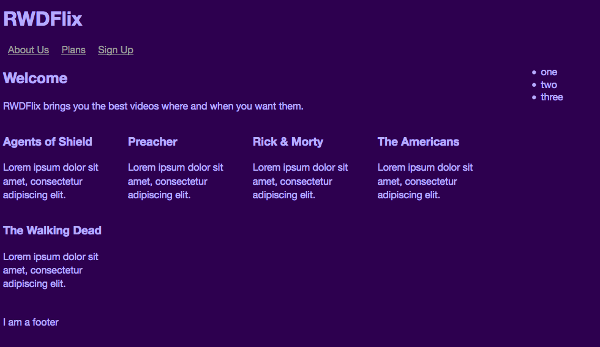
<section class="showslisting left">
    <h2>Welcome</h2>
    <p>RWDFlix brings you the best videos where and when
    you want them. <i>You are advised that shows
    highlighted contain more mature content.</i></p>
Another idea for responding to the time of day is to filter the level of blue light in the site to reduce eye strain or aid sleep, and the example later in this chapter that covers the Ambient Light Sensor API does something similar. You may have used applications like Flux that perform this function on a system level. If you do offer this option, it should be something a user opts into and that doesn’t happen automatically.
Battery Level
The HTML5 Battery Status API allows you to check the current battery level of a device and respond accordingly.
Security Concerns
There have been recent security concerns surrounding the Battery Status API, so read the W3C specification for news on its future.
Mobile devices (and laptops) are prone to running out of battery power just when you need it, so for this (mostly illustrative) example, let’s help our users by noticing when their battery level is low and making the page less consumptive.
Darker colors can help reduce the battery impact on certain device screens (especially AMOLED screens), so the colors for the page are already reasonably battery friendly, but let’s see how we can react to the battery level.
A JavaScript method is available to get a variety of information about a device’s battery.
Add the following code inside the index.js file to check if the browser supports the feature. If it does, then get the battery level, which is a value between 0 (empty) and 1 (full):
navigator.getBattery().then(function (battery) {
    var level = battery.level;
    console.log(level);
});
If it’s less than 20% (0.2), add a CSS class that reduces color brightness, and remove images from the DOM (since loading and displaying images can impact battery life, and every little bit helps):
if (level < 0.2) {
    body = document.getElementsByName('body');
    body.classList.add('battery-save');
    images = document.getElementsByName('img');
    var i;
    for (i = 0; i < images.length; i++) {
        images[i].remove();
    }
}
Add the new battery-save styling to your CSS, reducing the brightness of the page text:
.battery-save {
    color: gray;
}
Whether color schemes actually save battery life is a controversial topic that depends a lot on the device screen, but it might be worth experimenting. Other, more definite ideas for helping users save battery are:
- reducing network calls and traffic
- reducing animations and effects
- reducing the amount of client-side processing by removing less essential JavaScript.
Although we removed images from the DOM with JavaScript, they’re still loaded before being hidden. This contradicts the maxim of reducing network calls. As JavaScript only allows you to change an already existing page structure, you need to change what gets delivered to the browser in the first place. To make this work, you need to rethink the page structure to make it more mobile friendly.
Add classes to the current HTML to identify each TV show:
<section class="show1">
    …
</section>

<section class="show2">
    …
</section>
Now remove all the picture and video tags from each tvshow section, massively reducing the HTML file. Back in index.js, replace what is already there with the following code, which takes concepts we’ve already used in previous chapters (clicking the image for a video) and consolidates it:
Chapter6/battery_mobile_first/index.js
window.addEventListener("load",function(event) {
    navigator.getBattery().then(function (battery) {
    // Get the battery level, and load images if enough
    var level = battery.level;
    if (level > 0.2) {
        // Find all 'tvshow' divs and loop through them all
        tvShows = document.getElementsByClassName('tvshow');
        var i;
        for (i = 0; i < tvShows.length; i++) {
        tvShow = tvShows[i];
        // Get the show name
        showName = tvShow.classList[1];
        // Create a picture element
        var newPictureNode = document.createElement("picture");
        // Set the source and classes for the picture, the code is identical to earlier examples, but the show name is passed to generate for each show
        var pictureInnerHTML = '<source srcset="../images/' +
        showName + '-small.jpg" media="(max-width: 320px)"
        class="thumbnail"><source srcset="../images/' +
        showName + '-medium.jpg" media="((min-width: 320px) and
        (max-width: 480px))" class="thumbnail"><source
        srcset="../images/' + showName + '-large.jpg"
        media="(min-width: 480px)" class="thumbnail"><img
        src="../images/' + showName + '-medium.jpg"
        class="thumbnail">';
        newPictureNode.innerHTML = pictureInnerHTML;
        // Add an event listener to the picture
        newPictureNode.addEventListener('click', toggle_visibility,
        false);

        // Also generate the video HTML in the same way
        var newVideoNode = document.createElement("video");
        var videoInnerHTML = '<source src="../videos/' + showName
        + '.mp4" type="video/mp4"><source src="../videos/' +
        showName + '.ogv" type="video/ogg">Your browser doesn\'t
        support HTML5 video tag.';
        newVideoNode.setAttribute("controls", "controls");
        newVideoNode.setAttribute("poster", '../images/' +
        showName + '-medium.jpg');
        newVideoNode.setAttribute("preload", "none");
        newVideoNode.innerHTML = videoInnerHTML;

        // Insert the new image and video in the correct place
        var nextNode = tvShow.getElementsByClassName('showdescription');
        tvShow.insertBefore(newVideoNode, nextNode[0]);
        tvShow.insertBefore(newPictureNode, newVideoNode);
        }
    }
    });
},false);

function toggle_visibility(id) {
    var e = this;
    var v = e.nextSibling;
    v.style.display = 'block';
    v.play();
    e.style.display = 'none';
}
When the page loads, it checks to see if the battery level is above 20%. If so, then image and video nodes (elements inside the DOM) are added inside each tvshow class, using the class name for the TV show to ensure the correct media files are loaded. If the battery is below 20%, only text is displayed. Ideally, you should add this functionality to a preference setting, so that users don’t get an unwanted surprise.
This took some reorganizing, but now the page starts in a more mobile friendly state, only loading the heaviest page elements when the device is in a good state to do so. For the rest of the examples in this chapter, we’ll use this concept to show how to add different detection capabilities. In fact, before continuing, try refactoring the time example to use the framework above.
Geolocation
The HTML5 Geolocation API allows you to detect the rough latitude and longitude of a user’s current location.
As well as providing great video content, RWDFlix also likes to recommend shows that may interest a user. This example will use the current location of the user to highlight shows that contain content about that location.
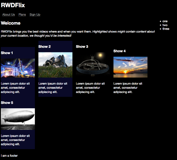
Shows highlighted that match user location
In index.js, replace the existing contents of the file with the following code that checks if the browser supports geolocation, informing the user if it doesn’t:
window.addEventListener("load",function(event) {
    if ("geolocation" in navigator) {

    } else {
    alert("RWDFlix uses geolocation to recommend shows that may
    be relevant to you.")
    }
},false);
If the browser does support geolocation, get the current position of the user and pass the values to a new function:
if ("geolocation" in navigator) {
    navigator.geolocation.getCurrentPosition(getPosition);
} else {
    alert("RWDFlix uses geolocation to recommend shows that may
    be relevant to you.")
}
The API method returns the current latitude and longitude, which is not that useful to us, as we really want to know the current country of a user. Use the Google Maps API to turn it into a more useful country code:
function getPosition(position) {
    // Define the URL with the current latitude and longitude
    var url =
    "http://maps.googleapis.com/maps/api/geocode/json?latlng=" +
    position.coords.latitude + "," + position.coords.longitude +
    "&sensor=false";
    // Create a request and send the URL
    var xmlhttp = new XMLHttpRequest();
    xmlhttp.open("GET", url, true);
    xmlhttp.send();
    // When the request returns, process the response
    xmlhttp.addEventListener("readystatechange", processRequest,
    false);
}
Now that we have a result from Google Maps, we can process the results. We need to find the array that contains the country value, and then highlight TV shows that match that country in a similar way to the time example:
function processRequest() {
    // Is the response OK?
    if (this.readyState == 4 && this.status == 200) {
    // Parse the JSON response
    var myArr = JSON.parse(this.responseText);
    var i;
    for (i = 0; i < myArr.results.length; i++) {
        // Loop through the array of results and find the element we want, then continue when we find it
        if (myArr.results[i].types[0] == "country") {
        country = myArr.results[i].formatted_address;
        tvShows = document.getElementsByClassName('tvshow');
        var j;
        // Loop through TV Shows and highlight any that match this value
        for (j = 0; j < tvShows.length; j++) {
            tvShow = tvShows[j];
            if (tvShow.classList[1] == country ||
            tvShow.classList[2] ==  country) {
            tvShows[j].classList.add('highlight')
            }
        }
        }
    }
    }
}
Modifying the HTML
I added country classes to the tvshow sections. Go ahead and add some of your own before running this example. They need to begin with a capital letter.
Based on Network
The example site is a video site, and while we currently have the clickable images allowing a viewer to only load a video file when they wish too, we could make this more flexible based on the device’s network connection. Or even better, we could create a preference that users can set if they want this feature.
The Network Information API is not widely supported (currently only Chrome on Android), but browser manufacturers move quickly, so it may be better supported by the time you decide to implement it.
First, the easiest (and most supported) check is to see if the user is online at all:
if (navigator.onLine) {
    // Do something
}
Granted, this has limited use in the example, unless you want to check if the user has become disconnected before attempting to play a video. Still, it’s a good idea to cover all bases.
While the Network Information API lets you check all sorts of values, it’s not much use right now. There are third-party (paid) services for checking internet speeds, but currently, the “best” solution is using complex code to check how long an image takes to load, and calculate speed from that. I won’t reproduce it here, but if you’re interested, there’s some helpful information on Stack Overflow.
Browser Support
While the Network Information API is still in a draft state, it’s an active proposal, so by the time of reading it may be better supported. You can find out its current status on the API’s community group site.
User Preference
You have likely experienced cookies in your day-to-day web browsing. Cookies are typically used to retain state such as preferences. They can be set or read by the client or server and are transmitted within every HTTP request. This example will read user preferences and display page elements accordingly.
Often the browser will write a cookie when a user submits a form or undertakes some other action. For this example, we’ll write a setting manually:
window.addEventListener("load",function(event) {
    document.cookie = "mature=no";
    …
},false);
This determines if the user wants to see videos considered “mature” content. Using this value, we can use the same technique for selectively rendering TV shows.
To test, add the mature class to the end of the class list of a couple of the tvshow sections, and add all-ages to the end of all the others. In the index.js loop that renders the TV shows, read the cookie value and hide/show the appropriate shows:
for (i = 0; i < tvShows.length; i++) {
    tvShow = tvShows[i];
    var mature = getCookie('mature');
    if (mature == 'no' && tvShow.classList[2] !=
    'mature') {
    …
    }
}
As all cookies are stored in the same property, you can use a regular expression to find and read the particular cookie you want:
function getCookie(name) {
    var regexp = new RegExp("(?:^" + name + "|;\s*"+ name +
    ")=(.*?)(?:;|$)", "g");
    var result = regexp.exec(document.cookie);
    return (result === null) ? null : result[1];
}
Ambient Light
Combining the Ambient Light Sensor API with time detection could be a great way to adjust page or video brightness dependent on the time of day and the light available to a viewer. On many mobile devices, this is now handled by the operating system, but you could give it a boost or add similar functionality for computer users.
Security Concerns
There have been security issues recently highlighted with the Ambient Light Sensor API. I recommend you read the W3C specification to check its future.
Let’s make an example that changes the colors of the page based on the current ambient luminosity (or the brightness of the surrounding area).
Replace the contents of the current index.js file with the following, which adds a class to the page body depending on the level of ambient light—the luminosity value:
window.addEventListener("devicelight", function (event) {
    var luminosity = event.value;

    if (luminosity <= 5) {
    document.body.className = "darkness";
    } else if (luminosity <= 50) {
    document.body.className = "dim";
    } else if (luminosity <= 1000) {
    document.body.className = "bright";
    }
});
Add these styles to your CSS file, for when a light is brightest:
.bright {
    background-color: #fff;
    color: #000;
}
This is how the page looks when this class is applied:
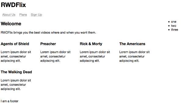
Setting high contrast in bright light
This styling inverts the current color scheme to black on white to make it higher contrast and more readable in bright sunlight. If you have a modern device, you might have noticed a similar thing happening to the screen.
Next, add styles for the dimmest light level:
.dim {
    background-color: #6600b4;
    color: #b5aaff;
}
And here’s how the page looks:
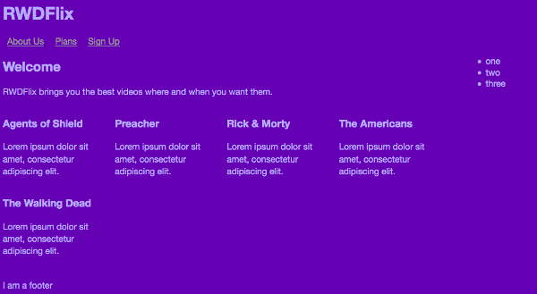
Setting low contrast in dim light
This makes the background and text easier to read in lower light situations.
Next, in a very dark situation, add a class that makes the contrast between text and background even less:
.darkness {
    background-color: #2d004f;
    color: #b5aaff;
}
Setting low contrast for a dark setting
Rapid transitions between color schemes are disconcerting to users, so to make this less harsh, add the following CSS to the body element that eases the transitions between colors:
body {
    -webkit-transition: all 0.5s ease-in-out;
    -moz-transition: all 0.5s ease-in-out;
    -o-transition: all 0.5s ease-in-out;
    transition: all 0.5s ease-in-out;
}
Vibration
Another W3C innovation is the Vibration API, which provides access to a mobile device’s vibration mechanism to provide tactile feedback. We could use this to add a more immersive experience to video playback by adding vibration to a soundtrack, but it would require a lot of work. There are other uses for this API that are handy for accessibility. For example, it can be useful if a device vibrates slightly when a button is tapped, letting the user know the action was detected.
Device Orientation
We’ve already seen how to detect and react to device orientation with media queries, but we could also react dynamically to device orientation. For example, we could switch a video file to a format more suitable for a landscape or portrait video.
If you want to get more experimental, what about controlling playback of a video based on the orientation of a device? For example, if a user tilts their phone in one direction, we could pause the video, and vice versa.
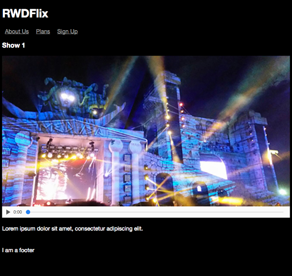
For this example, we’ll create a new, simplified version of the page that’s purely for playing one video.
Here’s the HTML:
Chapter6/oreintation/index.html (excerpt)
<!DOCTYPE html>
<html lang="en">
<head>
    <meta charset="UTF-8">
    <meta name="viewport" content="width=device-width,
    initial-scale=1.0, user-scalable=no">
    <title>RWDFLix</title>
    <link rel="stylesheet" type="text/css" media="all"
    href="layout.css">
</head>
<body>
    <header><h1>RWDFlix</h1></header>
    <main>
    <section class="showslisting">

        <section class="tvshow">
        <h3>Show 1</h3>
        <video controls poster="../images/show1-medium.jpg"
        preload="none" id="show1">
            <source src="../videos/show1.mp4" type="video/mp4">
            <source src="../videos/show1.ogv" type="video/ogg">
                Your browser doesn’t support HTML5 video tag.
        </video>
        <p class="showdescription">Lorem ipsum dolor sit amet,
        consectetur adipiscing elit.</p>
        </section>

    </section>

    </main>
    <footer>
    I am a footer
    </footer>
</body>
</html>
And the CSS is equally simplified:
Chapter6/orientation/layout.css (excerpt)
body {
    background: black;
    color: white;
    font-family: ’Helvetica Neue’, Helvetica, Arial, sans-serif;
    font-size: 1em;
}

section.showslisting {
    width: 100%;
    margin-bottom: 25px;
}

section.showslisting p {
    line-height: 1.2em;
    word-spacing: 0.2em;
}

section.tvshow {
    width: 100%;
    margin: 0 auto;
    display: block;
}

video {
    width: 100%;
    height: auto;
}

.thumbnail {
    width: 100%;
    height: auto;
}

footer {
    clear: both;
}

/* Media Queries */

/* Extra Small Devices and Phones */
@media only screen and (min-width: 480px) {
    section.tvshow {
        margin: 0 auto;
        display: block;
    }
}

/* Small Devices and Tablets */
@media only screen and (min-width: 768px) {

    section.tvshow {
        margin-right: 15px;
        display: inline-block;
    }

    section.showslisting p {
        line-height: 1.4em;
        word-spacing: 0em;
    }
}

/* Medium Devices and Desktops */
@media only screen and (min-width: 992px) {

    section.tvshow {
        margin-right: 15px;
        display: inline-block;
    }

    .showdescription {
        white-space: normal;
    }
}

/* Large Devices, Wide Screens, TVs */
@media only screen and (min-width: 1800px) {

    section.showslisting {
        width: 100%;
        margin-bottom: 25px;
    }

    section.tvshow {
        margin-right: 15px;
        display: inline-block;
    }
}
This results in the following layout for one video:
The video playback layout
Now add a script element below the page footer, containing the following code. This script initiates when the page loads, and accesses the video element, listening to whether it’s playing:
<script>
(function () {
    var video = document.getElementById("show1");
    video.addEventListener("play", control_video, false);

})();
</script>
Add the control_video function, and assign the video clicked to a variable:
function control_video(e) {
    var v = e.target;
}
Check if the device supports the orientation API and if so, listen for changes to orientation. If it doesn’t, then warn the user:
if (window.DeviceOrientationEvent) {
    window.addEventListener("deviceorientation", function (e) {

    }, false);
} else {
    alert("Sorry, your browser doesn't support Device
    Orientation");
}
Finally, react to the changes in orientation, pausing the video if a user rotates their phone to the right, and playing it again if they rotate to the left:
if ((e.gamma < -45) && (e.gamma > -90)) {
    v.play();
}

if ((e.gamma > 45) && (e.gamma < 90)) {
    v.pause();
}
Getting Oriented
If you’re interested in learning more about the three-rotation axis that exist in the Orientation API, I recommend reading “Using Device Orientation in HTML5”.
Responding to All
In this chapter, we’ve seen hypothetical examples of how we can change the contents of our pages to respond to the variety of sensors found in modern devices. These are always evolving, and I encourage you to keep up to date on the new APIs you can take advantage of in your designs to deliver tailored experiences to users.
This brings us to the end of our journey with this book. Responsive design is fundamentally about crafting pages that are usable by anyone, no matter what their device or circumstances. Whether it be screen size, performance or other factors, it’s our responsibility to ensure that the user’s experience is as good as it can be.
You’re beginning your responsive adventure at a good time. There have never been better features available and soon to arrive in the HTML and CSS specifications—features for crafting experiences to suit the ever-changing landscape of modern web design. Some of these features are in flux, and their final forms undecided, but this also means you have the opportunity to test and shape their future. Get involved, and help create the Web you want to see.