Table of Contents for
Jump Start Responsive Web Design, 2nd Edition
 Jump Start Responsive Web Design, 2nd Edition
Published by
SitePoint, 2017
Jump Start Responsive Web Design, 2nd Edition
Published by
SitePoint, 2017
- Cover
- Jump Start Responsive Web Design, 2nd Edition
- Preface
- Chapter 1: The Meaning and Purpose of Responsive Web Design
- Chapter 2: The Building Blocks of Responsive Design
- Chapter 3: Better Responsive Structures with Grid Systems
- Chapter 4: Responsive Text
- Chapter 5: Responsive Images and Video
- Chapter 6: Responding to User Context
Chapter 5: Responsive Images and Video
The exchange of text-based content brought the web into existence, but images and other rich media have kept it evolving and made it what we all know/love/dislike.
Options for making images responsive has developed rapidly in recent years, with the ability to load images perfectly suited to users’ devices. And the addition of new HTML elements like video has opened up new options for responsive design. It’s fresh territory, but with pitfalls, compromises, and new techniques to learn. So let’s get going!
Images
Images are a powerful communication device, portraying a message, intent, explanation, and bringing life to your web pages.
Images have also been a constant source of anguish for designers (web and print) for many years, and while HTML5 has brought a lot of improvements, adding responsive images to your web page still requires planning and preparation.
For this chapter, I’ve replaced the placeholder graphics used up to this point on the site with images from royalty free sites to represent what a site with real TV shows might look like.
Adding show images
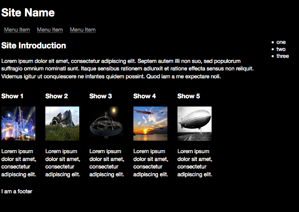
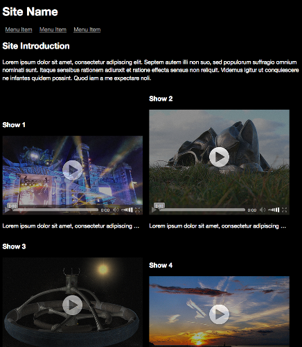
There are issues with the page now that we’ve added real images. The most obvious is that, while the layout is still fine, all the images are forced into the same dimensions, which means they aren’t taking advantage of the available screen space. The example site is for browsing and watching videos, so it makes sense to make the visual content as prominent and easy to see as possible.
To show how to use responsive images, we’ll change the demo site to have different image sizes and layouts suited to each use case at the breakpoints defined in Chapter 3.
First, change the CSS and HTML to better accommodate the images we’ll be adding. Let’s give the main content area more space and reduce the size of the aside menu:
@media only screen and (min-width: 992px) {
    aside {
        width: 15%;
        display: block;
    }

    section.showslisting {
        width: 75%;
    }
}
Add the mobile first styles for the divs that contain details about a show. This sets a maximum width of 480px, centered, with an ideal width of most of the screen:
section.tvshow {
    width: 90%;
    max-width: 480px;
    margin: 0 auto;
    display: block;
}
Next, add a media query for the same div when displayed on larger screens—still centered and filling most of the screen:
@media only screen and (min-width: 480px) {
    section.tvshow {
        max-width: 768px;
    }
}
As we jump to a larger screen, let’s start showing more than one thumbnail in a row. This actually means that images will now be smaller, and the max-width of each div should be half the maximum screen size for this media query:
@media only screen and (min-width: 768px) {
    section.tvshow {
        width: 46%;
        margin-right: 15px;
        display: inline-block;
        max-width: 496px; /* The next break point divided by 2*/
    }
}
Next is the media query for larger screens, where we now show four items per row and adjust the div and image sizes accordingly:
@media only screen and (min-width: 992px) {
    section.tvshow {
        width: 22%;
        margin-right: 15px;
        display: inline-block;
    }
}
Finally, change the media query for TV and larger screens:
Chapter5/image_width/layout.css (excerpt)
/* Large Devices, Wide Screens, TVs */
@media only screen and (min-width: 1800px) {
    section.tvshow {
    width: 46%;
    margin-right: 15px;
    display: inline-block;
    max-width: 900px;  /* The next break point divided by 2 */
    }
}
Okay, now that the containers for the images are sorted, we can focus on the images.
The page restructured at medium screen size
Responsive Dimensions
Change the image sizing to the following:
.thumbnail {
    width: 100%;
    height: auto;
}
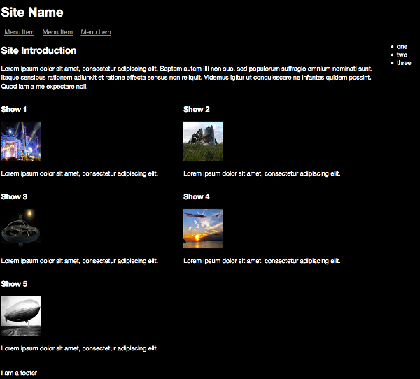
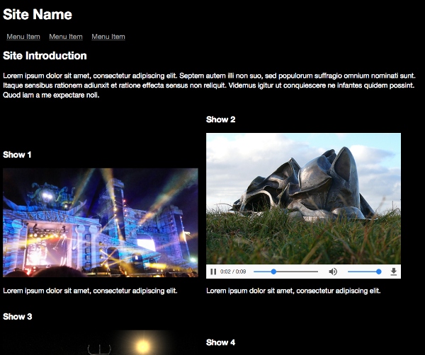
The effect of the changed image styles
This will set the image width to 100% of its container’s width, and setting image’s height to auto allows the image to occupy as much vertical space as needed to maintain its natural proportions. You’ll notice that this means the images don’t currently all have the same height, which affects the layout. You could swap these values to instead fill 100% of the height and fill the width automatically. Attempting to make images always fit precise dimensions can be a compromising challenge that depends a lot on the source of the images. If you’re able, it might be best to edit them first so they all have the same dimensions.
Using width: 100% can mean that images will scale larger than their original size and render pixelated. To prevent this, try using max-width or max-height on the thumbnail styles relevant to each breakpoint.
So that’s it, you’re done, right? Unfortunately, no. Inspect one of the images in your web inspector and you’ll notice that all we’re doing is resizing a very large image. Even though it looks small, the actual file is still large, adding a lot of page weight. Look at the network requests: these five images total nearly 4MB, which is a lot of data for a mobile user to load. To make your images fully responsive, you need to make sure the right file is served to the right device.
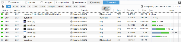
Image sizes
The Right Image for the Right Device
There are two methods for handling images responsively. One is srcset, an attribute to the img tag you know already, and the other is the new HTML5 picture element. Both methods use media query like syntax to select the image most suited to the device capabilities, but srcset allows the browser to make the final decision on what image to render, and picture explicitly tells the browser which image to render. For most use cases, srcset will be all you need, but for design heavy sites when you want more control over how a browser renders an image (e.g. cropping an image instead of resizing it) then using the picture tag will suit you better.
Much like the CSS rules loaded by your media queries, what image sizes you use and support is up to you and your use case. The example project is moderately well optimized, but could be better. For example, we could reduce the maximum size of images loaded on smaller screens. The queries can take the same format as those outlined in Chapter 2.
I created each of the images needed for the design manually, giving them a width roughly matching the maximum width the image will be displayed at:
- Small Image: 320px wide.
- Medium Image: 480px wide.
- Large Image: 768px wide.
Creating different versions of images manually is tedious, but gives you control over what gets shown in each image size. If you’d rather automate the generation of these images, there are several options, such as:
- batch processing in an image editor like Photoshop or XnView (Windows).
- batch processing with a build tool such as Gulp.
- using a plugin for your CMS or static site generator, which is likely a wrapper around the popular imagemagick or OptiPNG libraries.
srcset
Replace the existing image element with the following:
Chapter5/srcset/index.html (excerpt)
<section class="tvshow">
    <h3>Show 1</h3>
    <img src="../images/show1-medium.jpg"
        srcset="../images/show1-medium.jpg 480w,
        ../images/show1-small.jpg 320w,
        ../images/show1-large.jpg 768w"
        sizes="(max-width: 768px) 480px,
        (max-width: 1800px) 320px, 768px"
        class="thumbnail" >
    <p class="showdescription">Lorem ipsum dolor sit amet,
     consectetur adipiscing elit.<p>
</section>
Some Homework
This example replaces one image, and to reduce repetition, I haven’t included code for replacing the other four images. You can find the code for the remaining images in the code archive if you want to try replacing the others too. Keep the media queries the same and replace the images with the appropriate files.
This requires breaking down, and the layout we're using also adds complexity.
The first part of the element is normal, as is the last class property, the second and third lines are the new syntax. srcset is designed to allow the browser to make the best decisions about what image to display based on information you provide it. Each pair in the second line defines the images available and tells the browser its width, appended with a w. The third line defines the viewport sizes you want to load a particular image at, and what image to load.
The example above declares:
- Up to a viewport width of 768px, load an image of 480px width.
- Between a viewport width of 768 and 1800px, load an image of 320px width.
- If no other rule applies, then load an image of 768px.
You can be more subtle with these declarations, for example:
<img src="../images/show1-medium.jpg"
    srcset="../images/show1-medium.jpg 480w,
    ../images/show1-small.jpg 320w,
    ../images/show1-large.jpg 768w"
    sizes="(max-width: 768px) 90vw,
    (max-width: 1800px) 24vw, 50vw"
    class="thumbnail" />
This instead declares that at the different viewport sizes pick an image that suits best a certain viewport width (vw) size. For this design, they are essentially the same, but it gives you an idea of how smart you can let your browser be. It's worth noting that this smartness can actually cause confusion when testing; I have frequently found myself wondering why the tag wasn't working how I expected it to, only to realize that it was due to the browser holding on to cached version of the images, or optimizing for a retina screen, and again caching those images. To debug what's happening while figuring out your srcsets, I recommend using incognito / private windows, double-checking your screen resolution, and keeping developer tools open to see what files the browser is actually loading.
If this smartness is too unpredictable for you and you find yourself needing more control, then the picture tag is for you.
The picture Element
Try replacing the img tags with the below:
Chapter5/picture_tag/index.html (excerpt)
<picture>
    <source srcset="../images/show1-small.jpg"
    media="(max-width: 320px)" class="thumbnail">
    <source srcset="../images/show1-medium.jpg"
    media="((min-width: 320px) and (max-width: 480px))"
    class="thumbnail">
    <source srcset="../images/show1-large.jpg"
    media="(min-width: 480px)"
    class="thumbnail">
    <img src="../images/show1-medium.jpg"
    class="thumbnail">
</picture>
More Homework
As with the previous section, this example replaces one image, and to reduce repetition, I haven’t included code for replacing the other four images. You can find the code for replacing the remaining images here if you want to try replacing the others too. Keep the media queries the same and replace the images with the appropriate files.
We’ve replaced the default img with the HTML5 picture element. This element is still considered experimental (especially with Microsoft and older Android browsers) but should be widely used soon. Helpfully, the img inside the picture is a fallback image for browsers that don’t support picture, meaning that the browser will load a default image if it doesn’t support the newer element.
I chose the medium-sized image, as it’s not too large or small, allowing for a reasonable level of responsiveness on unsupported browsers.
Supporting Older Browsers
If you want to add better support for older browsers, you can use a “polyfill” (a term for a library that plugs missing functionality). Specifically, in this case, that’s Scott Jehl’s picturefill.
One other useful application of the picture element, enabled through its inner source element, is to load different image formats, such as scaleable vector images (SVGs):
<picture>
    <source srcset="logo.svg" type="image/svg+xml">
    <img src="logo.png" alt="Logo">
</picture>
If the browser doesn’t support SVG images, then it will load the PNG instead.
Another option is to load higher resolution images for high resolution screens:
<picture>
    <source srcset="../images/show1-2x.jpg"
    media="(min-resolution: 120dpi)" class="thumbnail">
    <img src="../images/show1-medium.jpg"
    class="thumbnail">
</picture>
Responsive Video
Continuing the theme of semantic elements in HTML5, the respective elements for video and audio are video and audio. Since we’re building a video site in this book, I won’t focus too much on the audio element, but I think after using the picture and video elements, you’ll understand how to use it.
The video Element
Many years ago, I made a site of music videos. This was prior to the widespread availability of broadband, and I spent a long time optimizing videos as much as possible to make them viewable on slow connections. I also had to decide what video plugin to use to display the video. Would it be best with Quicktime? RealPlayer? Or the tool that everyone loves to hate now (but which was popular at the time), Flash?
Those video format wars are largely over now, replaced by a series of standard formats and HTML5 elements, making a designer’s life much easier, and also reducing that user-experience-killing process of having to download a plugin to view a video. The video element has a lot wider support than picture, with only IE8 and early Android versions likely to cause you problems.
However, the file formats supported by the video element still present problems, mostly thanks to vendors’ differing attitudes to DRM and to which format is the “best” to use (each vendor preferring the format it supports or helped to develop). All browsers that support the video element support MPEG-4/H.264, which is a compressed format. But it’s also proprietary, which means browser manufacturers must pay a license to use it. Support for the WebM and Ogg/Theora formats (which are open formats) is less common, with really only Chrome, Firefox, and Opera supporting them.
Here’s an example of the video element in use:
<video width="320" height="240" autoplay>
    <source src="file.mp4" type="video/mp4">
    <source src="file.ogg" type="video/ogg">
    Your browser does not support the video tag.
</video>
It’s a much simpler and consolidated HTML element than the options that existed before. It loads whichever video format is supported by the user’s browser, or a default string of text if the the video element or the file formats it contains aren’t supported. The source elements are processed in the order presented. So, in the example above, if the browser supports both formats, it will load the first one it sees. That’s about it; there isn’t much particularly responsive about the video element, except that it loads suitable video files with controls for them.
There are a few tricks you can try to make videos more responsive, but let’s start simply by making the video player controls visible, adding a poster image (a thumbnail shows before the video plays), and removing the manual size.
<video controls poster="../images/show1-medium.jpg">
    <source src="../videos/show1.ogv" type="video/ogg">
    <source src="../videos/show1.mp4" type="video/mp4">
    Your browser does not support the video tag.
</video>
Early proposals for the video element included having its own media queries (like the picture element has, as we saw above). But the idea was dropped, meaning that different video files can’t be swapped out for different devices. So the only real way to make the video responsive in any way is to use percentage widths, for example:
video {
    width: 100%;
    height: auto;
}
This will make the video scale to fit its containing element, and you could use a max-width property to limit the dimensional size it could grow to, or a smaller value, such as 50%. However at larger screen sizes it won’t prevent upscaling of the video, meaning it could look pixelated if sized too large.
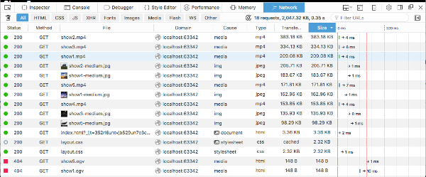
Unless you specify otherwise, a video will start to download to your browser once the page is loaded (so that it’s ready to view if a user chooses to watch it). Notice the potential network overhead with a video, which isn’t great for mobile users:
The video file size shown in the web inspector
There’s a partial solution to this problem: add preload="none" to the video tag:
<video controls poster="../images/show1-medium.jpg"
preload="none">
    …
</video>
Now the video will only load when a user clicks the play button, allowing the user to choose when/if it’s loaded.
In our code files, go ahead and comment out the picture element (for now) and replace it with the video element as shown above.
Videos loaded on a tablet device
If you use a larger video, then the video scales quite well at larger sizes. But you’ll notice that at larger player sizes (the tablet and TV breakpoints) the poster image is pixelated.
There are no ideal solutions to this problem, and hopefully, better solutions will emerge as the element evolves. (One possible solution I’d like to see would be the option to set the poster image along with the source sub-elements inside the video tags, ideally with support for breakpoints and media format selective loading.)
Using a Larger Image as a Poster
Replacing the poster image with the large variant will mean the poster image scales across all file sizes, but it does mean that we’re loading an unnecessarily large file at certain breakpoints.
If you want to style the poster element further (to change the dimensions or add padding), you can target it directly with the following selector:
video[poster] {
    …
}
Background Image
A way to create a responsive image representation of the video is to remove the poster image and then instead set a background image for the video, allowing you use media queries to load the appropriate image.
You’ll need to set a background image inline within the video tag, or create a CSS style for each video to set the image, because each video needs a different image set as a background.
With an inline style:
<video controls preload="none"
style="background: transparent
url('../images/show1-large.jpg')
0 0  cover no-repeat;">
    …
<video>
And with a CSS class:
<video controls preload="none" class="show1">
    …
</video>
.show1 {
    background: transparent url("../images/show1-large.jpg")
    0 0 / cover no-repeat;
}
Using specific styles isn’t a scalable option as you add more content, but for our example it’s the best option. To avoid repeated typing on a production site, you’d probably use a templating system such as Twig or Mustache, which would loop through the videos you want to display and populate the various file names as required.
If you don’t want to use inline styles you could use a CSS preprocessor such as Less or Sass, which allows you to use functions and arguments (in this case, the background image) to generate the necessary CSS classes for you, but this will result in a lot of CSS classes.
To demonstrate the principle, let’s take an approach somewhere between the two mentioned above, but without using any new dependencies. Add a class to each video, and then create the styles needed for the background image at each breakpoint. First, remove all the poster attributes from the video tags and add the class. For example:
<video controls preload="none" class="show1">
    …
</video>
And the CSS for the mobile-first layout:
.show1 {
    background: transparent url("../images/show1-medium.jpg")
    0 0 / cover no-repeat;
}
Then for larger mobile devices:
@media only screen and (min-width: 480px) {
    .show1 {
    background: transparent url("../images/show1-large.jpg")
    0 0 / cover no-repeat;
    }
}
For larger tablets and desktop devices:
@media only screen and (min-width: 992px) {
    .show1 {
        background: transparent url("../images/show1-small.jpg")
        0 0 / cover no-repeat;
    }
}
And finally for large screens and TVs:
@media only screen and (min-width: 1800px) {
    .show1 {
        background: transparent url("../images/show1-large.jpg")
        0 0 / cover no-repeat;
    }
}
Now create matching classes and styles for each other video thumbnail. Phew! That’s great for responsiveness, but a lot of code! You can find the complete example in the code archive.
Clickable Image
Another different solution to creating a fully responsive video is to replace the video player with a picture tag that, when clicked, loads the player. This allows you to use the best of all responsive worlds, but will need JavaScript. It will also allow you to add features such as opening the video in a layer above the web page.
First, add the picture and video tags together for each TV show:
<section class="tvshow">
    <h3>Show 1</h3>
    <picture>
    <source srcset="../images/show1-small.jpg"
    media="(max-width: 320px)" class="thumbnail">
    <source srcset="../images/show1-medium.jpg"
    media="((min-width: 320px) and (max-width: 480px))"
    class="thumbnail">
    <source srcset="../images/show1-large.jpg"
    media="(min-width: 480px)" class="thumbnail">
    <img src="../images/show1-medium.jpg"
    class="thumbnail">
    </picture>
    <video controls poster="../images/show1-medium.jpg"
    preload="none">
    <source src="../videos/show1.mp4" type="video/mp4">
    <source src="../videos/show1.ogv" type="video/ogg">
    Your browser doesn’t support HTML5 video tag.
    </video>
    <p class="showdescription">Lorem ipsum dolor sit amet,
    consectetur adipiscing elit.</p>
</section>
Do the same for each other show, replacing the images and video sources.
Now set the video element to be hidden by default:
video {
    display: none;
    width: 100%;
    height: auto;
}
A Note on JavaScript
The JavaScript code in this chapter and in Chapter 6 are mostly presented in isolation, as they offer separate options to experiment with. If you wanted to combine and use all of the examples together, you’d need to plan further, especially in trying to minimize the number of event handlers required.
Next, add the following JavaScript that adds a click event listener to the page. If a click is detected, the code will check if the click was on a thumbnail. If it was, then it calls a toggle_visibility function. This function shows the hidden video, plays it and then hides the image that was clicked.
Add the following JavaScript inside a script tag to the index.html file, which adds the event listener:
(function () {
    document.addEventListener('click', toggle_visibility,
    false);
Once inside the function, if the element clicked was one of the video thumbnails, then continue, ignoring all other elements:
function toggle_visibility(id) {
    clickedElement = id.target;
    if (clickedElement.classList.contains('thumbnail')) {
Next, you need to detect which image was clicked, find the relevant video for the thumbnail, start playing it and hide the thumbnail image.
var v = clickedElement.parentNode.parentNode.querySelector('video');
    v.style.display = 'block';
    v.play();
    clickedElement.style.display = 'none';
    }
}
})();
And now, responsive images are replaced with a video player that by design stretches to fit. You could improve this by reversing the process when the video is paused.
Clickable image and resulting video player
Get Visual
And there you have it: in this chapter, we’ve added a lot to flesh out the sample site with images and video, making it feel much more like a proper web page. As you can see, pictures are now a lot easier to make responsive. New tools and libraries have made responsive images much simpler and comprehensive than they used to be. Videos still require more work, but at least the days of complex media plugins are behind us.
In the next chapter, we’ll polish the page with techniques for reacting to the capabilities of a user’s browser, location, data and other “adaptive” techniques.