


6.4 Maintain Coding Standards with ESLint
Consistent code is criticial to ensuring that a software developer can feel at home in any part of the code base. Honey and maple syrup are both capable of sweetening a dish, but mixing them together will probably lead to loss of the unique flavors achieved with either sweetener. The same is true with code: mixing tabs and spaces, camelCase, and snake_case in the same code base leaves the software developer’s palette wanting.
Problem
How do you make sure that your project feels like it was written by one author? A good ESLint rule set will protect every member of the team from each other and yourself.
Solution
Begin by adding ESLint to your project. Airbnb has published an excellent JavaScript style guide. It has gone above and beyond and provided a set of linting tools that can easily be incorporated into any React Native project.
Start by installing ESLint:
$>npm install --save-dev eslint$>./node_modules/.bin/eslint --init
You will then be prompted to select how to configure ESLint. For my project, I chose:
-
How would you like to configure ESLint? Use a popular style guide
-
Which style guide do you want to follow? Airbnb
-
Do you use React? (y/N) y
-
What format do you want your config file to be in? JSON
Tip
ESlint works best when you can give it a handful of folders to run against. I recommend putting your
React Native project code in a folder like src/. You can then simplify your ESLint script. For
the react-native-pastry-picker project, I have moved all the components into src/.
Because my project includes a collection of flow types from Recipe 6.2, some
additional configuration is required. Fortunately, the
eslint-plugin-flowtype
package makes the integration between ESLint and Flow seamless:
npm install babel-eslint --save-dev
npm install eslint-plugin-flowtype --save-dev
babel-eslint is a special ESLint parser that will properly account for the
Flow type hints in your project. eslint-plugin-flowtype includes a collection
of additional ESLint rules. Layer on additional ESLint rules
that account for Flow’s extended type hints by updating the .eslintrc.json
file:
{"parser":"babel-eslint","extends":"airbnb","plugins":["flowtype"],"rules":{"flowtype/boolean-style":[2,"boolean"],"flowtype/define-flow-type":1,"flowtype/delimiter-dangle":[2,"never"],"flowtype/generic-spacing":[2,"never"],"flowtype/no-primitive-constructor-types":2,"flowtype/no-types-missing-file-annotation":2,"flowtype/no-weak-types":2,"flowtype/object-type-delimiter":[2,"comma"],"flowtype/require-parameter-type":2,"flowtype/require-return-type":[2,"always",{"annotateUndefined":"never"}],"flowtype/require-valid-file-annotation":2,"flowtype/semi":[2,"always"],"flowtype/space-after-type-colon":[2,"always"],"flowtype/space-before-generic-bracket":[2,"never"],"flowtype/space-before-type-colon":[2,"never"],"flowtype/type-id-match":[2,"^([A-Z][a-z0-9]+)+Type$"],"flowtype/union-intersection-spacing":[2,"always"],"flowtype/use-flow-type":1,"flowtype/valid-syntax":1},"settings":{"flowtype":{"onlyFilesWithFlowAnnotation":false}}}
By running node_modules/eslint/bin/eslint.js, you should start to see all the inconsistencies in your source code:
/Users/jon/Projects/react-native-pastry-picker/src/ingredientBar.js 4:3 err.'Animated'is defined but ... no-unused-vars 7:3 err.'TouchableHighlight'is de... no-unused-vars 12:1 err. Type identifier'Props'do... flowtype/type-id-match 18:16 err. Component should be written... react/prefer-stateless-function 19:9 err. Missingreturntypeannotation flowtype/require-return-type 21:13 err. JSX not allowed in files with... react/jsx-filename-extension 21:26 err.'styles'was used before it was... no-use-before-define 22:20 err.'styles'was used before it was... no-use-before-define 24:20 err.'styles'was used before it was... no-use-before-define 25:13 err. Expected indentation of4space... react/jsx-indent /Users/jon/Projects/react-native-pastry-picker/src/pastryButton.js 10:1 err. Type identifier'Props'does... flowtype/type-id-match 21:9 err. Missingreturntypeannotation flowtype/require-return-type 23:13 err. JSX not allowed in files with... react/jsx-filename-extension 23:26 err.'styles'was used before it was... no-use-before-define 26:17 err.'styles'was used before it was... no-use-before-define 29:22 err.'styles'was used before it was... no-use-before-define 31:13 err. Expected indentation of4space... react/jsx-indent /Users/jon/Projects/react-native-pastry-picker/src/pastryPicker.js 26:1 err. Type identifier'State'does... flowtype/type-id-match 31:3 err. state should be placed after... react/sort-comp 44:9 err. Missingreturntypeannotation flowtype/require-return-type 48:13 err. JSX not allowed in files with... react/jsx-filename-extension 48:26 err.'styles'was used before it was... no-use-before-define 49:20 err.'styles'was used before it was... no-use-before-define 51:39 err. Missing"key"parameter type... flowtype/require-parameter-type 51:39 err. Missingreturntypeannotation flowtype/require-return-type 59:20 err.'styles'was used before it was... no-use-before-define 65:13 err. Expected indentation of4space... react/jsx-indent ✖27problems(27errors,0warnings)3errors,0warnings potentially fixable with the`--fix`option.
In just three components, ESLint was able to detect 27 errors! Some of these are style choices that I don’t agree with—for example, I don’t have a problem including JSX in a file ending in .js. Let’s disable that rule in our .eslintrc.json file:
..."env":{"jest":true},"rules":{"react/jsx-filename-extension":[0],"import/no-extraneous-dependencies":["error",{"devDependencies":true}],...
By setting react/jsx-filename-extension to [ 0 ], ESLint will now ignore
this rule. I also want to run eslint on my test suite, which relies on a few
global functions. To ignore them, add "jest": true as part of your
environment. Because the react-native-pastry-picker is an external package,
certain dependencies, like react and react-native, are devDependencies.
Relaxing the import/no-extraneous-dependencies rule is required because it will be
imported into other React Native applications with their own dependencies on react and react-native.
By rerunning the linter, my error set has dropped to 24 errors.
The following three components, after ESLint and Flow checking, now all follow a
consistent style. Note that the implementation has not changed at all—ESLint detected that the <IngredientBar /> component could be refactored into
a pure function:
// src/ingredientBar.js// @flowimportReact,{typeElement}from'react';import{StyleSheet,Text,View,}from'react-native';typePropType={backgroundColor:string,label:string,flex:number};conststyles=StyleSheet.create({ingredientColumn:{flexDirection:'column',flex:1,justifyContent:'flex-end',},bar:{alignSelf:'flex-start',flexGrow:0,},label:{flex:0.2,},});exportdefaultfunctionIngredientBar({backgroundColor,flex,label}:PropType):Element<View>{return(<Viewstyle={styles.ingredientColumn}><Viewstyle={styles.bar}/><Viewstyle={{backgroundColor,flex}}/><Viewstyle={styles.label}><Text>{label}</Text></View></View>);}
The render() method now has a Flow return type:
// src/pastryButton.js// @flowimportReact,{Component,typeElement}from'react';import{StyleSheet,Text,TouchableHighlight,View,}from'react-native';typePropType={isActive?:boolean,label:string,onPress:(key:string)=>void};conststyles=StyleSheet.create({button:{padding:10,minWidth:140,justifyContent:'center',backgroundColor:'#5A8282',borderRadius:10,},buttonContainer:{margin:10,},buttonText:{fontSize:18,color:'#FFF',},});exportdefaultclassPastryButtonextendsComponent<PropType>{staticdefaultProps={isActive:false,}props:PropTyperender():Element<View>{const{isActive,onPress,label}=this.props;return(<Viewstyle={styles.buttonContainer}><TouchableHighlightonPress={onPress}style={[styles.button,{backgroundColor:isActive?'#CD7734':'#54250B'}]}underlayColor="#CD7734"><Textstyle={styles.buttonText}>{label}</Text></TouchableHighlight></View>);}}
ESLint’s --fix flag reformatted the PASTRIES constant:
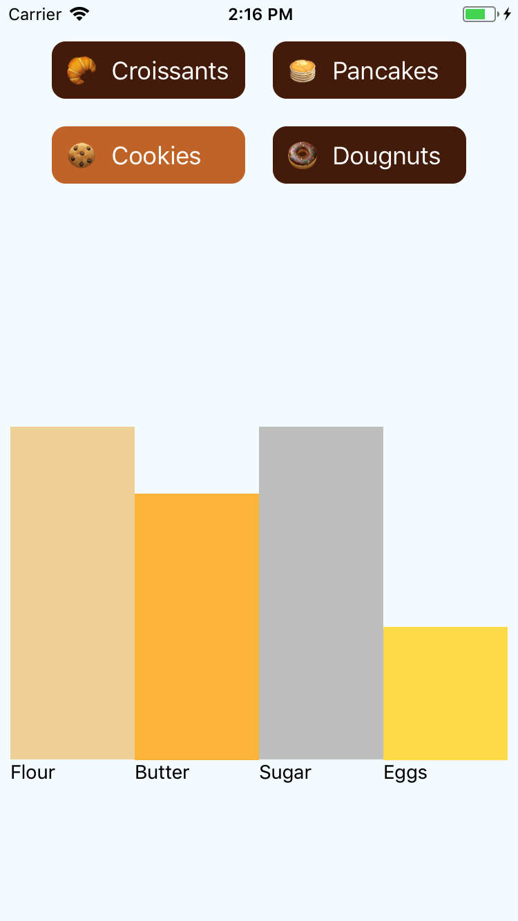
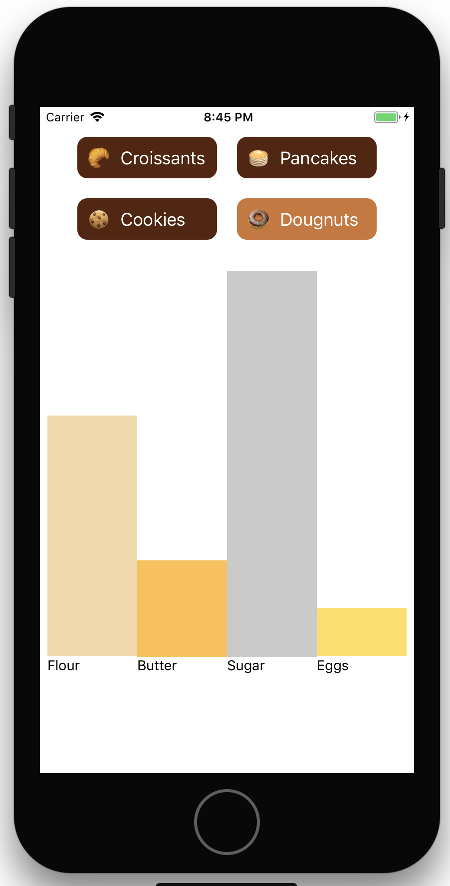
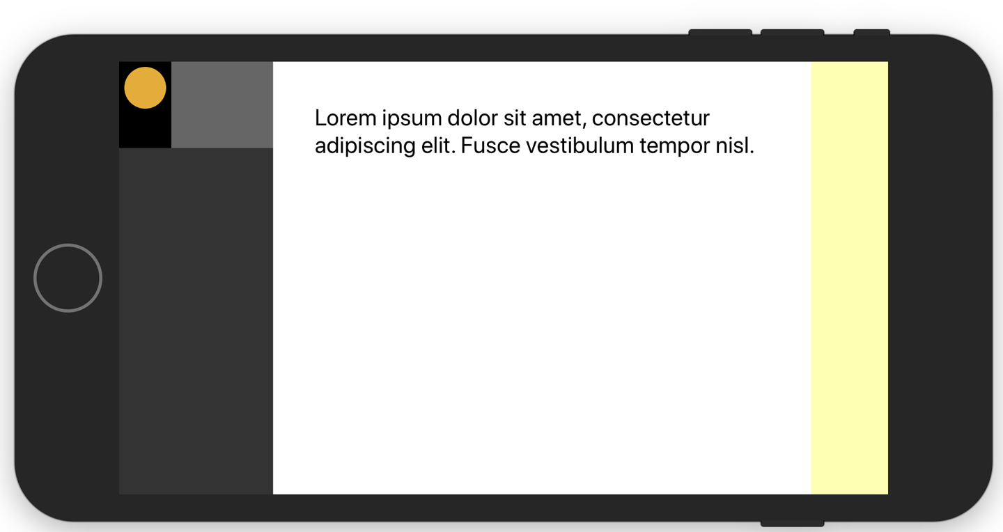
// @flowimportReact,{Component,typeElement}from'react';import{StyleSheet,View,}from'react-native';importIngredientBarfrom'./ingredientBar';importPastryButtonfrom'./pastryButton';constPASTRIES={croissant:{label:'Croissants',flour:0.7,butter:0.5,sugar:0.2,eggs:0,},cookie:{label:'Cookies',flour:0.5,butter:0.4,sugar:0.5,eggs:0.2,},pancake:{label:'Pancakes',flour:0.7,butter:0.5,sugar:0.3,eggs:0.3,},doughnut:{label:'Dougnuts',flour:0.5,butter:0.2,sugar:0.8,eggs:0.1,},};conststyles=StyleSheet.create({pastryPicker:{flex:1,flexDirection:'column',margin:20,},ingredientContainer:{flex:1,flexDirection:'row',},ingredientColumn:{flexDirection:'column',flex:1,justifyContent:'flex-end',},buttons:{flexDirection:'column',flexWrap:'wrap',paddingRight:20,paddingLeft:20,flex:0.3,},});typeStateType={selectedPastry:string};exportdefaultclassPastryPickerextendsComponent<{},StateType>{constructor(props:{}){super(props);this.state={selectedPastry:'croissant',};}state:StateTypesetPastry=(selectedPastry:string)=>{this.setState({selectedPastry});}renderButtons():Array<View>{returnObject.keys(PASTRIES).map((key:string):Element<View>=>(<PastryButtonkey={key}isActive={this.state.selectedPastry===key}onPress={()=>{this.setPastry(key);}}label={PASTRIES[key].label}/>));}render():Element<View>{const{flour,butter,sugar,eggs,}=PASTRIES[this.state.selectedPastry];return(<Viewstyle={styles.pastryPicker}><Viewstyle={styles.buttons}>{this.renderButtons()}</View><Viewstyle={styles.ingredientContainer}><IngredientBarbackgroundColor='#F2D8A6'flex={flour}label='Flour'/><IngredientBarbackgroundColor='#FFC049'flex={butter}label='Butter'/><IngredientBarbackgroundColor='#CACACA'flex={sugar}label='Sugar'/><IngredientBarbackgroundColor='#FFDE59'flex={eggs}label='Eggs'/></View></View>);}}
Discussion
With Flow and Jest, you have tools that ensure program correctness, but neither will address style and consistency. ESLint is a powerful tool for ensuring that:
-
Variables that have been declared are used
-
Spacing rules are respected
-
Naming conventions are followed
-
Debugging statements like
console.logordebuggerare removed -
Semicolons are added (or not)
-
Variables are not assigned inside of
if()statements
Explore all rules ESLint can enforce in its documentation.
See Also
This example only scratches the surface of what ESLint can do to improve the maintainability and code quality of your project. Consider integrating ESLint into your development environment by using the ESLint integrations guide.