Table of Contents for
Introduction to Machine Learning with Python
 Introduction to Machine Learning with Python
Published by
O'Reilly Media, Inc., 2016
Introduction to Machine Learning with Python
Published by
O'Reilly Media, Inc., 2016
- Cover
- nav
- Introduction to Machine Learning with Python
- Introduction to Machine Learning with Python
- Preface
- 1. Introduction
- 2. Supervised Learning
- 3. Unsupervised Learning and Preprocessing
- 4. Representing Data and Engineering Features
- 5. Model Evaluation and Improvement
- 6. Algorithm Chains and Pipelines
- 7. Working with Text Data
- 8. Wrapping Up
- Index
- About the Authors
- Colophon
Chapter 3. Unsupervised Learning and Preprocessing
The second family of machine learning algorithms that we will discuss is unsupervised learning algorithms. Unsupervised learning subsumes all kinds of machine learning where there is no known output, no teacher to instruct the learning algorithm. In unsupervised learning, the learning algorithm is just shown the input data and asked to extract knowledge from this data.
3.1 Types of Unsupervised Learning
We will look into two kinds of unsupervised learning in this chapter: transformations of the dataset and clustering.
Unsupervised transformations of a dataset are algorithms that create a new representation of the data which might be easier for humans or other machine learning algorithms to understand compared to the original representation of the data. A common application of unsupervised transformations is dimensionality reduction, which takes a high-dimensional representation of the data, consisting of many features, and finds a new way to represent this data that summarizes the essential characteristics with fewer features. A common application for dimensionality reduction is reduction to two dimensions for visualization purposes.
Another application for unsupervised transformations is finding the parts or components that “make up” the data. An example of this is topic extraction on collections of text documents. Here, the task is to find the unknown topics that are talked about in each document, and to learn what topics appear in each document. This can be useful for tracking the discussion of themes like elections, gun control, or pop stars on social media.
Clustering algorithms, on the other hand, partition data into distinct groups of similar items. Consider the example of uploading photos to a social media site. To allow you to organize your pictures, the site might want to group together pictures that show the same person. However, the site doesn’t know which pictures show whom, and it doesn’t know how many different people appear in your photo collection. A sensible approach would be to extract all the faces and divide them into groups of faces that look similar. Hopefully, these correspond to the same person, and the images can be grouped together for you.
3.2 Challenges in Unsupervised Learning
A major challenge in unsupervised learning is evaluating whether the algorithm learned something useful. Unsupervised learning algorithms are usually applied to data that does not contain any label information, so we don’t know what the right output should be. Therefore, it is very hard to say whether a model “did well.” For example, our hypothetical clustering algorithm could have grouped together all the pictures that show faces in profile and all the full-face pictures. This would certainly be a possible way to divide a collection of pictures of people’s faces, but it’s not the one we were looking for. However, there is no way for us to “tell” the algorithm what we are looking for, and often the only way to evaluate the result of an unsupervised algorithm is to inspect it manually.
As a consequence, unsupervised algorithms are used often in an exploratory setting, when a data scientist wants to understand the data better, rather than as part of a larger automatic system. Another common application for unsupervised algorithms is as a preprocessing step for supervised algorithms. Learning a new representation of the data can sometimes improve the accuracy of supervised algorithms, or can lead to reduced memory and time consumption.
Before we start with “real” unsupervised algorithms, we will briefly discuss some simple preprocessing methods that often come in handy. Even though preprocessing and scaling are often used in tandem with supervised learning algorithms, scaling methods don’t make use of the supervised information, making them unsupervised.
3.3 Preprocessing and Scaling
In the previous chapter we saw that some algorithms, like neural networks and SVMs, are very sensitive to the scaling of the data. Therefore, a common practice is to adjust the features so that the data representation is more suitable for these algorithms. Often, this is a simple per-feature rescaling and shift of the data. The following code (Figure 3-1) shows a simple example:
In[1]:
mglearn.plots.plot_scaling()
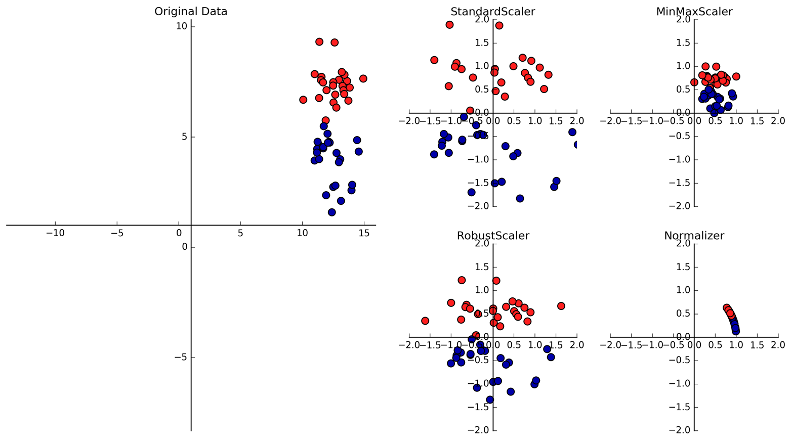
Figure 3-1. Different ways to rescale and preprocess a dataset
3.3.1 Different Kinds of Preprocessing
The first plot in Figure 3-1 shows a synthetic two-class classification dataset with two features. The first feature (the x-axis value) is between 10 and 15. The second feature (the y-axis value) is between around 1 and 9.
The following four plots show four different ways to transform the data
that yield more standard ranges. The StandardScaler in scikit-learn
ensures that for each feature the mean is 0 and the variance is
1, bringing all features to the same magnitude. However, this scaling
does not ensure any particular minimum and maximum values for the
features. The RobustScaler works similarly to the StandardScaler in
that it ensures statistical properties for each feature that guarantee
that they are on the same scale. However, the RobustScaler uses the
median and quartiles,1 instead of mean and
variance. This makes the RobustScaler ignore data points that are very
different from the rest (like measurement errors). These odd data points
are also called outliers, and can lead to trouble for other scaling
techniques.
The MinMaxScaler, on the other hand, shifts the data such that all
features are exactly between 0 and 1. For the two-dimensional dataset
this means all of the data is contained within the rectangle created by
the x-axis between 0 and 1 and the y-axis between 0 and 1.
Finally, the Normalizer does a very different kind of rescaling. It
scales each data point such that the feature vector has a Euclidean
length of 1. In other words, it projects a data point on the circle
(or sphere, in the case of higher dimensions) with a radius of 1. This
means every data point is scaled by a different number (by the inverse
of its length). This normalization is often used when only the
direction (or angle) of the data matters, not the length of the feature
vector.
3.3.2 Applying Data Transformations
Now that we’ve seen what the different kinds of transformations do, let’s
apply them using scikit-learn. We will use the cancer dataset that we
saw in Chapter 2. Preprocessing methods like the scalers are usually
applied before applying a supervised machine learning algorithm. As an
example, say we want to apply the kernel SVM (SVC) to the cancer
dataset, and use MinMaxScaler for preprocessing the data. We start by
loading our dataset and splitting it into a training set and a test set (we
need separate training and test sets to evaluate the supervised model
we will build after the preprocessing):
In[2]:
fromsklearn.datasetsimportload_breast_cancerfromsklearn.model_selectionimporttrain_test_splitcancer=load_breast_cancer()X_train,X_test,y_train,y_test=train_test_split(cancer.data,cancer.target,random_state=1)(X_train.shape)(X_test.shape)
Out[2]:
(426, 30)
(143, 30)
As a reminder, the dataset contains 569 data points, each represented by 30 measurements. We split the dataset into 426 samples for the training set and 143 samples for the test set.
As with the supervised models we built earlier, we first import the class that implements the preprocessing, and then instantiate it:
In[3]:
fromsklearn.preprocessingimportMinMaxScalerscaler=MinMaxScaler()
We then fit the scaler using the fit method, applied to the training
data. For the MinMaxScaler, the fit method computes the minimum and
maximum value of each feature on the training set. In contrast to the
classifiers and regressors of Chapter 2, the scaler is only provided
with the data (X_train) when fit is called, and y_train is not used:
In[4]:
scaler.fit(X_train)
Out[4]:
MinMaxScaler(copy=True, feature_range=(0, 1))
To apply the transformation that we just learned—that is, to actually
scale the training data—we use the transform method of the scaler.
The transform method is used in scikit-learn whenever a model returns
a new representation of the data:
In[5]:
# transform dataX_train_scaled=scaler.transform(X_train)# print dataset properties before and after scaling("transformed shape: {}".format(X_train_scaled.shape))("per-feature minimum before scaling:\n{}".format(X_train.min(axis=0)))("per-feature maximum before scaling:\n{}".format(X_train.max(axis=0)))("per-feature minimum after scaling:\n{}".format(X_train_scaled.min(axis=0)))("per-feature maximum after scaling:\n{}".format(X_train_scaled.max(axis=0)))
Out[5]:
transformed shape: (426, 30)
per-feature minimum before scaling:
 [  6.981   9.71   43.79  143.5     0.053   0.019   0.      0.      0.106
   0.05    0.115   0.36    0.757   6.802   0.002   0.002   0.      0.
   0.01    0.001   7.93   12.02   50.41  185.2     0.071   0.027   0.
   0.      0.157   0.055]
per-feature maximum before scaling:
 [  28.11    39.28   188.5   2501.       0.163    0.287    0.427    0.201
    0.304    0.096    2.873    4.885   21.98   542.2      0.031    0.135
    0.396    0.053    0.061    0.03    36.04    49.54   251.2   4254.
    0.223    0.938    1.17     0.291    0.577    0.149]
per-feature minimum after scaling:
 [0. 0. 0. 0. 0. 0. 0. 0. 0. 0. 0. 0. 0. 0. 0. 0. 0. 0. 0. 0. 0. 0. 0. 0.
 0. 0. 0. 0. 0. 0.]
per-feature maximum after scaling:
 [1. 1. 1. 1. 1. 1. 1. 1. 1. 1. 1. 1. 1. 1. 1. 1. 1. 1. 1. 1. 1. 1. 1. 1.
 1. 1. 1. 1. 1. 1.]
The transformed data has the same shape as the original data—the features are simply shifted and scaled. You can see that all of the features are now between 0 and 1, as desired.
To apply the SVM to the scaled data, we also need to transform the test
set. This is again done by calling the transform method, this time on
X_test:
In[6]:
# transform test dataX_test_scaled=scaler.transform(X_test)# print test data properties after scaling("per-feature minimum after scaling:\n{}".format(X_test_scaled.min(axis=0)))("per-feature maximum after scaling:\n{}".format(X_test_scaled.max(axis=0)))
Out[6]:
per-feature minimum after scaling:
[ 0.034  0.023  0.031  0.011  0.141  0.044  0.     0.     0.154 -0.006
 -0.001  0.006  0.004  0.001  0.039  0.011  0.     0.    -0.032  0.007
  0.027  0.058  0.02   0.009  0.109  0.026  0.     0.    -0.    -0.002]
per-feature maximum after scaling:
[0.958 0.815 0.956 0.894 0.811 1.22  0.88  0.933 0.932 1.037 0.427 0.498
 0.441 0.284 0.487 0.739 0.767 0.629 1.337 0.391 0.896 0.793 0.849 0.745
 0.915 1.132 1.07  0.924 1.205 1.631]
Maybe somewhat surprisingly, you can see that for the test set, after
scaling, the minimum and maximum are not 0 and 1. Some of the
features are even outside the 0–1 range! The explanation is that the
MinMaxScaler (and all the other scalers) always applies exactly the
same transformation to the training and the test set. This means the transform
method always subtracts the training set minimum and divides by the
training set range, which might be different from the minimum and range
for the test set.
3.3.3 Scaling Training and Test Data the Same Way
It is important to apply exactly the same transformation to the training set and the test set for the supervised model to work on the test set. The following example (Figure 3-2) illustrates what would happen if we were to use the minimum and range of the test set instead:
In[7]:
fromsklearn.datasetsimportmake_blobs# make synthetic dataX,_=make_blobs(n_samples=50,centers=5,random_state=4,cluster_std=2)# split it into training and test setsX_train,X_test=train_test_split(X,random_state=5,test_size=.1)# plot the training and test setsfig,axes=plt.subplots(1,3,figsize=(13,4))axes[0].scatter(X_train[:,0],X_train[:,1],c=mglearn.cm2(0),label="Training set",s=60)axes[0].scatter(X_test[:,0],X_test[:,1],marker='^',c=mglearn.cm2(1),label="Test set",s=60)axes[0].legend(loc='upper left')axes[0].set_title("Original Data")# scale the data using MinMaxScalerscaler=MinMaxScaler()scaler.fit(X_train)X_train_scaled=scaler.transform(X_train)X_test_scaled=scaler.transform(X_test)# visualize the properly scaled dataaxes[1].scatter(X_train_scaled[:,0],X_train_scaled[:,1],c=mglearn.cm2(0),label="Training set",s=60)axes[1].scatter(X_test_scaled[:,0],X_test_scaled[:,1],marker='^',c=mglearn.cm2(1),label="Test set",s=60)axes[1].set_title("Scaled Data")# rescale the test set separately# so test set min is 0 and test set max is 1# DO NOT DO THIS! For illustration purposes only.test_scaler=MinMaxScaler()test_scaler.fit(X_test)X_test_scaled_badly=test_scaler.transform(X_test)# visualize wrongly scaled dataaxes[2].scatter(X_train_scaled[:,0],X_train_scaled[:,1],c=mglearn.cm2(0),label="training set",s=60)axes[2].scatter(X_test_scaled_badly[:,0],X_test_scaled_badly[:,1],marker='^',c=mglearn.cm2(1),label="test set",s=60)axes[2].set_title("Improperly Scaled Data")foraxinaxes:ax.set_xlabel("Feature 0")ax.set_ylabel("Feature 1")fig.tight_layout()
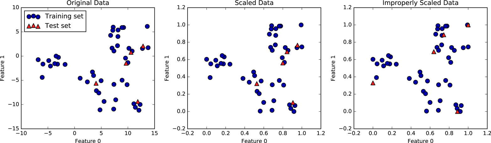
Figure 3-2. Effect of scaling training and test data shown on the left together (center) and separately (right)
The first panel is an unscaled two-dimensional dataset, with the
training set shown as circles and the test set shown as triangles. The
second panel is the same data, but scaled using the MinMaxScaler.
Here, we called fit on the training set, and then called transform on the
training and test sets. You can see that the dataset in the second
panel looks identical to the first; only the ticks on the axes have changed.
Now all the features are between 0 and 1. You can also see that the
minimum and maximum feature values for the test data (the triangles) are
not 0 and 1.
The third panel shows what would happen if we scaled the training set and test set separately. In this case, the minimum and maximum feature values for both the training and the test set are 0 and 1. But now the dataset looks different. The test points moved incongruously to the training set, as they were scaled differently. We changed the arrangement of the data in an arbitrary way. Clearly this is not what we want to do.
As another way to think about this, imagine your test set is a
single point. There is no way to scale a single point correctly, to
fulfill the minimum and maximum requirements of the MinMaxScaler. But
the size of your test set should not change your processing.
3.3.4 The Effect of Preprocessing on Supervised Learning
Now let’s go back to the cancer dataset and see the effect of using the
MinMaxScaler on learning the SVC (this is a different way of doing
the same scaling we did in Chapter 2). First, let’s fit the SVC on the
original data again for comparison:
In[9]:
fromsklearn.svmimportSVCX_train,X_test,y_train,y_test=train_test_split(cancer.data,cancer.target,random_state=0)svm=SVC(C=100)svm.fit(X_train,y_train)("Test set accuracy: {:.2f}".format(svm.score(X_test,y_test)))
Out[9]:
Test set accuracy: 0.63
Now, let’s scale the data using MinMaxScaler before fitting the SVC:
In[10]:
# preprocessing using 0-1 scalingscaler=MinMaxScaler()scaler.fit(X_train)X_train_scaled=scaler.transform(X_train)X_test_scaled=scaler.transform(X_test)# learning an SVM on the scaled training datasvm.fit(X_train_scaled,y_train)# scoring on the scaled test set("Scaled test set accuracy: {:.2f}".format(svm.score(X_test_scaled,y_test)))
Out[10]:
Scaled test set accuracy: 0.97
As we saw before, the effect of scaling the data is quite significant.
Even though scaling the data doesn’t involve any complicated math, it is
good practice to use the scaling mechanisms provided by scikit-learn
instead of reimplementing them yourself, as it’s easy to make mistakes
even in these simple computations.
You can also easily replace one preprocessing algorithm with another by
changing the class you use, as all of the preprocessing classes have the
same interface, consisting of the fit and transform methods:
In[11]:
# preprocessing using zero mean and unit variance scalingfromsklearn.preprocessingimportStandardScalerscaler=StandardScaler()scaler.fit(X_train)X_train_scaled=scaler.transform(X_train)X_test_scaled=scaler.transform(X_test)# learning an SVM on the scaled training datasvm.fit(X_train_scaled,y_train)# scoring on the scaled test set("SVM test accuracy: {:.2f}".format(svm.score(X_test_scaled,y_test)))
Out[11]:
SVM test accuracy: 0.96
Now that we’ve seen how simple data transformations for preprocessing work, let’s move on to more interesting transformations using unsupervised learning.
3.4 Dimensionality Reduction, Feature Extraction, and Manifold Learning
As we discussed earlier, transforming data using unsupervised learning can have many motivations. The most common motivations are visualization, compressing the data, and finding a representation that is more informative for further processing.
One of the simplest and most widely used algorithms for all of these is principal component analysis. We’ll also look at two other algorithms: non-negative matrix factorization (NMF), which is commonly used for feature extraction, and t-SNE, which is commonly used for visualization using two-dimensional scatter plots.
3.4.1 Principal Component Analysis (PCA)
Principal component analysis is a method that rotates the dataset in a way such that the rotated features are statistically uncorrelated. This rotation is often followed by selecting only a subset of the new features, according to how important they are for explaining the data. The following example (Figure 3-3) illustrates the effect of PCA on a synthetic two-dimensional dataset:
In[12]:
mglearn.plots.plot_pca_illustration()
The first plot (top left) shows the original data points, colored to distinguish among them. The algorithm proceeds by first finding the direction of maximum variance, labeled “Component 1.” This is the direction (or vector) in the data that contains most of the information, or in other words, the direction along which the features are most correlated with each other. Then, the algorithm finds the direction that contains the most information while being orthogonal (at a right angle) to the first direction. In two dimensions, there is only one possible orientation that is at a right angle, but in higher-dimensional spaces there would be (infinitely) many orthogonal directions. Although the two components are drawn as arrows, it doesn’t really matter where the head and the tail are; we could have drawn the first component from the center up to the top left instead of down to the bottom right. The directions found using this process are called principal components, as they are the main directions of variance in the data. In general, there are as many principal components as original features.
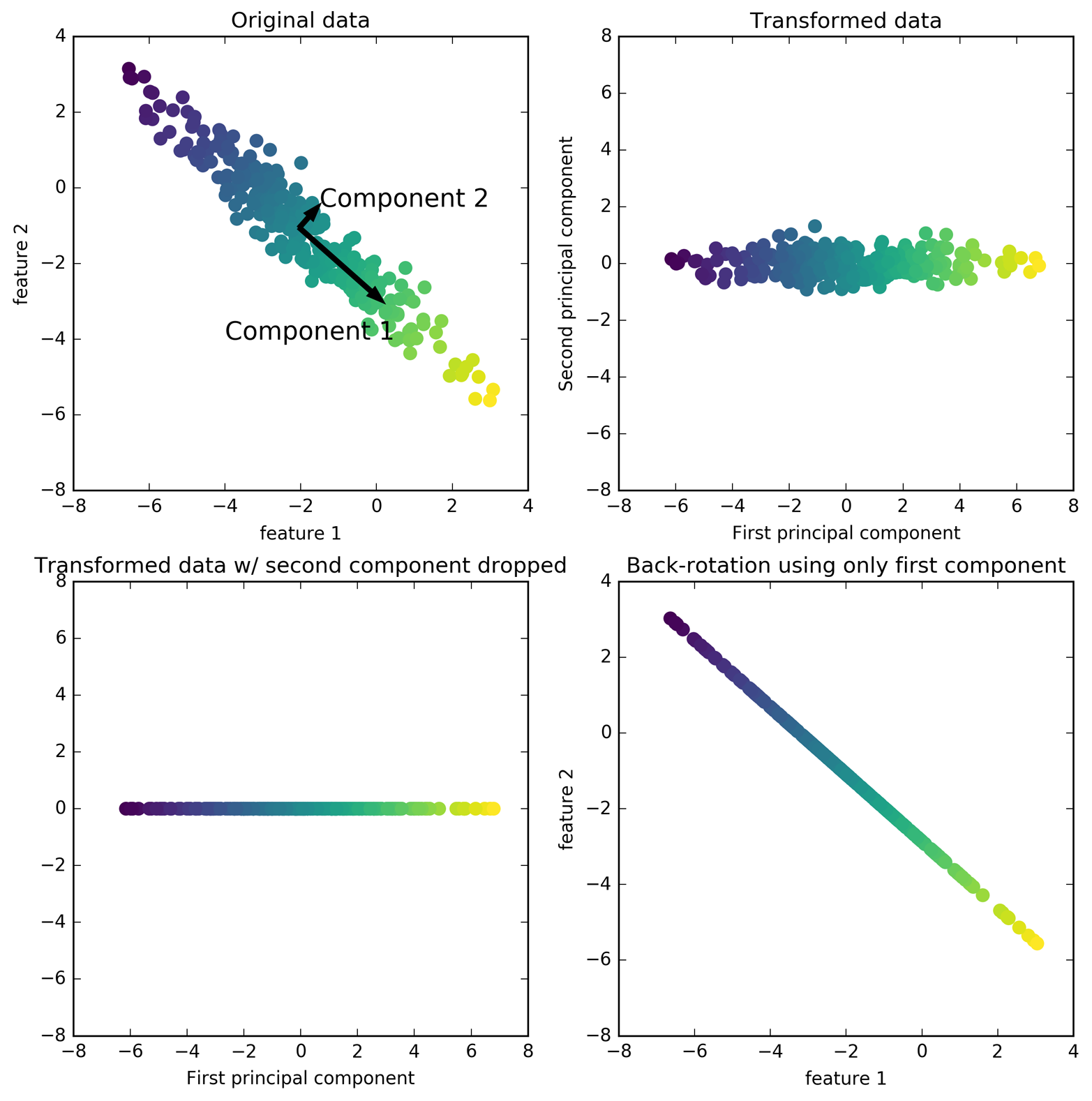
Figure 3-3. Transformation of data with PCA
The second plot (top right) shows the same data, but now rotated so that the first principal component aligns with the x-axis and the second principal component aligns with the y-axis. Before the rotation, the mean was subtracted from the data, so that the transformed data is centered around zero. In the rotated representation found by PCA, the two axes are uncorrelated, meaning that the correlation matrix of the data in this representation is zero except for the diagonal.
We can use PCA for dimensionality reduction by retaining only some of the principal components. In this example, we might keep only the first principal component, as shown in the third panel in Figure 3-3 (bottom left). This reduces the data from a two-dimensional dataset to a one-dimensional dataset. Note, however, that instead of keeping only one of the original features, we found the most interesting direction (top left to bottom right in the first panel) and kept this direction, the first principal component.
Finally, we can undo the rotation and add the mean back to the data. This will result in the data shown in the last panel in Figure 3-3. These points are in the original feature space, but we kept only the information contained in the first principal component. This transformation is sometimes used to remove noise effects from the data or visualize what part of the information is retained using the principal components.
Applying PCA to the cancer dataset for visualization
One of the most common applications of PCA is visualizing high-dimensional datasets. As we saw in Chapter 1, it is hard to create scatter plots of data that has more than two features. For the Iris dataset, we were able to create a pair plot (Figure 1-3 in Chapter 1) that gave us a partial picture of the data by showing us all the possible combinations of two features. But if we want to look at the Breast Cancer dataset, even using a pair plot is tricky. The breast cancer dataset has 30 features, which would result in 30 * 29 / 2 = 435 scatter plots (for just the upper triangle)! We’d never be able to look at all these plots in detail, let alone try to understand them.
There is an even simpler visualization we can use, though—computing histograms of each of the features for the two classes, benign and malignant cancer (Figure 3-4):
In[13]:
fig,axes=plt.subplots(15,2,figsize=(10,20))malignant=cancer.data[cancer.target==0]benign=cancer.data[cancer.target==1]ax=axes.ravel()foriinrange(30):_,bins=np.histogram(cancer.data[:,i],bins=50)ax[i].hist(malignant[:,i],bins=bins,color=mglearn.cm3(0),alpha=.5)ax[i].hist(benign[:,i],bins=bins,color=mglearn.cm3(2),alpha=.5)ax[i].set_title(cancer.feature_names[i])ax[i].set_yticks(())ax[0].set_xlabel("Feature magnitude")ax[0].set_ylabel("Frequency")ax[0].legend(["malignant","benign"],loc="best")fig.tight_layout()
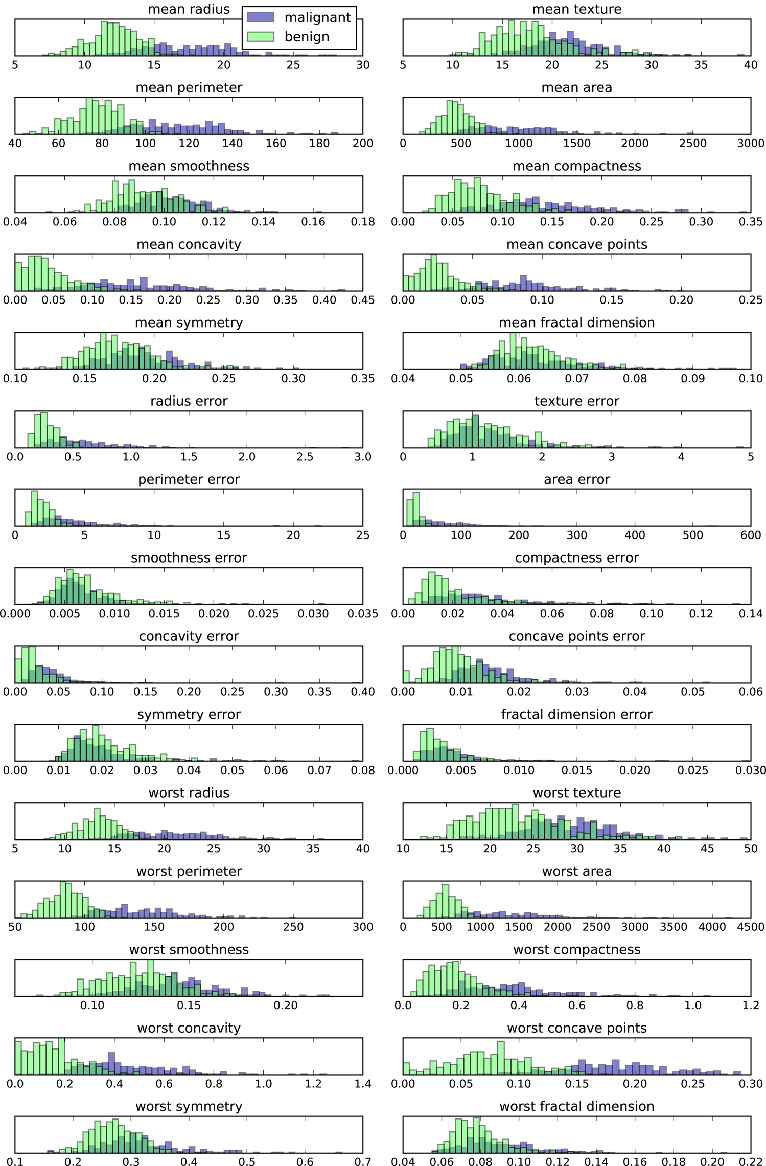
Figure 3-4. Per-class feature histograms on the Breast Cancer dataset
Here we create a histogram for each of the features, counting how often a data point appears with a feature in a certain range (called a bin). Each plot overlays two histograms, one for all of the points in the benign class and one for all the points in the malignant class. This gives us some idea of how each feature is distributed across the two classes, and allows us to venture a guess as to which features are better at distinguishing malignant and benign samples. For example, the feature “smoothness error” seems quite uninformative, because the two histograms mostly overlap, while the feature “worst concave points” seems quite informative, because the histograms are quite disjoint.
However, this plot doesn’t show us anything about the interactions between variables and how these relate to the classes. Using PCA, we can capture the main interactions and get a slightly more complete picture. We can find the first two principal components, and visualize the data in this new two-dimensional space with a single scatter plot.
Before we apply PCA, we scale our data so that each feature has unit
variance using StandardScaler:
In[14]:
fromsklearn.datasetsimportload_breast_cancercancer=load_breast_cancer()scaler=StandardScaler()scaler.fit(cancer.data)X_scaled=scaler.transform(cancer.data)
Learning the PCA transformation and applying it is as simple as applying
a preprocessing transformation. We instantiate the PCA object, find the
principal components by calling the fit method, and then apply the
rotation and dimensionality reduction by calling transform. By
default, PCA only rotates (and shifts) the data, but keeps all
principal components. To reduce the dimensionality of the data, we need
to specify how many components we want to keep when creating the PCA
object:
In[15]:
fromsklearn.decompositionimportPCA# keep the first two principal components of the datapca=PCA(n_components=2)# fit PCA model to breast cancer datapca.fit(X_scaled)# transform data onto the first two principal componentsX_pca=pca.transform(X_scaled)("Original shape: {}".format(str(X_scaled.shape)))("Reduced shape: {}".format(str(X_pca.shape)))
Out[15]:
Original shape: (569, 30)
Reduced shape: (569, 2)
We can now plot the first two principal components (Figure 3-5):
In[16]:
# plot first vs. second principal component, colored by classplt.figure(figsize=(8,8))mglearn.discrete_scatter(X_pca[:,0],X_pca[:,1],cancer.target)plt.legend(cancer.target_names,loc="best")plt.gca().set_aspect("equal")plt.xlabel("First principal component")plt.ylabel("Second principal component")
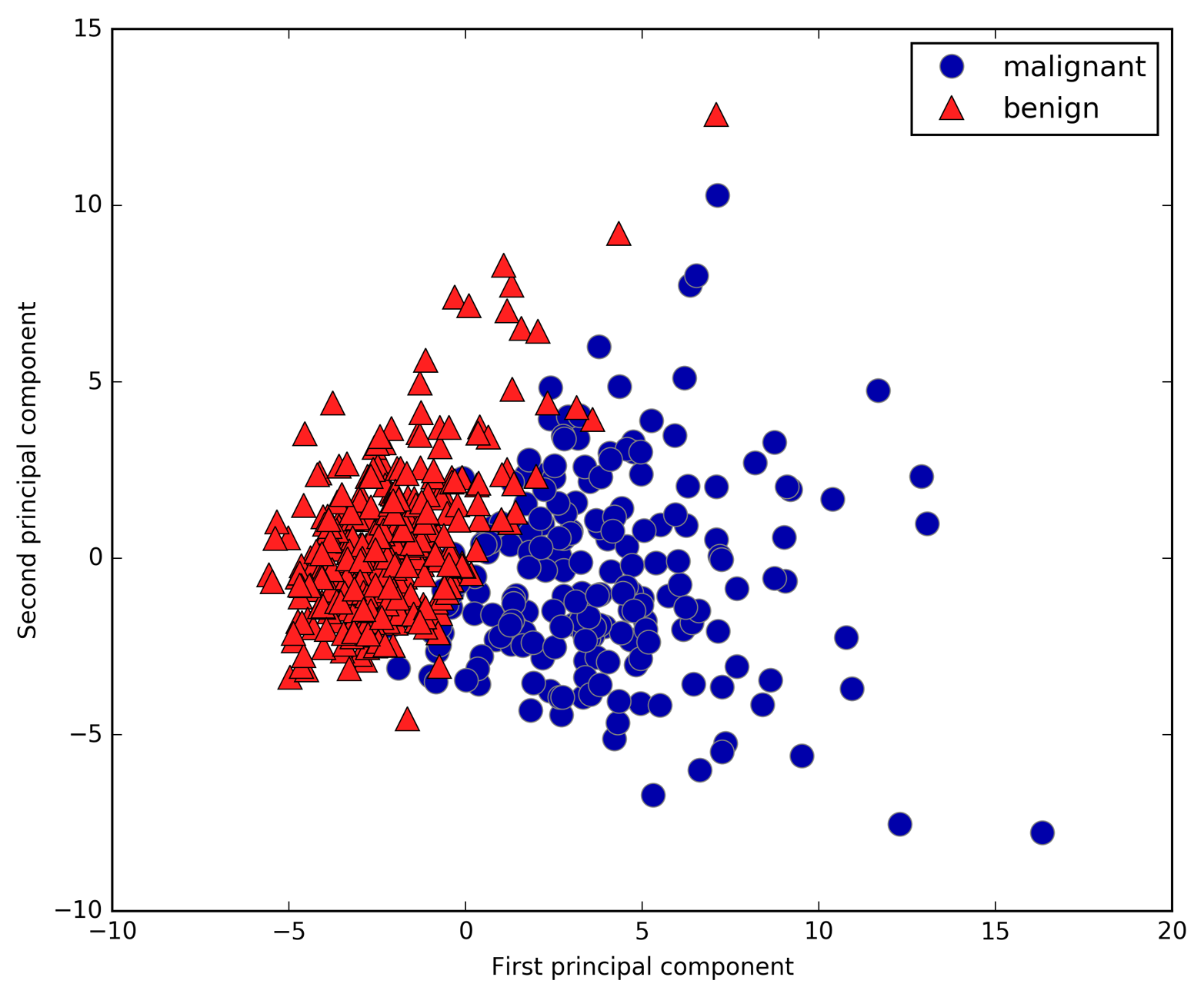
Figure 3-5. Two-dimensional scatter plot of the Breast Cancer dataset using the first two principal components
It is important to note that PCA is an unsupervised method, and
does not use any class information when finding the rotation. It simply
looks at the correlations in the data. For the scatter plot shown here, we
plotted the first principal component against the second principal
component, and then used the class information to color the points. You
can see that the two classes separate quite well in this two-dimensional
space. This leads us to believe that even a linear classifier (that
would learn a line in this space) could do a reasonably good job at
distinguishing the two classes. We can also see that the malignant points are more spread out than the benign points—something that
we could already see a bit from the histograms in
Figure 3-4.
A downside of PCA is that the two axes in the plot are often not
very easy to interpret. The principal components correspond to
directions in the original data, so they are combinations of the
original features. However, these combinations are usually very complex,
as we’ll see shortly. The principal components themselves are stored in
the components_ attribute of the PCA object during fitting:
In[17]:
("PCA component shape: {}".format(pca.components_.shape))
Out[17]:
PCA component shape: (2, 30)
Each row in components_ corresponds to one principal component, and they are sorted
by their importance (the first principal component comes first, etc.).
The columns correspond to the original features attribute of the PCA in this example, “mean
radius,” “mean texture,” and so on. Let’s have a look at the content of
components_:
In[18]:
("PCA components:\n{}".format(pca.components_))
Out[18]:
PCA components:
[[ 0.219  0.104  0.228  0.221  0.143  0.239  0.258  0.261  0.138  0.064
   0.206  0.017  0.211  0.203  0.015  0.17   0.154  0.183  0.042  0.103
   0.228  0.104  0.237  0.225  0.128  0.21   0.229  0.251  0.123  0.132]
 [-0.234 -0.06  -0.215 -0.231  0.186  0.152  0.06  -0.035  0.19   0.367
  -0.106  0.09  -0.089 -0.152  0.204  0.233  0.197  0.13   0.184  0.28
  -0.22  -0.045 -0.2   -0.219  0.172  0.144  0.098 -0.008  0.142  0.275]]
We can also visualize the coefficients using a heat map (Figure 3-6), which might be easier to understand:
In[19]:
plt.matshow(pca.components_,cmap='viridis')plt.yticks([0,1],["First component","Second component"])plt.colorbar()plt.xticks(range(len(cancer.feature_names)),cancer.feature_names,rotation=60,ha='left')plt.xlabel("Feature")plt.ylabel("Principal components")
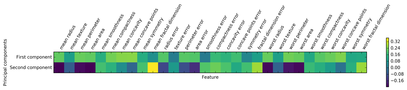
Figure 3-6. Heat map of the first two principal components on the Breast Cancer dataset
You can see that in the first component, all features have the same sign (it’s positive, but as we mentioned earlier, it doesn’t matter which direction the arrow points in). That means that there is a general correlation between all features. As one measurement is high, the others are likely to be high as well. The second component has mixed signs, and both of the components involve all of the 30 features. This mixing of all features is what makes explaining the axes in Figure 3-6 so tricky.
Eigenfaces for feature extraction
Another application of PCA that we mentioned earlier is feature extraction. The idea behind feature extraction is that it is possible to find a representation of your data that is better suited to analysis than the raw representation you were given. A great example of an application where feature extraction is helpful is with images. Images are made up of pixels, usually stored as red, green, and blue (RGB) intensities. Objects in images are usually made up of thousands of pixels, and only together are they meaningful.
We will give a very simple application of feature extraction on images using PCA, by working with face images from the Labeled Faces in the Wild dataset. This dataset contains face images of celebrities downloaded from the Internet, and it includes faces of politicians, singers, actors, and athletes from the early 2000s. We use grayscale versions of these images, and scale them down for faster processing. You can see some of the images in Figure 3-7:
In[20]:
fromsklearn.datasetsimportfetch_lfw_peoplepeople=fetch_lfw_people(min_faces_per_person=20,resize=0.7)image_shape=people.images[0].shapefig,axes=plt.subplots(2,5,figsize=(15,8),subplot_kw={'xticks':(),'yticks':()})fortarget,image,axinzip(people.target,people.images,axes.ravel()):ax.imshow(image)ax.set_title(people.target_names[target])
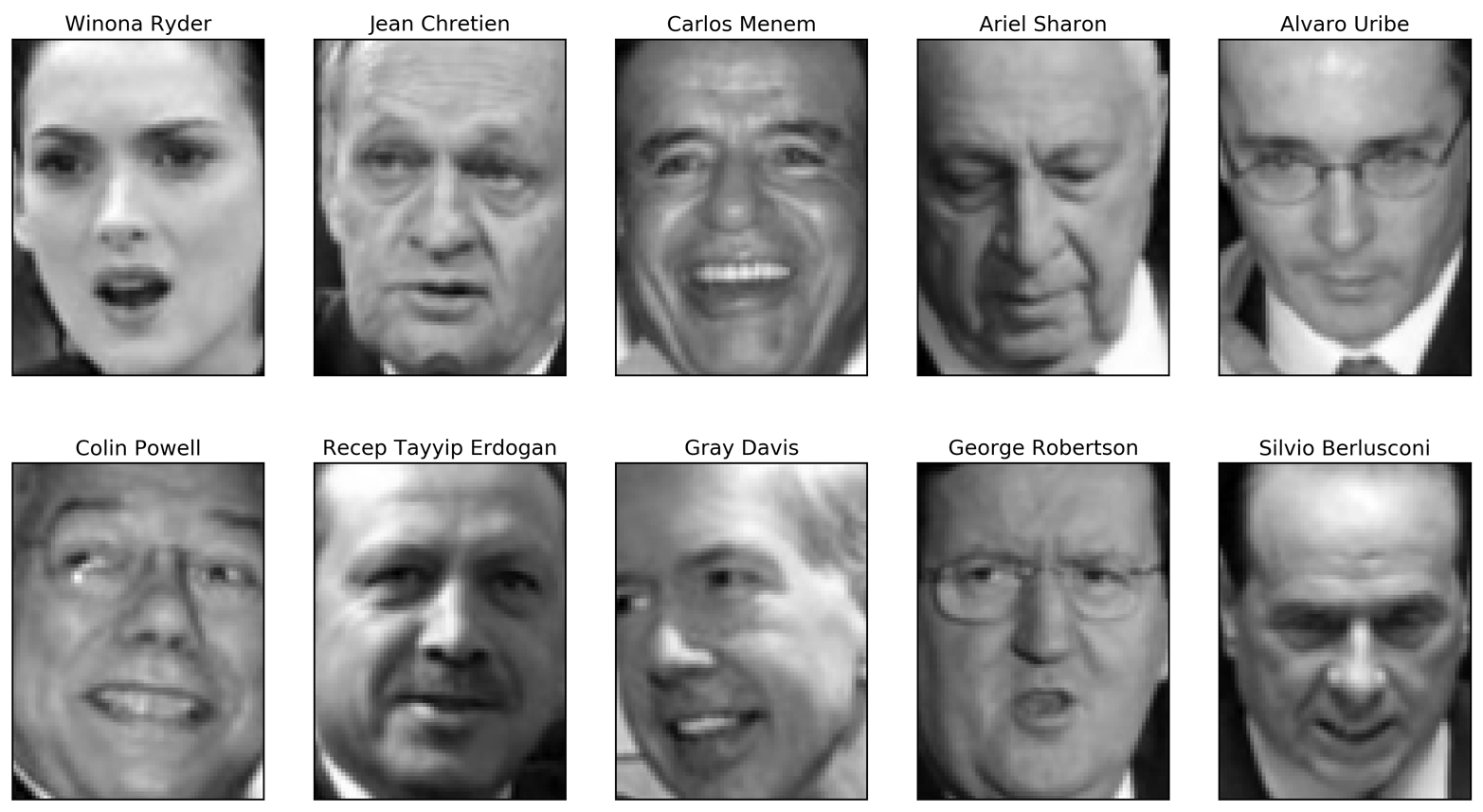
Figure 3-7. Some images from the Labeled Faces in the Wild dataset
There are 3,023 images, each 87×65 pixels large, belonging to 62 different people:
In[21]:
("people.images.shape: {}".format(people.images.shape))("Number of classes: {}".format(len(people.target_names)))
Out[21]:
people.images.shape: (3023, 87, 65)
Number of classes: 62
The dataset is a bit skewed, however, containing a lot of images of George W. Bush and Colin Powell, as you can see here:
In[22]:
# count how often each target appearscounts=np.bincount(people.target)# print counts next to target namesfori,(count,name)inenumerate(zip(counts,people.target_names)):("{0:25} {1:3}".format(name,count),end=' ')if(i+1)%3==0:()
Out[22]:
Alejandro Toledo           39   Alvaro Uribe               35
Amelie Mauresmo            21   Andre Agassi               36
Angelina Jolie             20   Arnold Schwarzenegger      42
Atal Bihari Vajpayee       24   Bill Clinton               29
Carlos Menem               21   Colin Powell              236
David Beckham              31   Donald Rumsfeld           121
George W Bush             530   George Robertson           22
Gerhard Schroeder         109   Gloria Macapagal Arroyo    44
Gray Davis                 26   Guillermo Coria            30
Hamid Karzai               22   Hans Blix                  39
Hugo Chavez                71   Igor Ivanov                20
[...]                           [...]
Laura Bush                 41   Lindsay Davenport          22
Lleyton Hewitt             41   Luiz Inacio Lula da Silva  48
Mahmoud Abbas              29   Megawati Sukarnoputri      33
Michael Bloomberg          20   Naomi Watts                22
Nestor Kirchner            37   Paul Bremer                20
Pete Sampras               22   Recep Tayyip Erdogan       30
Ricardo Lagos              27   Roh Moo-hyun               32
Rudolph Giuliani           26   Saddam Hussein             23
Serena Williams            52   Silvio Berlusconi          33
Tiger Woods                23   Tom Daschle                25
Tom Ridge                  33   Tony Blair                144
Vicente Fox                32   Vladimir Putin             49
Winona Ryder               24
To make the data less skewed, we will only take up to 50 images of each person (otherwise, the feature extraction would be overwhelmed by the likelihood of George W. Bush):
In[23]:
mask=np.zeros(people.target.shape,dtype=np.bool)fortargetinnp.unique(people.target):mask[np.where(people.target==target)[0][:50]]=1X_people=people.data[mask]y_people=people.target[mask]# scale the grayscale values to be between 0 and 1# instead of 0 and 255 for better numeric stabilityX_people=X_people/255.
A common task in face recognition is to ask if a previously unseen face belongs to a known person from a database. This has applications in photo collection, social media, and security applications. One way to solve this problem would be to build a classifier where each person is a separate class. However, there are usually many different people in face databases, and very few images of the same person (i.e., very few training examples per class). That makes it hard to train most classifiers. Additionally, you often want to be able to add new people easily, without needing to retrain a large model.
A simple solution is to use a one-nearest-neighbor classifier that
looks for the most similar face image to the face you are classifying. This classifier could in principle work with only a single training
example per class. Let’s take a look at how well KNeighborsClassifier does here:
In[24]:
fromsklearn.neighborsimportKNeighborsClassifier# split the data into training and test setsX_train,X_test,y_train,y_test=train_test_split(X_people,y_people,stratify=y_people,random_state=0)# build a KNeighborsClassifier using one neighborknn=KNeighborsClassifier(n_neighbors=1)knn.fit(X_train,y_train)("Test set score of 1-nn: {:.2f}".format(knn.score(X_test,y_test)))
Out[24]:
Test set score of 1-nn: 0.27
We obtain an accuracy of 26.6%, which is not actually that bad for a 62-class classification problem (random guessing would give you around 1/62 = 1.6% accuracy), but is also not great. We only correctly identify a person every fourth time.
This is where PCA comes in. Computing distances in the original pixel
space is quite a bad way to measure similarity between faces. When using
a pixel representation to compare two images, we compare the grayscale
value of each individual pixel to the value of the pixel in the
corresponding position in the other image. This representation is quite
different from how humans would interpret the image of a face, and it is
hard to capture the facial features using this raw representation. For
example, using pixel distances means that shifting a face by one pixel to
the right corresponds to a drastic change, with a completely different
representation. We hope that using distances along principal components
can improve our accuracy. Here, we enable the whitening option of PCA,
which rescales the principal components to have the same scale. This is
the same as using StandardScaler after the transformation. Reusing the
data from Figure 3-3 again, whitening corresponds to not
only rotating the data, but also rescaling it so that the center panel
is a circle instead of an ellipse (see Figure 3-8):
In[25]:
mglearn.plots.plot_pca_whitening()
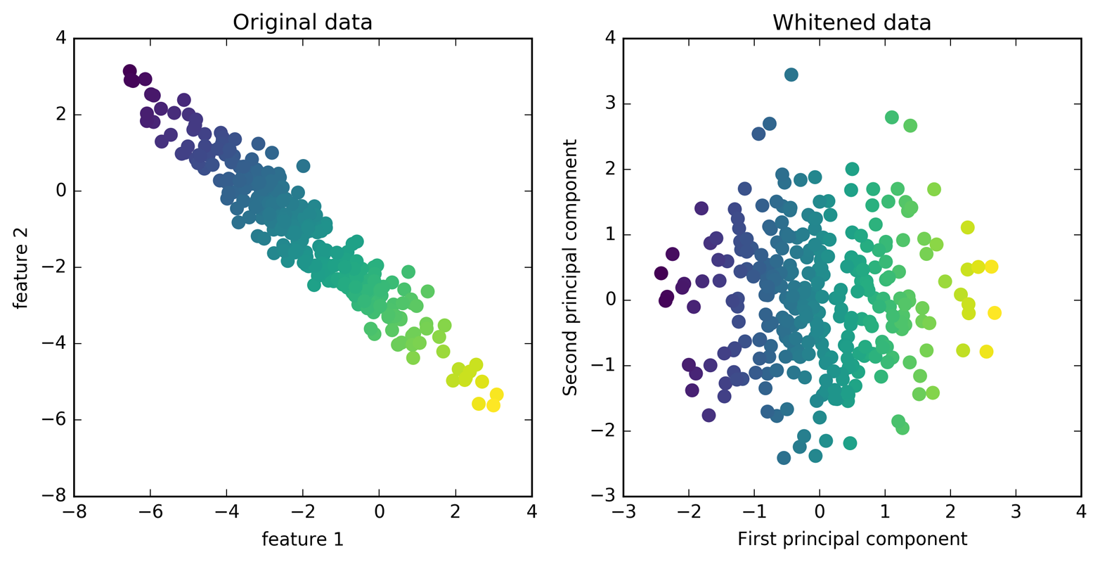
Figure 3-8. Transformation of data with PCA using whitening
We fit the PCA object to the training data and extract the first 100
principal components. Then we transform the training and test data:
In[26]:
pca=PCA(n_components=100,whiten=True,random_state=0).fit(X_train)X_train_pca=pca.transform(X_train)X_test_pca=pca.transform(X_test)("X_train_pca.shape: {}".format(X_train_pca.shape))
Out[26]:
X_train_pca.shape: (1547, 100)
The new data has 100 features, the first 100 principal components. Now, we can use the new representation to classify our images using a one-nearest-neighbors classifier:
In[27]:
knn=KNeighborsClassifier(n_neighbors=1)knn.fit(X_train_pca,y_train)("Test set accuracy: {:.2f}".format(knn.score(X_test_pca,y_test)))
Out[27]:
Test set accuracy: 0.36
Our accuracy improved quite significantly, from 26.6% to 35.7%, confirming our intuition that the principal components might provide a better representation of the data.
For image data, we can also easily visualize the principal components that are found. Remember that components correspond to directions in the input space. The input space here is 87×65-pixel grayscale images, so directions within this space are also 87×65-pixel grayscale images.
Let’s look at the first couple of principal components (Figure 3-9):
In[28]:
("pca.components_.shape: {}".format(pca.components_.shape))
Out[28]:
pca.components_.shape: (100, 5655)
In[29]:
fig,axes=plt.subplots(3,5,figsize=(15,12),subplot_kw={'xticks':(),'yticks':()})fori,(component,ax)inenumerate(zip(pca.components_,axes.ravel())):ax.imshow(component.reshape(image_shape),cmap='viridis')ax.set_title("{}. component".format((i+1)))
While we certainly cannot understand all aspects of these components, we can guess which aspects of the face images some of the components are capturing. The first component seems to mostly encode the contrast between the face and the background, the second component encodes differences in lighting between the right and the left half of the face, and so on. While this representation is slightly more semantic than the raw pixel values, it is still quite far from how a human might perceive a face. As the PCA model is based on pixels, the alignment of the face (the position of eyes, chin, and nose) and the lighting both have a strong influence on how similar two images are in their pixel representation. But alignment and lighting are probably not what a human would perceive first. When asking people to rate similarity of faces, they are more likely to use attributes like age, gender, facial expression, and hair style, which are attributes that are hard to infer from the pixel intensities. It’s important to keep in mind that algorithms often interpret data (particularly visual data, such as images, which humans are very familiar with) quite differently from how a human would.
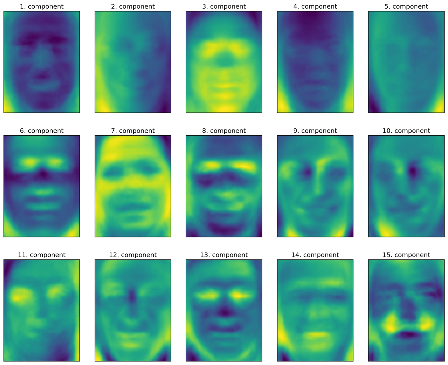
Figure 3-9. Component vectors of the first 15 principal components of the faces dataset
Let’s come back to the specific case of PCA, though. We introduced the PCA transformation as rotating the data and then dropping the components with low variance. Another useful interpretation is to try to find some numbers (the new feature values after the PCA rotation) so that we can express the test points as a weighted sum of the principal components (see Figure 3-10).
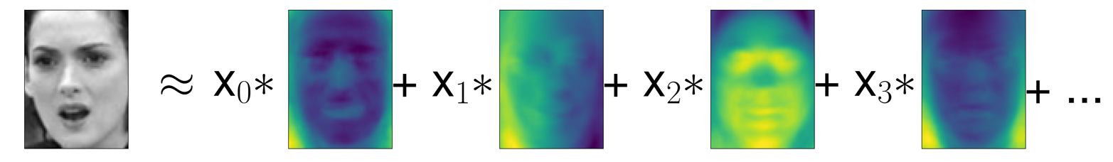
Figure 3-10. Schematic view of PCA as decomposing an image into a weighted sum of components
Here, x0, x1, and so on are the coefficients of the principal components for this data point; in other words, they are the representation of the image in the rotated space.
Another way we can try to understand what a PCA model is doing is by
looking at the reconstructions of the original data using only some
components. In Figure 3-3, after dropping the second
component and arriving at the third panel, we undid the rotation and
added the mean back to obtain new points in the original space with the
second component removed, as shown in the last panel. We can do a
similar transformation for the faces by reducing the data to only some
principal components and then rotating back into the original space.
This return to the original feature space can be done using the
inverse_transform method. Here, we visualize the reconstruction of some
faces using 10, 50, 100, or 500 components (Figure 3-11):
In[30]:
mglearn.plots.plot_pca_faces(X_train,X_test,image_shape)
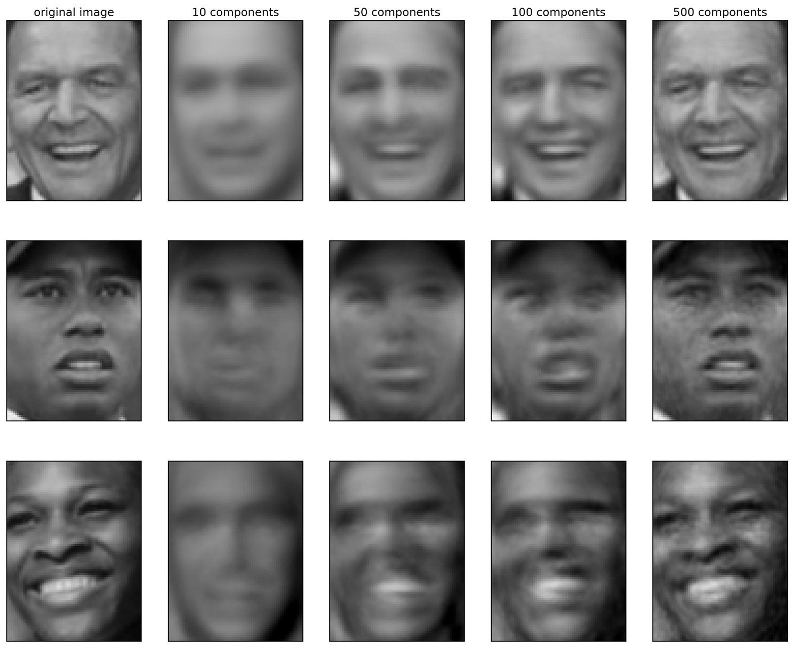
Figure 3-11. Reconstructing three face images using increasing numbers of principal components
You can see that when we use only the first 10 principal components, only the essence of the picture, like the face orientation and lighting, is captured. By using more and more principal components, more and more details in the image are preserved. This corresponds to extending the sum in Figure 3-10 to include more and more terms. Using as many components as there are pixels would mean that we would not discard any information after the rotation, and we would reconstruct the image perfectly.
We can also try to use PCA to visualize all the faces in the dataset in
a scatter plot using the first two principal components (Figure 3-12), with classes
given by who is shown in the image, similarly to what we did for the
cancer dataset:
In[31]:
mglearn.discrete_scatter(X_train_pca[:,0],X_train_pca[:,1],y_train)plt.xlabel("First principal component")plt.ylabel("Second principal component")
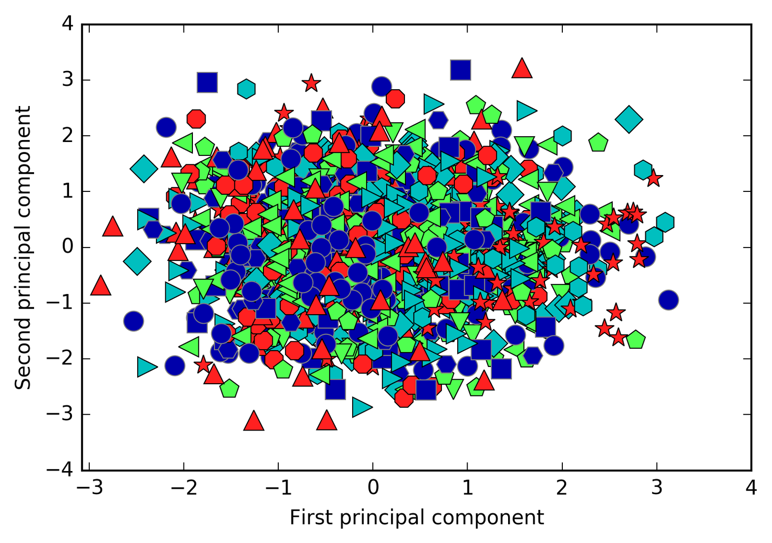
Figure 3-12. Scatter plot of the faces dataset using the first two principal components (see Figure 3-5 for the corresponding image for the cancer dataset)
As you can see, when we use only the first two principal components the whole data is just a big blob, with no separation of classes visible. This is not very surprising, given that even with 10 components, as shown earlier in Figure 3-11, PCA only captures very rough characteristics of the faces.
3.4.2 Non-Negative Matrix Factorization (NMF)
Non-negative matrix factorization is another unsupervised learning algorithm that aims to extract useful features. It works similarly to PCA and can also be used for dimensionality reduction. As in PCA, we are trying to write each data point as a weighted sum of some components, as illustrated in Figure 3-10. But whereas in PCA we wanted components that were orthogonal and that explained as much variance of the data as possible, in NMF, we want the components and the coefficients to be non-negative; that is, we want both the components and the coefficients to be greater than or equal to zero. Consequently, this method can only be applied to data where each feature is non-negative, as a non-negative sum of non-negative components cannot become negative.
The process of decomposing data into a non-negative weighted sum is particularly helpful for data that is created as the addition (or overlay) of several independent sources, such as an audio track of multiple people speaking, or music with many instruments. In these situations, NMF can identify the original components that make up the combined data. Overall, NMF leads to more interpretable components than PCA, as negative components and coefficients can lead to hard-to-interpret cancellation effects. The eigenfaces in Figure 3-9, for example, contain both positive and negative parts, and as we mentioned in the description of PCA, the sign is actually arbitrary. Before we apply NMF to the face dataset, let’s briefly revisit the synthetic data.
Applying NMF to synthetic data
In contrast to when using PCA, we need to ensure that our data is positive for NMF to be able to operate on the data. This means where the data lies relative to the origin (0, 0) actually matters for NMF. Therefore, you can think of the non-negative components that are extracted as directions from (0, 0) toward the data.
The following example (Figure 3-13) shows the results of NMF on the two-dimensional toy data:
In[32]:
mglearn.plots.plot_nmf_illustration()
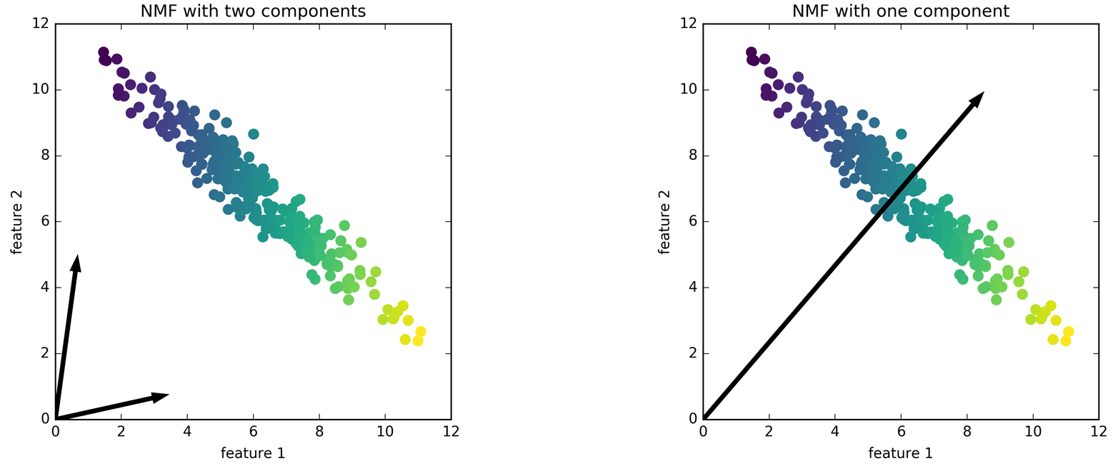
Figure 3-13. Components found by non-negative matrix factorization with two components (left) and one component (right)
For NMF with two components, as shown on the left, it is clear that all points in the data can be written as a positive combination of the two components. If there are enough components to perfectly reconstruct the data (as many components as there are features), the algorithm will choose directions that point toward the extremes of the data.
If we only use a single component, NMF creates a component that points toward the mean, as pointing there best explains the data. You can see that in contrast with PCA, reducing the number of components not only removes some directions, but creates an entirely different set of components! Components in NMF are also not ordered in any specific way, so there is no “first non-negative component”: all components play an equal part.
NMF uses a random initialization, which might lead to different results depending on the random seed. In relatively simple cases such as the synthetic data with two components, where all the data can be explained perfectly, the randomness has little effect (though it might change the order or scale of the components). In more complex situations, there might be more drastic changes.
Applying NMF to face images
Now, let’s apply NMF to the Labeled Faces in the Wild dataset we used earlier. The main parameter of NMF is how many components we want to extract. Usually this is lower than the number of input features (otherwise, the data could be explained by making each pixel a separate component).
First, let’s inspect how the number of components impacts how well the data can be reconstructed using NMF (Figure 3-14):
In[33]:
mglearn.plots.plot_nmf_faces(X_train,X_test,image_shape)
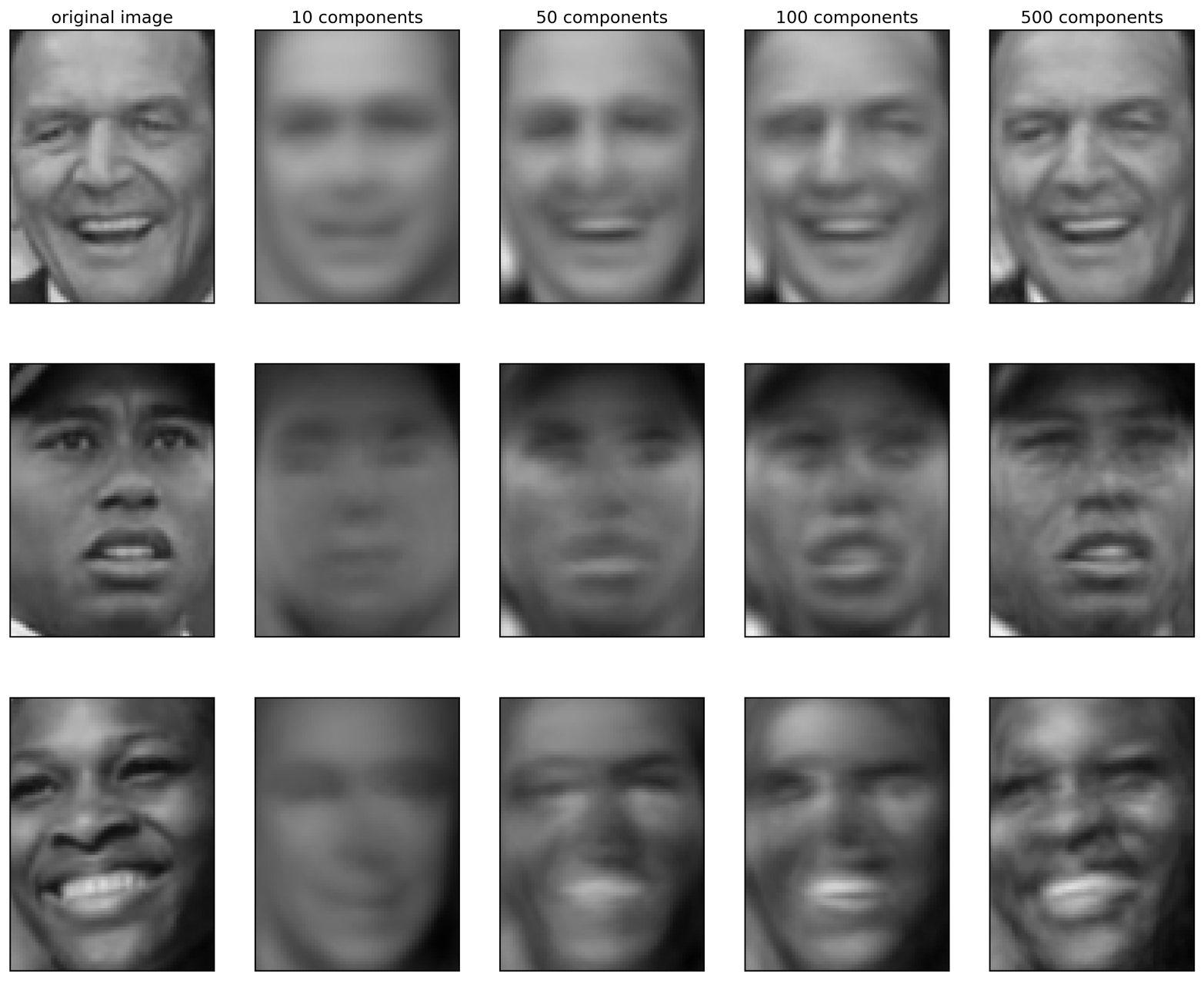
Figure 3-14. Reconstructing three face images using increasing numbers of components found by NMF
The quality of the back-transformed data is similar to when using PCA, but slightly worse. This is expected, as PCA finds the optimum directions in terms of reconstruction. NMF is usually not used for its ability to reconstruct or encode data, but rather for finding interesting patterns within the data.
As a first look into the data, let’s try extracting only a few components (say, 15). Figure 3-15 shows the result:
In[34]:
fromsklearn.decompositionimportNMFnmf=NMF(n_components=15,random_state=0)nmf.fit(X_train)X_train_nmf=nmf.transform(X_train)X_test_nmf=nmf.transform(X_test)fig,axes=plt.subplots(3,5,figsize=(15,12),subplot_kw={'xticks':(),'yticks':()})fori,(component,ax)inenumerate(zip(nmf.components_,axes.ravel())):ax.imshow(component.reshape(image_shape))ax.set_title("{}. component".format(i))
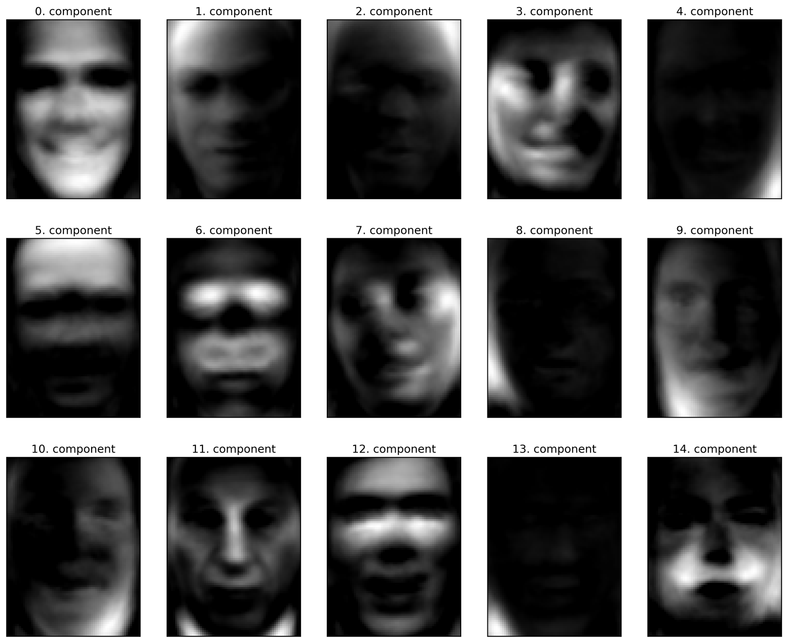
Figure 3-15. The components found by NMF on the faces dataset when using 15 components
These components are all positive, and so resemble prototypes of faces much more so than the components shown for PCA in Figure 3-9. For example, one can clearly see that component 3 shows a face rotated somewhat to the right, while component 7 shows a face somewhat rotated to the left. Let’s look at the images for which these components are particularly strong, shown in Figures 3-16 and 3-17:
In[35]:
compn=3# sort by 3rd component, plot first 10 imagesinds=np.argsort(X_train_nmf[:,compn])[::-1]fig,axes=plt.subplots(2,5,figsize=(15,8),subplot_kw={'xticks':(),'yticks':()})fig.suptitle("Large component 3")fori,(ind,ax)inenumerate(zip(inds,axes.ravel())):ax.imshow(X_train[ind].reshape(image_shape))compn=7# sort by 7th component, plot first 10 imagesinds=np.argsort(X_train_nmf[:,compn])[::-1]fig.suptitle("Large component 7")fig,axes=plt.subplots(2,5,figsize=(15,8),subplot_kw={'xticks':(),'yticks':()})fori,(ind,ax)inenumerate(zip(inds,axes.ravel())):ax.imshow(X_train[ind].reshape(image_shape))
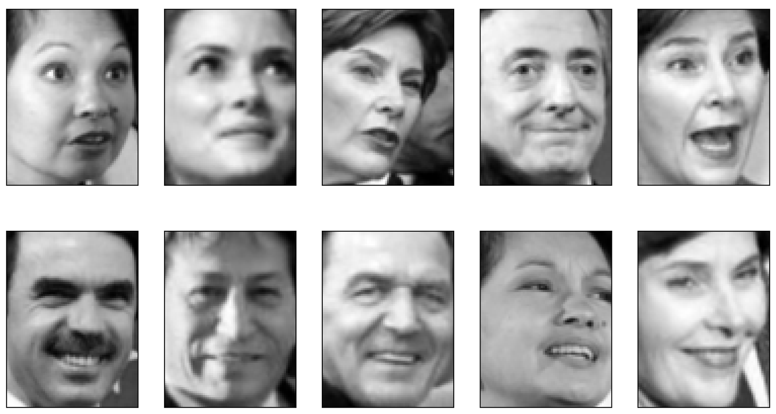
Figure 3-16. Faces that have a large coefficient for component 3
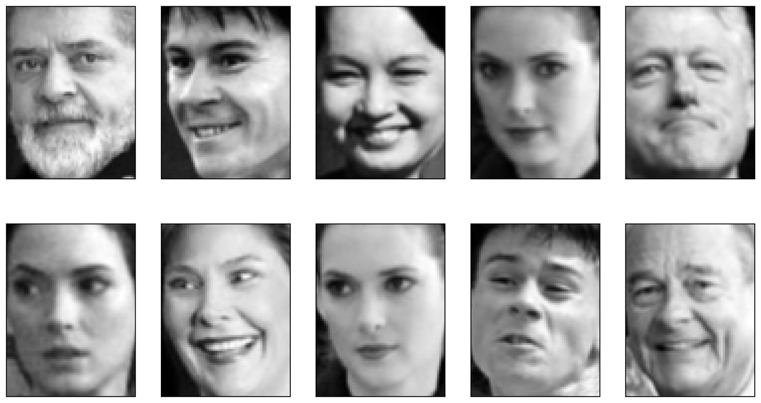
Figure 3-17. Faces that have a large coefficient for component 7
As expected, faces that have a high coefficient for component 3 are faces looking to the right (Figure 3-16), while faces with a high coefficient for component 7 are looking to the left (Figure 3-17). As mentioned earlier, extracting patterns like these works best for data with additive structure, including audio, gene expression, and text data. Let’s walk through one example on synthetic data to see what this might look like.
Let’s say we are interested in a signal that is a combination of three different sources (Figure 3-18):
In[36]:
S=mglearn.datasets.make_signals()plt.figure(figsize=(6,1))plt.plot(S,'-')plt.xlabel("Time")plt.ylabel("Signal")
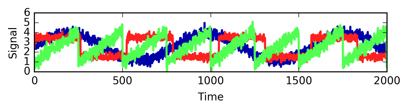
Figure 3-18. Original signal sources
Unfortunately we cannot observe the original signals, but only an additive mixture of all three of them. We want to recover the decomposition of the mixed signal into the original components. We assume that we have many different ways to observe the mixture (say 100 measurement devices), each of which provides us with a series of measurements:
In[37]:
# mix data into a 100-dimensional stateA=np.random.RandomState(0).uniform(size=(100,3))X=np.dot(S,A.T)("Shape of measurements: {}".format(X.shape))
Out[37]:
Shape of measurements: (2000, 100)
We can use NMF to recover the three signals:
In[38]:
nmf=NMF(n_components=3,random_state=42)S_=nmf.fit_transform(X)("Recovered signal shape: {}".format(S_.shape))
Out[38]:
Recovered signal shape: (2000, 3)
For comparison, we also apply PCA:
In[39]:
pca=PCA(n_components=3)H=pca.fit_transform(X)
Figure 3-19 shows the signal activity that was discovered by NMF and PCA:
In[40]:
models=[X,S,S_,H]names=['Observations (first three measurements)','True sources','NMF recovered signals','PCA recovered signals']fig,axes=plt.subplots(4,figsize=(8,4),gridspec_kw={'hspace':.5},subplot_kw={'xticks':(),'yticks':()})formodel,name,axinzip(models,names,axes):ax.set_title(name)ax.plot(model[:,:3],'-')
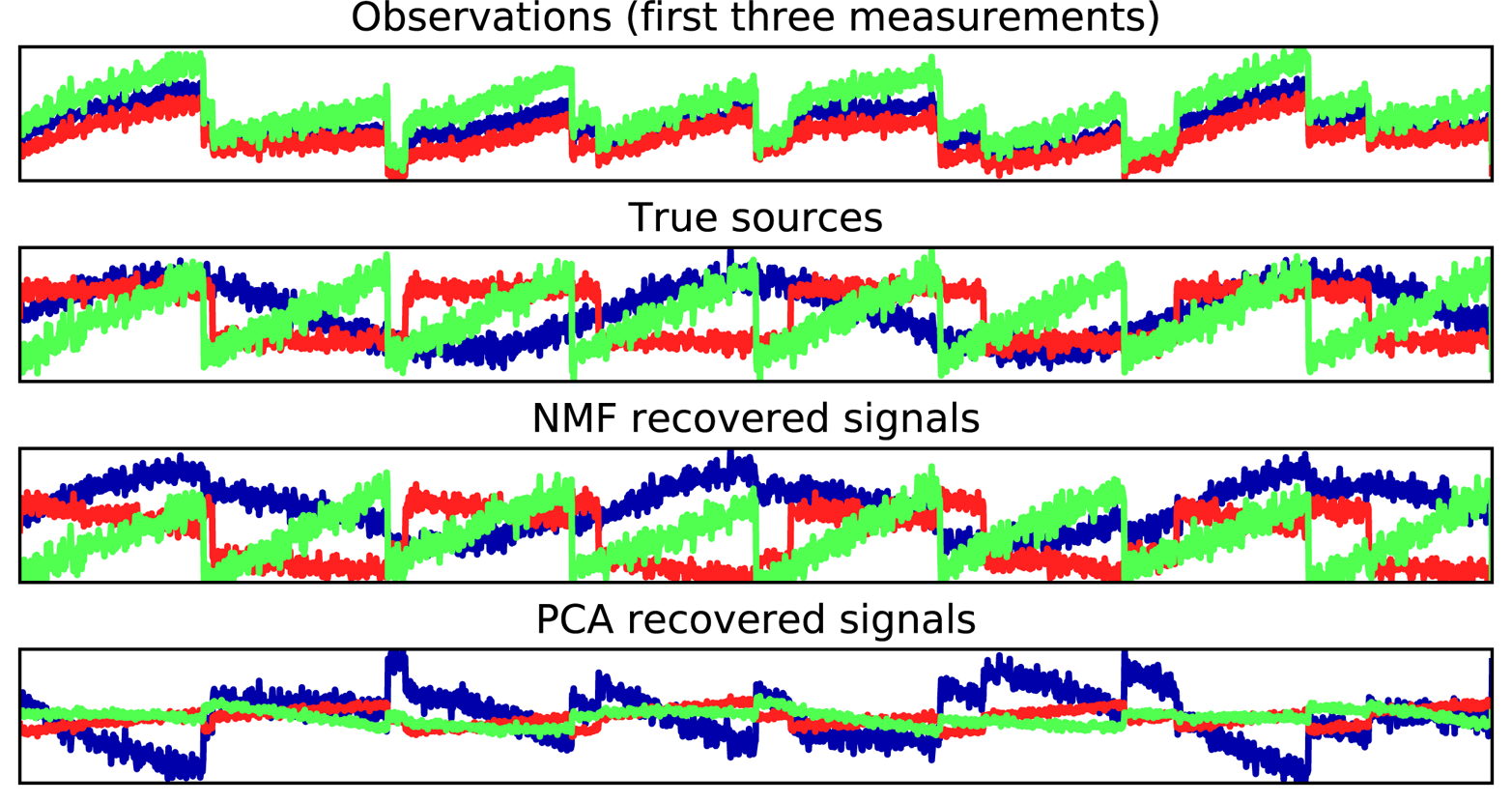
Figure 3-19. Recovering mixed sources using NMF and PCA
The figure includes 3 of the 100 measurements
from the mixed measurements X for reference. As you can see, NMF did a reasonable job of
discovering the original sources, while PCA failed and used the first
component to explain the majority of the variation in the data. Keep in
mind that the components produced by NMF have no natural ordering. In
this example, the ordering of the NMF components is the same as in the
original signal (see the shading of the three curves), but this is purely
accidental.
There are many other algorithms that can be used to decompose each data
point into a weighted sum of a fixed set of components, as PCA and NMF
do. Discussing all of them is beyond the scope of this book, and
describing the constraints made on the components and coefficients often
involves probability theory. If you are interested in this kind of
pattern extraction, we recommend that you study the sections of the scikit_learn user guide on independent component analysis (ICA), factor analysis (FA), and sparse
coding (dictionary learning), all of which you can find on the page about decomposition methods.
3.4.3 Manifold Learning with t-SNE
While PCA is often a good first approach for transforming your data so that you might be able to visualize it using a scatter plot, the nature of the method (applying a rotation and then dropping directions) limits its usefulness, as we saw with the scatter plot of the Labeled Faces in the Wild dataset. There is a class of algorithms for visualization called manifold learning algorithms that allow for much more complex mappings, and often provide better visualizations. A particularly useful one is the t-SNE algorithm.
Manifold learning algorithms are mainly aimed at visualization, and so are rarely used to generate more than two new features. Some of them, including t-SNE, compute a new representation of the training data, but don’t allow transformations of new data. This means these algorithms cannot be applied to a test set: rather, they can only transform the data they were trained for. Manifold learning can be useful for exploratory data analysis, but is rarely used if the final goal is supervised learning. The idea behind t-SNE is to find a two-dimensional representation of the data that preserves the distances between points as best as possible. t-SNE starts with a random two-dimensional representation for each data point, and then tries to make points that are close in the original feature space closer, and points that are far apart in the original feature space farther apart. t-SNE puts more emphasis on points that are close by, rather than preserving distances between far-apart points. In other words, it tries to preserve the information indicating which points are neighbors to each other.
We will apply the t-SNE manifold learning algorithm on a dataset of
handwritten digits that is included in scikit-learn.2 Each data point in this
dataset is an 8×8 grayscale image of a handwritten digit between 0 and
9. Figure 3-20 shows an example image for each class:
In[41]:
fromsklearn.datasetsimportload_digitsdigits=load_digits()fig,axes=plt.subplots(2,5,figsize=(10,5),subplot_kw={'xticks':(),'yticks':()})forax,imginzip(axes.ravel(),digits.images):ax.imshow(img)
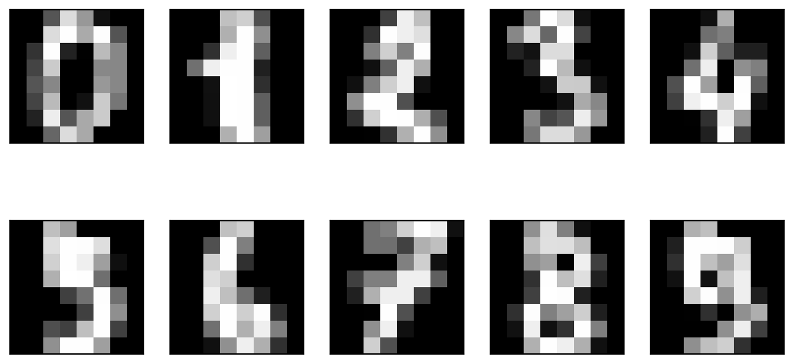
Figure 3-20. Example images from the digits dataset
Let’s use PCA to visualize the data reduced to two dimensions. We plot the first two principal components, and represent each sample with a digit corresponding to its class (see Figure 3-21):
In[42]:
# build a PCA modelpca=PCA(n_components=2)pca.fit(digits.data)# transform the digits data onto the first two principal componentsdigits_pca=pca.transform(digits.data)colors=["#476A2A","#7851B8","#BD3430","#4A2D4E","#875525","#A83683","#4E655E","#853541","#3A3120","#535D8E"]plt.figure(figsize=(10,10))plt.xlim(digits_pca[:,0].min(),digits_pca[:,0].max())plt.ylim(digits_pca[:,1].min(),digits_pca[:,1].max())foriinrange(len(digits.data)):# actually plot the digits as text instead of using scatterplt.text(digits_pca[i,0],digits_pca[i,1],str(digits.target[i]),color=colors[digits.target[i]],fontdict={'weight':'bold','size':9})plt.xlabel("First principal component")plt.ylabel("Second principal component")
Here, we actually used the true digit classes as glyphs, to show which class is where. The digits zero, six, and four are relatively well separated using the first two principal components, though they still overlap. Most of the other digits overlap significantly.
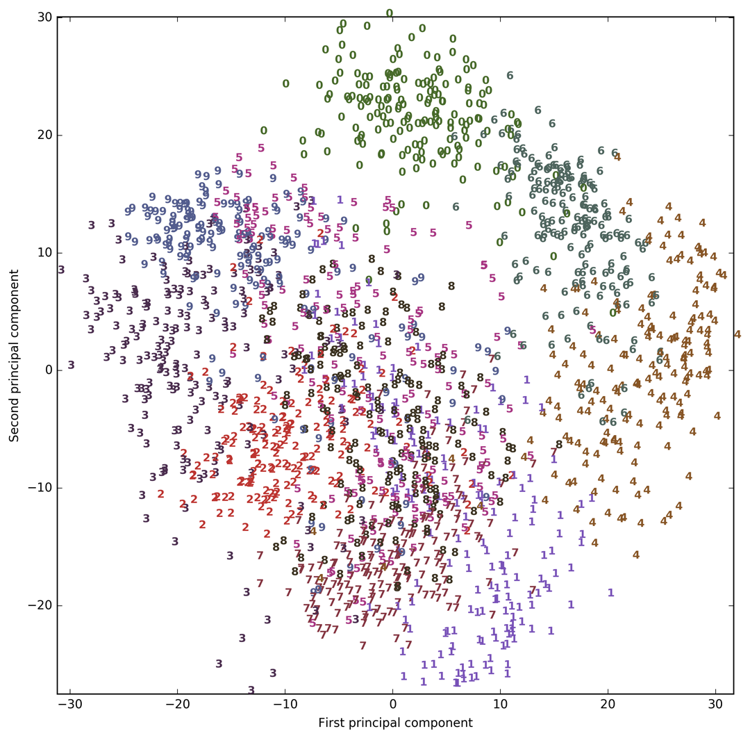
Figure 3-21. Scatter plot of the digits dataset using the first two principal components
Let’s apply t-SNE to the same dataset, and compare the results. As t-SNE
does not support transforming new data, the TSNE class has no
transform method. Instead, we can call the fit_transform method,
which will build the model and immediately return the transformed data (see Figure 3-22):
In[43]:
fromsklearn.manifoldimportTSNEtsne=TSNE(random_state=42)# use fit_transform instead of fit, as TSNE has no transform methoddigits_tsne=tsne.fit_transform(digits.data)
In[44]:
plt.figure(figsize=(10,10))plt.xlim(digits_tsne[:,0].min(),digits_tsne[:,0].max()+1)plt.ylim(digits_tsne[:,1].min(),digits_tsne[:,1].max()+1)foriinrange(len(digits.data)):# actually plot the digits as text instead of using scatterplt.text(digits_tsne[i,0],digits_tsne[i,1],str(digits.target[i]),color=colors[digits.target[i]],fontdict={'weight':'bold','size':9})plt.xlabel("t-SNE feature 0")plt.ylabel("t-SNE feature 1")
Figure 3-22. Scatter plot of the digits dataset using two components found by t-SNE
The result of t-SNE is quite remarkable. All the classes are quite clearly separated. The ones and nines are somewhat split up, but most of the classes form a single dense group. Keep in mind that this method has no knowledge of the class labels: it is completely unsupervised. Still, it can find a representation of the data in two dimensions that clearly separates the classes, based solely on how close points are in the original space.
The t-SNE algorithm has some tuning parameters, though it often works well with the
default settings. You can try playing with perplexity and
early_exaggeration, but the effects are usually minor.
3.5 Clustering
As we described earlier, clustering is the task of partitioning the dataset into groups, called clusters. The goal is to split up the data in such a way that points within a single cluster are very similar and points in different clusters are different. Similarly to classification algorithms, clustering algorithms assign (or predict) a number to each data point, indicating which cluster a particular point belongs to.
3.5.1 k-Means Clustering
k-means clustering is one of the simplest and most commonly used clustering algorithms. It tries to find cluster centers that are representative of certain regions of the data. The algorithm alternates between two steps: assigning each data point to the closest cluster center, and then setting each cluster center as the mean of the data points that are assigned to it. The algorithm is finished when the assignment of instances to clusters no longer changes. The following example (Figure 3-23) illustrates the algorithm on a synthetic dataset:
In[45]:
mglearn.plots.plot_kmeans_algorithm()
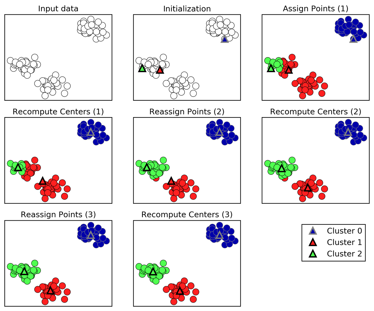
Figure 3-23. Input data and three steps of the k-means algorithm
Cluster centers are shown as triangles, while data points are shown as circles. Colors indicate cluster membership. We specified that we are looking for three clusters, so the algorithm was initialized by declaring three data points randomly as cluster centers (see “Initialization”). Then the iterative algorithm starts. First, each data point is assigned to the cluster center it is closest to (see “Assign Points (1)”). Next, the cluster centers are updated to be the mean of the assigned points (see “Recompute Centers (1)”). Then the process is repeated two more times. After the third iteration, the assignment of points to cluster centers remained unchanged, so the algorithm stops.
Given new data points, k-means will assign each to the closest cluster center. The next example (Figure 3-24) shows the boundaries of the cluster centers that were learned in Figure 3-23:
In[46]:
mglearn.plots.plot_kmeans_boundaries()
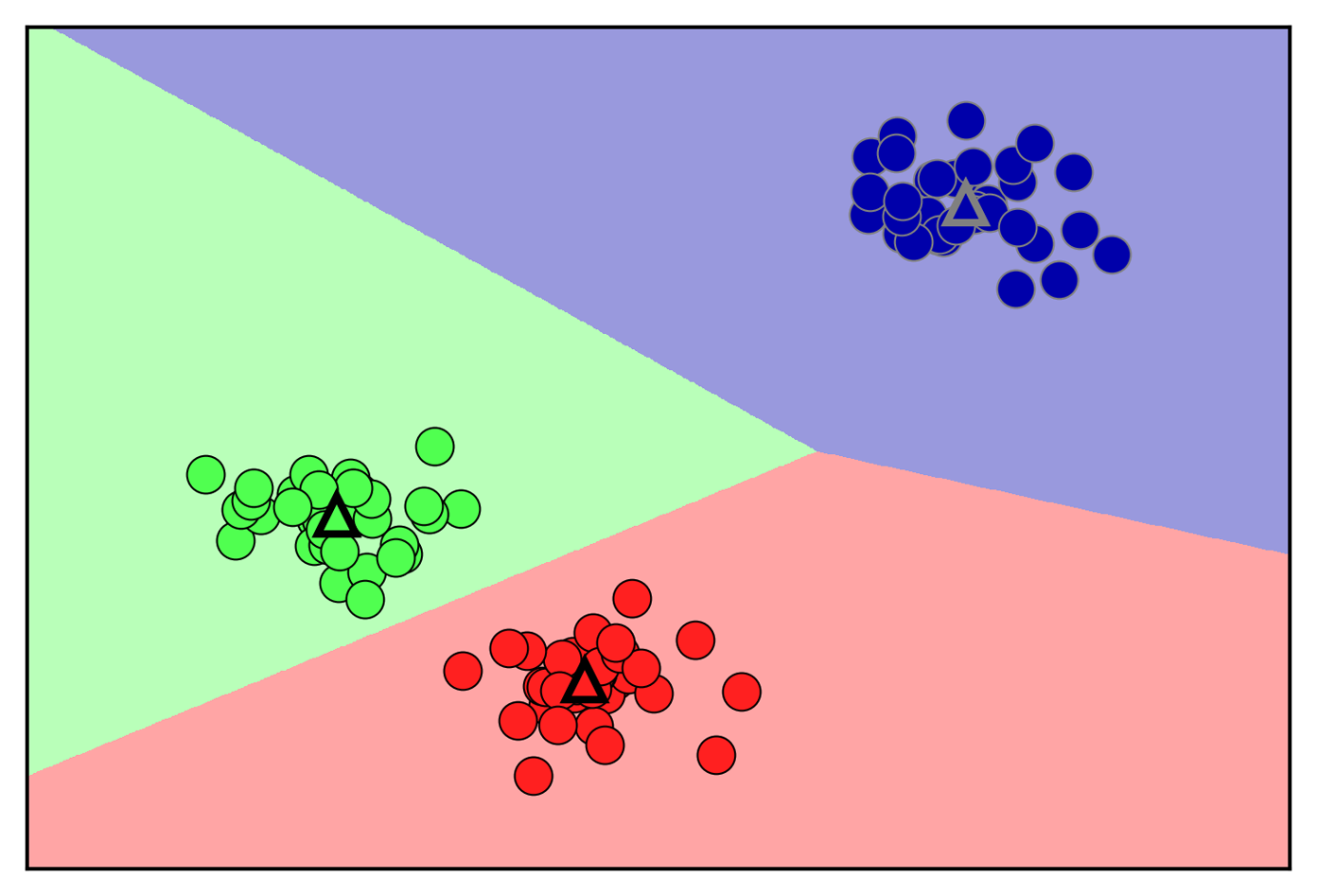
Figure 3-24. Cluster centers and cluster boundaries found by the k-means algorithm
Applying k-means with scikit-learn is quite straightforward. Here, we
apply it to the synthetic data that we used for the preceding plots. We
instantiate the KMeans class, and set the number of clusters we are
looking for.3 Then we call the fit method with the data:
In[47]:
fromsklearn.datasetsimportmake_blobsfromsklearn.clusterimportKMeans# generate synthetic two-dimensional dataX,y=make_blobs(random_state=1)# build the clustering modelkmeans=KMeans(n_clusters=3)kmeans.fit(X)
During the algorithm, each training data point in X is assigned a
cluster label. You can find these labels in the kmeans.labels_
attribute:
In[48]:
("Cluster memberships:\n{}".format(kmeans.labels_))
Out[48]:
Cluster memberships:
[0 2 2 2 1 1 1 2 0 0 2 2 1 0 1 1 1 0 2 2 1 2 1 0 2 1 1 0 0 1 0 0 1 0 2 1 2
 2 2 1 1 2 0 2 2 1 0 0 0 0 2 1 1 1 0 1 2 2 0 0 2 1 1 2 2 1 0 1 0 2 2 2 1 0
 0 2 1 1 0 2 0 2 2 1 0 0 0 0 2 0 1 0 0 2 2 1 1 0 1 0]
As we asked for three clusters, the clusters are numbered 0 to 2.
You can also assign cluster labels to new points, using the predict
method. Each new point is assigned to the closest cluster center when
predicting, but the existing model is not changed. Running predict on
the training set returns the same result as labels_:
In[49]:
(kmeans.predict(X))
Out[49]:
[0 2 2 2 1 1 1 2 0 0 2 2 1 0 1 1 1 0 2 2 1 2 1 0 2 1 1 0 0 1 0 0 1 0 2 1 2
 2 2 1 1 2 0 2 2 1 0 0 0 0 2 1 1 1 0 1 2 2 0 0 2 1 1 2 2 1 0 1 0 2 2 2 1 0
 0 2 1 1 0 2 0 2 2 1 0 0 0 0 2 0 1 0 0 2 2 1 1 0 1 0]
You can see that clustering is somewhat similar to classification, in that each item gets a label. However, there is no ground truth, and consequently the labels themselves have no a priori meaning. Let’s go back to the example of clustering face images that we discussed before. It might be that the cluster 3 found by the algorithm contains only faces of your friend Bela. You can only know that after you look at the pictures, though, and the number 3 is arbitrary. The only information the algorithm gives you is that all faces labeled as 3 are similar.
For the clustering we just computed on the two-dimensional toy dataset, that means that we should not assign any significance to the fact that one group was labeled 0 and another one was labeled 1. Running the algorithm again might result in a different numbering of clusters because of the random nature of the initialization.
Here is a plot of this data again (Figure 3-25). The cluster centers are stored in the
cluster_centers_ attribute, and we plot them as triangles:
In[50]:
mglearn.discrete_scatter(X[:,0],X[:,1],kmeans.labels_,markers='o')mglearn.discrete_scatter(kmeans.cluster_centers_[:,0],kmeans.cluster_centers_[:,1],[0,1,2],markers='^',markeredgewidth=2)
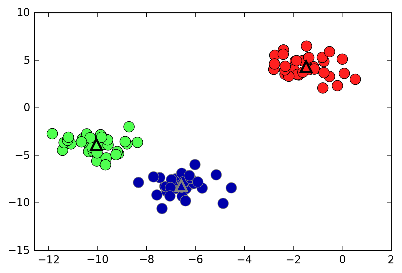
Figure 3-25. Cluster assignments and cluster centers found by k-means with three clusters
We can also use more or fewer cluster centers (Figure 3-26):
In[51]:
fig,axes=plt.subplots(1,2,figsize=(10,5))# using two cluster centers:kmeans=KMeans(n_clusters=2)kmeans.fit(X)assignments=kmeans.labels_mglearn.discrete_scatter(X[:,0],X[:,1],assignments,ax=axes[0])# using five cluster centers:kmeans=KMeans(n_clusters=5)kmeans.fit(X)assignments=kmeans.labels_mglearn.discrete_scatter(X[:,0],X[:,1],assignments,ax=axes[1])
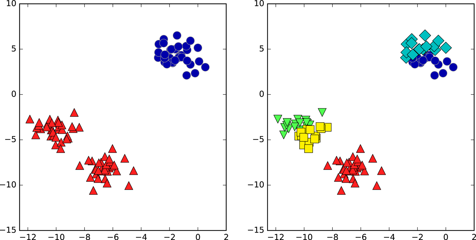
Figure 3-26. Cluster assignments found by k-means using two clusters (left) and five clusters (right)
Failure cases of k-means
Even if you know the “right” number of clusters for a given dataset, k-means might not always be able to recover them. Each cluster is defined solely by its center, which means that each cluster is a convex shape. As a result of this, k-means can only capture relatively simple shapes. k-means also assumes that all clusters have the same “diameter” in some sense; it always draws the boundary between clusters to be exactly in the middle between the cluster centers. That can sometimes lead to surprising results, as shown in Figure 3-27:
In[52]:
X_varied,y_varied=make_blobs(n_samples=200,cluster_std=[1.0,2.5,0.5],random_state=170)y_pred=KMeans(n_clusters=3,random_state=0).fit_predict(X_varied)mglearn.discrete_scatter(X_varied[:,0],X_varied[:,1],y_pred)plt.legend(["cluster 0","cluster 1","cluster 2"],loc='best')plt.xlabel("Feature 0")plt.ylabel("Feature 1")
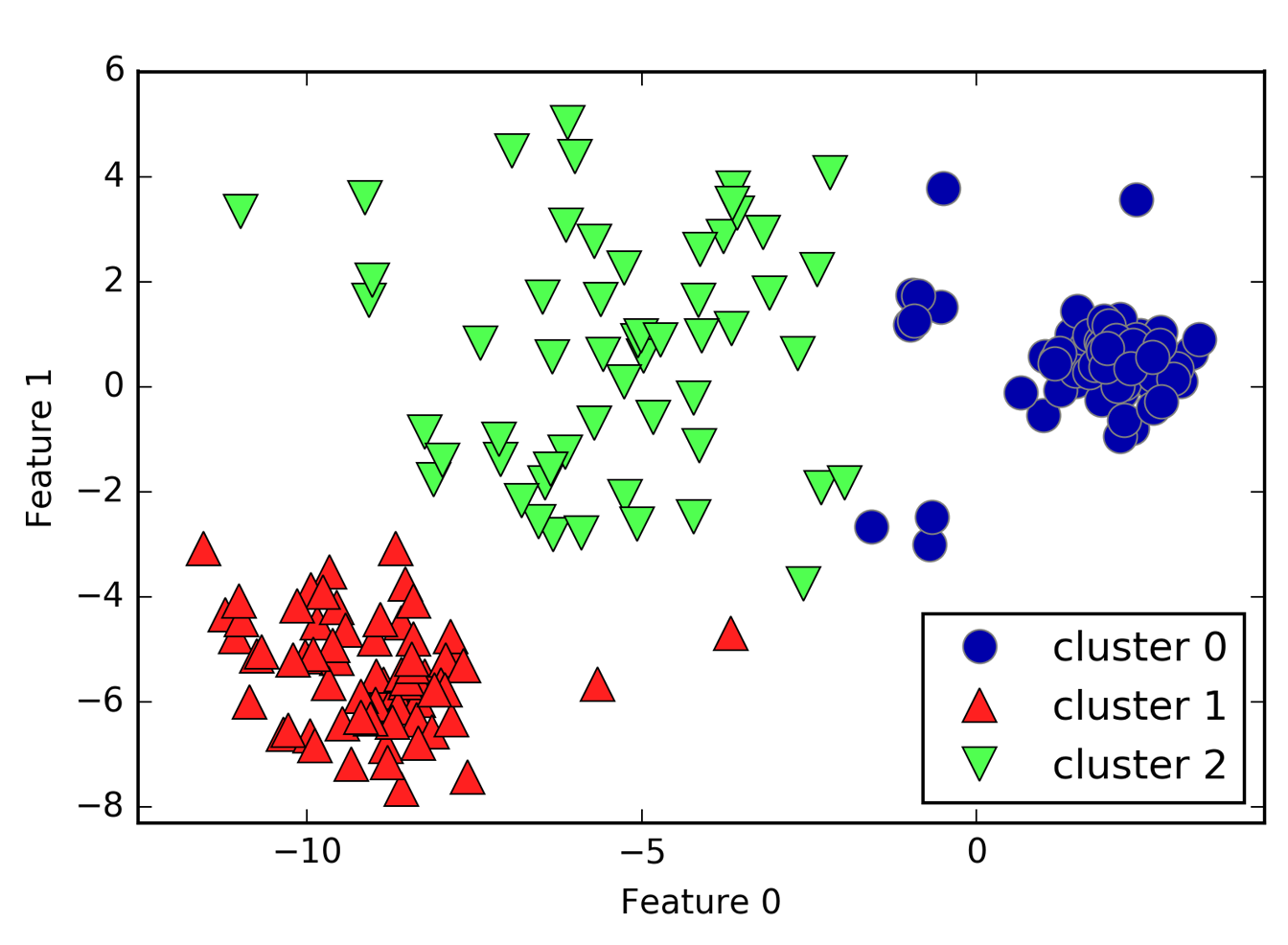
Figure 3-27. Cluster assignments found by k-means when clusters have different densities
One might have expected the dense region in the lower left to be the first cluster, the dense region in the upper right to be the second, and the less dense region in the center to be the third. Instead, both cluster 0 and cluster 1 have some points that are far away from all the other points in these clusters that “reach” toward the center.
k-means also assumes that all directions are equally important for each cluster. The following plot (Figure 3-28) shows a two-dimensional dataset where there are three clearly separated parts in the data. However, these groups are stretched toward the diagonal. As k-means only considers the distance to the nearest cluster center, it can’t handle this kind of data:
In[53]:
# generate some random cluster dataX,y=make_blobs(random_state=170,n_samples=600)rng=np.random.RandomState(74)# transform the data to be stretchedtransformation=rng.normal(size=(2,2))X=np.dot(X,transformation)# cluster the data into three clusterskmeans=KMeans(n_clusters=3)kmeans.fit(X)y_pred=kmeans.predict(X)# plot the cluster assignments and cluster centersmglearn.discrete_scatter(X[:,0],X[:,1],kmeans.labels_,markers='o')mglearn.discrete_scatter(kmeans.cluster_centers_[:,0],kmeans.cluster_centers_[:,1],[0,1,2],markers='^',markeredgewidth=2)plt.xlabel("Feature 0")plt.ylabel("Feature 1")
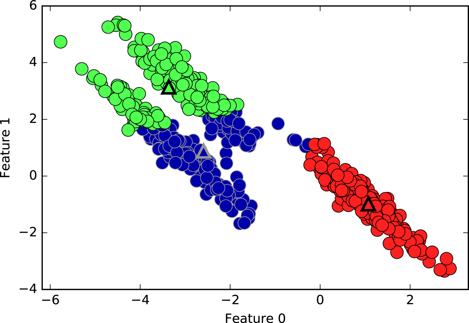
Figure 3-28. k-means fails to identify nonspherical clusters
k-means
also performs poorly if the clusters have more complex shapes,
like the two_moons data we encountered in Chapter 2 (see Figure 3-29):
In[54]:
# generate synthetic two_moons data (with less noise this time)fromsklearn.datasetsimportmake_moonsX,y=make_moons(n_samples=200,noise=0.05,random_state=0)# cluster the data into two clusterskmeans=KMeans(n_clusters=2)kmeans.fit(X)y_pred=kmeans.predict(X)# plot the cluster assignments and cluster centersplt.scatter(X[:,0],X[:,1],c=y_pred,cmap=mglearn.cm2,s=60,edgecolor='k')plt.scatter(kmeans.cluster_centers_[:,0],kmeans.cluster_centers_[:,1],marker='^',c=[mglearn.cm2(0),mglearn.cm2(1)],s=100,linewidth=2,edgecolor='k')plt.xlabel("Feature 0")plt.ylabel("Feature 1")
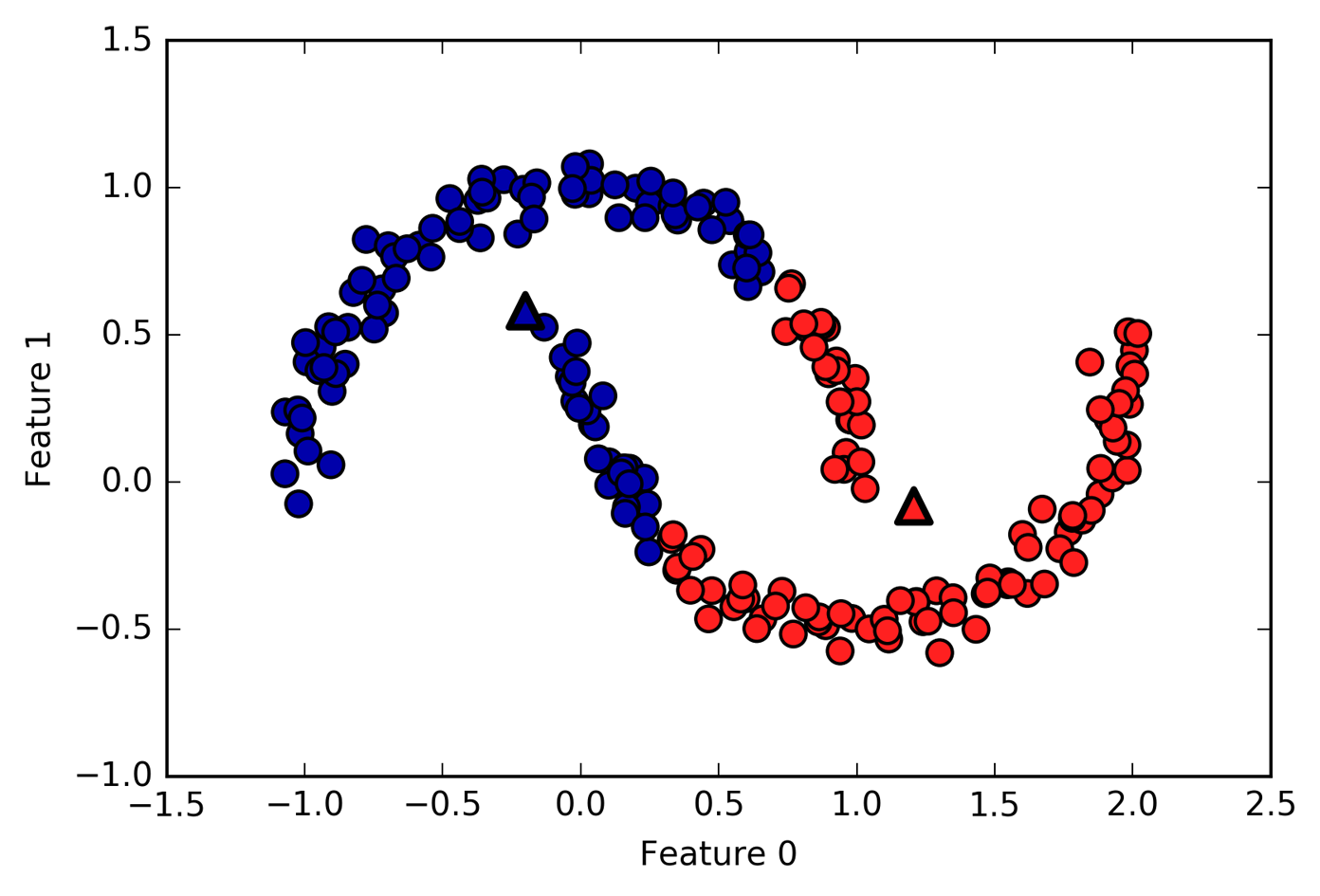
Figure 3-29. k-means fails to identify clusters with complex shapes
Here, we would hope that the clustering algorithm can discover the two half-moon shapes. However, this is not possible using the k-means algorithm.
Vector quantization, or seeing k-means as decomposition
Even though k-means is a clustering algorithm, there are interesting parallels between k-means and the decomposition methods like PCA and NMF that we discussed earlier. You might remember that PCA tries to find directions of maximum variance in the data, while NMF tries to find additive components, which often correspond to “extremes” or “parts” of the data (see Figure 3-13). Both methods tried to express the data points as a sum over some components. k-means, on the other hand, tries to represent each data point using a cluster center. You can think of that as each point being represented using only a single component, which is given by the cluster center. This view of k-means as a decomposition method, where each point is represented using a single component, is called vector quantization.
Let’s do a side-by-side comparison of PCA, NMF, and k-means, showing the components extracted (Figure 3-30), as well as reconstructions of faces from the test set using 100 components (Figure 3-31). For k-means, the reconstruction is the closest cluster center found on the training set:
In[55]:
X_train,X_test,y_train,y_test=train_test_split(X_people,y_people,stratify=y_people,random_state=0)nmf=NMF(n_components=100,random_state=0)nmf.fit(X_train)pca=PCA(n_components=100,random_state=0)pca.fit(X_train)kmeans=KMeans(n_clusters=100,random_state=0)kmeans.fit(X_train)X_reconstructed_pca=pca.inverse_transform(pca.transform(X_test))X_reconstructed_kmeans=kmeans.cluster_centers_[kmeans.predict(X_test)]X_reconstructed_nmf=np.dot(nmf.transform(X_test),nmf.components_)
In[56]:
fig,axes=plt.subplots(3,5,figsize=(8,8),subplot_kw={'xticks':(),'yticks':()})fig.suptitle("Extracted Components")forax,comp_kmeans,comp_pca,comp_nmfinzip(axes.T,kmeans.cluster_centers_,pca.components_,nmf.components_):ax[0].imshow(comp_kmeans.reshape(image_shape))ax[1].imshow(comp_pca.reshape(image_shape),cmap='viridis')ax[2].imshow(comp_nmf.reshape(image_shape))axes[0,0].set_ylabel("kmeans")axes[1,0].set_ylabel("pca")axes[2,0].set_ylabel("nmf")fig,axes=plt.subplots(4,5,subplot_kw={'xticks':(),'yticks':()},figsize=(8,8))fig.suptitle("Reconstructions")forax,orig,rec_kmeans,rec_pca,rec_nmfinzip(axes.T,X_test,X_reconstructed_kmeans,X_reconstructed_pca,X_reconstructed_nmf):ax[0].imshow(orig.reshape(image_shape))ax[1].imshow(rec_kmeans.reshape(image_shape))ax[2].imshow(rec_pca.reshape(image_shape))ax[3].imshow(rec_nmf.reshape(image_shape))axes[0,0].set_ylabel("original")axes[1,0].set_ylabel("kmeans")axes[2,0].set_ylabel("pca")axes[3,0].set_ylabel("nmf")
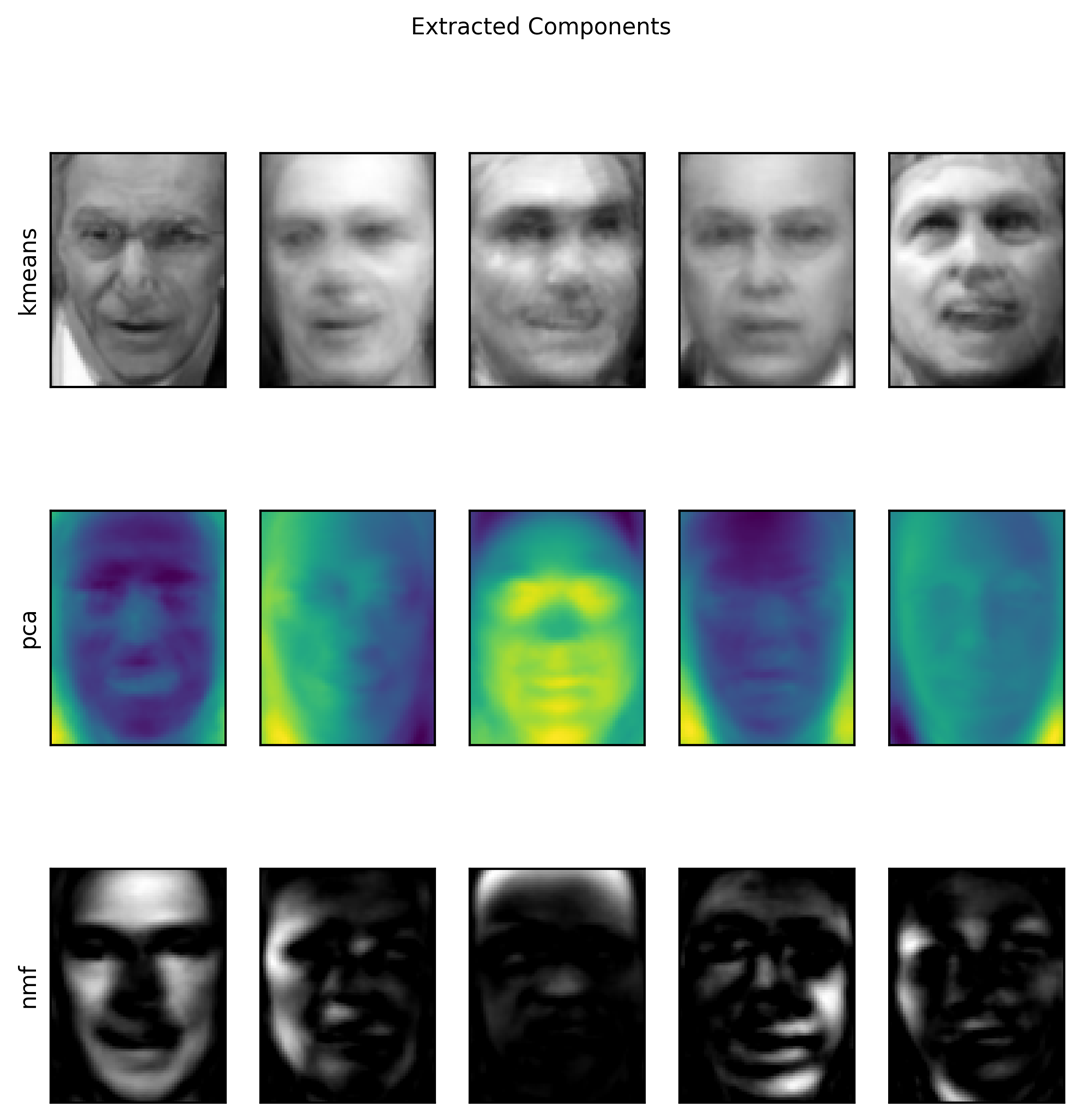
Figure 3-30. Comparing k-means cluster centers to components found by PCA and NMF
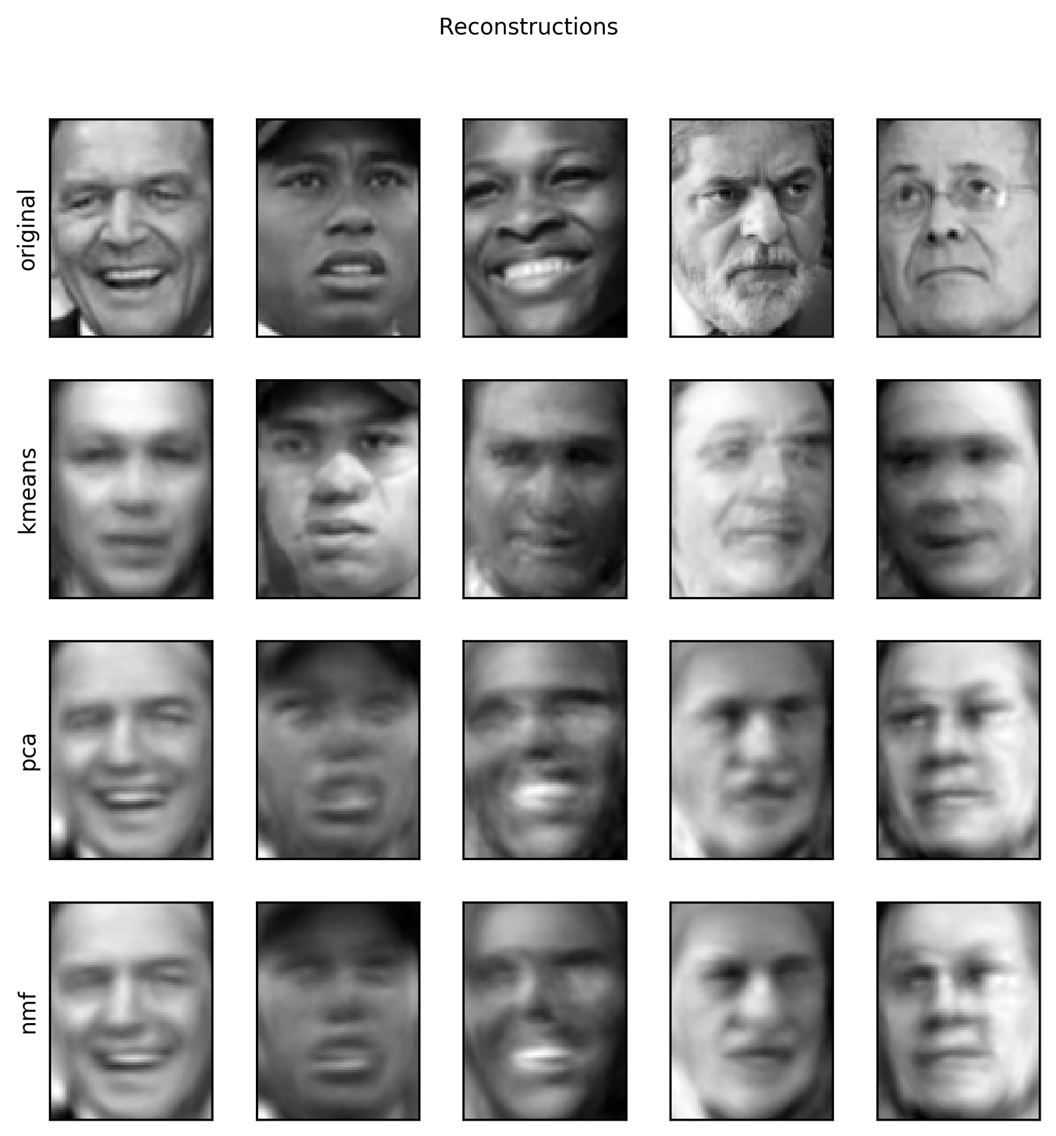
Figure 3-31. Comparing image reconstructions using k-means, PCA, and NMF with 100 components (or cluster centers)—k-means uses only a single cluster center per image
An interesting aspect of vector quantization using k-means is that we
can use many more clusters than input dimensions to encode our data.
Let’s go back to the two_moons data. Using PCA or NMF, there is
nothing much we can do to this data, as it lives in only two dimensions.
Reducing it to one dimension with PCA or NMF would completely destroy
the structure of the data. But we can find a more expressive
representation with k-means, by using more cluster centers (see Figure 3-32):
In[57]:
X,y=make_moons(n_samples=200,noise=0.05,random_state=0)kmeans=KMeans(n_clusters=10,random_state=0)kmeans.fit(X)y_pred=kmeans.predict(X)plt.scatter(X[:,0],X[:,1],c=y_pred,s=60,cmap='Paired')plt.scatter(kmeans.cluster_centers_[:,0],kmeans.cluster_centers_[:,1],s=60,marker='^',c=range(kmeans.n_clusters),linewidth=2,cmap='Paired')plt.xlabel("Feature 0")plt.ylabel("Feature 1")("Cluster memberships:\n{}".format(y_pred))
Out[57]:
Cluster memberships:
[9 2 5 4 2 7 9 6 9 6 1 0 2 6 1 9 3 0 3 1 7 6 8 6 8 5 2 7 5 8 9 8 6 5 3 7 0
 9 4 5 0 1 3 5 2 8 9 1 5 6 1 0 7 4 6 3 3 6 3 8 0 4 2 9 6 4 8 2 8 4 0 4 0 5
 6 4 5 9 3 0 7 8 0 7 5 8 9 8 0 7 3 9 7 1 7 2 2 0 4 5 6 7 8 9 4 5 4 1 2 3 1
 8 8 4 9 2 3 7 0 9 9 1 5 8 5 1 9 5 6 7 9 1 4 0 6 2 6 4 7 9 5 5 3 8 1 9 5 6
 3 5 0 2 9 3 0 8 6 0 3 3 5 6 3 2 0 2 3 0 2 6 3 4 4 1 5 6 7 1 1 3 2 4 7 2 7
 3 8 6 4 1 4 3 9 9 5 1 7 5 8 2]
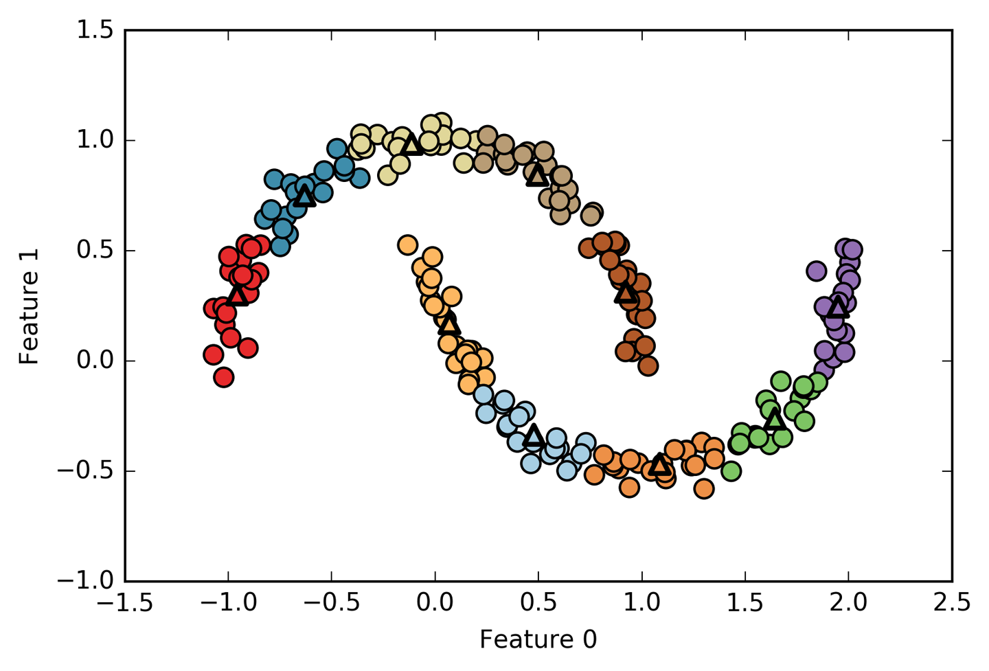
Figure 3-32. Using many k-means clusters to cover the variation in a complex dataset
We used 10 cluster centers, which means each point is now assigned a
number between 0 and 9. We can see this as the data being represented
using 10 components (that is, we have 10 new features), with all
features being 0, apart from the one that represents the cluster
center the point is assigned to. Using this 10-dimensional
representation, it would now be possible to separate the two half-moon
shapes using a linear model, which would not have been possible using
the original two features. It is also possible to get an even more
expressive representation of the data by using the distances to each of
the cluster centers as features. This can be accomplished using the transform
method of kmeans:
In[58]:
distance_features=kmeans.transform(X)("Distance feature shape: {}".format(distance_features.shape))("Distance features:\n{}".format(distance_features))
Out[58]:
Distance feature shape: (200, 10)
Distance features:
[[0.922 1.466 1.14  ... 1.166 1.039 0.233]
 [1.142 2.517 0.12  ... 0.707 2.204 0.983]
 [0.788 0.774 1.749 ... 1.971 0.716 0.944]
 ...
 [0.446 1.106 1.49  ... 1.791 1.032 0.812]
 [1.39  0.798 1.981 ... 1.978 0.239 1.058]
 [1.149 2.454 0.045 ... 0.572 2.113 0.882]]
k-means is a
very popular algorithm for clustering, not only because it
is relatively easy to understand and implement, but also because it runs
relatively quickly. k-means scales easily to large datasets, and
scikit-learn even includes a more scalable variant in the
MiniBatchKMeans class, which can handle very large datasets.
One of the drawbacks of k-means is that it relies on a random
initialization, which means the outcome of the algorithm depends on a
random seed. By default, scikit-learn runs the algorithm 10 times with
10 different random initializations, and returns the best result.4 Further downsides of k-means are the relatively
restrictive assumptions made on the shape of clusters, and the
requirement to specify the number of clusters you are looking for (which
might not be known in a real-world application).
Next, we will look at two more clustering algorithms that improve upon these properties in some ways.
3.5.2 Agglomerative Clustering
Agglomerative clustering
refers to a collection of clustering algorithms
that all build upon the same principles: the algorithm starts by
declaring each point its own cluster, and then merges the two most
similar clusters until some stopping criterion is satisfied. The
stopping criterion implemented in scikit-learn is the number of
clusters, so similar clusters are merged until only the specified number
of clusters are left. There are several linkage criteria that specify
how exactly the “most similar cluster” is measured. This measure is always
defined between two existing clusters.
The following three choices are implemented in scikit-learn:
ward-
The default choice,
wardpicks the two clusters to merge such that the variance within all clusters increases the least. This often leads to clusters that are relatively equally sized. average-
averagelinkage merges the two clusters that have the smallest average distance between all their points. complete-
completelinkage (also known as maximum linkage) merges the two clusters that have the smallest maximum distance between their points.
ward works on most datasets, and we will use it in our examples.
If the clusters have very dissimilar numbers of members (if one is much
bigger than all the others, for example), average or complete might
work better.
The following plot (Figure 3-33) illustrates the progression of agglomerative clustering on a two-dimensional dataset, looking for three clusters:
In[59]:
mglearn.plots.plot_agglomerative_algorithm()
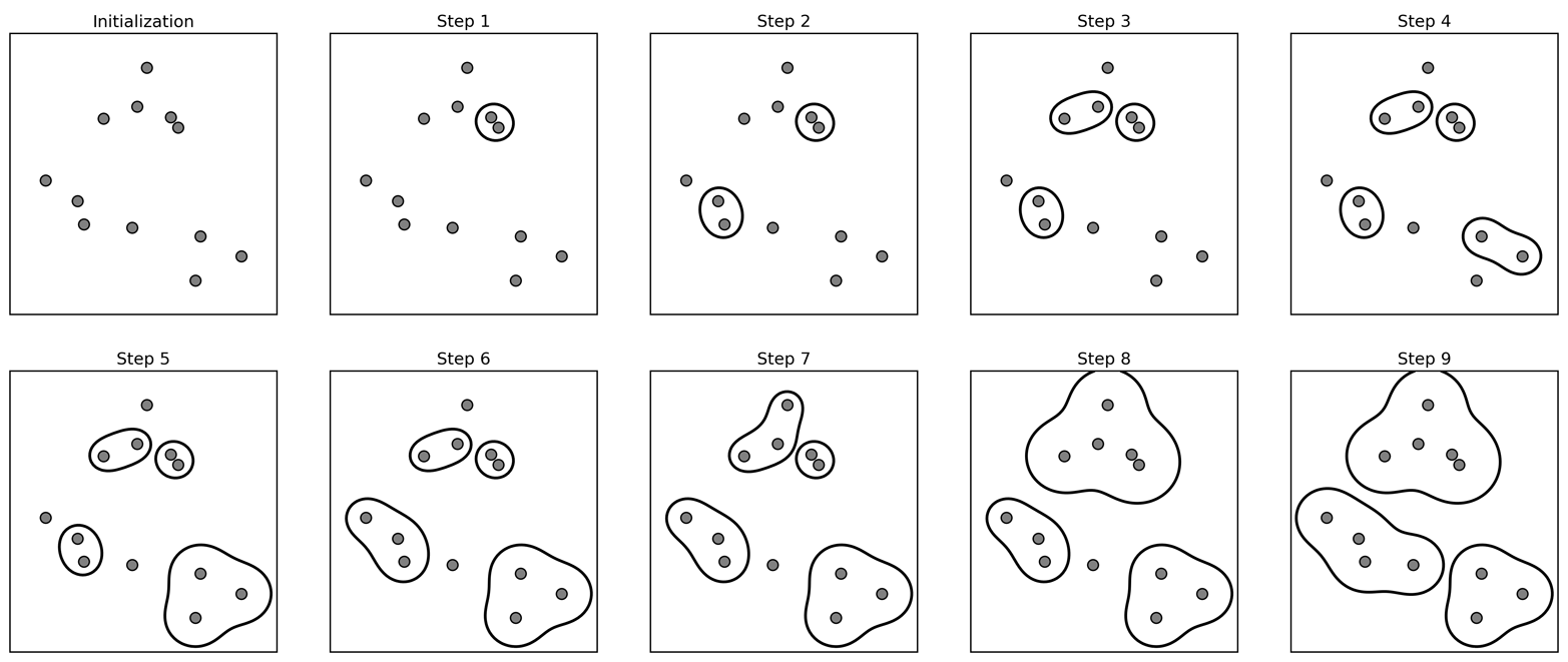
Figure 3-33. Agglomerative clustering iteratively joins the two closest clusters
Initially, each point is its own cluster. Then, in each step, the two clusters that are closest are merged. In the first four steps, two single-point clusters are picked and these are joined into two-point clusters. In step 5, one of the two-point clusters is extended to a third point, and so on. In step 9, there are only three clusters remaining. As we specified that we are looking for three clusters, the algorithm then stops.
Let’s have a look at how agglomerative clustering performs on the simple
three-cluster data we used here. Because of the way the algorithm
works, agglomerative clustering cannot make predictions for new data
points. Therefore, AgglomerativeClustering has no predict method. To
build the model and get the cluster memberships on the training set,
use the fit_predict method instead.5 The result is shown in Figure 3-34:
In[60]:
fromsklearn.clusterimportAgglomerativeClusteringX,y=make_blobs(random_state=1)agg=AgglomerativeClustering(n_clusters=3)assignment=agg.fit_predict(X)mglearn.discrete_scatter(X[:,0],X[:,1],assignment)plt.legend(["Cluster 0","Cluster 1","Cluster 2"],loc="best")plt.xlabel("Feature 0")plt.ylabel("Feature 1")
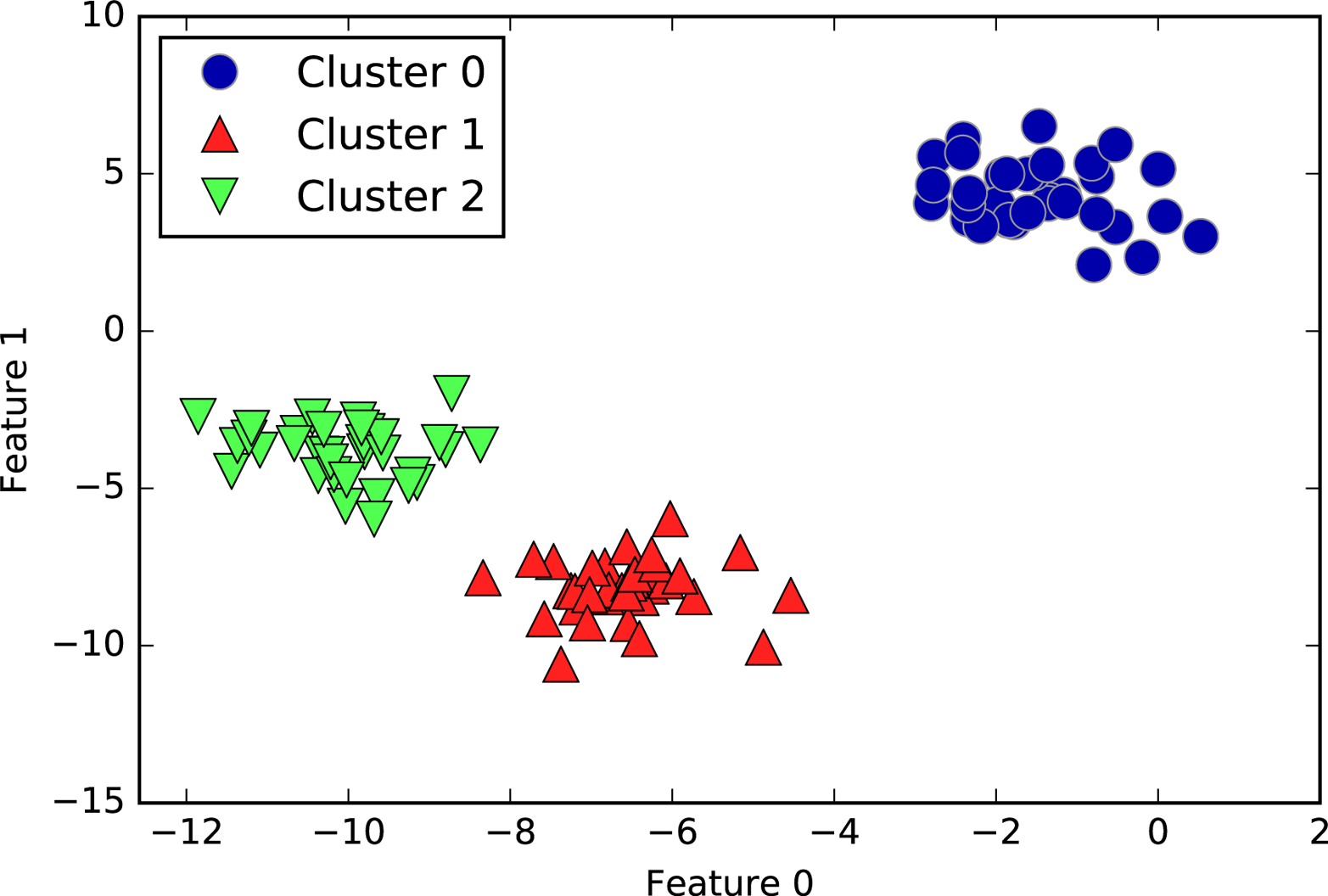
Figure 3-34. Cluster assignment using agglomerative clustering with three clusters
As expected, the algorithm recovers the clustering perfectly. While the
scikit-learn implementation of agglomerative clustering requires you to
specify the number of clusters you want the algorithm to find,
agglomerative clustering methods provide some help with choosing the
right number, which we will discuss next.
Hierarchical clustering and dendrograms
Agglomerative clustering produces what is known as a hierarchical clustering. The clustering proceeds iteratively, and every point makes a journey from being a single point cluster to belonging to some final cluster. Each intermediate step provides a clustering of the data (with a different number of clusters). It is sometimes helpful to look at all possible clusterings jointly. The next example (Figure 3-35) shows an overlay of all the possible clusterings shown in Figure 3-33, providing some insight into how each cluster breaks up into smaller clusters:
In[61]:
mglearn.plots.plot_agglomerative()
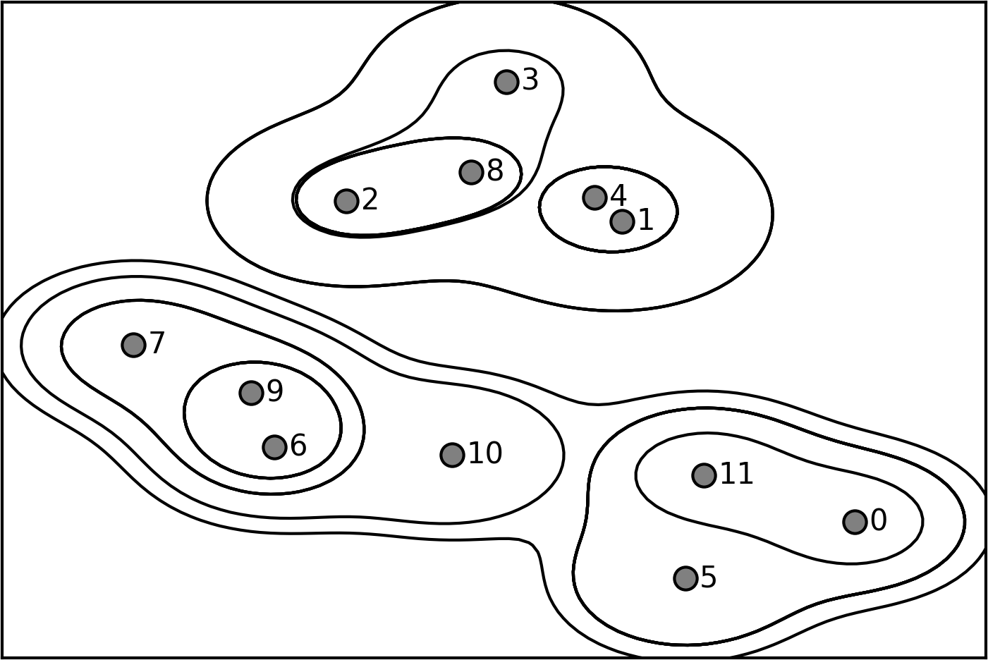
Figure 3-35. Hierarchical cluster assignment (shown as lines) generated with agglomerative clustering, with numbered data points (cf. Figure 3-36)
While this visualization provides a very detailed view of the hierarchical clustering, it relies on the two-dimensional nature of the data and therefore cannot be used on datasets that have more than two features. There is, however, another tool to visualize hierarchical clustering, called a dendrogram, that can handle multidimensional datasets.
Unfortunately, scikit-learn currently does not have the functionality to
draw dendrograms. However, you can generate them easily using SciPy. The
SciPy clustering algorithms have a slightly different interface to the
scikit-learn clustering algorithms. SciPy provides a function that takes a
data array X and computes a linkage array, which encodes
hierarchical cluster similarities. We can then feed this linkage array
into the scipy dendrogram function to plot the dendrogram (Figure 3-36):
In[62]:
# Import the dendrogram function and the ward clustering function from SciPyfromscipy.cluster.hierarchyimportdendrogram,wardX,y=make_blobs(random_state=0,n_samples=12)# Apply the ward clustering to the data array X# The SciPy ward function returns an array that specifies the distances# bridged when performing agglomerative clusteringlinkage_array=ward(X)# Now we plot the dendrogram for the linkage_array containing the distances# between clustersdendrogram(linkage_array)# Mark the cuts in the tree that signify two or three clustersax=plt.gca()bounds=ax.get_xbound()ax.plot(bounds,[7.25,7.25],'--',c='k')ax.plot(bounds,[4,4],'--',c='k')ax.text(bounds[1],7.25,' two clusters',va='center',fontdict={'size':15})ax.text(bounds[1],4,' three clusters',va='center',fontdict={'size':15})plt.xlabel("Sample index")plt.ylabel("Cluster distance")
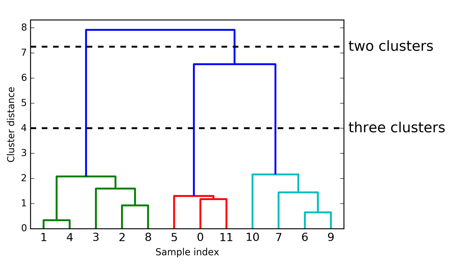
Figure 3-36. Dendrogram of the clustering shown in Figure 3-35 with lines indicating splits into two and three clusters
The dendrogram shows data points as points on the bottom (numbered from 0 to 11). Then, a tree is plotted with these points (representing single-point clusters) as the leaves, and a new node parent is added for each two clusters that are joined.
Reading from bottom to top, the data points 1 and 4 are joined first (as you could see in Figure 3-33). Next, points 6 and 9 are joined into a cluster, and so on. At the top level, there are two branches, one consisting of points 11, 0, 5, 10, 7, 6, and 9, and the other consisting of points 1, 4, 3, 2, and 8. These correspond to the two largest clusters in the lefthand side of the plot.
The y-axis in the dendrogram doesn’t just specify when in the agglomerative algorithm two clusters get merged. The length of each branch also shows how far apart the merged clusters are. The longest branches in this dendrogram are the three lines that are marked by the dashed line labeled “three clusters.” That these are the longest branches indicates that going from three to two clusters meant merging some very far-apart points. We see this again at the top of the chart, where merging the two remaining clusters into a single cluster again bridges a relatively large distance.
Unfortunately, agglomerative clustering still fails at separating
complex shapes like the two_moons dataset. But the same is not true
for the next algorithm we will look at, DBSCAN.
3.5.3 DBSCAN
Another very useful clustering algorithm is DBSCAN (which stands for “density-based spatial clustering of applications with noise”). The main benefits of DBSCAN are that it does not require the user to set the number of clusters a priori, it can capture clusters of complex shapes, and it can identify points that are not part of any cluster. DBSCAN is somewhat slower than agglomerative clustering and k-means, but still scales to relatively large datasets.
DBSCAN works by identifying points that are in “crowded” regions of the feature space, where many data points are close together. These regions are referred to as dense regions in feature space. The idea behind DBSCAN is that clusters form dense regions of data, separated by regions that are relatively empty.
Points that are within a dense region are called core samples (or core points), and
they are defined as follows. There are two parameters in DBSCAN:
min_samples and eps. If there are at least min_samples many data
points within a distance of eps to a given data point, that data point is classified as a core sample. Core samples that are closer to each other than the distance eps are
put into the same cluster by DBSCAN.
The algorithm works by picking an arbitrary point to start with. It then finds all
points with distance eps or less from that point. If there are less than min_samples
points within distance eps of the starting point, this point is labeled as noise,
meaning that it doesn’t belong to any cluster. If there are more
than min_samples points within a distance of eps, the point is
labeled a core sample and assigned a new cluster label. Then, all
neighbors (within eps) of the point are visited. If they have not
been assigned a cluster yet, they are assigned the new cluster label that was just created. If they are core samples, their neighbors are visited in
turn, and so on. The cluster grows until there are no more core samples
within distance eps of the cluster. Then another point that hasn’t
yet been visited is picked, and the same procedure is repeated.
In the end, there are three kinds of points: core points, points that
are within distance eps of core points (called boundary points), and
noise. When the DBSCAN algorithm is run on a particular dataset
multiple times, the clustering of the core points is always the same,
and the same points will always be labeled as noise. However, a boundary
point might be neighbor to core samples of more than one cluster.
Therefore, the cluster membership of boundary points depends on the
order in which points are visited. Usually there are only few boundary
points, and this slight dependence on the order of points is not
important.
Let’s apply DBSCAN on the synthetic dataset we used to demonstrate agglomerative clustering. Like agglomerative
clustering, DBSCAN does not allow predictions on new test data, so we
will use the fit_predict method to perform clustering and return the
cluster labels in one step:
In[63]:
fromsklearn.clusterimportDBSCANX,y=make_blobs(random_state=0,n_samples=12)dbscan=DBSCAN()clusters=dbscan.fit_predict(X)("Cluster memberships:\n{}".format(clusters))
Out[63]:
Cluster memberships:
[-1 -1 -1 -1 -1 -1 -1 -1 -1 -1 -1 -1]
As you can see, all data points were assigned the label -1, which
stands for noise. This is a consequence of the default parameter
settings for eps and min_samples, which are not tuned for small toy
datasets. The cluster assignments for different values of min_samples and eps are shown below, and visualized in Figure 3-37:
In[64]:
mglearn.plots.plot_dbscan()
Out[64]:
min_samples: 2 eps: 1.000000  cluster: [-1  0  0 -1  0 -1  1  1  0  1 -1 -1]
min_samples: 2 eps: 1.500000  cluster: [0 1 1 1 1 0 2 2 1 2 2 0]
min_samples: 2 eps: 2.000000  cluster: [0 1 1 1 1 0 0 0 1 0 0 0]
min_samples: 2 eps: 3.000000  cluster: [0 0 0 0 0 0 0 0 0 0 0 0]
min_samples: 3 eps: 1.000000  cluster: [-1  0  0 -1  0 -1  1  1  0  1 -1 -1]
min_samples: 3 eps: 1.500000  cluster: [0 1 1 1 1 0 2 2 1 2 2 0]
min_samples: 3 eps: 2.000000  cluster: [0 1 1 1 1 0 0 0 1 0 0 0]
min_samples: 3 eps: 3.000000  cluster: [0 0 0 0 0 0 0 0 0 0 0 0]
min_samples: 5 eps: 1.000000  cluster: [-1 -1 -1 -1 -1 -1 -1 -1 -1 -1 -1 -1]
min_samples: 5 eps: 1.500000  cluster: [-1  0  0  0  0 -1 -1 -1  0 -1 -1 -1]
min_samples: 5 eps: 2.000000  cluster: [-1  0  0  0  0 -1 -1 -1  0 -1 -1 -1]
min_samples: 5 eps: 3.000000  cluster: [0 0 0 0 0 0 0 0 0 0 0 0]
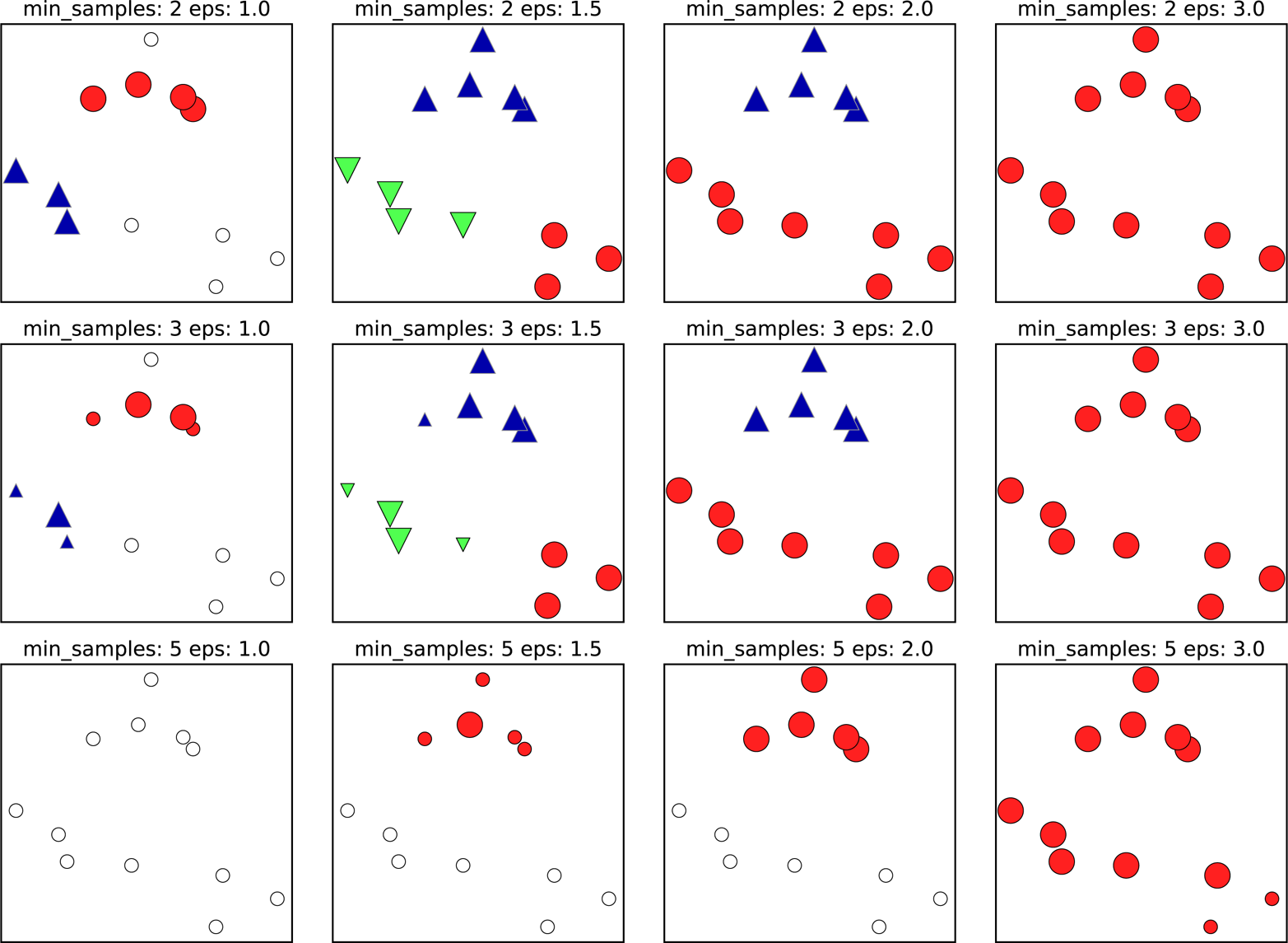
Figure 3-37. Cluster assignments found by DBSCAN with varying settings for the min_samples and eps parameters
In this plot, points that belong to clusters are solid, while the noise
points are shown in white. Core samples are shown as large markers,
while boundary points are displayed as smaller markers. Increasing eps
(going from left to right in the figure) means that more points
will be included in a cluster. This makes clusters grow, but might also
lead to multiple clusters joining into one. Increasing min_samples
(going from top to bottom in the figure) means that fewer points will be
core points, and more points will be labeled as noise.
The parameter eps is somewhat more important, as it determines what it
means for points to be “close.” Setting eps to be very small will mean
that no points are core samples, and may lead to all points being
labeled as noise. Setting eps to be very large will result in all
points forming a single cluster.
The min_samples setting mostly determines whether points in less dense
regions will be labeled as outliers or as their own clusters. If you
increase min_samples, anything that would have been a cluster with
less than min_samples many samples will now be labeled as noise. min_samples therefore determines the minimum cluster size. You can see
this very clearly in Figure 3-37, when going from min_samples=3 to
min_samples=5 with eps=1.5. With min_samples=3, there are three
clusters: one of four points, one of five points, and one of three
points. Using min_samples=5, the two smaller clusters (with three and
four points) are now labeled as noise, and only the cluster with five
samples remains.
While DBSCAN doesn’t require setting the number of clusters explicitly,
setting eps implicitly controls how many clusters will be found. Finding a good setting for eps is sometimes easier after scaling the
data using StandardScaler or MinMaxScaler, as using these scaling
techniques will ensure that all features have similar ranges.
Figure 3-38
shows the result of running DBSCAN on the two_moons dataset. The
algorithm actually finds the two half-circles and separates them using
the default settings:
In[65]:
X,y=make_moons(n_samples=200,noise=0.05,random_state=0)# rescale the data to zero mean and unit variancescaler=StandardScaler()scaler.fit(X)X_scaled=scaler.transform(X)dbscan=DBSCAN()clusters=dbscan.fit_predict(X_scaled)# plot the cluster assignmentsplt.scatter(X_scaled[:,0],X_scaled[:,1],c=clusters,cmap=mglearn.cm2,s=60)plt.xlabel("Feature 0")plt.ylabel("Feature 1")
As the algorithm produced the desired number of clusters (two), the
parameter settings seem to work well. If we decrease eps to 0.2 (from
the default of 0.5), we will get eight clusters, which is clearly too many.
Increasing eps to 0.7 results in a single cluster.
When using DBSCAN, you need to be careful about handling the returned
cluster assignments. The use of -1 to indicate noise might result in
unexpected effects when using the cluster labels to index another array.
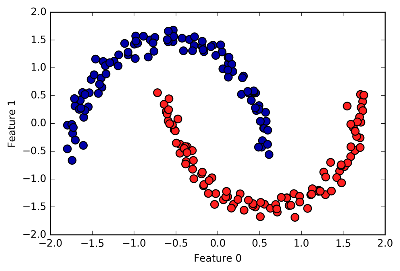
Figure 3-38. Cluster assignment found by DBSCAN using the default value of eps=0.5
3.5.4 Comparing and Evaluating Clustering Algorithms
One of the challenges in applying clustering algorithms is that it is very hard to assess how well an algorithm worked, and to compare outcomes between different algorithms. After talking about the algorithms behind k-means, agglomerative clustering, and DBSCAN, we will now compare them on some real-world datasets.
Evaluating clustering with ground truth
There are metrics that can be used to assess the outcome of a clustering algorithm relative to a ground truth clustering, the most important ones being the adjusted rand index (ARI) and normalized mutual information (NMI), which both provide a quantitative measure with an optimum of 1 and a value of 0 for unrelated clusterings (though the ARI can become negative).
Here, we compare the k-means, agglomerative clustering, and DBSCAN algorithms using ARI. We also include what it looks like when we randomly assign points to two clusters for comparison (see Figure 3-39):
In[66]:
fromsklearn.metrics.clusterimportadjusted_rand_scoreX,y=make_moons(n_samples=200,noise=0.05,random_state=0)# rescale the data to zero mean and unit variancescaler=StandardScaler()scaler.fit(X)X_scaled=scaler.transform(X)fig,axes=plt.subplots(1,4,figsize=(15,3),subplot_kw={'xticks':(),'yticks':()})# make a list of algorithms to usealgorithms=[KMeans(n_clusters=2),AgglomerativeClustering(n_clusters=2),DBSCAN()]# create a random cluster assignment for referencerandom_state=np.random.RandomState(seed=0)random_clusters=random_state.randint(low=0,high=2,size=len(X))# plot random assignmentaxes[0].scatter(X_scaled[:,0],X_scaled[:,1],c=random_clusters,cmap=mglearn.cm3,s=60)axes[0].set_title("Random assignment - ARI: {:.2f}".format(adjusted_rand_score(y,random_clusters)))forax,algorithminzip(axes[1:],algorithms):# plot the cluster assignments and cluster centersclusters=algorithm.fit_predict(X_scaled)ax.scatter(X_scaled[:,0],X_scaled[:,1],c=clusters,cmap=mglearn.cm3,s=60)ax.set_title("{} - ARI: {:.2f}".format(algorithm.__class__.__name__,adjusted_rand_score(y,clusters)))
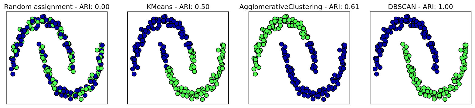
Figure 3-39. Comparing random assignment, k-means, agglomerative clustering, and DBSCAN on the two_moons dataset using the supervised ARI score
The adjusted rand index provides intuitive results, with a random cluster assignment having a score of 0 and DBSCAN (which recovers the desired clustering perfectly) having a score of 1.
A common mistake when evaluating clustering in this way is to use accuracy_score instead of adjusted_rand_score, normalized_mutual_info_score, or some other clustering metric. The problem in using accuracy is that it requires the assigned cluster
labels to exactly match the ground truth. However, the cluster labels
themselves are meaningless—the only thing that matters is which points
are in the same cluster:
In[67]:
fromsklearn.metricsimportaccuracy_score# these two labelings of points correspond to the same clusteringclusters1=[0,0,1,1,0]clusters2=[1,1,0,0,1]# accuracy is zero, as none of the labels are the same("Accuracy: {:.2f}".format(accuracy_score(clusters1,clusters2)))# adjusted rand score is 1, as the clustering is exactly the same("ARI: {:.2f}".format(adjusted_rand_score(clusters1,clusters2)))
Out[67]:
Accuracy: 0.00
ARI: 1.00
Evaluating clustering without ground truth
Although we have just shown one way to evaluate clustering algorithms, in practice, there is a big problem with using measures like ARI. When applying clustering algorithms, there is usually no ground truth to which to compare the results. If we knew the right clustering of the data, we could use this information to build a supervised model like a classifier. Therefore, using metrics like ARI and NMI usually only helps in developing algorithms, not in assessing success in an application.
There are scoring metrics for clustering that don’t require ground truth, like the silhouette coefficient. However, these often don’t work well in practice. The silhouette score computes the compactness of a cluster, where higher is better, with a perfect score of 1. While compact clusters are good, compactness doesn’t allow for complex shapes.
Here is an example comparing the outcome of k-means, agglomerative
clustering, and DBSCAN on the two-moons dataset using the silhouette score (Figure 3-40):
In[68]:
fromsklearn.metrics.clusterimportsilhouette_scoreX,y=make_moons(n_samples=200,noise=0.05,random_state=0)# rescale the data to zero mean and unit variancescaler=StandardScaler()scaler.fit(X)X_scaled=scaler.transform(X)fig,axes=plt.subplots(1,4,figsize=(15,3),subplot_kw={'xticks':(),'yticks':()})# create a random cluster assignment for referencerandom_state=np.random.RandomState(seed=0)random_clusters=random_state.randint(low=0,high=2,size=len(X))# plot random assignmentaxes[0].scatter(X_scaled[:,0],X_scaled[:,1],c=random_clusters,cmap=mglearn.cm3,s=60)axes[0].set_title("Random assignment: {:.2f}".format(silhouette_score(X_scaled,random_clusters)))algorithms=[KMeans(n_clusters=2),AgglomerativeClustering(n_clusters=2),DBSCAN()]forax,algorithminzip(axes[1:],algorithms):clusters=algorithm.fit_predict(X_scaled)# plot the cluster assignments and cluster centersax.scatter(X_scaled[:,0],X_scaled[:,1],c=clusters,cmap=mglearn.cm3,s=60)ax.set_title("{} : {:.2f}".format(algorithm.__class__.__name__,silhouette_score(X_scaled,clusters)))
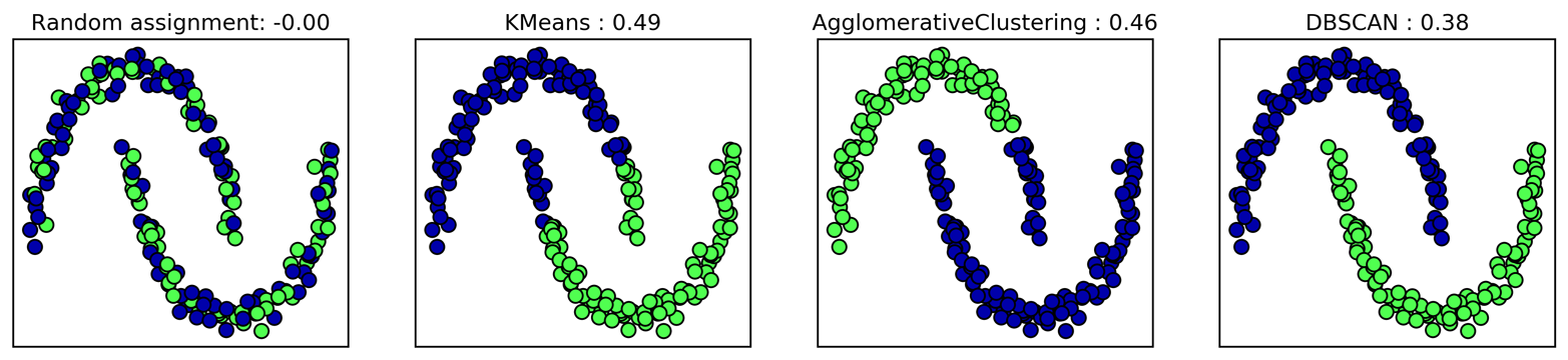
Figure 3-40. Comparing random assignment, k-means, agglomerative clustering, and DBSCAN on the two_moons dataset using the unsupervised silhouette score—the more intuitive result of DBSCAN has a lower silhouette score than the assignments found by k-means
As you can see, k-means gets the highest silhouette score, even though
we might prefer the result produced by DBSCAN. A slightly better
strategy for evaluating clusters is using robustness-based clustering
metrics. These run an algorithm after adding some noise to the data, or
using different parameter settings, and compare the outcomes. The idea
is that if many algorithm parameters and many perturbations of the data
return the same result, it is likely to be trustworthy. Unfortunately,
this strategy is not implemented in scikit-learn at the time of writing.
Even if we get a very robust clustering, or a very high silhouette score, we still don’t know if there is any semantic meaning in the clustering, or whether the clustering reflects an aspect of the data that we are interested in. Let’s go back to the example of face images. We hope to find groups of similar faces—say, men and women, or old people and young people, or people with beards and without. Let’s say we cluster the data into two clusters, and all algorithms agree about which points should be clustered together. We still don’t know if the clusters that are found correspond in any way to the concepts we are interested in. It could be that they found side views versus front views, or pictures taken at night versus pictures taken during the day, or pictures taken with iPhones versus pictures taken with Android phones. The only way to know whether the clustering corresponds to anything we are interested in is to analyze the clusters manually.
Comparing algorithms on the faces dataset
Let’s apply the k-means, DBSCAN, and agglomerative clustering algorithms
to the Labeled Faces in the Wild dataset, and see if any of them find
interesting structure. We will use the eigenface representation of the
data, as produced by PCA(whiten=True), with 100 components:
In[69]:
# extract eigenfaces from lfw data and transform datafromsklearn.decompositionimportPCApca=PCA(n_components=100,whiten=True,random_state=0)X_pca=pca.fit_transform(X_people)
We saw earlier that this is a more semantic representation of the face images than the raw pixels. It will also make computation faster. A good exercise would be for you to run the following experiments on the original data, without PCA, and see if you find similar clusters.
Analyzing the faces dataset with DBSCAN
We will start by applying DBSCAN, which we just discussed:
In[70]:
# apply DBSCAN with default parametersdbscan=DBSCAN()labels=dbscan.fit_predict(X_pca)("Unique labels: {}".format(np.unique(labels)))
Out[70]:
Unique labels: [-1]
We see that all the returned labels are –1, so all of the data was labeled
as “noise” by DBSCAN. There are two things we can change to help this:
we can make eps higher, to expand the neighborhood of each point, and
set min_samples lower, to consider smaller groups of points as
clusters. Let’s try changing min_samples first:
In[71]:
dbscan=DBSCAN(min_samples=3)labels=dbscan.fit_predict(X_pca)("Unique labels: {}".format(np.unique(labels)))
Out[71]:
Unique labels: [-1]
Even when considering groups of three points, everything is labeled as
noise. So, we need to increase eps:
In[72]:
dbscan=DBSCAN(min_samples=3,eps=15)labels=dbscan.fit_predict(X_pca)("Unique labels: {}".format(np.unique(labels)))
Out[72]:
Unique labels: [-1 0]
Using a much larger eps of 15, we get only a single cluster and noise
points. We can use this result to find out what the “noise” looks like
compared to the rest of the data. To understand better what’s happening,
let’s look at how many points are noise, and how many points are inside
the cluster:
In[73]:
# Count number of points in all clusters and noise.# bincount doesn't allow negative numbers, so we need to add 1.# The first number in the result corresponds to noise points.("Number of points per cluster: {}".format(np.bincount(labels+1)))
Out[73]:
Number of points per cluster: [ 27 2036]
There are very few noise points—only 27—so we can look at all of them (see Figure 3-41):
In[74]:
noise=X_people[labels==-1]fig,axes=plt.subplots(3,9,subplot_kw={'xticks':(),'yticks':()},figsize=(12,4))forimage,axinzip(noise,axes.ravel()):ax.imshow(image.reshape(image_shape),vmin=0,vmax=1)
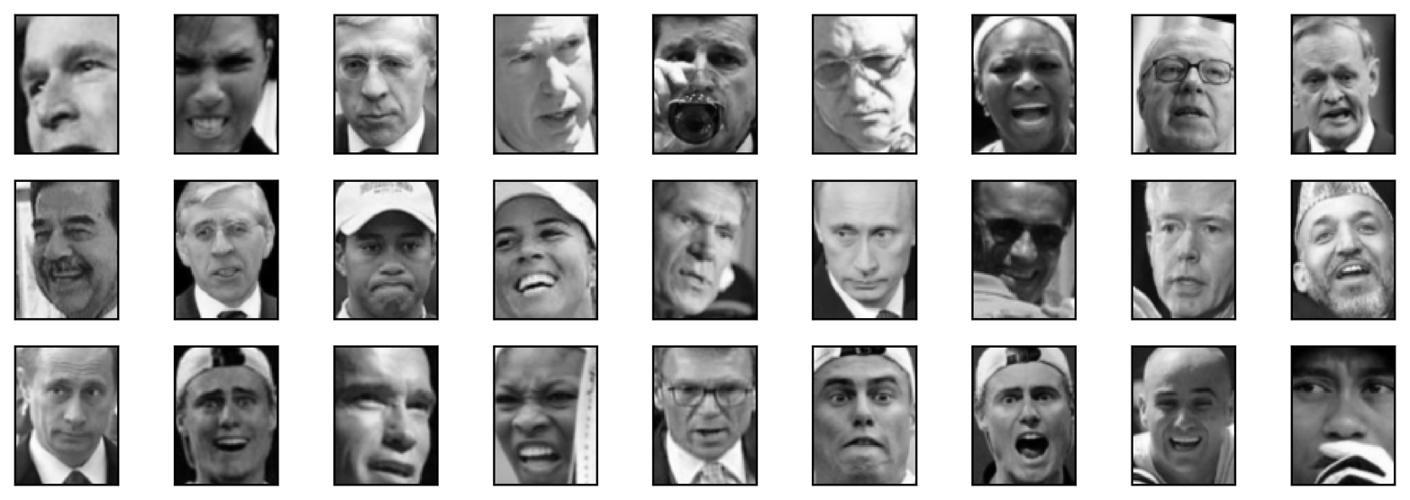
Figure 3-41. Samples from the faces dataset labeled as noise by DBSCAN
Comparing these images to the random sample of face images from Figure 3-7, we can guess why they were labeled as noise: the fifth image in the first row shows a person drinking from a glass, there are images of people wearing hats, and in the last image there’s a hand in front of the person’s face. The other images contain odd angles or crops that are too close or too wide.
This kind of analysis—trying to find “the odd one out”—is called outlier detection. If this was a real application, we might try to do a better job of cropping images, to get more homogeneous data. There is little we can do about people in photos sometimes wearing hats, drinking, or holding something in front of their faces, but it’s good to know that these are issues in the data that any algorithm we might apply needs to handle.
If we want to find more interesting clusters than just one large one, we
need to set eps smaller, somewhere between 15 and 0.5 (the default).
Let’s have a look at what different values of eps result in:
In[75]:
forepsin[1,3,5,7,9,11,13]:("\neps={}".format(eps))dbscan=DBSCAN(eps=eps,min_samples=3)labels=dbscan.fit_predict(X_pca)("Number of clusters: {}".format(len(np.unique(labels))))("Cluster sizes: {}".format(np.bincount(labels+1)))
Out[75]:
eps=1
Number of clusters: 1
Cluster sizes: [2063]

eps=3
Number of clusters: 1
Cluster sizes: [2063]

eps=5
Number of clusters: 1
Cluster sizes: [2063]

eps=7
Number of clusters: 14
Cluster sizes: [2006  4  6  6  6  9  3  3  4  3  3  3  3  4]

eps=9
Number of clusters: 4
Cluster sizes: [1269  788    3    3]

eps=11
Number of clusters: 2
Cluster sizes: [ 430 1633]

eps=13
Number of clusters: 2
Cluster sizes: [ 112 1951]
For low settings of eps, all points are labeled as noise. For eps=7,
we get many noise points and many smaller clusters. For eps=9 we
still get many noise points, but we get one big cluster and some smaller clusters.
Starting from eps=11, we get only one large cluster and noise.
What is interesting to note is that there is never more than one large cluster. At most, there is one large cluster containing most of the points, and some smaller clusters. This indicates that there are not two or three different kinds of face images in the data that are very distinct, but rather that all images are more or less equally similar to (or dissimilar from) the rest.
The results for eps=7 look most interesting, with many small clusters.
We can investigate this clustering in more detail by visualizing all of the
points in each of the 13 small clusters (Figure 3-42):
In[76]:
dbscan=DBSCAN(min_samples=3,eps=7)labels=dbscan.fit_predict(X_pca)forclusterinrange(max(labels)+1):mask=labels==clustern_images=np.sum(mask)fig,axes=plt.subplots(1,n_images,figsize=(n_images*1.5,4),subplot_kw={'xticks':(),'yticks':()})forimage,label,axinzip(X_people[mask],y_people[mask],axes):ax.imshow(image.reshape(image_shape),vmin=0,vmax=1)ax.set_title(people.target_names[label].split()[-1])
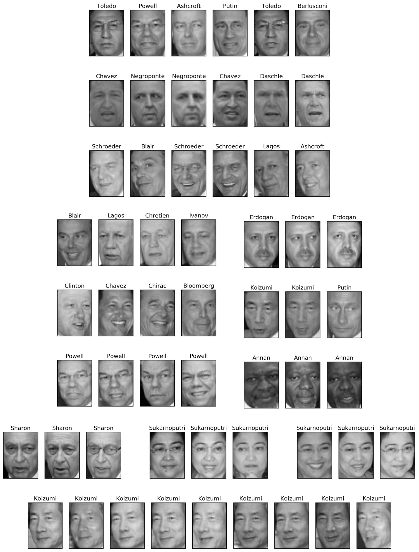
Figure 3-42. Clusters found by DBSCAN with eps=7
Some of the clusters correspond to people with very distinct faces (within this dataset), such as Sharon or Koizumi. Within each cluster, the orientation of the face is also quite fixed, as well as the facial expression. Some of the clusters contain faces of multiple people, but they share a similar orientation and expression.
This concludes our analysis of the DBSCAN algorithm applied to the faces dataset. As you can see, we are doing a manual analysis here, different from the much more automatic search approach we could use for supervised learning based on R2 score or accuracy.
Let’s move on to applying k-means and agglomerative clustering.
Analyzing the faces dataset with k-means
We saw that it was not possible to create more than one big cluster using DBSCAN. Agglomerative clustering and k-means are much more likely to create clusters of even size, but we do need to set a target number of clusters. We could set the number of clusters to the known number of people in the dataset, though it is very unlikely that an unsupervised clustering algorithm will recover them. Instead, we can start with a low number of clusters, like 10, which might allow us to analyze each of the clusters:
In[77]:
# extract clusters with k-meanskm=KMeans(n_clusters=10,random_state=0)labels_km=km.fit_predict(X_pca)("Cluster sizes k-means: {}".format(np.bincount(labels_km)))
Out[77]:
Cluster sizes k-means: [269 128 170 186 386 222 237 64 253 148]
As you can see, k-means clustering partitioned the data into relatively similarly sized clusters from 64 to 386. This is quite different from the result of DBSCAN.
We can further analyze the outcome of k-means by visualizing the cluster
centers (Figure 3-43). As we clustered in the representation produced by PCA, we need
to rotate the cluster centers back into the original space to visualize
them, using pca.inverse_transform:
In[78]:
fig,axes=plt.subplots(2,5,subplot_kw={'xticks':(),'yticks':()},figsize=(12,4))forcenter,axinzip(km.cluster_centers_,axes.ravel()):ax.imshow(pca.inverse_transform(center).reshape(image_shape),vmin=0,vmax=1)
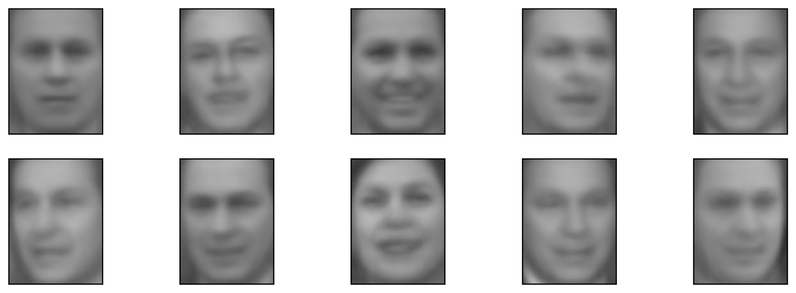
Figure 3-43. Cluster centers found by k-means when setting the number of clusters to 10
The cluster centers found by k-means are very smooth versions of faces. This is not very surprising, given that each center is an average of 64 to 386 face images. Working with a reduced PCA representation adds to the smoothness of the images (compared to the faces reconstructed using 100 PCA dimensions in Figure 3-11). The clustering seems to pick up on different orientations of the face, different expressions (the third cluster center seems to show a smiling face), and the presence of shirt collars (see the second-to-last cluster center).
For a more detailed view, in Figure 3-44 we show for each cluster center the five most typical images in the cluster (the images assigned to the cluster that are closest to the cluster center) and the five most atypical images in the cluster (the images assigned to the cluster that are furthest from the cluster center):
In[79]:
mglearn.plots.plot_kmeans_faces(km,pca,X_pca,X_people,y_people,people.target_names)
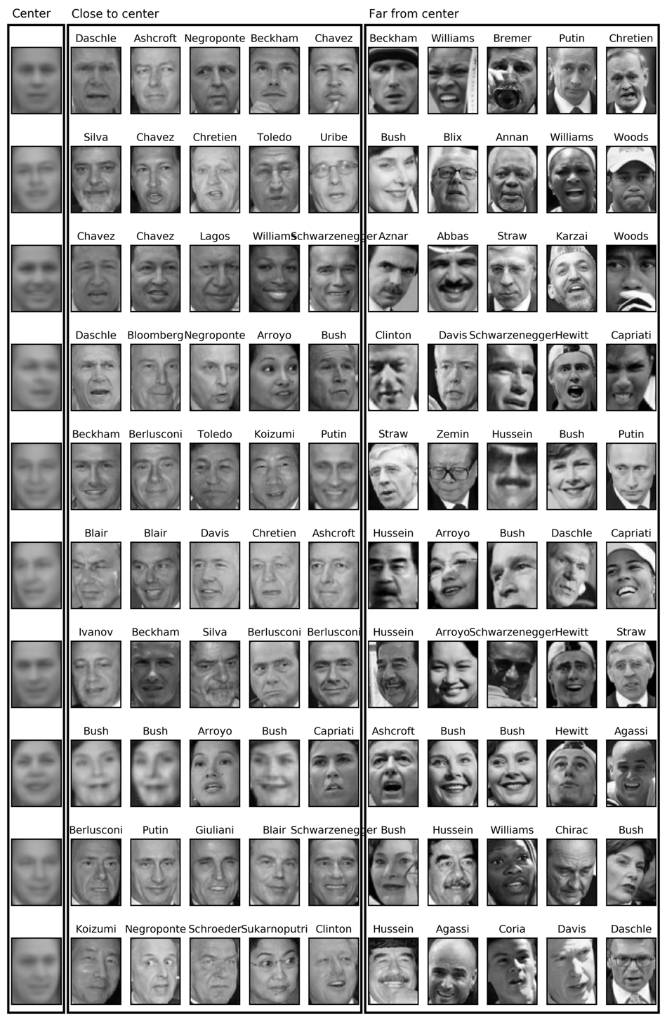
Figure 3-44. Sample images for each cluster found by k-means—the cluster centers are on the left, followed by the five closest points to each center and the five points that are assigned to the cluster but are furthest away from the center
Figure 3-44 confirms our intuition about smiling faces for the third cluster, and also the importance of orientation for the other clusters. The “atypical” points are not very similar to the cluster centers, though, and their assignment seems somewhat arbitrary. This can be attributed to the fact that k-means partitions all the data points and doesn’t have a concept of “noise” points, as DBSCAN does. Using a larger number of clusters, the algorithm could find finer distinctions. However, adding more clusters makes manual inspection even harder.
Analyzing the faces dataset with agglomerative clustering
Now, let’s look at the results of agglomerative clustering:
In[80]:
# extract clusters with ward agglomerative clusteringagglomerative=AgglomerativeClustering(n_clusters=10)labels_agg=agglomerative.fit_predict(X_pca)("Cluster sizes agglomerative clustering: {}".format(np.bincount(labels_agg)))
Out[80]:
Cluster sizes agglomerative clustering: [255 623 86 102 122 199 265 26 230 155]
Agglomerative clustering also produces relatively equally sized clusters, with cluster sizes between 26 and 623. These are more uneven than those produced by k-means, but much more even than the ones produced by DBSCAN.
We can compute the ARI to measure whether the two partitions of the data given by agglomerative clustering and k-means are similar:
In[81]:
("ARI: {:.2f}".format(adjusted_rand_score(labels_agg,labels_km)))
Out[81]:
ARI: 0.13
An ARI of only 0.13 means that the two clusterings labels_agg and
labels_km have little in common. This is not very surprising, given
the fact that points further away from the cluster centers seem to have
little in common for k-means.
Next, we might want to plot the dendrogram (Figure 3-45). We’ll limit the depth of the tree in the plot, as branching down to the individual 2,063 data points would result in an unreadably dense plot:
In[82]:
linkage_array=ward(X_pca)# now we plot the dendrogram for the linkage_array# containing the distances between clustersplt.figure(figsize=(20,5))dendrogram(linkage_array,p=7,truncate_mode='level',no_labels=True)plt.xlabel("Sample index")plt.ylabel("Cluster distance")
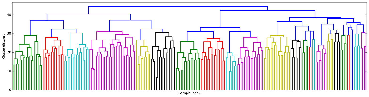
Figure 3-45. Dendrogram of agglomerative clustering on the faces dataset
Creating 10 clusters, we cut across the tree at the very top, where there are 10 vertical lines. In the dendrogram for the toy data shown in Figure 3-36, you could see by the length of the branches that two or three clusters might capture the data appropriately. For the faces data, there doesn’t seem to be a very natural cutoff point. There are some branches that represent more distinct groups, but there doesn’t appear to be a particular number of clusters that is a good fit. This is not surprising, given the result of DBSCAN that we observed earlier, which tried to cluster all points together.
Let’s visualize the 10 clusters, as we did for k-means earlier (Figure 3-46). Note that there is no notion of cluster center in agglomerative clustering (though we could compute the mean), and we simply show the first couple of points in each cluster. We show the number of points in each cluster to the left of the first image:
In[83]:
n_clusters=10forclusterinrange(n_clusters):mask=labels_agg==clusterfig,axes=plt.subplots(1,10,subplot_kw={'xticks':(),'yticks':()},figsize=(15,8))axes[0].set_ylabel(np.sum(mask))forimage,label,asdf,axinzip(X_people[mask],y_people[mask],labels_agg[mask],axes):ax.imshow(image.reshape(image_shape),vmin=0,vmax=1)ax.set_title(people.target_names[label].split()[-1],fontdict={'fontsize':9})
Figure 3-46. Random images from the clusters generated by In[82]—each row corresponds to one cluster; the number to the left lists the number of images in each cluster
While some of the clusters seem to have a semantic theme, many of them are too large to be actually homogeneous. To get more homogeneous clusters, we can run the algorithm again, this time with 40 clusters, and pick out some of the clusters that are particularly interesting (Figure 3-47):
In[84]:
# extract clusters with ward agglomerative clusteringagglomerative=AgglomerativeClustering(n_clusters=40)labels_agg=agglomerative.fit_predict(X_pca)("cluster sizes agglomerative clustering: {}".format(np.bincount(labels_agg)))n_clusters=40forclusterin[10,13,19,22,36]:# hand-picked "interesting" clustersmask=labels_agg==clusterfig,axes=plt.subplots(1,15,subplot_kw={'xticks':(),'yticks':()},figsize=(15,8))cluster_size=np.sum(mask)axes[0].set_ylabel("#{}: {}".format(cluster,cluster_size))forimage,label,asdf,axinzip(X_people[mask],y_people[mask],labels_agg[mask],axes):ax.imshow(image.reshape(image_shape),vmin=0,vmax=1)ax.set_title(people.target_names[label].split()[-1],fontdict={'fontsize':9})foriinrange(cluster_size,15):axes[i].set_visible(False)
Out[84]:
cluster sizes agglomerative clustering:
 [ 58  80  79  40 222  50  55  78 172  28  26  34  14  11  60  66 152  27
  47  31  54   5   8  56   3   5   8  18  22  82  37  89  28  24  41  40
  21  10 113  69]
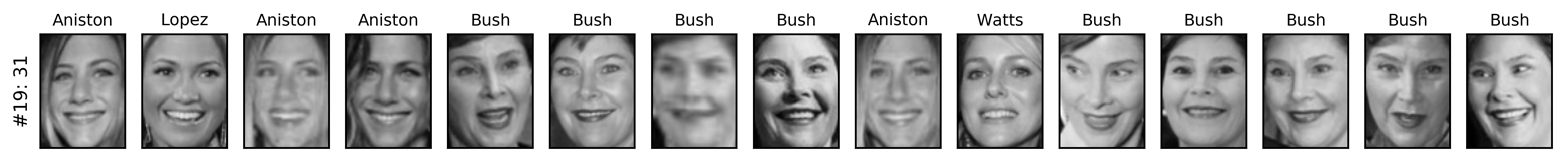
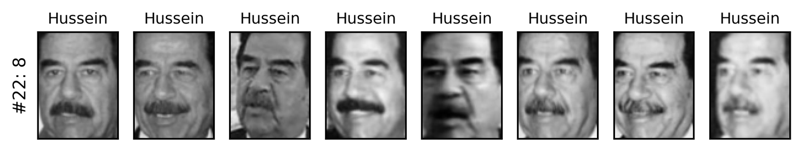
Figure 3-47. Images from selected clusters found by agglomerative clustering when setting the number of clusters to 40—the text to the left shows the index of the cluster and the total number of points in the cluster
Here, the clustering seems to have picked up on “dark skinned and smiling,” “collared shirt,” “smiling woman,” “Hussein,” and “high forehead.” We could also find these highly similar clusters using the dendrogram, if we did more a detailed analysis.
3.5.5 Summary of Clustering Methods
This section has shown that applying and evaluating clustering is a
highly qualitative procedure, and often most helpful in the exploratory
phase of data analysis. We looked at three clustering algorithms:
k-means, DBSCAN, and agglomerative clustering. All three have a way of
controlling the granularity of clustering. k-means and agglomerative
clustering allow you to specify the number of desired clusters, while
DBSCAN lets you define proximity using the eps parameter, which
indirectly influences cluster size. All three methods can be used on
large, real-world datasets, are relatively easy to understand, and allow
for clustering into many clusters.
Each of the algorithms has somewhat different strengths. k-means allows
for a characterization of the clusters using the cluster means. It can
also be viewed as a decomposition method, where each data point is
represented by its cluster center. DBSCAN allows for the detection of
“noise points” that are not assigned any cluster, and it can help
automatically determine the number of clusters. In contrast to the other
two methods, it allow for complex cluster shapes, as we saw in the
two_moons example. DBSCAN sometimes produces clusters of very
differing size, which can be a strength or a weakness. Agglomerative
clustering can provide a whole hierarchy of possible partitions of the
data, which can be easily inspected via dendrograms.
3.6 Summary and Outlook
This chapter introduced a range of unsupervised learning algorithms that can be applied for exploratory data analysis and preprocessing. Having the right representation of the data is often crucial for supervised or unsupervised learning to succeed, and preprocessing and decomposition methods play an important part in data preparation.
Decomposition, manifold learning, and clustering are essential tools to further your understanding of your data, and can be the only ways to make sense of your data in the absence of supervision information. Even in a supervised setting, exploratory tools are important for a better understanding of the properties of the data. Often it is hard to quantify the usefulness of an unsupervised algorithm, though this shouldn’t deter you from using them to gather insights from your data. With these methods under your belt, you are now equipped with all the essential learning algorithms that machine learning practitioners use every day.
We encourage you to try clustering and decomposition methods both on
two-dimensional toy data and on real-world datasets included in
scikit-learn, like the digits, iris, and cancer datasets.
1 The median of a set of numbers is the number x such that half of the numbers are smaller than x and half of the numbers are larger than x. The lower quartile is the number x such that one-fourth of the numbers are smaller than x, and the upper quartile is the number x such that one-fourth of the numbers are larger than x.
2 Not to be confused with the much larger MNIST dataset.
3 If you don’t provide n_clusters, it is set to 8 by default. There is no particular reason why you should use this value.
4 In this case, “best” means that the sum of variances of the clusters is small.
5 We could also use the labels_ attribute, as we did for k-means.