Email Marketing For Mobile App Creators
By Ros HodgekissIf you’ve developed mobile applications or have just started building one, then you probably realize that marketing should be as much of an ongoing concern as the product’s design and development. After all, what’s the point in creating a beautiful, valuable app if no one knows about it?
Assuming that promotion on Google Play1 or Apple’s App Store2 will take your app from beta to bestseller is… well, magical thinking. In reality, most successful developers kick off their marketing efforts months before release.
In this chapter, we’ll focus on how to get a head start with email marketing, not only by wrangling testers and staying in touch with users, but by successfully building hype for your app. Then, we’ll move on to how to announce the launch and measure results. Along the way, we’ll share techniques and code snippets from solid marketing campaigns, spanning different stages of an app’s lifecycle.
While this chapter isn’t heavy on coding and development, you’ll find an assortment of practical suggestions that you can apply to your projects. But if all you get is a little perspective on how important it is to actively work on getting the word out about your app from the get-go, then still consider this time well spent!
Why Email Marketing?
First, why focus on email and not, say, social media or word of mouth? Simply put, email gives you the most bang for your buck. With a return of $40 for every $1 spent3, email marketing stands head and shoulders above other methods, such as keyword advertising ($17 for every $1) or banner advertising ($2). Email also generates superior conversion rates, while giving you full control over your message. And we haven’t even mentioned the big-picture goals, such as using it to keep your most valuable users in the loop — for example, when recruiting testers, announcing launch day or requesting feedback.
But HTML Email Is Hard, Right?
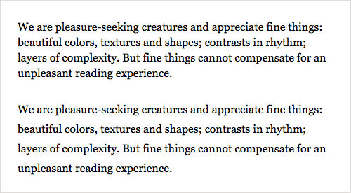
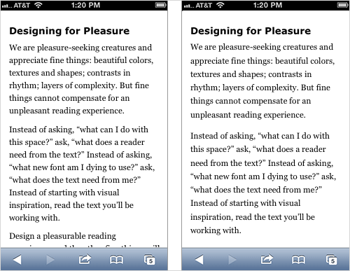
To be fair, creating and sending HTML email has always been a tricky sport. If your background is Web design and development (as it is for many app creators), then you’re likely aware that designing, coding and testing for the inbox is significantly different from doing that for the Web. A skim of Campaign Monitor’s “CSS Support4” chart quickly reveals that providing a consistent experience across multiple email clients is truly a minefield.
Yet feel consoled that, if you’re primarily targeting mobile users (for example, by encouraging them to download an app directly to their phones), mobile email clients such as iOS Mail are powered by WebKit5. This offers the luxury of a browser-like experience — including solid HTML5 and CSS3 support — in the inbox. Secondly, a number of email service providers, including Campaign Monitor and MailChimp, offer HTML email builders that not only whip up campaigns quickly and painlessly, but produce templates that make the most of mobile email clients, with media query support. In the email marketing business, we call these responsive email templates.
While we’ll touch on some of the code that goes into tailoring a better mobile email experience, we won’t dive too deep into responsive email design. To get up to speed on both the concept and code behind it, I highly recommend reading the chapter “From Monitor to Mobile: Optimizing Email Newsletters With CSS” and the article “Responsive Email Design6.”
But before all that exciting stuff, let’s start with the fundamentals: building a mailing list of email addresses (i.e. subscribers). Without this, you’ll have no one to email — and let’s be clear, buying a list is never the right option7.
An App Marketing War Plan
When you’re elbow-deep in designing or coding a mobile app, it’s hard to step back, change tack and focus on the equally important yet arguably less fun tasks of putting together a promotional website, a trailer and, yes, email campaigns. That’s why it’s best to make a marketing plan and execute it early on, instead of waiting until App Store approval anxiety has kicked in.
A marketing plan doesn’t have to be complex. For email, it could be something as informal as the following.
Pre-Launch
1. Choose an email service provider, and create a subscription list.
2. Build a pre-launch page with an email sign-up form.
3. Encourage people to visit the pre-launch page and subscribe for email updates.
4. Build an email subscription form into the app.
Beta Testing
•One week prior to beta testing
Create an email campaign, inviting subscribers to a first look at the app in beta. Explain how they can download the app and provide feedback.
•Three days after beta launching
Email your beta testers to request feedback.
Launch
•One week before launch
Email subscribers to let them know the app is close to launching. Include positive reviews and encourage subscribers to spread the word.
•Launch day
Email subscribers to announce the launch, and link to the app’s download page in the App Store, Google Play, Windows Store, etc.
Post-Launch
•One week after launch
Thank your subscribers, and encourage them to leave feedback on the app’s download page.
•After major updates
Email a summary of what’s new and improved, and encourage subscribers to spread the word.
It’s that straightforward — just jot down a rough outline of what you plan to do, on a napkin if need be. You can be as creative as you like with your email marketing strategy. Just make sure to make good on it!
Choose An Email Service Provider
If you’ve never fooled around with email marketing, choosing the right provider will likely be a touch confounding. Many services are out there for creating and running email campaigns, from Web-based ones such as MailChimp8 and Campaign Monitor9, to self-hosted apps such as Sendy10. My advice is to talk to other designers and app creators about what they’ve tried, and then open free accounts with some of the Web-based DIY services. The differences in the experiences (not to mention the features and pricing) between apps will soon become clear. Cheapest doesn’t mean best in this game, so shop around and run a few trial campaigns.
The benefit of a Web-based email marketing app is that getting started is generally quick and easy. Remember that if your needs change, you should be able to migrate your lists to another service.
Pull Together A Pre-Launch Page
Even when your project is in an early stage, it really pays to create a simple pre-launch, or landing, page with a few details about the app, perhaps some concept art and, of course, an email subscription form. After all, if visitors to your website like the concept, they’ll be keen to sign up for email updates and find out when your app is launching. These will also likely be your most valuable, passionate users for giving feedback and spreading the word when you launch. Below is the pre-launch page for the mobile game The Drowning11, by DeNA12:
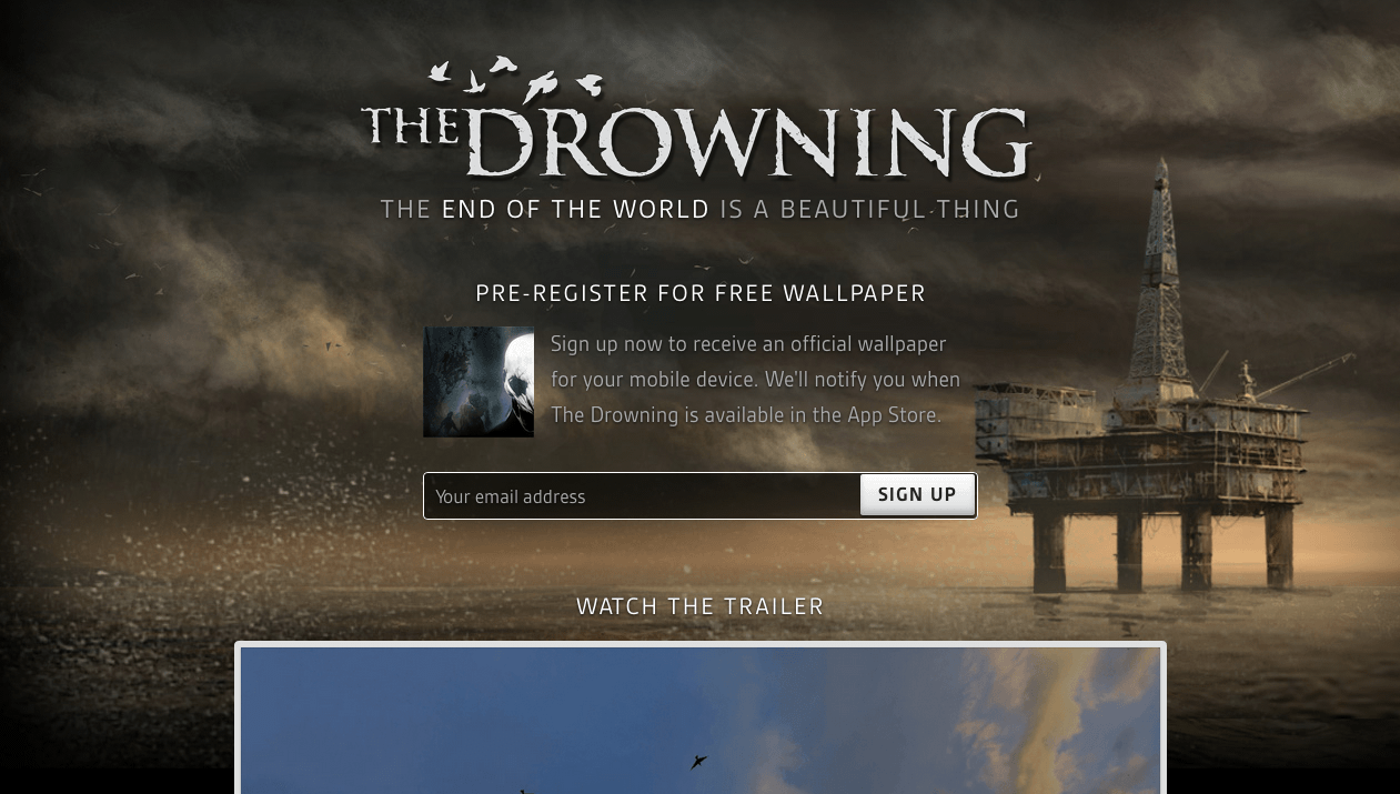
I like The Drowning’s pre-launch page for its sophistication yet simplicity. The artwork and trailer for this ominous first-person shooter are polished and persuasive. There’s even a nice incentive to sign up to the mailing list: email updates and a free wallpaper. Above all, the entire page is geared to getting visitors to subscribe, and the subscription form is unmissable. You’ll find a couple of other great examples in the post “Building An Effective ‘Coming Soon’ Page For Your Product13.”
Now back to your page. One thing your email service provider should be able to do is generate a snippet of code with which you can add a subscription form to your website and automatically push new email addresses to a list. Alternatively, a number of simple services and plugins not only enable you to build good-looking pre-launch pages, but integrate with some of the major email service providers. Popular ones include out-of-the-box apps like LaunchRock14 and Unbounce15; if you’re already running a CMS such as WordPress, then the Launchpad16 plugin for WordPress is worth a look. Or you could create your own self-hosted launch page using a template such as Launching.me17.
With a pre-launch page up and running, you can get back to focusing on your app for a while. Or you could start communicating with your new subscribers, using autoresponders18.
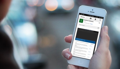
Add An Email Subscription Form To Your App
View larger version19
While it might sound a bit odd, nothing is wrong with boosting your ongoing marketing efforts by adding a subscription form to your mobile app itself. You could collect email addresses from early adopters to inform them of updates. Or perhaps you’re planning a really great newsletter for your audience and feel that in-app sign-ups would give the app a real boost.
If Cocoa is your language of choice and you are using Mailchimp, then check an unofficial Objective-C wrapper for Mailchimp20 and Mad Mimi21. If you are using CampaignMonitor, make sure to check the Objective-C wrapper on GitHub22 which can be used to create in-app subscription forms. With an extensive API23, it’s also well documented and comes with usage examples. Just something to think about.
Experiment With Other List-Building Tactics
Creating a pre-launch page and adding an email sign-up form to your app are both great ways to bring more people into the loop with your current mobile app and future ones. While these tactics tend to be rather set-and-forget, you could try other things to actively build interest in your title:
•Collect email addresses at events.
Do you attend developer meetups or conferences? If you’re going to be talking about your upcoming app, you might as well give attendees a way to track its progress. Pretty much every email service provider comes with a customizable mobile app to collect email addresses and push them to your lists. Campaign Monitor’s is Enlist24, and MailChimp’s is Chimpadeedoo25.
•Offer something valuable.
One effective tactic is to offer teaser content via a blog, such as concept art or even posts on what you’ve learned during development. Smack a subscription form onto your blog posts or even in your videos26 (using a service such as Wistia27), with the promise of useful content and updates via your email newsletter.
•Offer a discount on the app.
If you’re building a paid app, offering a generous discount to early adopters wouldn’t hurt — if they agree to sign up to your email newsletter, that is. Slipping in an incentive is always a reliable tactic, especially when it demands very little effort.
Now that new subscribers are rolling in, let’s look at what it takes to send out emails.
Create Your First Email Campaign
Some time has passed and, after a little promotion, your pre-launch page has collected quite a few email addresses. You might have some cool teaser artwork to share now, or you might feel it’s time to invite some subscribers to join the beta phase — heaven forbid, you might be a week out from launch! Scary stuff.
At this stage, you might be tempted to obsess over the technical details28 of creating HTML email campaigns (which are important), but, ultimately, this is a marketing exercise. What matters above all is your message and ensuring that readers are hooked at first glance.
Another thing that folks regularly obsess over is figuring out the best time to launch a campaign. While some (albeit conflicting) evidence29 shows that the hour or day of the week you choose does make some difference, I think the advantages of emailing at 7:00 pm over, say, 10:00 am are marginal, especially if your subscribers are international. Even public holidays30 seem to work for some creators, so relax and follow a schedule that suits you. Your content will make the big difference, after all.
Having gone through all of this heavy stuff, let’s take an inspiration break and look at a couple of email newsletters from app developers, sent at certain milestones prior to launch.
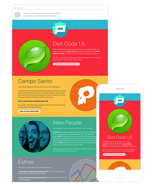
“Visit Our Pre-Launch Page”
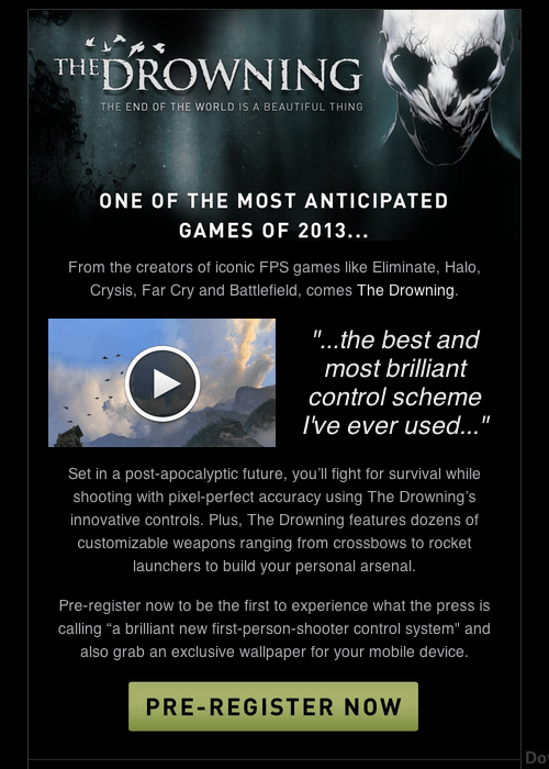
The Drowning31, by DeNA32.
Now that you’ve got a shiny new promotional website, what better way to drive visitors to it than by running a campaign for your existing email lists? As an established mobile game developer, DeNA is in the fortunate position of having an established community of dedicated gamers, many of whom would probably be interested in this title. This email’s narrow format makes it comfortable to read on mobile devices, too.
“Invitation to Beta Test”
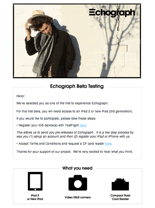
Echograph33, by Clear Media34.
I like this invitation to beta test Echograph35 because it’s as clear as it gets. There’s no waffling about this awesome animated GIF builder for the iPad — just a couple images that show beta testers what they need, a sample GIF and step-by-step instructions for installing the app during the beta phase.
“Thank You for Beta Testing”
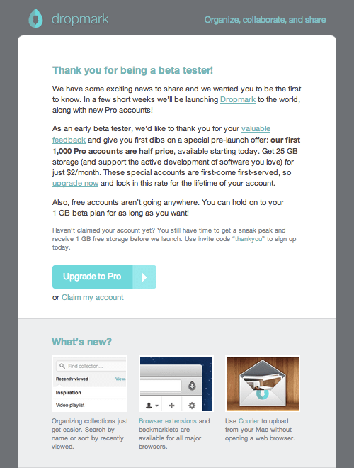
Dropmark36, by Oak37.
Once beta testing has wrapped up, it’s nice to say “Thank you” and offer a little something for the effort and feedback your audience has volunteered. Dropmark38’s thoughtful email campaign does this with class, by providing a discounted upgrade for beta testers. It’s a great way to ensure that they keep using the service.
I hope you’ve enjoyed that visual interlude. Now, let’s discuss how to announce your app’s launch. Hold tight!
Launch Your App With Email
So, the big reveal is imminent. You’ve probably just submitted your app to the App Store or published it on Google Play. Either way, it’s time to focus on getting the word out.
Whether you announce the launch in a newsletter or via a standalone email announcement, you need to do two things: first, make an impact, and secondly, make it very easy to download the app from the newsletter itself. To achieve both, you’ll need to get the logo and branding for your app store of choice, as well as the link to the download page and, of course, some compelling content to get subscribers excited about the app.
At our company we announced the release of our subscription form app for the iPad, Enlist, via our monthly newsletter:
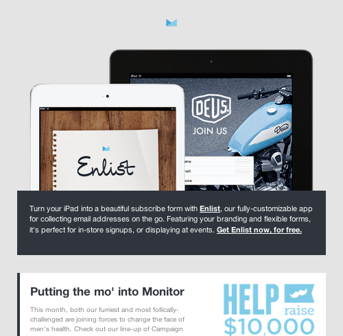
Enlist39
The images are crisp and inviting. But the real magic happens when you view the newsletter on an iPad. A “Get it from the App Store” link appears, allowing users to download the app to their device in two taps.
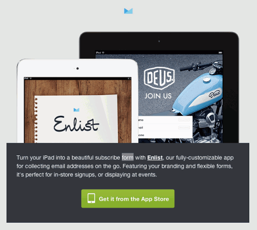
As you might have guessed, we are using media queries to reveal the App Store link when the email is viewed on an iPad. While I don’t want to go too deep into code, this neat trick is worth sharing. Below is an abridged version of the HTML and CSS.
CSS
p.ipad {
    font-size: 0px;

}
…
@media only screen and (min-device-width : 768px) and (max-device-width : 1024px) {

    a[id="reveal"] {
        display: block !important;
        background: url('http://yourdomain.com/images/appstore.png') no-repeat center center !important;
        background-size: 232px 49px !important;
        width: 232px !important;
        height: 49px !important;
    }
}
HTML
<p class="ipad"><a id="reveal" href="http://campaignmonitor.createsend1.com/t/y-l-jidkuht-l-p/" title="Get Enlist from the App Store"></a></p>
You might be curious why we use font-size: 0px to hide the App Store link when the email is viewed on anything other than an iPad. This strange choice is explained in the blog post “How to Display Content on Mobile Devices Only40.” It gives a taste of the quirkiness involved in designing HTML emails.
On to the content. Let’s go to the second launch campaign for Echograph, which features a prominent download link, plus a video and animated GIF that walk viewers through the app:
Second launch campaign for Echograph41.
Nicely done. Overall, the best thing you can do with your launch email is have fun and be creative — while staying concise. By the way, TechCrunch reckons that Sunday is the best day to launch an app42.
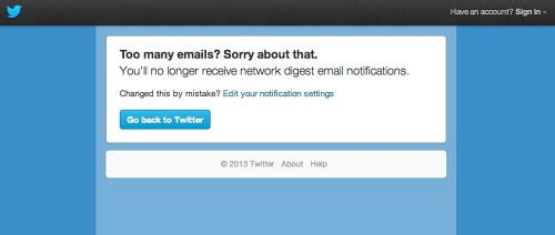
So, What Next?
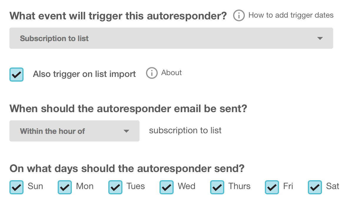
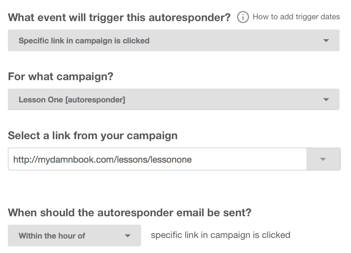
Once your app has launched, you might be tempted to take a break from campaigns, but then you’d miss out on a big opportunity. By continuing to grow your email lists and stay in touch with subscribers — whether to collect feedback, announce updates or simply share your successes — you’ll find email to be a valuable tool in your marketing arsenal. If this sounds like work, consider going on autopilot with43 autoresponders44, which are email campaigns that are automatically run when set off by certain triggers, such as a date (“send two weeks after visitor signs up”) or an action (“send whenever a user upgrades”). To learn more, read Smashing Magazine’s guide on “How to Market Your Mobile Application45,” and, of course, talk to your fellow developers.
This post hasn’t been code-heavy, but it could have been — designing for mobile, let alone email, is a surprisingly demanding process, regardless of your aptitude as a designer or coder. However, I wanted to focus on helping you make the most of your marketing milestones by engaging with users via email.
If you walk away from this chapter with one thing, it should be a desire to get your planning in the bag as soon as possible. Otherwise, you risk missing out on the opportunity to build an audience that is as committed to your project as you are. Best of luck with your email marketing journey.
