Drive Engagement, Conversion, and Retention with Every Word
Copyright © 2019 Torrey Podmajerski. All rights reserved.
Printed in the United States of America.
Published by O’Reilly Media, Inc. , 1005 Gravenstein Highway North, Sebastopol, CA 95472.
O’Reilly books may be purchased for educational, business, or sales promotional use. Online editions are also available for most titles ( http://oreilly.com/safari ). For more information, contact our corporate/institutional sales department: 800-998-9938 or corporate@oreilly.com .
See http://oreilly.com/catalog/errata.csp?isbn=0636920235583 for release details.
The O’Reilly logo is a registered trademark of O’Reilly Media, Inc. Strategic Writing for UX, the cover image, and related trade dress are trademarks of O’Reilly Media, Inc.
The views expressed in this work are those of the author(s), and do not represent the publisher’s views. While the publisher and the author(s) have used good faith efforts to ensure that the information and instructions contained in this work are accurate, the publisher and the author(s) disclaim all responsibility for errors or omissions, including without limitation responsibility for damages resulting from the use of or reliance on this work. Use of the information and instructions contained in this work is at your own risk. If any code samples or other technology this work contains or describes is subject to open source licenses or the intellectual property rights of others, it is your responsibility to ensure that your use thereof complies with such licenses and/or rights.
063-6-920-23558-3
[FILL IN]
“They may forget what you said, but they will never forget how you made them feel.” - Attributed to Carl Buehner, Maya Angelou, and others.
UX content is all about supporting the person who uses an experience to do what they came to the experience to do. That is, when we create content for doing, we don’t want the person using the experience to spend any energy noticing what we said or how we said it. But humans will feel something from the experience; it will leave an impression. If we don’t design that feeling, and how the content supports that feeling, the person is left to feel affection or repulsion, engendering loyalty or disgust, or any feeling in between.
As the business or organization making the experience, we do want them to remember how it makes them feel. Voice is the content’s part of the difference that helps to create loyal customers, even when the “doing” is similar to a competitor.
Even informal descriptions of voice will help a team create a cohesive voice in the content. For example, the voice for the Xbox 360 console in 2010 was “The console speaks like we’re sitting beside them, helping them play.” The “them” was well understood: Console gaming enthusiasts, who just wanted to play their game. How we sat beside them could be further defined: “We’re not the guy that takes the controller away and does it himself,” which could inspire disgust, disappointment, or frustration, ‘but the one who will tell you exactly what to do, to make it easy for you,” to inspire feelings of camaraderie, achievement, and belonging. Because the gamer and role of the person on the sofa was so familiar to the people making the product, the definition and documentation of voice could be simple.
As Xbox started to understand its broader audience, we adapted the voice. No matter who was playing, or if they were using the console to watch TV or listen to music, they should have a positive experience. We defined the voice as “Clean, casual, and keep ‘em playing.” We focused the feeling on playing, achievement, and having fun.
For the change in the Xbox voice, we put up posters in the Xbox buildings to spread the word. We created a special email address for anybody, from operations to development, to work with the dedicated UX writing team whenever they were using words. The writing team worked closely with each other, our design teams, and our single editor. We used design critiques, hallway brainstorming sessions, and peer reviews of strings to stay aligned.
But these informal descriptions of voice are only as strong as the consistent understanding of that voice. Getting all of the team to understand that description is a major challenge, because teams can work in isolation from each other, and humans have a different “feeling” for the words.
Where there is no writing team, and no editor, the process of developing and aligning the text to the voice has to be managed across the entire organization. Even if responsibility is centered in a single person, as it was for me at OfferUp, there won’t be enough of their time to go around; text will sometimes have to be created without that person. To make the voice consistent in a way that would scale across the organization, supporting multiple teams, I created the voice chart as a way to define the voice we wanted.
In this chapter, I’ll introduce the voice chart and its six components: concepts, vocabulary, verbosity, syntax, punctuation, and capitalization. To show how that system works, and for the subsequent examples in this book, I’ve created three example voice charts for three made-up apps from made-up organizations.
There is a maxim in fiction writing: each character is should be recognizable from their dialog: how they speak and what they talk about. It’s also a good goal for a product’s voice that the people using an experience should be able to recognize it or its brand from any piece of text: any title, button, or message. That way, the organization can feel confident that when a person sees a message or screen from them, the person can immediately recognize it, know it’s legitimate, and trust that they can use it.
To demonstrate this recognizability of voice, I’ve designed 3 different mock apps.1 I use these apps throughout this book to show UX text principles, methods, and tools.
The Sturgeon Club app, an exclusive club membership app with updates about club events, reservations for facility use, dues paying, menu, and calendar.
‘appee, a casual social game with daily thematic challenges for photo-taking and uploads, with prizes, comment threads, rating, and purchases available.
TAPP, a regional bus service app with updates per route and region. Look up info, pay fares, manage account, and access city and regional services.
I’ve chosen these three example apps because they have important similarities and differences. To make the examples easy to understand, none of the experiences require professional skills or understanding. Similarly, the motivations of the organizations and the people using the experiences can be easily explained. Each experience involves exchange of money and information, and for each app, customer purchases, engagement, and retention are important metrics for future planning.
These three different experiences were chosen for their differences, too. The Sturgeon Club and TAPP depend on the locations and utilities in the physical world, but ‘appee is not limited or grounded in that way. TAPP is a public, government-run service, required to be accessible and include the entire population, while The Sturgeon Club and ‘appee need only serve the people who choose to participate. ‘appee wants to expand into global markets, TAPP serves a local, but multilingual market, and The Sturgeon Club operates in a single region and language. This breadth of usage and requirement will affect the language chosen for each app. (Table 4.1)
| The Sturgeon Club | ‘appee | TAPP | |
| Exclusive vs. Inclusive | Exclusively for club members | Available to people who want it, but nobody needs it | Intended for every person who uses regional public transit |
| Physical vs. Digital | App is an interface for physical location | Organization’s location is unimportant | App is an interface for physical utilities |
| International vs. Local | Regional, single language | International | Regional, multiple languages |
Table 4.1 Important differences among the example experiences in this book.
In the examples from these apps throughout this book, my goal is to make the text different enough that even if you didn’t see it in context, you could tell which app it comes from. The text in those examples depends on the decisions made in the voice charts created in the rest of this chapter. Let’s begin.
The voice chart below (Table 4.2) will hold a set of decision-making rules and creative guidance to make the text align more closely to the needs of the business and the person using the experience. When the text being drafted isn’t good enough yet, it helps people identify what might make it better. When there are multiple good options for the text, the voice chart will make deciding between those good options easier. I’ll explain how to use it after we build it.
The fundamental structure of the voice chart is to hold each product principle in a column. Then, for each principle, each of the six aspects of voice is defined in a different row: the concepts, vocabulary, verbosity, syntax, punctuation, and capitalization.
| Blank voice chart | |||
| Principles | Product principle 1 | Product principle 2 | Product principle 3 |
| Concepts | |||
| Vocabulary | |||
| Verbosity | |||
| Syntax | |||
| Punctuation | |||
| Capitalization | |||
Table 4.2 This blank voice chart has room for three voice principle columns, and space to define concepts, vocabulary, verbosity, syntax, punctuation and capitalization according to each.
The definitions in one column are aligned to one principle. They don’t have to be the same as the definitions in another column. It’s even OK, and expected, that two columns may contradict or complement each other, in the same row.
This variation is the difference between voice and tone: Voice is the consistent, recognizable choices of language across an entire experience. Tone is the variability in voice from one part of the experience to another. For example, when I overhear my mother answer a phone call, I can quickly tell by her tone whether the phone call is from a stranger or a loved one--but I am never confused that it is my mother’s voice.
By encapsulating these variations together in the same document, the writer is equipped to intentionally include and vary the tone to align the overall voice with the experience principles. In the rest of this chapter, we’ll fill the voice chart. We’ll start from the principles, then tackle the other aspects of voice as separate, creative decisions: the concepts, vocabulary, verbosity, syntax, punctuation, and capitalization that align to each experience principle.
The foundation of the voice chart are the experience principles: the terms that define what the experience is trying to be to its customers. The voice will help convey that experience in the ideas it conveys, the words it chooses, the punctuation it uses or omits--all of the aspects of language. The purpose of the voice chart is to make the text convey those principles deliberately, consistently, and scalably--so that anybody in the organization can work on them as necessary.
If your organization doesn’t know what the experience is trying to be to the people who use it, work can’t begin to define the voice. While you can increase clarity and usability of the text, and thereby “fix” some text problems, the experience will also inspire feeling and be assigned a personality. The purpose of the principles is to make sure the organization has determined, strategically, what that feeling and personality should be.
To be clear, identifying a product or organization’s principles is not usually the job of the content strategist. If your organization has marketing or advertising support, they may already have defined these principles. When I have had to facilitate the articulation of these principles, it has helped me to keep in mind that my goal, as the content strategist, is not to “own” the principles, but to align the content strategy to them after they are ratified.
When the organization hasn’t defined its principles, I recommend interviewing people inside your organization. In Nicely Said2, Nicole Fenton and Kate Kiefer Lee outline a process of interviewing people inside the organization to determine the goals of the brand, the organization, and the experience.
Use the results of interviews to draft the most important principles that emerge, then ratify those with your stakeholders. As the process continues, the articulation of the principles will change considerably--and that’s fine. The process of articulating the product principles can become political. When I draft these principles, I expect that the first, and even second and third drafts will end up on the trash heap. The important thing is that the conversations continue, and these early drafts help the stakeholders get to the organization’s goal.
For the examples in this book, I’ve invented three principles for each organization. Imagine that each organization has developed its own set of principles to meet its business or civic purposes, and its purpose in the lives of the people who use it. Let’s look at each one.
Sturgeon Club
The purpose of the Sturgeon Club, as defined by its Board, is to provide a private, elegant venue for its membership to socialize and recreate. To bring that purpose to life, the Club’s executive and operations leaders have determined that the physical building, the internal spaces, and each experience the members have should be imbued with elegance, build camaraderie, and connect members to the club’s traditions.
Table 4.3 shows the top row of the voice chart for The Sturgeon Club, which uses each of those three main principles as column headings: Imbued with elegance, Build camaraderie, and Connect to tradition.
| The Sturgeon Club Voice Chart | Imbued with elegance | Build camaraderie | Connect to tradition |
Table 4.3 The Sturgeon Club product principles, which make up the top row of its voice chart.
‘appee
The purpose of ‘appee is to create an entertaining, engaging experience for its players while generating content for the platform, viewing advertising, and buying merchandise. Instead of competing with “serious” art experiences, it is trying a strategy of playfulness, seeking to provide surprising entertainment and moments of insight.
The ‘appee voice chart in Table 4.4 shows those three strategic principles as the headings for its voice chart columns: Playful, Insightful, and Surprising.
| ‘appee Voice Chart | Playful | Insightful | Surprising |
Table 4.4 ‘appee product principles, which make up the top row of its voice chart.
TAPP
The purpose of the TAPP app is an extension of the purpose of the regional transit system itself. Move people around the region, and therefore through the online experience, in a way the public finds efficient, trustworthy, and accessible. The TAPP voice chart (Table 4.5) uses those principles as the headings for the columns: Efficient, Trustworthy, and Accessible.
| TAPP Voice Chart | Efficient | Trustworthy | Accessible |
Table 4.5 TAPP product principles, which make up the top row of its voice chart.
The concepts are the ideas or topics that are intentionally mentioned in the experience. The voice chart helps us specify, in advance, those concepts that we think will support the product principles. The topics should reflect the role the organization wants the experience to have in the person’s life. They are the ideas the organization wants to emphasize at any open opportunity, even when they aren’t part of the task at hand.
That doesn’t mean that the experience endlessly discusses itself and its organizational concerns. Instead, when applicable, it includes the key ideas. Concepts also don’t specify the language to use; these are the ideas that should land regardless of slogans or campaigns.
The Sturgeon Club
The Sturgeon Club voice, for example, specifies to use the details about togetherness and belonging (Table 4.6). For example, instead of describing the formal event space as merely “Capacity of 124 people,” the experience could mention “Mingle with up to 124 members.”
| The Sturgeon Club Voice Chart | Imbued with elegance | Build camaraderie | Connect to tradition |
| Concepts | Details of finish, opulence; functional and ornamental | Togetherness, belonging, and discretion | Specific connections to club members, history, fame, and power |
Table 4.6 Concepts aligned to The Sturgeon Club product principles.
‘appee
Concepts included in ‘appee are to include surprising information, and small delights and coincidences (Table 4.7).
| ‘appee Voice Chart | Playful | Insightful | Surprising |
| Concepts | Small delights, avoiding grand successes; Frippery | Commonalities found especially at the intersection of ideas | Unpredictable; misdirection and difficulty can be fun |
Table 4.7 Concepts aligned to ‘appee product principles.
TAPP
The TAPP experience adds very few new concepts to the experience. If they are included, they are specific to supporting the operating principles: a lack of waste, rides happening on time, and the inclusion of every possible rider (Table 4.8).
| TAPP Voice Chart | Efficient | Trustworthy | Accessible |
| Concepts | Waste no resource | Every ride on time | Rides for every rider |
Table 4.8 Concepts aligned to TAPP product principles.
Where specific words can support a voice principle, or specific words can undermine a voice principle, use the Vocabulary row to specify them. If there aren’t specific words that help land the principle, this row can be omitted.
The Sturgeon Club
As shown in Table 4.9, The Sturgeon Club vocabulary serves to reinforce the social order. A member may have an appointment with staff, like a nutritionist or concierge. But members meet with each other. Generalities are to be avoided, and so is referring to someone as a “former member.”
| The Sturgeon Club Voice Chart | Imbued with elegance | Build camaraderie | Connect to tradition |
| Vocabulary | Avoid generalities (“very”,”really”, etc.) | secure, not safe meet with members appointment with staff |
member member emeritus, member (deceased), not former member |
Table 4.9 Vocabulary aligned to The Sturgeon Club product principles.
‘appee
Vocabulary isn’t the same kind of tool in ‘appee as it is in The Sturgeon Club. In Table 4.10, Playful and Surprising don’t specify any vocabulary to use or avoid. Even in the one place it does reference vocabulary, it is vague, but important: Use non-metaphoric language when defining insights, such as “Your Wednesday photos are your best photos.”
| ‘appee Voice Chart | Playful | Insightful | Surprising |
| Vocabulary | {not terminology specific} | Plain,non-metaphoric language to define the insight | {not terminology specific} |
Table 4.10 Vocabulary aligned to ‘appee product principles.
TAPP
In Table 4.11, the TAPP voice chart specifies words that could be used throughout the experience. Notably, the Accessible principle says to never use “disabled” or “invalid,” but encourages the use of available, easy, and ready. In practice, this means the team will avoid language that has been used to exclude people who use wheelchairs and other assistive devices, but instead include them by specifying what is and isn’t available, easy, or ready.
| TAPP Voice Chart | Efficient | Trustworthy | Accessible |
| Vocabulary | Fast, save time, save money | regular, on time | available, easy, ready Never use: disabled, invalid |
Table 4.11 Vocabulary aligned to TAPP product principles.
For strict usability, the text inside an experience should get out of people’s way. It isn’t there to be savored or read for pleasure, the text is there to keep them moving through the experience. But using few words where many are expected can block a person from moving forward as thoroughly as using too many words where few are expected. Screen size and reading format makes a difference, too: people are more willing to read on a desktop computer than on a TV screen.
To choose verbosity for voice, make sure you understand the expectations of the person using the experience, how they expect the experience to behave, and the general constraints you’ll have in the design. Then align the quantity and type of language to the support particular product principles.
The Sturgeon Club
The Sturgeon Club intentionally sets a measured pace. It is not afraid to take time to expand upon its own glory, so it will enhance descriptions with adjectives and adverbs, as seen in the Verbosity row of the voice chart (Table 4.12). The club also wants an air of formality, even where a more casual atmosphere is common, so it will use complete sentences (and therefore more words), even where short phrases are more common. However, there is a tension between setting a stately pace and wasting the members’ time: Members are there to build camaraderie with each other, not with the concierge, the staff, or the experience.
| The Sturgeon Club Voice Chart | Imbued with elegance | Build camaraderie | Connect to tradition |
| Verbosity | Enhance responses and descriptions with adjectives/adverbs | Be brief and begone; they aren’t here to talk to the concierge | Complete sentences even where phrases are more common |
Table 4.12 Verbosity aligned to The Sturgeon Club product principles.
‘appee
‘appee shows its playful side with its entry for Playful on the Verbosity row of its voice chart, in Table 4.13. As a quasi-game experience, ‘appee needs to introduce difficulty or challenge in the use of the app. One way it can do this is by using fewer words than strictly necessary to get its point across. This cell in the ‘appee voice chart is a good reminder that the Voice for any experience is used like a spice when cooking: too little and the food is unappetizing; too much, and the food is inedible. If the writer applied this piece of the voice too heavily, there would be no words in the experience at all!
| ‘appee Voice Chart | Playful | Insightful | Surprising |
| Verbosity | Fewer than strictly necessary | {not verbosity specific} | {not verbosity specific} |
Table 4.13 Verbosity aligned to ‘appee product principles.
TAPP
In table 4.14, the Verbosity row of the TAPP voice chart exhorts the team to avoid unnecessary adjectives or adverbs, except to ensure customer success, to be accurate, and to be unambiguous. As a public service, the TAPP voice aligns neatly with its utilitarian purpose.
| TAPP Voice Chart | Efficient | Trustworthy | Accessible |
| Verbosity | No adjectives or adverbs except to ensure customer success | Enough words to have accurate information | Enough words to have unambiguous information |
Table 4.14 Verbosity aligned to TAPP product principles.
Natural language gives us a rich variety of ways to construct and convey our ideas, but all of those ways don’t work in all experiences. To maximize usability, simple grammatical structures work best for most purposes. In English, that means simple subject-predicate sentences, or verb-object imperative directions, such as “The bus accepts correct change and transit passes” and “Add money to your transit pass.” For more specific examples, see the UX Text patterns in Chapter 5.
However, merely maximizing usability can result in a robotic, impersonal tone. By choosing the sentence structures and other syntax that support the product principles, you have an opportunity to define the right balance of usability and personality for the experience.
The Sturgeon Club
Once again, we see The Sturgeon Club use patterns in language to reinforce its culture, using the Syntax row of its voice chart (Table 4.15). To imbue with elegance, the experience should consider complex sentence structures. But to build camaraderie, the simple syntax is preferred when discussing people. Most importantly, the Club itself is spoken of in the syntax associated with formality: passive voice, past tense, and complex sentences.
| The Sturgeon Club Voice Chart | Imbued with elegance | Build camaraderie | Connect to tradition |
| Syntax | In descriptions of experience, prefer complex to simple or compound | When discussing people, prefer simple statements | When discussing the club, prefer passive voice, past tense, complex and compound sentences |
Table 4.15 Syntax aligned to The Sturgeon Club product principles.
‘appee
In contrast to The Sturgeon Club, ‘appee prefers using the present and future tense in its app. It rarely, if ever, uses complete sentences, as shown in the Syntax row of its voice chart (Table 4.16).
| ‘appee Voice Chart | Playful | Insightful | Surprising |
| Syntax | Present and future tense | {not syntax specific} | Phrases preferred |
Table 4.16 Syntax aligned to ‘appee product principles.
TAPP
TAPP continues its utilitarian style in the Syntax row of its voice chart (Table 4.17). It uses complete sentences to emphasize trustworthiness, but phrases are also acceptable, as long as they are all simple.
| TAPP Voice Chart | Efficient | Trustworthy | Accessible |
| Syntax | Simple sentences or phrases | Complete sentences | Simple sentences or phrases |
Table 4.17 Syntax aligned to TAPP product principles.
There is a strong argument to be made that punctuation and capitalization are part of the visual and typographic design of experience, and not the responsibility of the content strategist. Regardless of who owns those decisions in an organization, punctuation and capitalization continue to be among the chief complaints people make when they are dissatisfied with the text. One of the purposes of the voice chart is to force the discussions and record the result, so that future confusion or arguments can be avoided, and the experience can be made consistent.
The Sturgeon Club
In Table 4.18, The Sturgeon Club voice chart Capitalization row details how capitalization emphasizes relationships and roles within the club. It also emphasizes commas and eschews exclamation marks and tildes, aligned to elegance and tradition.
| The Sturgeon Club Voice Chart | Imbued with elegance | Build camaraderie | Connect to tradition |
| Punctuation | Serial commas, colon instead of m-dash, no tilde, and no exclamation mark. | {not punctuation specific} | Sentences include terminal punctuation. Titles do not. |
| Capitalization | Title case is used for titles, buttons, headings | Relationship roles (friend, wife, spouse, parent) are not capitalized | Member titles, roles, committee titles, names, and roles are initial-capitalized |
Table 4.18 Punctuation and capitalization aligned to The Sturgeon Club product principles.
‘appee
‘appee enjoys fringe punctuation, preferring to stretch into playfulness, away from tradition and formality with the use of emoji and interrobangs. Instead of using capitalization to signify importance, it indicates that capitalization should only be used for emphasis. ‘appee Punctuation and Capitalization rows are shown in Table 4.19.
| ‘appee Voice Chart | Playful | Insightful | Surprising |
| Punctuation | Avoid periods; use emoji, exclamations, interrobangs, question marks | Tilde instead of colon, semicolon, dash, or ellipsis | {not punctuation specific} |
| Capitalization | Use capitalization only for emphasis | Use sentence case | {not capitalization specific} |
Table 4.19 Punctuation and capitalization aligned to ‘appee product principles.
TAPP
With its Punctuation and Capitalization rows in its voice chart (Table 4.20), TAPP continues to emphasize its focus on clarity as the best route to efficiency, trustworthiness, and accessibility. TAPP uses commas and periods, and avoids semicolons, dashes, parenthentical remarks, and asking questions. Titles and buttons are immediately recognizable as members of a hierarchy because of their capitalization.
| TAPP Voice Chart | Efficient | Trustworthy | Accessible |
| Punctuation | Use periods, commas. Avoid question marks. Avoid terminal punctuation for instructions | Use periods, commas. Avoid question marks. Avoid terminal punctuation for instructions | Avoid semicolons, dashes, parenthetical remarks |
| Capitalization | Title-case titles, headings, buttons | Title-case titles, headings, buttons | Title-case titles, headings, buttons |
Table 4.20 Punctuation and capitalization aligned to TAPP product principles.
With all of the rows put together, the voice chart for each experience is already a formidable tool to keep the UX content focused on meeting customer and business goals. Each content decision, from the concepts that are included to the punctuation that ends (or doesn’t end) its phrases, can be informed and aligned to be in the same voice, no matter who is writing that content. Each complete voice chart is shown below: The Sturgeon Club voice chart (Table 4.21), the ‘appee voice chart (Table 4.22), and the TAPP voice chart (Table 4.23).
| The Sturgeon Club Voice Chart | Elegance | Camaraderie | Tradition |
| Concepts | Details of finish, opulence; functional and ornamental | Togetherness, belonging, and discretion | Specific connections to club members, history, fame, and power |
| Vocabulary | Avoid generalities (“very”,”really”, etc.) | secure, not safe meet with members appointment with staff |
member member emeritus, member (deceased), not former member |
| Verbosity | Enhance responses and descriptions with adjectives/adverbs | Be brief and begone; they aren’t here to talk to the concierge | Complete sentences even where phrases are more common |
| Syntax | In descriptions of experience, prefer complex to simple or compound | When discussing people, prefer simple statements | When discussing the club, prefer passive voice, past tense, complex and compound sentences |
| Punctuation | Serial commas, colon instead of m-dash, no tilde, and no exclamation mark. | {not punctuation specific} | Sentences include terminal punctuation. Titles do not. |
| Capitalization | Title case is used for titles, buttons, headings | Relationship roles (friend, wife, spouse, parent) are not capitalized | Member titles, roles, committee titles, names, and roles are initial-capitalized |
Table 4.21 The complete voice chart for The Sturgeon Club.
| ‘appee Voice Chart | Playful | Insightful | Surprising |
| Concepts | Small delights, avoiding grand successes; Frippery | Commonalities found especially at the intersection of ideas | Unpredictable; misdirection and difficulty can be fun |
| Vocabulary | {not terminology specific} | Plain,non-metaphoric language to define the insight | {not terminology specific} |
| Verbosity | Fewer than strictly necessary | {not verbosity specific} | {not verbosity specific} |
| Syntax | Present and future tense | Slogans over observations | Phrases preferred |
| Punctuation | Avoid periods; use emoji, exclamations, interrobangs, question marks | Tilde instead of colon, semicolon, dash, or ellipsis | {not punctuation specific} |
| Capitalization | Use capitalization only for emphasis | Use sentence case | {not capitalization specific} |
Table 4.22 The complete voice chart for ‘appee.
| TAPP Voice Chart | Efficient | Trustworthy | Accessible |
| Concepts | Waste no resource | Every ride on time | Rides for every rider |
| Vocabulary | Fast, save time, save money | regular, on time | available, easy, ready |
| Verbosity | No adjectives or adverbs except to ensure customer success | Enough words to have accurate information | Enough words to have unambiguous information |
| Syntax | Simple sentences or phrases | Complete sentences | Simple sentences or phrases |
| Punctuation | Use periods, commas. Avoid question marks. Avoid terminal punctuation for instructions | Use periods, commas. Avoid question marks. Avoid terminal punctuation for instructions | Avoid semicolons, dashes, parenthetical remarks |
| Capitalization | Title-case titles, headings, buttons | Title-case titles, headings, buttons | Title-case titles, headings, buttons |
Table 4.23 The complete voice chart for TAPP.
But to make the voice chart authoritative in the organization, it must be ratified, agreed-to by parties at the highest possible level in the organization. It needs their sponsorship and support as a useful tool, for the team to be aware of it and to take it seriously enough to realize its value in their own work.
To make the voice chart useful, plan the ceremony of a high-level sign off, in which you will walk decision-makers through the voice chart, piece by piece. Provide examples of content that can be made better by rewriting it for alignment. Show how you will use it to inform decisions, and how you will measure the effect on sentiment, engagement, or other metrics relevant to your organization (See Chapter 6 about Measuring UX Text.)
Plan a second meeting to present the voice chart to the team, and follow up by driving awareness in newsletters, email announcements, or other channels appropriate to the team’s culture. Ceremonies and unveilings are how organizations indicate their level of investment in an idea; to be effective as a decision making tool, the voice chart needs that investment to be visible.
And once the voice chart is complete, and visibly adopted by the organization, it’s time to use it as a tool to make decisions and make improvements.
Once it exists, and has been ratified and shared, the voice chart has three main roles: Training new content creators, designing new text, and tie-breaking.
One of the things a content creator needs to do when they join the team is to internalize the ideas, vocabulary, and syntax that the experience uses strategically. The voice chart gives them a structured reference to learn that voice the same way they’d learn any other heuristic.
Feedback from others is especially helpful to onboard new team members. Using the voice chart to ground that feedback can help them learn faster. For example, “Our voice is to use the simplest possible syntax. What would it look like if you applied that lens?” Or, “Could you add more about this idea, since it’s part of our voice to include that concept where appropriate?”
When designing new text, use the voice chart to iterate and ideate. Choose one of principles that applies to the moment in the experience, and draft the text to amplify that principle. Embed those ideas, introduce that vocabulary, add (or reduce) verbosity. Then, putting aside that option, repeat that drafting process with a second product principle. Rewrite the text to make that second product principle shine, leveraging those ideas, vocabulary, and more.
For example, the TAPP experience principles are Efficient, Trustworthy, and Accessible. The main screen of the TAPP experience includes a map that shows the person’s location, a search box to find a transit route, and a main button to buy or pay bus fare. The main title does double duty: it introduces the TAPP value and promise, and not distract from the main actions the person opening the app will take, either to find a route or to buy a bus fare. By using the voice chart to guide the iterations, I’ve created one version of the main title for each of the three principles (Figure 4.1).
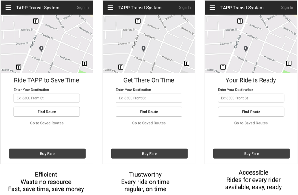
By creating versions of the content that align to different product principles, each of which are a part of the product’s brand, we’re exercising the content. It becomes capable of lifting more weight, more capable of meeting its purpose, when we have a clear articulation of that purpose and how we intend to meet it--and that’s what the voice chart is for.
For any set of text, when you have done this iterative process, you will have a broader range of options to choose from. The more very different, very good options you can share with your team, the more you will change the conversation from “fix the words” to “let’s find and test the best options.” Then it’s time for decision making, and sometimes, to break ties between good options.
When you have created several good options for the text, it’s less important which text is chosen, and more important that the text will do its job. Ideally, you have multiple good options that can be tested against each other to determine the difference (if any) in their effectiveness. But sometimes that’s not possible, practical, or desirable.
If it’s just about the words, then the person responsible for the words needs to make the call--and there’s no easy answer. The good news is that they’re all great options, so they will all work. The tougher news is that the experience needs to be considered as a whole, and the emphasis of different principles should be balanced across that experience.
When there are disagreements about which option is truly best, tie-breaking will come down to how your organization makes decisions. There are three common methods I’ve seen in teams and organizations: consensus, autonomous decisions, and hierarchical decisions. How to influence or make those decisions, using the voice chart as a tool, is explained below.
Consensus decisions: When an organization has a preference for driving consensus, you can create opportunities to make the case for the best option or options available. Frame that argument by illustrating the problems to be solved: the immediate business need, the customer experience, and the broader business objectives. Use the voice chart to remind the group about the broader need of the business to build the brand’s relationship with the customer.
Autonomous decisions: When an organization prefers for independent, responsible work, it may be all up to you! In my experience, this feels fun and powerful for a moment, and then immediately starts to feel like a heavy, important responsibility. When it’s all up to you, seek feedback from others, and recognize that this is where the voice chart is most helpful. Use the chart as your own personal checklist: if it’s good against the chart, it’s good for voice. Does the text include the right ideas, is it phrased according to the pre-defined syntax? If you have more than one option that’s good for voice, and good for usability, what a wonderful problem to have.
Hierarchical or autocratic decisions: Many organizations prefer the opinions of the people who hold the most power in the organization. The people higher in the hierarchy are the designated decision makers, regardless of who holds specific knowledge or expertise. Those designated decision makers want to make the best possible choice, both for the business and the team, so will seek information from their networks. By informing those networks in advance about the benefits and risks of the options, the decision maker can have more confidence in their alignment with the experts.
If the decision comes down to an option preferred by a team member, but isn’t aligned to the voice, then the voice chart itself can serve as a tie-breaker. Because you did the work to have the voice chart ratified, it holds the same authority as the highest-level person who signed off on it. For example, the team doesn’t need to argue a point if it’s written into a document that was signed off by the CEO.
The voice of a product or experience is made up of many choices in the text. It starts with the ideas we choose to include or exclude, even if those words don’t have a detectable difference on the “doing” at hand. It continues with the words we choose, how many we use, how we organize them, and how we use punctuation and capitalization.
When we create the voice of an experience with intention, we can wield language as a power tool, making it align the every word to the goals of the organization and the customer. But it’s not a one-person tool: Creating the voice chart is work that will take time and investment from a broad set of stakeholders.
Even if a content strategist or UX writer is certain they could create the voice chart in isolation, they should resist the temptation. The experience will reflect the people who make it, so we can create greater and more scalable future success by shepherding the team through the process of defining how the product principles affect the voice. To get people speaking in the new voice, those people will need to consider it, commit to it, and practice it.
The minimum team to establish the product voice will include representatives from marketing, product, leadership, support, and design. The exact makeup of any one partner group varies based on that organization’s culture. The extent to which a person supports creating the voice chart will influence the extent to which they support using it, so it’s important to get investment and involvement from the highest levels of the organization.
When the team has participated in creating the voice chart, and then uses it to build and improve the experience, the experience can truly sing. It will be better at creating the feelings that the people who use it are looking for, and better at creating the business success that the organization needs.
1 At the time of publication, these apps only exist in this book. Any resemblance to existing apps is unintentional.
2 https://www.safaribooksonline.com/library/view/nicely-said-writing/9780133818444/
“We need to hire someone to fix the words!” I have heard this phrase from multiple people on teams I’ve worked on, and UX leaders I’ve talked with. In each case, the person can point to the places in the experience where the words are “broken.” These people have recognized that fixing the words would help their organization or their customers advance in some important way.
In each case I have seen, there is enough “fixing” to be done to keep a person busy for years, but fixing the words will never be enough. Consider this metaphor: An experience with broken words is a house with broken walls. Fix the words as you would repair the walls.
If there’s only one broken wall, and it was built robustly, and the hole doesn’t affect the electrical, plumbing, or architectural support the building needs, then it can be fixed cheaply. The only problem might be choosing materials and wall coverings that match.
But when multiple walls are broken, or the breaks go through electrical, plumbing, or supporting timbers, then words can’t fix the hole by themselves. We’ll need to apply some engineering--in this case, content strategy--to fix the walls and support the building.
As an added benefit: Fixing those walls will make the whole building stronger.
When an experience has already been built with consistent terminology, voice, and information architecture, and ways to find, maintain, internationalize, and update its content, then all we would need to do is fix the words. When those things haven’t been considered, then we will need a strategic approach to fix the underlying experience.
In this chapter, I distill the 30/60/90-day plan I’ve used in three teams, at three companies. Each time, the team brought me in because they realized they (1) had a problem with words and (2) knew that they didn’t know how to fix it.
The actual number of days is an estimate, not a rule. The times have been pretty accurate for me in teams of roughly 350, 150, and 50 people. These three phases should be done thoroughly, but quickly--and definitely not perfectly. Their purpose is to fix the words; your method will create a basis for collaboration and iteration that makes the whole experience better.
The first 30 days is all about learning the experience, the people who will use it, and the team of people who build it. To be successful, I’ll need to know what’s important to each of them. At the same time, I need to build the team’s confidence that the time, energy, and money they spend on content will pay off.
My first task is to find a couple of key people to get the widest possible perspective on the organization. Those two or three people have a couple of key characteristics: they have broad knowledge of the organization, and they know why the organization decided to “fix the words.” In the best case scenario, those two or three people have different points of view from each other.
I ask these key people, in one-on-one, face-to-face meetings: Who is on the team? That is, who will affect what a person might encounter about the experience we’re making? I write down names from marketing, design, engineering, product owners, program managers, support agents, forum moderators, trainers, attorneys, and executives. I try to draw the organization, and ask these key contacts to correct my drawing.
Then I request half-hour meetings with each of those 10 to 20 people I’ve just found out about. In my invitation, I write something like, “Hi, I’m the new content person on product X. Your name came up as a person who’s important to the product and team, and I’m hoping to learn more from you.” I choose a time that’s likely to be convenient for them, and make sure I have enough time in my calendar to consolidate learnings between meetings.
To prepare for the meetings, I make a mostly-empty document, whether that’s a slide deck or text document. As shown for TAPP in Figure 7.1, I use headings to create structure, and fill in the information I know so far. The document is intentionally rough and unpretty, to make it clear that I’m spending time learning the information, not “polishing” the presentation. It’s also shareable, and I make the link or document available to the people I meet with.
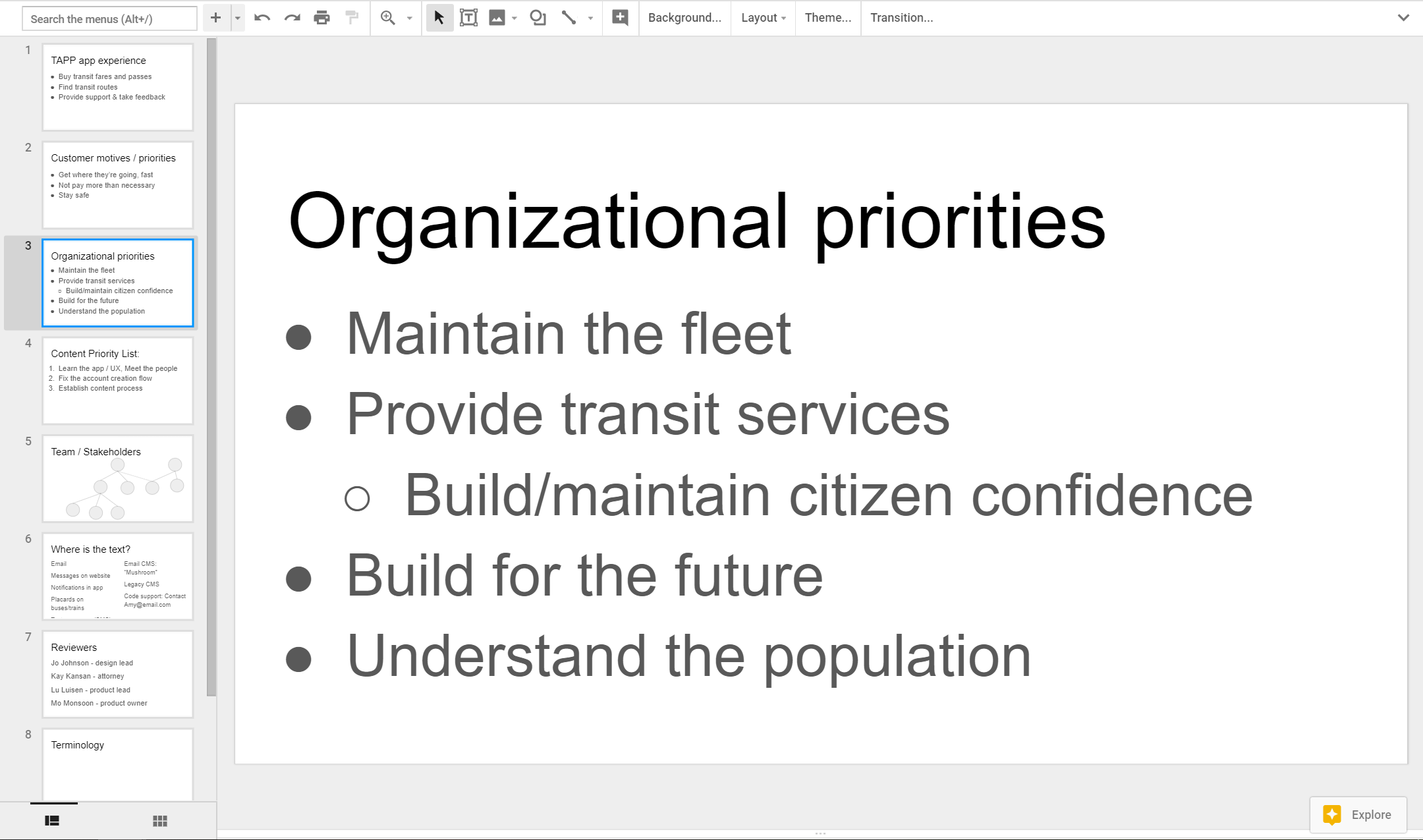
This first document, named “Content Strategy Notes” contains the following sections:
Definition of the experience
Customer motives
Organizational priorities
Priorities for content strategy
Team/Stakeholders
List of existing content
Reviewers
Terminology
Before the meetings, I add the information I think I know, in the briefest, most scannable form. Where I don’t know anything yet, I leave the slide or section empty. By doing so, I communicate (1) what I want to know, (2) that I know that I don’t know it yet, and (3) that sharing these things will be valuable to me. Then, I’m prepared to not only take notes in the meetings, but to organize and give context to the information I’m getting.
During the meeting, the important thing is to start to build the working relationship with the person I’m meeting with. To do that, and also to gain more information, we discuss the experience, customer, business, and priorities. If the other topics come up, I listen, take notes, and move on.
Example questions I ask:
To you, what’s the most important part of the experience?
To you, who are the customers? For an enterprise product, are they the people who buy it, or the people who use it? If it came down to one over the other, who do we prioritize?
How do these people solve the problem right now? How is that experience different?
What’s important to them? What motivates them? What are their priorities, their desires? Do we know what they like or dislike?
Among the people making and supporting the product, who will be an ally in making a great experience? What are their motivations, hopes, desires for it?
In the organization or industry, is there anything working against us? Is there anything working in our favor?
To you, what’s the most important thing I can work on?
Where are the words broken, or where can the words help the most?
As I listen and learn, I present the document and take notes at the same time, as much as possible. That way, I can show in real-time that I’m adding that person’s priorities to my priority list, and adding their information to my understanding. If what they say is already represented, I ask them to check and correct me.
Between meetings, I consolidate what I’ve learned. Note taking can get very messy! Sometimes I add notes as text in line, sometimes in comments. Sometimes, we use a whiteboard or paper, so I take pictures of those to add its content to the Content Strategy Notes.
One of the most important pieces of knowledge to develop is the list of existing content. In many cases, if a team has been working without a content professional, nobody actually knows what all of the content is. So when a new source or repository of text is mentioned, whether it is text in the UX, emails, notifications, websites, repositories of help documents, or canned responses, I add it to my Content Strategy Notes. Any content that affects the customer doing what they’re trying to do is something I should be aware of--even if I never work on those pieces of content.
Similarly, my ears perk up whenever I hear words used with special or unusual meanings. I add those to my document, as a new, baby terminology list inside the Content Strategy Notes. Having a list of terms, and my attempts at definitions of those terms, helps me ask the team to check and correct my understanding.
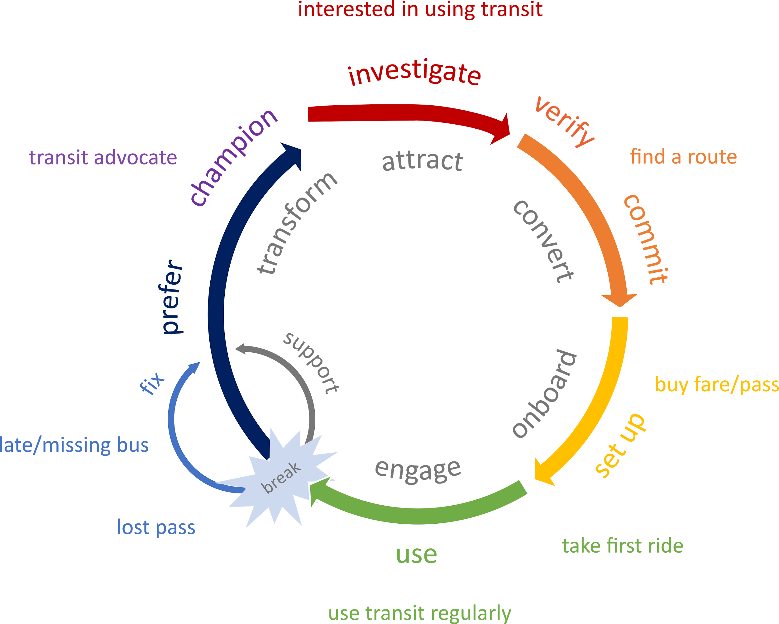
As my understanding of the experience starts to mature, I try to draw the lifecycle of the experience, like in Figure 7.2. This should show the journey of the customer through a cycle of using and staying with the experience. I adjust the length of sections to reflect the reality of this product, this organization, and the people who will buy and/or use this experience, at this moment in time.
When I have the experience drawn, I add it to my Content Strategy Notes. I use the diagram to ask members of the team where they think the experience isn’t working. I also use it to explain what I’m there to do: I will be making the content that will help spin the wheel, for the business and for the customer.
By the end of the second week, if not earlier, I start to get tactical requests: Can you rewrite this email? What should go in this error message? I start these first writing tasks in parallel to my learning about the end-to-end business and experience, because the strategy will only work if the writing can get into the experience.
These first writing tasks are a great testing ground for the ideas percolating in my brain about who the customer is, what our purpose is, and how the customer and organization priorities could be expressed in the UX. This is also my opportunity to show how I work.
I draft text in the design. This might be my first time working in a designer’s file, or with a copy of that file. More likely, I have a screenshot of bad text on a screen, which I will hack to show different text. The person requesting the text may expect nothing more than an email or chat message with the text to use, but I will demonstrate that UX content should always be reviewed as part of the design, the way the customer will see it.
I look for existing resources about voice or tone, and list them in my notes. These could be brand guidelines, voice charts, principles, or they may not exist at all. I use what already exists to inform the options I write for the new, requested content.
I use what I know so far to write at least three good options for the content. I make the options as different from each other as possible to show the power of what we can do with words. I make them as effective as I can to meet the purpose the customer has for that moment, and the purpose the business has for that moment.
To the person who requested the text, I explain the reasons that any one of the three options might be the right choice. In general, I learn more about the problem at this time, and need to draft more options! This revising is a normal part of the process, and it lets me understand the experience and the business at a practical, hands-on level.
When we agree on one or more of the text options, I ask: Who else should be reviewing this? I suggest some names I learned from my interviews, and use the names they recommend. I send my first requests for review, listing my recommendation first, and one or two alternates, including the reasoning.
At the end of these first 30 days, I’ve talked to most of the right people, I’m in most of the right meetings and internal communication channels, like group emails and chat groups, and I’ve drafted my first text.
My Content Strategy Notes, the document I started at the beginning, contains at least the following:
A prioritized list of tactical content production or improvement tasks
Description(s) of customer and/or user motivations and priorities that my partners agree with
Description of the organization’s priorities and constraints
Beginnings of lists: channels, terminology, content reviewers
Links or images of first, tactical content work
I know I’m ready for Phase 2 when I have built new relationships with my team, and have equipped myself with the information contained in the Content Strategy Notes.
In this second phase of work, half of my time is spent chipping away at urgent, “on fire” work. Doing the “on fire” work helps provide a content development platform to test, practice, and create the foundational pieces that will help the work go better and faster in the future. It helps me build my understanding of the team, the experience, and the people who will use the experience. Just as important, it helps me build trust with the team: They say it’s broken, so I’ll fix it.
As much as possible during this second phase, I delay effort on larger, systemic changes. The text I write in this second month is unlikely to be the best writing I’ll do for the experience. It won’t be consistent, because there’s no consistency defined. It won’t be in the ideal voice, because voice isn’t defined. To do good work on systemic changes, that work must be categorized and prioritized against the strategy and against the development schedule to avoid randomizing the team and fracturing my own attention.
Right now, before those systemic changes begin, is the time to measure the baseline of how the UX content is meeting customer and business needs. If the team can’t tell where in the experience people drop out, or where they fail to engage, or where they make the decision to buy or commit, now is the moment to specify and advocate for the measurements, research, or instrumentation necessary to notice a change.
Even without automatic instrumentation, this is the time to examine the “broken walls” in the experience. I try to use the experience myself, recording the experience or taking screenshots as I go. I consume the usability research already conducted, if it exists. Then I apply heuristic measures to the existing content.
I make initial reports on those experiences--the baselines I’ll seek to improve and report on again, in the future. The report includes what we know about customer behavior, sentiment, and a scorecard of content usability based on the heuristics, for that particular part of the experience. These initial reports indicate what’s working, what isn’t working well yet, and which work I recommend prioritizing.
At first, I share the report informally with members of the team most directly involved with creating the experience. It’s a report that outlines problems in what they already built, so I don’t share too widely, nor with too much fanfare. Later, after the experience is improved, I’ll use the report as a baseline to measure improvement from.
As I handle these “fires,” the other half of my time is spent setting up the foundational pieces so that I can work and collaborate faster and more effectively. I need to set up tools for content creation, sharing, and organization, code environments, partnerships and processes that integrate with the team, and to track, manage, and prioritize the work to be done.
I ended the first 30 days with a basic sketch of content work to be done, and work requests will start to flood in. Some requests are for single pieces of text, and other requests encompass hundreds or thousands of individual items: text through an entire experience, error messages, articles and videos, notifications, and more.
On any given day, UX writers create and review content with designers, researchers, executives, support agents, attorneys, and in code, on multiple projects. At a minimum, the tracking system, whether it is a ticket or bug tracking system like Team Foundation Studio or Jira, or a simple spreadsheet, should serve as a central place to gather and prioritize tasks, and include basic information. That information should include the task’s deadline, who asked for it, who’s responsible for it, and the locations of any related files. By using a tracking system, I will keep myself and my team (when there is a team) afloat on the flood of work to be done.
Work tracking also shows the scope and shape of the whole content picture. I can see where most of the work is concentrated. By comparing the work to the broader pictures of the organization and the experiences, I can see which parts of the organization I haven’t engaged enough with, and which parts of the experience I haven’t examined.
As this work continues, I uncover more repositories of content. I request access to the content and meet the people responsible for it. I build on the list I began in the first 30 days, adding the file systems, code repositories, web pages, and content management systems. As I continue to build the content strategy, it will be helpful to be able to illustrate the complexity of the content ecosystem.
Knowing the work to be done gives me the scope of the battle, but doesn’t help me fight it. In these second 30 days, I need to have tool-chain conversations with engineering, design, and product teams to hammer out the process. The first (few) projects from the first 30 days can help set the context: Did that delivery method work for them? Do they have any feedback? What’s the best way to get that person’s input?
I want to listen to what people expect and need from me, and what tools they expect us to use together. I want to steer the work toward a repeatable process, so that not only is my work easier, but all of my stakeholders know what they can expect from me. I also want to make the simplest possible process, because optimizing too early will make the processes hard to change.
Continuing my Content Strategy Notes document from the first 30 days, I draw a practical, basic process for a content workflow (Figure 7.3):
Content requested
Content draft
Give to engineer for coding
Content support as needed
Design review
Code review
Release process
Content released!
Figure 7.3 A basic process for UX content, from request, through drafting, review, coding, code review, and release.
The process starts with a content request: this could be a change I request, or a change someone else has asked for. The content is drafted, and goes through a drafting and design review process. When it passes the design review, it is given to an engineer--usually with a bug or other kind of work item opened in a ticketing system used to track engineering work.
The engineer gets additional content support as needed, for example, when the engineer discovers more error messages or updates to related content are needed. When the code is complete, it gets reviewed with the engineering team’s process and also for a last check on the content before the experience is released.
I get feedback from product owners, marketing and business leaders about the process. I ask where it should change to best fit with their system. I show them when and how to involve me (making requests), and when and how I’ll involve them (design and code review.) I ask who I should put on the review lists, and suggest people I can contact both regularly and as needed, to keep engineering unblocked. I add those people to the list of reviewers I started in the first 30 days. I find out the basics of how I should open work items for developers, and how to connect to their code review system.
Sometimes, a key person in the organization will say “I want to review every piece of text.” In my experience, they have thoroughly meant it--and they also don’t want to sit down and walk through the code, every time there is a change. What people want is confidence that the text won’t increase the organization’s liability. They want to be sure that the strings accurately reflect the company’s brand. They want to have the gut feeling that the strings “feel right” in the product. By drawing the content process, I have something to point to and say “Right here, let’s look at the strings together. You give me feedback, and I’ll make it right.”
The process helps make clear who has responsibility for the content. The best working relationships I have experienced are the ones in which the product owner has responsibility for what the experience is supposed to do, the designer has responsibility for the interaction and appearance of the experience, and the UX writer has responsibility for the content. We have to partner closely together, and we all need collaboration with researchers, engineers, and other stakeholders.
To do great work, I need to think systematically about the deep connective tissue of the content: the core terminology, the voice that permeates the conversations the product or service has with the customer, and the tone that the product has at specific moments in the experience, responding to the expected emotional state of the customer.
But not only do I need these fundamentals of content design, I need my teams to understand the systemic importance of content. Documenting the content strategy helps me demonstrate how it is useful to the organization, but that documentation can be its own uphill battle. Not only is it difficult, technical work, it takes time and energy.
I make a point of repeating: The purpose of documenting internal strategy is to make future tactical decisions easier, faster, and more consistently. If the strategy is not being used, it’s useless. So here’s what I use it for:
Terminology creates consistency and reduces time spent rehashing choices about how a particular concept is represented in the experience.
Voice attributes guide the direction of content creation and iterations, and tie-break between good text options.
The list of reviewers includes and excludes the right people in the content process strategically, instead of creating tactical political complications.
Documented organizational priorities and customer motivations focus the content by defining the core UX problem that it helps to solve.
These are living documents. Pieces were begun in the first 30 days, and need to be further developed. Throughout their existence, when they are wrong, they need to be updated. They should be reviewed on a regular cadence (at least annually), and updated when there are organizational changes.
Here’s how I know I’m at the end of the second phase:
I’ve passed at least these milestones:
New content created
Tracking system and process established
Poorly-performing content updated
Legal sign-off on a piece of liability-sensitive text
Marketing sign-off on a piece of brand-sensitive text
At least these indicators of trust have appeared:
Leaders including me as the responsible party for in-product text
Casual requests from non-managers to work on individual strings
Active inclusion from product and design in early design thinking
About 75% of this strategic work is complete:
A tracking system for content tasks
Alignment about customer motivations and business priorities
Knowledge of the existing content, and how to access it
Terminology list
Voice and tone map
Another indicator of the end of Phase 2 is a sense that I could be doing slightly more. There is nothing routine, static, or conventional about the content work done in phases 1 or 2, but now, the urgent, distracting, tactical work is complete. Just as importantly, the important foundations are laid. The UX content is ready to have an enormous impact on the quality and effectiveness of the experience to meet both business and customer goals. It is time for Phase 3.
“A good plan, violently executed now, is better than a perfect plan next week.” – General George S. Patton.
The strategy is nearly done, which is as good as a strategy ever gets. It is time to present the strategy as a whole for the first time. The outcome of the presentation is to cement the solid foundation built with my team and my leadership: They should see that the content strategy is created considerately, together, and that the work has a purpose. By signing off on the strategy, they validate and support the work to be done.
Communication about the work is a critical part of the work, and might be the hardest part to get right. The presentation includes a summary of all the parts created to date: the tracking process and list of current tasks, the content landscape, alignment on customer and business priorities, terminology list, and voice chart. The summary is solid enough that the important (or controversial) ideas are covered, but unpolished enough to show that I haven’t been wasting time polishing internal documents.
Ideally, everybody at the presentation has participated in the process of creating the strategy. They get to see the fruition of their own work and advice, and as a result, the fruition of their decision to hire me. There will be feedback either during or after the presentation, and that’s good too: it means people care and are invested in the content strategy working.
I seek feedback during and after the presentation, because it provides the corrections necessary now to be successful later. If the feedback is that the strategy is wrong, I thank them for their perspective. If they’re wrong, it may be simply that the presentation of the work didn’t scratch their itch. If they’re right, it’s fantastic that I’ve gotten correction so early. It’s only the second (or third) month on the job, so it’s the best time to make adjustments.
During and after the presentation, I’m deeply engaged in tracked, prioritized work. I am following the process defined in phase 2 to respond to requests and to make requests for content changes. The excitement of the ramp-up phase is winding down, but there will continue to be plenty of strategic and tactical work to be done. I’ll apply, and sometimes revisit and tweak the strategy. I’ll have more time and energy to apply best practices to new and newly-updated work, and I’ll be a consistent advocate for the team to consider their customers every time they consider the words.
Phase 3, at roughly 90 days, is over when the process of creating content for the experience is healthy enough that I can start to imagine broadening the scope of what content strategy can do for the organization. Keeping up with the wider world of how content is used is an essential benefit I bring to the experience and to my team. I check in on trends in the field, and on the rest of the content being served to customers about my product. I look to strengthen connections to be made with marketing, operations, and knowledge management. I look for opportunities in the industry, like content-bots using machine learning to pre-write content. I seek out new research, like best practices about titles, labels, accessibility, and inclusion.
To create content that aligns to the business and customer purpose, we start by understanding not only those purposes, but who our teammates are in this adventure, what work they have done, and which work they didn’t know to do yet. In phase 2, we fix urgent problems while building the scaffolding and framing that will help us organize and show the effect of future work. Phase 3 is the beginning of work that uses the power of content tools from the beginning, to be more effective than ever before.
There are a lot of content accomplishments in this 30/60/90 day plan, but the work that pays the most dividends comes from doing the work visibly, in partnerships with the team. In the process of doing the work, the text in the experience goes from being invisible, and “a tax” to being visible and valued. By making the content strategy visible in presentations of voice and terminology, the team and executives see that you have unlocked a new power tool to meet business and customer intents. By making the content tasks visible as tickets or bugs in the tracking system, the team sees how content can support and advance the goals of engineering, design, and business, while it supports the customer.
This plan has helped me create the basis for collaborative, iterative content creation. With these tools, I have had the privilege of helping people do what they came to the experience to do, and meet the goals of the business. And isn’t that the whole point?
Drive Engagement, Conversion, and Retention with Every Word
Copyright © 2019 Torrey Podmajerski. All rights reserved.
Printed in the United States of America.
Published by O’Reilly Media, Inc. , 1005 Gravenstein Highway North, Sebastopol, CA 95472.
O’Reilly books may be purchased for educational, business, or sales promotional use. Online editions are also available for most titles ( http://oreilly.com/safari ). For more information, contact our corporate/institutional sales department: 800-998-9938 or corporate@oreilly.com .
See http://oreilly.com/catalog/errata.csp?isbn=0636920235583 for release details.
The O’Reilly logo is a registered trademark of O’Reilly Media, Inc. Strategic Writing for UX, the cover image, and related trade dress are trademarks of O’Reilly Media, Inc.
The views expressed in this work are those of the author(s), and do not represent the publisher’s views. While the publisher and the author(s) have used good faith efforts to ensure that the information and instructions contained in this work are accurate, the publisher and the author(s) disclaim all responsibility for errors or omissions, including without limitation responsibility for damages resulting from the use of or reliance on this work. Use of the information and instructions contained in this work is at your own risk. If any code samples or other technology this work contains or describes is subject to open source licenses or the intellectual property rights of others, it is your responsibility to ensure that your use thereof complies with such licenses and/or rights.
063-6-920-23558-3
[FILL IN]
“They may forget what you said, but they will never forget how you made them feel.” - Attributed to Carl Buehner, Maya Angelou, and others.
UX content is all about supporting the person who uses an experience to do what they came to the experience to do. That is, when we create content for doing, we don’t want the person using the experience to spend any energy noticing what we said or how we said it. But humans will feel something from the experience; it will leave an impression. If we don’t design that feeling, and how the content supports that feeling, the person is left to feel affection or repulsion, engendering loyalty or disgust, or any feeling in between.
As the business or organization making the experience, we do want them to remember how it makes them feel. Voice is the content’s part of the difference that helps to create loyal customers, even when the “doing” is similar to a competitor.
Even informal descriptions of voice will help a team create a cohesive voice in the content. For example, the voice for the Xbox 360 console in 2010 was “The console speaks like we’re sitting beside them, helping them play.” The “them” was well understood: Console gaming enthusiasts, who just wanted to play their game. How we sat beside them could be further defined: “We’re not the guy that takes the controller away and does it himself,” which could inspire disgust, disappointment, or frustration, ‘but the one who will tell you exactly what to do, to make it easy for you,” to inspire feelings of camaraderie, achievement, and belonging. Because the gamer and role of the person on the sofa was so familiar to the people making the product, the definition and documentation of voice could be simple.
As Xbox started to understand its broader audience, we adapted the voice. No matter who was playing, or if they were using the console to watch TV or listen to music, they should have a positive experience. We defined the voice as “Clean, casual, and keep ‘em playing.” We focused the feeling on playing, achievement, and having fun.
For the change in the Xbox voice, we put up posters in the Xbox buildings to spread the word. We created a special email address for anybody, from operations to development, to work with the dedicated UX writing team whenever they were using words. The writing team worked closely with each other, our design teams, and our single editor. We used design critiques, hallway brainstorming sessions, and peer reviews of strings to stay aligned.
But these informal descriptions of voice are only as strong as the consistent understanding of that voice. Getting all of the team to understand that description is a major challenge, because teams can work in isolation from each other, and humans have a different “feeling” for the words.
Where there is no writing team, and no editor, the process of developing and aligning the text to the voice has to be managed across the entire organization. Even if responsibility is centered in a single person, as it was for me at OfferUp, there won’t be enough of their time to go around; text will sometimes have to be created without that person. To make the voice consistent in a way that would scale across the organization, supporting multiple teams, I created the voice chart as a way to define the voice we wanted.
In this chapter, I’ll introduce the voice chart and its six components: concepts, vocabulary, verbosity, syntax, punctuation, and capitalization. To show how that system works, and for the subsequent examples in this book, I’ve created three example voice charts for three made-up apps from made-up organizations.
There is a maxim in fiction writing: each character is should be recognizable from their dialog: how they speak and what they talk about. It’s also a good goal for a product’s voice that the people using an experience should be able to recognize it or its brand from any piece of text: any title, button, or message. That way, the organization can feel confident that when a person sees a message or screen from them, the person can immediately recognize it, know it’s legitimate, and trust that they can use it.
To demonstrate this recognizability of voice, I’ve designed 3 different mock apps.1 I use these apps throughout this book to show UX text principles, methods, and tools.
The Sturgeon Club app, an exclusive club membership app with updates about club events, reservations for facility use, dues paying, menu, and calendar.
‘appee, a casual social game with daily thematic challenges for photo-taking and uploads, with prizes, comment threads, rating, and purchases available.
TAPP, a regional bus service app with updates per route and region. Look up info, pay fares, manage account, and access city and regional services.
I’ve chosen these three example apps because they have important similarities and differences. To make the examples easy to understand, none of the experiences require professional skills or understanding. Similarly, the motivations of the organizations and the people using the experiences can be easily explained. Each experience involves exchange of money and information, and for each app, customer purchases, engagement, and retention are important metrics for future planning.
These three different experiences were chosen for their differences, too. The Sturgeon Club and TAPP depend on the locations and utilities in the physical world, but ‘appee is not limited or grounded in that way. TAPP is a public, government-run service, required to be accessible and include the entire population, while The Sturgeon Club and ‘appee need only serve the people who choose to participate. ‘appee wants to expand into global markets, TAPP serves a local, but multilingual market, and The Sturgeon Club operates in a single region and language. This breadth of usage and requirement will affect the language chosen for each app. (Table 4.1)
| The Sturgeon Club | ‘appee | TAPP | |
| Exclusive vs. Inclusive | Exclusively for club members | Available to people who want it, but nobody needs it | Intended for every person who uses regional public transit |
| Physical vs. Digital | App is an interface for physical location | Organization’s location is unimportant | App is an interface for physical utilities |
| International vs. Local | Regional, single language | International | Regional, multiple languages |
Table 4.1 Important differences among the example experiences in this book.
In the examples from these apps throughout this book, my goal is to make the text different enough that even if you didn’t see it in context, you could tell which app it comes from. The text in those examples depends on the decisions made in the voice charts created in the rest of this chapter. Let’s begin.
The voice chart below (Table 4.2) will hold a set of decision-making rules and creative guidance to make the text align more closely to the needs of the business and the person using the experience. When the text being drafted isn’t good enough yet, it helps people identify what might make it better. When there are multiple good options for the text, the voice chart will make deciding between those good options easier. I’ll explain how to use it after we build it.
The fundamental structure of the voice chart is to hold each product principle in a column. Then, for each principle, each of the six aspects of voice is defined in a different row: the concepts, vocabulary, verbosity, syntax, punctuation, and capitalization.
| Blank voice chart | |||
| Principles | Product principle 1 | Product principle 2 | Product principle 3 |
| Concepts | |||
| Vocabulary | |||
| Verbosity | |||
| Syntax | |||
| Punctuation | |||
| Capitalization | |||
Table 4.2 This blank voice chart has room for three voice principle columns, and space to define concepts, vocabulary, verbosity, syntax, punctuation and capitalization according to each.
The definitions in one column are aligned to one principle. They don’t have to be the same as the definitions in another column. It’s even OK, and expected, that two columns may contradict or complement each other, in the same row.
This variation is the difference between voice and tone: Voice is the consistent, recognizable choices of language across an entire experience. Tone is the variability in voice from one part of the experience to another. For example, when I overhear my mother answer a phone call, I can quickly tell by her tone whether the phone call is from a stranger or a loved one--but I am never confused that it is my mother’s voice.
By encapsulating these variations together in the same document, the writer is equipped to intentionally include and vary the tone to align the overall voice with the experience principles. In the rest of this chapter, we’ll fill the voice chart. We’ll start from the principles, then tackle the other aspects of voice as separate, creative decisions: the concepts, vocabulary, verbosity, syntax, punctuation, and capitalization that align to each experience principle.
The foundation of the voice chart are the experience principles: the terms that define what the experience is trying to be to its customers. The voice will help convey that experience in the ideas it conveys, the words it chooses, the punctuation it uses or omits--all of the aspects of language. The purpose of the voice chart is to make the text convey those principles deliberately, consistently, and scalably--so that anybody in the organization can work on them as necessary.
If your organization doesn’t know what the experience is trying to be to the people who use it, work can’t begin to define the voice. While you can increase clarity and usability of the text, and thereby “fix” some text problems, the experience will also inspire feeling and be assigned a personality. The purpose of the principles is to make sure the organization has determined, strategically, what that feeling and personality should be.
To be clear, identifying a product or organization’s principles is not usually the job of the content strategist. If your organization has marketing or advertising support, they may already have defined these principles. When I have had to facilitate the articulation of these principles, it has helped me to keep in mind that my goal, as the content strategist, is not to “own” the principles, but to align the content strategy to them after they are ratified.
When the organization hasn’t defined its principles, I recommend interviewing people inside your organization. In Nicely Said2, Nicole Fenton and Kate Kiefer Lee outline a process of interviewing people inside the organization to determine the goals of the brand, the organization, and the experience.
Use the results of interviews to draft the most important principles that emerge, then ratify those with your stakeholders. As the process continues, the articulation of the principles will change considerably--and that’s fine. The process of articulating the product principles can become political. When I draft these principles, I expect that the first, and even second and third drafts will end up on the trash heap. The important thing is that the conversations continue, and these early drafts help the stakeholders get to the organization’s goal.
For the examples in this book, I’ve invented three principles for each organization. Imagine that each organization has developed its own set of principles to meet its business or civic purposes, and its purpose in the lives of the people who use it. Let’s look at each one.
Sturgeon Club
The purpose of the Sturgeon Club, as defined by its Board, is to provide a private, elegant venue for its membership to socialize and recreate. To bring that purpose to life, the Club’s executive and operations leaders have determined that the physical building, the internal spaces, and each experience the members have should be imbued with elegance, build camaraderie, and connect members to the club’s traditions.
Table 4.3 shows the top row of the voice chart for The Sturgeon Club, which uses each of those three main principles as column headings: Imbued with elegance, Build camaraderie, and Connect to tradition.
| The Sturgeon Club Voice Chart | Imbued with elegance | Build camaraderie | Connect to tradition |
Table 4.3 The Sturgeon Club product principles, which make up the top row of its voice chart.
‘appee
The purpose of ‘appee is to create an entertaining, engaging experience for its players while generating content for the platform, viewing advertising, and buying merchandise. Instead of competing with “serious” art experiences, it is trying a strategy of playfulness, seeking to provide surprising entertainment and moments of insight.
The ‘appee voice chart in Table 4.4 shows those three strategic principles as the headings for its voice chart columns: Playful, Insightful, and Surprising.
| ‘appee Voice Chart | Playful | Insightful | Surprising |
Table 4.4 ‘appee product principles, which make up the top row of its voice chart.
TAPP
The purpose of the TAPP app is an extension of the purpose of the regional transit system itself. Move people around the region, and therefore through the online experience, in a way the public finds efficient, trustworthy, and accessible. The TAPP voice chart (Table 4.5) uses those principles as the headings for the columns: Efficient, Trustworthy, and Accessible.
| TAPP Voice Chart | Efficient | Trustworthy | Accessible |
Table 4.5 TAPP product principles, which make up the top row of its voice chart.
The concepts are the ideas or topics that are intentionally mentioned in the experience. The voice chart helps us specify, in advance, those concepts that we think will support the product principles. The topics should reflect the role the organization wants the experience to have in the person’s life. They are the ideas the organization wants to emphasize at any open opportunity, even when they aren’t part of the task at hand.
That doesn’t mean that the experience endlessly discusses itself and its organizational concerns. Instead, when applicable, it includes the key ideas. Concepts also don’t specify the language to use; these are the ideas that should land regardless of slogans or campaigns.
The Sturgeon Club
The Sturgeon Club voice, for example, specifies to use the details about togetherness and belonging (Table 4.6). For example, instead of describing the formal event space as merely “Capacity of 124 people,” the experience could mention “Mingle with up to 124 members.”
| The Sturgeon Club Voice Chart | Imbued with elegance | Build camaraderie | Connect to tradition |
| Concepts | Details of finish, opulence; functional and ornamental | Togetherness, belonging, and discretion | Specific connections to club members, history, fame, and power |
Table 4.6 Concepts aligned to The Sturgeon Club product principles.
‘appee
Concepts included in ‘appee are to include surprising information, and small delights and coincidences (Table 4.7).
| ‘appee Voice Chart | Playful | Insightful | Surprising |
| Concepts | Small delights, avoiding grand successes; Frippery | Commonalities found especially at the intersection of ideas | Unpredictable; misdirection and difficulty can be fun |
Table 4.7 Concepts aligned to ‘appee product principles.
TAPP
The TAPP experience adds very few new concepts to the experience. If they are included, they are specific to supporting the operating principles: a lack of waste, rides happening on time, and the inclusion of every possible rider (Table 4.8).
| TAPP Voice Chart | Efficient | Trustworthy | Accessible |
| Concepts | Waste no resource | Every ride on time | Rides for every rider |
Table 4.8 Concepts aligned to TAPP product principles.
Where specific words can support a voice principle, or specific words can undermine a voice principle, use the Vocabulary row to specify them. If there aren’t specific words that help land the principle, this row can be omitted.
The Sturgeon Club
As shown in Table 4.9, The Sturgeon Club vocabulary serves to reinforce the social order. A member may have an appointment with staff, like a nutritionist or concierge. But members meet with each other. Generalities are to be avoided, and so is referring to someone as a “former member.”
| The Sturgeon Club Voice Chart | Imbued with elegance | Build camaraderie | Connect to tradition |
| Vocabulary | Avoid generalities (“very”,”really”, etc.) | secure, not safe meet with members appointment with staff |
member member emeritus, member (deceased), not former member |
Table 4.9 Vocabulary aligned to The Sturgeon Club product principles.
‘appee
Vocabulary isn’t the same kind of tool in ‘appee as it is in The Sturgeon Club. In Table 4.10, Playful and Surprising don’t specify any vocabulary to use or avoid. Even in the one place it does reference vocabulary, it is vague, but important: Use non-metaphoric language when defining insights, such as “Your Wednesday photos are your best photos.”
| ‘appee Voice Chart | Playful | Insightful | Surprising |
| Vocabulary | {not terminology specific} | Plain,non-metaphoric language to define the insight | {not terminology specific} |
Table 4.10 Vocabulary aligned to ‘appee product principles.
TAPP
In Table 4.11, the TAPP voice chart specifies words that could be used throughout the experience. Notably, the Accessible principle says to never use “disabled” or “invalid,” but encourages the use of available, easy, and ready. In practice, this means the team will avoid language that has been used to exclude people who use wheelchairs and other assistive devices, but instead include them by specifying what is and isn’t available, easy, or ready.
| TAPP Voice Chart | Efficient | Trustworthy | Accessible |
| Vocabulary | Fast, save time, save money | regular, on time | available, easy, ready Never use: disabled, invalid |
Table 4.11 Vocabulary aligned to TAPP product principles.
For strict usability, the text inside an experience should get out of people’s way. It isn’t there to be savored or read for pleasure, the text is there to keep them moving through the experience. But using few words where many are expected can block a person from moving forward as thoroughly as using too many words where few are expected. Screen size and reading format makes a difference, too: people are more willing to read on a desktop computer than on a TV screen.
To choose verbosity for voice, make sure you understand the expectations of the person using the experience, how they expect the experience to behave, and the general constraints you’ll have in the design. Then align the quantity and type of language to the support particular product principles.
The Sturgeon Club
The Sturgeon Club intentionally sets a measured pace. It is not afraid to take time to expand upon its own glory, so it will enhance descriptions with adjectives and adverbs, as seen in the Verbosity row of the voice chart (Table 4.12). The club also wants an air of formality, even where a more casual atmosphere is common, so it will use complete sentences (and therefore more words), even where short phrases are more common. However, there is a tension between setting a stately pace and wasting the members’ time: Members are there to build camaraderie with each other, not with the concierge, the staff, or the experience.
| The Sturgeon Club Voice Chart | Imbued with elegance | Build camaraderie | Connect to tradition |
| Verbosity | Enhance responses and descriptions with adjectives/adverbs | Be brief and begone; they aren’t here to talk to the concierge | Complete sentences even where phrases are more common |
Table 4.12 Verbosity aligned to The Sturgeon Club product principles.
‘appee
‘appee shows its playful side with its entry for Playful on the Verbosity row of its voice chart, in Table 4.13. As a quasi-game experience, ‘appee needs to introduce difficulty or challenge in the use of the app. One way it can do this is by using fewer words than strictly necessary to get its point across. This cell in the ‘appee voice chart is a good reminder that the Voice for any experience is used like a spice when cooking: too little and the food is unappetizing; too much, and the food is inedible. If the writer applied this piece of the voice too heavily, there would be no words in the experience at all!
| ‘appee Voice Chart | Playful | Insightful | Surprising |
| Verbosity | Fewer than strictly necessary | {not verbosity specific} | {not verbosity specific} |
Table 4.13 Verbosity aligned to ‘appee product principles.
TAPP
In table 4.14, the Verbosity row of the TAPP voice chart exhorts the team to avoid unnecessary adjectives or adverbs, except to ensure customer success, to be accurate, and to be unambiguous. As a public service, the TAPP voice aligns neatly with its utilitarian purpose.
| TAPP Voice Chart | Efficient | Trustworthy | Accessible |
| Verbosity | No adjectives or adverbs except to ensure customer success | Enough words to have accurate information | Enough words to have unambiguous information |
Table 4.14 Verbosity aligned to TAPP product principles.
Natural language gives us a rich variety of ways to construct and convey our ideas, but all of those ways don’t work in all experiences. To maximize usability, simple grammatical structures work best for most purposes. In English, that means simple subject-predicate sentences, or verb-object imperative directions, such as “The bus accepts correct change and transit passes” and “Add money to your transit pass.” For more specific examples, see the UX Text patterns in Chapter 5.
However, merely maximizing usability can result in a robotic, impersonal tone. By choosing the sentence structures and other syntax that support the product principles, you have an opportunity to define the right balance of usability and personality for the experience.
The Sturgeon Club
Once again, we see The Sturgeon Club use patterns in language to reinforce its culture, using the Syntax row of its voice chart (Table 4.15). To imbue with elegance, the experience should consider complex sentence structures. But to build camaraderie, the simple syntax is preferred when discussing people. Most importantly, the Club itself is spoken of in the syntax associated with formality: passive voice, past tense, and complex sentences.
| The Sturgeon Club Voice Chart | Imbued with elegance | Build camaraderie | Connect to tradition |
| Syntax | In descriptions of experience, prefer complex to simple or compound | When discussing people, prefer simple statements | When discussing the club, prefer passive voice, past tense, complex and compound sentences |
Table 4.15 Syntax aligned to The Sturgeon Club product principles.
‘appee
In contrast to The Sturgeon Club, ‘appee prefers using the present and future tense in its app. It rarely, if ever, uses complete sentences, as shown in the Syntax row of its voice chart (Table 4.16).
| ‘appee Voice Chart | Playful | Insightful | Surprising |
| Syntax | Present and future tense | {not syntax specific} | Phrases preferred |
Table 4.16 Syntax aligned to ‘appee product principles.
TAPP
TAPP continues its utilitarian style in the Syntax row of its voice chart (Table 4.17). It uses complete sentences to emphasize trustworthiness, but phrases are also acceptable, as long as they are all simple.
| TAPP Voice Chart | Efficient | Trustworthy | Accessible |
| Syntax | Simple sentences or phrases | Complete sentences | Simple sentences or phrases |
Table 4.17 Syntax aligned to TAPP product principles.
There is a strong argument to be made that punctuation and capitalization are part of the visual and typographic design of experience, and not the responsibility of the content strategist. Regardless of who owns those decisions in an organization, punctuation and capitalization continue to be among the chief complaints people make when they are dissatisfied with the text. One of the purposes of the voice chart is to force the discussions and record the result, so that future confusion or arguments can be avoided, and the experience can be made consistent.
The Sturgeon Club
In Table 4.18, The Sturgeon Club voice chart Capitalization row details how capitalization emphasizes relationships and roles within the club. It also emphasizes commas and eschews exclamation marks and tildes, aligned to elegance and tradition.
| The Sturgeon Club Voice Chart | Imbued with elegance | Build camaraderie | Connect to tradition |
| Punctuation | Serial commas, colon instead of m-dash, no tilde, and no exclamation mark. | {not punctuation specific} | Sentences include terminal punctuation. Titles do not. |
| Capitalization | Title case is used for titles, buttons, headings | Relationship roles (friend, wife, spouse, parent) are not capitalized | Member titles, roles, committee titles, names, and roles are initial-capitalized |
Table 4.18 Punctuation and capitalization aligned to The Sturgeon Club product principles.
‘appee
‘appee enjoys fringe punctuation, preferring to stretch into playfulness, away from tradition and formality with the use of emoji and interrobangs. Instead of using capitalization to signify importance, it indicates that capitalization should only be used for emphasis. ‘appee Punctuation and Capitalization rows are shown in Table 4.19.
| ‘appee Voice Chart | Playful | Insightful | Surprising |
| Punctuation | Avoid periods; use emoji, exclamations, interrobangs, question marks | Tilde instead of colon, semicolon, dash, or ellipsis | {not punctuation specific} |
| Capitalization | Use capitalization only for emphasis | Use sentence case | {not capitalization specific} |
Table 4.19 Punctuation and capitalization aligned to ‘appee product principles.
TAPP
With its Punctuation and Capitalization rows in its voice chart (Table 4.20), TAPP continues to emphasize its focus on clarity as the best route to efficiency, trustworthiness, and accessibility. TAPP uses commas and periods, and avoids semicolons, dashes, parenthentical remarks, and asking questions. Titles and buttons are immediately recognizable as members of a hierarchy because of their capitalization.
| TAPP Voice Chart | Efficient | Trustworthy | Accessible |
| Punctuation | Use periods, commas. Avoid question marks. Avoid terminal punctuation for instructions | Use periods, commas. Avoid question marks. Avoid terminal punctuation for instructions | Avoid semicolons, dashes, parenthetical remarks |
| Capitalization | Title-case titles, headings, buttons | Title-case titles, headings, buttons | Title-case titles, headings, buttons |
Table 4.20 Punctuation and capitalization aligned to TAPP product principles.
With all of the rows put together, the voice chart for each experience is already a formidable tool to keep the UX content focused on meeting customer and business goals. Each content decision, from the concepts that are included to the punctuation that ends (or doesn’t end) its phrases, can be informed and aligned to be in the same voice, no matter who is writing that content. Each complete voice chart is shown below: The Sturgeon Club voice chart (Table 4.21), the ‘appee voice chart (Table 4.22), and the TAPP voice chart (Table 4.23).
| The Sturgeon Club Voice Chart | Elegance | Camaraderie | Tradition |
| Concepts | Details of finish, opulence; functional and ornamental | Togetherness, belonging, and discretion | Specific connections to club members, history, fame, and power |
| Vocabulary | Avoid generalities (“very”,”really”, etc.) | secure, not safe meet with members appointment with staff |
member member emeritus, member (deceased), not former member |
| Verbosity | Enhance responses and descriptions with adjectives/adverbs | Be brief and begone; they aren’t here to talk to the concierge | Complete sentences even where phrases are more common |
| Syntax | In descriptions of experience, prefer complex to simple or compound | When discussing people, prefer simple statements | When discussing the club, prefer passive voice, past tense, complex and compound sentences |
| Punctuation | Serial commas, colon instead of m-dash, no tilde, and no exclamation mark. | {not punctuation specific} | Sentences include terminal punctuation. Titles do not. |
| Capitalization | Title case is used for titles, buttons, headings | Relationship roles (friend, wife, spouse, parent) are not capitalized | Member titles, roles, committee titles, names, and roles are initial-capitalized |
Table 4.21 The complete voice chart for The Sturgeon Club.
| ‘appee Voice Chart | Playful | Insightful | Surprising |
| Concepts | Small delights, avoiding grand successes; Frippery | Commonalities found especially at the intersection of ideas | Unpredictable; misdirection and difficulty can be fun |
| Vocabulary | {not terminology specific} | Plain,non-metaphoric language to define the insight | {not terminology specific} |
| Verbosity | Fewer than strictly necessary | {not verbosity specific} | {not verbosity specific} |
| Syntax | Present and future tense | Slogans over observations | Phrases preferred |
| Punctuation | Avoid periods; use emoji, exclamations, interrobangs, question marks | Tilde instead of colon, semicolon, dash, or ellipsis | {not punctuation specific} |
| Capitalization | Use capitalization only for emphasis | Use sentence case | {not capitalization specific} |
Table 4.22 The complete voice chart for ‘appee.
| TAPP Voice Chart | Efficient | Trustworthy | Accessible |
| Concepts | Waste no resource | Every ride on time | Rides for every rider |
| Vocabulary | Fast, save time, save money | regular, on time | available, easy, ready |
| Verbosity | No adjectives or adverbs except to ensure customer success | Enough words to have accurate information | Enough words to have unambiguous information |
| Syntax | Simple sentences or phrases | Complete sentences | Simple sentences or phrases |
| Punctuation | Use periods, commas. Avoid question marks. Avoid terminal punctuation for instructions | Use periods, commas. Avoid question marks. Avoid terminal punctuation for instructions | Avoid semicolons, dashes, parenthetical remarks |
| Capitalization | Title-case titles, headings, buttons | Title-case titles, headings, buttons | Title-case titles, headings, buttons |
Table 4.23 The complete voice chart for TAPP.
But to make the voice chart authoritative in the organization, it must be ratified, agreed-to by parties at the highest possible level in the organization. It needs their sponsorship and support as a useful tool, for the team to be aware of it and to take it seriously enough to realize its value in their own work.
To make the voice chart useful, plan the ceremony of a high-level sign off, in which you will walk decision-makers through the voice chart, piece by piece. Provide examples of content that can be made better by rewriting it for alignment. Show how you will use it to inform decisions, and how you will measure the effect on sentiment, engagement, or other metrics relevant to your organization (See Chapter 6 about Measuring UX Text.)
Plan a second meeting to present the voice chart to the team, and follow up by driving awareness in newsletters, email announcements, or other channels appropriate to the team’s culture. Ceremonies and unveilings are how organizations indicate their level of investment in an idea; to be effective as a decision making tool, the voice chart needs that investment to be visible.
And once the voice chart is complete, and visibly adopted by the organization, it’s time to use it as a tool to make decisions and make improvements.
Once it exists, and has been ratified and shared, the voice chart has three main roles: Training new content creators, designing new text, and tie-breaking.
One of the things a content creator needs to do when they join the team is to internalize the ideas, vocabulary, and syntax that the experience uses strategically. The voice chart gives them a structured reference to learn that voice the same way they’d learn any other heuristic.
Feedback from others is especially helpful to onboard new team members. Using the voice chart to ground that feedback can help them learn faster. For example, “Our voice is to use the simplest possible syntax. What would it look like if you applied that lens?” Or, “Could you add more about this idea, since it’s part of our voice to include that concept where appropriate?”
When designing new text, use the voice chart to iterate and ideate. Choose one of principles that applies to the moment in the experience, and draft the text to amplify that principle. Embed those ideas, introduce that vocabulary, add (or reduce) verbosity. Then, putting aside that option, repeat that drafting process with a second product principle. Rewrite the text to make that second product principle shine, leveraging those ideas, vocabulary, and more.
For example, the TAPP experience principles are Efficient, Trustworthy, and Accessible. The main screen of the TAPP experience includes a map that shows the person’s location, a search box to find a transit route, and a main button to buy or pay bus fare. The main title does double duty: it introduces the TAPP value and promise, and not distract from the main actions the person opening the app will take, either to find a route or to buy a bus fare. By using the voice chart to guide the iterations, I’ve created one version of the main title for each of the three principles (Figure 4.1).
By creating versions of the content that align to different product principles, each of which are a part of the product’s brand, we’re exercising the content. It becomes capable of lifting more weight, more capable of meeting its purpose, when we have a clear articulation of that purpose and how we intend to meet it--and that’s what the voice chart is for.
For any set of text, when you have done this iterative process, you will have a broader range of options to choose from. The more very different, very good options you can share with your team, the more you will change the conversation from “fix the words” to “let’s find and test the best options.” Then it’s time for decision making, and sometimes, to break ties between good options.
When you have created several good options for the text, it’s less important which text is chosen, and more important that the text will do its job. Ideally, you have multiple good options that can be tested against each other to determine the difference (if any) in their effectiveness. But sometimes that’s not possible, practical, or desirable.
If it’s just about the words, then the person responsible for the words needs to make the call--and there’s no easy answer. The good news is that they’re all great options, so they will all work. The tougher news is that the experience needs to be considered as a whole, and the emphasis of different principles should be balanced across that experience.
When there are disagreements about which option is truly best, tie-breaking will come down to how your organization makes decisions. There are three common methods I’ve seen in teams and organizations: consensus, autonomous decisions, and hierarchical decisions. How to influence or make those decisions, using the voice chart as a tool, is explained below.
Consensus decisions: When an organization has a preference for driving consensus, you can create opportunities to make the case for the best option or options available. Frame that argument by illustrating the problems to be solved: the immediate business need, the customer experience, and the broader business objectives. Use the voice chart to remind the group about the broader need of the business to build the brand’s relationship with the customer.
Autonomous decisions: When an organization prefers for independent, responsible work, it may be all up to you! In my experience, this feels fun and powerful for a moment, and then immediately starts to feel like a heavy, important responsibility. When it’s all up to you, seek feedback from others, and recognize that this is where the voice chart is most helpful. Use the chart as your own personal checklist: if it’s good against the chart, it’s good for voice. Does the text include the right ideas, is it phrased according to the pre-defined syntax? If you have more than one option that’s good for voice, and good for usability, what a wonderful problem to have.
Hierarchical or autocratic decisions: Many organizations prefer the opinions of the people who hold the most power in the organization. The people higher in the hierarchy are the designated decision makers, regardless of who holds specific knowledge or expertise. Those designated decision makers want to make the best possible choice, both for the business and the team, so will seek information from their networks. By informing those networks in advance about the benefits and risks of the options, the decision maker can have more confidence in their alignment with the experts.
If the decision comes down to an option preferred by a team member, but isn’t aligned to the voice, then the voice chart itself can serve as a tie-breaker. Because you did the work to have the voice chart ratified, it holds the same authority as the highest-level person who signed off on it. For example, the team doesn’t need to argue a point if it’s written into a document that was signed off by the CEO.
The voice of a product or experience is made up of many choices in the text. It starts with the ideas we choose to include or exclude, even if those words don’t have a detectable difference on the “doing” at hand. It continues with the words we choose, how many we use, how we organize them, and how we use punctuation and capitalization.
When we create the voice of an experience with intention, we can wield language as a power tool, making it align the every word to the goals of the organization and the customer. But it’s not a one-person tool: Creating the voice chart is work that will take time and investment from a broad set of stakeholders.
Even if a content strategist or UX writer is certain they could create the voice chart in isolation, they should resist the temptation. The experience will reflect the people who make it, so we can create greater and more scalable future success by shepherding the team through the process of defining how the product principles affect the voice. To get people speaking in the new voice, those people will need to consider it, commit to it, and practice it.
The minimum team to establish the product voice will include representatives from marketing, product, leadership, support, and design. The exact makeup of any one partner group varies based on that organization’s culture. The extent to which a person supports creating the voice chart will influence the extent to which they support using it, so it’s important to get investment and involvement from the highest levels of the organization.
When the team has participated in creating the voice chart, and then uses it to build and improve the experience, the experience can truly sing. It will be better at creating the feelings that the people who use it are looking for, and better at creating the business success that the organization needs.
1 At the time of publication, these apps only exist in this book. Any resemblance to existing apps is unintentional.
2 https://www.safaribooksonline.com/library/view/nicely-said-writing/9780133818444/
“We need to hire someone to fix the words!” I have heard this phrase from multiple people on teams I’ve worked on, and UX leaders I’ve talked with. In each case, the person can point to the places in the experience where the words are “broken.” These people have recognized that fixing the words would help their organization or their customers advance in some important way.
In each case I have seen, there is enough “fixing” to be done to keep a person busy for years, but fixing the words will never be enough. Consider this metaphor: An experience with broken words is a house with broken walls. Fix the words as you would repair the walls.
If there’s only one broken wall, and it was built robustly, and the hole doesn’t affect the electrical, plumbing, or architectural support the building needs, then it can be fixed cheaply. The only problem might be choosing materials and wall coverings that match.
But when multiple walls are broken, or the breaks go through electrical, plumbing, or supporting timbers, then words can’t fix the hole by themselves. We’ll need to apply some engineering--in this case, content strategy--to fix the walls and support the building.
As an added benefit: Fixing those walls will make the whole building stronger.
When an experience has already been built with consistent terminology, voice, and information architecture, and ways to find, maintain, internationalize, and update its content, then all we would need to do is fix the words. When those things haven’t been considered, then we will need a strategic approach to fix the underlying experience.
In this chapter, I distill the 30/60/90-day plan I’ve used in three teams, at three companies. Each time, the team brought me in because they realized they (1) had a problem with words and (2) knew that they didn’t know how to fix it.
The actual number of days is an estimate, not a rule. The times have been pretty accurate for me in teams of roughly 350, 150, and 50 people. These three phases should be done thoroughly, but quickly--and definitely not perfectly. Their purpose is to fix the words; your method will create a basis for collaboration and iteration that makes the whole experience better.
The first 30 days is all about learning the experience, the people who will use it, and the team of people who build it. To be successful, I’ll need to know what’s important to each of them. At the same time, I need to build the team’s confidence that the time, energy, and money they spend on content will pay off.
My first task is to find a couple of key people to get the widest possible perspective on the organization. Those two or three people have a couple of key characteristics: they have broad knowledge of the organization, and they know why the organization decided to “fix the words.” In the best case scenario, those two or three people have different points of view from each other.
I ask these key people, in one-on-one, face-to-face meetings: Who is on the team? That is, who will affect what a person might encounter about the experience we’re making? I write down names from marketing, design, engineering, product owners, program managers, support agents, forum moderators, trainers, attorneys, and executives. I try to draw the organization, and ask these key contacts to correct my drawing.
Then I request half-hour meetings with each of those 10 to 20 people I’ve just found out about. In my invitation, I write something like, “Hi, I’m the new content person on product X. Your name came up as a person who’s important to the product and team, and I’m hoping to learn more from you.” I choose a time that’s likely to be convenient for them, and make sure I have enough time in my calendar to consolidate learnings between meetings.
To prepare for the meetings, I make a mostly-empty document, whether that’s a slide deck or text document. As shown for TAPP in Figure 7.1, I use headings to create structure, and fill in the information I know so far. The document is intentionally rough and unpretty, to make it clear that I’m spending time learning the information, not “polishing” the presentation. It’s also shareable, and I make the link or document available to the people I meet with.
This first document, named “Content Strategy Notes” contains the following sections:
Definition of the experience
Customer motives
Organizational priorities
Priorities for content strategy
Team/Stakeholders
List of existing content
Reviewers
Terminology
Before the meetings, I add the information I think I know, in the briefest, most scannable form. Where I don’t know anything yet, I leave the slide or section empty. By doing so, I communicate (1) what I want to know, (2) that I know that I don’t know it yet, and (3) that sharing these things will be valuable to me. Then, I’m prepared to not only take notes in the meetings, but to organize and give context to the information I’m getting.
During the meeting, the important thing is to start to build the working relationship with the person I’m meeting with. To do that, and also to gain more information, we discuss the experience, customer, business, and priorities. If the other topics come up, I listen, take notes, and move on.
Example questions I ask:
To you, what’s the most important part of the experience?
To you, who are the customers? For an enterprise product, are they the people who buy it, or the people who use it? If it came down to one over the other, who do we prioritize?
How do these people solve the problem right now? How is that experience different?
What’s important to them? What motivates them? What are their priorities, their desires? Do we know what they like or dislike?
Among the people making and supporting the product, who will be an ally in making a great experience? What are their motivations, hopes, desires for it?
In the organization or industry, is there anything working against us? Is there anything working in our favor?
To you, what’s the most important thing I can work on?
Where are the words broken, or where can the words help the most?
As I listen and learn, I present the document and take notes at the same time, as much as possible. That way, I can show in real-time that I’m adding that person’s priorities to my priority list, and adding their information to my understanding. If what they say is already represented, I ask them to check and correct me.
Between meetings, I consolidate what I’ve learned. Note taking can get very messy! Sometimes I add notes as text in line, sometimes in comments. Sometimes, we use a whiteboard or paper, so I take pictures of those to add its content to the Content Strategy Notes.
One of the most important pieces of knowledge to develop is the list of existing content. In many cases, if a team has been working without a content professional, nobody actually knows what all of the content is. So when a new source or repository of text is mentioned, whether it is text in the UX, emails, notifications, websites, repositories of help documents, or canned responses, I add it to my Content Strategy Notes. Any content that affects the customer doing what they’re trying to do is something I should be aware of--even if I never work on those pieces of content.
Similarly, my ears perk up whenever I hear words used with special or unusual meanings. I add those to my document, as a new, baby terminology list inside the Content Strategy Notes. Having a list of terms, and my attempts at definitions of those terms, helps me ask the team to check and correct my understanding.
As my understanding of the experience starts to mature, I try to draw the lifecycle of the experience, like in Figure 7.2. This should show the journey of the customer through a cycle of using and staying with the experience. I adjust the length of sections to reflect the reality of this product, this organization, and the people who will buy and/or use this experience, at this moment in time.
When I have the experience drawn, I add it to my Content Strategy Notes. I use the diagram to ask members of the team where they think the experience isn’t working. I also use it to explain what I’m there to do: I will be making the content that will help spin the wheel, for the business and for the customer.
By the end of the second week, if not earlier, I start to get tactical requests: Can you rewrite this email? What should go in this error message? I start these first writing tasks in parallel to my learning about the end-to-end business and experience, because the strategy will only work if the writing can get into the experience.
These first writing tasks are a great testing ground for the ideas percolating in my brain about who the customer is, what our purpose is, and how the customer and organization priorities could be expressed in the UX. This is also my opportunity to show how I work.
I draft text in the design. This might be my first time working in a designer’s file, or with a copy of that file. More likely, I have a screenshot of bad text on a screen, which I will hack to show different text. The person requesting the text may expect nothing more than an email or chat message with the text to use, but I will demonstrate that UX content should always be reviewed as part of the design, the way the customer will see it.
I look for existing resources about voice or tone, and list them in my notes. These could be brand guidelines, voice charts, principles, or they may not exist at all. I use what already exists to inform the options I write for the new, requested content.
I use what I know so far to write at least three good options for the content. I make the options as different from each other as possible to show the power of what we can do with words. I make them as effective as I can to meet the purpose the customer has for that moment, and the purpose the business has for that moment.
To the person who requested the text, I explain the reasons that any one of the three options might be the right choice. In general, I learn more about the problem at this time, and need to draft more options! This revising is a normal part of the process, and it lets me understand the experience and the business at a practical, hands-on level.
When we agree on one or more of the text options, I ask: Who else should be reviewing this? I suggest some names I learned from my interviews, and use the names they recommend. I send my first requests for review, listing my recommendation first, and one or two alternates, including the reasoning.
At the end of these first 30 days, I’ve talked to most of the right people, I’m in most of the right meetings and internal communication channels, like group emails and chat groups, and I’ve drafted my first text.
My Content Strategy Notes, the document I started at the beginning, contains at least the following:
A prioritized list of tactical content production or improvement tasks
Description(s) of customer and/or user motivations and priorities that my partners agree with
Description of the organization’s priorities and constraints
Beginnings of lists: channels, terminology, content reviewers
Links or images of first, tactical content work
I know I’m ready for Phase 2 when I have built new relationships with my team, and have equipped myself with the information contained in the Content Strategy Notes.
In this second phase of work, half of my time is spent chipping away at urgent, “on fire” work. Doing the “on fire” work helps provide a content development platform to test, practice, and create the foundational pieces that will help the work go better and faster in the future. It helps me build my understanding of the team, the experience, and the people who will use the experience. Just as important, it helps me build trust with the team: They say it’s broken, so I’ll fix it.
As much as possible during this second phase, I delay effort on larger, systemic changes. The text I write in this second month is unlikely to be the best writing I’ll do for the experience. It won’t be consistent, because there’s no consistency defined. It won’t be in the ideal voice, because voice isn’t defined. To do good work on systemic changes, that work must be categorized and prioritized against the strategy and against the development schedule to avoid randomizing the team and fracturing my own attention.
Right now, before those systemic changes begin, is the time to measure the baseline of how the UX content is meeting customer and business needs. If the team can’t tell where in the experience people drop out, or where they fail to engage, or where they make the decision to buy or commit, now is the moment to specify and advocate for the measurements, research, or instrumentation necessary to notice a change.
Even without automatic instrumentation, this is the time to examine the “broken walls” in the experience. I try to use the experience myself, recording the experience or taking screenshots as I go. I consume the usability research already conducted, if it exists. Then I apply heuristic measures to the existing content.
I make initial reports on those experiences--the baselines I’ll seek to improve and report on again, in the future. The report includes what we know about customer behavior, sentiment, and a scorecard of content usability based on the heuristics, for that particular part of the experience. These initial reports indicate what’s working, what isn’t working well yet, and which work I recommend prioritizing.
At first, I share the report informally with members of the team most directly involved with creating the experience. It’s a report that outlines problems in what they already built, so I don’t share too widely, nor with too much fanfare. Later, after the experience is improved, I’ll use the report as a baseline to measure improvement from.
As I handle these “fires,” the other half of my time is spent setting up the foundational pieces so that I can work and collaborate faster and more effectively. I need to set up tools for content creation, sharing, and organization, code environments, partnerships and processes that integrate with the team, and to track, manage, and prioritize the work to be done.
I ended the first 30 days with a basic sketch of content work to be done, and work requests will start to flood in. Some requests are for single pieces of text, and other requests encompass hundreds or thousands of individual items: text through an entire experience, error messages, articles and videos, notifications, and more.
On any given day, UX writers create and review content with designers, researchers, executives, support agents, attorneys, and in code, on multiple projects. At a minimum, the tracking system, whether it is a ticket or bug tracking system like Team Foundation Studio or Jira, or a simple spreadsheet, should serve as a central place to gather and prioritize tasks, and include basic information. That information should include the task’s deadline, who asked for it, who’s responsible for it, and the locations of any related files. By using a tracking system, I will keep myself and my team (when there is a team) afloat on the flood of work to be done.
Work tracking also shows the scope and shape of the whole content picture. I can see where most of the work is concentrated. By comparing the work to the broader pictures of the organization and the experiences, I can see which parts of the organization I haven’t engaged enough with, and which parts of the experience I haven’t examined.
As this work continues, I uncover more repositories of content. I request access to the content and meet the people responsible for it. I build on the list I began in the first 30 days, adding the file systems, code repositories, web pages, and content management systems. As I continue to build the content strategy, it will be helpful to be able to illustrate the complexity of the content ecosystem.
Knowing the work to be done gives me the scope of the battle, but doesn’t help me fight it. In these second 30 days, I need to have tool-chain conversations with engineering, design, and product teams to hammer out the process. The first (few) projects from the first 30 days can help set the context: Did that delivery method work for them? Do they have any feedback? What’s the best way to get that person’s input?
I want to listen to what people expect and need from me, and what tools they expect us to use together. I want to steer the work toward a repeatable process, so that not only is my work easier, but all of my stakeholders know what they can expect from me. I also want to make the simplest possible process, because optimizing too early will make the processes hard to change.
Continuing my Content Strategy Notes document from the first 30 days, I draw a practical, basic process for a content workflow (Figure 7.3):
Content requested
Content draft
Give to engineer for coding
Content support as needed
Design review
Code review
Release process
Content released!
Figure 7.3 A basic process for UX content, from request, through drafting, review, coding, code review, and release.
The process starts with a content request: this could be a change I request, or a change someone else has asked for. The content is drafted, and goes through a drafting and design review process. When it passes the design review, it is given to an engineer--usually with a bug or other kind of work item opened in a ticketing system used to track engineering work.
The engineer gets additional content support as needed, for example, when the engineer discovers more error messages or updates to related content are needed. When the code is complete, it gets reviewed with the engineering team’s process and also for a last check on the content before the experience is released.
I get feedback from product owners, marketing and business leaders about the process. I ask where it should change to best fit with their system. I show them when and how to involve me (making requests), and when and how I’ll involve them (design and code review.) I ask who I should put on the review lists, and suggest people I can contact both regularly and as needed, to keep engineering unblocked. I add those people to the list of reviewers I started in the first 30 days. I find out the basics of how I should open work items for developers, and how to connect to their code review system.
Sometimes, a key person in the organization will say “I want to review every piece of text.” In my experience, they have thoroughly meant it--and they also don’t want to sit down and walk through the code, every time there is a change. What people want is confidence that the text won’t increase the organization’s liability. They want to be sure that the strings accurately reflect the company’s brand. They want to have the gut feeling that the strings “feel right” in the product. By drawing the content process, I have something to point to and say “Right here, let’s look at the strings together. You give me feedback, and I’ll make it right.”
The process helps make clear who has responsibility for the content. The best working relationships I have experienced are the ones in which the product owner has responsibility for what the experience is supposed to do, the designer has responsibility for the interaction and appearance of the experience, and the UX writer has responsibility for the content. We have to partner closely together, and we all need collaboration with researchers, engineers, and other stakeholders.
To do great work, I need to think systematically about the deep connective tissue of the content: the core terminology, the voice that permeates the conversations the product or service has with the customer, and the tone that the product has at specific moments in the experience, responding to the expected emotional state of the customer.
But not only do I need these fundamentals of content design, I need my teams to understand the systemic importance of content. Documenting the content strategy helps me demonstrate how it is useful to the organization, but that documentation can be its own uphill battle. Not only is it difficult, technical work, it takes time and energy.
I make a point of repeating: The purpose of documenting internal strategy is to make future tactical decisions easier, faster, and more consistently. If the strategy is not being used, it’s useless. So here’s what I use it for:
Terminology creates consistency and reduces time spent rehashing choices about how a particular concept is represented in the experience.
Voice attributes guide the direction of content creation and iterations, and tie-break between good text options.
The list of reviewers includes and excludes the right people in the content process strategically, instead of creating tactical political complications.
Documented organizational priorities and customer motivations focus the content by defining the core UX problem that it helps to solve.
These are living documents. Pieces were begun in the first 30 days, and need to be further developed. Throughout their existence, when they are wrong, they need to be updated. They should be reviewed on a regular cadence (at least annually), and updated when there are organizational changes.
Here’s how I know I’m at the end of the second phase:
I’ve passed at least these milestones:
New content created
Tracking system and process established
Poorly-performing content updated
Legal sign-off on a piece of liability-sensitive text
Marketing sign-off on a piece of brand-sensitive text
At least these indicators of trust have appeared:
Leaders including me as the responsible party for in-product text
Casual requests from non-managers to work on individual strings
Active inclusion from product and design in early design thinking
About 75% of this strategic work is complete:
A tracking system for content tasks
Alignment about customer motivations and business priorities
Knowledge of the existing content, and how to access it
Terminology list
Voice and tone map
Another indicator of the end of Phase 2 is a sense that I could be doing slightly more. There is nothing routine, static, or conventional about the content work done in phases 1 or 2, but now, the urgent, distracting, tactical work is complete. Just as importantly, the important foundations are laid. The UX content is ready to have an enormous impact on the quality and effectiveness of the experience to meet both business and customer goals. It is time for Phase 3.
“A good plan, violently executed now, is better than a perfect plan next week.” – General George S. Patton.
The strategy is nearly done, which is as good as a strategy ever gets. It is time to present the strategy as a whole for the first time. The outcome of the presentation is to cement the solid foundation built with my team and my leadership: They should see that the content strategy is created considerately, together, and that the work has a purpose. By signing off on the strategy, they validate and support the work to be done.
Communication about the work is a critical part of the work, and might be the hardest part to get right. The presentation includes a summary of all the parts created to date: the tracking process and list of current tasks, the content landscape, alignment on customer and business priorities, terminology list, and voice chart. The summary is solid enough that the important (or controversial) ideas are covered, but unpolished enough to show that I haven’t been wasting time polishing internal documents.
Ideally, everybody at the presentation has participated in the process of creating the strategy. They get to see the fruition of their own work and advice, and as a result, the fruition of their decision to hire me. There will be feedback either during or after the presentation, and that’s good too: it means people care and are invested in the content strategy working.
I seek feedback during and after the presentation, because it provides the corrections necessary now to be successful later. If the feedback is that the strategy is wrong, I thank them for their perspective. If they’re wrong, it may be simply that the presentation of the work didn’t scratch their itch. If they’re right, it’s fantastic that I’ve gotten correction so early. It’s only the second (or third) month on the job, so it’s the best time to make adjustments.
During and after the presentation, I’m deeply engaged in tracked, prioritized work. I am following the process defined in phase 2 to respond to requests and to make requests for content changes. The excitement of the ramp-up phase is winding down, but there will continue to be plenty of strategic and tactical work to be done. I’ll apply, and sometimes revisit and tweak the strategy. I’ll have more time and energy to apply best practices to new and newly-updated work, and I’ll be a consistent advocate for the team to consider their customers every time they consider the words.
Phase 3, at roughly 90 days, is over when the process of creating content for the experience is healthy enough that I can start to imagine broadening the scope of what content strategy can do for the organization. Keeping up with the wider world of how content is used is an essential benefit I bring to the experience and to my team. I check in on trends in the field, and on the rest of the content being served to customers about my product. I look to strengthen connections to be made with marketing, operations, and knowledge management. I look for opportunities in the industry, like content-bots using machine learning to pre-write content. I seek out new research, like best practices about titles, labels, accessibility, and inclusion.
To create content that aligns to the business and customer purpose, we start by understanding not only those purposes, but who our teammates are in this adventure, what work they have done, and which work they didn’t know to do yet. In phase 2, we fix urgent problems while building the scaffolding and framing that will help us organize and show the effect of future work. Phase 3 is the beginning of work that uses the power of content tools from the beginning, to be more effective than ever before.
There are a lot of content accomplishments in this 30/60/90 day plan, but the work that pays the most dividends comes from doing the work visibly, in partnerships with the team. In the process of doing the work, the text in the experience goes from being invisible, and “a tax” to being visible and valued. By making the content strategy visible in presentations of voice and terminology, the team and executives see that you have unlocked a new power tool to meet business and customer intents. By making the content tasks visible as tickets or bugs in the tracking system, the team sees how content can support and advance the goals of engineering, design, and business, while it supports the customer.
This plan has helped me create the basis for collaborative, iterative content creation. With these tools, I have had the privilege of helping people do what they came to the experience to do, and meet the goals of the business. And isn’t that the whole point?