Table of Contents for
Hacking Web Performance
 Hacking Web Performance
Published by
O'Reilly Media, Inc., 2018
Hacking Web Performance
Published by
O'Reilly Media, Inc., 2018
Hacking Web Performance
Counting Every Millisecond
Today, there are several metrics that we are interested in that are user centric:
-
Server Response Time
-
Start Render
-
First Meaningful Paint
-
First Interactive
-
Consistently Interactive
-
Last Painted Hero, as defined by Steve Souders
-
Visually Complete
Note
You can play interactively to understand differences between rendering metrics at SpeedCurve’s Rendering Metrics Picker.
It’s a good idea to define our custom metric in the relationship with our most crucial user-centric goal, such as “time to first tweet” that Twitter uses to measure the time to see the first tweet in a timeline when loading the page.
Also, a non-timeline–based metric frequently used nowadays is Speed Index. Imagine your website as a drawing to be filled by the browser; Speed Index calculates the visual progress of your canvas on a timeline.
Another way I like to define the Speed Index metric is that it determines how much blank content the user has seen on the screen during the loading process. If the Speed Index is close to 1,500, it means the user has not seen too much blank space for too long a period of time (which is good from the user’s point of view).
If the Speed Index is a larger value (e.g., more than 2,500), it means that the user has seen a lot of “nothing” for too much time, and then the entire content appeared late or in one shot (which is bad).
A smaller Speed Index value is better because it means that the user has seen more content in less time.
The Speed Index is a viewport-dependent float value, so on different screen sizes (such as an iPhone or iPad), you might get different values.
Goals
It’s difficult to standardize goals, and many companies are trying to define their own goals to their metrics based on user satisfaction metrics, but let’s establish that common current goals for most tools (such as Lighthouse) are close to the following values:
-
Speed Index: 1,100–2,500
-
Server Response Times: 350–600 ms
-
First Meaningful Paint: 1–3 s
-
First Interactive: 2–4 s
It’s also a good idea to define a budget for file sizes as a goal and keep the sizes under that budget to maintain a performant goal. Check out “Can You Afford It?: Real-World Web Performance Budgets” for more information.
Web Performance Optimization Checklist
If you are reading this report, I’m sure you have already applied basic web performance optimization techniques. Just as a quick reminder, let’s make a checklist of what you should be doing:
-
GZIP is enabled for text-based resources
-
CSS external resources are delivered at the top of your markup
-
JavaScript external resources are deferred
-
External requests were minimized
-
CSS and JavaScript files are bundled, finding the balance between bundling and caching for future reference
-
Images were optimized with basic tools and techniques
-
An HTTP Cache Policy is defined, expiring several static resources in the future
-
HTTP redirects were minimized or suppressed during entry points to your website
-
TLS and HTTP/2 are currently used for serving most of your users
Note
Using a Content Delivery Network (CDN) for at least static resources will help you with performance improvements without making any changes on your servers and will keep your content updated with the latest techniques.
Although most websites are currently following these techniques, according to research by Think with Google:
-
It takes on average 22 seconds to load a mobile landing page.
-
If it takes more than 3 seconds to load, 53% of your users will abandon your content.
Therefore, there is a problem, and we need to find a solution.
The Mobile Underestimation
One of the leading causes of poor average metrics on mobile devices is the fact that we often underestimate the challenges of the mobile platform. That has been a problem for years now. We don’t test using real scenarios—we think the mobile space is just a miniature version of the web on classic browsers, but it’s not.
Let’s cover the main differences briefly.
On desktop operating systems, 98% of the web browsing happens in five browsers that most developers know, but in the mobile space, the situation is not so simple. The popular browsers cover only half of the market there, whereas the rest is shared between not-so-well-known browsers such as Samsung Internet or UC Web and WebViews, mainly the Facebook In-App Browser that appears when you click a link within the Facebook native app.
When you look at global official statistics, around 40% of users worldwide are on 2G connections, and the rest are equally divided between 3G and 4G connections. Even when you are in the middle of Silicon Valley with the latest iPhone, there is a 10% probability that you will be downgraded to 3G.
Even more important, if you are a lucky 4G user at the time you are browsing, the latency of the data can be up to 10 times longer than with a wired connection.
Note
Although mobile networks suffer more from high latencies, other networks such as cable or satellite can also suffer from network performance issues resulting from your ISP or the last mile. Ilya Grigorik’s post “Latency: The New Web Performance Bottleneck” discusses this topic more fully.
Google has published the paper “More Bandwidth Doesn’t Matter”, in which you can find further details about how latency and round-trip time (RTT) are the worst issues for web performance.
A Facebook report states that “in emerging markets like India, people would spend 600 ms (75th percentile) trying to establish a TLS connection.”
That’s why we need to do more; we need to hack web performance.
Hacking the Initial Load
The first impression is the most important one, and every entry point of your website or web app needs particular attention. The impact in conversions is visible when you reduce the initial loading experience to the minimum while keeping a good user experience.
Redirects
HTTP redirects (both 301 and 302) are a big enemy for initial loading experience because they shift every metric from 100 milliseconds to 1 second based on the type of connection and DNS queries needed.
We have already stated that you should have removed every trace of them for initial loading, and you should be serving your content over Transport Layer Security (TLS), but there is one more thing you can do: reduce the "http://yourdomain to https://yourdomain" redirect to the minimum thanks to HTTP Strict Transport Security (HSTS). Because we now want to deliver content on TLS by default, we must tell browsers to stop making an HTTP request by default when accessing our domain.
When you type a URL for the first time in your browser’s address bar, you don’t usually add the protocol. That is, you don’t type http://; you type domain.com. So what happens when a user does this if you are serving your website through HTTPS only (as you should be)? Your server responds with a 301 HTTP response redirecting the browser to the TLS version, wasting time with a redirection. The 301 response can be cached, but it won’t be there if the cache is cleared, and that redirect will happen again the next time.
To reduce these redirects, we have HSTS. It’s a way to say to the browser, “I will never support nonsecure connections in this domain, so from now on, always go to HTTPS.” To implement HSTS, our first 301 redirect must return an HTTP header asking the browser to move to HTTPS forever from now on. The header is Strict-Transport-Security, usually defining a max-age and two Boolean tokens: preload and includeSubdomains.
So the response will look like the following:
HTTP/1.1 301 Moved Permanently
Content-Length: 0
Location: https://mydomain/
Strict-Transport-Security: max-age: 30000000; includeSubdomains; preload
What happens the first time the user accesses our website? The browser won’t have received the HSTS header to know it should try first with HTTPS, so we will still have the redirect, wasting up to one second on 2G connections. That’s why some browsers allow you to whitelist your host in the browser itself if you follow some rules. If you want to be included in the whitelist and increase performance for first-time visitors, you can register your domain at https://hstspreload.org.
Slow Start, Fast Rendering
If we want to render the above-the-fold (ATF) content as soon as possible, we should reduce roundtrips to the server, particularly when over cellular networks with high latencies.
Therefore, our goal is to send everything we need to render the page in one TCP packet. But how big is a TCP packet? The size is defined by negotiation between both parties after they send and acknowledge receipt of several packets.
We are talking about the first load here, so there is no previous negotiation and we want to start as fast as possible, but there is an algorithm defined in TCP known as a “slow start” that doesn’t sound good for web performance. The algorithm says that the connection should start with a low amount of bytes (initial congestion window or initCWND) to see whether there is congestion in the network, increasing it slowly.
The initial congestion window is defined by the server TCP stack, and it’s typically set up by the operating system. Linux systems usually use 14.6 KiB (10 segments) as the most common scenario.
In other words, if your HTTP response on a Linux-based server for the first HTML is 15 KiB, it might finally end up in two TCP packets, and another 50 to 800 milliseconds will be used for the second TCP packet on cellular connections so that we will shift our performance metrics.
What to store
But you might be thinking that 14.6 KiB sounds too bad for storing the initial web page. We first need to remember that we will compress the HTML; using standard gzip, a 14.6 KiB compressed HTML might fit around 70 KiB of content, and using other compression algorithms (which we cover later in this report), we can provide 15% more content.
If you can prioritize only the markup and inline CSS for rendering the ATF content and fit that into 70 to 80 KiB, your probability of a First Meaningful Paint within one round trip will increase. If you still have space, you can embed inline images in SVG format or base64 (even low-res) within your HTML and load the rest of the content after the initial paint is done.
Hacking the initCWND value
If you own the server, you might want to test different values for the initial congestion window to find an optimum value. Several CDNs play over time, changing their CWND value to offer better performance on initial loads; whereas a lot of CDNs keep the default 10 segments (14.6 KiB), some other companies play with different values, sometimes even dynamically, with values between 20 and 46 packets (29 KiB and 671 KiB, respectively). You can see more in this CDN Planet blog post.
You can check your current initial congestion window using the Initcwnd Checker Tool.
Hacking Data Transfer
One of the first causes of web performance problems is data transfer. The quicker the transfer, the faster the browser will be able to determine what needs to be done. HTTP/2 has managed to reduce some transfer issues in the past few years, but there are still more things that we can do.
Quick UDP Internet Connections
Quick UDP Internet Connections (QUIC) is an experimental transport protocol created by Google to serve secure websites over multiplexed User Datagram Protocol (UDP) connections instead of the standard TCP. It reduces latency and connection messages between the endpoints. It’s a draft currently being discussed in IETF for standardization, and its primary focus is to improve web performance.
QUIC manages packet loss and uses a set of modern ideas and algorithms to control traffic congestion faster than TCP. It includes a Zero RTT (0-RTT) for establishing a connection (see Figure 1-1), meaning that for the first packet sent to an unknown host, there will be a minimum latency similar to TCP, but for the next packet, there will be zero latency. It sits on top of UDP, and it offers to the browser an HTTP/2 interface with TLS support.
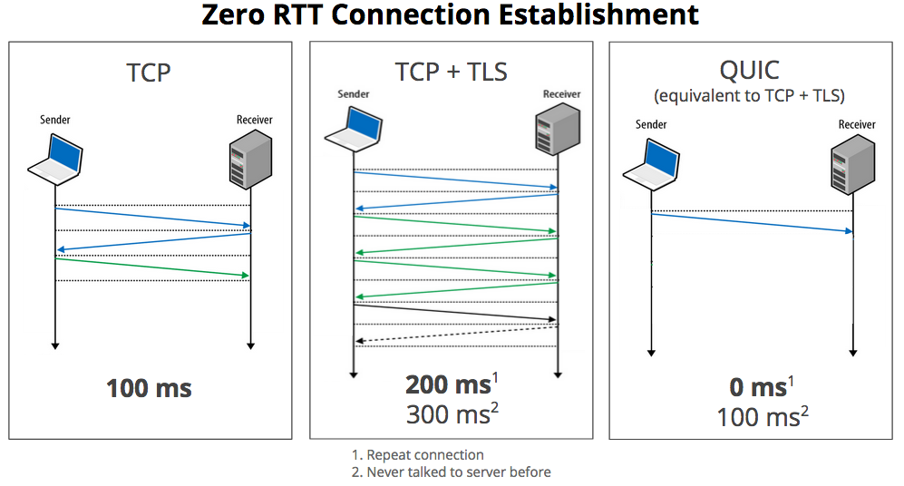
Figure 1-1. QUIC has a Zero-RTT mechanism for known hosts (image from Chromium Blog)
According to Google’s research, the Google Search Page could gain one full second of page load under adverse network conditions, and a 3% improvement in mean page load time. Also, data indicates that 75% of requests on the web can be optimized and transferred more quickly if they are served on QUIC instead of HTTPS+TLS over TCP, while remaining secure and reliable. Video streaming is one of the critical use cases for QUIC, reducing 30% buffering on YouTube while watching videos using this protocol.
Facebook has also been experimenting with 0-RTT protocols for its native apps. It created a derivate from QUIC known as Zero Protocol that decreases request times by 2% while reducing the initial connection-established time at the 75th percentile by 41%.
CDNs are currently looking at QUIC and doing research to begin serving under this protocol. Regarding servers, Litespeed and Caddy are the first and the most used servers for the QUIC protocol. If you want to play with QUIC without a server change, you can use a reserve proxy, QUIC-to-HTTP, as a frontend for your real HTTP/2 server.
Much of the work of QUIC is to reduce the round trips necessary to send the actual data. Google has been using QUIC for a couple of years now, serving all of its apps (such as Maps, Drive, Gmail, and more) using the protocol when a compatible browser appears, mainly Google Chrome. That’s why according to the 2018 report “A first look at QUIC in the Wild”, less than 9% of the traffic on the web is currently on QUIC, serving Google 42% of its traffic under that protocol. Looking at host data, only 0.1% of the .com zone and 1.2% of the Top 1 million Alexa domains are currently QUIC-enabled.
The main current limitation is availability, as only Google Chrome has it enabled, followed by Opera, which has it but under a flag. Besides Facebook’s similar protocol reducing request times by 2%, there is still no public data on how much time we can save using QUIC on a typical website. The entire community is still experimenting with it, and if it becomes an IETF standard, we might see it as the next companion of HTTP/2.
Compression Reloaded
We’ve been compressing text-based content for years now since HTTP/1.1 (HTML, scripts, stylesheets, SVGs, JSONs, etc.), but now we have new alternatives to push the limits even further forward.
Zopfli
Google has open sourced Zopfli, a compression library that can replace the compression algorithm while still using deflate, zlib, or gzip. It has better compression results than standard algorithms (around 3%–8%) but is much slower (up to 80 times). The decompression time is not altered, and all browsers will be compatible with it, which makes it an excellent candidate to improve performance even with the additional compression cost.
Brotli
Google also open sourced a new compression algorithm and file format after delivering Zopfli that can achieve a compression rate up to 25% greater than gzip for text-based files, but it requires compatibility from the browser for decompression.
If the Accept-Encoding HTTP request’s header includes br, we can safely answer from the server with a Brotli-compressed body, saving data transferred to the client.
Facebook has done research on Brotli and found it saves about 17% of CSS bytes and 20% of JavaScript bytes compared with gzip using Zopfli. LinkedIn saved 4% on its website load times, thanks to Brotli.
Similar to Zopfli, the disadvantage is that it takes more CPU power and time to compress both in the magnitude of 80. The configuration that makes a better balance when we precompress assets is q11. CDNs can help you with compressing and precaching compressed assets to server-compatible browsers.
Service Workers
With Service Workers now available on every primary browser, we have a new set of ideas available at our fingertips that can help in the HTTP layer for web performance besides using a local Cache Storage.
One example is the ability to remove cookies from every HTTP request before sending them to the server, saving data that we don’t use on the upload stream. You can check at sw-remove-cookies.
Readable Streams
Within the Fetch API, we can start processing data as soon as it gets from the server in chunks, thanks to the Streams API, which can parse data as soon as it arrives without waiting for the full file to load.
Some initial tests created by Jake Archibald shows a decrease of 45% on First Paint when using Streams to parse and render content against a Server-Side Rendered Page with all the data. The difference is even more significant when compared with a normal script that renders data when a JSON file finished loading four times slower.
The API started on Chrome and is slowly getting into all the browsers on top of the Fetch API.
Hacking Resource Loading
Loading resources is a crucial part of a website, having 85 requests on a desktop and 79 requests on mobile devices as a median today for the web (data from HTTP Archive). The amount and timing of these loads affects rendering, so let’s see what we can do to improve it.
HTTP/2 Push
We know that HTTP/2 has included a method to push resources from the server after an HTTP Response. Therefore, there were many suggestions on pushing the stylesheet after delivering the HTML. The main problem is that HTTP/2 Server Push has become an antipattern, mainly due to a lack of a browser’s cache protocol.
If it’s the first time the user is accessing the website, pushing the CSS file before the browser realizes it needs it sounds like a good idea and we can save some milliseconds. The problem appears when the browser already has that file in the cache from previous visits or in the Cache Storage from the Service Worker. If that is the case, our server will take bandwidth and will use the channel to send bytes that are already in the client, deferring the download of other resources that the client might need.
Therefore, use HTTP/2 Push with care. You can create your protocol using cookies or other techniques to create a dynamic solution that will push a file only on certain circumstances, but try to avoid static definitions that will always push the same data.
Note
To read more about the problems with HTTP/2 Push, read Jake Archibald’s post “HTTP/2 Push is tougher than I thought”. Several ideas are coming to solve the issue.
Modern Cache Control
There are two extensions to the Cache-Control headers that will help us define how the browser’s cache mechanism works.
Immutability
It’s common today to use the technique of hashing the filename of our resources based on version and changes, so a unique URL will never change in the future.
To help with this, we can now define Cache-Control: immutable, so that browsers will never create a conditional request to see whether the resource has been updated in the server. This is currently available in Firefox, Safari, and Edge.
Stale While Revalidate
With the Stale While Revalidate pattern, we can ask the browser to serve a cached file but also update the cache in the background. This is still a work in progress and will let us define something as Cache-Control: stale-while-revalidate=60, to specify that for 60 minutes it should use that pattern (accepting a stale response while checking updates asynchronously).
Warming Up Engines
A DNS lookup on a cellular connection might take up to 200 ms, so every time you add a script or style from an external host (such as a Facebook Like button, and Google Analytics script), the browser will need to make a DNS lookup.
When we know that we will later use the HTML resources for additional domains, we can use the Resource Hints specification to help the browser to get those queries as soon as possible.
We can set the DNS we will need through a <link> HTML element with a rel="dns-prefetch" attribute and the domain as the href attribute; for example:
<linkrel="dns-prefetch"href="https://my-analytics.com">
After the DNS, we know that on HTTPS a Secure Sockets Layer (SSL) negotiation should happen, as well as a TCP connection with several roundtrips. We can also ask the browser to prepare the SSL negotiation and TCP connection, asking for a preconnect:
<linkrel="preconnect"href="https://my-analytics.com"crossorigin>
We can even go further with this trick and serve the DNS prefetch or preconnect suggestions over the initial HTML response so that the browser will know about them before even parsing the HTML, as demonstrated here:
Link: <https://my-analytics.com>; rel=preconnect; crossorigin
You can read more about the advantages of preconnect in Iya Grigorik’s post “Eliminating Roundtrips with Preconnect”.
It’s better to keep the list of hints only for the hosts that are important for the rendering and might affect our performance metrics.
Loading JavaScript
If you have one JPEG file and one JavaScript file of the same size, after both files are downloaded, the JavaScript file will take 3,000% more time to be parsed and be ready to use than the JPEG.
Therefore, JavaScript loading, parsing, and execution are one of the most significant performance issues today. Even though we know that we must load most of our scripts using async or defer, the optimizations to hack performance metrics require us to go further and try to minimize JavaScript execution for the initial rendering.
Also, between a fast phone and an average phone, there might be a difference of 5× for just 1 MiB of JavaScript only between parsing and compilation.
To bundle or not to bundle
You are probably bundling all of your JavaScript files in one big script, such as when using WebPack. Also when running apps with frameworks such as React or Angular, it’s common to start with a big JavaScript bundle with everything in it.
With HTTP/2, some people began to think that bundling is now an antipattern—we now have compressed HTTP headers and can multiplex over one TCP connection, so the overhead of small scripts is lower. However, several reports still indicate that bundling remains the best option for performance, for several reasons, including that compression algorithms work better with bigger files.
Check out Khan Academy’s “Forgo JS packaging? Not so fast” article about this topic. Paul Irish, a web performance engineer from Google, has been researching how to load JavaScript modules more quickly, and has concluded that bundling is still the best idea, as you can see in his tweet in Figure 1-2.
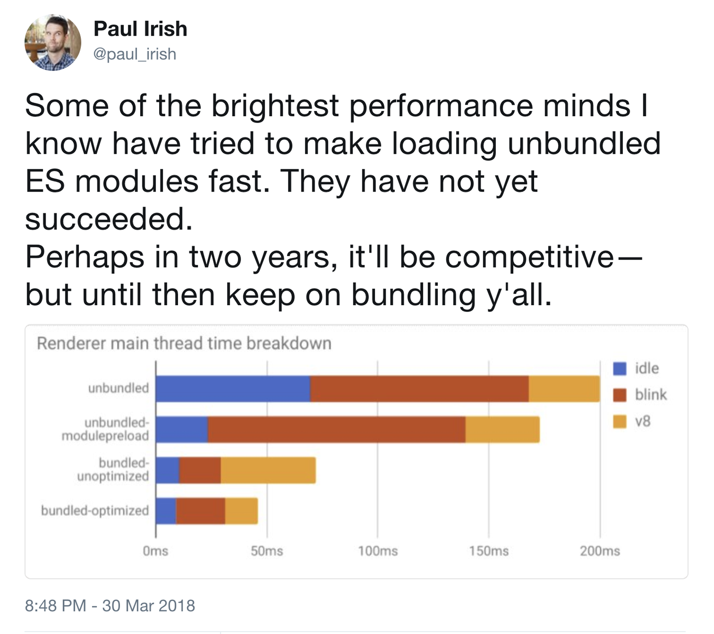
Figure 1-2. Chrome engineer Paul Irish supporting bundling JavaScript code as the best solution today
This doesn’t mean that you should create only one bundle and load it with the first visit. In fact, that’s probably a performance problem. If you can render the ATF content without any JavaScript, go for it. If you need some code, bundle only that code (using defer or async if necessary) and defer the rest.
You can code-split the remainder based on user needs.
Is server-side rendering a solution?
Several client-side frameworks are offering Universal or Isomorphic rendering solutions that will compile and render the same code on the server and then continue the execution on the client through hydration.
Also, new tools such as Puppeteer make server-side rendering (SSR) pretty easy to implement even with custom JavaScript code that doesn’t use well-known frameworks. We can prerender JavaScript-based sites and apps on the server and deliver static HTML.
Although it will undoubtedly improve some rendering and paint metrics, it might still be a problem for interactive metrics such as First Interactive because we will send a big HTML file now, but there will be a zone (known as the Uncanny Valley) in the timeline during which the content is rendered, but it’s not interactive because the big client-side framework that makes it work is still loading. For one or two seconds in good cases, your web app might not be interactive while on screen.
To solve this issue, there are two new patterns currently in the discussion: Progressive Bootstrapping and the PRPL Pattern.
Progressive Bootstrapping
Progressive Bootstrapping means sending fully functional but minimal HTML plus its CSS and JavaScript. After that is done and interactive, we progressively bootstrap the rest of the features of the app.
This pattern reminds me of the BigPipe model proposed by Facebook several years ago in which it defined the idea of “paglets.”
PRPL Pattern
PRPL is a design pattern to structure and serve a web app’s code to improve performance, achieving a fast Time to Interactive and maximizing caching efficiency and simplicity of development.
Here’s what the acronym stands for and instructs you to do:
-
Push critical resources for the initial URL route
-
Render initial route
-
Precache remaining routes
-
Lazy-load and create remaining routes on demand
The pattern is still being tested by several companies, but it appears to be a solution to some of the Universal Rendering issues while keeping good interactivity and rendering metrics.
Scripts on low budget
No matter what, it’s essential to keep your JavaScript to the minimum. JavaScript takes time to render and execute. That’s why it’s important to always use the latest compilers for your framework, as well as tools (such as Chrome DevTools Coverage) that will both handle code coverage and use other techniques to detect code that can be safely removed.
For example, using the Ivy rendering engine in Angular 6 with the latest compiler in command-line interface (CLI), your Angular JS bundle can be much smaller with the same functionality.
In your custom code, you can use Tree Shaking techniques or tools such as Closure Compiler to reduce the size of your JavaScript code, eliminating dead code among other things.
You should invest time and effort into testing tools that can reduce your JavaScript code.
Also, if you are using large JavaScript libraries to do a lot of math and memory operations, such as encoding, decoding, decrypting, machine learning, optical character recognition, audio management, and artificial intelligence applications, it might be a good idea to analyze the advantages of converting that code into a WebAssembly module.
Finally, you need to be very careful with third-party scripts: always load them asynchronously, lazy load them when possible, and test load them within a sandbox iframe that won’t affect your main performance timeline as the AMP Project loads scripts.
Loading Web Fonts
Text by default is a nonblocking resource; this means that when we have text in our HTML, the browser will render it as soon as the render starts. However, when we apply a custom font, we convert nonblocking text into blocking text. As you can see when browsing the web, it’s common to find empty boxes with no text in situations where the font is still being loaded (a problem known as FOUT, or Flash of Unstyled Text).
Solving this issue is a high priority in improving rendering metrics, so after compressing the font file, removing unused characters, and simplifying glyphs, it’s time for something else.
The most straightforward and high impact thing you can do is to look for your @font-face declaration and add the new font-display property with the values "optional" or "swap". This is part of the CSS Fonts Level 4 specification, which is currently available in Chrome, Firefox, and Safari from 11.1 (iOS from 11.3).
The idea is that the browser has different periods: font block and font swap. Font block means that the user won’t see any text (invisible content) if the requested font is not yet loaded; with font swap, the user will see a fallback font while the primary requested custom font is not available. If the font couldn’t be downloaded or if it’s taking too much time, it will move into a failed period: the fallback font will win, and the browser won’t wait any longer.
If you set font-display: optional, you will instruct the browser that loading the font is not mandatory, so it will usually wait 100 ms on block period and then move to the fallback. Also, in poor network situations, the browser might decide to jump into the fallback font.
With font-display: swap, we are directing the browser to not use any block period; you will see the text with the fallback font immediately and the swap period will be infinite, so no matter when the final font arrives, it will be replaced on screen.
For performance, optional and swap are the most common values. You can also check the font-display: block, which acts like typical browsers before this spec, waiting three seconds in block period and then an infinite swap. Or check font-display: fallback, which will have a short block period (around 100 ms) and then a finite swap period (around three seconds), so if the font takes more time, it will just abort its download and usage.
Another option is to use the Font Loading API (available on some browsers) to load fonts with JavaScript and have full control of the process, as shown here:
constmyFont=newFontFace("MyFont","url('myfont.woff')");myFont.load().then(()=>{// The font is ready to use});
Be careful when using Preload with web fonts, because the browser might decide not to use a font (because of the font-display property or because there is already a local copy of that font). With Preload, we will ask for a high-priority download anyway.
Prefetching and Preloading
Earlier in this report we discussed that it’s possible to make the browser aware of DNS queries that we will need. The Resource Hint specification also supports another kind of hint that will help the browser to render the content faster.
For every hint available, we can use the <link> element of a new Link header in the response.
We can use this to ask the browser to prefetch a resource that we know we will need later with rel="prefetch" so that the browser can download and store it in the cache. However, the browser will do this only in some situations, and there is no guarantee that it will happen.
We can also ask for a complete page prerender by using rel="prerender". This case is useful when we know the likely next step for the user during navigation, so we give the browser a hint to download that resource and render it so that it will be up and running when the user navigates there.
So far, we have only been talking about basic hints to the browser to prefetch or prerender content that we might need later, and it does that with low priority. But we have a new specification available to help us define more information to support the browser: Preload.
Preload fetches resources with high priority and is used only for the current navigation (whereas you can use prefetch for possible future navigations). With preload, we will also use a <link> element with rel="preload" and will specify the type of content with the as attribute (such as script, style, image, fetch, video, font, document):
<linkrel="preload"href="styles.css"as="style">
If you are preloading resources from external origins using CORS, you must supply the crossorigin empty attribute. And, of course, we can also set this up from the HTTP response headers:
Link: <https://otherhost.com/font.woff2>; rel=preload; as=font; crossorigin
Preload is currently available in Chrome, Firefox, Samsung Internet, Edge from 17, and Safari from 11.1 (including iOS 11.3+).
The preload definition also accepts a type attribute with a MIME type and the media attributes with a CSS Media Query so that we can load different resources with a responsive approach. Chrome is also adding support for Priority Hints.
Using preload is particularly useful for resources that are needed in the ATF rendering but are discovered late within the timeline, such as a font file that is declared within a CSS external stylesheet or a background image that is injected with CSS by a JavaScript code.
Cache Storage Is Here
As a result of its newly acquired compatibility with all browsers, Cache Storage within the Service Workers specification is now available everywhere. You should certainly define a policy of using Service Workers, Cache Storage, and a hash-based solution to update the cache in order to improve performance on future user visits.
On Safari and iOS, the storage can be up to 50 MiB per origin, and it will be removed automatically after a few weeks of no interaction with that origin.
On other browsers, the available size is usually a percentage of the total size of the user’s device, and its persistence has to do with not having storage pressure in that device. The Cache Storage can be persistent on some browsers using the Persistent Storage API.
If you are doing a Progressive Web App (PWA), Cache Storage is a must, but even if you are still building classic websites, you can take advantage of this cache and improve the user’s experience.
Hacking Images and Animations
Images and media, in general, are essential within a website or web app, and they affect rendering metrics such as Speed Index and Visually Complete. Because they are important, new metrics have been proposed within the Web Performance Community, such as metrics for Hero images suggested by Steve Souders.
Image file size is not the only important thing to see here; other things might affect performance, such as decompression time and used memory after decompression.
After you have done basic optimizations for your images, what’s next? Let’s now turn our attention to what we can do to save bytes and precious milliseconds.
Responsive Images
One of the first problems with images on a website is not sending the appropriate size for that viewport and pixel density, thus delivering a bigger file than is actually necessary.
Serving different versions of the same image is mandatory for a high-performance mobile or responsive website.
The new <picture> element is now a part of the HTML 5.1 specification. It’s a container that provides multiple sources to its contained <img> element to allow authors to declaratively control or give hints to the user agent about which image resource to use, based on the screen’s pixel density, viewport size, image format, and other factors. It represents its children, and it will help us with art direction.
Using Responsive Images for performance means that we need to create n versions of the same image in different sizes. According to a report published by ScientiaMobile, 84% improvement in data savings happens when creating n versions against three versions (such as mobile, desktop, and tablet). We can create them manually in a build process or dynamically on the fly. Instead of doing it on your own, you can use cloud-based services or CDNs that will take care of this for you.
This means that besides the format and the image compression, delivering n versions of the same image is mandatory for better performance metrics. This idea doesn’t mean that you should always need to do what the client says. There are Android devices today with a 5× factor for pixel density, but that doesn’t mean you should deliver your bitmap image 25 times bigger than on the desktop (5 × 5). You need to find a balance between file size, decompression time, and memory usage versus image quality.
Client Hints
HTTP Client Hints is an extension to the HTTP protocol to support headers that will enable content negotiation between client and server based on hints sent by the browser.
It can reduce the amount of <source> elements in a <picture> tag for Responsive Images because we won’t set media queries or source sets for every possible situation. We can ask for a logo, and the server will know which version to provide.
You need to opt in for this feature through an HTTP response header or a <meta> element Accept-CH in your HTML document.
The spec defines a list of HTTP headers that the client will send if you opt in, including the following:
- Width
-
The expected resource width in physical pixels
- Viewport-Width
-
The current layout width in CSS pixels
- DPR
-
The device’s pixel ratio or density (such as 3 for iPhone X, 4 for Samsung Galaxy S9)
To opt in, you can then use the following:
<metahttp-equiv="Accept-CH"content="DPR,Width,Viewport-Width">
The HTML document can also advertise support for Client Hints through an HTTP header:
Accept-CH: DPR, Width, Viewport-Width
On compatible browsers, with image requests your server will also receive new HTTP headers with the data to decide which image file to deliver, such as the following:
DPR: 4
Width: 200
Viewport-Width: 400
In Chrome 67, more Client Hints are available (coming from the NetInfo API, which we cover later in “Reactive Web Performance”). The new data available for opt-in is:
- RTT
-
The effective latency in milliseconds on observed measurements across recently active connections
- Downlink
-
Estimated bandwidth observed measurements across recently active connections
- ECT (Effective Connection Time)
-
With the possible values 2g, 3g, 4g, or slow-2g
With these additions, we can decide to serve 1× images even if the DPR is 4× when the connection is slow.
Another extension currently available from Chrome 67 is the ability to ask the browser to remember a Client Hints declaration for our origin for a period of time, using the Accept-CH-Lifetime response header or meta HTTP-equiv element.
Finally, we can also use Client Hints for the proposed Key new HTTP header.
Scale with Vectors
Although SVG is not new, it is still underused on the web. Using SVG for vector graphics (logos, icons, diagrams) with the <svg> HTML element or as an external image with <img> is a good idea whenever you can use that format. It is widely supported today and the advantages are clear: compressed (with gzip or Brotli) and without the need for several versions. One SVG will fit most scenarios today when nonbitmap images are used.
New Bitmap Formats
Besides the well-known animated GIF, JPEG, and PNG formats, newer mobile browsers support new formats that will help you in delivering smaller files with the same quality. Unfortunately, support for these formats is still browser-based, so the best option today is to use the <picture> element with the type:
<picture><sourcetype="image/heif"src="image.heif"><sourcetype="image/webp"src="image.webp"><sourcetype="image/vnd.ms-photo"src="image.jxr"><sourcetype="image/jp2"src="image.jp2"><imgsrc="image.png"alt="description"></picture>
The advantage is that these new formats are more efficient in file size and decompression times for the same quality, thus achieving better performance results.
Note
If you feel that the effort to create n versions of your images in different formats is high, consider using a CDN. Most companies in the CDN industry will offer you a solution for serving responsive images using the latest techniques.
Using these formats, improvements can reach 30% in transfer and save with the same image quality, which will undoubtedly deliver the image faster to the client.
Compatible formats
The available formats today on web browsers are as follows:
- WebP (often pronounced weppy)
-
This is an open format created by Google that aims to replace both JPEG and PNG files (lossy and lossless formats) while getting the same quality with a 25% to 40% reduction in file size. It’s available in only Chromium-based browsers.
- JPEG-XR
-
Available only on Internet Explorer and Edge, this is an evolution of the JPEG format that is optimized for high-resolution images, creating better quality with less size compared to JPEG. It supports both lossy and lossless pictures.
- JPEG-2000 (JP2)
-
This is available only in Safari (iOS and macOS). It is a wavelet-based format that was created by the Joint Photographic Experts Group committee in 2000 with the intention of superseding the original JPEG standard built in 1992. It offers some advantages in image fidelity over standard JPEG.
- HEIF (High-Efficiency Image Format, often pronounced heef)
-
This is a new format that offers high quality and better compression compared with JPEG based on the H.265 video compression algorithm. It was claimed by the creator group that you can store twice the information on the same file size as JPEG. The iPhone from iOS 11 and macOS now support HEIF files and also a variant HEIC container to store media files, including Live Photos and transformations such as rotation or crop data. Windows 10 and Android P will also be adding support for the format shortly. At the time of this writing, although the format is available for native apps, it doesn’t appear compatible with browsers.
Image format polyfills
Reading the previous section, you were probably wondering why we’re covering these formats if they are not compatible with all the browsers. Thanks to Service Workers, we can now decode any format within that thread and then deliver a compatible PNG file to the web or PWA.
For example, we can render WebP files on Safari or Edge, even if those browsers don’t have support for them. To do this, you need a JavaScript or WebAssembly module to decode the format into PNG or JPEG and then deliver that format to the web client for rendering, acting like a transformation proxy.
These tools are currently experimental, and you need to test them a lot, both from a functionality point of view and for performance. Does the reduction in file size and transfer overcome the overhead of using a decoder? The answer relies on your testing because it will depend on different factors. You can use the Cache Storage or IndexedDB to locally store the decoded versions of them.
You can check Service-Workers-WebP and “On the fly WebP decoding using WASM and a Service Worker” for more information.
New life for old formats
What can we do for old browsers that are still out there and don’t support next-generation formats? Thanks to new compression algorithms, we can even take advantage of PNG and JPEG formats that are currently compatible with all our users’ browsers, including IE 11 and Android Stock Browser.
With Guetzli, you can encode JPEG files with high compression while keeping the high visual quality. Guetzli-generated images are typically 20 to 30% smaller than images of equivalent quality generated by libjpeg and they’re compatible with every browser.
If you need lossless images, PNG is still your friend; thanks to Zopfli (the new algorithm over deflate and gzip), we can use ZopfliPNG and get smaller PNG files compatible with every browser.
Decoding on a Thread
Decoding an image is a process that we typically don’t care about. The browser decodes the image into a bitmap in memory as part of its image loading process. But decrypting a large image file can take several hundreds of milliseconds on the main thread, interrupting other actions.
What if we can take advantage of threading (Web Workers) and decode images without affecting the UI thread? Or what if we can ask the browser to use a special behavior? That will improve metrics with more impact on low-CPU devices.
The ability to decode an image within a Web Worker scope is still under development on most browsers, and there are several proposals to help in this matter.
Future Formats
The future looks promising, with more formats that will increase performance. The list includes:
- AVIF (AV1 Still Image File Format)
-
This is a new open format from the Alliance from Open Media based on different video codecs, such as V9. It supports HDR and Wide Color Gamut, among other features. It’s still under development, but it feels like it’s going to be the natural evolution of the WebP format.
- Better Portable Graphics (BPG)
-
This format is a JPEG replacement that can yield smaller files with better quality and even animations. Today, it’s not compatible with any browser, but you can use a JavaScript decoder to test it.
- FLIF
-
This one is still in the early stages of development FLIF is a lossless image format that outperforms PNG, lossless WebP, lossless BPG, lossless JPEG2000, and lossless JPEG XR, in regard to compression ratio. It includes a way to deliver responsive images in different resolutions with the same file.
You can only use these formats today with a JavaScript decoder used within a Web Worker or Service Worker, such as the BPG Decoder. Using WebAssembly for the decoding will also improve performance. You need to analyze the number of images you have to see whether the savings of using the new format is still better for performance when you take into account the decoder delivery, compilation, and execution time.
Life Is Better with Fast Animations
We know that life is not just about static images, and animated GIFs have begun to appear everywhere. Unfortunately, they do not offer a lot in the way of web performance.
We have three solutions available today to replace animated GIFs with more performant solutions:
-
Animated PNG (APNG) is a nonstandard animated format based on PNG that can create better and smaller animations compared to animated GIF. It’s available in Chrome, Firefox, and Safari, and there are polyfills for other browsers; it’s typically 20% smaller than a GIF animation.
-
Animated WebP, an extension of the Chrome-only WebP image format, is not often used.
-
Use video containers, such as MP4 videos (without an audio track) for animations. For these cases, you can save more than 90% in file transfer, and it creates a 20× faster experience with 7× faster decoding.
The main problem with videos is that we don’t want the user to see video controls or to go fullscreen, and we want autoplay that is not available on mobile devices.
Fortunately, today most mobile browsers support muted videos, which can be played inline and with autoplay with no audio, either because they don’t have an audio track or because the muted Boolean attribute was used.
For iOS, the video will have to use a proprietary attribute for this behavior, webkit-playsinline, as shown here:
<videowidth="300"height="150"mutedautoplaywebkit-playsinline><!-- sources --></video>
The previous video element will just appear as an animated GIF. The problem is that a <video> tag is treated as a low priority for most browsers, so the perception might not be the best one.
The latest versions of some browsers, such as Safari 11.1+, support using video formats inside an <img> tag. They are treated as images and render as muted autoplayable videos. We can use it with preload, and it can be adapted with the <picture> tag to support fallbacks:
<!-- Without fallback --><imgsrc="animation.mp4"alt="Animation"><!-- With fallback --><picture><sourcesrc="animation.mp4"type="video/mp4"><sourcesrc="animation.webp"type="image/webp"><imgsrc="animation.gif"alt="Animation"></picture>
We will probably see this technique for the use of videos in images much more in the future as more browsers support it.
Image Loading Antipatterns?
There are two usual tricks for web performance loading that are currently under debate to decide whether they are now antipatterns: using very low-res preview images and using JPEG Compressive images.
The technique of using very low-res preview images (known as LQIP or Low Quality Image Placeholders) has been used by several companies including Facebook and Medium (Figure 1-3). It loads an extremely low-res image, typically blurred, while the final image is not ready or while the placeholder is not within the visible area of the screen. A similar trick is to load a colorful placeholder (such as something from Google Images or an SVG representation of the image).
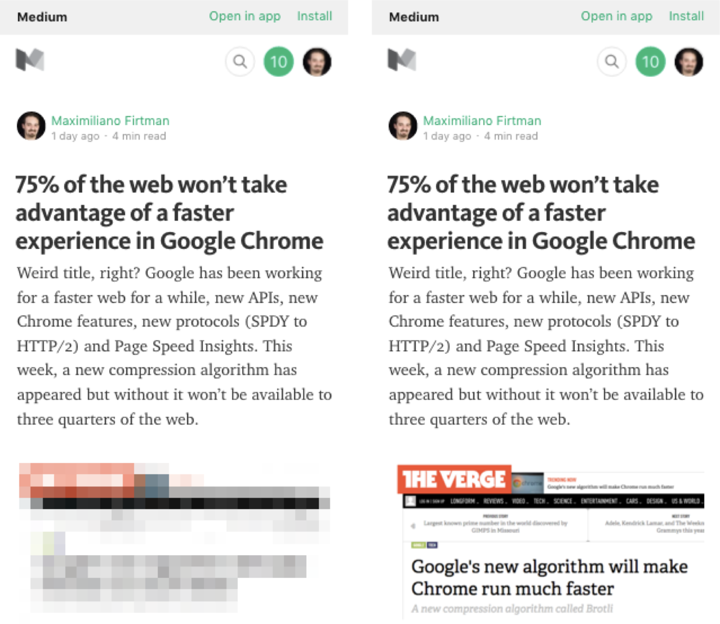
Figure 1-3. Medium uses low-res images as a pattern to improve performance, but there is research underway to see whether this is an antipattern
Analysis began to reveal that when a blurry image appears, our brain might think, “This is downloading, we need to wait for the final version to appear.” Thus, the time it takes to process the final image leads us to believe that there is a performance issue, compared with not having a LQIP version. So it might be an antipattern in some situations, but it’s still under debate. Check out José Manuel Perez’s article “Taking a Look at the State of Progressive Images and User Perception” for further discussion.
JPEG Compressive Images is a technique to create a much larger JPEG image than the one needed for its <img> container on the current device, but with extreme compression. The results were clear: with excellent file reduction (up to 50%) we can achieve similar quality results. But today, it’s becoming an antipattern because of the high memory overload of this technique. Read more about it in Tim Kadlec’s blog post “Compressive Images Revisited”.
Hacking User Experience Performance
After the initial loading has finished, web performance optimization continues with two main objectives: keeping a consistent frame rate (a goal of 60 FPS) and having a feedback response on every interaction within 100 ms.
Consistent Frame Rate and Feedback Response Times
The first thing that usually goes against these goals is JavaScript execution. Every script that takes more than 50 ms to release the thread on an average phone is a candidate for optimization (you can use the Long Tasks API to observe and find those bottlenecks on the fly, or DevTools).
There are several solutions to this problem, including using Web Workers, splitting the code into chunks, and using modern API to execute code in low-priority mode, such as requestIdleCallback.
Avoid Calculations and Repainting
When we have a sophisticated web design and use JavaScript to manipulate elements in the DOM, the browser needs to recalculate styles, redo the layout, and sometimes even repaint elements that didn’t suffer any change. This is because of the nature of CSS selectors, where a new element on the screen can affect others (such as sibling selectors, descendant selectors, and nth-child pseudoselectors).
When the browser needs to repaint on each frame, you usually have a frame rate drop—and remember, your goal is to get 60 FPS. Therefore, you should avoid repainting.
You should promote layers that you will animate to the GPU through the CSS style will-change or the JavaScript version element.style.willChange. You define which property you are going to animate, as in the following example, and most browsers will take that as a flag saying that the element should be promoted to the GPU:
.fadedElement{will-change:opacity;}.transitionedElement{will-change:transform;}
Modern CSS also accepts a way to limit a browser’s ability to style, layout, and paint on some regions of your document through CSS Containment. This is currently only available on Chromium-based browsers, and is being tested in Firefox.
To use it, we define a selector and the contain property (which accepts several values with different behaviors), as in the following:
#myElement{contain:strict}
In our example, strict is the most restrictive value because its contents are guaranteed to not affect the rest of the page outside the element’s bounds, and it must have a size defined in advance. Most of the time, we don’t know the precise size of the container beforehand, so content should usually be the default option for those cases.
Passive Listeners
Passive event listeners are a new way to bind events for those situations when we don’t have the option of preventing the default operation. This technique is pretty useful for handling wheel and touch events while the user is scrolling through the document. Because we don’t have the option to cancel the default scroll, the browser can do the scrolling even if we are executing some JavaScript code.
You can make an event listener passive by using an optional fourth argument:
myElement.addEventListener("touch",e=>{// Your event handling code},true,{passive:true});
This possibility is currently available in every major browser.
Reactive Web Performance
Classic web performance optimizations involve a series of static analyses based on lab tests or even Real User Monitoring (RUM). We apply a series of techniques, hacks, and best practices and our metrics are improved. Great! But is that enough?
If we have set a series of goals on custom or standard metrics to provide a good user experience, such as “First Meaningful Paint in 3 s” or “Last Hero Paint in 4 s”, how can we guarantee that we are achieving our goal for each of our users? Are we talking best scenario, worst scenario, median, or average? Why can’t we try to reach our goal for each of our users no matter their context?
Some web performance engineers or developers trying to optimize performance think that user network problems or old devices are not their concern. You can take two paths: “It’s not my fault; on my high-end device in a big city, it’s fast” or “Let’s do something about this, I’m responsible for your experience on my website.”
Meet reactive web performance, a set of on-the-fly optimizations that we apply to keep a consistent user experience, no matter whether the user is on an iPhone 8 on LTE+ or a MotoX 3rd Generation with a poor 3G connection.
If you are or have been a Netflix user, you’ve probably seen how they meet user’s expectation with a dynamic approach: if the network quality changes, the video quality changes dynamically without buffering or pausing the video, maintaining a consistent user experience no matter what.
With today’s browsers, we can apply similar techniques thanks to new APIs that will let us know more about the current context and its changes. We can make decisions to keep the user experience consistent and fast, while upholding high quality (as context allows).
This means, for example, that no matter the DPR and device’s CPU, it makes no sense to send a 4K image to a Samsung Galaxy S9 if it’s set to roaming on EDGE outside of a big city. Send a very compressed version of that image. It’s better to get a low-quality image than nothing, which will cause you lose your user at that moment.
Know about current context
Today’s browsers are full of client-side APIs that will let you detect the current situation and act in response. You can make decisions in your client’s JavaScript code, within a Service Worker or send enough information (such as extended Client Hints) to the server so it can make the decision.
Here are the currently available APIs:
- Navigation Timing
-
Get basic timings for current page load; for example, DNS lookup latency, network latency, and network total fetch time.
- Resource Timing
-
Get timings per resource.
- Network Information
-
Learn about current network status (such as cellular or WiFi), estimated bandwidth, connection type (to know whether we are on EDGE, 3G, LTE, or other technology), latency (RTT) and event handlers to detect changes on the current connection. The API is only available on Chromium-based browsers, and from Chrome 67 it’s also exposed as Client Hints to the server.
- Paint Timing
-
See current First Paint and First Contentful Paint metrics (as of this writing, available only on Chromium-based browsers).
- User Timing
-
Measure your own custom events, which can help you understand network, memory, and CPU load.
- Server Timing
-
Get timings generated by the server through HTTP headers.
- Frame Timing
-
This is a future API to measure current frame rate, and it’s changed to react when FPS are dropping.
- Device Memory
-
This is a client hint extension to inform the server about a client’s approximate RAM in GiB. You can request for that information server side or read it client side through
navigator.deviceMemory. For example, a low-end device might give you a reported value less than 1 GiB. - Long Tasks
-
Used to detect whether an operation took more than 50 ms on the main thread, so we can determine that we need to do things differently to keep a high frame rate; it’s currently available on Chrome.
CDN race
With Service Workers, we have now the ability to hold a race between two CDNs or servers and see (for that user, on the fly), which one is faster, and keep that consistent for that session.
Save data flag
Initially part of Client Hints and now part of the latest Network Information API, Save Data is an extension to the Client Hints spec where the browser can ask the server to reduce data usage. We can use the flag on a user decision (see Figure 1-4).
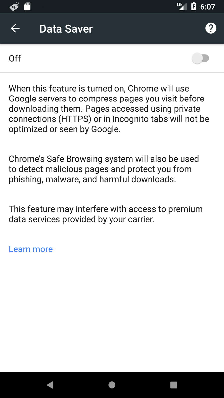
Figure 1-4. On Chrome on Android, users can enable a Data Saver, a flag that will be received on your server as a header; on HTTPS, savings are up to your server because Chrome won’t optimize it
On compatible browsers (Chromium-based, as of this writing), it’s available client-side through the JavaScript NetInfo API, as in the following:
constsaveData=navigator.connection.saveData;
It’s also available server side through an HTTP header:
save-data: on
Save Data is currently available on Chrome on Android by enabling the “Data Saver” option, on Chrome on the desktop through the “Data Saver” extension, and in Opera by enabling “Data Savings” on Android or Opera Turbo on the desktop.
What to do to keep a consistent experience
If, based on the previous APIs and solutions, you know you should deliver a lower-quality version of your website, that doesn’t mean a less powerful version. Here are some of the things that you can do:
-
Don’t provide web fonts
-
Deliver 1× low-res images no matter current the DPR
-
Serve low-quality videos
-
Stop HTTP/2 push to reduce bandwidth usage
-
Change Service Workers’ cache policy to prefer cached resources and reduce updates when possible
-
Omit images that are not data or important
-
Don’t prefetch files for later usage
-
Reduce the amount of data loaded per page on a paginated or infinite list
It’s always a good idea to show an indicator within your UI that you are currently serving a limited version of the website. When clicked, it might provide additional information on why (such as Save Data flag or a bad connection) and let the user override our decision and force a full-quality solution, maybe saving a cookie for it. This is similar to YouTube, where the video quality starts automatically but users can override YouTube’s decision and make themselves responsible for the result.
Performance Is Top Priority
Web performance trumps designer or developer happiness and is more important than using the latest framework. It has to do with conversion, and you can achieve that only by offering users an excellent and consistent experience.
Basic optimizations are not enough—always try to push it further. You’ll find that it’s a worthwhile effort.