In the previous chapters, we learned how to globally lay out all the flex items within a flex container by adding flexbox property values to that container. The flexible box layout specification provides several additional properties applicable directly to flex items. With these flex item–specific properties, we can more precisely control the layout of individual flex containers’ non-anonymous flex items.
Figure 3-1. Items with display: flex; become flex containers, and their non-absolutely positioned children become flex items
Now that we have a good understanding of the properties applicable to
the flex container, it’s time to focus on properties applicable to the
flex items.
What Are Flex Items?
We create flex containers simply by adding a display: flex or
display: inline-flex to an element that has child nodes. The children
of those flex container are called flex items, be they DOM nodes,
nonempty text nodes, or generated content.
When it comes to text-node children of flex containers, if the text node
is not empty (containing content other than whitespace) it will be
wrapped in an anonymous flex item, behaving like its flex item siblings.
While these anonymous flex items do inherit all the flex properties set
by the flex container, just like their DOM node siblings, they are not
directly targetable with CSS. Therefore, we can’t directly set any of
the flex item–specific properties on them.
Generated content can be targeted directly; therefore all the properties
discussed in this chapter apply equally to generated content as they do
to element nodes.
Whitespace-only text nodes within a flex container are ignored, as if
their display property were set to none, as the following code example shows:
In the preceding code, with its display property set to flex, the
unordered list is the flex container, and its child list items are all
flex items. These list items, being flex items, are flex-level boxes,
semantically still list items, but not list items in their presentation.
They are not block-level boxes either. Rather, they participate in their
container’s flex formatting context. The whitespace is ignored. The
links, which are descendants of the flex items, are not impacted by in
inclusion of flex display on their parent’s parent.
Flex Item Features
The margins of flex items do not collapse. The float and clear
properties don’t have an effect on flex items, and do not take a flex
item out of flow. Additionally, vertical-align has no effect on a flex item. However, the float property can still affect box generation by influencing the display property’s computed value, as the following code example shows:
In this example, the aside is the flex container. The comment and
whitespace-only text nodes are ignored. The text node containing “some
text” is wrapped in an anonymous flex item. The header, image, and text
node containing “some text” are all flex items. As the image is a flex
item, the float is ignored. Even though images and text nodes are
inline-level nodes, being flex items, as long as they are not absolutely
positioned, they are blockified:
In the last example, the markup is similar to the code in the second example, with the
addition of a link within the nonempty text node. In this case, we are
creating five flex items. The comment and whitespace-only text nodes are
ignored. The header, the image, the text node before the link, the link,
and the text node after the link are all flex items. The text nodes
containing “some text” and “and more text” are wrapped in anonymous flex
items. As these two text node children of the <aside> are not
contiguous, they are wrapped in separate anonymous flex items. The
header, image, and link, being DOM nodes, can be targeted directly with CSS. The anonymous flex containers are not directly targetable.
Absolute positioning
While a value of float: left or float: right on the child of a flex
container does not float the item—as the child is a flex item and the float
is ignored—setting position: absolute is a different story. The
absolutely-positioned children of flex containers, just like any other
absolutely-positioned element, are taken out of the flow of the
document.
They do not get converted to flex items. They are not in the document
flow. They do not participate in flex layout. However, they can be
impacted by the properties set on the flex container, just like a child
can be impacted by a parent element that isn’t a flex container. In addition to inheriting inheritable properties as they would had the parent not been a flex container, the parent’s properties impact the origin of the positioning.
The absolutely positioned child of a flex container is impacted by both
the justify-content value of the parent flex container and its own
align-self value, if there is one. For example, if you set
align-content: center; on the absolutely positioned child, it will by
default be centered on the flex container parent’s cross-axis. The
order property may not impact where the absolutely-positioned flex
container child is drawn, but it does impact the order of when it is
drawn in relation to its siblings.
min-width
In Figure 3-2, you’ll note the line that is set to the nowrap default overflows the flex container. This is because when it comes to flex
items, the implied value of min-width is auto, rather than 0.
Originally in the specification, if the items didn’t fit onto that
single main-axis, they would shrink. However, the specification of
min-width was altered. In the CSS 2.1 specification, the default value for min-width is 0. Now, for flex items, the implied minimum size is auto, not 0.
Figure 3-2. Flex items overflowing their container when min-width defaults to auto, unless wrapping is allowed
If you set the min-width to a width narrower than the computed value
of auto—for example, if we declare min-width: 0;—the flex items
in the nowrap example will shrink to be narrower than the flex
items in containers that are not allowed to wrap, as shown in Figure 3-3. This
is what Safari 9 displays by default, as it has not updated the implied
min-width change. We’ll cover flex item width in greater depth in “The flex Property”.
Figure 3-3. Flex items in non-wrapping containers will shrink if the min-width is explicitly set to 0, which is the default in Safari 9
Flex Item–Specific Properties
While the flex items’ alignment, order, and flexibility are to some extent
controllable via properties set on their parent flex container, there
are several properties that can be applied to individual flex items for
more granular control.
The flex shorthand property, along with its component properties of
flex-grow, flex-shrink, and flex-basis, control the flexibility of
the flex items. The align-self helps control a flex item’s alignment.
The order property provides for more granular control of the visual
ordering of individual or groups of flex items. All of these properties
are discussed in the following sections.
The defining aspect of flex layout is the ability to make the flex items
“flex”: altering their width or height to fill the available space in
the main dimension. A flex container distributes free space to its items
proportional to their flex grow factor, or shrinks them to prevent
overflow proportional to their flex shrink factor.
Defining the flex shorthand property on a flex item, or defining the
individual properties that make up the shorthand, enables developers to
define the grow and shrink factors. If there is excess space, you can
tell the flex items to grow to fill that space. Or not. If there isn’t
enough room to fit all the flex items within the flex container at their
defined or default sizes, you can tell the flex items to shrink
proportionally to fit into the space. Or not. This is all done with the
flex property, which is a shorthand property for flex-grow,
flex-shrink, and flex-basis. While these three subproperties can be
used separately, it is highly recommended to always use the flex
shorthand.
We will briefly introduce the flex shorthand property, then dive
deeper into the three longhand values that make it up. It is important
to fully understand what each component is doing so you can effectively
use the flex shorthand property.
The flex Property
The flex shorthand, a flex item property, is made up of the
flex-grow, flex-shrink, and flex-basis properties, which define the
flex growth factor, the flex shrink factor, and the flex basis,
respectively.
The flex property specifies the components of a flexible length: the “length” of the flex
item being the length of the flex item along the
main-axis (see “Understanding axes”). When a box
is a flex item, flex is consulted instead of the main-size (height
or width) property of the flex item to determine the size of the box.
The “components” of the flex property include the flex growth factor,
flex shrink factor, and the flex basis. If the target of a selector is not a flex item, applying the flex property to it will have no effect.
The flex basis determines how the flex growth and shrink factors are
implemented. As its name suggests, the flex-basis component of the flex
shorthand is the basis on which the flex item determines how much it can
grow to fill available space or how much it should shrink to fit all the
flex items when there isn’t enough space. It’s the initial size of each
flex item, and can be restricted to that specific size by specifying 0
for both the growth and shrink factors:
.flexItem{flex:00200px;}
In the preceding code snippet, the flex item will have a main-size of
exactly 200 px, as the flex basis is 200 px, and it is neither allowed to
grow nor shrink.
It is important to understand the three components that make up the
flex shorthand property, which is the property you should be
employing. The reason it is advised to use flex rather than its three
individual subproperties is because the spec (and therefore the browser)
resets any missing flex values to sensible defaults, which are not
always the individual property defaults.
To ensure you fully grok flex, let’s deep dive into its three
components.
The order of flex is important, with the first float number being the
growth factor.
The flex-grow Property
The flex-grow property defines whether a flex item is allowed to grow
when there is available space, and, if it is allowed to grow and there
is available space, how much will it grow proportionally relative to the
growth of other flex item siblings.
The value flex-grow and of the flex-grow portion of the flex
shorthand is always a number. Negative numbers are not valid. Float
values, as long as they are greater than 0, are valid.
The value specifies the growth factor, which determines how much the
flex item will grow relative to the rest of the flex item siblings as
the flex container’s free space is distributed. If there is any
available space within the flex container, the space will be distributed
proportionally among the children with a nonzero positive growth factor
based on the various values of those growth factors.
For example, with the 750px wide horizontal flex container with three
flex items all set to width: 100px, as in the four examples in Figure 3-4, you can dictate none, one, two, or all three of the flex items to
grow to fill the extra 450px of available space.
Figure 3-4. With a growth factor of 0, the flex item will not grow; any positive value will allow the item to grow proportionally to the value
As noted in “min-width”, if no width or flex basis is set, the flex basis defaults to auto,
meaning each flex item basis is the width of its nonwrapped content.
auto is a special value: it defaults to content unless the item has a
width set on it, at which point the flex-basis becomes that width. The
auto value is discussed in “auto”. Had we not set
the width, in this example scenario, with our smallish font size, we
would have had more than 450 px of distributable space along the main-axis.
Note
The examples in this section describe the basics of the growth factor.
The main-size of a flex item is impacted by the available space, the
growth factor of all the flex items, as well as the flex basis of the
item. We have yet to cover flex-basis. We will revisit both the growth
and shrink factors and these examples when we learn about
flex basis.
Note that the amount of distributable space depends on the basis. In
Figure 3-4, because the width of
the flex items was set to 100 px each and no basis was set, we have 450 px
of distributable space. When a different width or no width is declared,
or if a basis is set, the distributable space is different, as shown in
Figure 3-6.
Any positive value greater than 0 for the growth factor means the flex
item can grow to fill a portion or all of the available space. You can
tell the items not to grow with a growth factor of 0, as demonstrated
in the first example of Figure 3-4. You can mix and match: growing some flex items and not others, as demonstrated in the second example.
In the 4 examples in Figure 3-4, because the flex container is 750 px
wide and each of the 3 flex items has a width: 100px declared, there
are 450 extra pixels to be distributed among the flex items that are
allowed to grow:
750px - (3 * 100px) = 450px
We have 450 px of empty space in the main end direction as align-items
defaults to flex-start. The first example has no growth factors set, so no flex items grew.
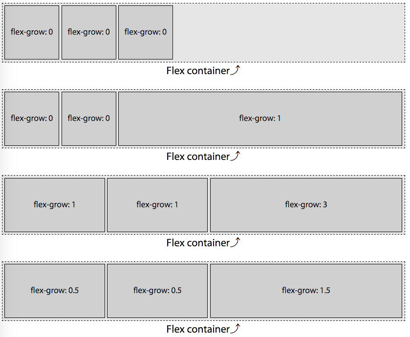
Non-Null Growth Factor
In the second example of Figure 3-4, the first two flex items, with a
growth factor set to 0, will not grow. Only the third flex item has a
value greater than 0, with flex-grow: 1 set, which means the single
element with a positive growth factor value will take up all the extra
available space.
The first two flex items with flex growth factor of 0 will remain at
100px wide, even if the content doesn’t fit. Only the third flex item
is allowed to grow, and therefore it must grow, taking up the extra 450
pixels to become 550 px wide.
The growth factor needs to be a positive, non-null float value for the
flex item to grow. In this example the growth factor was 1, but had it
been 0.000001 or 10000000, the layout would be the same.
Growing Proportionally Based on Growth Factor
If all items are allowed to grow, the excess space is distributed
proportionally based on the flex growth factors. In the third example,
with two flex items having a growth factor of 1, and one flex item
having a growth factor of 3, we have a total of five growth factors:
(2 x 1) + (1 x 3) = 5
With 5 growth factors, and a total of 450 px needing to be distributed,
each growth factor is worth 90 px:
450px / 5 = 90px.
Before being allowed to grow based on individual flex item’s growth
factor, the flex items were each 100 px wide as set forth by the width
property. With each growth factor being 90 px, we have 2 flex items
with a width of 190 px each and the last flex item has a width of 370 px:
100px + (1 x 90px) = 190px
100px + (3 x 90px) = 370px
In the last example, we have a total of 2.5 growth factors:
(2 x 0.5) + (1 x 1.5) = 2.5
With 2.5 growth factors, and a total of 450 px needing to be filled, each
growth factor is worth 180 px:
450px / 2.5 = 180px
Again, the default flex item size was 100 px, with the flex basis
defaulting to auto, leading us to have the exact same layout as in
the second example. This demonstrates how the distribution of extra space is
proportional. Again we see 2 flex items with a width of 190 px and the
last flex item having a width of 370 px:
100px + (0.5 x 180px) = 190px
100px + (1.5 x 180px) = 370px
Had we declared growth factors of 0.1, 0.1, and 0.3, respectively, or 25,
25, 75, the layout would have been identical.
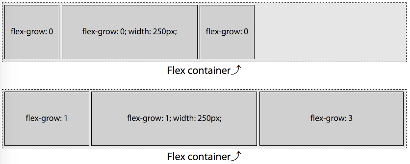
Growth Factor with Different Widths
As mentioned, the available space is distributed proportionally among the flex items
in each flex row based on the flex growth factors, without regards to the original, underlying widths.
In Figure 3-5, in the second example, we have flex items that are 100 px, 250 px, and 100 px wide, with growth factors of 1, 1, and 3, respectively, in a container that is 750 px wide. This means we have 300 px of extra space to distribute among a total of 5 growth factors. Each growth factor is therefore 60 px, meaning the first and second flex items, with a growth factor of 1, will each grow by 60 px, and the last will grow by 180 px as the growth factor is set to 3.
Figure 3-5. The available space is evenly distributed to each growth factor; any positive value will allow the item to grow proportionally to the value
The available space, growth factors, and width of each growth factor are:
Available space: 750px - (100px + 250px + 100px) = 300px
Growth factors:  1 + 1 + 3 = 5
Width of each growth factor: 300px / 5 = 60px
When flexed, the width based on their original width and growth factors
become:
The flex property takes up to three values—the growth factor, shrink
factor, and basis. The first positive non-null float value, if there is
one, is the growth factor. When the growth factor is omitted in the
shorthand, it defaults to 1. Otherwise, if neither flex nor flex-grow
is included, it defaults to 0.
In the second example in Figure 3-4, because we declared a value for flex-grow only, the flex
basis was set to auto, as if we had declared:
Declaring flex-grow is strongly discouraged. Rather, declare the
growth factor as part of the flex shorthand.
Had we declared flex: 0, flex: 0.5;, flex: 1;, flex: 1.5;, and
flex: 3; in the examples in Figure 3-4 instead of ill-advisedly declaring flex-grow values, the flex basis
would be set to 0%, and the width distribution would have been very
different, as shown in Figure 3-6:
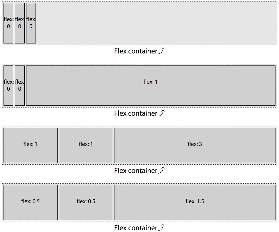
You may notice something odd: the flex basis has been set to zero, and only the last flex item has a positive value for flex grow. Logic would seem that the widths of the 3 flex items should be 0, 0, and 750 px, respectively. But logic would also dictate that it makes no sense to have content overflowing its flex item if the flex container has the room for all the content, even if the basis is set to zero.
The specification authors thought of this quandary. When the flex
property declaration explicitly sets or defaults the flex-basis to 0 px
and a flex item’s growth factor is 0, the length of the main-axis of
the nongrowing flex items will shrink to the smallest width the content
allows, or smaller. In our example, the width is the width of the widest
word “flex:”.
As long as a flex item has a visible overflow and no min-width (or
min-height for vertical main-axes) explicitly set, the minimum width (or minimum height) will be the smallest width (or height) that the flex item needs to be able to fit the content or the declared width (or height), whichever is smaller. In the first and second examples in Figure 3-6, even though the growth factor is 0, the flex items don’t shrink to 0. Rather, they shrink to the width of the widest nonbreakable word, as the word “flex-” is narrower than 100 px. Had width: 10px been set instead of width: 100px, the flex items would have narrowed down to whichever was smaller: the width of the word “flex-” or 10 px.
If all items are allowed to grow, and the flex basis for each flex item
is 0%, all of the space—the entire 750 px rather than just excess
space—is distributed proportionally based on the growth factors. In
the examples the flex container is 750 px wide. In Figure 3-6, as the flex
basis is zero, rather than auto, and with no positive shrink factors, the first two flex items are only as wide as their widest content (the word flex:), and all the extra space goes to the third flex item with a positive growth factor. This will make more sense after reading the flex-shrink section (see “The flex-shrink Property”). In the third example,
with two flex items having growth factors of one, and one flex item having a growth factor of three, we have a total of five growth factors:
(2 x 1) + (1 x 3) = 5
With 5 grows factors, and a total of 750 px, each growth factor is worth
150 px:
750px / 5 = 150px.
While the default flex item size was 100 px, the flex basis of 0 overrides that, leaving us with 2 flex items at 150 px each and the last flex item with a width of 450 px:
1 x 150px = 150px
3 x 150px = 450px
150px + 150px + 450px = 750px
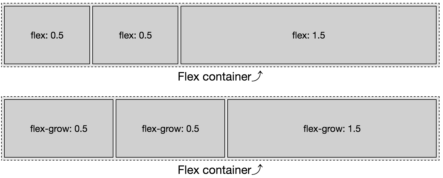
Similarly, in the last example of Figure 3-6, with two flex items having growth factors of 0.5, and one flex item having a growth factor of 1.5, we have a total of 2.5 growth factors:
(2 x 0.5) + (1 x 1.5) = 2.5
With 2.5 grows factors, and a total of 750 px, each growth factor is
worth 300 px:
750px / 2.5 = 300px.
While the default flex item size was 100 px, the flex basis of 0%
overrides that, leaving us with 2 flex items at 150 px each and the
last flex item with a width of 450 px:
0.5 x 300px = 150px
1.5 x 300px = 450px
150px + 150px + 450px = 750px
This is different from declaring only flex-grow, as shown in Figure 3-7.
Only declaring flex-grow means flex-basis defaults to auto. When set
to auto, only the extra space, not all the space, is distributed
proportionally. This lack of simplicity is why it is highly encouraged
to always use the flex shorthand instead of flex-grow, flex-shrink,
and flex-basis separately or not at all.
Figure 3-7. When using flex-grow instead of the flex shorthand, the flex basis will be auto instead of 0.
While the available space is distributed proportionally based on the
flex items’ growth factor, the amount of available space is defined by
the flex basis, which is discussed in a following section. Let’s first cover the
shrinking factor.
The flex-shrink Property
The flex-shrink portion of the flex shorthand property specifies the
shrink factor. The shrink factor determines how much a flex item
will shrink relative to the rest of the flex item siblings when there
isn’t enough space for them all to fit as defined by their content, basis, and
other CSS properties. Basically, the shrink factor defines how the
negative space is distributed, or how flex items should become
narrower or shorter, when the flex container parent isn’t allowed to
otherwise grow or wrap.
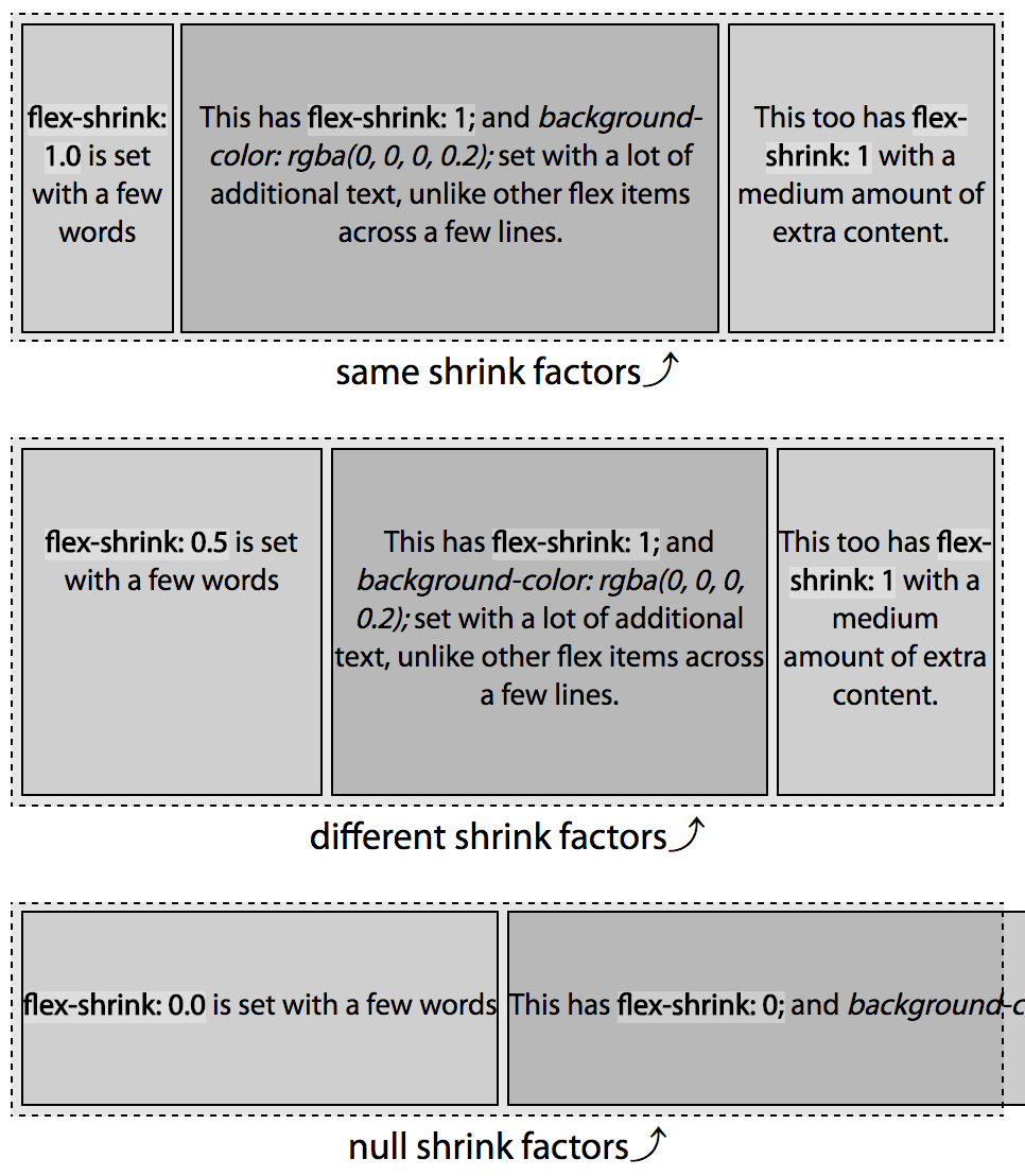
Figure 3-8 is similar to Figure 3-4, with the
flex items set to 300 px instead of 100 px. We have a 750 px-wide flex
container with three 300 px-wide flex items. The total width of the 3
items is 900 px, meaning the content is 150 px wider than the parent flex
container. If the items are not allowed to shrink or
wrap (see “The flex-wrap Property”), they will burst out from the
fixed-size flex container. This is demonstrated in the first example in
Figure 3-8: those items will not shrink as they have a null shrink factor.
Instead, the flex items overflow the flex container along the main-end
side, as justify-content (described in “The justify-content Property”) defaults to flex-start.
In the second example in Figure 3-8, only the last flex item is set to be able to shrink. We forced the single element with a positive shrink factor to do all the shrinking necessary to enable all the flex items to fit within the container. With 900 px worth of content needing to fit into our 750 px container, we have 150 px of negative space. The 2 flex items with no shrink factor stay at 300 px wide. The third flex item, with the positive value for the shrink factor, shrinks down by 150 pixels, to be 150 px wide, enabling the 3 items to fit within the container. In this example the shrink factor was 1, but had it been 0.001 or 100, the layout would be the same.
Figure 3-8. A flex shrink factor of 0 will not allow flex items to shrink; any positive value will enable the item to shrink proportionally relative to sibling flex items that are allowed to shrink on the same flex line
When omitted in the shorthand flex property value or when both flex
and flex-shrink are omitted, the shrink factor defaults to 1. Like the
growth factor, the value is always a number. Negative numbers are not
valid. Floats, as long as they are greater than 0, are valid.
In the third example, we provided positive shrink factors for all three
flex items:
This is likely not the layout you will be developing for production. So,
use the flex shorthand.
If all items are allowed to shrink, as is the case here, the shrinking
is distributed proportionally based on the shrink factor of the
individual items that have a positive value set for that property.
When all items have the same basis, it’s easy to figure out how they
will shrink based on the values of their shrink factors. With a parent
750 px wide, and 3 flex items with a width of 300 px, there are 150
extra pixels that need to be shaved off of the flex items that are
allowed to shrink. With two flex items having a shrink factor of 1, and
one flex item having a shrink factor of 3, we have a total of five
shrink factors:
(2 x 1) + (1 x 3) = 5
With 5 shrink factors, and a total of 150 px needing to be shaved off all
the flex items, each shrink factor is worth 30 px:
150px / 5 = 30px.
The default flex item size was 300 px, leading us to have 2 flex items
with a width of 270 px each and the last flex item having a width of
210 px, which total 750 px. In shrinking proportionally based on their
shrink factor, we have dictated how they shrink to fit in the space
allotted:
The flex items will shrink to 270 px, 270 px, and 210 px, respectively, as
long as the content (like media objects or nonwrappable text) within
each flex item is not wider than 270 px, 270 px, or 210 px, respectively:
The preceding code produces the same outcome: while the numeric representation of the shrink factors are
different, they are proportionally the same.
A positive shrink value does not mean a flex item will necessarily
shrink even if there isn’t room available in the parent flex container
for it and its siblings. If the flex item contains content that cannot
wrap or otherwise shrink in the main-dimension, the flex item will not
shrink.
For example, if the first flex items contain a 300 px–wide image or an URL of
characters wider than 300 px, the 150 px of negative space would be distributed among the four available shrink factors:
item1 = 300px - (0 x 37.5px) = 300.0px
item2 = 300px - (1 x 37.5px) = 262.5px
item3 = 300px - (3 x 37.5px) = 187.5px
In this case, the first item would be 300 px, with the 150 px of negative
space distributed proportionally based on the shrink factors of the
second and third flex items. That first flex item can not shrink, and
other flex items can shrink, therefore it will not shrink, as if it had
a null shrink factor. We have 4 unimpeded shrink factors for 150 px of
negative space, with each shrink factor being worth 37.5 px. The flex
items are 300 px, 262.5 px, and 187.5 px respectively, for a total of 750 px.
Had the image or URL in the first flex item been 296 px wide, that first
flex item would have been able to shrink by 4 px. We would have then
distributed the 146 of negative space among the 4 remaining shrink
factors for flex items that were 296 px, 263.5 px, and 190.5 px wide, respectively.
If all 3 flex items contained non-wrappable URLs, or media 300 px or
wider, the 3 flex items would not shrink, appearing similar to the
first example in Figure 3-8.
All the items had the same width or flex basis, therefore this is easy
to calculate. Had they not had the same widths, this equation would be
more complex. This only works this way because all the flex items had
the same flex bases.
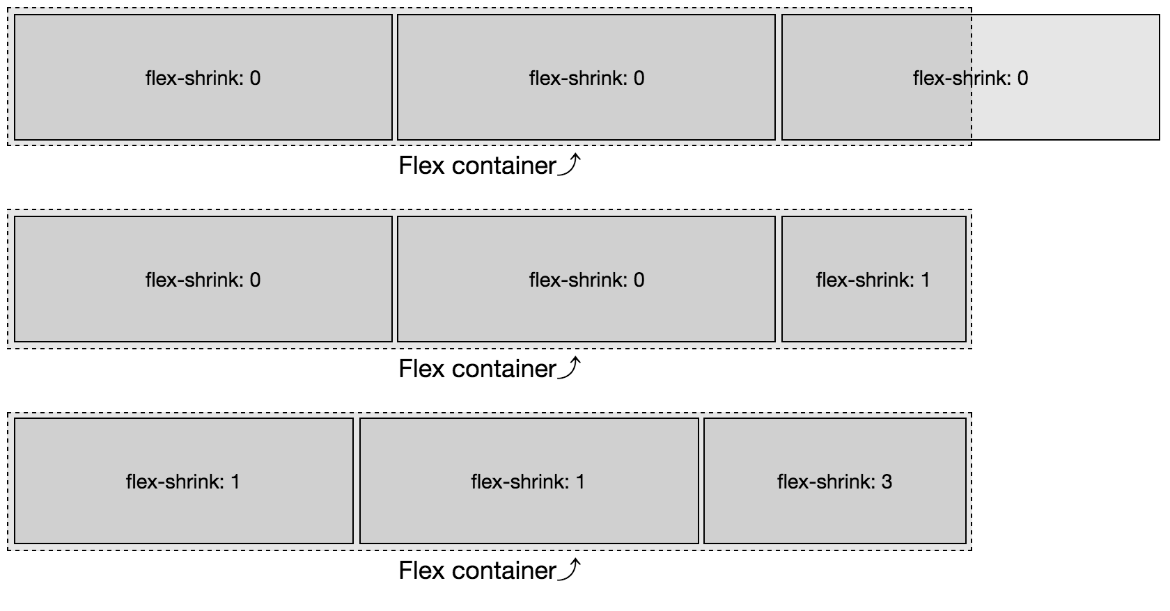
Proportional Based on Width and Shrink Factor
The preceding code example was fairly simple because all the flex items started with the same
width. But what if the widths were different? What if the first and last
flex items had a width of 250 px and the middle flex item had a width of
500 px?
Flex items shrink proportionally relative to both the shrink factors and
the flex item width, with the width often being content, the width of the flex item’s content with no wrapping. In Figure 3-9, we are trying to fit 1,000 pixels into a
750 px-width flex container. We have an excess of 250 px to be removed from
five shrink factors. If this were a flex-grow concern, we would simply
divide 250 px by 5, allocating 50 px per growth factor. If we shrank that
way, we would see 200 px, 550 px, and 100 px wide flex items, respectively.
But that’s not what we see.
Figure 3-9. Flex items shrink proportionally relative to their shrink factor
Instead we have 250 px of negative space to proportionally distribute. To get the shrink factor proportions, we divide the negative space by the actual space times their shrink factors:
Using this equation, we learn the shrink factor percent:
We get flex items that are 208.33 px, 416.67 px, and 125 px wide,
respectively.
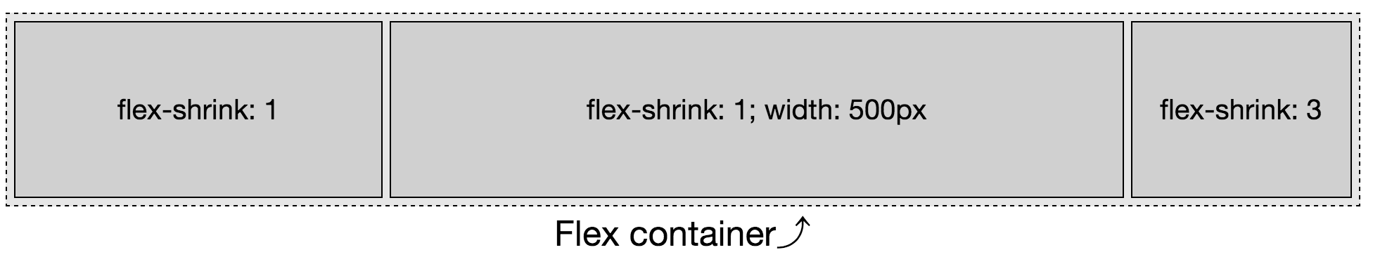
In the Real World
Allowing flex items to shrink proportionally like this allows for
responsive objects and layouts that can shrink proportionally without
breaking.
For example, you can create a three-column layout that smartly grows
and shrinks without media queries, as shown on a wide screen in Figure 3-10 and narrower screen in Figure 3-11):
Figure 3-10. By setting different values for growth, shrink, basis, and min-width, you can create responsive layouts, with or without media queries
Figure 3-11. With growth, shrink, basis, and min-width set, you can create responsive layouts that look great on narrower screens, without needing a multitude of media queries
In this example, if the viewport is greater than 1,000 px, only the middle
column grows because only the middle column was provided with a positive growth factor. We also dictated that below the 1,000 px-width mark the right column
shrinks twice as fast as the left 2 columns, using min-width to
ensure the columns never shrinks below its narrowest word or that
minimum width, whichever is greater.
Differing Bases
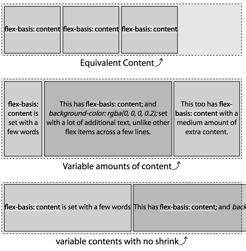
With a null shrink factor, if no width or basis is set on a flex item,
its content will not wrap. When we have more content than could neatly
fit on one line, a positive shrink value enables the content to wrap. Shrink factors enable proportional wrapping. Because shrinking is proportional based on shrink factor, if all the flex items have similar shrink factors, the content should wrap over a similar number of lines.
Unlike in the previous examples in this chapter, in the two examples in
Figure 3-12, the flex items do not have a declared width. Rather, the width is based on the content—the width defaults to auto, as does the flex basis, as if flex-basis: content were set (see “The flex-basis Property”).
Figure 3-12. Flex items shrink proportionally relative to their shrink factor and content
You’ll note in the first example, all content wraps over four lines. In
the second example, the first flex item, with a shrink factor half of
value of the other flex items, wraps over half the number of lines. This
is the power of the shrink factor.
In the third example, with a null shrink factor, the text doesn’t wrap and the flex items overflow the container.
Because the flex property’s shrink factor reduces the width of flex
items proportionally, the number of lines of text in the flex items will
grow or shrink as the width shrinks or grows, leading to similar height
content within sibling flex items when the shrink factors are similar.
In the examples, the content of the flex items on my device are 280 px,
995 px, and 480 px, respectively—which is the width of the nonwrapping flex items in the third example (as measured by the developer tools, then rounded
to make this example a little simpler). This means we have to fit
1,755 px of content into a 520 px-wide flex container by shrinking the
flex items proportionally based on their shrink factor. This means we
have 1,235 px of negative space to proportionally distribute.
Obviously you can’t rely on web inspector tools to figure out shrink
factors for production. We’re going through this exercise to understand how
shrink factors work. If minutia isn’t your thing, feel free to jump to
“The flex-basis Property”.
Because flex items shrink proportionally, based on the width of their
content, in our example, the single line of text flex items will end up
with the same, or approximately the same, number of lines.
We didn’t declare a width, therefore we can’t simply use 300 px as the
basis as we did in the previous examples. Rather, we distribute the
1,235 px of negative space proportionally based on the widths of the
content—280 px, 995 px, and 480 px, respectively. We determine 520 is
29.63% of 1,755. To determine the width of each flex item with a shrink
factor of 1, we multiply the content width of each flex item by 29.63%:
With the default of align-items: stretch; (see “The align-items Property”), your three-column layout would have, by default, created three columns
of equal height. By using a uniform shrink factor, you can dictate that
the actual content of these three flex items be of approximately equal height: though,
by doing this, the width of those columns will not be uniform. The width
of the flex items is the purview of flex-basis.
In our second example in Figure 3-12, the flex items don’t all have the same shrink
factor. The first flex item will, proportionally, shrink half as much as
the others. We start with the same widths: 280 px, 995 px, and 480 px,
respectively, but the shrink factors are 0.5, 1.0, and 1.0, respectively.
As we know the widths of the content, the shrink factor (X) can be found
mathematically:
We can find the final widths now that we know the shrink factor. If the
shrink factor is 76.47%, it means that item2 and item3 will be 23.53% of
their original widths, and item1, because it has a 0.5 shrink factor,
will be 61.76% of its original width:
The total combined widths of these 3 flex items is 520 px.
Adding in varying shrink and growth factors makes it all a little less
intuitive. That’s why you likely want to always declare the flex
shorthand, preferably with a width or basis set for each flex item.
If this doesn’t make sense yet, don’t worry, we’ll cover a few more
examples of shrinking as we discuss flex-basis.
The flex-basis Property
Again, while we are covering the flex-basis property individually here
so you fully understand it, the CSS working group encourages declaring
the basis as part of the flex shorthand property instead of on its
own. flex resets to common usage (rather than defaulting) the grow,
shrink, and basis values if any of them are not declared within the
shorthand. When flex-basis is set, instead of flex, flex items can
shrink but will not grow, as if flex: 0 1 <flex-basis> were set.
Seriously, use flex instead of declaring the three longhand values separately. We’re only covering the shorthand here because 1) this is the definitive guide, so we have to, and 2) so you fully understand what the flex-basis of the flex shorthand property does. By this point, I hope you’ve been convinced.
As we’ve already seen, a flex item’s size is impacted by its content and
box-model properties and can be reset via the three components of the
flex property. The flex-basis component of the flex property
defines the initial or default size of flex items, before extra or
negative space is distributed—before the flex items are allowed to
grow or shrink according to their growth and shrink factors, which we just
described.
The basis determines the size of the content box, impacted by
box-sizing. By default, when an element is not a flex item,
the size is determined by the size of its parent, content, and box-model
properties. When no size properties are explicitly declared or
inherited, the size defaults to its individual content, border, and
padding, which is 100% of the width of its parent for block-level
elements.
The flex-basis property accepts the same length value types as the
width and height properties—like 5vw, 12%, and 300px—or the
key terms auto, initial, inherit, and content.
None of the flex properties are inherited by default, but you can tell a flex item to inherit the flex-basis from its parent with the inherit value.
The global values of initial resets the flex basis to the initial value of auto, so you might as well declare auto. In turn, auto evaluates to the width (or height) if declared. The main-size keyword used to do this: it was part of an older specification, but was deprecated. If the value of width (or height) is set to auto, then the value is evaluated to content.
content
The content keyword value is
not supported in most browsers at the time of this writing, with the exception of Microsoft Edge 12+, but is equal to the width or height of the content. When content is used and supported, the basis is the size of the flex item’s content—the value being the main-size of the longest line of content or widest (or tallest) media object.
Until support is complete, flex-basis: content; can be easily
polly-filled as it is the equivalent of declaring
flex-basis: auto; width: auto; on that flex item, or
flex-basis: auto; height: auto; if the main-dimension is vertical.
Unfortunately, using content in the shorthand in nonsupporting
browsers invalidates the entire flex declaration. The entire declaration is
invalidated when any value is not understood as per the specification.
The value of content is basically what we saw in the third example in
Figure 3-12, and is shown in Figure 3-13.
Figure 3-13. When set to content the basis is the width (or height) of the content
In the first and third examples in Figure 3-13, the width of the flex item
is the size of the content; and the basis is also that width. In the
first example, the flex items width and basis are approximately 132 px.
The total width of the 3 flex items side by side is 396 px, fitting
neatly into the parent container.
In the third example, we have set a null shrink factor: this means the
flex items cannot shrink, so they won’t shrink or wrap to fit into the
fixed-width flex container parent. Rather, they are the width of their
nonwrapped text. That width is the value of the flex basis. The flex
items’ width and basis are approximately 309 px, 1,037 px, and 523 px,
respectively. You can’t see the full width of the second flex item or
the third flex item at all, but they’re in the
chapter
files.
The second example contains the same content as the third example, but
the flex items are defaulting to flex-shrink: 1: the text in this
example wraps because the flex items can shrink. So while the width of
the flex item is not the width of the content, the flex basis—the
basis by which it will proportionally shrink—is the width of the content: 309 px, 1,037 px, and 523 px, respectively, as measured with developer tools.
When the shrink factors are the same, because flex items shrinking is
proportional based on the content-width flex basis, they end up with the
same or approximately the same number of lines.
Note
Until the content value is supported everywhere, you can
replicate it by setting (or defaulting) the width/height and basis to
auto.
It is the same as setting flex-basis: auto; width: auto; or
flex-basis: auto; height: auto;.
auto
When set to auto, or omitted, the flex-basis is the main-size of
the node had the element not been turned into a flex item. For length
values, flex-basis resolves to the width or height value, with
the exception that when the value of the width or height is auto,
the value resolves to content.
If the basis is explicitly set to auto, or omitted and therefore
defaults to auto, and all the flex items can fit within the parent
flex container, the flex items will be their pre-flexed size, as seen in Figure 3-14. If the
flex items don’t fit into their parent flex container, the flex items
within that container will shrink proportionally based on their
nonflexed main-sizes, unless the shrink factor is null.
Figure 3-14. When a flex basis is set, by default the item’s main-size will be the value declared
When there are no other properties setting the main-size of the flex items
(there’s no width or even min-width set on these flex items), and
flex-basis: auto; or flex: 0 1 auto; is set, the flex items will
only be as wide as they need to be for the content to fit, as seen in the
first example in Figure 3-14. In this case, they are the width of the text
“flex-basis: auto”, which in this case, with this font, is approximately
110 px. The flex items are their pre-flexed size, as if set to
display: inline-block;. In this example, they’re grouped at
main-start because the
flex
container’s justify-content defaults to flex-start.
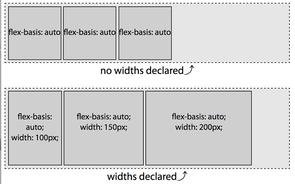
In the second example in Figure 3-14, each of the flex items has flex basis
of auto and a declared width. The main-size of the nodes had the
elements not been turned into a flex items would be 100 px, 150 px, and 200 px. In using flex-basis: auto
we are telling it to use these underlying box-model properties to
determine the flex basis.
There’s a little bit more to understanding of how auto works with the underlying width. While the examples in this section used percentages
and auto, when we discussed the growth and shrink factors earlier, the
flex items had underlying widths of 100 px and 300 px respectively.
Because the basis was not explicitly set to a length, the width value
was the basis in those scenarios.
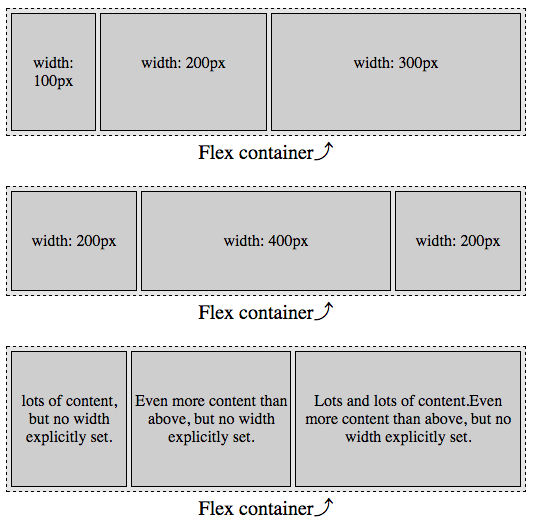
Default Values
When neither flex-basis nor flex is set, the flex item’s main-size is
the pre-flex size of the item, as their default value is auto.
In Figure 3-15 two things are happening: the flex bases are defaulting to auto, and the shrink factor of each item is defaulting to 1. That means the bases are being set to the values of the width properties: 100 px, 200 px, and 300 px in the first example and 200 px, 400 px, and 200 px in the second example, and they are all able to shrink. For each, the flex basis is their individual width value. As the combined widths are 600 px and 800 px, which are both greater than the main-size of the 540 px-wide containers, they are all shrinking proportionally to fit.
In the first example, we are trying to fit 600 px in 540 px, so each flex item will shrink by 10%, resulting in flex items that are 90 px, 180 px, and 270 px. In our second examples, we are trying to fit 800 px into 540 px, making the flex items 135 px, 270 px, and 135 px.
Figure 3-15. When no flex properties are set, the flex item’s main-size will be the pre-flex size of the item
Length Units
In the previous examples, the basis defaulted to the declared widths of
the various flex items. We can use the same length units for our
flex-basis value as we do for width and height.
When there are both flex-basis and width values, the basis trumps the
width. Let’s add bases values to the first example from
Figure 3-15. The flex items include the
following CSS:
Figure 3-16. Note the main-size of the flex item is proportion to the flex-basis property, not the width property
The widths are overridden by the bases. The flex items shrunk down to
270 px, 180 px, and 90 px, respectively.
While the declared basis can override the main-size of flex items, the
size can be impacted by other properties, such as min-width,
min-height, max-width, and max-height. These are not ignored.
Length units: percentages
Percentage values for flex-basis are relative to the size of the main
dimension of the flex container.
We’ve already seen the first example in Figure 3-17. I am including it here to recall that the width of the text “flex-basis: auto” in this case, with my OS, browser, and installed fonts, is approximately 110 px wide. In this case only, declaring flex-basis: auto looks the same as writing flex-basis: 110px:
Figure 3-17. The percentage value for flex-basis is relative to the width of the flex container
In the second example in Figure 3-17, the first two have a flex basis of
auto with a default width of auto, which is as if their flex basis were set to content. As we’ve noted previously, the flex-basis of the first 2 items ends up being the equivalent of 110 px as the content is 110 px wide.
The last item has its flex basis set to 100%. The percentage value is relative to the
parent, which is 540 px. As the third item, with a basis of 100%, is not
the only flex item within the non-wrapping flex container, it will not
grow to be 100% of the width of the parent flex container unless its
shrink factor is set with a null shrink factor (meaning it can’t shrink) or if it contains
nonwrappable content that is as wide or wider than the parent
container. This is not the case. Each flex item contains only wrappable
content, and all three flex items are able to shrink as all have a
default shrink factor of 1.
Note
Remember: when the flex basis is a percent value, the main-size is
relative to the parent, which is the flex container.
If the content is indeed 110 px wide, and the container is 540 px wide (ignoring other box-model properties for simplicity’s sake), we have a total of 760 px to fit in a 540 px space in this second example. With three flex items with flex bases equivalent to 110 px, 110 px, and 540 px, respectively, we’re trying to fit 760 px of content into a 540 px-width container. We have 220 px of negative space to
distribute proportionally. The shrink factor is:
Shrink factor = 220px / 760px = 28.95%
Each flex item will be shrunk by 28.95%, becoming 71.05% of the width
they would have been had they not been allowed to shrink. We can figure
the final widths:
These numbers hold true as long as the flex items can be that small: as long as none of the flex items contain media or nonbreaking text wider than 78.16 px or 383.68 px. This is the widest these flex items will be as long as the content can wrap to be that width or narrower. “Widest” because if one of the other two flex items can’t shrink to be as narrow as this value, they’ll have to absorb some of that negative space.
In our third example, the flex-basis: auto item wraps over three
lines. The CSS for this example is the equivalent of:
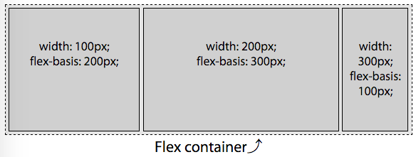
We declared the flex-basis of the 3 flex items to be 70%,
auto, and 80%, respectively. Remembering that “auto” is the width of the nonwrapping content, which in this case is approximately 110 px and our flex container is 540 px, the bases are the
equivalent of:
In this third example we have an item with a basis of 70%. This means the basis is 70% of the parent’s 540 px width, or 378 px. The second item is set to auto, which in this case means 110 px because of the width of the content. Lastly, we have flex item with a basis of 80%, meaning 80% of 540 px, or 432 px. When we add the widths of these 3 flex items, they have total combined width of 920 px, which needs to fit into a flex container 540 px wide. We have 380 px of negative space to remove proportionally among the 3 flex items. To figure out the ratio, we divide the available width of our flex container by the sum of widths of the flex items that they would have if they couldn’t shrink:
Proportional Width = 540px / 920px = 0.587
Because the shrink factors are all the same, this is fairly simple. Each
item will be 58.7% of the width it would be if it had no flex item
siblings:
What happens when the container is a different width? Say, 1,000 px? The
flex basis would be 700 px (70% x 1,000 px), 110 px, and 800 px (80% x 1,000 px), respectively, for a total of 1,610 px:
Because with a basis of 70% and 80%, the combined bases of the flex items will always be wider than 100%, no matter how wide we make the parent, all 3 items will always shrink.
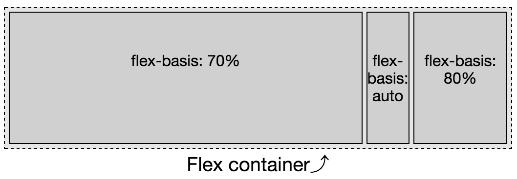
If the first flex item couldn’t shrink, as shown in Figure 3-18, it would be 70% of the width of
the parent—378 px in this case. The other 2 flex items will shrink proportionally to fit into the remaining 30%, or
162 px. In this case, you would expect widths to be 378 px, 32.875 px, and 129.125 px. As the text “basis:” is wider than that (at 42 px on my
device) we get 378 px, 42 px, and 120 px.
Figure 3-18. While the percentage value for flex-basis is relative to the width of the flex container, the main-size is impacted by its siblings
Testing this out on your device will likely have slightly different
results, as the width of the text “flex-basis: auto” may not be the same
on your screen.
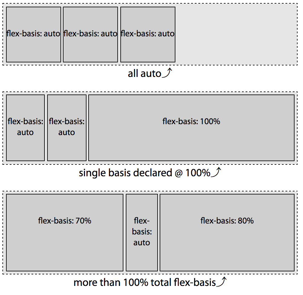
Zero Basis
If neither the flex-basis property nor the flex shorthand is
included at all, the basis defaults to auto. When the flex property is
included, but the basis component of the shorthand is omitted from the
shorthand, the basis defaults to 0%. While on the surface you
might think the two values of auto and 0 may seem similar, the 0
value is actually very different, and may not be what you expect. Once
you understand it, you’ll realize it’s actually fairly intuitive.
The growth and shrink factors have completely different outcomes
depending on whether the basis is set to 0 versus auto, as shown in
Figure 3-19.
It is only the extra space that is
distributed proportionally based on the flex growth factors. In the case of flex-basis: auto;, the basis is the main size of their content. If the basis of each of the flex items is 0, the “available” space is all the space, or main-size of the parent flex container. This “available” space is distributed proportionally based on the growth factors of each flex item. In the case of a basis of 0%, the size of the container is divided up and distributed proportionally to each flex item based on their growth factors—their default original main-size as defined by height, width, or content, is not taken into account, though min-width, max-width, min-height, and max-height do impact the flexed size.
Figure 3-19. flex-basis auto, versus 0
As shown in this example, when the basis is auto, it is just the extra space that is divided up proportionally and added to each flex item set to grow. Again, assuming the width of the text “flex: X X auto” is 110 px, in the first examples we have 210 px to distribute among 6 growth factors, or 35 px per growth factor. Our flex items are 180 px, 145 px, and 215 px wide, respectively.
In the second example, when the basis is 0, all 540 px of the width is distributable space. With 540 px of distributable space between 6 growth factors, each growth factor is worth 90 px. Our flex items are 180 px, 90 px, and 270 px wide, respectively. While our middle flex item is 90 px wide, the content in this example is narrower than the 110 px from our other examples, so the flex item didn’t wrap.
The flex Shorthand Property
Now that we have a fuller understanding of the properties that make up
the flex shorthand, always use the flex shorthand. There are some
commonly used shorthand values, including initial, auto, none, and
the use of an integer, usually 1, meaning the flex item can grow.
Let’s go over all these values.
Common flex Values
The common flex values are four flex values providing the most
commonly desired effects:
flex: initial
This value sizes flex items based on the width/height properties, while allowing shrinking.
flex: auto
This flex value also sizes flex items based on the width/height properties, but makes them fully flexible, allowing both shrinking and growing.
flex: none
This value again sizes flex items based on the width/height properties, but makes them completely inflexible: they
can’t shrink or grow.
flex: n
This value doesn’t care about the width/height values as the shrink factor is set to 0. In this case, the flex item’s size is be proportional to the flex factor n.
flex: initial
Initial is a global CSS keyword, which means initial can be used on all properties to represent the property’s initial value:
flex:initial;flex:01auto;
These lines are the same: flex: initial is the equivalent of
flex: 0 1 auto. This means the flex items’ size will be based on
its own width and height properties, or based on the contents if the
main-size isn’t explicitly set (set or defaulting to auto). If the
flex container is not large enough for the flex items, the flex items
can be shrunk, but the flex items will not grow even if there extra
distributable space available.
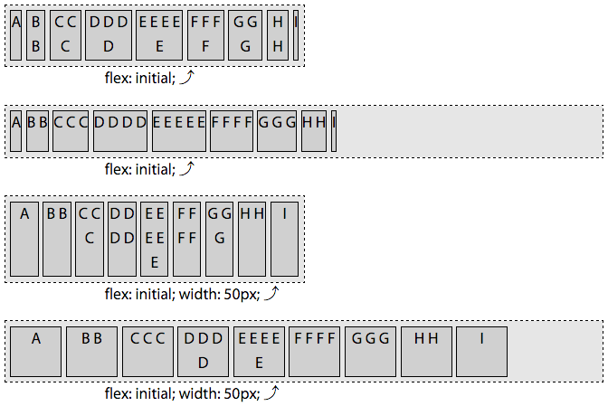
Declaring flex: initial sets a null growth factor, a shrink factor of 1, and sets the flex bases to auto. In Figure 3-20, we can see the effect of the auto flex bases. In the first two examples, the basis of each flex item is content—with each flex item having the width of the single line of letters that make up their content. In the last 2 examples, the flex bases of all the items are equal at 50 px, since width: 50px has been applied to all the flex items. The flex: initial declaration sets the flex-basis to auto, which we previously learned means it is the value of the width (or height), if declared, or content if not declared.
Figure 3-20. With containers of different main sizes, the flex items shrink but won’t grow when flex: initial is set on the flex items
In the first and third examples in Figure 3-20, we see how, if the flex container is too small to fit all the flex items at their default main-size, the flex items will shrink, with all the flex items fitting within the parent flex container. In these examples, the combined flex bases of all the flex items is greater than the main-size of the flex container. In the first example, the amount by which each flex item shrinks are all different. They all shrink proportionally based on their shrink factor. In the third example, with each flex item’s flex-basis being equal at 50 px, all the items shrink equally.
In the first example, you’ll note the last flex item, with the single
narrow capital letter I, is the narrowest flex item in the group,
followed by A (They would have been the same had we used a monospaced font family). B and H are wider than A and I, even with the wrapping caused by the flex items shrinking, because their bases are based on three characters (two letters and a space) rather than one. The shrinking results in these flex items having only one letter per line of text, but they are still wider than the flex items that have a single character as their bases.
The flex items with more characters
are wider because flex-basis is based on the width of the content. A
and I are one letter wide. The basis for B and H are based on the
width of two space-separated letters. Similarly, D and F are wider
than C and G. In the first example, with flex: initial, E ends up being the widest as it has the most characters creating the widest content of all the bases.
In the second and fourth examples, the flex items all fit, so there is
no shrinkage. When flex: initial is set, the growth factor is null, so
the flex items can’t grow, and therefore don’t grow, to fill up their container.
Flex items, by default, are grouped at main start, as flex-start is
the default value of for the justify-content property. This is only
noticable when the combined main-size of the flex items on a flex line are smaller than the main-size of the flex container.
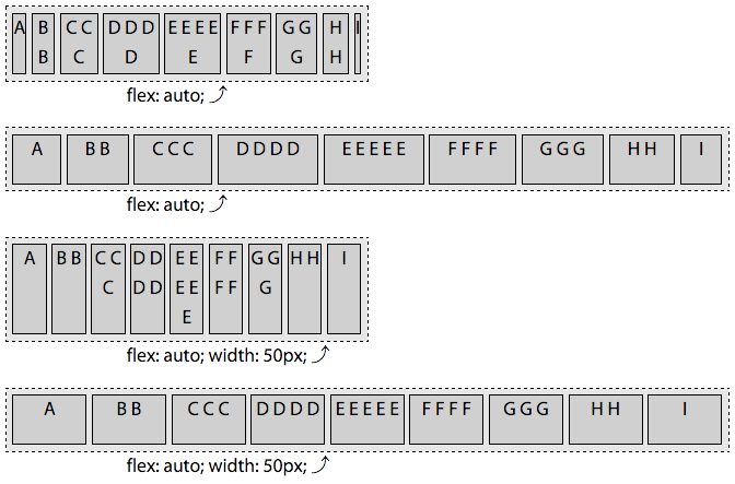
flex: auto
Setting flex: auto; on a flex item is the same as
setting flex: 1 1 auto. The following two statements are equivalent:
flex:auto;flex:11auto;
flex: auto is similar to flex: initial, but makes the flex items
flexible in both directions: they’ll shrink if there isn’t enough room
to fit all the items within the container, and they’ll grow to take up
all the extra space within the container if there is distributable
space. The flex items absorb any free space along the main-axis.
You’ll note the first and third examples of Figure 3-21 are identical to
the examples in Figure 3-20, as the shrinking and bases are the same.
However, the second and fourth examples are different, as when
flex: auto is set, the growth factor is not null, and the flex items therefore grow incorporating all the extra available space.
Figure 3-21. With flex: auto set on the flex items, they can grow and shrink
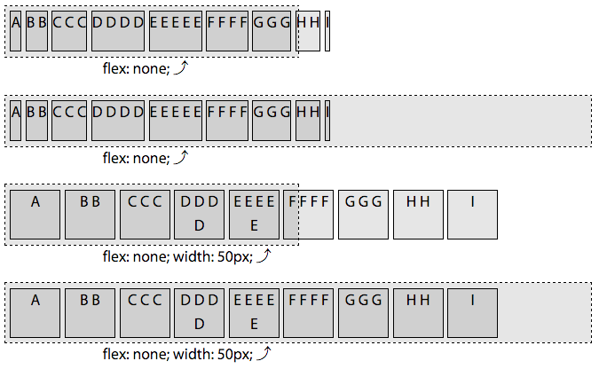
flex: none
Setting flex: none is equivalent to setting
flex: 0 0 auto, making the following two lines of CSS equivalent:
flex:none;flex:00auto;
The flex: none items are inflexible: the flex items will neither
shrink nor grow.
As demonstrated in the first and third examples of Figure 3-22, if there
isn’t enough space, the flex items overflow the flex container. This is
different from flex: initial and flex: auto, which both set a
positive shrink factor.
Figure 3-22. With flex: none, flex items will neither grow nor shrink
The basis resolves to auto, meaning each flex item’s main-size is determined by the main-size of the node had the element not been turned into a flex item: the flex-basis resolves to the width or height value. If that value resolved to auto, the basis would be the main-size of the content. In the first two examples, the basis—and the width, since there is no growing or shrinking—is the width of the content. In the third and fourth examples, the width and basis are all 50 px.
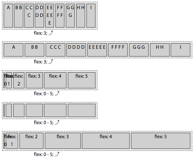
flex: n
When the values of the flex property is a single, positive numeric value, that value will be the growth factor, while the shrink factor will default to 0, and the basis will default to 0%:
flex-grow:n;flex-shrink:0;flex-basis:0%;
The following two CSS declarations are equivalent:
flex:3;flex:300%;
Declaring flex: 3 is the same as declaring flex: 3 0 0%. This makes
the flex item on which it is set flexible: it can grow. The shrink
factor is actually moot, as the flex-basis was set to 0% and the
flex item, even if a positive shrink factor were declared, cannot be
less than 0 px wide or tall.
In the first two examples in Figure 3-23, all the flex items have a flex growth factor of 3. All the flex items in each example grew to be the same
width. While in Figures 3-20, 3-21, and 3-22, the flex items shrank to fit the flex container parent, when you set flex: n, where n is any positive float, the basis is 0, so they didn’t “shrink”; they just grew equally from 0px wide until the sum of their main dimension grew to fill the container’s main dimension. With all the flex items having a basis of 0, 100% of the main dimension is distributable space. The main-size of the flex items are wider in this second example as the wider parent has more distributable space.
Any value for n that is greater than 0, even 0.1, means the flex item
can grow. The n is the growth factor. When there is available space to
grow, if only one flex item has a positive growth factor, that item will
take up all the available space. If all the items can grow, the
available extra space will be distributed proportionally to each flex
item based on to their growth factor. In the case of all the flex items
having flex: n declared, where n is a single or variety of positive
numbers, the growth will be proportional based only on n, not on the
underlying main size, as the basis for each flex item is 0.
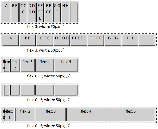
In the last three examples of Figure 3-23, there are six flex items with flex: 0, flex: 1, flex: 2, flex: 3, flex: 4, and flex: 5 declared, respectively. These are the growth factors for the flex items, with each having a shrink factor of 0 and a basis of 0. The main-size of each is proportional to the specified flex growth factor.
Figure 3-23. With flex: n, you’re declaring the flex items growth factor while setting the flex basis to zero
There are 15 total growth factors distributed across 6 flex items. The narrow flex container is 300 px wide, meaning each growth factor is worth 20 px. This means the widths of the flex items will be 0, 20 px, 40 px, 60 px, 80 px, and 100 px, for a total of 300 px. The last example has a width of 600 px, meaning each growth factor is worth 40 px. This leaves us with flex items that are 0, 40 px, 80 px, 120 px, 160 px, and 200 px, for a total of 600 px.
We added a bit of padding, margins, and borders on the example to make the visuals more pleasing. For this reason, the leftmost flex item, with flex: 0 declared, is visible: it has a 1 px border making it visible even though it’s 0 px wide.
If we had declared a width on these flex items, it would have made no difference. Setting flex: 0, flex: 5, or any other values for n in flex: n sets the flex-basis to 0%. You’ll see no difference between Figures 3-23 and
3-24, other than the “width: 50px” in the paragraph below each flex container.
Figure 3-24. With flex: n, the basis of the flex item is 0, not auto, so setting a width will not alter the appearance
Custom flex Values
flex: initial, flex: auto, flex: none, and flex: n are preset values. While these are provided as they are the most
commonly used values, they may not meet all of your needs, and they don’t
provide as much flexibility as defining your own custom flex values.
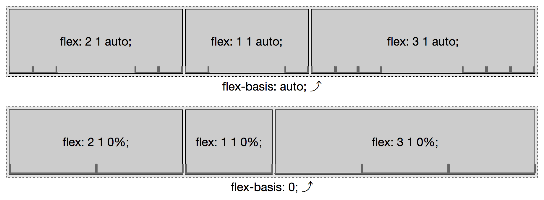
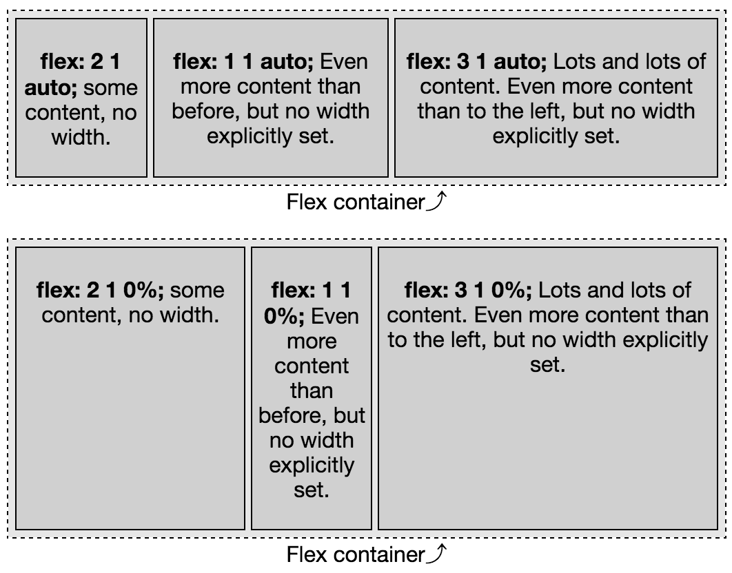
When flex-basis is set to auto, as shown in the first example in
Figure 3-25, the main-size of each flex item is based on the content. Looking at the growth factor, you may have thought the middle item would be the
narrowest as the growth factor is the smallest, but there is no
“growing.” In this example there is no available distributable space. Rather, they’re all shrinking equally as they all have the same shrink factor and the basis of auto means the basis is the width of the content. In
this case the flex items’ content are all of equal height, as the size
of each is based on the flex basis, rather than the growth factor.
In the second example in Figure 3-25, the basis is 0%, so the main-size is determined by the various growth factors. In this case, the first flex item, with flex: 2 1 0% is twice as wide as the second flex item with flex: 1 1 0%. This second item, in turn, has a main-size that is one-third as wide as the last flex item with flex: 3 1 0%;.
Figure 3-25. flex-basis auto versus 0
We included a shrink factor in this example to make it parallel to the the first example, but it was completely not necessary. When using a 0 (or 0%) basis, the shrink factor has no impact on the main-size of the flex items. We could have included any of the three statements in each declaration:
In these two examples, there was no width set on the flex items. By default, flex items won’t shrink below their minimum content size (the length of the longest word or fixed-size element). To change this, set
the min-width or min-height property. For the examples in Figure 3-25,
had min-width: 200px been set on the second flex item, in both cases, the width would have been 200 px.
How can this help in practice? In theory the similar height
columns we get with auto seem like a good idea, but in reality
controlling the widths of the columns in a multiple-column layout is
likely a greater priority, as demonstrated by the difference in the two
layouts in Figures 3-26 and
3-27.
Figure 3-26. A responsive three-column layout with just a few lines of code and flex: auto
Figure 3-27. Altering the proportion of a responsive layout by altering the flex value of the flex items
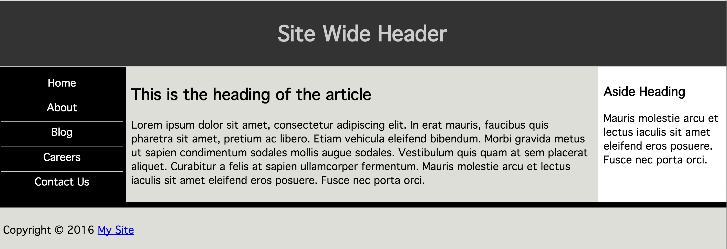
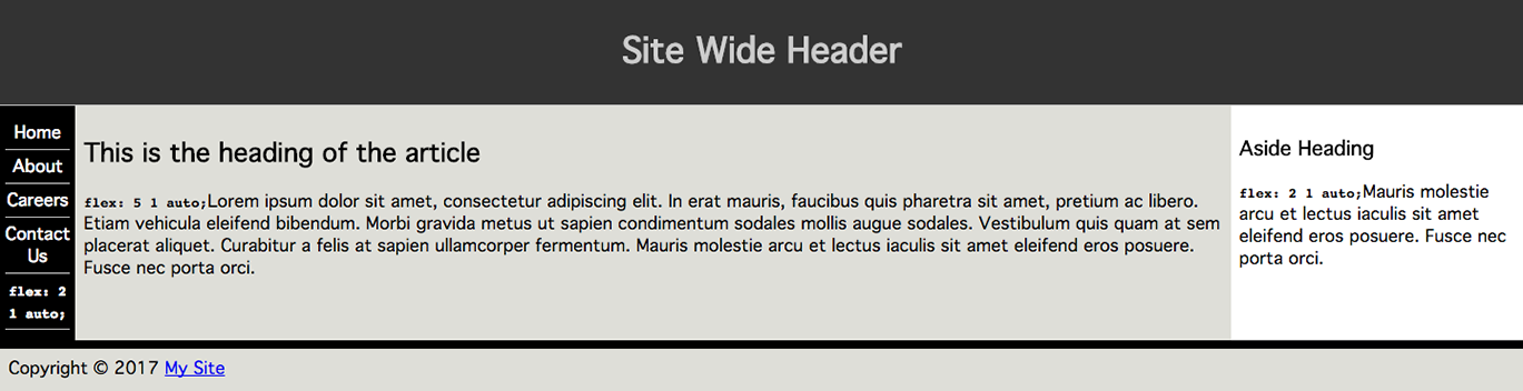
The first example’s flex basis, Figure 3-26, is based on the content. For the
navigation, the longest line, and therefore the basis, is the link with the longest content. If
the article or aside contained a line break in the long and longer
paragraphs, their widths would change.
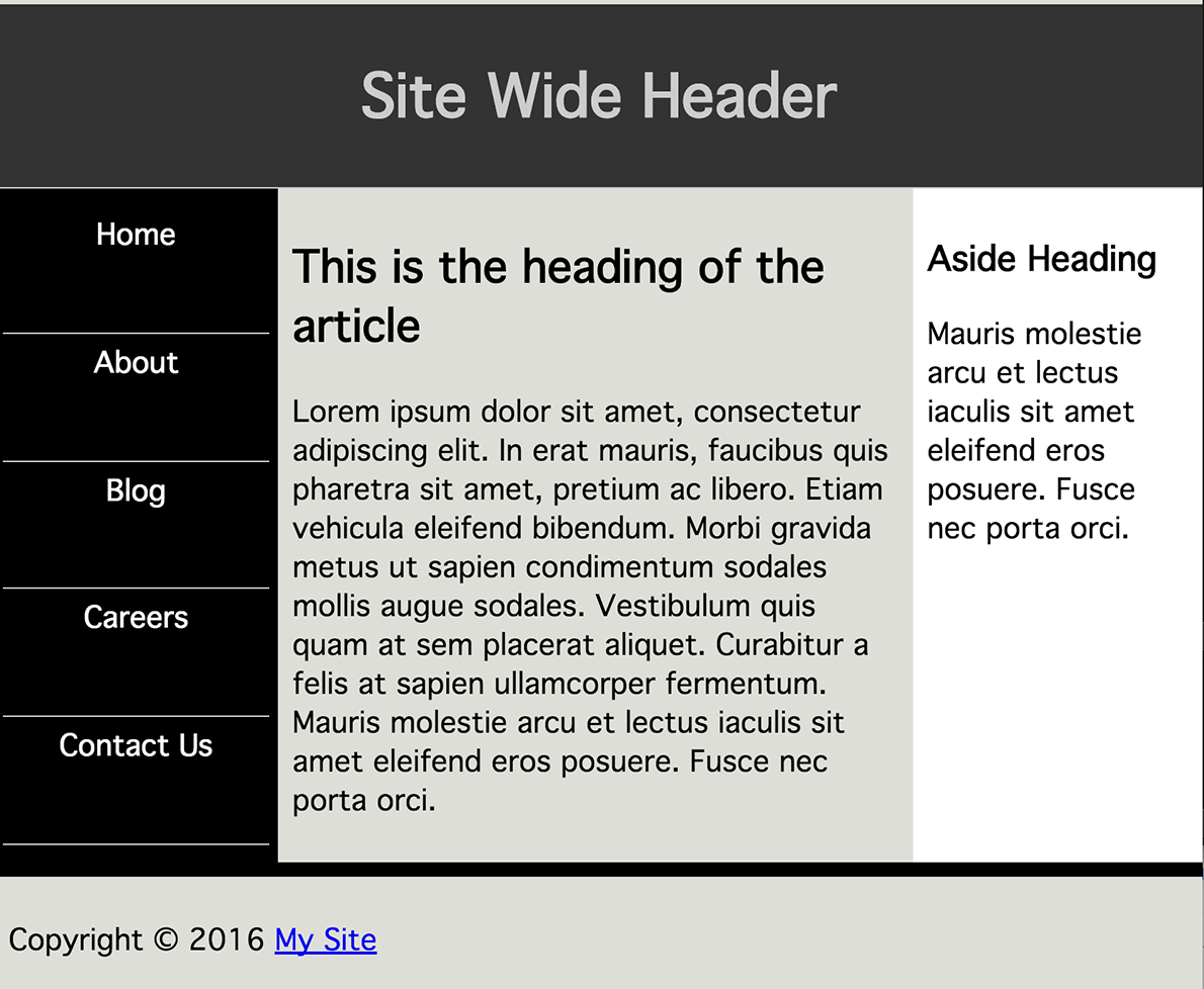
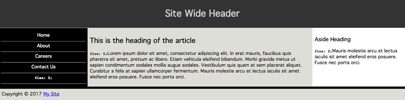
The following CSS was used to create the second example:
In the second example, Figure 3-27, in viewports that are 500 px or wider, the nav and aside will always each be 22% of the width of the main area, unless they contain a component that is wider than 22%. The main article will be 56% of the width. You can include a min-width on any or all of the items, like we did on the navigation and aside, to ensure the layout never gets too narrow. You can use media queries to let the sections of the layout drop on very narrow screens. So many options!
We’ll cover this example again when we discuss the order property “The order property”. Quickly: in
the markup the nav is last, and it will come last on a viewport that is
less than 500 px wide. On wider screens that have room for the three columns,
it will come first in appearance. Screen readers will still read it in
source order (except in Firefox at the moment). Tabbing will still make
it appear last.
Sticky Footer with flex
Obviously, flex can be used for a lot of designs. A common one is
creating a sticky footer. A sticky footer is a fixed-height footer is at
the bottom of the document, sticking to the bottom of the browser window
even when the document would otherwise be shorter than the browser
window.
As you can see in Figure 3-28, when the document gets taller, the footer sticks to the bottom of the window:
If you define the body to be a flex container at least as tall as the
browser window—as we did with min-height: 100vh;—and define the main area of the page to be able to grow, when you give the footer a defined height, it will always be that height, stuck to the bottom of the document, appearing stuck to the bottom of the browser window, even if the main area doesn’t have enough content to fill the window and grows to fill the available space.
Without a flex value, the footer will neither shrink nor grow, as the
main area will be doing the growing.
The main area will not shrink to be less tall than the left navigation even though it theoretically could shrink with a flex: 1; being set on main. The reason? In this example, both the <main> and
<nav> elements are both flex items and flex containers, with the
navigation item not being shrinkable. Had we set:
nava{flex:010%;}
the links would have been able to shrink, and, with a flex-basis of 0,
would have shrunk, enabling the main to shrink further, leaving room
for the footer to be at its declared height.
The align-self Property
The align-self property is used to override the align-items property
value on a per-flex-item basis.
With the align-items property set on the flex container, you can
align all the flex items of that container to the start, end, or center
of the cross-axis of their flex line. The align-self property, which
is set directly on the flex item, enables you to override the aligns-items property on a per-flex-item basis.
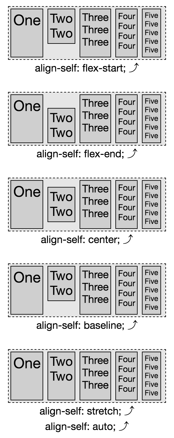
You can override the alignment of any individual flex item with the
align-self property, as shown in Figure 3-29. The default value of align-items is stretch, which is why all the flex items in the five examples in Figure 3-29 are all as tall as the parent, with the exception of the second flex item. All the flex items have the align-self’s default value of auto set, meaning they inherit the alignment from the container’s align-items property, except the second flex item in each example. Each “two” has a different align-self value set.
Just as with the values of the align-items property, the flex-start value places the item at the cross-start edge. flex-end places the item at the cross-end edge. center aligns the item in the middle of the cross axis, etc. In this example, auto, inherit, and stretch all stretch the flex items, as the align-items value was allowed to default to stretch.
To learn more about the flex-start, flex-end,
center, baseline, and stretch values, see
“The align-items Property”.
Figure 3-29. You can overwrite the alignment of any individual flex item with the align-self property; note the default value of align-items is stretch
The order property
Flex items are, by default, displayed and laid out in the same order as
they appear in the source code. The order of flex items and flex lines can be reversed with flex container property reverse values. The order property can be used to
change the ordering of individual flex items.
The order property enables you to control the order in which flex items appear within the flex container by assigning them to ordinal groups. By default, all flex items are assigned the order of 0, with the flex items being displayed in the same order as the source order and the direction of that order based on the flex container properties (“Flex Container Properties”).
To change the visual order of a flex item, set the order property
value to a nonzero integer. Setting the order property on elements
that are not children of a flex container has no effect on that element:
the property is basically ignored in that case.
The value of the order property specifies which ordinal group the flex
item belongs to. Any flex items with a negative value will appear to
come before those defaulting to 0 when drawn to the page, and all the
flex items with a positive value will appear to come after those
defaulting to 0. While visually altered, the source order remains the
same. Screen readers and tabbing order remains as defined by the source
order of the HTML.
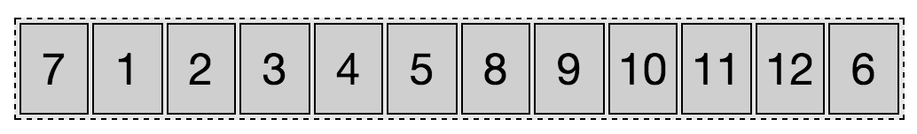
For example, if you have a group of 12 items, and you want the 7th
to come first and the 6th to be last, as shown in Figure 3-30, you would declare:
Figure 3-30. Setting order to any value other than 0 will reorder that flex item
In this scenario, we are explicitly setting the order for the sixth and
seventh list items, while the other list items are defaulting to order: 0.
As shown in Figure 3-30, the flex items are laid out from lowest order
value to highest. The seventh item is the first in appearance due to the
negative value of the order property—order: -1—which is less
than the default zero, and the lowest value of any of its sibling flex
items. The sixth item, the only item with a value greater than zero, and
therefore having the highest order value out of all of its siblings,
will visually appear last. All the other items, all having the default
order of 0, will be drawn to the page between these first and last
items, in the same order as their source order, since they are all
members of the same ordinal group—0.
The flex container lays out its content in order-modified document
order, starting from the lowest numbered ordinal group and going up.
When you have multiple flex items having the same value for the order
property, the items are in the same ordinal group. The flex items will
appear in order by ordinal group, and the items in each ordinal group
will appear in source order:
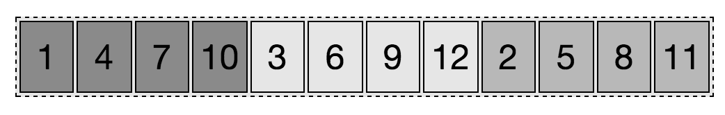
Setting the same order value to more than one flex item, the items
will appear by ordinal group, and by source order within each individual
ordinal group. In Figure 3-31, you’ll note that darkest items appear first,
which have an order: -1 set. Within that ordinal group,
the items appear in the order in which they appear in the source code.
The middle group, the equivalent of li:nth-of-type(3n), has no order
or background-color value set; therefore they default to order:0 and
with a transparent background, the background color of the parent ul
shows through. The last four items have all have order: 3 set, which
is the highest value of any order set, greater than the default 0.
This ordinal group appears last. Within the ordinal group, the elements
are laid out in the order they appeared in the source code.
Figure 3-31. Flex items appear in order of ordinal groups, by source order within their group
This reordering is purely visual. Screen readers
should read the document as it appeared in the source code. As a visual
change, ordering flex items impacts the painting order of the page: the
painting order of the flex items is the order in which they appear, as
if they were reordered in the source document, which they aren’t.
Changing the layout with the order property has no effect on the tab
order of the page. If the numbers in Figure 3-31 were links, tabbing through
the links would go through the links in the order of the source code, not
in the order of the layout. While it might be intuitive that the link
order in Figure 3-31 would be 1, 4, 7, 10, 3, 6, 9, 12, 2, 5, 8, and 11,
tabbing through the links will actually take you in order from 1 through
12.
Tabbed Navigation Revisited
Adding to our tabbed navigation bar example in Figure 1-7,
we can make the currently active tab appear first, as Figure 3-32 shows:
Figure 3-32. Changing the order will change the visual order, but not the tab order
The currently active tab has the .active class added, the href
attribute removed, and the order set to -1, which is less than the
default 0 of the other sibling flex items, meaning it appears first.
Why did we remove the href attribute? As the tab is the currently
active document, there is no reason for the document to link to itself.
But, more importantly, if it was an active link instead of a placeholder
link, and the user was using the keyboard to tab through the navigation,
the order of appearance is Blog, Home, About, Careers, and
Contact Us, with the Blog appearing first; but the tab order would
have been Home, About, Blog, Careers, and Contact Us, following
the source order rather than the visual order, which can be confusing.
The order property can be used to enable marking up the main content
area before the side columns for mobile devices and those using screen
readers and other assistive technology, while creating the appearance of
the common three-column layout: a center main content area, with site navigation
on the left and a sidebar on the right, as we demonstrated in our
“Custom flex Values”.
While you can put your footer before your header in your markup, and use
the order property to reorder the page, this is an inappropriate use
of the property. The order should only be used for visual reordering
of content. Your underlying markup should always reflect the logical
order of your content:
We’ve been marking up websites in the order we want them to appear, as
shown on the right in the preceding code example, which is the same code as in our three-column layout example (Figure 3-10). It really would make more sense if we marked up the page as shown
on the left, with the article content, which is the main content,
first in the source order: this puts the article first for screen
readers, search engines, and even mobile device, but in the middle for
our sighted users on larger screens:
main{display:flex;}main>nav{order:-1;}
By using the order: -1 declaration we are able to make the nav
appear first, as it is the lone flex item in the ordinal group of -1.
The article and aside, with no order explicitly declared, default
to order: 0.
Remember, when more than one flex item is in the same ordinal group,
the members of that group are displayed in source order in the direction
of main-start to main-end, so the article is displayed before the
aside.
Some developers, when changing the order of at least one flex item, like
to give all flex items an order value for better markup readability.
In previous years, before browsers supported flex, all this could have
been done with floats: we would have set float: right on the nav.
While doable, flex layout makes it much simpler, especially if we want
all three columns—the aside, nav, and article—to be of equal
heights.