Table of Contents for
Fine-tuning CSS transitions with the transition-timing-function property
 Fine-tuning CSS transitions with the transition-timing-function property
Published by
O'Reilly Media, Inc., 2016
Fine-tuning CSS transitions with the transition-timing-function property
Published by
O'Reilly Media, Inc., 2016
The transition-timing-function Property
Do you want your transition to start off slow and get faster, start off
fast and end slower, advance at an even keel, jump through various steps,
or even bounce? The transition-timing-function provides a way to
control the pace of the transition. The
transition-timing-function property describes how the transition proceeds as it is being executed.
The transition-timing-function values include ease, linear,
ease-in, ease-out, ease-in-out, step-start, step-end,
steps(n, start)—where n is the number of steps—steps(n, end), and cubic-bezier(x1, y1, x2, y2). These values are
also the valid values for the animation-timing-function.
The non-step keyword are easing timing functions employing cubic Bézier mathematical functions to provide smooth curves. The
specification provides for five predefined easing functions, but you can
describe your own precise timing function by defining your own
cubic-bezier() function, as shown in Table 1-1.
| Timing function | Definition | cubic-bezier value |
|---|---|---|
ease |
Starts slow, then speeds up, then ends very slowly |
cubic-bezier(0.25, 0.1, 0.25, 1)
|
linear |
Proceeds at the same speed throughout transition |
cubic-bezier(0, 0, 1, 1)
|
ease-in |
Starts slow, then speeds up |
cubic-bezier(0.42, 0, 1, 1)
|
ease-out |
Starts fast, then slows down |
cubic-bezier(0, 0, 0.58, 1)
|
ease-in-out |
Similar to ease; faster in the middle, with a slow start but not as slow at the end |
cubic-bezier(0.42, 0, 0.58, 1)
|
cubic-bezier() |
Specifies a cubic-bezier curve |
cubic-bezier(x1, y1, x2, y2)
|
Cubic Bézier curves, including the underlying curves defining the
five named easing functions defined in Table 1-1 and displayed in Figure 1-1, take four numeric parameters. For example,
linear is the same as cubic-bezier(0, 0, 1, 1). The first and third
cubic Bézier function parameter values need to be between 0 and +1.
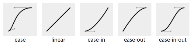
Figure 1-1. Supported cubic Bézier named functions incude ease, linear, ease-in, ease-out, and ease-in-out
If you’ve taken six years of calculus, the method of writing a cubic Bézier function might make sense; otherwise, it’s likely you’ll want to stick to one of the five basic timing functions. There are online tools that let you play with different values, such as cubic-bezier.com, which lets you compare the common keywords against each other, or against your own cubic Bézier function.
The predefined key terms are fairly limited. To better follow the principles of animation, you may want to use a cubic Bézier function with four float values instead of the predefined key words.
As shown in Figure 1-2, the website easings.net provides many additional cubic Bézier function values you can use to provide for a more realistic, delightful animation.
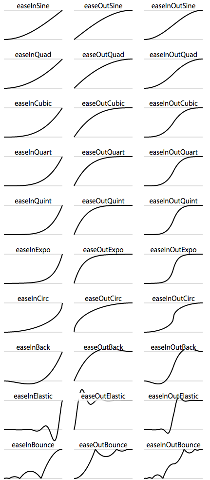
Figure 1-2. Useful author-defined cubic Bézier functions
While the authors of the site named their animations, the preceding names are not part of the CSS specifications, and must be written as follows:
| Unofficial name | Cubic Bézier function value |
|---|---|
|
|
|
|
|
|
|
|
|
|
|
|
|
|
|
|
|
|
|
|
|
|
|
|
|
|
|
|
|
|
|
|
|
|
|
|
|
|
|
|
|
|
|
|
|
|
|
|
There are also step timing functions available, with two predefined step values:
| Timing function | Definition |
|---|---|
|
Stays on the final keyframe throughout transition. Equal to |
|
Stays on the initial keyframe throughout transition. Equal to |
|
Displays n stillshots, where the first stillshot is n/100 percent of the way through the transition. |
|
Displays n stillshots, staying on the initial values for the first n/100 percent of the time. |
As Figure 1-3 shows, the stepping functions show the progression of the transition from the initial value to the final value in steps, rather than as a smooth curve.
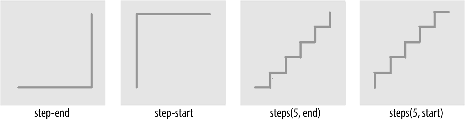
Figure 1-3. Step timing functions
The step functions allow you to divide the transition over equidistant
steps. The functions define the number and direction of steps. There are
two direction options: start and end. With start, the first step
happens at the animation start. With end, the last step happens at the
animation end. For example, steps(5, end) would jump through the
equidistant steps at 0%, 20%, 40%, 60%, and 80%; and steps(5, start)
would jump through the equidistant steps at 20%, 40%, 60%, 80%, and 100%.
The step-start function is the same as steps(1, start). When you use it, the property value stays on the final value from the
beginning until the end of the transition. The step-end function,
which is the same as steps(1, end), sits on the initial value of
the property, staying there through the transition’s duration.
Continuing on with the same super-long transition-property declaration, we can declare a single timing function for all the properties or
individual timing functions for each property, or we can make every even
property have one timing function, while every odd property proceeds at
a separate pace:
div{...transition-property:color,border-width,border-color,border-radius,transform,opacity,box-shadow,width,padding;transition-duration:200ms;transition-timing-function:ease-in;}
In the preceding example, we made all the properties transition at the same tempo by including
a single time as the timing-function value:
div{...transition-property:color,border-width,border-color,border-radius,transform,opacity,box-shadow,width,padding;transition-duration:200ms,180ms,160ms,140ms,120ms,100ms,1s,2s,3s;transition-timing-function:ease,ease-in,ease-out,ease-in-out,linear,step-end,step-start,steps(5,start),steps(3,end);}
We can also create a horrible user experience by making every property
transition at a different rhythm. The transition-timing-function does
not change the time it takes to transition properties: that is set with
the transition-duration property; but it does change how the
transition progresses during that set time:
div{...transition-property:color,border-width,border-color,border-radius,transform,opacity,box-shadow,width,padding;transition-duration:200ms;transition-timing-function:ease,ease-in,ease-out,ease-in-out,linear,step-end,step-start,steps(5,start),steps(3,end);}
If we include these nine different timing functions for the nine different properties, as long as they have the same transition duration and delay, all the properties start and finish transitioning at the same time. The timing function controls how the transition progresses, but does not alter the time it takes for the transition to finish.
The best way to familiarize yourself with
the timing functions is to play with them and see which one works best
for the effect you’re looking for. While testing, set a relatively long
transition-duration to better visualize the difference1 between the
various functions. At higher speeds, you may not be able to tell the
difference with the easing function; just don’t forget to set it back to
under 200 milliseconds before launching your website:
navliul{transition-property:transform,opacity;transition-duration:200ms;transition-timing-function:ease-in;...}
Our navigation example has transitions occurring in two directions: one transition occurs when changing from the default or initial value to the final hovered value. The second transition occurs when the user mouses off the list item and the nested unordered list returns to its previous or initial state. When the user hovers over the drop-down navigation, it transitions open; it transitions closed when the user mouses off.
We want our menu to open and become opaque fairly quickly, while
appearing gradual. The ease-in value is the best for this. The timing
function is reversed in the reverse direction; by default, when returning to the initial values, the transition will run in reverse order, inverting the timing function. It therefore eases in as it opens
and eases out as it closes. In this example, ease-in was used, so the return trip will
appear as if it was set to ease-out as it proceeds in the opposite
direction, going from open to closed. This is the default behavior, but
it can be controlled.
1 You can test the various transition-timing-function examples at http://www.standardista.com/css3/transitions.