Table of Contents for
CSS: The Definitive Guide, 4th Edition
 CSS: The Definitive Guide, 4th Edition
Published by
O'Reilly Media, Inc., 2017
CSS: The Definitive Guide, 4th Edition
Published by
O'Reilly Media, Inc., 2017
- nav
- Cover
- CSS: The Definitive Guide
- CSS: The Definitive Guide
- Dedication
- Preface
- 1. CSS and Documents
- 2. Selectors
- 3. Specificity and the Cascade
- 4. Values and Units
- 5. Fonts
- 6. Text Properties
- 7. Basic Visual Formatting
- 8. Padding, Borders, Outlines, and Margins
- 9. Colors, Backgrounds, and Gradients
- 10. Floating and Shapes
- 11. Positioning
- 12. Flexible Box Layout
- 13. Grid Layout
- 14. Table Layout in CSS
- 15. Lists and Generated Content
- 16. Transforms
- 17. Transitions
- 18. Animation
- 19. Filters, Blending, Clipping, and Masking
- 20. Media-Dependent Styles
- A. Animatable Properties
- B. Basic Property Reference
- C. Color Equivalence Table
- Index
- About the Authors
- Colophon
Chapter 17. Transitions
CSS transitions allow us to animate CSS properties from an original value to a new value over time when a property value changes. These transition an element from one state to another, in response to some change—usually a user interaction, but it can also be due to the scripted change of class, ID, or other state.
Normally, when a CSS property value changes—when a “style change event” occurs—the change is instantaneous. The new property value replaces the old property in the milliseconds it takes to repaint, or reflow and repaint when necessary, the affected content. Most value changes seem instantaneous, taking less than 16 milliseconds1 to render. Even if the changes takes longer, it is still a single step from one value to the next. For example, when changing a background color on mouse hover, the background changes from one color to the next, with no gradual transition.
CSS Transitions
CSS transitions provide a way to control how a property changes from one value to the next over a period of time. Thus, we can make the property values change gradually, creating pleasant and (hopefully) unobtrusive effects. For example:
button{color:magenta;transition:color200msease-in50ms;}button:hover{color:rebeccapurple;transition:color200msease-out50ms;}
In this example, instead of instantaneously changing a
button’s color value on hover, with CSS transitions the button can be set to
gradually fade from magenta to rebeccapurple over 200 milliseconds,
even adding a 50-millisecond delay before transitioning. Changing the
color, no matter how long or short a time it takes, is a transition. But by adding the
CSS transition property, the color change can happen gradually over a period of time and be perceivable by the human eye.
You can use CSS transitions today, even if you still support IE9 or older browsers. When a browser doesn’t support CSS transition properties, the change is immediate instead of gradual, which is completely fine. If the property or property values specified aren’t animatable, again, the change will be immediate instead of gradual.
Note
When we say “animatable,” we mean any properties that can be animated, whether through transitions or animations (the subject of the next chapter, “Animations.”) See Appendix A for a summary.
Sometimes you want instantaneous value changes. Though we used link colors as an example in the preceding section, link colors usually change instantly on hover, informing sighted users an interaction is occurring and that the hovered content is a link. Similarly, options in an autocomplete listbox shouldn’t fade in: you want the options to appear instantly, rather than fade in more slowly than the user types. Instantaneous value changes are often the best user experience.
At other times, you might want to make a property value change more gradually,
bringing attention to what is occurring. For example, you may want to make a card game more realistic by taking
200 milliseconds to animate the flipping of a card, as the user may not
realize what happened if there is no animation. 
Tip
Look for the Play symbol to know when an online example is available. All of the examples in this chapter can be found at https://meyerweb.github.io/csstdg4figs/17-transitions/.
As another example, you may want some drop-down menus to expand
or become visible over 200 milliseconds (instead of instantly, which may be
jarring). With transitions, you can make a drop-down menu appear
slowly. In Figure 17-1 , we transition the submenu’s height by making a scale transform. This is a common use for CSS transitions, which we will also explore later in this chapter.
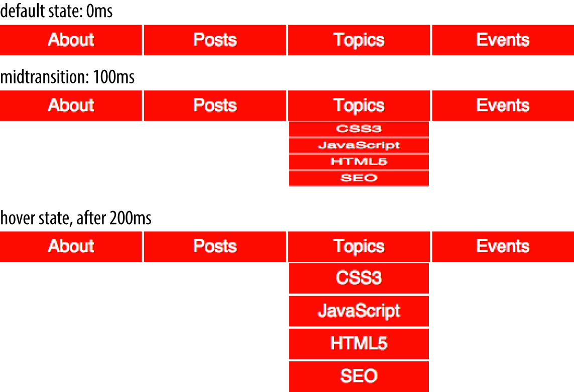
Figure 17-1. Transition initial, midtransition, and final state
Transition Properties
In CSS, transitions are written using four transition properties:
transition-property, transition-duration,
transition-timing-function, and transition-delay, along with the
transition property as a shorthand for the four longhand properties.
To create the drop-down navigation from Figure 17-1, we used all four CSS transition properties, in addition to non-transform properties defining the beginning and end states of the transition. The following code could define the transition for the example illustrated in Figure 17-1:
navliul{transition-property:transform;transition-duration:200ms;transition-timing-function:ease-in;transition-delay:50ms;transform:scale(1,0);transform-origin:topcenter;}navli:hoverul{transform:scale(1,1);}
Note that while we are using the :hover state for the style change event in our transition examples, you can transition properties in other scenarios too. For example, you might add or remove a class, or otherwise change the state—say, by changing an input from :invalid to :valid or from :checked to :not(:checked). Or you might append a table row at the end of a zebra-striped table or list item at the end of a list with styles based
on :nth-last-of-type selectors.
In the scenario pictured in Figure 17-1, the initial state of the nested
lists is transform: scale(1, 0) with a
transform-origin: top center. The final state is transform: scale(1, 1): the transform-origin remains the same.
Note
For more information on transform properties, see Chapter 16.
In this example, the transition properties define a transition on the transform
property: when the new transform value is set on hover, the nested
unordered list scales to its original, default size, changing
smoothly between the old value of transform: scale(1, 0) and the new
value of transform: scale(1, 1), all over a period of 200 milliseconds.
This transition starts after a 50-millisecond delay, and “eases in,”
proceeding slowly at first, then picking up speed as it progresses.
Transitions are declared along with the regular styles on an element. Whenever a target property changes, if a transition is set on that property, the browser will apply a transition to make the change gradual.
Note that all the transition properties were set for the unhovered state of the ul elements. The hovered state was only used to change the transform, not the transition. There’s a very good reason for this: it means not only that the menus will slide open when hovered, but will slide closed when the hover state ends.
Imagine if the transition properties were applied via the hover state instead, like this:
navliul{transform:scale(1,0);transform-origin:topcenter;}navli:hoverul{transition-property:transform;transition-duration:200ms;transition-timing-function:ease-in;transition-delay:50ms;transform:scale(1,1);}
That would mean that when not hovered, the element would have default transition values—which is to say, instantaneous transitions. That means the menus in our previous example would slide open on hover, but instantly disappear when the hover state ends—because without being in hover, the transition properties would no longer apply!
It might be that you want exactly this effect: slide smoothly open, but instantly disappear. If so, then apply the transitions to the hover state. Otherwise, apply them to the element directly so that the transitions will apply as the hover state is both entered and exited. When the state change is exited, the transition timing is reversed. You can override this default reverse transition by declaring different transitions in both the initial and changed states.
By “initial state,” we mean a state that matches
the element on page load. This could be a state that the element always
has, such as properties set on an element selector versus a :hover
state for that element. It could mean a content-editable element that could get
:focus, as in the following:
/* selector that matches elementsallthe time */p[contenteditable]{background-color:rgba(0,0,0,0);}/* selector that matches elementssomeof the time */p[contenteditable]:focus{/* overriding declaration */background-color:rgba(0,0,0,0.1);}
In this example, the fully transparent background is always the initial state, only changing when the user gives the element focus. This is what we mean when we say initial or default value throughout this chapter. The transition properties included in the selector that matches the element all the time will impact that element whenever the state changes, whether it is from the initial state to the changed state (being focused, in the preceding example).
An initial state could also be a temporary state that may change, such
as a :checked checkbox or a :valid form control, or even a class
that gets toggled on and off:
/* selector that matches elementssomeof the time */input:valid{border-color:green;}/* selector that matches elementssomeof the time, when the prior selector does NOT match. */input:invalid{border-color:red;}/* selector that matches elementssomeof the time, whether the input is valid or invalid */input:focus{/* alternative declaration */border-color:yellow;}
In this example, either the :valid or :invalid selector can match any given element, but
never both. The :focus selector, as shown in Figure 17-2, matches whenever an input has focus, regardless of whether the
input is matching the :valid or :invalid selector simultaneously.
In
this case, when we refer to the initial state, we are referring to the
original value, which could be either :valid or :invalid.
The changed state for a given element the opposite of the initial :valid
or :invalid state.
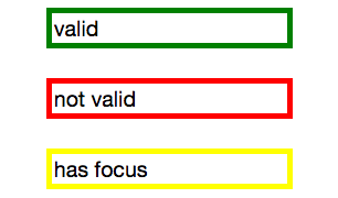
Figure 17-2. The input’s appearance in the valid, invalid, and focused states
Remember, you can apply different transition values to the initial and changed states, but you always want to apply the value used when you enter a given state. Take the following code as an example, where the transitions are set up to have menus slide open over 2 seconds but close in just 200 milliseconds:
navliul{transition-property:transform;transition-duration:200ms;transition-timing-function:ease-in;transition-delay:50ms;transform:scale(1,0);transform-origin:topcenter;}navli:hoverul{transition-property:transform;transition-duration:2s;transition-timing-function:linear;transition-delay:1s;transform:scale(1,1);}
This provides a horrible user experience, but it nicely illustrates the point. When hovered over, the opening of the
navigation takes a full 2 seconds. When closing, it quickly closes over
0.2 seconds. The transition properties in the changed, or hover, state
are in force when hovering over the list item. Thus, the transition-duration: 2s defined for the hover state takes effect.
When a menu is no longer hovered over, it
returns to the default scaled-down state, and the transition properties of
the initial state—the nav li ul condition—are used, causing the menu to take 200ms to close.
Look more closely at the example, specifically the default transition styles. When the user stops hovering over the parent navigational element or the child drop-down menu, the drop-down menu delays 50 milliseconds before starting the 200ms transition to close. This is actually a decent user experience style, because it give users a chance (however brief) to get the mouse point back over a menu before it starts closing.
While the four transition properties can be declared separately, you will probably always use the shorthand. We’ll take a look at the four properties individually first so you have a good understanding of what each one does.
Limiting Transition Effects by Property
The transition-property property specifies the names of the CSS
properties you want to transition. This allows you to limit the transition to only certain properties, while having other properties change instantaneously. And, yes, it’s weird to say “the transition-property property.”
The value of transition-property is a comma-separated list of
properties; the keyword none if you want no properties transitioned;
or the default all, which means “transition all the animatable
properties.” You can also include the keyword all within a
comma-separated list of properties.
If you include all as the only keyword—or default to all—all animatable
properties will transition in unison. Let’s say you want to change a box’s appearance on hover:
div{color:#ff0000;border:1pxsolid#00ff00;border-radius:0;transform:scale(1)rotate(0deg);opacity:1;box-shadow:3px3pxrgba(0,0,0,0.1);width:50px;padding:100px;}div:hover{color:#000000;border:5pxdashed#000000;border-radius:50%;transform:scale(2)rotate(-10deg);opacity:0.5;box-shadow:-3px-3pxrgba(255,0,0,0.5);width:100px;padding:20px;}
When the mouse pointer hovers over the div, every property that has a different
value in the initial state versus the hovered (changed) state will change to the
hover-state values. The transition-property property is used to define
which of those properties are animated over time (versus
instantly). All the properties change from the default value to the
hovered value on hover, but only the animatable properties included in
the transition-property transition over the transition’s duration. Non-animatable
properties like border-style change from one value to the next
instantly.
If all is the only value or the last value
in the comma-separated value for transition-property, then all the
animatable properties will transition in unison. Otherwise, provide a comma-separated list of properties to be affected by the transition properties.
Thus, if we want to transition all the properties, the following statements are almost equivalent:
div{color:#ff0000;border:1pxsolid#00ff00;border-radius:0;transform:scale(1)rotate(0deg);opacity:1;box-shadow:3px3pxrgba(0,0,0,0.1);width:50px;padding:100px;transition-property:color,border,border-radius,transform,opacity,box-shadow,width,padding;transition-duration:1s;}div{color:#ff0000;border:1pxsolid#00ff00;border-radius:0;transform:scale(1)rotate(0deg);opacity:1;box-shadow:3px3pxrgba(0,0,0,0.1);width:50px;padding:100px;transition-property:all;transition-duration:1s;}
Both transition-property property declarations will transition all the
properties listed—but the former will transition only the eight
properties that may change, based on property declarations that may be
included in other rule blocks. Those eight property values are included
in the same rule block, but they don’t have to be.
The transition-property: all in the latter rule ensures that all animatable property
values that would change based on any style change event—no matter
which CSS rule block includes the changed property value—transitions over one second.
The transition applies to all animatable properties of all elements
matched by the selector, not just the properties declared in the same
style block as the all.
In this case, the first version limits the transition to only the eight properties listed, but enables us to provide more control over how each property will transition. Declaring the properties individually lets us provide different speeds, delays, and/or durations to each property’s transition if we declared those transition properties separately:
div{color:#ff0000;border:1pxsolid#0f0;border-radius:0;transform:scale(1)rotate(0deg);opacity:1;box-shadow:3px3pxrgba(0,0,0,0.1);width:50px;padding:100px;}.foo{color:#00ff00;transition-property:color,border,border-radius,transform,opacity,box-shadow,width,padding;transition-duration:1s;}
<divclass="foo">Hello</div>
If you want to define the transitions for each property separately,
write them all out, separating each of the properties with a comma. If
you want to animate almost all the properties at the same time, delay,
and pace, with a few exceptions, you can use a combination of all and
the individual properties you want to transition at different times,
speeds, or pace. Make sure to use all as the first value:
div{color:#f00;border:1pxsolid#00ff00;border-radius:0;transform:scale(1)rotate(0deg);opacity:1;box-shadow:3px3pxrgba(0,0,0,0.1);width:50px;padding:100px;transition-property:all,border-radius,opacity;transition-duration:1s,2s,3s;}
The all part of the comma-separated value includes all the properties
listed in the example, as well as all the inherited CSS properties, and
all the properties defined in any other CSS rule block matching or inherited by the element.
In the preceding example, all the properties getting new values
will transition at the same duration, delay, and timing function, with
the exception of border-radius and opacity, which we’ve explicitly
included separately. Because we included them as part of a comma-separated
list after the all, we can transition them at the the same time,
delay, and timing function as all the other properties, or we can provide
different times, delays, and timing functions for these two properties. In this case, we transition all the properties over one
second, except for border-radius and opacity, which we transition
over two seconds and three seconds respectively. (transition-duration is covered in an upcoming section.)
Note
Make sure to use all as the first value in your comma-separated value list, as the properties
declared before the all will be included in the all, overriding any
other transition property values you intended to apply to those now
overridden properties.
Suppressing transitions via property limits
While transitioning over time doesn’t happen by default, if you do include a CSS
transition and want to override that transition in a particular scenario, you can set
transition-property: none to override the entire transition and ensure no properties are transitioned.
The none keyword can only be
used as a unique value of the property—you can’t include it as part
of a comma-separated list of properties. If you want to override the
transition of a limited set of properties, you will have to list all of
the properties you still want to transition. You can’t use the
transition-property property to exclude properties; rather, you can
only use that property to include them.
Note
Another method would be to set
the delay and duration of the property to 0s. That way it will appear
instantaneously, as if no CSS transition is being applied to it.
Transition events
In the DOM, a transitionend event if fired at the end of every transition, in either
direction, for every property that is transitioned over any amount of
time or after any delay. This happens whether the property is declared individually
or is part of the all declaration. For some seemingly single property
declarations, there will be several transitionend events, as every
animatable property within a shorthand property gets its own transitionend event. Consider:
div{color:#f00;border:1pxsolid#00ff00;border-radius:0;transform:scale(1)rotate(0deg);opacity:1;box-shadow:3px3pxrgba(0,0,0,0.1);width:50px;padding:100px;transition-property:all,border-radius,opacity;transition-duration:1s,2s,3s;}
When the transitions conclude, there will be well
over eight transitionend events. For example, the border-radius
transition alone produces four transitionend events, one each for:
-
border-bottom-left-radius -
border-bottom-right-radius -
border-top-right-radius -
border-top-left-radius
The padding property is also a shorthand for four longhand properties:
-
padding-top -
padding-right -
padding-bottom -
padding-left
The border shorthand property produces eight transitionend events:
four values for the four properties represented by the border-width shorthand, and four for the properties represented by border-color:
-
border-left-width -
border-right-width -
border-top-width -
border-bottom-width -
border-top-color -
border-left-color -
border-right-color -
border-bottom-color
There are no transitionend events for border-style properties, however, as
border-style is not an animatable property.
How do we know border-style isn’t animatable? We can assume it isn’t, since there
is no logical midpoint between the two values of solid and dashed.
We can confirm by looking up the list of animatable properties in Appendix A or the specifications for the individual properties.
There will be 21 transitionend events in our scenario in which 8
specific properties are listed, as those 8 include several shorthand
properties that have different values in the pre and post states.
In the case of all, there will be at least 21 transitionend events:
one for each of the longhand values making up the 8 properties we know are included in the pre and
post states, and possibly from others that are inherited or declared in
other style blocks impacting the element:
You can listen for transitionend events in a manner like this:
document.querySelector('div').addEventListener('transitionend',function(e){console.log(e.propertyName);});
The transitionend event includes three event specific attributes:
-
propertyName, which is the name of the CSS property that just finished transitioning. -
pseudoElement, which is the pseudoelement upon which the transition occurred, preceded by two semicolons, or an empty string if the transition was on a regular DOM node. -
elapsedTime, which is the amount of time the transition took to run, in seconds; usually this is the time listed in thetransition-durationproperty.
The transitionend event only occurs if the property successfully
transitions to the new value. The transitioned event doesn’t fire if
the transition was interrupted, such as by another change to the same property on the same element.
When the properties return to their initial value, another
transitionend event occurs. This event occurs as long as the
transition started, even if it didn’t finish its initial transition in the
original direction.
Setting Transition Duration
The transition-duration property takes as its value a comma-separated
list of lengths of time, in seconds (s) or milliseconds (ms). These values describe the time it will
take to transition from one state to another.
If reverting between two states, and the duration is only present in a declaration applying to one of those states, the transition duration will only impact the transition to that state. Consider:
input:invalid{transition-duration:1s;background-color:red;}input:valid{transition-duration:0.2s;background-color:green;}
If different values for the transition-duration are declared, the
duration of the transition will be the transition-duration value declared in the rule block to which it is transitioning. In the preceding example, it will take 1 second for the input to change to a red background when it becomes invalid, and only 200 milliseconds to transition to a green background when it becomes valid.
The value of the transition-duration property is a
positive value in either seconds (s) or milliseconds (ms). The time unit of ms or s is required by the specification, even if the
duration is set to 0s. By default, properties change from one value to the next instantly, showing no visible animation, which is why the default value for the duration of a transition is 0s.
Unless there is a positive value for transition-delay set on a property, if transition-duration is omitted, it is as if no transition-property declaration had been
applied—with no transitionend event occuring. As long
as the total time set for a transition to occur is greater than zero seconds—which can happen with a duration of 0s or when the
transition-duration is omitted and defaults to 0s—the transition will still be
applied, and a transitionend event will occur when the transition
finishes.
Negative values for transition-duration are invalid, and, if included, will invalidate the entire
property value.
Using the same super-long transition-property declaration from before, we
can declare a single duration for all the properties or individual
durations for each property, or we can make alternate properties animate
for the same length of time. We can declare a single duration that applies to all properties during the transition by including a single transition-duration value:
div{color:#ff0000;...transition-property:color,border,border-radius,transform,opacity,box-shadow,width,padding;transition-duration:200ms;}
We can also declare the same number of comma-separated time
values for the transition-duration property value as the CSS
properties listed in the transition-property property value. If
we want each property to transition over a different length of time, we
have to include a different comma-separated value for each property name
declared:
div{color:#ff0000;...transition-property:color,border,border-radius,transform,opacity,box-shadow,width,padding;transition-duration:200ms,180ms,160ms,140ms,120ms,100ms,1s,2s;}
If the number of properties declared does not match the number of
durations declared, the browser has specific rules on how to handle the
mismatch. If there are more durations than properties, the extra
durations are ignored. If there are more properties than durations, the
durations are repeated. In this example, color, border-radius, opacity, and width have a duration of 100 ms; border, transform, box-shadow, and padding will be set to 200 ms:
div{...transition-property:color,border,border-radius,transform,opacity,box-shadow,width,padding;transition-duration:100ms,200ms;}
If we declare exactly two comma-separated durations, every odd property will transition over the first time declared, and every even property will transition over the second time value declared.
User experience is important. If a transition is too slow, the website will appear slow or unresponsive, drawing unwanted focus to what should be a subtle effect. If a transition is too fast, it may be too subtle to be noticed. While you can declare any positive length of time you want for your transitions, your goal is likely to provide an enhanced rather than annoying user experience. Effects should last long enough to be seen, but not so long as to be noticeable. Generally, the best effects range between 100 and 200 milliseconds, creating a visible, yet not distracting, transition.
We want a good user experience for our drop-down menu, so we set both properties to transition over 200 milliseconds:
navliul{transition-property:transform,opacity;transition-duration:200ms;...}
Altering the Internal Timing of Transitions
Do you want your transition to start off slow and get faster, start off
fast and end slower, advance at an even keel, jump through various steps,
or even bounce? The transition-timing-function provides a way to
control the pace of the transition.
The transition-timing-function values include ease, linear,
ease-in, ease-out, ease-in-out, step-start, step-end,
steps(n, start)—where n is the number of steps—steps(n, end), and cubic-bezier(x1, y1, x2, y2). (These values are
also the valid values for the animation-timing-function and are
described in great detail in Chapter 18.)
The non-step keywords are easing timing functions that server as aliases for cubic Bézier mathematical functions that provide smooth curves. The specification provides for five predefined easing functions, as shown in Table 17-1.
| Timing function | Description | Cubic Bezier value |
|---|---|---|
cubic-bezier() |
Specifies a cubic-bezier curve |
cubic-bezier(x1, y1, x2, y2)
|
ease |
Starts slow, then speeds up, then slows down, then ends very slowly |
cubic-bezier(0.25, 0.1, 0.25, 1)
|
linear |
Proceeds at the same speed throughout transition |
cubic-bezier(0, 0, 1, 1)
|
ease-in |
Starts slow, then speeds up |
cubic-bezier(0.42, 0, 1, 1)
|
ease-out |
Starts fast, then slows down |
cubic-bezier(0, 0, 0.58, 1)
|
ease-in-out |
Similar to ease; faster in the middle, with a slow start but not as slow at the end |
cubic-bezier(0.42, 0, 0.58, 1)
|
Cubic Bézier curves, including the underlying curves defining the
five named easing functions defined in Table 17-1 and displayed in Figure 17-3, take four numeric parameters. For example,
linear is the same as cubic-bezier(0, 0, 1, 1). The first and third
cubic Bézier function parameter values need to be between 0 and +1.
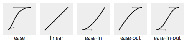
Figure 17-3. Curve representations of named cubic Bézier functions
The four numbers in a cubic-bezier() function define the x and y coordinates of two handles within a box. These handles are the endpoints of lines that stretch from the bottom-left and top-right corners of the box. The curve is constructed using the two corners, and the two handles’ coordinates, via a Bézier function.
To get an idea of how this works, look at the curves and their corresponding values, as shown in Figure 17-4.
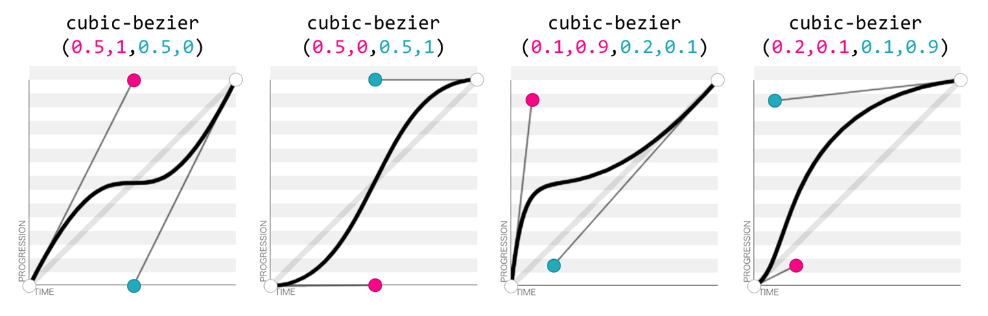
Figure 17-4. Four Bézier curves and their cubic-bezier() values (via http://cubic-bezier.com)
Consider the first example. The first two values, corresponding to x1 and y1, are 0.5 and 1. If you go halfway across the box (x1 = 0.5) and all the way to the top of the box (y1 = 1), you land at the spot where the first handle is placed. Similarly, the coordinates 0.5,0 for x2,y2 describes the point at the center bottom of the box, which is where the second handle is placed. The curve shown there results from those handle placements.
In the second example, the handle positions are switched, with the resulting change in the curve. Ditto for the third and fourth examples, which are inversions of each other. Notice how different the resulting curve is when switching the handle positions.
The predefined key terms are fairly limited. To better follow the principles of animation, you may want to use a cubic Bézier function with four float values instead of the predefined key words. If you’re a whiz at calculus or have a lot of experience with programs like Freehand or Illustrator, you might be able to invent cubic Bézier functions in your head; otherwise, there are online tools that let you play with different values, such as http://cubic-bezier.com/, which lets you compare the common keywords against each other, or against your own cubic Bézier function.
As shown in Figure 17-5, the website http://easings.net provides many additional cubic Bézier function values you can use to provide for a more realistic, delightful animation.
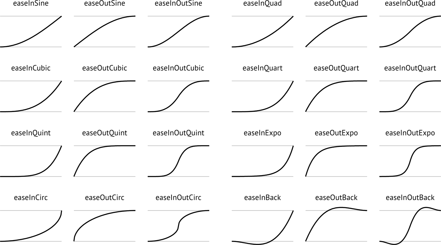
Figure 17-5. Useful author-defined cubic Bézier functions (from http://easings.net)
While the authors of the site named their animations, the preceding names are not part of the CSS specifications, and must be written as follows:
| Unofficial name | Cubic Bézier function value |
|---|---|
|
|
|
|
|
|
|
|
|
|
|
|
|
|
|
|
|
|
|
|
|
|
|
|
|
|
|
|
|
|
|
|
|
|
|
|
|
|
|
|
|
|
|
|
|
|
|
|
Step timing
There are also step timing functions available, as well as two predefined step values:
| Timing function | Definition |
|---|---|
|
Stays on the final keyframe throughout transition. Equal to |
|
Stays on the initial keyframe throughout transition. Equal to |
|
Displays n stillshots, where the first stillshot is n/100 percent of the way through the transition. |
|
Displays n stillshots, staying on the initial values for the first n/100 percent of the time. |
As Figure 17-6 shows, the stepping functions show the progression of the transition from the initial value to the final value in steps, rather than as a smooth curve.
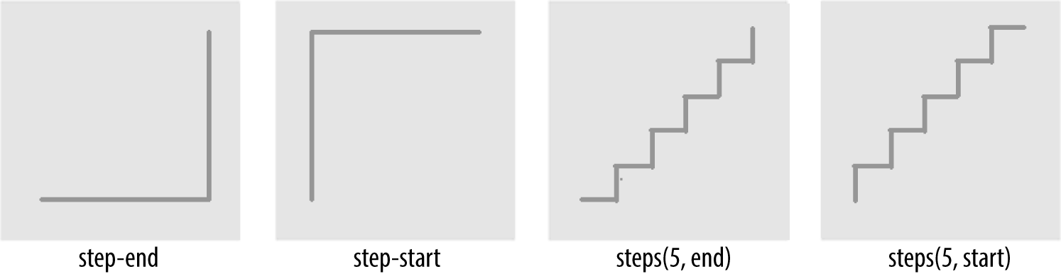
Figure 17-6. Step timing functions
The step functions allow you to divide the transition over equidistant
steps. The functions define the number and direction of steps. There are
two direction options: start and end. With start, the first step
happens at the animation start. With end, the last step happens at the
animation end. For example, steps(5, end) would jump through the
equidistant steps at 0%, 20%, 40%, 60%, and 80%; and steps(5, start)
would jump through the equidistant steps at 20%, 40%, 60%, 80%, and 100%.
The step-start function is the same as steps(1, start). When used, transitioned property values stay on their final values from the
beginning until the end of the transition. The step-end function,
which is the same as steps(1, end), sets transitioned values to their initial values, staying there throughout the transition’s duration.
Note
Step timing, and especially the precise meaning of start and end, is discussed in depth in Chapter 18.
Continuing on with the same super-long transition-property declaration we’ve used before, we can declare a single timing function for all the properties, or
define individual timing functions for each property and so on. Here, we set all the transitioned properties to a single duration:
div{transition-property:color,border-width,border-color,border-radius,transform,opacity,box-shadow,width,padding;transition-duration:200ms;transition-timing-function:ease-in;}
We can also create a horrible user experience by making every property transition at a different rhythm, like this:
Always remember that the transition-timing-function does
not change the time it takes to transition properties: that is set with
the transition-duration property. It just changes how the
transition progresses during that set time. Consider the following:
div{...transition-property:color,border-width,border-color,border-radius,transform,opacity,box-shadow,width,padding;transition-duration:200ms;transition-timing-function:ease,ease-in,ease-out,ease-in-out,linear,step-end,step-start,steps(5,start),steps(3,end);}
If we include these nine different timing functions for the nine different properties, as long as they have the same transition duration and delay, all the properties start and finish transitioning at the same time. The timing function controls how the transition progresses over the duration of the transition, but does not alter the time it takes for the transition to finish. (The preceding transition would be a terrible user experience, by the way. Please don’t do that.)
The best way to familiarize yourself with
the various timing functions is to play with them and see which one works best
for the effect you’re looking for. While testing, set a relatively long
transition-duration to better visualize the difference between the
various functions. At higher speeds, you may not be able to tell the
difference with the easing function; just don’t forget to set it back to
a faster speed before publishing the result to the web!
Delaying Transitions
The transition-delay property enables you to introduce a time delay
between when the change that initiates the transition is applied to an
element, and when the transition begins.
A transition-delay of 0s (the default) means the transition will begin immediately—it will start executing as soon as the state of the element is altered. This is familiar from the instant-change effect of a:hover, for example.
With a value other than 0s, the <time> value of
transition-delay defines the time offset from the moment the property
values would have changed, had no transition or transition-property
been applied, until the property values declared in the transition or
transition-property value begin animating to their final values.
Interestingly, negative values of time are valid. The effects you can create with
negative transition-delays are described in “Negative delay values”.
Continuing with the 8- (or 21-) property transition-property declaration we’ve been using, we can make all the properties start transitioning right away by omitting the transition-delay property, or by including it with a value of 0s. Another possibility is to start half the transitions right away, and the rest 200 milliseconds later, as in the the following:
div{transition-property:color,border,border-radius,transform,opacity,box-shadow,width,padding;transition-duration:200ms;transition-timing-function:linear;transition-delay:0s,200ms;}
By including transition-delay: 0s, 200ms on a series of properties,
each taking 200 milliseconds to transition, we make color, border-radius, opacity, and width begin their
transitions immediately. All the rest begin
their transitions as soon as the odd transitions have completed, because their transition-delay is equal to the transition-duration applied to all the properties.
As with transition-duration and transition-timing-function, when the
number of comma-separated transition-delay values outnumbers the
number of comma-separated transition-property values, the extra delay
values are ignored. When the number of comma-separated
transition-property values outnumbers the number of comma-separated
transition-delay values, the delay values are repeated.
We can even declare nine different transition-delay values so that each
property begins transitioning after the previous property has
transitioned, as follows:
div{...transition-property:color,border-width,border-color,border-radius,transform,opacity,box-shadow,width,padding;transition-duration:200ms;transition-timing-function:linear;transition-delay:0s,0.2s,0.4s,0.6s,0.8s,1s,1.2s,1.4s,1.6s;}
In this example, we declared each transition to
last 200 milliseconds with the transition-duration property. We then declare a
transition-delay that provides comma-separated delay values for each
property that increment by 200 milliseconds, or 0.2 seconds—the same time as the
duration of each property’s transition. Each property
starts transitioning at the point the previous property has finished.
We can use math to give every transitioning property different durations and delays, ensuring they all complete transitioning at the same time:
div{...transition-property:color,border-width,border-color,border-radius,transform,opacity,box-shadow,width,padding;transition-duration:1.8s,1.6s,1.4s,1.2s,1s,0.8s,0.6s,0.4s,0.2s;transition-timing-function:linear;transition-delay:0s,0.2s,0.4s,0.6s,0.8s,1s,1.2s,1.4s,1.6s;}
In this example, each property completes transitioning at the
1.8-second mark, but each with a different duration and delay. For each
property, the transition-duration value plus the transition-delay
value will add up to 1.8 seconds.
Generally, you want all the transitions to begin at the same time. You can make that happen by
including a single transition-delay value, which gets applied to all
the properties. In our drop-down menu in Figure 17-1, we include a delay of
50 milliseconds. This delay is not long enough for the user to notice and will not
cause the application to appear slow. Rather, a 50-millisecond delay can help
prevent the navigation from shooting open unintentionally as the user accidentally passes over, or hovers over, the menu items while moving the cursor from one part of the page or app to another.
Negative delay values
A negative value for
transition-delay that is smaller than the transition-duration will
cause the transition to
start immediately, partway through the transition. For example:
div{transform:translateX(0);transition-property:transform;transition-duration:200ms;transition-delay:-150ms;transition-timing-function:linear;}div:hover{transform:translateX(200px);}
Given the transition-delay of -150ms on a 200ms
transition, the transition will start three-quarters of the way through
the transition and will last 50 milliseconds. In that scenario, with a linear
timing function, it jumps to being translated 150px along the
x-axis immediately on hover and then animates the translation from
150 pixels to 200 pixels over 50 milliseconds.
If the absolute value of the negative transition-delay is greater than
or equal to the transition-duration, the change of property values is
immediate, as if no transition had been applied, and no transitionend event occurs.
When transitioning back from the hovered state to the original state, by
default, the same value for the transition-delay is applied. In the
preceding scenario, since the transition-delay is not overridden in the
hover state, it will jump 75% of the way back (or 25% of the way through
the original transition) and then transition back to the initial state.
On mouseout, it will jump to being translated 50 pixels along the x-axis and
then take 50 milliseconds to return to its initial position of being translated
0 pixels along the x-axis.
The transition Shorthand
The transition shorthand property combines the four properties covered thus far—transition-property, transition-duration,
transition-timing-function, and transition-delay—into a single
shorthand property.
The transition property accepts the value of none, or any number of
comma-separated list of single transitions. A single transition
contains a single property to transition, or the keyword all to
transition all the properties; the duration of the
transition; the timing function; and the delay.
If a single transition within the transition shorthand omits the
property to transition, the single transition
will default to all. If the transition-timing-function value is
omitted, it will default to ease. If only one time value is included,
that will be the duration, and there will be no delay, as if
transition-delay were set to 0s.
Within each single transition, the order of the duration versus the delay is important: the first value that can be parsed as a time will be set as the duration. If an additional time value is found before the comma or the end of the statement, that will be set as the delay.
Here are three equivalent ways to write the same transition effects:
navliul{transition:transform200msease-in50ms,opacity200msease-in50ms;}navliul{transition:all200msease-in50ms;}navliul{transition:200msease-in50ms;}
In the first example, we see shorthand for each of
the two properties. Because we are transitioning all the properties that
change on hover, we could use the keyword all, as shown in the second
example. And, since all is the default value, we could write the
shorthand with just the duration, timing function, and delay. Had we used
ease instead of ease-in, we could have omitted the timing function,
since ease is the default.
We had to include the duration, or no transition would be visible. In
other words, the only portion of the transition property value that can truly be
considered required is transition-duration.
If we only wanted to delay the change from closed menu to open menu
without a gradual transition, we would still need to include a duration of 0s. Remember, the first value parsable as time will be set as the
duration, and the second one will be set as the delay:
navliul{transition:0s200ms;...
Warning
This transition will wait 200 milliseconds, then show the drop-down fully open and
opaque with no gradual transition. This is horrible user experience.
Though if you switch the selector from nav li ul to *, it might make
for an April Fools’ joke.
If there is a comma-separated list of transitions (versus just a single
declaration) and the word none is included, the entire transition
declaration is invalid and will be ignored:
div{transition-property:color,border-width,border-color,border-radius,transform,opacity,box-shadow,width,padding;transition-duration:200ms,180ms,160ms,140ms,120ms,100ms,1s,2s,3s;transition-timing-function:ease,ease-in,ease-out,ease-in-out,linear,step-end,step-start,steps(5,start),steps(3,end);transition-delay:0s,0.2s,0.4s,0.6s,0.8s,1s,1.2s,1.4s,1.6s;}div{transition:color200ms,border-width180msease-in200ms,border-color160msease-out400ms,border-radius140msease-in-out600ms,transform120mslinear800ms,opacity100msstep-end1s,box-shadow1sstep-start1.2s,width2ssteps(5,start)1.4s,padding3ssteps(3,end)1.6s;}
The two preceding CSS rule blocks are functionally equivalent: you can
declare comma-separated values for the four longhand transition
properties, or you can include a comma-separated list of multiple shorthand
transitions. You can’t, however, mix the two:
transition: transform, opacity 200ms ease-in 50ms will ease in the
opacity over 200 milliseconds after a 50-millisecond delay, but the transform change will be
instantaneous, with no transitionend event.
In Reverse: Transitioning Back to Baseline
In the preceding examples, we’ve declared a single transition. All our
transitions have been applied in the default state and initiated with a
hover. With these declarations, the properties return back to the
default state via the same transition on mouseout, with a reversing of
the timing function and a duplication of the delay.
With transition declarations only in the global state, both the hover
and mouseout states use the same transition declaration: the
selector matches both states. We can override this duplication of the
entire transition or just some of the transition properties by
including different values for transition properties in the global
(versus the hover-only) state.
When declaring transitions in multiple states, the transition included is to that state:
a{background:yellow;transition:200msbackground-colorlinear0s;}a:hover{background-color:orange;/* delay when going TO the :hover state */transition-delay:50ms;}
In this scenario, when the user hovers over a link, the background
color waits 50 milliseconds before transitioning to orange. When the user
mouses off the link, the background starts transitioning back to yellow
immediately. In both directions, the transition takes 200 milliseconds to complete, and the gradual change proceeds in a linear manner. The 50 milliseconds is included in the :hover (orange) state. The delay happens, therefore, as the background changes to orange.
In our drop-down menu example, on :hover, the menu appears and grows
over 200 milliseconds, easing in after a delay of 50 milliseconds. The transition is set with the transition property in the default (non-hovered) state. When the user mouses out, the properties revert over 200 milliseconds, easing out after a delay of 50 milliseconds. This reverse effect is responding to the transition value from the non-hovered state. This is the default behavior, but it’s something we can control. The best user experience is
this default behavior, so you likely don’t want to alter it—but it’s important to know that you can.
If we want the closing of the menu to be jumpy and slow (we don’t want to do that; it’s bad user experience. But for the sake of this example, let’s pretend we do), we can declare two different transitions:
navulul{transform:scale(1,0);opacity:0;...transition:all4ssteps(8,start)1s;}navli:hoverul{transform:scale(1,1);opacity:1;transition:all200mslinear50ms;}
Transitions are to the to state: when there’s a style change, the
transition properties used to make the transition are the new values of
the transition properties, not the old ones. We put the smooth, linear
animation in the :hover state. The transition that applies is the one
we are going toward. In the preceding example, when the user hovers over
the drop-down menu’s parent li, the opening of the drop-down menu will
be gradual but quick, lasting 200 milliseconds after a delay of 50 milliseconds. When the user
mouses off the drop-down menu or its parent li, the transition will
wait one second and take four seconds to complete, showing eight steps along the
way.
When we only have one transition, we put it in the global from state, as you want the transition to occur toward any state, be that a hovering or a class change. Because we want the transition to occur with any change, we generally put the only transition declaration in the initial, default (least specific) block. If you do want to exert more control and provide for different effects depending on the direction of the transition, make sure to include a transition declaration in all of the possible class and UI states.
Warning
Beware of having transitions on both ancestors and descendants. Transitioning properties soon after making a change that transition ancestral or descendant nodes can have unexpected outcomes. If the transition on the descendant completes before the transition on the ancestor, the descendant will then resume inheriting the (still transitioning) value from its parent. This effect may not be what you expected.
Reversing interrupted transitions
When a transition is interrupted before it is able to finish (such as mousing off of our drop-down menu example before it finishes opening), property values are reset to the values they had before the transition began, and the properties transition back to those values. Because repeating the duration and timing functions on a reverting partial transition can lead to an odd or even bad user experience, the CSS transitions specification provides for making the reverting transition shorter.
In our menu example, we have a transition-delay of
50ms set on the default state and no transition properties declared on the hover state; thus, browsers will wait 50 milliseconds before beginning the
reverse or closing transition.
When the forward animation finishes transitioning to the final values and the transitionend event
is fired, all browsers will duplicate the transition-delay in the
reverse states.
As Table 17-2 shows, if the transition didn’t finish—say, if the user moved off the navigation before the transition finished—all browsers except Microsoft Edge will repeat the delay in the reverse direction. Some browsers replicate the transition-duration as well, but
Edge and Firefox have implemented the specification’s reverse
shortening factor.
| Browser | Reverse delay | Transition time | Elapsed time |
|---|---|---|---|
Chrome |
Yes |
200 ms |
0.200 s |
Chrome |
Yes |
200 ms |
0.250 s |
Safari |
Yes |
200 ms |
0.200 s |
Firefox |
Yes |
38 ms |
0.038 s |
Opera |
Yes |
200 ms |
0.250 s |
Edge |
No |
38 ms |
0.038 s |
Let’s say the user moves off that menu 75 milliseconds after it started transitioning. This means the drop-down menu will animate closed without ever being fully opened and fully opaque. The browser should have a 50-millisecond delay before closing the menu, just like it waited 50 milliseconds before starting to open it.
This is actually a good user experience, as it provides a few milliseconds of delay before closing, preventing jerky behavior if the user accidentally navigates off the menu. As shown in Table 17-2, all browsers do this, except Microsoft Edge.
Even though we only gave the browser 75 milliseconds to partially open the
drop-down menu before closing
the menu, some browsers will take 200 milliseconds—the full value of the
transition-duration property—to revert. Other browsers, including
Firefox and Edge, have implemented the CSS specification’s reversing
shortening factor and the reversing-adjusted start value. When
implemented, the time to complete the partial transition in the reverse
direction will be similar to the original value, though not necessarily
exact.
In the case of a step timing function, Firefox and Edge will take the
time, rounded down to the number of steps the function has completed. For example,
if the transition was 10 seconds with 10 steps, and the properties
reverted after 3.25 seconds, ending a quarter of the way between the
third and fourth steps (completing 3 steps, or 30% of the transition), it
will take 3 seconds to revert to the previous values. In the following
example, the width of our div will grow to 130 pixels wide before it begins
reverting back to 100 pixels wide on mouseout:
div{width:100px;transition:width10ssteps(10,start);}div:hover{width:200px;}
While the reverse duration will be rounded down to the time it took to reach the most recently-executed step, the reverse direction will be split into the originally declared number of steps, not the number of steps that completed. In our 3.25-second case, it will take 3 seconds to revert through 10 steps. These reverse transition steps will be shorter in duration at 300 milliseconds each, each step shrinking the width by 3 pixels, instead of 10 pixels.
If we were animating a sprite by
transitioning the background-position , this would look really bad. The
specification and implementations may change to make the reverse
direction take the same number of steps as the partial transition.
Other browsers currently take 10 seconds, reverting the progression of
the 3 steps over 10 seconds across 10 steps—taking a full second to
grow the width in 3-pixel steps.
Browsers that haven’t implemented shortened reversed timing will take the full 10 seconds, instead of only
3, splitting the transition into 10 steps, to reverse the 30% change.
Whether the initial transition completed or not, these browsers will
take the full value of the initial transition duration, less the
absolute value of any negative transition-delay, to reverse the
transition, no matter the timing function. In the steps case just shown, the
reverse direction will take 10 seconds. In our navigation example, it
will reverse over 200 milliseconds, whether the navigation has fully scaled up or not.
For browsers that have implemented the reversing timing adjustments, if the
timing function is linear, the duration will be the same in both
directions. If the timing function is a step function, the reverse
duration will be equal to the time it took to complete the last
completed step. All other cubic-bezier functions will have a duration that is proportional to progress the initial transition made before being interrupted. Negative transition-delay values are also proportionally shortened. Positive delays remain unchanged in both directions.
No browser will have a transitionend for the hover state, as the
transition did not end; but all browsers will have a transitionend
event in the reverse state when the menu finishes collapsing. The
elapsedTime for that reverse transition depends on whether the browser
took the full 200 milliseconds to close the menu, or if the browser takes as long to close the menu as it did to partially open the menu.
To override these values, include transition properties in both the initial and final states (e.g., both the unhovered and hovered styles). While this does not impact the reverse shortening, it does provide more control.
Animatable Properties and Values
Before implementing transitions and animations, it’s important to understand that not all properties are animatable. You can transition (or animate) any animatable CSS properties; but which properties are animatable?
Note
While we’ve included a list of these properties in Appendix A, CSS is evolving, and the animatable properties list will likely get new additions.
One key to developing a sense for which properties can be animated is to identify which have values that can be interpolated. Interpolation is the construction of data points between the values of known data points. The key guideline to determining if a property value is animatable is whether the computed value can be interpolated. If a property’s computed values are keywords, they can’t be interpolated; if its keywords compute to a number of some sort, they can be. The quick rule of thought is that if you can determine a midpoint between two property values, those property values are probably animatable.
For example, the display values like
block and inline-block aren’t numeric and therefore don’t have a
midpoint; they aren’t animatable. The transform property values of
rotate(10deg) and rotate(20deg) have a midpoint of rotate(15deg); they are animatable.
The border property is shorthand for border-style, border-width,
and border-color (which, in turn, are themselves shorthand properties
for the four side values). While there is no midpoint between any of the
border-style values, the border-width property length units are
numeric, so they can be animated. The keyword values of medium, thick, and
thin have numeric equivalents and are interpolatable: the computed
value of the border-width property computes those keywords to lengths.
In the border-color value, colors are numeric—the named
colors all represent hexadecimal color values—so colors are
animatable as well. If you transition from border: red solid 3px to
border: blue dashed 10px, the border width and border colors will
transition at the defined speed, but border-style will jump from
solid to dashed as soon as the transition begins (after any delay).
As noted (see Appendix A), numeric values tend to be animatable. Keyword values that
aren’t translatable to numeric values generally aren’t. CSS functions
that take numeric values as parameters generally are animatable. One
exception to this rule is visibility: while there is no
midpoint between the values of visible and hidden, visibility
values are interpolatable between visible and not-visible. When it comes
to the visibility property, either the initial value or the destination
value must be visible or no interpolation can happen. The value will
change at the end of the transition from visible to hidden. For a
transition from hidden to visible, it changes at the start of the
transition.
auto should generally be considered a non-animatable value and should
be avoided for animations and transitions. According to the
specification, it is not an animatable value, but some browsers
interpolate the current numeric value of auto (such as height: auto)
to be 0px. auto is non-animatable for properties like
height, width, top, bottom, left, right, and margin.
Often an alternative property or value may work. For example,
instead of changing height: 0 to height: auto, use max-height: 0
to max-height: 100vh, which will generally create the expected
effect. The auto value is animatable for min-height and min-width,
since min-height: auto actually computes to 0.
How Property Values Are Interpolated
Interpolation can happen when values falling between two or more known values can be determined. Interpolatable values can be transitioned and animated.
Numbers are interpolated as floating-point numbers. Integers are interpolated as whole numbers, incrementing or decrementing as whole numbers.
In CSS, length and percentage units are translated into real numbers.
When transitioning or animating calc(), or from one type of length to
or from a percentage, the values will be converted into a calc()
function and interpolated as real numbers.
Colors, whether they are HSLA, RGB, or named colors like aliceblue, are translated to their RGBA equivalent values for transitioning, and interpolated across the RGBA color space.
When animating font weights, if you use keywords like bold, they’ll
be converted to numeric values and animated in steps of multiples of
100. This may change in the future, as font weights may be permitted to take any integer value, in which case weights will be interpolated as integers instead of multiples of 100.
When including animatable property values that have more than one
component, each component is interpolated appropriately for that
component. For example, text-shadow has up to four components: the
color, x, y, and blur. The color is interpolated as color: the x, y,
and blur components are interpolated as lengths. Box shadows have two
additional optional properties: inset (or lack thereof) and spread.
spread, being a length, is interpolated as such. The inset keyword
cannot be converted to a numeric equivalent: you can transition from one
inset shadow to another inset shadow, or from one drop shadow to another
drop shadow multicomponent value, but there is no way to gradually
transition between inset and drop shadows.
Similar to values with more than one component, gradients can be transitioned only if you are transitioning gradients of the same type (linear or radial) with equal numbers of color stops. The colors of each color stop are then interpolated as colors, and the position of each color stop is interpolated as length and percentage units.
Interpolating repeating values
When you have simple lists of other types of properties, each item in the list is interpolated appropriately for that type—as long as the lists have the same number of items or repeatable items, and each pair of values can be interpolated:
.img{background-image:url(1.gif),url(2.gif),url(3.gif),url(4.gif),url(5.gif),url(6.gif),url(7.gif),url(8.gif),url(9.gif),url(10.gif),url(11.gif),url(12.gif);background-size:10px10px,20px20px,30px30px,40px40px;transition:background-size1sease-in0s;}.img:hover{background-size:25px25px,50px50px,75px75px,100px100px;}
For example, in transitioning four background-sizes, with all the sizes in
both lists listed in pixels, the third background-size from the
pretransitioned state can gradually transition to the third
background-size of the transitioned list. In the preceding example,
background images 1, 6, and 10 will transition from 10px to 25px in height and width when hovered. Similarly, images 3, 7, and 11
will transition from 30px to 75px, and so forth.
Thus, the background-size values
are repeated three times, as if the CSS had been written as:
.img{...background-size:10px10px,20px20px,30px30px,40px40px,10px10px,20px20px,30px30px,40px40px,10px10px,20px20px,30px30px,40px40px;...}.img:hover{background-size:25px25px,50px50px,75px75px,100px100px,25px25px,50px50px,75px75px,100px100px,25px25px,50px50px,75px75px,100px100px;}
If a property doesn’t have enough comma-separated values to match the
number of background images, the list of values is repeated until there are
enough, even when the list in the :hover state doesn’t match the
initial state:
.img:hover{background-size:33px33px,66px66px,99px99px;}
If we transitioned from four background-size declarations in the initial
state to three background-size declarations in the :hover state, all in
pixels, still with 12 background images, the hover and initial state
values are repeated (three and four times respectively) until we have the 12
necessary values, as if the following had been declared:
.img{...background-size:10px10px,20px20px,30px30px,40px40px,10px10px,20px20px,30px30px,40px40px,10px10px,20px20px,30px30px,40px40px;...}.img:hover{background-size:33px33px,66px66px,99px99px,33px33px,66px66px,99px99px,33px33px,66px66px,99px99px,33px33px,66px66px,99px99px;}
If a pair of values cannot be interpolated—for example, if the background-size changes from contain in the default state to cover when hovered—then, according to the
specification, the lists are not interpolatable. However, some browsers
ignore that particular pair of values for the purposes of the transition, but
still animate the interpolatable values.
There are some property values that can animate if the browser can infer
implicit values. For example, for shadows, the browser will
infer an implicit shadow box-shadow: transparent 0 0 0 or
box-shadow: inset transparent 0 0 0, replacing any values not
explicitly included in the pre- or post-transition state. These examples are in the chapter files for this book.
Only the interpolatable values trigger transitionend events.
As noted previously, visibility animates differently than other properties:
if animating or transitioning to or from visible, it is interpolated
as a discrete step. It is always visible during the transition or
animation as long as the timing function output is between 0 and 1. It
will switch at the beginning if the transition is from hidden to
visible. It will switch at the end if the transition is from
visible to hidden. Note that this can be controlled with the step timing
functions.
If you accidentally include a property that can’t be transitioned, fear not. The entire declaration will not fail. The browser will simply not transition the property that is not animatable. Note that the non-animatable property or nonexistent CSS property is not exactly ignored. The browser passes over unrecognized or non-animatable properties, keeping their place in the property list order to ensure that the other comma-separated transition properties described next are not applied on the wrong properties.2
Note
Transitions can only occur on properties that are not currently being impacted by a CSS animation. If the element is being animated, properties may still transition, as long as they are not properties that are currently controlled by the animation. CSS animations are covered in Chapter 18.
Fallbacks: Transitions Are Enhancements
Transitions have excellent browser support. All browsers, including Safari, Chrome, Opera, Firefox, Edge, and Internet Explorer (starting with IE10) support CSS transitions.
Transitions are user-interface (UI) enhancements. Lack of full support should not prevent you from including them. If a browser doesn’t support CSS transitions, the changes you are attempting to transition will still be applied: they will just “transition” from the initial state to the end state instantaneously when the style recomputation occurs.
Your users may miss out on an interesting (or possibly annoying) effect, but will not miss out on any content.
As transitions are generally progressive enhancements, there is no need to polyfill for archaic IE browsers. While you could use a JavaScript polyfill for IE9 and earlier, and prefix your transitions for Android 4.3 and earlier, there is likely little need to do so.
Printing Transitions
When web pages or web applications are printed, the stylesheet for print
media is used. If your style element’s media attribute matches only
screen, the CSS will not impact the printed page at all.
Often, no media attribute is included; it is as if media="all" were
set, which is the default. Depending on the browser, when a transitioned
element is printed, either the interpolating values are ignored, or the
property values in their current state are printed.
You can’t see the element transitioning on a piece of paper, but in some
browsers, like Chrome, if an element transitioned from one state to
another, the current state at the time the print function is called will
be the value on the printed page, if that property is printable. For
example, if a background color changed, neither the pre-transition or the
post-transition background color will be printed, as background colors
are generally not printed. However, if the text color mutated from one
value to another, the current value of color will be what gets printed
on a color printer or PDF.
In other browsers, like Firefox, whether the pre-transition or post-transition value is printed depends on how the transition was initiated. If it initiated with a hover, the non-hovered value will be printed, as you are no longer hovering over the element while you interact with the print dialog. If it transitioned with a class addition, the post-transition value will be printed, even if the transition hasn’t completed. The printing acts as if the transition properties are ignored.
Given that there are separate printstyle sheets or @media rules for print, browsers compute style separately. In the print style, styles don’t change, so there just aren’t any transitions. The printing acts as if the property values changed instantly, instead of transitioning over time.
1 Changing a background image may take longer than 16 milliseconds to decode and repaint to the page. This isn’t a transition; it is just poor performance.
2 This might change. The CSS Working Group is considering making all property values animatable, switching from one value to the next at the midpoint of the timing function if there is no midpoint between the pre and post values.