Table of Contents for
Responsive Web Design, Second Edition
 Responsive Web Design, Second Edition
Published by
A Book Apart, 2015
Responsive Web Design, Second Edition
Published by
A Book Apart, 2015
- Cover Page
- Title Page
- More From The A Book Apart Library
- Copyright Page
- Table of Contents
- Foreword
- Introduction
- 1. Our Responsive Web
- 2. The Flexible Grid
- 3. Flexible Images
- 4. Media Queries
- 5. Becoming Responsive
- Acknowledgements
- Resources
- References
- Index
- About the Author
- About A Book Apart
- Colophon
- Code Snippets
- Images
- Images
- Images
5. Becoming Responsive
“The Way is shaped by use, But then the shape is lost. Do not hold fast to shapes But let sensation flow into the world As a river courses down to the sea.”
—DAO DE JING, SECTION 32, “SHAPES”
By now, you have all the tools you need to start building responsive layouts. You’ve mastered the proportional thinking behind the flexible grid, investigated a few strategies for incorporating fixed-width media into your design, and explored how media queries can bring our designs beyond the desktop.
But up until this point, we’ve been looking at responsive design in a vacuum. In this chapter, let’s look at some different ways to begin incorporating it into our work, as well as a few paths to improve on some of the techniques we’ve already discussed.
A Matter of Context
As you begin experimenting, you’ll find that responsive designs, when properly built, can provide your visitors with a high level of continuity between different contexts. That’s because, at its most basic level, responsive design is about serving one HTML document to countless browsers and devices, using flexible layouts and media queries to ensure that design is as portable and accessible as possible.
However, certain web designers argue against this approach, suggesting that different devices should always be served different markup. In a rather lengthy blog post, mobile developer James Pearce questions the merits of responsive design (http://bkaprt.com/rwd2/46/):
The fact that the user has a small screen in their hand is one thing—the fact that it is in their hand at all is another. The fact that the user may be walking, driving, or lounging is yet another. In fact, it’s quite likely that they really deserve different content and services altogether—or, at least, a differently prioritized version of the default desktop experience.
Jeff Croft (http://bkaprt.com/rwd2/47/) puts it much more succinctly:
By and large, mobile users want different things from your product than desktop users do. If you’re a restaurant, desktop users may want photos of your place, a complete menu, and some information about your history. But mobile users probably just want your address and operating hours.
There are two prongs to this argument: first, that the device implies a context, telling us whether the user is stationary or mobile. From that context, we can create a class of users, and infer a set of goals. In other words, mobile users will want quicker access to different tasks than they would if they were on a desktop or laptop, where both time and bandwidth are on their side.
Second, if the user’s priorities and goals do indeed differ from one context to the next, then serving one HTML document to everyone won’t cut it. Take Jeff’s example: if the restaurant site features photos prominently at the top of every page, then chances are good that they’re near the top of the HTML. Which means that a mobile visitor, when presented with the same markup in a more linear fashion, will have to do a considerable amount of scrolling just to find the hours of operation they wanted.
For what it’s worth, I agree with these arguments—but up to a point. It’s absolutely fair to assume a user’s context from their device, but it’s just that: an assumption. For example, much of my “mobile” browsing happens on the couch in my living room, flipping idly through sites on my wireless network. Now, this isn’t just another of my “Ethan doesn’t have a life” jokes: research has shown that a significant percentage of people use “the mobile web” from the comfort of their home (http://bkaprt.com/rwd2/48/, http://bkaprt.com/rwd2/49/). And it’s not just the “mobile context” that’s fuzzy, either: what does a “desktop” user look like, anyway? Sure, they might be seated at a desk, with a high-speed connection available to them—or they might be tethered to a phone, or connected to a spotty hotel network. “Mobile” and “desktop” are useful shorthand terms, but they’re just that—shorthand terms that can, if we’re not careful, mask a lot of complexity.
Now, that’s not to say that the context question isn’t valuable, or that we shouldn’t be thinking about these difficult questions. But we can’t simply infer a user’s context from a class of devices—in many cases, the implementation of these separate, “context-aware” sites can be lacking (FIG 5.1). What’s more, we can’t neatly silo our audiences into device-specific groups: a visitor to our sites may return at multiple points throughout her day, using whatever screen happens to be nearest (http://bkaprt.com/rwd2/50/). In other words, relying upon all-too-convenient terms like “mobile” and “desktop” is no substitute for conducting the proper research into how your audience accesses your site: not only the devices and browsers they use, but how, where, and why they use them.
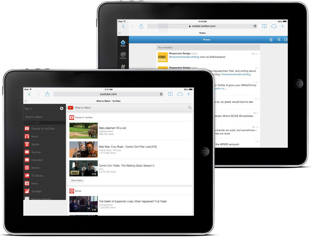
FIG 5.1: When viewed on an iPad, YouTube and Twitter currently default to feature-light “mobile” sites. Great design, but is it the right context?
But most importantly, responsive web design isn’t intended to serve as a replacement for mobile web sites. Responsive design is, I believe, one part design philosophy, one part front-end development strategy. And as a development strategy, it’s meant to be evaluated to see if it meets the needs of the project you’re working on. Perhaps there’s a compelling reason to keep your site’s desktop and mobile experiences separate, or perhaps your content would be better served by a responsive approach. Only you and your users know for certain.
So while I agree with mobile web designers who say that certain users of certain sites deserve different content, I think the reverse is also true: many sites can benefit from serving one document up to multiple contexts or devices. And those are the perfect candidates for a responsive approach.
So how do you know if responsive design is right for you?
Know thy users’ goals
In early 2010 I worked on a site called Cog’aoke (FIG 5.2), designed to promote a karaoke event hosted by my then-employer. Its main purpose was to provide visitors with information about the party, its sponsors, and its venue. But there was an application component as well: visitors could sign up to perform at the event, browse through the available catalog of songs, and vote for other prospective performers.
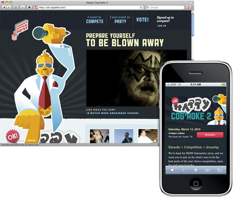
We also decided that the site needed a mobile-friendly component. But we envisioned something completely different from the desktop-specific site. We realized people stumbling to our event would need quick and ready access to the directions. Furthermore, we were going to have a live voting event at the show, and invite the audience to rate their favorite performer at a certain time—all through our site, accessed via their mobile phone.
As we were planning the site, it helped us to think of the desktop site as the “pre-game” experience. The mobile site, on the other hand, was really intended for the night of the event, for attendees who were physically present. So the goals of the two different contexts couldn’t have been more distinct.
With that in mind, it definitely would have been possible for us to include all the markup for each context on every page of the site. If we’d taken that route, every page would have had the regular “desktop” content marked up in its HTML, as well as the map, directions, and voting information for the mobile site. And with those two modes baked into every HTML page, we could have used some combination of media queries and display: none to deliver the two sites to the right devices.
But that wouldn’t have been the right approach. We realized it would have been irresponsible of us to ask our visitors to download all that extraneous HTML, marking up content that they’d never see, much less benefit from. And I don’t say that just out of concern for mobile visitors: regardless of whether our visitors were on a phone- or a desktop-based browser, we would have been penalizing them with extra markup.
Meet “Mobile First”
When you have a free moment (and a stiff drink in hand), I recommend browsing through Merlin Mann’s “Noise to Noise Ratio” Flickr set (http://bkaprt.com/rwd2/51/). These screen grabs showcase some of the most content-saturated pages on the web; the pages are drowning in a sea of cruft. And the actual article, both paragraphs of it, is nigh unfindable.
While the sites in Merlin’s gallery might be new to you, I wager the problems they demonstrate are pretty familiar. What’s more, I think this trend informs some of our preconceptions about designing for “mobile” users: namely, we assume mobile users need less content in part because desktop users can tolerate more. After all, screens are larger, users are often more stationary, and can generally better focus on searching for the content they want.
But just because desktop users can sift through more content, does that mean they need to? In other words, why is easy access to key tasks only the domain of mobile users? Why can’t all users of our sites enjoy the same level of focused, curated content?
Toward the end of 2009, designer Luke Wroblewski fired off a little challenge to our industry, suggesting a website’s mobile experience shouldn’t be an afterthought (http://bkaprt.com/rwd2/52/). Citing the explosive growth of mobile web traffic, as well as the exciting new technical capabilities of modern phones, Luke suggested that instead today’s web professionals should begin designing for mobile first.
“Mobile first” is a wonderful design philosophy. What’s more, I’ve found it absolutely invaluable for the responsive design projects I’ve worked on. As more browsers and devices begin accessing our designs, and as our clients become interested in designing beyond the desktop, it’s a perfect opportunity to take a hard look at how we design for the web: our processes and vocabulary, as well as the questions we ask and the solutions we apply.
Toward a Responsive Workflow
Of course, these are early days yet. Many designers, studios, and companies are still learning about responsive design. As a result, we don’t have many “best practices” to share within our community. That’ll change over time, as we start thinking more responsively in our work. So in the meantime, I thought I’d share some of my experiences working with a more responsive workflow. Perhaps they’ll be helpful to you, and (more likely) you’ll find a way to improve upon them.
As I first began writing this, I was working on the redesign of a large, content-rich site. Over the course of a given day, a reader might access the site from home in the morning over coffee, read an article or two during their morning train commute, and possibly check in a few more times during the day.
Given the diversity of their readership, the client decided that a responsive approach would be the most appropriate one for their audience. So during the planning phases, the design team has taken a hard look at every proposed piece of content for the site, and asked one question: How does this content or feature benefit our mobile users?
Okay, maybe I should’ve made that sound a bit more exciting—I never was especially good at marketing. But it’s a question we’ve derived from the “mobile first” approach, and one we’ve found incredibly useful as the site’s designed. Here’s Luke’s rationale for the value of this thinking in site planning (http://bkaprt.com/rwd2/53/):
If you design mobile first, you create agreement on what matters most. You can then apply the same rationale to the desktop/laptop version of the web site. We agreed that this was the most important set of features and content for our customers and business—why should that change with more screen space?
It’s all too easy to fill a desktop browser window with social media toolbars, links to related articles, battalions of RSS links, and tag clouds galore. (This process is called “adding value,” I believe.) But when we’re forced to work with a screen that’s 80% smaller than our usual canvas, nonessential content and cruft quickly fall away, allowing us to focus on the truly critical aspects of our designs.
In other words, designing for mobile devices first can enrich the experience for all users, by providing the element often missing from modern web design: focus. That’s not to say that our client’s pages are light on content, or lacking in features. But by framing our design process with that simple question, we’ve gained a handy acid test to apply when considering each proposed element, each new piece of functionality.
Iterative, collaborative design
Now, most design projects follow some version of the “waterfall” project management workflow, dividing the work into distinct, task-based phases. The specifics might change from one studio to the next, but there are usually four segments: a planning phase, a design phase, a development phase, and then, finally, delivery of the finished site. In each phase, documents or files are created—for example, a site map and wireframes during the planning phase—which the client approves before the next phase of work begins.
Again, the way you manage your projects might differ slightly. But for the design phase, the design team often mocks up a number of pages in a graphics editor like Photoshop, Fireworks, or the like. And once those mockups are finished and approved, they’re handed off to the development team, ready to be produced into static HTML templates.
But for a responsive site, that process can quickly become a bit unwieldy. Let’s pretend for a moment you’re redesigning a site with only one page, so you knock out a mockup in your favorite design application. But how do you communicate to your client how that page will appear on a phone? Or an iPad? Or a widescreen display? If you’ve the time, budget, and resources, it might be feasible for you to design each of those alternate views, presenting those comps to the client, gathering feedback, and then revising each as needed. But if you’re designing fifteen pages, or fifty, then it can quickly become impractical to produce every one of those mockups and their alternate views.
Recently, the responsive projects I’ve worked on have had a lot of success combining design and development into one hybrid phase, bringing the two teams into one highly collaborative group. I refer to this new, Voltron-esque phase as “designopment.” (No, not really.)
Our reviews begin with the design team presenting a page mockup to the entire group. This will typically be a desktop-centric design (FIG 5.3), although occasionally we might start with a more mobile-focused layout. The goal is to get a starting point in front of the entire group, to kick off a discussion about how this design will need to accommodate different resolution ranges and input types. Questions tend to fly back and forth pretty rapidly: “How do you envision this slideshow working on a touch device?” “Is this module always going to be collapsed by default, or will widescreen users need to see more information?” “How will this element look (and function) if JavaScript isn’t available?”
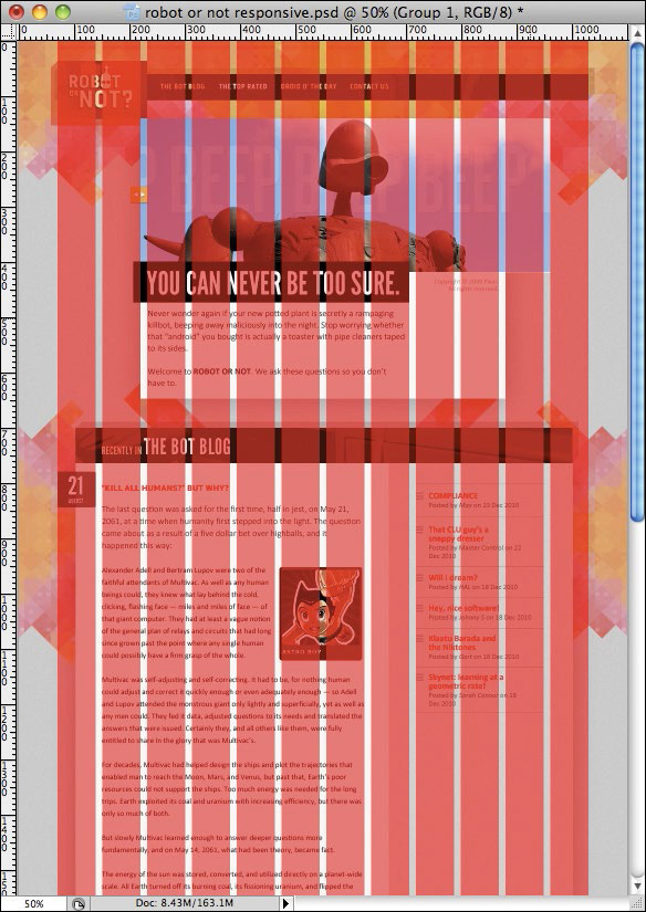
FIG 5.3: We’ll begin by reviewing a finished page comp, asking questions about how it should respond to different devices and browsers.
The open questions are a really great forum for the team to share ideas, to discuss how the design is intended to function on different displays, and to review any particularly complex pieces of interaction. If any design feedback needs action, then the design gets revised. But if the group feels comfortable, or if the revisions are sufficiently minor, then the development team inherits the comps for some prototyping.
“Prototyping before the designs are final, you say?” Absolutely, I say. Our goal is to get beyond the pixel limitations of Photoshop, and begin building a design that can flex and grow inside a changing browser window, that can scale to different devices. So the development team quickly begins producing a responsive design: converting the fixed grid into a fluid one, discussing ways to flexibly handle different types of media, and then finally applying the media queries that adapt our design to different resolution ranges.
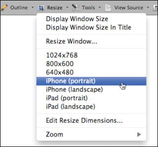
Once our media queries are in place, we’re constantly resizing our browser window to approximate how the designs will hold up at different resolution ranges (FIG 5.4). Browser resizing extensions, such as the one included in the Web Developer Toolbar for Firefox and Chrome (http://bkaprt.com/rwd2/54/), can be a huge help here; you can even store common screen resolutions in the extension for quick access later on (FIG 5.5). But if browser extensions and whatnot aren’t your thing, you might try Dave Rupert’s fitWeird bookmarklet (http://bkaprt.com/rwd2/55/) or Jordan Moore’s “Responsive Roulette” viewer (http://bkaprt.com/rwd2/56/), which, in addition to being well-made tools, beautifully reinforce that your responsive design could be encountered on screens of any size.
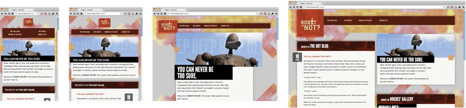
FIG 5.4: As we’ve discussed, resizing your browser window is a great way to quickly test your design. But it’s only the first step.
But as we discussed in the last chapter, resizing your browser window is really an intermediary step. If you want to test how your page is going to perform on a given device, there’s no substitute for viewing it on the actual device. (If you’re interested in setting up a mobile testing suite, I highly recommend Peter-Paul Koch’s A List Apart article on the “Smartphone Browser Landscape” (http://bkaprt.com/rwd2/57/), or Brad Frost’s tips on smartly investing in mobile devices (http://bkaprt.com/rwd2/58/). And if you’re not interested in buying a small army of phones and tablets and whatnot, why not use http://opendevicelab.com/ to see if there’s an open device lab near you?)
During this development process, a prototype begins to take shape. It’s based on the initial mockup supplied by the design team, of course, but as the development team codes they begin making recommendations about how the design should respond to different devices. In other words, during this collaboration the developers act as designers, too; they’re just designing in a different medium. They’re making design recommendations within the browser, rather than in Photoshop—recommendations that will be shared, tested, and vetted by the entire team.
Now, the prototype doesn’t have to be completely tested or production-ready. Because once that template’s somewhat finished, we start another design review—but this time, the design and development teams are reviewing code, not comps.
The interactive design review
To prepare for this meeting, we’ll load up the prototype page on several phones, tablets, laptops, and other devices (FIG 5.6). When the meeting begins, the development team will introduce the page to the group, and then let everyone have at it. Because during the rest of the review, the entire group experiments with the design: on laptops and desktops, on phones and tablets. We’ll resize our browser windows, swipe through photo galleries, and test how usable forms are on both keyboards and touch screens.
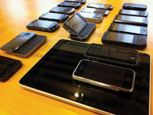
FIG 5.6: The devices used in the jQuery Mobile testing suite. (Courtesy Filament Group, Inc., http://bkaprt.com/rwd2/59/.)
But while everyone’s experimenting with the prototype, we try to keep a steady flow of conversation going. I’ve found it helps if the development team has a list of questions that came up as they were building the responsive design. Perhaps they noticed that a crucial link is a little too difficult to hit on a touch screen, or a maybe an animation is moving a little too slowly on a particular desktop browser. Calling out areas of interest or potential sticking points, and then asking for feedback, is a great way to get people talking about how well the design performs, and how it generally feels.
Because ultimately, the purpose of these reviews is to help vet the “live” design. After all, the initial mockup was used as a blueprint, providing layout rules, a typographic guide, and a pattern library; from there, the development team was responsible for adapting the design into its more responsive incarnation. In other words, we’re testing the design recommendations made by the development team, and discussing whether further refinement is needed. That refinement could either be a revised mockup, or some tweaks in the template. And once the meeting is finished, the two halves of the group decamp with their respective feedback, and the process repeats itself. Review, design, build, and repeat.
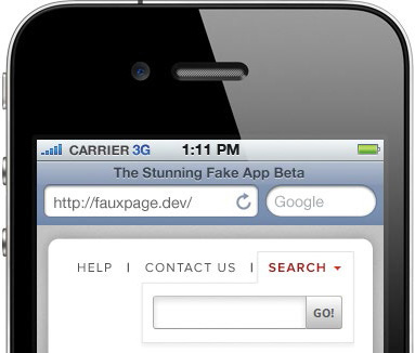
Here’s a hypothetical example of how this back-and-forth works. Let’s say the design team has mocked up a global navigation module, which includes a couple of key links and a search field. And with that comp in hand, the development team has dutifully built the navigation into the template (FIG 5.7).
The design’s fairly straightforward, calling for two links displayed inline, with the search field to their right. And in making the design responsive, the development team settles on a fairly modest solution for smaller displays, choosing to give the search bar the full width of the page, and centering the two links beneath it (FIG 5.8).

During the design review, a few design team members ask about the smaller version of the global navigation, as something about the elements’ placement feels a bit off to them. The search bar is considerably more prominent, sure, but some of the folks feel that maybe it’s too prominent, crowding out the links beneath it. And in fact, once they started interacting with the design on touch-enabled phones, they realize it’s a little too easy to tap into the search field when trying to activate a link.
So the coded version of the navigation isn’t quite working. And after discussing it for a bit, the design team comes up with an alternate solution (FIG 5.9). Instead of displaying the search bar at smaller resolutions, they decide to collapse it by default, making it appear as though it was just another link in the menu. But when that label is tapped or clicked on, the search bar appears as a drop-down beneath the rest of the menu (FIG 5.10).
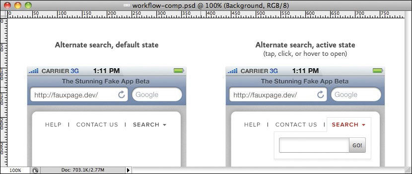
FIG 5.9: After discussing the problems at hand, the design team comes up with an alternate design for our problematic little navigation bar.
That’s just one brief example of how this more collaborative approach can work. The key is to make this design/development cycle as iterative as it needs to be, with both groups constantly refining their work, and then sharing it with the group for review. For the project I’m working on, we’ve been meeting weekly for our interactive design reviews, but we’re constantly sharing sketches—whether in design or in code—via email throughout the week.
Ultimately, the goal is to close the gap between the traditional “design” and “development” cycles, and let the two groups collaborate more closely to produce a finished, responsive design. This more agile approach has allowed the groups I’ve worked on to use applications like Photoshop for design direction and guidance, but then quickly move into our real canvas: the browser.
Being Responsive, Responsibly
During our design/development cycle, the pages are constantly being refined as we build them, with the goal of finishing the phase with production-ready templates. And as we code our responsive design, we’ve found the philosophy of “mobile first” to be incredibly important.
Throughout the book, we’ve been using the Robot or Not site to demonstrate how a fluid grid, flexible images, and media queries work together to provide a more responsive approach to design. We began by taking our rigid mockup, designed in Photoshop, and converting it into a fluid grid. As we saw in Chapter 4, that caused no end of problems when we started resizing our browser window; our initial design wasn’t intended to scale beyond its original context. So we introduced media queries to address those issues, and to provide alternate small-and widescreen layouts. And finally, for browsers lacking native support for media queries, we included the respond.js library to provide access to our alternate designs.
However, this approach raises another very real problem: what if an @media-blind browser doesn’t have access to JavaScript? In that case, they’d be forced to render our full, desktop-centric design, regardless of whether that’s appropriate for their device. And for many mobile devices, that’s exactly what they’d see: a design intended for a much wider screen, shoehorned into a tiny space (FIG 5.11).
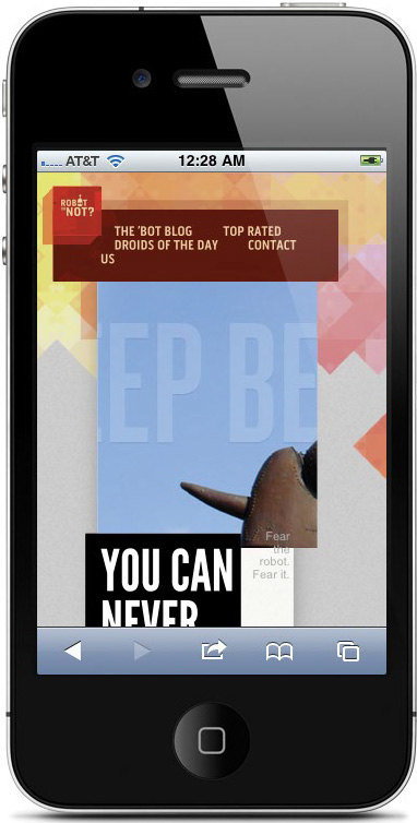
FIG 5.11: No media queries? No JavaScript? No good: our flexible, desktop-friendly layout tries to cram into a small space.
And there’s another problem with the way we’ve built the site. Here’s a brief snippet from the CSS:
.blog {
background: #F8F5F2 url("img/blog-bg.png") repeat-y;
}
@media screen and (max-width: 768px) {
.blog {
background: #F8F5F2 url("img/noise.gif");
}
}
First, we’re setting a background image on the .blog element. (Specifically, the two-toned blog-bg.png graphic we used in Chapter 2 to create the illusion of two columns.) Then for smaller displays, those narrower than 768px wide, we’re instead placing a simple tiled GIF on the blog element, since we’ve linearized the display of those narrower pages.
The problem with this approach is that some browsers will actually download both graphics, even if only one is ultimately applied to the page (see developer Tim Kadlec’s tests for more info: http://bkaprt.com/rwd2/60/). While smaller screens don’t always equate to lower bandwidth, we might be punishing users on smaller screens with the download of a much heavier image than they’ll ever see.
Thankfully, these aren’t problems with responsive design in and of itself—we just need to rethink the way we’ve implemented it.
“Mobile first” meets media queries
Speaking broadly, responsive design is about starting from a reference resolution, and using media queries to adapt it to other contexts. A more responsible approach to responsive design would mean building our stylesheet with “mobile first” in mind, rather than defaulting to a desktop layout. So we’d begin by defining a layout appropriate to smaller screens, and then use media queries to progressively enhance our design as the resolution increases.
In fact, we took this approach on the responsive site for The Boston Globe (http://www.bostonglobe.com/). By default, the content is arranged in a very linear manner, one friendly to mobile devices and narrow browser windows (FIG 5.12). But as the viewport widens, the grid becomes more complex (FIG 5.13). And at the highest end of the spectrum, the “full” design finally reveals itself: the layout becomes even more complex, making for a truly widescreen display (FIG 5.14).

FIG 5.12: The small-screen-friendly foundation of BostonGlobe.com: a vertically-sorted list of tasks and content, with very little layout to speak of.
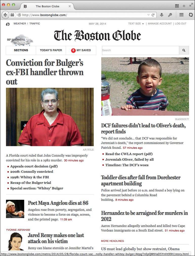
FIG 5.13: As the viewport gets a little wider, the bostonglobe.com layout gets slightly more complex, using min-width queries to make better use of the available space.
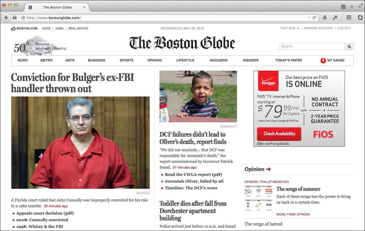
FIG 5.14: At wider screens, another set of min-width queries reshapes the layout again, converting bostonglobe.com to a widescreen-friendly layout. By beginning with a small-screen-ready layout, each breakpoint builds on the one preceding it, leaving us with an accessible and responsive design.
The design is still responsive, using all of the techniques we’ve discussed thus far in this book: the layout is based on a fluid grid, and the images still work well within that flexible context. But in contrast to the Robot or Not site, we’re applying min-width media queries to scale our design up through the resolution spectrum. The basic structure of the stylesheet looks something like this:
/* Default, linear layout */
.page {
margin: 0 auto;
max-width: 700px;
background: #fff;
position: relative;
}
/* Small screen! */
@media screen and (min-width: 480px) { ... }
@media screen and (min-width: 620px) { ... }
@media screen and (min-width: 810px) { ... }
@media screen and (min-width: 1400px) { ... }
The bulk of the stylesheet contains little else but color- and type-related rules, providing a basic (but hopefully still attractive) design to all users. In other words: outside of the media queries, the stylesheet begins with a linear, small-screen-friendly design by default, one that doesn’t have much of a layout to speak of. But then, breakpoints are set in a series of min-width media queries, for minimum viewport widths of 480px, 620px, 810px, and 1400px. And as the viewport scales up beyond those thresholds, the appropriate layout rules are applied. The benefit to this approach? If a browser without media query support accesses the Globe, they’re given an attractive, single-column layout if our JavaScript patch isn’t available to them (FIG 5.15).
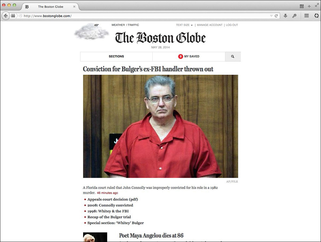
FIG 5.15: No media queries? No JavaScript? No problem: designing for the small screen first means every browser is left with an accessible design, regardless of the size of its screen.
What if we wanted to take this approach with our little Robot site? Converting the entire design to small-screen-friendly breakpoints is beyond the scope of this short book, but let’s walk through a simple layout. Here’s the CSS we’re currently using to control the two-column layout for our blog:
.blog .main {
float: left;
width: 62.8888889%; /* 566px / 900px */
}
.blog .other {
float: right;
width: 36.7777778%; /* 331px / 900px */
}
@media screen and (max-width: 768px) {
.blog .main,
.blog .other {
float: none;
width: auto;
}
}
In other words, our .main and .other elements—the blog entry, and the list of recent entries that follows it—are floated columns by default, unless the viewport is narrower than 768px. (@media screen and (max-width: 768px) { ... }.) If it falls below that threshold, we disable our floats, set the width of the two elements back to auto, and allow them to stack vertically on smaller screens. (FIG 5.16)
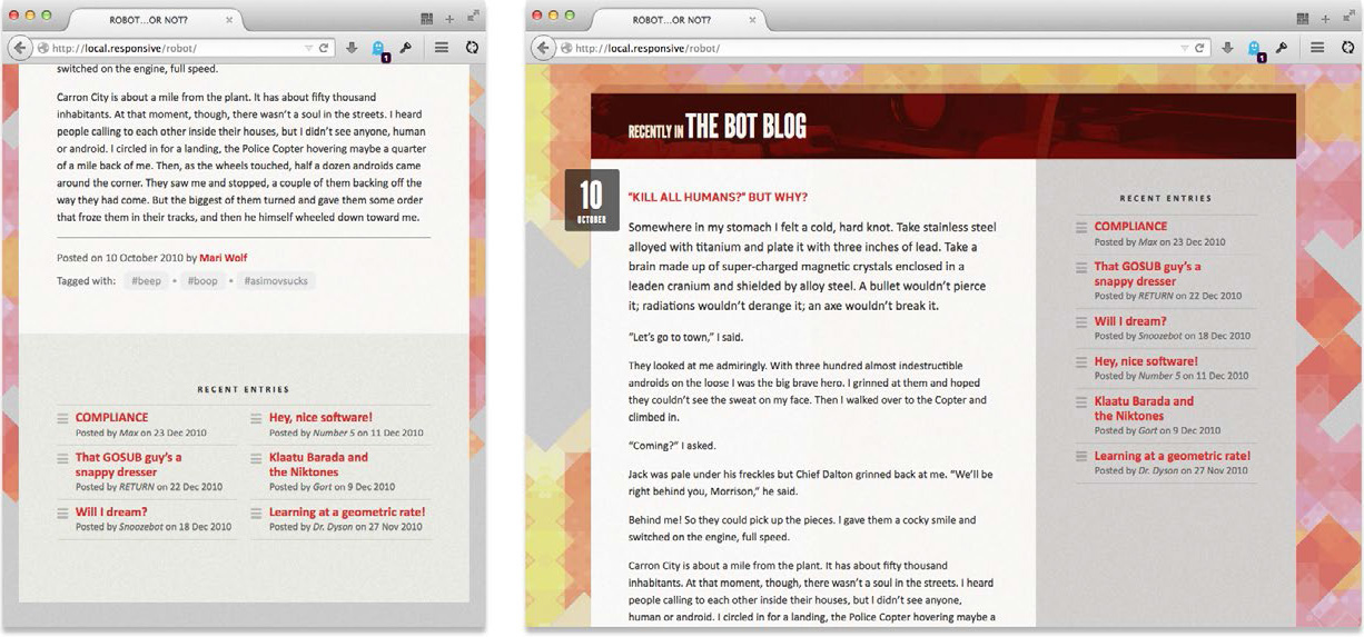
FIG 5.16: Our blog layout now defaults to a linear, small-screen-friendly design, but then moves to a two-column layout only when seen above a certain viewport width. The result is the same, but the code is much more accessible.
But what if we wanted to adopt a more “mobile first” approach to this same layout? Thankfully, it’s easily done:
@media screen and (min-width: 768px) {
.blog .main {
float: left;
width: 62.8888889%; /* 566px / 900px */
}
.blog .other {
float: right;
width: 36.7777778%; /* 331px / 900px */
}
}
All we’ve done is take the floats and widths for our two-column layout, and moved them into a min-width media query—not a max-width query, as we did before. The result is that the two-column layout will apply only if the screen is at least 768px wide. In other words, we’re not using our media query to override rules from wider breakpoints; we’re using it to layer complexity onto our design as viewports gradually widen. While the two approaches are visually similar, this “mobile first” approach to building responsive templates ensures greater accessibility to our content, but doesn’t make any assumptions about the capabilities of the device or browser rendering our design. And after adopting it for my client projects, I’ve found it’s the best, most bulletproof way to implement your responsive designs.
Revisiting Progressive Enhancement
A more thorough implementation of this approach would be the responsive redesign of The Guardian (http://www.theguardian.com/), which is, at the time of this book’s writing, in a public beta (FIG 5.17). (If you’re on a non-mobile device, select the “Beta” link from the site’s header to see the new responsive beta.) In a conference presentation (http://bkaprt.com/rwd2/61/), The Guardian’s Matt Andrews discussed the various ways in which responsive design changed the way their team collaborated. And there were a number of changes—from design to development, from project planning to internal communication. But for them, one of the most critical ideas was this:
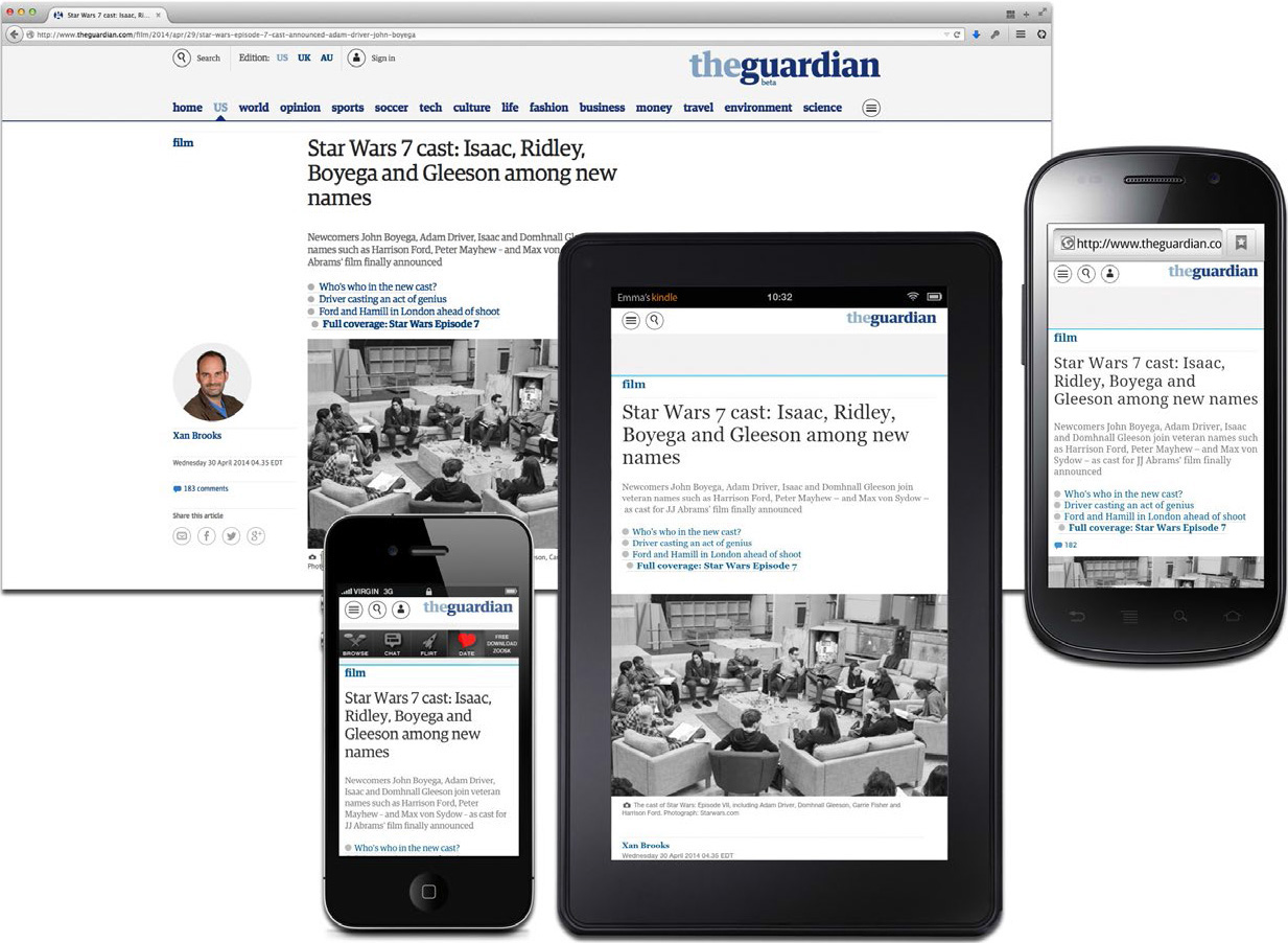
FIG 5.17: Regardless of how wide or small your screen might be, or how modern or ancient your browser happens to be, The Guardian’s new responsive site is at once accessible and beautiful.
The first step in rethinking the web for the future is accepting that making things look exactly the same across all browsers is an idea best left to the past.
The language is different, of course, but it overlaps beautifully with Nick Finck and Steven Champeon’s original definition of “progressive enhancement” (http://bkaprt.com/rwd2/62/):
Rather than hoping for graceful degradation, progressive enhancement builds documents for the least capable or differently capable devices first, then moves on to enhance those documents with separate logic for presentation, in ways that don’t place an undue burden on baseline devices but which allow a richer experience for those users with modern graphical browser software.
Since Nick and Steven coined the term in 2003, progressive enhancement has been the hallmark of the responsible approach to standards-based web design. By beginning with a foundation of semantic, well-structured markup, styling with a layer of CSS, and adding DOM scripting via JavaScript as needed, we can create compelling experiences in capable browsers, while ensuring universal access to the content beneath the design.
In fact, progressive enhancement has been the cornerstone for most modern responsive designs. Take the BBC News website, for example: they’ve been experimenting with responsive design in public at http://m.bbc.com/news/, only allowing “mobile” devices to access the responsive site (FIG 5.18). In time, that responsive prototype will become the default experience for all their visitors—mobile, tablet, desktop, and whatever comes next. (In fact, by the time you read this, it might be the default experience already. Books are weird that way.)
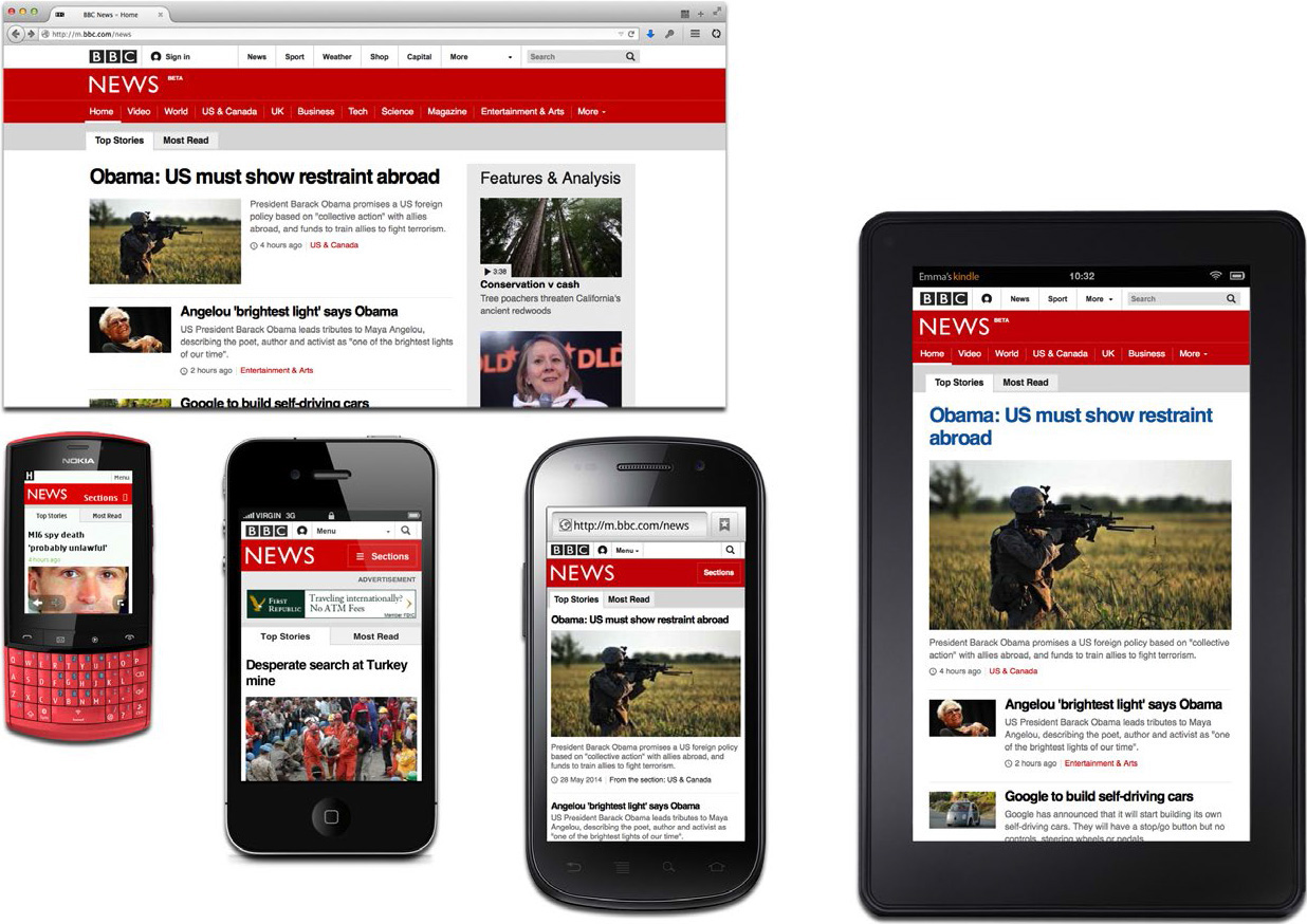
FIG 5.18: The new responsive BBC News site isn’t just accessible to differently sized screens, but to high- and low-end devices and browsers alike.
The BBC News team is designing responsively on a massive scale, planning for a site that will work on the latest iOS and Android devices—as well as less capable smartphones in developing markets. And the key of their strategy is progressive enhancement: of letting even the lowest-end devices access the new responsive site, but conditionally enhancing up to an enriched experience. In 2012, they took to their development blog (http://bkaprt.com/rwd2/63/) to describe how they responsively design for a complex, sprawling device landscape:
We have ~80 significant browsers / operating system combinations regularly using our application across the globe and a long tail of hundreds more.... We make this manageable in the same [way] you and everyone else in the industry does it: by having a lowest common denominator and developing towards that. So we’ve taken the decision to split the entire browser market into two, which we are currently calling “feature browsers” and “smart browsers”.
...
The first tier of support we call the core experience. This works on everything.... As the application loads we earmark incapable browsers with [some inline code] and exclude the bulk of the Javascript powered UI from them, leaving them with clean, concise, core experience.
In other words, the BBC News team isn’t designing for specific platforms, or even focusing on device classes. Instead, they’re designing for experience tiers: a basic design served to every device; and a more enhanced version, conditionally served to more capable browsers. The result is a responsive design that loads quickly in every HTML-capable device, but then upgrades to a more robust interface—but only if the browser is deemed capable of handling the more enhanced experience (FIG 5.19). And this progressive enhancement-driven approach has been the foundation of some of the largest responsive designs, including responsive sites like The Boston Globe and The Guardian.
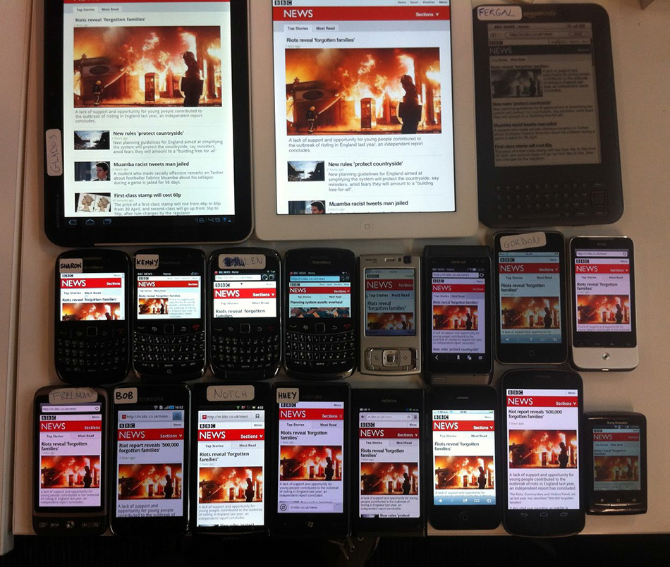
FIG 5.19: By building with progressive enhancement, the responsive BBC News site doesn’t have to focus on individual devices or platforms; instead, they can design for broad experience tiers. (Source: http://bkaprt.com/rwd2/64/)
Stephen Hay reiterated the need for progressive enhancement as well, in his fantastic essay “There is no Mobile Web” (http://bkaprt.com/rwd2/65/):
Most sites on the web are not built with specific mobile use-cases in mind. However, millions of people access these sites every day through mobile devices. They access a “normal” (whatever that means) website through their “mobile” device.
...
To be honest, I can think of a few, but not many use cases of web sites or apps which are or should be exclusively mobile. It seems like the Mobile Web allows us to revisit all of the talk of inclusion, progressive enhancement, and accessibility from years ago.
Ever have one of those moments where someone else perfectly expresses why you believe in something? Stephen’s essay manages to capture exactly why I’m excited about responsive web design. Rather than simply siloing our content into different, device-specific sites, we can use progressive enhancement to ensure quality access for all, with an enhanced experience for those devices that are capable of it.
Working with JavaScript
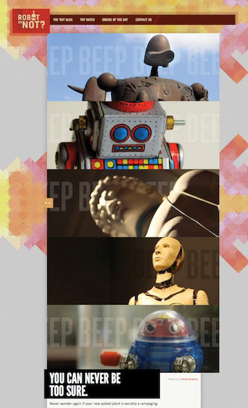
To put this to the test, let’s take a look at the slideshow at the top of the Robot or Not site (FIG 5.20). Currently, the markup looks like this:
<div class="slides">
<div class="figure">
<b><img src="img/slide-robot.jpg" alt="" /></b>
<div class="figcaption">...</div>
</div><!-- /end .figure -->
<ul class="carousel-nav">
<li><a class="prev" href="#">Previous</a></li>
<li><a class="next" href="#">Next</a></li>
</ul>
</div><!-- /end .slides -->

Not too fancy. But also, not too functional: we’ve marked up the interface for a slideshow, but it isn’t implemented yet. We’ve included a single slide in our template, as well as the previous/next navigation. But clicking on those links won’t do a darned thing.
So, we’ll need to introduce a bit of JavaScript, and bring some interactivity into our design. But first, we need slides! So, let’s grab some more images, and augment our HTML a bit:
<div class="slides">
<div class="figure">
<b><img src="img/slide-robot.jpg" alt="" /></b>
<div class="figcaption">...</div>
</div><!-- /end .figure -->
<div class="figure">
<b><img src="img/slide-tin.jpg" alt="" /></b>
<div class="figcaption">...</div>
</div><!-- /end .figure -->
</div><!-- /end .slides -->
Let’s drop in four more slides, using the same .figure markup pattern as before. I’ve also deleted the .carousel-nav element that housed our previous and next links, as we’ll be adding that dynamically through our JavaScript.
So, yes, this looks a little weird right now, as our slides are currently just stacked on top of each other (FIG 5.21). To get our slideshow up and running, we’ll be using a free jQuery plugin designed by Filament Group (http://bkaprt.com/rwd2/66/). It’s one of the more robust slideshow scripts I’ve used. I like it because it works incredibly well with flexible content; if your slides have different amounts of text or images in them, this plugin handles them with ease—all without resorting to convoluted CSS foofery. (Oh, yes. I said “foofery.” I’m not messing around.)
So to work the carousel script into the page, I’m going to add three new script elements to our HTML:
<script src="jquery.js"></script>
<script src="carousel.js"></script>
<script src="core.js"></script>
Since the carousel script requires jQuery to run, I’ve downloaded the library from http://jquery.com/ and placed it in the head of the page (jquery.js), followed by the carousel script (carousel.js), and a file called core.js, which is where we’ll actually write the code for our slideshow.
And actually, it’s fairly easy to do. Inside of core.js, let’s write the following:
(function( $ ) {
$( function(){
$( ".welcome .slides" ).carousel();
} );
}( jQuery ));
Now, if you’re not completely comfortable with JavaScript, or haven’t used jQuery before, that’s okay. The script above is just doing two different things:
1. First, it locates the div.slides element inside of the .welcome module, using jQuery’s very CSS-friendly selector syntax. ($(".welcome .slides")).
2. Once it has located that element, our script runs the .carousel() function, creating the slideshow.
And with those five short lines of JavaScript, we’ve got a working slideshow (FIG 5.22). Success!

Lazily (but intelligently) loading content
Or at least, it’s a starting point. If we disable JavaScript in the browser, we’re back to where we were before: with a whole mess of slides stacked on top of each other. So for any visitor to our site that doesn’t have JavaScript available to them, the experience quickly becomes decidedly un-great.
So let’s do something about that. In fact, let’s get a bit tricky: we’re going to remove all but one of the slides from the page, and put them in a separate HTML file. So now, our page’s source looks considerably lighter:
<div class="slides">
<div class="figure">
<b><img src="img/slide-robot.jpg" alt="" /></b>
<div class="figcaption">...</div>
</div><!-- /end .figure -->
</div><!-- /end .slides -->
However, we’ve created a separate file (let’s call it slides.html), and pasted in the markup for our four remaining slides:
<div class="figure">
<b><img src="img/slide-tin.jpg" alt="" /></b>
<div class="figcaption">...</div>
</div><!-- /end .figure -->
<div class="figure">
<b><img src="img/slide-statue.jpg" alt="" /></b>
<div class="figcaption">...</div>
...
</div><!-- /end .figure -->
You’ve probably noticed that slides.html isn’t even a valid HTML document. In fact, it’s more like a markup stub, a mini-document we can use to store some HTML for later use. In fact, we’ll just use jQuery to open slides.html and load the images into the slideshow, like so:
(function( $ ) {
$( function(){
$.get( "-/ajax/slides.html", function( data ) {
$( ".welcome .slides" )
.append( data )
.carousel();
});
} );
}( jQuery ));
And that’s that. The jQuery .get() function opens our HTML snippet (slides.html), and inserts its contents into our module by using append(). If JavaScript isn’t available, or if jQuery can’t load that file, then the user is presented with a single image at the top of the page: a perfectly acceptable fallback for our design (FIG 5.23).
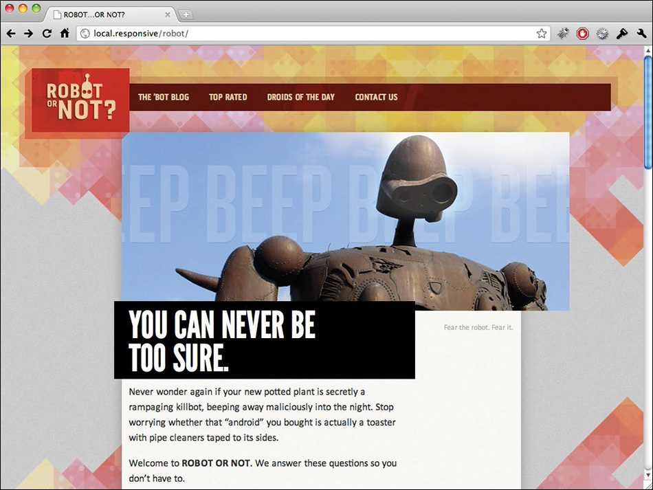
FIG 5.23: No JavaScript? No problem. Our slideshow degrades to a single image, which looks just grand.
Further improvements
We’ve augmented our simple slideshow script with considerably more code, but the end result is a much more robust and accessible experience. We’re not assuming anything about the capabilities of the browser or device rendering our page: if JavaScript is available to them, then our slideshow will appear.
But there’s always room for improvement—and this rough little prototype is no exception. For example, we could potentially restrict our slideshow to only appear on certain types of displays, making the script resolution dependent. For example, if we wanted to prevent it from loading at all on smaller screens, we could work a simple resolution test into our script:
if (document.documentElement.clientWidth >= 500) {
$(document).ready(function() { ... });
}
That opening if statement is the JavaScript equivalent of a min-width: 500px media query: if the screen is narrower than 500 pixels, then the enclosed JavaScript won’t fire (FIG 5.24). And while we’re being bandwidth-conscientious, I’d probably use the new picture element—with support patched in via Filament Group’s picturefill.js library (http://bkaprt.com/rwd2/67/)—which would allow us to serve lighter, more bandwidth-friendly images to smaller displays, with the full-sized images served only to wider screens.

FIG 5.24: We’ve decided that our slideshow will only be available to browsers wider than 480px. Smaller screens get a single image.
And we could refine this approach further. For example: instead of including three script elements in our HTML, we would ideally use a lightweight JavaScript loader like LabJS (http://labjs.com/) or yepnope (http://yepnopejs.com/) to dynamically load jQuery, the carousel plugin, and our own custom.js—perhaps including them only if the user’s browser is sufficiently advanced. That would help ensure that users on less capable devices aren’t saddled with the overhead of downloading all that JavaScript, especially if the carousel wouldn’t work well for them.
Go Forth and Be Responsive
I mention these enhancements not because they’re necessarily the right approach; in the age of portable 3G hotspots and wifi-enabled phones, it’s dangerous to automatically equate a screen’s dimensions with the bandwidth available to it. But if you need an extra level of resolution awareness in your work, these tools are available.
Still, I find it helpful to keep Luke’s “mobile first” philosophy in mind when I’m faced with a particularly involved bit of functionality. If I’m disabling a tricky interface for mobile users, then why is there value in it for the rest of my audience? If that sounds like a loaded question, it’s not meant to be: there aren’t any easy answers here.
Because more than anything, web design is about asking the right questions. And really, that’s what responsive web design is: a possible solution, a way to more fully design for the web’s inherent flexibility. In the first chapter, I said that the ingredients for a responsive design were a fluid grid, flexible images, and media queries. But really, they’re just the vocabulary we’ll use to articulate answers to the problems our users face, a framework for ordering content in an ever-increasing number of devices and browsers.
If we’re willing to research the needs of our users, and apply those ingredients carefully, then responsive web design is a powerful approach indeed.
I can’t wait to see the stories you’ll tell with it.