Clown Car Technique: Solving Adaptive Images In Responsive Web Design
By Estelle WeylAdaptive images are the current hot topic in conversations about adaptive and responsive web design. Why? Because no one likes any of the solutions thus far. New elements and attributes are being discussed as a solution for what is, for most of us, a big headache: to provide every user with one image optimized for their display size and resolution, without wasting time, memory or bandwidth with a client-side solution.
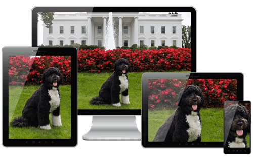
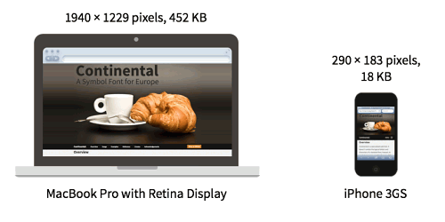
We have foreground and background images. We have large and small displays. We have regular and high-resolution displays. We have high-bandwidth and low-bandwidth connections. We have portrait and landscape orientations.
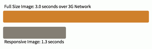
Some people waste bandwidth (and memory) by sending high-resolution images to all devices. Others send regular-resolution images to all devices, with the images looking less crisp on high-resolution displays.
What we really want to do is find the holy grail: the one solution that sends the image with the most appropriate size and resolution based on the browser and device making the request that can also be made accessible.
The “clown car” technique is the closest thing we’ve got to a holy grail: leveraging well-supported media queries, the SVG format and the <object> element to serve responsive images with a single request. The solution isn’t perfect yet, but it’s getting close.
Background Images And Media Queries
We’ve solved adaptive background images. Media queries make it simple to tailor the size and resolution of images to a device’s pixel ratio, viewport size and even screen orientation.
By using media queries with our background image styles, we can ensure that only the images that are needed are downloaded from the server. We can limit downloads to the assets that are most appropriate, saving bandwidth, memory and HTTP requests.
Unfortunately, there has been no solution for foreground images — until now. The technology has been available for a long time. The clown car technique is just a new technique that leverages existing technology.
Proposed Solutions With New Technology
New Elements and Attributes
With inline or “content” images, getting the browser to download and display only the appropriate foreground image is a bit more difficult. Most people believe that there is no mechanism for the <img> tag to cause an image of the right size and resolution to be downloaded. To that end, polyfills1 have been created and services2 have been established.
The <picture> element3 — which leverages the semantics of the HTML5 <video> element, with its support of media queries to swap in different source files — was proposed:
<picture alt="responsive image">
<source src="large.jpg" media="(min-width:1600px),
(min-resolution: 136dpi) and (min-width:800px)">
<source src="medium.jpg" media="(min-width:800px),
(min-resolution: 136dpi) and (min-width:400px)">
<source src="small.jpg">
<img src="small.jpg" alt="responsive image">
</picture>
Another method, using a srcset attribute4 on the <img> element, has also been proposed. The above <picture> element would be written as this:
<img
    alt="responsive image"
    src="small.jpg"
    srcset="large.jpg 1600w,
          large.jpg 800w 1.95x,
          medium.jpg 800w,
          medium.jpg 400w 1.95x">
Both solutions have benefits and drawbacks. Picking one is hard — but we don’t have to anymore. The two solutions have been joined into what’s called “Florian’s Compromise5.” However, the traction isn’t quite there6 yet.
Google has proposed client hints7 as part of HTTP headers, to enable the right image to be served server-side.
SVG as an Out-of-the-Box Solution
Many people don’t realize that we already have the technology to create and serve responsive images.
SVG has supported media queries for a long time, and browsers have supported SVG8 for… well, long enough, too. Most browsers support media queries in SVG (you can test your own browser9). When it comes to responsive images, the only browsers in the mobile space that don’t support SVG are old versions of the Android browser (Android support for SVG began with Android 3.0).
We can leverage browser support for SVG and SVG support for both media queries and raster images to create responsive images, using media queries in SVG to serve up the right image.
My original experiment should theoretically work, and it does work in Internet Explorer (IE) 10 and Opera. When you mark up the HTML, you add a single call to an SVG file.
<img src="awesomefile.svg" alt="responsive image">
Now, isn’t that code simple?
SVGs support raster images included with the <image> element and with the CSS background-image property. In our responsive SVG, we would include all of the images that we might need to serve and then show only the appropriate image based on media queries.
Download a Single Raster Image
My first attempt at SVG used <image> with media queries, hiding them with display: none.
While the SVG works perfectly in terms of responsiveness, it has several problems. Unfortunately, setting display: none on an <image> in SVG, similar to <img> in HTML, does not prevent the resource from being downloaded. If you open the <image> SVG in your browser10, all four PNGs will be retrieved from the server, making four HTTP requests, wasting bandwidth and memory.
We know from CSS background images that downloading only the images that are needed is indeed possible. Similarly, to prevent the SVG from downloading all of the included images, we would use CSS background images instead of foreground images in our SVG file:
<svg xmlns="http://www.w3.org/2000/svg"
   viewBox="0 0 300 329" preserveAspectRatio="xMidYMid meet">

<title>Clown Car Technique</title>

<style>
svg {
	background-size: 100% 100%;
	background-repeat: no-repeat;
}

@media screen and (max-width: 400px) {
	svg {
		background-image: url(images/small.png");
	}
}

@media screen and (min-width: 401px) and (max-width: 700px) {
	svg {
		background-image: url(images/medium.png);
	}
}

@media screen and (min-width: 701px) and (max-width: 1000px) {
	svg {
		background-image: url(images/big.png);
	}
}

@media screen and (min-width: 1001px) {
	svg {
		background-image: url(images/huge.png);
	}
}
</style>
</svg>
The above can be included directly as an inline <svg>, or embedded with the <img> src attribute or <object> data attribute.
If you’re familiar with media queries and CSS, most of the code above should make sense. The clown car technique uses the same media queries that you would use elsewhere on your adaptive website.
To preserve the aspect ratio of the containing element and ensure that it scales uniformly, we include the viewbox and preserveAspectRatio attributes.
The value of the viewbox attribute is a list of four space- or comma-separated numbers: min-x, min-y, width and height. By defining the width and height of our viewbox, we define the aspect ratio of the SVG image. The values we set for the preserveAspectRatio11 attribute — 300 × 329 — preserve the aspect ratio defined in viewbox.
Issues with including the above include
1. Chrome and Safari not maintaining the aspect ratio when <svg> is included12 inline: instead, defaulting the <svg> to 100% width and height. A bug has been submitted13.
2. Webkit and Firefox not allowing the inclusion of raster images or scripts in SVGs embedded via the <img> element, and
3. No SVG support in IE <=8 and Android <=2.3.3.
When you open the SVG file with just background images14 defined, the raster image will take up the entire viewport. While the <image> version might look better as a standalone file because it is maintaining its aspect ratio and the background-image version is filling up the viewport, when you include the SVG as a separate document pulled into the HTML, the aspect ratio is preserved by default. The background-size of contain, cover or 100% all work: choose the one that works best for your requirements.
The CSS background-image property solves the HTTP request problem. Open the SVG file with just PNG background images15 (or the JPEG version16 ) and look at the “Network” tab in your developer tools, and you’ll see that the SVG has made only two HTTP requests, rather than five. If your monitor is large, then the browser would have downloaded a small SVG file (676 bytes) and huge.png or huge.jpg.
Our first problem — that all of the different sizes of images are downloaded, even those that aren’t needed — has been resolved. This background-image version downloads only the image required, thereby addressing the concerns about multiple HTTP requests and wasted bandwidth.
The magic happens when we include SVG in a flexible layout. You’ll notice that the first time you resize the image, the browser might flicker white as it requests the next required PNG — because it doesn’t automatically download all assets. Rather, it downloads only the asset it needs. Simply declare either the width or the height of the container (<img>, <svg> or <object>) with CSS within your layout media queries, and the SVG will only pull in the single raster image it needs.
We still have the SVG file itself, which requires an HTTP request when not embedded inline with <svg>. We’ll solve that issue third.
Content Security Issues
In Opera or in Windows 9 or 10, open the HTML file containing an SVG raster image17 that is linked to with the <img> tag. Note in the “Resources” panel of the developer tools that only one JPEG or PNG is being downloaded. Resize your browser. Note that the <img> is responsive. Additional JPEGs or PNGs (we could also have used GIF or WebP) are downloaded only when needed.
If you opened the HTML file containing an SVG raster image18 in Firefox or WebKit, you would likely have seen no image. The SVG works in all modern browsers, but the <img> that calls in an SVG pulling in raster images works only in Opera and IE 9+. We’ll first cover how it works in IE and Opera, then we’ll cover the issues with WebKit and Firefox.
The code is simple:
<img src="awesomefile.svg" alt="responsive image">
When you include the SVG in your HTML <img> with a flexible width, such as 70% of the viewport, then as you grow and shrink the container by changing the window’s size or the CSS, the image will respond accordingly.
The width media query in the SVG is based on the parent element in which the SVG is contained — the <img>, in this case — not the viewport’s width.
As the window grows and shrinks, the image displayed by the SVG changes. In the SVG file, the images are defined as being 100% of the height and width of the parent, which, in the case above, when we opened the SVG directly, was the viewport. Now, the container is the <img> element. Because we included the viewbox and preserveAspectRatio attributes, as long as at least one length is defined, the SVG will grow or shrink to fit that length, maintaining the declared aspect ratio in the SVG, whatever the image’s size.
These foreground images work perfectly in Opera and IE 9+ (the versions found on mobile devices). In Chrome and Safari, if you open the SVG file first, thereby caching it, then the HTML file that contains the foreground SVG image might work as well.
While we saw earlier that the browser can indeed render the SVG, if the SVG is included in our document via the <img> tag, then this particular type of SVG will fail to render.
Why? To prevent cross-domain scripting attacks, some browsers have content security policies in place to keep SVG from importing media or scripts, in case they’re malicious in nature.
Blocking SVGs from importing scripts and images does make sense: To prevent cross-domain scripting attacks, you don’t want a file to pull potentially malicious content. So, SVG is supported, but in the case of WebKit and FireFox, it is just being prevented from pulling in external raster images. I’ve submitted a Chrome bug report19 to get the ban on importing raster images in SVG lifted.
In Firefox, the responsive SVG also works on its own. Firefox fully supports SVG. However, for security reasons, Firefox blocks the importing of external raster images, even if those images are on the same domain. The rationale is that allowing visitors to upload images and then displaying those images and scripts as part of an SVG constitutes a security risk. I would argue that if a website uses unsecured user-generated content, they’re already doing it wrong.
For right now, this simple line…
<img src="awesomefile.svg" alt="responsive image">
… is blocked in some browsers and, therefore, isn’t a viable solution.
All browsers support SVG media queries. They all support SVG as foreground or content images. They all support SVG as background images. The support just isn’t identical because of browser security policies.
All browsers do support the <object> tag. Without changing browser security policies, <img> alone won’t work yet. We can leverage the <object> tag.
With the <object> Tag
The <object> element allows an external resource to be treated as an image. It can take care of the browser security drawbacks we see with <img>, disallowing the importing of images or scripts into an <img> file. The <object> element allows both.
The code isn’t that much more complex:
<object data="awesomefile.svg" type="image/svg+xml"></object>
By default, the <object> will be as wide as the parent element. However, as with images, we can declare a width or height with the width or height attribute or with the CSS width or height property. For the clown car technique to maintain the declared aspect ratio, simply declare just one length value.
Because of the viewbox and preserveAspectRatio declarations in our SVG file, the <object> will by default maintain the declared aspect ratio. You can overwrite this with HTML or CSS attributes.
As noted earlier, the media queries in the SVG match the SVG’s container, not the viewport. The matched media queries in the SVG file will reflect the parent of the <object> tag, rather than the viewport.
If you look at an SVG being pulled in as the <object> data20, you’ll see that it works in all browsers that support SVG.
With the <svg> Tag
Instead of including an external SVG file, you can also include the svg as inline content with the <svg> tag21. The benefit is no additional http request for an external .svg file.
Unfortunately, Chrome and Safari render the SVG as a full screen block display element and appear to not support the preserveAspectRatio attribute when included this way (they do support preserveAspectRatio when the SVG is included via the <object> tag).
The other drawback is that, unlike <object>, we can’t include fallback content for browsers that don’t support SVG. Instead we would need to include background-image, with height and width on the <svg> for browsers that don’t support SVG.
Fallback for IE
The <object> element is supported in all browsers, even mobile browsers. But this technique works only if the browser supports SVG as well. Therefore, it doesn’t work in IE 8 and below or in Android 2.3 and below. There is a fallback for these older browsers. Also, we are making two HTTP requests to pull in the correct image — one for the SVG file and one for the raster image that we want to show — there is a solution for this, too.
What makes <object> more interesting than <img> or <svg>is that it is a non-empty element that can include fallback content when a browser fails to support the <object>’s data type. If you want, you can include an <img> tag nested in <object> for browsers that don’t support the SVG.
For IE 8 and below, we’ll include our medium-sized raster image because they’re generally displayed on monitors at a normal DPI:
<object data="awesomefile.svg" type="image/svg+xml">
  <img src="medium.png" alt="responsive image">
</object>
Unfortunately, content nested within <object> is downloaded even when the object is rendered and the nested content is not needed or rendered. This adds a download of the medium-sized image whether or not it is needed.
To handle this issue, we can use conditional comments for IE.
<object data="awesomefile.svg" type="image/svg+xml">
</object>
A Single HTTP Request
We’ve narrowed the SVG to download a single raster image. The <object> method downloads both the raster image and the SVG file. We have two HTTP requests instead of one. To prevent additional HTTP requests, we can create an SVG data URI, instead of calling in an external SVG file.
<object data="data:image/svg+xml,<svg viewBox='0 0 300 329' preserveAspectRatio='xMidYMid meet' xmlns='http://www.w3.org/2000/svg'><title>Clown Car Technique</title><style>svg{background-size:100% 100%;background-repeat:no-repeat;}@media screen and (max-width: 400px){svg{background-image:url(images/small.png);}}@media screen and (min-width: 401px) and (max-width:700px){svg{ background-image:url(images/medium.png);}}@media screen and (min-width: 701px) and (max-width:1000px){svg{background-image:url(images/big.png);}}@media screen and (min-width:1001px){svg{background-image:url(images/huge.png);}}</style></svg>" type="image/svg+xml">
</object>
The code above looks messy, but it’s simply data:image/svg+xml, followed by the contents of the SVG file, minified. It is the same code we would include had we used the content <svg>, but this method supports the preserveAspectRatio attribute of the SVG.
It works in all browsers that support SVG, except IE. While this is frustrating, it’s actually because Microsoft is trying to follow the specification to the letter. The specification states that the data URI must be escaped. So, to make all browsers, including IE 9 and 10, support the data URI, we escape it:
<object data="data:image/svg+xml,%3Csvg%20viewBox='0%200%20300%20329'%20preserveAspectRatio='xMidYMid%20meet'%20xmlns='http://www.w3.org/2000/svg'%3E%3Ctitle%3EClown%20Car%20Technique%3C/title%3E%3Cstyle%3Esvg%7Bbackground-size:100%25%20100%25;background-repeat:no-repeat;%7D@media%20screen%20and%20(max-width:400px)%7Bsvg%7Bbackground-image:url(images/small.png);%7D%7D@media%20screen%20and%20(min-width:401px)%7Bsvg%7Bbackground-image:url(images/medium.png);%7D%7D@media%20screen%20and%20(min-width:701px)%7Bsvg%7Bbackground-image:url(images/big.png);%7D%7D@media%20screen%20and%20(min-width:1001px)%7Bsvg%7Bbackground-image:url(images/huge.png);%7D%7D%3C/style%3E%3C/svg%3E"
type="image/svg+xml">
</object>
The markup is ugly, but it works!
Open up our first page22 and our second page23, and then open up the developer tools to inspect the HTTP requests. You’ll notice two HTTP requests: the HTML file, and the PNG that the SVG pulls in. The inspector will show an entry for the SVG file as well. But notice that no HTTP request is being made: the status of the SVG is “success,” and the size over the network is 0 bytes, with the size of the data URI SVG coming in at under 600 bytes.
Landscape Vs. Portrait
Generally, content images are either landscape or portrait: faces are portrait, groups of people, products and sunsets are landscape. Some people object strongly to the clown car technique because they believe that images don’t change according to orientation. That isn’t necessarily true.
The magic of this technique is that the rendered image changes based on the size of the container. You could set your landscape foreground image to 33% or 240 pixels or whatever else, and your portrait object’s width to 25% or 180 pixels or whatever else. The object’s size is determined by the CSS for your HTML. The raster image served is based on the media queries that match the object’s size.
The aspect ratio remains the same, but you can control which raster image is served by changing the proportions of the SVG container, matching the media queries in the HTML’s CSS with the media queries in the SVG’s CSS.
If you do prefer to serve landscape foreground images when in landscape mode and portrait when in portrait mode, don’t use the preserveAspectRatio attribute. Instead, declare absolute heights and widths in your CSS for each breakpoint design size.
Other Benefits
Another benefit of the clown car technique is that all of the logic remains in the SVG file. Similar to how we separate content from presentation from behavior, this method enables us to separate image logic from content. The <img> or <object> element is part of the content, but the logic that makes it all work can be made separate from the content layer: The logic is in the SVG image, instead of polluting the CSS and HTML. This benefit may make some choose the non-data-URI version of the <object> method, in-spite of the extra http request, because it is so easy and clean.
The technique enables us to neatly organize our images, separating behavior from presentation from content from images. I envision the structure of responsive image files to be something like this:
images/
	clowns/
		small.png
		medium.png
		large.png
		svg.svg
	cars/
		small.png
		medium.png
		large.png
		svg.svg
	techniques/
		small.png
		medium.png
		large.png
		svg.svg
All of our assets for a single image live in a single separate directory. The image file names are consistent, while the folder names vary. We can have responsive foreground images without littering our HTML with extra unused code, thus making image management and updating a breeze.
Drawbacks Of The Clown Car Technique
We’ve covered the pros of the technique. The technique is still nascent, so I haven’t figured out all of the problems. I am working on solutions to some of the issues that have been found, and I assume new issues will arise.
I am mostly concerned with the ways in which images that arise from the clown car technique fail to behave like regular PNGs, JPEGs and GIFs. The main issues I have noticed are loading order, fallback for Android 2.3.3 and below, accessibility, and the ability to right-click on the image.
Page Layout
According to John Wilkins, the clown car technique requires the CSS layout to fully render before images start to load. I have not had a chance to compare the loading of regular foreground images versus the <object> element with SVG pulling in raster images, so I cannot comment on the impact of this issue yet.
Android 2.3 and Below
Android 2.3 and below does not support SVG. I have found three possible solutions, which I have yet to flesh out.
<SVG> with background-image
We can use <svg> as inline content instead of <object>. While IE 8 and below and Android 2.3 and below do not support SVG, with CSS these browsers can give <svg> layout with height and width, and then declare the raster image as the background-image value.
As our goal is to create responsive foreground images without the use of CSS background images, this backward-compatibility hack doesn’t suit our purposes. If this is our solution, why not just use CSS background images instead of the Clown Car Technique for all browsers and devices?
Conditional Comments
The first is to include conditional comments to include a medium-sized fallback for IE 8 and below, and a small-sized fallback for all browsers that ignore conditional comments (including IE 10):
<img src="images/small.png" alt="fallback"/>
This fallback will show the small PNG to all Android phones. Unfortunately, all browsers other than IE 9 and below will download small.png, even though the image will not be shown. In trying to solve for old Android, we are downloading the small PNG to most devices unnecessarily.
JavaScript Feature Detection
The other solution is feature detection with JavaScript — i.e. test for SVG support. Include a .no-svg class in the <html> element if the browser doesn’t support SVG. Using a WebKit-prefixed media query to exclude non-WebKit browsers, targeting as follows:
.no-svg object[type*="svg"] {
    width: 300px;
    height: 329px;
    background-image: url(small.png);
}
The properties above add dimensions and a background image to the <object> object. Again, I haven’t tested this yet, and it’s not accessible, which brings us to the next topic.
Accessibility
The benefit of <img> is that a simple alt attribute can make it accessible. The <object> element does not have an alt attribute. Ideas to make clown car images accessible include the following:
•Add a <title> and <desc> to the SVG file.
•Add ARIA role="img" and other ARIA attributes, such as aria-label and aria-labeled-by.
•Include tab-index="0" to enable the <object> to gain focus without changing tab order.
•Add alt attributes to the fallback images.
•Add alternative text between the opening and closing <object> tags.
Mac OS X’s Universal Access’s VoiceOver reads the content of the SVG’s <title> and value of the aria-label attribute on the <object> when the <object> includes tabindex="0". Testing of the accessibility testing page24 still needs to be done with actual screen readers.
Right-Click to Save
When you right-click on an image in a desktop browser, you’ll get a menu enabling you to save the image. On some phones, a lingering touch on an image will prompt a save. This does not work with <object> or with background images, which is what our SVG is made of.
This “drawback” might be a feature for people who are wary of their images being stolen. In the brief time that I have contemplated this issue, I have yet to come up with a native way to resolve this issue. It is likely resolvable with JavaScript.
If the inability to right-click to save is your main argument against this technique, then recall that while users can right-click on WebP images in browsers that support WebP (only Chrome and Opera), they can’t do much with those images because native applications don’t support this new format. But this needn’t prevent us from moving forward with these bandwidth-saving techniques and features.
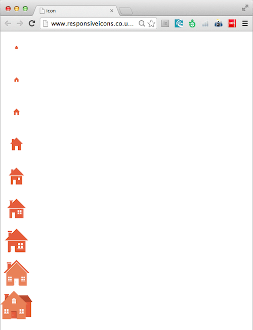
Why “Clown Car”?
With help from Christopher Schmitt25 and Amie Gregory26, I’ve named this technique “clown car” because it includes many large images (the clowns) in a single tiny SVG image file (the car).
We need to use the non-semantic <object> element as we encourage browser vendors to support raster images in SVG as an <img> source either via CORS or CSP.
The clown car technique is a solution we can use now. Detractors argue that <picture> and/or srcset are the answer without convincing me that the clown car technique isn’t the right answer. Some argue that the lack of support in Android is its downfall, forgetting that Android 2.3.3 and IE 8 don’t support <picture> or srcset either.
I believe the <object> element can be made accessible. While the lack of semantics is a drawback, I will be satisfied using this technique once accessibility is assured. Testing accessibility is my next priority. While I would like to see this element work with the simpler and more semantic <img> tag, once the accessibility issue is resolved, this technique will be production-ready.
Further Reading
•Making Advertising Work In A Responsive World27
•Bandwidth Media Queries? We Don’t Need ’Em!28
•Implementing Off-Canvas Navigation For A Responsive Website29


