Adding Motion with CSS
Copyright © 2016 Estelle Weyl. All rights reserved.
Printed in the United States of America.
Published by O’Reilly Media, Inc., 1005 Gravenstein Highway North, Sebastopol, CA 95472.
O’Reilly books may be purchased for educational, business, or sales promotional use. Online editions are also available for most titles (http://safaribooksonline.com). For more information, contact our corporate/institutional sales department: 800-998-9938 or corporate@oreilly.com.
See http://oreilly.com/catalog/errata.csp?isbn=9781491929889 for release details.
The O’Reilly logo is a registered trademark of O’Reilly Media, Inc. Transitions and Animations in CSS, the cover image of salmon, and related trade dress are trademarks of O’Reilly Media, Inc.
While the publisher and the author have used good faith efforts to ensure that the information and instructions contained in this work are accurate, the publisher and the author disclaim all responsibility for errors or omissions, including without limitation responsibility for damages resulting from the use of or reliance on this work. Use of the information and instructions contained in this work is at your own risk. If any code samples or other technology this work contains or describes is subject to open source licenses or the intellectual property rights of others, it is your responsibility to ensure that your use thereof complies with such licenses and/or rights.
978-1-491-92988-9
[LSI]
The following typographical conventions are used in this book:
Indicates new terms, URLs, email addresses, filenames, and file extensions.
Constant widthUsed for program listings, as well as within paragraphs to refer to program elements such as variable or function names, databases, data types, environment variables, statements, and keywords.
Constant width boldShows commands or other text that should be typed literally by the user.
Constant width italicShows text that should be replaced with user-supplied values or by values determined by context.
This element signifies a general note.
Whenever you come across an icon that looks like  , it means there is an associated code example. Live examples are available at http://standardista.com/css3/transitions and http://standardista.com/css3/animations. You can either click on the icon while reading this book in electronic format to go directly to a live version of the code example referenced, or visit those links for a list of all of the code examples found in the Transitions and Animations chapters.
This book is here to help you get your job done. In general, if example code is offered with this book, you may use it in your programs and documentation. You do not need to contact us for permission unless you’re reproducing a significant portion of the code. For example, writing a program that uses several chunks of code from this book does not require permission. Selling or distributing a CD-ROM of examples from O’Reilly books does require permission. Answering a question by citing this book and quoting example code does not require permission. Incorporating a significant amount of example code from this book into your product’s documentation does require permission.
We appreciate, but do not require, attribution. An attribution usually includes the title, author, publisher, and ISBN. For example: “Transitions and Animations in CSS by Estelle Weyl (O’Reilly). Copyright 2016 Estelle Weyl, 978-1-4919-2988-9.”
If you feel your use of code examples falls outside fair use or the permission given above, feel free to contact us at permissions@oreilly.com.
Safari Books Online is an on-demand digital library that delivers expert content in both book and video form from the world’s leading authors in technology and business.
Technology professionals, software developers, web designers, and business and creative professionals use Safari Books Online as their primary resource for research, problem solving, learning, and certification training.
Safari Books Online offers a range of plans and pricing for enterprise, government, education, and individuals.
Members have access to thousands of books, training videos, and prepublication manuscripts in one fully searchable database from publishers like O’Reilly Media, Prentice Hall Professional, Addison-Wesley Professional, Microsoft Press, Sams, Que, Peachpit Press, Focal Press, Cisco Press, John Wiley & Sons, Syngress, Morgan Kaufmann, IBM Redbooks, Packt, Adobe Press, FT Press, Apress, Manning, New Riders, McGraw-Hill, Jones & Bartlett, Course Technology, and hundreds more. For more information about Safari Books Online, please visit us online.
Please address comments and questions concerning this book to the publisher:
We have a web page for this book, where we list errata and any additional information. You can access this page at http://bit.ly/transitions-and-animations-in-css.
To comment or ask technical questions about this book, send email to bookquestions@oreilly.com.
For more information about our books, courses, conferences, and news, see our website at http://www.oreilly.com.
Find us on Facebook: http://facebook.com/oreilly
Follow us on Twitter: http://twitter.com/oreillymedia
Watch us on YouTube: http://www.youtube.com/oreillymedia
You can also find Estelle Weyl on Twitter at @estellevw, @standardista, and
@webdevtips.
Thank you to the technical reviewers:
Matt Rakow is a program manager at Microsoft, working on the Internet Explorer and Edge browsers since 2010 and the W3C CSS Working Group since 2013. His current focus is advancing the capability and performance of webpage composition and rendering, but also is devoted to improving scrolling performance, touch interactions, and high pixel density screen support.
David Baron is a distinguished engineer at Mozilla. He’s been involved in the CSS community and the development of the Gecko layout engine since 1998. At Mozilla, Baron implemented media queries, CSS transitions and animations, and the CSS calc() function, and designed and implemented the reftest test format and fixes for :visited privacy. As a participant at the W3C, he has edited the CSS Color Module, CSS Conditional Rules, CSS Transitions, CSS Animations, and the CSS Overflow Module. He can be found on Twitter at @davidbaron, and on the Web.
Sarah Drasner is an award-winning Senior UX Engineer at Trulia (Zillow Group). She is also a staff writer at CSS-Tricks. She has worked for 15 years as a web developer and designer, and at points worked concurrently as a scientific illustrator and a college professor. Sarah loves SVG, informative animation, and welding together pieces of the DOM. Follow her at @sarah_edo, on CodePen, or her website.
CSS transforms, CSS transitions, and CSS animations are three separate CSS specifications. While the three terms sound like they may do the same thing—make something move—CSS transitions and animations make things move over time. Transitions and animations let you define the transition between two or more states of an element.
Transforms change an element’s appearance through
translation, rotation, scaling, and skewing, but do not have a time
component. You can use the CSS transform property to change the location
of an element’s coordinate space of the CSS visual formatting model, but you
need transitions or animation to make that change occur over time. The
transform property is covered in Transforms in CSS (O’Reilly).
While animation is possible with JavaScript, understanding CSS3 transitions and animations will save you a lot of time and effort if you need to animate anything on the Web. Generally, it will also save your users’ CPU and battery compared to JavaScript.
Used correctly, CSS animations and transitions can give your web applications life and depth. While this booklet focuses on how to transition and animate elements in your documents, understanding when to use animation can improve your user experience (UX) as well. By adding the dimension of time, animating can help your UX communicate on a different level.
Well before the advent of the Web, animators at Disney came up with 12 principles for cartoon animation. Some of these principles are very relevant to CSS animation as well.
According to the “bible of animation”—The Illusion of Life: Disney Animation by Frank Thomas and Ollie Johnston—there are 12 basic principles for animation, including:
Depending on what something is made of, objects deform under motion. Squashing and stretching gives the illusion of weight and volume to an object or character as it bounces or otherwise moves. For example, when a ball bounces, it’s squashed as it hits the ground and stretches as it heads upward.
Users may not understand an animation unless there is a sequence of actions that leads clearly from one activity to the next. They must anticipate or expect a change before it actually occurs. In cartoons, it’s a movement preparing the viewer for a major action the character is about to perform, like a knee bending before a jump. On the Web, it could be a button depression before the start of the more extensive animation that starts when the button is selected.
Guide your users mentally to where they should focus before initiating the main effect, especially if the start of the animation is important.
In a cartoon, staging is the presentation of an idea so it is unmistakably clear. On the Web, staging is directing the user’s attention to an action, such as a small jiggle of the call-to-action button. Staging helps guide users through the story or idea being told: for example, through the steps of a check-out process.
There are two main approaches to animation on the big screen. In the straight ahead action approach, the animator starts at the first drawing and works drawing to drawing to the end of a scene. In pose to pose, the animator draws the main points within an animation and creates (or has an assistant create) the points in between later. While seemingly only applicable to storyboarding, this principle is also related to drawing keyframes and how the animation fills in the space or time between them.
With CSS animations, when we animate image sprites to create motion, we
are emulating the Straight Ahead approach. This is described when we
cover the steps values of the
animation-timing-function property (see “The step timing functions”). In most animation scenarios, we
let the browser be our assistant, defining specific points, or poses,
within the animation and allowing the browser to interpolate property
values as it animates from pose to pose, or
keyframe definition to keyframe definition.
Follow-through is the inclusion of additional motion when the main animation concludes. For example, if a character is running and stops, her hair and clothes were likely bouncing and fall back into place after her legs and body cease moving, catching up to the main mass of the character. Nothing stops all at once.
Overlapping action is when some components are slightly delayed after other components change direction, like the way Wile E. Coyote’s legs keep moving forward as he drops off a cliff. His ears take a moment to follow.
If your CSS animations ever become complex enough to require follow-through and overlapping action, timing will be critical to making your effects work.
Just like cars don’t start and end at full speed—rather, they accelerate from stopped to full speed and decelerate back to zero—slow ins and slow outs make animation more lifelike and soften the action. Only mechanical animations will proceed at a linear speed.
The slow in and slow out principle states that the beginning and end of
an animation are more interesting than its middle; and
therefore, unless it’s mechanical, the animation should proceed fastest
in the middle of the animation, with a slower start and slower end.
With cartoon animation, the effect is created by having more cells at
the ends and fewer in the middle of the action. With CSS, this effect is
created by setting cubic
Bézier timing functions to something other than linear (see “The transition-timing-function Property”).
The arcs principle states that almost all actions follow an arc or slightly circular path. Think of your hand moving back and forth as you walk: your hand arcs back and forth rather than always staying at an equal distance from the ground.
Linear animations can be very mechanical. Arcs can be achieved with granular control within a keyframe animation. Because of this, CSS developers often use CSS animations instead of transitions; animations offer more granularity in creating an arced path, while CSS transitions only allow for moving between two states. However, with some cubic Bézier timing functions, creating an arc with CSS transitions is actually not only possible, but fairly simple.
Secondary actions can enrich a main action by adding dimension, supplementing or reinforcing the main action and giving the scene more life. If you include secondary actions, the animations should work together in support of one another.
For example, if your main animation drops a module onto a page, a secondary action might be the main call-to-action button within the module dropping into place, then finishing its action a little after the main module has finished animating in. A secondary action should reinforce the main action. It is OK to literally “think outside the box” and animate a child element differently from its parent.
Timing is likely the most important of the principles in this list when
it comes to animation. While in traditional animation it’s based on the number of frames,
in CSS animation it has more to do with creating the appropriate amount
of time to read the motion, but not so long as to make the site appear
slow. Timing includes not just the duration of the animation (see “The animation-duration Property”), but also the
delay (“The animation-delay Property”) and timing function (“The animation-timing-function Property”).
There are no right answers when it comes to timing. Expertise in timing comes with experience and experimentation, if it comes at all. I recommend using trial and error to refine the timing of your animation, then cut your times in half: while you may want your animation to progress slowly enough to grok the difference in times and discover what is the best combination of duration, delay, and progression, you don’t want your site to appear slow.
Exaggeration is the highlighting of movements beyond their natural state to call attention to what you want the user to focus on. A tiny bit of exaggeration can give added life to an animation and actually make it look more realistic. Use good taste and common sense: exaggeration is not extreme distortion, but rather a slight distortion that gives emphasis without being so exaggerated as to be visibly distorted for your visitors.
The solid drawing principle includes the principles of drawing or coding forms that convey the illusion of three dimensions, with weight and solid form. In CSS, this includes using box shadows, gradients, and transforms, giving your content the illusion of being three-dimensional. If you aren’t doing 3D animation or spriting, this principle is only tangentially related to web animation, as on the Web, we’re drawing with CSS in a two-dimensional space.
The appeal principle has to do with charisma, believability, and interest. Appeal on the Web includes an easy-to-read design, clear drawing, and motion that will capture and involve the visitor’s interest. The animation has to appeal to the mind as well as to the eye.
There’s a nice video explaining the 12 principles of animation at https://vimeo.com/93206523, and a nice display of all of the principles can be found at The Illusion of Life.
Flash animation, animated banner ads, and Geocities animated GIFs from 1996 have given animation a bad name. In reality, it isn’t that animation itself is bad; it’s the way those animations were implemented that led to bad user experiences. With CSS, we can create animations and transitions that improve and augment user experience. Animation can give the appearance of life to two-dimensional, lifeless objects and give understanding to objects that have no meaning. But with great power comes great responsibility.
Animations can be used for good: a small animation can help inform the user that the state of an object has changed, or can occupy the user’s attention so they don’t notice a slow loading time.
The most important principle is timing and it’s the most difficult to fine-tune. Unlike cartoons, timing in CSS means milliseconds, not frames.
There is no magic value of milliseconds for the duration. Depending on
the timing function, you may want to add a few milliseconds for the
effect to feel natural. A developer-defined cubic Bézier timing function that creates a bounce
might work better with a bit more time than a simple ease-in timing function.
Just ensure the animation is short enough for your site to feel
responsive rather than slow.
If you have many animations in your site or application, think of timing as a choreography of animations. There is no “right” number of animations. It’s not the number of animations, it’s the design behind it.
All your animations should feel related. If there is a mix and match of delays, timings, and timing functions, the animations may seem unrelated. Choreograph your animations to ensure a cohesive feel among all the moving parts. Make sure your animations are making your site more sophisticated, more modern, and more trustworthy.
It is up to your designers to design animations that have purpose and style. It’s up to this book to teach you how to implement those animations.
CSS transitions allow us to animate CSS properties from an original value to a new value over time when a property value changes.
Normally, when a CSS property value changes—when a “style change event” occurs—the change is instantaneous. The new property value replaces the old property in the milliseconds it takes to repaint (or reflow and repaint if necessary) the affected content. Most value changes seem instantaneous, taking less than 16 ms1 to render. Even if the changes takes longer, it is a single step from one value to the next. For example, when changing a background color on hover, the background changes from one color to the next, with no gradual transition. CSS transitions enable us to smoothly animate CSS properties from an original value to a new value over time as the style recomputation proceeds:
button{color:magenta;transition:color200msease-in50ms;}button:hover{color:rebeccapurple;transition:color200msease-out50ms;}
Transitions allow the values of CSS animatable properties to change over
time, providing for simple animations.2 For example, instead of instantaneously changing a
button’s color on hover, with CSS transitions the button can be set to
gradually fade from magenta to rebeccapurple over 200 milliseconds,
even adding a 50-millisecond delay before transitioning. Changing a
color, no matter how long it takes, is a transition. But by adding the
CSS transition property, the color change can be gradual.
You can use CSS transitions today, even if you still support IE9 or older browsers. If a browser doesn’t support CSS transition properties, the change will be immediate instead of gradual, which is fine and accessible. If the property or property values specified aren’t animatable, again, the change will be immediate instead of gradual.
Because transitions are simply progressive enhancements, there is no reason to not use them today.
CSS transitions provide a way to control how a property changes from one value to the next over time. We can make the property value change gradually, creating pleasant and, hopefully, unobtrusive effects.
The CSS transition properties can be used to animate CSS property values smoothly, following an acceleration curve, after an optional delay, from a previous value to a new value over a specified length of time. CSS transitions let you decide which properties to animate, how long to wait before the animation starts, how long the transition should take, and how the transition will proceed. All these features are customizable.
Sometimes you want instantaneous value changes. Though we used link colors as an example in the preceding section, link colors should change instantly on hover, informing sighted users an interaction is occurring and that the hovered content is a link. Similarly, options in an autocomplete listbox shouldn’t fade in: you want the options to appear instantly, rather than fade in more slowly than the user types. Instantaneous value changes are often the best user experience.
At other times, you might want to make a property value change more gradually, bringing attention to what is occurring.
For example, you may want to make a card game more realistic by taking
200 milliseconds to animate the flipping of a card 3, as the user may not
realize what happened if there is no animation.
As another example, you may want your site’s drop-down menus to expand
or become visible over 200 milliseconds (instead of instantly) which may be
jarring. With CSS transitions, you can make a drop-down menu appear
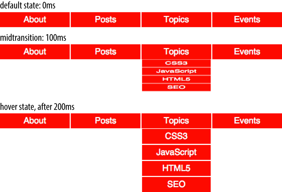
slowly. In Figure 2-1, we are transitioning the submenu’s height and
opacity over 200 milliseconds. The menu changes from hidden to fully opaque and
expanded. This is a common use for CSS transitions, which we will also
explore later in this chapter.
In this chapter, we cover the four transition properties and the
transition shorthand that not only make our transition possible but very easy to implement.
Transitions have excellent browser support. All browsers, including Safari, Chrome, Opera, Firefox, Edge, and Internet Explorer (starting with IE10) support CSS transitions.
Transitions are user-interface (UI) enhancements. Lack of full support should not prevent you from including them. If a browser doesn’t support CSS transitions, the changes you are attempting to transition will still be applied: they will just “transition” from the initial state to the end state instantaneously when the style recomputation occurs.
Your users may miss out on an interesting (or possibly annoying) effect, but will not miss out on any content.
As transitions are generally progressive enhancements, there is no need to polyfill for archaic IE browsers. While you could use a JavaScript polyfill for IE9 and earlier, and prefix your transitions for Android 4.3 and earlier, there is likely little need to do so.
In CSS, transitions are written using four transition properties:
transition-property, transition-duration,
transition-timing-function, and transition-delay, along with the
transition property as a shorthand for the four longhand properties.
To create the drop-down navigation from Figure 2-1, we used all four CSS transition properties:
navliul{transition-property:transform;transition-duration:200ms;transition-timing-function:ease-in;transition-delay:50ms;transform:scale(1,0);transform-origin:topcenter;}navli:hoverul{transform:scale(1,1);}
This example defines the transition for our drop-down navigation example in Figure 2-1. The style change in this scenario is caused by hovering over navigational elements.
While we are using the :hover state for our style change event in our transition examples, you can transition properties in other scenarios too. For example, you might add or remove a class, or otherwise change the state—say, by changing an input from :invalid to :valid or from :checked to :not(:checked). Or you might append a table row at the end of a zebra-striped table or list item at the end of a list with styles based
on :nth-last-of-type selectors.
In the navigation pictured in Figure 2-1, the initial state of the nested
lists is transform: scale(1, 0) with a
transform-origin: top center. The final state is transform: scale(1, 1): the transform-origin remains the same.
In this example, the transition properties define a transition on the transform
property: when the new transform value is set on hover, the nested
unordered list will scale to its original, default size, changing
smoothly between the old value of transform: scale(1, 0) and the new
value of transform: scale(1, 1) over a period of 200 milliseconds.
This transition will start after a 50-millisecond delay, and will ease in,
proceeding slowly at first, then picking up speed as it progresses.
Transitions are declared along with the regular styles on an element. Whenever a target property changes, if a transition is set on that property, the browser will apply a transition to make the change gradual. While the most common initiation of a transition is changing property values from a default state to a hovered state, transitions also work if the property is changed by adding a class, manipulating the DOM, or otherwise changing the state.
You can declare transition properties in the initial state, the changed state, or in both the initial and changed states. If you only declare the transition on the initial state, when the state changes, it will transition to the changed state as you indicate with CSS transition properties. If and when it changes back to the initial state, the transition timing is reversed. You can override this default reverse transition by declaring different transitions in both the initial and changed states.
By initial state, I mean a state that matches
the element on page load. This could be a state that the element always
has, such as properties set on an element selector versus a :hover
state for that element, or a content editable element that may get
:focus:
/* selector that matches elementallthe time */p[contenteditable]{background-color:rgba(0,0,0,0);}/* selector that matches elementsomeof the time */p[contenteditable]:focus{/* overriding declaration */background-color:rgba(0,0,0,0.1);}
In this example, the fully transparent declaration is always the initial value, changing when the user gives it focus. This is what I mean when I use initial or default value throughout this chapter. The transition properties included in the selector that matches the element all the time will impact that element whenever the state changes, whether it is from the initial state to the focused state (as in the preceding example) or any other altered state, such as a hover state; or when properties are changed with the dynamic addition of a class.
An initial state could also be a temporary state that may change, such
as a :checked checkbox or a :valid form control, or even a class
that gets toggled on and off:
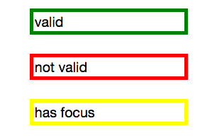
/* selector that matches elementsomeof the time */input:valid{border-color:green;}/* selector that matches elementsomeof the time, when the prior selector does NOT match. */input:invalid{border-color:red;}/* selector that matches elementsomeof the time, whether the input is valid or invalid */input:focus{/* alternative declaration */border-color:yellow;}
In this example, either the :valid or :invalid selector matches, but
never both. The :focus selector, as shown in Figure 2-2, matches some of the time, when the input has focus, whether the
input is matching the :valid or :invalid selector simultaneously. In
this case, when we refer to the initial state, we are referring to the
original value, which could be either valid or invalid. In this
scenario, the changed state can be the opposite of the initial :valid
or :invalid value. The :focus state is another
altered state.
Generally, you want to declare the transition properties at minimum on the selector
that applies to the element all the time. In the preceding contenteditable
scenario, it is the first rule. The second scenario is not as
clear-cut: if the transition is only set on the :invalid state, the
color will transition from red to green as the state of the input
changes from invalid to valid, and it will transition from red to yellow
when an invalid input receives focus. However, it will not slowly
transition from green to yellow, or yellow back to green, when a valid
input receives or loses focus. Similarly, the border will transition
as it changes from or to the invalid state with a red border; if the input is valid, there will
be no transition when the user gives or removes focus.
In this second scenario, we could put the transition on the :focus
selector, as generally the value will change from valid to invalid or
the reverse when the input has focus. Preferably, however, you will want
to put the transition on both the possible initial states, or all
three states.
In other words, if you always want the property to transition, you likely want to put the transition on all the states. The transition properties that are used are the ones in the destination state; the new values of the transition properties are used to transition to the new value of the property:
navliul{transition-property:transform;transition-duration:200ms;transition-timing-function:ease-in;transition-delay:50ms;transform:scale(1,0);transform-origin:topcenter;}navli:hoverul{transition-property:transform;transition-duration:2s;transition-timing-function:linear;transition-delay:1s;transform:scale(1,1);}
This provides a horrible user experience, but I’ve included it to show a point. When hovered over, the opening of the
navigation takes a full two seconds. When closing, it quickly closes over
0.2 seconds. The transition properties in the destination or hover state
are used when hovering over the list item. When no longer hovered over, as it
returns to the default scaled-down state, the transition properties of
the default properties it is returning to—the nav li ul condition—are used.
In our example, we don’t want horrible UX. We will omit the slow
transition, and instead allow the browser to
reverse the transition on mouse out:
navliul{transition-property:transform;transition-duration:200ms;transition-timing-function:ease-in;transition-delay:50ms;transform:scale(1,0);transform-origin:topcenter;}navli:hoverul{transform:scale(1,1);}
To create a simple CSS hover transition, such as the expansion of nested
list items in the preceding navigation example, we declare property values
in two states: the default or initial state of the element and the hovered state of
the element. The initial or original state of the element is declared in the
default style declaration. The changed properties, or final or destination state of the
element, are declared within a :hover style block. If no transition is
set, the nested unordered list scales to its default height instantly on
hover.
To transition this expansion, we add the transition functions using the
transition-* properties of transition-property,
transition-duration, transition-timing-function, and
transition-delay, or the transition shorthand. In our example, we
will be adding the transition properties only in the default style
declaration. When the transition is declared in the style block of the
initial state of the element, the transition will be applied as the
element changes from the initial state to the changed or destination state and applied
in reverse as it changes back to the initial state from the changed
state.
In our example, when the user stops hovering over the parent
navigational element or the child drop-down menu, the drop-down menu
will wait 50 milliseconds before closing over 200 milliseconds, using ease-out as the timing
function, reversing the transition declared in the default state. As we
saw in our bad UX example, the reverse transition timing function,
duration, and delay in the reverting direction can be overridden by
providing different transition property values in the default and
changed-state style blocks.
While the four transition properties can be declared separately, you
will probably always use the shorthand. We’ll take a look at the four
properties individually first so you have a good understanding of what
each one does, and then we’ll cover the transition shorthand, which is
what you will likely use in your code.
Let’s look at the four properties in greater detail.
transition-property PropertyThe transition-property property specifies the names of the CSS
properties you want to transition. And, yes, it’s weird to say “the
transition-property property.”
The value for the transition-property is a comma-separated list of
properties; the keyword none if you want no properties transitioned;
or the default all, which means “transition all the transitionable
properties.” You can also include the keyterm all within a
comma-separated list of properties.
If you include all as the only keyterm—or default to all—all the transitionable
properties will transition in unison.
Let’s say you want to change a box’s appearance on hover:
div{color:#ff0000;border:1pxsolid#00ff00;border-radius:0;transform:scale(1)rotate(0deg);opacity:1;box-shadow:3px3pxrgba(0,0,0,0.1);width:50px;padding:100px;}div:hover{color:#000000;border:5pxdashed#000000;border-radius:50%;transform:scale(2)rotate(-10deg);opacity:0.5;box-shadow:-3px-3pxrgba(255,0,0,0.5);width:100px;padding:20px;}
When the user hovers over the div, every property that has a different
value in the default state versus the hovered state will change to the
hover-state values. We use the transition-property property to define
which of those properties we want to animate over time (versus
instantly). All the properties will change from the default value to the
hovered value on hover, but only the animatable properties included in
the transition-property will transition over time. Nonanimatable
properties like border-style will change from one value to the next
instantly. See “Transitionable properties”.
allIf you want to define all the properties to transition at the same time,
speed, and pace, use all. If all is the only value or the last value
in the comma-separated value for transition-property, all the
animatable properties will transition in unison.
If we want to transition all the properties, the following statements are almost equivalent:
div{color:#ff0000;border:1pxsolid#00ff00;border-radius:0;transform:scale(1)rotate(0deg);opacity:1;box-shadow:3px3pxrgba(0,0,0,0.1);width:50px;padding:100px;transition-property:color,border,border-radius,transform,opacity,box-shadow,width,padding;transition-duration:1s;}
and
div{color:#ff0000;border:1pxsolid#00ff00;border-radius:0;transform:scale(1)rotate(0deg);opacity:1;box-shadow:3px3pxrgba(0,0,0,0.1);width:50px;padding:100px;transition-property:all;transition-duration:1s;}
Both transition-property property declarations will transition all the
properties listed—but the former will transition only the eight
properties that may change, based on property declarations that may be
included in other rule blocks. Those eight property values are included
in the same rule block, but they don’t have to be.
The all in the latter example ensures that all animatable property
values that would change based on any style change event—no matter
which CSS rule block includes the changed property value—transitions over one second.
The transition applies to all animatable properties of all elements
matched by the selector, not just the properties declared in the same
style block as the all.
Declaring individual properties means only the properties specifically defined in the value of the transition-property transition when the value gets changed—whether those property values are inherited, declared in the same rule block, or applied to the element via a different CSS rule block.
In this case, the first version limits the transition to only the eight properties listed, but enables us to provide more control over how each property will transition. Declaring the properties individually lets us provide different speeds, delays, and/or durations to each property’s transition if we declared those transition properties separately:
<divclass="foo">Hello</div>div{color:#ff0000;border:1pxsolid#0f0;border-radius:0;transform:scale(1)rotate(0deg);opacity:1;box-shadow:3px3pxrgba(0,0,0,0.1);width:50px;padding:100px;}.foo{color:#00ff00;transition-property:color,border,border-radius,transform,opacity,box-shadow,width,padding;transition-duration:1s;}
The transition-property property does not need to be in the same rule
block as the properties that make up its value.
If you want to define the transitions for each property separately,
write them all out, separating each of the properties with a comma. If
you want to animate almost all the properties at the same time, delay,
and pace, with a few exceptions, you can use a combination of all and
the individual properties you want to transition at different times,
speeds, or pace. Make sure to use all as the first value:
div{color:#f00;border:1pxsolid#00ff00;border-radius:0;transform:scale(1)rotate(0deg);opacity:1;box-shadow:3px3pxrgba(0,0,0,0.1);width:50px;padding:100px;transition-property:all,border-radius,opacity;transition-duration:1s,2s,3s;}
The all part of the comma-separated value includes all the properties
listed in the example, as well as all the inherited CSS properties, and
all the properties defined in any other CSS rule block matching or inherited by the
element. In the preceding example, all the properties getting new values
will transition at the same duration, delay, and timing function, with
the exception of border-radius and opacity, which we’ve explicitly
included separately. Because we included them as part of a comma-separated
list after the all, we can transition them at the the same time,
delay, and timing function as all the other properties, or we can provide
different times, delays, and timing functions for these two properties. In this case, we transition all the properties over one
second, except for border-radius and opacity, which we transition
over two seconds and three seconds, respectively. We cover
transition-duration next.
Make sure to use all as the first value in your comma-separated value list, as the properties
declared before the all will be included in the all, overriding any
other transition property values you intended to apply to those now
overridden properties.
noneWhile transitioning over time doesn’t happen by default, if you do include a CSS
transition and want to override that transition in a particular scenario, you can set
transition-property: none to override the entire transition and ensure no properties are transitioned. The none; keyword can only be
used as a unique value of the property—you can’t include it as part
of a comma-separated list of properties. If you want to override the
animation of fewer than all the properties, you will have to list all of
the properties you still want to transition. You can’t use the
transition-property property to exclude properties; rather, you can
only use that property to include them. Another trick would be to set
the delay and duration of the property to 0s. That way it will appear
instantaneously: no CSS transition is being applied to it.
Not all properties are transitionable, and not all values of some normally transitionable properties can be transitioned. There is a finite list of CSS 2.1 properties that are animatable, which is summarized in “Animatable Properties”. Realize that as CSS is evolving, new properties are being added. While the animatable properties list is not worth memorizing, the general rule is that if there is a logical midpoint between the initial value and the final value of a property, that property and value type is probably animatable.
By “property and value type,” I mean that some properties are
animatable, but not all values of those properties are animatable. Numeric
values tend to be animatable; keyword values that can’t be converted to
numeric values generally aren’t. Keywords that represent computed
values, like red (which is converted to an RGB value) are animatable.
Keyterms that aren’t computed values, like auto in top: auto, are
not. CSS functions that take numeric values as parameters generally are
animatable. For example, you can transition from height: 0 to
height: 200px as both values are numeric. But even though height
is an animatable property, height: auto is not an animatable value,
as auto in this case is not a computed value.
You can transition from color: red to color: slategray, as the
browser converts the colors from named colors to hexadecimal values,
which are numeric; the browser can determine the midpoint between two
numeric values.
If you accidentally included a property that can’t be transitioned, fear not. The browser will simply not transition the property that is not animatable. The entire declaration will not fail. The nonanimatable property or nonexistent CSS property is not exactly ignored. The browser passes over unrecognized or nonanimatable properties, keeping their place in the property list order to ensure that the other comma-separated transition properties described next are not applied on the wrong properties.4
Transitions can only occur on properties that are not currently being impacted by a CSS animation. If the element is being animated, properties may still transition, as long as they are not properties that are currently controlled by the animation. CSS animations are covered in Chapter 3.
The behavior of transitions seemingly not adhering to the basics of CSS cascades when an animation on the same element and property is running does not affect whether the transition has started or ended. The cascade is actually being adhered to. Transition events will still fire, confirming the transition occurred.
The length of the transition-property list determines the number of
items in the transition-duration, transition-timing-function, and
transition-delay lists. If the number of values in any or all of these
three properties does not match the number of values listed in the
transition-property value, the browser will ignore any excess values,
or repeat values when these other properties have fewer values in
their comma-separated list than the transition-property property. For
this reason, the order of the values in the transition-property value
may be important, just as it is important for other transition
properties.
If you include a property that is not animatable (like a border-style
value change) or a nonexistent property (such as a property name with a
typo in it), the transition-property will still work. Unrecognized words
or properties that are not animatable are not ignored. Rather, they are
kept in the list of properties to ensure that values from other
comma-separated transition properties, such as transition-duration,
are applied in the right order.
However, if you have a syntax error, like a missing comma between two
property names or a space within a property name, that
transition-property property declaration will be ignored. Similarly,
if you include the terms none, inherit, or initial, as per the
specification, the entire property exists, but fails, so should be
ignored. This is not the case in some browsers, however. Safari 8 and IE
Edge 12 treat none, inherit, and initial in a list of
comma-separated properties as unrecognized or nonanimatable properties.
transitionendA transitionend event occurs at the end of every transition, in each
direction, for every property that is transitioned over any amount of
time or after any delay, whether the property is declared individually
or is part of the all declaration. For some seemingly single property
declarations, there will be several transitionend events, as every
animatable property within a shorthand property gets its own transitionend event.
In the preceding example, when the transition concludes, there will be well
over eight transitionend events. For example, the border-radius
transition alone produces four transitionend events, one each for:
border-bottom-left-radiusborder-bottom-right-radiusborder-top-right-radiusborder-top-left-radius
The padding property is also a shorthand for four longhand properties:
padding-toppadding-rightpadding-bottompadding-left
The border shorthand property produces eight transitionend events:
four values for border-width and four for border-color, both of
which are shorthand declaration themselves:
border-left-widthborder-right-widthborder-top-widthborder-bottom-widthborder-top-colorborder-left-colorborder-right-colorborder-bottom-color
There are no transitionend events for border-style properties, as
border-style is not an animatable property.
How do we know it’s not animatable? We can assume it isn’t, since there
is no logical midpoint between the two values of solid and dashed.
We can confirm by looking up the
list
of animatable properties or the specifications for the individual
properties.
There will be 21 transitionend events in our scenario in which 8
specific properties are listed, as those 8 include several shorthand
properties that have different values in the pre and post states.
In the case of all, there will be at least 21 transitionend events:
one for each of the longhand values making up the 8 properties we know are included in the pre and
post states, and possibly from others that are inherited or declared in
other style blocks impacting the element:
document.querySelector('div').addEventListener('transitionend',function(e){console.log(e.propertyName);});
The transitionend event includes three event specific attributes: 1) propertyName, which is the name of the CSS property that
just finished transitioning; 2) pseudoElement, which is the pseudoelement upon which the transition occurred, preceded by two semicolons,
or an empty string if the transition was on a regular DOM node; and 3)
elapsedTime, which is the amount of time the transition took to run, in
seconds, which is generally the time listed in the transition-duration
property.
The transitionend event only occurs if the property successfully
transitions to the new value. The transitioned event doesn’t fire if
the transition was interrupted by another change to the same property on
the same element.
When the properties return to their initial value, another
transitionend event occurs. This event occurs as long as the
transition started, even if it didn’t finish transitioning in the
original direction.
transition-duration PropertyThe transition-duration property takes as its value a comma-separated
list of lengths of time, in seconds (s) or milliseconds (ms), it should
take to transition from the original property values to the final
property values.
The transition-duration property dictates how long it should take for
each property to transition from the original value to the new value. If
reverting between two states, and the duration is only declared in one
of those states, the transition will take the amount of time declared to revert to the previous state:
input:invalid{transition-duration:1s;background-color:red;}input:valid{transition-duration:0.2s;background-color:green;}
If different values for the transition-duration are declared, the
duration of the transition will be the transition-duration value declared in the rule block it is transitioning to. In the preceding example, it will take 1 second for the input to change to a red background when it becomes invalid, and only 200 milliseconds to transition to a green background when it becomes valid.
The value of the transition-duration property should be declared as a
positive value in either seconds (s) or milliseconds (ms). The time unit of ms or s is required by the specification, even if the
duration is set to 0s. By default, properties simply change from one value to the next instantly. In line with this, the default value for the duration of a transition is 0s, meaning the transition is immediate, showing no animation.
Unless there is a positive value for transition-delay set on a property, if transition-duration is omitted, it is as if no transition-property declaration had been
applied—with no transitionend event occuring. As long
as the total time set for a transition to occur is greater than 0s—which can happen with a duration of 0s or when the
transition-duration is omitted and defaults to 0s, if there is a positive transition-delay value—the transition will still be
applied and a transitionend event will occur if the transition
finishes.
Negative values for transition-duration are invalid, and, if included, will invalidate the entire
property value.
Using the same super-long transition-property declaration, we
can declare a single duration for all the properties or individual
durations for each property, or we can make alternate properties animate
for the same length of time. We can declare a single duration that applies to all properties during the transition by including a single transition-duration value:
div{color:#ff0000;...transition-property:color,border,border-radius,transform,opacity,box-shadow,width,padding;transition-duration:200ms;}
We could have instead declared the same number of comma-separated time
values for the transition-duration property value as the CSS
properties we enumerated in the transition-property property value. If
we want each property to transition over a different length of time, we
have to include a different comma-separated value for each property name
declared:
div{color:#ff0000;...transition-property:color,border,border-radius,transform,opacity,box-shadow,width,padding;transition-duration:200ms,180ms,160ms,140ms,120ms,100ms,1s,2s;}
If the number of properties declared does not match the number of
durations declared, the browser has specific rules on how to handle the
mismatch. If there are more durations than properties, the extra
durations are ignored. If there are more properties than durations, the
durations are repeated. In this example, color, border-radius, opacity, and width have a duration of 100 ms; border, transform, box-shadow, and padding will be set to 200 ms:
div{...transition-property:color,border,border-radius,transform,opacity,box-shadow,width,padding;transition-duration:100ms,200ms;}
If we declare exactly two comma-separated durations, every odd property will transition over the first time declared, and every even property will transition over the second time value declared.
If a transition is too slow, the website will appear slow or unresponsive, drawing unwanted focus to what should be a subtle effect. If a transition is too fast, it may be too subtle to be noticed. While you can declare any positive length of time you want for your transitions, your goal is likely to provide an enhanced rather than annoying user experience. Effects should last long enough to be seen, but not so long as to be noticeable. Generally, the best effects range between 100 and 200 milliseconds, creating a visible, yet not distracting, transition.
We want a good user experience for our drop-down menu, so we set both properties to transition over 200 milliseconds:
navliul{transition-property:transform,opacity;transition-duration:200ms;...}
transition-timing-function PropertyDo you want your transition to start off slow and get faster, start off
fast and end slower, advance at an even keel, jump through various steps,
or even bounce? The transition-timing-function provides a way to
control the pace of the transition. The
transition-timing-function property describes how the transition proceeds as it is being executed.
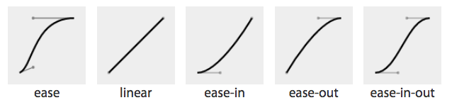
The transition-timing-function values include ease, linear,
ease-in, ease-out, ease-in-out, step-start, step-end,
steps(n, start)—where n is the number of steps—steps(n, end), and cubic-bezier(x1, y1, x2, y2). These values are
also the valid values for the animation-timing-function and are
described in great detail in Chapter 3.
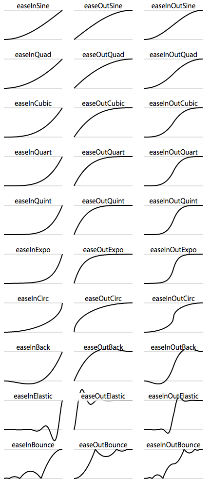
The non-step keyword are easing timing functions employing cubic Bézier mathematical functions to provide smooth curves. The
specification provides for five predefined easing functions, but you can
describe your own precise timing function by defining your own
cubic-bezier() function, as shown in Table 2-1.
| Timing function | Definition | cubic-bezier value |
|---|---|---|
ease |
Starts slow, then speeds up, then ends very slowly |
cubic-bezier(0.25, 0.1, 0.25, 1)
|
linear |
Proceeds at the same speed throughout transition |
cubic-bezier(0, 0, 1, 1)
|
ease-in |
Starts slow, then speeds up |
cubic-bezier(0.42, 0, 1, 1)
|
ease-out |
Starts fast, then slows down |
cubic-bezier(0, 0, 0.58, 1)
|
ease-in-out |
Similar to ease; faster in the middle, with a slow start but not as slow at the end |
cubic-bezier(0.42, 0, 0.58, 1)
|
cubic-bezier() |
Specifies a cubic-bezier curve |
cubic-bezier(x1, y1, x2, y2)
|
Cubic Bézier curves, including the underlying curves defining the
five named easing functions defined in Table 2-1 and displayed in Figure 2-3, take four numeric parameters. For example,
linear is the same as cubic-bezier(0, 0, 1, 1). The first and third
cubic Bézier function parameter values need to be between 0 and +1.
ease, linear, ease-in, ease-out, and ease-in-outIf you’ve taken six years of calculus, the method of writing a cubic Bézier function might make sense; otherwise, it’s likely you’ll want to stick to one of the five basic timing functions. There are online tools that let you play with different values, such as cubic-bezier.com, which lets you compare the common keywords against each other, or against your own cubic Bézier function.
The predefined key terms are fairly limited. To better follow the principles of animation (refer back to “12 Basic Principles of Animation”), you may want to use a cubic Bézier function with four float values instead of the predefined key words.
As shown in Figure 2-4, the website easings.net provides many additional cubic Bézier function values you can use to provide for a more realistic, delightful animation.
While the authors of the site named their animations, the preceding names are not part of the CSS specifications, and must be written as follows:
| Unofficial name | Cubic Bézier function value |
|---|---|
|
|
|
|
|
|
|
|
|
|
|
|
|
|
|
|
|
|
|
|
|
|
|
|
|
|
|
|
|
|
|
|
|
|
|
|
|
|
|
|
|
|
|
|
|
|
|
|
There are also step timing functions available, with two predefined step values:
| Timing function | Definition |
|---|---|
|
Stays on the final keyframe throughout transition. Equal to |
|
Stays on the initial keyframe throughout transition. Equal to |
|
Displays n stillshots, where the first stillshot is n/100 percent of the way through the transition. |
|
Displays n stillshots, staying on the initial values for the first n/100 percent of the time. |
As Figure 2-5 shows, the stepping functions show the progression of the transition from the initial value to the final value in steps, rather than as a smooth curve.
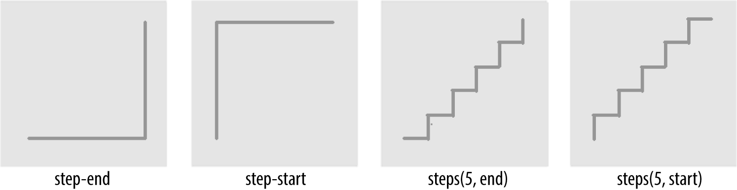
The step functions allow you to divide the transition over equidistant
steps. The functions define the number and direction of steps. There are
two direction options: start and end. With start, the first step
happens at the animation start. With end, the last step happens at the
animation end. For example, steps(5, end) would jump through the
equidistant steps at 0%, 20%, 40%, 60%, and 80%; and steps(5, start)
would jump through the equidistant steps at 20%, 40%, 60%, 80%, and 100%.
The step-start function is the same as steps(1, start). When you use it, the property value stays on the final value from the
beginning until the end of the transition. The step-end function,
which is the same as steps(1, end), sits on the initial value of
the property, staying there through the transition’s duration.
Continuing on with the same super-long transition-property declaration, we can declare a single timing function for all the properties or
individual timing functions for each property, or we can make every even
property have one timing function, while every odd property proceeds at
a separate pace:
div{...transition-property:color,border-width,border-color,border-radius,transform,opacity,box-shadow,width,padding;transition-duration:200ms;transition-timing-function:ease-in;}
In the preceding example, we made all the properties transition at the same tempo by including
a single time as the timing-function value:
div{...transition-property:color,border-width,border-color,border-radius,transform,opacity,box-shadow,width,padding;transition-duration:200ms,180ms,160ms,140ms,120ms,100ms,1s,2s,3s;transition-timing-function:ease,ease-in,ease-out,ease-in-out,linear,step-end,step-start,steps(5,start),steps(3,end);}
We can also create a horrible user experience by making every property
transition at a different rhythm. The transition-timing-function does
not change the time it takes to transition properties: that is set with
the transition-duration property; but it does change how the
transition progresses during that set time:
div{...transition-property:color,border-width,border-color,border-radius,transform,opacity,box-shadow,width,padding;transition-duration:200ms;transition-timing-function:ease,ease-in,ease-out,ease-in-out,linear,step-end,step-start,steps(5,start),steps(3,end);}
If we include these nine different timing functions for the nine different properties, as long as they have the same transition duration and delay, all the properties start and finish transitioning at the same time. The timing function controls how the transition progresses, but does not alter the time it takes for the transition to finish.
These timing functions are described in great detail in “animation-timing-function”. The best way to familiarize yourself with
the timing functions is to play with them and see which one works best
for the effect you’re looking for. While testing, set a relatively long
transition-duration to better visualize the difference5 between the
various functions. At higher speeds, you may not be able to tell the
difference with the easing function; just don’t forget to set it back to
under 200 milliseconds before launching your website:
navliul{transition-property:transform,opacity;transition-duration:200ms;transition-timing-function:ease-in;...}
Our navigation example has transitions occurring in two directions: one transition occurs when changing from the default or initial value to the final hovered value. The second transition occurs when the user mouses off the list item and the nested unordered list returns to its previous or initial state. When the user hovers over the drop-down navigation, it transitions open; it transitions closed when the user mouses off.
We want our menu to open and become opaque fairly quickly, while
appearing gradual. The ease-in value is the best for this. The timing
function is reversed in the reverse direction; by default, when returning to the initial values, the transition will run in reverse order, inverting the timing function. It therefore eases in as it opens
and eases out as it closes. In this example, ease-in was used, so the return trip will
appear as if it was set to ease-out as it proceeds in the opposite
direction, going from open to closed. This is the default behavior, but
it can be controlled. Controlling the reverse transition direction is
discussed in “In Reverse: Transitioning Back to Baseline”.
transition-delay PropertyThe transition-delay property enables you to introduce a time delay
between when the change that initiates the transition is applied to an
element and when the transition begins.
If you hover over an element that has a color change on hover without a
transition, the color will change immediately. Similarly, a transition-delay of 0s (the default) means the transition will begin immediately—it will start executing as soon as the state of the element is altered. Otherwise, the time value of the
transition-delay defines the time offset from the moment the property
values would have changed (had no transition or transition-property
been applied) until the property values declared in the transition or
transition-property value begins animating to the next value.
Including a transition-delay with a positive number of milliseconds
(ms) or seconds (s) to delay the transition will delay the onset of
the transition effect. The time unit, as s or ms, is required.
Negative values of time are valid. The effects you can create with
negative transition-delays are described in “Negative values”.
Unlike transition-duration, negative time values are allowed for the
transition-delay property.
Continuing with the 8- (or 21-) property transition-property declaration, we can make all the properties start transitioning right away by omitting the transition-delay property or including it with a value of 0s—but that’s not a very interesting example. For
the sake of examples, we could delay
the start of all the even-numbered properties, while all the odd-numbered
properties start right away, by including two comma-separated values, starting with 0s or 0ms:
div{...transition-property:color,border,border-radius,transform,opacity,box-shadow,width,padding;transition-duration:200ms;transition-timing-function:linear;transition-delay:0s,200ms;}
By including transition-delay: 0s, 200ms on a series of properties,
each taking 200 milliseconds to transition, we make every odd-numbered property begin its
transition immediately; all the even-numbered transitions begin
their transitions as soon as the odd transitions have completed.
As with transition-duration and transition-timing-function, when the
number of comma-separated transition-delay values outnumbers the
number of comma-separated transition-property values, the extra delay
values are ignored. When the number of comma-separated
transition-property values outnumbers the number of comma-separated
transition-delay values, the delay values are repeated. In this case, with only two values, the first value (0s) is applied to each odd
property, providing no delay, and the second value is applied to every even
property, providing a 200-millisecond delay. Because we declared the
transition-duration as 200ms in this scenario, every evenly
numbered property will begin transitioning after 200 milliseconds, which is after
every oddly numbered property has finished transitioning:
div{...transition-property:color,border-width,border-color,border-radius,transform,opacity,box-shadow,width,padding;transition-duration:200ms;transition-timing-function:linear;transition-delay:0s,0.2s,0.4s,0.6s,0.8s,1s,1.2s,1.4s,1.6s;}
We can even declare nine different transition-delay values so that each
property begins transitioning after the previous property has
transitioned. In this example, we declared each transition to
last 200 milliseconds with the transition-duration property. We then declare a
transition-delay that provides comma-separated delay values for each
property that increment by 200 milliseconds, or 0.2 seconds—the same time as the
duration of each property’s transition. That means we can make each property
start transitioning as soon as the previous property has finished.
We can use math to give every transitioning property different durations and delays, ensuring they all complete transitioning at the same time:
div{...transition-property:color,border-width,border-color,border-radius,transform,opacity,box-shadow,width,padding;transition-duration:1.8s,1.6s,1.4s,1.2s,1s,0.8s,0.6s,0.4s,0.2s;transition-timing-function:linear;transition-delay:0s,0.2s,0.4s,0.6s,0.8s,1s,1.2s,1.4s,1.6s;}
In this example, each property completes transitioning at the
1.8-second mark, but each with a different duration and delay. For each
property, the transition-duration value plus the transition-delay
value will add up to 1.8 seconds:
div{...transition-property:color,border-width,border-color,border-radius,transform,opacity,box-shadow,width,padding;transition-duration:200ms;transition-timing-function:linear;transition-delay:50ms;}
Generally, you want all the transitions to begin at the same time. You can make that happen by
including a single transition-delay value, which gets applied to all
the properties. In our drop-down menu in Figure 2-1, we include a delay of
50 milliseconds. This delay is not long enough for the user to notice and will not
cause the application to appear slow. Rather, a 50-millisecond delay can help
prevent the navigation from shooting open unintentionally as the user accidentally passes over, or hovers over, the menu items while moving the cursor from one part of the page or app to another.
A negative time value for transition-delay will make the transition
begin immediately, partially through the transition. A negative
transition-delay that is smaller than the transition-duration will
cause the transition to
start immediately, partway through the transition:
div{transform:translateX(0);transition-property:transform;transition-duration:200ms;transition-delay:-150ms;transition-timing-function:linear;}div:hover{transform:translateX(200px);}
For example, if you have a transition-delay of -150ms on a 200ms
transition, the transition will start three-quarters of the way through
the transition and will last 50 milliseconds. In that scenario, with a linear
timing function, it will jump to being translated 150px along the
x-axis immediately on hover and then animate the translation from
150 pixels to 200 pixels over 50 milliseconds.
If the absolute value of the negative transition-delay is greater than
or equal to the transition-duration, the change of property values is
immediate, as if no transition had been applied, and no transitionend event occurs.
When transitioning back from the hovered state to the original state, by
default, the same value for the transition-delay is applied. In the
preceding scenario, with the transition-delay not being overridden in the
hover state, it will jump 75% of the way back (or 25% of the way through
the original transition) and then transition back to the initial state.
On mouseout, it will jump to being translated 50 pixels along the x-axis and
then take 50 milliseconds to return to its initial position of being translated
0 pixels along the x-axis.
If you hover over the navigation item from Figure 2-1, you would expect the drop-down menu to appear immediately. But that isn’t the user experience we want. The user may unintentionally hover over the navigation while mousing from one section of the document to another. Waiting for the user to hover over the navigation element for 50 milliseconds before opening the drop-down menu isn’t enough of a delay to make the site appear slow but is enough of a delay to ensure menus don’t seem to be unintentionally flying open:
navliul{transition-property:transform,opacity;transition-duration:200ms;transition-timing-function:ease-in;transition-delay:50ms;transform:scale(1,0);transform-origin:topcenter;opacity:0;}navli:hoverul{transform:scale(1,1);opacity:1;}
In our navigation example, we add a 50-millisecond transition delay.
This way, our drop-down menu won’t transition immediately if the user
accidentally mouses over a link on the way from one part of the document
to another. By adding transition-delay: 50ms, we can be more
confident the user is intentionally hovering over the parent navigation
item before opening the drop-down menu.
The browser will also wait 50 milliseconds after the user mouses off the
navigational element before transitioning back to the pretransitioned
state. When the transition-delay is specified somewhere that
applies to the element all the time, the transition-delay occurs in both
transition directions; that means the browser will wait 50 milliseconds after the parent li or its descendant loses hover before closing the drop-down menu.
This 50-millisecond delay before closing occurs whether or not the menu is completely open or even if the user mouses out of the menu before the menu finishes transitioning open. The browser will wait 50 milliseconds before opening the drop-down menu and will also wait 50 milliseconds before closing it—whether or not it was ever fully visible—as long as it had started to open.
This may seem odd, but it improves user experience. Often users accidentally mouse out of a navigational element as they mouse toward an item in the newly opened submenu. This 50-millisecond delay in the reverse direction gives the user a 50-millisecond window to get back onto the drop-down menu before it closes. This isn’t enough time to completely hover off and back on, but if there are submenus, an accidental mousing over nonnavigation space as the user moves the pointer to a subnavigation may be short enough to not close the navigation completely. If the user doesn’t hover over the open menu of the parent tab, the menu will transition back to a closed state. This is a good user experience.
If a mouse user leaves the area after the 50-millisecond delay but before the 200-millisecond duration, the menu will not open fully. Rather, there will be a 50-millisecond delay, and then the menu will revert to its fully closed state. Some browsers will take the full 200 milliseconds to revert; others will spend the same amount of time in the reverse direction as they did in the normal direction. A reversing shortening factor, which shortens the reverse transition time of incomplete transitions, is defined in the CSS Transitions specifications and is beginning to be implemented in browsers.
When a transitioned property reverts from the final state to the initial state and transition properties are only set on the start or initial state, the delay is repeated and the timing is reversed. If the transition is interrupted and doesn’t complete, the duration and delay are not ignored as the properties revert.
When a transition is interrupted before it is able to finish (such as mousing off of our drop-down menu example before it finishes opening), property values are reset to the values they had before the transition began, and the properties will transition back to those values. Because repeating the duration and timing functions on a reverting partial transition can lead to an odd or even bad user experience, the CSS transitions specification provides for making the reverting transition shorter.
In our menu example, we have a transition-delay of
50ms set on the default state and no transition properties declared on the hover state; thus, browsers will wait 50 milliseconds before beginning the
reverse or closing transition.
When the forward animation finishes transitioning to the final values and the transitionend event
is fired, all browsers will duplicate the transition-delay in the
reverse states.
As Table 2-2 shows, if the transition didn’t finish—say, if the user moved off the navigation before the transition finished—all browsers except Microsoft Edge will repeat the delay in the reverse
direction. Some browsers replicate the transition-duration as well, but
Edge and Firefox have implemented the specification’s reversing
shortening factor.
| Browser | Reverse delay | Transition time | Elapsed time |
|---|---|---|---|
Chrome 37 |
Yes |
200 ms |
0.200s |
Chrome 42 |
Yes |
200 ms |
0.250s |
Safari 8 |
Yes |
200 ms |
0.200s |
Firefox 41 |
Yes |
38 ms |
0.038s |
Opera 32 |
Yes |
200 ms |
0.250s |
Edge 12 |
No |
38 ms |
0.038s |
Let’s say the user moves off that menu 75 milliseconds after it started
transitioning. This means the drop-down menu will animate closed without ever being fully opened and fully opaque. The browser should have
a 50-millisecond delay before closing the menu, just like it waited 50 milliseconds before
starting to open it. This is actually a good user experience, as it
provides a few milliseconds of delay before closing, preventing jerky
behavior if the user accidentally navigates off the menu. As shown in
Table 2-2, all browsers do this, except Microsoft
Edge. In cases where the original transition has completed, all
browsers, including Edge, will repeat the 50-millisecond delay before reverting
the transition and closing the menu—but if the original transition did
not have time to conclude, Microsoft Edge currently does not wait before
reversing the transition. This is true for positive transition-delay
values.
Even though we only gave the browser 75 milliseconds to partially open the
drop-down menu before closing
the menu, some browsers will take 200 milliseconds—the full value of the
transition-duration property—to revert. Other browsers, including
Firefox and Edge, have implemented the CSS specification’s reversing
shortening factor and the reversing-adjusted start value. When
implemented, the time to complete the partial transition in the reverse
direction will be similar to the original value, though not necessarily
exact. For step timing functions, it will be the time it took
to complete the last completed step. For linear timing
functions, the partial durations will be the same in both directions. In
the case of our ease-in 75-millisecond partial transition duration, the reverse
duration is 38.4 milliseconds:
div{width:100px;transition:width10ssteps(10,start);}div:hover{width:200px;}
In the case of a steps timing function, Firefox and Edge will take the
time, rounded down to the number of steps the function has completed. For example,
if the transition was 10 seconds with 10 steps, and the properties
reverted after 3.25 seconds, ending a quarter of the way between the
third and fourth steps (completing 3 steps, or 30% of the transition) it
will take 3 seconds to revert to the previous values. In the preceding
example, the width of our div will grow to 130 pixels wide before it begins
reverting back to 100 pixels wide on mouseout.
While the reverse duration will be rounded down to the time it took to the last step, the reverse direction will be split into the originally declared number of steps, not the number of steps that completed. In our 3.25-second case, it will take 3 seconds to revert through 10 steps. These reverse transition steps will be shorter in duration at 300 milliseconds each, each step shrinking the width by 3 pixels, instead of 10 pixels.
If we were animating a sprite by
transitioning the background-position , this would look really bad. The
specification and implementation may change to make the reverse
direction take the same number of steps as the partial transition.
Other browsers currently take 10 seconds, reverting the progression of
the 3 steps over 10 seconds across 10 steps—taking a full second to
grow the width in 3-pixel steps.
Browsers that haven’t implemented shortened reversed timing, including
Chrome, Safari, and Opera, will take the full 10 seconds, instead of only
3, splitting the transition into 10 steps, to reverse the 30% change.
Whether the initial transition completed or not, these browsers will
take the full value of the initial transition duration, less the
absolute value of any negative transition-delay, to reverse the
transition, no matter the timing function. In the steps case just shown, the
reverse direction will take 10 seconds. In our navigation example, it
will reverse over 200 milliseconds, whether the navigation has fully scaled up or not.
For browsers that have implemented the reversing timing adjustments, if the
timing function is linear, the duration will be the same in both
directions. If the timing function is a step function, the reverse
duration will be equal to the time it took to complete the last
completed step. All other cubic-bezier functions will have a duration
that is
proportional
to progress the initial transition made before being interrupted.
Negative transition-delay values are also proportionally shortened.
Positive delays remain unchanged in both directions.
No browser will have a transitionend for the hover state, as the
transition did not end; but all browsers will have a transitionend
event in the reverse state when the menu finishes collapsing. The
elapsedTime for that reverse transition depends on whether the browser
took the full 200 milliseconds to close the menu, or if the browser takes as long to close the menu as it did to partially open the menu. Chrome and Opera
include the delay in their elapsedTime value. As of early 2016, this is a bug,
and should be fixed soon. All other browsers include only the time the
browser spent transitioning back—75 milliseconds for Firefox and Edge, 200 milliseconds for Safari and older versions of Chrome and Android.
To override these values, include transition properties in both CSS rule blocks. While this does not impact the reverse shortening, it does provide more control.
We’ll first cover the transition shorthand property, then we’ll use
that property to set different transitions in the reverse
direction.
transition Shorthand PropertyThe transition shorthand property combines the four properties just
described—transition-property, transition-duration,
transition-timing-function, and transition-delay—into a single
property.
The transition property accepts the value of none or any number of
comma-separated list of single transitions. A single transition
contains a single property to transition, or the keyword all to
transition all the properties—preferably the duration for the
transition, and optionally, the timing function and delay.
If a single transition within the transition shorthand omits the
property to transition (or the keyword all), the single transition
will default to all. If the transition-timing-function value is
omitted, it will default to ease. If only one time value is included,
that will be the duration, and there will be no delay, as if
transition-delay were set to 0s. If two time values are included,
the first is the transition-duration and the second is the
transition-delay.
Within each single transition, the order of the duration versus the delay is important: the first value that can be parsed as a time will be set as a duration. If an additional time value is found before the comma or the end of the statement, that will be set as the delay:
navliul{transition:transform200msease-in50ms,opacity200msease-in50ms;...}navliul{transition:all200msease-in50ms;...}navliul{transition:200msease-in50ms;...}
The shorthand for our drop-down menu can be written three different
ways. In the first example, we included shorthand for each of
the two properties. Because we are transitioning all the properties that
change on hover, we could use the keyword all, as shown in the second
example. And, as all is the default value, we could write the
shorthand with just the duration, timing-function and delay. Had we used
ease instead of ease-in, we could have omitted the timing function,
since ease is the default.
We had to include the duration, or no transition would be visible. In
other words, the only portion of the transition property that can be
considered required is transition-duration.
If we simply wanted to delay the change from closed menu to open menu
without a gradual transition, we would still need to include a duration of 0s. Remember, the first value parsable as time will be set as the
duration, and the second one will be set as the delay:
navliul{transition:0s200ms;...
This navigation will wait 200 milliseconds, then show the drop-down fully open and
opaque with no gradual transition. This is horrible user experience.
Though if you switch the selector from nav li ul to *, it might make
for an April Fools’ joke.
If there is a comma-separated list of transitions (versus just a single
declaration) and the word none is included, the entire transition
declaration is invalid and will be ignored:
div{...transition-property:color,border-width,border-color,border-radius,transform,opacity,box-shadow,width,padding;transition-duration:200ms,180ms,160ms,140ms,120ms,100ms,1s,2s,3s;transition-timing-function:ease,ease-in,ease-out,ease-in-out,linear,step-end,step-start,steps(5,start),steps(3,end);transition-delay:0s,0.2s,0.4s,0.6s,0.8s,1s,1.2s,1.4s,1.6s;}div{...transition:color200ms,border-width180msease-in200ms,border-color160msease-out400ms,border-radius140msease-in-out600ms,transform120mslinear800ms,opacity100msstep-end1s,box-shadow1sstep-start1.2s,width2ssteps(5,start)1.4s,padding3ssteps(3,end)1.6s;}
The two preceding CSS rule blocks are functionally equivalent: you can
declare comma-separated values for the four longhand transition
properties, or you can include a comma-separated list of single
transitions. You can’t, however, mix the two:
transition: transform, opacity 200ms ease-in 50ms will ease in the
opacity over 200 milliseconds after a 50-millisecond delay, but the transform change will be
instantaneous, with no transitionend event.
Note the duration comes before the delay in all the single transitions. Also note the first single transition omits the delay and timing-function, as the values they’re mapped to in the longhand syntax version are the properties’ default values.
In the preceding examples, we’ve declared a single transition. All our
transitions have been applied in the default state and initiated with a
hover. With these declarations, the properties return back to the
default state via the same transition on mouseout, with a reversing of
the timing function and a duplication of the delay.
With transition declarations only in the global state, both the hover
and mouseout states use the same transition declaration: the
selector matches both states. We can override this duplication of the
entire transition or just some of the transition properties by
including different values for transition properties in the global
(versus the hover-only) state.
When declaring transitions in multiple states, the transition included is to that state:
a{background:yellow;transition:200msbackground-colorlinear0s;}a:hover{background-color:orange;/* delay when going <strong>to</strong> the :hover state */transition-delay:50ms;}
In this scenario, when the user hovers over a link, the background
color waits 50 milliseconds before transitioning to orange. When the user
mouses off the link, the background starts transitioning back to yellow
immediately. In both directions, the transition takes 200 milliseconds to complete, and the gradual change proceeds in a linear manner. The 50 milliseconds is included in the :hover (orange) state. The delay happens, therefore, as the background changes to orange.
In our drop-down menu example, on :hover, the menu appears and grows
over 200 milliseconds, easing in after a delay of 50 milliseconds. The transition is set with the transition property in the default (nonhovered) state. When the user mouses out, the properties revert over 200 milliseconds, easing out after a delay of 50 milliseconds. This reverse effect is responding to the transition value from the non-hovered state. This is the default behavior, but it’s something we can control. The best user experience is
this default behavior, so you likely don’t want to alter it—but it’s important to know that you can.
If we want the closing of the menu to be jumpy and slow (we don’t want to do that; it’s bad user experience. But for the sake of this example, let’s pretend we do), we can declare two different transitions:
navulul{transform:scale(1,0);opacity:0;...transition:all4ssteps(8,start)1s;}navli:hoverul{transform:scale(1,1);opacity:1;transition:all200mslinear50ms;}
Transitions are to the to state: when there’s a style change, the
transition properties used to make the transition are the new values of
the transition properties, not the old ones. We put the smooth, linear
animation in the :hover state. The transition that applies is the one
we are going toward. In the preceding example, when the user hovers over
the drop-down menu’s parent li, the opening of the drop-down menu will
be gradual but quick, lasting 200 milliseconds after a delay of 50 milliseconds. When the user
mouses off the drop-down menu or its parent li, the transition will
wait one second and take four seconds to complete, showing eight steps along the
way.
When we only have one transition, we put it in the global from state, as you want the transition to occur toward any state, be that a hovering or a class change. Because we want the transition to occur with any change, we generally put the only transition declaration in the initial, default (least specific) block. If you do want to exert more control and provide for different effects depending on the direction of the transition, make sure to include a transition declaration in all of the possible class and UI states.
Beware of having transitions on both ancestors and descendants. Transitioning properties soon after making a change that transition ancestral or descendant nodes can have unexpected outcomes. If the transition on the descendant completes before the transition on the ancestor, the descendant will then resume inheriting the (still transitioning) value from its parent. This effect may not be what you expected.
Before implementing transitions and animations, it is important to understand what properties are transitionable and animatable. You can transition (or animate) any animatable CSS properties; but which properties are animatable?
While we’ve included a list of these properties in “Animatable Properties”, CSS is evolving, and the animatable properties list will likely get new additions.6
Interpolation is the construction of data points between the values of known data points. The key guideline to determining if a property value is animatable is whether the computed value can be interpolated. If a property’s keywords are computed values, they can’t be interpolated; if its keywords compute to a number, they can be. The quick rule of thought is that if you can determine a midpoint between two property values, those property values are probably animatable. Values that are interpolatable are animatable. Those that aren’t, aren’t.
For example, the display values are nonnumeric keywords. Values like
block and inline-block aren’t numeric and therefore don’t have a
midpoint; they aren’t animatable. The transform property values of
rotate(10deg) and rotate(20deg) have a midpoint of rotate(15deg); they are animatable.
The border property is shorthand for border-style, border-width,
and border-color (which, in turn, are themselves shorthand properties
for the four side values). While there is no midpoint between any of the
border-style values, the border-width property length units are
numeric, so they can be animated. The keyword values of medium, thick, and
thin have numeric equivalents and are interpolatable: the computed
value of the border-width property computes those keywords to lengths.
In the border-color value, colors are numeric—the named
colors all represent hexadecimal color values—so colors are
animatable as well. If you transition from border: red solid 3px to
border: blue dashed 10px, the border width and border colors will
transition at the defined speed, but border-style will jump from
solid to dashed as soon as the new value is applied.
transitionend events will occur for all the animatable properties. In
this case, there will be eight transitionend events, for border-top-width,
border-right-width, border-bottom-width, border-left-width,
border-top-color, border-right-color, border-bottom-color, and
border-left-color.
As noted (see Table 2-3), numeric values tend to be animatable. Keyword values that
aren’t translatable to numeric values generally aren’t. CSS functions
that take numeric values as parameters generally are animatable. One
exception to this rule of thought is visibility: while there is no
midpoint between the values of visible and hidden, visibility
values are interpolatable between visible and not-visible. When it comes
to the visibility property, either the initial value or the destination
value must be visible or no interpolation can happen. The value will
change at the end of the transition from visible to hidden. For a
transition from hidden to visible, it changes at the start of the
transition.
auto should generally be considered a nonanimatable value and should
be avoided for animations and transitions. According to the
specification, it is not an animatable value, but some browsers
interpolate the current numeric value of auto (such as height: auto)
to be 0px. auto is nonanimatable because it is a computed value for properties like
height, width, top, bottom, left, right, and margin.
Often an alternative property or value may work. For example,
instead of changing height: 0 to height: auto, use max-height: 0
to max-height: 100vh, which will generally create the expected
effect. The auto value is animatable for min-height and min-width,
since min-height: auto actually computes to 0.
Interpolation can happen when values falling between two or more known values can be determined. Interpolatable values can be transitioned and animated.
Numbers are interpolated as floating-point numbers. Integers are interpolated as whole numbers, incrementing or decrementing as whole numbers.
In CSS, length and percentage units are translated into real numbers.
When transitioning or animating calc(), or from one type of length to
or from a percentage, the values will be converted into a calc()
function and interpolated as real numbers.
Colors, whether they are HSLA, RGB, or named colors, are interpolated into their RGBA equivalent values for transitioning.
When animating font weights, if you use keyterms like bold, they’ll
be converted to numeric values and animated in steps of multiples of
100. You may be used to writing bold and normal, but the values of
100 through 900 have been around as long as CSS—since CSS Level 1 in
1996.
When including animatable property values that have more than one
component, each component is interpolated appropriately for that
component. For example, text-shadow has up to four components: the
color, x, y, and blur. The color is interpolated as color: the x, y,
and blur components are interpolated as lengths. Box shadows have two
additional optional properties: inset (or lack thereof) and spread.
spread, being a length, is interpolated as such. The inset keyterm
cannot be converted to a numeric equivalent: you can transition from one
inset shadow to another inset shadow, or from one drop shadow to another
drop shadow multi-component value, but there is no way to gradually
transition between inset and drop shadows.
Similar to values with more than one component, gradients can be transitioned only if you are transitioning gradients of the same type (linear or radial) with equal numbers of color stops. The colors of each color stop are then interpolated as colors, and the position of each color stop is interpolated as length and percentage units.
When you have simple lists of other types of properties, each item in the list is interpolated appropriately for that type—as long as the lists have the same number of items or repeatable items, and each pair of values can be interpolated:
.img{background-image:url(1.gif),url(2.gif),url(3.gif),url(4.gif),url(5.gif),url(6.gif),url(7.gif),url(8.gif),url(9.gif),url(10.gif),url(11.gif),url(12.gif);background-size:10px10px,20px20px,30px30px,40px40px;transition:background-size1sease-in0s;}.img:hover{background-size:25px25px,50px50px,75px75px,100px100px;}
For example, in transitioning four background-sizes, with all the sizes in
both lists listed in pixels, the third background-size from the
pretransitioned state can gradually transition to the third
background-size of the transitioned list. In the preceding example,
background images 1, 6, and 10 will transition from 10px to 25px in height and width when hovered. Similarly, images 3, 7, and 11
will transition from 30px to 75px, and so forth.
Remember, when there aren’t enough declarations to match the number of background
layers, the values are repeated. If there are too many values, the
excess values are ignored. In this case, the background-size values
are repeated three times, as if the CSS had been written as:
.img{...background-size:10px10px,20px20px,30px30px,40px40px,10px10px,20px20px,30px30px,40px40px,10px10px,20px20px,30px30px,40px40px;...}.img:hover{background-size:25px25px,50px50px,75px75px,100px100px,25px25px,50px50px,75px75px,100px100px,25px25px,50px50px,75px75px,100px100px;}
If a property doesn’t have enough comma-separated values to match the
number of background images, the list of values is repeated until there are
enough, even when the list in the :hover state doesn’t match the
initial state:
.img:hover{background-size:33px33px,66px66px,99px99px;}
If we transitioned from four background-size declarations in the initial
state to three background-size declarations in the :hover state, all in
pixels, still with 12 background images, the hover and initial state
values are repeated (three and four times respectively) until we have the 12
necessary values, as if the following had been declared:
.img{...background-size:10px10px,20px20px,30px30px,40px40px,10px10px,20px20px,30px30px,40px40px,10px10px,20px20px,30px30px,40px40px;...}.img:hover{background-size:33px33px,66px66px,99px99px,33px33px,66px66px,99px99px,33px33px,66px66px,99px99px,33px33px,66px66px,99px99px;}
If a pair of values cannot be interpolated—for example, if the background-size changes from contain in the default state to cover when hovered—then, according to the
specification, the lists are not interpolatable. However, some browsers
ignore that particular pair of values for the purposes of the transition, but
still animate the interpolatable values.
There are some property values that can animate if the browser can infer
implicit values. For example, shadows. For shadows, the browser will
infer an implicit shadow box-shadow: transparent 0 0 0 or
box-shadow: inset transparent 0 0 0, replacing any values not
explicitly included in the pre- or post-transition state. These examples are in the chapter files for this book.
Only the interpolatable values lead to transitionend events.
As noted previously, visibility animates differently than other properties:
if animating or transitioning to or from visible, it is interpolated
as a discrete step. It is always visible during the transition or
animation as long as the timing function output is between 0 and 1. It
will switch at the beginning if the transition is from hidden to
visible. It will switch at the end if the transition is from
visible to hidden. Note that this can be controlled with the step timing
functions.
There is a list of animatable properties in the CSS Transitions specification. This list only lists the CSS 2.1 properties that are transitionable, so it is not wholly accurate.
Table 2-3 shows a list of animatable properties and how their values are interpolated.
| Property name | Interpolation | |
|---|---|---|
| color | ||
color
|
as color | |
opacity
|
as number | |
| columns | ||
column-width
|
as length | |
column-count
|
as integer | |
column-gap
|
as length | |
column-rule (see longhands)
|
||
column-rule-color:
|
as color | |
column-rule-style:
|
no | |
column-rule-width:
|
as length | |
break-before
|
no | |
break-after
|
no | |
break-inside
|
no | |
column-span
|
no | |
column-fill
|
no | |
| text | ||
hyphens
|
no | |
letter-spacing
|
as length | |
word-wrap
|
no | |
overflow-wrap
|
no | |
text-transform
|
no | |
tab-size
|
as length | |
text-align
|
no | |
text-align-last
|
no | |
text-indent
|
as length, percentage, or calc(); | |
direction
|
no | |
white-space
|
no | |
word-break
|
no | |
word-spacing
|
as length | |
line-break
|
no | |
| Text decorations | ||
text-decoration-color:
|
as color | |
text-decoration-style:
|
no | |
text-decoration-line:
|
no | |
text-decoration-skip
|
no | |
text-shadow
|
as shadow list | |
text-underline-position
|
no | |
| Flexible boxes | ||
align-content
|
no | |
align-items
|
no | |
align-self
|
no | |
flex-basis
|
as length, percentage, or calc(); | |
flex-direction
|
no | |
flex-flow
|
no | |
flex (see longhand)
|
||
flex-grow
|
as number | |
flex-shrink
|
as number | |
flex-basis:
|
as length, percentage, or calc(); | |
flex-wrap
|
no | |
justify-content
|
no | |
order
|
as integer | |
| Background and borders | ||
background
|
||
background-color:
|
as color | |
background-image:
|
no | |
background-clip:
|
no | |
background-position:
|
as list of length, percentage, or calc | |
background-size:
|
as list of length, percentage, or calc | |
background-repeat:
|
no | |
background-attachment
|
no | |
abackground-origin
|
no | |
| Borders | ||
border (see longhand)
|
||
border-color
|
as color | |
border-style
|
no | |
border-width
|
as length | |
border-radius
|
as length, percentage, or calc(); | |
border-image
|
no (see longhand) | |
border-image-outset
|
no | |
border-image-repeat
|
no | |
border-image-slice
|
no | |
border-image-source
|
no | |
border-image-width
|
no | |
| Box model | ||
box-decoration-break
|
no | |
box-shadow
|
as shadow list | |
margin
|
as length | |
padding
|
as length | |
box-sizing
|
no | |
max-height
|
as length, percentage, or calc(); | |
min-height
|
as length, percentage, or calc(); | |
height
|
as length, percentage, or calc(); | |
max-width
|
as length, percentage, or calc(); | |
min-width
|
as length, percentage, or calc(); | |
width
|
as length, percentage, or calc(); | |
overflow
|
no | |
visibility
|
as visibility (see “How Property Values Are Interpolated”) | |
| Table | ||
border-collapse
|
no | |
border-spacing
|
no | |
caption-side
|
no | |
empty-cells
|
no | |
table-layout
|
no | |
vertical-align
|
as length | |
| Positioning | ||
bottom
|
as length, percentage, or calc(); | |
left
|
as length, percentage, or calc(); | |
right
|
as length, percentage, or calc(); | |
top
|
as length, percentage, or calc(); | |
float
|
no | |
clear
|
no | |
position
|
no | |
z-index
|
as integer | |
| Fonts | ||
font (see longhand)
|
||
font-style
|
no | |
font-variant
|
no | |
font-weight
|
as font weight | |
font-stretch
|
as font stretch | |
font-size
|
as length | |
line-height
|
as number, length | |
font-family
|
no | |
font-variant-ligatures
|
no | |
font-feature-settings
|
no | |
font-language-override
|
no | |
font-size-adjust
|
as number | |
font-synthesis
|
no | |
font-kerning
|
no | |
font-variant-position
|
no | |
font-variant-caps
|
no | |
font-variant-numeric
|
no | |
font-variant-east-asian
|
no | |
font-variant-alternates
|
no | |
| Images | ||
object-fit
|
no | |
object-position
|
as length, percentage, or calc(); | |
image-rendering
|
no | |
image-orientation
|
no | |
| Counters, lists, and generated content | ||
content
|
no | |
quotes
|
no | |
counter-increment
|
no | |
counter-reset
|
no | |
list-style
|
no | |
list-style-image
|
no | |
list-style-position
|
no | |
list-style-type
|
no | |
| Page | ||
orphans
|
no | |
page-break-after
|
no | |
page-break-before
|
no | |
page-break-inside
|
no | |
widows
|
no | |
| User interface | ||
outline (see longhand)
|
||
outline-color
|
as color | |
outline-width
|
as length | |
outline-style
|
no | |
outline-offset
|
as length | |
cursor
|
no | |
resize
|
no | |
text-overflow
|
no | |
| Animations | ||
animation
|
no (see longhands) | |
animation-delay
|
no | |
animation-direction
|
no | |
animation-duration
|
no | |
animation-fill-mode
|
no | |
animation-iteration-count
|
no | |
animation-name
|
no | |
animation-play-state
|
no | |
animation-timing-function
|
no, though animation-timing-function can be included in keyframes
|
|
| Transitions | ||
transition
|
no (see longhands) | |
transition-delay
|
no | |
transition-duration
|
no | |
transition-property
|
no | |
transition-timing-function
|
no | |
| Transform properties | ||
transform
|
as transform (see Transforms in CSS [O’Reilly]) | |
transform-origin
|
as length, percentage or calc(); | |
transform-style
|
no | |
perspective
|
as length | |
perspective-origin
|
as simple list of a length, percentage or calc(); | |
backface-visibility
|
no | |
| Compositing and blending | ||
background-blend-mode
|
no | |
mix-blend-mode
|
no | |
isolation
|
no | |
| Shapes | ||
shape-outside
|
yes, as basic-shape
|
|
shape-margin
|
as length, percentage, or calc(); | |
shape-image-threshold
|
as number | |
| Miscellaneous | ||
clip (deprecated)
|
as rectangle | |
display
|
no | |
unicode-bidi
|
no | |
text-orientation
|
no | |
ime-mode
|
no | |
all |
as each of the properties of the shorthand (all properties but unicode-bidi and direction)
|
|
will-change
|
no | |
box-decoration-break
|
no | |
touch-action
|
no | |
initial-letter
|
no | |
initial-letter-align
|
no | |
transition Events RevisitedThe transitionend event fires when a transition completes.
The transitionend event has three properties. propertyName is
the name of the CSS property whose transition completed, and
elapsedTime is the number of seconds the transition had been running
at the time the event fired, not including the transition delay. The
third property is the pseudoElement property, which returns the name
of the pseudo-element on which the transition occurred, either
::before or ::after (with two colons), or the empty string if the transition
occurred on an element and not a pseudo-element.
Currently, the transitionend event will only occur if there is a
positive, nonzero transition-delay or a nonzero transition-duration. The transitionend event only occurs if the sum of
transition-delay (which can be negative) and transition-duration (which
can’t) is greater than zero. If there is no delay or no duration, there
is no gradual transition, and no transitionend is fired, even if a property value has changed state.
You can use the addEventListener() method for the transitionend
event to listen for this event.
If a keyframe animation, explained in the next chapter, is applied to a transitioning element, and it
animates the same properties that are being transitioned, the animation
takes precedence over the transition. Oddly, the transitionend event
will still occur, but it will occur at the end of the animation.
When web pages or web applications are printed, the stylesheet for print
media is used. If your style element’s media attribute matches only
screen, the CSS will not impact the printed page at all.
Often, no media attribute is included; it is as if media="all" were
set, which is the default. Depending on the browser, when a transitioned
element is printed, either the interpolating values are ignored, or the
property values in their current state are printed.
You can’t see the element transitioning on a piece of paper, but in some
browsers, like Chrome, if an element transitioned from one state to
another, the current state at the time the print function is called will
be the value on the printed page, if that property is printable. For
example, if a background color changed, neither the pre-transition or the
post-transition background color will be printed, as background colors
are generally not printed. However, if the text color mutated from one
value to another, the current value of color will be what gets printed
on a color printer or PDF.
In other browsers, like Firefox, whether the pre-transition or post-transition value is printed depends on how the transition was initiated. If it initiated with a hover, the non-hovered value will be printed, as you are no longer hovering over the element while you interact with the print dialog. If it transitioned with a class addition, the post-transition value will be printed, even if the transition hasn’t completed. The printing acts as if the transition properties are ignored.
Given that there are separate printstyle sheets or @media rules for print, browsers compute style separately. In the print style, styles don’t change, so there just aren’t any transitions. The printing acts as if the property values changed instantly, instead of transitioning over time.
1 Changing a background image may take longer than 16 milliseconds to decode and repaint to the page. This isn’t a transition; it is just poor performance.
2 There is a pending resolution in the CSS Working Group stating that nonanimatable properties should obey transitions. This will likely not be web-compatible and will probably be reverted.
3 All of the examples in this chapter can be found at http://standardista.com/transitions.
4 This might change. The CSS Working Group is considering making all property values animatable, switching from one value to the next at the midpoint of the timing function if there is no midpoint between the pre and post values.
5 You can test the various transition-timing-function examples at http://www.standardista.com/css3/transitions.
6 A proposed change to the specifications would make all properties transitionable, even if they aren’t in fact animatable. This has yet to be added to the specification, and I don’t foresee it being implemented.
CSS transitions, covered in the previous chapter, enabled simple animations. With transitions, an element’s properties change from the values set in one style block to the values set in a different style block as the element changes state over time instead of instantly. With CSS transitions, the start and end states of property values are controlled by existing property values and provide little control over how the property value interpolation progresses over time.
CSS animations are similar to transitions in that values of CSS properties change over time. But transitions only let us animate from an initial value to a destination value and back again. CSS keyframe animations let us decide if and how an animation repeats and give us granular control over what happens throughout the animation.
CSS animation lets us animate the values of CSS properties over time using keyframes. Similar to transitions, animation provides us with control over the delay and duration. With CSS animations, we can control the number of iterations, the iteration behavior, what happens before the first animation commences, and the state of animated properties after the last animation iteration concludes. CSS animation properties allow us to control timing and even pause an animation mid-stream.
While transitions trigger implicit property values changes, animations are explicitly executed when animation keyframe properties are applied.
With CSS animations, you can change property values that are not part of
the set pre or post state of the element. The property values set on the
animated element don’t necessarily have to be part of the animation
progression. For example, with transitions, going from black to white
will only display varying shades of gray. With animation, that same
element doesn’t have to be black or white or even in-between shades of
gray during the animation. While you can transition through shades of gray,
you could instead turn the element yellow, then animate from
yellow to orange. Alternatively, you could animate through various colors,
starting with black and ending with white, but progressing through the entire
rainbow 1 if you so choose. With animations, you can use as many keyframes
as needed to granularly control an element’s property values to create
your desired effect.
The first step in implementing CSS animations is to create a keyframe
animation—a reusable @keyframes at-rule
defining which properties will be animated and how. The second step is
to apply that keyframe animation to one or more elements in
your document or application, using various animation properties to
define how it will progress through the keyframes.
To animate an element, we need to set the name of a keyframe animation; to do
that, we need a named keyframe animation. Our first step is to define
this reusable CSS keyframe animation using the @keyframes at-rule.
To define a CSS animation, we declare a reusable keyframe animation
using the @keyframes rule, giving our animation a name. The name we
create will then be used within a CSS selector’s code block to attach
this particular animation to the element(s) and/or pseudo-element(s) defined
by the selector(s).
The @keyframes at-rule includes the animation identifier, or name, and
one or more keyframe blocks. Each keyframe block includes one or more
keyframe selectors with declaration blocks of zero or more property/value pairs. The entire @keyframes at-rule specifies the behavior of one
full iteration of the animation. The animation may iterate zero or more
times, depending mainly on the animation-iteration-count property
value, which we’ll discuss in “The animation-iteration-count Property”.
The @keyframes at-rule keyterm is followed by the animation_identifier (the name you give your animation for future reference), followed
by curly braces that encompass the series of keyframe blocks.
Each keyframe block includes one or more keyframe selectors. The keyframe selectors are percentage-of-time positions along the duration of the animation; they are declared either as percentages or with the keyterms from or to:
@keyframesanimation_identifier{keyframe_selectorA{property1:value1a;property2:value2b;}keyframe_selectorB{property1:value1b;property2:value2b;}}
To create our keyframe animation, we start with the @keyframes at-rule
keyterm, an animation name, and curly brackets to encompass the
animation directives. Within the opening and closing curly brackets, we
include a series of keyframe selectors with blocks of CSS in which we
declare the properties we want to animate. The keyframes we declare
don’t in themselves animate anything. Rather, we must attach the
keyframe animations we created via the animation-name property, whose
value is the name or animation identifier we provided within our
at-rule. We discuss that property in “The animation-name Property”.
Start with the at-rule declaration, followed by the animation name and brackets:
@keyframesnameOfAnimation{...}
The name, which you create, is an identifier, not a string. Identifiers
have specific rules. First, they can’t be quoted. You can use any
characters [a-zA-Z0-9], the hyphen (-), underscore (_), and any ISO
10646 character U+00A0 and higher. ISO 10646 is the universal character
set; this means you can use any character in the Unicode standard that
matches the regular expression [-_a-zA-Z0-9\u00A0-\u10FFFF].
There are some limitations on the name. As mentioned, do not quote
the animation identifier (or animation name). The name can’t start with
a digit [0-9] or two hyphens. One hyphen is fine, as long as it is
not followed by a digit—unless you escape the digit or hyphen with a backslash.
If you include any escape characters within your animation name, make
sure to escape them with a backslash (\). For example, Q&A! must be
written as Q\&A\!. ✎ can be left as ✎ (no, that’s not a typo),
and ✎ is a valid name as well. But if you are going to use any
keyboard characters that aren’t letters or digits, like
!, @, #, $, %, ^, &, *, (, ), +, =, ~, \\, ,, ., ', ", ;, :, [, ], {, }, |, \, or /, escape them with a backslash.
Also, don’t use any of the keyterms covered in this chapter as the name
of your animation. For example, possible values for the various
animation properties we’ll be covering later in the chapter include
none, paused, running, infinite, backwards, and forwards,
among others. Using an animation property keyterm, while not prohibited
by the spec, will likely break your animation when using the animation
shorthand property discussed in “The animation Shorthand Property”. So, while you can legally name your
animation paused (or another keyterm,) I strongly recommend against it:
@keyframesbouncing{...}
After declaring the name of our @keyframe animation, in this case bouncing, we enclose all
the rules of our at-rule in curly braces, as shown in the last code snippet. This is where
we will put all our keyframes.
Keyframe selectors provide points during our animation where we set the values of the properties we want to animate. In defining animations, we dictate the values we want properties to have at a specific percentage of the way through the animations. If you want a value at the start of the animation, you declare it at the 0% mark. If you want a different value at the end of the animation, you declare the property value at the 100% mark. If you want a value a third of the way through the animation, you declare it at the 33% mark. These marks are defined with keyframe selectors.
Keyframe selectors consist of a comma-separated list of one or more
percentage values or the keywords from or to. The keyword from is
equal to 0%. The keyword to equals 100%. The keyframe selectors are used to
specify the percentage along the duration of the animation the keyframe
represents. The keyframe itself is specified by the block of property
values declared on the selector. The % unit must be used on percentage
values: in other words, 0 is invalid as a keyframe selector:
@keyframesW{from{left:0;top:0;}25%,75%{top:100%;}50%{top:50%;}to{left:100%;top:0;}}
This @keyframes animation, named W, when attached to a
non-statically positioned element, would move that element along a W-shaped path. W has five keyframes, at the 0%, 25%, 50%, 75%, and 100%
marks. The from is the 0% mark. The to is the 100% mark.
As the property values we set for the 25% and 75% mark are the same,
we put two keyframe selectors together as a comma-separated list. Just
as with regular CSS selectors, we can put multiple comma-separated
keyframe selectors together in front of a single CSS block. Whether you
keep those selectors on one line (as in the example) or put each selector on its
own line is up to your own CSS style guidelines:
25%,75%{top:100%;}
Note that selectors do not need to be listed in ascending order. In the preceding example, we’ve placed the 25% and 75% on the same line, with the 50%
mark coming after that declaration. For legibility, it is highly
encouraged to progress from the 0% to the 100% mark. However, as
demonstrated by the 75% keyframe in this example, which is “out of order,” it is
not required.
from and to ValuesIf a 0% or from keyframe is not specified, then the user agent
(browser) constructs a 0% keyframe using the original values of the
properties being animated, as if the 0% keyframe were declared with the
same property values that impact the element when no animation was
applied. Similarly, if the 100% or to keyframe is not defined, the
browser creates a faux 100% keyframe using the value the element would
have had if no animation had been set on it.
Assuming we have a background-color change animation:
@keyframeschange_bgcolor{45%{background-color:green;}55%{background-color:blue;}}
And the element originally had background-color: red set on it, it
would be as if the animation were written as:
@keyframeschange_bgcolor{0%{background-color:red;}45%{background-color:green;}55%{background-color:blue;}100%{background-color:red;}}
Or, remembering that we can include multiple identical keyframes as a comma-separated list, this faux animation could have also been written as:
@keyframeschange_bgcolor{0%,100%{background-color:red;}45%{background-color:green;}55%{background-color:blue;}}
Note the background-color: red; declarations are not actually part of
the keyframe animation. If the background color were set to yellow in
the element’s default state, the 0% and 100% marks would display a
yellow background, animating into green, then blue, then back to yellow
as the animation progressed:
@keyframeschange_bgcolor{0%,100%{background-color:yellow;}45%{background-color:green;}55%{background-color:blue;}}
We can include this change_bgcolor animation on many elements, and the
perceived animation will differ based on the element’s value for the
background-color property in the nonanimated state.
Negative percentages, values greater than 100%, and values that aren’t
otherwise percentages or the keyterms to or from are not valid and
will be ignored. Noninteger percentage values, such as 33.33%, are
valid.
In the original -webkit- implementation of animation, each keyframe
could only be declared once: if declared more than once, only the last
declaration would be applied, and the previous keyframe selector block
was ignored. This has been updated. Now, similar to the rest of CSS, the
values in the keyframe declaration blocks with identical keyframe values
cascade. In the standard (nonprefixed) syntax, the preceding W animation
can be written with the to, or 100%, declared twice, overriding the
value of the left property:
@keyframesW{from,to{top:0;left:0;}25%,75%{top:100%;}50%{top:50%;}to{left:100%;}}
Note that in the preceding code block, to is declared along with from as
keyframe selectors for the first code block. The left value is
overridden for the to in the last keyframe block.
Not all properties are animatable. Similar to the rest of CSS, the browser ignores properties and values in a keyframe
declaration block that are not understood.
Properties that are not animatable, with the exception of
animation-timing-function, are also ignored. There is a fairly
exhaustive list of animatable properties maintained by the community on
the
Mozilla
Developer Network site.
The animation-timing-function, described in greater detail
in “The animation-timing-function Property”, while not an animatable property, is not ignored. If you include
the animation-timing-function as a keyframe style rule within a
keyframe selector block, the timing function of the
properties within that block will change to the declared timing function
when the animation moves to the next keyframe.
You should not try to animate between nonnumeric values, with a few exceptions. For example, you can animate between nonnumeric values as long as they can be extrapolated into a numeric value, like named colors, which are extrapolated to hexadecimal color values.
If the animation is set between two property values that don’t have a
midpoint, the results may not be what you expect: the property will not
animate correctly—or at all. For example, you shouldn’t declare an
element’s height to animate between height: auto and
height: 300px. There is no midpoint between auto and 300px. The
element may still animate, but different browsers handle this
differently: Firefox does not animate the element; Safari may animate as
if auto is equal to 0; and both Opera and Chrome currently jump from
the preanimated state to the postanimated state halfway through the
animation, which may or may not be at the 50% keyframe selector,
depending on the value of the animation-timing-function. In other
words, different browsers behave differently for different properties
when there is no midpoint, so you can’t be sure you will get your
expected outcome.
The behavior of your animation will be most predictable if you declare
both a 0% and a 100% value for every property you animate.
@keyframesround{100%{border-radius:50%;}}
For example, if you declare border-radius: 50%; in your animation, you
may want to declare border-radius: 0; as well, because there is no
midpoint between none and anything: the default value of
border-radius is none, not 0:
@keyframessquare_to_round{0%{border-radius:0%;}100%{border-radius:50%;}}
The round animation will animate an element using the original border-radius value of that element to a border-radius of 50% over
the duration of the animation cycle. The round animation may work as
expected if you are turning rounded corner buttons into ovals (but it isn’t likely to look good).
While including a 0% keyframe will ensure that your animation runs
smoothly, the element may have had rounded corners to begin with. By
adding border-radius: 0%; in the from keyframe, if the element was
originally rounded, it will jump to rectangular corners before it starts
animating. This might not be what you want. The best way to resolve this
issue is to use the round animation instead of square_to_round, making sure any element that gets animated with the round keyframe
animation has its border-radius explicitly set.
As long as an animatable property is included in at least one block with a value that is different then the nonanimated attribute value, and there is a possible midpoint between those two values, that property will animate.
Exceptions to the midpoint “rule” include visibility and
animation-timing-function.
Visibility is an animatable property, even though there is no midpoint
between visibility: hidden and visibility: visible. When you
animate from hidden to visible, the visibility value jumps from one
value to the next at the keyframe upon which it is declared.
While the animation-timing-function is not, in fact, an animatable
property, when included in a keyframe block, the animation timing will switch to
the newly declared value at that point in the animation for the
properties within that keyframe selector block. The change in animation
timing is not animated; it simply switches to the new value.
@keyframes AnimationsThere is an API that enables finding,
appending, and deleting keyframe rules. You can change the content of a
keyframe block within an @keyframes animation declaration with
appendRule(n) or deleteRule(n), where n is the full selector of that
keyframe. You can return the contents of a keyframe with findRule(n):
@keyframesW{from,to{top:0;left:0;}25%,75%{top:100%;}50%{top:50%;}to{left:100%;}}
The appendRule(), deleteRule(), and findRule() methods takes the full
keyframe selector as an argument. Revisiting the W animation, to return
the 25% / 75% keyframe, the argument is 25%, 75%:
// Get the selector and content block for a keyframevaraRule=myAnimation.findRule('25%, 75%').cssText;// Delete the 50% keyframe rulemyAnimation.deleteRule('50%');// Add a 53% keyframe rules to the end of the animationmyAnimation.appendRule('53% {top: 50%;}');
The statement myAnimation.findRule('25%, 75%').cssText; where
myAnimation is pointing to a keyframe animation, returns the keyframe
that matches 25%, 75%. It would not match anything if we had used
either 25% or 75% only. If pointing to the W animation, this
statement returns 25%, 75% { top: 100%; }.
Similarly, myAnimation.deleteRule('50%') will delete the last 50%
keyframe. deleteRule(n) deletes the last keyframe rule that has a
keyframe selector n. To add a keyframe,
myAnimation.appendRule('53% {top: 50%;}') will append a 53% keyframe
after the last keyframe of the @keyframes block.
Once you have created a keyframe animation, you need to apply that animation to elements and/or pseudo-elements for anything to actually animate. CSS animation provides us with numerous animation properties to attach a keyframe animation to an element and control its progression. At a minimum, we need to include the name of the animation for the element to animate, and a duration if we want the animation to actually be visible.
There are three animation events—animationstart, animationend,
and animationiteration—that occur at the start and end
of an animation, and between the end of an iteration and the start of
a subsequent iteration. Any animation for which a valid keyframe rule is
defined will generate the start and end events, even animations with
empty keyframe rules. The animationiteration event only occurs when an
animation has more than one iteration, as the animationiteration event
does not fire if the animationend event would fire at the same time.
There are two ways of attaching animation properties to an element: you
can include all the animation properties separately, or you can declare
all the properties in one line using the animation shorthand property (or a combination of shorthand and longhand properties). We are going to first learn all the longhand properties. Later in this
chapter, we’ll condense all the declarations into one line with the
animation shorthand property.
Let’s start with the individual properties:
animation-name PropertyThe animation-name property takes as its value the name or
comma-separated list of names of the keyframe animation you want to
apply to an element or group of elements. The names are the unquoted identifiers you
created in your @keyframes rule.
The default value is none, which means there is no animation. The
none value can be used to override any animation applied elsewhere in
the CSS cascade. (This is also the reason you don’t want to name your
animation none, unless you’re a masochist.) To apply an animation,
include the @keyframe identifier, which is the animation name.
Using the change_bgcolor keyframe animation defined in “Omitting from and to Values”:
div{animation-name:change_bgcolor;}
To apply more than one animation, include more than one comma-separated @keyframe identifier:
div{animation-name:change_bgcolor,round,W;}
If one of the included keyframe identifiers does not exist, the series of animations will not fail: rather, the failed animation will be ignored, and the valid animations will be applied. While ignored initially, the failed animation will be applied if and when that identifier comes into existence as a valid animation:
div{animation-name:change_bgcolor,spin,round,W;}
In this example, there is no spin keyframe animation defined. The
spin animation will be ignored, while the change_bgcolor, round,
and W animations are applied. Should a spin keyframe animation come
into existence, it will be applied to the element at that time.
In order to include more than one animation, we’ve included each @keyframe
animation identifier in our list of comma-separated values on the
animation-name property. If more than one animation is applied to an
element and those animations have repeated properties, the latter animations override
the property values in the preceding animations. For example, if more
than two background color changes are applied concurrently in two
different keyframe animations, the latter animation will
override the background property declarations of the preceding one, but only
if the background colors were set to change at the same time. For more
on this, see “Animation, Specificity, and Precedence Order”.
While not required, if you include three animation names, consider
including three values for all the animation longhand property values,
such as animation-duration and animation-iteration-count, so there are corresponding values for each attached animation. If there are
too many values, the extra values are ignored. If there are too few
comma-separated values, the provided values will be repeated. In other
words, while it often makes sense to include the same number of values
for each animation property as you do for the animation-name property,
including fewer or more valid values will not invalidate the animations.
If an included keyframe identifier doesn’t exist, the animation
doesn’t fail. Any other animations attached via the animation-name
property will proceed normally. If that nonexistent animation comes
into existence, the animation will be attached to the element when the
identifier becomes valid, and will start iterating immediately or after
the expiration of any animation-delay. See “Setting Up Your Keyframe Animation”.
This is true as long as the keyframe identifier for the
nonexistent animation is a valid identifier.
change_bgcolor, spin, round, W will work in spite of there being no
spin animation, but change_bgcolor, Q&A!, round, W would fail, even
if a Q&A! animation is declared, as Q&A! is not a valid identifier.
Simply applying an animation to an element is not enough for the element
to visibly animate, but it will make the animation
occur. The keyframe properties will be interpolated, and the
animationstart and animationend events will fire. A single animationstart event occurs when the animation starts, and a single
animationend event occurs when the animation ends, because the
property-value interpolation occurs even if there was no perceptible
animation.
For an element to visibly animate, the animation must last at least some
amount of time. For that we have the animation-duration property.
animation-duration PropertyThe animation-duration property defines how long a single animation
iteration should take in seconds (s) or milliseconds (ms).
The animation-duration property takes as its value the length of
time, in seconds (s) or milliseconds (ms), it should take to complete
one cycle through all the keyframes. If omitted, the animation will still
be applied with a duration of 0s, with animationstart and
animationend still being fired even though the animation, taking 0s,
is imperceptible. Negative values are invalid.
When including a duration, you must include the second (s) or
millisecond (ms) unit:
div{animation-name:change_bgcolor;animation-duration:200ms;}
If you have more than one animation, you can include a different
animation-duration for each animation by including more than one
comma-separated time duration:
div{animation-name:change_bgcolor,round,W;animation-duration:200ms,100ms,0.5s;}
If you have an invalid value within your comma-separated list of
durations, like animation-duration: 200ms, 0, 0.5s, the entire
declaration will fail, and it will behave as if animation-duration: 0s
had been declared. 0 is not a valid time value.
Generally, you will want to include an animation-duration value for
each animation-name provided. If you have only one duration, all the
animations will last the same amount of time. Having fewer
animation-duration values than animation-name values in your
comma-separated property value list will not fail: rather, the values
that are included will be repeated. If you have a greater number of
animation-duration values than animation-name values, the extra
values will be ignored. If one of the included animations does not
exist, the series of animations and animation durations will not fail:
the failed animation, along with its duration, are ignored:
div{animation-name:change_bgcolor,spin,round,W;animation-duration:200ms,5s,100ms,0.5s;}
In this example, the 5s, or 5 seconds, is associated with spin.
As there is no spin @keyframes declaration, spin doesn’t exist, and
the 5s and spin are ignored. Should a spin animation come into existence, it will be applied to the div and last 5 seconds.
animation-iteration-count PropertySimply including the required animation-name will lead to the animation playing once. Include the animation-iteration-count property if you want to iterate through the animation more or less than the default one time.
By default, the animation will occur once. If
animation-iteration-count is included, and there isn’t a negative
value for the animation-delay property, the animation will repeat the
number of times specified by the value if the property, which can be any
number or the keyterm infinite.
If the numeric value is not an integer, the animation will end partway
through its last cycle. The animation will still run, but will cut off
mid-iteration on the final iteration. For example,
animation-iteration-count: 1.25 will iterate through the animation 1.25
times, cutting off 25% through the second iteration. If the value is 0.25
on an 8-second animation, the animation will play about 25% of the way
through, ending after 2 seconds.
Negative numbers are not valid. Like any invalid value, a negative value
will lead to a default single iteration.
Interestingly, 0 is a valid value for the animation-iteration-count
property. When set to 0, the animation still occurs, but zero times. It
is similar to setting animation-duration: 0s: it will throw both an
animationstart and an animationend event.
If you are attaching more than one animation to an element or
pseudo-element, include a comma-separated list of values for
animation-name, animation-duration, and animation-iteration-count:
.flag{animation-name:red,white,blue;animation-duration:2s,4s,6s;animation-iteration-count:3,5;}
The iteration-count values (and all other animation property values)
will be assigned in the order of the comma-separated animation-name
property value. Extra values will be ignored. Missing values will cause
the existing values to be repeated. Invalid values will invalidate the
entire declaration.
In the preceding example, there are more name values than count values, so the
count values will repeat: red and blue will iterate three times, and
white will iterate five times. There are the same number of name values
as duration values; therefore, the duration values will not repeat. The
red animation lasts two seconds, iterating three times, and therefore will run
for six seconds. The white animation lasts four seconds, iterating five times,
for a total of 20 seconds. The blue animation is six seconds per
iteration with the repeated three iterations value, animating for a total of
18 seconds.
If we wanted all three animations to end at the same time, even though
their durations differ, we can control that with
animation-iteration-count:
.flag{animation-name:red,white,blue;animation-duration:2s,4s,6s;animation-iteration-count:6,3,2;}
In that example, the red, white, and blue animations will last
for a total of 12 seconds each: red animates over 2 seconds, iterating 6
times, for a total of 12 seconds; white lasts 4 seconds, iterating 3 times,
for a total of 12 seconds; and blue lasts 6 seconds, iterating 2 times, for a
total of 12 seconds. With simple arithmetic, you can figure out how many
iterations you need to make one effect last as long as another,
remembering that the animation-iteration-count value doesn’t need to
be an integer.
animation-direction PropertyWith the animation-direction property, you can control whether the
animation progresses from the 0% keyframe to the 100% keyframe, or from
the 100% keyframe to the 0% keyframe. You can control whether all the
iterations progress in the same direction, or set every other animation
cycle to progress in the opposite direction.
The animation-direction property defines the direction of the animation’s
progression through the keyframes. There are four possible
values:
animation-direction: normalWhen set to normal (or omitted, which defaults to normal), each
iteration of the animation progresses from the 0% keyframe to the 100%
keyframe.
animation-direction: reverseThe reverse value sets each iteration to play in reverse keyframe
order, always progressing from the 100% keyframe to the 0% keyframe.
Reversing the animation direction also reverses the
animation-timing-function. This property is
described in “The animation-timing-function Property”.
animation-direction: alternateThe alternate value means the first iteration (and each
subsequent odd-numbered iteration) should proceed from 0% to 100%, and the
second iteration (and each subsequent even-numbered cycle) should reverse direction, proceeding from 100% to 0%.
animation-direction: alternate-reverseThe alternate-reverse value is similar to the alternate value,
except the odd-numbered iterations are in the reverse direction, and the
even-numbered animation iterations are in the normal direction.
alternate-reverse alternates the direction of each iteration,
beginning with reverse. The first iteration (and each subsequent odd
numbered iteration) proceeds from 100% to 0%; the second iteration (and
each subsequent even-numbered cycle) reverses direction, going from 100% to 0%:
.ball{animation-name:bouncing;animation-duration:400ms;animation-iteration-count:infinite;animation-direction:alternate-reverse;}@keyframesbouncing{from{transforms:translateY(500px);}to{transforms:translateY(0);}}
In this example, we are bouncing our ball, but we want to start by dropping it, not by throwing it up in the air: we want it to
alternate between going down and up, rather than up and down, so
animation-direction: alternate-reverse is the most appropriate value
for our needs.
This is a very rudimentary way of making a ball bounce. When balls are
bouncing, they are moving slowest when they reach their apex and fastest
when they reach their nadir. We included this example here to illustrate
the alternate-reverse animation directions. We’ll revisit the bouncing
animation again later to make it more realistic with the addition of timing (see “The animation-timing-function Property”).
There we will also discuss how, when the animation is iterating in the
reverse direction, the animation-timing-function is reversed.
animation-delay PropertyThe animation-delay property defines how long the browser waits after
the animation is attached to the element before beginning the first
animation iteration. The default value is 0s, meaning the animation will
commence immediately when it is applied. A positive value will delay the
start of the animation until the prescribed time, listed as the value of
the animation-delay property has elapsed. A negative value will cause
the animation to begin immediately—but it will start partway through the animation.
The animation-delay property sets the time, defined in seconds (s) or
milliseconds (ms), that the animation will wait between when the animation is
attached to the element and when the animation begins executing. By
default, the animation begins iterating as soon as it is applied to the
element, with a 0-second delay.
Unlike animation-duration, a negative value for the
animation-delay property is valid. Negative values for
animation-delay can create interesting effects. A negative delay will
execute the animation immediately but will begin animating the element
part way through the attached animation. For example, if
animation-delay: -4s and animation-duration: 10s are set on an
element, the animation will begin immediately but will start
approximately 40% of the way through the first animation.
I say “approximately” because it will not necessarily start at the 40%
keyframe block: when the 40% mark of an animation occurs depends on the
value of the animation-timing-function. If
animation-timing-function: linear is set, then it will be 40% through
the animation, at the 40% keyframe, if there is one:
div{animation-name:move;animation-duration:10s;animation-delay:-4s;animation-timing-function:linear;}@keyframesmove{from{transform:translateX(0);}to{transform:translateX(1000px);}}
In this linear animation example, we have a 10-second animation
with a 4-second delay. In this case, the animation will start
immediately 40% of the way through the animation, with the div translated
400 pixels to the right of its original position.
If an animation is set to occur 10 times, with a delay of -800 milliseconds and an animation duration of 200 milliseconds, the element will start animating right away, at the beginning of the fifth iteration:
.ball{animation-name:bounce;animation-duration:200ms;animation-delay:-600ms;animation-iteration-count:10;animation-timing-function:ease-in;animation-direction:alternate;}@keyframesbounce{from{transform:translateY(0);}to{transform:translateY(500px);}}
Instead of animating for 2,000 milliseconds (200 ms x 10 = 2,000 ms), or 2
seconds, starting in the normal direction, the ball will animate for
1,400 milliseconds with the animation starting immediately—but at the
start of the fourth iteration, and in the reverse direction. The
animation-direction is set to alternate, meaning every even iteration
iterates in the reverse direction from the 100% keyframe to the 0% keyframe.
The fourth iteration, which is an even-numbered iteration, is the first
visible iteration.
The animation will throw the animationstart event immediately. The
animationend event will occur at the 1,400-millisecond mark. The ball will be
tossed up, rather than bounced, throwing 6 animationiteration events,
after 200, 400, 600, 800, 1,000, and 1,200 milliseconds. While the iteration count was
set to 10, we only get 6 animationiteration events because we are only
getting 7 iterations; 3 iterations didn’t occur because of the negative animation-delay, and the last iteration concluded at the same time as the
animationend event. Remember, when an animationiteration event
would occur at the same time as an animationend event, the
animationiteration event does not occur.
Let’s take a deeper look at animation events before continuing.
There are three different types of animation events:
animationstart, animationiteration, and animationend. For browsers
still prefixing animations, these events are supported when written as
webkitAnimationStart, webkitAnimationIteration, and
webkitAnimationEnd. Each event has three read-only properties of
animationName, elapsedTime, and pseudoElement, unprefixed in all
browsers.
The animationstart event occurs at the start of the animation: after
the animation-delay (if present) has expired, or immediately if there
is no delay set. If a negative animation-delay value is present, the
animationstart will fire immediately, with an elapsedTime equal to
the absolute value of the delay in supporting browsers. In browsers
where prefixing is still necessary, the elapsedTime is 0:
.noAnimationEnd{animation-name:myAnimation;animation-duration:1s;animation-iteration-count:infinite;}.startAndEndSimultaneously{animation-name:myAnimation;animation-duration:0s;animation-iteration-count:infinite;}
The animationend event occurs when the animation finishes. If the
animation-iteration-count is set to infinite as long as the
animation-duration is set to a time greater than 0, the event will
never fire. If the animation-duration is set or defaults to 0 seconds, even
when the iteration count is infinite animationstart and
animationend will occur virtually simultaneously, in that order.
The animationiteration event fires between iterations. The animationend event fires at the conclusion of iterations that do not occur at the same time as the conclusion of the animation itself; the animationiteration and animationend events do not fire simultaneously:
.noAnimationIteration{animation-name:myAnimation;animation-duration:1s;animation-iteration-count:1;}
In the .noAnimationIteration example, with the
animation-iteration-count set to a single occurrence, the animation
ends at the conclusion of the first and only iteration. When the
animationiteration event would occur at the same time as an animationend, the animationend event occurs, but
the animationiteration event does not. The animationiteration does
not fire unless an animation cycle ends and another begins.
When the animation-iteration-count property is omitted, or when its
value is 1 or less, no animationiteration event will be fired. As long
as an iteration finishes (even if it’s a partial iteration) and the next
iteration begins, if the duration is greater than 0s, an
animationiteration event will occur.
If the animation-iteration-count is omitted, or has an invalid value,
it defaults to animation-iteration-count: 1. Because the
animationiteration event does not fire if it would occur at the same
time as the animationend, the animationiteration event will not
occur when animation-iteration-count is omitted, even though a full
cycle of the animation may occur:
.noAnimationIteration{animation-name:myAnimation;animation-duration:1s;animation-iteration-count:4;animation-delay:-3s;}
When an animation iterates through fewer cycles than listed in the
animation-iteration-count because of a negative animation-delay, there
are no animationiteration events for the non-occurring cycles. In the
preceding example code, there are no animationiteration events, as the first
three cycles do not occur (due to the -3s animation-delay), and the last
cycle finishes at the same time the animation ends.
In that example, the elapsedTime on the animationstart event is
3, as it is equal to the absolute value of the delay. This is supported
in browsers that can handle unprefixed animations.
You can use animation-delay to chain animations together so the next
animation starts immediately after the conclusion of the preceding
animation:
.rainbow{animation-name:red,orange,yellow,blue,green;animation-duration:1s,3s,5s,7s,11s;animation-delay:3s,4s,7s,12s,19s;}
In this example, the red animation starts after a three-second delay and lasts
one second, meaning the animationend event occurs at the four-second mark. This
example starts each subsequent animation at the conclusion of the
previous animation. This is known as animation chaining.
By including a four-second delay on the second animation, the orange animation
will begin interpolating the @keyframe property values at the four-second mark,
starting the orange animation immediately at the conclusion of the
red animation. The orange animation concludes at the seven-second mark—it
lasts 3 seconds, starting after a four-second delay—which is the delay set on the
third, or yellow, animation, making the yellow animation begin
immediately after the orange animation ends.
This is an example of chaining animations on a single element. You can
also use the animation-delay property to chain the animations for
different elements:
li:first-of-type{animation-name:red;animation-duration:1s;animation-delay:3s;}li:nth-of-type(2){animation-name:orange;animation-duration:3s;animation-delay:4s;}li:nth-of-type(3){animation-name:yellow;animation-duration:5s;animation-delay:7s;}li:nth-of-type(4){animation-name:green;animation-duration:7s;animation-delay:12s;}li:nth-of-type(5){animation-name:blue;animation-duration:11s;animation-delay:19s;}
If you want a group of list items to animate in order, appearing as if
the animations were chained in sequence, the animation-delay of each
list item should be the combined time of the animation-duration and
animation-delay of the previous animation.
The animation-delay property is an appropriate method of using CSS
animation properties to chain animations. There is one caveat: animations are the lowest priority on the UI thread. Therefore, if you
have a script running that is occupying the user interface (or UI)
thread, depending on the browser and which properties are being animated
and what property values are set on the element, the browser may let the delays expire while waiting
until the UI thread is available before starting the animations.
Some, but not all, animations in all browsers take place on the UI thread. In most browsers, when opacity or transforms are being animated, the animation takes place on the GPU, instead of the CPU, and doesn’t rely on the UI thread’s availability. If those properties are not part of the animation, the unavailability of the UI thread can lead to jank. Changing the opacity, transforming, or putting an element in 3D space puts the element in its own independent layer to be drawn by the graphics processor, using GPU instead of CPU and the potentially blocked UI thread.
/* Don't do this */*{transform:translateZ(0);}
On devices and browsers that support 3D animation, putting an element
into 3D space moves that element into its own layer, allowing for jank-free animations. For this reason, the translateZ hack—the thing I just told you not to do—became overused. While putting a few elements onto their own
layers with this hack is OK, some devices have limited video memory.
Each independent layer you create uses video memory and takes time
to move from the UI thread to the composited layer on the GPU. The
more layers you create, the higher the performance cost.
Edge, Chrome, Opera, and Safari can all be optimized this way. Firefox currently can’t. It’s likely that additional animatable properties will be animated on the GPU on composite layers off-thread in the near future.
For improved performance, whenever possible, include transform and
opacity in your animations over top, left, bottom, right, and visibility.
Not only does it improve performance by using the GPU over the CPU, but when
you change box-model properties, the browser needs to reflow and
repaint, which is bad for performance. Just don’t put everything on the
GPU, or you’ll find different performance issues.
In the preceding scenario in a nonperformant browser, if it took 11 seconds
for the browser to download, parse, and execute the document’s
JavaScript, the animation delay for the first 3 list items will expire
before the UI thread is able to animate the properties. In this case,
the first three animations—red, orange, and yellow—will begin
simultaneously when the JavaScript finishes executing, with the fourth
animation—green—starting a second later, before the orange and
yellow animations have finished animating. In this scenario, only the
last animation—blue—would start as designed: when the previous
animation ended.
For this reason, you may want to attach animations to elements based on an ancestor class that gets added when the document is ready, with JavaScript.
If you are able to rely on JavaScript, another way of chaining
animations is listening for animationend events to start subsequent
animations:
document.querySelectorAll('li')[0].addEventListener('animationend',function(e){document.querySelectorAll('li')[1].style.animationName='orange';},false);document.querySelectorAll('li')[1].addEventListener('animationend',function(e){document.querySelectorAll('li')[2].style.animationName='yellow';},false);document.querySelectorAll('li')[2].addEventListener('animationend',function(e){document.querySelectorAll('li')[3].style.animationName='green';},false);document.querySelectorAll('li')[3].addEventListener('animationend',function(e){document.querySelectorAll('li')[4].style.animationName='blue';},false);li:first-of-type{animation-name:red;animation-duration:1s;}li:nth-of-type(2){animation-duration:3s;}li:nth-of-type(3){animation-duration:5s;}li:nth-of-type(4){animation-duration:7s;}li:nth-of-type(5){animation-duration:11s;}
In this example, there is an event handler on each of the first four list
items listening for that list item’s animationend event. When the
animationend event occurs, the event listeners add an animation-name
to the subsequent list item.
This animation chaining method doesn’t employ animation-delay. Instead
of using this CSS property, it employs JavaScript event listeners to
attach animations to the element by setting the animation-name
property when the animationend event is thrown.
In our CSS snippet, you’ll note that the animation-name was only included
for the first list item. The other list items only have an animation-duration—with no animation-name, and therefore no attached
animations. Adding animation-name is what attaches and starts the
animation. To start or restart an animation, the animation name or
identifier must be removed and then added back—at which point all the
animation properties take effect, including animation-delay.
Instead of writing:
document.querySelectorAll('li')[2].addEventListener('animationend',function(e){document.querySelectorAll('li')[3].style.animationName='green';},false);document.querySelectorAll('li')[3].addEventListener('animationend',function(e){document.querySelectorAll('li')[4].style.animationName='blue';},false);li:nth-of-type(4){animation-duration:7s;}li:nth-of-type(5){animation-duration:11s;}
we could have also written:
document.querySelectorAll('li')[2].addEventListener('animationend',function(e){document.querySelectorAll('li')[3].style.animationName='green';document.querySelectorAll('li')[4].style.animationName='blue';},false);li:nth-of-type(4){animation-duration:7s;}li:nth-of-type(5){animation-delay:7s;animation-duration:11s;}
When we added the blue animation name to the fifth list item with
JavaScript at the same time we added green, the delay on the fifth
element took effect at that point in time and started expiring.
While changing the values of animation properties (other than name) on the element during an animation has no effect on the animation,
removing or adding an animation-name does have an impact. You can’t
change the animation duration from 100ms to 400ms in the middle of an
animation. You can’t switch the delay from -200ms to 5s once the delay
has already been applied. You can, however, stop and start the animation
by removing it and reapplying it. In this JavaScript example, we
started the animations by applying them to the elements.
In addition, setting display: none on an element terminates the
animation. Updating the display back to a visible value restarts the
animation from the beginning. If there is a positive value for
animation-delay, the delay will have to expire before the
animationstart event happens and any animations occur. If the delay is
negative, the animation will start midway through an iteration, exactly as
it would have if the animation had been applied any other way.
While there is no such property as an animation-iteration-delay, you
can employ the animation-delay property, incorporate delays within
your keyframe declaration, or use JavaScript to fake it. The best method
for faking it depends on the number of iterations, performance, and
whether the delays are all equal in length.
What is an animation iteration delay? Sometimes you want an animation to occur multiple times, but want to wait a specific amount of time between each iteration.
Let’s say you want your element to grow three times, but want to wait four seconds between each one-second iteration. You can include the delay within your keyframe definition and iterate through it three times:
.animate3times{background-color:red;animation:color_and_scale_after_delay;animation-iteration-count:3;animation-duration:5s;}@keyframescolor_and_scale_after_delay{80%{transform:scale(1);background-color:red;}80.1%{background-color:green;transform:scale(0.5);}100%{background-color:yellow;transform:scale(1.5);}}
Note the first keyframe selector is at the 80% mark and matches the
default state. This will animate your element three times: it stays in the default state for 80% of the five-second animation (or four seconds) and then moves from green to yellow and small to big over the last one second of the animation before iterating again, stopping after three iterations.
This method works for any number of iterations of the animation.
Unfortunately, it is only a good solution if the delay between
each iteration is identical and you don’t want to reuse the animation
with any other timing, such as a delay of six seconds. If you want
to change the delay between each iteration while not changing the
duration of the change in size and color, you have to write a new
@keyframes definition.
To enable different iteration delays between animations, we could create a single animation and bake in the effect of three different delays:
.animate3times{background-color:red;animation:color_and_scale_3_times;animation-iteration-count:1;animation-duration:15s;}@keyframescolor_and_scale_3_times{0%,13.32%,20.01%,40%,46.67%,93.32%{transform:scale(1);background-color:red;}13.33%,40.01%,93.33%{background-color:green;transform:scale(0.5);}20%,46.66%,100%{background-color:yellow;transform:scale(1.5);}}
This method may be more difficult to code and maintain. It works for a
single cycle of the animation. To change the number of animations or the
iteration delay durations, another @keyframes declaration would be
required. This example is even less robust than the previous one, but it
does allow for different between-iteration delays.
There’s a solution that currently works in most browsers that is not
specifically allowed in the animation specification, but it isn’t
disallowed—it’s not currently supported in Edge, but hopefully it
will be. The solution is to declare an animation multiple times, each
with a different animation-delay value:
.animate3times{animation:color_and_scale,color_and_scale,color_and_scale;animation-delay:0,4s,10s;animation-duration:1s;}@keyframescolor_and_scale{0%{background-color:green;transform:scale(0.5);}100%{background-color:yellow;transform:scale(1.5);}}
We’ve attached the animation three times, each with a different delay. In this case, each animation iteration concludes before the next one proceeds.
If animations overlap while they’re concurrently animating, the values
will be the values from the last declared animation. As is true whenever
there are multiple animations changing an element’s property at the
same time, the animation that occurs last in the sequence of animation
names will override any animations occurring before it in the list of
names. In declaring three color_and_scale animations but at different
intervals, the value of the property of the last iteration of the
color_and_scale animation will override the values of the previous
ones that haven’t yet concluded.
The safest, most robust and most cross-browser-friendly method of faking
an animation-iteration-delay property is to use animation events. On
animationend, detach the animation from the element, then reattach it after
the iteration delay. If all the iteration delays are the same, you can
use setInterval; if they vary, use setTimeout:
variteration=0;varel=document.getElementById('myElement');el.addEventListener('animationend',function(e){vartime=++iteration*1000;el.classList.remove('animationClass');setTimeout(function(){el.classList.add('animationClass');},time);});
This example animates
myElement infinitely, adding an additional second between each iteration
of the animation.
animation-timing-function PropertySimilar to the transition-timing-function property, the
animation-timing-function property describes how the animation will
progress over one cycle of its duration, or iteration.
Other than the step
timing functions, described in “The step timing functions”, the timing functions are all Bézier
curves. Just like the transition-timing-function, the CSS specification provides for five predefined Bézier curve
keyterms, as shown in Figure 3-1 and Table 3-1.

| Timing function | Cubic Bézier value |
|---|---|
|
|
|
|
|
|
|
|
|
|
A handy tool to visualize Bézier curves and to create your own is Lea Verou’s cubic Bézier visualizer.
The default ease is equal to cubic-bezier(0.25, 0.1, 0.25, 1), which
has a slow start, then speeds up, and ends slowly. This function is
similar to ease-in-out at cubic-bezier(0.42, 0, 0.58, 1), which has
a greater acceleration at the beginning. linear is equal to cubic-bezier(0, 0, 1, 1), and, as the name describes, creates an
animation that animates at a constant speed.
ease-in is equal to cubic-bezier(0.42, 0, 1, 1), which creates an
animation that is slow to start, gains speed, then stops abruptly.
The opposite ease-out timing function is equal to
cubic-bezier(0, 0, 0.58, 1), starting at full speed, then slowing
progressively as it reaches the conclusion of the animation iteration.
If none of these work for you, you can create your own Bézier curve timing function by passing four values, such as:
animation-timing-function:cubic-bezier(0.2,0.4,0.6,0.8);
Bézier curves are mathematically defined parametric curves used in two-dimensional graphic applications. See Table 2-3 for examples of curves you can define yourself in CSS.
The Bézier curve takes four values, defining the originating position of the two handles. In CSS, the anchors are at 0, 0 and 1, 1. The first two values define the x and y of the first point or handle of the curve, and the last two are the x and y of the second handle of the curve. The x values must be between 0 and 1, or the Bézier curve is invalid. When creating your own Bézier curve, remember: the steeper the curve, the faster the motion. The flatter the curve, the slower the motion.
While the x values must be between 0 and 1, by using values for y that are greater than 1 or less than 0, you can create a bouncing effect, making the animation bounce up and down between values, rather than going consistently in a single direction:
.snake{animation-name:shrink;animation-duration:10s;animation-timing-function:cubic-bezier(0,4,1,-4);animation-fill-mode:both;}@keyframesshrink{0%{width:500px;}100%{width:100px;}}
This animation-timing-function value makes the property values go
outside the boundaries of the values set in the 0% and 100%
keyframes. In this example, we are shrinking an element from 500px to
100px. However, because of the cubic-bezier values, the element
we’re shrinking will actually grow to be wider than the 500px width
defined in the 0% keyframe and narrower than the 100px width
defined in the 100% keyframe, as shown in Figure 3-2.
In this scenario, with
animation-timing-function: cubic-bezier(0, 4, 1, -4); set on an
animation that is shrinking an element from from 500px to 100px
wide, the snake starts with a width of 500px, defined in the 0%
keyframe. It then quickly shrinks down to a width of about 40px, which
is narrower than width: 100px; (which was declared in the 100%
keyframe) before slowly expanding to about 750px wide, which is larger
than the original width of width: 500px declared as the original (and
widest) declared width. It then quickly shrinks back down to
width: 100px, which is the value defined in the 100% keyframe. You
can test this and your own cubic Bézier
values.
You may have realized that the curve created by our animation is the same
curve as our Bézier curve. Just like our s-curve goes below and above our bounding box, the width
of our animation goes narrower than the smaller width we set of 100px and
wider than the larger width we set of 500px.
The Bézier curve has the appearance of a snake, going up and down and up again, because one y coordinate is positive and the other negative. If both are positive values greater than 1 or both are negative values less than -1, the Bézier curve is arc-shaped, going above or below one of the values set, but not bouncing out of bounds on both ends like the s-curve above.
The timing function declared for the animation-timing-function is the
timing for the normal animation direction, when the animation is
progressing from the 0% mark to the 100% mark. When the animation is running
in the reverse direction, from the 100% mark to the 0% mark, the
animation timing function is reversed:
.ball{animation-name:bounce;animation-duration:1s;animation-iteration-count:infinite;animation-timing-function:ease-in;animation-direction:alternate;}@keyframesbounce{0%{transform:translateY(0);}100%{transform:translateY(500px);}}
If we remember the bouncing ball
example , when the ball is dropping it gets faster as it nears
its nadir at the 100% keyframe, with the animation-timing-function
set to ease-in. When it is bouncing up, it is animating in the reverse
direction, from 100% to 0%, so the animating-timing-function is
reversed as well, to ease-out, slowing down as it reaches its apex.
Our original defaulted to ease. This timing function makes the
bouncing ball look a bit more realistic.
The step timing functions, step-start, step-end, and steps(),
aren’t Bézier curves. Rather, they’re tweening definitions.
The steps() timing function divides the animation into a series of
equal-length steps. steps() takes two parameters: the number of steps
and the direction.
The steps() function is most useful when it comes to character or sprite
animation. If you want to animate complex shapes that subtly change,
like the drawings or pictures in a flip book, the steps() timing
function is the solution.
The number of steps is the first parameter; its value must be a positive integer. The animation will be divided equally into the number of steps provided. For example, if the animation duration is 1 second and the number of steps is 5, the animation will be divided into five 200-millisecond steps, with the element being redrawn to the page 5 times, at 200-millisecond intervals, moving 20% through the animation at each interval.
If an animation were to pass through 5 steps, that means it either draws the animation at the 0%, 20%, 40%, 60%, and 80% keyframes or at the 20%, 40%, 60%, 80%, and 100% keyframes. It will either skip drawing the 100% or the 0% keyframe. That is where the direction parameter comes in.
The direction parameter takes one of two values: either start or
end. The direction determines if the function is left- or
right-continuous: basically, if the 0% or the 100% keyframe is going to
be skipped. Including start as the second parameter will create a
left-continuous function, meaning the first step happens when the
animation begins, skipping the 0%, but including the 100%. Including
end or omitting the second parameter (end is the default direction)
will create a right-continuous function. This mean the first step will
be at the 0% mark, and the last step will be before the 100% mark. With
end, the 100% keyframe will not be seen unless animation-fill-mode
of either forwards or both is set.
See “The animation-fill-mode Property”.
The direction parameter can be hard to remember. I like to think of it
this way: the start value skips the start value of 0%, and the end value
skips the ending value of the 100% keyframe.
The step-start value is equal to steps(1, start), with only a single
step displaying the 100% keyframe. The step-end value is equal to
steps(1, end), which displays only the 0% keyframe.
Consider the flip book. A flip book is a book with a series of pictures. Each page contains a single drawing or picture that changes
slightly from one page to the next, like one frame from a movie reel or
cartoon stamped onto each page. When the pages of a flip book are
flipped through rapidly (hence the name), the pictures appear as an
animated motion. You can create similar animations with CSS using an
image sprite, the background-position property, and the steps()
timing function.
Figure 3-3 shows an image sprite containing several images that change just slightly, like the drawings on the individual pages of our flip book.

We put all of our slightly differing images into a single image called a sprite. Each image in our sprite is a frame in the single animated image we’re creating.
We create a container element that is the size of a single image of our
sprite and attach the sprite as the container element’s background image. We then animate the background-position, using the steps()
timing function so we only see a single instance of the changing image
of our sprite at a time. The number of steps in our steps() timing
function is the number of occurrences of the image in our sprite. The
number of steps defines how many stops our background image makes to
complete a single animation.
The sprite in Figure 3-3 has 22 images, each 56 x 100 pixels. The total size of our
sprite is 1232 x 100 pixels. We set our container to the individual image
size: 56 x 100 pixels. We set our sprite as our background image: the
initial or default value of background-position is top left, which
is the same as 0 0. Our image will appear at 0 0, which is a good
default: older browsers that don’t support CSS animation will simply
display the first image from our sprite:
.dancer{height:100px;width:56px;background-image:url(../images/dancer.png);....}
The trick is to use steps() to change the background-position value
so that each frame is a view of a separate image within the sprite.
Instead of sliding in the background image from the left, the steps()
timing function will pop in the background image in the number of steps
we declared.
We declare our animation to simply be a change in the left-right value
of the background-position. The image is 1,232 pixels wide, so we move
the background image from 0 0, which is the left top, to
0 -1232px, putting the sprite fully outside of our 56 x 100 pixel
<div> viewport.
The values of -1232px 0 will move the image completely to the left,
outside of our containing block viewport. It will no longer show up as a
background image in our 100 x 56 pixel div at the 100% mark unless
background-repeat is set to repeat along the x-axis. We don’t want that to happen!
With the steps(n, end) syntax, the 100% keyframe never gets shown as
the animation runs. Had we used start instead of end, the 0% keyframe wouldn’t
show. With end, the 100% keyframe is skipped instead. Because we used
end, the 100% keyframe—when the background image is outside of
the border box of our element—doesn’t show. This is what we want:
@keyframesdance_in_place{from{background-position:00;}to{background-position:-1232px0;}}.dancer{....background-image:url(../images/dancer.png);animation-name:dance_in_place;animation-duration:4s;animation-timing-function:steps(22,end);animation-iteration-count:infinite;}
We used steps(22, end). We use the end direction to show the 0%
keyframe, but not the 100% keyframe. What may have seemed like a
complex animation is very simple: just like a flip book, we see one
frame of the sprite at a time. Our keyframe animation simply moves the
background.
Our dancer is dancing in place. Most dancers move around when they dance. We can add a little left-and-right and back-and-forth motion by adding a second animation:
@keyframesmove_around{0%,100%{transform:translate(0,-40px)scale(0.9);}25%{transform:translate(40px,0)scale(1);}50%{transform:translate(0,40px)scale(1.1);}75%{transform:translate(-40px,0)scale(1);}}
We create a second keyframe animation called move_around and attach
it to our dancer element as a second animation with comma-separated
animation property declarations:
.dancer{....background-image:url(../images/dancer.png);animation-name:dance_in_place,move_around;animation-duration:4s,16s;animation-timing-function:steps(22,end),steps(5,end);animation-iteration-count:infinite;}
Note that each animation property has two comma-separated values except
animation-iteration-count. If you recall, if an animation property
doesn’t have enough comma-separated values to match the number of
animations declared by the animation-name property, the values present
will be repeated until there are enough. We want both animations to
continue indefinitely. As the value of infinite is for all the
attached animations, we only need a single value for that property. The
browser will repeat the list of animation-iteration-count values—in
this case, just the single value of infinite—until it has matched
an animation-iteration-count value for each animation declared.
animation-timing-functionThe animation-timing-function is not an animatable property, but it
can be included in a keyframe to alter the current timing of the
animation.
When included within a keyframe, the animation-timing-function doesn’t transition from one value to another over time. Rather, the
timing function applies between keyframes, updating the timing function
when it reaches a keyframe that has a timing function defined.
While none of the animation properties are animatable,
animation-timing-function is the only CSS animation property that has an effect when specified on individual keyframes. Unlike animatable
properties, the animation-timing-function values aren’t interpolated
over time. When included in a keyframe within the @keyframes definition,
the timing function for the properties declared within that same keyframe will change to the new animation-timing-function
value when that keyframe is reached, as shown in Figure 3-4:
@keyframeswidth{0%{width:200px;animation-timing-function:linear;}50%{width:350px;animation-timing-function:ease-in;}100%{width:500px;}}
In other words, the rate at which the animation proceeds can be altered
mid animation. In the preceding example, as shown in Figure 3-4, halfway through the animation, we
switch from a linear animation progression for the width property to
one that eases in.
We can include the animation-timing-function within our keyframe
animation definitions to override this default inverting behavior or to
control the timing in any other way we please. The
animation-timing-function property isn’t animated in the sense of
changing from one value to another over time. Rather, it changes from
one value to the next when it reaches a keyframe selector that declares
a change to that value.
Specifying the animation-timing-function within the to or 100%
keyframe will have no effect on the animation. When included in the
from or 0% keyframe, the animation will follow the
animation-timing-function specified in the keyframe definition,
overriding the element’s default or declared animation-timing-function.
The specification states explicitly the timing function should
only impact the progression of an animation if it is declared in any
keyframe other than the to or 100% keyframe values. An
animation-timing-function declaration in the 100% or to keyframe
has no effect, as per current implementations and the specification.
If the animation-timing-function property is included in a keyframe,
only the properties also included in that keyframe block will have their
timing function impacted. This is not currently specified in the CSS
specification, but it is implemented as such and is
expected to be included in the final specification. If we take our W animation as an example:
@keyframesW{from{left:0;top:0;}25%,75%{top:100%;}50%{top:50%;}to{left:100%;top:0;}}
This follows the idea that conceptually, when an animation is set on an
element or pseudo-element, it is as if a set of keyframes is created for
each property that is present in any of the keyframes, as if an
animation is run independently for each property that is being animated.
It’s as if the W animation were made up of two animations that run
simultaneously: W_part1 and W_part2.
@keyframesW_part1{from,to{top:0;}25%,75%{top:100%;}50%{top:50%;}}@keyframesW_part2{from{left:0;}to{left:100%;}}
The animation-timing-function that is set on any of the keyframes is
added to the progression of only the properties that are defined at that
keyframe:
@keyframesW{from{left:0;top:0;}25%,75%{top:100%;}50%{animation-timing-function:ease-in;top:50%;}to{left:100%;top:0;}}
You can have multiple occurrences of a keyframe value, such as
50%, as the current implementation stands, but the animation-timing-function
and property have to be in the same selector block for the animation-timing-function change to have an impact. The preceding code will change the
animation-timing-function to ease-in for the top property only, not the left property,
impacting only the W_part1 section of our W animation.
However, with the following animation, the animation-timing-function (in a
keyframe block that has no property/value declarations) will have no
effect:
@keyframesW{from{left:0;top:0;}25%,75%{top:100%;}50%{animation-timing-function:ease-in;}50%{top:50%;}to{left:100%;top:0;}}
How is it useful to change the timing function midanimation? In the
bounce animation, we had a frictionless environment: the ball
bounced forever, never losing momentum. We had a very simple animation
that iterated forever. The ease-in timing function made it speed up as
it dropped, when it was in the normal animation direction. We took
advantage of timing functions being inverted in the reverse animation
direction: in this case, as if it was set to ease-out in the
reverse direction. With our infinite animation, the ball sped up as it
dropped and slowed as it rose because the timing function was
inverted from ease-in to ease-out by default as the animation
proceeded from the normal to reverse direction every other iteration.
In reality, friction exists; momentum is lost. Balls will not continue
to bounce indefinitely. If we want our bouncing ball to look natural, we
have to make it bounce less high as it loses energy with each impact. To
do this, we need a single animation that bounces multiple times, losing
momentum on each bounce, while switching between ease-in and ease-out at each
apex and nadir:
@keyframesbounce{0%{transform:translateY(0);animation-timing-function:ease-in;}30%{transform:translateY(100px);animation-timing-function:ease-in;}58%{transform:translateY(200px);animation-timing-function:ease-in;}80%{transform:translateY(300px);animation-timing-function:ease-in;}95%{transform:translateY(360px);animation-timing-function:ease-in;}15%,45%,71%,89%,100%{transform:translateY(380px);animation-timing-function:ease-out;}}
This animation loses height after a few bounces, eventually stopping. This more realistic animation has a single iteration, with the granular control provided via the keyframe blocks.
In the case of a single iteration, we can’t rely on the
animation-direction to change our timing function. We need to
ensure that while each bounce causes the ball to lose momentum, it still
speeds up with gravity and slows down as it reaches its apex. Because
we will have only a single iteration, we control the timing by including
animation-timing-function within our keyframes. At every apex, we
switch to ease-in, and at every nadir, or bounce, we switch to
ease-out.
animation-play-state propertyThe animation-play-state property defines whether the animation is
running or paused.
When set to the default running, the animation proceeds as normal. If
set to paused, the animation will be paused. When paused, the
animation is still applied to the element, halted at the progress it had
made before being paused. When set back to running or returned to the
default of running, it restarts from where it left off, as if the
“clock” that controls the animation had stopped and started again.
If the property is set to animation-play-state: paused during the
delay phase of the animation, the delay clock is also paused and resumes
expiring as soon as animation-play-state is set back to running.
animation-fill-mode PropertyThe animation-fill-mode property defines what values are applied by
the animation before and after the animation iterations are executed.
The animation-fill-mode property enables us to define whether or not
an element’s property values are applied by the animation outside of the
animation execution. The duration of the animation execution is set by the number of
iterations multiplied by the duration, less the absolute value of any
negative delay.
With animation-fill-mode, we can define how the animation impacts the
element on which it is set before the animationstart and after the
animationend events are fired. We can define whether the property values
set in the 0% keyframe are applied to the element during the expiration
of any animation delay, and if the property values that exist when the
animationend event is fired continue to be applied to the animated
element after the animation’s conclusion, or if the properties revert to
the values they had in their initial state prior to the attachment of
the animation.
By default, an animation will not affect the property values of the
element immediately if there is a positive animation-delay applied.
Rather, animation property values are applied when the animation-delay
expires, when the animationstart event is fired. By default, the animation property values are applied until the
last iteration has completed: at the completion of the animation, when
the animationend event is fired. At that time, the element’s property values revert
back to its nonanimated values.
The animation-fill-mode property lets us apply the property
values of any from or 0% keyframes to an element from the time the animation is
applied to that element until the expiration of the animation
delay. It also enables us to maintain the property values of the 100% or to
keyframe after the last animation cycle is complete, from the time the
animationend event has fired until forever—or until the animation is
removed from the element.
The default value is none, which means the animation has no effect
when it is not executing: the animation’s 0% keyframe block property
values are not applied to the animated element until the
animation-delay has expired, when the animationstart event is fired.
When the value is set to backwards, the property values from the 0%
or from keyframe (if there is one) will be applied to the element as
soon as the animation is applied to the element. The 0% keyframe
property values are applied immediately (or 100% keyframe, if the value of the animation-direction property is
reversed or reversed-alternate), without waiting for the animation-delay time to expire,
before the animationstart event fires.
The value of forwards means when the animation is done executing—has concluded the last part of the last iteration as defined by the
animation-iteration-count value—it continues to apply the values of
the properties at the values as they were when the animationend event
occurred. If the iteration-count has an integer value, this will be
either the 100% keyframe, or, if the last iteration was in the reverse
direction, the 0% keyframe.
The value of both applies both the backwards effect of applying the
property values when the animation is attached to the element and the
forwards value of persisting the property values from when the
animationend event occurred.
If the animation-iteration-count is a float value, and not an integer,
the last iteration will not end on the 0% or 100% keyframe: the
animation will end its execution partway through an animation cycle. If
the animation-fill-mode was set forwards or both, the element will
maintain the property values it had when the animationend event
occurred. For example, if the animation-iteration-count is 6.5, and
the animation-timing-function is linear, the animationend event fires
and the values of the properties at the 50% mark (whether or not a 50%
keyframe is explicitly declared) will stick, as if the
animation-play-state had been set to pause at that point.
For example, if we take the following code:
@keyframesmove_me{0%{transform:translateX(0);}100%{transform:translateX(1000px);}}.moved{animation-name:move_me;animation-duration:10s;animation-timing-function:linear;animation-iteration-count:0.6;animation-fill-mode:forwards;}
The animation will only go through 0.6 iterations. Being a linear 10-second
animation, it will stop at the 60% mark 6 seconds into the animation,
when the element is translated 600 pixels to the right. With
animation-fill-mode set to forwards or both, the animation will
stop animating when it is translated 600 pixels to the right, holding the
moved element 600 pixels to the right of its original position, keeping it
translated indefinitely, or until the animation is detached from the
element.
In Safari 9 and earlier, forwards and both will set the values from
the 100% keyframe onto the element, no matter the direction of the last
iteration or whether the animation otherwise ended on the 100% keyframe
or elsewhere in the animation. In the preceding example, in Safari 9, the
.moved element will jump from being translated by 400 pixels to the right
to be 1,000 pixels to the right of where it normally would have been and stay
there indefinitely or until the animation is detached from the moved
element. In Safari 9 and earlier, it doesn’t matter whether the last iteration was
normal or reverse, or whether the animation ended 25% or 75% of the
way through an animation cycle; animation-fill-mode: forwards; causes
the animation to jump to the 100% frame and stay there. This follows an
older version of the specification, but we expect it will be updated to
match the updated specification and all other evergreen browsers.
The backwards value controls what happens to the element from the
time the animation is attached to the element until the time the
animation delay expires, the animation starts executing, and the
animationstart event is fired. Before the animation starts executing
(during the period specified by a positive animation-delay value), the
animation applies the values it will have when the animation starts
executing. If the animation-direction is normal or alternate, the values specified in the animation’s 0% keyframe are applied immediately when the animation is attached. If the animation-direction is reverse or alternate-reverse, the property values of the 100%
keyframe are used.
The value of both simply means that both the forwards and backwards
fill modes will be applied. Most times when you set an animation, you will set
the animation-fill-mode property to both. This ensures that the
animated element’s properties don’t jump from the element’s default
state to the animated state at the start of execution, and that the
element’s properties don’t jump back to its original property
values at the animation’s end. Having properties jump from one value to
another before or after a smooth animation is generally the opposite of
what you’re trying to do.
With both, as soon as the animation is attached to an element, that
element will assume the properties provided in the 0% keyframe (or 100%
keyframe if animation-direction is set to reverse or
alternate-reverse). When the last iteration concludes, it will be as
if the animation-fill-mode were set to forwards: if it was a full
iteration in the normal direction, the property values of the 100%
keyframe will be applied. If the last cycle was in the reverse
direction, the property values of the 0% keyframe will be applied. With forwards and both, whether or not the last iteration was a full iteration, the values that were present when the
animationend event occurred will stay in effect.
If the animation-duration is set to 0s and backward or both is
set, the animation will stay on the 0% keyframe (or 100% keyframe if
animation-direction is set to reverse or reverse-alternate) until
the animation delay has expired. With no duration, it will immediately jump to the 100%
keyframe (or the 0% keyframe if animation-direction is set to
reverse or reverse-alternate). If both or forwards is set, it
will stay on that final keyframe in perpetuity or until the animation
is removed from the element or generated content. This happens no matter
the value of the animation-iteration-count, even if the count is 0.
In that case, the animationstart and animationend events will occur
in succession at the expiration of the delay, and there will be no
animationiteration event.
If the 0% or 100% keyframes are not explicitly defined, the browser
uses the implied values for those keyframes: the values set
forth on the element itself. If an keyframe animation has neither a 0%
or 100% keyframe set, setting animation-fill-mode: backwards will have
no impact. Similarly, in the case where the animation-iteration-count
is an integer and no 0% or 100% keyframe is set, setting
animation-fill-mode to forwards or both has no impact. If the
iteration count is a float, even if there are no to or from
keyframes, if there is an intermediary keyframe block with property
values set, forwards, backwards, and both should have an impact,
other than in Safari ≤9.
animation Shorthand PropertyThe animation shorthand property enables us to use one line instead of
eight to define all the animation properties on an element. The
animation property value is a list of space-separated values for the
various longhand animation properties. If you are setting multiple
animations on an element or pseudo-element, include the multiple
space-separated animation shorthands as a comma-separated list of
animations.
The animation shorthand takes as its value all the other preceding animation
properties, including animation-duration,
animation-timing-function, animation-delay,
animation-iteration-count, animation-direction,
animation-fill-mode, animation-play-state, and animation-name:
#animated{animation:200msease-in50ms1normalrunningforwardsslidedown;}
is the equivalent of:
#animated{animation-name:slidedown;animation-duration:200ms;animation-timing-function:ease-in;animation-delay:50ms;animation-iteration-count:1;animation-fill-mode:forwards;animation-direction:normal;animation-play-state:running;}
or:
#animated{animation:200msease-in50msforwardsslidedown;}
We didn’t have to declare all of the values in the animation shorthand; any values that aren’t declared are set to the default or initial values. The first shorthand line was long and three of the properties were set to default, so were not necessary.
It’s important to remember that if you don’t declare all eight values in your shorthand declaration, the ones you don’t declare will get the initial value for that property. The initial or default values are:
animation-name:none;animation-duration:0s;animation-timing-function:ease;animation-delay:0;animation-iteration-count:1;animation-fill-mode:none;animation-direction:normal;animation-play-state:running;
The order of the shorthand is partially important. For example, there are two time properties: the first is always the duration. The second, if present, is interpreted as the delay.
While the order of all properties that make up a shorthand are
important, the order of numeric values with the same unit type are
always important, no matter the property. For example, in the flex
shorthand, the first unitless number is the flex-grow value; the
second is the flex-shrink factor. Similarly, for the animation
shorthand, the first time value is always the animation-duration. The
second, if present, is always the animation-delay.
The placement of the animation-name can also be important. If you use
an animation property value as your animation identifier (which you
shouldn’t), the animation-name should be placed as the last property
value in the animation shorthand. The first occurrence of a keyword
that is a valid value for any of the other animation properties, such as
ease or running, will be assumed to be part of the shorthand of the
animation property the keyword is associated with rather than the
animation-name. Note that none is basically the only word that is
not a valid animation name:
#failedAnimation{animation:paused2s;}
This is the equivalent to:
#failedAnimation{animation-name:none;animation-duration:2s;animation-delay:0;animation-timing-function:ease;animation-iteration-count:1;animation-fill-mode:none;animation-direction:normal;animation-play-state:paused;}
paused is a valid animation name. While it may seem that the animation
named paused with a duration of 2s is being attached to the element,
that is not what is happening. Because words within the shorthand
animation are first checked against possible valid values of all
animation properties other than animation-name first, paused is
being set as the value of the animation-play-state property.
#anotherFailedAnimation{animation:running2sease-in-outforwards;}
The preceding code snippet is the equivalent to:
#anotherFailedAnimation{animation-name:none;animation-duration:2s;animation-delay:0s;animation-timing-function:ease-in-out;animation-iteration-count:1;animation-fill-mode:forwards;animation-direction:normal;animation-play-state:running;}
The developer probably has a keyframe animation called running. The
browser, however, sees the term and assigns it to the
animation-play-state property rather than the animation-name
property. With no animation-name declared, there is no animation
attached to the element.
In light of this, animation: 2s 3s 4s; may seem valid, as if the
following were being set:
#invalidName{animation-name:4s;animation-duration:2s;animation-delay:3s;}
But as we remember from “Setting Up Your Keyframe Animation”, 4s is not a
valid identifier. Identifiers cannot start with a digit unless escaped.
For this animation to be valid, it would have to be written as
animation: 2s 3s \34 s;
To attach multiple animations to a single element or pseudo-element, comma-separate the animation declarations:
.snowflake{animation:3sease-in200ms32forwardsfalling,1.5slinear200ms64spinning;}
Our snowflake will fall while spinning for 96 seconds, spinning twice
during each 3-second fall. At the end of the last animation cycle, the
snowflake will stay fixed on the 100% keyframe of the falling
@keyframes animation. We declared six of the eight animation properties for
the falling animation and five for the spinning animation, separating the
two animations with a comma.
While you’ll most often see the animation name as the first value—it’s easier to read that way, because of the issue with animation property keywords being valid keyframe identifiers—it is not a best practice. That is why we put the animation name at the end.
It is fine, even a good idea, to use the animation shorthand. Just
remember that the placement of the duration, delay, and name within that
shorthand are important, and omitted values will be set to their default
values. Also, it is a good idea to not use any animation keyterms as
your identifier.
In terms of specificity, the cascade, and which property values get
applied to an element, animations currently supersede all other values
in the cascade. When an animation is attached to an element, it takes
precedence, as if the specificity was even stronger than if the keyframe animation’s property
values were set inline with an !important:
as if <div style="keyframe-property: value !important">.
!importantIn general, the weight of a property attached with an ID selector 1-0-0
should take precedence over a property applied by an element selector
0-0-1. However, if that property value was changed via a keyframe
animation, it will be applied as if that property/value pair were added
as an inline style. The current behavior in all browsers that support
animation is as if the property values were declared inline with an
added !important. This is wrong, according to the specifications. The
animation specification states “animations override all normal rules,
but are overridden by !important rules.” This is a bug in the current
implementations and should be resolved eventually.
A property added via a CSS animation, even if that animation was added
on a CSS block with very low specificity, will be applied to the
element, even if the same property is applied to the same
element via a more specific selector, an inline style, or,
currently, even the keyterm !important—even on three nested ID
selectors. Currently, if an !important is declared on a property value
within the cascade, that will not override the style that was added with
an animation. The animation
is “even more !important.”
That being said, don’t include !important within your animation
declaration block; the property/value upon which it is declared will be
ignored.
If there are multiple animations specifying values for the same property, the property value from the last animation applied will override the previous animations:
#colorchange{animation-name:red,green,blue;animation-duration:11s,9s,6s;}
In this code example, if red, green, and blue are all keyframe
animations that change the color property to their respective names,
once the animation-name and animation-duration properties are
applied to #colorchange, for the first six seconds, the property values in
blue will take precedence, then green for three seconds, then red for two seconds,
before returning to its default property values.
The default properties of an element are not impacted before the
animation starts, and the properties return to their original values
after the animation ends unless an animation-fill-mode value other
than the default none has been set. If animation-fill-mode: both
were added to the mix, the color would always be blue, as the last
animation, or blue, overrides the previous green animation, which
overrides the red first animation.
display: none;If the display property is set to none on an element, any animation
iterating on that element or its descendants will cease, as if the
animation were detached from the element. Updating the display
property back to a visible value will reattach all the animation
properties, restarting the animation from scratch:
.snowflake{animation:spin2slinear5s20;}
The snowflake will spin 20 times; each spin takes 2 seconds, with the
first spin starting after 5 seconds. If the snowflake element’s
display property gets set to none after 15 seconds, it would have
completed 5 spins before disappearing (5-second delay, then 5 spins at 2
seconds each). If the snowflake display property changes back to
anything other than none, the animation starts from scratch: a 5-second delay will elapse again before it starts spinning 20 times. It
makes no difference how many animation cycles iterated before it
disappeared from view the first time.
CSS animations have the lowest priority on the UI thread. If you attach
multiple animations on page load with positive values for
animation-delay, the delays expire as prescribed, but the animations
may not begin until the UI thread is available to animate.
If the animations require the UI thread (they aren’t on the GPU as
described in “Animation chaining”); if you have 20
animations set with an animation delays to start animating at 1-second
intervals over 20 seconds, with the animation-delay property on each
set to 1s, 2s, 3s, 4s, and so on; if the document or application takes
a long time to load, with 11 seconds between the time the animated elements
were drawn to the page and the time the JavaScript finished being
downloaded, parsed, and executed; the delays of the first 11 animations
will have expired and will all commence when the UI thread becomes
available. The remaining animations will each then begin animating at
one-second intervals.
While you can use animations to create changing content, dynamically changing content can lead to seizures in some users. Always keep accessibility in mind, ensuring the accessibility of your website to people with epilepsy and other seizure disorders.
Let’s recap animation-related events we can access with DOM event listeners.
animationstartThe animationstart event occurs at the start of the animation. If
there is an animation-delay, this event will fire once the delay
period has expired. If there is no delay, the animationstart event occurs
when the animation is applied to the element. Even if there are no
iterations, the animationstart event still occurs. If there are
multiple animations attached to an element, an animationstart event
will occur for each of the applied valid keyframe animations: generally,
one animationstart for each valid animation-name identifier present:
#colorchange{animation:red,green,blue;}
In this example, as long as the red, green, and blue keyframe
animations are valid, while the animations will not be perceptible (as
the default duration of 0s is set on each), there will be three
animationstart events thrown: one for each animation name.
If the browser requires the -webkit- prefix for the animation
properties—basically, Safari 8 and earlier and Android 4.4.4 and older—the event is written as webkitAnimationStart instead of
animationstart. Note the -webkit- prefix and the camelCasing. It is
best to default to the unprefixed syntax and fall back to the prefixed
version only when the unprefixed is unavailable.
animationendThe animationend event occurs at the conclusion of the last animation.
It only occurs once per applied animation: if an element has 3
animations applied to it, like in our #colorchange example, the
animationend event will occur three times, at the end of the animation. In the example, there was no duration for any of the
animations; however, the animationend event timing is usually
equivalent to the result of the following equation:
(animation-duration*animation-iteration-count)+animation-delay=time
Even if there are no iterations, the animationend event still occurs once
for each animation applied. If the animation-iteration-count is set to
infinite, the animationend event never occurs.
If the browser requires the -webkit- prefix for the animation
properties, the event is written as webkitAnimationEnd instead of
animationend.
animationiterationThe animationiteration event occurs at the end of each iteration of an
animation, before the start of the next iteration. If there are no
iterations, or the iteration count is less than or equal to one, the
animationiteration event never occurs. If the iteration count is
infinite, the animationiteration event occurs ad infinitum, unless
there is no duration set or the duration is 0s.
Unlike the animationstart and animationend events, which each occur
once for each animation name, the animationiteration event can occur
multiple times or no times per animation name, depending on how many
iterations occur. Note that the event happens between animation cycles and
will not occur at the same time as an animationend event. In other
words, if the animation-iteration-count is an integer, the number of
animationiteration events that occur is generally one less that the value of the
animation-iteration-count property as long as the absolute value of any negative delay is less than the duration.
While not actually “animating” on a printed piece of paper, when an
animated element is printed, the relevant property values will be
printed. Obviously, you can’t see the element animating on a piece of
paper, but if the animation caused an element to have a border-radius of
50%, the printed element will have a border-radius of 50%.
1 All of the examples in this chapter can be found at http://standardista.com/css3/animations.
The animal on the cover of Transitions and Animations in CSS are salmon (salmonidae), which is a family of fish consisting of many different species. Two of the most common salmon are the Pacific salmon and the Atlantic salmon.
Pacific salmon live in the northern Pacific Ocean off the coasts of North America and Asia. There are five subspecies of Pacific salmon, with an average weight of 10 to 30 pounds. Pacific salmon are born in the fall in freshwater stream gravel beds, where they incubate through the winter and emerge as inch-long fish. They live for a year or two in streams or lakes and then head downstream to the ocean. There they live for a few years, before heading back upstream to their exact place of birth to spawn and then die.
Atlantic salmon live in the northern Atlantic Ocean off the coasts of North America and Europe. There are many subspecies of Atlantic salmon, including the trout and the char. Their average weight is 10 to 20 pounds. The Atlantic salmon family has a life cycle similar to that of its Pacific cousins, and also travels from freshwater gravel beds to the sea. A major difference between the two, however, is that the Atlantic salmon does not die after spawning; it can return to the ocean and then return to the stream to spawn again, usually two or three times.
Salmon, in general, are graceful, silver-colored fish with spots on their backs and fins. Their diet consists of plankton, insect larvae, shrimp, and smaller fish. Their unusually keen sense of smell is thought to help them navigate from the ocean back to the exact spot of their birth, upstream past many obstacles. Some species of salmon remain landlocked, living their entire lives in freshwater.
Salmon are an important part of the ecosystem, as their decaying bodies provide fertilizer for streambeds. Their numbers have been dwindling over the years, however. Factors in the declining salmon population include habitat destruction, fishing, dams that block spawning paths, acid rain, droughts, floods, and pollution.
The cover image is a 19th-century engraving from the Dover Pictorial Archive. The cover fonts are URW Typewriter and Guardian Sans. The text font is Adobe Minion Pro; the heading font is Adobe Myriad Condensed; and the code font is Dalton Maag’s Ubuntu Mono.
Adding Motion with CSS
Copyright © 2016 Estelle Weyl. All rights reserved.
Printed in the United States of America.
Published by O’Reilly Media, Inc., 1005 Gravenstein Highway North, Sebastopol, CA 95472.
O’Reilly books may be purchased for educational, business, or sales promotional use. Online editions are also available for most titles (http://safaribooksonline.com). For more information, contact our corporate/institutional sales department: 800-998-9938 or corporate@oreilly.com.
See http://oreilly.com/catalog/errata.csp?isbn=9781491929889 for release details.
The O’Reilly logo is a registered trademark of O’Reilly Media, Inc. Transitions and Animations in CSS, the cover image of salmon, and related trade dress are trademarks of O’Reilly Media, Inc.
While the publisher and the author have used good faith efforts to ensure that the information and instructions contained in this work are accurate, the publisher and the author disclaim all responsibility for errors or omissions, including without limitation responsibility for damages resulting from the use of or reliance on this work. Use of the information and instructions contained in this work is at your own risk. If any code samples or other technology this work contains or describes is subject to open source licenses or the intellectual property rights of others, it is your responsibility to ensure that your use thereof complies with such licenses and/or rights.
978-1-491-92988-9
[LSI]
The following typographical conventions are used in this book:
Indicates new terms, URLs, email addresses, filenames, and file extensions.
Constant widthUsed for program listings, as well as within paragraphs to refer to program elements such as variable or function names, databases, data types, environment variables, statements, and keywords.
Constant width boldShows commands or other text that should be typed literally by the user.
Constant width italicShows text that should be replaced with user-supplied values or by values determined by context.
This element signifies a general note.
Whenever you come across an icon that looks like , it means there is an associated code example. Live examples are available at http://standardista.com/css3/transitions and http://standardista.com/css3/animations. You can either click on the icon while reading this book in electronic format to go directly to a live version of the code example referenced, or visit those links for a list of all of the code examples found in the Transitions and Animations chapters.
This book is here to help you get your job done. In general, if example code is offered with this book, you may use it in your programs and documentation. You do not need to contact us for permission unless you’re reproducing a significant portion of the code. For example, writing a program that uses several chunks of code from this book does not require permission. Selling or distributing a CD-ROM of examples from O’Reilly books does require permission. Answering a question by citing this book and quoting example code does not require permission. Incorporating a significant amount of example code from this book into your product’s documentation does require permission.
We appreciate, but do not require, attribution. An attribution usually includes the title, author, publisher, and ISBN. For example: “Transitions and Animations in CSS by Estelle Weyl (O’Reilly). Copyright 2016 Estelle Weyl, 978-1-4919-2988-9.”
If you feel your use of code examples falls outside fair use or the permission given above, feel free to contact us at permissions@oreilly.com.
Safari Books Online is an on-demand digital library that delivers expert content in both book and video form from the world’s leading authors in technology and business.
Technology professionals, software developers, web designers, and business and creative professionals use Safari Books Online as their primary resource for research, problem solving, learning, and certification training.
Safari Books Online offers a range of plans and pricing for enterprise, government, education, and individuals.
Members have access to thousands of books, training videos, and prepublication manuscripts in one fully searchable database from publishers like O’Reilly Media, Prentice Hall Professional, Addison-Wesley Professional, Microsoft Press, Sams, Que, Peachpit Press, Focal Press, Cisco Press, John Wiley & Sons, Syngress, Morgan Kaufmann, IBM Redbooks, Packt, Adobe Press, FT Press, Apress, Manning, New Riders, McGraw-Hill, Jones & Bartlett, Course Technology, and hundreds more. For more information about Safari Books Online, please visit us online.
Please address comments and questions concerning this book to the publisher:
We have a web page for this book, where we list errata and any additional information. You can access this page at http://bit.ly/transitions-and-animations-in-css.
To comment or ask technical questions about this book, send email to bookquestions@oreilly.com.
For more information about our books, courses, conferences, and news, see our website at http://www.oreilly.com.
Find us on Facebook: http://facebook.com/oreilly
Follow us on Twitter: http://twitter.com/oreillymedia
Watch us on YouTube: http://www.youtube.com/oreillymedia
You can also find Estelle Weyl on Twitter at @estellevw, @standardista, and
@webdevtips.
Thank you to the technical reviewers:
Matt Rakow is a program manager at Microsoft, working on the Internet Explorer and Edge browsers since 2010 and the W3C CSS Working Group since 2013. His current focus is advancing the capability and performance of webpage composition and rendering, but also is devoted to improving scrolling performance, touch interactions, and high pixel density screen support.
David Baron is a distinguished engineer at Mozilla. He’s been involved in the CSS community and the development of the Gecko layout engine since 1998. At Mozilla, Baron implemented media queries, CSS transitions and animations, and the CSS calc() function, and designed and implemented the reftest test format and fixes for :visited privacy. As a participant at the W3C, he has edited the CSS Color Module, CSS Conditional Rules, CSS Transitions, CSS Animations, and the CSS Overflow Module. He can be found on Twitter at @davidbaron, and on the Web.
Sarah Drasner is an award-winning Senior UX Engineer at Trulia (Zillow Group). She is also a staff writer at CSS-Tricks. She has worked for 15 years as a web developer and designer, and at points worked concurrently as a scientific illustrator and a college professor. Sarah loves SVG, informative animation, and welding together pieces of the DOM. Follow her at @sarah_edo, on CodePen, or her website.
CSS transforms, CSS transitions, and CSS animations are three separate CSS specifications. While the three terms sound like they may do the same thing—make something move—CSS transitions and animations make things move over time. Transitions and animations let you define the transition between two or more states of an element.
Transforms change an element’s appearance through
translation, rotation, scaling, and skewing, but do not have a time
component. You can use the CSS transform property to change the location
of an element’s coordinate space of the CSS visual formatting model, but you
need transitions or animation to make that change occur over time. The
transform property is covered in Transforms in CSS (O’Reilly).
While animation is possible with JavaScript, understanding CSS3 transitions and animations will save you a lot of time and effort if you need to animate anything on the Web. Generally, it will also save your users’ CPU and battery compared to JavaScript.
Used correctly, CSS animations and transitions can give your web applications life and depth. While this booklet focuses on how to transition and animate elements in your documents, understanding when to use animation can improve your user experience (UX) as well. By adding the dimension of time, animating can help your UX communicate on a different level.
Well before the advent of the Web, animators at Disney came up with 12 principles for cartoon animation. Some of these principles are very relevant to CSS animation as well.
According to the “bible of animation”—The Illusion of Life: Disney Animation by Frank Thomas and Ollie Johnston—there are 12 basic principles for animation, including:
Depending on what something is made of, objects deform under motion. Squashing and stretching gives the illusion of weight and volume to an object or character as it bounces or otherwise moves. For example, when a ball bounces, it’s squashed as it hits the ground and stretches as it heads upward.
Users may not understand an animation unless there is a sequence of actions that leads clearly from one activity to the next. They must anticipate or expect a change before it actually occurs. In cartoons, it’s a movement preparing the viewer for a major action the character is about to perform, like a knee bending before a jump. On the Web, it could be a button depression before the start of the more extensive animation that starts when the button is selected.
Guide your users mentally to where they should focus before initiating the main effect, especially if the start of the animation is important.
In a cartoon, staging is the presentation of an idea so it is unmistakably clear. On the Web, staging is directing the user’s attention to an action, such as a small jiggle of the call-to-action button. Staging helps guide users through the story or idea being told: for example, through the steps of a check-out process.
There are two main approaches to animation on the big screen. In the straight ahead action approach, the animator starts at the first drawing and works drawing to drawing to the end of a scene. In pose to pose, the animator draws the main points within an animation and creates (or has an assistant create) the points in between later. While seemingly only applicable to storyboarding, this principle is also related to drawing keyframes and how the animation fills in the space or time between them.
With CSS animations, when we animate image sprites to create motion, we
are emulating the Straight Ahead approach. This is described when we
cover the steps values of the
animation-timing-function property (see “The step timing functions”). In most animation scenarios, we
let the browser be our assistant, defining specific points, or poses,
within the animation and allowing the browser to interpolate property
values as it animates from pose to pose, or
keyframe definition to keyframe definition.
Follow-through is the inclusion of additional motion when the main animation concludes. For example, if a character is running and stops, her hair and clothes were likely bouncing and fall back into place after her legs and body cease moving, catching up to the main mass of the character. Nothing stops all at once.
Overlapping action is when some components are slightly delayed after other components change direction, like the way Wile E. Coyote’s legs keep moving forward as he drops off a cliff. His ears take a moment to follow.
If your CSS animations ever become complex enough to require follow-through and overlapping action, timing will be critical to making your effects work.
Just like cars don’t start and end at full speed—rather, they accelerate from stopped to full speed and decelerate back to zero—slow ins and slow outs make animation more lifelike and soften the action. Only mechanical animations will proceed at a linear speed.
The slow in and slow out principle states that the beginning and end of
an animation are more interesting than its middle; and
therefore, unless it’s mechanical, the animation should proceed fastest
in the middle of the animation, with a slower start and slower end.
With cartoon animation, the effect is created by having more cells at
the ends and fewer in the middle of the action. With CSS, this effect is
created by setting cubic
Bézier timing functions to something other than linear (see “The transition-timing-function Property”).
The arcs principle states that almost all actions follow an arc or slightly circular path. Think of your hand moving back and forth as you walk: your hand arcs back and forth rather than always staying at an equal distance from the ground.
Linear animations can be very mechanical. Arcs can be achieved with granular control within a keyframe animation. Because of this, CSS developers often use CSS animations instead of transitions; animations offer more granularity in creating an arced path, while CSS transitions only allow for moving between two states. However, with some cubic Bézier timing functions, creating an arc with CSS transitions is actually not only possible, but fairly simple.
Secondary actions can enrich a main action by adding dimension, supplementing or reinforcing the main action and giving the scene more life. If you include secondary actions, the animations should work together in support of one another.
For example, if your main animation drops a module onto a page, a secondary action might be the main call-to-action button within the module dropping into place, then finishing its action a little after the main module has finished animating in. A secondary action should reinforce the main action. It is OK to literally “think outside the box” and animate a child element differently from its parent.
Timing is likely the most important of the principles in this list when
it comes to animation. While in traditional animation it’s based on the number of frames,
in CSS animation it has more to do with creating the appropriate amount
of time to read the motion, but not so long as to make the site appear
slow. Timing includes not just the duration of the animation (see “The animation-duration Property”), but also the
delay (“The animation-delay Property”) and timing function (“The animation-timing-function Property”).
There are no right answers when it comes to timing. Expertise in timing comes with experience and experimentation, if it comes at all. I recommend using trial and error to refine the timing of your animation, then cut your times in half: while you may want your animation to progress slowly enough to grok the difference in times and discover what is the best combination of duration, delay, and progression, you don’t want your site to appear slow.
Exaggeration is the highlighting of movements beyond their natural state to call attention to what you want the user to focus on. A tiny bit of exaggeration can give added life to an animation and actually make it look more realistic. Use good taste and common sense: exaggeration is not extreme distortion, but rather a slight distortion that gives emphasis without being so exaggerated as to be visibly distorted for your visitors.
The solid drawing principle includes the principles of drawing or coding forms that convey the illusion of three dimensions, with weight and solid form. In CSS, this includes using box shadows, gradients, and transforms, giving your content the illusion of being three-dimensional. If you aren’t doing 3D animation or spriting, this principle is only tangentially related to web animation, as on the Web, we’re drawing with CSS in a two-dimensional space.
The appeal principle has to do with charisma, believability, and interest. Appeal on the Web includes an easy-to-read design, clear drawing, and motion that will capture and involve the visitor’s interest. The animation has to appeal to the mind as well as to the eye.
There’s a nice video explaining the 12 principles of animation at https://vimeo.com/93206523, and a nice display of all of the principles can be found at The Illusion of Life.
Flash animation, animated banner ads, and Geocities animated GIFs from 1996 have given animation a bad name. In reality, it isn’t that animation itself is bad; it’s the way those animations were implemented that led to bad user experiences. With CSS, we can create animations and transitions that improve and augment user experience. Animation can give the appearance of life to two-dimensional, lifeless objects and give understanding to objects that have no meaning. But with great power comes great responsibility.
Animations can be used for good: a small animation can help inform the user that the state of an object has changed, or can occupy the user’s attention so they don’t notice a slow loading time.
The most important principle is timing and it’s the most difficult to fine-tune. Unlike cartoons, timing in CSS means milliseconds, not frames.
There is no magic value of milliseconds for the duration. Depending on
the timing function, you may want to add a few milliseconds for the
effect to feel natural. A developer-defined cubic Bézier timing function that creates a bounce
might work better with a bit more time than a simple ease-in timing function.
Just ensure the animation is short enough for your site to feel
responsive rather than slow.
If you have many animations in your site or application, think of timing as a choreography of animations. There is no “right” number of animations. It’s not the number of animations, it’s the design behind it.
All your animations should feel related. If there is a mix and match of delays, timings, and timing functions, the animations may seem unrelated. Choreograph your animations to ensure a cohesive feel among all the moving parts. Make sure your animations are making your site more sophisticated, more modern, and more trustworthy.
It is up to your designers to design animations that have purpose and style. It’s up to this book to teach you how to implement those animations.
CSS transitions allow us to animate CSS properties from an original value to a new value over time when a property value changes.
Normally, when a CSS property value changes—when a “style change event” occurs—the change is instantaneous. The new property value replaces the old property in the milliseconds it takes to repaint (or reflow and repaint if necessary) the affected content. Most value changes seem instantaneous, taking less than 16 ms1 to render. Even if the changes takes longer, it is a single step from one value to the next. For example, when changing a background color on hover, the background changes from one color to the next, with no gradual transition. CSS transitions enable us to smoothly animate CSS properties from an original value to a new value over time as the style recomputation proceeds:
button{color:magenta;transition:color200msease-in50ms;}button:hover{color:rebeccapurple;transition:color200msease-out50ms;}
Transitions allow the values of CSS animatable properties to change over
time, providing for simple animations.2 For example, instead of instantaneously changing a
button’s color on hover, with CSS transitions the button can be set to
gradually fade from magenta to rebeccapurple over 200 milliseconds,
even adding a 50-millisecond delay before transitioning. Changing a
color, no matter how long it takes, is a transition. But by adding the
CSS transition property, the color change can be gradual.
You can use CSS transitions today, even if you still support IE9 or older browsers. If a browser doesn’t support CSS transition properties, the change will be immediate instead of gradual, which is fine and accessible. If the property or property values specified aren’t animatable, again, the change will be immediate instead of gradual.
Because transitions are simply progressive enhancements, there is no reason to not use them today.
CSS transitions provide a way to control how a property changes from one value to the next over time. We can make the property value change gradually, creating pleasant and, hopefully, unobtrusive effects.
The CSS transition properties can be used to animate CSS property values smoothly, following an acceleration curve, after an optional delay, from a previous value to a new value over a specified length of time. CSS transitions let you decide which properties to animate, how long to wait before the animation starts, how long the transition should take, and how the transition will proceed. All these features are customizable.
Sometimes you want instantaneous value changes. Though we used link colors as an example in the preceding section, link colors should change instantly on hover, informing sighted users an interaction is occurring and that the hovered content is a link. Similarly, options in an autocomplete listbox shouldn’t fade in: you want the options to appear instantly, rather than fade in more slowly than the user types. Instantaneous value changes are often the best user experience.
At other times, you might want to make a property value change more gradually, bringing attention to what is occurring.
For example, you may want to make a card game more realistic by taking
200 milliseconds to animate the flipping of a card 3, as the user may not
realize what happened if there is no animation.
As another example, you may want your site’s drop-down menus to expand
or become visible over 200 milliseconds (instead of instantly) which may be
jarring. With CSS transitions, you can make a drop-down menu appear
slowly. In Figure 2-1, we are transitioning the submenu’s height and
opacity over 200 milliseconds. The menu changes from hidden to fully opaque and
expanded. This is a common use for CSS transitions, which we will also
explore later in this chapter.
In this chapter, we cover the four transition properties and the
transition shorthand that not only make our transition possible but very easy to implement.
Transitions have excellent browser support. All browsers, including Safari, Chrome, Opera, Firefox, Edge, and Internet Explorer (starting with IE10) support CSS transitions.
Transitions are user-interface (UI) enhancements. Lack of full support should not prevent you from including them. If a browser doesn’t support CSS transitions, the changes you are attempting to transition will still be applied: they will just “transition” from the initial state to the end state instantaneously when the style recomputation occurs.
Your users may miss out on an interesting (or possibly annoying) effect, but will not miss out on any content.
As transitions are generally progressive enhancements, there is no need to polyfill for archaic IE browsers. While you could use a JavaScript polyfill for IE9 and earlier, and prefix your transitions for Android 4.3 and earlier, there is likely little need to do so.
In CSS, transitions are written using four transition properties:
transition-property, transition-duration,
transition-timing-function, and transition-delay, along with the
transition property as a shorthand for the four longhand properties.
To create the drop-down navigation from Figure 2-1, we used all four CSS transition properties:
navliul{transition-property:transform;transition-duration:200ms;transition-timing-function:ease-in;transition-delay:50ms;transform:scale(1,0);transform-origin:topcenter;}navli:hoverul{transform:scale(1,1);}
This example defines the transition for our drop-down navigation example in Figure 2-1. The style change in this scenario is caused by hovering over navigational elements.
While we are using the :hover state for our style change event in our transition examples, you can transition properties in other scenarios too. For example, you might add or remove a class, or otherwise change the state—say, by changing an input from :invalid to :valid or from :checked to :not(:checked). Or you might append a table row at the end of a zebra-striped table or list item at the end of a list with styles based
on :nth-last-of-type selectors.
In the navigation pictured in Figure 2-1, the initial state of the nested
lists is transform: scale(1, 0) with a
transform-origin: top center. The final state is transform: scale(1, 1): the transform-origin remains the same.
In this example, the transition properties define a transition on the transform
property: when the new transform value is set on hover, the nested
unordered list will scale to its original, default size, changing
smoothly between the old value of transform: scale(1, 0) and the new
value of transform: scale(1, 1) over a period of 200 milliseconds.
This transition will start after a 50-millisecond delay, and will ease in,
proceeding slowly at first, then picking up speed as it progresses.
Transitions are declared along with the regular styles on an element. Whenever a target property changes, if a transition is set on that property, the browser will apply a transition to make the change gradual. While the most common initiation of a transition is changing property values from a default state to a hovered state, transitions also work if the property is changed by adding a class, manipulating the DOM, or otherwise changing the state.
You can declare transition properties in the initial state, the changed state, or in both the initial and changed states. If you only declare the transition on the initial state, when the state changes, it will transition to the changed state as you indicate with CSS transition properties. If and when it changes back to the initial state, the transition timing is reversed. You can override this default reverse transition by declaring different transitions in both the initial and changed states.
By initial state, I mean a state that matches
the element on page load. This could be a state that the element always
has, such as properties set on an element selector versus a :hover
state for that element, or a content editable element that may get
:focus:
/* selector that matches elementallthe time */p[contenteditable]{background-color:rgba(0,0,0,0);}/* selector that matches elementsomeof the time */p[contenteditable]:focus{/* overriding declaration */background-color:rgba(0,0,0,0.1);}
In this example, the fully transparent declaration is always the initial value, changing when the user gives it focus. This is what I mean when I use initial or default value throughout this chapter. The transition properties included in the selector that matches the element all the time will impact that element whenever the state changes, whether it is from the initial state to the focused state (as in the preceding example) or any other altered state, such as a hover state; or when properties are changed with the dynamic addition of a class.
An initial state could also be a temporary state that may change, such
as a :checked checkbox or a :valid form control, or even a class
that gets toggled on and off:
/* selector that matches elementsomeof the time */input:valid{border-color:green;}/* selector that matches elementsomeof the time, when the prior selector does NOT match. */input:invalid{border-color:red;}/* selector that matches elementsomeof the time, whether the input is valid or invalid */input:focus{/* alternative declaration */border-color:yellow;}
In this example, either the :valid or :invalid selector matches, but
never both. The :focus selector, as shown in Figure 2-2, matches some of the time, when the input has focus, whether the
input is matching the :valid or :invalid selector simultaneously. In
this case, when we refer to the initial state, we are referring to the
original value, which could be either valid or invalid. In this
scenario, the changed state can be the opposite of the initial :valid
or :invalid value. The :focus state is another
altered state.
Generally, you want to declare the transition properties at minimum on the selector
that applies to the element all the time. In the preceding contenteditable
scenario, it is the first rule. The second scenario is not as
clear-cut: if the transition is only set on the :invalid state, the
color will transition from red to green as the state of the input
changes from invalid to valid, and it will transition from red to yellow
when an invalid input receives focus. However, it will not slowly
transition from green to yellow, or yellow back to green, when a valid
input receives or loses focus. Similarly, the border will transition
as it changes from or to the invalid state with a red border; if the input is valid, there will
be no transition when the user gives or removes focus.
In this second scenario, we could put the transition on the :focus
selector, as generally the value will change from valid to invalid or
the reverse when the input has focus. Preferably, however, you will want
to put the transition on both the possible initial states, or all
three states.
In other words, if you always want the property to transition, you likely want to put the transition on all the states. The transition properties that are used are the ones in the destination state; the new values of the transition properties are used to transition to the new value of the property:
navliul{transition-property:transform;transition-duration:200ms;transition-timing-function:ease-in;transition-delay:50ms;transform:scale(1,0);transform-origin:topcenter;}navli:hoverul{transition-property:transform;transition-duration:2s;transition-timing-function:linear;transition-delay:1s;transform:scale(1,1);}
This provides a horrible user experience, but I’ve included it to show a point. When hovered over, the opening of the
navigation takes a full two seconds. When closing, it quickly closes over
0.2 seconds. The transition properties in the destination or hover state
are used when hovering over the list item. When no longer hovered over, as it
returns to the default scaled-down state, the transition properties of
the default properties it is returning to—the nav li ul condition—are used.
In our example, we don’t want horrible UX. We will omit the slow
transition, and instead allow the browser to
reverse the transition on mouse out:
navliul{transition-property:transform;transition-duration:200ms;transition-timing-function:ease-in;transition-delay:50ms;transform:scale(1,0);transform-origin:topcenter;}navli:hoverul{transform:scale(1,1);}
To create a simple CSS hover transition, such as the expansion of nested
list items in the preceding navigation example, we declare property values
in two states: the default or initial state of the element and the hovered state of
the element. The initial or original state of the element is declared in the
default style declaration. The changed properties, or final or destination state of the
element, are declared within a :hover style block. If no transition is
set, the nested unordered list scales to its default height instantly on
hover.
To transition this expansion, we add the transition functions using the
transition-* properties of transition-property,
transition-duration, transition-timing-function, and
transition-delay, or the transition shorthand. In our example, we
will be adding the transition properties only in the default style
declaration. When the transition is declared in the style block of the
initial state of the element, the transition will be applied as the
element changes from the initial state to the changed or destination state and applied
in reverse as it changes back to the initial state from the changed
state.
In our example, when the user stops hovering over the parent
navigational element or the child drop-down menu, the drop-down menu
will wait 50 milliseconds before closing over 200 milliseconds, using ease-out as the timing
function, reversing the transition declared in the default state. As we
saw in our bad UX example, the reverse transition timing function,
duration, and delay in the reverting direction can be overridden by
providing different transition property values in the default and
changed-state style blocks.
While the four transition properties can be declared separately, you
will probably always use the shorthand. We’ll take a look at the four
properties individually first so you have a good understanding of what
each one does, and then we’ll cover the transition shorthand, which is
what you will likely use in your code.
Let’s look at the four properties in greater detail.
transition-property PropertyThe transition-property property specifies the names of the CSS
properties you want to transition. And, yes, it’s weird to say “the
transition-property property.”
The value for the transition-property is a comma-separated list of
properties; the keyword none if you want no properties transitioned;
or the default all, which means “transition all the transitionable
properties.” You can also include the keyterm all within a
comma-separated list of properties.
If you include all as the only keyterm—or default to all—all the transitionable
properties will transition in unison.
Let’s say you want to change a box’s appearance on hover:
div{color:#ff0000;border:1pxsolid#00ff00;border-radius:0;transform:scale(1)rotate(0deg);opacity:1;box-shadow:3px3pxrgba(0,0,0,0.1);width:50px;padding:100px;}div:hover{color:#000000;border:5pxdashed#000000;border-radius:50%;transform:scale(2)rotate(-10deg);opacity:0.5;box-shadow:-3px-3pxrgba(255,0,0,0.5);width:100px;padding:20px;}
When the user hovers over the div, every property that has a different
value in the default state versus the hovered state will change to the
hover-state values. We use the transition-property property to define
which of those properties we want to animate over time (versus
instantly). All the properties will change from the default value to the
hovered value on hover, but only the animatable properties included in
the transition-property will transition over time. Nonanimatable
properties like border-style will change from one value to the next
instantly. See “Transitionable properties”.
allIf you want to define all the properties to transition at the same time,
speed, and pace, use all. If all is the only value or the last value
in the comma-separated value for transition-property, all the
animatable properties will transition in unison.
If we want to transition all the properties, the following statements are almost equivalent:
div{color:#ff0000;border:1pxsolid#00ff00;border-radius:0;transform:scale(1)rotate(0deg);opacity:1;box-shadow:3px3pxrgba(0,0,0,0.1);width:50px;padding:100px;transition-property:color,border,border-radius,transform,opacity,box-shadow,width,padding;transition-duration:1s;}
and
div{color:#ff0000;border:1pxsolid#00ff00;border-radius:0;transform:scale(1)rotate(0deg);opacity:1;box-shadow:3px3pxrgba(0,0,0,0.1);width:50px;padding:100px;transition-property:all;transition-duration:1s;}
Both transition-property property declarations will transition all the
properties listed—but the former will transition only the eight
properties that may change, based on property declarations that may be
included in other rule blocks. Those eight property values are included
in the same rule block, but they don’t have to be.
The all in the latter example ensures that all animatable property
values that would change based on any style change event—no matter
which CSS rule block includes the changed property value—transitions over one second.
The transition applies to all animatable properties of all elements
matched by the selector, not just the properties declared in the same
style block as the all.
Declaring individual properties means only the properties specifically defined in the value of the transition-property transition when the value gets changed—whether those property values are inherited, declared in the same rule block, or applied to the element via a different CSS rule block.
In this case, the first version limits the transition to only the eight properties listed, but enables us to provide more control over how each property will transition. Declaring the properties individually lets us provide different speeds, delays, and/or durations to each property’s transition if we declared those transition properties separately:
<divclass="foo">Hello</div>div{color:#ff0000;border:1pxsolid#0f0;border-radius:0;transform:scale(1)rotate(0deg);opacity:1;box-shadow:3px3pxrgba(0,0,0,0.1);width:50px;padding:100px;}.foo{color:#00ff00;transition-property:color,border,border-radius,transform,opacity,box-shadow,width,padding;transition-duration:1s;}
The transition-property property does not need to be in the same rule
block as the properties that make up its value.
If you want to define the transitions for each property separately,
write them all out, separating each of the properties with a comma. If
you want to animate almost all the properties at the same time, delay,
and pace, with a few exceptions, you can use a combination of all and
the individual properties you want to transition at different times,
speeds, or pace. Make sure to use all as the first value:
div{color:#f00;border:1pxsolid#00ff00;border-radius:0;transform:scale(1)rotate(0deg);opacity:1;box-shadow:3px3pxrgba(0,0,0,0.1);width:50px;padding:100px;transition-property:all,border-radius,opacity;transition-duration:1s,2s,3s;}
The all part of the comma-separated value includes all the properties
listed in the example, as well as all the inherited CSS properties, and
all the properties defined in any other CSS rule block matching or inherited by the
element. In the preceding example, all the properties getting new values
will transition at the same duration, delay, and timing function, with
the exception of border-radius and opacity, which we’ve explicitly
included separately. Because we included them as part of a comma-separated
list after the all, we can transition them at the the same time,
delay, and timing function as all the other properties, or we can provide
different times, delays, and timing functions for these two properties. In this case, we transition all the properties over one
second, except for border-radius and opacity, which we transition
over two seconds and three seconds, respectively. We cover
transition-duration next.
Make sure to use all as the first value in your comma-separated value list, as the properties
declared before the all will be included in the all, overriding any
other transition property values you intended to apply to those now
overridden properties.
noneWhile transitioning over time doesn’t happen by default, if you do include a CSS
transition and want to override that transition in a particular scenario, you can set
transition-property: none to override the entire transition and ensure no properties are transitioned. The none; keyword can only be
used as a unique value of the property—you can’t include it as part
of a comma-separated list of properties. If you want to override the
animation of fewer than all the properties, you will have to list all of
the properties you still want to transition. You can’t use the
transition-property property to exclude properties; rather, you can
only use that property to include them. Another trick would be to set
the delay and duration of the property to 0s. That way it will appear
instantaneously: no CSS transition is being applied to it.
Not all properties are transitionable, and not all values of some normally transitionable properties can be transitioned. There is a finite list of CSS 2.1 properties that are animatable, which is summarized in “Animatable Properties”. Realize that as CSS is evolving, new properties are being added. While the animatable properties list is not worth memorizing, the general rule is that if there is a logical midpoint between the initial value and the final value of a property, that property and value type is probably animatable.
By “property and value type,” I mean that some properties are
animatable, but not all values of those properties are animatable. Numeric
values tend to be animatable; keyword values that can’t be converted to
numeric values generally aren’t. Keywords that represent computed
values, like red (which is converted to an RGB value) are animatable.
Keyterms that aren’t computed values, like auto in top: auto, are
not. CSS functions that take numeric values as parameters generally are
animatable. For example, you can transition from height: 0 to
height: 200px as both values are numeric. But even though height
is an animatable property, height: auto is not an animatable value,
as auto in this case is not a computed value.
You can transition from color: red to color: slategray, as the
browser converts the colors from named colors to hexadecimal values,
which are numeric; the browser can determine the midpoint between two
numeric values.
If you accidentally included a property that can’t be transitioned, fear not. The browser will simply not transition the property that is not animatable. The entire declaration will not fail. The nonanimatable property or nonexistent CSS property is not exactly ignored. The browser passes over unrecognized or nonanimatable properties, keeping their place in the property list order to ensure that the other comma-separated transition properties described next are not applied on the wrong properties.4
Transitions can only occur on properties that are not currently being impacted by a CSS animation. If the element is being animated, properties may still transition, as long as they are not properties that are currently controlled by the animation. CSS animations are covered in Chapter 3.
The behavior of transitions seemingly not adhering to the basics of CSS cascades when an animation on the same element and property is running does not affect whether the transition has started or ended. The cascade is actually being adhered to. Transition events will still fire, confirming the transition occurred.
The length of the transition-property list determines the number of
items in the transition-duration, transition-timing-function, and
transition-delay lists. If the number of values in any or all of these
three properties does not match the number of values listed in the
transition-property value, the browser will ignore any excess values,
or repeat values when these other properties have fewer values in
their comma-separated list than the transition-property property. For
this reason, the order of the values in the transition-property value
may be important, just as it is important for other transition
properties.
If you include a property that is not animatable (like a border-style
value change) or a nonexistent property (such as a property name with a
typo in it), the transition-property will still work. Unrecognized words
or properties that are not animatable are not ignored. Rather, they are
kept in the list of properties to ensure that values from other
comma-separated transition properties, such as transition-duration,
are applied in the right order.
However, if you have a syntax error, like a missing comma between two
property names or a space within a property name, that
transition-property property declaration will be ignored. Similarly,
if you include the terms none, inherit, or initial, as per the
specification, the entire property exists, but fails, so should be
ignored. This is not the case in some browsers, however. Safari 8 and IE
Edge 12 treat none, inherit, and initial in a list of
comma-separated properties as unrecognized or nonanimatable properties.
transitionendA transitionend event occurs at the end of every transition, in each
direction, for every property that is transitioned over any amount of
time or after any delay, whether the property is declared individually
or is part of the all declaration. For some seemingly single property
declarations, there will be several transitionend events, as every
animatable property within a shorthand property gets its own transitionend event.
In the preceding example, when the transition concludes, there will be well
over eight transitionend events. For example, the border-radius
transition alone produces four transitionend events, one each for:
border-bottom-left-radiusborder-bottom-right-radiusborder-top-right-radiusborder-top-left-radius
The padding property is also a shorthand for four longhand properties:
padding-toppadding-rightpadding-bottompadding-left
The border shorthand property produces eight transitionend events:
four values for border-width and four for border-color, both of
which are shorthand declaration themselves:
border-left-widthborder-right-widthborder-top-widthborder-bottom-widthborder-top-colorborder-left-colorborder-right-colorborder-bottom-color
There are no transitionend events for border-style properties, as
border-style is not an animatable property.
How do we know it’s not animatable? We can assume it isn’t, since there
is no logical midpoint between the two values of solid and dashed.
We can confirm by looking up the
list
of animatable properties or the specifications for the individual
properties.
There will be 21 transitionend events in our scenario in which 8
specific properties are listed, as those 8 include several shorthand
properties that have different values in the pre and post states.
In the case of all, there will be at least 21 transitionend events:
one for each of the longhand values making up the 8 properties we know are included in the pre and
post states, and possibly from others that are inherited or declared in
other style blocks impacting the element:
document.querySelector('div').addEventListener('transitionend',function(e){console.log(e.propertyName);});
The transitionend event includes three event specific attributes: 1) propertyName, which is the name of the CSS property that
just finished transitioning; 2) pseudoElement, which is the pseudoelement upon which the transition occurred, preceded by two semicolons,
or an empty string if the transition was on a regular DOM node; and 3)
elapsedTime, which is the amount of time the transition took to run, in
seconds, which is generally the time listed in the transition-duration
property.
The transitionend event only occurs if the property successfully
transitions to the new value. The transitioned event doesn’t fire if
the transition was interrupted by another change to the same property on
the same element.
When the properties return to their initial value, another
transitionend event occurs. This event occurs as long as the
transition started, even if it didn’t finish transitioning in the
original direction.
transition-duration PropertyThe transition-duration property takes as its value a comma-separated
list of lengths of time, in seconds (s) or milliseconds (ms), it should
take to transition from the original property values to the final
property values.
The transition-duration property dictates how long it should take for
each property to transition from the original value to the new value. If
reverting between two states, and the duration is only declared in one
of those states, the transition will take the amount of time declared to revert to the previous state:
input:invalid{transition-duration:1s;background-color:red;}input:valid{transition-duration:0.2s;background-color:green;}
If different values for the transition-duration are declared, the
duration of the transition will be the transition-duration value declared in the rule block it is transitioning to. In the preceding example, it will take 1 second for the input to change to a red background when it becomes invalid, and only 200 milliseconds to transition to a green background when it becomes valid.
The value of the transition-duration property should be declared as a
positive value in either seconds (s) or milliseconds (ms). The time unit of ms or s is required by the specification, even if the
duration is set to 0s. By default, properties simply change from one value to the next instantly. In line with this, the default value for the duration of a transition is 0s, meaning the transition is immediate, showing no animation.
Unless there is a positive value for transition-delay set on a property, if transition-duration is omitted, it is as if no transition-property declaration had been
applied—with no transitionend event occuring. As long
as the total time set for a transition to occur is greater than 0s—which can happen with a duration of 0s or when the
transition-duration is omitted and defaults to 0s, if there is a positive transition-delay value—the transition will still be
applied and a transitionend event will occur if the transition
finishes.
Negative values for transition-duration are invalid, and, if included, will invalidate the entire
property value.
Using the same super-long transition-property declaration, we
can declare a single duration for all the properties or individual
durations for each property, or we can make alternate properties animate
for the same length of time. We can declare a single duration that applies to all properties during the transition by including a single transition-duration value:
div{color:#ff0000;...transition-property:color,border,border-radius,transform,opacity,box-shadow,width,padding;transition-duration:200ms;}
We could have instead declared the same number of comma-separated time
values for the transition-duration property value as the CSS
properties we enumerated in the transition-property property value. If
we want each property to transition over a different length of time, we
have to include a different comma-separated value for each property name
declared:
div{color:#ff0000;...transition-property:color,border,border-radius,transform,opacity,box-shadow,width,padding;transition-duration:200ms,180ms,160ms,140ms,120ms,100ms,1s,2s;}
If the number of properties declared does not match the number of
durations declared, the browser has specific rules on how to handle the
mismatch. If there are more durations than properties, the extra
durations are ignored. If there are more properties than durations, the
durations are repeated. In this example, color, border-radius, opacity, and width have a duration of 100 ms; border, transform, box-shadow, and padding will be set to 200 ms:
div{...transition-property:color,border,border-radius,transform,opacity,box-shadow,width,padding;transition-duration:100ms,200ms;}
If we declare exactly two comma-separated durations, every odd property will transition over the first time declared, and every even property will transition over the second time value declared.
If a transition is too slow, the website will appear slow or unresponsive, drawing unwanted focus to what should be a subtle effect. If a transition is too fast, it may be too subtle to be noticed. While you can declare any positive length of time you want for your transitions, your goal is likely to provide an enhanced rather than annoying user experience. Effects should last long enough to be seen, but not so long as to be noticeable. Generally, the best effects range between 100 and 200 milliseconds, creating a visible, yet not distracting, transition.
We want a good user experience for our drop-down menu, so we set both properties to transition over 200 milliseconds:
navliul{transition-property:transform,opacity;transition-duration:200ms;...}
transition-timing-function PropertyDo you want your transition to start off slow and get faster, start off
fast and end slower, advance at an even keel, jump through various steps,
or even bounce? The transition-timing-function provides a way to
control the pace of the transition. The
transition-timing-function property describes how the transition proceeds as it is being executed.
The transition-timing-function values include ease, linear,
ease-in, ease-out, ease-in-out, step-start, step-end,
steps(n, start)—where n is the number of steps—steps(n, end), and cubic-bezier(x1, y1, x2, y2). These values are
also the valid values for the animation-timing-function and are
described in great detail in Chapter 3.
The non-step keyword are easing timing functions employing cubic Bézier mathematical functions to provide smooth curves. The
specification provides for five predefined easing functions, but you can
describe your own precise timing function by defining your own
cubic-bezier() function, as shown in Table 2-1.
| Timing function | Definition | cubic-bezier value |
|---|---|---|
ease |
Starts slow, then speeds up, then ends very slowly |
cubic-bezier(0.25, 0.1, 0.25, 1)
|
linear |
Proceeds at the same speed throughout transition |
cubic-bezier(0, 0, 1, 1)
|
ease-in |
Starts slow, then speeds up |
cubic-bezier(0.42, 0, 1, 1)
|
ease-out |
Starts fast, then slows down |
cubic-bezier(0, 0, 0.58, 1)
|
ease-in-out |
Similar to ease; faster in the middle, with a slow start but not as slow at the end |
cubic-bezier(0.42, 0, 0.58, 1)
|
cubic-bezier() |
Specifies a cubic-bezier curve |
cubic-bezier(x1, y1, x2, y2)
|
Cubic Bézier curves, including the underlying curves defining the
five named easing functions defined in Table 2-1 and displayed in Figure 2-3, take four numeric parameters. For example,
linear is the same as cubic-bezier(0, 0, 1, 1). The first and third
cubic Bézier function parameter values need to be between 0 and +1.
ease, linear, ease-in, ease-out, and ease-in-outIf you’ve taken six years of calculus, the method of writing a cubic Bézier function might make sense; otherwise, it’s likely you’ll want to stick to one of the five basic timing functions. There are online tools that let you play with different values, such as cubic-bezier.com, which lets you compare the common keywords against each other, or against your own cubic Bézier function.
The predefined key terms are fairly limited. To better follow the principles of animation (refer back to “12 Basic Principles of Animation”), you may want to use a cubic Bézier function with four float values instead of the predefined key words.
As shown in Figure 2-4, the website easings.net provides many additional cubic Bézier function values you can use to provide for a more realistic, delightful animation.
While the authors of the site named their animations, the preceding names are not part of the CSS specifications, and must be written as follows:
| Unofficial name | Cubic Bézier function value |
|---|---|
|
|
|
|
|
|
|
|
|
|
|
|
|
|
|
|
|
|
|
|
|
|
|
|
|
|
|
|
|
|
|
|
|
|
|
|
|
|
|
|
|
|
|
|
|
|
|
|
There are also step timing functions available, with two predefined step values:
| Timing function | Definition |
|---|---|
|
Stays on the final keyframe throughout transition. Equal to |
|
Stays on the initial keyframe throughout transition. Equal to |
|
Displays n stillshots, where the first stillshot is n/100 percent of the way through the transition. |
|
Displays n stillshots, staying on the initial values for the first n/100 percent of the time. |
As Figure 2-5 shows, the stepping functions show the progression of the transition from the initial value to the final value in steps, rather than as a smooth curve.
The step functions allow you to divide the transition over equidistant
steps. The functions define the number and direction of steps. There are
two direction options: start and end. With start, the first step
happens at the animation start. With end, the last step happens at the
animation end. For example, steps(5, end) would jump through the
equidistant steps at 0%, 20%, 40%, 60%, and 80%; and steps(5, start)
would jump through the equidistant steps at 20%, 40%, 60%, 80%, and 100%.
The step-start function is the same as steps(1, start). When you use it, the property value stays on the final value from the
beginning until the end of the transition. The step-end function,
which is the same as steps(1, end), sits on the initial value of
the property, staying there through the transition’s duration.
Continuing on with the same super-long transition-property declaration, we can declare a single timing function for all the properties or
individual timing functions for each property, or we can make every even
property have one timing function, while every odd property proceeds at
a separate pace:
div{...transition-property:color,border-width,border-color,border-radius,transform,opacity,box-shadow,width,padding;transition-duration:200ms;transition-timing-function:ease-in;}
In the preceding example, we made all the properties transition at the same tempo by including
a single time as the timing-function value:
div{...transition-property:color,border-width,border-color,border-radius,transform,opacity,box-shadow,width,padding;transition-duration:200ms,180ms,160ms,140ms,120ms,100ms,1s,2s,3s;transition-timing-function:ease,ease-in,ease-out,ease-in-out,linear,step-end,step-start,steps(5,start),steps(3,end);}
We can also create a horrible user experience by making every property
transition at a different rhythm. The transition-timing-function does
not change the time it takes to transition properties: that is set with
the transition-duration property; but it does change how the
transition progresses during that set time:
div{...transition-property:color,border-width,border-color,border-radius,transform,opacity,box-shadow,width,padding;transition-duration:200ms;transition-timing-function:ease,ease-in,ease-out,ease-in-out,linear,step-end,step-start,steps(5,start),steps(3,end);}
If we include these nine different timing functions for the nine different properties, as long as they have the same transition duration and delay, all the properties start and finish transitioning at the same time. The timing function controls how the transition progresses, but does not alter the time it takes for the transition to finish.
These timing functions are described in great detail in “animation-timing-function”. The best way to familiarize yourself with
the timing functions is to play with them and see which one works best
for the effect you’re looking for. While testing, set a relatively long
transition-duration to better visualize the difference5 between the
various functions. At higher speeds, you may not be able to tell the
difference with the easing function; just don’t forget to set it back to
under 200 milliseconds before launching your website:
navliul{transition-property:transform,opacity;transition-duration:200ms;transition-timing-function:ease-in;...}
Our navigation example has transitions occurring in two directions: one transition occurs when changing from the default or initial value to the final hovered value. The second transition occurs when the user mouses off the list item and the nested unordered list returns to its previous or initial state. When the user hovers over the drop-down navigation, it transitions open; it transitions closed when the user mouses off.
We want our menu to open and become opaque fairly quickly, while
appearing gradual. The ease-in value is the best for this. The timing
function is reversed in the reverse direction; by default, when returning to the initial values, the transition will run in reverse order, inverting the timing function. It therefore eases in as it opens
and eases out as it closes. In this example, ease-in was used, so the return trip will
appear as if it was set to ease-out as it proceeds in the opposite
direction, going from open to closed. This is the default behavior, but
it can be controlled. Controlling the reverse transition direction is
discussed in “In Reverse: Transitioning Back to Baseline”.
transition-delay PropertyThe transition-delay property enables you to introduce a time delay
between when the change that initiates the transition is applied to an
element and when the transition begins.
If you hover over an element that has a color change on hover without a
transition, the color will change immediately. Similarly, a transition-delay of 0s (the default) means the transition will begin immediately—it will start executing as soon as the state of the element is altered. Otherwise, the time value of the
transition-delay defines the time offset from the moment the property
values would have changed (had no transition or transition-property
been applied) until the property values declared in the transition or
transition-property value begins animating to the next value.
Including a transition-delay with a positive number of milliseconds
(ms) or seconds (s) to delay the transition will delay the onset of
the transition effect. The time unit, as s or ms, is required.
Negative values of time are valid. The effects you can create with
negative transition-delays are described in “Negative values”.
Unlike transition-duration, negative time values are allowed for the
transition-delay property.
Continuing with the 8- (or 21-) property transition-property declaration, we can make all the properties start transitioning right away by omitting the transition-delay property or including it with a value of 0s—but that’s not a very interesting example. For
the sake of examples, we could delay
the start of all the even-numbered properties, while all the odd-numbered
properties start right away, by including two comma-separated values, starting with 0s or 0ms:
div{...transition-property:color,border,border-radius,transform,opacity,box-shadow,width,padding;transition-duration:200ms;transition-timing-function:linear;transition-delay:0s,200ms;}
By including transition-delay: 0s, 200ms on a series of properties,
each taking 200 milliseconds to transition, we make every odd-numbered property begin its
transition immediately; all the even-numbered transitions begin
their transitions as soon as the odd transitions have completed.
As with transition-duration and transition-timing-function, when the
number of comma-separated transition-delay values outnumbers the
number of comma-separated transition-property values, the extra delay
values are ignored. When the number of comma-separated
transition-property values outnumbers the number of comma-separated
transition-delay values, the delay values are repeated. In this case, with only two values, the first value (0s) is applied to each odd
property, providing no delay, and the second value is applied to every even
property, providing a 200-millisecond delay. Because we declared the
transition-duration as 200ms in this scenario, every evenly
numbered property will begin transitioning after 200 milliseconds, which is after
every oddly numbered property has finished transitioning:
div{...transition-property:color,border-width,border-color,border-radius,transform,opacity,box-shadow,width,padding;transition-duration:200ms;transition-timing-function:linear;transition-delay:0s,0.2s,0.4s,0.6s,0.8s,1s,1.2s,1.4s,1.6s;}
We can even declare nine different transition-delay values so that each
property begins transitioning after the previous property has
transitioned. In this example, we declared each transition to
last 200 milliseconds with the transition-duration property. We then declare a
transition-delay that provides comma-separated delay values for each
property that increment by 200 milliseconds, or 0.2 seconds—the same time as the
duration of each property’s transition. That means we can make each property
start transitioning as soon as the previous property has finished.
We can use math to give every transitioning property different durations and delays, ensuring they all complete transitioning at the same time:
div{...transition-property:color,border-width,border-color,border-radius,transform,opacity,box-shadow,width,padding;transition-duration:1.8s,1.6s,1.4s,1.2s,1s,0.8s,0.6s,0.4s,0.2s;transition-timing-function:linear;transition-delay:0s,0.2s,0.4s,0.6s,0.8s,1s,1.2s,1.4s,1.6s;}
In this example, each property completes transitioning at the
1.8-second mark, but each with a different duration and delay. For each
property, the transition-duration value plus the transition-delay
value will add up to 1.8 seconds:
div{...transition-property:color,border-width,border-color,border-radius,transform,opacity,box-shadow,width,padding;transition-duration:200ms;transition-timing-function:linear;transition-delay:50ms;}
Generally, you want all the transitions to begin at the same time. You can make that happen by
including a single transition-delay value, which gets applied to all
the properties. In our drop-down menu in Figure 2-1, we include a delay of
50 milliseconds. This delay is not long enough for the user to notice and will not
cause the application to appear slow. Rather, a 50-millisecond delay can help
prevent the navigation from shooting open unintentionally as the user accidentally passes over, or hovers over, the menu items while moving the cursor from one part of the page or app to another.
A negative time value for transition-delay will make the transition
begin immediately, partially through the transition. A negative
transition-delay that is smaller than the transition-duration will
cause the transition to
start immediately, partway through the transition:
div{transform:translateX(0);transition-property:transform;transition-duration:200ms;transition-delay:-150ms;transition-timing-function:linear;}div:hover{transform:translateX(200px);}
For example, if you have a transition-delay of -150ms on a 200ms
transition, the transition will start three-quarters of the way through
the transition and will last 50 milliseconds. In that scenario, with a linear
timing function, it will jump to being translated 150px along the
x-axis immediately on hover and then animate the translation from
150 pixels to 200 pixels over 50 milliseconds.
If the absolute value of the negative transition-delay is greater than
or equal to the transition-duration, the change of property values is
immediate, as if no transition had been applied, and no transitionend event occurs.
When transitioning back from the hovered state to the original state, by
default, the same value for the transition-delay is applied. In the
preceding scenario, with the transition-delay not being overridden in the
hover state, it will jump 75% of the way back (or 25% of the way through
the original transition) and then transition back to the initial state.
On mouseout, it will jump to being translated 50 pixels along the x-axis and
then take 50 milliseconds to return to its initial position of being translated
0 pixels along the x-axis.
If you hover over the navigation item from Figure 2-1, you would expect the drop-down menu to appear immediately. But that isn’t the user experience we want. The user may unintentionally hover over the navigation while mousing from one section of the document to another. Waiting for the user to hover over the navigation element for 50 milliseconds before opening the drop-down menu isn’t enough of a delay to make the site appear slow but is enough of a delay to ensure menus don’t seem to be unintentionally flying open:
navliul{transition-property:transform,opacity;transition-duration:200ms;transition-timing-function:ease-in;transition-delay:50ms;transform:scale(1,0);transform-origin:topcenter;opacity:0;}navli:hoverul{transform:scale(1,1);opacity:1;}
In our navigation example, we add a 50-millisecond transition delay.
This way, our drop-down menu won’t transition immediately if the user
accidentally mouses over a link on the way from one part of the document
to another. By adding transition-delay: 50ms, we can be more
confident the user is intentionally hovering over the parent navigation
item before opening the drop-down menu.
The browser will also wait 50 milliseconds after the user mouses off the
navigational element before transitioning back to the pretransitioned
state. When the transition-delay is specified somewhere that
applies to the element all the time, the transition-delay occurs in both
transition directions; that means the browser will wait 50 milliseconds after the parent li or its descendant loses hover before closing the drop-down menu.
This 50-millisecond delay before closing occurs whether or not the menu is completely open or even if the user mouses out of the menu before the menu finishes transitioning open. The browser will wait 50 milliseconds before opening the drop-down menu and will also wait 50 milliseconds before closing it—whether or not it was ever fully visible—as long as it had started to open.
This may seem odd, but it improves user experience. Often users accidentally mouse out of a navigational element as they mouse toward an item in the newly opened submenu. This 50-millisecond delay in the reverse direction gives the user a 50-millisecond window to get back onto the drop-down menu before it closes. This isn’t enough time to completely hover off and back on, but if there are submenus, an accidental mousing over nonnavigation space as the user moves the pointer to a subnavigation may be short enough to not close the navigation completely. If the user doesn’t hover over the open menu of the parent tab, the menu will transition back to a closed state. This is a good user experience.
If a mouse user leaves the area after the 50-millisecond delay but before the 200-millisecond duration, the menu will not open fully. Rather, there will be a 50-millisecond delay, and then the menu will revert to its fully closed state. Some browsers will take the full 200 milliseconds to revert; others will spend the same amount of time in the reverse direction as they did in the normal direction. A reversing shortening factor, which shortens the reverse transition time of incomplete transitions, is defined in the CSS Transitions specifications and is beginning to be implemented in browsers.
When a transitioned property reverts from the final state to the initial state and transition properties are only set on the start or initial state, the delay is repeated and the timing is reversed. If the transition is interrupted and doesn’t complete, the duration and delay are not ignored as the properties revert.
When a transition is interrupted before it is able to finish (such as mousing off of our drop-down menu example before it finishes opening), property values are reset to the values they had before the transition began, and the properties will transition back to those values. Because repeating the duration and timing functions on a reverting partial transition can lead to an odd or even bad user experience, the CSS transitions specification provides for making the reverting transition shorter.
In our menu example, we have a transition-delay of
50ms set on the default state and no transition properties declared on the hover state; thus, browsers will wait 50 milliseconds before beginning the
reverse or closing transition.
When the forward animation finishes transitioning to the final values and the transitionend event
is fired, all browsers will duplicate the transition-delay in the
reverse states.
As Table 2-2 shows, if the transition didn’t finish—say, if the user moved off the navigation before the transition finished—all browsers except Microsoft Edge will repeat the delay in the reverse
direction. Some browsers replicate the transition-duration as well, but
Edge and Firefox have implemented the specification’s reversing
shortening factor.
| Browser | Reverse delay | Transition time | Elapsed time |
|---|---|---|---|
Chrome 37 |
Yes |
200 ms |
0.200s |
Chrome 42 |
Yes |
200 ms |
0.250s |
Safari 8 |
Yes |
200 ms |
0.200s |
Firefox 41 |
Yes |
38 ms |
0.038s |
Opera 32 |
Yes |
200 ms |
0.250s |
Edge 12 |
No |
38 ms |
0.038s |
Let’s say the user moves off that menu 75 milliseconds after it started
transitioning. This means the drop-down menu will animate closed without ever being fully opened and fully opaque. The browser should have
a 50-millisecond delay before closing the menu, just like it waited 50 milliseconds before
starting to open it. This is actually a good user experience, as it
provides a few milliseconds of delay before closing, preventing jerky
behavior if the user accidentally navigates off the menu. As shown in
Table 2-2, all browsers do this, except Microsoft
Edge. In cases where the original transition has completed, all
browsers, including Edge, will repeat the 50-millisecond delay before reverting
the transition and closing the menu—but if the original transition did
not have time to conclude, Microsoft Edge currently does not wait before
reversing the transition. This is true for positive transition-delay
values.
Even though we only gave the browser 75 milliseconds to partially open the
drop-down menu before closing
the menu, some browsers will take 200 milliseconds—the full value of the
transition-duration property—to revert. Other browsers, including
Firefox and Edge, have implemented the CSS specification’s reversing
shortening factor and the reversing-adjusted start value. When
implemented, the time to complete the partial transition in the reverse
direction will be similar to the original value, though not necessarily
exact. For step timing functions, it will be the time it took
to complete the last completed step. For linear timing
functions, the partial durations will be the same in both directions. In
the case of our ease-in 75-millisecond partial transition duration, the reverse
duration is 38.4 milliseconds:
div{width:100px;transition:width10ssteps(10,start);}div:hover{width:200px;}
In the case of a steps timing function, Firefox and Edge will take the
time, rounded down to the number of steps the function has completed. For example,
if the transition was 10 seconds with 10 steps, and the properties
reverted after 3.25 seconds, ending a quarter of the way between the
third and fourth steps (completing 3 steps, or 30% of the transition) it
will take 3 seconds to revert to the previous values. In the preceding
example, the width of our div will grow to 130 pixels wide before it begins
reverting back to 100 pixels wide on mouseout.
While the reverse duration will be rounded down to the time it took to the last step, the reverse direction will be split into the originally declared number of steps, not the number of steps that completed. In our 3.25-second case, it will take 3 seconds to revert through 10 steps. These reverse transition steps will be shorter in duration at 300 milliseconds each, each step shrinking the width by 3 pixels, instead of 10 pixels.
If we were animating a sprite by
transitioning the background-position , this would look really bad. The
specification and implementation may change to make the reverse
direction take the same number of steps as the partial transition.
Other browsers currently take 10 seconds, reverting the progression of
the 3 steps over 10 seconds across 10 steps—taking a full second to
grow the width in 3-pixel steps.
Browsers that haven’t implemented shortened reversed timing, including
Chrome, Safari, and Opera, will take the full 10 seconds, instead of only
3, splitting the transition into 10 steps, to reverse the 30% change.
Whether the initial transition completed or not, these browsers will
take the full value of the initial transition duration, less the
absolute value of any negative transition-delay, to reverse the
transition, no matter the timing function. In the steps case just shown, the
reverse direction will take 10 seconds. In our navigation example, it
will reverse over 200 milliseconds, whether the navigation has fully scaled up or not.
For browsers that have implemented the reversing timing adjustments, if the
timing function is linear, the duration will be the same in both
directions. If the timing function is a step function, the reverse
duration will be equal to the time it took to complete the last
completed step. All other cubic-bezier functions will have a duration
that is
proportional
to progress the initial transition made before being interrupted.
Negative transition-delay values are also proportionally shortened.
Positive delays remain unchanged in both directions.
No browser will have a transitionend for the hover state, as the
transition did not end; but all browsers will have a transitionend
event in the reverse state when the menu finishes collapsing. The
elapsedTime for that reverse transition depends on whether the browser
took the full 200 milliseconds to close the menu, or if the browser takes as long to close the menu as it did to partially open the menu. Chrome and Opera
include the delay in their elapsedTime value. As of early 2016, this is a bug,
and should be fixed soon. All other browsers include only the time the
browser spent transitioning back—75 milliseconds for Firefox and Edge, 200 milliseconds for Safari and older versions of Chrome and Android.
To override these values, include transition properties in both CSS rule blocks. While this does not impact the reverse shortening, it does provide more control.
We’ll first cover the transition shorthand property, then we’ll use
that property to set different transitions in the reverse
direction.
transition Shorthand PropertyThe transition shorthand property combines the four properties just
described—transition-property, transition-duration,
transition-timing-function, and transition-delay—into a single
property.
The transition property accepts the value of none or any number of
comma-separated list of single transitions. A single transition
contains a single property to transition, or the keyword all to
transition all the properties—preferably the duration for the
transition, and optionally, the timing function and delay.
If a single transition within the transition shorthand omits the
property to transition (or the keyword all), the single transition
will default to all. If the transition-timing-function value is
omitted, it will default to ease. If only one time value is included,
that will be the duration, and there will be no delay, as if
transition-delay were set to 0s. If two time values are included,
the first is the transition-duration and the second is the
transition-delay.
Within each single transition, the order of the duration versus the delay is important: the first value that can be parsed as a time will be set as a duration. If an additional time value is found before the comma or the end of the statement, that will be set as the delay:
navliul{transition:transform200msease-in50ms,opacity200msease-in50ms;...}navliul{transition:all200msease-in50ms;...}navliul{transition:200msease-in50ms;...}
The shorthand for our drop-down menu can be written three different
ways. In the first example, we included shorthand for each of
the two properties. Because we are transitioning all the properties that
change on hover, we could use the keyword all, as shown in the second
example. And, as all is the default value, we could write the
shorthand with just the duration, timing-function and delay. Had we used
ease instead of ease-in, we could have omitted the timing function,
since ease is the default.
We had to include the duration, or no transition would be visible. In
other words, the only portion of the transition property that can be
considered required is transition-duration.
If we simply wanted to delay the change from closed menu to open menu
without a gradual transition, we would still need to include a duration of 0s. Remember, the first value parsable as time will be set as the
duration, and the second one will be set as the delay:
navliul{transition:0s200ms;...
This navigation will wait 200 milliseconds, then show the drop-down fully open and
opaque with no gradual transition. This is horrible user experience.
Though if you switch the selector from nav li ul to *, it might make
for an April Fools’ joke.
If there is a comma-separated list of transitions (versus just a single
declaration) and the word none is included, the entire transition
declaration is invalid and will be ignored:
div{...transition-property:color,border-width,border-color,border-radius,transform,opacity,box-shadow,width,padding;transition-duration:200ms,180ms,160ms,140ms,120ms,100ms,1s,2s,3s;transition-timing-function:ease,ease-in,ease-out,ease-in-out,linear,step-end,step-start,steps(5,start),steps(3,end);transition-delay:0s,0.2s,0.4s,0.6s,0.8s,1s,1.2s,1.4s,1.6s;}div{...transition:color200ms,border-width180msease-in200ms,border-color160msease-out400ms,border-radius140msease-in-out600ms,transform120mslinear800ms,opacity100msstep-end1s,box-shadow1sstep-start1.2s,width2ssteps(5,start)1.4s,padding3ssteps(3,end)1.6s;}
The two preceding CSS rule blocks are functionally equivalent: you can
declare comma-separated values for the four longhand transition
properties, or you can include a comma-separated list of single
transitions. You can’t, however, mix the two:
transition: transform, opacity 200ms ease-in 50ms will ease in the
opacity over 200 milliseconds after a 50-millisecond delay, but the transform change will be
instantaneous, with no transitionend event.
Note the duration comes before the delay in all the single transitions. Also note the first single transition omits the delay and timing-function, as the values they’re mapped to in the longhand syntax version are the properties’ default values.
In the preceding examples, we’ve declared a single transition. All our
transitions have been applied in the default state and initiated with a
hover. With these declarations, the properties return back to the
default state via the same transition on mouseout, with a reversing of
the timing function and a duplication of the delay.
With transition declarations only in the global state, both the hover
and mouseout states use the same transition declaration: the
selector matches both states. We can override this duplication of the
entire transition or just some of the transition properties by
including different values for transition properties in the global
(versus the hover-only) state.
When declaring transitions in multiple states, the transition included is to that state:
a{background:yellow;transition:200msbackground-colorlinear0s;}a:hover{background-color:orange;/* delay when going <strong>to</strong> the :hover state */transition-delay:50ms;}
In this scenario, when the user hovers over a link, the background
color waits 50 milliseconds before transitioning to orange. When the user
mouses off the link, the background starts transitioning back to yellow
immediately. In both directions, the transition takes 200 milliseconds to complete, and the gradual change proceeds in a linear manner. The 50 milliseconds is included in the :hover (orange) state. The delay happens, therefore, as the background changes to orange.
In our drop-down menu example, on :hover, the menu appears and grows
over 200 milliseconds, easing in after a delay of 50 milliseconds. The transition is set with the transition property in the default (nonhovered) state. When the user mouses out, the properties revert over 200 milliseconds, easing out after a delay of 50 milliseconds. This reverse effect is responding to the transition value from the non-hovered state. This is the default behavior, but it’s something we can control. The best user experience is
this default behavior, so you likely don’t want to alter it—but it’s important to know that you can.
If we want the closing of the menu to be jumpy and slow (we don’t want to do that; it’s bad user experience. But for the sake of this example, let’s pretend we do), we can declare two different transitions:
navulul{transform:scale(1,0);opacity:0;...transition:all4ssteps(8,start)1s;}navli:hoverul{transform:scale(1,1);opacity:1;transition:all200mslinear50ms;}
Transitions are to the to state: when there’s a style change, the
transition properties used to make the transition are the new values of
the transition properties, not the old ones. We put the smooth, linear
animation in the :hover state. The transition that applies is the one
we are going toward. In the preceding example, when the user hovers over
the drop-down menu’s parent li, the opening of the drop-down menu will
be gradual but quick, lasting 200 milliseconds after a delay of 50 milliseconds. When the user
mouses off the drop-down menu or its parent li, the transition will
wait one second and take four seconds to complete, showing eight steps along the
way.
When we only have one transition, we put it in the global from state, as you want the transition to occur toward any state, be that a hovering or a class change. Because we want the transition to occur with any change, we generally put the only transition declaration in the initial, default (least specific) block. If you do want to exert more control and provide for different effects depending on the direction of the transition, make sure to include a transition declaration in all of the possible class and UI states.
Beware of having transitions on both ancestors and descendants. Transitioning properties soon after making a change that transition ancestral or descendant nodes can have unexpected outcomes. If the transition on the descendant completes before the transition on the ancestor, the descendant will then resume inheriting the (still transitioning) value from its parent. This effect may not be what you expected.
Before implementing transitions and animations, it is important to understand what properties are transitionable and animatable. You can transition (or animate) any animatable CSS properties; but which properties are animatable?
While we’ve included a list of these properties in “Animatable Properties”, CSS is evolving, and the animatable properties list will likely get new additions.6
Interpolation is the construction of data points between the values of known data points. The key guideline to determining if a property value is animatable is whether the computed value can be interpolated. If a property’s keywords are computed values, they can’t be interpolated; if its keywords compute to a number, they can be. The quick rule of thought is that if you can determine a midpoint between two property values, those property values are probably animatable. Values that are interpolatable are animatable. Those that aren’t, aren’t.
For example, the display values are nonnumeric keywords. Values like
block and inline-block aren’t numeric and therefore don’t have a
midpoint; they aren’t animatable. The transform property values of
rotate(10deg) and rotate(20deg) have a midpoint of rotate(15deg); they are animatable.
The border property is shorthand for border-style, border-width,
and border-color (which, in turn, are themselves shorthand properties
for the four side values). While there is no midpoint between any of the
border-style values, the border-width property length units are
numeric, so they can be animated. The keyword values of medium, thick, and
thin have numeric equivalents and are interpolatable: the computed
value of the border-width property computes those keywords to lengths.
In the border-color value, colors are numeric—the named
colors all represent hexadecimal color values—so colors are
animatable as well. If you transition from border: red solid 3px to
border: blue dashed 10px, the border width and border colors will
transition at the defined speed, but border-style will jump from
solid to dashed as soon as the new value is applied.
transitionend events will occur for all the animatable properties. In
this case, there will be eight transitionend events, for border-top-width,
border-right-width, border-bottom-width, border-left-width,
border-top-color, border-right-color, border-bottom-color, and
border-left-color.
As noted (see Table 2-3), numeric values tend to be animatable. Keyword values that
aren’t translatable to numeric values generally aren’t. CSS functions
that take numeric values as parameters generally are animatable. One
exception to this rule of thought is visibility: while there is no
midpoint between the values of visible and hidden, visibility
values are interpolatable between visible and not-visible. When it comes
to the visibility property, either the initial value or the destination
value must be visible or no interpolation can happen. The value will
change at the end of the transition from visible to hidden. For a
transition from hidden to visible, it changes at the start of the
transition.
auto should generally be considered a nonanimatable value and should
be avoided for animations and transitions. According to the
specification, it is not an animatable value, but some browsers
interpolate the current numeric value of auto (such as height: auto)
to be 0px. auto is nonanimatable because it is a computed value for properties like
height, width, top, bottom, left, right, and margin.
Often an alternative property or value may work. For example,
instead of changing height: 0 to height: auto, use max-height: 0
to max-height: 100vh, which will generally create the expected
effect. The auto value is animatable for min-height and min-width,
since min-height: auto actually computes to 0.
Interpolation can happen when values falling between two or more known values can be determined. Interpolatable values can be transitioned and animated.
Numbers are interpolated as floating-point numbers. Integers are interpolated as whole numbers, incrementing or decrementing as whole numbers.
In CSS, length and percentage units are translated into real numbers.
When transitioning or animating calc(), or from one type of length to
or from a percentage, the values will be converted into a calc()
function and interpolated as real numbers.
Colors, whether they are HSLA, RGB, or named colors, are interpolated into their RGBA equivalent values for transitioning.
When animating font weights, if you use keyterms like bold, they’ll
be converted to numeric values and animated in steps of multiples of
100. You may be used to writing bold and normal, but the values of
100 through 900 have been around as long as CSS—since CSS Level 1 in
1996.
When including animatable property values that have more than one
component, each component is interpolated appropriately for that
component. For example, text-shadow has up to four components: the
color, x, y, and blur. The color is interpolated as color: the x, y,
and blur components are interpolated as lengths. Box shadows have two
additional optional properties: inset (or lack thereof) and spread.
spread, being a length, is interpolated as such. The inset keyterm
cannot be converted to a numeric equivalent: you can transition from one
inset shadow to another inset shadow, or from one drop shadow to another
drop shadow multi-component value, but there is no way to gradually
transition between inset and drop shadows.
Similar to values with more than one component, gradients can be transitioned only if you are transitioning gradients of the same type (linear or radial) with equal numbers of color stops. The colors of each color stop are then interpolated as colors, and the position of each color stop is interpolated as length and percentage units.
When you have simple lists of other types of properties, each item in the list is interpolated appropriately for that type—as long as the lists have the same number of items or repeatable items, and each pair of values can be interpolated:
.img{background-image:url(1.gif),url(2.gif),url(3.gif),url(4.gif),url(5.gif),url(6.gif),url(7.gif),url(8.gif),url(9.gif),url(10.gif),url(11.gif),url(12.gif);background-size:10px10px,20px20px,30px30px,40px40px;transition:background-size1sease-in0s;}.img:hover{background-size:25px25px,50px50px,75px75px,100px100px;}
For example, in transitioning four background-sizes, with all the sizes in
both lists listed in pixels, the third background-size from the
pretransitioned state can gradually transition to the third
background-size of the transitioned list. In the preceding example,
background images 1, 6, and 10 will transition from 10px to 25px in height and width when hovered. Similarly, images 3, 7, and 11
will transition from 30px to 75px, and so forth.
Remember, when there aren’t enough declarations to match the number of background
layers, the values are repeated. If there are too many values, the
excess values are ignored. In this case, the background-size values
are repeated three times, as if the CSS had been written as:
.img{...background-size:10px10px,20px20px,30px30px,40px40px,10px10px,20px20px,30px30px,40px40px,10px10px,20px20px,30px30px,40px40px;...}.img:hover{background-size:25px25px,50px50px,75px75px,100px100px,25px25px,50px50px,75px75px,100px100px,25px25px,50px50px,75px75px,100px100px;}
If a property doesn’t have enough comma-separated values to match the
number of background images, the list of values is repeated until there are
enough, even when the list in the :hover state doesn’t match the
initial state:
.img:hover{background-size:33px33px,66px66px,99px99px;}
If we transitioned from four background-size declarations in the initial
state to three background-size declarations in the :hover state, all in
pixels, still with 12 background images, the hover and initial state
values are repeated (three and four times respectively) until we have the 12
necessary values, as if the following had been declared:
.img{...background-size:10px10px,20px20px,30px30px,40px40px,10px10px,20px20px,30px30px,40px40px,10px10px,20px20px,30px30px,40px40px;...}.img:hover{background-size:33px33px,66px66px,99px99px,33px33px,66px66px,99px99px,33px33px,66px66px,99px99px,33px33px,66px66px,99px99px;}
If a pair of values cannot be interpolated—for example, if the background-size changes from contain in the default state to cover when hovered—then, according to the
specification, the lists are not interpolatable. However, some browsers
ignore that particular pair of values for the purposes of the transition, but
still animate the interpolatable values.
There are some property values that can animate if the browser can infer
implicit values. For example, shadows. For shadows, the browser will
infer an implicit shadow box-shadow: transparent 0 0 0 or
box-shadow: inset transparent 0 0 0, replacing any values not
explicitly included in the pre- or post-transition state. These examples are in the chapter files for this book.
Only the interpolatable values lead to transitionend events.
As noted previously, visibility animates differently than other properties:
if animating or transitioning to or from visible, it is interpolated
as a discrete step. It is always visible during the transition or
animation as long as the timing function output is between 0 and 1. It
will switch at the beginning if the transition is from hidden to
visible. It will switch at the end if the transition is from
visible to hidden. Note that this can be controlled with the step timing
functions.
There is a list of animatable properties in the CSS Transitions specification. This list only lists the CSS 2.1 properties that are transitionable, so it is not wholly accurate.
Table 2-3 shows a list of animatable properties and how their values are interpolated.
| Property name | Interpolation | |
|---|---|---|
| color | ||
color
|
as color | |
opacity
|
as number | |
| columns | ||
column-width
|
as length | |
column-count
|
as integer | |
column-gap
|
as length | |
column-rule (see longhands)
|
||
column-rule-color:
|
as color | |
column-rule-style:
|
no | |
column-rule-width:
|
as length | |
break-before
|
no | |
break-after
|
no | |
break-inside
|
no | |
column-span
|
no | |
column-fill
|
no | |
| text | ||
hyphens
|
no | |
letter-spacing
|
as length | |
word-wrap
|
no | |
overflow-wrap
|
no | |
text-transform
|
no | |
tab-size
|
as length | |
text-align
|
no | |
text-align-last
|
no | |
text-indent
|
as length, percentage, or calc(); | |
direction
|
no | |
white-space
|
no | |
word-break
|
no | |
word-spacing
|
as length | |
line-break
|
no | |
| Text decorations | ||
text-decoration-color:
|
as color | |
text-decoration-style:
|
no | |
text-decoration-line:
|
no | |
text-decoration-skip
|
no | |
text-shadow
|
as shadow list | |
text-underline-position
|
no | |
| Flexible boxes | ||
align-content
|
no | |
align-items
|
no | |
align-self
|
no | |
flex-basis
|
as length, percentage, or calc(); | |
flex-direction
|
no | |
flex-flow
|
no | |
flex (see longhand)
|
||
flex-grow
|
as number | |
flex-shrink
|
as number | |
flex-basis:
|
as length, percentage, or calc(); | |
flex-wrap
|
no | |
justify-content
|
no | |
order
|
as integer | |
| Background and borders | ||
background
|
||
background-color:
|
as color | |
background-image:
|
no | |
background-clip:
|
no | |
background-position:
|
as list of length, percentage, or calc | |
background-size:
|
as list of length, percentage, or calc | |
background-repeat:
|
no | |
background-attachment
|
no | |
abackground-origin
|
no | |
| Borders | ||
border (see longhand)
|
||
border-color
|
as color | |
border-style
|
no | |
border-width
|
as length | |
border-radius
|
as length, percentage, or calc(); | |
border-image
|
no (see longhand) | |
border-image-outset
|
no | |
border-image-repeat
|
no | |
border-image-slice
|
no | |
border-image-source
|
no | |
border-image-width
|
no | |
| Box model | ||
box-decoration-break
|
no | |
box-shadow
|
as shadow list | |
margin
|
as length | |
padding
|
as length | |
box-sizing
|
no | |
max-height
|
as length, percentage, or calc(); | |
min-height
|
as length, percentage, or calc(); | |
height
|
as length, percentage, or calc(); | |
max-width
|
as length, percentage, or calc(); | |
min-width
|
as length, percentage, or calc(); | |
width
|
as length, percentage, or calc(); | |
overflow
|
no | |
visibility
|
as visibility (see “How Property Values Are Interpolated”) | |
| Table | ||
border-collapse
|
no | |
border-spacing
|
no | |
caption-side
|
no | |
empty-cells
|
no | |
table-layout
|
no | |
vertical-align
|
as length | |
| Positioning | ||
bottom
|
as length, percentage, or calc(); | |
left
|
as length, percentage, or calc(); | |
right
|
as length, percentage, or calc(); | |
top
|
as length, percentage, or calc(); | |
float
|
no | |
clear
|
no | |
position
|
no | |
z-index
|
as integer | |
| Fonts | ||
font (see longhand)
|
||
font-style
|
no | |
font-variant
|
no | |
font-weight
|
as font weight | |
font-stretch
|
as font stretch | |
font-size
|
as length | |
line-height
|
as number, length | |
font-family
|
no | |
font-variant-ligatures
|
no | |
font-feature-settings
|
no | |
font-language-override
|
no | |
font-size-adjust
|
as number | |
font-synthesis
|
no | |
font-kerning
|
no | |
font-variant-position
|
no | |
font-variant-caps
|
no | |
font-variant-numeric
|
no | |
font-variant-east-asian
|
no | |
font-variant-alternates
|
no | |
| Images | ||
object-fit
|
no | |
object-position
|
as length, percentage, or calc(); | |
image-rendering
|
no | |
image-orientation
|
no | |
| Counters, lists, and generated content | ||
content
|
no | |
quotes
|
no | |
counter-increment
|
no | |
counter-reset
|
no | |
list-style
|
no | |
list-style-image
|
no | |
list-style-position
|
no | |
list-style-type
|
no | |
| Page | ||
orphans
|
no | |
page-break-after
|
no | |
page-break-before
|
no | |
page-break-inside
|
no | |
widows
|
no | |
| User interface | ||
outline (see longhand)
|
||
outline-color
|
as color | |
outline-width
|
as length | |
outline-style
|
no | |
outline-offset
|
as length | |
cursor
|
no | |
resize
|
no | |
text-overflow
|
no | |
| Animations | ||
animation
|
no (see longhands) | |
animation-delay
|
no | |
animation-direction
|
no | |
animation-duration
|
no | |
animation-fill-mode
|
no | |
animation-iteration-count
|
no | |
animation-name
|
no | |
animation-play-state
|
no | |
animation-timing-function
|
no, though animation-timing-function can be included in keyframes
|
|
| Transitions | ||
transition
|
no (see longhands) | |
transition-delay
|
no | |
transition-duration
|
no | |
transition-property
|
no | |
transition-timing-function
|
no | |
| Transform properties | ||
transform
|
as transform (see Transforms in CSS [O’Reilly]) | |
transform-origin
|
as length, percentage or calc(); | |
transform-style
|
no | |
perspective
|
as length | |
perspective-origin
|
as simple list of a length, percentage or calc(); | |
backface-visibility
|
no | |
| Compositing and blending | ||
background-blend-mode
|
no | |
mix-blend-mode
|
no | |
isolation
|
no | |
| Shapes | ||
shape-outside
|
yes, as basic-shape
|
|
shape-margin
|
as length, percentage, or calc(); | |
shape-image-threshold
|
as number | |
| Miscellaneous | ||
clip (deprecated)
|
as rectangle | |
display
|
no | |
unicode-bidi
|
no | |
text-orientation
|
no | |
ime-mode
|
no | |
all |
as each of the properties of the shorthand (all properties but unicode-bidi and direction)
|
|
will-change
|
no | |
box-decoration-break
|
no | |
touch-action
|
no | |
initial-letter
|
no | |
initial-letter-align
|
no | |
transition Events RevisitedThe transitionend event fires when a transition completes.
The transitionend event has three properties. propertyName is
the name of the CSS property whose transition completed, and
elapsedTime is the number of seconds the transition had been running
at the time the event fired, not including the transition delay. The
third property is the pseudoElement property, which returns the name
of the pseudo-element on which the transition occurred, either
::before or ::after (with two colons), or the empty string if the transition
occurred on an element and not a pseudo-element.
Currently, the transitionend event will only occur if there is a
positive, nonzero transition-delay or a nonzero transition-duration. The transitionend event only occurs if the sum of
transition-delay (which can be negative) and transition-duration (which
can’t) is greater than zero. If there is no delay or no duration, there
is no gradual transition, and no transitionend is fired, even if a property value has changed state.
You can use the addEventListener() method for the transitionend
event to listen for this event.
If a keyframe animation, explained in the next chapter, is applied to a transitioning element, and it
animates the same properties that are being transitioned, the animation
takes precedence over the transition. Oddly, the transitionend event
will still occur, but it will occur at the end of the animation.
When web pages or web applications are printed, the stylesheet for print
media is used. If your style element’s media attribute matches only
screen, the CSS will not impact the printed page at all.
Often, no media attribute is included; it is as if media="all" were
set, which is the default. Depending on the browser, when a transitioned
element is printed, either the interpolating values are ignored, or the
property values in their current state are printed.
You can’t see the element transitioning on a piece of paper, but in some
browsers, like Chrome, if an element transitioned from one state to
another, the current state at the time the print function is called will
be the value on the printed page, if that property is printable. For
example, if a background color changed, neither the pre-transition or the
post-transition background color will be printed, as background colors
are generally not printed. However, if the text color mutated from one
value to another, the current value of color will be what gets printed
on a color printer or PDF.
In other browsers, like Firefox, whether the pre-transition or post-transition value is printed depends on how the transition was initiated. If it initiated with a hover, the non-hovered value will be printed, as you are no longer hovering over the element while you interact with the print dialog. If it transitioned with a class addition, the post-transition value will be printed, even if the transition hasn’t completed. The printing acts as if the transition properties are ignored.
Given that there are separate printstyle sheets or @media rules for print, browsers compute style separately. In the print style, styles don’t change, so there just aren’t any transitions. The printing acts as if the property values changed instantly, instead of transitioning over time.
1 Changing a background image may take longer than 16 milliseconds to decode and repaint to the page. This isn’t a transition; it is just poor performance.
2 There is a pending resolution in the CSS Working Group stating that nonanimatable properties should obey transitions. This will likely not be web-compatible and will probably be reverted.
3 All of the examples in this chapter can be found at http://standardista.com/transitions.
4 This might change. The CSS Working Group is considering making all property values animatable, switching from one value to the next at the midpoint of the timing function if there is no midpoint between the pre and post values.
5 You can test the various transition-timing-function examples at http://www.standardista.com/css3/transitions.
6 A proposed change to the specifications would make all properties transitionable, even if they aren’t in fact animatable. This has yet to be added to the specification, and I don’t foresee it being implemented.
CSS transitions, covered in the previous chapter, enabled simple animations. With transitions, an element’s properties change from the values set in one style block to the values set in a different style block as the element changes state over time instead of instantly. With CSS transitions, the start and end states of property values are controlled by existing property values and provide little control over how the property value interpolation progresses over time.
CSS animations are similar to transitions in that values of CSS properties change over time. But transitions only let us animate from an initial value to a destination value and back again. CSS keyframe animations let us decide if and how an animation repeats and give us granular control over what happens throughout the animation.
CSS animation lets us animate the values of CSS properties over time using keyframes. Similar to transitions, animation provides us with control over the delay and duration. With CSS animations, we can control the number of iterations, the iteration behavior, what happens before the first animation commences, and the state of animated properties after the last animation iteration concludes. CSS animation properties allow us to control timing and even pause an animation mid-stream.
While transitions trigger implicit property values changes, animations are explicitly executed when animation keyframe properties are applied.
With CSS animations, you can change property values that are not part of
the set pre or post state of the element. The property values set on the
animated element don’t necessarily have to be part of the animation
progression. For example, with transitions, going from black to white
will only display varying shades of gray. With animation, that same
element doesn’t have to be black or white or even in-between shades of
gray during the animation. While you can transition through shades of gray,
you could instead turn the element yellow, then animate from
yellow to orange. Alternatively, you could animate through various colors,
starting with black and ending with white, but progressing through the entire
rainbow 1 if you so choose. With animations, you can use as many keyframes
as needed to granularly control an element’s property values to create
your desired effect.
The first step in implementing CSS animations is to create a keyframe
animation—a reusable @keyframes at-rule
defining which properties will be animated and how. The second step is
to apply that keyframe animation to one or more elements in
your document or application, using various animation properties to
define how it will progress through the keyframes.
To animate an element, we need to set the name of a keyframe animation; to do
that, we need a named keyframe animation. Our first step is to define
this reusable CSS keyframe animation using the @keyframes at-rule.
To define a CSS animation, we declare a reusable keyframe animation
using the @keyframes rule, giving our animation a name. The name we
create will then be used within a CSS selector’s code block to attach
this particular animation to the element(s) and/or pseudo-element(s) defined
by the selector(s).
The @keyframes at-rule includes the animation identifier, or name, and
one or more keyframe blocks. Each keyframe block includes one or more
keyframe selectors with declaration blocks of zero or more property/value pairs. The entire @keyframes at-rule specifies the behavior of one
full iteration of the animation. The animation may iterate zero or more
times, depending mainly on the animation-iteration-count property
value, which we’ll discuss in “The animation-iteration-count Property”.
The @keyframes at-rule keyterm is followed by the animation_identifier (the name you give your animation for future reference), followed
by curly braces that encompass the series of keyframe blocks.
Each keyframe block includes one or more keyframe selectors. The keyframe selectors are percentage-of-time positions along the duration of the animation; they are declared either as percentages or with the keyterms from or to:
@keyframesanimation_identifier{keyframe_selectorA{property1:value1a;property2:value2b;}keyframe_selectorB{property1:value1b;property2:value2b;}}
To create our keyframe animation, we start with the @keyframes at-rule
keyterm, an animation name, and curly brackets to encompass the
animation directives. Within the opening and closing curly brackets, we
include a series of keyframe selectors with blocks of CSS in which we
declare the properties we want to animate. The keyframes we declare
don’t in themselves animate anything. Rather, we must attach the
keyframe animations we created via the animation-name property, whose
value is the name or animation identifier we provided within our
at-rule. We discuss that property in “The animation-name Property”.
Start with the at-rule declaration, followed by the animation name and brackets:
@keyframesnameOfAnimation{...}
The name, which you create, is an identifier, not a string. Identifiers
have specific rules. First, they can’t be quoted. You can use any
characters [a-zA-Z0-9], the hyphen (-), underscore (_), and any ISO
10646 character U+00A0 and higher. ISO 10646 is the universal character
set; this means you can use any character in the Unicode standard that
matches the regular expression [-_a-zA-Z0-9\u00A0-\u10FFFF].
There are some limitations on the name. As mentioned, do not quote
the animation identifier (or animation name). The name can’t start with
a digit [0-9] or two hyphens. One hyphen is fine, as long as it is
not followed by a digit—unless you escape the digit or hyphen with a backslash.
If you include any escape characters within your animation name, make
sure to escape them with a backslash (\). For example, Q&A! must be
written as Q\&A\!. ✎ can be left as ✎ (no, that’s not a typo),
and ✎ is a valid name as well. But if you are going to use any
keyboard characters that aren’t letters or digits, like
!, @, #, $, %, ^, &, *, (, ), +, =, ~, \\, ,, ., ', ", ;, :, [, ], {, }, |, \, or /, escape them with a backslash.
Also, don’t use any of the keyterms covered in this chapter as the name
of your animation. For example, possible values for the various
animation properties we’ll be covering later in the chapter include
none, paused, running, infinite, backwards, and forwards,
among others. Using an animation property keyterm, while not prohibited
by the spec, will likely break your animation when using the animation
shorthand property discussed in “The animation Shorthand Property”. So, while you can legally name your
animation paused (or another keyterm,) I strongly recommend against it:
@keyframesbouncing{...}
After declaring the name of our @keyframe animation, in this case bouncing, we enclose all
the rules of our at-rule in curly braces, as shown in the last code snippet. This is where
we will put all our keyframes.
Keyframe selectors provide points during our animation where we set the values of the properties we want to animate. In defining animations, we dictate the values we want properties to have at a specific percentage of the way through the animations. If you want a value at the start of the animation, you declare it at the 0% mark. If you want a different value at the end of the animation, you declare the property value at the 100% mark. If you want a value a third of the way through the animation, you declare it at the 33% mark. These marks are defined with keyframe selectors.
Keyframe selectors consist of a comma-separated list of one or more
percentage values or the keywords from or to. The keyword from is
equal to 0%. The keyword to equals 100%. The keyframe selectors are used to
specify the percentage along the duration of the animation the keyframe
represents. The keyframe itself is specified by the block of property
values declared on the selector. The % unit must be used on percentage
values: in other words, 0 is invalid as a keyframe selector:
@keyframesW{from{left:0;top:0;}25%,75%{top:100%;}50%{top:50%;}to{left:100%;top:0;}}
This @keyframes animation, named W, when attached to a
non-statically positioned element, would move that element along a W-shaped path. W has five keyframes, at the 0%, 25%, 50%, 75%, and 100%
marks. The from is the 0% mark. The to is the 100% mark.
As the property values we set for the 25% and 75% mark are the same,
we put two keyframe selectors together as a comma-separated list. Just
as with regular CSS selectors, we can put multiple comma-separated
keyframe selectors together in front of a single CSS block. Whether you
keep those selectors on one line (as in the example) or put each selector on its
own line is up to your own CSS style guidelines:
25%,75%{top:100%;}
Note that selectors do not need to be listed in ascending order. In the preceding example, we’ve placed the 25% and 75% on the same line, with the 50%
mark coming after that declaration. For legibility, it is highly
encouraged to progress from the 0% to the 100% mark. However, as
demonstrated by the 75% keyframe in this example, which is “out of order,” it is
not required.
from and to ValuesIf a 0% or from keyframe is not specified, then the user agent
(browser) constructs a 0% keyframe using the original values of the
properties being animated, as if the 0% keyframe were declared with the
same property values that impact the element when no animation was
applied. Similarly, if the 100% or to keyframe is not defined, the
browser creates a faux 100% keyframe using the value the element would
have had if no animation had been set on it.
Assuming we have a background-color change animation:
@keyframeschange_bgcolor{45%{background-color:green;}55%{background-color:blue;}}
And the element originally had background-color: red set on it, it
would be as if the animation were written as:
@keyframeschange_bgcolor{0%{background-color:red;}45%{background-color:green;}55%{background-color:blue;}100%{background-color:red;}}
Or, remembering that we can include multiple identical keyframes as a comma-separated list, this faux animation could have also been written as:
@keyframeschange_bgcolor{0%,100%{background-color:red;}45%{background-color:green;}55%{background-color:blue;}}
Note the background-color: red; declarations are not actually part of
the keyframe animation. If the background color were set to yellow in
the element’s default state, the 0% and 100% marks would display a
yellow background, animating into green, then blue, then back to yellow
as the animation progressed:
@keyframeschange_bgcolor{0%,100%{background-color:yellow;}45%{background-color:green;}55%{background-color:blue;}}
We can include this change_bgcolor animation on many elements, and the
perceived animation will differ based on the element’s value for the
background-color property in the nonanimated state.
Negative percentages, values greater than 100%, and values that aren’t
otherwise percentages or the keyterms to or from are not valid and
will be ignored. Noninteger percentage values, such as 33.33%, are
valid.
In the original -webkit- implementation of animation, each keyframe
could only be declared once: if declared more than once, only the last
declaration would be applied, and the previous keyframe selector block
was ignored. This has been updated. Now, similar to the rest of CSS, the
values in the keyframe declaration blocks with identical keyframe values
cascade. In the standard (nonprefixed) syntax, the preceding W animation
can be written with the to, or 100%, declared twice, overriding the
value of the left property:
@keyframesW{from,to{top:0;left:0;}25%,75%{top:100%;}50%{top:50%;}to{left:100%;}}
Note that in the preceding code block, to is declared along with from as
keyframe selectors for the first code block. The left value is
overridden for the to in the last keyframe block.
Not all properties are animatable. Similar to the rest of CSS, the browser ignores properties and values in a keyframe
declaration block that are not understood.
Properties that are not animatable, with the exception of
animation-timing-function, are also ignored. There is a fairly
exhaustive list of animatable properties maintained by the community on
the
Mozilla
Developer Network site.
The animation-timing-function, described in greater detail
in “The animation-timing-function Property”, while not an animatable property, is not ignored. If you include
the animation-timing-function as a keyframe style rule within a
keyframe selector block, the timing function of the
properties within that block will change to the declared timing function
when the animation moves to the next keyframe.
You should not try to animate between nonnumeric values, with a few exceptions. For example, you can animate between nonnumeric values as long as they can be extrapolated into a numeric value, like named colors, which are extrapolated to hexadecimal color values.
If the animation is set between two property values that don’t have a
midpoint, the results may not be what you expect: the property will not
animate correctly—or at all. For example, you shouldn’t declare an
element’s height to animate between height: auto and
height: 300px. There is no midpoint between auto and 300px. The
element may still animate, but different browsers handle this
differently: Firefox does not animate the element; Safari may animate as
if auto is equal to 0; and both Opera and Chrome currently jump from
the preanimated state to the postanimated state halfway through the
animation, which may or may not be at the 50% keyframe selector,
depending on the value of the animation-timing-function. In other
words, different browsers behave differently for different properties
when there is no midpoint, so you can’t be sure you will get your
expected outcome.
The behavior of your animation will be most predictable if you declare
both a 0% and a 100% value for every property you animate.
@keyframesround{100%{border-radius:50%;}}
For example, if you declare border-radius: 50%; in your animation, you
may want to declare border-radius: 0; as well, because there is no
midpoint between none and anything: the default value of
border-radius is none, not 0:
@keyframessquare_to_round{0%{border-radius:0%;}100%{border-radius:50%;}}
The round animation will animate an element using the original border-radius value of that element to a border-radius of 50% over
the duration of the animation cycle. The round animation may work as
expected if you are turning rounded corner buttons into ovals (but it isn’t likely to look good).
While including a 0% keyframe will ensure that your animation runs
smoothly, the element may have had rounded corners to begin with. By
adding border-radius: 0%; in the from keyframe, if the element was
originally rounded, it will jump to rectangular corners before it starts
animating. This might not be what you want. The best way to resolve this
issue is to use the round animation instead of square_to_round, making sure any element that gets animated with the round keyframe
animation has its border-radius explicitly set.
As long as an animatable property is included in at least one block with a value that is different then the nonanimated attribute value, and there is a possible midpoint between those two values, that property will animate.
Exceptions to the midpoint “rule” include visibility and
animation-timing-function.
Visibility is an animatable property, even though there is no midpoint
between visibility: hidden and visibility: visible. When you
animate from hidden to visible, the visibility value jumps from one
value to the next at the keyframe upon which it is declared.
While the animation-timing-function is not, in fact, an animatable
property, when included in a keyframe block, the animation timing will switch to
the newly declared value at that point in the animation for the
properties within that keyframe selector block. The change in animation
timing is not animated; it simply switches to the new value.
@keyframes AnimationsThere is an API that enables finding,
appending, and deleting keyframe rules. You can change the content of a
keyframe block within an @keyframes animation declaration with
appendRule(n) or deleteRule(n), where n is the full selector of that
keyframe. You can return the contents of a keyframe with findRule(n):
@keyframesW{from,to{top:0;left:0;}25%,75%{top:100%;}50%{top:50%;}to{left:100%;}}
The appendRule(), deleteRule(), and findRule() methods takes the full
keyframe selector as an argument. Revisiting the W animation, to return
the 25% / 75% keyframe, the argument is 25%, 75%:
// Get the selector and content block for a keyframevaraRule=myAnimation.findRule('25%, 75%').cssText;// Delete the 50% keyframe rulemyAnimation.deleteRule('50%');// Add a 53% keyframe rules to the end of the animationmyAnimation.appendRule('53% {top: 50%;}');
The statement myAnimation.findRule('25%, 75%').cssText; where
myAnimation is pointing to a keyframe animation, returns the keyframe
that matches 25%, 75%. It would not match anything if we had used
either 25% or 75% only. If pointing to the W animation, this
statement returns 25%, 75% { top: 100%; }.
Similarly, myAnimation.deleteRule('50%') will delete the last 50%
keyframe. deleteRule(n) deletes the last keyframe rule that has a
keyframe selector n. To add a keyframe,
myAnimation.appendRule('53% {top: 50%;}') will append a 53% keyframe
after the last keyframe of the @keyframes block.
Once you have created a keyframe animation, you need to apply that animation to elements and/or pseudo-elements for anything to actually animate. CSS animation provides us with numerous animation properties to attach a keyframe animation to an element and control its progression. At a minimum, we need to include the name of the animation for the element to animate, and a duration if we want the animation to actually be visible.
There are three animation events—animationstart, animationend,
and animationiteration—that occur at the start and end
of an animation, and between the end of an iteration and the start of
a subsequent iteration. Any animation for which a valid keyframe rule is
defined will generate the start and end events, even animations with
empty keyframe rules. The animationiteration event only occurs when an
animation has more than one iteration, as the animationiteration event
does not fire if the animationend event would fire at the same time.
There are two ways of attaching animation properties to an element: you
can include all the animation properties separately, or you can declare
all the properties in one line using the animation shorthand property (or a combination of shorthand and longhand properties). We are going to first learn all the longhand properties. Later in this
chapter, we’ll condense all the declarations into one line with the
animation shorthand property.
Let’s start with the individual properties:
animation-name PropertyThe animation-name property takes as its value the name or
comma-separated list of names of the keyframe animation you want to
apply to an element or group of elements. The names are the unquoted identifiers you
created in your @keyframes rule.
The default value is none, which means there is no animation. The
none value can be used to override any animation applied elsewhere in
the CSS cascade. (This is also the reason you don’t want to name your
animation none, unless you’re a masochist.) To apply an animation,
include the @keyframe identifier, which is the animation name.
Using the change_bgcolor keyframe animation defined in “Omitting from and to Values”:
div{animation-name:change_bgcolor;}
To apply more than one animation, include more than one comma-separated @keyframe identifier:
div{animation-name:change_bgcolor,round,W;}
If one of the included keyframe identifiers does not exist, the series of animations will not fail: rather, the failed animation will be ignored, and the valid animations will be applied. While ignored initially, the failed animation will be applied if and when that identifier comes into existence as a valid animation:
div{animation-name:change_bgcolor,spin,round,W;}
In this example, there is no spin keyframe animation defined. The
spin animation will be ignored, while the change_bgcolor, round,
and W animations are applied. Should a spin keyframe animation come
into existence, it will be applied to the element at that time.
In order to include more than one animation, we’ve included each @keyframe
animation identifier in our list of comma-separated values on the
animation-name property. If more than one animation is applied to an
element and those animations have repeated properties, the latter animations override
the property values in the preceding animations. For example, if more
than two background color changes are applied concurrently in two
different keyframe animations, the latter animation will
override the background property declarations of the preceding one, but only
if the background colors were set to change at the same time. For more
on this, see “Animation, Specificity, and Precedence Order”.
While not required, if you include three animation names, consider
including three values for all the animation longhand property values,
such as animation-duration and animation-iteration-count, so there are corresponding values for each attached animation. If there are
too many values, the extra values are ignored. If there are too few
comma-separated values, the provided values will be repeated. In other
words, while it often makes sense to include the same number of values
for each animation property as you do for the animation-name property,
including fewer or more valid values will not invalidate the animations.
If an included keyframe identifier doesn’t exist, the animation
doesn’t fail. Any other animations attached via the animation-name
property will proceed normally. If that nonexistent animation comes
into existence, the animation will be attached to the element when the
identifier becomes valid, and will start iterating immediately or after
the expiration of any animation-delay. See “Setting Up Your Keyframe Animation”.
This is true as long as the keyframe identifier for the
nonexistent animation is a valid identifier.
change_bgcolor, spin, round, W will work in spite of there being no
spin animation, but change_bgcolor, Q&A!, round, W would fail, even
if a Q&A! animation is declared, as Q&A! is not a valid identifier.
Simply applying an animation to an element is not enough for the element
to visibly animate, but it will make the animation
occur. The keyframe properties will be interpolated, and the
animationstart and animationend events will fire. A single animationstart event occurs when the animation starts, and a single
animationend event occurs when the animation ends, because the
property-value interpolation occurs even if there was no perceptible
animation.
For an element to visibly animate, the animation must last at least some
amount of time. For that we have the animation-duration property.
animation-duration PropertyThe animation-duration property defines how long a single animation
iteration should take in seconds (s) or milliseconds (ms).
The animation-duration property takes as its value the length of
time, in seconds (s) or milliseconds (ms), it should take to complete
one cycle through all the keyframes. If omitted, the animation will still
be applied with a duration of 0s, with animationstart and
animationend still being fired even though the animation, taking 0s,
is imperceptible. Negative values are invalid.
When including a duration, you must include the second (s) or
millisecond (ms) unit:
div{animation-name:change_bgcolor;animation-duration:200ms;}
If you have more than one animation, you can include a different
animation-duration for each animation by including more than one
comma-separated time duration:
div{animation-name:change_bgcolor,round,W;animation-duration:200ms,100ms,0.5s;}
If you have an invalid value within your comma-separated list of
durations, like animation-duration: 200ms, 0, 0.5s, the entire
declaration will fail, and it will behave as if animation-duration: 0s
had been declared. 0 is not a valid time value.
Generally, you will want to include an animation-duration value for
each animation-name provided. If you have only one duration, all the
animations will last the same amount of time. Having fewer
animation-duration values than animation-name values in your
comma-separated property value list will not fail: rather, the values
that are included will be repeated. If you have a greater number of
animation-duration values than animation-name values, the extra
values will be ignored. If one of the included animations does not
exist, the series of animations and animation durations will not fail:
the failed animation, along with its duration, are ignored:
div{animation-name:change_bgcolor,spin,round,W;animation-duration:200ms,5s,100ms,0.5s;}
In this example, the 5s, or 5 seconds, is associated with spin.
As there is no spin @keyframes declaration, spin doesn’t exist, and
the 5s and spin are ignored. Should a spin animation come into existence, it will be applied to the div and last 5 seconds.
animation-iteration-count PropertySimply including the required animation-name will lead to the animation playing once. Include the animation-iteration-count property if you want to iterate through the animation more or less than the default one time.
By default, the animation will occur once. If
animation-iteration-count is included, and there isn’t a negative
value for the animation-delay property, the animation will repeat the
number of times specified by the value if the property, which can be any
number or the keyterm infinite.
If the numeric value is not an integer, the animation will end partway
through its last cycle. The animation will still run, but will cut off
mid-iteration on the final iteration. For example,
animation-iteration-count: 1.25 will iterate through the animation 1.25
times, cutting off 25% through the second iteration. If the value is 0.25
on an 8-second animation, the animation will play about 25% of the way
through, ending after 2 seconds.
Negative numbers are not valid. Like any invalid value, a negative value
will lead to a default single iteration.
Interestingly, 0 is a valid value for the animation-iteration-count
property. When set to 0, the animation still occurs, but zero times. It
is similar to setting animation-duration: 0s: it will throw both an
animationstart and an animationend event.
If you are attaching more than one animation to an element or
pseudo-element, include a comma-separated list of values for
animation-name, animation-duration, and animation-iteration-count:
.flag{animation-name:red,white,blue;animation-duration:2s,4s,6s;animation-iteration-count:3,5;}
The iteration-count values (and all other animation property values)
will be assigned in the order of the comma-separated animation-name
property value. Extra values will be ignored. Missing values will cause
the existing values to be repeated. Invalid values will invalidate the
entire declaration.
In the preceding example, there are more name values than count values, so the
count values will repeat: red and blue will iterate three times, and
white will iterate five times. There are the same number of name values
as duration values; therefore, the duration values will not repeat. The
red animation lasts two seconds, iterating three times, and therefore will run
for six seconds. The white animation lasts four seconds, iterating five times,
for a total of 20 seconds. The blue animation is six seconds per
iteration with the repeated three iterations value, animating for a total of
18 seconds.
If we wanted all three animations to end at the same time, even though
their durations differ, we can control that with
animation-iteration-count:
.flag{animation-name:red,white,blue;animation-duration:2s,4s,6s;animation-iteration-count:6,3,2;}
In that example, the red, white, and blue animations will last
for a total of 12 seconds each: red animates over 2 seconds, iterating 6
times, for a total of 12 seconds; white lasts 4 seconds, iterating 3 times,
for a total of 12 seconds; and blue lasts 6 seconds, iterating 2 times, for a
total of 12 seconds. With simple arithmetic, you can figure out how many
iterations you need to make one effect last as long as another,
remembering that the animation-iteration-count value doesn’t need to
be an integer.
animation-direction PropertyWith the animation-direction property, you can control whether the
animation progresses from the 0% keyframe to the 100% keyframe, or from
the 100% keyframe to the 0% keyframe. You can control whether all the
iterations progress in the same direction, or set every other animation
cycle to progress in the opposite direction.
The animation-direction property defines the direction of the animation’s
progression through the keyframes. There are four possible
values:
animation-direction: normalWhen set to normal (or omitted, which defaults to normal), each
iteration of the animation progresses from the 0% keyframe to the 100%
keyframe.
animation-direction: reverseThe reverse value sets each iteration to play in reverse keyframe
order, always progressing from the 100% keyframe to the 0% keyframe.
Reversing the animation direction also reverses the
animation-timing-function. This property is
described in “The animation-timing-function Property”.
animation-direction: alternateThe alternate value means the first iteration (and each
subsequent odd-numbered iteration) should proceed from 0% to 100%, and the
second iteration (and each subsequent even-numbered cycle) should reverse direction, proceeding from 100% to 0%.
animation-direction: alternate-reverseThe alternate-reverse value is similar to the alternate value,
except the odd-numbered iterations are in the reverse direction, and the
even-numbered animation iterations are in the normal direction.
alternate-reverse alternates the direction of each iteration,
beginning with reverse. The first iteration (and each subsequent odd
numbered iteration) proceeds from 100% to 0%; the second iteration (and
each subsequent even-numbered cycle) reverses direction, going from 100% to 0%:
.ball{animation-name:bouncing;animation-duration:400ms;animation-iteration-count:infinite;animation-direction:alternate-reverse;}@keyframesbouncing{from{transforms:translateY(500px);}to{transforms:translateY(0);}}
In this example, we are bouncing our ball, but we want to start by dropping it, not by throwing it up in the air: we want it to
alternate between going down and up, rather than up and down, so
animation-direction: alternate-reverse is the most appropriate value
for our needs.
This is a very rudimentary way of making a ball bounce. When balls are
bouncing, they are moving slowest when they reach their apex and fastest
when they reach their nadir. We included this example here to illustrate
the alternate-reverse animation directions. We’ll revisit the bouncing
animation again later to make it more realistic with the addition of timing (see “The animation-timing-function Property”).
There we will also discuss how, when the animation is iterating in the
reverse direction, the animation-timing-function is reversed.
animation-delay PropertyThe animation-delay property defines how long the browser waits after
the animation is attached to the element before beginning the first
animation iteration. The default value is 0s, meaning the animation will
commence immediately when it is applied. A positive value will delay the
start of the animation until the prescribed time, listed as the value of
the animation-delay property has elapsed. A negative value will cause
the animation to begin immediately—but it will start partway through the animation.
The animation-delay property sets the time, defined in seconds (s) or
milliseconds (ms), that the animation will wait between when the animation is
attached to the element and when the animation begins executing. By
default, the animation begins iterating as soon as it is applied to the
element, with a 0-second delay.
Unlike animation-duration, a negative value for the
animation-delay property is valid. Negative values for
animation-delay can create interesting effects. A negative delay will
execute the animation immediately but will begin animating the element
part way through the attached animation. For example, if
animation-delay: -4s and animation-duration: 10s are set on an
element, the animation will begin immediately but will start
approximately 40% of the way through the first animation.
I say “approximately” because it will not necessarily start at the 40%
keyframe block: when the 40% mark of an animation occurs depends on the
value of the animation-timing-function. If
animation-timing-function: linear is set, then it will be 40% through
the animation, at the 40% keyframe, if there is one:
div{animation-name:move;animation-duration:10s;animation-delay:-4s;animation-timing-function:linear;}@keyframesmove{from{transform:translateX(0);}to{transform:translateX(1000px);}}
In this linear animation example, we have a 10-second animation
with a 4-second delay. In this case, the animation will start
immediately 40% of the way through the animation, with the div translated
400 pixels to the right of its original position.
If an animation is set to occur 10 times, with a delay of -800 milliseconds and an animation duration of 200 milliseconds, the element will start animating right away, at the beginning of the fifth iteration:
.ball{animation-name:bounce;animation-duration:200ms;animation-delay:-600ms;animation-iteration-count:10;animation-timing-function:ease-in;animation-direction:alternate;}@keyframesbounce{from{transform:translateY(0);}to{transform:translateY(500px);}}
Instead of animating for 2,000 milliseconds (200 ms x 10 = 2,000 ms), or 2
seconds, starting in the normal direction, the ball will animate for
1,400 milliseconds with the animation starting immediately—but at the
start of the fourth iteration, and in the reverse direction. The
animation-direction is set to alternate, meaning every even iteration
iterates in the reverse direction from the 100% keyframe to the 0% keyframe.
The fourth iteration, which is an even-numbered iteration, is the first
visible iteration.
The animation will throw the animationstart event immediately. The
animationend event will occur at the 1,400-millisecond mark. The ball will be
tossed up, rather than bounced, throwing 6 animationiteration events,
after 200, 400, 600, 800, 1,000, and 1,200 milliseconds. While the iteration count was
set to 10, we only get 6 animationiteration events because we are only
getting 7 iterations; 3 iterations didn’t occur because of the negative animation-delay, and the last iteration concluded at the same time as the
animationend event. Remember, when an animationiteration event
would occur at the same time as an animationend event, the
animationiteration event does not occur.
Let’s take a deeper look at animation events before continuing.
There are three different types of animation events:
animationstart, animationiteration, and animationend. For browsers
still prefixing animations, these events are supported when written as
webkitAnimationStart, webkitAnimationIteration, and
webkitAnimationEnd. Each event has three read-only properties of
animationName, elapsedTime, and pseudoElement, unprefixed in all
browsers.
The animationstart event occurs at the start of the animation: after
the animation-delay (if present) has expired, or immediately if there
is no delay set. If a negative animation-delay value is present, the
animationstart will fire immediately, with an elapsedTime equal to
the absolute value of the delay in supporting browsers. In browsers
where prefixing is still necessary, the elapsedTime is 0:
.noAnimationEnd{animation-name:myAnimation;animation-duration:1s;animation-iteration-count:infinite;}.startAndEndSimultaneously{animation-name:myAnimation;animation-duration:0s;animation-iteration-count:infinite;}
The animationend event occurs when the animation finishes. If the
animation-iteration-count is set to infinite as long as the
animation-duration is set to a time greater than 0, the event will
never fire. If the animation-duration is set or defaults to 0 seconds, even
when the iteration count is infinite animationstart and
animationend will occur virtually simultaneously, in that order.
The animationiteration event fires between iterations. The animationend event fires at the conclusion of iterations that do not occur at the same time as the conclusion of the animation itself; the animationiteration and animationend events do not fire simultaneously:
.noAnimationIteration{animation-name:myAnimation;animation-duration:1s;animation-iteration-count:1;}
In the .noAnimationIteration example, with the
animation-iteration-count set to a single occurrence, the animation
ends at the conclusion of the first and only iteration. When the
animationiteration event would occur at the same time as an animationend, the animationend event occurs, but
the animationiteration event does not. The animationiteration does
not fire unless an animation cycle ends and another begins.
When the animation-iteration-count property is omitted, or when its
value is 1 or less, no animationiteration event will be fired. As long
as an iteration finishes (even if it’s a partial iteration) and the next
iteration begins, if the duration is greater than 0s, an
animationiteration event will occur.
If the animation-iteration-count is omitted, or has an invalid value,
it defaults to animation-iteration-count: 1. Because the
animationiteration event does not fire if it would occur at the same
time as the animationend, the animationiteration event will not
occur when animation-iteration-count is omitted, even though a full
cycle of the animation may occur:
.noAnimationIteration{animation-name:myAnimation;animation-duration:1s;animation-iteration-count:4;animation-delay:-3s;}
When an animation iterates through fewer cycles than listed in the
animation-iteration-count because of a negative animation-delay, there
are no animationiteration events for the non-occurring cycles. In the
preceding example code, there are no animationiteration events, as the first
three cycles do not occur (due to the -3s animation-delay), and the last
cycle finishes at the same time the animation ends.
In that example, the elapsedTime on the animationstart event is
3, as it is equal to the absolute value of the delay. This is supported
in browsers that can handle unprefixed animations.
You can use animation-delay to chain animations together so the next
animation starts immediately after the conclusion of the preceding
animation:
.rainbow{animation-name:red,orange,yellow,blue,green;animation-duration:1s,3s,5s,7s,11s;animation-delay:3s,4s,7s,12s,19s;}
In this example, the red animation starts after a three-second delay and lasts
one second, meaning the animationend event occurs at the four-second mark. This
example starts each subsequent animation at the conclusion of the
previous animation. This is known as animation chaining.
By including a four-second delay on the second animation, the orange animation
will begin interpolating the @keyframe property values at the four-second mark,
starting the orange animation immediately at the conclusion of the
red animation. The orange animation concludes at the seven-second mark—it
lasts 3 seconds, starting after a four-second delay—which is the delay set on the
third, or yellow, animation, making the yellow animation begin
immediately after the orange animation ends.
This is an example of chaining animations on a single element. You can
also use the animation-delay property to chain the animations for
different elements:
li:first-of-type{animation-name:red;animation-duration:1s;animation-delay:3s;}li:nth-of-type(2){animation-name:orange;animation-duration:3s;animation-delay:4s;}li:nth-of-type(3){animation-name:yellow;animation-duration:5s;animation-delay:7s;}li:nth-of-type(4){animation-name:green;animation-duration:7s;animation-delay:12s;}li:nth-of-type(5){animation-name:blue;animation-duration:11s;animation-delay:19s;}
If you want a group of list items to animate in order, appearing as if
the animations were chained in sequence, the animation-delay of each
list item should be the combined time of the animation-duration and
animation-delay of the previous animation.
The animation-delay property is an appropriate method of using CSS
animation properties to chain animations. There is one caveat: animations are the lowest priority on the UI thread. Therefore, if you
have a script running that is occupying the user interface (or UI)
thread, depending on the browser and which properties are being animated
and what property values are set on the element, the browser may let the delays expire while waiting
until the UI thread is available before starting the animations.
Some, but not all, animations in all browsers take place on the UI thread. In most browsers, when opacity or transforms are being animated, the animation takes place on the GPU, instead of the CPU, and doesn’t rely on the UI thread’s availability. If those properties are not part of the animation, the unavailability of the UI thread can lead to jank. Changing the opacity, transforming, or putting an element in 3D space puts the element in its own independent layer to be drawn by the graphics processor, using GPU instead of CPU and the potentially blocked UI thread.
/* Don't do this */*{transform:translateZ(0);}
On devices and browsers that support 3D animation, putting an element
into 3D space moves that element into its own layer, allowing for jank-free animations. For this reason, the translateZ hack—the thing I just told you not to do—became overused. While putting a few elements onto their own
layers with this hack is OK, some devices have limited video memory.
Each independent layer you create uses video memory and takes time
to move from the UI thread to the composited layer on the GPU. The
more layers you create, the higher the performance cost.
Edge, Chrome, Opera, and Safari can all be optimized this way. Firefox currently can’t. It’s likely that additional animatable properties will be animated on the GPU on composite layers off-thread in the near future.
For improved performance, whenever possible, include transform and
opacity in your animations over top, left, bottom, right, and visibility.
Not only does it improve performance by using the GPU over the CPU, but when
you change box-model properties, the browser needs to reflow and
repaint, which is bad for performance. Just don’t put everything on the
GPU, or you’ll find different performance issues.
In the preceding scenario in a nonperformant browser, if it took 11 seconds
for the browser to download, parse, and execute the document’s
JavaScript, the animation delay for the first 3 list items will expire
before the UI thread is able to animate the properties. In this case,
the first three animations—red, orange, and yellow—will begin
simultaneously when the JavaScript finishes executing, with the fourth
animation—green—starting a second later, before the orange and
yellow animations have finished animating. In this scenario, only the
last animation—blue—would start as designed: when the previous
animation ended.
For this reason, you may want to attach animations to elements based on an ancestor class that gets added when the document is ready, with JavaScript.
If you are able to rely on JavaScript, another way of chaining
animations is listening for animationend events to start subsequent
animations:
document.querySelectorAll('li')[0].addEventListener('animationend',function(e){document.querySelectorAll('li')[1].style.animationName='orange';},false);document.querySelectorAll('li')[1].addEventListener('animationend',function(e){document.querySelectorAll('li')[2].style.animationName='yellow';},false);document.querySelectorAll('li')[2].addEventListener('animationend',function(e){document.querySelectorAll('li')[3].style.animationName='green';},false);document.querySelectorAll('li')[3].addEventListener('animationend',function(e){document.querySelectorAll('li')[4].style.animationName='blue';},false);li:first-of-type{animation-name:red;animation-duration:1s;}li:nth-of-type(2){animation-duration:3s;}li:nth-of-type(3){animation-duration:5s;}li:nth-of-type(4){animation-duration:7s;}li:nth-of-type(5){animation-duration:11s;}
In this example, there is an event handler on each of the first four list
items listening for that list item’s animationend event. When the
animationend event occurs, the event listeners add an animation-name
to the subsequent list item.
This animation chaining method doesn’t employ animation-delay. Instead
of using this CSS property, it employs JavaScript event listeners to
attach animations to the element by setting the animation-name
property when the animationend event is thrown.
In our CSS snippet, you’ll note that the animation-name was only included
for the first list item. The other list items only have an animation-duration—with no animation-name, and therefore no attached
animations. Adding animation-name is what attaches and starts the
animation. To start or restart an animation, the animation name or
identifier must be removed and then added back—at which point all the
animation properties take effect, including animation-delay.
Instead of writing:
document.querySelectorAll('li')[2].addEventListener('animationend',function(e){document.querySelectorAll('li')[3].style.animationName='green';},false);document.querySelectorAll('li')[3].addEventListener('animationend',function(e){document.querySelectorAll('li')[4].style.animationName='blue';},false);li:nth-of-type(4){animation-duration:7s;}li:nth-of-type(5){animation-duration:11s;}
we could have also written:
document.querySelectorAll('li')[2].addEventListener('animationend',function(e){document.querySelectorAll('li')[3].style.animationName='green';document.querySelectorAll('li')[4].style.animationName='blue';},false);li:nth-of-type(4){animation-duration:7s;}li:nth-of-type(5){animation-delay:7s;animation-duration:11s;}
When we added the blue animation name to the fifth list item with
JavaScript at the same time we added green, the delay on the fifth
element took effect at that point in time and started expiring.
While changing the values of animation properties (other than name) on the element during an animation has no effect on the animation,
removing or adding an animation-name does have an impact. You can’t
change the animation duration from 100ms to 400ms in the middle of an
animation. You can’t switch the delay from -200ms to 5s once the delay
has already been applied. You can, however, stop and start the animation
by removing it and reapplying it. In this JavaScript example, we
started the animations by applying them to the elements.
In addition, setting display: none on an element terminates the
animation. Updating the display back to a visible value restarts the
animation from the beginning. If there is a positive value for
animation-delay, the delay will have to expire before the
animationstart event happens and any animations occur. If the delay is
negative, the animation will start midway through an iteration, exactly as
it would have if the animation had been applied any other way.
While there is no such property as an animation-iteration-delay, you
can employ the animation-delay property, incorporate delays within
your keyframe declaration, or use JavaScript to fake it. The best method
for faking it depends on the number of iterations, performance, and
whether the delays are all equal in length.
What is an animation iteration delay? Sometimes you want an animation to occur multiple times, but want to wait a specific amount of time between each iteration.
Let’s say you want your element to grow three times, but want to wait four seconds between each one-second iteration. You can include the delay within your keyframe definition and iterate through it three times:
.animate3times{background-color:red;animation:color_and_scale_after_delay;animation-iteration-count:3;animation-duration:5s;}@keyframescolor_and_scale_after_delay{80%{transform:scale(1);background-color:red;}80.1%{background-color:green;transform:scale(0.5);}100%{background-color:yellow;transform:scale(1.5);}}
Note the first keyframe selector is at the 80% mark and matches the
default state. This will animate your element three times: it stays in the default state for 80% of the five-second animation (or four seconds) and then moves from green to yellow and small to big over the last one second of the animation before iterating again, stopping after three iterations.
This method works for any number of iterations of the animation.
Unfortunately, it is only a good solution if the delay between
each iteration is identical and you don’t want to reuse the animation
with any other timing, such as a delay of six seconds. If you want
to change the delay between each iteration while not changing the
duration of the change in size and color, you have to write a new
@keyframes definition.
To enable different iteration delays between animations, we could create a single animation and bake in the effect of three different delays:
.animate3times{background-color:red;animation:color_and_scale_3_times;animation-iteration-count:1;animation-duration:15s;}@keyframescolor_and_scale_3_times{0%,13.32%,20.01%,40%,46.67%,93.32%{transform:scale(1);background-color:red;}13.33%,40.01%,93.33%{background-color:green;transform:scale(0.5);}20%,46.66%,100%{background-color:yellow;transform:scale(1.5);}}
This method may be more difficult to code and maintain. It works for a
single cycle of the animation. To change the number of animations or the
iteration delay durations, another @keyframes declaration would be
required. This example is even less robust than the previous one, but it
does allow for different between-iteration delays.
There’s a solution that currently works in most browsers that is not
specifically allowed in the animation specification, but it isn’t
disallowed—it’s not currently supported in Edge, but hopefully it
will be. The solution is to declare an animation multiple times, each
with a different animation-delay value:
.animate3times{animation:color_and_scale,color_and_scale,color_and_scale;animation-delay:0,4s,10s;animation-duration:1s;}@keyframescolor_and_scale{0%{background-color:green;transform:scale(0.5);}100%{background-color:yellow;transform:scale(1.5);}}
We’ve attached the animation three times, each with a different delay. In this case, each animation iteration concludes before the next one proceeds.
If animations overlap while they’re concurrently animating, the values
will be the values from the last declared animation. As is true whenever
there are multiple animations changing an element’s property at the
same time, the animation that occurs last in the sequence of animation
names will override any animations occurring before it in the list of
names. In declaring three color_and_scale animations but at different
intervals, the value of the property of the last iteration of the
color_and_scale animation will override the values of the previous
ones that haven’t yet concluded.
The safest, most robust and most cross-browser-friendly method of faking
an animation-iteration-delay property is to use animation events. On
animationend, detach the animation from the element, then reattach it after
the iteration delay. If all the iteration delays are the same, you can
use setInterval; if they vary, use setTimeout:
variteration=0;varel=document.getElementById('myElement');el.addEventListener('animationend',function(e){vartime=++iteration*1000;el.classList.remove('animationClass');setTimeout(function(){el.classList.add('animationClass');},time);});
This example animates
myElement infinitely, adding an additional second between each iteration
of the animation.
animation-timing-function PropertySimilar to the transition-timing-function property, the
animation-timing-function property describes how the animation will
progress over one cycle of its duration, or iteration.
Other than the step
timing functions, described in “The step timing functions”, the timing functions are all Bézier
curves. Just like the transition-timing-function, the CSS specification provides for five predefined Bézier curve
keyterms, as shown in Figure 3-1 and Table 3-1.
| Timing function | Cubic Bézier value |
|---|---|
|
|
|
|
|
|
|
|
|
|
A handy tool to visualize Bézier curves and to create your own is Lea Verou’s cubic Bézier visualizer.
The default ease is equal to cubic-bezier(0.25, 0.1, 0.25, 1), which
has a slow start, then speeds up, and ends slowly. This function is
similar to ease-in-out at cubic-bezier(0.42, 0, 0.58, 1), which has
a greater acceleration at the beginning. linear is equal to cubic-bezier(0, 0, 1, 1), and, as the name describes, creates an
animation that animates at a constant speed.
ease-in is equal to cubic-bezier(0.42, 0, 1, 1), which creates an
animation that is slow to start, gains speed, then stops abruptly.
The opposite ease-out timing function is equal to
cubic-bezier(0, 0, 0.58, 1), starting at full speed, then slowing
progressively as it reaches the conclusion of the animation iteration.
If none of these work for you, you can create your own Bézier curve timing function by passing four values, such as:
animation-timing-function:cubic-bezier(0.2,0.4,0.6,0.8);
Bézier curves are mathematically defined parametric curves used in two-dimensional graphic applications. See Table 2-3 for examples of curves you can define yourself in CSS.
The Bézier curve takes four values, defining the originating position of the two handles. In CSS, the anchors are at 0, 0 and 1, 1. The first two values define the x and y of the first point or handle of the curve, and the last two are the x and y of the second handle of the curve. The x values must be between 0 and 1, or the Bézier curve is invalid. When creating your own Bézier curve, remember: the steeper the curve, the faster the motion. The flatter the curve, the slower the motion.
While the x values must be between 0 and 1, by using values for y that are greater than 1 or less than 0, you can create a bouncing effect, making the animation bounce up and down between values, rather than going consistently in a single direction:
.snake{animation-name:shrink;animation-duration:10s;animation-timing-function:cubic-bezier(0,4,1,-4);animation-fill-mode:both;}@keyframesshrink{0%{width:500px;}100%{width:100px;}}
This animation-timing-function value makes the property values go
outside the boundaries of the values set in the 0% and 100%
keyframes. In this example, we are shrinking an element from 500px to
100px. However, because of the cubic-bezier values, the element
we’re shrinking will actually grow to be wider than the 500px width
defined in the 0% keyframe and narrower than the 100px width
defined in the 100% keyframe, as shown in Figure 3-2.
In this scenario, with
animation-timing-function: cubic-bezier(0, 4, 1, -4); set on an
animation that is shrinking an element from from 500px to 100px
wide, the snake starts with a width of 500px, defined in the 0%
keyframe. It then quickly shrinks down to a width of about 40px, which
is narrower than width: 100px; (which was declared in the 100%
keyframe) before slowly expanding to about 750px wide, which is larger
than the original width of width: 500px declared as the original (and
widest) declared width. It then quickly shrinks back down to
width: 100px, which is the value defined in the 100% keyframe. You
can test this and your own cubic Bézier
values.
You may have realized that the curve created by our animation is the same
curve as our Bézier curve. Just like our s-curve goes below and above our bounding box, the width
of our animation goes narrower than the smaller width we set of 100px and
wider than the larger width we set of 500px.
The Bézier curve has the appearance of a snake, going up and down and up again, because one y coordinate is positive and the other negative. If both are positive values greater than 1 or both are negative values less than -1, the Bézier curve is arc-shaped, going above or below one of the values set, but not bouncing out of bounds on both ends like the s-curve above.
The timing function declared for the animation-timing-function is the
timing for the normal animation direction, when the animation is
progressing from the 0% mark to the 100% mark. When the animation is running
in the reverse direction, from the 100% mark to the 0% mark, the
animation timing function is reversed:
.ball{animation-name:bounce;animation-duration:1s;animation-iteration-count:infinite;animation-timing-function:ease-in;animation-direction:alternate;}@keyframesbounce{0%{transform:translateY(0);}100%{transform:translateY(500px);}}
If we remember the bouncing ball
example , when the ball is dropping it gets faster as it nears
its nadir at the 100% keyframe, with the animation-timing-function
set to ease-in. When it is bouncing up, it is animating in the reverse
direction, from 100% to 0%, so the animating-timing-function is
reversed as well, to ease-out, slowing down as it reaches its apex.
Our original defaulted to ease. This timing function makes the
bouncing ball look a bit more realistic.
The step timing functions, step-start, step-end, and steps(),
aren’t Bézier curves. Rather, they’re tweening definitions.
The steps() timing function divides the animation into a series of
equal-length steps. steps() takes two parameters: the number of steps
and the direction.
The steps() function is most useful when it comes to character or sprite
animation. If you want to animate complex shapes that subtly change,
like the drawings or pictures in a flip book, the steps() timing
function is the solution.
The number of steps is the first parameter; its value must be a positive integer. The animation will be divided equally into the number of steps provided. For example, if the animation duration is 1 second and the number of steps is 5, the animation will be divided into five 200-millisecond steps, with the element being redrawn to the page 5 times, at 200-millisecond intervals, moving 20% through the animation at each interval.
If an animation were to pass through 5 steps, that means it either draws the animation at the 0%, 20%, 40%, 60%, and 80% keyframes or at the 20%, 40%, 60%, 80%, and 100% keyframes. It will either skip drawing the 100% or the 0% keyframe. That is where the direction parameter comes in.
The direction parameter takes one of two values: either start or
end. The direction determines if the function is left- or
right-continuous: basically, if the 0% or the 100% keyframe is going to
be skipped. Including start as the second parameter will create a
left-continuous function, meaning the first step happens when the
animation begins, skipping the 0%, but including the 100%. Including
end or omitting the second parameter (end is the default direction)
will create a right-continuous function. This mean the first step will
be at the 0% mark, and the last step will be before the 100% mark. With
end, the 100% keyframe will not be seen unless animation-fill-mode
of either forwards or both is set.
See “The animation-fill-mode Property”.
The direction parameter can be hard to remember. I like to think of it
this way: the start value skips the start value of 0%, and the end value
skips the ending value of the 100% keyframe.
The step-start value is equal to steps(1, start), with only a single
step displaying the 100% keyframe. The step-end value is equal to
steps(1, end), which displays only the 0% keyframe.
Consider the flip book. A flip book is a book with a series of pictures. Each page contains a single drawing or picture that changes
slightly from one page to the next, like one frame from a movie reel or
cartoon stamped onto each page. When the pages of a flip book are
flipped through rapidly (hence the name), the pictures appear as an
animated motion. You can create similar animations with CSS using an
image sprite, the background-position property, and the steps()
timing function.
Figure 3-3 shows an image sprite containing several images that change just slightly, like the drawings on the individual pages of our flip book.
We put all of our slightly differing images into a single image called a sprite. Each image in our sprite is a frame in the single animated image we’re creating.
We create a container element that is the size of a single image of our
sprite and attach the sprite as the container element’s background image. We then animate the background-position, using the steps()
timing function so we only see a single instance of the changing image
of our sprite at a time. The number of steps in our steps() timing
function is the number of occurrences of the image in our sprite. The
number of steps defines how many stops our background image makes to
complete a single animation.
The sprite in Figure 3-3 has 22 images, each 56 x 100 pixels. The total size of our
sprite is 1232 x 100 pixels. We set our container to the individual image
size: 56 x 100 pixels. We set our sprite as our background image: the
initial or default value of background-position is top left, which
is the same as 0 0. Our image will appear at 0 0, which is a good
default: older browsers that don’t support CSS animation will simply
display the first image from our sprite:
.dancer{height:100px;width:56px;background-image:url(../images/dancer.png);....}
The trick is to use steps() to change the background-position value
so that each frame is a view of a separate image within the sprite.
Instead of sliding in the background image from the left, the steps()
timing function will pop in the background image in the number of steps
we declared.
We declare our animation to simply be a change in the left-right value
of the background-position. The image is 1,232 pixels wide, so we move
the background image from 0 0, which is the left top, to
0 -1232px, putting the sprite fully outside of our 56 x 100 pixel
<div> viewport.
The values of -1232px 0 will move the image completely to the left,
outside of our containing block viewport. It will no longer show up as a
background image in our 100 x 56 pixel div at the 100% mark unless
background-repeat is set to repeat along the x-axis. We don’t want that to happen!
With the steps(n, end) syntax, the 100% keyframe never gets shown as
the animation runs. Had we used start instead of end, the 0% keyframe wouldn’t
show. With end, the 100% keyframe is skipped instead. Because we used
end, the 100% keyframe—when the background image is outside of
the border box of our element—doesn’t show. This is what we want:
@keyframesdance_in_place{from{background-position:00;}to{background-position:-1232px0;}}.dancer{....background-image:url(../images/dancer.png);animation-name:dance_in_place;animation-duration:4s;animation-timing-function:steps(22,end);animation-iteration-count:infinite;}
We used steps(22, end). We use the end direction to show the 0%
keyframe, but not the 100% keyframe. What may have seemed like a
complex animation is very simple: just like a flip book, we see one
frame of the sprite at a time. Our keyframe animation simply moves the
background.
Our dancer is dancing in place. Most dancers move around when they dance. We can add a little left-and-right and back-and-forth motion by adding a second animation:
@keyframesmove_around{0%,100%{transform:translate(0,-40px)scale(0.9);}25%{transform:translate(40px,0)scale(1);}50%{transform:translate(0,40px)scale(1.1);}75%{transform:translate(-40px,0)scale(1);}}
We create a second keyframe animation called move_around and attach
it to our dancer element as a second animation with comma-separated
animation property declarations:
.dancer{....background-image:url(../images/dancer.png);animation-name:dance_in_place,move_around;animation-duration:4s,16s;animation-timing-function:steps(22,end),steps(5,end);animation-iteration-count:infinite;}
Note that each animation property has two comma-separated values except
animation-iteration-count. If you recall, if an animation property
doesn’t have enough comma-separated values to match the number of
animations declared by the animation-name property, the values present
will be repeated until there are enough. We want both animations to
continue indefinitely. As the value of infinite is for all the
attached animations, we only need a single value for that property. The
browser will repeat the list of animation-iteration-count values—in
this case, just the single value of infinite—until it has matched
an animation-iteration-count value for each animation declared.
animation-timing-functionThe animation-timing-function is not an animatable property, but it
can be included in a keyframe to alter the current timing of the
animation.
When included within a keyframe, the animation-timing-function doesn’t transition from one value to another over time. Rather, the
timing function applies between keyframes, updating the timing function
when it reaches a keyframe that has a timing function defined.
While none of the animation properties are animatable,
animation-timing-function is the only CSS animation property that has an effect when specified on individual keyframes. Unlike animatable
properties, the animation-timing-function values aren’t interpolated
over time. When included in a keyframe within the @keyframes definition,
the timing function for the properties declared within that same keyframe will change to the new animation-timing-function
value when that keyframe is reached, as shown in Figure 3-4:
@keyframeswidth{0%{width:200px;animation-timing-function:linear;}50%{width:350px;animation-timing-function:ease-in;}100%{width:500px;}}
In other words, the rate at which the animation proceeds can be altered
mid animation. In the preceding example, as shown in Figure 3-4, halfway through the animation, we
switch from a linear animation progression for the width property to
one that eases in.
We can include the animation-timing-function within our keyframe
animation definitions to override this default inverting behavior or to
control the timing in any other way we please. The
animation-timing-function property isn’t animated in the sense of
changing from one value to another over time. Rather, it changes from
one value to the next when it reaches a keyframe selector that declares
a change to that value.
Specifying the animation-timing-function within the to or 100%
keyframe will have no effect on the animation. When included in the
from or 0% keyframe, the animation will follow the
animation-timing-function specified in the keyframe definition,
overriding the element’s default or declared animation-timing-function.
The specification states explicitly the timing function should
only impact the progression of an animation if it is declared in any
keyframe other than the to or 100% keyframe values. An
animation-timing-function declaration in the 100% or to keyframe
has no effect, as per current implementations and the specification.
If the animation-timing-function property is included in a keyframe,
only the properties also included in that keyframe block will have their
timing function impacted. This is not currently specified in the CSS
specification, but it is implemented as such and is
expected to be included in the final specification. If we take our W animation as an example:
@keyframesW{from{left:0;top:0;}25%,75%{top:100%;}50%{top:50%;}to{left:100%;top:0;}}
This follows the idea that conceptually, when an animation is set on an
element or pseudo-element, it is as if a set of keyframes is created for
each property that is present in any of the keyframes, as if an
animation is run independently for each property that is being animated.
It’s as if the W animation were made up of two animations that run
simultaneously: W_part1 and W_part2.
@keyframesW_part1{from,to{top:0;}25%,75%{top:100%;}50%{top:50%;}}@keyframesW_part2{from{left:0;}to{left:100%;}}
The animation-timing-function that is set on any of the keyframes is
added to the progression of only the properties that are defined at that
keyframe:
@keyframesW{from{left:0;top:0;}25%,75%{top:100%;}50%{animation-timing-function:ease-in;top:50%;}to{left:100%;top:0;}}
You can have multiple occurrences of a keyframe value, such as
50%, as the current implementation stands, but the animation-timing-function
and property have to be in the same selector block for the animation-timing-function change to have an impact. The preceding code will change the
animation-timing-function to ease-in for the top property only, not the left property,
impacting only the W_part1 section of our W animation.
However, with the following animation, the animation-timing-function (in a
keyframe block that has no property/value declarations) will have no
effect:
@keyframesW{from{left:0;top:0;}25%,75%{top:100%;}50%{animation-timing-function:ease-in;}50%{top:50%;}to{left:100%;top:0;}}
How is it useful to change the timing function midanimation? In the
bounce animation, we had a frictionless environment: the ball
bounced forever, never losing momentum. We had a very simple animation
that iterated forever. The ease-in timing function made it speed up as
it dropped, when it was in the normal animation direction. We took
advantage of timing functions being inverted in the reverse animation
direction: in this case, as if it was set to ease-out in the
reverse direction. With our infinite animation, the ball sped up as it
dropped and slowed as it rose because the timing function was
inverted from ease-in to ease-out by default as the animation
proceeded from the normal to reverse direction every other iteration.
In reality, friction exists; momentum is lost. Balls will not continue
to bounce indefinitely. If we want our bouncing ball to look natural, we
have to make it bounce less high as it loses energy with each impact. To
do this, we need a single animation that bounces multiple times, losing
momentum on each bounce, while switching between ease-in and ease-out at each
apex and nadir:
@keyframesbounce{0%{transform:translateY(0);animation-timing-function:ease-in;}30%{transform:translateY(100px);animation-timing-function:ease-in;}58%{transform:translateY(200px);animation-timing-function:ease-in;}80%{transform:translateY(300px);animation-timing-function:ease-in;}95%{transform:translateY(360px);animation-timing-function:ease-in;}15%,45%,71%,89%,100%{transform:translateY(380px);animation-timing-function:ease-out;}}
This animation loses height after a few bounces, eventually stopping. This more realistic animation has a single iteration, with the granular control provided via the keyframe blocks.
In the case of a single iteration, we can’t rely on the
animation-direction to change our timing function. We need to
ensure that while each bounce causes the ball to lose momentum, it still
speeds up with gravity and slows down as it reaches its apex. Because
we will have only a single iteration, we control the timing by including
animation-timing-function within our keyframes. At every apex, we
switch to ease-in, and at every nadir, or bounce, we switch to
ease-out.
animation-play-state propertyThe animation-play-state property defines whether the animation is
running or paused.
When set to the default running, the animation proceeds as normal. If
set to paused, the animation will be paused. When paused, the
animation is still applied to the element, halted at the progress it had
made before being paused. When set back to running or returned to the
default of running, it restarts from where it left off, as if the
“clock” that controls the animation had stopped and started again.
If the property is set to animation-play-state: paused during the
delay phase of the animation, the delay clock is also paused and resumes
expiring as soon as animation-play-state is set back to running.
animation-fill-mode PropertyThe animation-fill-mode property defines what values are applied by
the animation before and after the animation iterations are executed.
The animation-fill-mode property enables us to define whether or not
an element’s property values are applied by the animation outside of the
animation execution. The duration of the animation execution is set by the number of
iterations multiplied by the duration, less the absolute value of any
negative delay.
With animation-fill-mode, we can define how the animation impacts the
element on which it is set before the animationstart and after the
animationend events are fired. We can define whether the property values
set in the 0% keyframe are applied to the element during the expiration
of any animation delay, and if the property values that exist when the
animationend event is fired continue to be applied to the animated
element after the animation’s conclusion, or if the properties revert to
the values they had in their initial state prior to the attachment of
the animation.
By default, an animation will not affect the property values of the
element immediately if there is a positive animation-delay applied.
Rather, animation property values are applied when the animation-delay
expires, when the animationstart event is fired. By default, the animation property values are applied until the
last iteration has completed: at the completion of the animation, when
the animationend event is fired. At that time, the element’s property values revert
back to its nonanimated values.
The animation-fill-mode property lets us apply the property
values of any from or 0% keyframes to an element from the time the animation is
applied to that element until the expiration of the animation
delay. It also enables us to maintain the property values of the 100% or to
keyframe after the last animation cycle is complete, from the time the
animationend event has fired until forever—or until the animation is
removed from the element.
The default value is none, which means the animation has no effect
when it is not executing: the animation’s 0% keyframe block property
values are not applied to the animated element until the
animation-delay has expired, when the animationstart event is fired.
When the value is set to backwards, the property values from the 0%
or from keyframe (if there is one) will be applied to the element as
soon as the animation is applied to the element. The 0% keyframe
property values are applied immediately (or 100% keyframe, if the value of the animation-direction property is
reversed or reversed-alternate), without waiting for the animation-delay time to expire,
before the animationstart event fires.
The value of forwards means when the animation is done executing—has concluded the last part of the last iteration as defined by the
animation-iteration-count value—it continues to apply the values of
the properties at the values as they were when the animationend event
occurred. If the iteration-count has an integer value, this will be
either the 100% keyframe, or, if the last iteration was in the reverse
direction, the 0% keyframe.
The value of both applies both the backwards effect of applying the
property values when the animation is attached to the element and the
forwards value of persisting the property values from when the
animationend event occurred.
If the animation-iteration-count is a float value, and not an integer,
the last iteration will not end on the 0% or 100% keyframe: the
animation will end its execution partway through an animation cycle. If
the animation-fill-mode was set forwards or both, the element will
maintain the property values it had when the animationend event
occurred. For example, if the animation-iteration-count is 6.5, and
the animation-timing-function is linear, the animationend event fires
and the values of the properties at the 50% mark (whether or not a 50%
keyframe is explicitly declared) will stick, as if the
animation-play-state had been set to pause at that point.
For example, if we take the following code:
@keyframesmove_me{0%{transform:translateX(0);}100%{transform:translateX(1000px);}}.moved{animation-name:move_me;animation-duration:10s;animation-timing-function:linear;animation-iteration-count:0.6;animation-fill-mode:forwards;}
The animation will only go through 0.6 iterations. Being a linear 10-second
animation, it will stop at the 60% mark 6 seconds into the animation,
when the element is translated 600 pixels to the right. With
animation-fill-mode set to forwards or both, the animation will
stop animating when it is translated 600 pixels to the right, holding the
moved element 600 pixels to the right of its original position, keeping it
translated indefinitely, or until the animation is detached from the
element.
In Safari 9 and earlier, forwards and both will set the values from
the 100% keyframe onto the element, no matter the direction of the last
iteration or whether the animation otherwise ended on the 100% keyframe
or elsewhere in the animation. In the preceding example, in Safari 9, the
.moved element will jump from being translated by 400 pixels to the right
to be 1,000 pixels to the right of where it normally would have been and stay
there indefinitely or until the animation is detached from the moved
element. In Safari 9 and earlier, it doesn’t matter whether the last iteration was
normal or reverse, or whether the animation ended 25% or 75% of the
way through an animation cycle; animation-fill-mode: forwards; causes
the animation to jump to the 100% frame and stay there. This follows an
older version of the specification, but we expect it will be updated to
match the updated specification and all other evergreen browsers.
The backwards value controls what happens to the element from the
time the animation is attached to the element until the time the
animation delay expires, the animation starts executing, and the
animationstart event is fired. Before the animation starts executing
(during the period specified by a positive animation-delay value), the
animation applies the values it will have when the animation starts
executing. If the animation-direction is normal or alternate, the values specified in the animation’s 0% keyframe are applied immediately when the animation is attached. If the animation-direction is reverse or alternate-reverse, the property values of the 100%
keyframe are used.
The value of both simply means that both the forwards and backwards
fill modes will be applied. Most times when you set an animation, you will set
the animation-fill-mode property to both. This ensures that the
animated element’s properties don’t jump from the element’s default
state to the animated state at the start of execution, and that the
element’s properties don’t jump back to its original property
values at the animation’s end. Having properties jump from one value to
another before or after a smooth animation is generally the opposite of
what you’re trying to do.
With both, as soon as the animation is attached to an element, that
element will assume the properties provided in the 0% keyframe (or 100%
keyframe if animation-direction is set to reverse or
alternate-reverse). When the last iteration concludes, it will be as
if the animation-fill-mode were set to forwards: if it was a full
iteration in the normal direction, the property values of the 100%
keyframe will be applied. If the last cycle was in the reverse
direction, the property values of the 0% keyframe will be applied. With forwards and both, whether or not the last iteration was a full iteration, the values that were present when the
animationend event occurred will stay in effect.
If the animation-duration is set to 0s and backward or both is
set, the animation will stay on the 0% keyframe (or 100% keyframe if
animation-direction is set to reverse or reverse-alternate) until
the animation delay has expired. With no duration, it will immediately jump to the 100%
keyframe (or the 0% keyframe if animation-direction is set to
reverse or reverse-alternate). If both or forwards is set, it
will stay on that final keyframe in perpetuity or until the animation
is removed from the element or generated content. This happens no matter
the value of the animation-iteration-count, even if the count is 0.
In that case, the animationstart and animationend events will occur
in succession at the expiration of the delay, and there will be no
animationiteration event.
If the 0% or 100% keyframes are not explicitly defined, the browser
uses the implied values for those keyframes: the values set
forth on the element itself. If an keyframe animation has neither a 0%
or 100% keyframe set, setting animation-fill-mode: backwards will have
no impact. Similarly, in the case where the animation-iteration-count
is an integer and no 0% or 100% keyframe is set, setting
animation-fill-mode to forwards or both has no impact. If the
iteration count is a float, even if there are no to or from
keyframes, if there is an intermediary keyframe block with property
values set, forwards, backwards, and both should have an impact,
other than in Safari ≤9.
animation Shorthand PropertyThe animation shorthand property enables us to use one line instead of
eight to define all the animation properties on an element. The
animation property value is a list of space-separated values for the
various longhand animation properties. If you are setting multiple
animations on an element or pseudo-element, include the multiple
space-separated animation shorthands as a comma-separated list of
animations.
The animation shorthand takes as its value all the other preceding animation
properties, including animation-duration,
animation-timing-function, animation-delay,
animation-iteration-count, animation-direction,
animation-fill-mode, animation-play-state, and animation-name:
#animated{animation:200msease-in50ms1normalrunningforwardsslidedown;}
is the equivalent of:
#animated{animation-name:slidedown;animation-duration:200ms;animation-timing-function:ease-in;animation-delay:50ms;animation-iteration-count:1;animation-fill-mode:forwards;animation-direction:normal;animation-play-state:running;}
or:
#animated{animation:200msease-in50msforwardsslidedown;}
We didn’t have to declare all of the values in the animation shorthand; any values that aren’t declared are set to the default or initial values. The first shorthand line was long and three of the properties were set to default, so were not necessary.
It’s important to remember that if you don’t declare all eight values in your shorthand declaration, the ones you don’t declare will get the initial value for that property. The initial or default values are:
animation-name:none;animation-duration:0s;animation-timing-function:ease;animation-delay:0;animation-iteration-count:1;animation-fill-mode:none;animation-direction:normal;animation-play-state:running;
The order of the shorthand is partially important. For example, there are two time properties: the first is always the duration. The second, if present, is interpreted as the delay.
While the order of all properties that make up a shorthand are
important, the order of numeric values with the same unit type are
always important, no matter the property. For example, in the flex
shorthand, the first unitless number is the flex-grow value; the
second is the flex-shrink factor. Similarly, for the animation
shorthand, the first time value is always the animation-duration. The
second, if present, is always the animation-delay.
The placement of the animation-name can also be important. If you use
an animation property value as your animation identifier (which you
shouldn’t), the animation-name should be placed as the last property
value in the animation shorthand. The first occurrence of a keyword
that is a valid value for any of the other animation properties, such as
ease or running, will be assumed to be part of the shorthand of the
animation property the keyword is associated with rather than the
animation-name. Note that none is basically the only word that is
not a valid animation name:
#failedAnimation{animation:paused2s;}
This is the equivalent to:
#failedAnimation{animation-name:none;animation-duration:2s;animation-delay:0;animation-timing-function:ease;animation-iteration-count:1;animation-fill-mode:none;animation-direction:normal;animation-play-state:paused;}
paused is a valid animation name. While it may seem that the animation
named paused with a duration of 2s is being attached to the element,
that is not what is happening. Because words within the shorthand
animation are first checked against possible valid values of all
animation properties other than animation-name first, paused is
being set as the value of the animation-play-state property.
#anotherFailedAnimation{animation:running2sease-in-outforwards;}
The preceding code snippet is the equivalent to:
#anotherFailedAnimation{animation-name:none;animation-duration:2s;animation-delay:0s;animation-timing-function:ease-in-out;animation-iteration-count:1;animation-fill-mode:forwards;animation-direction:normal;animation-play-state:running;}
The developer probably has a keyframe animation called running. The
browser, however, sees the term and assigns it to the
animation-play-state property rather than the animation-name
property. With no animation-name declared, there is no animation
attached to the element.
In light of this, animation: 2s 3s 4s; may seem valid, as if the
following were being set:
#invalidName{animation-name:4s;animation-duration:2s;animation-delay:3s;}
But as we remember from “Setting Up Your Keyframe Animation”, 4s is not a
valid identifier. Identifiers cannot start with a digit unless escaped.
For this animation to be valid, it would have to be written as
animation: 2s 3s \34 s;
To attach multiple animations to a single element or pseudo-element, comma-separate the animation declarations:
.snowflake{animation:3sease-in200ms32forwardsfalling,1.5slinear200ms64spinning;}
Our snowflake will fall while spinning for 96 seconds, spinning twice
during each 3-second fall. At the end of the last animation cycle, the
snowflake will stay fixed on the 100% keyframe of the falling
@keyframes animation. We declared six of the eight animation properties for
the falling animation and five for the spinning animation, separating the
two animations with a comma.
While you’ll most often see the animation name as the first value—it’s easier to read that way, because of the issue with animation property keywords being valid keyframe identifiers—it is not a best practice. That is why we put the animation name at the end.
It is fine, even a good idea, to use the animation shorthand. Just
remember that the placement of the duration, delay, and name within that
shorthand are important, and omitted values will be set to their default
values. Also, it is a good idea to not use any animation keyterms as
your identifier.
In terms of specificity, the cascade, and which property values get
applied to an element, animations currently supersede all other values
in the cascade. When an animation is attached to an element, it takes
precedence, as if the specificity was even stronger than if the keyframe animation’s property
values were set inline with an !important:
as if <div style="keyframe-property: value !important">.
!importantIn general, the weight of a property attached with an ID selector 1-0-0
should take precedence over a property applied by an element selector
0-0-1. However, if that property value was changed via a keyframe
animation, it will be applied as if that property/value pair were added
as an inline style. The current behavior in all browsers that support
animation is as if the property values were declared inline with an
added !important. This is wrong, according to the specifications. The
animation specification states “animations override all normal rules,
but are overridden by !important rules.” This is a bug in the current
implementations and should be resolved eventually.
A property added via a CSS animation, even if that animation was added
on a CSS block with very low specificity, will be applied to the
element, even if the same property is applied to the same
element via a more specific selector, an inline style, or,
currently, even the keyterm !important—even on three nested ID
selectors. Currently, if an !important is declared on a property value
within the cascade, that will not override the style that was added with
an animation. The animation
is “even more !important.”
That being said, don’t include !important within your animation
declaration block; the property/value upon which it is declared will be
ignored.
If there are multiple animations specifying values for the same property, the property value from the last animation applied will override the previous animations:
#colorchange{animation-name:red,green,blue;animation-duration:11s,9s,6s;}
In this code example, if red, green, and blue are all keyframe
animations that change the color property to their respective names,
once the animation-name and animation-duration properties are
applied to #colorchange, for the first six seconds, the property values in
blue will take precedence, then green for three seconds, then red for two seconds,
before returning to its default property values.
The default properties of an element are not impacted before the
animation starts, and the properties return to their original values
after the animation ends unless an animation-fill-mode value other
than the default none has been set. If animation-fill-mode: both
were added to the mix, the color would always be blue, as the last
animation, or blue, overrides the previous green animation, which
overrides the red first animation.
display: none;If the display property is set to none on an element, any animation
iterating on that element or its descendants will cease, as if the
animation were detached from the element. Updating the display
property back to a visible value will reattach all the animation
properties, restarting the animation from scratch:
.snowflake{animation:spin2slinear5s20;}
The snowflake will spin 20 times; each spin takes 2 seconds, with the
first spin starting after 5 seconds. If the snowflake element’s
display property gets set to none after 15 seconds, it would have
completed 5 spins before disappearing (5-second delay, then 5 spins at 2
seconds each). If the snowflake display property changes back to
anything other than none, the animation starts from scratch: a 5-second delay will elapse again before it starts spinning 20 times. It
makes no difference how many animation cycles iterated before it
disappeared from view the first time.
CSS animations have the lowest priority on the UI thread. If you attach
multiple animations on page load with positive values for
animation-delay, the delays expire as prescribed, but the animations
may not begin until the UI thread is available to animate.
If the animations require the UI thread (they aren’t on the GPU as
described in “Animation chaining”); if you have 20
animations set with an animation delays to start animating at 1-second
intervals over 20 seconds, with the animation-delay property on each
set to 1s, 2s, 3s, 4s, and so on; if the document or application takes
a long time to load, with 11 seconds between the time the animated elements
were drawn to the page and the time the JavaScript finished being
downloaded, parsed, and executed; the delays of the first 11 animations
will have expired and will all commence when the UI thread becomes
available. The remaining animations will each then begin animating at
one-second intervals.
While you can use animations to create changing content, dynamically changing content can lead to seizures in some users. Always keep accessibility in mind, ensuring the accessibility of your website to people with epilepsy and other seizure disorders.
Let’s recap animation-related events we can access with DOM event listeners.
animationstartThe animationstart event occurs at the start of the animation. If
there is an animation-delay, this event will fire once the delay
period has expired. If there is no delay, the animationstart event occurs
when the animation is applied to the element. Even if there are no
iterations, the animationstart event still occurs. If there are
multiple animations attached to an element, an animationstart event
will occur for each of the applied valid keyframe animations: generally,
one animationstart for each valid animation-name identifier present:
#colorchange{animation:red,green,blue;}
In this example, as long as the red, green, and blue keyframe
animations are valid, while the animations will not be perceptible (as
the default duration of 0s is set on each), there will be three
animationstart events thrown: one for each animation name.
If the browser requires the -webkit- prefix for the animation
properties—basically, Safari 8 and earlier and Android 4.4.4 and older—the event is written as webkitAnimationStart instead of
animationstart. Note the -webkit- prefix and the camelCasing. It is
best to default to the unprefixed syntax and fall back to the prefixed
version only when the unprefixed is unavailable.
animationendThe animationend event occurs at the conclusion of the last animation.
It only occurs once per applied animation: if an element has 3
animations applied to it, like in our #colorchange example, the
animationend event will occur three times, at the end of the animation. In the example, there was no duration for any of the
animations; however, the animationend event timing is usually
equivalent to the result of the following equation:
(animation-duration*animation-iteration-count)+animation-delay=time
Even if there are no iterations, the animationend event still occurs once
for each animation applied. If the animation-iteration-count is set to
infinite, the animationend event never occurs.
If the browser requires the -webkit- prefix for the animation
properties, the event is written as webkitAnimationEnd instead of
animationend.
animationiterationThe animationiteration event occurs at the end of each iteration of an
animation, before the start of the next iteration. If there are no
iterations, or the iteration count is less than or equal to one, the
animationiteration event never occurs. If the iteration count is
infinite, the animationiteration event occurs ad infinitum, unless
there is no duration set or the duration is 0s.
Unlike the animationstart and animationend events, which each occur
once for each animation name, the animationiteration event can occur
multiple times or no times per animation name, depending on how many
iterations occur. Note that the event happens between animation cycles and
will not occur at the same time as an animationend event. In other
words, if the animation-iteration-count is an integer, the number of
animationiteration events that occur is generally one less that the value of the
animation-iteration-count property as long as the absolute value of any negative delay is less than the duration.
While not actually “animating” on a printed piece of paper, when an
animated element is printed, the relevant property values will be
printed. Obviously, you can’t see the element animating on a piece of
paper, but if the animation caused an element to have a border-radius of
50%, the printed element will have a border-radius of 50%.
1 All of the examples in this chapter can be found at http://standardista.com/css3/animations.
The animal on the cover of Transitions and Animations in CSS are salmon (salmonidae), which is a family of fish consisting of many different species. Two of the most common salmon are the Pacific salmon and the Atlantic salmon.
Pacific salmon live in the northern Pacific Ocean off the coasts of North America and Asia. There are five subspecies of Pacific salmon, with an average weight of 10 to 30 pounds. Pacific salmon are born in the fall in freshwater stream gravel beds, where they incubate through the winter and emerge as inch-long fish. They live for a year or two in streams or lakes and then head downstream to the ocean. There they live for a few years, before heading back upstream to their exact place of birth to spawn and then die.
Atlantic salmon live in the northern Atlantic Ocean off the coasts of North America and Europe. There are many subspecies of Atlantic salmon, including the trout and the char. Their average weight is 10 to 20 pounds. The Atlantic salmon family has a life cycle similar to that of its Pacific cousins, and also travels from freshwater gravel beds to the sea. A major difference between the two, however, is that the Atlantic salmon does not die after spawning; it can return to the ocean and then return to the stream to spawn again, usually two or three times.
Salmon, in general, are graceful, silver-colored fish with spots on their backs and fins. Their diet consists of plankton, insect larvae, shrimp, and smaller fish. Their unusually keen sense of smell is thought to help them navigate from the ocean back to the exact spot of their birth, upstream past many obstacles. Some species of salmon remain landlocked, living their entire lives in freshwater.
Salmon are an important part of the ecosystem, as their decaying bodies provide fertilizer for streambeds. Their numbers have been dwindling over the years, however. Factors in the declining salmon population include habitat destruction, fishing, dams that block spawning paths, acid rain, droughts, floods, and pollution.
The cover image is a 19th-century engraving from the Dover Pictorial Archive. The cover fonts are URW Typewriter and Guardian Sans. The text font is Adobe Minion Pro; the heading font is Adobe Myriad Condensed; and the code font is Dalton Maag’s Ubuntu Mono.