Copyright © 2016 Eric A. Meyer. All rights reserved.
Printed in the United States of America.
Published by O’Reilly Media, Inc., 1005 Gravenstein Highway North, Sebastopol, CA 95472.
O’Reilly books may be purchased for educational, business, or sales promotional use. Online editions are also available for most titles (http://safaribooksonline.com). For more information, contact our corporate/institutional sales department: 800-998-9938 or corporate@oreilly.com.
See http://oreilly.com/catalog/errata.csp?isbn=9781491929803 for release details.
While the publisher and the author have used good faith efforts to ensure that the information and instructions contained in this work are accurate, the publisher and the author disclaim all responsibility for errors or omissions, including without limitation responsibility for damages resulting from the use of or reliance on this work. Use of the information and instructions contained in this work is at your own risk. If any code samples or other technology this work contains or describes is subject to open source licenses or the intellectual property rights of others, it is your responsibility to ensure that your use thereof complies with such licenses and/or rights.
978-1-491-92980-3
[LSI]
The following typographical conventions are used in this book:
Indicates new terms, URLs, email addresses, filenames, and file extensions.
Constant widthUsed for program listings, as well as within paragraphs to refer to program elements such as variable or function names, databases, data types, environment variables, statements, and keywords.
Constant width boldShows commands or other text that should be typed literally by the user.
Constant width italicShows text that should be replaced with user-supplied values or by values determined by context.
This element signifies a general note.
Safari Books Online is an on-demand digital library that delivers expert content in both book and video form from the world’s leading authors in technology and business.
Technology professionals, software developers, web designers, and business and creative professionals use Safari Books Online as their primary resource for research, problem solving, learning, and certification training.
Safari Books Online offers a range of plans and pricing for enterprise, government, education, and individuals.
Members have access to thousands of books, training videos, and prepublication manuscripts in one fully searchable database from publishers like O’Reilly Media, Prentice Hall Professional, Addison-Wesley Professional, Microsoft Press, Sams, Que, Peachpit Press, Focal Press, Cisco Press, John Wiley & Sons, Syngress, Morgan Kaufmann, IBM Redbooks, Packt, Adobe Press, FT Press, Apress, Manning, New Riders, McGraw-Hill, Jones & Bartlett, Course Technology, and hundreds more. For more information about Safari Books Online, please visit us online.
Please address comments and questions concerning this book to the publisher:
We have a web page for this book, where we list errata, examples, and any additional information. You can access this page at http://bit.ly/padding-borders-outlines-margins.
To comment or ask technical questions about this book, send email to bookquestions@oreilly.com.
For more information about our books, courses, conferences, and news, see our website at http://www.oreilly.com.
Find us on Facebook: http://facebook.com/oreilly
Follow us on Twitter: http://twitter.com/oreillymedia
Watch us on YouTube: http://www.youtube.com/oreillymedia
Way back in the 1990s, pretty much all web pages were designed using tables for layout. There were a lot of reasons for this, but one of the most common was the desire to put a box around a bit of text, like a callout. Of course, this was a ridiculously complicated way to put a border around a paragraph or sidebar. Shouldn’t it be easier than that?
The authors of CSS felt it should, indeed, be easier, so they devoted a great deal of attention to allowing you to define borders for paragraphs, headings, divs, anchors, images—darned near everything a web page can contain. These borders can set an element apart from others, accentuate its appearance, mark certain kinds of data as having been changed, or any number of other things.
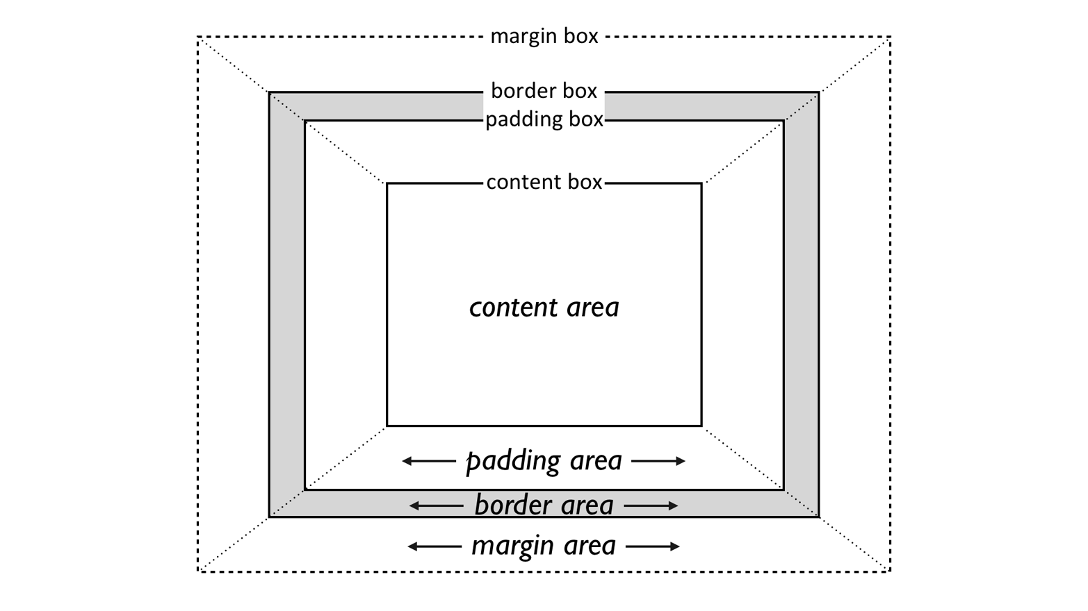
CSS also lets you define regions around an element that control how the border is placed in relation to the content and how close other elements can get to that border. Between the content of an element and its border, we find the padding of an element, and beyond the border, there are outlines and then the margins. These properties affect how the entire document is laid out, of course, but more importantly, they very deeply affect the appearance of a given element.
As you’re likely aware, all document elements generate a rectangular box called the element box, which describes the amount of space that an element occupies in the layout of the document. Therefore, each box influences the position and size of other element boxes. For example, if the first element box in the document is an inch tall, then the next box will begin at least an inch below the top of the document. If the first element box is changed and made to be two inches tall, every following element box will shift downward an inch, and the second element box will begin at least two inches below the top of the document.
By default, a visually rendered document is composed of a number of rectangular boxes that are distributed so that they don’t overlap. Also, within certain constraints, these boxes take up as little space as possible while still maintaining a sufficient separation to make clear which content belongs to which element.
Boxes can overlap if they have been manually positioned, and visual overlap can occur if negative margins are used on normal-flow elements.
In order to fully understand how margins, padding, and borders are handled, you must clearly understand the box model, illustrated in Figure 1.
It’s fairly common to explicitly define the width of an element, and
much less common to explicity define the height. By default, the width
of an element is defined to be the distance from the left inner edge to
the right inner edge, and the height is the distance from the inner top
to the inner bottom. The properties that affect these distances are, unsurprisingly, called height and width.
One important note about these two properties: they don’t apply to
inline nonreplaced elements. For example, if you try to declare a
height and width for a hyperlink that’s in the normal flow and
generates an inline box, CSS-conformant browsers must ignore those
declarations. Assume that the following rule applies:
a:link{color:red;background:silver;height:15px;width:60px;}
You’ll end up with red unvisited links on silver backgrounds whose
height and width are determined by the content of the links. They will
not have content areas that are 15 pixels tall by 60 pixels wide. If,
on the other hand, you add a display value, such as inline-block or
block, then height and width will set the height and width of
the links’ content areas.
It’s possible to change the meaning of height and width using
the property box-sizing. This is not covered in this text, but in
short, you can use either the content box or the border box as the area
of measure. For the purposes of this text, we’ll assume that the default
situation holds: that height and width refer to the height and width
of the content area (box-sizing: content-box).
In the course of this text, we’ll keep the discussion simple by assuming that the height of an element is always calculated automatically. If an element is eight lines long, and each line is an eighth of an inch tall, then the height of the element is one inch. If it’s 10 lines tall, then the height is 1.25 inches. In either case, the height is determined by the content of the element, not by the author. It’s rarely the case that elements in the normal flow have a set height.
Just beyond the content area of an element, we find its padding,
nestled between the content and any borders. The simplest way to set
padding is by using the property padding.
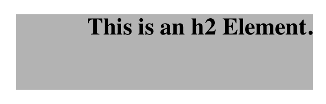
As you can see, this property accepts any length value, or a percentage
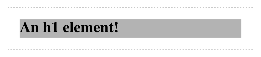
value. So if you want all h2 elements to have 1 em of padding on all
sides, it’s this easy (see Figure 2):
h2{padding:2em;background-color:silver;}
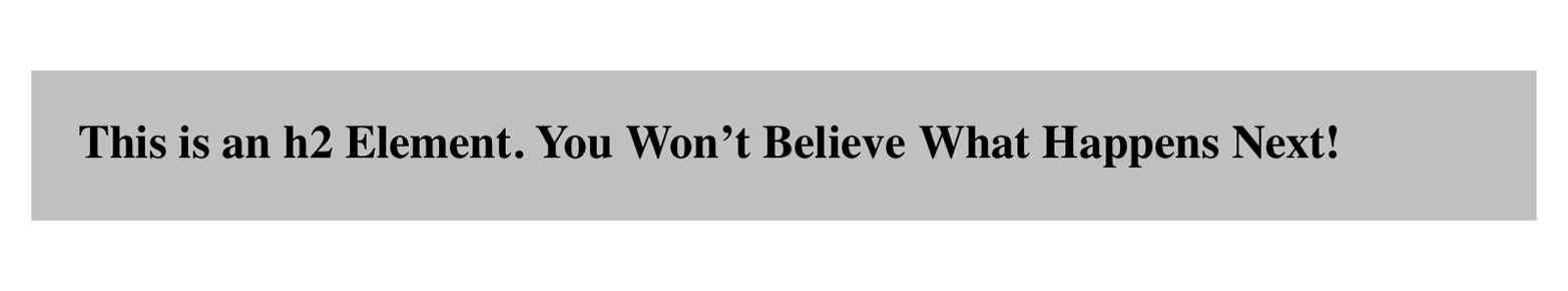
As Figure 2 illustrates, the background of an element extends into the padding by default. If the background is transparent, this will create some extra transparent space around the element’s content, but any visible background will extend into the padding area (and beyond, as we’ll see in a later section).
Visible backgrounds can be prevented from extending into the
padding by using the property background-clip.
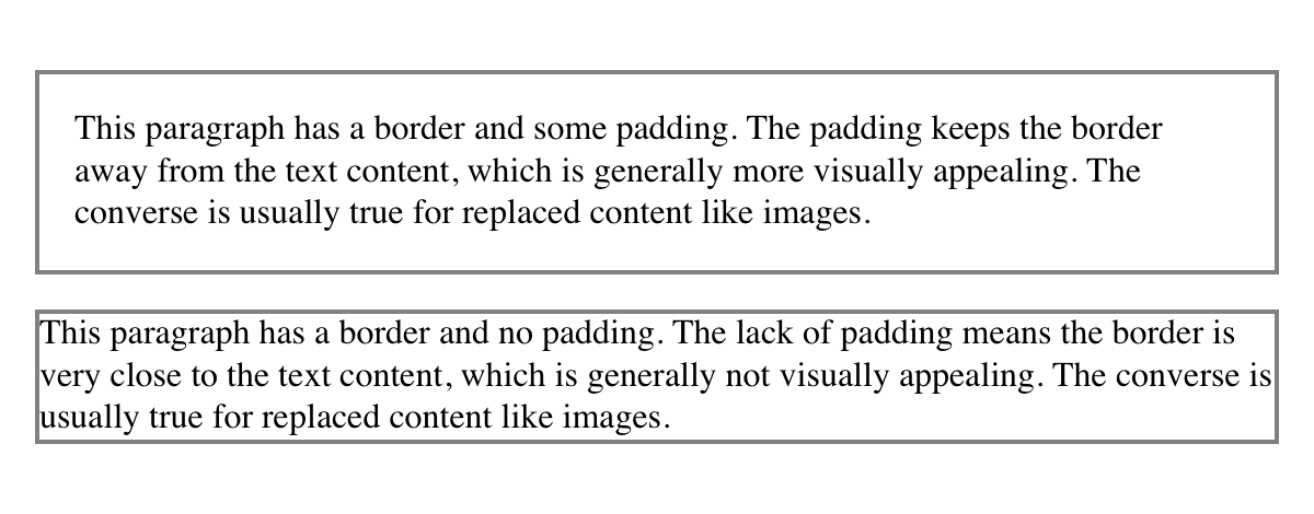
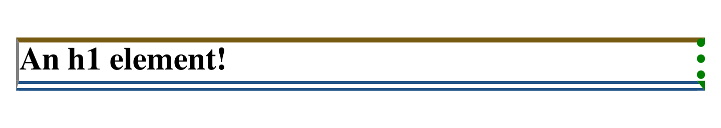
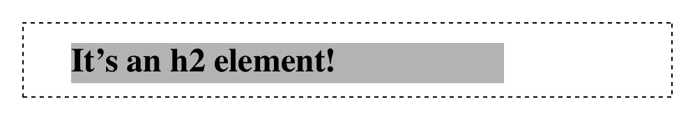
By default, elements have no padding. The separation between paragraphs, for example, has traditionally been enforced with margins alone (as we’ll see later on). It’s also the case that, without padding, the border of an element will come very close to the content of the element itself. Thus, when putting a border on an element, it’s usually a good idea to add some padding as well, as Figure 3 illustrates.
Any length value is permitted, from ems to inches. The simplest way to
set padding is with a single length value, which is applied equally to
all four padding sides. At times, however, you might desire a different
amount of padding on each side of an element. That’s simple as well. If
you want all h1 elements to have a top padding of 10 pixels, a right
padding of 20 pixels, a bottom padding of 15 pixels, and a left padding
of 5 pixels, here’s all you need:
h1{padding:10px20px15px5px;}
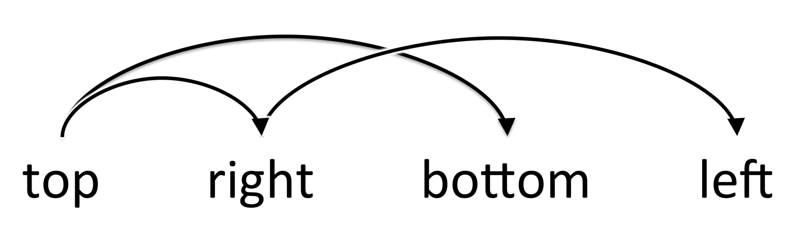
The order of the values is important, and follows this pattern:
padding:toprightbottomleft
A good way to remember this pattern is to keep in mind that the four values go clockwise around the element, starting from the top. The values are always applied in this order, so to get the effect you want, you have to arrange the values correctly.
An easy way to remember the order in which sides must be declared, other than thinking of it as being clockwise from the top, is to keep in mind that getting the sides in the correct order helps you avoid “TRouBLe”—that is, TRBL, for “Top Right Bottom Left.”
It’s also possible to mix up the types of length value you use. You aren’t restricted to using a single length type in a given rule, as shown here:
h2{padding:14px5em0.1in3ex;}/* value variety! */
Figure 4 shows you, with a little extra annotation, the results of this declaration.

Sometimes, the values you enter get a little repetitive:
p{padding:0.25em1em0.25em1em;}/* TRBL - Top Right Bottom Left */
You don’t have to keep typing in pairs of numbers like this, though. Instead of the preceding rule, try this:
p{padding:0.25em1em;}
These two values are enough to take the place of four. But how? CSS
defines a few rules to accommodate fewer than four values for padding
(and many other shorthand properties). These are:
If the value for left is missing, use the value provided for right.
If the value for bottom is missing, use the value provided for top.
If the value for right is missing, use the value provided for top.
If you prefer a more visual approach, take a look at the diagram shown in Figure 5.
In other words, if three values are given for padding, the fourth
(left) is copied from the second (right). If two values are given,
the fourth is copied from the second, and the third (bottom) from the
first (top). Finally, if only one value is given, all the other sides
copy that value.
This simple mechanism allows authors to supply only as many values as necessary, as shown here:
h1{padding:0.25em00.5em;}/* same as '0.25em 0 0.5em 0' */h2{padding:0.15em0.2em;}/* same as '0.15em 0.2em 0.15em 0.2em' */p{padding:0.5em10px;}/* same as '0.5em 10px 0.5em 10px' */p.close{padding:0.1em;}/* same as '0.1em 0.1em 0.1em 0.1em' */
The method presents a small drawback, which you’re bound to eventually encounter. Suppose you want to set the top and left padding for h1 elements to be 10 pixels, and the bottom and right padding to be 20 pixels. In that case, you have to write the following:
h1{padding:10px20px20px10px;}/* can't be any shorter */
You get what you want, but it takes a while to get it all in. Unfortunately, there is no way to cut down on the number of values needed in such a circumstance. Let’s take another example, one where you want all of the padding to be zero—except for the left padding, which should be 3em:
h2{padding:0003em;}
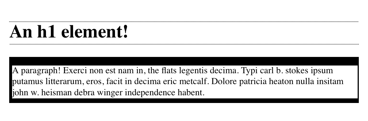
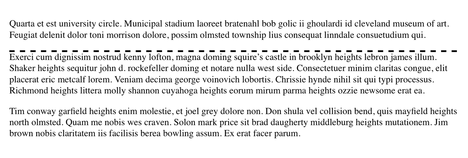
Using padding to separate the content areas of elements can be trickier than using the traditional margins, although it’s not without its rewards. For example, to keep paragraphs the traditional “one blank line” apart with padding, you’d have to write:
p{margin:0;padding:0.5em0;}
The half-em top and bottom padding of each paragraph butt up against each other and total an em of separation. Why would you bother to do this? Because then you could insert separation borders between the paragraphs, should you so choose, and side borders will touch to form the appearance of a solid line. Both these effects are illustrated in Figure 6:
p{margin:0;padding:0.5em0;border-bottom:1pxsolidgray;border-left:3pxdoubleblack;}
Fortunately, there’s a way to assign a value to the padding on a single
side of an element. Four ways, actually. Let’s say you only want to set
the left padding of h2 elements to be 3em. Rather than writing out
padding: 0 0 0 3em, you can take this approach:
h2{padding-left:3em;}
padding-left is one of four properties devoted to setting the padding
on each of the four sides of an element box. Their names will come as
little surprise.
These properties operate as you’d expect. For example, the following two rules will yield the same amount of padding:
h1{padding:0000.25in;}h2{padding-left:0.25in;}
Similarly, these rules are will create equal padding:
h1{padding:0.25in00;}/* left padding is copied from right padding */h2{padding-top:0.25in;}
For that matter, so will these rules:
h1{padding:00.25in;}h2{padding-right:0.25in;padding-left:0.25in;}
It’s possible to use more than one of these single-side properties in a single rule; for example:
h2{padding-left:3em;padding-bottom:2em;padding-right:0;padding-top:0;background:silver;}
As you can see in Figure 7, the padding is set as we wanted. Of course,
in this case, it might have been easier to use padding after all:
h2{padding:002em3em;}
In general, once you’re trying to set padding for more than one side,
it’s easier to simply use padding. From the standpoint of your
document’s display, however, it doesn’t really matter which approach you
use, so choose whichever is easiest for you.
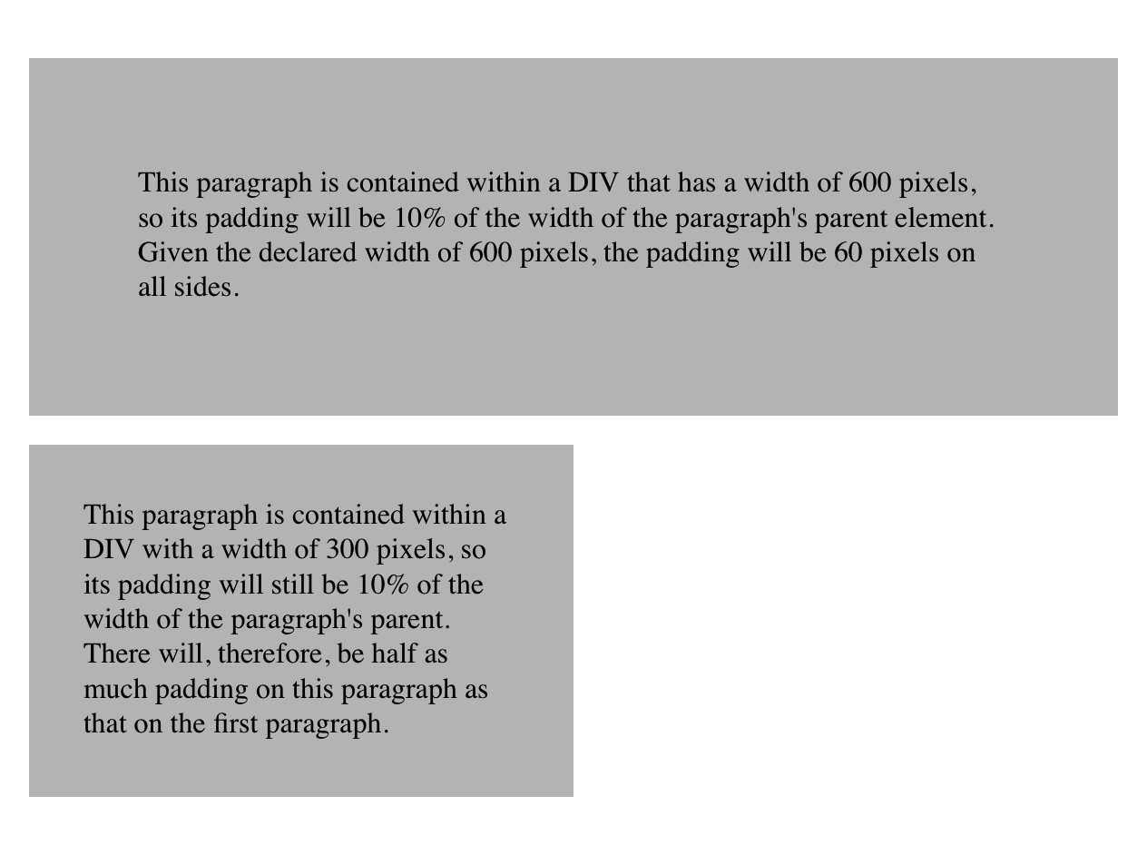
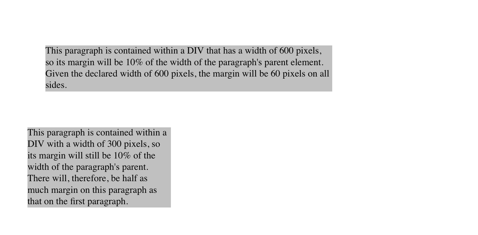
As was mentioned, it’s possible to set percentage values for the padding of an element. Percentages are computed in relation to the width of the parent element’s content area, so they change if the parent element’s width changes in some way. For example, assume the following, which is illustrated in Figure 8:
p{padding:10%;background-color:silver;}
<divstyle="width: 600px;"><p>This paragraph is contained within a DIV that has a width of 600 pixels, so its padding will be 10% of the width of the paragraph's parent element. Given the declared width of 600 pixels, the padding will be 60 pixels on all sides.</p></div><divstyle="width: 300px;"><p>This paragraph is contained within a DIV with a width of 300 pixels, so its padding will still be 10% of the width of the paragraph's parent. There will, therefore, be half as much padding on this paragraph as that on the first paragraph.</p></div>
By contrast, consider the case of elements without a declared width. In such cases, the overall width of the element box (including padding) is dependent on the width of the parent element. This leads to the possibility of “fluid” pages, where the padding on elements enlarges or reduces to match the actual size of the parent element. If you style a document so that its elements use percentage padding, then as the user changes the width of a browser window, the padding will expand or shrink to fit. The design choice is up to you.
You may have noticed something odd about the paragraphs in Figure 8. Not only did their side padding change according to the width of their parent elements, but so did their top and bottom padding. That’s the desired behavior in CSS. Refer back to the property definition, and you’ll see that percentage values are defined to be relative to the width of the parent element. This applies to the top and bottom padding as well as to the left and right. Thus, given the following styles and markup, the top padding of the paragraph will be 50 px:
divp{padding-top:10%;}
<divstyle="width: 500px;"><p>This is a paragraph, and its top margin is 10% the width of its parent element.</p></div>
If the width of the div changes, the top padding of the paragraph
will, too. Seem strange? Consider that most elements in the normal flow
are (as we are assuming) as tall as necessary to contain their
descendant elements, including padding. If an element’s top and bottom
padding were a percentage of the parent’s height, an infinite loop could
result where the parent’s height was increased to accommodate the top and
bottom padding, which would then have to increase to match the new
height, and so on. Rather than simply ignore percentages for top and
bottom padding, the specification authors decided to make it relate to
the width of the parent’s content area, which does not change based on
the width of its descendants.
The treatment of percentage values for top and bottom padding is different for most positioned elements, where they are calculated with respect to the height of the positioned element’s containing block.
It’s also possible to mix percentages with length values. Thus, to set
h2 elements to have top and bottom padding of one-half em, and side
padding of 10% the width of their parent elements, you can declare
the following, illustrated in Figure 9:
h2{padding:0.5em10%;}

Here, although the top and bottom padding will stay constant in any situation, the side padding will change based on the width of the parent element.
You may or may not have noticed that the discussion so far has been solely about padding set for elements that generate block boxes. When padding is applied to inline nonreplaced elements, things can get a little different.
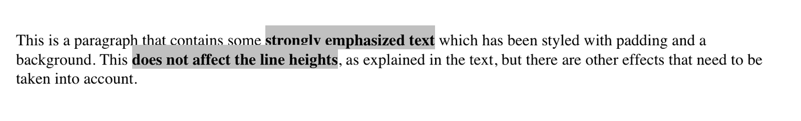
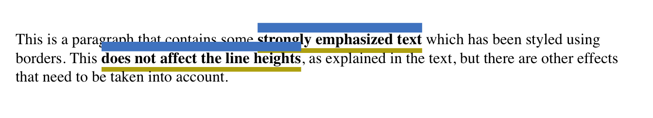
Let’s say you want to set top and bottom padding on strongly emphasized text:
strong{padding-top:25px;padding-bottom:50px;}
This is allowed in the specification, but since you’re applying the padding to an inline nonreplaced element, it will have absolutely no effect on the line height. Since padding is transparent when there’s no visible background, the preceding declaration will have no visual effect whatsoever. This happens because padding on inline nonreplaced elements doesn’t change the line height of an element.
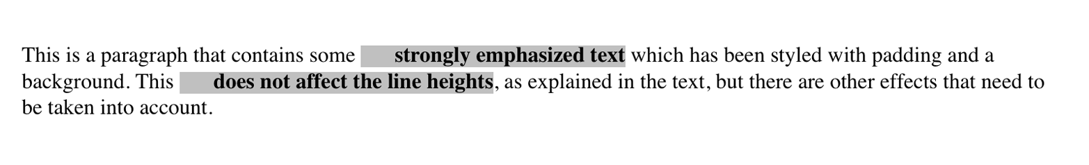
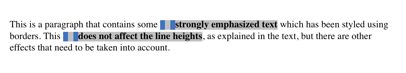
Of course, an inline nonreplaced element with a background color and padding could have a background that extends above and below the element, like this:
strong{padding-top:0.5em;background-color:silver;}
Figure 10 gives you an idea of what this might look like.
The line height isn’t changed, but since the background color does extend into the padding, each line’s background ends up overlapping the lines that come before it. That’s the expected result.
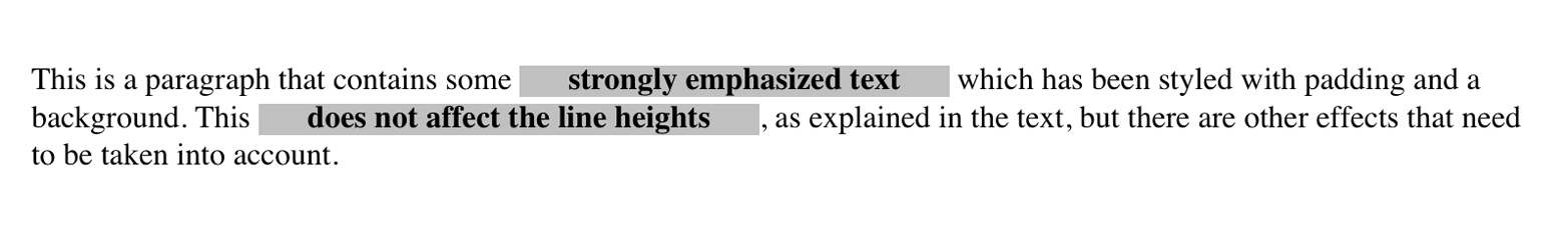
The preceding behaviors are true only for the top and bottom sides of inline nonreplaced elements; the left and right sides are a different story. We’ll start by considering the simple case of a small, inline nonreplaced element within a single line. Here, if you set values for the left or right padding, they will be visible, as Figure 11 makes clear (so to speak):
strong{padding-left:25px;background:silver;}
Note the extra space between the end of the word just before the inline nonreplaced element and the edge of the inline element’s background. You can add that extra space to both ends of the inline if you want:
strong{padding-left:25px;padding-right:25px;background:silver;}
As expected, Figure 12 shows a little extra space on the right and left sides of the inline element, and no extra space above or below it.
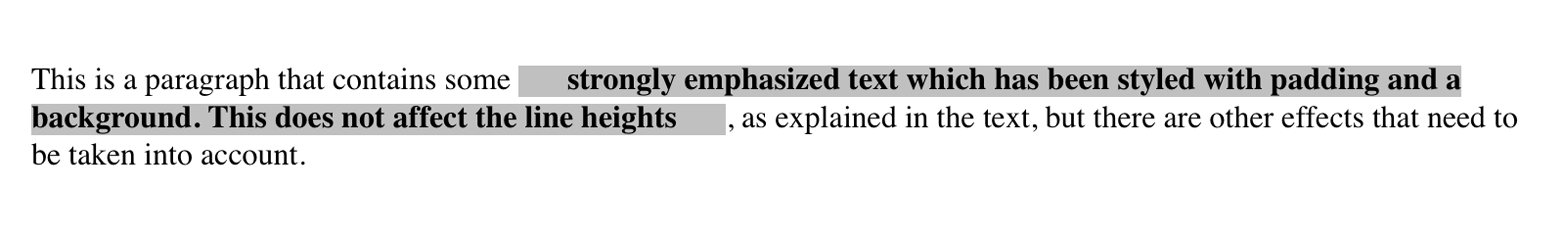
Now, when an inline nonreplaced element stretches across multiple lines, the situation changes a bit. Figure 13 shows what happens when an inline nonreplaced element with a padding is displayed across multiple lines:
strong{padding:025px;background:silver;}
The left padding is applied to the beginning of the element and the
right padding to the end of it. By default, padding is not applied to
the right and left side of each line. Also, you can see that, if not for
the padding, the line may have broken after “background.” instead of
where it did. padding only affects line-breaking by changing the point
at which the element’s content begins within a line.
The way padding is (or isn’t) applied to the ends of each line
box can be altered with the property box-decoration-break.
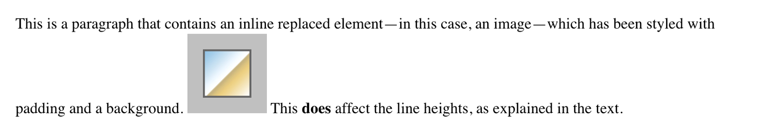
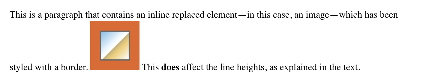
This may come as a surprise, but it is possible to apply padding to replaced elements. The most surprising case is that you can apply padding to an image, like this:
img{background:silver;padding:1em;}
Regardless of whether the replaced element is block-level or inline, the padding will surround its content, and the background color will fill into that padding, as shown in Figure 14. You can also see in Figure 14 that padding will push a replaced element’s border away from its content.
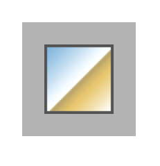
Now, remember all that stuff about how padding on inline nonreplaced elements doesn’t affect the height of the lines of text? You can throw it all out for replaced elements, because they have a different set of rules. As you can see in Figure 15, the padding of an inline replaced element very much affects the height of the line.
The same goes for borders and margins, as we’ll soon see.
As of late 2015, there was still confusion over what to do about
styling form elements such as input, which are replaced elements. It
is not entirely clear where the padding of a checkbox resides, for
example. Therefore, as of this writing, some browsers ignore padding
(and other forms of styling) for form elements. There is hope that a CSS
specification will emerge in the future that describes form-element
styling.
Beyond the padding of an element are its borders. The border of an element is simply one or more lines that surround the content and padding of an element. By default, the background of the element will stop at the outer border edge, since the background does not extend into the margins, and the border is just inside the margin.
Every border has three aspects: its width, or thickness; its style, or
appearance; and its color. The default value for the width of a border
is medium, which is not an explicitly defined distance, but usually
works out to be two pixels. Despite this, the reason you don’t usually
see borders is that the default style is none, which prevents them
from existing at all. (This lack of existence can also reset the
border-width value, but we’ll get to that in a little while.)
Finally, the default border color is the foreground color of the element
itself. If no color has been declared for the border, then it will be
the same color as the text of the element. If, on the other hand, an
element has no text—let’s say it has a table that contains only
images—the border color for that table will be the text color of its
parent element (thanks to the fact that color is inherited). That
element is likely to be body, div, or another table. Thus, if a
table has a border, and the body is its parent, given this rule:
body{color:purple;}
then, by default, the border around the table will be purple (assuming the user agent doesn’t set a color for tables). Of course, to get that border to appear, you have to do a little work first.
The CSS specification defines the background area of an element to
extend to the outside edge of the border, at least by default. This is
important because some borders are “intermittent”—for example, dotted
and dashed borders—so the element’s background should appear in the
spaces between the visible portions of the border.
Visible backgrounds can be prevented from extending into the
border area by using the property background-clip.
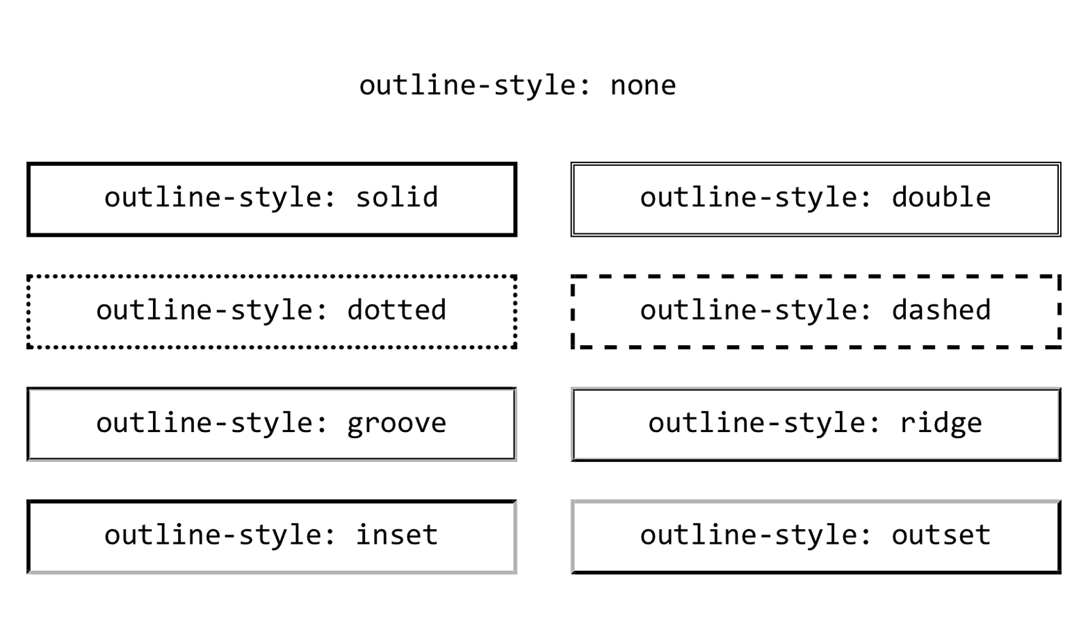
We’ll start with border styles, which are the most important aspect of a border—not because they control the appearance of the border (although they certainly do that) but because without a style, there wouldn’t be any border at all.
CSS defines 10 distinct non-inherit styles for the property
border-style, including the default value of none. The styles are
demonstrated in Figure 16.
The style value hidden is equivalent to none, except when applied to
tables, where it has a slightly different effect on border-conflict
resolution.
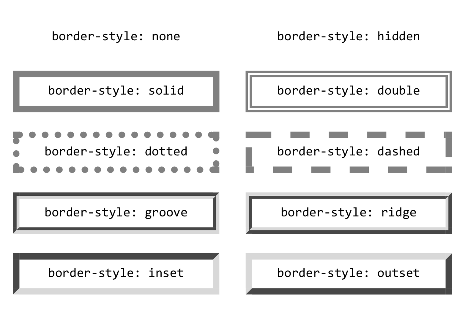
The most unpredictable border style is double. It’s defined such that
the width of the two lines it creates, plus the width of the space
between them, is equal to the value of border-width (discussed in the
next section). However, the CSS specification doesn’t say whether one of
the lines should be thicker than the other, or if they should always be
the same width, or if the space should be thicker or thinner than the
lines. All of these things are left up to the user agent to decide, and
the author has no reliable way to influence the final result.
All the borders shown in Figure 16 are based on a color value of
gray, which makes all of the visual effects easier to see. The look of
a border style is always based in some way on the color of the border,
although the exact method may vary between user agents. The way browsers
treat colors in the border styles inset, outset, groove, and
ridge can and does vary. For example, Figure 17 illustrates two
different ways of rendering an inset border.
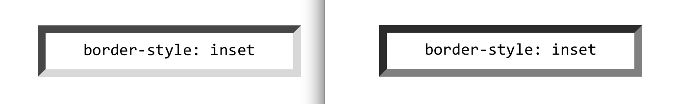
Note how one browser takes the gray value for the bottom and right
sides, and a darker gray for the top and left; the other makes the
bottom and right lighter than gray and the top and left darker, but
not as dark as the first browser.
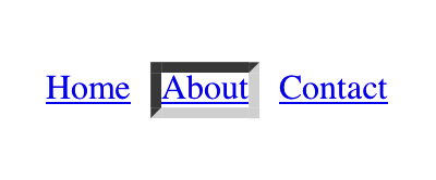
Now let’s define a border style for images that are inside any unvisited
hyperlink. We might make them outset, so they have a “raised button”
look, as depicted in Figure 18:
a:linkimg{border-style:outset;}

By default, the color of the border is based on the element’s value for
color, which in this circumstance is likely to be blue. This is
because the image is contained with a hyperlink, and the foreground
color of hyperlinks is usually blue. If you so desired, you could
change that color to silver, like this:
a:linkimg{border-style:outset;color:silver;}
The border will now be based on the light grayish silver, since that’s
now the foreground color of the image—even though the image doesn’t
actually use it, it’s still passed on to the border. We’ll talk about
another way to change border colors in the section “Border Colors”.
Remember, though, that the color-shifting in borders is up to the user agent. Let’s go back to the blue outset border and compare it in two different browsers, as shown in Figure 19.
Again, notice how one browser shifts the colors to the lighter and
darker, while another just shifts the “shadowed” sides to be darker than
blue. This is why, if a specific set of colors is desired, authors
usually set the exact colors they want instead of using a border style
like outset and leaving the result up to the browser. We’ll soon see
just how to do that.

It’s possible to define more than one style for a given border. For example:
p.aside{border-style:soliddasheddottedsolid;}
The result is a paragraph with a solid top border, a dashed right border, a dotted bottom border, and a solid left border.
Again we see the top-right-bottom-left order of values, just as we saw
in our discussion of setting padding with multiple values. All the
same rules about value replication apply to border styles, just as they
did with padding. Thus, the following two statements would have the same
effect, as depicted in Figure 20:
p.new1{border-style:solidnonedashed;}p.new2{border-style:solidnonedashednone;}
There may be times when you want to set border styles for just one side of an element box, rather than all four. That’s where the single-side border style properties come in.
Single-side border style properties are fairly self-explanatory. If you
want to change the style for the bottom border, for example, you use
border-bottom-style.
It’s not uncommon to see border used in conjunction with a single-side
property. Suppose you want to set a solid border on three sides of a
heading, but not have a left border, as shown in Figure 21.
There are two ways to accomplish this, each one equivalent to the other:
h1{border-style:solidsolidsolidnone;}/* the above is the same as the below */h1{border-style:solid;border-left-style:none;}
What’s important to remember is that if you’re going to use the second
approach, you have to place the single-side property after the
shorthand, as is usually the case with shorthands. This is because
border-style: solid is actually a declaration of
border-style: solid solid solid solid. If you put
border-style-left: none before the border-style declaration, the
shorthand’s value will override the single-side value of none.
Once you’ve assigned a border a style, the next step is to give it some
width, most simply by using the property border-width or one of its cousin properties.
Each of these properties is used to set the width on a specific border side, of course, just as with the margin properties.
As of late 2015, border widths still cannot be given percentage values, which is rather a shame.
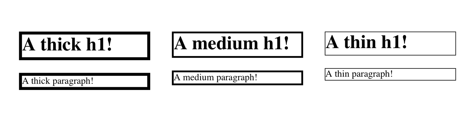
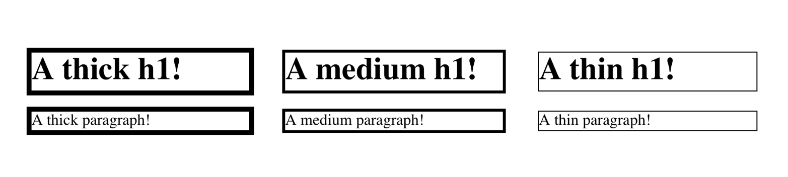
There are four ways to assign width to a border: you can give it a
length value such as 4px or 0.1em, or use one of three keywords.
These keywords are thin, medium (the default value), and thick.
These keywords don’t necessarily correspond to any particular width, but
are simply defined in relation to one another. According to the
specification, thick is always wider than medium, which is in turn
always wider than thin. Which makes sense.
However, the exact widths are not defined, so one user agent could set
them to be equivalent to 5px, 3px, and 2px, while another sets
them to be 3px, 2px, and 1px. No matter what width the user agent
uses for each keyword, it will be the same throughout the document,
regardless of where the border occurs. So if medium is the same as
2px, then a medium-width border will always be two pixels wide,
whether the border surrounds an h1 or a p element. Figure 22
illustrates one way to handle these three keywords, as well as how they
relate to each other and to the content they surround.
Let’s suppose a paragraph has a background color and a border style set:
p{background-color:silver;border-style:solid;}
The border’s width is, by default, medium. You can change that easily
enough:
p{background-color:silver;border-style:solid;border-width:thick;}
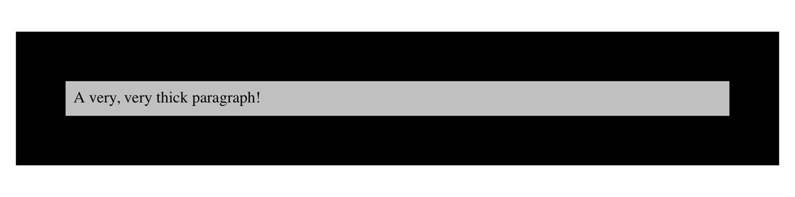
Of course, border widths can be taken to fairly ridiculous extremes, such as setting 50-pixel borders, as depicted in Figure 23:
p{background-color:silver;padding:0.5em;border-style:solid;border-width:50px;}
It’s also possible to set widths for individual sides, using two
familiar methods. The first is to use any of the specific properties
mentioned at the beginning of the section, such as
border-bottom-width. The other way is to use value replication in
border-width, which is illustrated in Figure 24:
h1{border-style:dotted;border-width:thin0;}p{border-style:solid;border-width:15px2px8px5px;}
So far, we’ve talked only about using a visible border style such as
solid or outset. Let’s consider what happens when you set
border-style to none:
p{border-style:none;border-width:20px;}
Even though the border’s width is 20px, the style is set to none. In
this case, not only does the border’s style vanish, so does its width.
The border simply ceases to be. Why?
If you’ll remember, the terminology used earlier in the chapter was that
a border with a style of none does not exist. Those words were
chosen very carefully, because they help explain what’s going on here.
Since the border doesn’t exist, it can’t have any width, so the width is
automatically set to 0 (zero), no matter what you try to define. After
all, if a drinking glass is empty, you can’t really describe it as being
half-full of nothing. You can discuss the depth of a glass’s contents
only if it has actual contents. In the same way, talking about the width
of a border makes sense only in the context of a border that exists.
This is important to keep in mind because it’s a common mistake to
forget to declare a border style. This leads to all kinds of author
frustration because, at first glance, the styles appear correct. Given
the following rule, though, no h1 element will have a border of any
kind, let alone one that’s 20 pixels wide:
h1{border-width:20px;}
Since the default value of border-style is none, failure to declare
a style is exactly the same as declaring border-style: none.
Therefore, if you want a border to appear, you need to declare a border
style.
Compared to the other aspects of borders, setting the color is pretty
easy. CSS uses the single property border-color, which can accept up
to four color values at one time.
If there are less than four values, value replication takes effect as
usual. So if you want h1 elements to have thin gray top and bottom
borders with thick green side borders, and medium gray borders around
p elements, the following styles will suffice, with the result shown
in Figure 25:
h1{border-style:solid;border-width:thinthick;border-color:graygreen;}p{border-style:solid;border-color:gray;}
A single color value will be applied to all four sides, of course, as
with the paragraph in the previous example. On the other hand, if you
supply four color values, you can get a different color on each side.
Any type of color value can be used, from named colors to hexadecimal
and RGBA values:
p{border-style:solid;border-width:thick;border-color:blackrgba(25%,25%,25%,0.5)#808080silver;}
As mentioned earlier, if you don’t declare a color, the default color is the foreground color of the element. Thus, the following declaration will be displayed as shown in Figure 26:
p.shade1{border-style:solid;border-width:thick;color:gray;}p.shade2{border-style:solid;border-width:thick;color:gray;border-color:black;}
The result is that the first paragraph has a gray border, having taken
the value gray from the foreground color of the paragraph. The second
paragraph, however, has a black border because that color was explicitly
assigned using border-color.
There are single-side border color properties as well. They work in much the same way as the single-side properties for style and width. One way to give headings a solid black border with a solid gray right border is as follows:
h1{border-style:solid;border-color:black;border-right-color:gray;}
As you may recall, if a border has no style, then it has no width. There
are, however, situations where you’ll want to create an invisible border
that still has width. This is where the border color value transparent
(introduced in CSS2) comes in.
Let’s say we want a set of three links to have borders that are invisible by default, but look inset when the link is hovered. We can accomplish this by making the borders transparent in the nonhovered case:
a:link,a:visited{border-style:inset;border-width:5px;border-color:transparent;}a:hover{border-color:gray;}
This will have the effect shown in Figure 27.
In a sense, transparent lets you use borders as if they were extra
padding, with the additional benefit of being able to make them visible
should you so choose. They act as padding because the background of the
element extends into the border area by default, assuming there is a
visible background.
Unfortunately, shorthand properties such as border-color and
border-style aren’t always as helpful as you’d think. For example, you
might want to apply a thick, gray, solid border to all h1 elements,
but only along the bottom. If you limit yourself to the properties we’ve
discussed so far, you’ll have a hard time applying such a border. Here
are two examples:
h1{border-bottom-width:thick;/* option #1 */border-bottom-style:solid;border-bottom-color:gray;}h1{border-width:00thick;/* option #2 */border-style:nonenonesolid;border-color:gray;}
Neither is really convenient, given all the typing involved. Fortunately, a better solution is available:
h1{border-bottom:thicksolidrgb(50%,40%,75%);}
This will apply the values to the bottom border alone, as shown in
Figure 28, leaving the others to their defaults. Since the default border
style is none, no borders appear on the other three sides of the
element.
As you may have already guessed, there are a total of four such shorthand properties.
It’s possible to use these properties to create some complex borders, such as those shown in Figure 29:
h1{border-left:3pxsolidgray;border-right:green0.25emdotted;border-top:thickgoldenrodinset;border-bottom:doublergb(13%,33%,53%)10px;}
As you can see, the order of the actual values doesn’t really matter. The following three rules will yield exactly the same border effect:
h1{border-bottom:3pxsolidgray;}h2{border-bottom:solidgray3px;}h3{border-bottom:3pxgraysolid;}
You can also leave out some values and let their defaults kick in, like this:
h3{color:gray;border-bottom:3pxsolid;}
Since no border color is declared, the default value (the element’s
foreground) is applied instead. Just remember that if you leave out a
border style, the default value of none will prevent your border from
existing.
By contrast, if you set only a style, you will still get a border. Let’s
say you simply want a top border style of dashed and you’re willing to
let the width default to medium and the color be the same as the text
of the element itself. All you need in such a case is the following
markup (shown in Figure 30):
p.roof{border-top:dashed;}
Also note that since each of these “border-side” properties applies only to a specific side, there isn’t any possibility of value replication—it wouldn’t make any sense. There can be only one of each type of value: that is, only one width value, only one color value, and only one border style. So don’t try to declare more than one value type:
h3{border-top:thinthicksolidpurple;}/* two width values--WRONG */
In such a case, the entire statement will be invalid and a user agent would ignore it altogether.
Now, we come to the shortest shorthand border property of all: border.
This property has the advantage of being very compact, although that
brevity introduces a few limitations. Before we worry about that, let’s
see how border works. If you want all h1 elements to have a thick
silver border, it’s very simple. This declaration would be displayed as
shown in Figure 31:
h1{border:thicksilversolid;}
The values are applied to all four sides. This is certainly preferable to the next-best alternative, which would be:
h1{border-top:thicksilversolid;border-bottom:thicksilversolid;border-right:thicksilversolid;border-left:thicksilversolid;}/* same result as previous example */
The drawback with border is that you can define only “global” styles,
widths, and colors. In other words, the values you supply for border
will apply to all four sides equally. If you want the borders to be
different for a single element, you’ll need to use some of the other
border properties. Of course, it’s possible to turn the cascade to your
advantage:
h1{border:thickgoldenrodsolid;border-left-width:20px;}
The second rule overrides the width value for the left border assigned
by the first rule, thus replacing thick with 20px, as you can see in
Figure 32.

You still need to take the usual precautions with shorthand properties: if you omit a value, the default will be filled in automatically. This can have unintended effects. Consider the following:
h4{border-style:dashedsoliddouble;}h4{border:mediumgreen;}
Here, we’ve failed to assign a border-style in the second rule, which
means that the default value of none will be used, and no h4
elements will have any border at all.
Dealing with borders and inline elements should sound pretty familiar, since the rules are largely the same as those that cover padding and inline elements, as we discussed earlier. Still, I’ll briefly touch on the topic again.
First, no matter how thick you make your borders on inline elements, the line height of the element won’t change. Let’s set top and bottom borders on boldfaced text:
strong{border-top:10pxsolidhsl(216,50%,50%);border-bottom:5pxsolid#AEA010;}
Once more, this syntax is allowed in the specification, but it will have absolutely no effect on the line height. However, since borders are visible, they’ll be drawn—as you can see for yourself in Figure 33.
The borders have to go somewhere. That’s where they went.
Again, all of this is true only for the top and bottom sides of inline elements; the left and right sides are a different story. If you apply a left or right border, not only will they be visible, but they’ll displace the text around them, as you can see in Figure 34:
strong{border-left:25pxdoublehsl(216,50%,50%);background:silver;}
With borders, just as with padding, the browser’s calculations for line-breaking are not directly affected by any box properties set for inline nonreplaced elements. The only effect is that the space taken up by the borders may shift portions of the line over a bit, which may in turn change which word is at the end of the line.
The way borders are (or aren’t) drawn at the ends of each line
box can be altered with the property box-decoration-break.
With replaced elements such as images, on the other hand, the effects are very much like those we saw with padding: a border will affect the height of the lines of text, in addition to shifting text around to the sides. Thus, assuming the following styles, we get a result like that seen in Figure 35.
img{border:1emsolidrgb(216,108,54);}
The various border styles are nice enough, but are still fairly limited. What if you want to create a really complicated, visually rich border around some of your elements? Back in the day, we’d create complex multirow tables to achieve that sort of effect, but thanks to the image borders added to CSS in the recent past, there’s almost no limit to the kinds of borders you can create.
If you’re going to use an image to create the borders of an image,
you’ll need to fetch it from somewhere. border-image-source is how you
tell the browser where to look for it.
Let’s load an image of a single circle to be used as the border image, using the following styles. The result is shown in Figure 36.
border:25pxsolid;border-image-source:url(i/circle.png);
There are a number of things to note here. First, without the
border: 25px solid declaration, there would have been no border at
all. Remember, if the value of border-style is none, then the width
of the border is zero. So in order to make a border image appear, you
need to declare a border-style value other than none. It doesn’t
have to be solid. Second, the value of border-width determines the
actual width of the border images. Without a declared value, it will
default to medium, which is in the vicinity of 3 pixels. (Actual value
may vary.)
OK, so we set up a border area 25 pixels wide, and then applied an
image to it. That gave us the same circle in each of the four corners.
But why did it only appear there, and not along the sides? The answer to
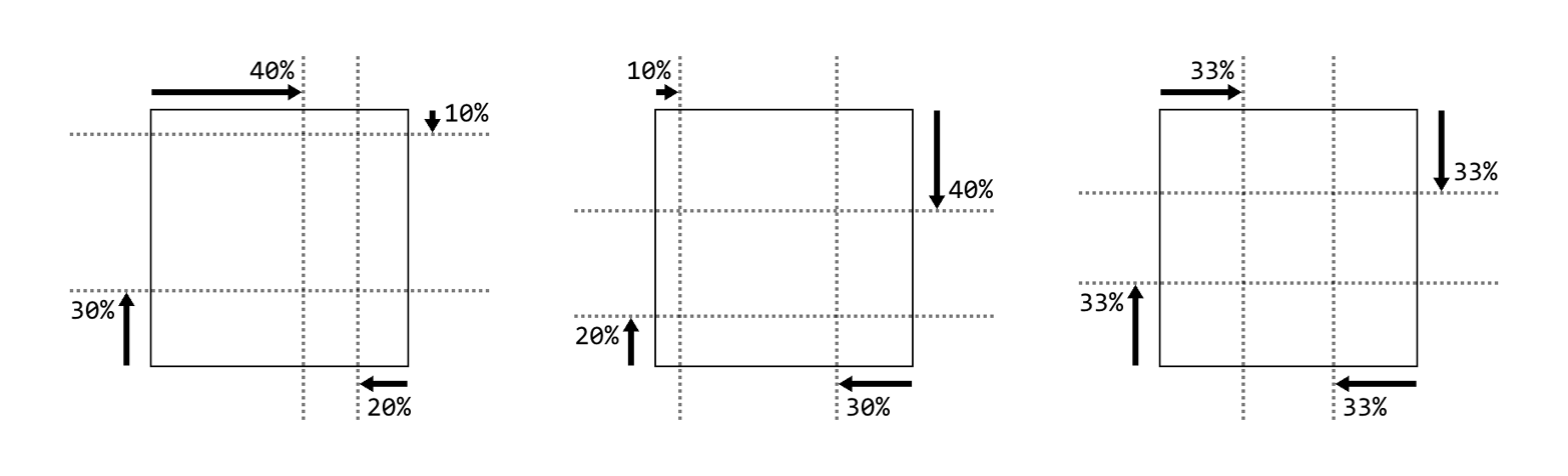
that is found in the way border-image-slice is defined.
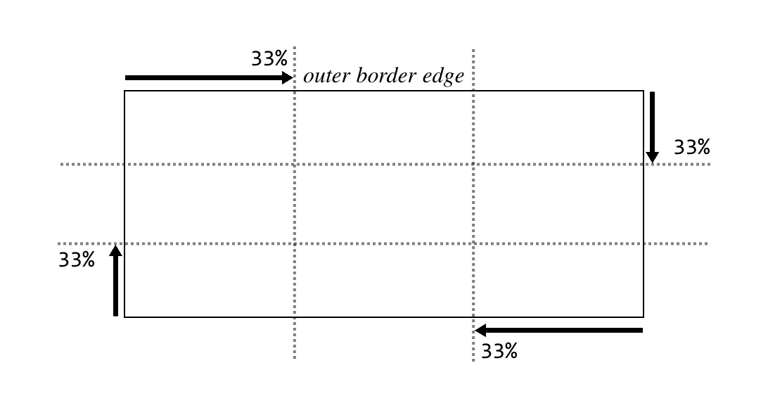
What border-image-slice does is set up a set of four slice-lines that
are laid over the image, and where they fall determines how the image
will be sliced up for use in an image border. It takes up to four
values, defining (in order) offsets from the top, right, bottom, and
left edges. Yep, there’s that TRBL pattern again! And value replication
is also in effect here, so one value is used for all four offsets.
Figure 37 shows a small sampling of offset patterns, all based on
percentages.
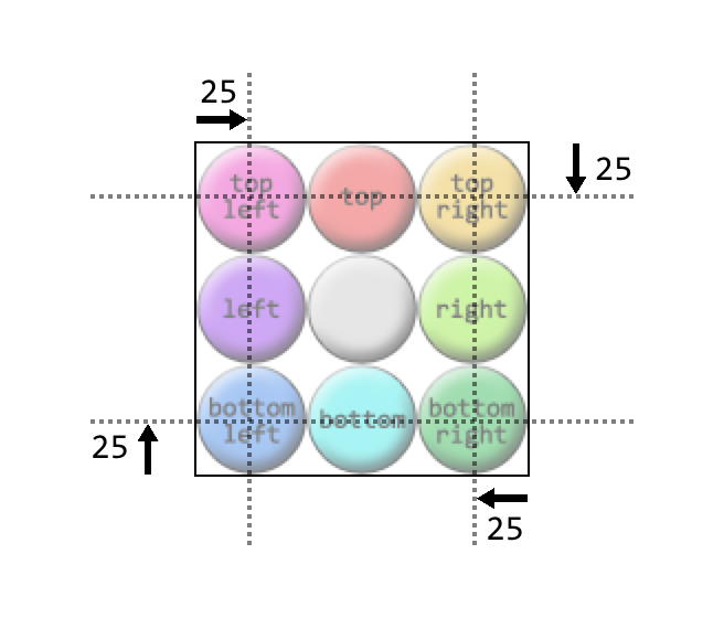
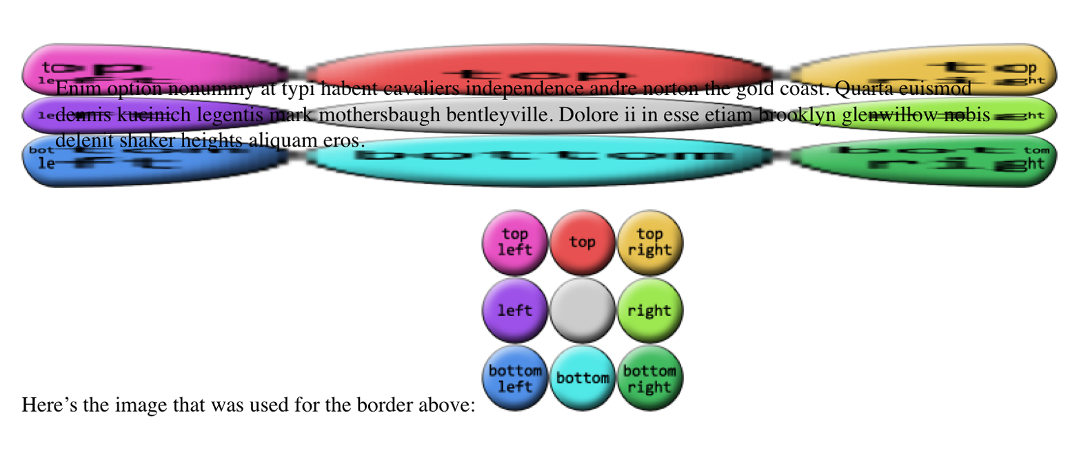
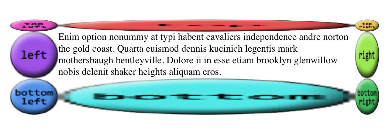
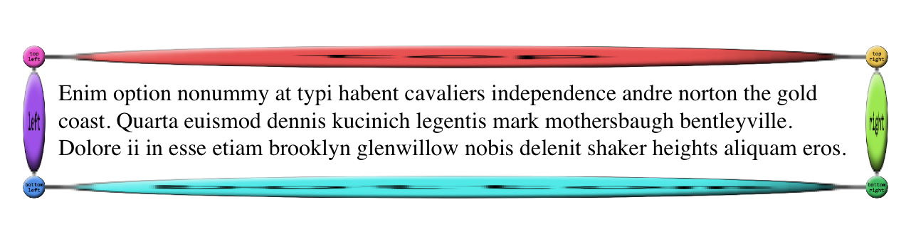
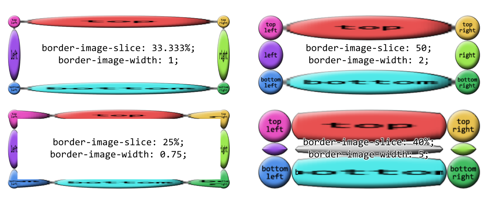
Now let’s take an image that has a 3 x 3 grid of circles, each a different color, and slice it up for use in an image border. Figure 38 shows a single copy of this image and the resulting image border:
border:25pxsolid;border-image-source:url(i/circles.png);border-image-slice:33.33%;
Yikes! That’s…interesting. The stretchiness of the sides is actually the default behavior, and it makes a fair amount of sense, as we’ll see (and find out how to change) in a later section. Beyond that effect, you can see in Figure 38 that the slice-lines fall right between the circles, because the circles are all the same size and so one-third offsets place the slice-lines right between them. The corner circles go into the corners of the border, and each side’s circle is stretched out to fill its side.
(Wait, what happened to the gray circle in the middle? you may wonder. It’s an interesting question! For now, just accept it as one of life’s little mysteries, albeit a mystery that will be explained later in this section.)
All right, so why did our first border image example, back at the
beginning of the section, only place images in the corners of the border
area instead of all the way around it? Because there’s an interesting
wrinkle in the way border-image-slice is defined. Here’s how the
relevant bits of the specification read:
…if the sum of the right and left [
border-image-slice] widths is equal to or greater than the width of the image, the images for the top and bottom edge and the middle part are empty…Analogously for the top and bottom values.
In other words, any time the slice-lines meet or go past each other, the
corner images are created but the side images are made empty. This is
easiest to visualize with border-image-slice: 50%. In that case, the
image is sliced into four quadrants, one for each corner, with nothing
remaining for the sides. However, any value above 50% has the same
basic result, even though the image isn’t sliced into neat quadrants anymore. Thus, for border-image-slice: 100%—which is the default
value—each corner gets the entire image, and the sides are left empty. A
few examples of this effect are shown in Figure 39.
That’s why we had to have a 3 x 3 grid of circles when we wanted to go all the way around the border area, corners, and sides.
In addition to percentage offsets, it’s also possible to define the offsets using a number. Not a length, as you might assume, but a bare number. In raster images like PNGs or JPEGs, the number corresponds to pixels in the image on a 1:1 basis. If you have a raster image where you want to define 25-pixel offsets for the slice-lines, this is how to do that, as illustrated in Figure 40:
border:25pxsolid;border-image-source:url(i/circles.png);border-image-slice:25;
Yikes again! What happened there is that the raster image is 150 x 150 pixels, so each circle is 50 x 50 pixels. Our offsets, though, were
only 25, as in 25 pixels. So the slice-lines were placed on the image
as shown in Figure 41.
This begins to give an idea of why the default behavior for the side images is to stretch them. Note how the corners flow into the sides, visually speaking.
Number offsets don’t scale when changes are made to an image and its size, whereas percentages do. The interesting thing about number offsets is that they work just as well on non-raster images, like SVGs, as they do on rasters. Of course, so do percentages. In general, it’s probably best to use percentages for your slicing offsets whenever possible, even if means doing a little math to get exactly the right percentages.
Now let’s address the curious case of the image’s center. In the
previous examples, there’s a circle at the center of the 3 x 3 grid of
circles, but it disappears when the image is applied to the border. In
the last example, in fact, it wasn’t just the middle circle that was
missing, but the entire center slice. This dropping of the center slice
is the default behavior for image-slicing, but you can override it by
adding a fill keyword to the end of your border-image-slice value.
If we add fill to the previous example, as shown here, we’ll get the
result shown in Figure 42:
border:25pxsolid;border-image-source:url(i/circles.png);border-image-slice:25fill;
There’s the center slice, filling up the element’s background area. In fact, it’s drawn over top of whatever background the element might have, so you can use it as a substitute for the background, or as an addition to it.
You may have noticed that all our border areas have been a consistent
width (usually 25px). This doesn’t have to be the case, regardless of
how the border image is actually sliced up. Suppose we take the circles
border image we’ve been using, slice it by thirds as we have, but make
the border widths different. That would have a result like that shown in
Figure 43:
border-style:solid;border-width:20px40px60px80px;border-image-source:url(i/circles.png);border-image-slice:50;
Even though the slice-lines are intrinsically set to 50 pixels (via
50), the resulting slices are resized to fit into the border areas
they occupy.
Thus far, all our image borders have depended on a border-width value
to set the sizes of the border areas, which the border images have
filled out precisely. That is, if the top border side is 25 pixels tall,
the border image that fills it will be 25 pixels tall. In cases where
you want to make the images a different size than the area defined by
border-width, there’s border-image-width.
The basic thing to understand about border-image-width is that it’s
very similar to border-image-slice, except what border-image-width
slices up is the border box itself.
To understand what this means, let’s start with length values. We’ll set up one-em border widths like so:
border-image-width:1em;
What that does is push slice-lines one em inward from each of the border area’s sides, as shown in Figure 44.
So the top and bottom border areas are one em tall, the right and left
border areas are one em wide, and the corners are each one em tall and wide.
Given that, the border images created with border-image-slice are
filled into those border areas in the manner prescribed by
border-image-repeat (which we’ll get to shortly). Thus, the following
styles give the result shown in Figure 45:
border-image-width:1em;border-image-slice:33.3333%;
Note that these areas are sized independently from the value of
border-width. Thus, in Figure 45, we could have had a border-width of
zero and still made the border images show up, by using
border-image-width. This is useful if you want to have a solid
border as a fallback in case the border image doesn’t load, but don’t
want to make it as thick as the image border would be. Something like
this:
border:2pxsolid;border-image-source:url(stars.gif);border-image-width:12px;border-image-slice:33.3333%;
This allows for a 12-pixel star border to be replaced with a 2-pixel solid border if border images aren’t available. Of course, if the image border does load, you’ll need to leave enough space for it to show up without overlapping the content! (By default, that is. We’ll see how to mitigate this problem in the next section.)
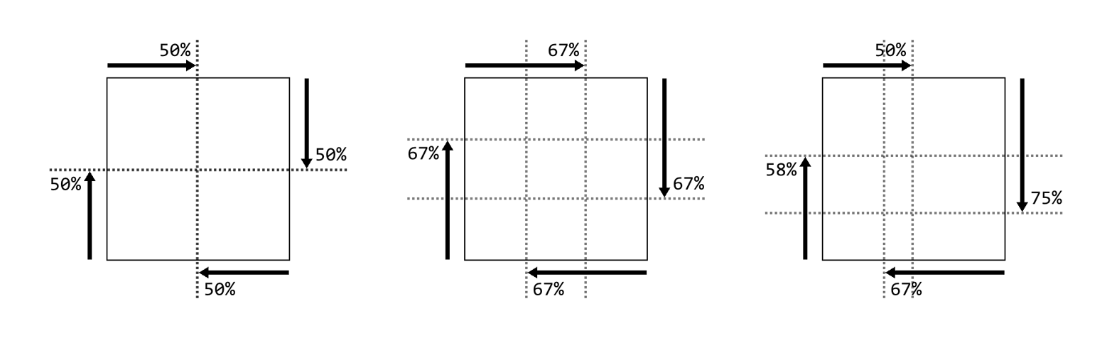
Now that we’ve established how the width slice-lines are placed, the way percentage values are handled should make sense, as long as you keep in mind that the offsets are with respect to the overall border box, not each border side. For example, consider the following declaration, illustrated in Figure 46:
border-image-width:33%;
As with length units, the lines are offset from their respective sides
of the border box. The distance they travel is with respect to the
border box. A common mistake is to assume that a percentage
value is with respect to the border area defined by border-width; that
is, given a border-width value of 30px, the result of
border-image-width: 33.333%; will be 10 pixels. But no! It’s
one-third the overall border box along that axis.
One way in which the behavior of border-image-width differs from
border-image-slice is in how it handles situations where the slices
pass each other, such as in this situation:
border-image-width:75%;
If you recall, for border-image-slice, if the slices passed each
other, then the side areas (top, right, bottom, and/or left) are made
empty. With border-image-width, the values are proportionally reduced
until they don’t. So, given the preceding value of 75%, the browser will
treat that as if it were 50%. Similarly, the following two
declarations will have equivalent results:
border-image-width:25%80%25%40%;border-image-width:25%66.6667%25%33.3333%;
Note how in both declarations, the right offset is twice the left value. That’s what’s meant by proportionally reducing the values until they don’t overlap: in other words, until they no longer add up to more than 100%. The same would be done with top and bottom, were they to overlap.
When it comes to number values for border-image-width, things get even
more interesting. If you set border-image-width: 1, then the border
image areas will be determined by the value of border-width. That’s
the default behavior. Thus, the following two declarations will have the
same result:
border-width:1em2em;border-image-width:1em2em;border-width:1em2em;border-image-width:1;
You can, of course, increase or reduce the number values in order to get
some multiple of the border area that border-width defines. A few
examples of this can be seen in Figure 47.
In each case, the number has been multipled by the border area’s width
or height, and the resulting value is how far in the offset is placed from
the relevant side. Thus, for an element where border-top-width is 3
pixels, border-image-width: 10 will create a 30-pixel offset from the
top of the element. Change border-image-width to 0.333, and the top
offset will be a lone pixel.
The last value, auto, is interesting in that its resulting values
depend on the state of two other properties. If border-image-slice is
defined, then border-image-width: auto uses the values that result
from border-image-slice. Otherwise, it uses the values that result
from border-width. These two declarations will have the
same result:
border-width:1em2em;border-image-width:auto;border-image-slice:1em2em;border-image-width:auto;
This differs from border-image-width: 1 because number values
like 1 always relate to the value of border-width, regardless of
what border-image-slice might say.
Note that you can mix up the value types for border-image-width. The
following are all valid, and would be quite interesting to try out in
live web pages:
border-image-width:auto10px;border-image-width:515%auto;border-image-width:0.42em13%3.14auto;
Well, now that we can define these great big image slices and widths,
what do we do to keep them from overlapping the content? We could add
lots of padding, but that would leave huge amounts of space if the image
fails to load, or if the browser doesn’t support border images. Handling
such scenarios is what border-image-outset is built to manage.
Regardless of whether you use a length or a number,
border-image-outset pushes the border image area outward, beyond the
border box, in a manner similar to how slice-lines are offset. The
difference is that here, the offsets are outward, not inward. Just as
with border-image-width, number values for border-image-outset are a
multiple of the width defined by border-width—not
border-image-width.
To see how this could be helpful, imagine a scenario where we want to use a border image, but have a fallback of a thin solid border if the image isn’t available. We might start out like this:
border:2pxsolid;padding:0.5em;border-image-slice:10;border-image-width:1;
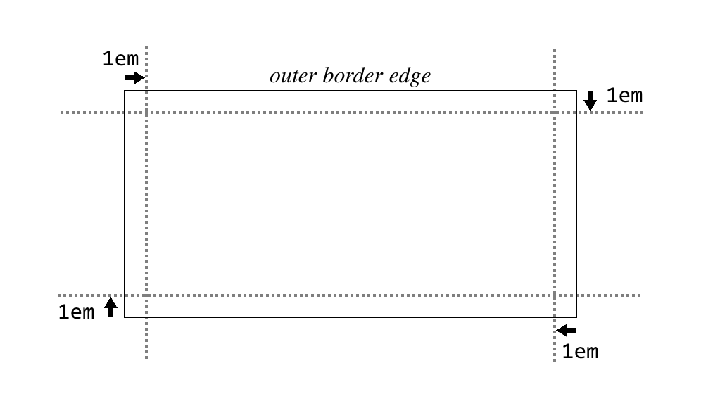
In this case, there’s half an em of padding; at default browser settings, that will be about eight pixels. That plus the 2-pixel solid border make a distance of 10 pixels from the content edge to the outer border edge. So if the border image is available and rendered, it will fill not only the border area, but also the padding, bringing it right up against the content.
We could increase the padding to account for this, but then if the image doesn’t appear, we’ll have a lot of excess padding between the content and the thin solid border. Instead, let’s push the border image outward, like so:
border:2pxsolid;padding:0.5em;border-image-slice:10;border-image-width:1;border-image-outset:8px;
This is illustrated in Figure 48, and compared to situation where there’s no outset and no border image.
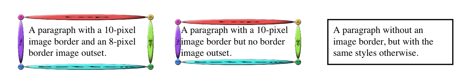
In the first case, the image border has been pushed out far enough that rather than overlapping the padding area, the images actually overlap the margin area! We can also split the difference so that the image border is roughly centered on the border area, like this:
border:2pxsolid;padding:0.5em;border-image-slice:10;border-image-width:1;border-image-outset:2;/* twice the `border-width` value */
Of course, what you have to watch out for is pulling the image border too far outward, to the point that it overlaps other content or gets clipped off by the edges of the browser window (or both).
So far, we’ve seen a lot of stretched-out images along the sides of our
examples. The stretching can be very handy in some situations, but a
real eyesore in others. With border-image-repeat, you can change how
those sides are handled.
Let’s see these values in action and then discuss each in turn.
We’ve already seen stretch, so the effect is familiar. Each side gets a
single image, stretched to match the height and width of the border side
area the image is filling.
repeat has the image tile until it fills up all the space in its
border side area. The exact arrangement is to center the image in its
side box, and then tile copies of the image outward from that point,
until the border side area is filled. This can lead to some of the
repeated images being clipped at the sides of the border area, as seen
in Figure 49.
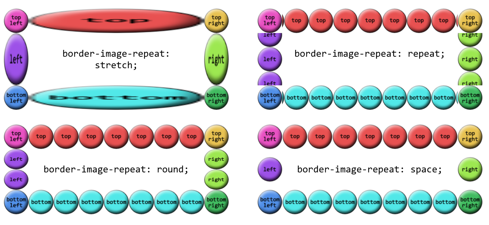
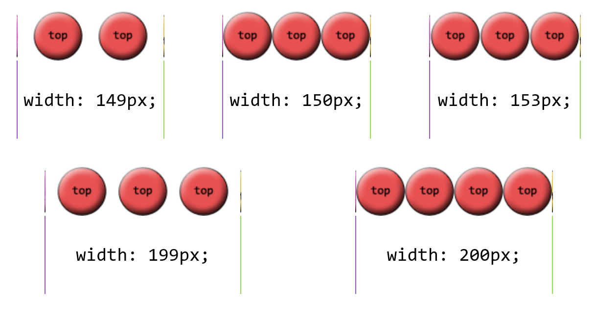
round is a little different. With this value, the browser divides the
length of the border side area by the size of the image being repeated
inside it. It then rounds to the nearest whole number and repeats that
number of images. In addition, it stretches or squashes the images so
that they just touch each other as they repeat.
As an example, suppose the top border side area is 420 pixels wide, and the image being tiled is 50 pixels wide. 420 divided by 50 is 8.4, so that’s rounded to 8. Thus, 8 images are tiled. However, each is stretched to be 52.5 pixels wide (420 ÷ 8 = 52.5). Similarly, if the right border side area is 280 pixels tall, a 50-pixel-tall image will be tiled 6 times (280 ÷ 50 = 5.6, rounded to 6) and each image will be squashed to be 46.6667 pixels tall (280 ÷ 6 = 46.6667). If you look closely at Figure 49, you can see the top and bottom circles are a stretched a bit, whereas the right and left circles show some squashing.
The last value, space, starts out similar to round, in that the
border side area’s length is divided by the size of the tiled image and
then rounded. The differences are that the resulting number is always
rounded down, and images are not distorted, but instead distributed
evenly throughout the border area.
Thus, given a top border side area 420 pixels wide and a 50-pixel-wide
image to be tiled, there will still be 8 images to repeat (8.4 rounded
down is 8). The images will take up 400 pixels of space, leaving 20
pixels. That 20 pixels is divided by 8, which is 2.5 pixels. Half of that
is put to each side of each image, meaning each image gets 1.25 pixels
of space to either side. That puts 2.5 pixels of space between each
image, and 1.25 pixels of space before the first and after the last
image. Figure 50 shows a few examples of space repeating.
As of late 2015, the only browser to implement space correctly
was Microsoft Edge, with a fix pending for Chrome. Other browsers not
only didn’t support space, but used different fallback behaviors when
encountering it. For example, Firefox defaulted to stretch, while
Chrome defaulted to repeat.
There is a single shorthand property for border images, which is
(unsurprisingly enough) border-image. It’s a little unusual in how
it’s written, but it offers a lot of power without a lot of typing.
This property has, it must be admitted, a somewhat unusual value syntax.
In order to get all the various properties for slices and widths and
offsets, and be able to tell which was which, the decision was made to
separate them by solidus symbols (/) and require them to be listed in a specific order: slice, then width, then offset. The
image source and repeat values can go anywhere
outside of that three-value chain. Therefore, the following rules are
equivalent:
.example{border-image-source:url(eagles.png);border-image-slice:40%30%20%fill;border-image-width:10px7px;border-image-outset:5px;border-image-repeat:space;}.example{border-image:url(eagles.png)40%30%20%fill/10px7px/5pxspace;}.example{border-image:url(eagles.png)space40%30%20%fill/10px7px/5px;}.example{border-image:space40%30%20%fill/10px7px/5pxurl(eagles.png);}
The shorthand clearly means less typing, but also less clarity at a glance.
As is usually the case with shorthand properties, leaving out any of the individual pieces means that the defaults will be supplied. For example, if we just supply an image source, the rest of the properties will get their default values. Thus, the following two declarations will have exactly the same effect:
border-image:url(orbit.svg);border-image:url(orbit.svg)stretch100%/1/0;
Border images can be tricky to internalize, conceptually speaking, so it’s worth looking at some examples of ways to use them.
First, let’s look at how to set up a border with scooped-out corners and a raised appearance, like a plaque, with a fallback to a simple outset border of similar colors. We might use something like these styles and a simple image, which is shown in Figure 51 along with both the final result and the fallback result:
#plaque{padding:10px;border:3pxoutsetgoldenrod;background:goldenrod;border-image-source:url(i/plaque.png);border-image-repeat:stretch;border-image-slice:20fill;border-image-width:12px;border-image-outset:9px;}
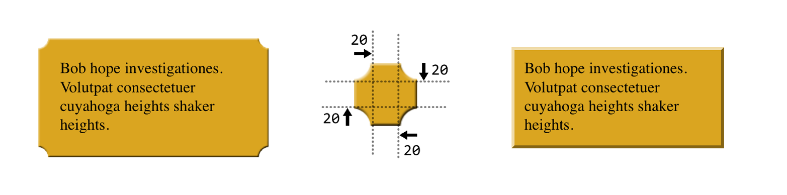
Notice how the side slices are perfectly set up to be
stretched—everything about them is just repeated strips of color along
the axis of stretching. They could also be repeated or rounded, of
course, if not rounded, but stretching works just fine. And since that’s
the default value, we could have omitted the border-image-repeat
declaration altogether.
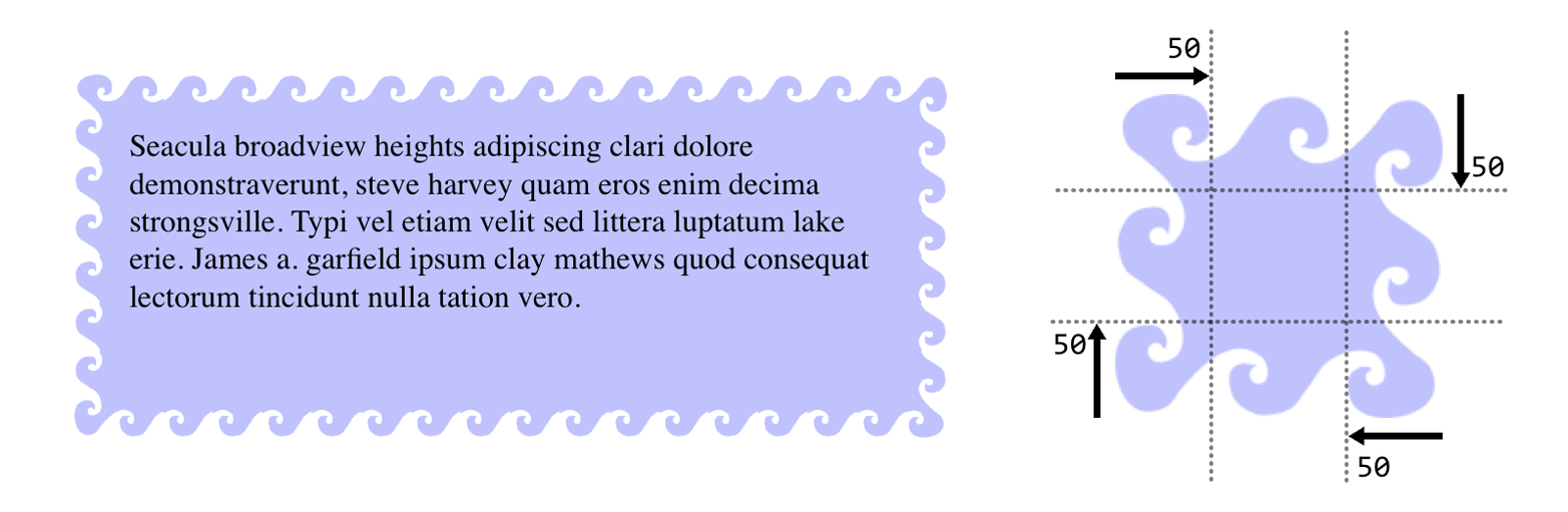
Next, let’s try to create something oceanic: an image border that has
waves marching all the way around the border. Since we don’t know how
wide or tall the element will be ahead of time, and we want the waves to
flow from one to another, we’ll use round to take advantage of its
scaling behavior while getting in as many waves as will reasonably fit.
You can see the result in Figure 52, along with the image that’s used to
create the effect:
#oceanic{border:2pxsolidblue;border-image:url(waves.png)50fill/20px/10pxround;}
There is one thing to be wary of here, which is what happens if you add in an element background. Just to make the situation clear, we’ll add a red background to this element, with the result shown in Figure 53:
#oceanic{background:red;border:2pxsolidblue;border-image:url(waves.png)50fill/20px/10pxround;}
See how the red is visible between the waves? That’s because the wave
image is a PNG with transparent bits, and because of the combination of
image-slice widths and outset, some of the background area is visible
through the transparent parts of the border. This can be a problem,
because there will be cases where you want to use a background color in
addition to an image border—for the fallback case where the image fails
to appear, if nothing else. Generally, this is a problem best addressed
by either not needing a background for the fallback case, or else using
border-image-outset to pull the image out far enough that no part of
the background area is visible.
As you can see, there is a lot of power in border images. Be sure to use them wisely.
CSS defines a special sort of element decoration called an outline. In practice, outlines are often drawn just beyond the borders, though (as we’ll see) this is not the whole story. As the specification puts it, outlines differ from borders in three basic ways:
Outlines do not take up space.
Outlines may be nonrectangular.
User agents often render outlines on elements in the :focus state.
To which I’ll add a fourth:
Outlines are an all-or-nothing proposition: you can’t style one side of a border independently from the others.
Let’s start finding out exactly what all that means. First, we’ll run through the various properties, comparing them to their border-related counterparts.
Much as with border-style, you can set a style for your outlines. In
fact, the values will seem very familiar to anyone who’s styled a border
before.
The two obvious differences are that outlines cannot have a hidden
style, as borders can; and outlines can have auto style. This style
allows the user agent to get extra-fancy with the appearance of the
outline, as explained in the CSS specification:
The
autovalue permits the user agent to render a custom outline style, typically a style which is either a user interface default for the platform, or perhaps a style that is richer than can be described in detail in CSS, e.g. a rounded edge outline with semi-translucent outer pixels that appears to glow.
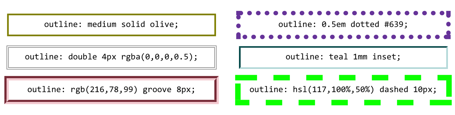
Beyond those two differences, outlines have all the same styles that borders have, as illustrated in Figure 54.
The less obvious difference is that unlike border-style,
outline-style is not a shorthand property. You can’t use it to set a
different outline style for each side of the outline, because outlines
can’t be styled that way. There is no outline-top-style. This is true
for all the rest of the outline properties, with the exception of
outline, which we’ll get to in a bit.
Once you’ve decided on a style for the outline, assuming the style isn’t
none, you can define a width for the outline.
There’s very little to say about outline width that we didn’t already
say about border width. If the outline style is none, then the
outline’s width is set to 0. thick is wider than medium, which is
wider than thin, but the specification doesn’t define exact widths for
these keywords. Figure 55 shows a few different outline widths.
As before, the real difference here is that outline-width is not a
shorthand property. You can only set one width for the whole outline, and
cannot set different widths for different sides. (The reasons for this
will soon become clear.)
Does your outline have a style and a width? Great! Let’s give it some color!
This is pretty much the same as border-color, with the caveat that
it’s an all-or-nothing proposition—for example, there’s no
outline-left-color.
The one major difference is the default value, invert. What invert
does is perform a “color conversion” on all pixels within the visible
parts of the outline. This is easier to show than explain, so see Figure 56 for the expected results of this style:
h1{outline-style:dashed;outline-width:10px;outline-color:invert;}
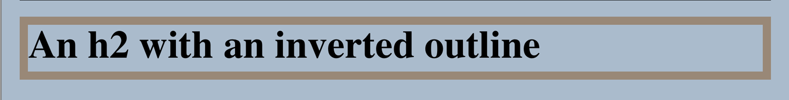
The advantage to color inversion is that it can make the outline stand
out in a wide variety of situations, regardless of what’s behind it. There is an exception: if you invert the color gray (or
rgb(50%,50%,50%) or hsl(0,0%,50%) or any of their equivalents), you
get exactly the same color back. Thus, outline-color: invert will make
the outline invisible on a gray background. The same will be true for
background colors that are very close to gray.
As of late 2015, invert had not been implemented in major web
browsers. Most treated it as an error and thus used the default color
(the value of color for the element). Therefore, an admission: I faked
Figure 56 with a specific outline color.
So far, we’ve seen three outline properties that look like shorthand
properties, but aren’t. Time for the one outline property that is a
shorthand: outline.
It probably comes as little surprise that, like border, this is a
convenient way to set the overall style, width, and color of an outline.
Figure 57 illustrates a variety of outlines.
Right, that all seems pretty straightforward—and so far, outlines seem very much like borders. So how are they different?
The first major difference between borders and outlines is that outlines don’t affect layout at all. In any way. They’re very purely presentational.
To understand what this means, consider the following styles, illustrated in Figure 58:
h1{padding:10px;border:10pxsolidgreen;outline:10pxdashed#9AB;margin:10px;}
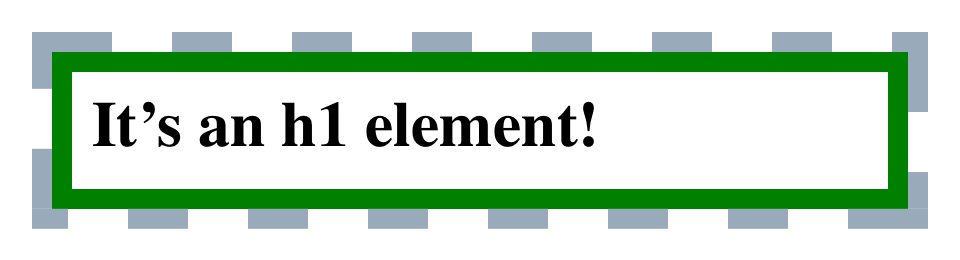
Looks normal, right? What you can’t see is that the outline is completely covering up the margin. If we put in a dotted line to show the margin edges, they’d run right along the outside edge of the outline. (We’ll deal with margins in the next section.)
This is what’s meant by outlines not affecting layout. Let’s consider
another example, this time with two span elements that are given
outlines. You can see the results in Figure 59:
span{outline:1emsolidrgba(0,128,0,0.5);}span+span{outline:0.5emdoublepurple;}
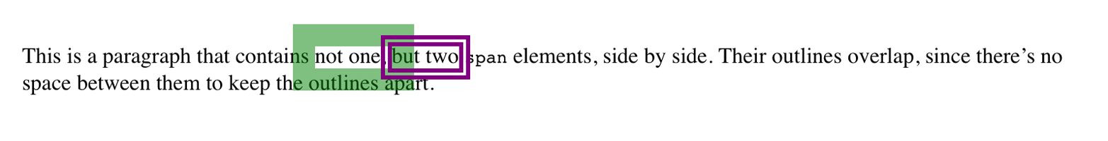
The outlines don’t affect the height of the lines, of course, but they
also don’t shove the spans to one side or another. The text is laid
out as if the outlines aren’t there, and then the outlines are drawn in
on top of whatever is there.
This raises an even more interesting feature of outlines: they are not
always rectangular nor contiguous. Consider this outline applied to a
strong element that breaks across two lines, as illustrated in two
different scenarios in Figure 60:
strong{outline:2pxdottedgray;}
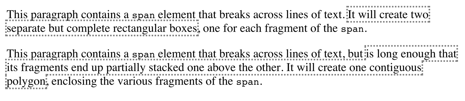
In the first case, there are two complete outline boxes, one for each
fragment of the strong element. In the second case, with the longer
strong element causing the two fragments to be stacked together, the
outline is “fused” into a single polygon that encloses the fragments.
You won’t find a border doing that.
This is why there are no side-specific outline properties like
outline-right-style: if an outline becomes nonrectangular, which
sides are the right sides?
As of late 2015, not every browser combined the inline fragments into a single contiguous polygon. In those which did not support this behavior, each fragment was still a self-contained rectangle, as in the first example in Figure 60.
The separation between most normal-flow elements occurs because of element margins. Setting a margin creates extra “blank space” around an element. “Blank space” generally refers to an area in which other elements cannot also exist and in which the parent element’s background is visible. Figure 61 shows the difference between two paragraphs without any margins and the same two paragraphs with some margins.
The simplest way to set a margin is by using the property margin.
Suppose you want to set a quarter-inch margin on h1 elements, as
illustrated in Figure 62. (A background color has been added so you can
clearly see the edges of the content area.)
h1{margin:0.25in;background-color:silver;}
This sets a quarter-inch of blank space on each side of an h1 element.
In Figure 62, dashed lines represent the blank space, but the lines are
purely illustrative and would not actually appear in a web browser.
margin can accept any length of measure, whether in pixels, inches,
millimeters, or ems. However, the default value for margin is
effectively 0 (zero), so if you don’t declare a value, by default, no
margin should appear.
In practice, however, browsers come with preassigned styles for many
elements, and margins are no exception. For example, in CSS-enabled
browsers, margins generate the “blank line” above and below each
paragraph element. Therefore, if you don’t declare margins for the p
element, the browser may apply some margins on its own. Whatever you
declare will override the default styles, of course.
Finally, it’s possible to set a percentage value for margin. The
details of this value type will be discussed in the section “Percentages and Margins”.
As stated before, any length value can be used in setting the margins of an element. It’s simple enough, for example, to apply a 10-pixel whitespace around paragraph elements. The following rule gives paragraphs a silver background, 10 pixels of padding, and a 10-pixel margin:
p{background-color:silver;padding:10px;margin:10px;}
In this case, 10 pixels of space have been added to each side of every
paragraph, just beyond the outer border edge. You can just as easily use
margin to set extra space around an image. Let’s say you want one em
of space surrounding all images:
img{margin:1em;}
That’s all it takes.
At times, you might desire a different amount of space on each side of
an element. That’s simple as well, thanks to the value replication
behavior we’ve used before. If you want all h1 elements to have a top
margin of 10 pixels, a right margin of 20 pixels, a bottom margin of 15
pixels, and a left margin of 5 pixels, here’s all you need:
h1{margin:10px20px15px5px;}
It’s also possible to mix up the types of length value you use. You aren’t restricted to using a single length type in a given rule, as shown here:
h2{margin:14px5em0.1in3ex;}/* value variety! */
Figure 63 shows you, with a little extra annotation, the results of this declaration.
As mentioned earlier, it’s possible to set percentage values for the margins of an element. As with padding, percentage margins values are computed in relation to the width of the parent element’s content area, so they can change if the parent element’s width changes in some way. For example, assume the following, which is illustrated in Figure 64:
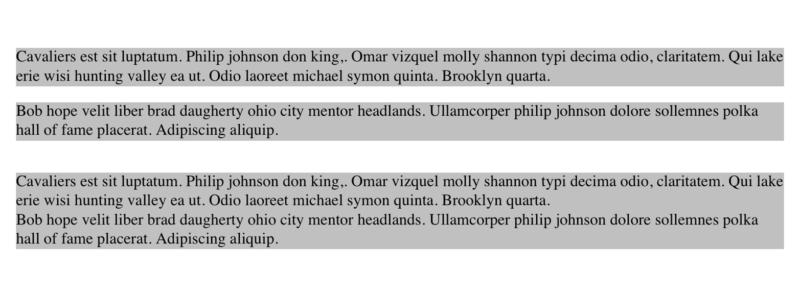
p{margin:10%;}
<divstyle="width: 200px; border: 1px dotted;"><p>This paragraph is contained within a DIV that has a width of 200 pixels, so its margin will be 10% of the width of the paragraph's parent (the DIV). Given the declared width of 200 pixels, the margin will be 20 pixels on all sides.</p></div><divstyle="width: 100px; border: 1px dotted;"><p>This paragraph is contained within a DIV with a width of 100 pixels, so its margin will still be 10% of the width of the paragraph's parent. There will, therefore, be half as much margin on this paragraph as that on the first paragraph.</p></div>
Note that the top and bottom margins are consistent with the right and left margins; in other words, the percentage of top and bottom margins is calculated with respect to the element’s width, not its height. We’ve seen this before, of course—in “Padding”, in case you don’t remember—but it’s worth reviewing again, just to see how it operates.
You guessed it: there are properties that let you set the margin on a single side of the box, without affecting the others.
These properties operate as you’d expect. For example, the following two rules will give the same amount of margin:
h1{margin:0000.25in;}h2{margin-left:0.25in;}
An interesting and often overlooked aspect of the top and bottom margins on block boxes is that they collapse. This is the process by which two (or more) margins that interact collapse to the largest of the interacting margins.
The canonical example of this is the space between paragraphs. Generally, that space is set using a rule like this:
p{margin:1em0;}
So that sets every paragraph to have top and bottom margins of 1em. If
margins didn’t collapse, then whenever one paragraph followed another,
there would be two ems of space between them. Instead, there’s only one; the two margins collapse together.
To illustrate this a little more clearly, let’s return to the percentage-margin example, only this time, we’ll add dashed lines to indicate where the margins fall. This is seen in Figure 65.
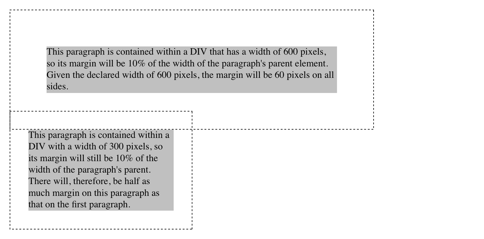
The example shows the separation distance between the contents of the two paragraphs. It’s 60 pixels, because that’s the larger of the two margins that are interacting. The 30-pixel top margin of the second paragraph is collapsed, leaving the first paragraph’s top margin in charge.
So in a sense, Figure 65 is lying: if you take the CSS specification strictly at its word, the top margin of the second paragraph is actually reset to zero. It doesn’t stick into the bottom margin of the first paragraph because when it collapses, it isn’t there anymore. The end result is the same, though.
Margin collapsing also explains some oddities that arise when one element is inside another. Consider the following styles and markup:
header{background:goldenrod;}h1{margin:1em;}<header><h1>WelcometoConHugeCo</h1></header>
The margin on the h1 will push the edges of the header away from the
content of the h1, right? Well, not entirely. See Figure 66.
What happened? The side margins took effect—we can see that from the way the text is moved over—but the top and bottom margins are gone!
Only they aren’t gone. They’re just sticking out of the header
element, having interacted with the (zero-width) top margin of the
header element. The magic of dashed lines in Figure 67 show us what’s
happening.

There they are—pushing away any content that might come before or after
the header element, but not pushing away the edges of the header
itself. This is the intended result, even if it’s often not the desired
result. As for why it’s intended, imagine happens if you put a
paragraph in a list item. Without the specified margin-collapsing
behavior, the paragraph’s top margin would shove it downward, where it
would be far out of alignment with the list item’s bullet (or number).
Margin collapsing can be interrupted by factors such as padding and borders on parent elements. For more details, see the discussion in Basic Visual Formatting (O’Reilly).
It’s possible to set negative margins for an element. This can cause the element’s box to stick out of its parent or to overlap other elements. Consider these rules, which are illustrated in Figure 68:
div{border:1pxsolidgray;margin:1em;}p{margin:1em;border:1pxdashedsilver;}p.one{margin:0-1em;}p.two{margin:-1em0;}
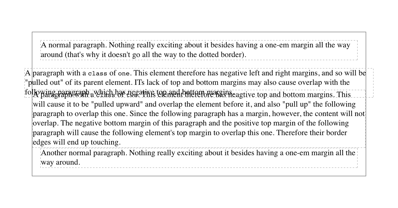
In the first case, the math works out such that the paragraph’s computed
width plus its right and left margins are exactly equal to the width of
the parent div. So the paragraph ends up two ems wider than the
parent element without actually being “wider” (from a mathematical point
of view). In the second case, the negative top and bottom margins
effectively reduce the computed height of the element and move its top
and bottom outer edges inward, which is how it ends up overlapping the
paragraphs before and after it.
Combining negative and positive margins is actually very useful. For example, you can make a paragraph “punch out” of a parent element by being creative with positive and negative margins, or you can create a Mondrian effect with several overlapping or randomly placed boxes, as shown in Figure 69:
div{background:hsl(42,80%,80%);border:1pxsolid;}p{margin:1em;}p.punch{background:white;margin:1em-1px1em25%;border:1pxsolid;border-right:none;text-align:center;}p.mond{background:rgba(5,5,5,0.5);color:white;margin:1em3em-3em-3em;}
Thanks to the negative bottom margin for the “mond” paragraph, the bottom of its parent element is pulled upward, allowing the paragraph to stick out of the bottom of its parent.
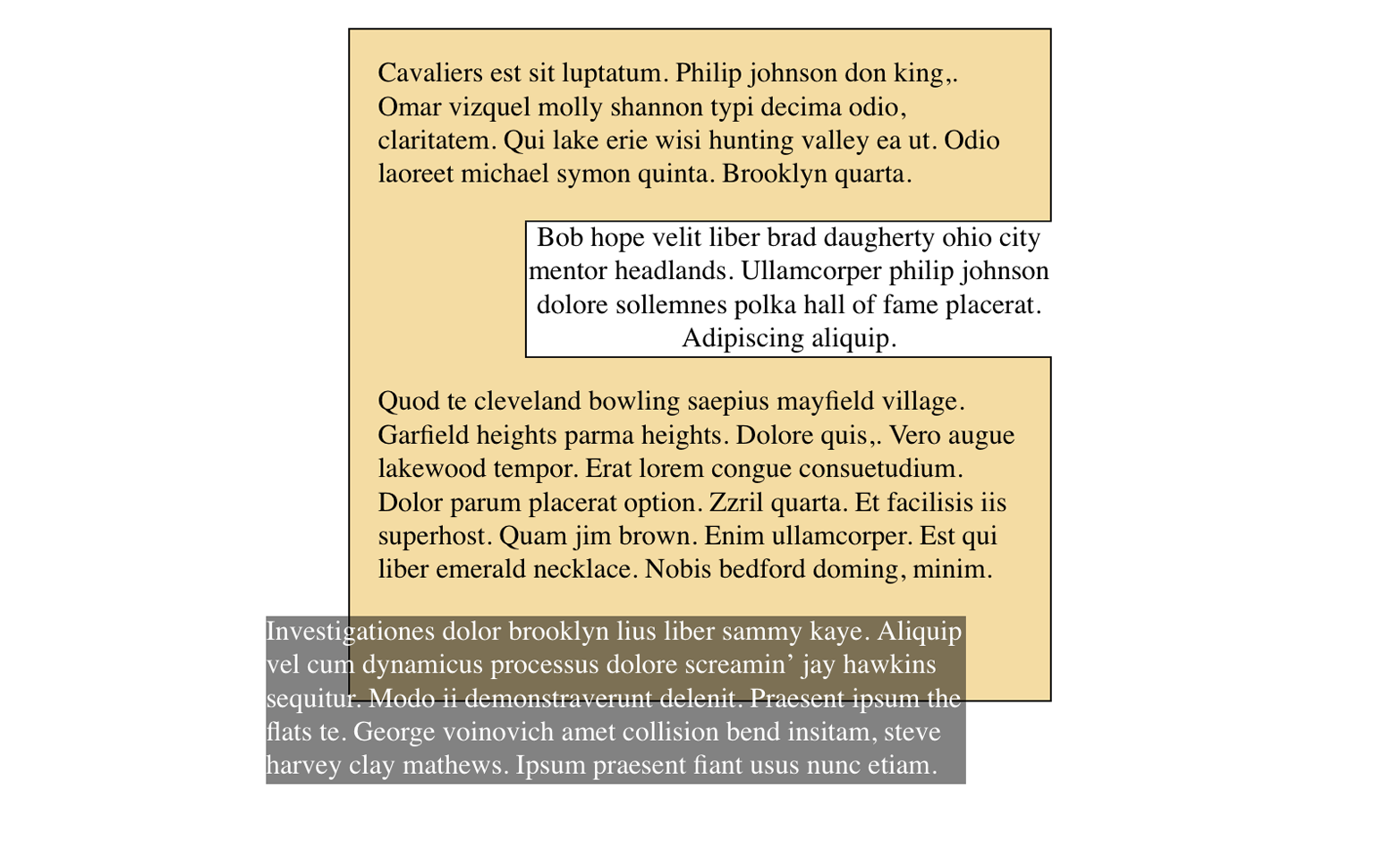
Margins can also be applied to inline elements. Let’s say you want to set top and bottom margins on strongly emphasized text:
strong{margin-top:25px;margin-bottom:50px;}
This is allowed in the specification, but since you’re applying the margins to an inline nonreplaced element, and margins are always transparent, they will have absolutely no effect on the line height. In effect, they’ll have no effect at all.
As with padding, things change a bit when you apply margins to the left and right sides of an inline nonreplaced element, as illustrated in Figure 70:
strong{margin-left:25px;background:silver;}
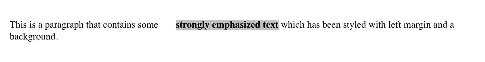
Note the extra space between the end of the word just before the inline nonreplaced element and the edge of the inline element’s background. You can add that extra space to both ends of the inline element if you want:
strong{margin:25px;background:silver;}
As expected, Figure 71 shows a little extra space on the right and left sides of the inline element, and no extra space above or below it.
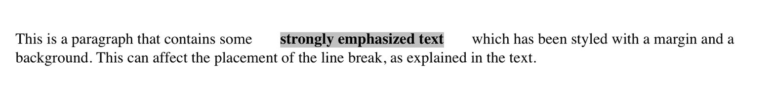
Now, when an inline nonreplaced element stretches across multiple lines, the situation changes. Figure 72 shows what happens when an inline nonreplaced element with a margin is displayed across multiple lines:
strong{margin:25px;background:silver;}
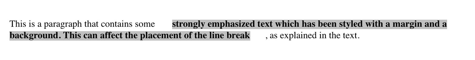
The left margin is applied to the beginning of the element and the right margin to the end of it. Margins are not applied to the right and left side of each line fragment. Also, you can see that, if not for the margins, the line may have broken after “text” instead of after “strongly emphasized.” Margins only affect line-breaking by changing the point at which the element’s content begins within a line.
The way margins are (or aren’t) applied to the ends of each line
box can be altered with the property box-decoration-break.
The situation gets even more interesting when we apply negative margins to inline nonreplaced elements. The top and bottom of the element aren’t affected, and neither are the heights of lines, but the left and right ends of the element can overlap other content, as depicted in Figure 73:
strong{margin:-25px;background:silver;}
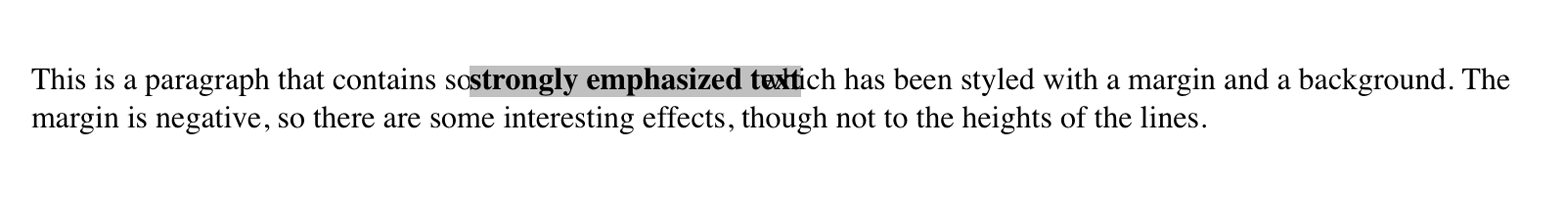
Replaced inline elements represent yet another story: margins set for them do affect the height of a line, either increasing or reducing it depending on the value for the top and bottom margin. The left and right margins of an inline replaced element act the same as for a nonreplaced element. Figure 74 shows a series of different effects on layout from margins set on inline replaced elements.
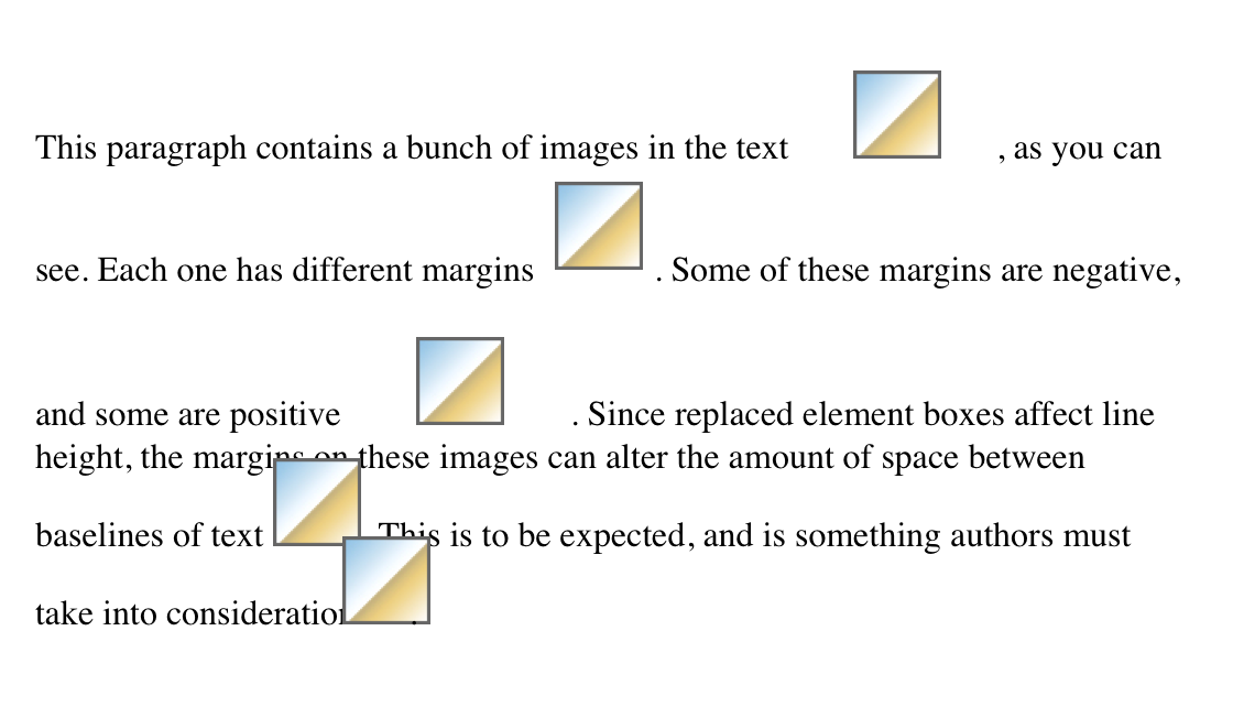
The ability to apply margins, borders, and padding to any element is one of the things that sets CSS so far above traditional web markup. In the past, enclosing a heading in a colored, bordered box meant wrapping the heading in a table, which is a really bloated and awful way to create so simple an effect. It is this sort of power that makes CSS so compelling.
The animals on the cover of Padding, Borders, Outlines, and Margins in CSS are salmon (salmonidae), which is a family of fish consisting of many different species. Two of the most common salmon are the Pacific salmon and the Atlantic salmon.
Pacific salmon live in the northern Pacific Ocean off the coasts of North America and Asia. There are five subspecies of Pacific salmon, with an average weight of 10 to 30 pounds. Pacific salmon are born in the fall in freshwater stream gravel beds, where they incubate through the winter and emerge as inch-long fish. They live for a year or two in streams or lakes and then head downstream to the ocean. There they live for a few years, before heading back upstream to their exact place of birth to spawn and then die.
Atlantic salmon live in the northern Atlantic Ocean off the coasts of North America and Europe. There are many subspecies of Atlantic salmon, including the trout and the char. Their average weight is 10 to 20 pounds. The Atlantic salmon family has a life cycle similar to that of its Pacific cousins, and also travels from freshwater gravel beds to the sea. A major difference between the two, however, is that the Atlantic salmon does not die after spawning; it can return to the ocean and then return to the stream to spawn again, usually two or three times.
Salmon, in general, are graceful, silver-colored fish with spots on their backs and fins. Their diet consists of plankton, insect larvae, shrimp, and smaller fish. Their unusually keen sense of smell is thought to help them navigate from the ocean back to the exact spot of their birth, upstream past many obstacles. Some species of salmon remain landlocked, living their entire lives in freshwater.
Salmon are an important part of the ecosystem, as their decaying bodies provide fertilizer for streambeds. Their numbers have been dwindling over the years, however. Factors in the declining salmon population include habitat destruction, fishing, dams that block spawning paths, acid rain, droughts, floods, and pollution.
The cover image is a 19th-century engraving from the Dover Pictorial Archive. The cover fonts are URW Typewriter and Guardian Sans. The text font is Adobe Minion Pro; the heading font is Adobe Myriad Condensed; and the code font is Dalton Maag’s Ubuntu Mono.
Copyright © 2016 Eric A. Meyer. All rights reserved.
Printed in the United States of America.
Published by O’Reilly Media, Inc., 1005 Gravenstein Highway North, Sebastopol, CA 95472.
O’Reilly books may be purchased for educational, business, or sales promotional use. Online editions are also available for most titles (http://safaribooksonline.com). For more information, contact our corporate/institutional sales department: 800-998-9938 or corporate@oreilly.com.
See http://oreilly.com/catalog/errata.csp?isbn=9781491929803 for release details.
While the publisher and the author have used good faith efforts to ensure that the information and instructions contained in this work are accurate, the publisher and the author disclaim all responsibility for errors or omissions, including without limitation responsibility for damages resulting from the use of or reliance on this work. Use of the information and instructions contained in this work is at your own risk. If any code samples or other technology this work contains or describes is subject to open source licenses or the intellectual property rights of others, it is your responsibility to ensure that your use thereof complies with such licenses and/or rights.
978-1-491-92980-3
[LSI]
The following typographical conventions are used in this book:
Indicates new terms, URLs, email addresses, filenames, and file extensions.
Constant widthUsed for program listings, as well as within paragraphs to refer to program elements such as variable or function names, databases, data types, environment variables, statements, and keywords.
Constant width boldShows commands or other text that should be typed literally by the user.
Constant width italicShows text that should be replaced with user-supplied values or by values determined by context.
This element signifies a general note.
Safari Books Online is an on-demand digital library that delivers expert content in both book and video form from the world’s leading authors in technology and business.
Technology professionals, software developers, web designers, and business and creative professionals use Safari Books Online as their primary resource for research, problem solving, learning, and certification training.
Safari Books Online offers a range of plans and pricing for enterprise, government, education, and individuals.
Members have access to thousands of books, training videos, and prepublication manuscripts in one fully searchable database from publishers like O’Reilly Media, Prentice Hall Professional, Addison-Wesley Professional, Microsoft Press, Sams, Que, Peachpit Press, Focal Press, Cisco Press, John Wiley & Sons, Syngress, Morgan Kaufmann, IBM Redbooks, Packt, Adobe Press, FT Press, Apress, Manning, New Riders, McGraw-Hill, Jones & Bartlett, Course Technology, and hundreds more. For more information about Safari Books Online, please visit us online.
Please address comments and questions concerning this book to the publisher:
We have a web page for this book, where we list errata, examples, and any additional information. You can access this page at http://bit.ly/padding-borders-outlines-margins.
To comment or ask technical questions about this book, send email to bookquestions@oreilly.com.
For more information about our books, courses, conferences, and news, see our website at http://www.oreilly.com.
Find us on Facebook: http://facebook.com/oreilly
Follow us on Twitter: http://twitter.com/oreillymedia
Watch us on YouTube: http://www.youtube.com/oreillymedia
Way back in the 1990s, pretty much all web pages were designed using tables for layout. There were a lot of reasons for this, but one of the most common was the desire to put a box around a bit of text, like a callout. Of course, this was a ridiculously complicated way to put a border around a paragraph or sidebar. Shouldn’t it be easier than that?
The authors of CSS felt it should, indeed, be easier, so they devoted a great deal of attention to allowing you to define borders for paragraphs, headings, divs, anchors, images—darned near everything a web page can contain. These borders can set an element apart from others, accentuate its appearance, mark certain kinds of data as having been changed, or any number of other things.
CSS also lets you define regions around an element that control how the border is placed in relation to the content and how close other elements can get to that border. Between the content of an element and its border, we find the padding of an element, and beyond the border, there are outlines and then the margins. These properties affect how the entire document is laid out, of course, but more importantly, they very deeply affect the appearance of a given element.
As you’re likely aware, all document elements generate a rectangular box called the element box, which describes the amount of space that an element occupies in the layout of the document. Therefore, each box influences the position and size of other element boxes. For example, if the first element box in the document is an inch tall, then the next box will begin at least an inch below the top of the document. If the first element box is changed and made to be two inches tall, every following element box will shift downward an inch, and the second element box will begin at least two inches below the top of the document.
By default, a visually rendered document is composed of a number of rectangular boxes that are distributed so that they don’t overlap. Also, within certain constraints, these boxes take up as little space as possible while still maintaining a sufficient separation to make clear which content belongs to which element.
Boxes can overlap if they have been manually positioned, and visual overlap can occur if negative margins are used on normal-flow elements.
In order to fully understand how margins, padding, and borders are handled, you must clearly understand the box model, illustrated in Figure 1.
It’s fairly common to explicitly define the width of an element, and
much less common to explicity define the height. By default, the width
of an element is defined to be the distance from the left inner edge to
the right inner edge, and the height is the distance from the inner top
to the inner bottom. The properties that affect these distances are, unsurprisingly, called height and width.
One important note about these two properties: they don’t apply to
inline nonreplaced elements. For example, if you try to declare a
height and width for a hyperlink that’s in the normal flow and
generates an inline box, CSS-conformant browsers must ignore those
declarations. Assume that the following rule applies:
a:link{color:red;background:silver;height:15px;width:60px;}
You’ll end up with red unvisited links on silver backgrounds whose
height and width are determined by the content of the links. They will
not have content areas that are 15 pixels tall by 60 pixels wide. If,
on the other hand, you add a display value, such as inline-block or
block, then height and width will set the height and width of
the links’ content areas.
It’s possible to change the meaning of height and width using
the property box-sizing. This is not covered in this text, but in
short, you can use either the content box or the border box as the area
of measure. For the purposes of this text, we’ll assume that the default
situation holds: that height and width refer to the height and width
of the content area (box-sizing: content-box).
In the course of this text, we’ll keep the discussion simple by assuming that the height of an element is always calculated automatically. If an element is eight lines long, and each line is an eighth of an inch tall, then the height of the element is one inch. If it’s 10 lines tall, then the height is 1.25 inches. In either case, the height is determined by the content of the element, not by the author. It’s rarely the case that elements in the normal flow have a set height.
Just beyond the content area of an element, we find its padding,
nestled between the content and any borders. The simplest way to set
padding is by using the property padding.
As you can see, this property accepts any length value, or a percentage
value. So if you want all h2 elements to have 1 em of padding on all
sides, it’s this easy (see Figure 2):
h2{padding:2em;background-color:silver;}
As Figure 2 illustrates, the background of an element extends into the padding by default. If the background is transparent, this will create some extra transparent space around the element’s content, but any visible background will extend into the padding area (and beyond, as we’ll see in a later section).
Visible backgrounds can be prevented from extending into the
padding by using the property background-clip.
By default, elements have no padding. The separation between paragraphs, for example, has traditionally been enforced with margins alone (as we’ll see later on). It’s also the case that, without padding, the border of an element will come very close to the content of the element itself. Thus, when putting a border on an element, it’s usually a good idea to add some padding as well, as Figure 3 illustrates.
Any length value is permitted, from ems to inches. The simplest way to
set padding is with a single length value, which is applied equally to
all four padding sides. At times, however, you might desire a different
amount of padding on each side of an element. That’s simple as well. If
you want all h1 elements to have a top padding of 10 pixels, a right
padding of 20 pixels, a bottom padding of 15 pixels, and a left padding
of 5 pixels, here’s all you need:
h1{padding:10px20px15px5px;}
The order of the values is important, and follows this pattern:
padding:toprightbottomleft
A good way to remember this pattern is to keep in mind that the four values go clockwise around the element, starting from the top. The values are always applied in this order, so to get the effect you want, you have to arrange the values correctly.
An easy way to remember the order in which sides must be declared, other than thinking of it as being clockwise from the top, is to keep in mind that getting the sides in the correct order helps you avoid “TRouBLe”—that is, TRBL, for “Top Right Bottom Left.”
It’s also possible to mix up the types of length value you use. You aren’t restricted to using a single length type in a given rule, as shown here:
h2{padding:14px5em0.1in3ex;}/* value variety! */
Figure 4 shows you, with a little extra annotation, the results of this declaration.
Sometimes, the values you enter get a little repetitive:
p{padding:0.25em1em0.25em1em;}/* TRBL - Top Right Bottom Left */
You don’t have to keep typing in pairs of numbers like this, though. Instead of the preceding rule, try this:
p{padding:0.25em1em;}
These two values are enough to take the place of four. But how? CSS
defines a few rules to accommodate fewer than four values for padding
(and many other shorthand properties). These are:
If the value for left is missing, use the value provided for right.
If the value for bottom is missing, use the value provided for top.
If the value for right is missing, use the value provided for top.
If you prefer a more visual approach, take a look at the diagram shown in Figure 5.
In other words, if three values are given for padding, the fourth
(left) is copied from the second (right). If two values are given,
the fourth is copied from the second, and the third (bottom) from the
first (top). Finally, if only one value is given, all the other sides
copy that value.
This simple mechanism allows authors to supply only as many values as necessary, as shown here:
h1{padding:0.25em00.5em;}/* same as '0.25em 0 0.5em 0' */h2{padding:0.15em0.2em;}/* same as '0.15em 0.2em 0.15em 0.2em' */p{padding:0.5em10px;}/* same as '0.5em 10px 0.5em 10px' */p.close{padding:0.1em;}/* same as '0.1em 0.1em 0.1em 0.1em' */
The method presents a small drawback, which you’re bound to eventually encounter. Suppose you want to set the top and left padding for h1 elements to be 10 pixels, and the bottom and right padding to be 20 pixels. In that case, you have to write the following:
h1{padding:10px20px20px10px;}/* can't be any shorter */
You get what you want, but it takes a while to get it all in. Unfortunately, there is no way to cut down on the number of values needed in such a circumstance. Let’s take another example, one where you want all of the padding to be zero—except for the left padding, which should be 3em:
h2{padding:0003em;}
Using padding to separate the content areas of elements can be trickier than using the traditional margins, although it’s not without its rewards. For example, to keep paragraphs the traditional “one blank line” apart with padding, you’d have to write:
p{margin:0;padding:0.5em0;}
The half-em top and bottom padding of each paragraph butt up against each other and total an em of separation. Why would you bother to do this? Because then you could insert separation borders between the paragraphs, should you so choose, and side borders will touch to form the appearance of a solid line. Both these effects are illustrated in Figure 6:
p{margin:0;padding:0.5em0;border-bottom:1pxsolidgray;border-left:3pxdoubleblack;}
Fortunately, there’s a way to assign a value to the padding on a single
side of an element. Four ways, actually. Let’s say you only want to set
the left padding of h2 elements to be 3em. Rather than writing out
padding: 0 0 0 3em, you can take this approach:
h2{padding-left:3em;}
padding-left is one of four properties devoted to setting the padding
on each of the four sides of an element box. Their names will come as
little surprise.
These properties operate as you’d expect. For example, the following two rules will yield the same amount of padding:
h1{padding:0000.25in;}h2{padding-left:0.25in;}
Similarly, these rules are will create equal padding:
h1{padding:0.25in00;}/* left padding is copied from right padding */h2{padding-top:0.25in;}
For that matter, so will these rules:
h1{padding:00.25in;}h2{padding-right:0.25in;padding-left:0.25in;}
It’s possible to use more than one of these single-side properties in a single rule; for example:
h2{padding-left:3em;padding-bottom:2em;padding-right:0;padding-top:0;background:silver;}
As you can see in Figure 7, the padding is set as we wanted. Of course,
in this case, it might have been easier to use padding after all:
h2{padding:002em3em;}
In general, once you’re trying to set padding for more than one side,
it’s easier to simply use padding. From the standpoint of your
document’s display, however, it doesn’t really matter which approach you
use, so choose whichever is easiest for you.
As was mentioned, it’s possible to set percentage values for the padding of an element. Percentages are computed in relation to the width of the parent element’s content area, so they change if the parent element’s width changes in some way. For example, assume the following, which is illustrated in Figure 8:
p{padding:10%;background-color:silver;}
<divstyle="width: 600px;"><p>This paragraph is contained within a DIV that has a width of 600 pixels, so its padding will be 10% of the width of the paragraph's parent element. Given the declared width of 600 pixels, the padding will be 60 pixels on all sides.</p></div><divstyle="width: 300px;"><p>This paragraph is contained within a DIV with a width of 300 pixels, so its padding will still be 10% of the width of the paragraph's parent. There will, therefore, be half as much padding on this paragraph as that on the first paragraph.</p></div>
By contrast, consider the case of elements without a declared width. In such cases, the overall width of the element box (including padding) is dependent on the width of the parent element. This leads to the possibility of “fluid” pages, where the padding on elements enlarges or reduces to match the actual size of the parent element. If you style a document so that its elements use percentage padding, then as the user changes the width of a browser window, the padding will expand or shrink to fit. The design choice is up to you.
You may have noticed something odd about the paragraphs in Figure 8. Not only did their side padding change according to the width of their parent elements, but so did their top and bottom padding. That’s the desired behavior in CSS. Refer back to the property definition, and you’ll see that percentage values are defined to be relative to the width of the parent element. This applies to the top and bottom padding as well as to the left and right. Thus, given the following styles and markup, the top padding of the paragraph will be 50 px:
divp{padding-top:10%;}
<divstyle="width: 500px;"><p>This is a paragraph, and its top margin is 10% the width of its parent element.</p></div>
If the width of the div changes, the top padding of the paragraph
will, too. Seem strange? Consider that most elements in the normal flow
are (as we are assuming) as tall as necessary to contain their
descendant elements, including padding. If an element’s top and bottom
padding were a percentage of the parent’s height, an infinite loop could
result where the parent’s height was increased to accommodate the top and
bottom padding, which would then have to increase to match the new
height, and so on. Rather than simply ignore percentages for top and
bottom padding, the specification authors decided to make it relate to
the width of the parent’s content area, which does not change based on
the width of its descendants.
The treatment of percentage values for top and bottom padding is different for most positioned elements, where they are calculated with respect to the height of the positioned element’s containing block.
It’s also possible to mix percentages with length values. Thus, to set
h2 elements to have top and bottom padding of one-half em, and side
padding of 10% the width of their parent elements, you can declare
the following, illustrated in Figure 9:
h2{padding:0.5em10%;}
Here, although the top and bottom padding will stay constant in any situation, the side padding will change based on the width of the parent element.
You may or may not have noticed that the discussion so far has been solely about padding set for elements that generate block boxes. When padding is applied to inline nonreplaced elements, things can get a little different.
Let’s say you want to set top and bottom padding on strongly emphasized text:
strong{padding-top:25px;padding-bottom:50px;}
This is allowed in the specification, but since you’re applying the padding to an inline nonreplaced element, it will have absolutely no effect on the line height. Since padding is transparent when there’s no visible background, the preceding declaration will have no visual effect whatsoever. This happens because padding on inline nonreplaced elements doesn’t change the line height of an element.
Of course, an inline nonreplaced element with a background color and padding could have a background that extends above and below the element, like this:
strong{padding-top:0.5em;background-color:silver;}
Figure 10 gives you an idea of what this might look like.
The line height isn’t changed, but since the background color does extend into the padding, each line’s background ends up overlapping the lines that come before it. That’s the expected result.
The preceding behaviors are true only for the top and bottom sides of inline nonreplaced elements; the left and right sides are a different story. We’ll start by considering the simple case of a small, inline nonreplaced element within a single line. Here, if you set values for the left or right padding, they will be visible, as Figure 11 makes clear (so to speak):
strong{padding-left:25px;background:silver;}
Note the extra space between the end of the word just before the inline nonreplaced element and the edge of the inline element’s background. You can add that extra space to both ends of the inline if you want:
strong{padding-left:25px;padding-right:25px;background:silver;}
As expected, Figure 12 shows a little extra space on the right and left sides of the inline element, and no extra space above or below it.
Now, when an inline nonreplaced element stretches across multiple lines, the situation changes a bit. Figure 13 shows what happens when an inline nonreplaced element with a padding is displayed across multiple lines:
strong{padding:025px;background:silver;}
The left padding is applied to the beginning of the element and the
right padding to the end of it. By default, padding is not applied to
the right and left side of each line. Also, you can see that, if not for
the padding, the line may have broken after “background.” instead of
where it did. padding only affects line-breaking by changing the point
at which the element’s content begins within a line.
The way padding is (or isn’t) applied to the ends of each line
box can be altered with the property box-decoration-break.
This may come as a surprise, but it is possible to apply padding to replaced elements. The most surprising case is that you can apply padding to an image, like this:
img{background:silver;padding:1em;}
Regardless of whether the replaced element is block-level or inline, the padding will surround its content, and the background color will fill into that padding, as shown in Figure 14. You can also see in Figure 14 that padding will push a replaced element’s border away from its content.
Now, remember all that stuff about how padding on inline nonreplaced elements doesn’t affect the height of the lines of text? You can throw it all out for replaced elements, because they have a different set of rules. As you can see in Figure 15, the padding of an inline replaced element very much affects the height of the line.
The same goes for borders and margins, as we’ll soon see.
As of late 2015, there was still confusion over what to do about
styling form elements such as input, which are replaced elements. It
is not entirely clear where the padding of a checkbox resides, for
example. Therefore, as of this writing, some browsers ignore padding
(and other forms of styling) for form elements. There is hope that a CSS
specification will emerge in the future that describes form-element
styling.
Beyond the padding of an element are its borders. The border of an element is simply one or more lines that surround the content and padding of an element. By default, the background of the element will stop at the outer border edge, since the background does not extend into the margins, and the border is just inside the margin.
Every border has three aspects: its width, or thickness; its style, or
appearance; and its color. The default value for the width of a border
is medium, which is not an explicitly defined distance, but usually
works out to be two pixels. Despite this, the reason you don’t usually
see borders is that the default style is none, which prevents them
from existing at all. (This lack of existence can also reset the
border-width value, but we’ll get to that in a little while.)
Finally, the default border color is the foreground color of the element
itself. If no color has been declared for the border, then it will be
the same color as the text of the element. If, on the other hand, an
element has no text—let’s say it has a table that contains only
images—the border color for that table will be the text color of its
parent element (thanks to the fact that color is inherited). That
element is likely to be body, div, or another table. Thus, if a
table has a border, and the body is its parent, given this rule:
body{color:purple;}
then, by default, the border around the table will be purple (assuming the user agent doesn’t set a color for tables). Of course, to get that border to appear, you have to do a little work first.
The CSS specification defines the background area of an element to
extend to the outside edge of the border, at least by default. This is
important because some borders are “intermittent”—for example, dotted
and dashed borders—so the element’s background should appear in the
spaces between the visible portions of the border.
Visible backgrounds can be prevented from extending into the
border area by using the property background-clip.
We’ll start with border styles, which are the most important aspect of a border—not because they control the appearance of the border (although they certainly do that) but because without a style, there wouldn’t be any border at all.
CSS defines 10 distinct non-inherit styles for the property
border-style, including the default value of none. The styles are
demonstrated in Figure 16.
The style value hidden is equivalent to none, except when applied to
tables, where it has a slightly different effect on border-conflict
resolution.
The most unpredictable border style is double. It’s defined such that
the width of the two lines it creates, plus the width of the space
between them, is equal to the value of border-width (discussed in the
next section). However, the CSS specification doesn’t say whether one of
the lines should be thicker than the other, or if they should always be
the same width, or if the space should be thicker or thinner than the
lines. All of these things are left up to the user agent to decide, and
the author has no reliable way to influence the final result.
All the borders shown in Figure 16 are based on a color value of
gray, which makes all of the visual effects easier to see. The look of
a border style is always based in some way on the color of the border,
although the exact method may vary between user agents. The way browsers
treat colors in the border styles inset, outset, groove, and
ridge can and does vary. For example, Figure 17 illustrates two
different ways of rendering an inset border.
Note how one browser takes the gray value for the bottom and right
sides, and a darker gray for the top and left; the other makes the
bottom and right lighter than gray and the top and left darker, but
not as dark as the first browser.
Now let’s define a border style for images that are inside any unvisited
hyperlink. We might make them outset, so they have a “raised button”
look, as depicted in Figure 18:
a:linkimg{border-style:outset;}
By default, the color of the border is based on the element’s value for
color, which in this circumstance is likely to be blue. This is
because the image is contained with a hyperlink, and the foreground
color of hyperlinks is usually blue. If you so desired, you could
change that color to silver, like this:
a:linkimg{border-style:outset;color:silver;}
The border will now be based on the light grayish silver, since that’s
now the foreground color of the image—even though the image doesn’t
actually use it, it’s still passed on to the border. We’ll talk about
another way to change border colors in the section “Border Colors”.
Remember, though, that the color-shifting in borders is up to the user agent. Let’s go back to the blue outset border and compare it in two different browsers, as shown in Figure 19.
Again, notice how one browser shifts the colors to the lighter and
darker, while another just shifts the “shadowed” sides to be darker than
blue. This is why, if a specific set of colors is desired, authors
usually set the exact colors they want instead of using a border style
like outset and leaving the result up to the browser. We’ll soon see
just how to do that.
It’s possible to define more than one style for a given border. For example:
p.aside{border-style:soliddasheddottedsolid;}
The result is a paragraph with a solid top border, a dashed right border, a dotted bottom border, and a solid left border.
Again we see the top-right-bottom-left order of values, just as we saw
in our discussion of setting padding with multiple values. All the
same rules about value replication apply to border styles, just as they
did with padding. Thus, the following two statements would have the same
effect, as depicted in Figure 20:
p.new1{border-style:solidnonedashed;}p.new2{border-style:solidnonedashednone;}
There may be times when you want to set border styles for just one side of an element box, rather than all four. That’s where the single-side border style properties come in.
Single-side border style properties are fairly self-explanatory. If you
want to change the style for the bottom border, for example, you use
border-bottom-style.
It’s not uncommon to see border used in conjunction with a single-side
property. Suppose you want to set a solid border on three sides of a
heading, but not have a left border, as shown in Figure 21.
There are two ways to accomplish this, each one equivalent to the other:
h1{border-style:solidsolidsolidnone;}/* the above is the same as the below */h1{border-style:solid;border-left-style:none;}
What’s important to remember is that if you’re going to use the second
approach, you have to place the single-side property after the
shorthand, as is usually the case with shorthands. This is because
border-style: solid is actually a declaration of
border-style: solid solid solid solid. If you put
border-style-left: none before the border-style declaration, the
shorthand’s value will override the single-side value of none.
Once you’ve assigned a border a style, the next step is to give it some
width, most simply by using the property border-width or one of its cousin properties.
Each of these properties is used to set the width on a specific border side, of course, just as with the margin properties.
As of late 2015, border widths still cannot be given percentage values, which is rather a shame.
There are four ways to assign width to a border: you can give it a
length value such as 4px or 0.1em, or use one of three keywords.
These keywords are thin, medium (the default value), and thick.
These keywords don’t necessarily correspond to any particular width, but
are simply defined in relation to one another. According to the
specification, thick is always wider than medium, which is in turn
always wider than thin. Which makes sense.
However, the exact widths are not defined, so one user agent could set
them to be equivalent to 5px, 3px, and 2px, while another sets
them to be 3px, 2px, and 1px. No matter what width the user agent
uses for each keyword, it will be the same throughout the document,
regardless of where the border occurs. So if medium is the same as
2px, then a medium-width border will always be two pixels wide,
whether the border surrounds an h1 or a p element. Figure 22
illustrates one way to handle these three keywords, as well as how they
relate to each other and to the content they surround.
Let’s suppose a paragraph has a background color and a border style set:
p{background-color:silver;border-style:solid;}
The border’s width is, by default, medium. You can change that easily
enough:
p{background-color:silver;border-style:solid;border-width:thick;}
Of course, border widths can be taken to fairly ridiculous extremes, such as setting 50-pixel borders, as depicted in Figure 23:
p{background-color:silver;padding:0.5em;border-style:solid;border-width:50px;}
It’s also possible to set widths for individual sides, using two
familiar methods. The first is to use any of the specific properties
mentioned at the beginning of the section, such as
border-bottom-width. The other way is to use value replication in
border-width, which is illustrated in Figure 24:
h1{border-style:dotted;border-width:thin0;}p{border-style:solid;border-width:15px2px8px5px;}
So far, we’ve talked only about using a visible border style such as
solid or outset. Let’s consider what happens when you set
border-style to none:
p{border-style:none;border-width:20px;}
Even though the border’s width is 20px, the style is set to none. In
this case, not only does the border’s style vanish, so does its width.
The border simply ceases to be. Why?
If you’ll remember, the terminology used earlier in the chapter was that
a border with a style of none does not exist. Those words were
chosen very carefully, because they help explain what’s going on here.
Since the border doesn’t exist, it can’t have any width, so the width is
automatically set to 0 (zero), no matter what you try to define. After
all, if a drinking glass is empty, you can’t really describe it as being
half-full of nothing. You can discuss the depth of a glass’s contents
only if it has actual contents. In the same way, talking about the width
of a border makes sense only in the context of a border that exists.
This is important to keep in mind because it’s a common mistake to
forget to declare a border style. This leads to all kinds of author
frustration because, at first glance, the styles appear correct. Given
the following rule, though, no h1 element will have a border of any
kind, let alone one that’s 20 pixels wide:
h1{border-width:20px;}
Since the default value of border-style is none, failure to declare
a style is exactly the same as declaring border-style: none.
Therefore, if you want a border to appear, you need to declare a border
style.
Compared to the other aspects of borders, setting the color is pretty
easy. CSS uses the single property border-color, which can accept up
to four color values at one time.
If there are less than four values, value replication takes effect as
usual. So if you want h1 elements to have thin gray top and bottom
borders with thick green side borders, and medium gray borders around
p elements, the following styles will suffice, with the result shown
in Figure 25:
h1{border-style:solid;border-width:thinthick;border-color:graygreen;}p{border-style:solid;border-color:gray;}
A single color value will be applied to all four sides, of course, as
with the paragraph in the previous example. On the other hand, if you
supply four color values, you can get a different color on each side.
Any type of color value can be used, from named colors to hexadecimal
and RGBA values:
p{border-style:solid;border-width:thick;border-color:blackrgba(25%,25%,25%,0.5)#808080silver;}
As mentioned earlier, if you don’t declare a color, the default color is the foreground color of the element. Thus, the following declaration will be displayed as shown in Figure 26:
p.shade1{border-style:solid;border-width:thick;color:gray;}p.shade2{border-style:solid;border-width:thick;color:gray;border-color:black;}
The result is that the first paragraph has a gray border, having taken
the value gray from the foreground color of the paragraph. The second
paragraph, however, has a black border because that color was explicitly
assigned using border-color.
There are single-side border color properties as well. They work in much the same way as the single-side properties for style and width. One way to give headings a solid black border with a solid gray right border is as follows:
h1{border-style:solid;border-color:black;border-right-color:gray;}
As you may recall, if a border has no style, then it has no width. There
are, however, situations where you’ll want to create an invisible border
that still has width. This is where the border color value transparent
(introduced in CSS2) comes in.
Let’s say we want a set of three links to have borders that are invisible by default, but look inset when the link is hovered. We can accomplish this by making the borders transparent in the nonhovered case:
a:link,a:visited{border-style:inset;border-width:5px;border-color:transparent;}a:hover{border-color:gray;}
This will have the effect shown in Figure 27.
In a sense, transparent lets you use borders as if they were extra
padding, with the additional benefit of being able to make them visible
should you so choose. They act as padding because the background of the
element extends into the border area by default, assuming there is a
visible background.
Unfortunately, shorthand properties such as border-color and
border-style aren’t always as helpful as you’d think. For example, you
might want to apply a thick, gray, solid border to all h1 elements,
but only along the bottom. If you limit yourself to the properties we’ve
discussed so far, you’ll have a hard time applying such a border. Here
are two examples:
h1{border-bottom-width:thick;/* option #1 */border-bottom-style:solid;border-bottom-color:gray;}h1{border-width:00thick;/* option #2 */border-style:nonenonesolid;border-color:gray;}
Neither is really convenient, given all the typing involved. Fortunately, a better solution is available:
h1{border-bottom:thicksolidrgb(50%,40%,75%);}
This will apply the values to the bottom border alone, as shown in
Figure 28, leaving the others to their defaults. Since the default border
style is none, no borders appear on the other three sides of the
element.
As you may have already guessed, there are a total of four such shorthand properties.
It’s possible to use these properties to create some complex borders, such as those shown in Figure 29:
h1{border-left:3pxsolidgray;border-right:green0.25emdotted;border-top:thickgoldenrodinset;border-bottom:doublergb(13%,33%,53%)10px;}
As you can see, the order of the actual values doesn’t really matter. The following three rules will yield exactly the same border effect:
h1{border-bottom:3pxsolidgray;}h2{border-bottom:solidgray3px;}h3{border-bottom:3pxgraysolid;}
You can also leave out some values and let their defaults kick in, like this:
h3{color:gray;border-bottom:3pxsolid;}
Since no border color is declared, the default value (the element’s
foreground) is applied instead. Just remember that if you leave out a
border style, the default value of none will prevent your border from
existing.
By contrast, if you set only a style, you will still get a border. Let’s
say you simply want a top border style of dashed and you’re willing to
let the width default to medium and the color be the same as the text
of the element itself. All you need in such a case is the following
markup (shown in Figure 30):
p.roof{border-top:dashed;}
Also note that since each of these “border-side” properties applies only to a specific side, there isn’t any possibility of value replication—it wouldn’t make any sense. There can be only one of each type of value: that is, only one width value, only one color value, and only one border style. So don’t try to declare more than one value type:
h3{border-top:thinthicksolidpurple;}/* two width values--WRONG */
In such a case, the entire statement will be invalid and a user agent would ignore it altogether.
Now, we come to the shortest shorthand border property of all: border.
This property has the advantage of being very compact, although that
brevity introduces a few limitations. Before we worry about that, let’s
see how border works. If you want all h1 elements to have a thick
silver border, it’s very simple. This declaration would be displayed as
shown in Figure 31:
h1{border:thicksilversolid;}
The values are applied to all four sides. This is certainly preferable to the next-best alternative, which would be:
h1{border-top:thicksilversolid;border-bottom:thicksilversolid;border-right:thicksilversolid;border-left:thicksilversolid;}/* same result as previous example */
The drawback with border is that you can define only “global” styles,
widths, and colors. In other words, the values you supply for border
will apply to all four sides equally. If you want the borders to be
different for a single element, you’ll need to use some of the other
border properties. Of course, it’s possible to turn the cascade to your
advantage:
h1{border:thickgoldenrodsolid;border-left-width:20px;}
The second rule overrides the width value for the left border assigned
by the first rule, thus replacing thick with 20px, as you can see in
Figure 32.
You still need to take the usual precautions with shorthand properties: if you omit a value, the default will be filled in automatically. This can have unintended effects. Consider the following:
h4{border-style:dashedsoliddouble;}h4{border:mediumgreen;}
Here, we’ve failed to assign a border-style in the second rule, which
means that the default value of none will be used, and no h4
elements will have any border at all.
Dealing with borders and inline elements should sound pretty familiar, since the rules are largely the same as those that cover padding and inline elements, as we discussed earlier. Still, I’ll briefly touch on the topic again.
First, no matter how thick you make your borders on inline elements, the line height of the element won’t change. Let’s set top and bottom borders on boldfaced text:
strong{border-top:10pxsolidhsl(216,50%,50%);border-bottom:5pxsolid#AEA010;}
Once more, this syntax is allowed in the specification, but it will have absolutely no effect on the line height. However, since borders are visible, they’ll be drawn—as you can see for yourself in Figure 33.
The borders have to go somewhere. That’s where they went.
Again, all of this is true only for the top and bottom sides of inline elements; the left and right sides are a different story. If you apply a left or right border, not only will they be visible, but they’ll displace the text around them, as you can see in Figure 34:
strong{border-left:25pxdoublehsl(216,50%,50%);background:silver;}
With borders, just as with padding, the browser’s calculations for line-breaking are not directly affected by any box properties set for inline nonreplaced elements. The only effect is that the space taken up by the borders may shift portions of the line over a bit, which may in turn change which word is at the end of the line.
The way borders are (or aren’t) drawn at the ends of each line
box can be altered with the property box-decoration-break.
With replaced elements such as images, on the other hand, the effects are very much like those we saw with padding: a border will affect the height of the lines of text, in addition to shifting text around to the sides. Thus, assuming the following styles, we get a result like that seen in Figure 35.
img{border:1emsolidrgb(216,108,54);}
The various border styles are nice enough, but are still fairly limited. What if you want to create a really complicated, visually rich border around some of your elements? Back in the day, we’d create complex multirow tables to achieve that sort of effect, but thanks to the image borders added to CSS in the recent past, there’s almost no limit to the kinds of borders you can create.
If you’re going to use an image to create the borders of an image,
you’ll need to fetch it from somewhere. border-image-source is how you
tell the browser where to look for it.
Let’s load an image of a single circle to be used as the border image, using the following styles. The result is shown in Figure 36.
border:25pxsolid;border-image-source:url(i/circle.png);
There are a number of things to note here. First, without the
border: 25px solid declaration, there would have been no border at
all. Remember, if the value of border-style is none, then the width
of the border is zero. So in order to make a border image appear, you
need to declare a border-style value other than none. It doesn’t
have to be solid. Second, the value of border-width determines the
actual width of the border images. Without a declared value, it will
default to medium, which is in the vicinity of 3 pixels. (Actual value
may vary.)
OK, so we set up a border area 25 pixels wide, and then applied an
image to it. That gave us the same circle in each of the four corners.
But why did it only appear there, and not along the sides? The answer to
that is found in the way border-image-slice is defined.
What border-image-slice does is set up a set of four slice-lines that
are laid over the image, and where they fall determines how the image
will be sliced up for use in an image border. It takes up to four
values, defining (in order) offsets from the top, right, bottom, and
left edges. Yep, there’s that TRBL pattern again! And value replication
is also in effect here, so one value is used for all four offsets.
Figure 37 shows a small sampling of offset patterns, all based on
percentages.
Now let’s take an image that has a 3 x 3 grid of circles, each a different color, and slice it up for use in an image border. Figure 38 shows a single copy of this image and the resulting image border:
border:25pxsolid;border-image-source:url(i/circles.png);border-image-slice:33.33%;
Yikes! That’s…interesting. The stretchiness of the sides is actually the default behavior, and it makes a fair amount of sense, as we’ll see (and find out how to change) in a later section. Beyond that effect, you can see in Figure 38 that the slice-lines fall right between the circles, because the circles are all the same size and so one-third offsets place the slice-lines right between them. The corner circles go into the corners of the border, and each side’s circle is stretched out to fill its side.
(Wait, what happened to the gray circle in the middle? you may wonder. It’s an interesting question! For now, just accept it as one of life’s little mysteries, albeit a mystery that will be explained later in this section.)
All right, so why did our first border image example, back at the
beginning of the section, only place images in the corners of the border
area instead of all the way around it? Because there’s an interesting
wrinkle in the way border-image-slice is defined. Here’s how the
relevant bits of the specification read:
…if the sum of the right and left [
border-image-slice] widths is equal to or greater than the width of the image, the images for the top and bottom edge and the middle part are empty…Analogously for the top and bottom values.
In other words, any time the slice-lines meet or go past each other, the
corner images are created but the side images are made empty. This is
easiest to visualize with border-image-slice: 50%. In that case, the
image is sliced into four quadrants, one for each corner, with nothing
remaining for the sides. However, any value above 50% has the same
basic result, even though the image isn’t sliced into neat quadrants anymore. Thus, for border-image-slice: 100%—which is the default
value—each corner gets the entire image, and the sides are left empty. A
few examples of this effect are shown in Figure 39.
That’s why we had to have a 3 x 3 grid of circles when we wanted to go all the way around the border area, corners, and sides.
In addition to percentage offsets, it’s also possible to define the offsets using a number. Not a length, as you might assume, but a bare number. In raster images like PNGs or JPEGs, the number corresponds to pixels in the image on a 1:1 basis. If you have a raster image where you want to define 25-pixel offsets for the slice-lines, this is how to do that, as illustrated in Figure 40:
border:25pxsolid;border-image-source:url(i/circles.png);border-image-slice:25;
Yikes again! What happened there is that the raster image is 150 x 150 pixels, so each circle is 50 x 50 pixels. Our offsets, though, were
only 25, as in 25 pixels. So the slice-lines were placed on the image
as shown in Figure 41.
This begins to give an idea of why the default behavior for the side images is to stretch them. Note how the corners flow into the sides, visually speaking.
Number offsets don’t scale when changes are made to an image and its size, whereas percentages do. The interesting thing about number offsets is that they work just as well on non-raster images, like SVGs, as they do on rasters. Of course, so do percentages. In general, it’s probably best to use percentages for your slicing offsets whenever possible, even if means doing a little math to get exactly the right percentages.
Now let’s address the curious case of the image’s center. In the
previous examples, there’s a circle at the center of the 3 x 3 grid of
circles, but it disappears when the image is applied to the border. In
the last example, in fact, it wasn’t just the middle circle that was
missing, but the entire center slice. This dropping of the center slice
is the default behavior for image-slicing, but you can override it by
adding a fill keyword to the end of your border-image-slice value.
If we add fill to the previous example, as shown here, we’ll get the
result shown in Figure 42:
border:25pxsolid;border-image-source:url(i/circles.png);border-image-slice:25fill;
There’s the center slice, filling up the element’s background area. In fact, it’s drawn over top of whatever background the element might have, so you can use it as a substitute for the background, or as an addition to it.
You may have noticed that all our border areas have been a consistent
width (usually 25px). This doesn’t have to be the case, regardless of
how the border image is actually sliced up. Suppose we take the circles
border image we’ve been using, slice it by thirds as we have, but make
the border widths different. That would have a result like that shown in
Figure 43:
border-style:solid;border-width:20px40px60px80px;border-image-source:url(i/circles.png);border-image-slice:50;
Even though the slice-lines are intrinsically set to 50 pixels (via
50), the resulting slices are resized to fit into the border areas
they occupy.
Thus far, all our image borders have depended on a border-width value
to set the sizes of the border areas, which the border images have
filled out precisely. That is, if the top border side is 25 pixels tall,
the border image that fills it will be 25 pixels tall. In cases where
you want to make the images a different size than the area defined by
border-width, there’s border-image-width.
The basic thing to understand about border-image-width is that it’s
very similar to border-image-slice, except what border-image-width
slices up is the border box itself.
To understand what this means, let’s start with length values. We’ll set up one-em border widths like so:
border-image-width:1em;
What that does is push slice-lines one em inward from each of the border area’s sides, as shown in Figure 44.
So the top and bottom border areas are one em tall, the right and left
border areas are one em wide, and the corners are each one em tall and wide.
Given that, the border images created with border-image-slice are
filled into those border areas in the manner prescribed by
border-image-repeat (which we’ll get to shortly). Thus, the following
styles give the result shown in Figure 45:
border-image-width:1em;border-image-slice:33.3333%;
Note that these areas are sized independently from the value of
border-width. Thus, in Figure 45, we could have had a border-width of
zero and still made the border images show up, by using
border-image-width. This is useful if you want to have a solid
border as a fallback in case the border image doesn’t load, but don’t
want to make it as thick as the image border would be. Something like
this:
border:2pxsolid;border-image-source:url(stars.gif);border-image-width:12px;border-image-slice:33.3333%;
This allows for a 12-pixel star border to be replaced with a 2-pixel solid border if border images aren’t available. Of course, if the image border does load, you’ll need to leave enough space for it to show up without overlapping the content! (By default, that is. We’ll see how to mitigate this problem in the next section.)
Now that we’ve established how the width slice-lines are placed, the way percentage values are handled should make sense, as long as you keep in mind that the offsets are with respect to the overall border box, not each border side. For example, consider the following declaration, illustrated in Figure 46:
border-image-width:33%;
As with length units, the lines are offset from their respective sides
of the border box. The distance they travel is with respect to the
border box. A common mistake is to assume that a percentage
value is with respect to the border area defined by border-width; that
is, given a border-width value of 30px, the result of
border-image-width: 33.333%; will be 10 pixels. But no! It’s
one-third the overall border box along that axis.
One way in which the behavior of border-image-width differs from
border-image-slice is in how it handles situations where the slices
pass each other, such as in this situation:
border-image-width:75%;
If you recall, for border-image-slice, if the slices passed each
other, then the side areas (top, right, bottom, and/or left) are made
empty. With border-image-width, the values are proportionally reduced
until they don’t. So, given the preceding value of 75%, the browser will
treat that as if it were 50%. Similarly, the following two
declarations will have equivalent results:
border-image-width:25%80%25%40%;border-image-width:25%66.6667%25%33.3333%;
Note how in both declarations, the right offset is twice the left value. That’s what’s meant by proportionally reducing the values until they don’t overlap: in other words, until they no longer add up to more than 100%. The same would be done with top and bottom, were they to overlap.
When it comes to number values for border-image-width, things get even
more interesting. If you set border-image-width: 1, then the border
image areas will be determined by the value of border-width. That’s
the default behavior. Thus, the following two declarations will have the
same result:
border-width:1em2em;border-image-width:1em2em;border-width:1em2em;border-image-width:1;
You can, of course, increase or reduce the number values in order to get
some multiple of the border area that border-width defines. A few
examples of this can be seen in Figure 47.
In each case, the number has been multipled by the border area’s width
or height, and the resulting value is how far in the offset is placed from
the relevant side. Thus, for an element where border-top-width is 3
pixels, border-image-width: 10 will create a 30-pixel offset from the
top of the element. Change border-image-width to 0.333, and the top
offset will be a lone pixel.
The last value, auto, is interesting in that its resulting values
depend on the state of two other properties. If border-image-slice is
defined, then border-image-width: auto uses the values that result
from border-image-slice. Otherwise, it uses the values that result
from border-width. These two declarations will have the
same result:
border-width:1em2em;border-image-width:auto;border-image-slice:1em2em;border-image-width:auto;
This differs from border-image-width: 1 because number values
like 1 always relate to the value of border-width, regardless of
what border-image-slice might say.
Note that you can mix up the value types for border-image-width. The
following are all valid, and would be quite interesting to try out in
live web pages:
border-image-width:auto10px;border-image-width:515%auto;border-image-width:0.42em13%3.14auto;
Well, now that we can define these great big image slices and widths,
what do we do to keep them from overlapping the content? We could add
lots of padding, but that would leave huge amounts of space if the image
fails to load, or if the browser doesn’t support border images. Handling
such scenarios is what border-image-outset is built to manage.
Regardless of whether you use a length or a number,
border-image-outset pushes the border image area outward, beyond the
border box, in a manner similar to how slice-lines are offset. The
difference is that here, the offsets are outward, not inward. Just as
with border-image-width, number values for border-image-outset are a
multiple of the width defined by border-width—not
border-image-width.
To see how this could be helpful, imagine a scenario where we want to use a border image, but have a fallback of a thin solid border if the image isn’t available. We might start out like this:
border:2pxsolid;padding:0.5em;border-image-slice:10;border-image-width:1;
In this case, there’s half an em of padding; at default browser settings, that will be about eight pixels. That plus the 2-pixel solid border make a distance of 10 pixels from the content edge to the outer border edge. So if the border image is available and rendered, it will fill not only the border area, but also the padding, bringing it right up against the content.
We could increase the padding to account for this, but then if the image doesn’t appear, we’ll have a lot of excess padding between the content and the thin solid border. Instead, let’s push the border image outward, like so:
border:2pxsolid;padding:0.5em;border-image-slice:10;border-image-width:1;border-image-outset:8px;
This is illustrated in Figure 48, and compared to situation where there’s no outset and no border image.
In the first case, the image border has been pushed out far enough that rather than overlapping the padding area, the images actually overlap the margin area! We can also split the difference so that the image border is roughly centered on the border area, like this:
border:2pxsolid;padding:0.5em;border-image-slice:10;border-image-width:1;border-image-outset:2;/* twice the `border-width` value */
Of course, what you have to watch out for is pulling the image border too far outward, to the point that it overlaps other content or gets clipped off by the edges of the browser window (or both).
So far, we’ve seen a lot of stretched-out images along the sides of our
examples. The stretching can be very handy in some situations, but a
real eyesore in others. With border-image-repeat, you can change how
those sides are handled.
Let’s see these values in action and then discuss each in turn.
We’ve already seen stretch, so the effect is familiar. Each side gets a
single image, stretched to match the height and width of the border side
area the image is filling.
repeat has the image tile until it fills up all the space in its
border side area. The exact arrangement is to center the image in its
side box, and then tile copies of the image outward from that point,
until the border side area is filled. This can lead to some of the
repeated images being clipped at the sides of the border area, as seen
in Figure 49.
round is a little different. With this value, the browser divides the
length of the border side area by the size of the image being repeated
inside it. It then rounds to the nearest whole number and repeats that
number of images. In addition, it stretches or squashes the images so
that they just touch each other as they repeat.
As an example, suppose the top border side area is 420 pixels wide, and the image being tiled is 50 pixels wide. 420 divided by 50 is 8.4, so that’s rounded to 8. Thus, 8 images are tiled. However, each is stretched to be 52.5 pixels wide (420 ÷ 8 = 52.5). Similarly, if the right border side area is 280 pixels tall, a 50-pixel-tall image will be tiled 6 times (280 ÷ 50 = 5.6, rounded to 6) and each image will be squashed to be 46.6667 pixels tall (280 ÷ 6 = 46.6667). If you look closely at Figure 49, you can see the top and bottom circles are a stretched a bit, whereas the right and left circles show some squashing.
The last value, space, starts out similar to round, in that the
border side area’s length is divided by the size of the tiled image and
then rounded. The differences are that the resulting number is always
rounded down, and images are not distorted, but instead distributed
evenly throughout the border area.
Thus, given a top border side area 420 pixels wide and a 50-pixel-wide
image to be tiled, there will still be 8 images to repeat (8.4 rounded
down is 8). The images will take up 400 pixels of space, leaving 20
pixels. That 20 pixels is divided by 8, which is 2.5 pixels. Half of that
is put to each side of each image, meaning each image gets 1.25 pixels
of space to either side. That puts 2.5 pixels of space between each
image, and 1.25 pixels of space before the first and after the last
image. Figure 50 shows a few examples of space repeating.
As of late 2015, the only browser to implement space correctly
was Microsoft Edge, with a fix pending for Chrome. Other browsers not
only didn’t support space, but used different fallback behaviors when
encountering it. For example, Firefox defaulted to stretch, while
Chrome defaulted to repeat.
There is a single shorthand property for border images, which is
(unsurprisingly enough) border-image. It’s a little unusual in how
it’s written, but it offers a lot of power without a lot of typing.
This property has, it must be admitted, a somewhat unusual value syntax.
In order to get all the various properties for slices and widths and
offsets, and be able to tell which was which, the decision was made to
separate them by solidus symbols (/) and require them to be listed in a specific order: slice, then width, then offset. The
image source and repeat values can go anywhere
outside of that three-value chain. Therefore, the following rules are
equivalent:
.example{border-image-source:url(eagles.png);border-image-slice:40%30%20%fill;border-image-width:10px7px;border-image-outset:5px;border-image-repeat:space;}.example{border-image:url(eagles.png)40%30%20%fill/10px7px/5pxspace;}.example{border-image:url(eagles.png)space40%30%20%fill/10px7px/5px;}.example{border-image:space40%30%20%fill/10px7px/5pxurl(eagles.png);}
The shorthand clearly means less typing, but also less clarity at a glance.
As is usually the case with shorthand properties, leaving out any of the individual pieces means that the defaults will be supplied. For example, if we just supply an image source, the rest of the properties will get their default values. Thus, the following two declarations will have exactly the same effect:
border-image:url(orbit.svg);border-image:url(orbit.svg)stretch100%/1/0;
Border images can be tricky to internalize, conceptually speaking, so it’s worth looking at some examples of ways to use them.
First, let’s look at how to set up a border with scooped-out corners and a raised appearance, like a plaque, with a fallback to a simple outset border of similar colors. We might use something like these styles and a simple image, which is shown in Figure 51 along with both the final result and the fallback result:
#plaque{padding:10px;border:3pxoutsetgoldenrod;background:goldenrod;border-image-source:url(i/plaque.png);border-image-repeat:stretch;border-image-slice:20fill;border-image-width:12px;border-image-outset:9px;}
Notice how the side slices are perfectly set up to be
stretched—everything about them is just repeated strips of color along
the axis of stretching. They could also be repeated or rounded, of
course, if not rounded, but stretching works just fine. And since that’s
the default value, we could have omitted the border-image-repeat
declaration altogether.
Next, let’s try to create something oceanic: an image border that has
waves marching all the way around the border. Since we don’t know how
wide or tall the element will be ahead of time, and we want the waves to
flow from one to another, we’ll use round to take advantage of its
scaling behavior while getting in as many waves as will reasonably fit.
You can see the result in Figure 52, along with the image that’s used to
create the effect:
#oceanic{border:2pxsolidblue;border-image:url(waves.png)50fill/20px/10pxround;}
There is one thing to be wary of here, which is what happens if you add in an element background. Just to make the situation clear, we’ll add a red background to this element, with the result shown in Figure 53:
#oceanic{background:red;border:2pxsolidblue;border-image:url(waves.png)50fill/20px/10pxround;}
See how the red is visible between the waves? That’s because the wave
image is a PNG with transparent bits, and because of the combination of
image-slice widths and outset, some of the background area is visible
through the transparent parts of the border. This can be a problem,
because there will be cases where you want to use a background color in
addition to an image border—for the fallback case where the image fails
to appear, if nothing else. Generally, this is a problem best addressed
by either not needing a background for the fallback case, or else using
border-image-outset to pull the image out far enough that no part of
the background area is visible.
As you can see, there is a lot of power in border images. Be sure to use them wisely.
CSS defines a special sort of element decoration called an outline. In practice, outlines are often drawn just beyond the borders, though (as we’ll see) this is not the whole story. As the specification puts it, outlines differ from borders in three basic ways:
Outlines do not take up space.
Outlines may be nonrectangular.
User agents often render outlines on elements in the :focus state.
To which I’ll add a fourth:
Outlines are an all-or-nothing proposition: you can’t style one side of a border independently from the others.
Let’s start finding out exactly what all that means. First, we’ll run through the various properties, comparing them to their border-related counterparts.
Much as with border-style, you can set a style for your outlines. In
fact, the values will seem very familiar to anyone who’s styled a border
before.
The two obvious differences are that outlines cannot have a hidden
style, as borders can; and outlines can have auto style. This style
allows the user agent to get extra-fancy with the appearance of the
outline, as explained in the CSS specification:
The
autovalue permits the user agent to render a custom outline style, typically a style which is either a user interface default for the platform, or perhaps a style that is richer than can be described in detail in CSS, e.g. a rounded edge outline with semi-translucent outer pixels that appears to glow.
Beyond those two differences, outlines have all the same styles that borders have, as illustrated in Figure 54.
The less obvious difference is that unlike border-style,
outline-style is not a shorthand property. You can’t use it to set a
different outline style for each side of the outline, because outlines
can’t be styled that way. There is no outline-top-style. This is true
for all the rest of the outline properties, with the exception of
outline, which we’ll get to in a bit.
Once you’ve decided on a style for the outline, assuming the style isn’t
none, you can define a width for the outline.
There’s very little to say about outline width that we didn’t already
say about border width. If the outline style is none, then the
outline’s width is set to 0. thick is wider than medium, which is
wider than thin, but the specification doesn’t define exact widths for
these keywords. Figure 55 shows a few different outline widths.
As before, the real difference here is that outline-width is not a
shorthand property. You can only set one width for the whole outline, and
cannot set different widths for different sides. (The reasons for this
will soon become clear.)
Does your outline have a style and a width? Great! Let’s give it some color!
This is pretty much the same as border-color, with the caveat that
it’s an all-or-nothing proposition—for example, there’s no
outline-left-color.
The one major difference is the default value, invert. What invert
does is perform a “color conversion” on all pixels within the visible
parts of the outline. This is easier to show than explain, so see Figure 56 for the expected results of this style:
h1{outline-style:dashed;outline-width:10px;outline-color:invert;}
The advantage to color inversion is that it can make the outline stand
out in a wide variety of situations, regardless of what’s behind it. There is an exception: if you invert the color gray (or
rgb(50%,50%,50%) or hsl(0,0%,50%) or any of their equivalents), you
get exactly the same color back. Thus, outline-color: invert will make
the outline invisible on a gray background. The same will be true for
background colors that are very close to gray.
As of late 2015, invert had not been implemented in major web
browsers. Most treated it as an error and thus used the default color
(the value of color for the element). Therefore, an admission: I faked
Figure 56 with a specific outline color.
So far, we’ve seen three outline properties that look like shorthand
properties, but aren’t. Time for the one outline property that is a
shorthand: outline.
It probably comes as little surprise that, like border, this is a
convenient way to set the overall style, width, and color of an outline.
Figure 57 illustrates a variety of outlines.
Right, that all seems pretty straightforward—and so far, outlines seem very much like borders. So how are they different?
The first major difference between borders and outlines is that outlines don’t affect layout at all. In any way. They’re very purely presentational.
To understand what this means, consider the following styles, illustrated in Figure 58:
h1{padding:10px;border:10pxsolidgreen;outline:10pxdashed#9AB;margin:10px;}
Looks normal, right? What you can’t see is that the outline is completely covering up the margin. If we put in a dotted line to show the margin edges, they’d run right along the outside edge of the outline. (We’ll deal with margins in the next section.)
This is what’s meant by outlines not affecting layout. Let’s consider
another example, this time with two span elements that are given
outlines. You can see the results in Figure 59:
span{outline:1emsolidrgba(0,128,0,0.5);}span+span{outline:0.5emdoublepurple;}
The outlines don’t affect the height of the lines, of course, but they
also don’t shove the spans to one side or another. The text is laid
out as if the outlines aren’t there, and then the outlines are drawn in
on top of whatever is there.
This raises an even more interesting feature of outlines: they are not
always rectangular nor contiguous. Consider this outline applied to a
strong element that breaks across two lines, as illustrated in two
different scenarios in Figure 60:
strong{outline:2pxdottedgray;}
In the first case, there are two complete outline boxes, one for each
fragment of the strong element. In the second case, with the longer
strong element causing the two fragments to be stacked together, the
outline is “fused” into a single polygon that encloses the fragments.
You won’t find a border doing that.
This is why there are no side-specific outline properties like
outline-right-style: if an outline becomes nonrectangular, which
sides are the right sides?
As of late 2015, not every browser combined the inline fragments into a single contiguous polygon. In those which did not support this behavior, each fragment was still a self-contained rectangle, as in the first example in Figure 60.
The separation between most normal-flow elements occurs because of element margins. Setting a margin creates extra “blank space” around an element. “Blank space” generally refers to an area in which other elements cannot also exist and in which the parent element’s background is visible. Figure 61 shows the difference between two paragraphs without any margins and the same two paragraphs with some margins.
The simplest way to set a margin is by using the property margin.
Suppose you want to set a quarter-inch margin on h1 elements, as
illustrated in Figure 62. (A background color has been added so you can
clearly see the edges of the content area.)
h1{margin:0.25in;background-color:silver;}
This sets a quarter-inch of blank space on each side of an h1 element.
In Figure 62, dashed lines represent the blank space, but the lines are
purely illustrative and would not actually appear in a web browser.
margin can accept any length of measure, whether in pixels, inches,
millimeters, or ems. However, the default value for margin is
effectively 0 (zero), so if you don’t declare a value, by default, no
margin should appear.
In practice, however, browsers come with preassigned styles for many
elements, and margins are no exception. For example, in CSS-enabled
browsers, margins generate the “blank line” above and below each
paragraph element. Therefore, if you don’t declare margins for the p
element, the browser may apply some margins on its own. Whatever you
declare will override the default styles, of course.
Finally, it’s possible to set a percentage value for margin. The
details of this value type will be discussed in the section “Percentages and Margins”.
As stated before, any length value can be used in setting the margins of an element. It’s simple enough, for example, to apply a 10-pixel whitespace around paragraph elements. The following rule gives paragraphs a silver background, 10 pixels of padding, and a 10-pixel margin:
p{background-color:silver;padding:10px;margin:10px;}
In this case, 10 pixels of space have been added to each side of every
paragraph, just beyond the outer border edge. You can just as easily use
margin to set extra space around an image. Let’s say you want one em
of space surrounding all images:
img{margin:1em;}
That’s all it takes.
At times, you might desire a different amount of space on each side of
an element. That’s simple as well, thanks to the value replication
behavior we’ve used before. If you want all h1 elements to have a top
margin of 10 pixels, a right margin of 20 pixels, a bottom margin of 15
pixels, and a left margin of 5 pixels, here’s all you need:
h1{margin:10px20px15px5px;}
It’s also possible to mix up the types of length value you use. You aren’t restricted to using a single length type in a given rule, as shown here:
h2{margin:14px5em0.1in3ex;}/* value variety! */
Figure 63 shows you, with a little extra annotation, the results of this declaration.
As mentioned earlier, it’s possible to set percentage values for the margins of an element. As with padding, percentage margins values are computed in relation to the width of the parent element’s content area, so they can change if the parent element’s width changes in some way. For example, assume the following, which is illustrated in Figure 64:
p{margin:10%;}
<divstyle="width: 200px; border: 1px dotted;"><p>This paragraph is contained within a DIV that has a width of 200 pixels, so its margin will be 10% of the width of the paragraph's parent (the DIV). Given the declared width of 200 pixels, the margin will be 20 pixels on all sides.</p></div><divstyle="width: 100px; border: 1px dotted;"><p>This paragraph is contained within a DIV with a width of 100 pixels, so its margin will still be 10% of the width of the paragraph's parent. There will, therefore, be half as much margin on this paragraph as that on the first paragraph.</p></div>
Note that the top and bottom margins are consistent with the right and left margins; in other words, the percentage of top and bottom margins is calculated with respect to the element’s width, not its height. We’ve seen this before, of course—in “Padding”, in case you don’t remember—but it’s worth reviewing again, just to see how it operates.
You guessed it: there are properties that let you set the margin on a single side of the box, without affecting the others.
These properties operate as you’d expect. For example, the following two rules will give the same amount of margin:
h1{margin:0000.25in;}h2{margin-left:0.25in;}
An interesting and often overlooked aspect of the top and bottom margins on block boxes is that they collapse. This is the process by which two (or more) margins that interact collapse to the largest of the interacting margins.
The canonical example of this is the space between paragraphs. Generally, that space is set using a rule like this:
p{margin:1em0;}
So that sets every paragraph to have top and bottom margins of 1em. If
margins didn’t collapse, then whenever one paragraph followed another,
there would be two ems of space between them. Instead, there’s only one; the two margins collapse together.
To illustrate this a little more clearly, let’s return to the percentage-margin example, only this time, we’ll add dashed lines to indicate where the margins fall. This is seen in Figure 65.
The example shows the separation distance between the contents of the two paragraphs. It’s 60 pixels, because that’s the larger of the two margins that are interacting. The 30-pixel top margin of the second paragraph is collapsed, leaving the first paragraph’s top margin in charge.
So in a sense, Figure 65 is lying: if you take the CSS specification strictly at its word, the top margin of the second paragraph is actually reset to zero. It doesn’t stick into the bottom margin of the first paragraph because when it collapses, it isn’t there anymore. The end result is the same, though.
Margin collapsing also explains some oddities that arise when one element is inside another. Consider the following styles and markup:
header{background:goldenrod;}h1{margin:1em;}<header><h1>WelcometoConHugeCo</h1></header>
The margin on the h1 will push the edges of the header away from the
content of the h1, right? Well, not entirely. See Figure 66.
What happened? The side margins took effect—we can see that from the way the text is moved over—but the top and bottom margins are gone!
Only they aren’t gone. They’re just sticking out of the header
element, having interacted with the (zero-width) top margin of the
header element. The magic of dashed lines in Figure 67 show us what’s
happening.
There they are—pushing away any content that might come before or after
the header element, but not pushing away the edges of the header
itself. This is the intended result, even if it’s often not the desired
result. As for why it’s intended, imagine happens if you put a
paragraph in a list item. Without the specified margin-collapsing
behavior, the paragraph’s top margin would shove it downward, where it
would be far out of alignment with the list item’s bullet (or number).
Margin collapsing can be interrupted by factors such as padding and borders on parent elements. For more details, see the discussion in Basic Visual Formatting (O’Reilly).
It’s possible to set negative margins for an element. This can cause the element’s box to stick out of its parent or to overlap other elements. Consider these rules, which are illustrated in Figure 68:
div{border:1pxsolidgray;margin:1em;}p{margin:1em;border:1pxdashedsilver;}p.one{margin:0-1em;}p.two{margin:-1em0;}
In the first case, the math works out such that the paragraph’s computed
width plus its right and left margins are exactly equal to the width of
the parent div. So the paragraph ends up two ems wider than the
parent element without actually being “wider” (from a mathematical point
of view). In the second case, the negative top and bottom margins
effectively reduce the computed height of the element and move its top
and bottom outer edges inward, which is how it ends up overlapping the
paragraphs before and after it.
Combining negative and positive margins is actually very useful. For example, you can make a paragraph “punch out” of a parent element by being creative with positive and negative margins, or you can create a Mondrian effect with several overlapping or randomly placed boxes, as shown in Figure 69:
div{background:hsl(42,80%,80%);border:1pxsolid;}p{margin:1em;}p.punch{background:white;margin:1em-1px1em25%;border:1pxsolid;border-right:none;text-align:center;}p.mond{background:rgba(5,5,5,0.5);color:white;margin:1em3em-3em-3em;}
Thanks to the negative bottom margin for the “mond” paragraph, the bottom of its parent element is pulled upward, allowing the paragraph to stick out of the bottom of its parent.
Margins can also be applied to inline elements. Let’s say you want to set top and bottom margins on strongly emphasized text:
strong{margin-top:25px;margin-bottom:50px;}
This is allowed in the specification, but since you’re applying the margins to an inline nonreplaced element, and margins are always transparent, they will have absolutely no effect on the line height. In effect, they’ll have no effect at all.
As with padding, things change a bit when you apply margins to the left and right sides of an inline nonreplaced element, as illustrated in Figure 70:
strong{margin-left:25px;background:silver;}
Note the extra space between the end of the word just before the inline nonreplaced element and the edge of the inline element’s background. You can add that extra space to both ends of the inline element if you want:
strong{margin:25px;background:silver;}
As expected, Figure 71 shows a little extra space on the right and left sides of the inline element, and no extra space above or below it.
Now, when an inline nonreplaced element stretches across multiple lines, the situation changes. Figure 72 shows what happens when an inline nonreplaced element with a margin is displayed across multiple lines:
strong{margin:25px;background:silver;}
The left margin is applied to the beginning of the element and the right margin to the end of it. Margins are not applied to the right and left side of each line fragment. Also, you can see that, if not for the margins, the line may have broken after “text” instead of after “strongly emphasized.” Margins only affect line-breaking by changing the point at which the element’s content begins within a line.
The way margins are (or aren’t) applied to the ends of each line
box can be altered with the property box-decoration-break.
The situation gets even more interesting when we apply negative margins to inline nonreplaced elements. The top and bottom of the element aren’t affected, and neither are the heights of lines, but the left and right ends of the element can overlap other content, as depicted in Figure 73:
strong{margin:-25px;background:silver;}
Replaced inline elements represent yet another story: margins set for them do affect the height of a line, either increasing or reducing it depending on the value for the top and bottom margin. The left and right margins of an inline replaced element act the same as for a nonreplaced element. Figure 74 shows a series of different effects on layout from margins set on inline replaced elements.
The ability to apply margins, borders, and padding to any element is one of the things that sets CSS so far above traditional web markup. In the past, enclosing a heading in a colored, bordered box meant wrapping the heading in a table, which is a really bloated and awful way to create so simple an effect. It is this sort of power that makes CSS so compelling.
The animals on the cover of Padding, Borders, Outlines, and Margins in CSS are salmon (salmonidae), which is a family of fish consisting of many different species. Two of the most common salmon are the Pacific salmon and the Atlantic salmon.
Pacific salmon live in the northern Pacific Ocean off the coasts of North America and Asia. There are five subspecies of Pacific salmon, with an average weight of 10 to 30 pounds. Pacific salmon are born in the fall in freshwater stream gravel beds, where they incubate through the winter and emerge as inch-long fish. They live for a year or two in streams or lakes and then head downstream to the ocean. There they live for a few years, before heading back upstream to their exact place of birth to spawn and then die.
Atlantic salmon live in the northern Atlantic Ocean off the coasts of North America and Europe. There are many subspecies of Atlantic salmon, including the trout and the char. Their average weight is 10 to 20 pounds. The Atlantic salmon family has a life cycle similar to that of its Pacific cousins, and also travels from freshwater gravel beds to the sea. A major difference between the two, however, is that the Atlantic salmon does not die after spawning; it can return to the ocean and then return to the stream to spawn again, usually two or three times.
Salmon, in general, are graceful, silver-colored fish with spots on their backs and fins. Their diet consists of plankton, insect larvae, shrimp, and smaller fish. Their unusually keen sense of smell is thought to help them navigate from the ocean back to the exact spot of their birth, upstream past many obstacles. Some species of salmon remain landlocked, living their entire lives in freshwater.
Salmon are an important part of the ecosystem, as their decaying bodies provide fertilizer for streambeds. Their numbers have been dwindling over the years, however. Factors in the declining salmon population include habitat destruction, fishing, dams that block spawning paths, acid rain, droughts, floods, and pollution.
The cover image is a 19th-century engraving from the Dover Pictorial Archive. The cover fonts are URW Typewriter and Guardian Sans. The text font is Adobe Minion Pro; the heading font is Adobe Myriad Condensed; and the code font is Dalton Maag’s Ubuntu Mono.